
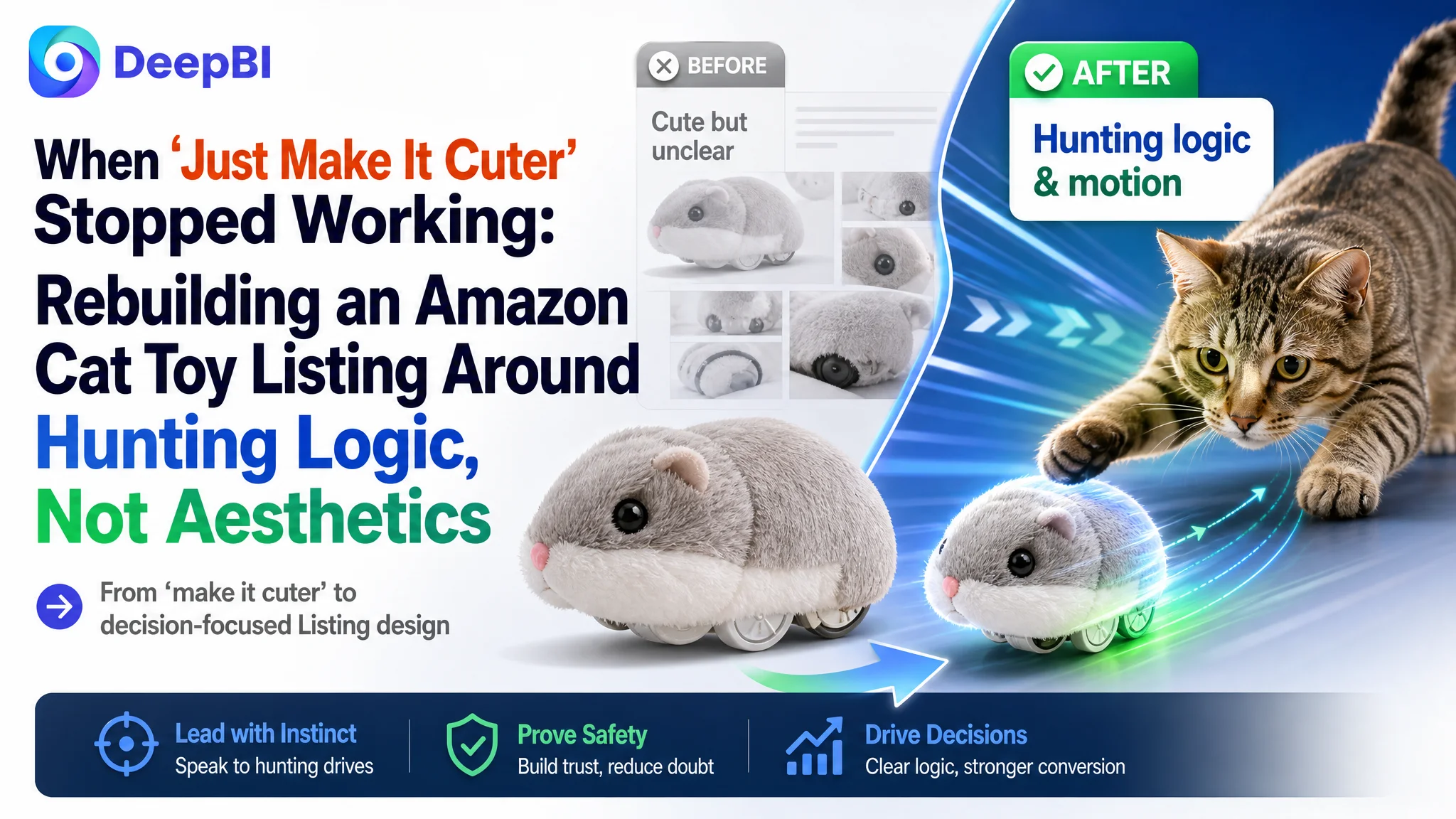
This case comes from an Amazon seller in the pet category whose interactive cat toy Listing kept consuming traffic without converting reliably. The team had been polishing “cute” visuals and emotional scenes, assuming the problem was weak appeal in the thumbnails. DeepBI’s diagnosis showed something different: the Listing was failing at a much more basic layer — it did not explain how the toy actually works, why it’s safe, or why it deserves to be treated as a serious interactive device rather than a cheap gadget.
Instead of being an advertising problem, this was a product-page conversion problem. Compared with a benchmark Amazon Listing in the same interactive cat toy niche, the target page scored 59/100 vs. the competitor’s 85/100. Title logic, main images, bullet points, A+ content, and review structure all lagged, especially on functional clarity and trust-building modules. Ads, if scaled on top of this, would only amplify the page’s structural weaknesses.
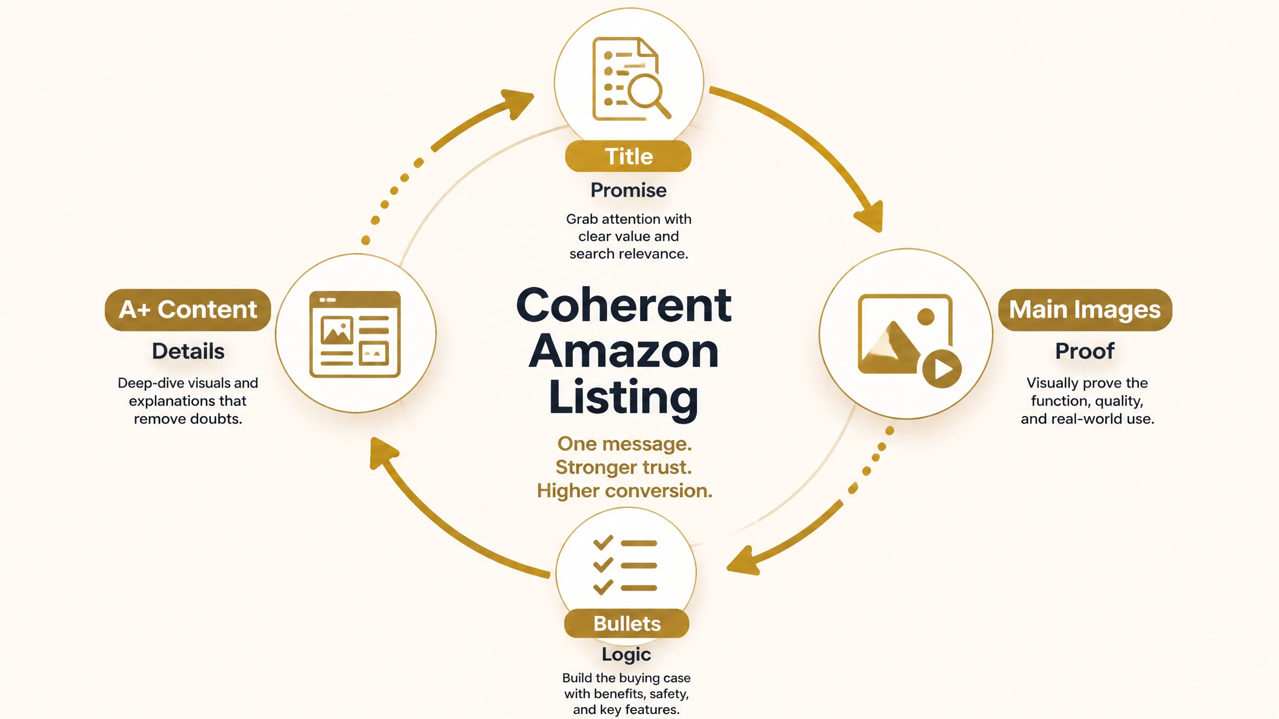
DeepBI reframed the work: pause the instinct to “push more traffic” and first rebuild the Amazon Listing so it mirrors how cat owners actually decide — from hunting instinct and control modes, to safety, durability, and ease of use. The optimization focused on: a clearer title built around core search terms, main images that visualize motion and hunting scenarios, bullet points that move from play value to health and home-protection logic, and A+ modules that explain vibration, size, materials, and usage steps. For other Amazon sellers, the case underlines a hard lesson: when ad efficiency stalls, it’s often a Listing conversion issue disguised as a traffic issue.
The Real Constraint Was Not Traffic. It Was a Weak Listing Framework.
Before working with DeepBI, the seller already had some traffic and reviews:
- Average rating around 3.8 stars
- Over 100 reviews
- A mid-price interactive cat toy for indoor pets
On the surface, nothing looked catastrophic. The team’s internal narrative was straightforward: “Our toy is fun, but our images look too synthetic and not cute enough. If we make the visuals warmer and more emotional, conversion will follow.”
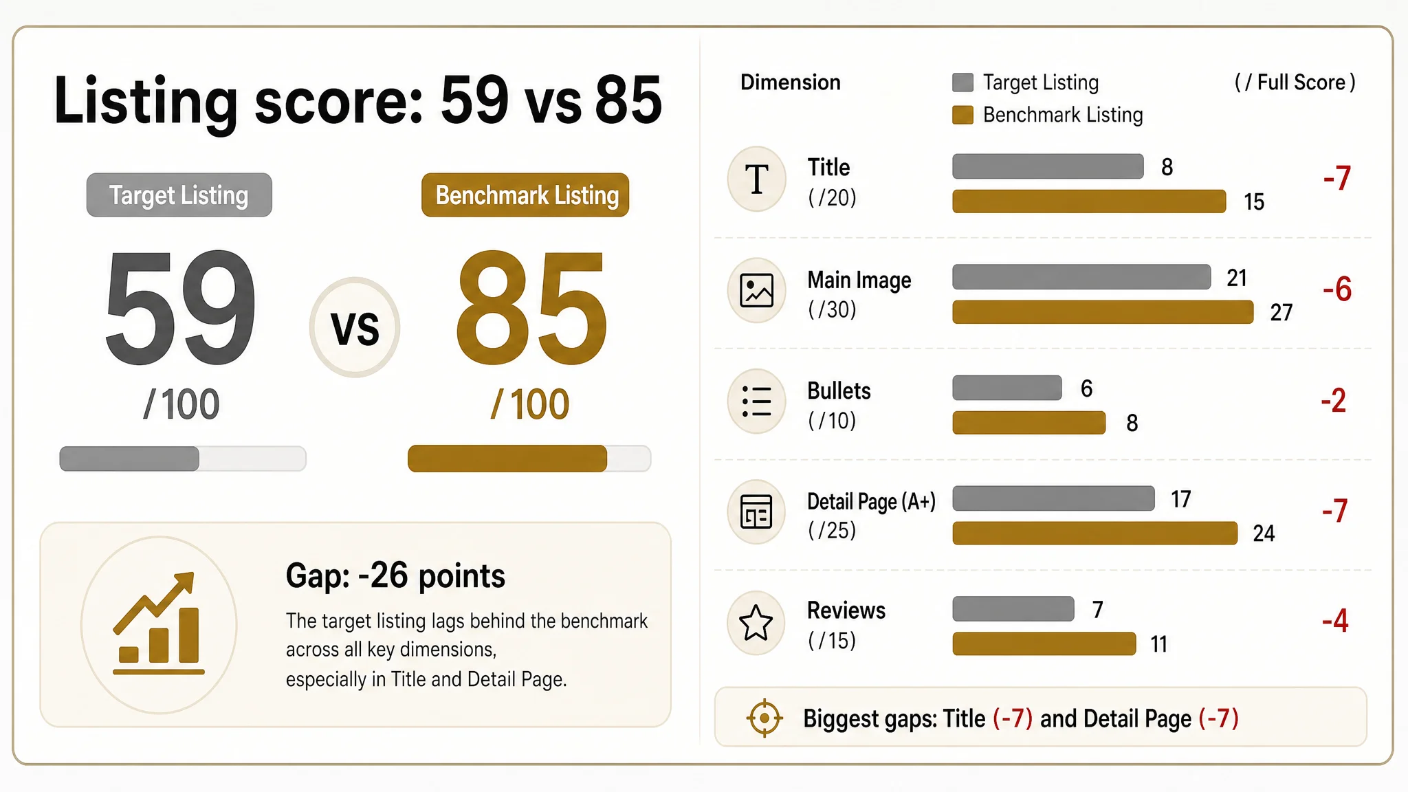
DeepBI’s Listing scoring, however, put a number on the gap:
- Target Listing total score: 59/100
- Benchmark Listing total score: 85/100
- Gap: -26 points
Breaking it down:
- Title: 8 vs 15 (gap -7)
- Main image: 21 vs 27 (gap -6)
- Bullet points: 6 vs 8 (gap -2)
- Detail page (A+): 17 vs 24 (gap -7)
- Reviews: 7 vs 11 (gap -4)
The pattern was clear: this Amazon product page was not structurally competitive. Its biggest problem was not lack of “emotion”; it was lack of decision logic. For a buyer landing from Amazon ads or search, too many critical questions remained unanswered:
- How exactly does this toy move?
- Is it auto or manual? Vibration or wheels?
- What happens when the cat is left alone?
- Is it safe, durable, and tested?
- Does it really help with boredom, anxiety, and weight control?
Until these questions were addressed, any extra advertising budget would simply push more hesitant visitors into the same dead-end funnel.
“The real problem was not that ads failed to bring traffic. It was that the page could not convert the traffic.”
The Original Misdiagnosis: Treating a Trust Gap as an Aesthetic Issue
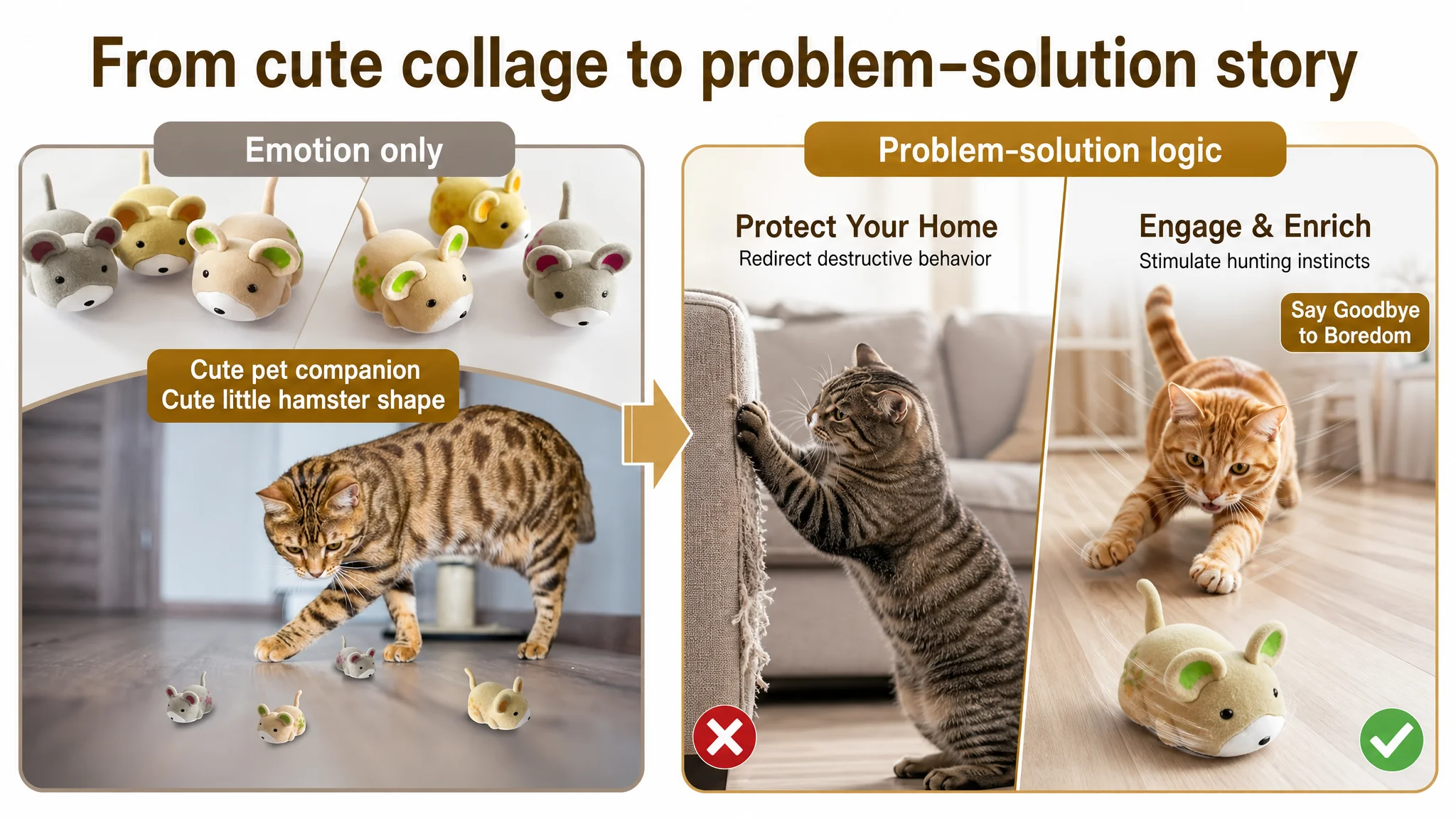
The team believed the main problem was “synthetic images” and “not enough cuteness”
Internally, the seller interpreted low conversion and mixed reviews as a visual-perception issue:
- The composite images looked “fake”.
- The overall tone leaned more functional than adorable.
- Emotional scenes (cats, kids, multi-pet play) were not vivid enough.
- They assumed: “If we make it visually warmer and more playful, CTR and CVR will recover.”
So efforts naturally clustered around:
- Trying new cute angles and lifestyle scenes
- Emphasizing multi-pet fun and child participation
- Highlighting quirky, fun shapes and emotional benefits
But the score breakdown told a different story. The page was under-explaining the mechanics, safety, and long-term value of the toy — all of which matter more when price is not at the absolute low end and the category itself has many “cheap and unreliable” products.
The misdiagnosis: They treated a credibility and clarity problem as a purely aesthetic problem.
Why Traditional Optimization Kept Failing
Amazon ads were feeding a page that didn’t answer the “Is this serious hardware?” question
From DeepBI’s perspective, the traffic–conversion funnel was broken at the page level:
- Main images lacked functional visualization:
- No clear depiction of the vibration motion.
- No visual cue that this is a smart, interactive device, not a random plastic toy.
- No clear indication of compatibility with common home floors.
- A+ and detail modules were emotion-heavy, spec-light:
- Scenes focused on cute interaction, multi-pet fun, and children.
- Almost no quantified performance metrics (battery behavior, run–sleep cycles, duration).
- No graphical explanation of how the vibration drive works.
- Bullet points were benefit-heavy, structure-light:
- Talked about fun, anxiety relief, and suitability.
- Weak on control modes, material clarity, safety layers, and usage logic.
- Reviews exposed a trust and expectation gap:
- 3.8 stars vs benchmark’s 4.2.
- Only about a quarter of the competitor’s review volume.
- 38% of front-page reviews were 3 stars or below, pulling down immediate trust.
When buyers compared this Listing with a benchmark interactive cat toy, the competitor looked like:
- A more serious device with clear control modes (auto/manual, speed, directions).
- Better documented safety features (standby modes, auto shutdown).
- More transparent material and certification story.
- Stronger explanation of how it stimulates hunting instincts and supports health.
In other words, ads were pushing shoppers into a comparison where the competitor had a much better argument. No amount of “make it cuter” could offset that.
“Advertising does not only amplify advantages. It can also amplify a page’s existing defects.”
What DeepBI’s Listing Data Actually Showed
DeepBI’s scoring and benchmark comparison isolated the core deficits.
1. Title: Weak search logic and vague value
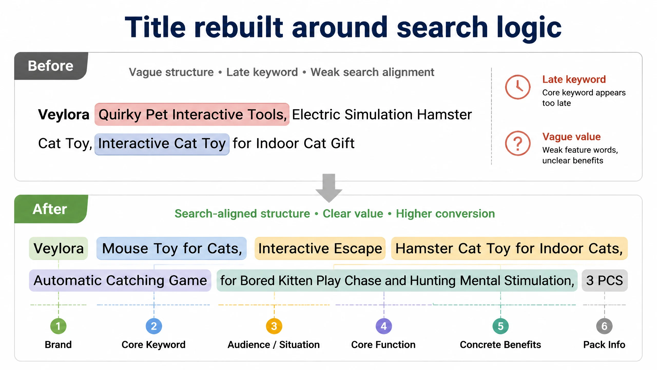
The original title:
- Pushed the core keyword “Interactive Cat Toy” to a later position.
- Used vague, decorative phrases like “Quirky Pet Interactive Tools”.
- Lacked clear scenario framing (“for indoor cats”, “for bored kittens”).
- Missed strong value markers such as “upgraded”, “DIY”, “mental stimulation”.
Benchmark titles in the same sub-niche followed a tight Amazon pattern:
- Brand + core keyword + audience/situation + core function + concrete benefits
For this cat toy, that meant:
- Leading with “mouse toy for cats” or similar core phrase.
- Adding “for indoor cats” and “bored kitten” to align with search intent.
- Explicitly calling out “chase”, “exercise”, “hunting”, “mental stimulation”.
- Avoiding non-compliant, hype-heavy phrases that risk listing issues.
The recommended structure:
Brand + Mouse Toy for Cats, Interactive Escape Hamster Cat Toy for Indoor Cats, Automatic Catching Game for Bored Kitten Play Chase and Hunting Mental Stimulation, 3 PCS
This repositioned the title around what Amazon’s search and buyers both care about: what it is, who it’s for, what it does, and why it matters.
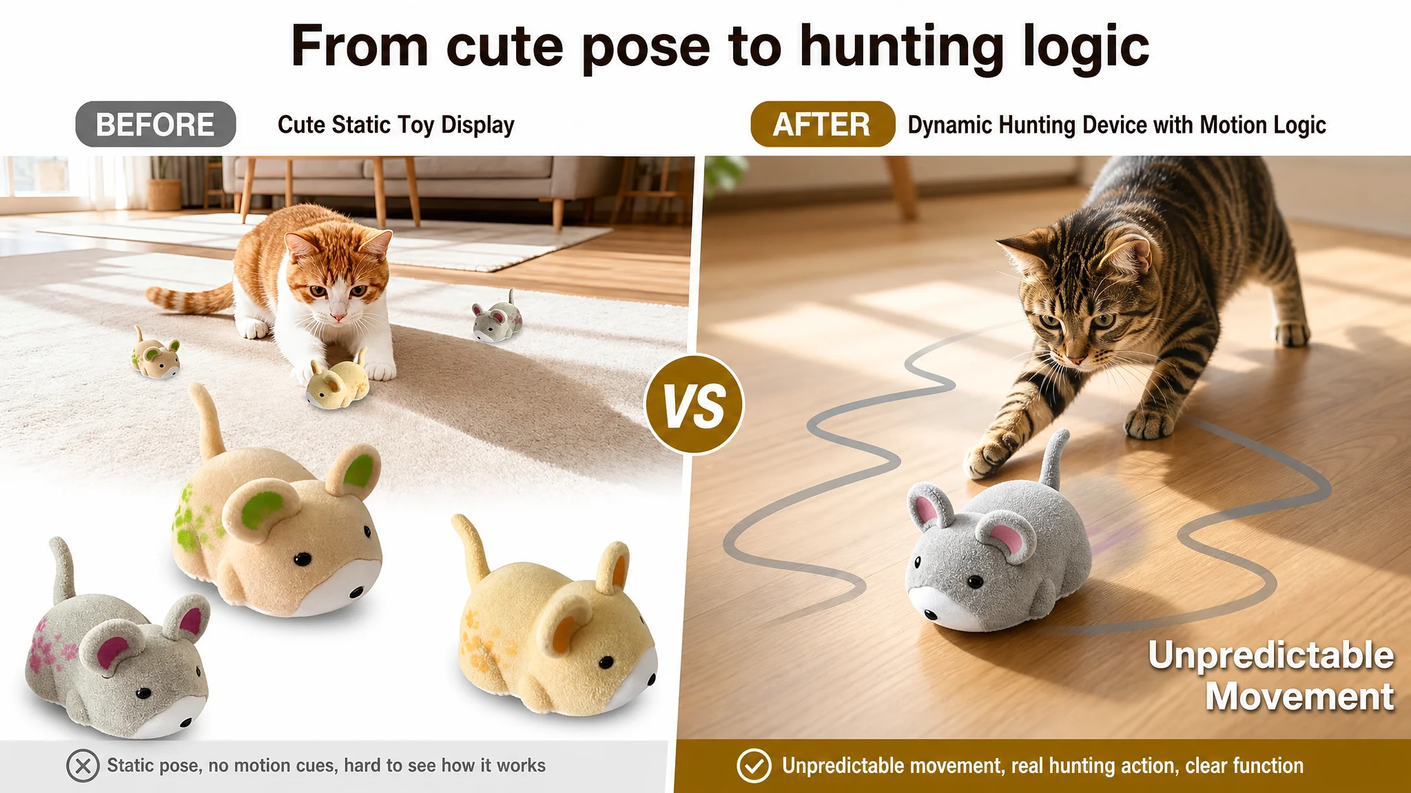
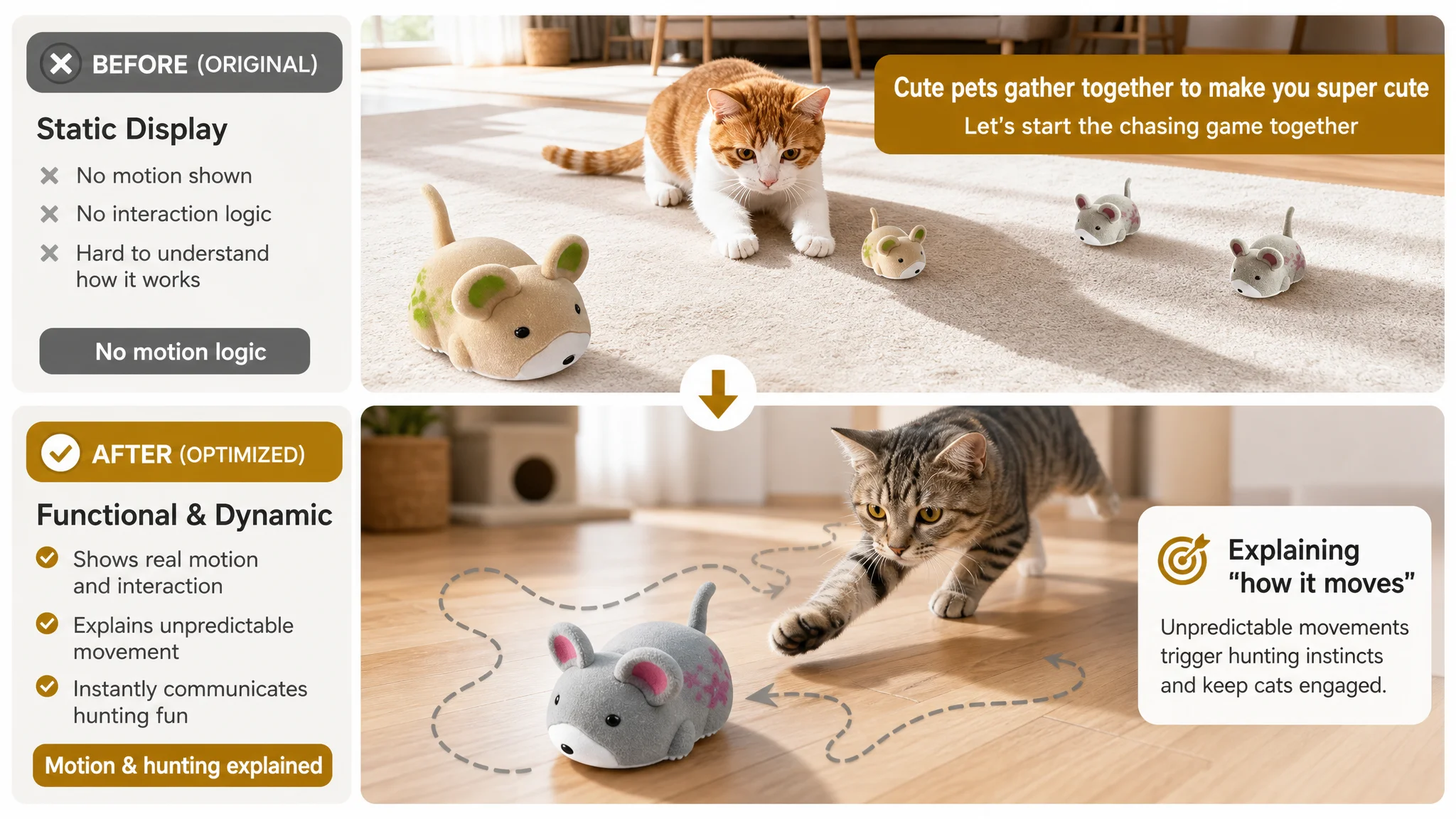
2. Main images: Static display instead of dynamic hunting logic
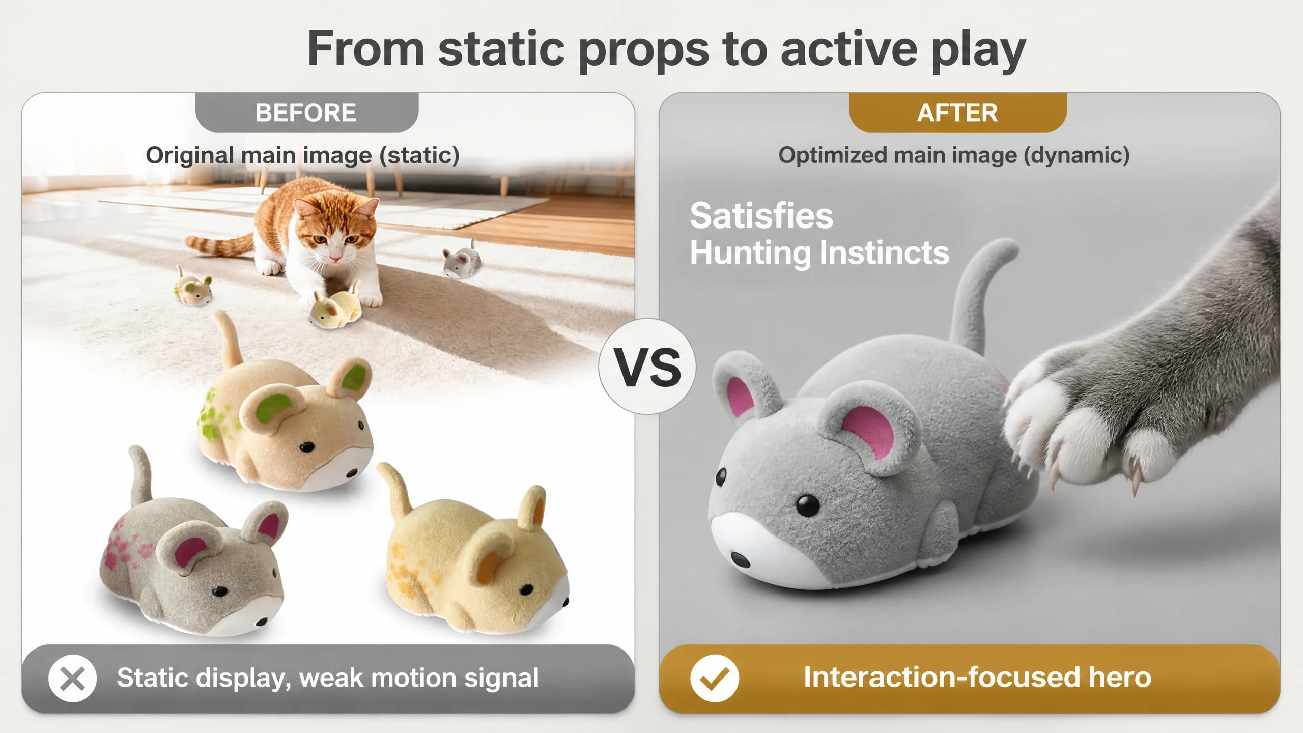
On the Amazon search results page, main images do most of the work. DeepBI found:
- The existing first image showed a static product pose, with weak emphasis on motion.
- No clear demonstration of:
- Unpredictable movement paths.
- Interaction intensity when a cat actually hunts it.
- Switch location or operation ease.
- Multi-color pack in a clean, professional layout.
- Before/after scenarios (bored destructive cat vs. engaged cat).
The benchmark’s visuals, in contrast:
- Showed dynamic chasing scenes in the very first frame.
- Included functional diagrams and control layouts.
- Built a strong mental link between “this device” and “serious hunting play and exercise”.
DeepBI’s recommendation was not “make it prettier”, but make it intelligible and persuasive:
- Main Image 1: Cat in mid-pounce, tracking trajectory lines around the toy, highlighting “Unpredictable Movement”.
- Main Image 2: Close-up of cat paw interacting with the fuzzy surface, highlighting “Satisfies Hunting Instincts”.
- Main Image 3: Split-screen showing the underside and switch clearly labeled “Easy One-Click Start”.
- Main Image 4: Clean, evenly lit three-color lineup with consistent shadows, signaling professional quality and true-to-life colors.
- Main Image 5: Strong contrast scene — cat destroying furniture vs. cat playing with the toy — with “Say Goodbye to Boredom”.
This was a shift from decorative scenes to decision-driving scenes.
3. Bullet points: Benefits without a buying path
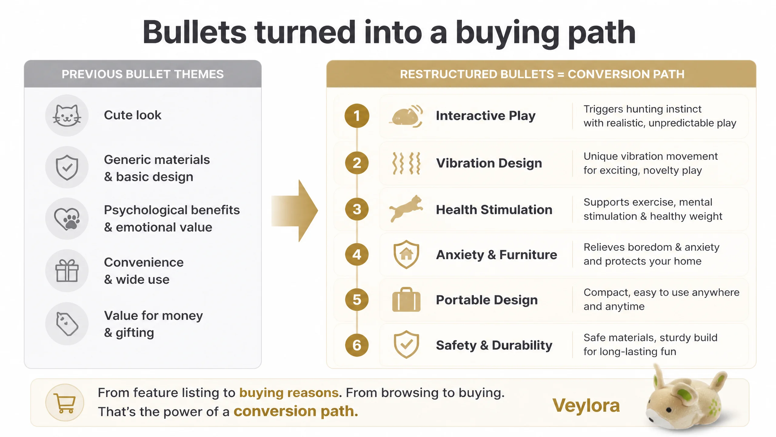
Previously, bullet points:
- Started from “funny appearance and basic function”.
- Mentioned design principles and materials in a generic way.
- Talked broadly about psychological and physical benefits.
- Ended with stress and anxiety relief, plus convenience and applicability.
The benchmark’s structure was different:
- Control & sensory modes: technical core
- DIY play and expansions: engagement depth
- Hunting instinct and health: behavioral logic
- Automation & safety: hands-off reassurance
- Materials & certification: final trust layer
DeepBI’s rewrite aligned bullets to a “pain point → mechanism → result” flow:
1. Engaging Interactive Play & Realistic Mimicry
- Lifelike shape + unpredictable vibration mimic real prey.
- Explicitly signals compatibility with flat floors and tables.
1. Innovative Vibration Design & Premium Quality
- Focus on vibration instead of wheels, clarifying why it feels more life-like and is quieter.
- Materials described as safe, durable, and appropriate for pet contact (without inventing untrue specs).
1. Mental & Physical Health Stimulation
- Links play to weight management and boredom reduction for indoor pets.
- Frames it as a solution for long-term health, not just entertainment.
1. Anxiety Relief & Furniture Protection
- Connects boredom to destructive behavior (sofas, shoes, curtains).
- Positions the toy as a “safe outlet” when the pet is alone.
1. Portable Design & Ready to Play
- Highlights compact size, easy switch operation, and spare batteries included.
1. Safe, Durable & Multi-Surface Friendly
- Clarifies safety edges, non-toxic materials, and compatibility with various smooth surfaces.
This turned bullet points into a coherent path from attraction → engagement → health → home protection → safety & convenience.
4. Detail page (A+) content: Emotion-heavy, trust-light
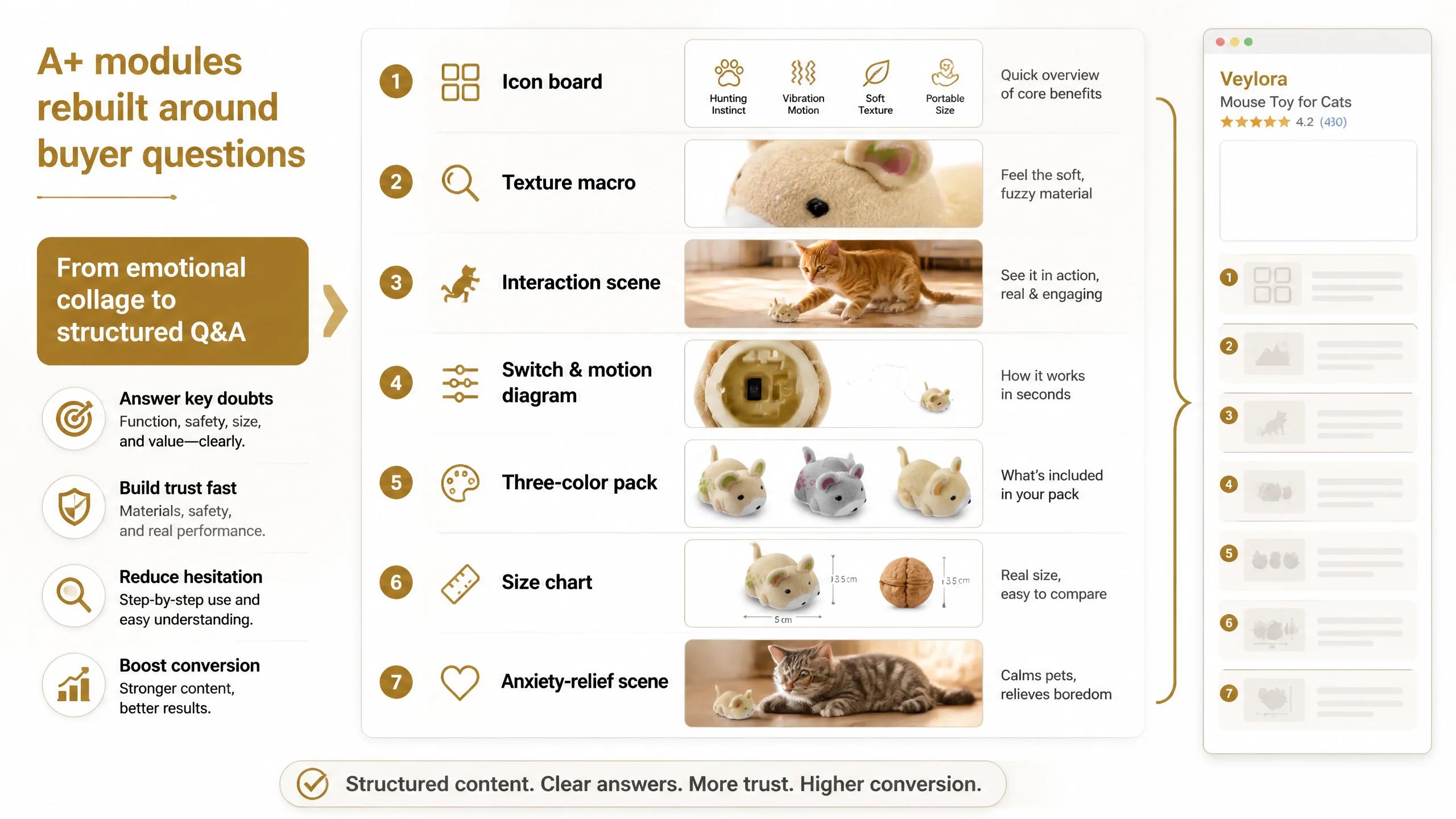
DeepBI’s analysis of the A+ section:
- Current modules:
- Emotional scenes (cats, children, multi-pet interaction).
- Exterior shots of the toy in various playful contexts.
- Missing high-value modules:
- Core function icon cluster (hunting instinct, vibration motion, soft texture, portable size).
- Trajectory and motion explanation (how vibration drives movement).
- Usage steps (how to turn on, where it works best).
- Standby behavior or battery story, even if not as advanced as the benchmark.
- Size visualization with common objects.
- Material and safety reassurance beyond generic statements.
Benchmark detail pages, by comparison, were dense with:
- Feature icons and quick summaries.
- Diagrams for smart standby modes and timers.
- Certified material callouts.
- Usage step-by-step guides and pack lists.
DeepBI’s recommended modules:
- Core-sell icon board:
- White background, centered product, 4–6 icons for key features.
- Clear contact shadows to remove “sticker” feeling and convey realism.
- Macro texture shot:
- Macro image focusing on plush fibers with side backlight, conveying softness and comfort.
- Realistic interaction scene:
- A cat in mid-action with realistic shadows, grounding the toy physically on the floor.
- Bottom switch & vibration explanation:
- Split layout with a real bottom view and a simplified path diagram.
- Shows what “vibration motion” looks like on a flat surface.
- Three-color pack visualization:
- Standardized top-down layout, emphasizing consistency and accurate color representation.
- Size and proportion chart:
- Neutral background, size lines, and a familiar reference object (e.g., finger or small nut) to set expectations.
- Emotional, anxiety-relief scene:
- Warm ambient scene focusing on calm companionship, reinforcing the stress-relief message.
This A+ rebuild was not about adding “more pictures”; it was about covering all the real questions a skeptical buyer has.
5. Reviews: Visible risk on first impression
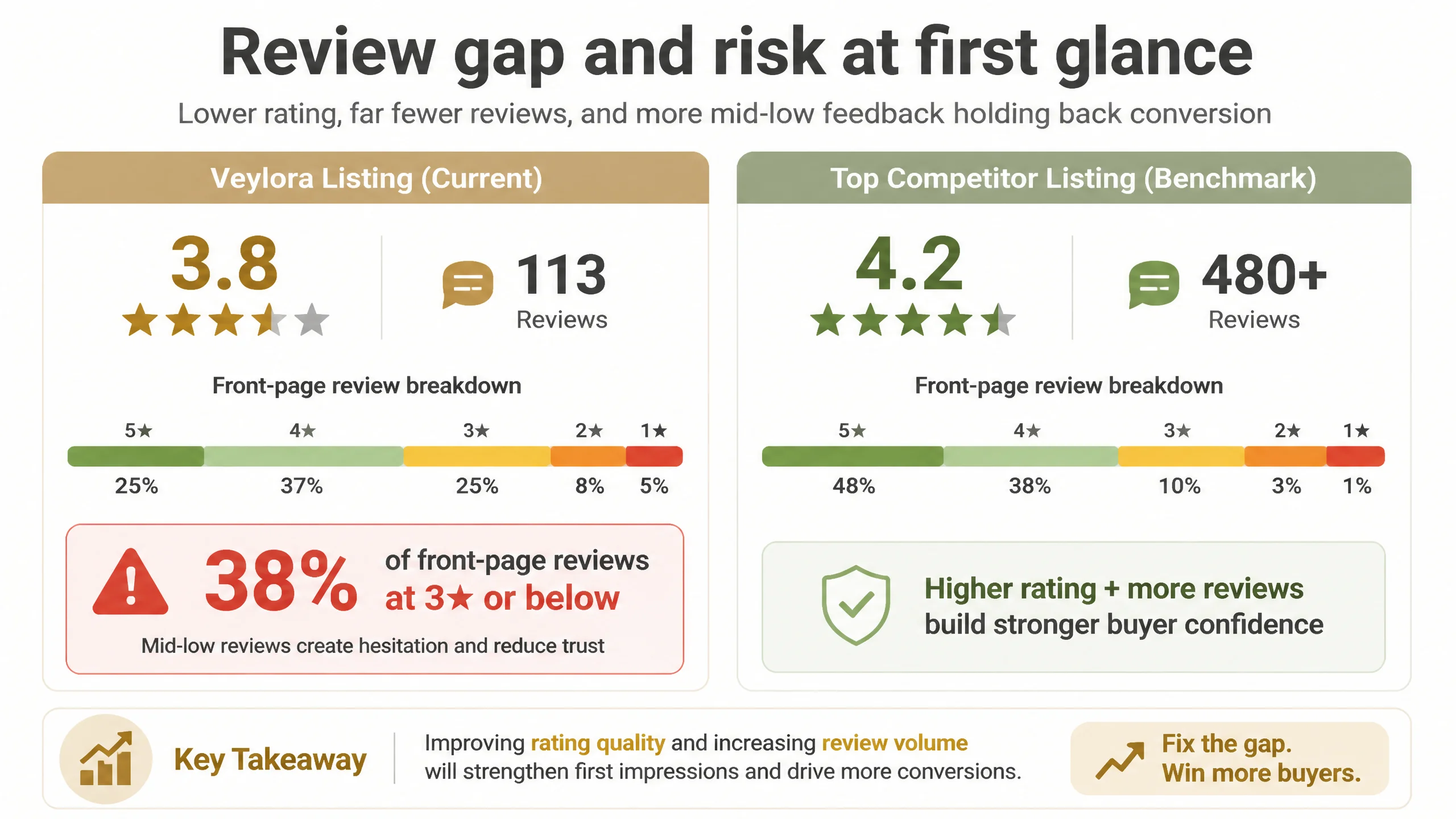
The review gap was not just numeric:
- 3.8 vs 4.2 stars is meaningful for first-time buyers.
- 113 reviews vs ~480 shows smaller validation volume.
- Front page negativities (38% at 3 stars or below) strongly influence perceived risk.
DeepBI’s role here was judgmental rather than manipulative:
- Listing content needed to set more realistic expectations:
- Clarify what surfaces work best.
- Clarify motion type (vibration vs wheels).
- Clarify size and intensity level so owners don’t expect a large, loud device.
By aligning the page content more tightly with the product’s real capabilities, the seller could gradually change the type of buyer coming in and the expectations they hold, which is the only sustainable path to improving review mix.
Why Listing Conversion Had to Be Fixed Before Ads
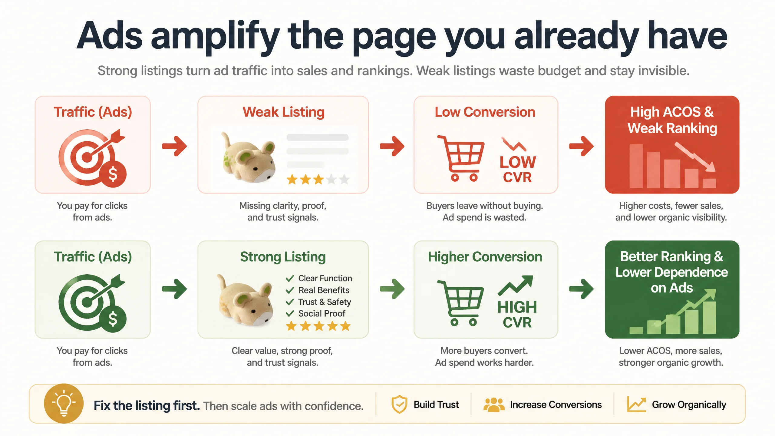
From DeepBI’s perspective, the risk of optimizing ads first was straightforward:
1. Every unconverted click from ads costs money.
If the Listing is structurally weaker than the benchmark, those costs accumulate without building ranking momentum.
1. A weak Listing forces overdependence on paid traffic.
Organic rankings stay fragile because Amazon’s algorithm sees weaker conversion signals compared with the category’s top performers.
1. Higher ACOS can easily be misread as “bid/budget problem” instead of “page problem”.
The seller could keep tweaking campaign structures (keywords, bids, match types) while never fixing the actual leak.
Given the score gap (59 vs 85) and the nature of the deficits (title logic, functional images, A+ trust gaps), DeepBI’s judgment was:
- Do not escalate ad spend on this foundation.
- Rebuild the Listing to close the gap with the benchmark first.
Only once the content side starts carrying its weight does it make sense to push more traffic, because every click has a higher probability of converting and sending positive signals back to Amazon’s ranking system.
How the Page’s Sales Logic Started to Recover
From “cute toy” to “structured interactive device”
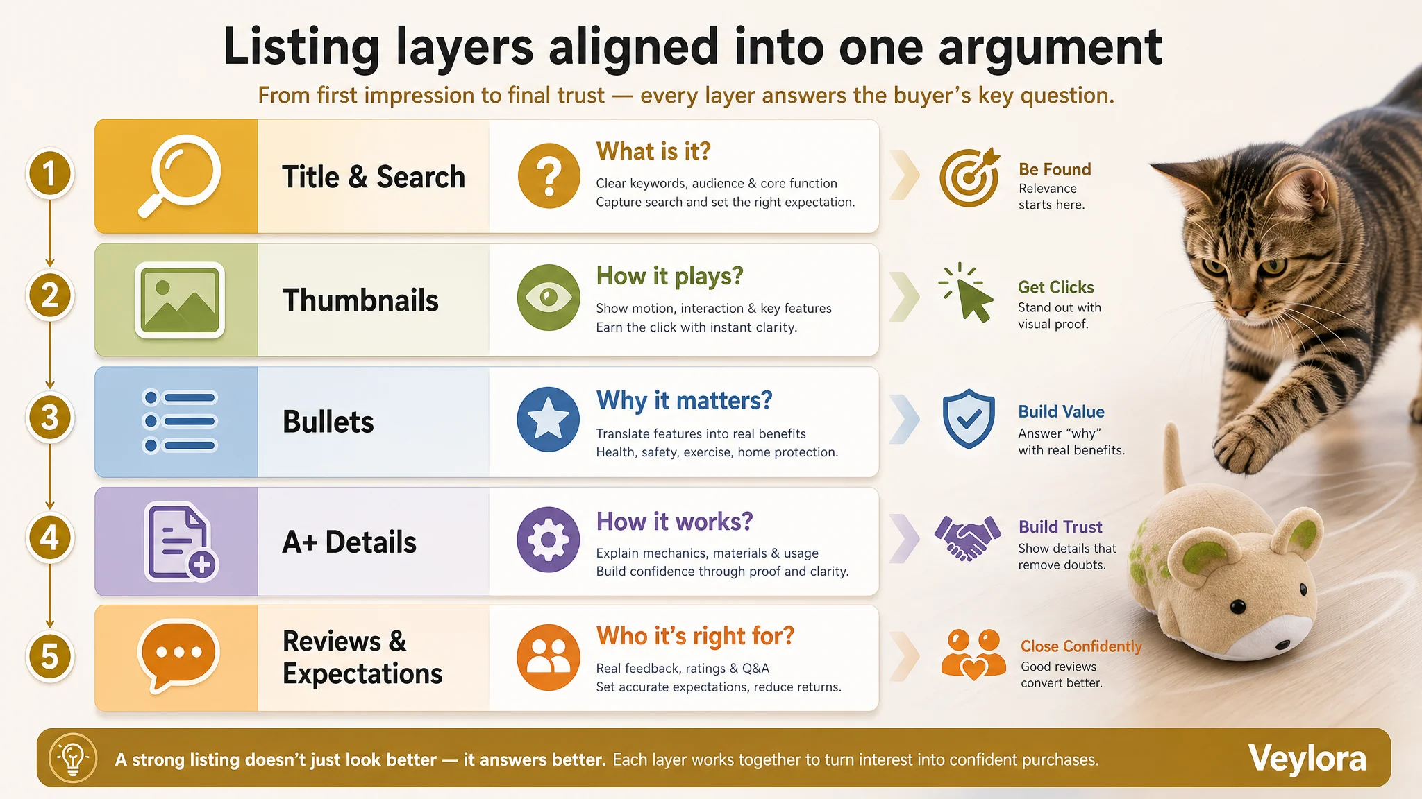
After the Listing structure changes, the page’s logic looked more like this:
1. Search & title layer
- Core keyword (“mouse toy for cats”) front-loaded.
- For “indoor cats” and “bored kittens” clearly indicated.
- “Chase”, “hunting”, “mental stimulation” inserted as outcome descriptors.
1. Thumbnail & main-image layer
- First contact: clear dynamic hunting situation.
- Visual proof of unpredictable movement and hunting satisfaction.
- Professional, consistent pack and color presentation.
- Before/after scenario tying boredom to destructive behavior and the toy to relief.
1. Bullet-point layer
- Logic path: interaction → sensation → health → anxiety → home protection → safety & portability.
- Each bullet built as a mini-argument, not a loose benefit statement.
1. Detail-page (A+) layer
- Icons summarizing core features.
- Texture and motion explained visually.
- Usage and switch logic clearly outlined.
- Size, materials, and surfaces framed explicitly.
- Emotional scene reinforcing the role of the toy as a boredom and anxiety outlet.
1. Review expectation alignment
- By clarifying what the toy is and is not, the Listing began attracting buyers whose expectations matched the reality of a vibration-driven mini toy.
While we do not fabricate numeric outcomes, the expected operational impact was:
- Higher CVR as fewer buyers bounced due to unaddressed doubts.
- More stable ACOS as ad clicks landed on a page that could defend itself against benchmark competition.
- Gradual improvement in review mix as mismatch complaints reduced.
- Lower dependence on ads as organic conversion signals strengthened.
Most importantly, the seller’s team acquired a different mental model: ads are an amplifier, not a repair kit for a weak Listing.
What Other Amazon Sellers Can Take from This Case
1. If your Amazon ads “stop working”, check the Listing before touching bids.
In this pet-category case, ad-side tweaks could never compensate for:
- A vague, low-priority title.
- Static main images with no motion logic.
- Emotionally rich but technically thin A+ content.
- Bullet points without a conversion path.
The seller’s original belief — “Cuter visuals will fix it” — kept them stuck. DeepBI’s scoring showed that the Listing’s conversion capacity, not the traffic input, was the binding constraint.
2. Trust issues often hide behind “synthetic image” complaints.
Buyers rarely say “You didn’t show enough icons.” They say:
- “This looks cheap.”
- “It doesn’t move like I expected.”
- “My cat ignored it.”
- “It’s smaller than it looks.”
Underneath these comments are usually:
- Missing size and proportion context.
- Poor explanation of motion mechanics.
- Overly composite scenes with unrealistic shadows or scaling.
- Lack of clear safety and material reassurance.
The fix is almost never “add more filters” but tighten reality, clarity, and logic.
3. Strong Amazon Listings align title, images, bullets, and A+ into one argument.
In the benchmark Listing:
- Title captures the search logic and functional promise.
- Main images prove those promises visually.
- Bullet points connect those functions to health, behavior, and safety.
- A+ content closes remaining doubts with diagrams, icons, and real scenes.
DeepBI’s role in this case was to reconstruct that same coherence for the seller’s page, not through guesswork, but by quantifying the gap and rebuilding each layer accordingly.
Closing Thought: Before You Scale Ads, Ask If the Page Deserves the Traffic
This cat toy seller came in thinking they had an ad problem and a “cutely-underdesigned” product page. DeepBI’s diagnosis showed the real issue: a Listing that could not convincingly explain what the toy is, how it works, and why it’s worth trusting, especially when buyers compare it with better-structured competitors.
The transformation did not come from a new advertising hack. It came from changing the question:
- From: “How do we get more traffic and prettier images?”
- To: “If we were the buyer, would this Amazon Listing be enough to choose us over the benchmark?”
For Amazon sellers reading this, that is the practical takeaway: before you invest in ads, make sure your product page can defend every click.