
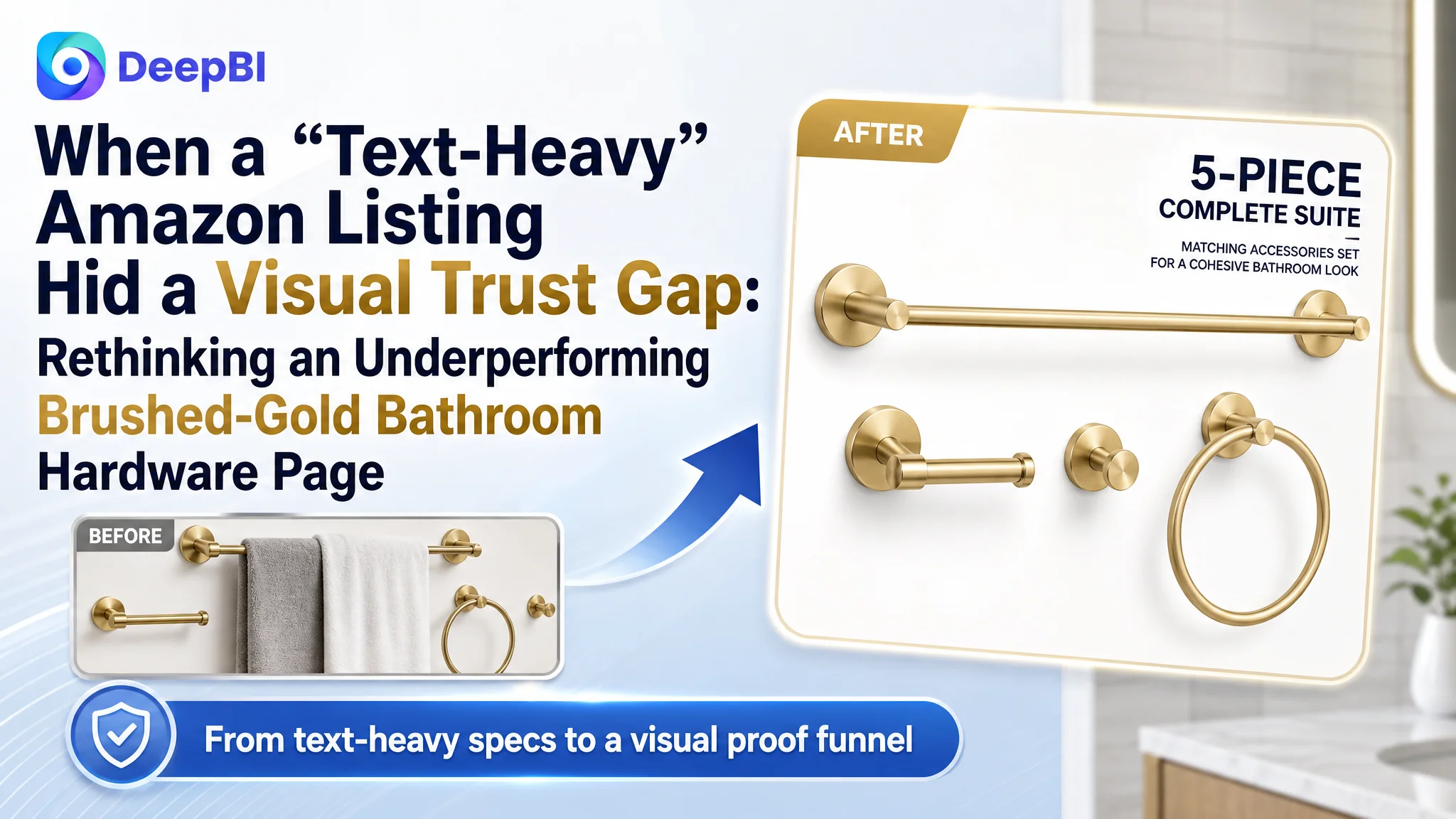
An Amazon seller in the brushed-gold bathroom hardware category came to DeepBI with a familiar frustration: ads were bringing traffic, reviews were strong, but the Amazon Listing simply could not keep up with a benchmark competitor’s conversion. Internally, the team believed the problem was mainly about ad tuning and “needing more reviews,” because the page already had detailed bullet points and a higher star rating than a leading competitor.
After DeepBI’s Listing scoring and benchmark comparison, the story reversed. The real constraint was not lack of information or social proof, but a visual trust gap on the Amazon product page—especially in the A+ detail area. While the competitor’s page used a full visual narrative to sell a “high-end bathroom solution,” this Listing relied almost entirely on text. Ads were driving visitors into a page that looked incomplete compared with the market’s visual expectation.
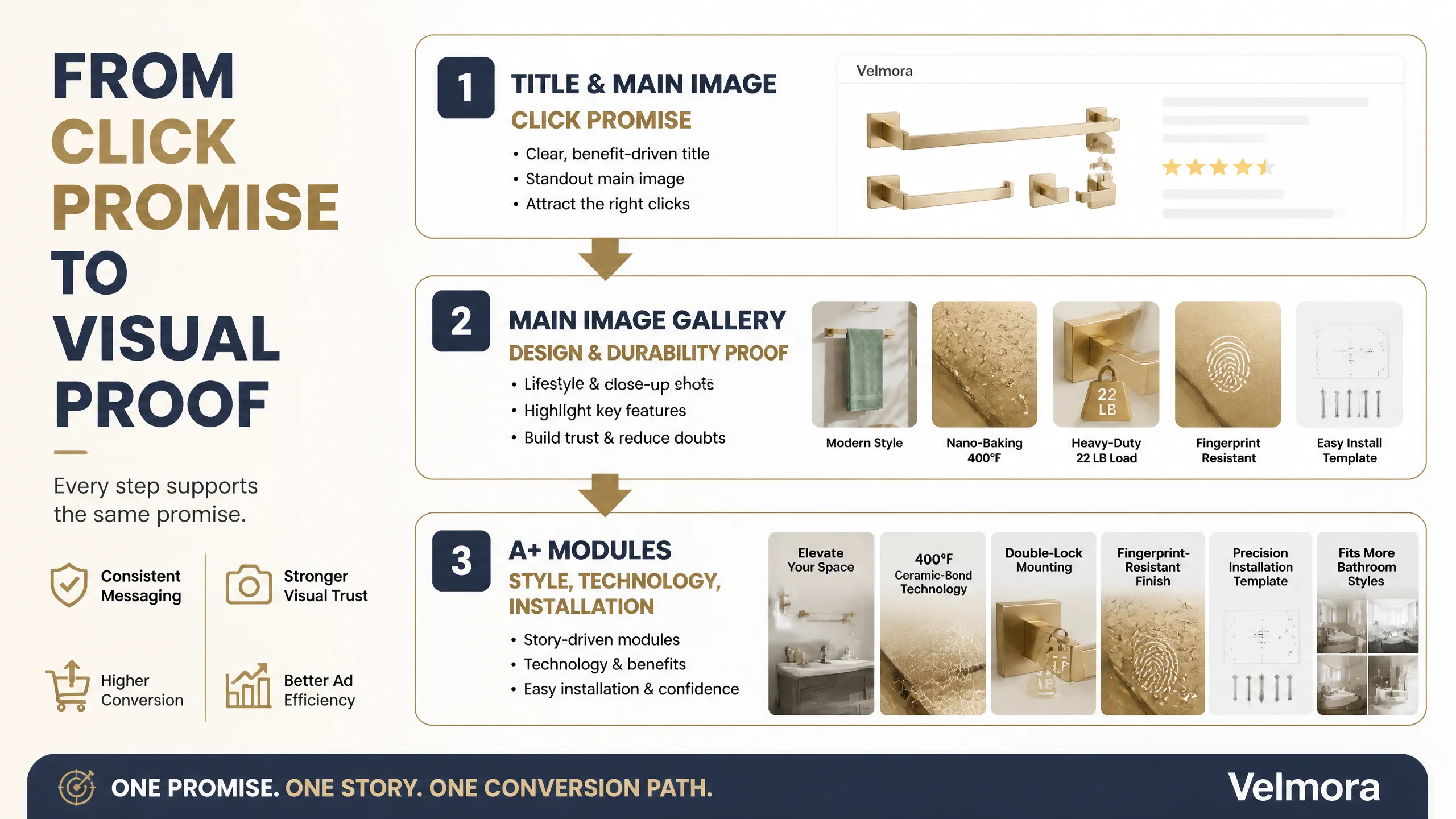
The later optimization therefore did not start with ads or copy tweaks, but with a restructuring of the main-image sequence and a complete rebuild of the detail/A+ modules. DeepBI helped the team refocus the page on “muted luxury + industrial durability”: softer, more compelling scenes at the top, followed by visual proof of 400°F nano-baking, 22 lb load-bearing, double-lock mounting, and anti-fingerprint finish. For other Amazon sellers, this case is a reminder that once traffic and reviews are in place, the next bottleneck is often how the page visually proves its claims—especially when you are going head-to-head against a visually mature competitor.
This Amazon Listing Did Not Lack Reviews. It Lacked a Visual Case for Its Claims.
From an Amazon metric standpoint, this bathroom hardware Listing looked healthy on the surface.
- Star rating: 4.8 (better than the benchmark competitor’s 4.6)
- Review volume: 174 (lower than the competitor’s 1,921, but with cleaner sentiment)
- Listing score: 69/100 vs. competitor’s 75/100 (a visible but not catastrophic gap)
Internally, the seller interpreted the situation as:
- Ads and traffic were “okay” but expensive.
- The main path to catch up with the competitor was to push more reviews and continue ad tuning.
- Since the bullet points were already detailed and highly technical, they believed page content was not the main issue.
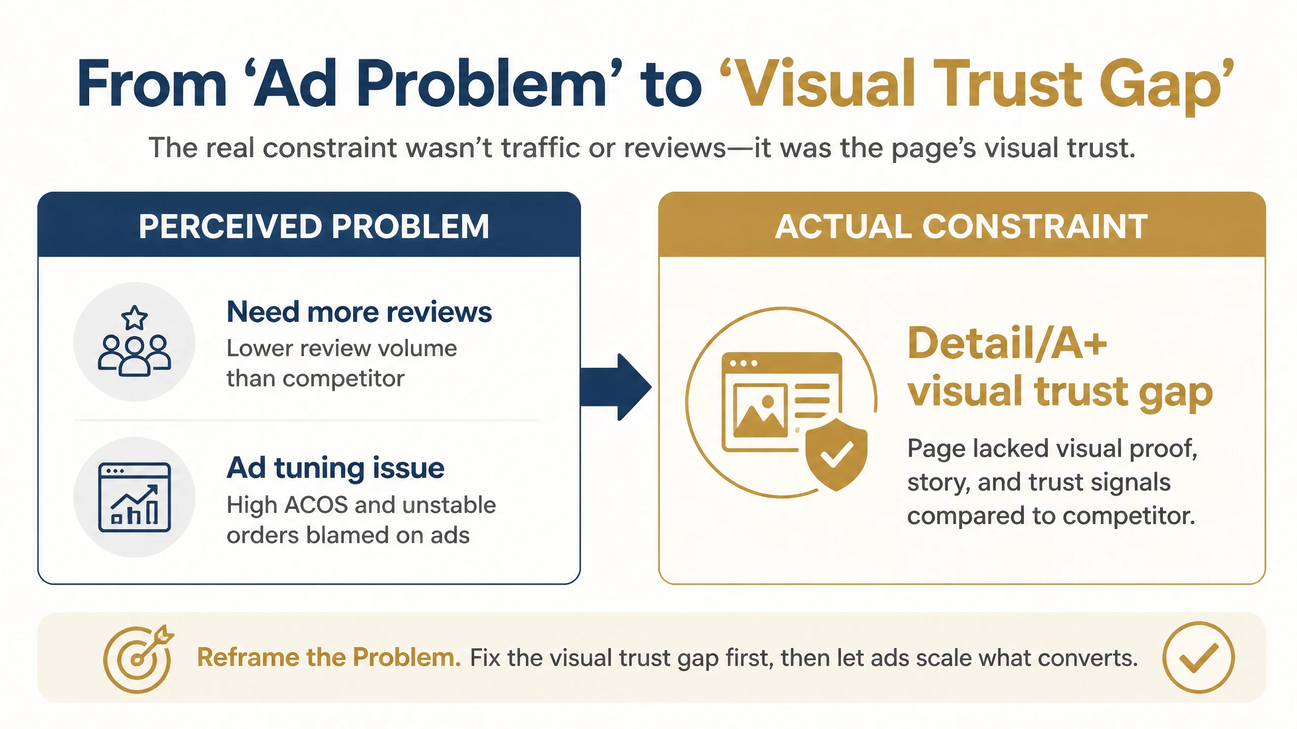
DeepBI’s diagnosis showed a different picture.
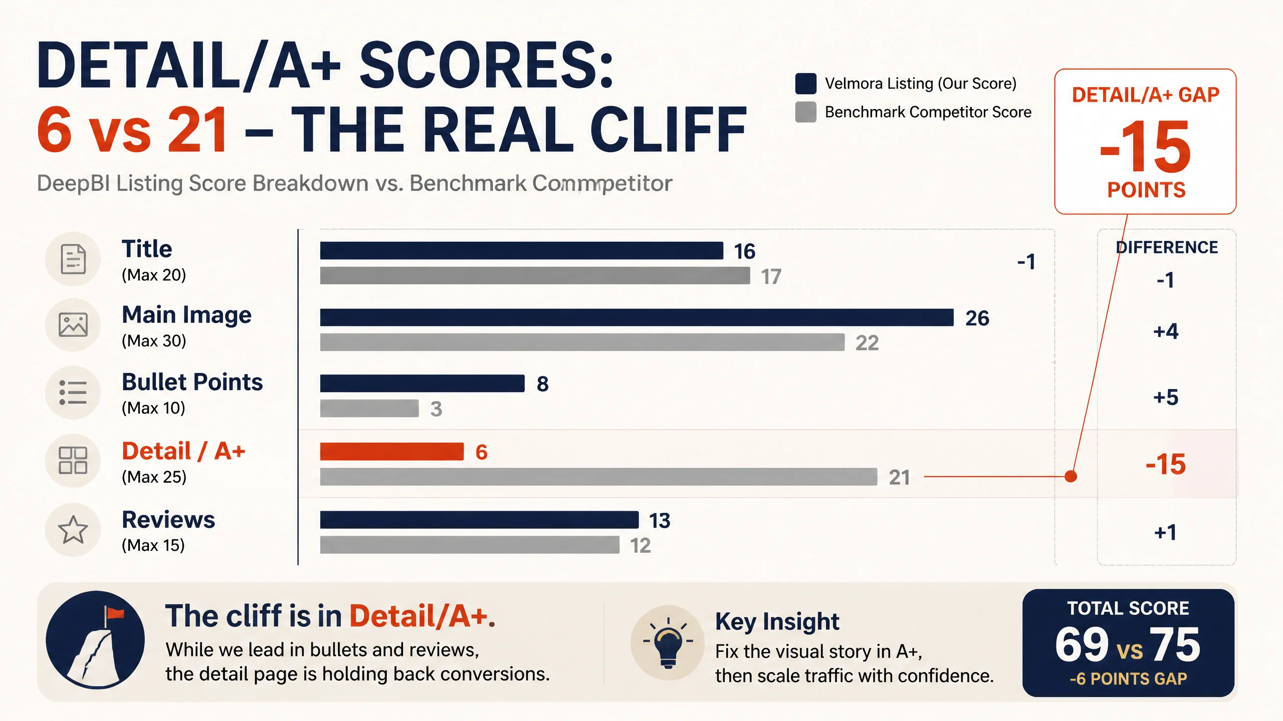
The total score gap of -6 points was not random. The breakdown revealed a sharp asymmetry:
- Title: -1 (close)
- Main image: +4 (this Listing even outscored the competitor on raw main-image dimension)
- Bullet points: +5 (stronger structure and logic)
- Detail/A+: -15 (this was the real cliff)
- Reviews: +1 (trust health was actually better)
In other words, the Listing was winning on copy structure and review quality, but losing decisively on detail-page visual persuasion. The page looked like a technical spec sheet competing against a fully visualized “bathroom upgrade experience.”
“The real problem was not that ads failed to bring traffic. It was that the page could not visually prove what the bullets claimed.”
For Amazon traffic coming from search and ads, this meant:
- The click promise (title + main thumb) was relatively aligned with the category baseline.
- But once users scrolled, they met a text-heavy detail section with no A+-style visuals.
- In comparison, the competitor’s A+ content delivered high-end bathroom scenes, material close-ups, and multi-style adaptability at a glance.
The result: traffic that should have converted was quietly slipping away at the detail stage.
The Original Misdiagnosis: “Our Copy Is Strong, So the Problem Must Be Ads or Reviews”
The seller had invested serious effort in the bullet points:
- Each bullet followed a “pain point → solution → proof” structure.
- They used real data (400°F, 22 lb), technical terms (Nano-Baking, SUS304) and clear benefit wording.
- Compared to the competitor’s relatively generic bullets (“durable and wear-resistant,” “5-in-1 set”), this Listing’s text logic was more advanced.
This led to two misjudgments:
1. “Our Listing content is already strong.”
Because the text layer was well structured, the team equated “content completeness” with “conversion readiness.”
1. “The gap is ad-side or review-side, not page-side.”
High ACOS and unstable orders were interpreted as:
- Need better keyword grouping and bidding.
- Need more reviews to catch up with the competitor’s volume.
However, DeepBI’s Listing score and competitor comparison highlighted a different mechanism:
- The bullets were indeed strong.
- But they were not being visually anchored anywhere—no A+ modules, no visual proof of the technology, no lifestyle storytelling to echo those claims.
- The competitor, despite weaker bullets, was winning because its visual layout made the decision path easier and more reassuring.
Traditional ad optimization in this state could not solve the problem:
- More traffic only meant more users hitting a visually underdeveloped detail page.
- The click and scroll behavior was being consumed by a page that did not look “finished” relative to the category benchmark.
- Ads were amplifying the Listing’s weakest layer.
DeepBI’s Judgment: The Core Constraint Was Detail-Page Conversion Capacity
When DeepBI compared this Listing with a high-performing benchmark, one gap overshadowed all others: the A+/detail section scored 6/25 versus the competitor’s 21/25.
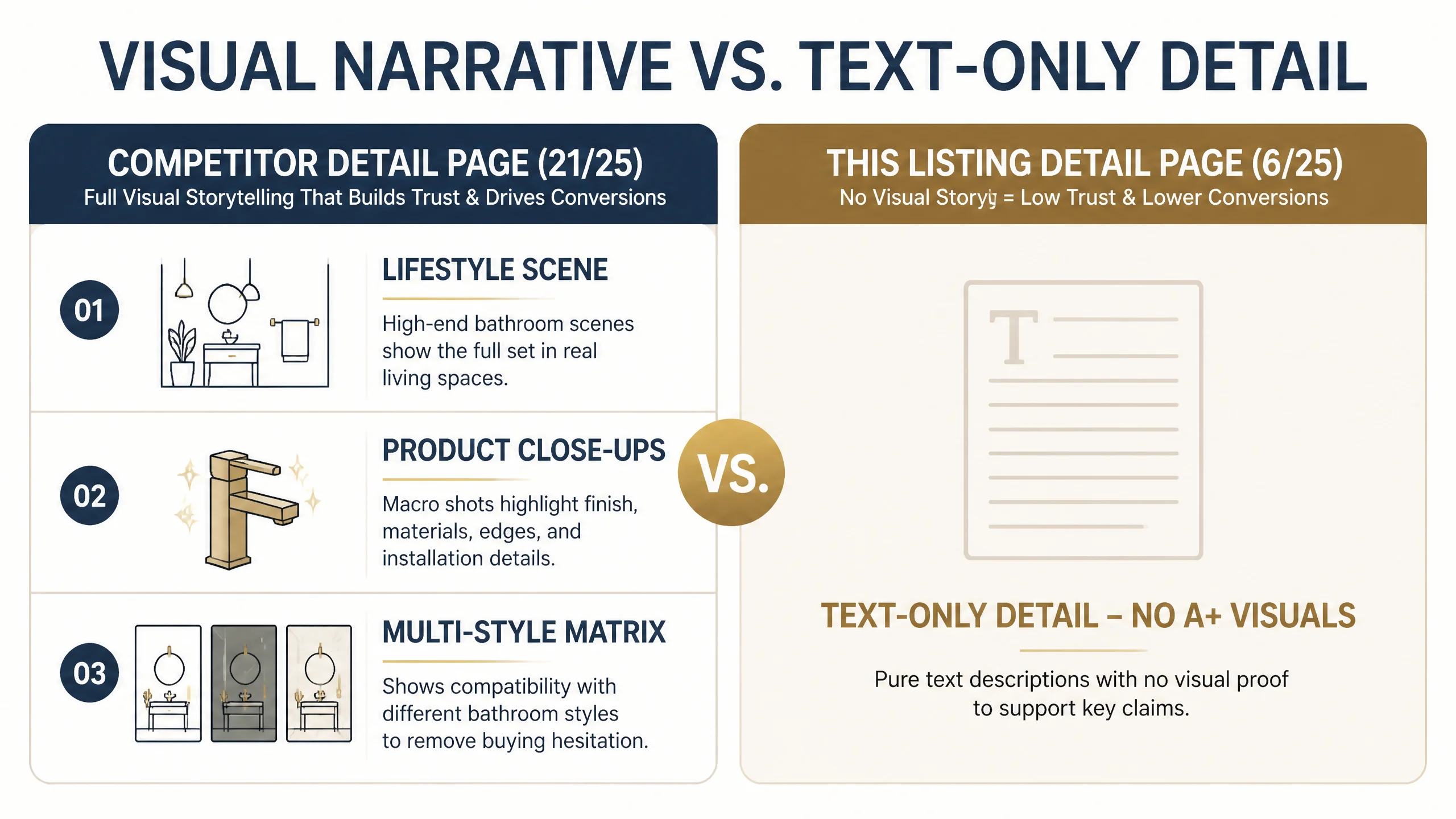
How the competitor’s Amazon detail page was structured
The benchmark product-page structure:
- Opened with a high-end bathroom scene: brushed gold hardware installed in a coherent, aspirational space.
- Followed with three single-product close-ups (towel bar, paper holder, hooks) showing finish, edges, and installation logic.
- Used a “lifestyle + product details + multi-style adaptation” sequence:
- First: style fit and emotional appeal (modern bathrooms, warm lighting).
- Second: material and craft verification via macro shots.
- Third: visual matrix of different bathroom styles, securing versatility.
Everything was framed visually. Text supported the images, not the other way around.
How this Listing’s Amazon detail page looked
By contrast, the seller’s detail section:
- Relied on pure text—no images, no modular visual layout, no A+ blocks.
- Repeated many of the same claims from the bullets (SUS304, nano-baking, durability) but never visualized them.
- Offered high information density, but low scanability and low emotional reassurance.
From a buyer’s perspective:
- The title and bullets made big promises: 400°F ceramic-bond technology, 22 lb heavy-duty mounting, fingerprint resistance.
- But the detail area provided no visual evidence.
- Against a competitor that was visually presenting a “high-end bathroom solution,” this Listing looked incomplete—even if the product was objectively stronger.
DeepBI’s judgment was straightforward: before tuning ads or chasing more reviews, the detail/A+ visual gap had to be closed.
“Advertising does not only amplify advantages. It can also amplify a page’s existing defects.”
If the Amazon product page could not convert incremental visitors into buyers, every extra dollar in ads was subsidizing the competitor’s visually superior funnel.
Why DeepBI Did Not Prioritize Ads First
At this stage, the biggest business risk was not “losing impression share” but feeding a structurally weak page with paid traffic.
DeepBI recommended reversing the sequence:
1. Repair Listing conversion capacity first
- Rebuild the visual persuasion path on the product page.
- Ensure bullets have visual counterparts.
- Make the page look at least as complete, if not more authoritative, than the benchmark.
1. Only then resume serious ad scaling
- Once the page could credibly hold and convert traffic.
- So that ACOS improvement did not depend solely on bid micro-tuning.
In an Amazon environment where ad costs are rising, this decision order matters:
- A page that converts poorly forces sellers to bid harder just to protect rank.
- Once conversion is repaired, you can either hold bids and benefit from better ACOS, or carefully increase traffic knowing the page will carry more of its own weight.
This Product Page Did Not Lack Traffic. It Lacked Visual Trust.
DeepBI’s optimization path targeted one core objective: turn the existing technical strengths into a visual story buyers can feel.
1. Reframing the title to match search behavior and clarity
The title gap was small but meaningful:
- Original title: started with “Brushed Gold Bathroom Accessories Set 5-Piece” and included brand collection and “Heavy Duty SUS304 Stainless Steel,” but became long and slightly diffuse.
- Competitor title: more compact, emphasized “Brushed Gold 5-Pieces Bathroom Hardware Set,” included “23.6 Inch” and “Wall-Mounted,” repeated “Towel Bar Set / Towel Holder Set” to capture search variations.
DeepBI’s suggested direction:
Brushed Gold 5-Piece Bathroom Hardware Set, SUS304 Stainless Steel Wall-Mounted Towel Bar Set, 24 Inch Towel Rack and Accessories, Manhattan Collection
Key decisions:
- Lead with “Brushed Gold 5-Piece Bathroom Hardware Set” to align with high-frequency queries.
- Bring “SUS304 Stainless Steel” and “Wall-Mounted” forward to quickly qualify the product in search results.
- Explicitly state the bar length (“24 Inch”) to reduce uncertainty.
- Trim vague descriptors like “Hardware & Decor” to free characters for specific, conversion-relevant attributes.
This was not about “stuffing keywords,” but about clarifying the promise at the click stage so that the main image and A+ content could continue that story.
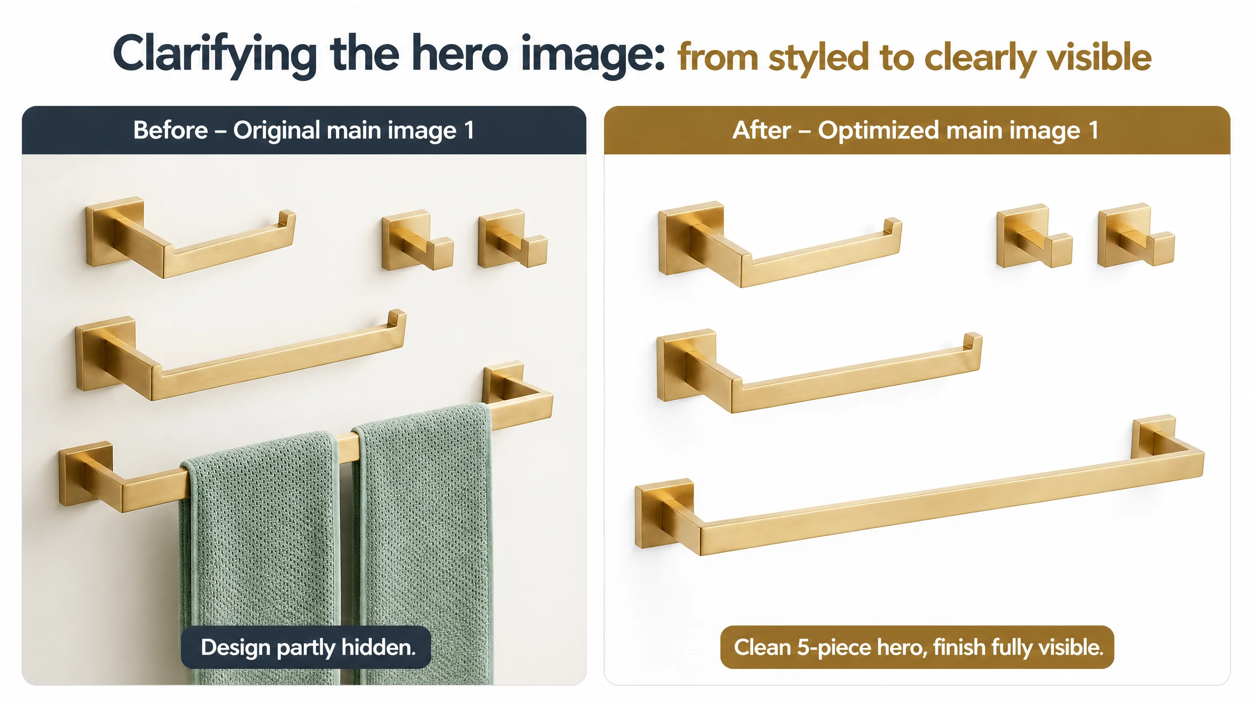
The Main Image Was Not Just a Visual Issue. It Failed to Create a Clear Reason to Click and Stay.
On the main-image dimension, this Listing even outscored the competitor numerically, but DeepBI’s qualitative review found structural problems in the sequence and role of each image.
What the main image sequence was doing wrong
- Image #1:
- Showed all five pieces, but towels partially covered the hardware.
- This justified an “interior styling” approach but weakened the first-glance clarity of design and finish.
- Image #2:
- Focused on size and dimension annotations.
- Appeared too early in the gallery, bringing heavy, dense information before trust and desirability were established.
- Images #3–#5:
- Each touched on some benefits (material, anti-fingerprint, stability, completeness).
- But they mixed multiple concepts per image and did not isolate the seller’s strongest differentiators.
The competitor’s gallery, by contrast, used:
- A clean, towel-free primary image to display every component clearly.
- Early images to neutralize corrosion/finish concerns and build a “premium bathroom” impression.
- A later image to handle detailed dimensions, when buyers were already convinced this was a serious choice.
DeepBI’s main-image restructuring logic
DeepBI recommended a reordered, role-based gallery:
1. Image 1 – Clean five-piece hero (no towels)
- White background, all five components fully visible.
- Emphasis on brushed gold texture and squared “Manhattan-style” geometry.
- Towel bar as the visual spine to anchor composition.
1. Image 2 – Aesthetic & maintenance trust
- Swap the early dimension image into a later slot.
- Replace this position with a lifestyle shot that:
- Shows the hardware in a high-end bathroom scene.
- Subtly layers in “easy maintenance” or “anti-fingerprint” messaging without clutter.
1. Image 3 – 400°F nano-baking / ceramic-bond technology
- Single-minded focus:
- Headline: “400°F Ceramic-Bond Nano-Baking Finish – Peel-Resistant.”
- Visual: brushed texture and sealed surface, implying resistance to moisture and flaking.
- This responds tactically to a common category fear: coatings that chip, peel, or rust.
1. Image 4 – Double-lock, 22 lb heavy-duty mounting
- Headline: “Double-Lock Mounting – Solid SUS304 Holds 22 lbs.”
- Visual:
- Close-up of mounting bracket structure.
- Clear emphasis on “solid” vs “hollow” construction.
1. Image 5 – Anti-fingerprint texture + installation template
- Combination shot:
- A hand touching the bar with no visible smudges.
- Installation template and hardware laid out clearly.
- Message:
- “Fingerprint-Resistant Micro-Texture – Easier to Maintain.”
- “Precision Installation Template – Consistent, Aligned Hardware.”
Dimension diagrams are not removed; they are moved later, after buyers have already:
- Seen the design clearly.
- Been reassured on finish durability.
- Understood the load-bearing and structural integrity.
This reordering recognizes that, for Amazon traffic, you must first justify attention, then justify measurements.
The Bullet Points Had Logic. They Needed Sharper Positioning.
DeepBI did not treat the bullets as the main problem; they were already more advanced than the competitor’s. But the optimization focused on sharpening each bullet’s role and aligning it with the new visual path.
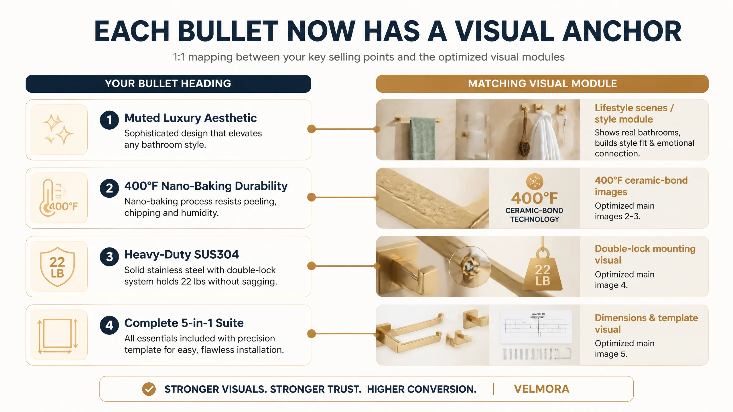
Bullet 1 – From generic “Stylish design” to “Sophisticated muted luxury”
Suggested direction:
【Sophisticated Muted Luxury】Elevate your space with the Manhattan Collection’s signature champagne gold. Unlike the harsh glare of traditional fixtures, our "Muted Luxury" aesthetic offers a soft, diffused glow that remains timeless. Inspired by warm sunset tones, it’s the premier choice for designers seeking an understated elegance that complements both white marble and dark tiles.
Why this matters:
- It reframes “brushed gold” from commodity color to design language (muted, sunset-inspired, designer-approved).
- It directly answers the style-fit question: will this work with my marble, my dark tiles, my existing decor?
Bullet 2 – Making durability tangible: 400°F Nano-Baking
Suggested direction:
【400°F Nano-Baking Durability】Stop worrying about peeling or wear. We utilize an industrial-grade Nano-Baking Process, curing the brushed gold coating at 400°F to fuse it with the steel core. This creates a micro-textured, fingerprint-resistant surface that is highly resistant to humidity and steam. Verified by adhesion tests, this finish resists chipping and flaking for lasting, wear-resistant performance.
This bullet is designed to:
- Turn a vague “durable” claim into a process-based, test-backed story.
- Plant a clear mental contrast: competitor “multi-layer paint,” versus “fusion at 400°F.”
Bullet 3 – Heavy-duty SUS304, quantified
Suggested direction:
【Heavy-Duty SUS304 Construction】Experience the stability of solid engineering. Unlike hollow gold towel racks that rattle, our core is forged from solid Industrial-Grade SUS304 Stainless Steel. Paired with secure Double-Lock mounting brackets, this brushed gold hardware is engineered to hold 22 lbs of wet textiles without sagging, providing a permanent and substantial feel to your bathroom decor.
Here, DeepBI pushes:
- Direct comparison to the common pain of hollow, rattling racks.
- A measured promise: “22 lbs of wet textiles” instead of vague “strong” or “heavy duty.”
Bullet 4 – Complete 5-in-1 suite and installation confidence
Suggested direction:
【Complete 5-in-1 Designer Suite】Designed for homeowners who value consistency, this complete 5-piece bathroom hardware set eliminates the "mismatched" look. Unify your entire bathroom with a single, sophisticated design language. The set arrives in protective packaging with precision installation templates, making it an ideal choice for renovation projects or as a high-end housewarming gift.
This bullet bridges:
- The competitor’s “5-in-1 convenience” angle.
- The seller’s unique strengths: style consistency, precision installation templates, gift-ready positioning.
Critically, these bullets now map 1:1 to the restructured main-image and A+ modules. Text no longer floats alone; it cues visual proof.
Before Ads Could Work Again, the A+ Page Had to Carry Its Weight
The biggest structural change came from the detail/A+ rebuild. DeepBI proposed a seven-module visual storyline:
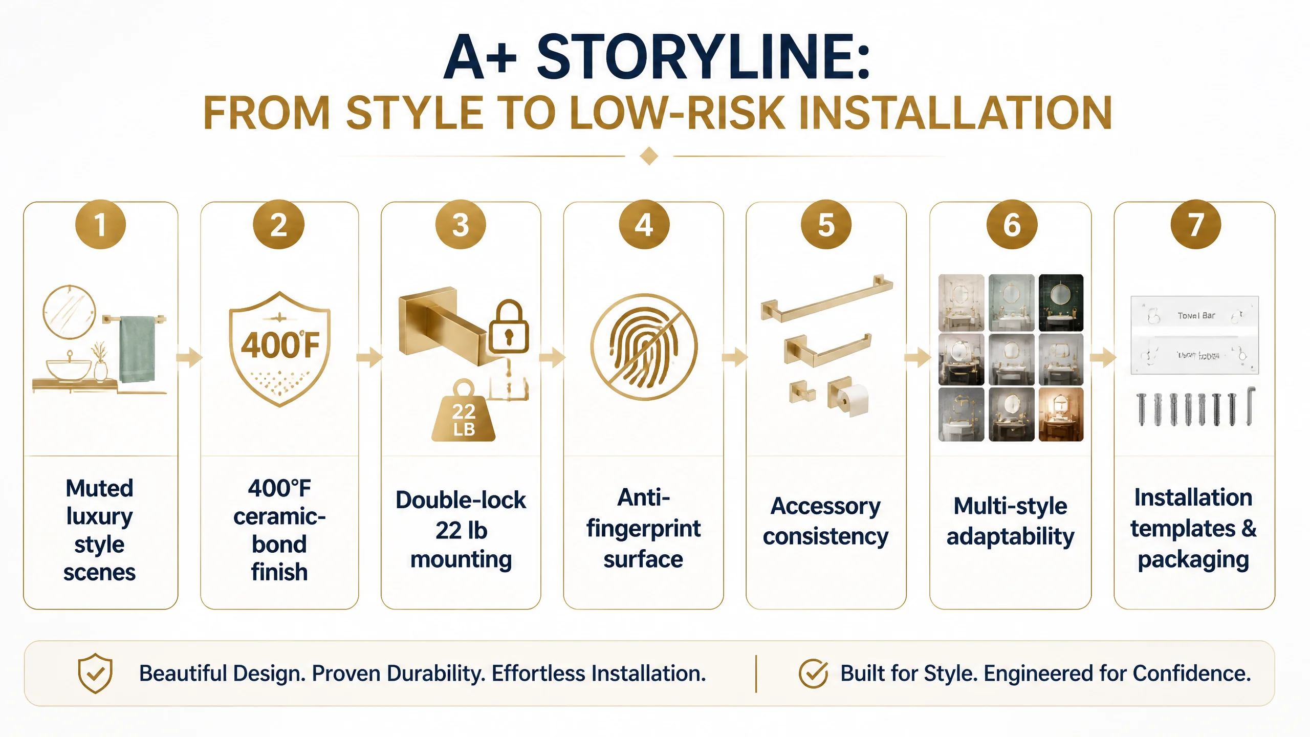
Module 1 – Style validation: “Muted luxury” across different bathrooms
Purpose:
- Pick up where the main images leave off.
- Show the set installed in multiple high-end bathroom styles:
- White marble with chrome/neutral complements.
- Dark tile, modern or hotel-style environments.
Key messaging:
- “Soft champagne gold, inspired by warm sunset tones.”
- “Enhances both light and dark surfaces.”
This directly mirrors the competitor’s effective use of multi-style scenes, but aligns to this product’s “muted luxury” positioning.
Module 2 – 400°F ceramic-bond technology (finish trust)
Purpose:
- Tackle the core “deal-breaker” fear: peeling or flaking coatings.
- Visualize the process without overpromising.
Visuals and messaging:
- Visual representation of a brushed gold bar under high-temperature curing.
- Clean surface micro-texture close-up.
- Text: “400°F ceramic-bond nano-baking,” “sealed for high humidity,” “resists steam and chipping.”
Competitor’s A+ largely avoids this durability topic; this becomes a differentiation strike rather than a parity move.
Module 3 – Double-lock, 22 lb mounting system (stability trust)
Purpose:
- Neutralize the second main fear: “The bar will sag, wobble, or fall.”
Visuals and messaging:
- Exploded-view style (without revealing internal structures inaccurately) showing:
- Solid SUS304 core.
- Double-lock brackets.
- Data callout: “Engineered to hold 22 lbs of wet textiles without sagging.”
This module responds to verified competitor weaknesses: vague description of mounting hardware and no strong visual answer in their A+.
Module 4 – Anti-fingerprint, easy-maintenance surface
Purpose:
- Address everyday maintenance pain in brushed gold finishes.
Visuals:
- Hand gently touching the bar, with no visible smudges.
- Micro-texture conceptual graphic showing how the surface disperses prints.
Messaging:
- “Fingerprint-resistant matte baked finish.”
- “Micro-textured surface helps resist water spots and prints.”
- “Requires minimal effort to keep clean.”
Again, the competitor does not directly address this; it becomes another trust wedge.
Module 5 – Consistent feel across all accessories
Purpose:
- Confirm that towel bar, paper holder, hooks, and other pieces share the same tactile and visual standard.
Visuals:
- Close-ups of each accessory showing:
- Champagne gold tone.
- Micro-texture finish.
- Geometric design consistency.
Messaging:
- “Unified design language.”
- “Same champagne gold and micro-texture on every component.”
This is about reducing doubt: buyers need to see that the entire set truly looks and feels cohesive.
Module 6 – Style adaptability: aligning with more bathrooms than the competitor
Purpose:
- Systematically answer the “Will this fit my style?” question.
Visuals:
- A matrix of bathrooms:
- Modern minimal.
- Classic warm.
- Dark luxury.
Messaging:
- “Works with white marble, dark tiles, and mixed-metal fixtures.”
- “Ideal finishing touch for renovation projects or upgrades.”
This not only matches but extends the competitor’s “multi-style” logic, making the seller’s page feel more complete.
Module 7 – Low-risk delivery: installation templates and protective packaging
Purpose:
- Reduce the last remaining friction: fear of misaligned hardware and poor packaging.
Visuals:
- Precision installation templates laid out with accessories.
- Protective packaging shown in a clean, reassuring way.
Messaging:
- “Precision installation templates eliminate alignment guesswork.”
- “Protective packaging ensures each piece arrives ready for installation.”
Where the competitor stays silent on installation details, this Listing now closes the loop, reinforcing both ease and seriousness.
How the Business Understanding Changed
After this Listing-level reframing, the seller’s operating mindset shifted in several ways:
- From “ad problem” to “page trust problem”
They recognized that high ACOS was partially self-inflicted by driving paid traffic to a visually incomplete detail page.
- From “text completeness” to “visual-text alignment”
They saw that strong bullet points alone were not enough; each claim needed visual proof, especially in A+.
- From “more reviews” to “more convincing story”
Even with fewer reviews than the competitor, their higher rating (4.8 vs 4.6) already carried weight—what was missing was a page that looked as serious as the rating implied.
- From “images as decoration” to “images as a conversion funnel”
Main images and A+ modules are now seen as a sequence:
- Attract click.
- Demonstrate design and style.
- Neutralize durability and stability fears.
- Reduce installation risk.
- Confirm consistency and gift-worthiness.
While this case does not report specific CVR or ACOS numbers, the operational shifts are clear:
- The Amazon Listing’s ability to convert both organic and paid traffic is expected to improve once visual trust catches up with textual claims.
- Ads are no longer asked to compensate for a weak product page; instead, they are used to amplify a page that has been structurally repaired.
- The traffic structure becomes more controllable, as paid clicks are less likely to leak out due to visual or trust gaps.
For other Amazon sellers, the lesson is straightforward: when ads feel “inefficient” and reviews seem “not enough,” it may not be an ad or social-proof problem. The real bottleneck might be that your Amazon product page cannot visually justify what your bullets and title are promising—especially compared to the best Listing in your category.