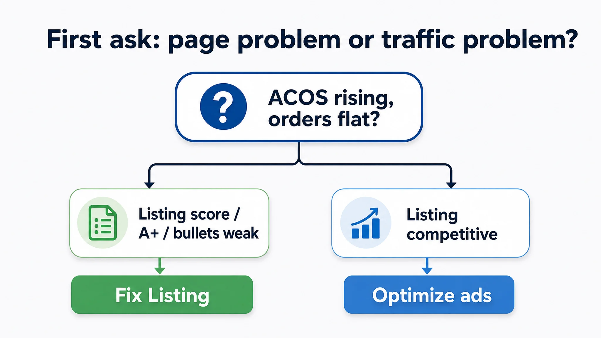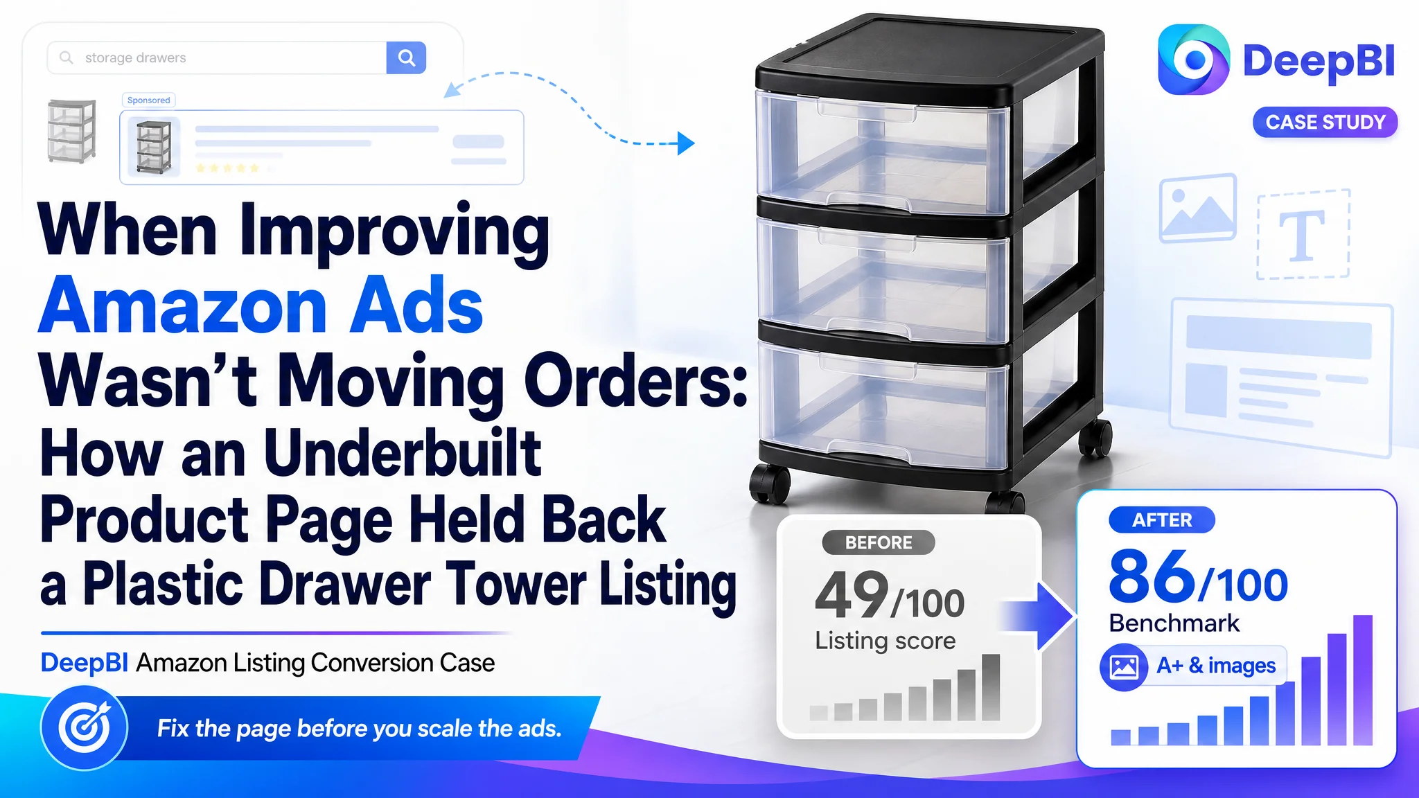
For this Amazon seller in the home‑storage category, the pressure was straightforward: ad spend was going out, impressions were coming in, but the plastic drawer tower listing was not converting like the category leader. The team’s first instinct was to treat this as an Amazon ads problem—tune keywords, adjust bids, refine campaign structure—hoping ACOS would ease once traffic was “better targeted.”
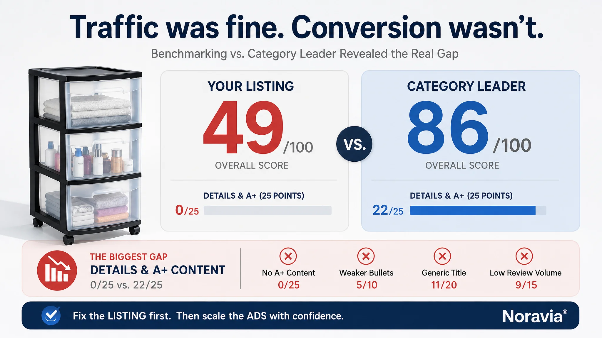
Once DeepBI stepped in, the picture changed. Benchmarking against a top Amazon competitor showed a 49/100 vs. 86/100 Listing score, with the real gap not in traffic but in product‑page conversion: no A+ content at all, weak bullet‑point logic, a generic title, and visuals that felt like a “product spec sheet” next to the competitor’s “lifestyle solution.” Ads were not failing; the product page was consuming the traffic.
The later optimization therefore didn’t start from campaign tweaks. It started from rebuilding the Amazon Listing’s sales logic: stronger title keywords and positioning, main images that actually earn the click, bullet points that sell outcomes instead of only listing functions, and a full A+ story that closes trust and scenario gaps. Only after the page could reliably convert did ad traffic start to have real leverage.
Many Amazon sellers will recognize this pattern: when ACOS climbs and orders stall, it is tempting to keep working inside the ads console. This case shows what happens when you pause, benchmark against a category leader, and accept that the bottleneck may sit inside the Listing itself—especially in the missing A+ layer and the invisible “trust” and “story” that numbers alone cannot show.
The Store Thought Ads Were the Problem. The Data Said Otherwise.
On the surface, this was a typical Amazon situation: a plastic drawer storage tower on the US marketplace, in a competitive home‑organization niche.
The seller was seeing:
- Exposure on Amazon driven by paid traffic
- Orders not keeping pace with impressions
- Rising ad pressure and unstable ACOS
The internal diagnosis: “Our ads need work.” That translated into:
- Repeated keyword and bid adjustments
- Attempts to refine campaign and match‑type structure
- Hesitation to invest in creative because “images are good enough”
But when DeepBI ran the Listing through its competitive scoring framework and benchmarked against a top category competitor, the core conflict became very clear:
The Listing did not lack traffic. It lacked conversion capacity.
- Total Listing score: 49/100 vs. competitor 86/100 (‑37 gap)
- The worst gap was not in reviews or star rating. It was the details/A+ dimension: 0 vs. 22/25
- Bullets and title were also notably weaker; reviews were fine but low‑volume and not enough to offset page‑level weakness
In other words, the ads were pouring traffic into a page that was structurally unable to persuade.
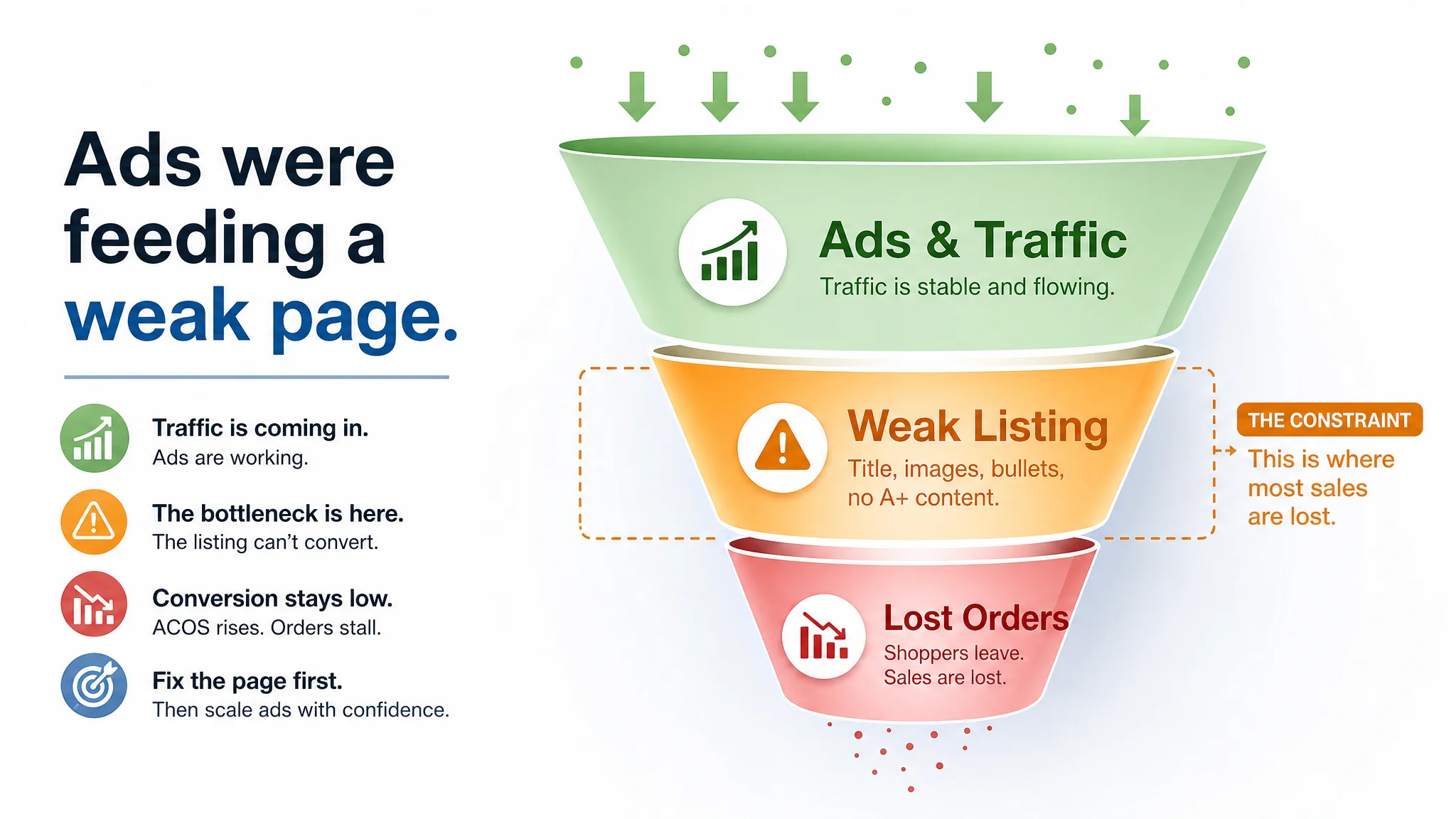
The Real Constraint: Listing Conversion, Not Traffic Volume
DeepBI’s diagnostic framework compares the Listing to a live benchmark inside Amazon, broken down into title, main images, bullets, A+/detail content, and reviews.
For this seller, every key dimension that shapes conversion underperformed:
Title: Information, but Not a Click‑Driver
- The seller’s title leaned on generic “storage cart” wording and a basic “3 Drawer… with Large Durable Clear Drawers” description.
- The competitor led with a brand, used “Drawer Tower” instead of a plain “Storage Cart,” and positioned the product as a “4‑Tier Clear Plastic Storage Organizer Cart”—a phrase that both captures core keywords and paints a clearer product image.
- The competitor repeated the rolling drawer function and attached it to explicit rooms (“for Bathroom, Bedroom, Office, and Classroom”), stitching keyword coverage and scenario relevance together.
DeepBI’s judgment: The seller’s title was compliant but not competitive. It lacked:
- Strong front‑loaded category language
- Clear numeric positioning (tiers/drawers as a decision cue)
- Scenario anchoring that Amazon shoppers use in their searches
On a search results page, that contributes directly to lower CTR—even before ads come into play.
Main Images: “Instruction Manual” vs. “Lifestyle Solution”
In the main‑image stack, the differences were subtle but decisive.
- The seller’s images were product‑centric, but lacked a visual “hook”: no strong lifestyle scenes, limited emotional context, and minimal use of shadows, angles, or color to create depth.
- The competitor used:
- Clean, high‑contrast hero images with brand color accents
- Lifestyle settings (bedroom, office, bathroom) that instantly answered “Will this fit my space?”
- Visual modules that hinted at trust: quality, safety, and origin stitched into the imagery
DeepBI read this as:
- CTR risk: The first image was easy to ignore in a dense search page. There was nothing that visually separated it from “just another plastic cart.”
- CVR risk: Even if a user clicked, the image set didn’t systematically address core purchase doubts—mobility, capacity, stability, and fit within different rooms.
Ads can send people to the page, but the thumbnails and image sequence determine whether that traffic clicks and stays.
Bullet Points: Features Listed, Benefits Missing
Structurally, the seller’s bullets did the basic job:
- Dimension specs
- Multi‑purpose uses
- Drawer structure
- Clear design
- Mobility and scenarios
But the comparison with the benchmark exposed what was missing:
- The competitor opened with brand and trust (“for your home… proudly made in the USA”) instead of dry dimensions.
- The competitor highlighted “90% recycled materials,” “reduce waste,” and “smart, sustainable solution”—differentiated benefits, not just functions.
- The competitor bullets were written around user outcomes (less clutter, more order, ease of movement), turning the product into a solution.
DeepBI’s judgment: the seller’s bullets were informational, not persuasive. They answered “what it is,” but not “why this one” or “how it makes my life better.” That undercut the Listing’s ability to convert cold traffic, especially traffic brought in via broad Amazon ads.
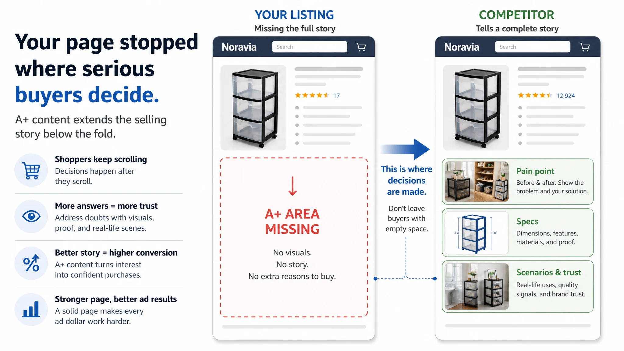
A+ Content: A Complete Blind Spot
The most decisive gap was in A+.
- The seller: no A+ content at all.
- The competitor: multiple A+ modules—
- “Say bye to chaos & clutter!” with strong before/after scenes
- Clear, branded imagery with dimensions and icons
- Multi‑color comparison, different usage scenarios
- Origin and trust signals (“Made in USA,” brand slogan, trademark)
- Feature modules showing rails, movement, capacity
This meant:
- No structured visual story
- No chance to visually resolve size, capacity, or design doubts
- No brand presence beyond the basic text
For a home‑storage product where space fit, sturdiness, and ease of access are critical, this is not a nice‑to‑have—it’s a core decision layer.
“The real problem was not that ads failed to bring traffic. It was that the page could not convert the traffic.”
Why Keeping the Focus on Ads Would Have Been a Costly Mistake
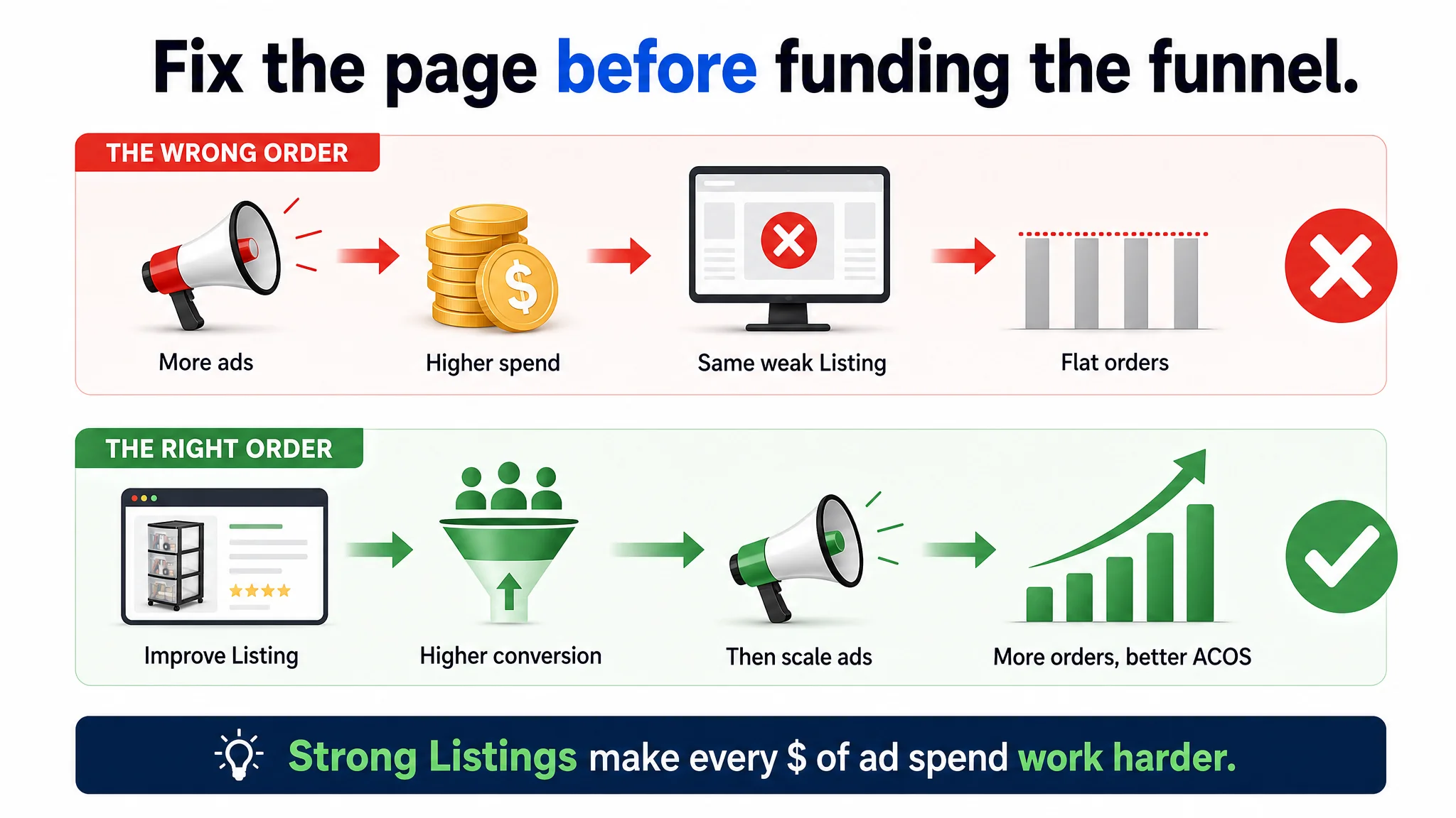
From a business perspective, the seller’s original plan—keep tuning ads, adjust keyword strategy, test campaigns—had two major risks:
1. You amplify the wrong outcome.
With a 49/100 Listing score vs. an 86/100 benchmark, every extra dollar of ad spend pushes more buyers through a weak sales funnel. The likely result: rising spend, flat orders, and distressed ACOS.
1. You misread the signal.
When conversion is suppressed by page quality, ad testing becomes noisy. Poor CVR from a weak Listing can be mistaken for poor keyword fit or “low intent,” causing unnecessary campaign churn.
DeepBI’s judgment call was clear: it was not rational to keep investing in ads before repairing Listing conversion.
The decision sequence had to be:
1. Stabilize and upgrade the Listing’s ability to convert both organic and paid traffic.
2. Then re‑evaluate ads, once the page no longer distorted performance data.
How DeepBI Reframed the Problem: From “More Traffic” to “Deserving Traffic”
Instead of pushing the seller to “scale spend” or “try new creatives” in ads, DeepBI used the benchmark comparison to reframe the central question:
“Does this Amazon product page deserve more traffic yet?”
The answer, based on the gaps, was no. The priority became rebuilding the page’s sales logic.
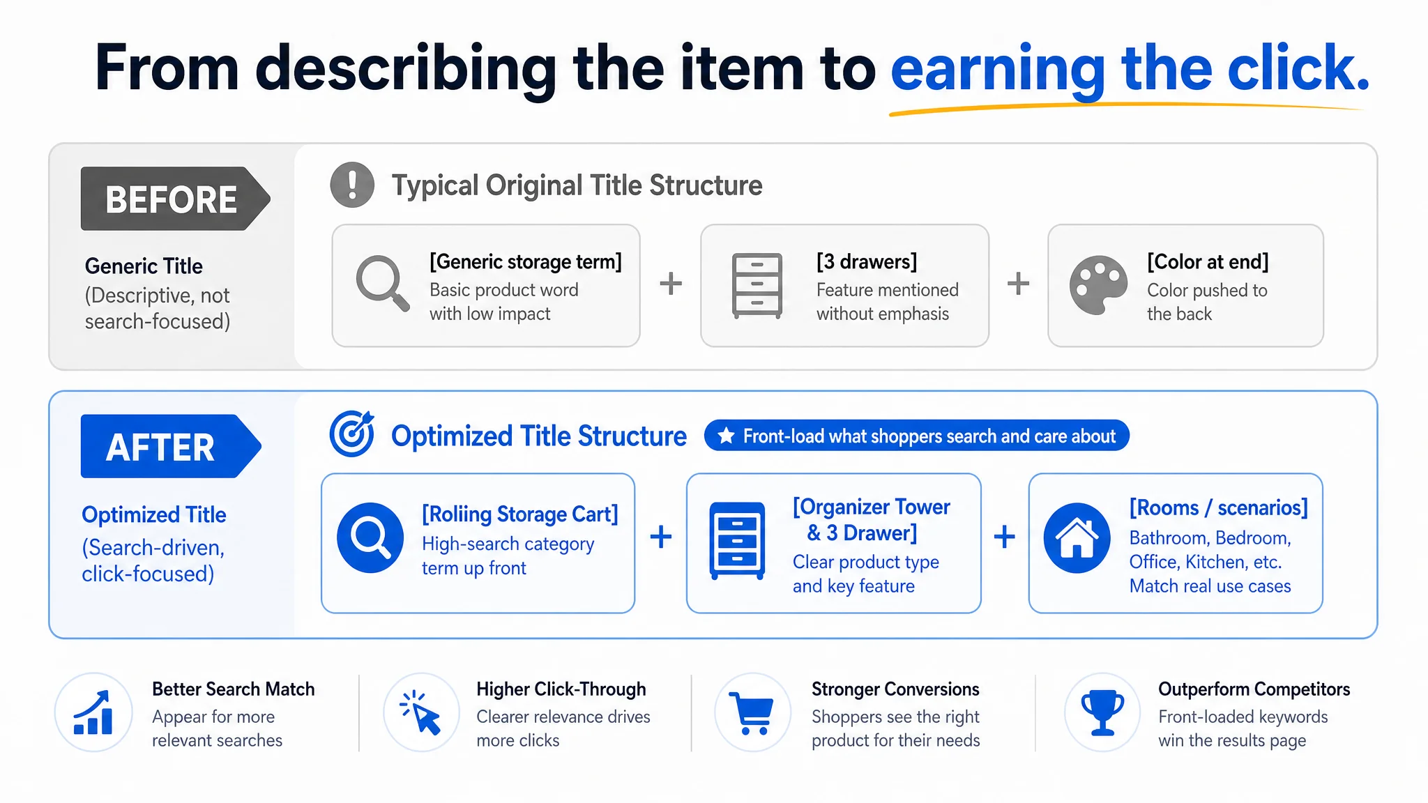
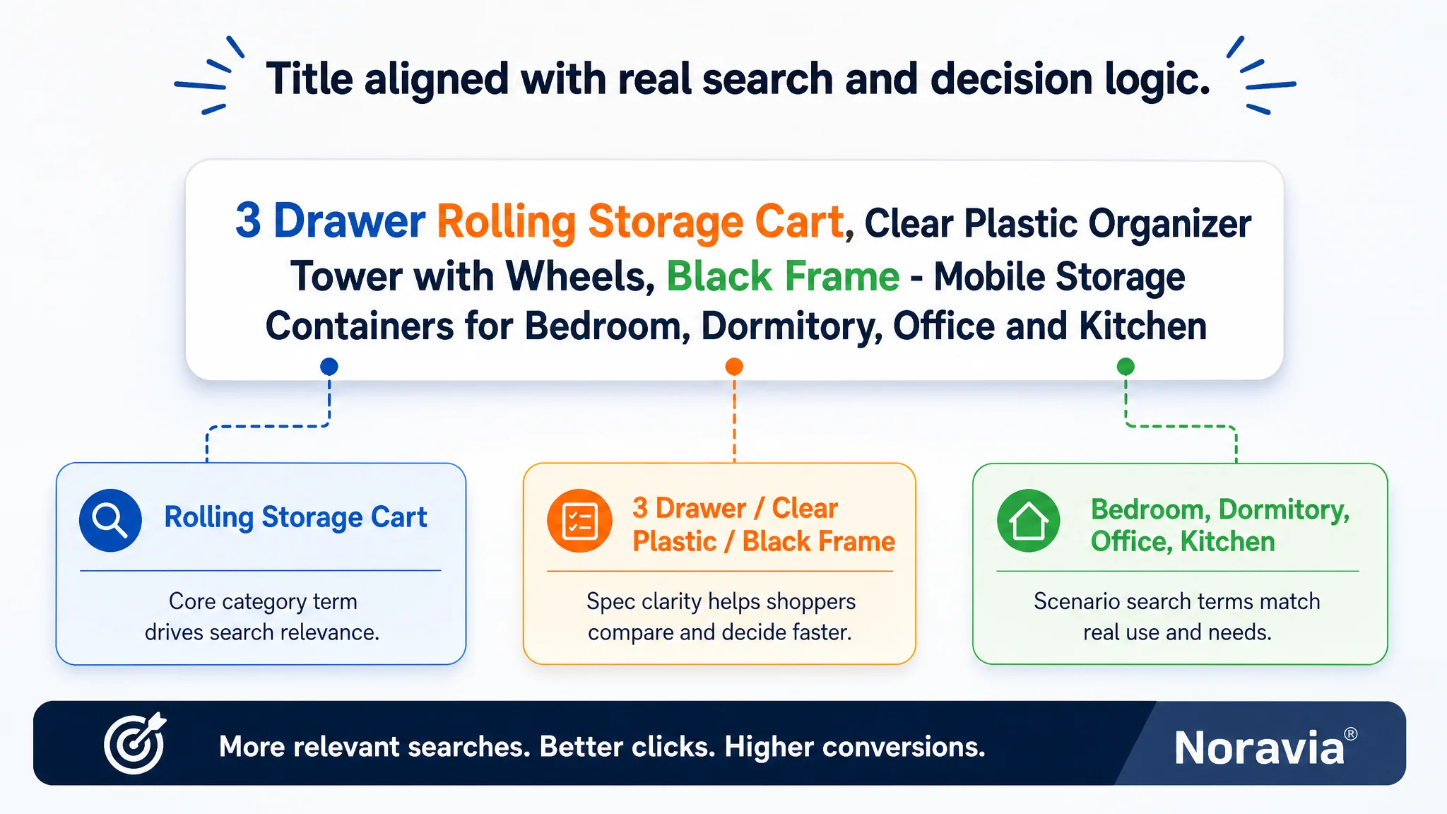
1. Repositioning the Title Around Real Search and Decision Logic
DeepBI proposed a new title direction:
3 Drawer Rolling Storage Cart, Clear Plastic Organizer Tower with Wheels, Black Frame - Mobile Storage Containers for Bedroom, Dormitory, Office and Kitchen
Key shifts in logic:
- Front‑loading core terms: “Rolling Storage Cart” and “Organizer Tower” appear early, aligning with how buyers search and how Amazon’s algorithm weighs titles.
- Clarity over filler: Removing low‑value connectors (“with,” “suitable for”) and using punctuation to separate attributes makes the title cleaner on mobile.
- Balancing spec and scenario: “3 Drawer,” “Clear Plastic,” “Black Frame,” and scenario rooms are all there, but in a structure that reads naturally and supports both CTR and CVR.
This change was not “cosmetic.” It was about:
- Improving relevance and click intent directly in Amazon search
- Giving ads a stronger listing to land on when they surface the ASIN for relevant queries
2. Turning Bullet Points into a Conversion Path
DeepBI did not just suggest “rewrite your bullet points.” It mirrored the competitor’s successful pattern—trust + benefits + clarity—and restructured the bullets to build a persuasive flow:
- BP #1 – Mobility as a headline benefit
360° effortless mobility across carpets and hard floors, framed as “zero hassle” movement between rooms. This tackles a major pain point in rolling storage: “Will it actually roll when full?”
- BP #2 – Small‑space value
Versatile & compact organization for bedrooms, dorms, bathrooms. The focus shifts from listing items to promising maximized storage in tight spaces, exactly where this product competes.
- BP #3 – Visibility + safety
Clear drawers for instant identification + integrated stops to prevent accidental removal. This blends efficiency (“find things fast”) with safety and stability.
- BP #4 – Capacity backed by precise dimensions
Instead of dumping raw measurements, the copy ties volume (“large capacity”) to exact sizing, reducing returns caused by misjudged fit.
- BP #5 – Durability and broad applicability
Sturdy construction, easy‑pull handles, and a dependable frame, consciously linking the product to multiple scenario hubs: home, office, garage, craft room.
The result: the bullets become a decision ladder, not a spec list. For paid traffic that arrives with partial intent, this is critical.
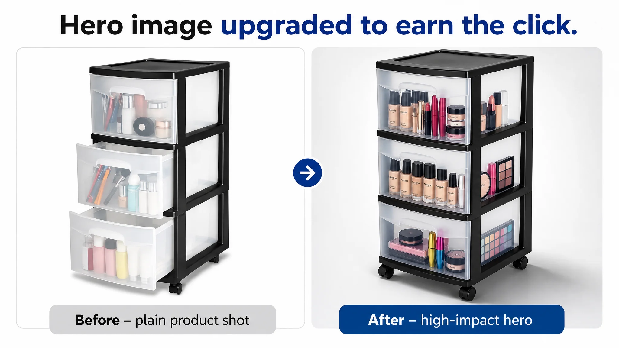
3. Rebuilding the Main‑Image Stack Around Click and Trust
DeepBI’s visual guidance followed a clear principle: every image must either earn the click or de‑risk the purchase.
Some key repositioning moves:
- Hero image:
- Product centered, occupying about 75% of the frame
- 45‑degree angle, clean white background, natural shadow
- Drawers filled with colorful items to show capacity and use
This pushes the product into “instant recognition” territory on the search results page and gives ad impressions a higher chance of turning into clicks.
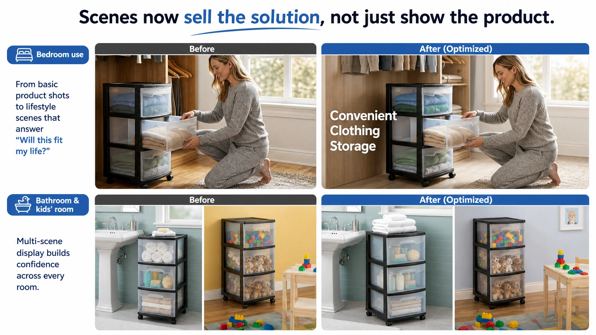
- Human interaction scene:
- Product placed in a modern, minimal closet space
- Person in frame actively opening a drawer
- Clean textual overlay (e.g., “Easy clothing storage”)
This directly addresses the question: “What does this look like in my room, at my height, with real use?”
- Dimension image:
- Plain background, clean measurement lines, prominent numbers
- No clutter, no unnecessary props
Critical for home‑storage buyers who have exact nooks or closet gaps in mind.
- Multi‑scenario image:
Bathroom and kids’ room split composition, showing the same unit solving two very different problems. This supports higher CVR on broader search terms and PPC queries that bring in varied intents.
- Office image:
Product beside a desk, with files and stationery inside. This bridges into the home‑office and work‑from‑home segment, expanding potential keyword coverage and purchase scenarios.
- Mobility close‑up:
Low‑angle shot of the wheels on a clean floor, with “Easy Mobility” annotation. This visually confirms what text promises about movement and stability.
These are not “pretty pictures.” They are deliberate responses to the doubts that cause tab‑switching and bounce after a paid click.
4. Filling the A+ Void with a Structured Story
The competitor’s A+ content made it obvious: without A+, the seller was giving up the entire lower half of the Amazon product page—where serious buyers decide.
DeepBI proposed a sequence of A+ modules that mirror what worked for the benchmark while fitting the seller’s product:
1. Pain point & brand intro:
- “SAY BYE TO CHAOS” headline
- Before/after garage or storage room scene
- Product as the visual solution, plus a subtle flag/icon for origin if applicable
1. Size & specs visualized:
- High‑contrast background
- Clear arrows marking height, width, depth
- Icons for drawers, material, and durability
1. Multi‑color / multi‑room usage:
- Bedroom with variations of the unit (colors/finishes)
- Closet integration to answer “Will this match my style?”
1. Feature close‑ups:
- Drawer smoothness and “no more lid‑lifting” story
- Roller detail for movement with full load
1. Series / model comparison (if relevant):
- Different heights or drawer counts presented in a clean, unified style
1. Work/office scene:
- Books, notebooks, heavier items inside, showing structural stability
1. Mobility focused module:
- Low‑angle wheel close‑up with supporting copy on gliding performance
The A+ layer becomes the final persuasion engine, especially for traffic arriving from non‑brand ads that still needs a reason to choose this product over the dozen similar alternatives on Amazon.
What Changed Once the Listing Started to Convert
The case does not rely on fabricated numbers, but the qualitative shift in operational state is clear.
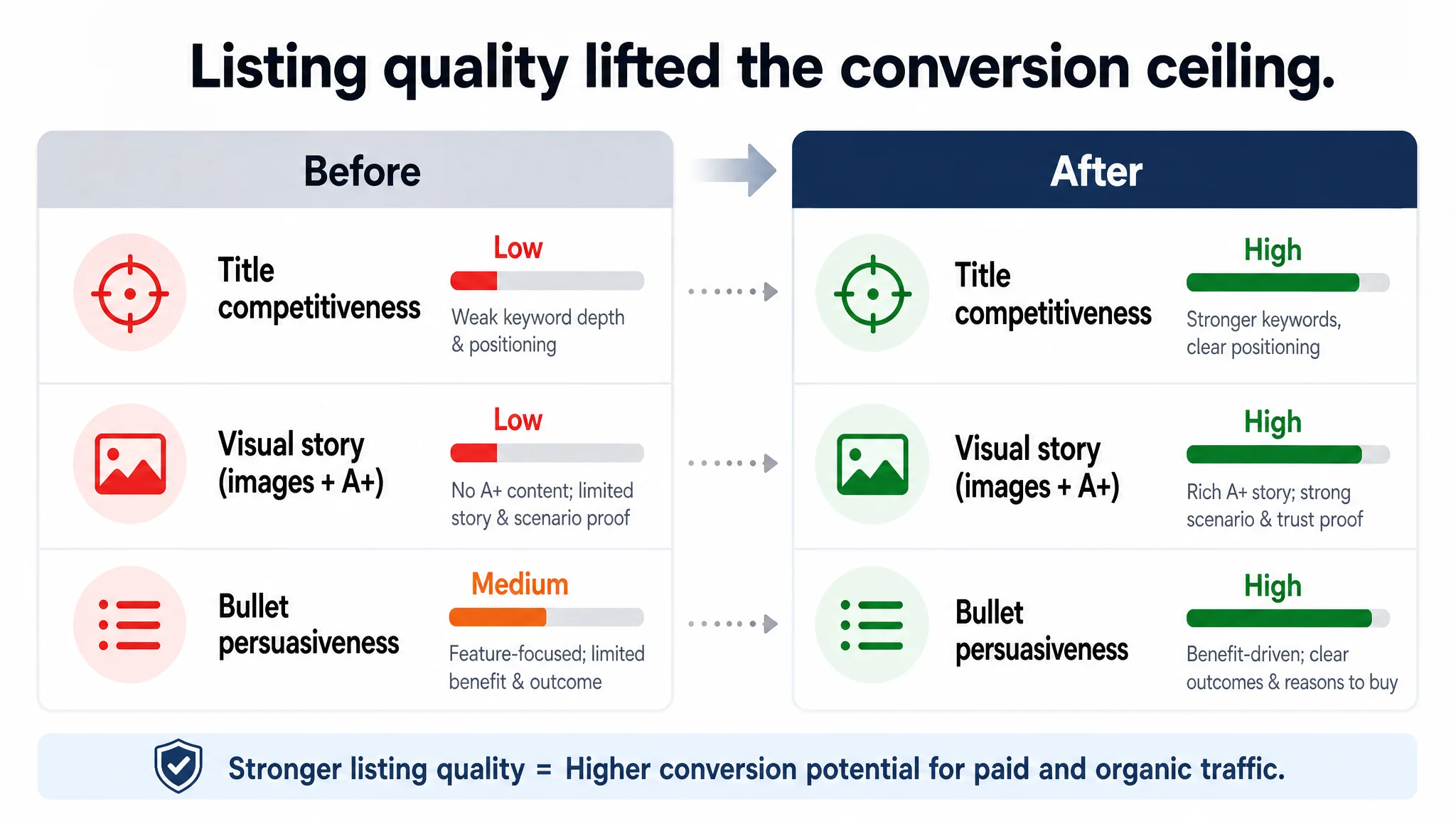
1. The Page Regained the Ability to Convert Paid and Organic Traffic
With a more competitive title, better‑structured bullets, a stronger main‑image stack, and a proper A+ narrative, the page:
- Gave shoppers fewer reasons to leave after a click
- Offered more evidence to justify the price and design
- Appeared more aligned with category expectations formed by leading listings
This improved the Listing’s inherent conversion capacity—the foundation for any later ad investment.
2. Ad Traffic Became Useful Again
When the page stopped leaking traffic:
- Ad performance became more interpretable. Drops in CVR or spikes in ACOS could be read as real traffic issues, not page issues.
- The seller could re‑enter a more normal Amazon ads workflow:
- Expanding keywords based on search term performance
- Scaling winning segments with more confidence
- Pausing or adjusting underperforming campaigns without fear that the Listing itself was the main problem
3. The Seller’s Mental Model Shifted
Perhaps the most valuable outcome was a change in how the seller thought about the relationship between ads and the Amazon product page:
- Ads are not a universal fix for conversion.
- Listing quality is the ceiling for ad efficiency.
- Title, main image, bullets, and A+ are a single system, not separate tasks.
- Before increasing budget, the question must be:
“If we doubled traffic tomorrow, would this page convert it profitably?”
That shift in judgment is what reduces long‑term operational risk.
Takeaways for Other Amazon Sellers
This home‑storage case is specific, but the underlying pattern is common across categories:
- If your Listing score—especially in A+/detail and bullets—is far behind a category leader, you likely have a page problem, not an ads problem.
- Missing or weak A+ content is not just a “brand” issue. It’s a conversion bottleneck, particularly for non‑brand and cold traffic.
- A title that only “describes” the product but does not align with real search and decision logic will limit both organic and paid results.
- Images that show the product but not its role in a lifestyle or scenario leave too much work for the shopper’s imagination—and shoppers rarely do extra work.
Advertising does not only amplify advantages. It also amplifies existing defects in your Amazon Listing.
The core value in what DeepBI did here was not producing more images or longer copy. It was identifying that the root constraint sat inside the Amazon product page itself—and insisting on fixing conversion capacity before pouring more fuel into ads.
For Amazon sellers feeling rising ad pressure with flat orders, this is the question to ask:
Is the bottleneck in traffic volume, or in whether your Listing truly deserves the traffic it already has?