

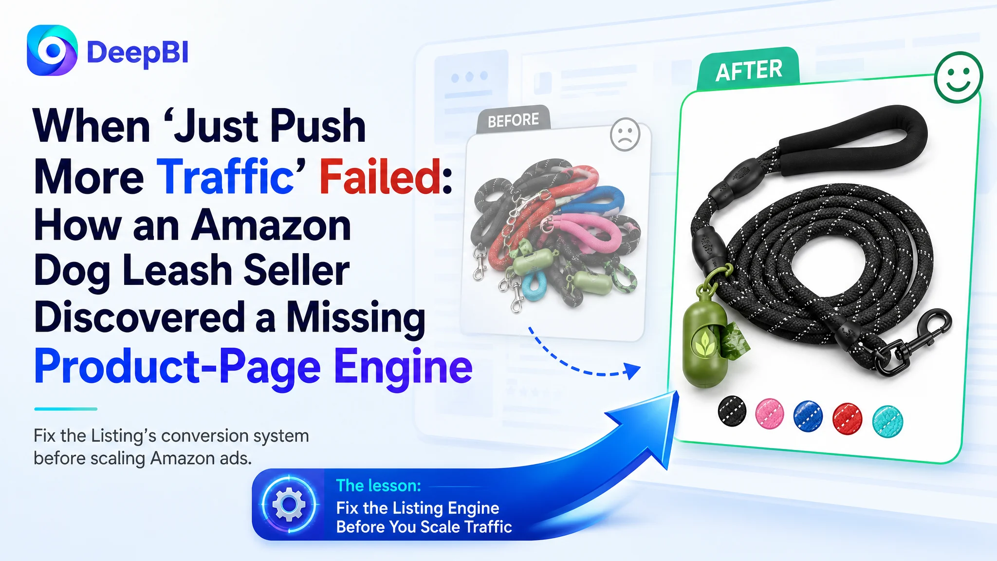
This Amazon seller in the dog leash category came to us with a familiar situation: the Listing was online, ads were already running, and traffic was not the biggest problem. But orders were not following the way they should, and every new ad dollar felt riskier than the last. The team’s first reaction was to blame bids, keywords, and creatives on the Amazon ads side.
Once we put their Amazon product page against a category-leading competitor, a different picture emerged. The issue was not that Amazon ads could not bring visitors; it was that the Listing itself had almost no structured power to convert that traffic. A weak title, no A+ content at all, and almost zero review volume meant every click landed on a page that could not build trust fast enough.
The later optimization work therefore did not start from campaign restructuring. It started from rebuilding the page’s sales logic: retuning the title around real decision factors, reworking bullet points from “spec listing” to “buying reasons,” and planning a full A+ story with real scenarios, specifications, and safety cues. Only after the page regained basic conversion capacity did ad traffic start to become commercially meaningful again.
For other Amazon sellers, this case is a reminder: when ACOS feels stubborn and ad tests keep failing, the real constraint may be the Amazon Listing itself. Before you keep increasing bids, you need to ask a harder question—does this product page actually deserve more traffic?
The Amazon Business Problem Was Not Traffic. It Was Conversion Capacity.
From the seller’s perspective, nothing looked obviously “broken” at first.
- The product: a rope dog leash for small to large dogs on the US Amazon marketplace.
- The category: high-competition, with established brands and very mature Listings.
- The operations focus: drive traffic with Amazon ads, then see what happens.
On the surface, the Listing looked acceptable: main images existed, five bullet points existed, and the rating was a perfect 5.0 stars.
But once we ran a structured Listing competitiveness audit against a benchmark dog-leash product page, the gap was not “slight” — it was structural:
- Total Listing score:
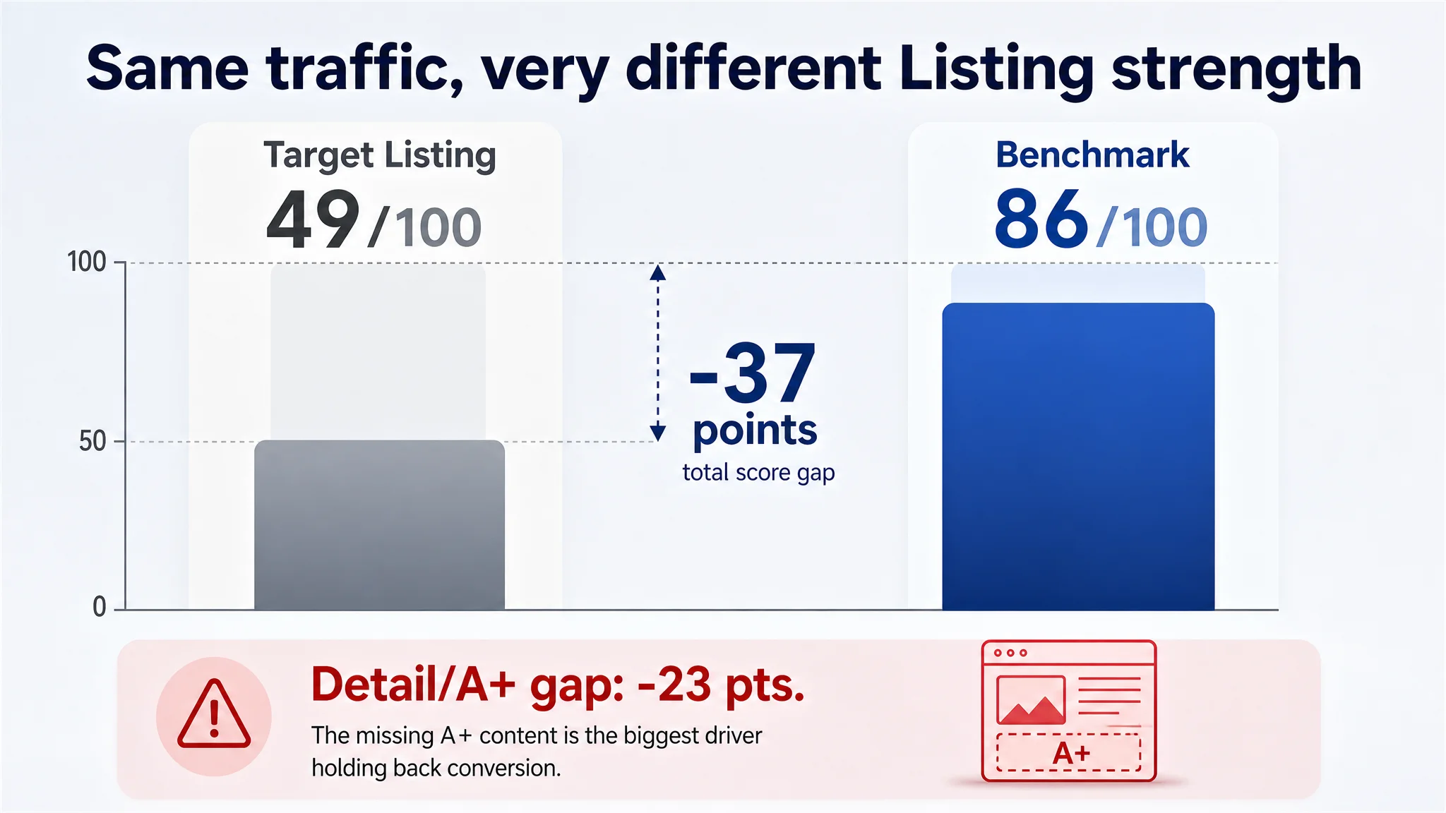
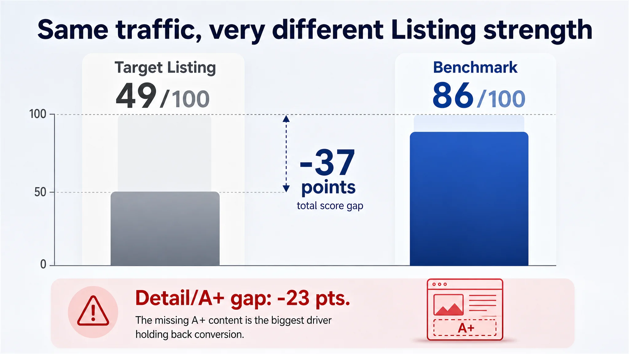
- Target product page: 49 / 100
- Benchmark competitor: 86 / 100
- Gap: -37 points
Broken down by dimension:
- Title: Target Listing: 12, Benchmark Listing: 17, Full Score: 20, Gap: -5
- Main Image: Target Listing: 25, Benchmark Listing: 23, Full Score: 30, Gap: +2
- Bullet Points: Target Listing: 6, Benchmark Listing: 8, Full Score: 10, Gap: -2
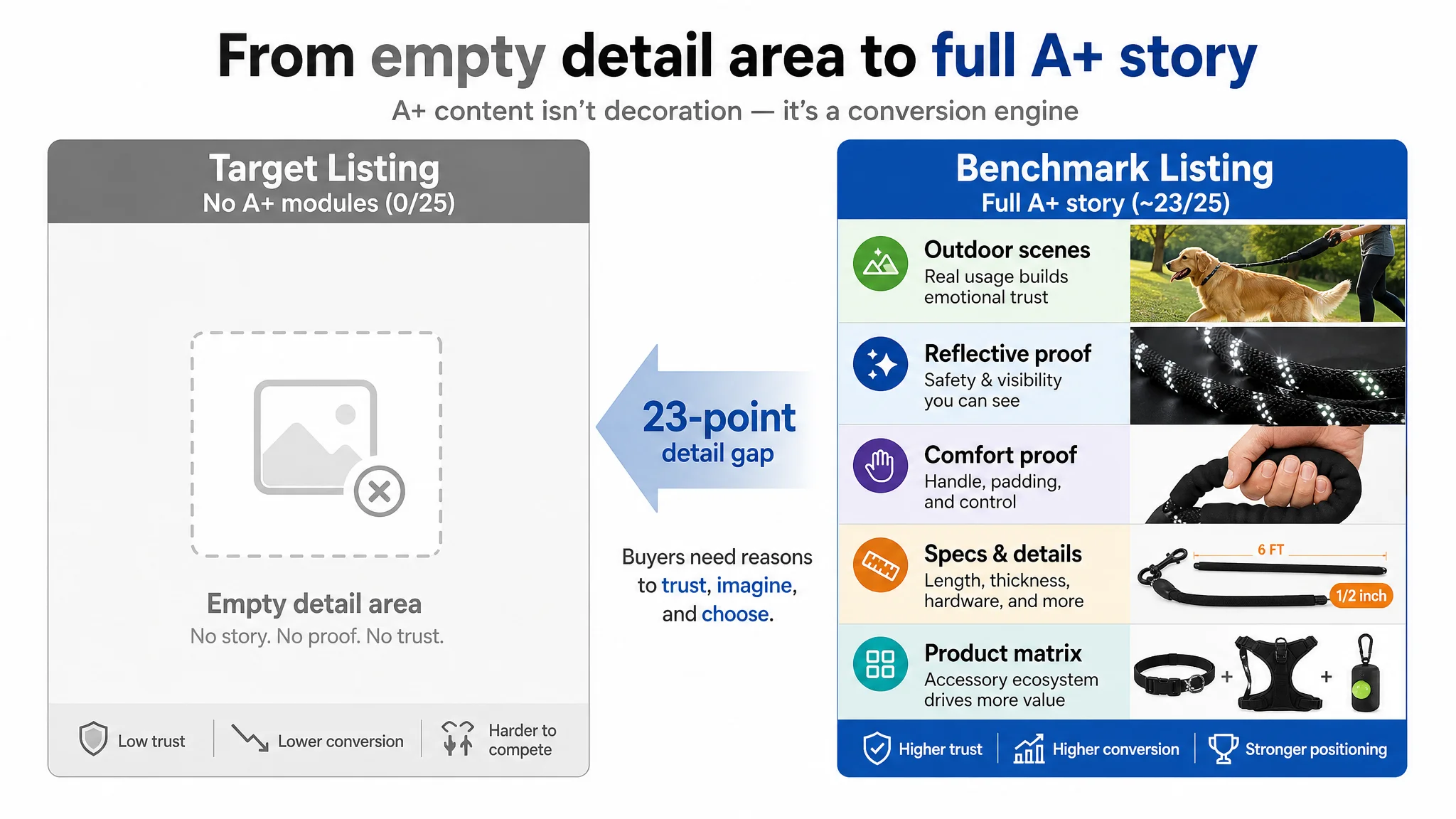
- Detail / A+: Target Listing: 0, Benchmark Listing: 23, Full Score: 25, Gap: -23
- Reviews: Target Listing: 6, Benchmark Listing: 15, Full Score: 15, Gap: -9
Two things stand out immediately:
1. The A+ / detail module scored 0 while the competitor scored 23/25.
2. Review structure was almost non-existent: 2 reviews vs. ~24,000.
In other words, the product was trying to compete in an Amazon search results environment where the main competitor had:
- An almost full-score A+ product story.
- A massive review base that instantly signals trust.
- Structurally stronger messaging in title and bullets.
Sending more paid traffic into this gap would not fix it. It would only make the problem more expensive.
“The real problem was not that ads failed to bring traffic. It was that the page could not convert the traffic.”
The Original Misdiagnosis: “Our Ads Are Not Precise Enough”
Before the deep Listing review, the seller’s internal narrative sounded like many Amazon teams:
- “ACOS is hard to control, we must not have the right keyword split yet.”
- “Maybe we need more aggressive bids on high-intent search terms.”
- “The creatives might not be attractive enough in Sponsored Brands and Sponsored Products.”
The underlying assumption: ads are the main lever, and if we keep tuning campaigns, the sales curve will eventually follow.
This logic breaks down once you compare the product page against the benchmark:
- The seller’s page had no A+ content at all.
- Bullet points were functional, but not persuasive.
- The title used generic adjectives instead of sharp decision hooks.
- Reviews existed in quality but not in scale.
Under these conditions, any ad optimization becomes a forced march against a structural conversion ceiling:
- CTR may move slightly with creative tweaks.
- ACOS may fluctuate with bid changes.
- But CVR will remain capped by how fast and how clearly the page answers “Why this product?”
DeepBI’s judgment was straightforward: this is not primarily an Amazon ads problem. It is a Listing conversion problem.
Where the Listing Really Broke: The A+ Void and Trust Gap
1. A+ Content: From 0 to “Visually Missing”
The most critical red flag was simple: the target Listing had no A+ content.
The benchmark competitor, in contrast, used roughly a dozen A+ modules to build a complete narrative:
- Real outdoor scenarios (owners walking Golden Retrievers, Huskies, etc.).
- Clear color displays and specification breakdowns.
- Structural close-ups of the rope, reflective threads, handle, and hardware.
- A product matrix (collar, harness, AirTag holder) that projects brand scale and professionalism.
- Module-level emphasis on functional pillars: reflectivity, lighting, personalization, AirTag compatibility.
Our seller had none of that. On Amazon, this is not a cosmetic difference; it is a conversion engine vs. blank space difference.
When users scroll past the bullet points and find no A+ visuals, several things happen:
- They cannot easily imagine real usage (night walks, hikes, city streets).
- They cannot quickly judge safety (reflectivity, strength, hardware stability).
- They cannot confirm fit (size, dog type, handle comfort) without mental effort.
- They see no brand story and no system of related products.
That is how one missing module (A+) becomes a 23-point score gap and a hard cap on conversion rate.
2. Reviews: Perfect Star, Invisible Scale
On the review side, the numbers looked paradoxical:
- Target Listing: 5.0 stars, total 2 reviews, both positive.
- Benchmark: 4.7 stars, total ~23,908 reviews, multi-language, with both positive and negative stories.
From a buyer’s perspective:
- 5.0 with 2 reviews looks like “too early to judge, no proof”.
- 4.7 with tens of thousands of reviews looks like “battle-tested, widely trusted”.
The competitor even shows a 1-star review on the first page, which paradoxically increases trust by showing transparency.
Our seller’s review quality was not the issue. Review density was. Under these conditions, the Listing needs to:
- Work harder in title, bullets, main images, and A+ to compensate for low review volume.
- Shorten the trust-building process by making every pixel count.
It was not doing that.
Title: Information Without a Buying Hook
The title dimension looked “acceptable” at first glance. It contained category keywords and basic specs. But compared to the benchmark, the structural weaknesses were clear.
How the benchmark structured its title
The benchmark Listing followed a proven Amazon discipline:
- Brand + Product Type + Key Outcome + Key Spec
For example (paraphrased):
[Brand] Rope Dog Leash 6 FT with Comfortable Padded Handle, Highly Reflective Threads, Anti-Tangle Clip for Walking Medium Large Dogs, 1/2 inch, Black
Core characteristics:
- Brand first, to lock in recognition and trust.
- Early positioning of “Comfortable Padded Handle” and “Highly Reflective Threads” as clear outcomes.
- Specific specs (“6 FT”, “1/2 inch”) placed up front, not buried.
What our seller’s original title looked like
The original structure was closer to:
- Keywords + Parameters + Generic adjectives (e.g., “Heavy Duty, Durable”)
- “Pack of 2 leash” placed mid-title, not used as a sharp differentiator.
- No brand anchor at the front.
The result:
- For Amazon’s search logic: less clean front-loaded keyword signaling.
- For buyers: no instant “Why this one, not the others?” hook.
- For click-through on search pages: generic claims that look like any low-context listing.
DeepBI’s optimization angle was not to add more adjectives. It was to rebuild the title around decision logic:
2 Pack Rope Dog Leash, 6 FT Heavy Duty Reflective Dog Leashes for Medium Large and Small Dogs, Comfortable Padded Handle Lead for Walking and Training, 1/2 Inch Thick, Black and Blue
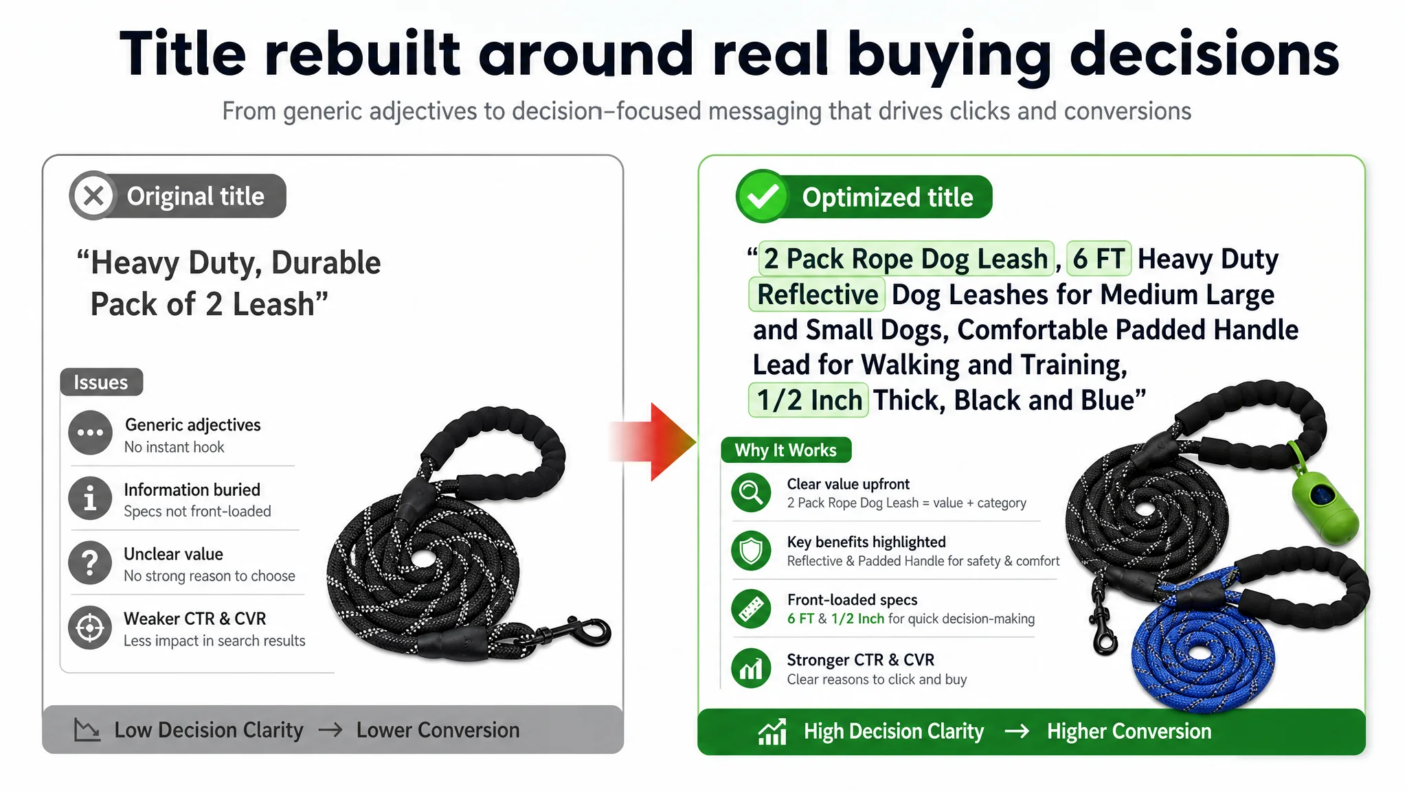
Key shifts:
- “Rope Dog Leash” and “2 Pack” front-loaded as category + value proposition.
- “Reflective” included early to catch both search and safety intent.
- Specs (“6 FT”, “1/2 inch”) and usage (walking, training, small to large) clearly surfaced.
This is not about style; it is about allowing both the algorithm and the human to understand the offer in one scan.
Bullet Points: From Feature Listing to Conversion Path
The bullet points had information, but not a clear buying path. The benchmark competitor did something different: it used each bullet to carry a distinct decision pillar.
How the competitor structured its bullets
In simplified terms:
1. Ultimate strength & durability (with explicit rope-diameter data and rock-climbing analogy).
2. Comfortable padded handle, solving “rope burn” and long-walk pain.
3. Maximum nighttime visibility, with emphasis on woven-in reflective threads.
4. Tangle-free 360° swivel, leveraging hardware quality and anti-rust material.
5. Versatile scenarios & size guidance, linking length and diameter to dog size and activities.
Each bullet is a reason to believe, not just a description.
Where our seller’s bullets fell short
The original bullet structure was more like a technical datasheet:
- Material durability
- Handle comfort
- Hardware reliability
- Length control
- Easy to clean / durable
Nothing is “wrong” here, but the sequence doesn’t echo how buyers actually decide:
- “Is this strong enough for my dog?”
- “Will it hurt my hand?”
- “Is it safe at night?”
- “Will it twist and tangle?”
- “Is this the right length for my usage?”
DeepBI’s optimization suggestions re-ordered and rewrote the bullets to mirror buyer decisions:
- BP #1 – Strength and safety:
- “1/2-inch high-strength braided nylon, inspired by rock-climbing gear… engineered to withstand powerful pulls from large, energetic dogs.”
- BP #2 – Handle comfort and pain relief:
- “Soft, non-slip neoprene grip… eliminates rope burn and protects your hands from sudden tugs.”
- BP #3 – Night visibility:
- “Highly reflective threads woven through the entire length, not just painted on… perfect for early morning jogs or late-night walks.”
- BP #4 – Hardware & anti-tangle:
- “Heavy-duty, rust-resistant clasp with 360° swivel to prevent twisting and tangling.”
- BP #5 – Usage scenarios & length logic:
- “6-foot length as the balance between freedom and control for city walks, park hikes, and training.”
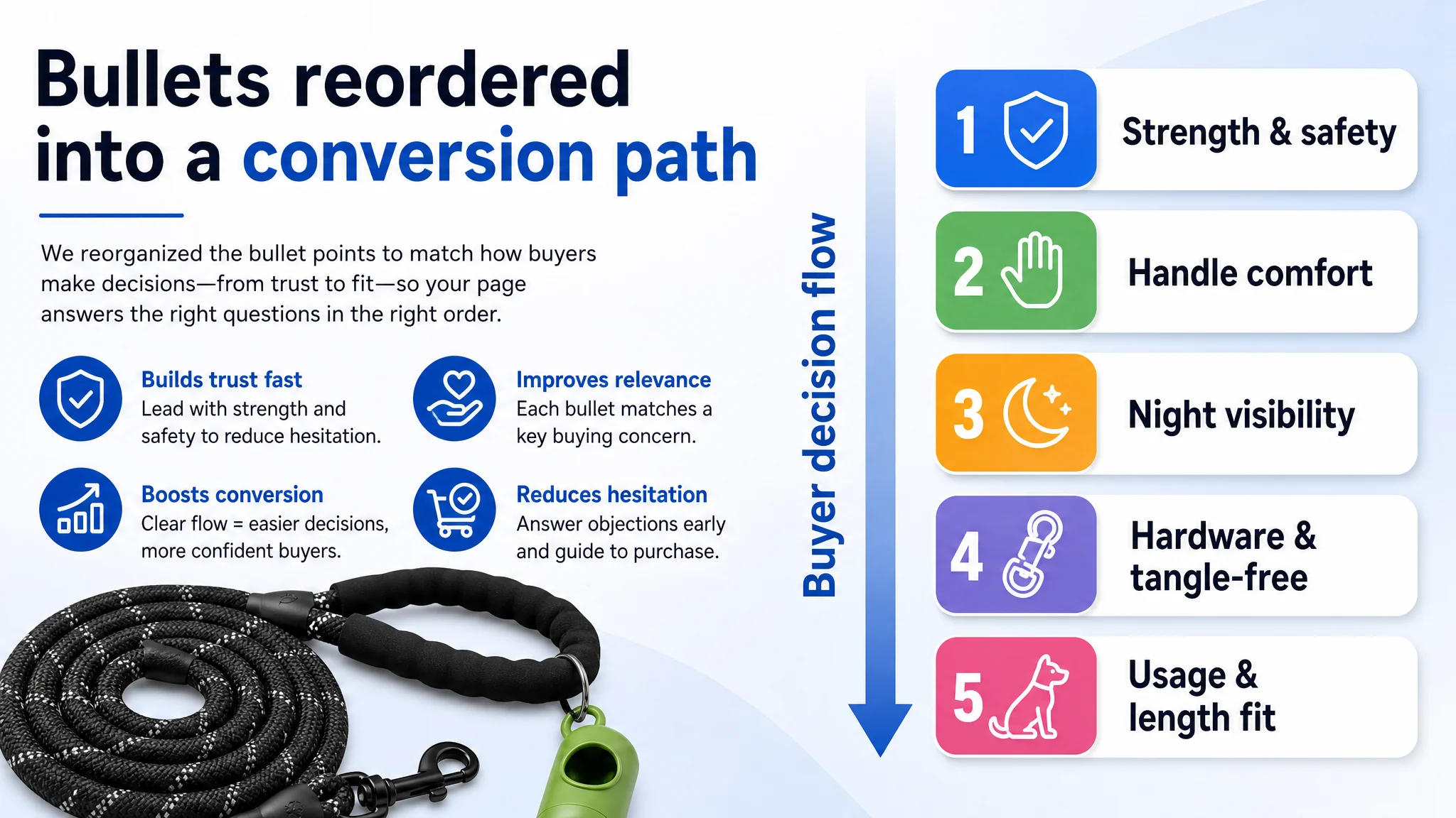
The objective was simple: turn scattered features into a coherent persuasion route.
Main Images: A Slight Advantage That Was Not Being Used
On paper, the target Listing’s main image score (25/30) slightly exceeded the benchmark’s (23/30). That does not mean the images were already optimized; it means the raw visual quality was decent, but several critical opportunities were still missed.
Key weaknesses in the existing image set
1. First image lacked a clear trust anchor
- The competitor used the first image to show a green poop bag holder and branded tag — signaling a complete, thoughtful solution.
- Our seller’s first image showed multiple colors piled together, creating a somewhat cheap and unfocused impression.
1. Parameters were not visually encoded
- The competitor visually highlighted “1/2 inch” diameter — a direct proxy for strength.
- The target Listing did not visually quantify rope thickness; users had to imagine it from words.
1. Handle versatility was not clearly shown
- The O-ring on the handle (for attaching accessories like poop bag holders) was not strategically visualized as a feature.
1. Anti-tangle mechanics remained abstract
- The metal clasp was shown but did not visually communicate the 360° swivel function.
1. Scene photography lacked professional light logic
- Shadows and lighting inconsistencies (e.g., in one scene image) slightly undermined perceived realism.
- Nighttime “effects” looked heavily post-processed, which can erode trust in actual reflectivity performance.
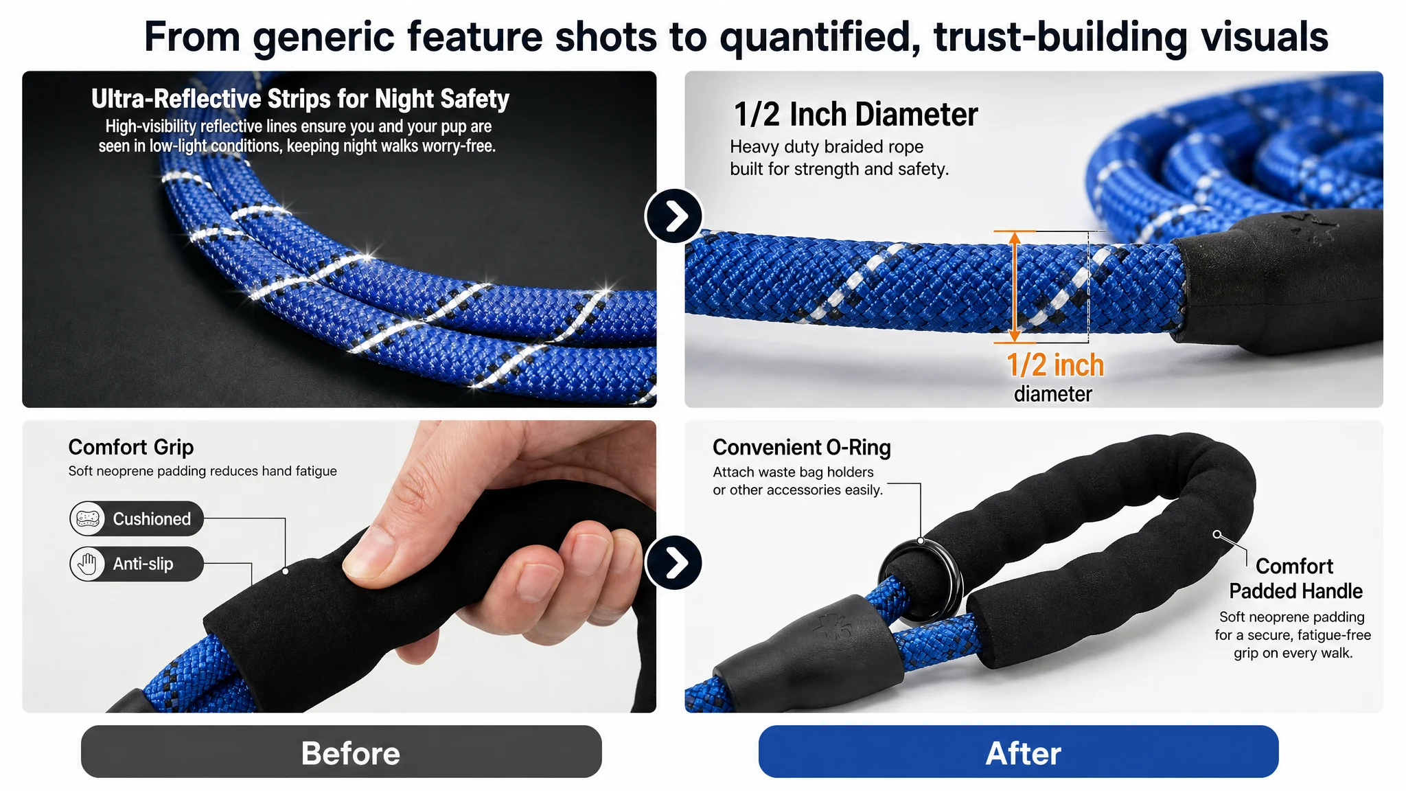
The recommended adjustments all reflect one principle: every main image must either build trust, clarify specs, or demonstrate usage — ideally two of the three.
Examples of visual decisions:
- A clean lead image: primary black leash coiled at a 45° angle, soft shadow, poop bag attached to the O-ring, color swatches in the corner.
- A micro shot of the rope with a clear “1/2 inch” label and professional, technical feel.
- A handle close-up with clean typography calling out “Comfort Padded Handle” and “Convenient O-Ring.”
- A clasp close-up with rotational arrows and “360° Swivel Tangle-Free” labeling.
- A lifestyle shot: owner and dog in a park, leash forming a confident diagonal line that visually screams “control & freedom.”
These are not aesthetic preferences; they are conversion assets.
“Advertising does not only amplify advantages. It can also amplify a page’s existing defects.”
A+ Content: The Missing Story That Was Killing Conversion
The absence of A+ content was the single largest structural deficit, creating a 23-point gap in the detail-page dimension.
The benchmark competitor used A+ to do what bullets and title cannot:
- Emotional entry: full-width outdoor images with active dogs and owners, making the product part of a lifestyle, not just an object.
- Core safety proof: macro shots of reflective threads lit with controlled light, showing how they stand out in low light.
- Comfort proof: real hands gripping padded handles, with visible pressure and softness cues.
- Specification clarity: clean side-by-side comparisons of different lengths and diameters, mapping them to dog sizes.
- Hardware credibility: detailed close-ups of hooks, swivel joints, and stitching, with industrial lighting to signal strength.
- Color and assortment: an array of 10+ colors, arranged with visual order to project brand scale and choice.
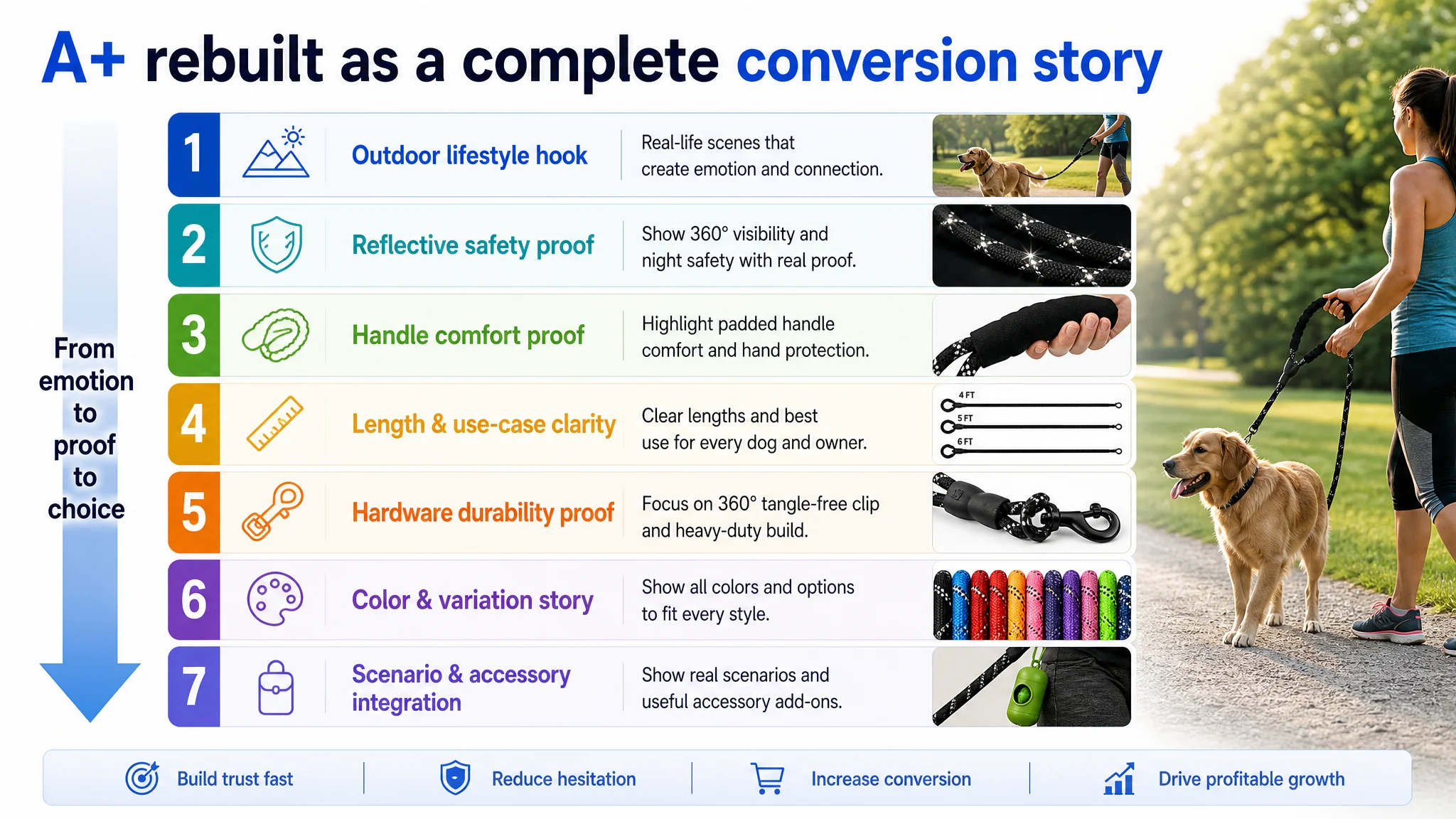
For our seller, DeepBI’s direction was to rebuild the detail section around a specific narrative arc:
1. Outdoor emotional hook
- Dog running in a park, leash clearly seen, owner in the background.
- Natural light, high saturation, to anchor the product as a “freedom with control” tool.
1. Reflective safety proof
- Macro shot of the rope with reflective threads lit by a top light.
- Cold-toned, minimal background to signal reliability and nighttime visibility.
1. Handle comfort proof
- Close-up of a human hand gripping the padded handle on a warm-toned surface.
- Visible compression of foam to show softness, solving the “rope burn / hand pain” concern.
1. Length and use case clarity
- Simple layout comparing 4ft, 5ft, 6ft options (if offered), with clear labels.
- The seller’s current 6ft position explained as the balance of freedom vs. control.
1. Hardware durability proof
- High-contrast close-up of the clasp and swivel joint, with sharp reflections.
- Visual emphasis on robustness and anti-tangle function.
1. Color & variation story
- A neat fan or diagonal array of all available colors with a clear “X COLORS” visual badge.
- Not just variety for variety’s sake, but a signal of brand seriousness.
1. Scenario versatility and accessory integration
- Rainy-day or wet-ground scene with a poop-bag holder attached to the O-ring.
- Demonstrates real-life problem solving, not just hardware.
The objective was not to “beautify” the page. It was to give ad traffic something persuasive to land on.
Why DeepBI Insisted: Fix the Page Before You Touch the Ads
At this stage, the seller had two obvious options:
1. Continue tuning Amazon ads first — split campaigns, tune bids, adjust creatives.
2. Pause aggressive scaling and rebuild the Listing conversion foundation.
DeepBI’s judgment was to prioritize option 2, for several reasons:
- Risk control: With a 0-point A+ score and weak trust signals, every incremental ad dollar had a low probability of profitable return.
- Conversion ceiling: Without a stronger sales narrative, even “perfect” traffic would underperform.
- Compounding effect: Improving Listing conversion (CVR) increases the value of every future click — both organic and paid.
- Organic health: A higher CVR helps the product’s organic ranking and keyword stability, reducing long-term overdependence on ads.
In practice, this meant:
- Do not mistake campaign complexity for progress.
- Accept that the current Listing was not yet worthy of scaled traffic.
- Use data to justify the uncomfortable decision to slow down ad changes and speed up content upgrades.
Only once the page showed signs of improved conversion — better engagement with images, stronger response to night-safety and comfort messaging, gradual review accumulation — would it make sense to ramp traffic again.
How the Business State Began to Change
Even without quoting specific post-optimization numbers, the expected trajectory was clear once the Listing’s structure improved:
- CVR started to have room to recover
- Buyers got clearer reasons to trust: strength, safety, comfort, hardware, and usage fit.
- The detail page stopped “losing” a high share of otherwise qualified visitors.
- ACOS began to be controllable again
- With a stronger page, the same ad traffic produced more orders.
- Campaign tuning became meaningful because the downstream page no longer absorbed clicks without converting.
- Organic vs. paid traffic structure became healthier
- Improved conversion sent better signals to Amazon’s algorithm.
- Dependence on paid traffic as the only engine slowly decreased.
- Operational risk decreased
- The seller no longer had to “buy their way out” of a weak Listing.
- Each new keyword or ad test could be evaluated on a more stable page baseline.
- Internal understanding shifted
- The team stopped treating Listing optimization as “design polish.”
- They started to see title, main image, bullets, and A+ as a single conversion system.
- Ads were reframed as an amplifier of an already coherent product-page story — not a replacement for it.
What Other Amazon Sellers Can Take From This Case
This case is not about dog leashes. It is about how easily ad problems can mask Listing problems.
Key takeaways:
- If ACOS is stubborn and ad tests feel like a treadmill, check whether your product page itself is underbuilt — especially A+ and review structure.
- A Rating of 5.0 with very few reviews is not a strength; it is a trust gap waiting to surface.
- A title full of adjectives but light on concrete outcomes and specs will not win the click in a mature Amazon category.
- Bullet points are not for dumping features; they are for walking the buyer through decision pillars in the right order.
- Main images and A+ are not art projects; they are visual arguments that must address strength, safety, comfort, fit, and brand trust.
- Before scaling ads, ask a hard question: “If I doubled traffic today, would my current Listing actually convert it?”
DeepBI’s value in this case was not about producing more assets; it was about forcing a shift in diagnosis. Once the seller accepted that the Amazon Listing — not the ad console — was the primary bottleneck, every subsequent optimization step started to align with real business outcomes.