

This Amazon seller in the bathroom accessories category thought they had a familiar problem: traffic came in, but the product page refused to convert, and reviews were dragging the listing down. The team’s first instinct was to push harder on Amazon ads and tweak keywords and bids, assuming ACOS and traffic volume were the core issues. But after several rounds of tuning, nothing structurally changed—clicks were fragile, orders unstable, and the listing seemed stuck in a low-conversion zone.
Once DeepBI stepped in and benchmarked the listing against a leading Amazon competitor in the same “self-draining suction soap dish” niche, the picture changed completely. The real bottleneck was not in traffic acquisition at all; it was a severe Listing conversion deficit: no A+ or detail images, weak main-image logic, and a fragmented value story. A 45/100 Listing score versus the competitor’s 87/100 made clear that ads were only amplifying an already weak page.
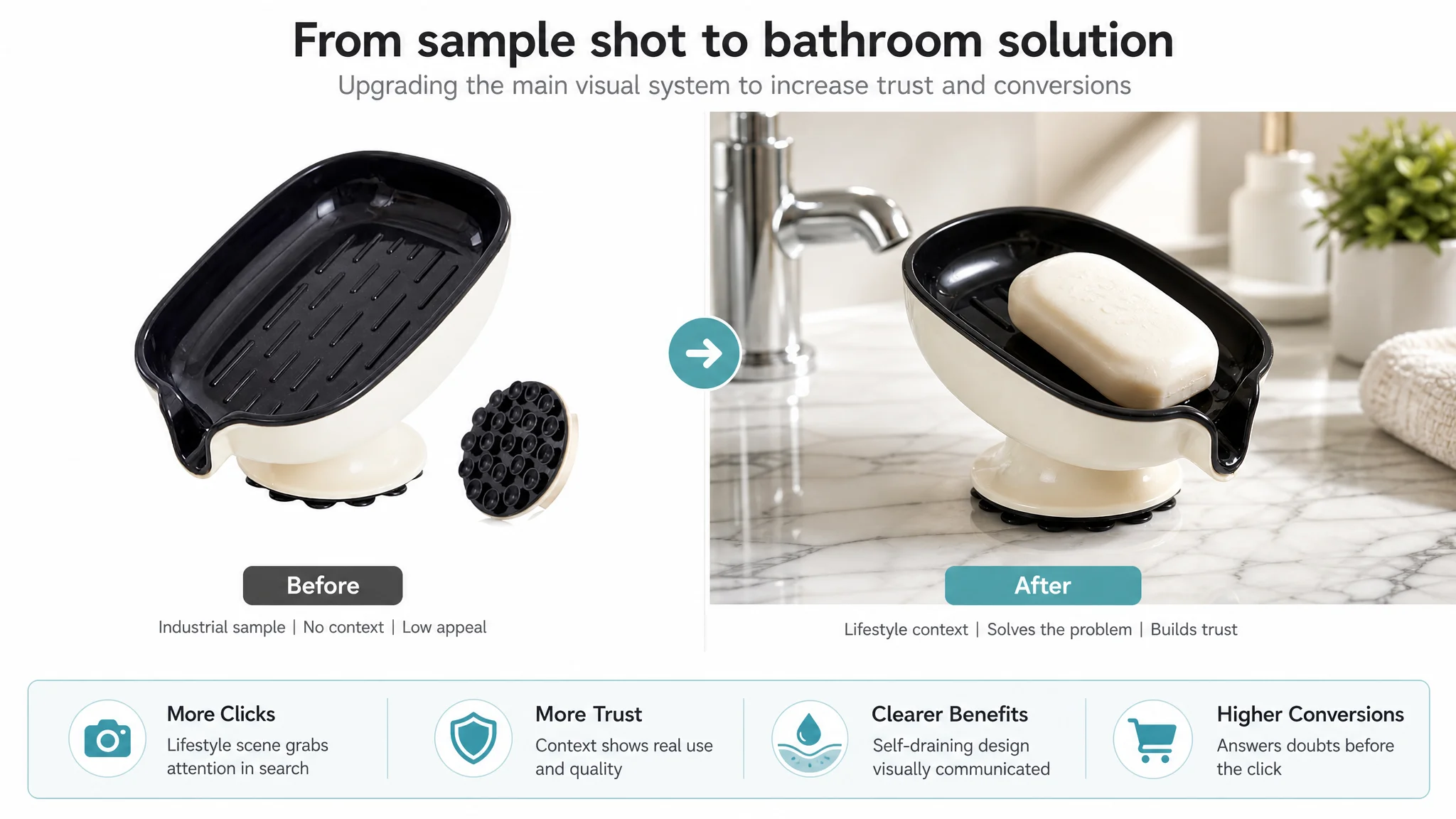
The later optimization did not start with “more ads.” It started with rebuilding the Amazon product page: a tighter, scenario-driven title, benefit-oriented bullet points, a new main-image system, and a complete A+ visual story that directly answered users’ core doubts about drainage, stability, hygiene, and compatibility. For other Amazon sellers, this case is a reminder: as ad costs rise, the real lever is often your Listing’s ability to convert the traffic you already have. If the page cannot sell, no amount of bid tweaking will fix the business.
This Listing Did Not Lack Traffic. It Lacked a Page That Could Sell.
When the seller first came to DeepBI, the pressure was straightforward:
- Ad spend was difficult to control.
- Conversion felt inconsistent.
- Reviews were not helping build trust.
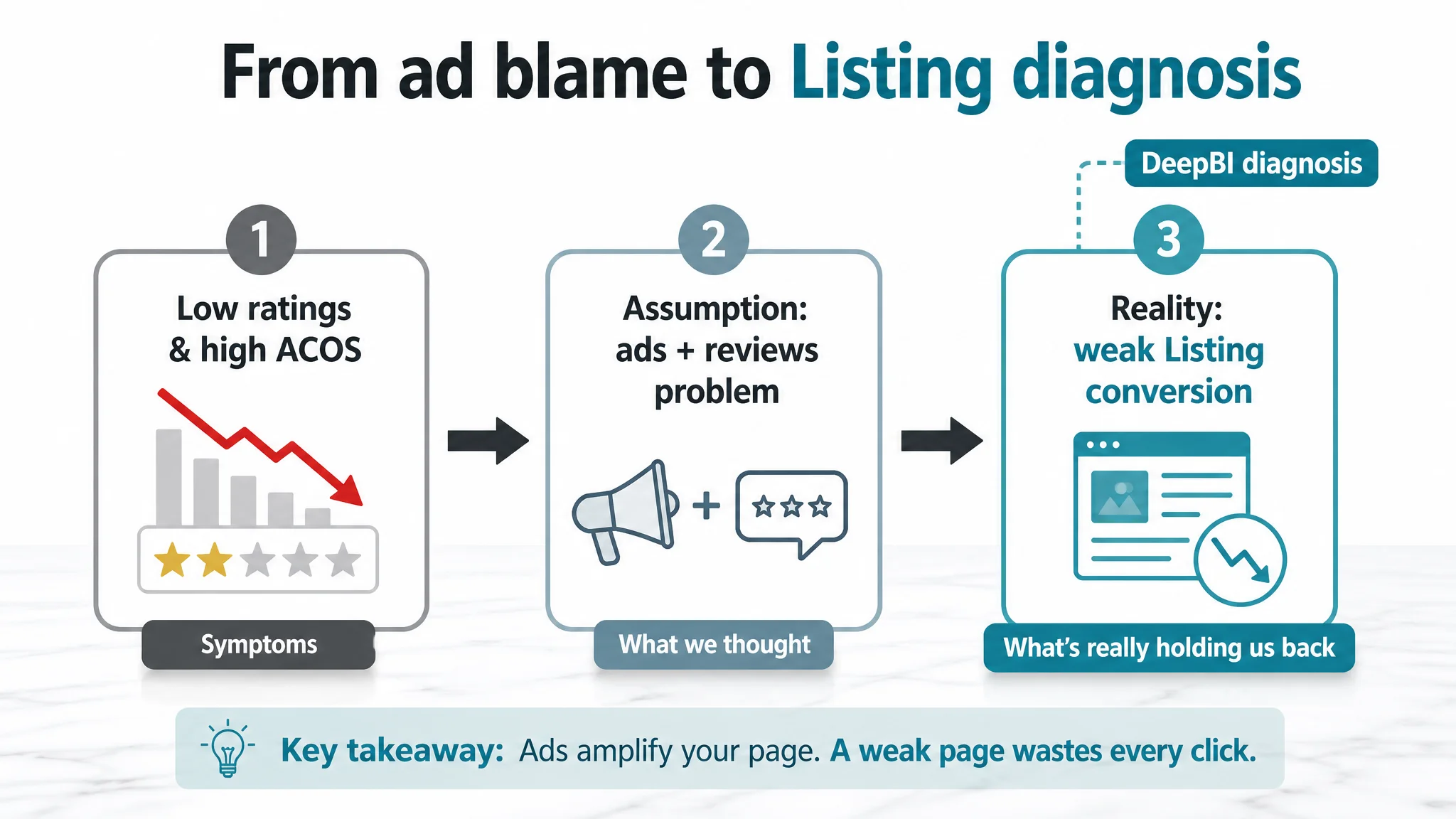
Internally, the team saw this as an “ads and reviews” problem: “ACOS is high → ads need more tuning,” and “ratings are low → we need more reviews.”
What they did not see was how far the Amazon Listing itself had fallen behind the benchmark in their own micro-category:
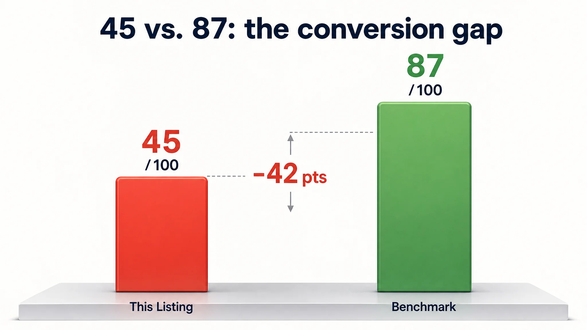
- Overall Listing score: 45/100
- Benchmark competitor: 87/100
- Gap: –42 points
At that point, more traffic was not leverage. It was a risk.
“The real problem was not that ads failed to bring traffic. It was that the page could not convert the traffic.”
The Core Constraint: Listing Conversion Capacity, Not Ad Skill
DeepBI’s diagnostic made one judgment very clear: the single biggest constraint on this ASIN’s growth was Listing conversion, not media buying skill.
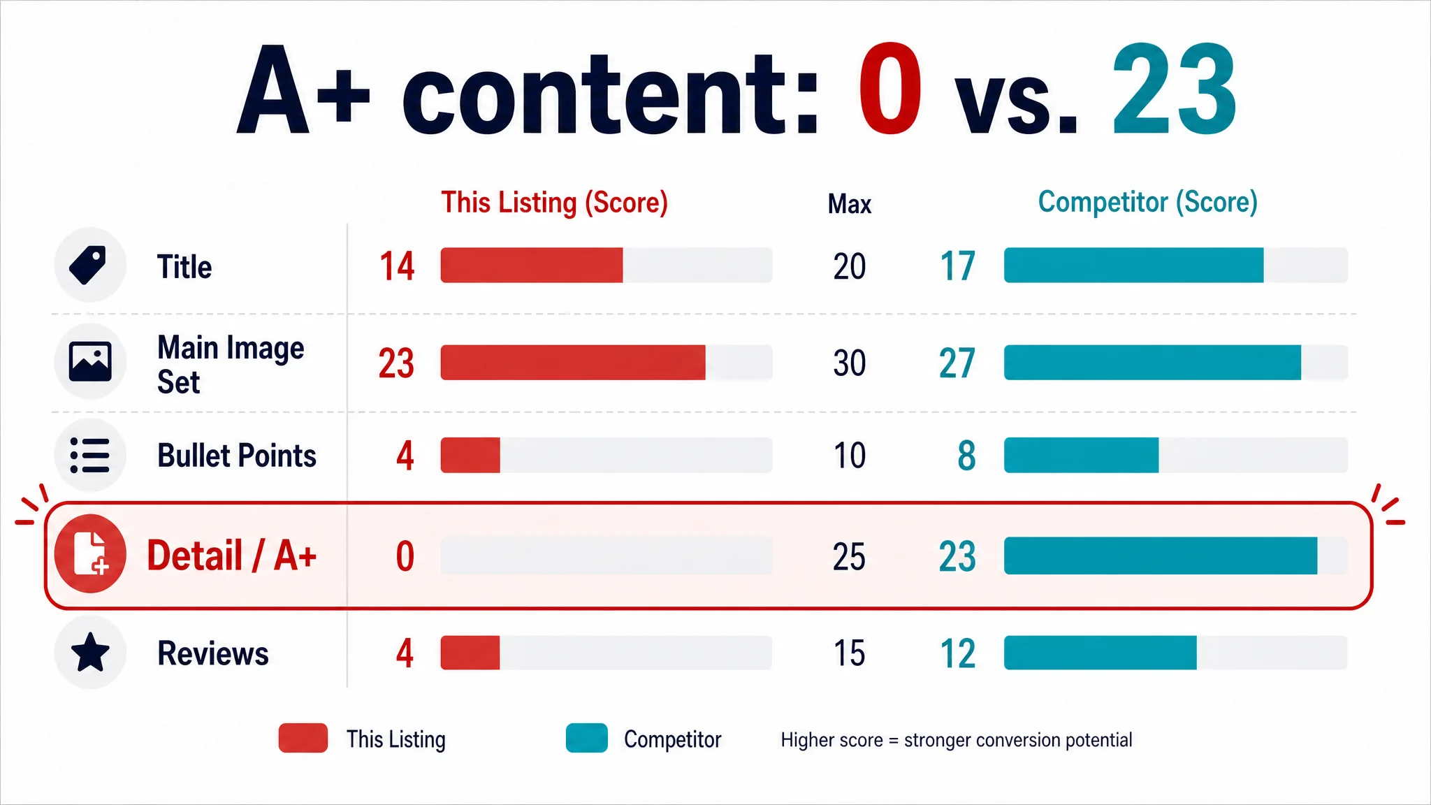
Across five core dimensions, the numbers told the story:
- Title: This Listing: 14, Competitor: 17, Max: 20, Gap: -3
- Main Image Set: This Listing: 23, Competitor: 27, Max: 30, Gap: -4
- Bullet Points: This Listing: 4, Competitor: 8, Max: 10, Gap: -4
- Detail / A+: This Listing: 0, Competitor: 23, Max: 25, Gap: -23
- Reviews: This Listing: 4, Competitor: 12, Max: 15, Gap: -8
There were gaps everywhere, but one number dominated the diagnosis: Detail / A+ content: 0 vs. 23.
On Amazon, that effectively means:
- No visual story below the fold
- No structured explanation of drainage, stability, or compatibility
- No reassurance around core usage doubts
In this state, any additional ads would merely:
- Pay for more visitors to land on an almost empty detail area
- Push more users into the same unanswered questions
- Increase the cost of each lost opportunity
From a business perspective, it was irrational to keep optimizing ads before repairing the page.
How the Original Misdiagnosis Formed
The seller’s internal reasoning followed a pattern many Amazon teams will recognize:
1. They saw low star ratings (3.3 vs. competitor’s 4.7)
→ concluded “we need more positive reviews” → but did not connect reviews back to how the page pre-set expectations.
1. They saw fragile conversion and high ACOS
→ concluded “ads might be set up poorly” → and doubled down on keyword, bid, and structure tweaks.
1. They believed the page was “basically okay”
Because:
- There was a standard white-background hero image.
- Bullet points mentioned material and suction.
- The product title had core keywords like “Black Plastic” and “Strong Suction.”
From inside the account, it was easy to think: “Everyone is selling a suction soap dish; our page looks like a normal Amazon listing.”
What the team did not see was how far the category’s visual and narrative standard had moved—and how brutally their page was now underperforming those expectations.
What DeepBI Saw in the Data and the Page
1. The Title Was Informative, but Not a Decision Driver
The title was not “wrong.” It had keywords. But benchmark comparison showed three conversion-relevant weaknesses:
- Brand recognition was missing.
The competitor led with its brand, then product. This listing led with “Black Plastic,” effectively signaling “generic, low-end accessory” before anything else.
- Benefits were buried, not sequenced.
The competitor followed a clear structure: brand → core product → specific function/shape → usage scenes → attributes (color). This listing scattered phrases like “Strong Suction” mid-title without a clear outcome focus such as “Keeps Bar Soap Dry,” “No Drill,” or “Removable Sponge Tray.”
- Scene and color clarity lagged.
The competitor explicitly told users it was for shower/bathroom/kitchen and labeled the color. This listing stayed narrow and generic, with “Black Plastic” as the only concrete detail.
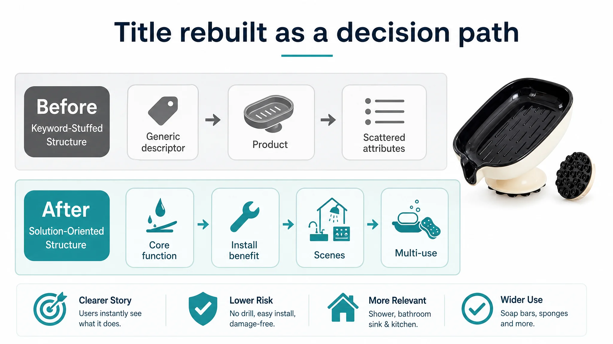
DeepBI’s judgment: the title did not have to be rewritten because of keywords. It had to be rebuilt to frame the product as a solution and expand scene coverage.
Proposed direction:
Black Self-Draining Suction Cup Soap Dish, No Drill Soap Holder for Shower, Bathroom Sink & Kitchen, Removable Sponge Tray, Easy to Clean & Keeps Bar Soap Dry
Key logic:
- Make “Self-Draining” and “Suction Cup” central.
- Explicitly bring in “No Drill” and “Removable” as high-intent modifiers.
- Expand from “generic soap tray” to multi-scene, multi-use (soap + sponge).
2. The Main Images Did Not Create a Reason to Click
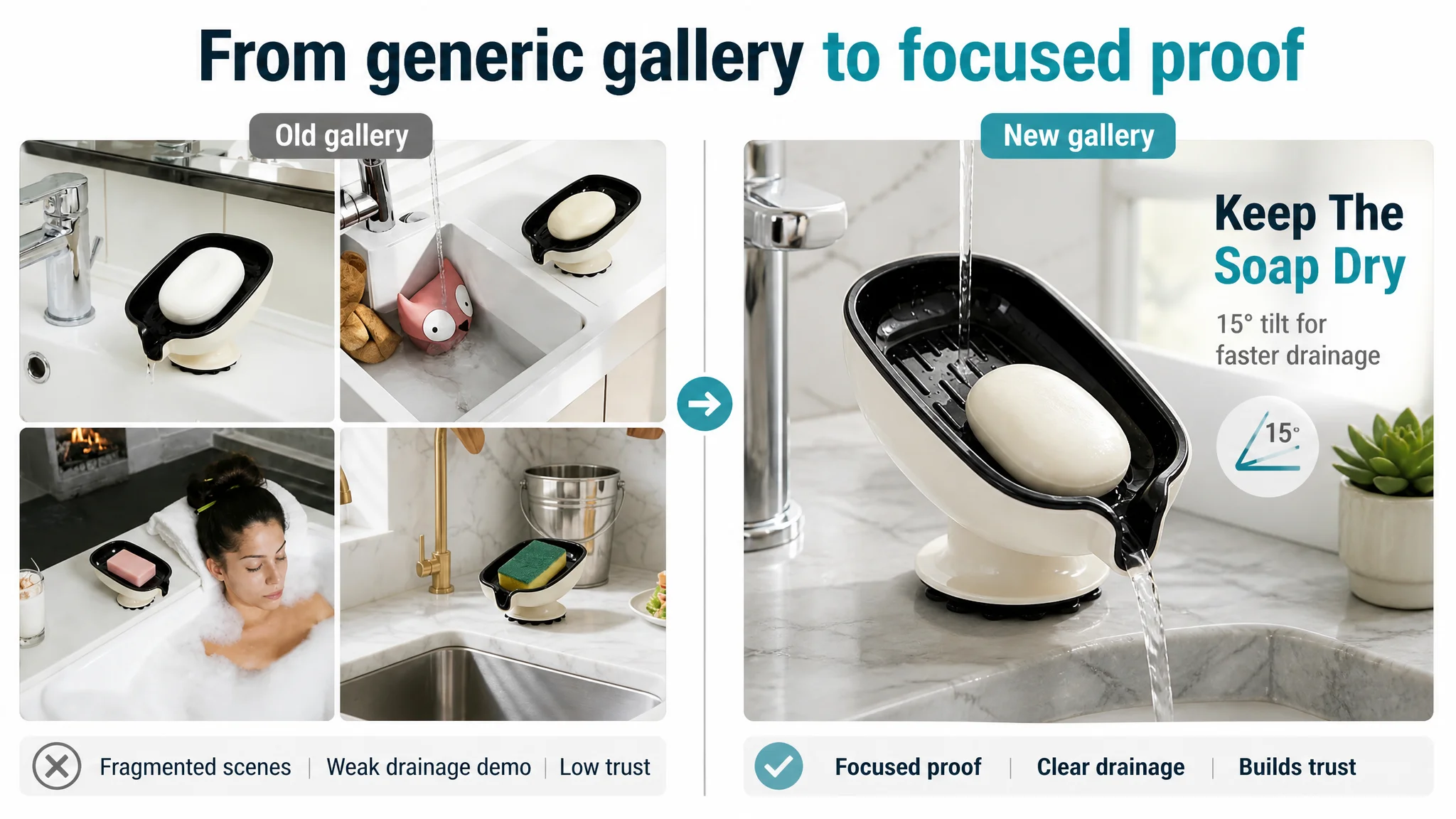
On the surface, the hero image had a clean white background. On Amazon search pages, that is no longer enough.
The benchmark competitor’s image system delivered:
- A soft, modern bathroom aesthetic that made the product feel like part of an intentional home environment.
- Clear visual before/after logic: messy, soggy soap vs. clean, dry bar.
- Visual emphasis on 15° drainage angle, suction structure, and usage scenes.
By comparison, this listing’s main images:
- Looked like generic industrial samples, with little emotional or scene context.
- Lacked a strong drainage demonstration shot, especially one that visually emphasized angle + water flow.
- Offered no decisive visual proof around suction stability.
DeepBI’s call: Clicks and conversions were being lost before users ever reached bullet points.
So the priority became:
- Turn the hero from “product cutout” into a modern, Nordic-style bathroom scene with warm light and clear product focus.
- Rebuild supporting images to cover:
- Dimension context with “fits multiple soap sizes”
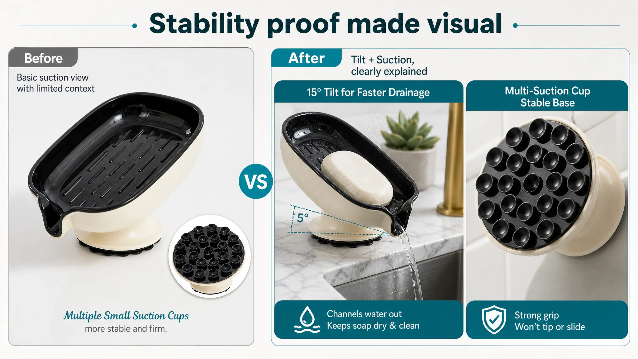
- Drainage demonstration from a low angle, highlighting tilt and flowing water
- Suction-cup close-ups that visually imply strength and stability
- A single, clean lifestyle scene instead of a fragmented four-grid layout
“Advertising does not only amplify advantages. It can also amplify a page’s existing defects.”
Here, ads were amplifying a visual system that failed to trigger desire or trust.
3. Bullet Points Had Information, but Not a Buying Logic
DeepBI’s scoring showed a 4 vs. 8 gap in the bullet-point dimension.
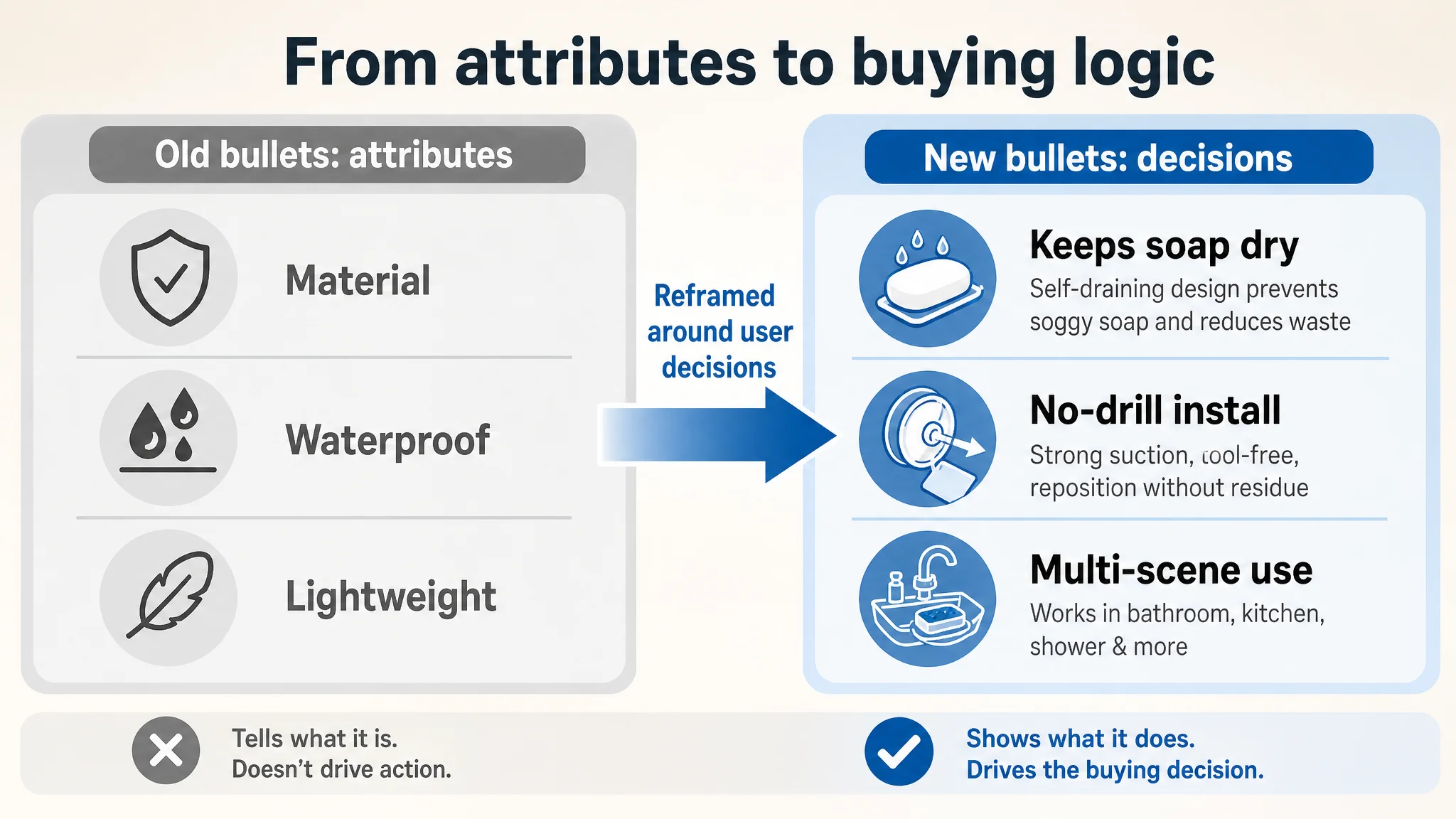
The problem was not length or grammar. It was logic:
- The current bullets were built around attributes (material, waterproof, lightweight).
- The competitor’s bullets were built around user pain points and results:
- “Prevents soap from sitting in water”
- “Reduces waste and extends soap life”
- “No drilling, easy to install and remove”
- “Holds up to 5.5 lbs” (quantified stability)
- “Suitable for soap bars, sponges, scrub brushes”
DeepBI reframed the bullets to follow a decision path:
1. Core problem & result
Efficient self-draining design that keeps soap dry and countertops clean.
1. Installation risk removal
Tool-free, damage-free suction that attaches to common surfaces and can be repositioned without residue.
1. Stability & durability
Thickened ABS material, waterproof, long-lasting suction performance in humid spaces.
1. Hygiene & maintenance
Detachable tray for quick rinsing and easy cleaning.
1. Scene expansion & multi-use
Compact, space-saving, suitable for bathrooms, kitchens, and laundry rooms, holding soap, sponges, and brushes.
In other words, bullets were rebuilt to answer the exact questions that block conversion, instead of listing static features.
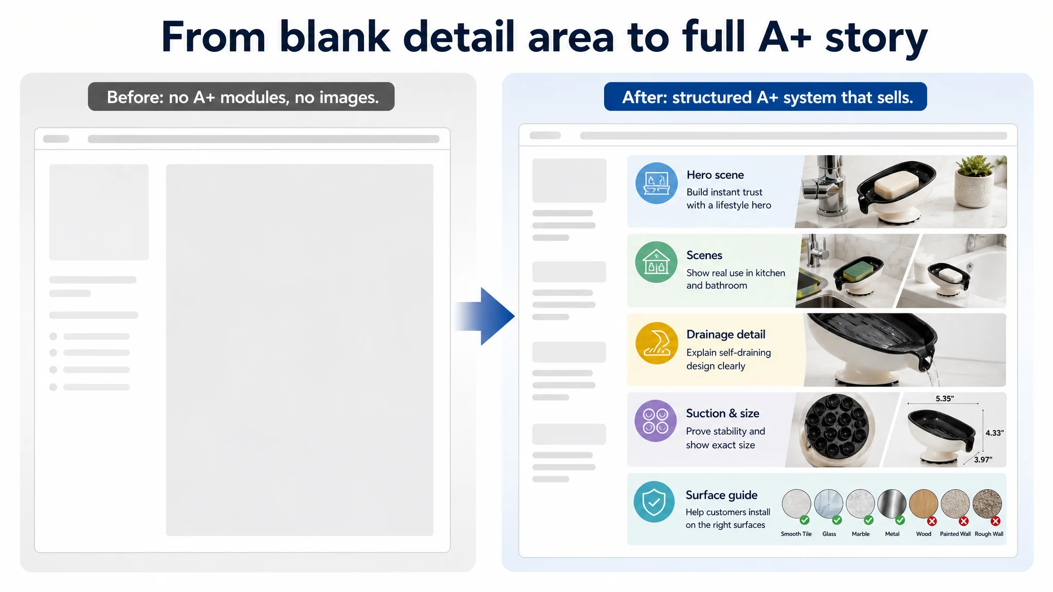
4. The Most Critical Gap: A Completely Empty A+ / Detail Area
The detail-page dimension was where the case crossed from “suboptimal” to business-critical.
- This listing: 0 points — no A+, no detail images, no modules.
- Benchmark: 23 points — full A+ system with:
- Main visual lifestyle image
- Multi-scene use (bathroom, shower, kitchen)
- Close-ups of drainage details
- Suction structure demonstrations
- Size and surface compatibility charts
- Video showing installation and actual usage
In practice, this meant:
- Users had no way to:
- Visualize the product in a real bathroom or kitchen.
- Understand how the 15° drainage logic actually worked.
- See how suction cups were arranged or how they attached.
- Confirm whether their own surfaces were compatible.
The natural outcome:
- High bounce rate once users scrolled.
- Elevated return risk from wrong expectations.
- Review pressure increasing over time.
Why DeepBI Did Not Recommend “Ads First”
With a 45/100 Listing vs. an 87/100 benchmark, the main business risk was clear:
- Every additional ad dollar would send more traffic into a defective conversion funnel.
- The Listing had already lost the right to scale ads; it could not carry traffic efficiently.
- Low star rating (3.3 vs. 4.7) was partially a consequence of weak expectation-setting and lack of trust-building, not just product quality.
DeepBI’s judgment path:
1. Stop treating ACOS as a pure ads problem.
Accept that the Listing itself is consuming efficiency.
1. Fix the foundations that influence CVR first:
- Visual narrative (main images + A+)
- Verbal narrative (title + bullets)
- Trust narrative (explanation of design logic, stability, compatibility)
1. Only after conversion capacity improves does it make sense to:
- Reassess bids and budgets
- Slowly scale traffic
- Rebuild organic and paid traffic balance
From a risk standpoint, this is the only rational order. Otherwise, ads keep funding a page that cannot close.
Rebuilding the Page: From “Industrial Sample” to Bathroom Solution
Main-Image System: From Plain Cutouts to Conversion Assets
DeepBI’s guidance for the new main-image set centered on two goals:
- Visually align with category best practices so users instantly understand “premium yet practical.”
- Answer core doubts through images before users even read text.
Key changes by slot (conceptually, not as a checklist of tasks):
1. Hero Image
- Shift from clinical white cutout to a modern, Scandinavian-style bathroom scene.
- Product at a 45° angle, occupying ~65% of the frame.
- Soft warm lighting and subtle shadowing to deliver depth and quality.
- Clear view of the suction cup base to hint at stability.
1. Dimensions & Fit
- Clean white background with clear dimension markers.
- Overlay text specifying key measurements and a line such as “Fits multiple bar soap sizes.”
1. Drainage Demonstration
- Low-angle shot emphasizing the drainage outlet.
- Water visibly flowing out, with overlay text calling out the tilt and drainage function.
1. Suction-Cup Close-Up
- Macro shot of the suction array at the bottom, with a strong lighting setup to highlight 3D shape.
- Visual impression: “multi-point vacuum suction, firm and stable.”
1. Lifestyle Scene
- One full, clean sink or bathroom scene with natural light, a green plant, and a dry bar of soap inside the holder.
- Purpose: help users imagine the product in their own home and feel the upgrade in neatness.
Taken together, these images change the listing from “cheap plastic add-on” to “practical, well-designed bathroom accessory” in a user’s mind—before any text is read.
A+ / Detail Modules: Filling the Empty Conversion Layer
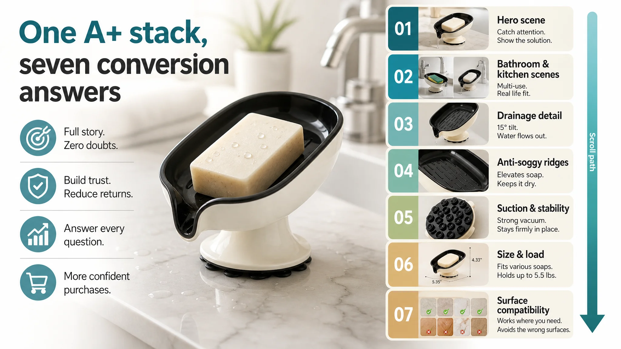
For this listing, the A+ rebuild was not a refinement step; it was creating a missing layer that the benchmark competitor was already monetizing.
DeepBI’s guidance:
1. Hero A+ Panel: Clean, High-End Bathroom Scene
- Bright, Nordic-style hand-wash station.
- Holder at center-right with a dry bar of soap on a stone or marble background.
- Soft natural light from the side, slightly blurred faucet in the background.
- Objective: set the tone—this is part of a clean, organized, aesthetically pleasing bathroom.
1. Scene Adaptability: Bathroom + Kitchen
- Split layout: one side shows a kitchen sink with a green sponge; the other shows a bathtub edge with a bar of soap.
- Clearly labeled scenes to communicate:
- Not just “soap dish,” but also “sponge holder.”
- Useful in bathroom, kitchen, laundry room.
1. Core Pain Point: Drainage Detail (15° Tilt Logic)
- Macro shot of the drainage outlet and internal guide channels.
- Side or 45° angle to show tilt and water direction.
- Very shallow depth of field to focus attention on flow path.
- Visual goal: “I can see exactly how water leaves the soap area.”
1. Pain Point: Soggy Soap & Stickiness
- Close-up of the raised ridges inside the tray.
- Lighting designed to make the ridges feel structured and functional.
- Visual message: soap is raised, air flows underneath, soap doesn’t sit in water.
1. Trust: Suction Structure & Stability
- Product tilted to show suction cups clearly.
- Light passing through transparent suction material to show structure.
- Intended to visually answer “Will this fall off my tiles?”
1. Parameters: Size and Load-Bearing
- Standardized technical panel: product with dimension lines, exact measurements, and a load-bearing icon (e.g., “5.5 lbs”).
- Goal: set clear expectations, reduce size-related returns.
1. Surface Compatibility Matrix
- Top-down view of the product in the center.
- Around it: circles showing common surfaces (marble, tile, metal, glass, etc.) with green checks or red crosses.
- Function: quickly answer “Can I use this on my sink/wall?” and pre-filter buyers who are a bad match.
This A+ structure does more than “beautify” the page. It:
- Explains how the product works at a design level.
- Clarifies where it can be used and on what surfaces.
- Prevents wrong expectations, which reduces returns and future negative reviews.
In a category where the promise is “clean, dry, and tidy,” this is the layer that actually sells.
Reviews: Symptom of a Weak Page, Not the Only Problem
The review metrics were clearly unfavorable:
- This listing: 3.3 stars, 14 total ratings, 7 reviews on the first page.
- Benchmark: 4.7 stars, 23 total ratings, 8 reviews on the first page.
- First-page negative review share for this listing: 43% (1–2 stars).
It would have been easy to chase more positive reviews first. DeepBI’s judgment was different:
- A page that does not explain how to use the product, on which surfaces, and what to expect will naturally generate more disappointment.
- Many negative reviews on suction products stem from:
- Use on incompatible surfaces
- Misunderstood installation
- Size mismatches
— all of which the current Listing did nothing to prevent.
By rebuilding the visual and textual narrative first, the seller:
- Pre-filters users who are a poor fit (wrong surface, wrong scene).
- Sets clearer expectations about size, drainage, and stability.
- Gives future buyers a more complete understanding before they purchase.
As this new structure stabilizes usage, the review profile has a chance to slowly normalize—supported by genuine experience, not only by review campaigns.
After the Repair: Making Ad Traffic Valuable Again
Once the page’s sales logic was rebuilt, the operating state changed—even before any dramatic ad scaling:
- The Listing began to regain its ability to convert both organic and paid traffic.
- Each incremental visit carried more potential value because the page now:
- Showed clear visuals.
- Answered core doubts.
- Presented a coherent usage story.
- Ads could be reassessed with more confidence, because:
- A click now landed on a page that could actually persuade.
- ACOS reflected both media quality and improved page conversion, not just page failure.
The seller’s internal understanding also shifted:
- Ads are not a universal solution to conversion problems.
- Listing quality is the foundation of ad efficiency.
- Title, main images, bullet points, and A+ must be treated as one integrated decision path, not four disconnected tasks.
What Other Amazon Sellers Can Take from This Case
For many Amazon sellers, this case will feel familiar:
- You see ACOS pressure and low conversion.
- You tweak campaigns, bids, and keywords.
- You push for more reviews.
- Yet the Listing itself—especially the A+ and image system—has not been seriously benchmarked against the current category standard.
This case shows:
- A 45/100 Listing competing against an 87/100 benchmark does not have an “ads problem”; it has a conversion-capacity problem.
- A missing or weak A+ section is not a cosmetic flaw; it is a structural leak that wastes every click you pay for.
- Before scaling Amazon ads, the first question should be:
“Does this page deserve more traffic?”
DeepBI’s value in this case was not generating images or rewriting copy for the sake of it. It was in making a clear judgment:
- Fix the Listing’s conversion capacity first.
- Only then decide how much traffic to buy.
For Amazon sellers operating under rising ad costs and intense competition, that judgment order is often the difference between endlessly paying for traffic and building a product page that can actually convert it.