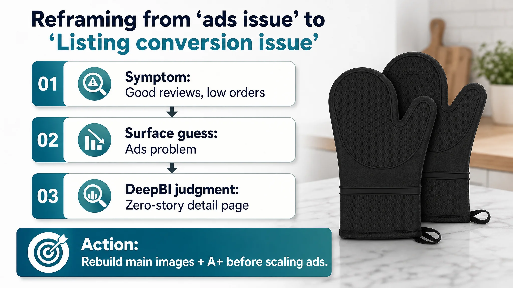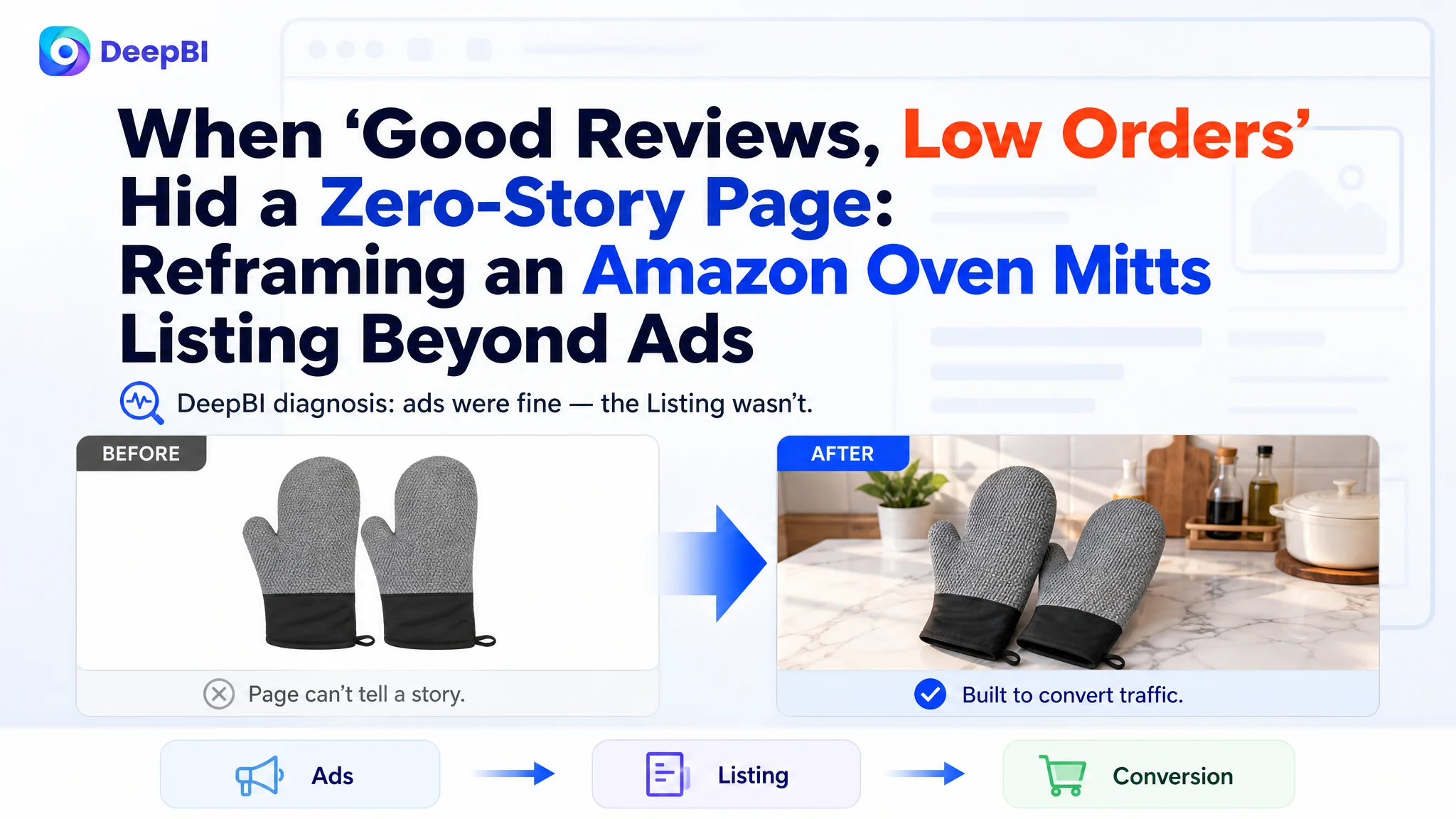
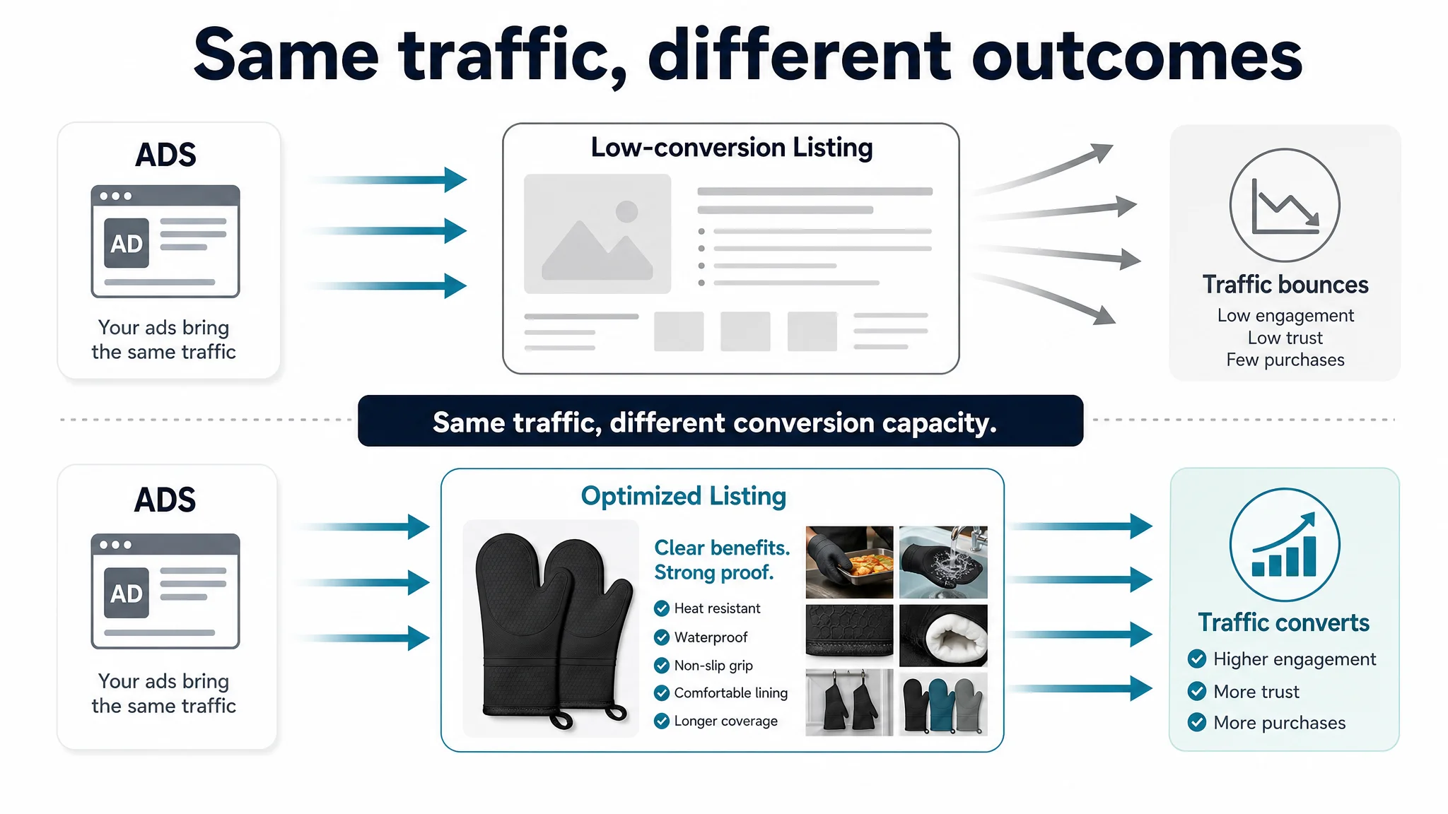
This case comes from an Amazon seller in the kitchenware category, promoting silicone oven mitts on the US marketplace. The team saw decent reviews and a solid product, yet orders lagged behind a key competitor. Their intuition was that “traffic is not enough, ads and keywords need to be pushed harder.” What they did not realize was that Amazon ads were already bringing enough people to the door — it was the product page that quietly stopped them from walking in.
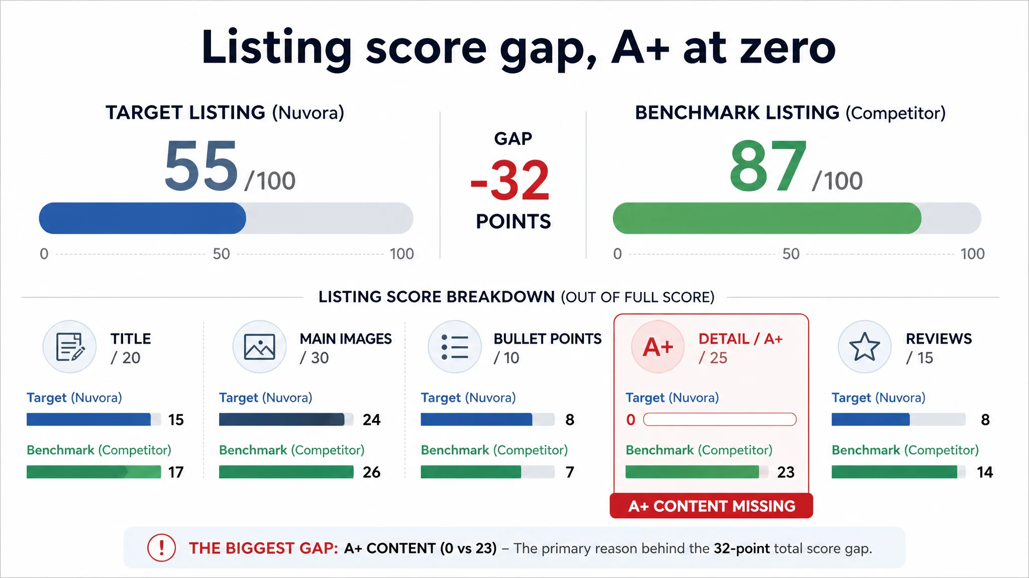
DeepBI’s diagnosis showed a brutal gap: while the competitor’s Amazon Listing scored 87/100, this seller’s Listing sat at 55/100. The most devastating issue was not in the title or bullet points; it was that the detail page had no A+ content at all — effectively zero visual story — in a category where the benchmark Listing used a full A+ image chain to build safety and trust. Ads and external efforts were feeding traffic into a page that could not complete the buying decision.
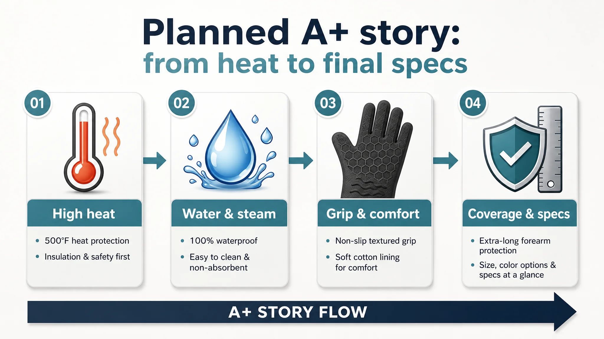
Once the problem was reframed from “insufficient ad performance” to “insufficient Listing conversion capacity,” the optimization focus shifted: rebuild the visual logic of the page, upgrade the main-image set, and construct a complete A+ story around heat protection, waterproofing, grip, comfort, and forearm coverage. After that, ad traffic finally had somewhere to “land,” and the product page started to behave like a real sales asset rather than a static brochure.
For other Amazon sellers, this case is a reminder: if your Listing cannot carry the weight of conversion, more traffic just amplifies the weakness. Before asking why ACOS is hard to control, it is often worth asking a more basic question — does the Amazon product page deserve the traffic you are buying for it?
What the Seller Saw: A “Normal” Listing That Just Would Not Convert
From the seller’s perspective, the situation looked familiar:
- The product was solid: silicone oven mitts, high heat resistance (up to 500°F), waterproof, quilted cotton lining.
- Ratings were good: 4.7 stars from early buyers, with detailed usage reviews.
- Ads were running, but orders were not catching up to a clear category benchmark.
On the surface, nothing looked broken enough to explain the gap. The title mentioned key features, the bullets felt well written, and reviews were positive. The seller’s instinct was to:
- Add more keywords into campaigns
- Try different bids and placements
- Consider extending budgets to “break through”
In other words, they saw this as an Amazon ads problem: “We just need more or better traffic.”
“The real problem was not that ads failed to bring traffic. It was that the page could not convert the traffic.”
The Original Misdiagnosis: Blaming Ads for a Page That Wasn’t Selling
When DeepBI compared this Listing with a leading competitor in the same Amazon category, the first numbers already told a different story:
- Overall Listing score:
- Target Listing: 55 / 100
- Benchmark Listing: 87 / 100
- Gap: -32 points
Breaking that down:
- Title: Target: 15, Benchmark: 17, Full Score: 20, Gap: -2
- Main Images: Target: 24, Benchmark: 26, Full Score: 30, Gap: -2
- Bullet Points: Target: 8, Benchmark: 7, Full Score: 10, Gap: +1
- Detail / A+: Target: 0, Benchmark: 23, Full Score: 25, Gap: -23
- Reviews: Target: 8, Benchmark: 14, Full Score: 15, Gap: -6
The title and main-image differences were noticeable but not catastrophic. Bullet copy was actually competitive — arguably stronger on data, contrast, and benefits than the competitor. The huge hole was the detail/A+ dimension: 0 vs 23.
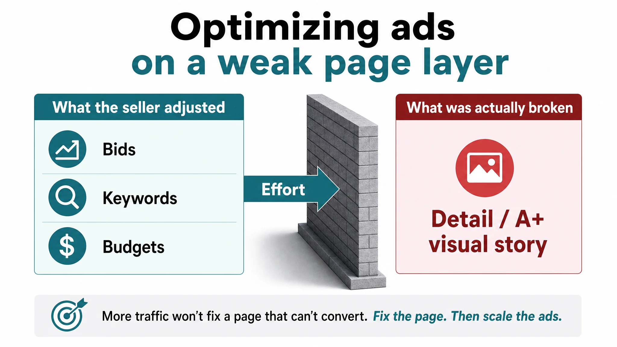
The seller was optimizing the wrong layer. They kept trying to:
- Adjust campaigns and bids
- Hunt for better keywords
- Think about more coupons or promotions
But they were effectively pushing traffic into an Amazon product page that stopped persuading after the bullets. There was no structured visual journey to turn “interested clickers” into “confident buyers.”
Amazon Ads Were Not Failing. The Page Was Consuming the Traffic.
From a business standpoint, the biggest risk was not “insufficient reach.” It was conversion leakage:
- The main image lacked emotional and contextual hooks, likely pulling CTR below the competitor by several percentage points.
- The image set lacked strong, structured storytelling (especially on mobile), reducing dwell time and weakening Amazon’s quality signals.
- The absence of A+ content left a vacuum in the lower half of the page — where many users decide whether to buy, scroll back up, or leave.
Meanwhile, the competitor’s Amazon Listing was doing the opposite:
- Full A+ content chain: main scene, multi-scenario images (kitchen, BBQ), close-ups for waterproof and grip, storage, color variants, and human usage.
- A coherent visual and textual story: from heat resistance and safety to ease of cleaning and lifestyle context.
- A dense review base: 4.8 stars with over 1,400 reviews, anchoring trust and making the page feel “safe to choose.”
So while the seller was trying to fix ad metrics, the true constraint was the Listing’s conversion capacity.
“Advertising does not only amplify advantages. It can also amplify a page’s existing defects.”
The Real Constraint: A Zero-Story Detail Page in a Story-Heavy Category
Digging into the five dimensions, DeepBI’s judgment was clear: the Listing did not lack information; it lacked structured persuasion.
Title: Not the Main Culprit, But Slightly Behind
The original title followed a common pattern — core keyword + features + uses. It was functional but left some power on the table:
- The competitor front-loaded quantity and size: “2PCS” and “12.5 Inch” were more immediate conversion anchors than “1 Pair” and “500°F”.
- Keyword density and variants: “Silicone Oven Mitts” + “Oven Mitts” + “Oven Glove” gave broader coverage.
- Usage scenes like “BBQ” appeared earlier, capturing more targeted search intent.
DeepBI’s proposed optimization:
Silicone Oven Mitts, 500°F Heat Resistant Oven Gloves with Soft Cotton Lining, Non-Slip Waterproof Kitchen Potholder Mits for Baking, Cooking, BBQ and Grilling (1 Pair)
Logic:
- Maintain “Silicone Oven Mitts” as the lead keyword.
- Add “Oven Gloves” and “Potholder Mits” to cover synonyms and related searches.
- Keep “500°F” prominent to carry safety assurance.
- Explicitly include “BBQ” and “Grilling” to match common search scenes.
- Place “(1 Pair)” in a clear, scannable position for mobile.
But even with a better title, fixing this alone would not change the fundamental conversion problem. The decisive gap was deeper on the page.
Bullet Points: Information-Rich, but Under-Leveraged
Ironically, the seller’s bullets were not their weakest area:
- Strong scene-based problem solving (“taking pans out of the oven”, “flipping meat on the grill”).
- Concrete data (500°F / 260°C), BPA-free material, stitched lining, and clear contrasts vs fabric gloves.
- Benefits embedded into each point (“handle hot dishes confidently”, “protect hands from burns”).
Where they fell short was not content quality, but visual presentation and integration with the rest of the page:
- Without matching visual support (images and A+ modules), many users never fully process bullet details.
- On mobile, scanning blocks of text without clear visual anchors reduces the practical impact, no matter how solid the wording is.
DeepBI did not treat bullet optimization as the primary lever. Instead, it reframed the bullet content as script material for the visual story that the page needed to build.
Detail / A+: The 23-Point Black Hole
This was the decisive constraint:
- The seller had no A+ content.
- The competitor had a full A+ module chain, effectively adding a second, visual “sales page” under the standard content.
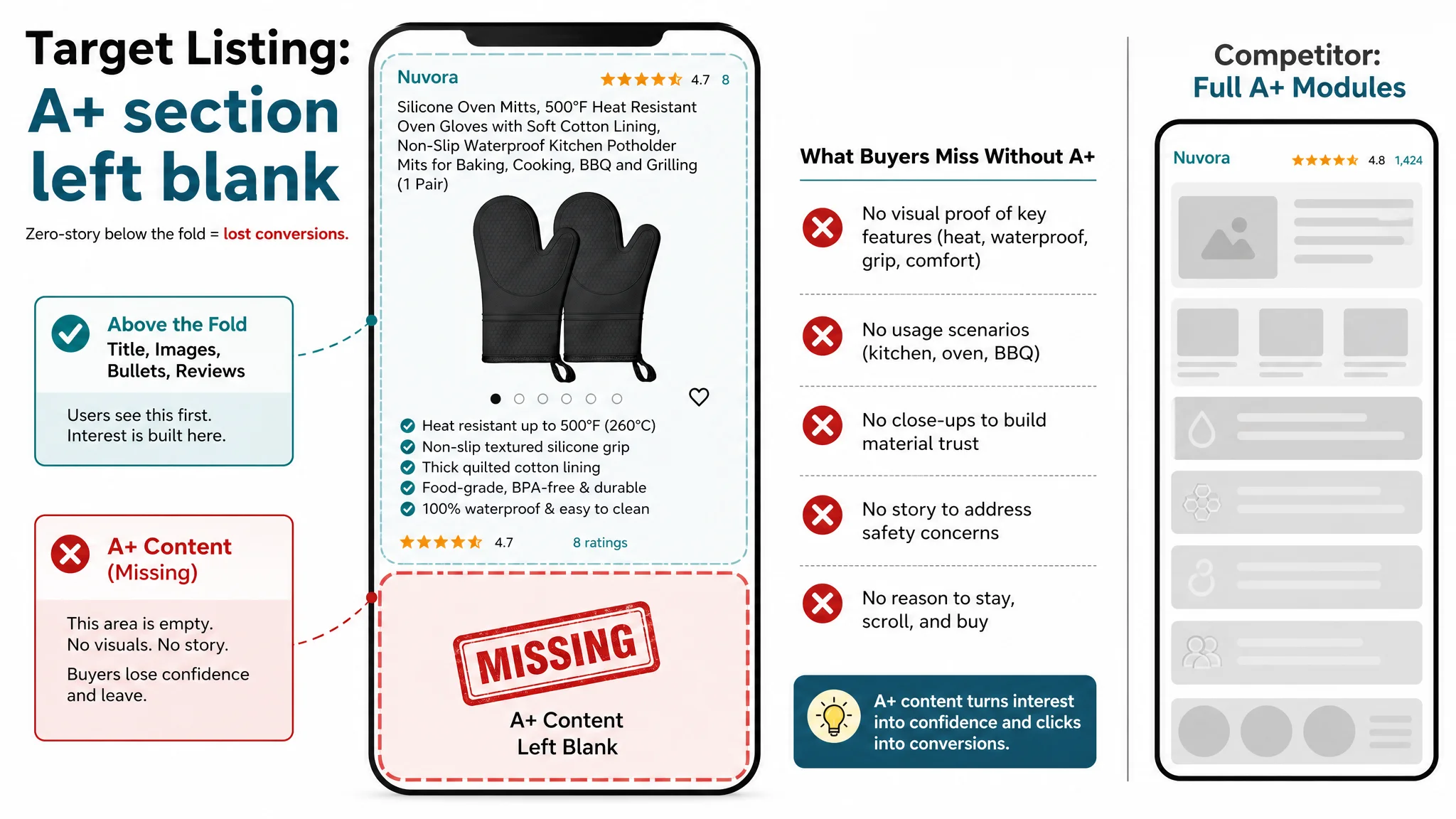
The competitor’s A+ structure:
- Hero image with a real kitchen scene – pulling the buyer into “their future use.”
- Multi-scenario panels – oven, kitchen, BBQ – covering the main use cases.
- Close-ups of waterproof surfaces and grip textures – turning abstract claims into visible proof.
- Storage and color options – reducing friction at the decision stage.
- Human usage shots – social proof and emotional connection.
DeepBI’s diagnosis:
The target Listing didn’t just “lack images.” It lacked a conversion framework in the lower half of the Amazon product page. As a result, regardless of traffic volume, the page could not systematically:
- Address specific safety fears (burns, hot steam, boiling liquids).
- Highlight the real functional edge (100% waterproof silicone vs fabric mitts).
- Show how the mitts solved everyday frustrations (cleaning, slipping, forearm exposure).
- Visually justify price and position against trusted competitors.
In this context, continuing to push ads would only increase paid traffic to a page that was structurally unprepared to close.
Why DeepBI Did Not Recommend “Tune Ads First”
From a risk and ROI standpoint, DeepBI’s judgment sequence was:
1. Conversion capacity of the page is the bottleneck.
A 55/100 Listing competing head-to-head with an 87/100 Listing in the same category, on the same marketplace, is structurally at a disadvantage — especially when the gap is 23 points in detail/A+ alone.
1. Ads amplify page quality, not just reach.
Improving bids and keywords without fixing the page would:
- Raise spend
- Increase exposure
- But still leak conversions at critical decision points
1. The dominant risk was “wasting traffic,” not “lack of traffic.”
The most dangerous scenario is paying for every new visitor twice: once in ad dollars, and once in missed conversions.
Therefore, the first priority had to be:
- Rebuild the visual and narrative logic of the Amazon Listing.
- Ensure that when users arrive — whether from organic search or ads — the page has the structure and content to convert them.
Only then does additional spending on ads begin to make commercial sense.
Rebuilding the Page: From Static Assets to a Conversion Journey
DeepBI’s optimization did not start from “pretty images.” It started from specific conversion functions that were missing.
1. Main Image Set: Click Drivers, Not Just Product Photos
The main image is not merely a visual element; it is an ad creative on the search results page. DeepBI’s comparative analysis of the main images vs the competitor’s led to these judgments:
- Click-through rate (CTR) risk: the existing hero lacked emotional or scenario hooks and likely underperformed by 5–8% vs the benchmark on mobile.
- Dwell and perception risk: dense but less-structured info images can shorten viewing time and weaken perceived quality.
- Trust risk: missing human scenes reduced social proof, particularly for household decision-makers.
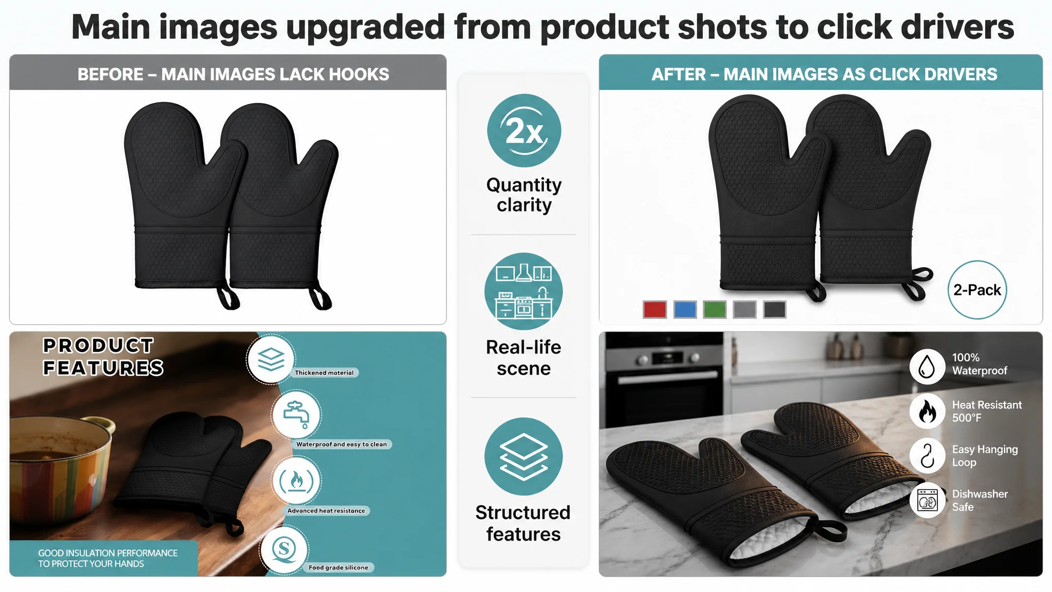
Key shifts in the main-image logic:
Hero Image: Richer Information, Still Clean
- Two mitts centered symmetrically, taking ~75% of the frame, 45° view.
- Pure white background to match Amazon’s standards.
- A simple “2-Pack” icon and small color swatches hinting at options.
- Lighting designed to reveal texture and shape.
Why: Give users a clear object understanding at a glance, signal quantity and variants, and create enough visual richness to earn the click without clutter.
Comparison Image: “Ours vs Others” to Resolve Size Anxiety
- Product on the left, a semi-transparent competitor silhouette on the right.
- Clear “Ours” vs “Others” labels, with size parameters.
Why: Many buyers worry about fit and coverage. A direct visual comparison removes guesswork and shifts the perception of value without extra text.
Function Image: From Neutral Background to Real Kitchen
- Mitts on a marble countertop with blurred modern kitchen background.
- Icon set for key functions: waterproof, heat resistant, hangable, easy to clean.
Why: Move from “raw product” to “product in the buyer’s real life,” strengthening emotional connection and supporting the bullet claims.
Detail Image: Texture, Lining, and Construction
- One mitt showing the exterior, the other flipped to expose the cotton lining.
- Fine lines pointing to anti-slip pattern, lining, and hanging loop with concise labels.
Why: Convert abstract claims like “thick cotton lining” and “non-slip pattern” into tangible, inspectable details that signal quality and durability.
Waterproof Image: Visual Proof of a Core Edge
- Hand wearing the mitt under a faucet, water visibly rolling off.
Why: 100% waterproof is a key differentiator vs fabric mitts. Visual proof here immediately justifies the claim and increases trust in all water/steam-related bullets.
2. A+ Content: A Four-Scene Story Around Safety and Comfort
The A+ content plan was not “add more images.” It was construct a decision path:
1. High-temperature performance
2. Waterproof and steam resistance
3. Grip and safety under real stress
4. Comfort and long-coverage protection
5. Color and spec confirmation at the end
A+ Hero: Reliable in Real Oven Use
- A real kitchen scene: hand with gray silicone glove taking a tray of golden bread from a lit oven.
- Bright, professional style, oven’s warm orange light against the cool gray glove.
Purpose: Set the tone — “this is a real, serious oven mitt for real heat,” not a decorative novelty. It also anchors the buyer’s imagination in a familiar action.
500°F Panel: From Claim to Visual Data
- Side-shot of the mitt with a dark kitchen background.
- Large “HEAT RESISTANT UP TO 500°F” text with an orange bar visualizing intensity.
Purpose: Move the 500°F claim from a text detail into a focal point, visually quantifying the protection and addressing fear of burns, steam, and hot trays.
Waterproof & Steam Panel: Dynamic Water, Not Static Icons
- Mitt at 45° with a strong water stream and droplets rolling off.
Purpose: Show the difference vs fabric mitts in one glance: no absorption, no soggy fabric, easy cleaning. This strengthens two key promises: safety + convenience.
Non-Slip Grip Panel: High-Risk Scenario, Not Abstract Texture
- First-person view gripping a steam-covered glass lid with condensation.
Purpose: Target one of the riskiest real situations: slippery glass with steam. This directly addresses the fear of dropping hot dishes, making “non-slip grip” feel real and urgent.
Comfort & Inner Lining Panel: Making “Soft” Visible
- Macro shot of the cuff folded up, revealing thick, diamond-stitched cotton.
Purpose: Turn comfort, breathability, and quality into a visible texture story. People see careful stitching and thickness instead of just reading “quilted cotton lining.”
Extended Length & Forearm Protection: Beyond the Wrist
- Outdoor BBQ scene, hand reaching deep into a grill, glove covering mid-forearm.
Purpose: Highlight the extended length as a functional safety advantage, especially in deeper ovens and grills. This is a differentiator many users only regret after a burn.
Final Specs & Colors Panel: Reducing Last-Mile Friction
- Clean, parallel layout of multiple colors with exact length and width.
Purpose: Remove doubt about size and look; ensure that at the end of the scroll, buyers have all the hard data needed to click “Add to Cart” without leaving to check competitors.
3. Aligning Bullet Copy With the New Visual Story
With a stronger visual framework, bullet points could now be refined to match:
1. 【HEAT RESISTANT PROTECTION UP TO 500°F】
Anchors all safety and serious-cooking positioning.
1. 【NON-SLIP GRIP & UNIVERSAL FIT】
Ties directly into the glass-lid grip visual, resolving risk of drops and fit anxiety.
1. 【THICK QUILTED COTTON COMFORT】
Reflects the macro shot of the lining, turning “comfort” into a visible quality signal.
1. 【FOOD-GRADE SAFE & DURABLE】
Connects BPA-free, food-grade silicone with durability so the product feels safe and long-lasting, not disposable.
1. 【100% WATERPROOF & EASY TO CLEAN】
Complements the faucet and water-droplet images, emphasizing not just ease of cleaning but non-absorption, a real edge vs fabric.
This alignment between text and visuals resolves a common Amazon Listing problem: strong bullet promises with weak or nonexistent proof. Here, each bullet now has a visual “anchor” somewhere on the page.
What Changed Once the Page Started to Sell
Because this case is focused on diagnosis and decision logic, not a numerical case-study, we will not fabricate performance data. But the operational state changed in several important ways:
- Listing conversion capacity began to recover.
The page moved from “information-heavy but visually thin” to a coherent story that could actually carry the weight of a buying decision.
- Ad traffic became useful again.
Instead of feeding traffic into a page with a 0/25 A+ section, ads were now landing users on a full-funnel product page built around safety, waterproofing, grip, comfort, and coverage.
- Risk of wasted spend decreased.
The seller could plan ad scaling with more confidence, knowing that the major conversion bottleneck was addressed.
- Dependency on “more traffic” as a default answer weakened.
The seller’s internal view shifted: before spending more on ads, they now ask, “What is this page actually doing with the traffic we already have?”
Perhaps the most important change was the seller’s understanding of how Amazon really works at their scale:
- Amazon ads do not solve a weak product-page story. They expose it.
- Listing quality — especially the main images and A+ content — is the foundation for any sustainable ad strategy.
- A high review score alone cannot compensate for a hollow detail page, especially against a competitor with both strong social proof and a full visual journey.
What Other Amazon Sellers Can Take From This Case
This case is not about oven mitts. It is about where you place your attention when ads stop performing the way they used to.
Key takeaways:
- If your Amazon Listing score is structurally weaker than a direct competitor — especially in main-image and A+ content — ad tuning will reach a hard limit.
- Bullet-quality alone rarely wins. Without aligned visual proof, buyers will not internalize your best arguments.
- A missing or thin A+ section is not a cosmetic issue; in many categories, it is a direct conversion bottleneck.
- Before increasing ad budgets or restructuring campaigns, always ask:
“Does this product page deserve more traffic?”
DeepBI’s value in this case did not lie in listing features; it lay in pointing to the actual constraint: a zero-story detail page in a story-heavy Amazon category. Once that judgment changed, every subsequent optimization step — title, bullets, images, A+ — started to move the business instead of just rearranging the parameters.