

An Amazon seller in the coffee accessories category came to DeepBI with a familiar frustration: traffic was acceptable, reviews were healthy, but orders lagged behind a core competitor and advertising was hard to scale efficiently. The team’s main belief was that their Amazon ads or maybe “not enough reviews” were holding them back.
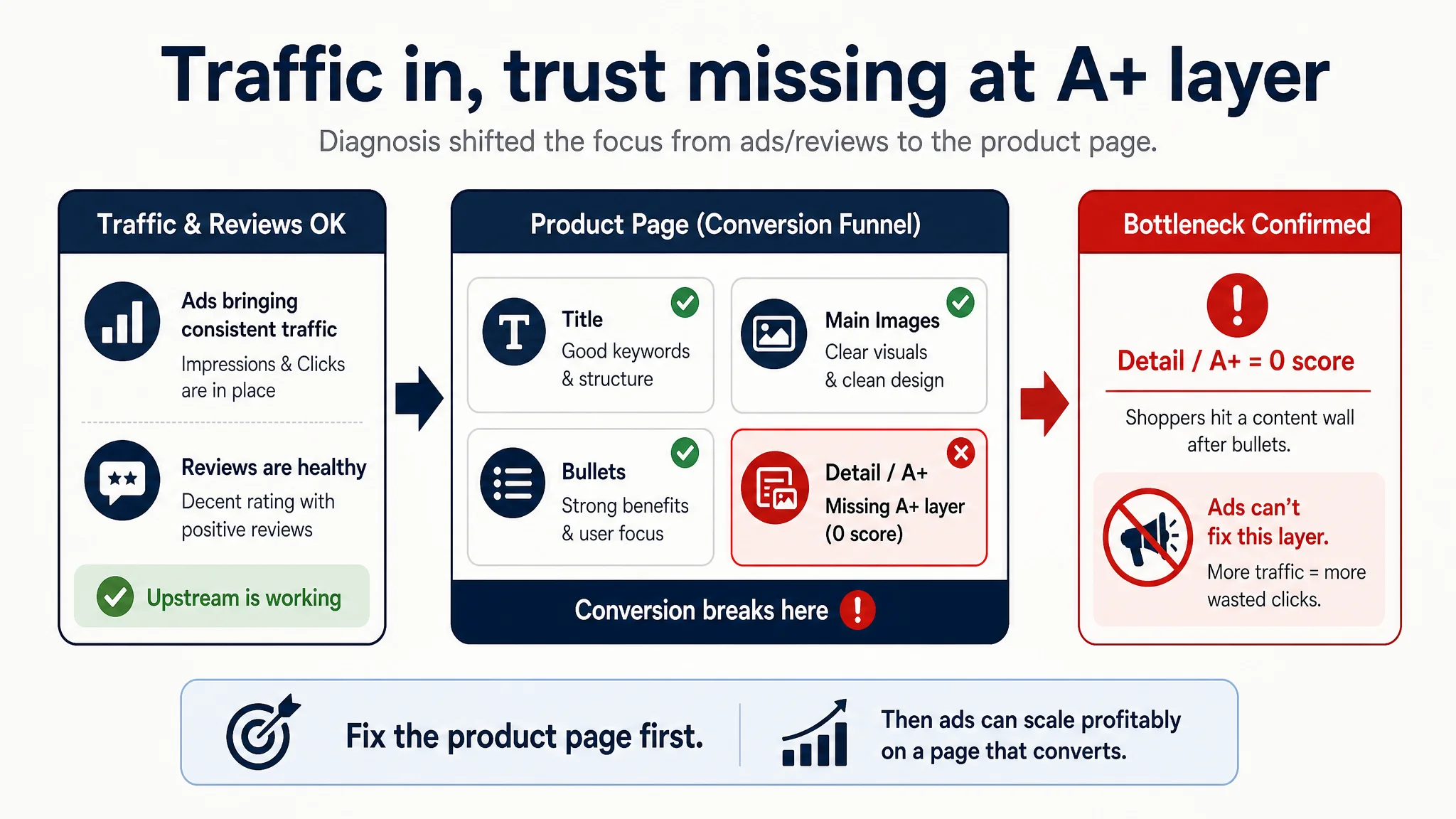
Once we put their Amazon Listing side by side with a benchmark competitor, the real constraint was obvious: the product page itself—especially the missing A+ content—was not building enough recognition and trust to convert the traffic it was already getting. Title, main image, and bullets were actually slightly stronger than the competitor. But the detail section scored 0 versus the competitor’s 21/25, creating a structural conversion handicap the ad team could never fix from the campaign console.
The later optimization work therefore did not start with more bid changes or new keyword packs. It started with rebuilding the visual and narrative logic of the Amazon product page: a more focused title, a clearer benefits-driven bullet structure, and a full A+ story that turned abstract advantages like “dense flannel” and “easy cleaning” into concrete, photographed proof. For other Amazon sellers, this case is a reminder: when ads feel “expensive” and you keep suspecting targeting or creatives, check whether your Listing has the conversion capacity to deserve more traffic in the first place.
The initial impression: “Our Listing isn’t bad. Why are we still losing?”
This case centers on a reusable flannel coffee sock filter on Amazon US.
When the seller first looked at their page, the conclusion was: “We’re basically fine; we just need more traffic and more reviews.”
- Title covered multiple use scenarios (Cuban coffee, manual drip, tea).
- Main images looked cleaner and somewhat more modern than the competitor’s.
- Bullet points were structured and user-benefit oriented.
- Rating was 4.2 stars with no visible negative reviews.
On the surface, nothing screamed “conversion disaster.” Yet when we ran DeepBI’s Listing scoring and direct benchmark comparison, the numbers told a different story:
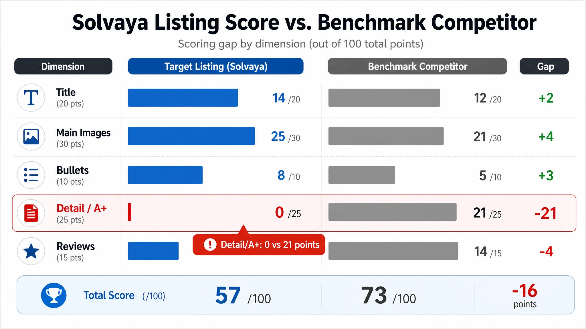
- Overall score:
- Target Listing: 57/100
- Benchmark competitor: 73/100
- Gap: -16 points
- By dimension:
- Title: 14 vs 12 (seller slightly ahead)
- Main image set: 25 vs 21 (seller ahead)
- Bullet points: 8 vs 5 (seller ahead)
- Detail/A+ content: 0 vs 21 (seller far behind)
- Reviews: 10 vs 14 (seller behind on volume, not on sentiment)
From a distance, the page looked “good enough.” Under scoring, one fact stood out:
The page was competing with three strong blocks and one gaping hole. That hole was big enough to drag the total Listing into a weak zone.
The seller’s misdiagnosis was simple: they treated this as an ads/review issue, while the real bottleneck was a missing trust and explanation layer in the detail section.
Amazon ads were not failing. The page was consuming the traffic.
From an operations standpoint, the seller’s pressure was real:
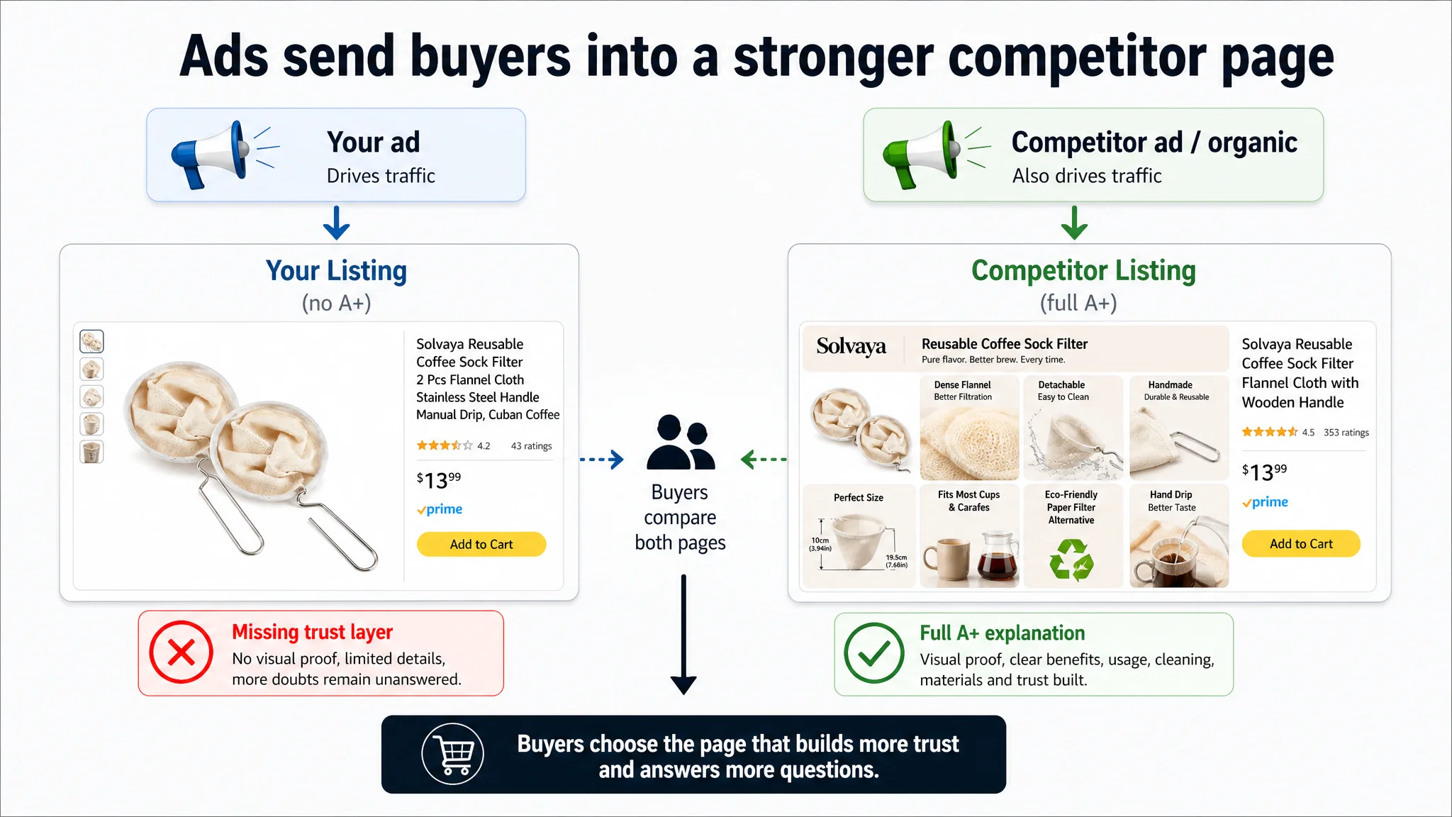
- Benchmark competitor had 8.2× more reviews (353 vs 43).
- The competitor’s rating was slightly higher (4.5 vs 4.2).
- The competitor had full, structured A+ content with multiple conversion-oriented modules.
In this context, every incremental click bought through Amazon ads carried extra risk:
- Ads brought visitors into a comparison environment where the competitor looked “more professional” and “better explained.”
- The seller’s Listing delivered stronger title and bullets, but no visual proof of flannel density, cleaning ease, or real usage scenarios.
- Once users scrolled below the bullets, they hit a wall of missing content.
This is where the traditional ad-optimization mindset gets trapped:
- When ACOS is high, the default reaction is: reduce bids, refine keywords, tweak placements.
- When that fails, the next guess is: ad creatives aren’t compelling enough; redesign the ad images.
But in this case, the problem was not the ad side of the funnel.
The real issue was that the product page did not provide enough visual and structural information to convert paid traffic into orders.
Ads were doing their job—bringing shoppers in. The Listing had not been built to answer the last-mile questions that actually generate a purchase.
The real constraint was Listing conversion capacity, not keyword quality
DeepBI’s scoring surfaced an unusual pattern:
- Title, main images, bullet points: all scored higher than the benchmark.
- Detail/A+ section: scored 0 where the competitor held a strong 21/25.
If title and bullets are the “headline and elevator pitch,” the A+ and detail content are the “full sales conversation.” This Listing was essentially:
- Shouting the value proposition in the upper fold, but
- Remaining silent when users wanted proof, clarity, and reassurance.
The competitor’s A+ design revealed what was missing:
- Modular layout: brand header, hero module, size diagrams, usage scenarios, before/after or new/old comparisons, functional six-grid detail, close-up grip shots.
- Visual explanation: flannel weave, density, coffee extraction process, detachable structure, cleaning steps.
- Decision support: specs, materials, environmental value, target user scenarios, precautions.
In other words:
The competitor’s A+ walked users through “What is it? How does it work? Is it easy to live with? Can I trust it?” The seller’s page left those questions largely unanswered.
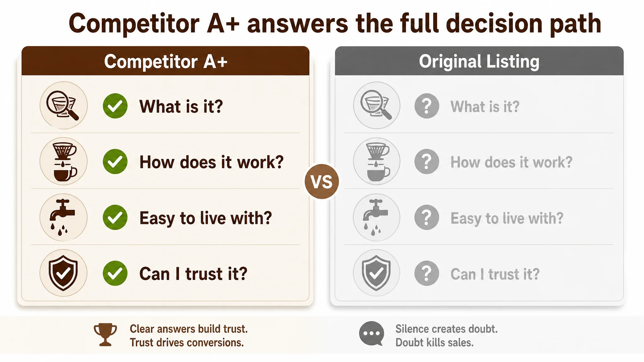
This is why DeepBI judged that Listing conversion capacity, not ad setup, was the core constraint. Until that was fixed, more traffic would simply mean more spend to feed a structurally incomplete page.
Why DeepBI did not recommend “keep tuning ads” first
With a clear 0 vs 21 gap in the detail dimension, DeepBI’s decision logic was:
1. Paid traffic was already sufficient to reveal a problem.
Ads were not starved; they were underperforming because the page couldn’t close the sale.
1. Upper-funnel content was not the weakest link.
Title and main-image scores were actually stronger than the competitor’s:
- Title captured multiple scenarios and clear attributes (2 pcs, stainless steel handle, flannel cloth).
- Main images were cleaner but underleveraged in storytelling (more on this below).
1. The biggest commercial risk was continued spend into a page with a missing trust layer.
Any ad improvement would still feed into:
- No visual representation of flannel density.
- No visual breakdown of detachable structure.
- No clear proof of ease of cleaning.
- No explicit visual argument for “reusable cloth vs disposable paper.”
Fixing ads first would be treating a fever while ignoring the infection.
Before scaling ad spend, the product page had to earn the right to receive more traffic.
So the first priority became: reconstruct the Listing to build a full “decision path” from thumbnail to A+.
This product page did not lack traffic. It lacked a clear buying story.
When we broke down each section, the pattern repeated: content elements existed, but the overall buying logic was incomplete.
1. Title: strong ingredients, but needed sharper keyword weight
The seller’s title already did many things right:
- Covered usage scenarios: Cuban coffee, manual drip, tea strainer.
- Clarified quantity and material: 2 pcs, stainless steel handle.
- Included multiple keyword phrases.
The improvement opportunity lay in weight distribution, not in adding more words:
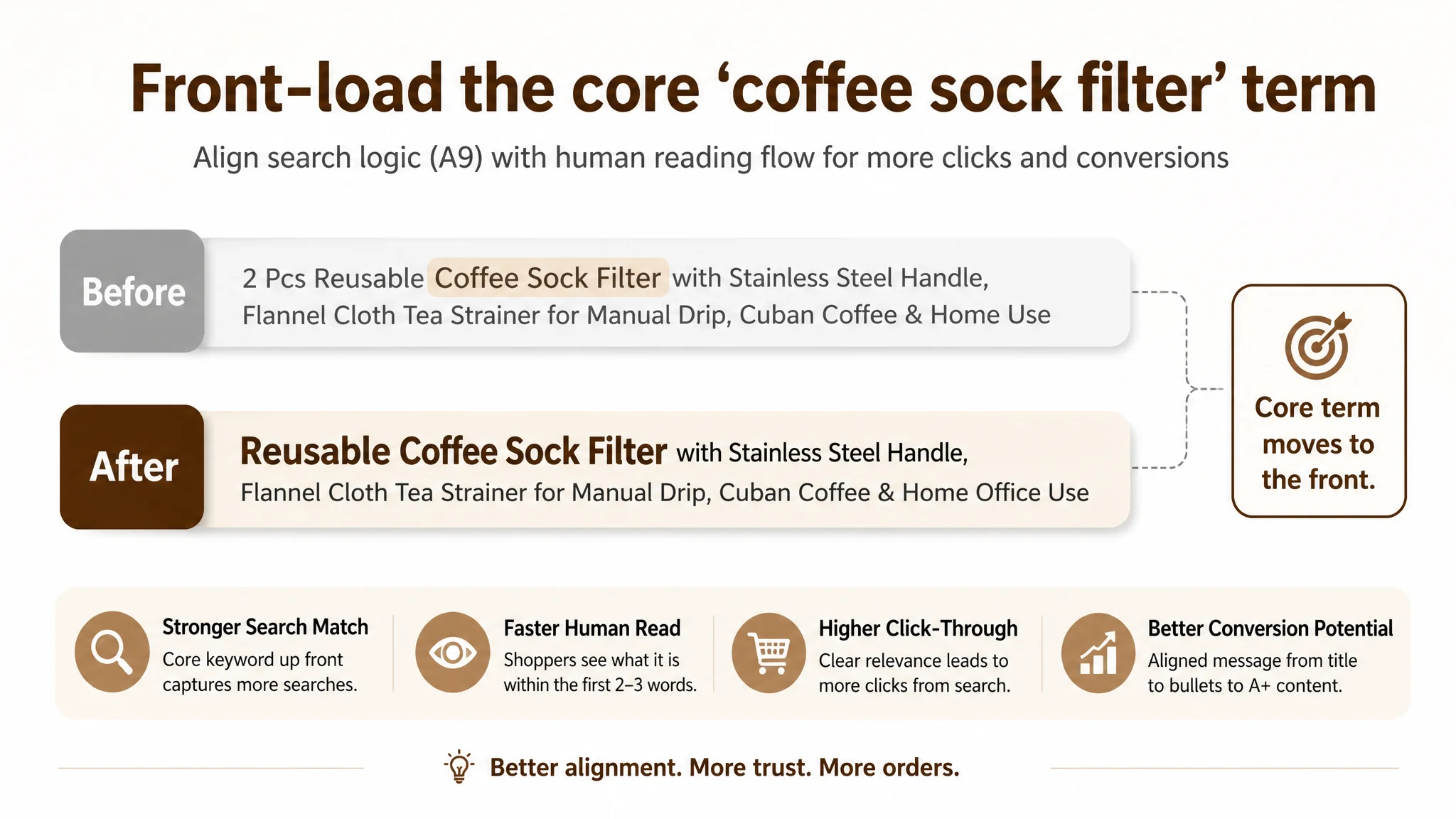
- The competitor front-loaded the core term “Coffee Filter,” gaining search-weight advantage.
- The seller’s original title scattered “filter” variations further back.
DeepBI’s recommendation reframed the title around:
- Core keyword first: “Reusable Coffee Sock Filter” at the front.
- Essential materials: “Flannel Cloth” + “Stainless Steel Handle.”
- Focused scenarios without redundancy: manual drip, Cuban coffee, home/office use.
This was not cosmetic. It aligned Amazon A9 logic (keyword positioning) with human reading flow, making the Listing more discoverable and more immediately understandable.
2. Main images: decent quality, incomplete decision coverage
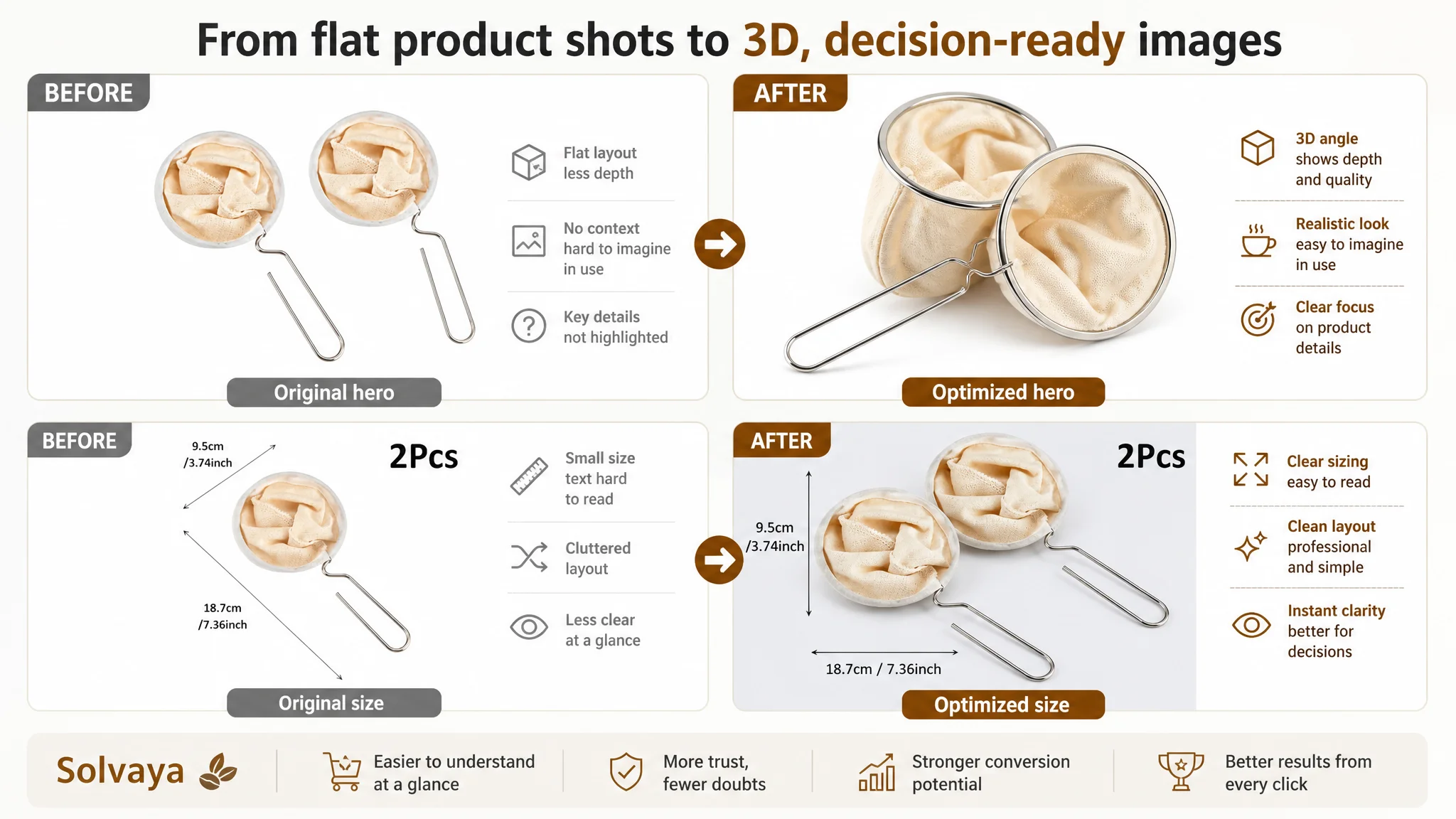
The scoring showed the seller ahead on main-image quality, but the set had structural issues:
- Too much static product-only presentation.
- Insufficient context for use, size, material, and cleaning.
- Overuse of text-heavy infographics that strain mobile viewing.
The competitor did a better job at emotional and functional framing:
- Hand-held shots with wood handles.
- Coffee in the cup, not just in the air.
- Clear “manual brewing ritual” vibes that speak to enthusiasts.
DeepBI’s assessment was not “your images are ugly.” It was:
Your images do not yet guide the buyer through how to use this tool, why it feels premium, and why it is easy to live with day after day.
So the image plan prioritized:
- A more three-dimensional hero image (45° side view, overlapping two units, clean white background).
- Clean dimension image with minimal text and clear 2 pcs call-out.
- A four-step assembly grid to demystify installation.
- Micro-detail of flannel weave to translate “dense filtering” into something the eye can verify.
- A dismantled layout to show detachable cleaning and hygiene.
- In-hand shots for proportional sense and ergonomics.
- Real brewing scene images with steam, water flow, and coffee extraction.
3. Bullet points: logic was good, but the claims needed more specificity
The bullets already had better structure than the competitor’s:
- Started with core benefit and effect (smooth flavor, reusable).
- Consistently framed features as user benefits.
- Created a logic chain from material → flavor → cleaning → use cases → size.
What they lacked was precision and category-specific credibility:
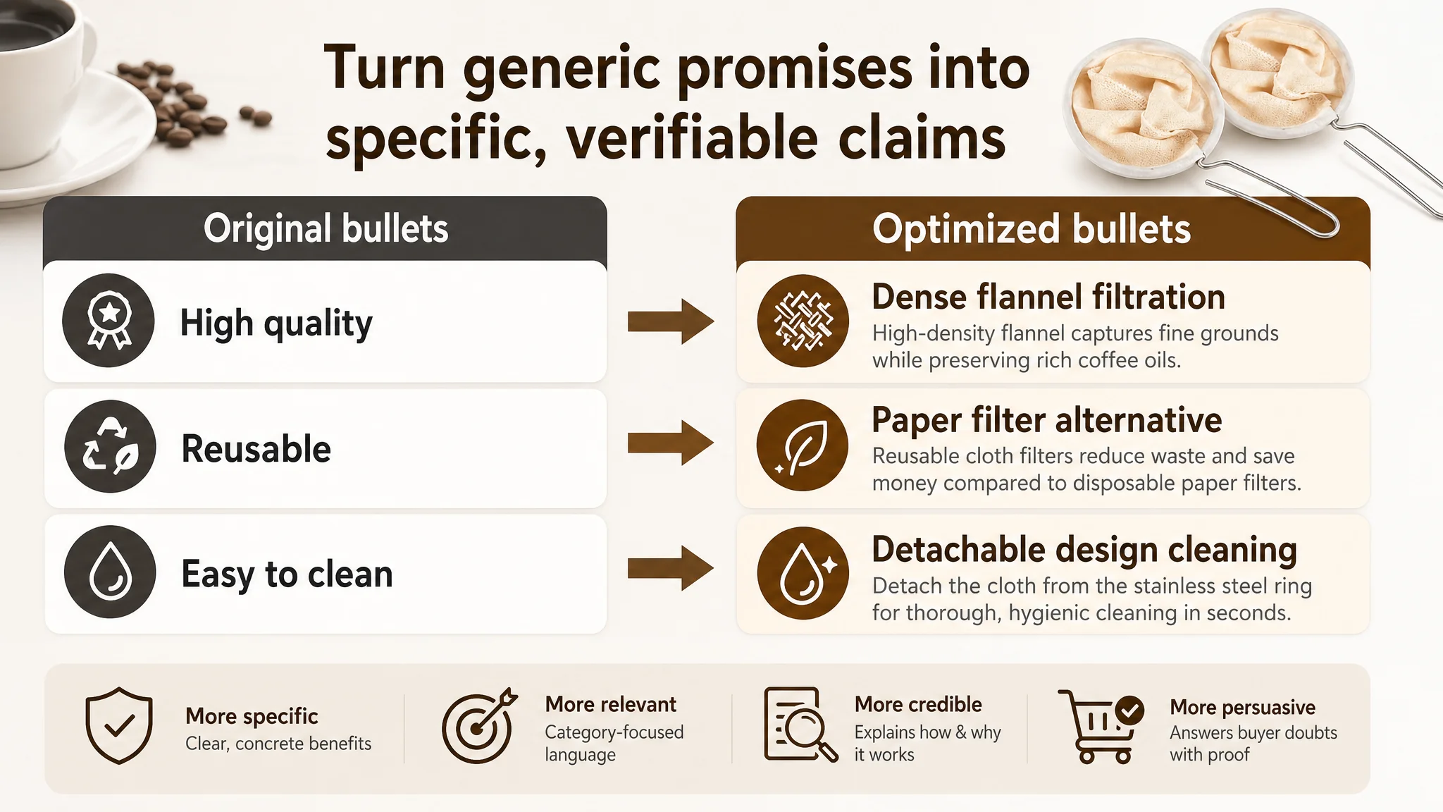
- “High quality” needed to be tied to flannel density and oil extraction.
- “Reusable” needed to be framed explicitly as a filter paper alternative, with environmental and cost implications.
- “Easy to clean” needed to reference the detachable cloth structure, not just generic washing.
- “For coffee enthusiasts” needed to map to manual hand-drip ritual without expensive machines.
DeepBI’s suggested bullets did exactly that:
- “Superior flannel filtration” with dense inner layer capturing fines while letting oils through.
- “Eco-friendly filter paper alternative” emphasizing hundreds of uses and waste reduction.
- “Detachable design for easy washing” clarifying frame/cloth separation.
- “Essential tool for hand drip coffee” specifying 4-inch size and context of use.
- “Reliable quality for coffee lovers” focusing on durability and consistent flavor, framed in a policy-compliant way.
The core change: the bullets stopped sounding like a generic eco-product and started sounding like a tool designed for a specific brewing culture.
4. Detail/A+ content: the missing trust chain
This was the decisive weakness.
- The seller had no A+ modules at all—no images, no structured text blocks.
- The competitor had a full suite of A+ sections that visually resolved nearly every buying hesitation:
- Is the cloth truly dense enough?
- Will it fit my kettle/mug?
- Is it hard to clean?
- How does it look and feel in a real brewing routine?
- Is it really better than paper filters over time?
The A+ gap translated into:
- No visual proof of unique value.
- No structure to the story.
- No reinforcement of upper-funnel promises with lower-funnel proof.
DeepBI’s judgment: this is not a cosmetic issue—it is a conversion foundation issue. Without A+ modules, the Listing’s ability to justify its price, its ritual appeal, and its eco positioning was almost zero.
Turning abstract claims into visual proof: how the A+ story was redesigned
DeepBI’s optimization plan focused on rebuilding the A+ as a sequence of specific, photographed assurances rather than generic lifestyle imagery.
The core pillars for this category were clear:
1. Dense filtering and pure flavor
2. Easy, hygienic cleaning via detachable structure
3. Comfortable, ergonomic handling
4. Reusable economic and environmental logic
Each A+ image recommendation corresponded to a specific psychological barrier:
Dense flannel → “Can it really filter fine grounds and keep flavor?”
- Micro close-up of flannel weave occupying most of the frame.
- Controlled lighting to highlight thickness and density.
- Background blur to keep focus on fabric structure.
This converts “high-density flannel” from a phrase into a visible property.
Dimensions and fit → “Will it work with my equipment?”
- Clean, minimal sizing image on light gray background.
- Clear length and diameter marked with simple lines and sans-serif fonts.
- No clutter, so the data is the only focal point.
This addresses fit anxiety for different kettles, mugs, and carafes.
Detachable cleaning → “Is cleaning annoying or unhygienic?”
- Deconstructed view of frame and flannel fully separated.
- Bright, clean background to signal hygiene.
- Light angled to show stainless steel clarity and cloth cleanliness.
This says: “You can get into every corner. Nothing stays trapped forever.”
Brewing scene → “Will this give me the experience I’m buying into?”
- Hand holding the filter, hot water pouring, coffee dripping into transparent glass.
- Warm kitchen background, slightly blurred.
- Color emphasis on the rich brown coffee stream.
This establishes the product as part of a desirable daily ritual, not just a tool.
Paper vs cloth → “Why not just keep using paper?”
- Split-screen: product on one side, piled paper filters on the other.
- Conscious color contrast: product vibrant, paper dull.
- Simple visual implication: one durable item vs many throw-away items.
This anchors the eco and cost-saving story in a single glance.
Ergonomic handle → “Will it feel solid and safe in my hand?”
- Close-up of an adult hand naturally gripping the handle.
- Background of blurred coffee beans.
- Light emphasizing curvature and texture.
Even though this particular seller uses a stainless handle (the competitor used wood), the same principle applies: show how the grip works and why it’s stable.
Cleaning in practice → “Will it ever really feel clean?”
- Flannel opened under running water in a real sink.
- Cool color tone to signal cleanliness.
- Crisp detail to show water flowing through and taking residue away.
This image directly tackles the main reason many users hesitate to move from paper to cloth: fear of residue and bacteria.
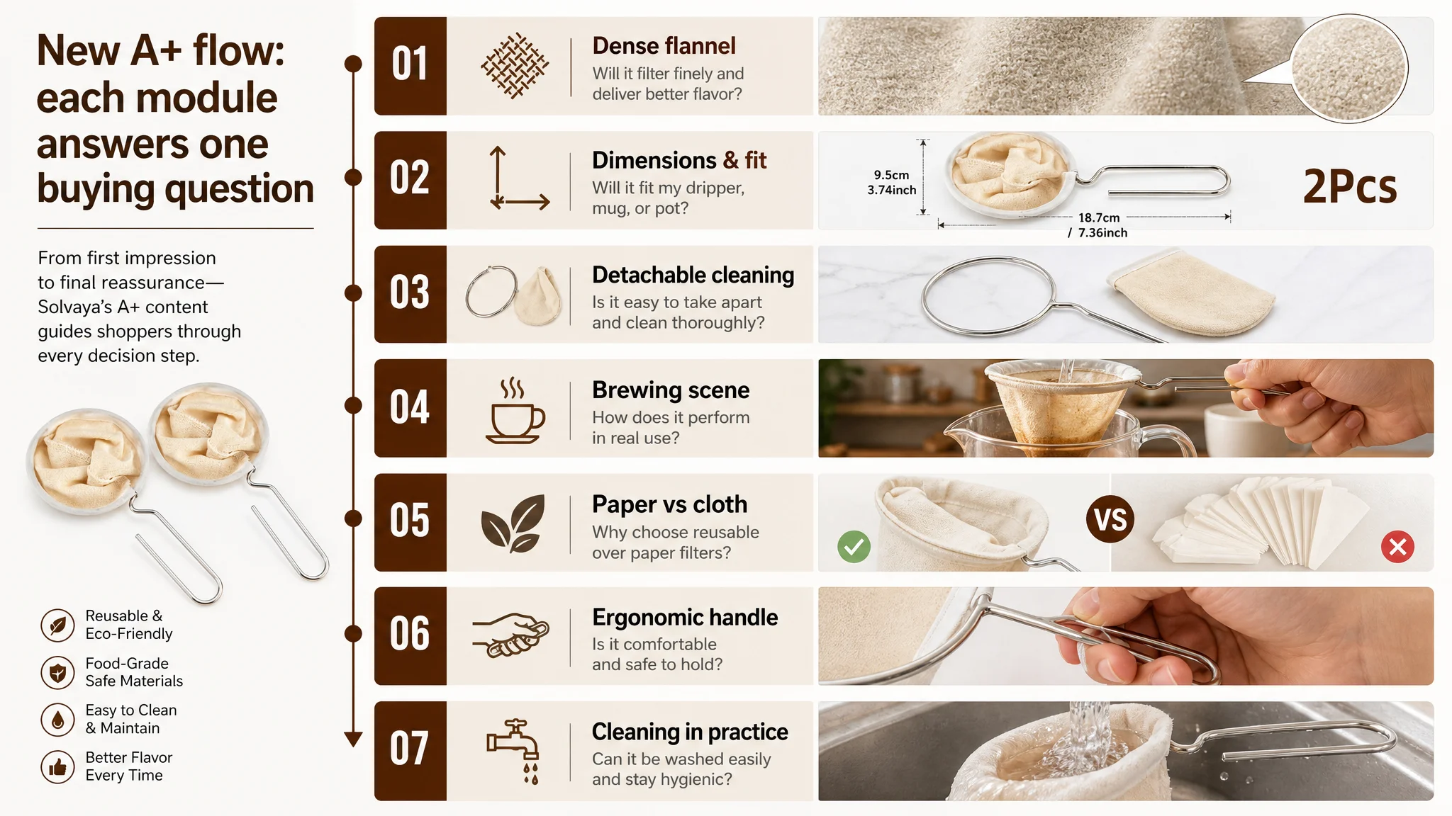
By the time a shopper scrolled through this redesigned A+ flow, every major objection—fit, flavor, hygiene, effort, eco logic—would have been addressed with both text and visuals.
How this changed the role of ads: from “wasteful” to “leveraged”
After the Listing diagnosis and content reconstruction, the seller did not suddenly obtain more reviews or an instant category crown. But the operating state of the product changed in several important ways:
- The Amazon Listing started to look and feel like a coherent brewing tool, not just a commodity accessory.
- The page gained the ability to convert both organic and paid traffic more consistently:
- Better alignment between search keywords and title.
- Stronger click rationale from main images.
- A+ providing the missing trust chain.
From an advertising perspective, this meant:
- Each paid click now landed on a page that could actually carry the user across the decision line.
- ACOS had a path to move down logically—not via arbitrary budget cuts, but via higher CVR.
- The seller was less forced to overpay for traffic just to maintain rank.
Even without quoting specific metrics, the directional effect matters:
The Listing regained sales capability; ads became a traffic amplifier, not a cost amplifier.
What other Amazon sellers can take from this case
Several patterns in this coffee filter case are common across many Amazon categories:
1. High ACOS is often a Listing problem wearing an “ads” mask.
When title, images, bullets, and especially A+ are not aligned, ads amplify weaknesses instead of strengths.
1. A slightly “stronger-looking” Listing can hide a structural gap.
This seller’s title and bullets were better than the competitor’s, but a 0 vs 21 detail score erased those advantages.
1. Reviews volume matters, but it is not the only trust source.
A page with fewer reviews but solid A+ storytelling can still compete, especially when the competitor’s A+ is the real decision driver.
1. Listing optimization is not just cosmetic editing; it is decision-path engineering.
Title gets the click. Images create initial trust. Bullets articulate benefits. A+ resolves doubts. All of these must cooperate.
1. Before scaling ads, ask one key question:
“If I doubled my traffic tomorrow, is my product page ready to double its orders—or just double its wasted clicks?”
In this case, DeepBI’s value was not in pushing another “optimize your ads” message. It was in showing where the Amazon Listing’s logic actually broke, quantifying the gap with a benchmark, and reordering the seller’s priorities:
- Fix Listing conversion first.
- Then let ads do what they are meant to do: amplify a page that deserves to be seen.