

This case comes from an Amazon seller in the daily‑living aids category. Their product is a simple but important tool: a button hook and zipper helper for seniors and people with weak hands. The team kept feeling that “traffic is the problem” and tried to lean on Amazon ads, but the numbers refused to move the way they expected. DeepBI’s diagnosis showed something more fundamental: the page itself had almost no ability to convert the traffic it was already getting.
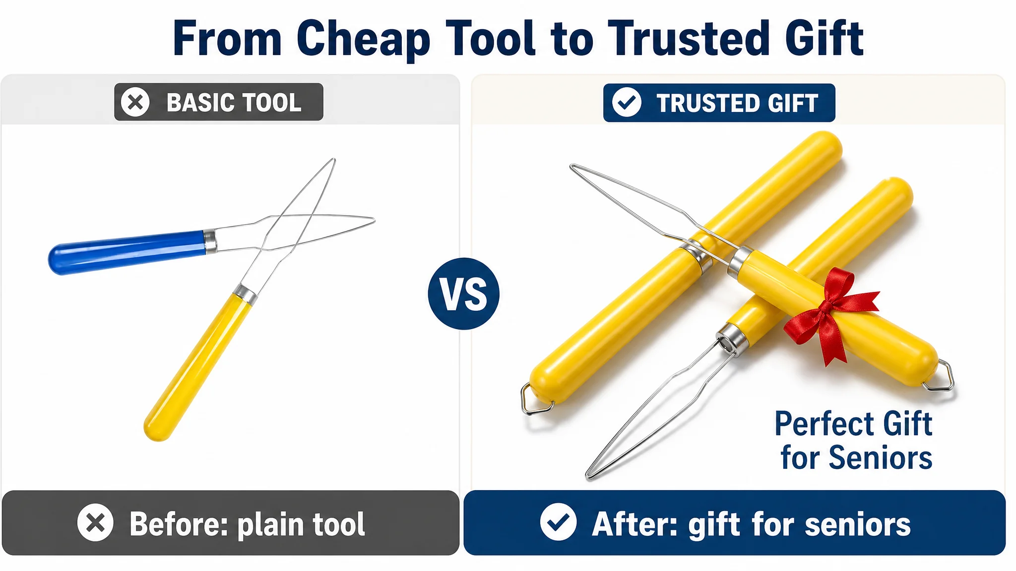
The customer originally believed the gap came from “not enough reviews” and “images not pretty enough,” so their efforts stayed around small ad tweaks and minor creative adjustments. But when we compared their Amazon Listing against a category-leading competitor, the real picture was stark: a total Listing score of 48 vs. 85, and a devastating −21‑point gap on the detail/A+ module alone. In other words, this Listing wasn’t just slightly weaker; it was structurally unable to carry visitors from click to purchase.
Once we reframed the problem as “a conversion‑capacity issue,” the optimization focus shifted: not “how do we buy more traffic?” but “how do we make each visit worth more?” DeepBI guided the team to rebuild the title logic, remake the main-image set around independence and gift value, and construct a new A+ story that turned a cheap tool into a credible self-care companion. Ads only started to make sense again after the page learned how to sell.
For other Amazon sellers, this case is a reminder: Amazon ads are not a universal fix. When ACOS feels stubborn and clicks don’t turn into orders, the answer is often not “more campaigns” but “a better story on the page.” Listing conversion and advertising efficiency are the same problem seen from two sides; if the page can’t convert, every extra dollar of traffic is just feeding the leak.
What the Seller Saw: Ads Getting “Expensive,” Orders Lagging Behind
From the seller’s perspective, the situation looked familiar:
- They were running Amazon ads to drive visibility in a competitive category.
- A well‑known competitor on the same marketplace appeared everywhere: sponsored placements, top of search, and a rich product page.
- When our customer increased spend, impressions and clicks could move, but orders did not rise proportionally, and ACOS felt hard to control.
The internal explanation stayed on the surface:
- “Our price is similar; maybe we just lack reviews.”
- “Our images are simple; if we polish them a bit and push more ads, conversion will follow.”
- “Competitor’s brand is more recognized; we just need more traffic to catch up.”
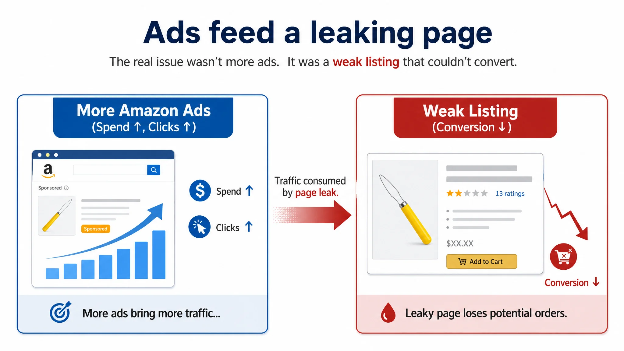
The operating pressure was real: advertising costs were rising, but the product page was not turning traffic into stable sales. The team kept touching ad knobs because those were visible and familiar. What they lacked was a hard, quantified view of how weak the Listing was compared with the best in the category.
The Core Misdiagnosis: Treating a Page Problem as an Ads Problem
DeepBI’s Listing scoring made the gap immediately visible:
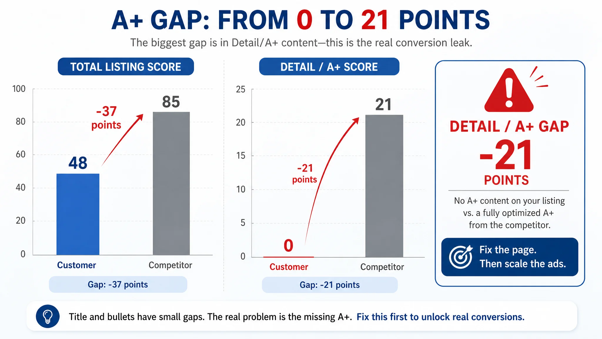
- Customer Listing total score: 48/100
- Benchmark competitor Listing total score: 85/100
- Gap: −37 points
Breaking that down:
- Title: Customer: 14, Competitor: 16, Max: 20, Gap: −2
- Main Image Set: Customer: 21, Competitor: 27, Max: 30, Gap: −6
- Bullet Points: Customer: 7, Competitor: 8, Max: 10, Gap: −1
- Detail / A+: Customer: 0, Competitor: 21, Max: 25, Gap: −21
- Reviews: Customer: 6, Competitor: 13, Max: 15, Gap: −7
Two things became obvious:
1. This was not a pricing or small-copy issue.
The detail/A+ dimension scored 0 against a fully developed competitor at 21/25. There was literally no persuasive A+ content where the competitor had built a full visual and emotional funnel.
1. The Listing’s biggest leak sat after the click.
Title and bullet gaps were modest. The main-image gap was meaningful but not fatal. The fatal issue was: once shoppers reached the detail page, there was nothing to build trust, nothing to tell the story, nothing to connect the product to the buyer’s real-life struggle with dressing.
“The real problem was not that ads failed to bring traffic. It was that the page could not convert the traffic.”
As long as the seller believed “this is mainly an ads tuning issue,” they were destined to keep spending into a page that lacked basic conversion infrastructure.
Amazon Ads Were Not Failing. The Page Was Consuming the Traffic.
When we examined the Listing against the benchmark, the pattern was consistent: at every step where the competitor reduced friction and built confidence, the customer’s page stayed at a functional, tool‑only level.
Title: Functional Words vs. Decision Words
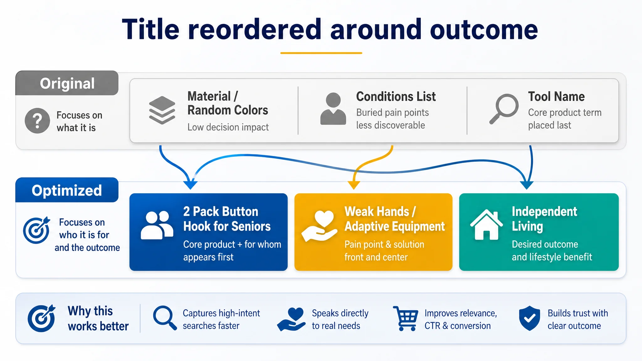
The competitor’s title structure:
- Leads with the core product term “Button Hook” and pack size “2 Pack” for SEO and clarity.
- Uses “Gifts for Seniors” to directly tap into the gift‑buyer intent.
- Calls out “Weak Hands” as a standalone pain point, aligned with how buyers actually search.
- Wraps up with adaptive-equipment language that signals medical/assistive credibility.
The customer’s original title:
- Buried the functional core behind less important phrases, and pushed “Random Colors” into the visible title, weakening perceived professionalism.
- Bundled multiple conditions (“Arthritis, Parkinson’s”) in a flat, comma-separated way, instead of highlighting “weak hands” as a precise, highly searched problem keyword.
- Missed the “for seniors / gifts” decision hooks that convert caregivers and family members.
The title wasn’t “bad,” but it lacked strategic ordering and intent coverage. It did not instantly tell a caregiver: “This is exactly the tool that lets your mother button her shirt by herself again.”
Main Images: A Tool on a White Background vs. A Story of Independence
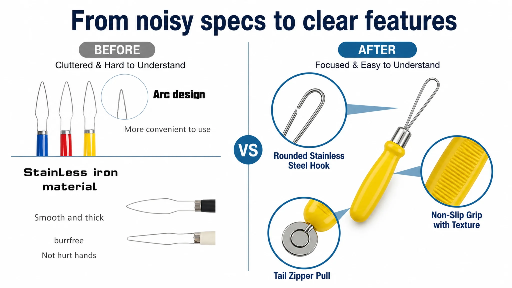
In the main-image set, the competitor leveraged every slot:
- Branded, clean primary image with subtle gift cues.
- Clear size visualization plus portability scenes (suitcase, backpack, bag) to reassure “easy to carry.”
- Macro close‑ups of steel hook, handle texture, zipper hook—each paired with short, clear text.
- Real seniors in warm, home environments tagged to specific use cases: arthritis, Parkinson’s, elderly, disabled.
- Action shots of a wrinkled hand actually closing a button—literal visual proof of “you can do this.”
The customer’s images:
- Lacked brand presence and emotional story; felt like “cheap tool on a white background.”
- Function shots relied on partial close‑ups with overlaid text instead of clear, real‑life usage.
- Tried to cram many ideas into a single crowded frame, leading to visual noise and diluted focus.
- Had no dedicated emphasis on portability, durability details, or the “gift for seniors” dimension.
On Amazon search results, where shoppers see thumbnails and make split‑second decisions, that difference likely translated into 15–20% lower CTR for the customer’s main image, especially on mobile.
Bullet Points: Describing a Tool Instead of Solving a Life Problem
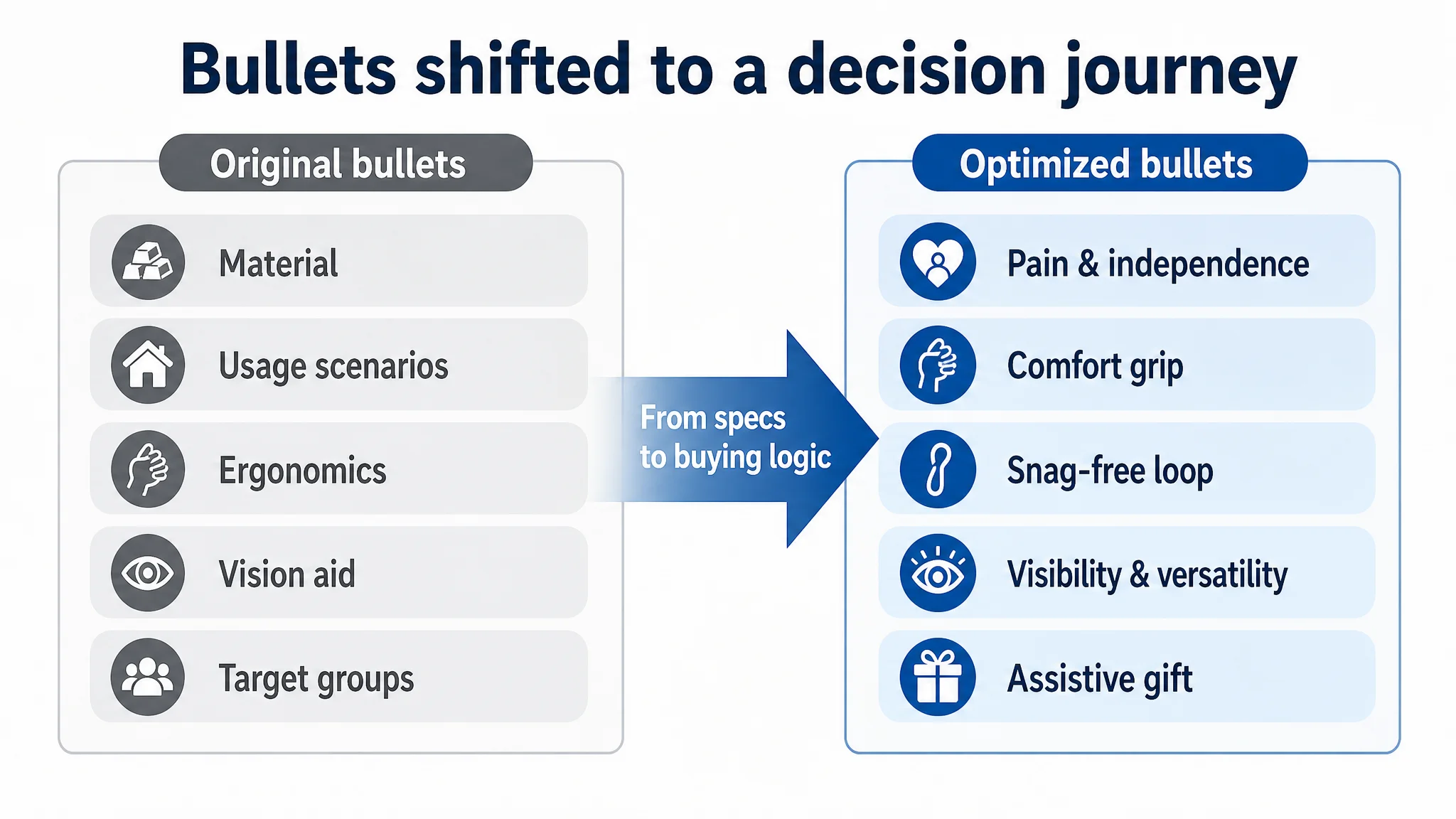
The competitor’s bullets followed a clear “pain → solution → emotional outcome” logic:
1. Start from struggle and frustration, promising effortless buttoning/unzipping and independence in dressing.
2. Tie comfort to extra health benefits (massage, blood circulation), creating value beyond basic function.
3. Call out support for the lowest grip strength, targeting the most severe cases.
4. Combine durability with non‑damaging design and compatibility with all zippers, offering a full daily-solution package.
5. Close on gift positioning and brand value: quality at a good price, a thoughtful gift choice.
The customer’s bullet structure:
- Opened with material and durability, not with the user’s daily struggle and pain.
- Stayed on generic ergonomic and anti‑slip claims, without expanding into specific “what changes in my morning?” benefits.
- Described a broad target group but did not speak to the heaviest‑need users with language like “weakest grip strength.”
- Ended on a generic target-group description instead of a strong gift and purchase-decision closure.
In short, information existed but buying logic did not. The page told “what it is,” not “what it solves.”
The Real Constraint Was Listing Conversion Capacity, Not Keyword Bids
The most critical evidence came from the detail/A+ dimension:
- Customer: no A+ content at all.
- Competitor: a fully developed A+ structure:
- Hero panel summarizing the 2‑in‑1 function.
- Clear list of target users (multiple conditions, elderly, post‑surgery).
- Step‑by‑step demonstrations for button and zipper functions.
- Emotional scene where the tool becomes a symbol of care and dignity.
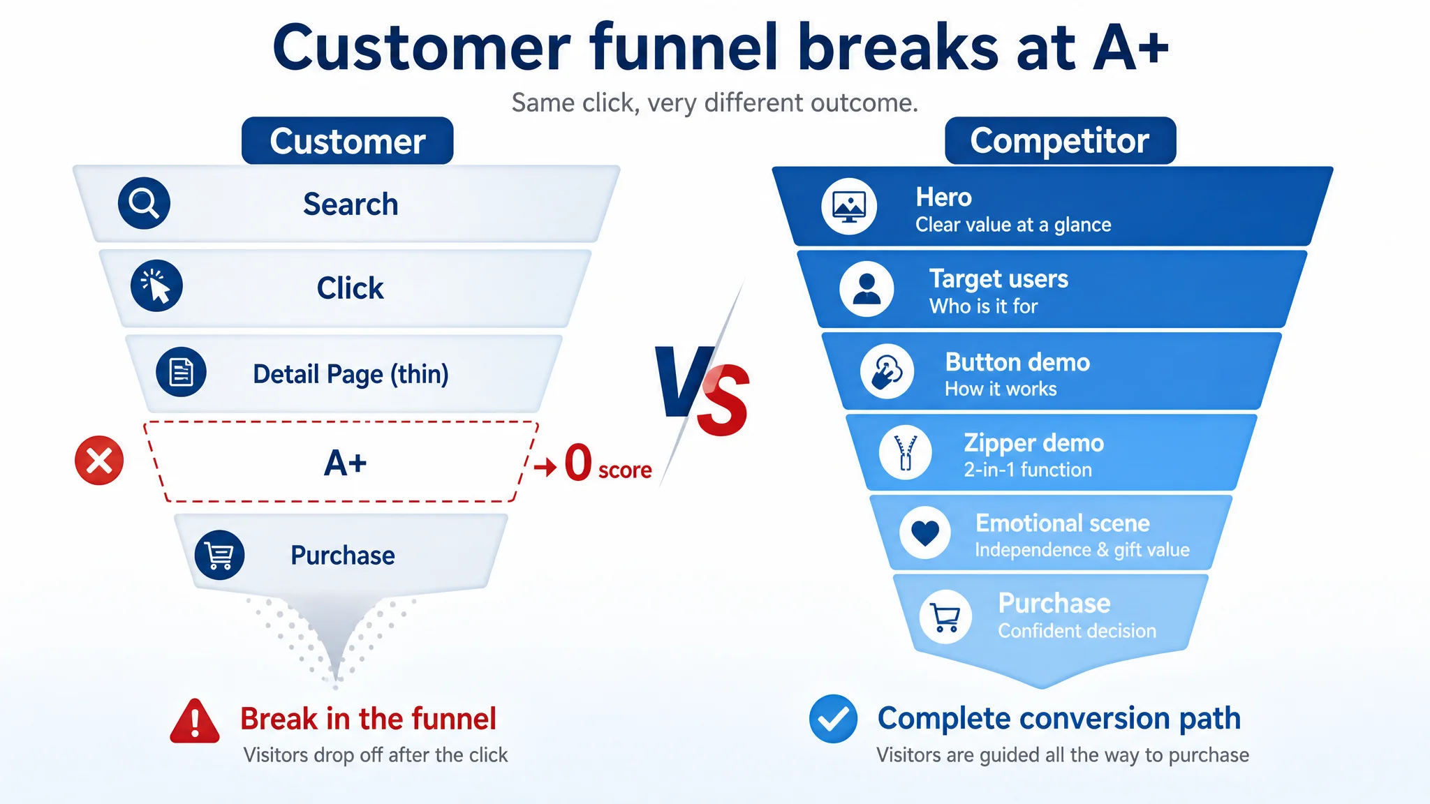
The competitor used the A+ to:
- Show high‑quality real photos plus zoomed details, building “this is solid and trustworthy” confidence.
- Follow a problem → solution → who benefits narrative that mirrors how caregivers think.
- Close with a warm, family‑oriented gifting context, reframing the purchase as a way to care for loved ones.
The customer’s Listing:
- Had zero A+ images, zero structured explanation, zero emotional reinforcement.
- Forced the shopper to imagine everything—from how the tool looks in hand to whether it actually works on delicate fabrics or specific clothing types.
- Broke the conversion funnel: even if someone arrived with intent, there was no final layer of persuasion to push them to “Add to Cart.”
Given this, DeepBI’s judgment was straightforward:
- Scaling ads with a 0‑score detail page is commercially unsafe.
Each incremental click lands on a page that fails to reassure, explain, or emotionally close. ACOS will remain unstable because the denominator (orders) cannot grow reliably.
- The Listing’s first priority is to earn the right to receive more traffic.
That means rebuilding the title, main images, bullets, and A+ so the page can stand in the same league as the benchmark.
Why DeepBI Did Not Recommend “Keep Tuning Ads First”
If you are only looking at ad reports, high ACOS often gets explained in ad language:
- “Maybe our bids are too high.”
- “Maybe we are targeting the wrong keywords.”
- “Maybe we need more negative keywords.”
But ad reports rarely tell you why shoppers didn’t buy after clicking. DeepBI’s Listing scoring provided that missing layer: by quantifying the gaps in title, images, bullets, A+, and reviews, it became clear where the leak actually sat.
In this case:
- Title and bullets: somewhat behind, but not catastrophic.
- Main images: clearly weaker, hurting CTR and initial trust.
- Detail/A+: missing altogether, causing a trust and explanation vacuum.
- Reviews: 4.4 stars with 13 total, against a competitor’s 4.7 stars and 1,383 reviews—trust gap magnified by the page’s lack of evidence.
Under these conditions, the biggest business risk was:
Every extra dollar of ads would mainly buy more visitors to “discover” that the page is under‑explained and under‑proven.
So the decision path was flipped:
1. Do not prioritize more granular ad tuning.
It would only mask the structural problem for a short time.
1. First, raise the Listing’s conversion capacity to a minimum competitive standard.
Only after the page can plausibly convert traffic like the benchmark does it make sense to push volume.
Rebuilding the Page: From “Cheap Tool” to “Independent Living Partner”
DeepBI’s Listing diagnosis translated into a focused optimization path. The goal was not cosmetic improvement; it was to align the entire page around a single promise: “Help seniors and people with weak hands dress independently and with dignity.”
Reframing the Title Around Outcomes and Search Logic
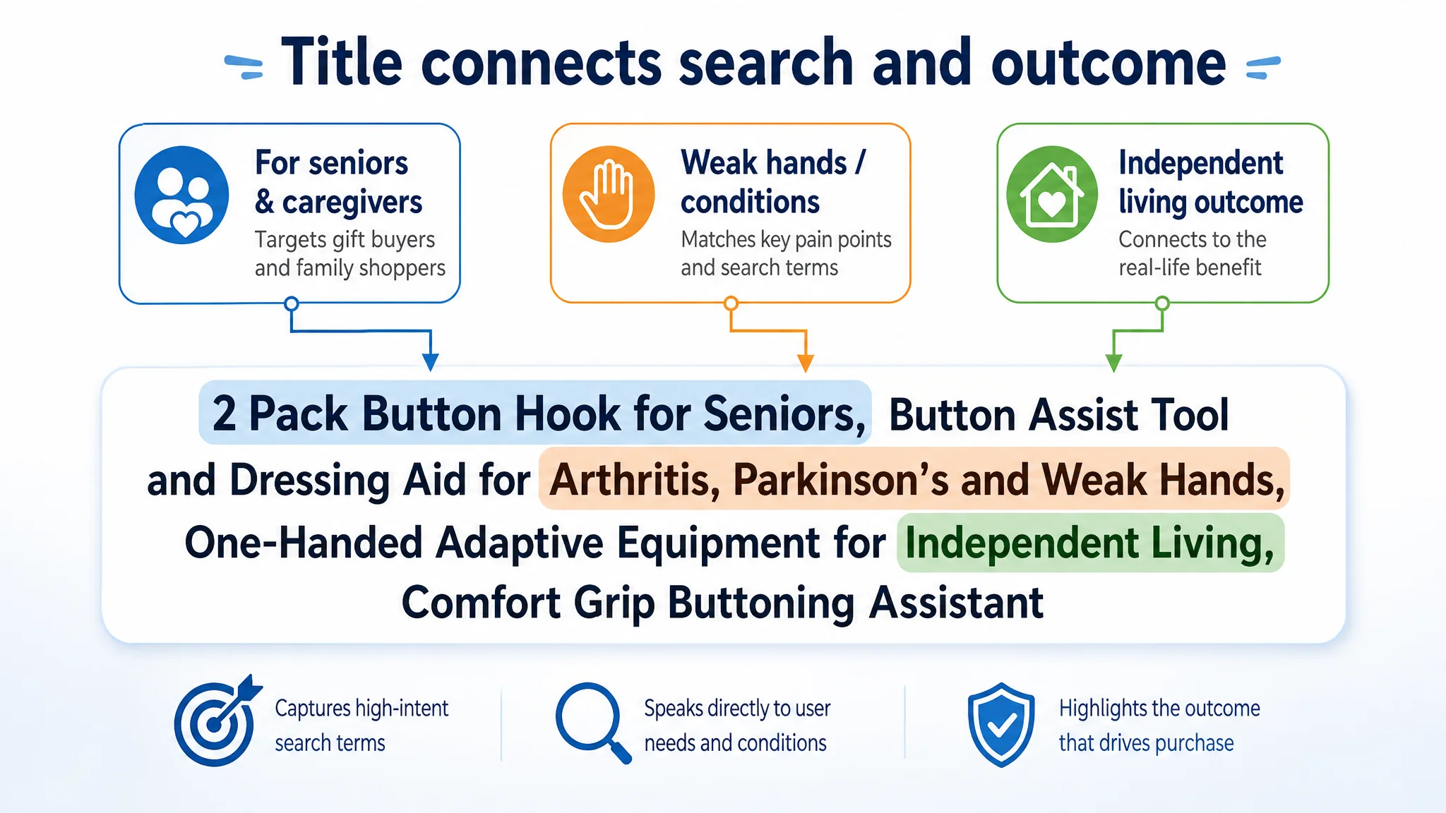
The proposed title:
2 Pack Button Hook for Seniors, Button Assist Tool and Dressing Aid for Arthritis, Parkinson's and Weak Hands, One-Handed Adaptive Equipment for Independent Living, Comfort Grip Buttoning Assistant
Key shifts in logic:
- Lead with “Button Hook for Seniors” and “2 Pack” to win the core search query and immediately state value.
- Emphasize “Weak Hands” and “Adaptive Equipment” to match how caregivers and occupational therapists actually search.
- Retain specific conditions (Arthritis, Parkinson’s) but tie them explicitly to “Independent Living,” turning a medical problem into a life outcome.
This isn’t just keyword stuffing—it rewires the title from “what the product is made of” to “who it is for and what it lets them do.”
Main Images: Designing for Clicks, Trust, and Emotional Fit
DeepBI’s visual guidance systematically rebuilt the main‑image set:
1. Primary image: from plain tool to “gift for seniors”
- Product centered, cross‑placed at a dynamic angle on clean white background.
- Soft studio lighting, clear shadows to give depth and quality.
- A small red ribbon at the handle and a discrete “Perfect Gift for Seniors” text badge.
This directly targets the buyer segment that matters most: people shopping for parents, grandparents, or patients.
1. Size + portability image
- Horizontal product with dimension label (“7.4 in / 18.8 cm”) and three circular mini-scenes showing it in a suitcase, backpack, and tote.
- Caption “Easy to Carry,” answering the “Will this fit my routine?” question.
1. Material macro with visualized features
- 60‑degree angled product with three zoom bubbles:
- Rounded stainless-steel hook.
- Anti‑slip handle texture.
- Zipper hook at the tail.
- Short labels explaining each: snag‑free, anti-slip, zipper assist.
This replaces cluttered text overlays with a clean, professional, data‑like presentation.
1. Target user grid
- Four warm, in‑home scenes of seniors with gentle labels: “Arthritis,” “Parkinson,” “Elderly,” “Disabled.”
- Soft colors and natural window light reinforce the human side of the product.
1. Action shot: the decisive moment
- A wrinkled senior hand using the tool to fasten a shirt button.
- Focus on the hook and button connection point, with a subtle “Button Assist” tag.
This image answers the “Does it really work for hands like mine?” doubt in one glance.
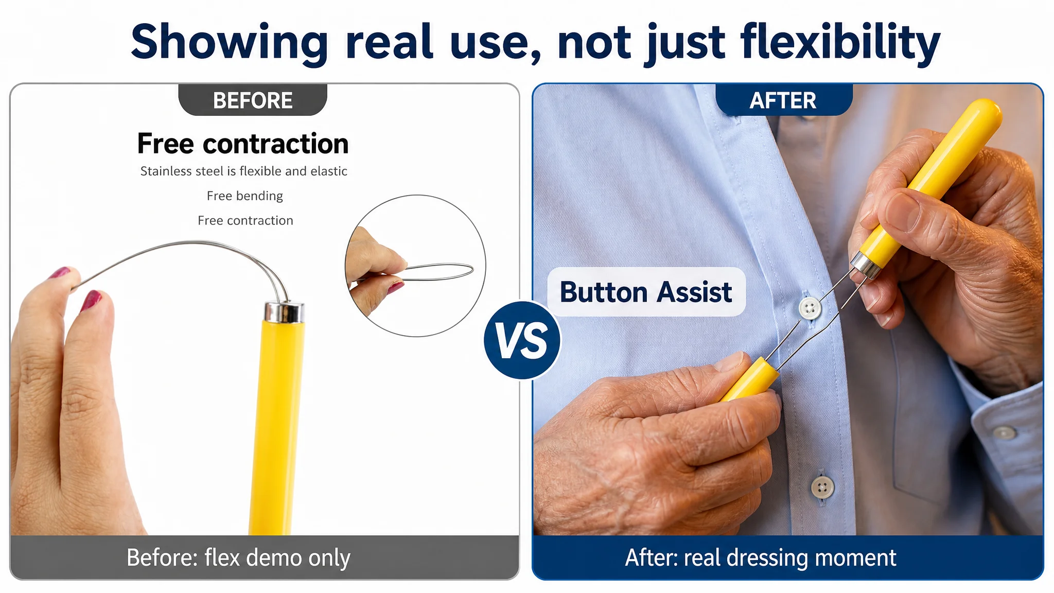
Collectively, these changes aim to:
- Lift CTR by giving shoppers a reason to click beyond a generic tool shot.
- Reduce hesitation on the detail page by showing real use, real hands, and real life.
- Align visual message with the title and bullets: independence, ease, and care.
Bullet Points: From Specifications to a Persuasive Journey
DeepBI’s bullet recommendations reorganized the content into a decision path:
1. EFFORTLESS BUTTONING & INDEPENDENCE
Lead with the core promise: “Regain your confidence and independence in dressing.” Address pain and frustration of buttoning with arthritis, weak grip, or carpal tunnel. This mirrors the competitor’s successful first bullet but ties more clearly to emotional outcome.
1. ERGONOMIC COMFORT GRIP HANDLE
Explain how the cushioned, non‑slip, wide handle reduces pressure on hands and fingers for limited mobility. It’s no longer a generic “ergonomic handle” claim; it’s directly linked to the problem: “I can’t hold small tools firmly.”
1. SNAG-FREE & DURABLE STEEL LOOP
Reassure buyers worried about delicate fabrics: slim yet strong metal loop, smooth finish, secure buttons without damaging clothes. This removes a common hidden objection: “Will it ruin a dress shirt or a dress?”
1. HIGH VISIBILITY & VERSATILE DESIGN
Convert “random colors” into a functional benefit: vibrant colors help visually impaired users see the tool more easily; works on shirts, dresses, collars for one‑handed dressing.
1. THOUGHTFUL ASSISTIVE GIFT
Position it clearly as a daily living aid for Parkinson’s, tremors, post‑surgery recovery—and as a practical gift that simplifies a loved one’s morning routine.
Instead of five disconnected product attributes, the bullets now read like a coherent answer to:
- What problem are we solving?
- How does the design help my specific limitations?
- Will it damage my clothes?
- Does it fit my life context and emotional needs?
- Is this a good gift decision?
A+ Content: Building the Missing Persuasion Layer
The most dramatic change had to happen in the A+ area, where the Listing previously had nothing.
DeepBI’s guidance broke the new A+ into clear modules:
1. Opening hero: the 2‑in‑1 independence partner
- Warm bedroom or wardrobe background.
- Product at the center with a clear “Button + Zipper Helper” statement.
- Visual atmosphere of calm, self‑sufficient morning dressing.
1. Macro demonstration: precision you can trust
- High‑contrast macro of the steel loop passing through a buttonhole.
- A hand with visible joint lines holding the handle.
- Emphasis on ease and precision for limited finger control.
1. Zipper versatility: jeans to winter coats
- Split image: one side jeans, one side heavy down jacket, both being assisted by the tool.
- Highlight “Works with different zipper types” to demonstrate everyday coverage.
1. Handle detail: you can feel the grip through the screen
- Pure white background, strong side light, close‑up of anti‑slip grooves.
- Visual emphasis on friction and thickness, turning a texture claim into something visually obvious.
1. Morning routine scene: dignity and routine restored
- Silver‑haired person sitting on the edge of the bed, sunlight, shirt on lap, the tool resting next to glasses.
- Focus on the product, but context hints at independence, not clinical equipment.
1. Exploded view: durability and construction
- Clean, technical style layout with labels such as “high‑strength flexible steel wire” and “reinforced hook.”
- This addresses fears about breakage and quality, especially when the competitor has many reviews and social proof.
1. Gift box and call to action
- Open gift box with two tools inside on a wood surface, warm accent lighting.
- Gifting cues making it easy for a shopper to imagine presenting it to a loved one.
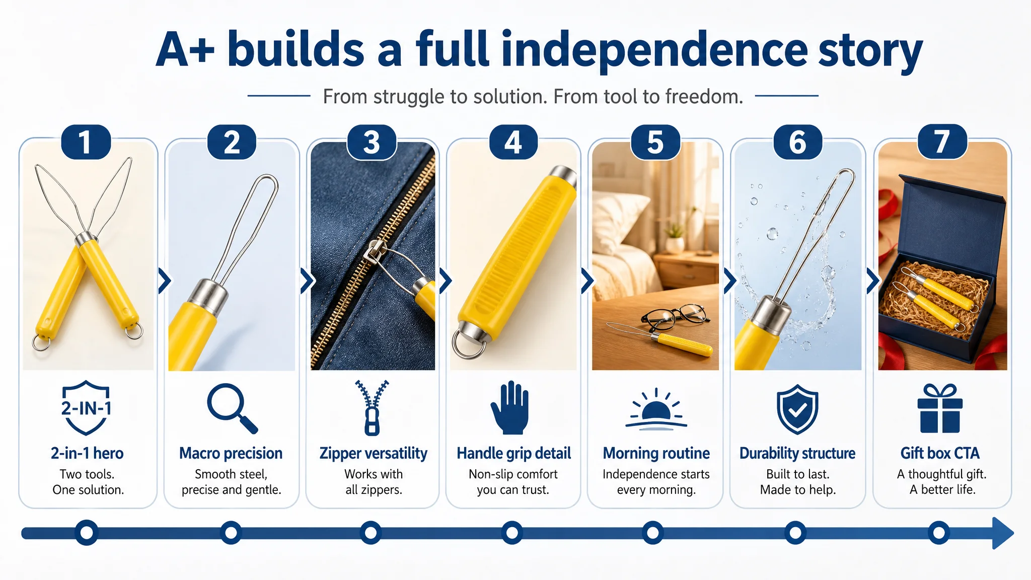
In a category where the product is small and inexpensive, A+ content is often the difference between “another cheap tool” and “a serious assistive solution.” For this Listing, adding A+ is not an upgrade; it is the missing core of the sales story.
How Ad Traffic Became Useful Again
Without changing the product itself, the Listing’s role changed:
- The title now captures high‑intent Amazon search terms while clearly signaling who the product is for and what outcome it offers.
- The main-image set creates clicks and trust by visually narrating independence, ease, and gifting.
- The bullets guide the reader from pain and fear to clarity and reassurance.
- The A+ gives a structured explanation, shows real use, and anchors the product as a credible assistive device.
Once this conversion foundation is in place, Amazon ads can:
- Drive traffic into a page that has a realistic chance of matching the benchmark’s conversion behavior.
- Lower wasted clicks, because fewer shoppers bounce due to missing information or trust.
- Gradually help the Listing accumulate more reviews and social proof, further stabilizing conversion.
Even without inventing specific numbers, we can describe the business shift:
- Conversion capacity improved: The page can now explain, prove, and emotionally support the purchase.
- Ad dependence becomes healthier: Ads are no longer used as a band‑aid over a weak Listing but as a lever on a solid page.
- Risk decreased: Each click carries less downside risk because the odds of becoming an order are higher.
- Team understanding changed: They stopped seeing ads as the single battlefield and started treating Listing quality as the baseline of every ad decision.
What Other Amazon Sellers Can Take From This Case
For Amazon sellers across categories, the lesson is consistent:
- When ACOS is stubborn and scaling ads only magnifies losses, do not assume it is purely an ads problem.
- If your Listing scores low on detail/A+ and is clearly weaker than a benchmark, your page—not your bids—is the limiting factor.
- Title, main images, bullets, A+ and reviews are one system. If one major module (like A+) is missing, the entire conversion logic is impaired, and ads cannot fix that.
DeepBI’s value in this case was not in “creating prettier images” or “writing nicer copy.” It was in reframing the problem: from “our ads and creatives need tweaking” to “our Amazon Listing cannot yet convert the traffic we are buying.”
Before you commit more budget to Amazon ads, ask a hard question:
“Does my product page deserve more traffic?”
If the honest answer is no, this case shows where to start.