

This case comes from an Amazon seller in the US marketplace, operating a travel makeup mirror / vanity mirror SKU. The team had been under pressure from rising Amazon ad costs and slow order growth, and their first reaction was familiar: “We must be losing because we don’t have enough reviews, so we should just push more ads and get more orders.” What they did not expect was that, against a benchmark listing with over 6,000 reviews, their own Amazon Listing quality score was not actually the main weakness—and that the real leak was how the page guided decisions from search results all the way through to the product detail.
DeepBI entered when “keep raising bids” and “wait for more reviews” stopped working. By comparing this Listing against a category-leading competitor, the system showed that visual and copy logic on the page was not aligned with how buyers were actually searching and deciding: the title was mis-positioned, the main image lacked a clear click reason, the A+ story leaned too heavily on aesthetic mood, and the “travel” and “vanity” scenarios were not made explicit where they matter most. At the same time, the customer’s A+ modules were actually stronger than the competitor’s on structure and information—but they were not being used to close the specific trust and use-case gaps that ads were paying to bring in.
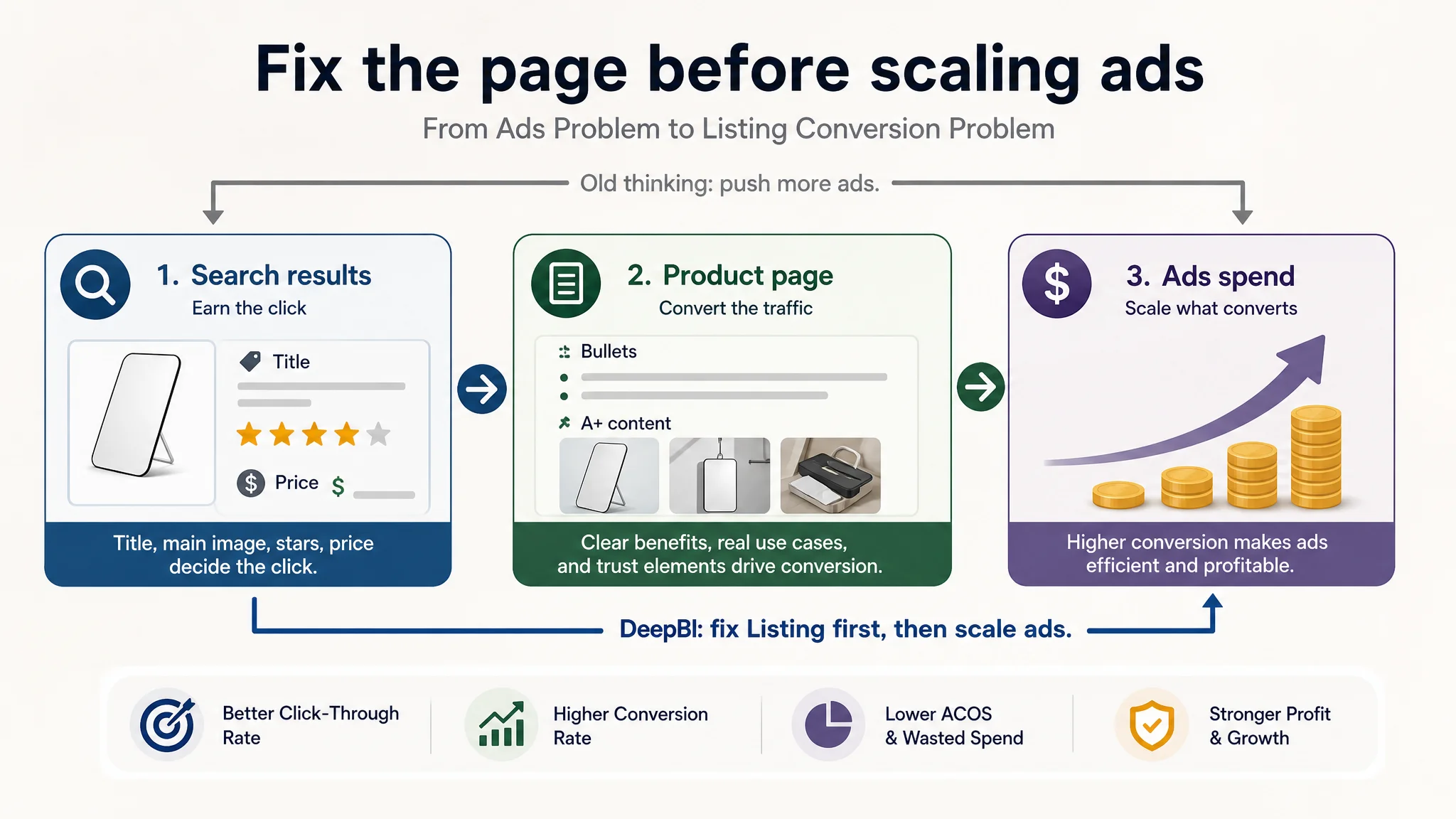
The optimization did not start from bidding, placements, or campaign restructuring. Instead, it focused on Amazon Listing conversion capacity: reframing the title around “travel vanity” intent, restructuring bullets into pain‑point/solution logic, and rebuilding main and secondary images to visually prove portability, hanging use, and bathroom / travel scenarios. Only after the product page could reliably convert did ad traffic begin to make economic sense again. For other Amazon sellers, this case is a reminder: when ACOS feels “stuck” and a huge review gap makes you want to blame ads, it is often the Listing—especially the main image and title-level positioning—that is quietly consuming your budget.
What the Seller Saw: A Growing Pressure on Ads and Reviews
The product page is a travel / vanity table mirror on Amazon US.
On paper, the Listing did not look like a disaster:
- Overall Listing score: 72/100
- Benchmark competitor: 74/100
Only a 2‑point gap.
But at the business level, the contrast was sharp:
- Seller’s reviews: 64 total, 4.2 stars
- Benchmark’s reviews: 6,608 total, 4.6 stars
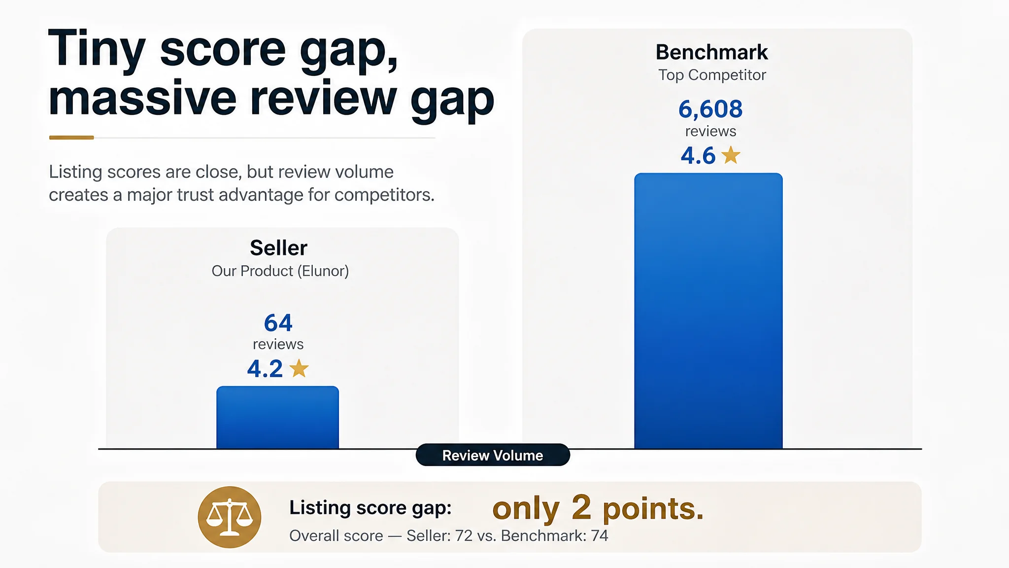
The competitor had roughly 100x the review volume and a higher rating. In the search result grid, this alone created a strong trust bias. Under traffic pressure, the seller drew two quick conclusions:
1. “We are losing because we don’t have enough reviews.”
2. “If we keep pushing ads and hold bids, orders will accumulate and the review gap will gradually narrow.”
So the operating plan became:
- Maintain or even increase Amazon ads investment
- Try to stabilize ACOS through bid micro‑tweaks
- Expect that more traffic + time will eventually close the trust gap
However, as spend continued, orders and conversion did not improve at the expected pace. ACOS was hard to bring down, and TACOS remained heavy. The seller started to question whether keywords, bids, or campaign structure were “wrong,” keeping attention locked on the ads console.
The Original Misdiagnosis: Treating a Page-Level Issue as an Ads Problem
From the seller’s perspective, the core obstacles seemed to be:
- “Not enough reviews”
- “Maybe our ads are not targeted or optimized enough”
So the team cycled through classic Amazon ads moves:
- Adding / trimming keywords
- Adjusting bids
- Rebalancing branded vs generic terms
- Tweaking budgets based on ACOS
Yet the core symptoms stayed:
- Exposure was not the bottleneck
- Click‑through rate in search was not improving as hoped
- Conversion rate on the product page remained fragile relative to ad spend
What was missing from this logic was a simple but critical question: Even if ads bring the right traffic, does this Amazon product page actually deserve it?
DeepBI’s diagnosis started from that point.
“Advertising does not only amplify advantages. It can also amplify a page’s existing defects.”
Once this was treated as a Listing conversion problem, the evidence lined up quickly.
Listing Scores: Where the Real Constraint Was Hiding
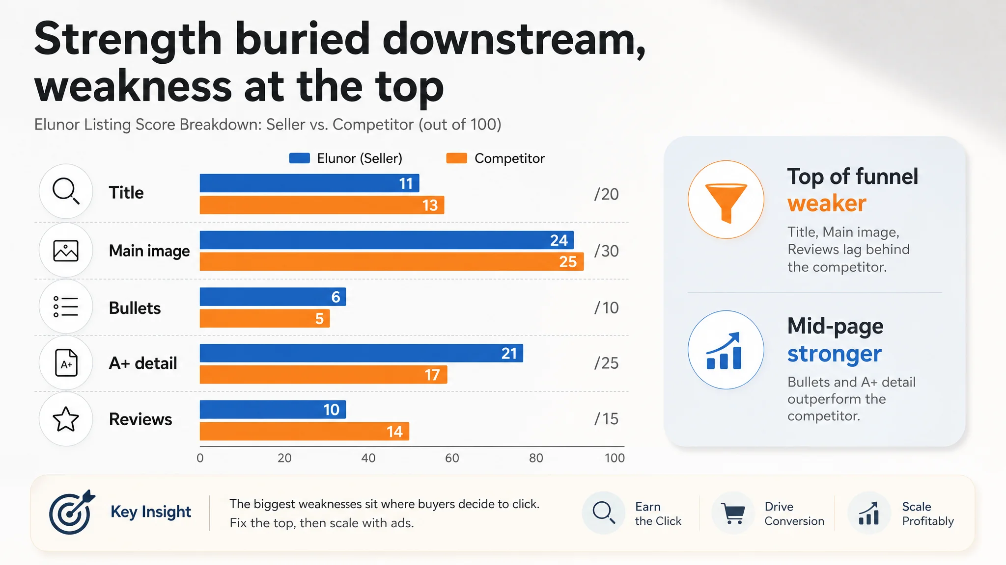
The DeepBI Listing scoring made one thing clear: the biggest structural gap was not overall “page quality,” but where the strengths and weaknesses sat relative to the benchmark.
Score comparison
- Overall: Seller 72 vs competitor 74
- Title: 11 vs 13 (‑2)
- Main image: 24 vs 25 (‑1)
- Bullet points: 6 vs 5 (+1)
- Detail / A+ content: 21 vs 17 (+4)
- Reviews: 10 vs 14 (‑4)
On the surface, the seller even outperformed the competitor on A+ depth and bullet logic. The competitor’s advantage came from:
- Slightly better title and main image alignment
- A very strong review profile
The crucial insight: the page’s “smartest” part (A+ and bullet logic) was buried downstream in the funnel, while the “weakest” parts (title and main image) were exactly where search traffic makes its first decision.
This meant:
- Ads were being judged in a battlefield dominated by title, thumbnail, star rating, and price
- The seller’s best content only appeared after a click, so it had no influence on whether the click would happen in the first place
- The seller was paying for traffic that the search results presentation did not earn efficiently
In other words, Amazon ads were not failing alone; the Listing’s top-line decision hooks were under‑serving the traffic.
Title: When “Desk Mirror” Missed the Real Search Intent
The benchmark’s title did two things better:
1. Positioning the use case:
- Competitor: “Table Desk Vanity Makeup Mirror”
- Seller: focused on “Desk” and generic “Makeup Mirror”
Putting “Vanity” forward aligned directly with how buyers search when they want a mirror for makeup and grooming, not just a generic desk mirror. It also signaled a more specific, aspirational use case that justifies attention and price.
1. Highlighting decisive functionality:
- Competitor clearly mentions “90° Adjustable Rotation”
- Seller only uses a generic “Foldable”
“Foldable” is weak as a conversion phrase because many low-end mirrors are foldable. “90° Adjustable Rotation” immediately frames comfort and usability—exactly what users care about when imagining daily use.
1. Expanding coverage and clarity:
- Competitor adds “(Gray)” at the end, supporting color-related search queries and clear SKU recognition
- Seller’s title has acceptable “makeup mirror” keyword placement but leans toward flat feature listing rather than outcome‑oriented value
DeepBI’s title recommendation reframed this:
OMIRO Travel Makeup Mirror, 8" x 5" Portable Folding Vanity Desk Mirror with Adjustable Stand and Hanging Hole for Shaving, Bathroom Shower and Traveling, Black
The logic:
- Bring “travel makeup mirror” and “vanity” into the front segment for search weight
- Explicitly tie the product to high-intent scenarios: shaving, bathroom shower, traveling
- Use “Portable” and “Adjustable” to convey clear functional advantages, not just generic descriptors
This shift was not cosmetic. It rewired how the page competes on the search results page, where ad impressions and organic impressions blend together.
Main Images: A Page That Looked “Pretty” but Did Not Create a Reason to Click
Both the seller and competitor had decent base photography. The issue was not “ugly pictures,” but role misalignment:
- The seller’s main images leaned into static aesthetics and minimalism
- The competitor’s set walked users through “bathroom install + vanity table + travel storage” across the carousel, covering the full usage lifecycle
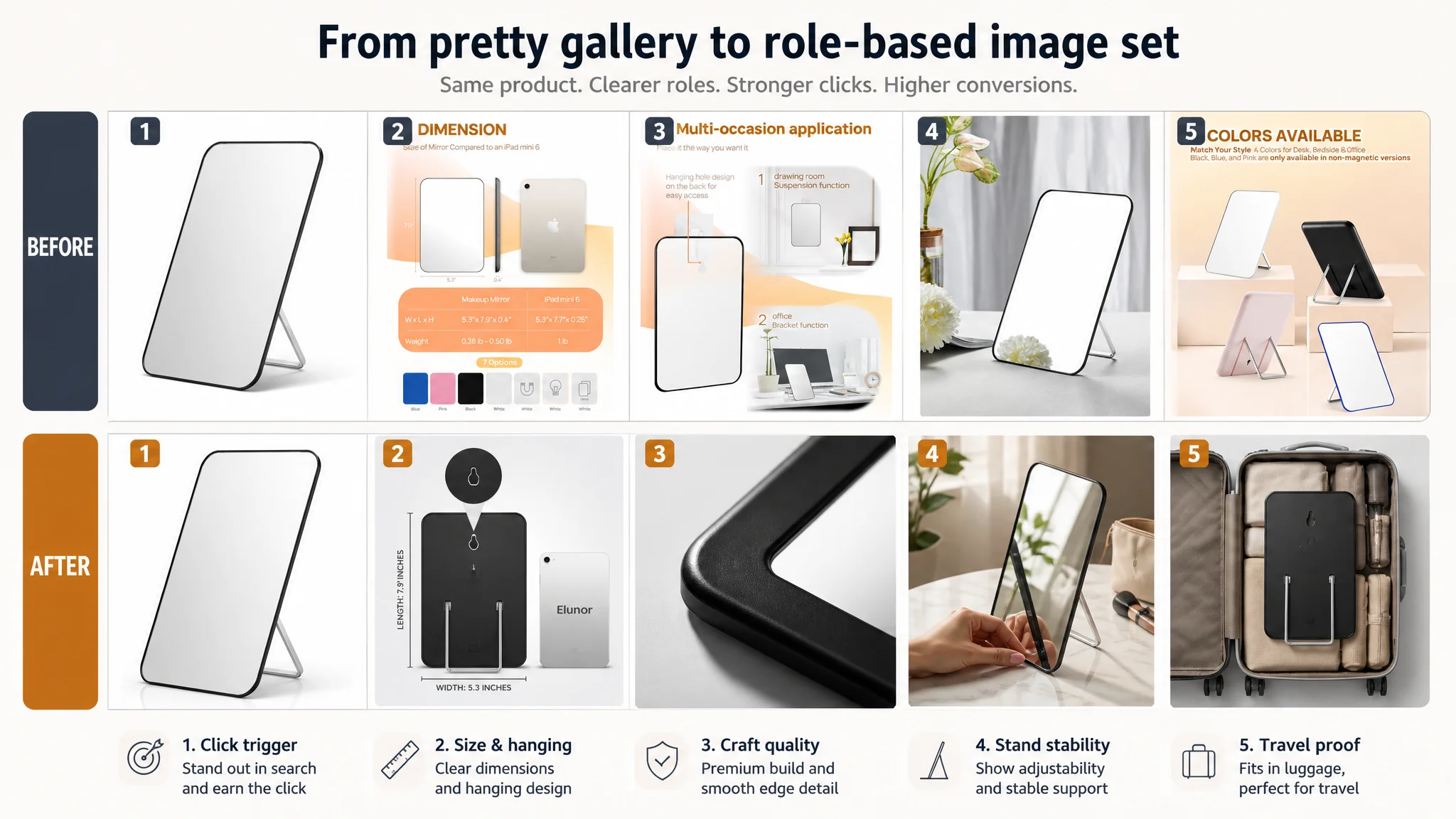
DeepBI’s visual analysis identified several functional gaps:
1. No sharp, differentiated hook in the first thumbnail
- The seller’s first image lacked a strong memory point
- In a crowded search grid, that likely meant a 3–5% lower CTR vs. the competitor
1. Weak proof of real use
- Very limited imagery of hands adjusting the stand, packing into luggage, or hanging in a bathroom
- For a higher-ticket everyday tool, buyers needed to see how it solves daily problems
1. Travel and multi-scene value buried
- The mirror was framed more like a design object than a “must have” travel/vanity tool
DeepBI did not just suggest “better images”; it broke down each image’s decision role and rewrote the image plan accordingly:
Image 1 – The core click trigger
- Product centered, ~75% of the frame
- Slight right 30° angle to show mirror area + slim frame
- Pure white background, high-contrast cool tone to accentuate the black frame lines
Purpose: At a glance in search results, transmit “large visible area + clean, modern design”—the visual promise that earns a click.
Image 2 – Removing size and hanging doubts
- Back view centered, flat frontal angle
- Subtle gradient background
- Bubble close-up on the hanging hole
- Simple length and width labels, plus an iPad mini sized reference
Purpose: Answer “how big is it” and “how do I hang it” in a single glance—critical for users comparing multiple similar mirrors.
Image 3 – Proving industrial quality
- Micro shot of the frame corner at 45°
- Strong side light to define curvature and finish
Purpose: Convert “cheap plastic worry” into “refined industrial design”, especially important for users suspicious of low-priced accessories.
Image 4 – Showing real interaction and stand stability
- Mirror on a marble desk, 45° angle
- A hand actively folding or adjusting the stand
- Soft natural window light, blurred makeup bag in the background
Purpose: Demonstrate stability and ease of adjustment, closing the “is this stand flimsy?” objection the competitor was solving with simpler words.
Image 5 – Making “travel” tangible
- Mirror placed inside a half-open suitcase
- Clothing and toiletry bag around it
- Top-down view, even soft lighting
Purpose: Turn the abstract word “travel” into a concrete, memorable packing scenario.
Add-on scene (from the detail-page plan): mirror magnetically attached to a bathroom radiator / metal surface or hung on a bathroom wall, further reinforcing multi-scene flexibility.
Once these roles were defined, it became clear that the problem was not the number of images, but that each image was not working hard enough for a specific conversion task.
A+ Content: Strong Visuals, Misaligned Story
Interestingly, the seller’s detail page was not the weak link in terms of sheer quality.
Seller’s A+ strengths:
- High-quality, full-bleed scene images
- Strong aesthetics, integrating the product into lifestyle setups
- Clear structural comparison: “magnetic vs non-magnetic” with highlighted functional points
- Data-backed claims such as “65% upgraded viewing area” and multi-occasion usage diagrams
Competitor’s A+ weaknesses:
- Simple white or pastel backgrounds
- More basic presentation, less emotional appeal
- Generic mentions of angle adjustability and portability without data or strong visual proof
However, from a conversion logic perspective, DeepBI found three issues:
1. Aesthetic emphasis before problem resolution
The page opened with a visually striking, lifestyle-driven image, but with messaging like “currently only white” that inadvertently limited perceived choice. It elevated mood, but did not immediately answer:
- “Is this mirror really better for my routine than a basic one?”
- “How exactly is magnetic/hanging use superior in my bathroom / dorm room?”
1. Technical advantages not fully tied to real-life pain points
- The “magnetic vs non-magnetic” graphic was strong, but its context (real wood wall vs metal surface) could be clearer
- Users care less about the abstract mechanism and more about “Will it work in my home?”
DeepBI recommended a split scene:
- Left: mirror hanging on a hook on a wooden wall
- Right: mirror magnetically attached to a black metal radiator
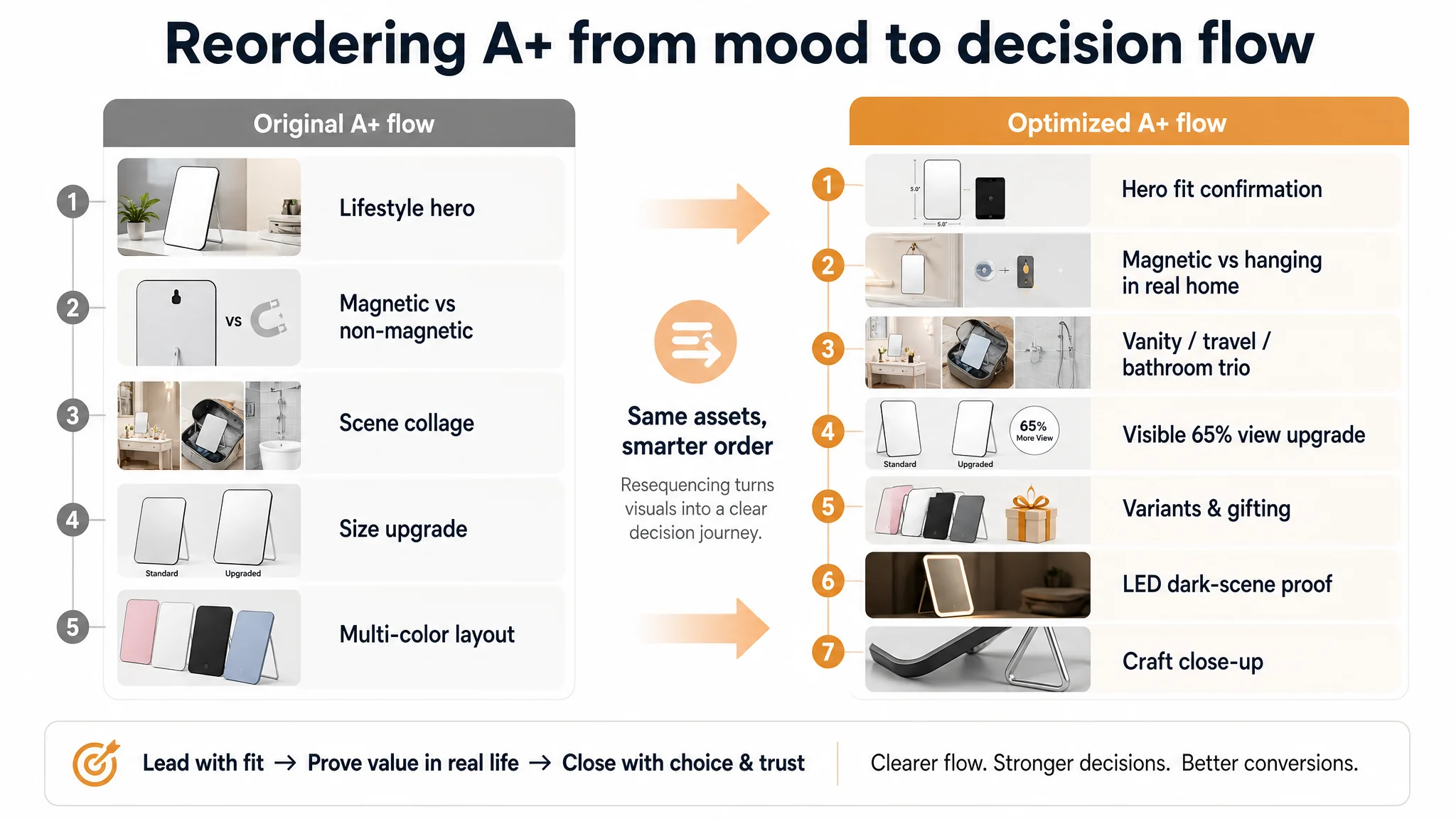
This repositioned the graphic from “technical illustration” to “home fit confirmation.”
1. Scene richness without scene sequencing
The seller already had multi-scene shots (desk, bathroom, travel), but they were not arranged to mirror the user’s mental journey:
- Decision to buy: “Will this work on my vanity and save space?”
- Everyday use: “Will it hang securely in my bathroom?”
- Mobility: “Will it be easy to pack?”
DeepBI’s suggestion was to reframe the A+ into a clear sequence:
- Opening hero: elevated brand + full mirror view in a premium interior
- Core functionality: magnetic vs hanging, clear and realistic
- Scene trio: vanity / travel bag / bathroom cabinet side
- Size comparison: medium vs large with “65% view increase” shown via visible facial area difference
- Color/variant array: clean, unified lighting for all colors
- LED use case: dark bedroom, warm light on, visually solving “poor lighting makeup” pain
- Craftsmanship close-up: metal stand and mirror edge macro shot
This did not change “how pretty” the A+ looked; it changed the order and purpose of each module so they would systematically remove buyer doubts ads had paid to bring in.
Bullet Points: Good Logic, But Not Fully Exploiting Category Language
DeepBI’s scoring actually gave the seller a slight advantage over the competitor in bullet points (6 vs 5), thanks to:
- Clear problem–solution structures (e.g., “save desk space”)
- Scenario-driven writing (home, office, travel)
- A final bullet that summarizes multi-function usage, closing the loop
But there was still untapped potential.
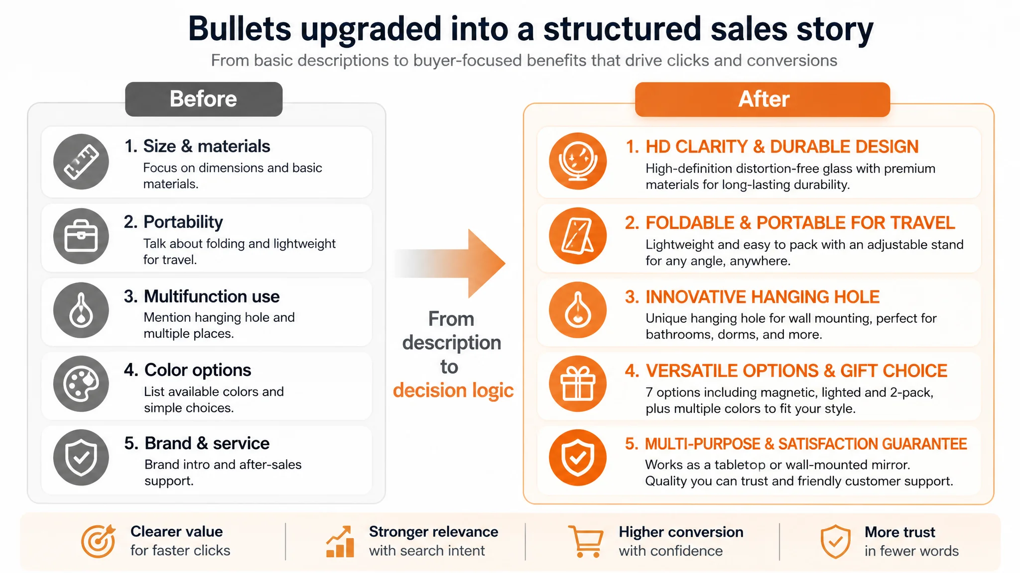
The optimization focused on:
1. Combining materials and size with a clear, benefit-focused headline
From:
- Generic mentions of size and materials
To:
- “HD CLARITY & DURABLE DESIGN” with explicit “distortion-free glass” and “premium protective shell + stainless steel components”
This aligned more with how the competitor built trust, without copying.
1. Reinforcing portability and adjustability as travel-specific advantages
- “FOLDABLE & PORTABLE FOR TRAVEL” with travel and hotel scenarios directly named
1. Making the hanging hole a star feature, not an afterthought
- “INNOVATIVE HANGING HOLE” explicitly addressing desk space saving and moisture-resistant bathroom use
1. Turning variations into a gift / style choice, not just a SKU list
- “VERSATILE OPTIONS & GIFT CHOICE” to connect multiple variants to gifting and style
1. Combining multi-purpose usage with a clear quality reassurance
- “MULTI-PURPOSE & SATISFACTION GUARANTEE” to end with a confident after-sales stance, mirroring the competitor’s “we will make it right” message but grounded in the product’s own positioning
The core change: bullet points stopped being “nice-to-have descriptions” and became a structured path from specs → use cases → emotional and trust closure.
Why DeepBI Did Not Start by Tuning the Ads
At this stage, the seller’s instinct was still to ask:
- “Which keywords should we add?”
- “Should we move budget from auto to manual?”
- “Should we focus on branded or generic terms?”
DeepBI’s judgment was that none of those changes would fundamentally shift ACOS until the page itself improved its ability to convert the traffic it already had.
Reasons:
1. The review gap could not be solved with bids
No bid strategy can make 64 reviews look like 6,608. The only way to neutralize some of that advantage is to:
- Build a much sharper value proposition in the title and main image
- Make every visit work harder to justify a purchase despite lower social proof
1. The Listing’s strong points were not in the first decision layer
The seller’s A+ and bullet logic were objectively strong. But if users never clicked due to weaker title and thumbnails, these strengths had almost zero impact on conversion.
1. Ads were amplifying the wrong story
As long as the search result thumbnail told a softer, less specific story (“desk mirror, foldable”), pumping more traffic would mainly accelerate spend, not orders.
So the decision path became:
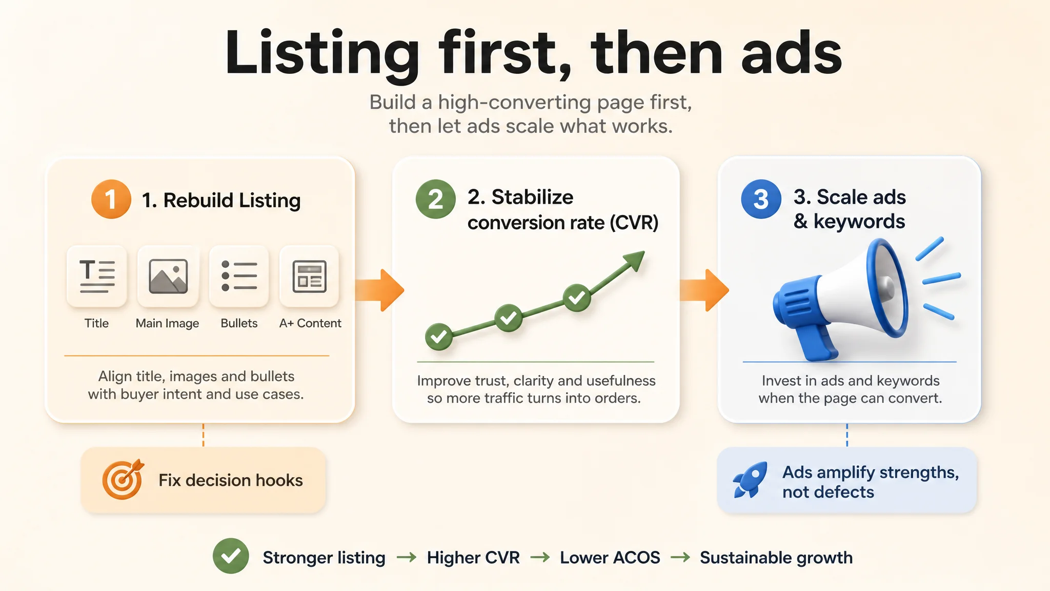
1. Rebuild Listing conversion logic (title, main images, bullets, A+ sequencing)
2. Let this new page handle existing traffic and stabilize CVR
3. Only then reconsider ad scaling, keyword expansion, and bid strategy
“Before ads could work again, the page had to convert.”
How the Page’s Sales Logic Started to Recover
After aligning title, images, and A+ around a clear “travel vanity mirror” promise and daily-life proof, several changes in operating state became visible:
- Search result presence became sharper
The new title and main image offered clearer, more specific reasons to click. Even with fewer reviews, the product began to speak to particular intents (travel, bathroom, shaving) rather than being just “another desk mirror.”
- Traffic quality and behavior improved
Visitors arriving via ads or organic search saw a page that quickly confirmed:
- “This fits my vanity / bathroom / dorm / travel use”
- “It’s sturdier and more thoughtfully designed than generic mirrors”
- The Listing started to regain conversion capacity
While exact metrics are not disclosed, the direction was clear:
- CVR became more resilient
- Wasted ad spend (clicks with no realistic chance of conversion) decreased
- The seller no longer had to push as hard on bids to maintain a baseline of orders
- Dependence on pure review volume softened
Reviews still mattered, but they were no longer the only trust lever. The page itself—through images, data-backed claims, and scene logic—began to carry some of the conversion weight that had previously been outsourced to social proof.
- Ad decisions became more controllable
With a higher-converting page, ACOS became more manageable, and the team could treat ads as a lever to scale, not a crutch to compensate for page weaknesses.
What This Means for Other Amazon Sellers
Several lessons from this travel makeup mirror case generalize across Amazon categories:
1. Do not confuse a review gap with an “ads-only” problem
A competitor with 100x more reviews will almost always win a clean review comparison. Your job is to reshape the Listing so that, despite fewer reviews, you give buyers a strong, specific reason to choose you.
1. Listing conversion is the foundation of advertising efficiency
If your title and main image do not clearly signal use case and advantage, no amount of bid tuning will sustainably fix ACOS. Ads cannot fix a page that does not deserve the traffic.
1. Every image and bullet must have a defined decision role
For this mirror, each visual asset was redefined to do one job: earn click, clarify size, prove quality, show real use, or lock in travel use. When assets are given precise roles, the Listing stops being decorative and becomes a sales machine.
1. A+ content must follow a decision sequence, not a gallery mindset
Strong design is valuable, but sequence is critical:
- Confirm product fit
- Demonstrate advantages with realistic scenes and data
- Close with variants, gifting, and craftsmanship trust
1. Ads should be adjusted after the Listing is tightened
DeepBI’s judgment in this case was simple: fixing the Listing first reduced the risk of ads amplifying defects. Only once the page could convert did additional traffic translate into healthier TACOS, rather than deeper losses.
For Amazon sellers who feel stuck in a loop of “higher bids, same conversions,” this case suggests a different starting point: step out of the ads console, audit your Amazon Listing against a real benchmark, and ask whether the page itself—title, main image, bullets, and A+—is truly built to convert the traffic you already have.