

For this Amazon women’s dress sandal seller, ad traffic was not the main problem. The team felt their category was crowded, bids were rising, and they believed they simply needed “more exposure” and “stronger ads” to compete with a leading heel-sandal brand. But as DeepBI’s diagnosis showed, the real constraint was on the Amazon Listing side: the product page could not fully convert the traffic it was already getting, especially when compared against a benchmark competitor in the same dress sandal niche.
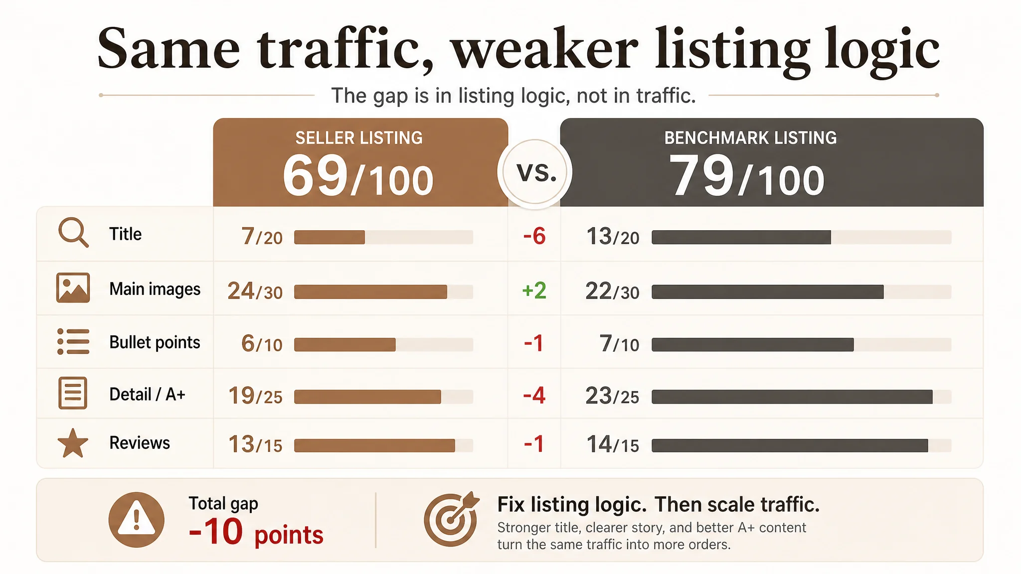
DeepBI’s Listing scoring put the seller at 69/100 versus the benchmark’s 79/100. The gap was not in reviews or basic image quality, but in how the title, main images, bullet points, and A+ content worked together to create a buying logic. The seller’s page stayed at “comfortable daily sandals” while the competitor’s Amazon Listing built a complete story of “elegant, multi-occasion dress heels” supported by high-end visuals and structured messaging.
Instead of continuing to tweak keywords and bids, the optimization pivoted: clarify the title for search and decision intent, reframe the images to deliver a high-end, occasion-driven story, and rebuild the bullets and A+ modules around comfort, fit, and multi-scenario wear. For other Amazon sellers, this case is a reminder: when ACOS feels stuck, it’s often not that ads are “bad”; it’s that the product page is not yet designed to deserve the traffic you’re already buying.
Amazon Ads Were Not Failing. The Page Was Consuming the Traffic.
The seller is in the women’s dress sandal segment on Amazon US, competing head‑to‑head with a category-leading open-toe ankle-strap heel brand.
Operationally, they were under pressure on three fronts:
- Bids in the category were rising.
- A benchmark listing in the same niche was dominating visibility and volume.
- Their own reviews were strong (4.7 stars) but orders lagged behind expectations.
Internally, the team’s judgment was straightforward: “We don’t have enough traffic, and our images probably aren’t pretty enough. If we push more ads and refresh visuals, conversions will follow.” So they focused on:
- Expanding keyword coverage in Amazon ads.
- Incrementally adjusting images without a clear conversion strategy.
- Hoping that strong ratings (4.7 vs. the competitor’s 4.2) would eventually carry them.
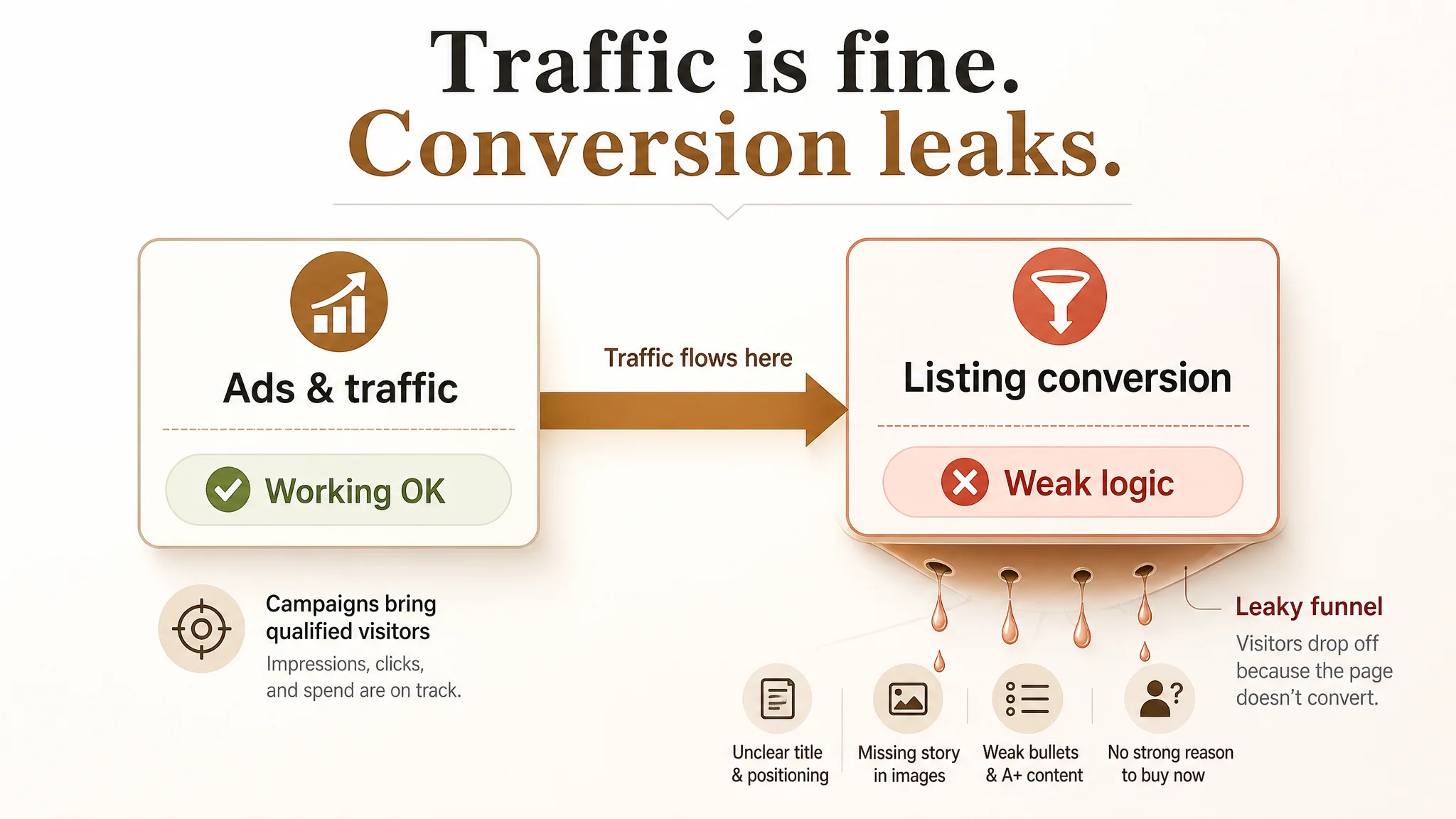
What they didn’t see was that their Amazon Listing was structurally weaker in decision logic, despite better ratings. Ads were bringing traffic into a product page that did not clearly answer: “Why this sandal, for which occasion, and why now?”
“The real problem was not that ads failed to bring traffic. It was that the page could not convert the traffic.”
DeepBI’s listing scoring made that visible very quickly.
The Real Constraint: Listing Conversion Capacity, Not Trust
DeepBI’s dynamic benchmarking locked onto a single, highly relevant competitor: a leading women’s open-toe ankle strap low-block heel sandal, positioned explicitly as a party and dress shoe.
On paper, the seller’s trust signals looked good:
- Rating: 4.7 stars (seller) vs. 4.2 stars (benchmark)
- Negative review ratio on the first page: 17% (seller) vs. 25% (benchmark)
But the volume gap was huge:
- 60 total reviews (seller) vs. 15,277 (benchmark)
So the question became: with better star rating and cleaner top reviews, why did the seller’s listing still lose?
DeepBI’s scoring breakdown gave the structure:
- Total score: 69 (seller) vs. 79 (benchmark), a 10‑point gap
- Title: 7 vs. 13 (‑6)
- Main images: 24 vs. 22 (+2)
- Bullet points: 6 vs. 7 (‑1)
- Detail/A+ content: 19 vs. 23 (‑4)
- Reviews: 13 vs. 14 (‑1)
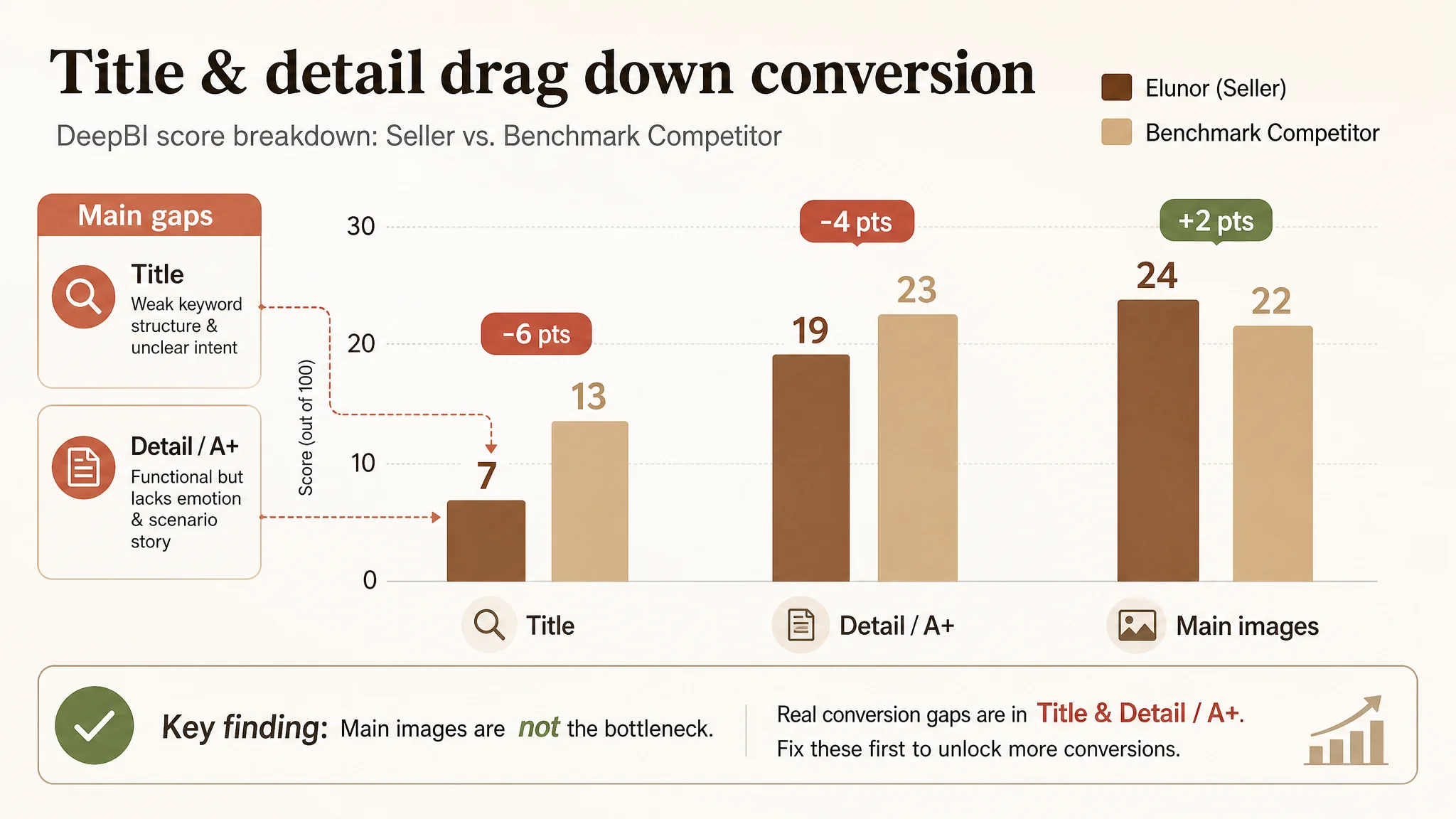
The key finding: the main images were not actually the bottleneck. The seller even outscored the benchmark visually at a raw level (24 vs. 22). The real drag was:
- A weak, confusing Amazon title.
- A detail/A+ section that stayed functional but failed to build emotion and multi‑scenario intent.
In other words, conversion capacity—not visual quality in isolation—was the constraint.
How the Title Quietly Undermined Both Search and Decision
The title did not communicate a clear product or outcome
Side‑by‑side with the benchmark, the differences in title logic were stark.
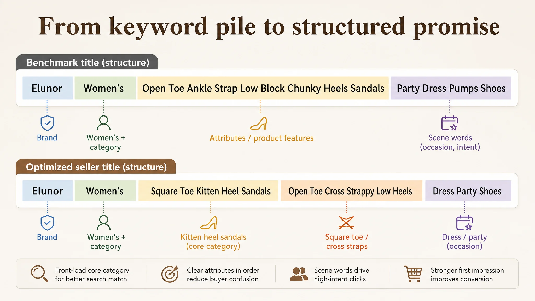
Benchmark title (simplified structure): Brand + Women’s [core category] + Open Toe + Ankle Strap + Low Block Chunky Heels + Sandals + Party Dress Pumps Shoes
This does three things:
- Leads with brand to borrow trust.
- Clearly defines shape and structure (“Open Toe Ankle Strap Low Block Chunky Heels”).
- Locks the usage scene (“Party Dress Pumps Shoes”), guiding buyers toward occasions where they are most ready to pay.
By contrast, the seller’s original title:
- Omitted the brand name, missing a simple trust anchor.
- Mixed attributes in a confusing way, such as “Square Toe” and “Open Toe” together, which can create hesitation: “So what exactly am I buying?”
- Used vague value claims like “Comfortable” instead of concrete usage scenarios.
- Failed to front-load the core category keywords, such as “Women’s” and “Sandals”, weakening search weight.
On Amazon, that means:
- Search visibility is less focused.
- The first read of the title does not resolve what the product is “for”.
- Ads bring traffic, but the title doesn’t immediately reassure buyers they’re in the right place.
DeepBI’s judgment on the title
DeepBI reframed the title as a conversion tool, not just a keyword bucket. The recommended direction:
Brand + Women's + Square Toe Kitten Heel Sandals + Open Toe Cross Strappy Low Heels + Dress Party Shoes
Key shifts in logic:
- Brand placed first to build trust quickly in search results.
- “Kitten Heel Sandals” immediately after the brand as the primary category phrase.
- Retain distinctive attributes (“Square Toe”, “Cross Strappy”) but with clear ordering.
- Inject scenario terms (“Dress”, “Party”, optionally “Wedding”) to match high-intent searches.
This was not just SEO. It was about aligning search intent, click expectations, and the first impression of the product’s role in the buyer’s wardrobe.
The Images Looked “OK”, But the Story Was Missing
When the seller looked at their images, the reflex idea was: “Our images are not pretty enough.” DeepBI’s visual analysis found something subtler: the images were not telling the right story for this category.
Main-image set: information present, but not prioritized
The seller’s image deck had issues such as:
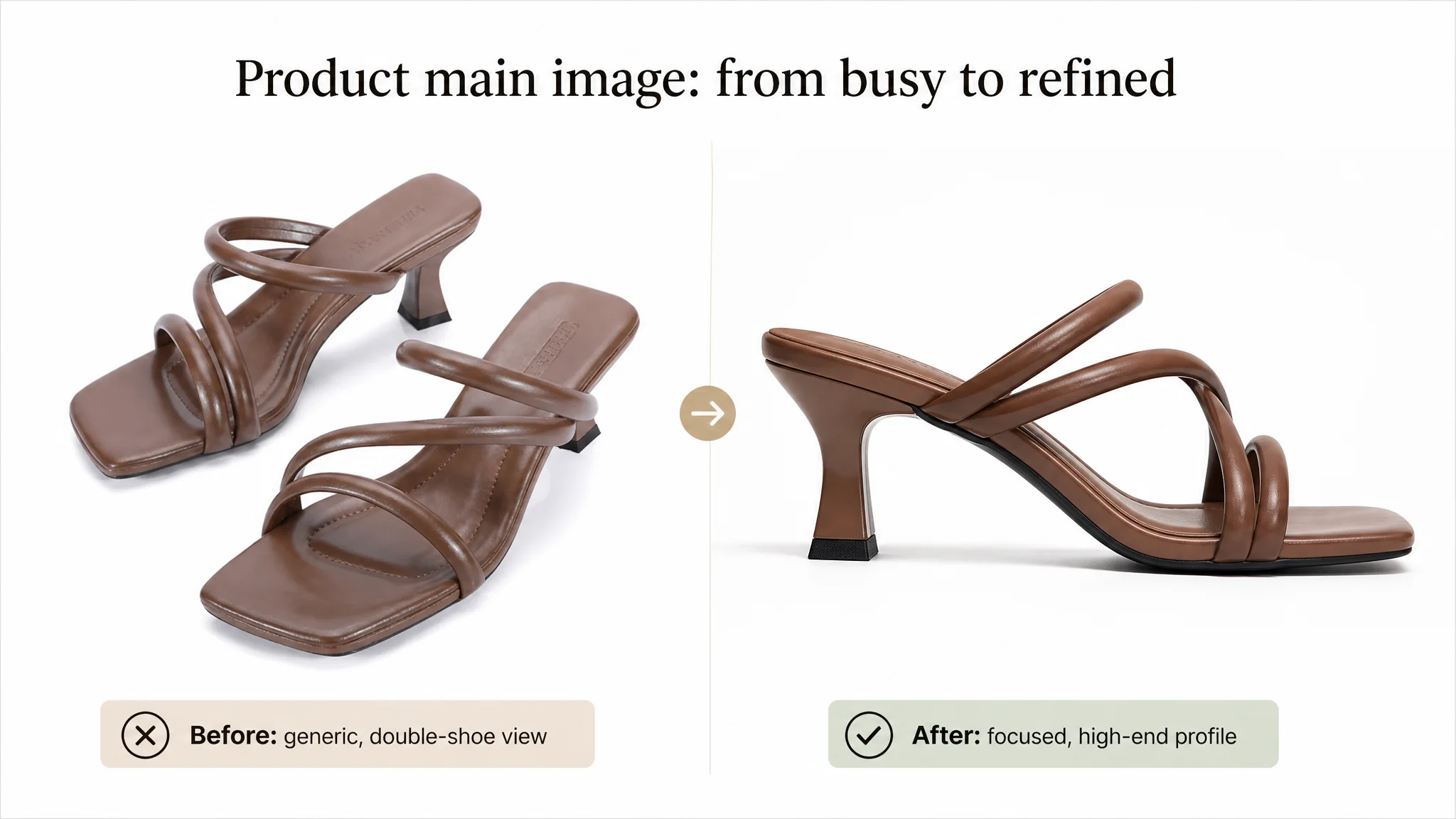
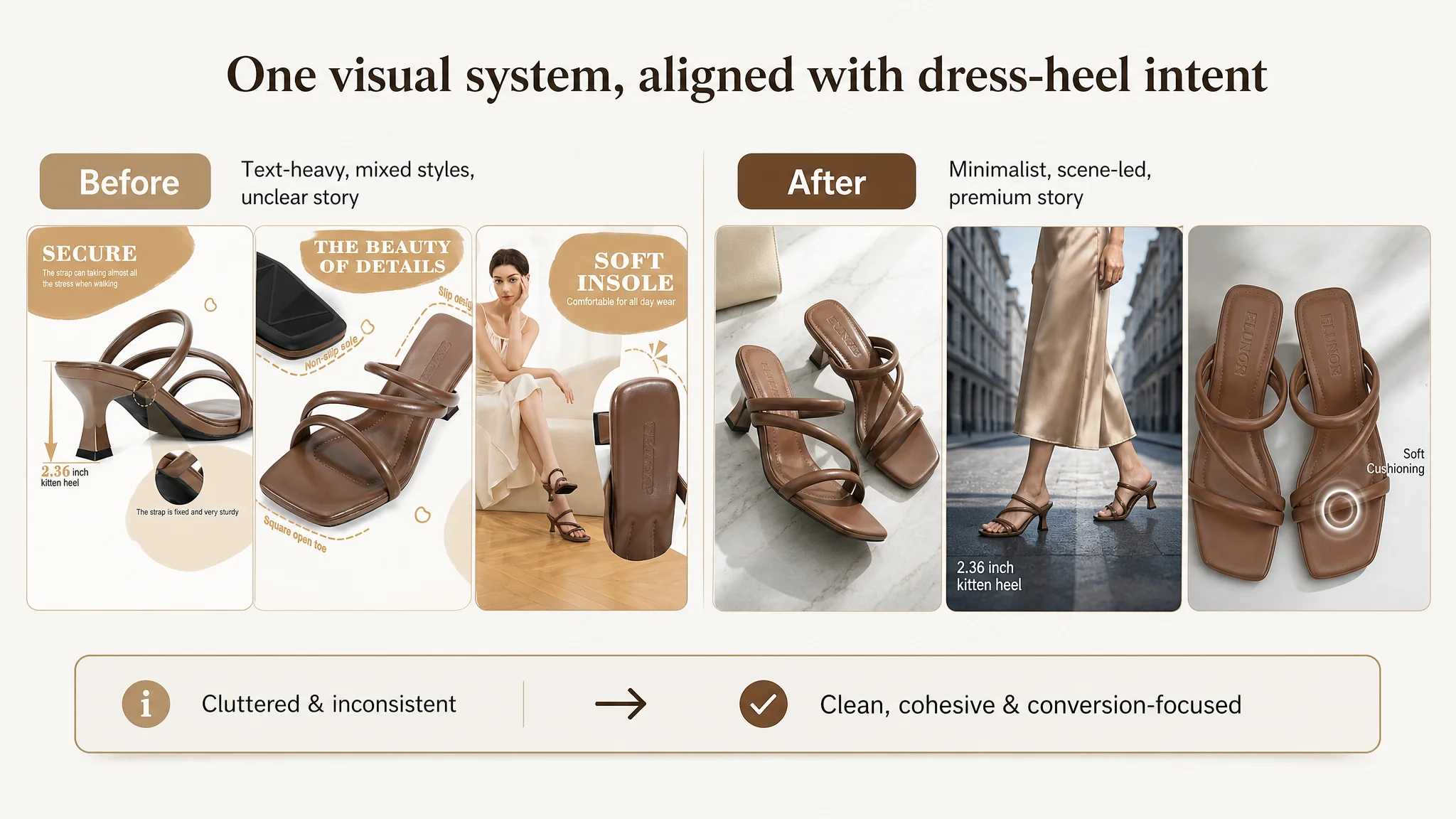
- Effective image slots underutilized. A video thumbnail occupied one slot, reducing space to reinforce key claims like anti‑slip and comfort across angles.
- Text overlays were cluttered and stylistically inconsistent. High-value information (e.g., 2.36-inch kitten heel, cushioned insole) was visually lost.
- Overall tone lacked a clear stylistic direction, giving a somewhat lower-end feel.
The benchmark, with the same number of images and no video, used:
- Real‑life street and lifestyle shots across images #2–#5.
- Consistent style, high emotional resonance, and a strong “wearability” signal.
For a dress sandal, the decision is often emotional: “Will this elevate my look and still be comfortable?” The competitor’s visuals answered that. The seller’s images answered: “Here is a sandal that is… comfortable.”
Why DeepBI did not treat this as a pure “beauty” issue
DeepBI’s analysis judged that this was not about adding random lifestyle shots, but about reframing the entire visual narrative:
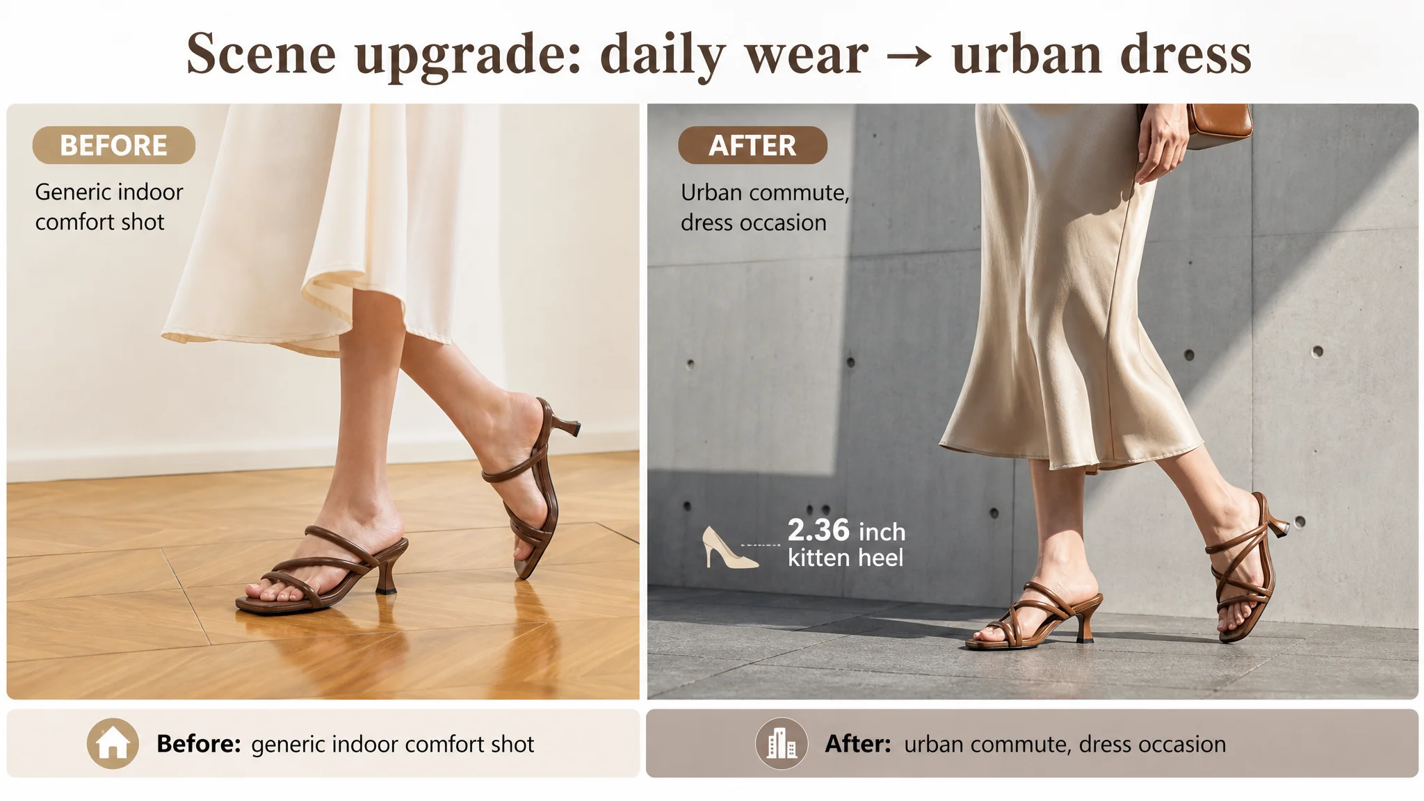
- Shift from a flat, text-heavy style to a minimalist urban / professional tone.
- Use cool-toned lighting, modern architectural backgrounds, and walking shots to highlight:
- The balance of square toe and slender heel.
- The product as a high-end commute and dress option, not just a daily sandal.
Specific prompt-level directions included:
- Main white background image: one shoe centered, ~75% of frame, clean 45° side angle, strong defined shadow, white seamless background—sharp focus on square toe and heel.
- Model shot: full-body city-commute scene, modern concrete wall, silk dress, natural light, subtle on-image label “2.36 inch kitten heel”.
- Lifestyle close-ups: diagonal compositions on marble, cross-placed pairs with “Soft Cushioning” callout, walking-in-the-city foot close-ups to show stability.
The goal was not “prettier pictures” but a coherent decision story: “elegant, stable, comfortable, versatile dress sandal.”
Bullet Points: From Listing Attributes to a Buying Logic
On paper, the seller had bullet points covering:
- Heel height and stability
- Multi‑scene usage
- All-day comfort
- Anti‑slip
- Size and design guidance
The benchmark, however, structured its bullets as a persuasive path, not a checklist:
1. Fitting guidance
2. Style elevation
3. Confident walking
4. All-day comfort
5. Secure fit
Each started with a strong phrase (“Elevate Your Style”, “Walk With Confidence”), then supported it with clear benefits.
How DeepBI reframed the bullets
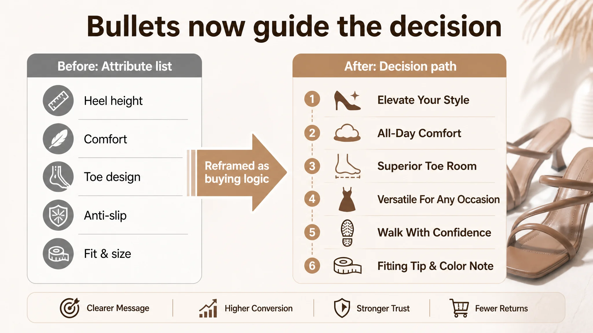
DeepBI’s analysis judged the seller’s bullets as “informative but flat”. They described physical attributes but did not tie them tightly to buyer outcomes. The optimization direction:
- Introduce short, bolded headline phrases to give each bullet a job in the buying journey.
- Connect each physical attribute to a felt experience and a specific scenario.
Examples of optimized bullets:
- Elevate Your Style: Position the 6cm (2.36 inch) kitten heel as a height boost with real stability, heel set under the center of the foot for long wear at work or events.
- All-Day Comfort: Focus on thick, pliable straps that are gentle on toes, supporting long days at work or all‑night celebrations.
- Superior Toe Room: Turn the square toe into a benefit for comfort‑sensitive or wider feet, emphasizing space and reduced pressure.
- Versatile For Any Occasion: Explicitly position the sandal as a wardrobe staple that works for church, office, dinners; from jeans to dresses.
- Walk With Confidence: Use professional language around non‑slip textured soles and durability in “rain or shine”.
- Fitting Tip & Color Note: Add concrete guidance for wide feet to size up, plus a small color-variation disclaimer to reduce returns.
“The bullet points had information, but not a buying logic.”
By restructuring them, DeepBI was effectively building a scripted path from the first glance to purchase confirmation.
A+ Content: This Listing Did Not Lack Information. It Lacked Emotion and Range.
The A+ / detail section is where, in this category, buyers expect to see:
- Brand tone and promise
- Clear visual breakdown of structure and comfort
- Multi-scene usage proof (work, party, wedding)
- Color options and fit guidance
- A final emotional nudge toward “affordable luxury”
What the seller had
The seller’s A+ modules included:
- Main visual scene image
- Design-detail image
- Material explanation
- Heel size image
- Foot-shape fit guide
- Size chart
These were functionally sound but visually flat and scene-limited. Most images:
- Used generic interior or stair backgrounds.
- Had a “straightforward product explanation” feel, not a brand story.
- Mixed text and imagery in ways that increased cognitive load.
What the benchmark did differently
The benchmark A+ content:
- Opened with a brand-tone hero image (“Elegance In Simplicity” type storytelling).
- Used multi-scene displays: home, street, wedding.
- Used clean three-cell feature cards: Wide Fit / Cushioned Comfort / Effortless Lift.
- Showed a multi-color spread to elevate perceived choice and encourage add‑ons.
DeepBI’s judgment: the seller’s detail page was not missing content; it was missing structure and emotional positioning.
The new A+ direction DeepBI defined
Rather than “add more images”, DeepBI’s plan was to resegment the A+ into clear modules with specific roles:
1. Brand hero module
- High-end indoor scene: model walking in a classic interior (elegant wall molding, herringbone wood floor), white silk dress, brown sandals.
- Strong side lighting to create long, soft shadows.
- Visual message: “elegant, modern, understated luxury.”
1. Three-part feature breakdown
- Three square windows in one image:
- Square toe close-up.
- Top view showing insole branding and cushioning.
- Heel side view with clearly labeled 2.36" height.
- Clean, warm neutral backgrounds and minimal sans-serif labels.
1. Multi-scenario usability module
- Split-screen:
- Left: office/meeting environment with black suit dress.
- Right: dinner/party environment with bright dress and restaurant lights.
- Differentiated light (cool for work, warm for evening) but same sandal.
1. Multi-color display module
- Circular arrangement of all colors around center, with the brown as the focal point.
- Even ring lighting, light reflections on the floor, conveying quality and choice.
1. Comfort close-up module
- Macro shot of a hand pressing the insole, showing visible indentation.
- Warm, home-like background, emphasizing “Cushioned Comfort” visually, not just in text.
1. Fit & sizing guidance module
- Left: on-foot shot focusing on toe coverage and straps.
- Right: clear size chart with simple sketches of different foot types (e.g., wide foot, high instep).
- Highlight “Wide Fit Option” and exact size advice.
1. Social/ceremonial trust module
- Cinematic shot: model in an evening dress on a classic white sofa, warm ambient lighting, focus on the ankle and sandal.
- Tone: “affordable luxury” rather than basic daily wear.
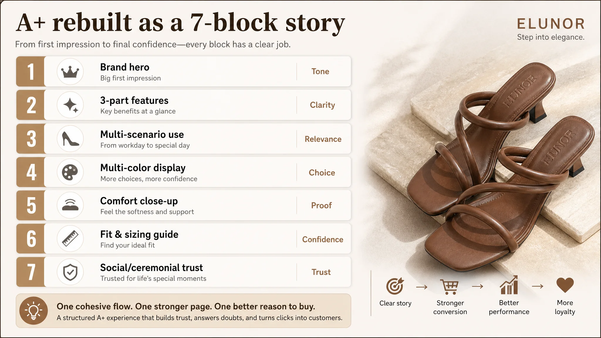
This was a complete reframe of the page from “daily wear sandal with comfort” to “elegant, versatile dress heel that can handle your full calendar.”
Why DeepBI Did Not Recommend “Keep Tweaking Ads First”
From a pure advertising perspective, the seller could have tried:
- Further segmenting campaigns.
- Adjusting bids and budgets more often.
- Adding more match types and long tails.
But DeepBI’s data-driven judgment was that any extra ad spend would simply amplify the listing’s existing weaknesses:
- A title that did not align with high-intent dress/party queries.
- Visuals that underplayed the product’s elegance and multi-scene versatility.
- A+ content that did not fully leverage comfort, fit, and “one pair, many occasions”.
“Advertising does not only amplify advantages. It can also amplify a page’s existing defects.”
So the optimization order was deliberate:
1. Repair the listing’s conversion logic
- Strengthen title for both search and decision clarity.
- Rebuild bullets into a pain‑point → solution structure.
- Recast images and A+ to align with high-end, multi-occasion expectations.
1. Then let ads work on a stronger foundation
- Once the page can actually convince, every paid click becomes more valuable.
- Organic ranking benefits from improved conversion and better alignment with category leaders.
This is where many Amazon sellers misdiagnose: they see high ACOS and assume “ads are the problem,” when in reality the product page is not ready to monetize the traffic.
How the Page’s Sales Logic Started to Recover
Because this is a strategic case, not a numeric brag sheet, we won’t manufacture performance figures. But the shifts in operating state and risk were clear.
Listing-level changes
- The Amazon title now:
- Leads with brand + core category.
- Resolves attribute confusion.
- Explicitly calls out dress and party usage.
- The image stack:
- Moves from generic and text-cluttered to a defined minimalist urban-professional style.
- Integrates motion and real-world scenes to prove stability and elegance.
- Makes heel height and cushioning visually obvious.
- Bullet points and A+:
- Run as a coherent persuasion route: elevate style → comfort and toe room → versatility → traction and durability → fit confidence.
- Turn “comfort” from a vague word into concrete, visualized experiences.
Business and risk changes
As the listing’s conversion logic tightened:
- Each paid click became less risky. The page now had multiple layers of reassurance for comfort, fit, and occasion fit.
- The seller’s strong review rating (4.7) was finally supported by a page that looked and felt like a “4.7-star experience.”
- The gap with the benchmark narrowed not just in score, but in perceived brand maturity.
- Future ad optimizations became meaningful: instead of fighting to compensate for a weak listing, ads could now scale on top of a page designed to convert.
The store moved from “pushing traffic into a leaky funnel” to “feeding traffic into a page built to sell a specific promise: elegant, stable, comfortable dress sandals that work from office to evening.”
What Other Amazon Sellers Can Take From This Case
1. High ratings do not guarantee high conversion.
A 4.7-star listing can still be structurally weaker than a 4.2-star competitor if the title, images, and A+ do not tell a coherent, scenario-driven story.
1. Ads are not a substitute for page logic.
If your Amazon Listing does not clearly define who the product is for, which occasions it serves, and how it solves core pains, more traffic only scales the problem.
1. Titles are not just for search; they are micro‑positioning tools.
Position your listing around the actual buying context (“dress”, “party”, “wedding”, “work”) rather than relying on generic adjectives like “comfortable.”
1. Bullet points must form a decision path, not a parameter list.
Lead with outcomes, then explain attributes. “Walk With Confidence” + anti‑slip sole is more persuasive than “Rubber outsole” alone.
1. A+ content should extend your story, not repeat your bullets.
Use it to show scenes, color range, fit guidance, and comfort in concrete, visual ways. Especially in emotional categories like women’s footwear.
1. Before scaling ads, ask: does this page deserve more traffic?
DeepBI’s role in this case was not to “make better pictures,” but to confront a misdiagnosis: the real bottleneck was listing conversion capacity. Once that was fixed, the seller had a justified reason to increase traffic again.
For Amazon sellers feeling stuck between rising ACOS and flat orders, this case is a reminder to look beyond bid tables. Often, the biggest leverage lies not in more advertising, but in rebuilding the product page so that every click—paid or organic—finally has somewhere strong to land.