

An Amazon seller in the professional audio/video accessories category came to DeepBI with a familiar dilemma: ad spend on Amazon Italy kept climbing, but the listing for its wireless intercom headset system was not turning that traffic into stable orders. The team’s first reaction was to focus on Amazon ads—keywords, bids, campaign structures—assuming the problem was traffic volume and targeting.
Once we put the listing into DeepBI’s diagnostic system and benchmarked it against a category-leading competitor on Amazon Italy, a different picture emerged. The core issue was not that ads were failing to bring traffic, but that the Amazon product page itself had weak conversion capacity: a 52/100 listing score versus the competitor’s 84/100, with an especially fatal gap in the A+ / detail content.
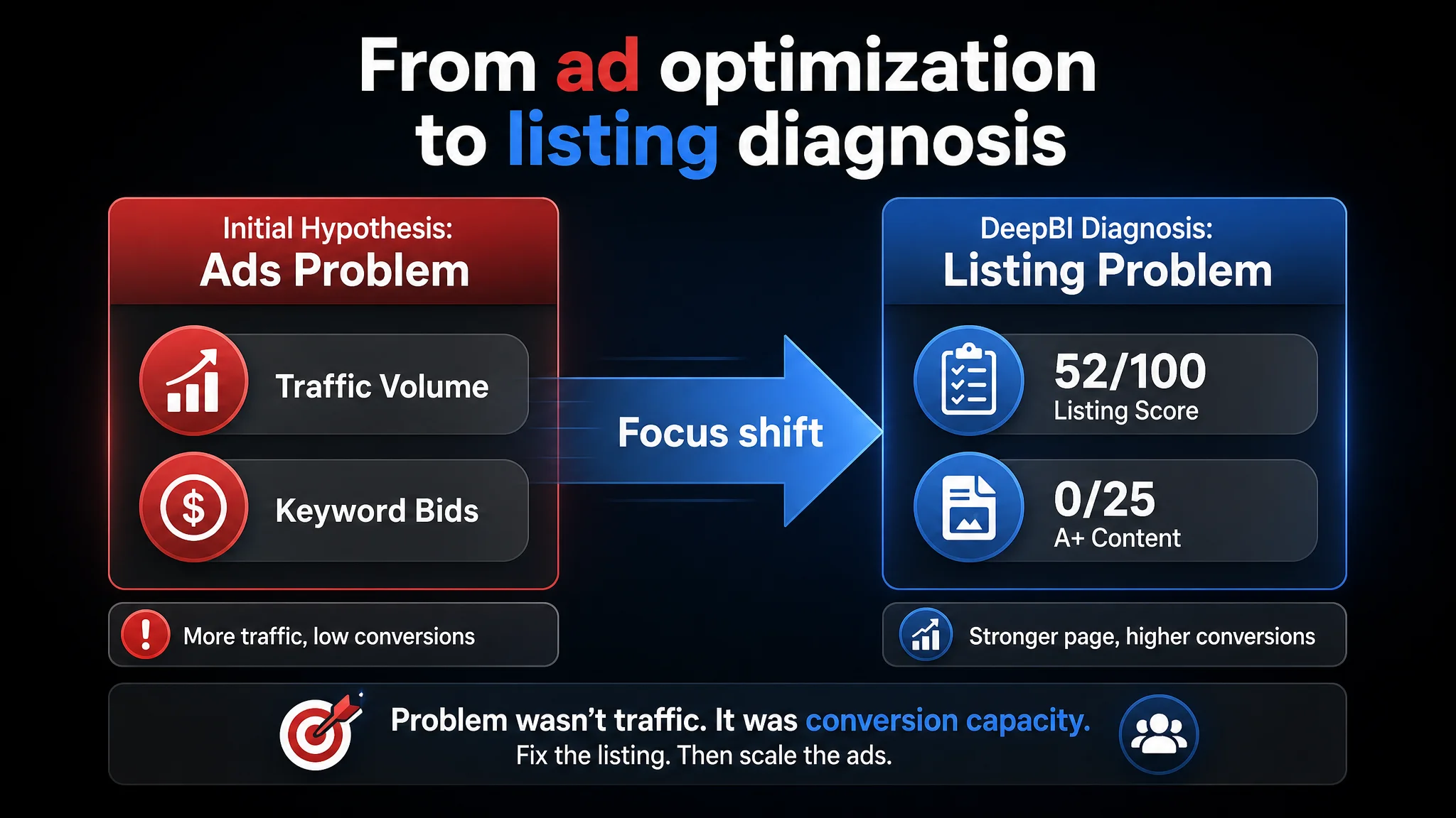
We helped the seller shift focus from “push more ads” to “fix the listing so ads can actually convert”: tightening the title’s Amazon keyword logic, restructuring bullet points around buying outcomes instead of raw specs, redesigning main images with professional “film production” trust cues, and rebuilding the detail/A+ section into a complete decision path. For other Amazon sellers, this case is a reminder: when ACOS is stuck and CPC is rising, it’s often the listing—not the ads—that is silently consuming your budget.
Amazon Ads Were Not Failing. The Page Was Consuming the Traffic.
What the seller saw in day‑to‑day operations was straightforward: paid traffic wasn’t translating into enough orders on Amazon Italy. With a professional wireless intercom headset (two‑user full‑duplex system for video and drone work), the team assumed the issue lay in advertising:
- “Maybe our keyword coverage is not wide enough.”
- “Maybe we need to raise bids on ‘wireless intercom’ and video production terms.”
- “Maybe the competitor is just outbidding us on Amazon ads.”
They kept iterating on campaigns, but ACOS remained difficult to control. Traffic existed; orders lagged. At this point, they brought the ASIN into DeepBI for a full listing diagnosis and competitor benchmark.
The scoring results were blunt:
- Their listing total score: 52/100
- Competitor benchmark listing: 84/100
- Gap: –32 points
Across dimensions:
- Title: 10 vs 15 (–5)
- Main images: 25 vs 26 (–1)
- Bullet points: 7 vs 8 (–1)
- Detail/A+ content: 0 vs 24 (–24)
- Reviews: 10 vs 11 (–1)
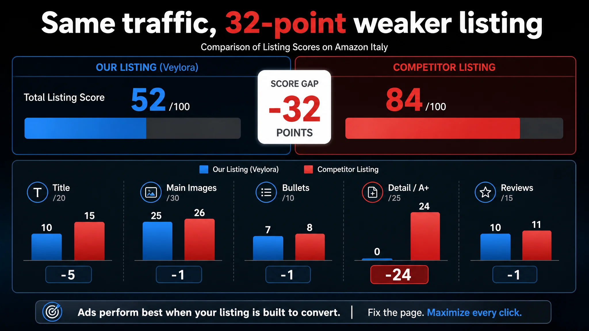
The numbers made the business risk explicit: ads were being pushed into a listing with essentially no detail content, while the leading competitor had a full A+ story tailored to this category’s decision logic.
“The real problem was not that ads failed to bring traffic. It was that the page could not convert the traffic.”
At this stage, continuing to optimize ads first would simply amplify a low‑conversion asset.
The Real Constraint Was Listing Conversion Capacity
When we looked at the benchmark listing for a comparable two‑user wireless intercom system on Amazon Italy, the difference wasn’t that it had a cheaper price or radically better reviews. In fact, the customer’s listing had:
- Very comparable rating: 4.3 stars vs competitor’s 4.4
- Higher review count: 363 vs 204 (a scale advantage)
On the surface, this should have been enough to build trust—if the rest of the listing could carry the evaluation traffic. But the page was structurally weak.
The title worked like a sentence, not like an Amazon search entry
The customer’s original Italian title:
- Led with a long, natural‑language phrase: “Sistema Cuffie Interfoniche Wireless Comunicazione per Team…”
- Placed the brand name near the back.
- Mixed core keywords with generic descriptive wording.
- Omitted concrete, quantified performance promises (distance, battery, etc.).
By contrast, the benchmark title on Amazon Italy:
- Put brand and model right up front.
- Followed “2.4G” immediately with “Wireless Intercom Headset System” to tightly pack high‑value search terms.
- Spelled out PTT mute, single‑ear headset, and specific use cases (“for TV Film Production Drone”).
- Included a clear “350 m” distance parameter to signal professional‑grade performance.
The result: the competitor’s title was written for Amazon search and decision logic; the customer’s title was written like generic copy.
The main images lacked a clear professional role
On the visual side, the customer was not “failing” in an obvious way—image count and basic quality were acceptable. But under Amazon search‑page conditions, several subtle weaknesses added up:
- The first image had no emotional or professional anchor. Two headsets and accessories appeared, but there was no clear “film crew / live event” context. In a mobile thumbnail, that meant less reason to click.
- Technical images were dense and hard to scan. Key advantages like AEC echo cancellation or USB‑C fast charging were present as text but not visually prioritized, reducing recall.
- Scene images lacked consistency in quality and style, which matters in a B2B‑tilted category where buyers (film crews, event teams) infer reliability from visual polish.
The benchmark listing used a coherent “professional film / broadcast” visual language: controlled lighting, consistent dark backgrounds, and clear iconography around distance, noise cancellation, and group communication.
Bullet points described specs, not buying outcomes
The customer’s bullet structure:
- Opened with technical concepts (“full duplex”, transmission performance).
- Treated each bullet as a siloed spec (mode, range, ergonomics, etc.).
- Rarely tied those specs to the operational outcome for the crew.
The benchmark listing took a different approach:
- Started with team communication value (“impeccable team conversation”) rather than a protocol name.
- Frequently connected technology to results (“auto frequency hopping” → more reliable communication; ENC → clarity in noisy environments).
- Aggregated related benefits in one bullet (operation + design + hygiene) for higher information density.
On paper, the customer’s hardware was highly competitive—arguably stronger on some axes (master‑free architecture, 24‑hour battery). The problem was that the bullets never turned these into a clear, easy‑to‑read buying logic.
Detail/A+ content: the decisive gap
The most critical constraint was the detail/A+ dimension:
- Customer detail/A+: 0/25
- Competitor detail/A+: 24/25
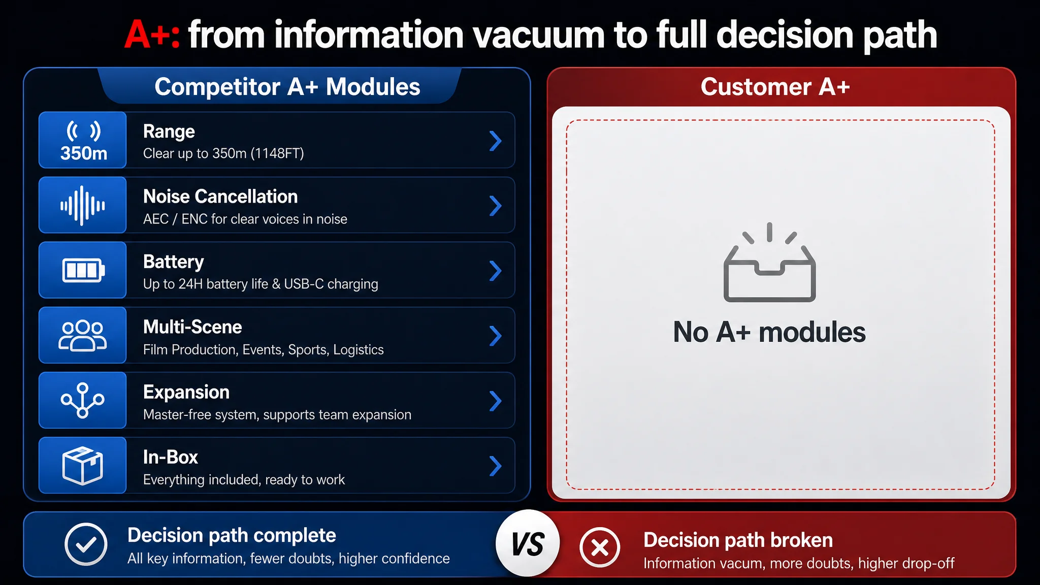
The competitor’s A+ on Amazon Italy included:
- Core sound/ENC modules.
- Technical diagrams for auto frequency hopping.
- Visualized transmission distance.
- Water resistance imagery.
- Battery and charging explanations.
- Compatibility and spare‑parts modules.
- Multi‑scene grids (film, commercial video, water activities).
- System expansion diagrams and package content layouts.
The customer had no A+ content at all.
In a category where buyers make high‑value, professional decisions, this meant:
- No visual confirmation of 350 m range.
- No explanation of AEC vs ENC, or how the system behaves in noisy or windy environments.
- No reassurance around master‑free architecture, expansion, or real‑world setup.
- No clear view of what is included in the box.
From a business standpoint, this was the single biggest bottleneck. Even with decent CTR and good review volume, traffic arriving at the detail page had no structured story to complete the decision. Fixing ads first would not change that.
Why DeepBI Did Not Keep Tuning the Ads First
Given the scoring breakdown and competitive landscape, we advised the seller to reverse their usual order of operations:
1. Do not keep pouring effort into ads until the listing can convert.
2. Rebuild title, bullets, images, and A+ so that the page earns the right to receive more traffic.
The biggest business risk was straightforward: every additional click bought at a higher CPC was landing on a page with a 32‑point competitive deficit, mainly in the A+ layer. That meant:
- Unstable ACOS: ads were being tasked with compensating for a weak page.
- Erosion of organic potential: low conversion depresses ranking signals for critical keywords.
- Hidden opportunity cost: technically superior features (24‑hour battery, master‑free topology) were not generating any differentiation in the listing.
In other words, ads were amplifying the wrong output.
“Advertising does not only amplify advantages. It can also amplify a page’s existing defects.”
By contrast, if the listing could be brought closer to the benchmark’s 84/100—especially by filling the A+ vacuum—the same ad spend could begin to produce more orders, and organic share could start to recover.
So the optimization path prioritized:
- Title: search logic and professional framing.
- Bullet points: from spec listing to decision narrative.
- Main images: clear professional use, structured information, and trust.
- A+ / detail: complete decision journey with visualized parameters and scenes.
Ads would only be scaled again once the page showed signs of improved conversion capacity.
This Product Page Did Not Lack Traffic. It Lacked Trust and Clarity.
DeepBI’s role was not to redesign for “beauty,” but to rebuild the listing around how Amazon buyers actually decide in this category. That meant turning under‑communicated strengths into visible reasons to buy.
Reframing the title around Amazon search and usage
We recommended a new Italian title structure:
Brand + Model + Product form + Core function + Key technology + Primary use cases + Set composition
For example (conceptually):
“[Brand] [Model] Sistema di Cuffie Interfoniche Wireless Full Duplex 2.4G per Comunicazione di Squadra con Cancellazione Rumore ENC, per Produzione Video, Film e Droni – Set da 2 Cuffie”
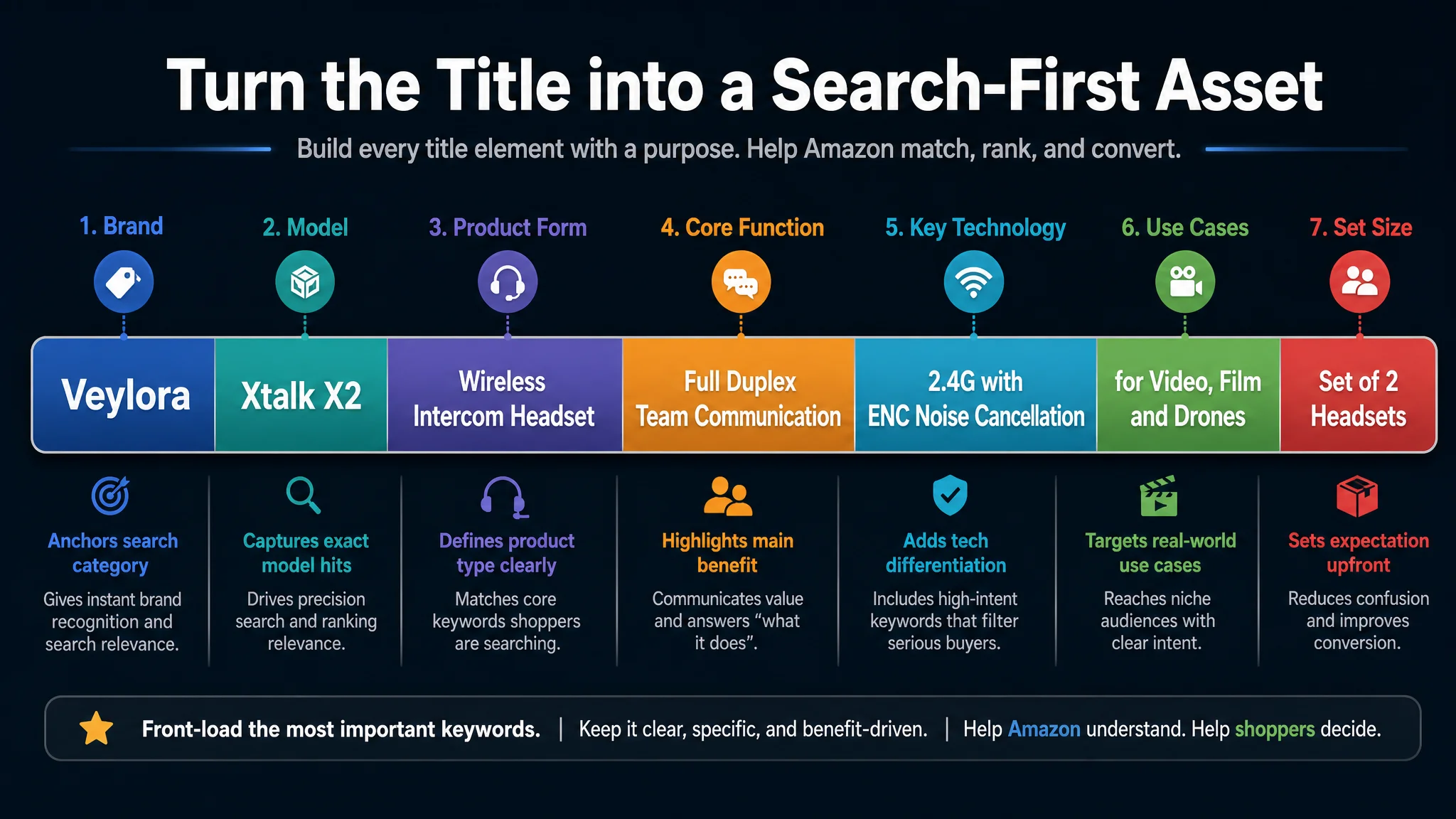
Key shifts:
- Move “Cuffie Interfoniche Wireless” forward to anchor the category.
- Keep “2.4G” and “Full Duplex” close to the core term for algorithm and professional relevance.
- Introduce ENC/AEC explicitly to match category language.
- Add video production, film, drone use cases to attract the right traffic.
- Correct plural/singular grammar to maintain professional credibility.
This turns the title into a concise, search‑aligned index of what matters to Amazon’s engine and to professional crews scanning results.
Turning bullets from specs into a structured buying logic
Instead of five loosely connected technical bullets, we restructured around two principles:
1. Each bullet must link a pain point to a technical solution and a real scenario.
2. Differentiating strengths must be unmissable.
Examples of this shift:
1. From protocol name to communication result
Original focus: “full duplex communication, 2.4 GHz”.
Reframed:
- “Full‑duplex communication and AEC echo cancellation for noisy sets.”
- Explain AEC (Acoustic Echo Cancellation) in plain terms and connect it to noisy events: film sets, concerts, weddings.
- Emphasize “crystal‑clear voice in loud environments”, not just a technical acronym.
2. Making master‑free architecture a hero benefit
The benchmark talks about reliable connection and expansion. The customer has something stronger: every headset can become master.
Reframed bullet:
- Name the architecture “Master‑Free”.
- Explain the failure mode: “if the current master headset shuts down, another can take over in seconds.”
- Translate that into outcome: no communication blackout during live shoots or events.
This is a non‑obvious but powerful differentiator that the original listing barely surfaced.
3. Quantifying range and audio fidelity
The competitor popularized 350 m distance; the customer can match that and add audio range detail.
Reframed bullet:
- Spell out coverage: 350 m (LOS), explicitly linking it to large venues and outdoor events.
- Add 150 Hz–7 kHz frequency response to signal broadcast‑grade voice fidelity.
- Use “HD audio” language grounded in real numbers, not vague “clear sound”.
4. Comfort as a quantified professional benefit
The competitor vaguely mentions lightweight design. The customer can state 188 g.
Reframed bullet:
- Emphasize 188 g as “ultra‑lightweight” with ergonomic leather padding.
- Tie to real usage: “comfortable for a full shooting day without fatigue.”
5. Battery life as a category‑level hammer
The competitor promises up to 12 hours. The customer can go to 24 hours.
Reframed bullet:
- Highlight “24 hours of continuous use – double the standard systems”.
- Mention 1050 mAh swappable battery and USB‑C fast charging (about 2.5h).
- Frame it as “no interruptions on long shooting days”.
This set of bullets allows the listing to compete not just on being “good enough,” but on having clearly better endurance and flexibility, expressed in Amazon‑native, scannable form.
The Main Image Was Not Just a Visual Issue. It Failed to Create a Reason to Click.
The main image set had to carry more weight at the search‑results stage, especially on mobile, where users spend only seconds per row.
1. First image: from clutter to a complete professional kit
We recommended:
- Two headsets centered, in 45° three‑quarter view, occupying ~60% of the frame.
- Accessories neatly grid‑aligned below, ~25% of frame, not scattered.
- Clean light‑gray to white gradient background.
- Soft three‑point lighting to remove harsh shadows.
- Subtle text tag like “Complete Intercom Solution” in the corner.
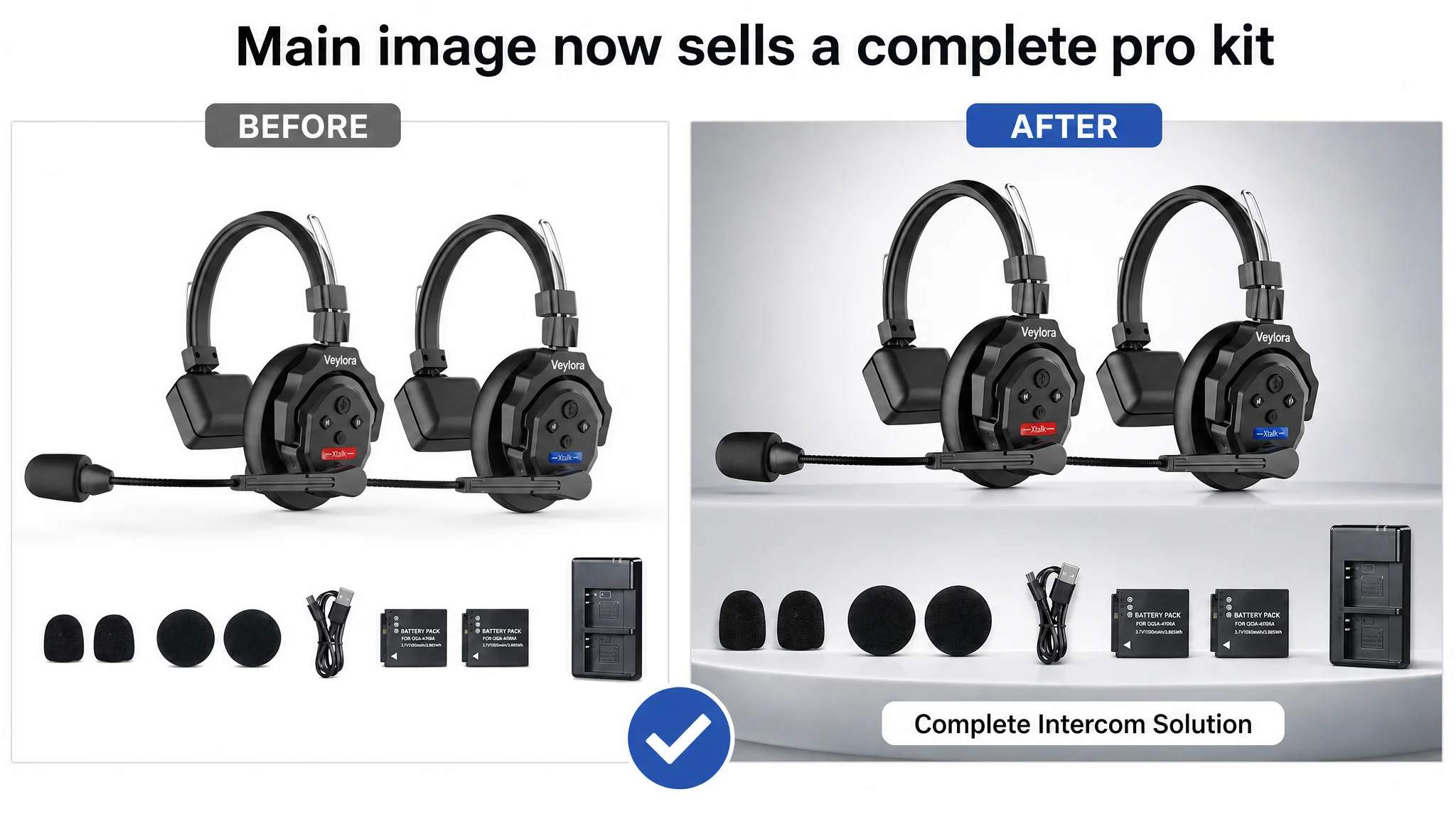
Business logic:
- Make it immediately clear: this is a full two‑user system, not a single random headset.
- Reduce cognitive load: structured layout signals professional quality and completeness.
2. Hero scene: film‑set credibility at thumbnail size
To address the lack of emotional/professional anchoring, we repositioned one key scene image:
- Half frame: male model in profile wearing the headset.
- Background: dark, blurred film‑shoot environment with blue light flares.
- Left side: six simple line icons summarizing key functions, each labeled.
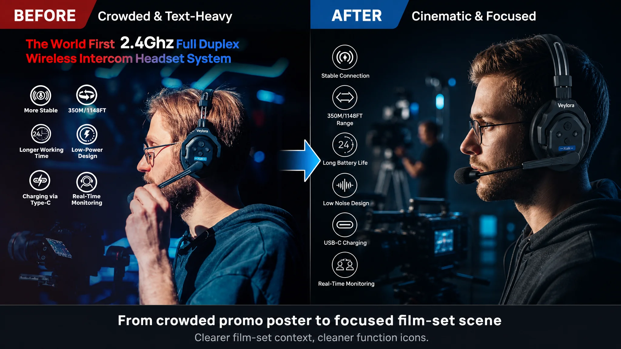
This creates an instant association with serious film/video work, which is exactly where the competitor had been winning hearts.
3. Visualizing the 3.5 mm monitoring function
The original images mentioned the 3.5 mm jack but didn’t make it intuitive why it mattered.
We suggested:
- Close‑up of the headset side, with a visible hand plugging a cable into the 3.5 mm jack.
- Background: blurred camera/monitor gear.
- High‑contrast highlight around the jack, plus a concise caption explaining real‑time monitoring.
This converts a technical footnote into a visible, easy‑to‑grasp use case for professionals who need to monitor camera audio and intercom simultaneously.
4. Making AEC/ENC visually legible
Instead of just writing “AEC” in text, one image can:
- Show the headset centered against a black background.
- Include huge semi‑transparent “AEC” letters as a backdrop.
- Add blue audio waveforms converging at the microphone.
- Feature a red accent bar with frequency range data.
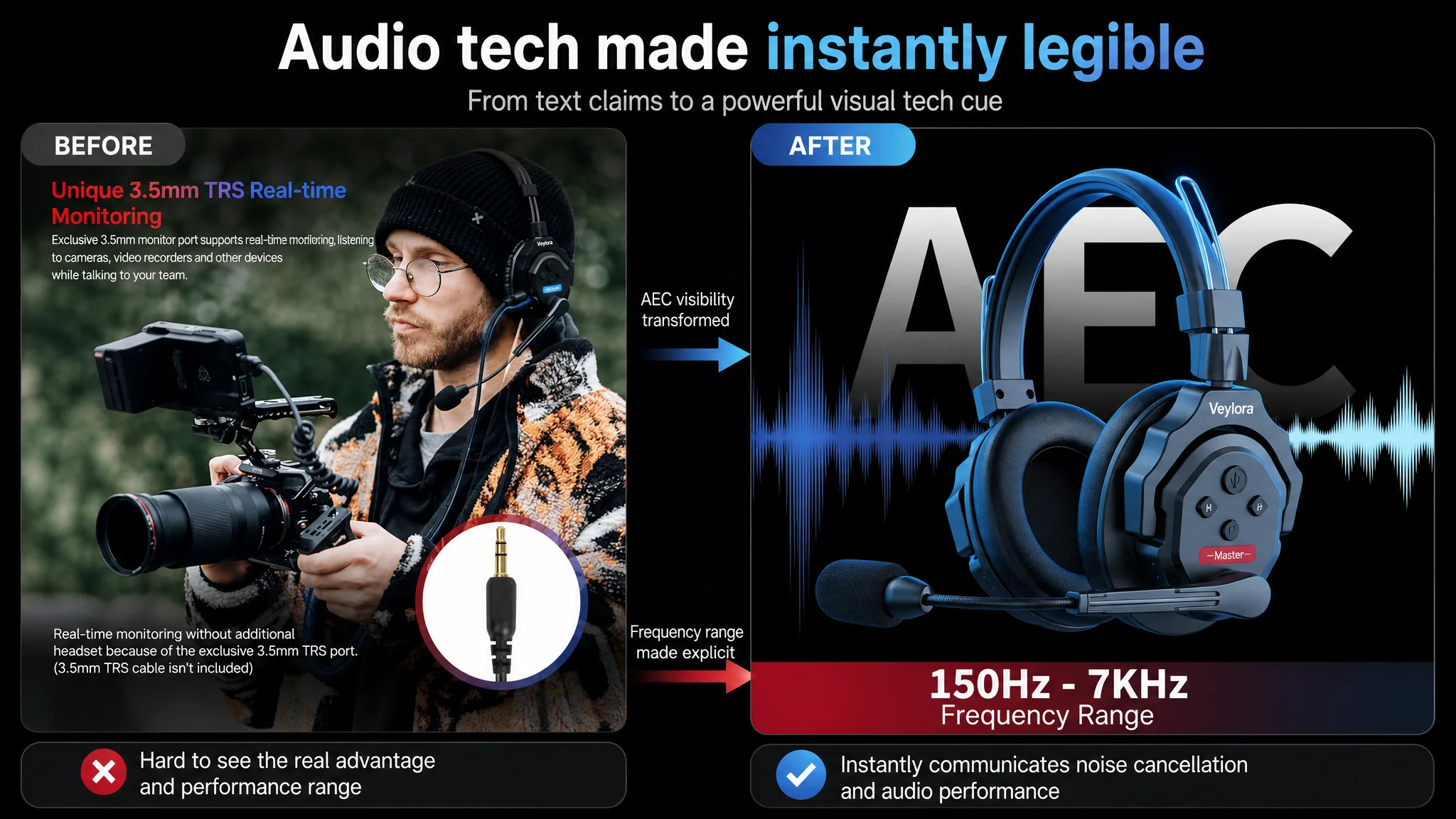
This mirrors the benchmark’s strong audio‑tech imagery while keeping the customer’s genuine AEC spec front and center.
5. Clearing up power and charging doubts
A final main image focuses on:
- Split‑screen layout.
- On one side: battery compartment opened, battery insertion in progress.
- On the other: USB‑C port with dust cap open and cable plugged in.
- A gradient parameter bar showing capacity and runtime.
This addresses a frequent pre‑purchase anxiety in wireless intercom categories: “Will it last through our event, and how complicated is charging?”
Before Ads Could Work Again, the A+ Page Had to Convert
The A+ and long‑scroll detail area were the biggest missing piece. The benchmark listing had turned that space into a full decision engine; the customer had nothing. We structured the future A+ around six core question blocks buyers subconsciously ask.
1. “How far and how reliably can it communicate?”
Suggested A+ visual:
- Outdoor stadium track, two crew members wearing headsets at opposite diagonals.
- A bright blue signal arc connecting them.
- Large central text: “350 m / 1148 ft”.
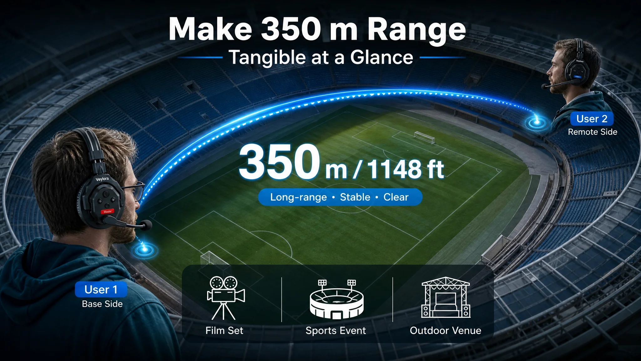
Purpose:
- Make the abstract “350 m” tangible by anchoring it to a large‑scale scene.
- Build immediate confidence in range and stability.
2. “Will it stay clear in noisy, chaotic environments?”
A noise‑cancellation module:
- Left/right split: text on one side, close‑up of a user on a hectic film set on the other.
- Overlaid waveform transitioning from messy red to clean blue between mouth and mic.
- Clear badges: “ENC” and “150 Hz–7 kHz”.
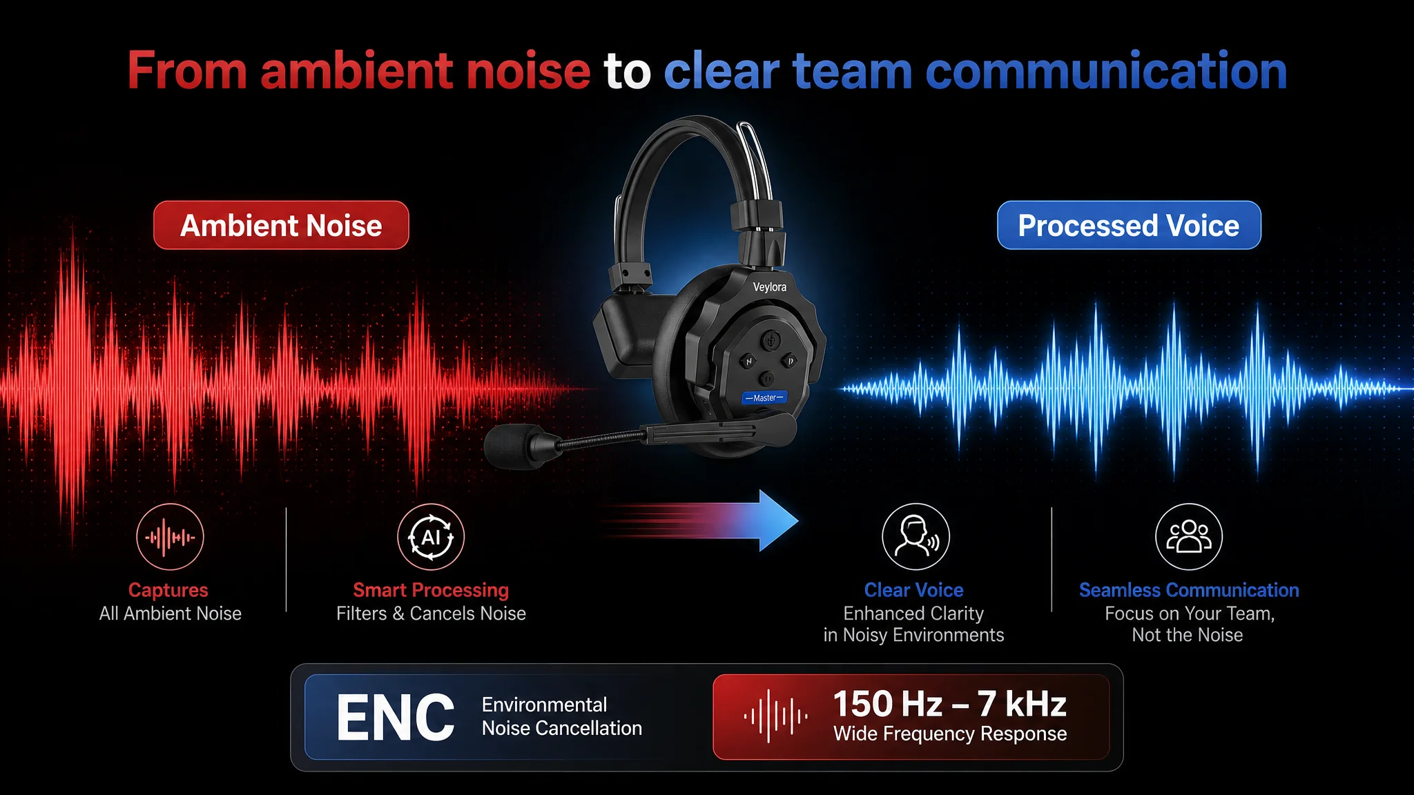
This visually explains what AEC/ENC actually does, closing the common gap between “spec line” and “trusted performance.”
3. “Can I monitor in real time with my camera gear?”
A dedicated real‑time monitoring image:
- Photographer in three‑quarter view wearing the headset, cable connected to a camera monitor.
- Highlighted circle zooming into the 3.5 mm jack area.
- Short caption like “Real‑Time Monitoring for Camera Audio”.
This answers a silent objection: “Can I integrate this into my existing rig, or will I need a workaround?”
4. “Will my team be comfortable wearing this all day?”
Comfort/ergonomics module:
- Exploded view of the headset at 45°, with four callouts:
- Soft ear cushions.
- Detachable mic.
- Adjustable headband.
- 270° rotating boom.
- Clean studio background, consistent with a high‑end equipment catalog.
This addresses comfort and durability without exaggeration, mirroring the benchmark’s professional tone.
5. “Will it make it through a full shoot day without dying?”
Battery and charging module:
- Left: crew member wearing headset on a sunset outdoor set.
- Right: circular crop showing USB‑C port with cable.
- A large “24H” with a progress ring, emphasizing continuous use.
This not only states 24 hours; it shows long‑day use in a way that’s memorable.
6. “Is it versatile enough for different types of jobs?”
Multi‑scene applicability image:
- Asymmetric grid: one large film set image, two smaller ones showing a warehouse and a sports event.
- In each, visible operators wearing the headset and communicating.
- Simple icons and scene labels: “Film”, “Logistics”, “Sports”.
This aligns with how the benchmark broadened its base—while keeping the customer’s professional feel and avoiding amateurish settings.
7. “Exactly what do I get in the box?”
Packaging / contents flat‑lay:
- Overhead shot of the entire kit on a subtle textured background.
- Each piece labeled with quantity (“Battery x2”, etc.).
- Realistic lighting, no over‑editing.
This removes friction around “Do I need to buy anything else?” and helps justify the price as a full professional kit.
How the Page’s Sales Logic Started to Recover—and What Changed for Ads
Once the seller saw the scoring comparison and the detail content vacuum, their understanding of the problem fundamentally changed:
- High ACOS was not proof that “Amazon ads don’t work for this product”.
- It was evidence that the listing was not ready to monetize either organic or paid traffic at the level the hardware deserved.
By restructuring the listing around:
- A search‑ and usage‑oriented title.
- Bullet points that link technology to outcomes and scenes.
- Main images that show a complete, professional solution.
- A+ modules that step through range, clarity, integration, comfort, endurance, multi‑scene use, and box contents.
…the product page began to regain its ability to carry traffic instead of consuming it.
From an operating perspective, this led to three key shifts:
1. Ads became a lever, not a crutch.
With a page that can tell a complete story, each incremental click has a higher chance of converting, and it becomes rational again to test more aggressive ad strategies.
1. Organic traffic potential improved.
Better conversion on relevant keywords feeds back into Amazon’s ranking signals. The listing has a chance to climb for terms like “wireless intercom headset system”, “full duplex intercom”, “video production communication”, instead of slowly drifting down.
1. Business decisions became more controllable.
The seller stopped treating CPC spikes and ACOS swings as purely advertising puzzles. They started to see them as signals to check whether the listing is still aligned with category‑leading content.
What Other Amazon Sellers Can Take Away
This case on Amazon Italy is not about one intercom product; it’s about misdiagnosis:
- The seller believed a conversion problem was a traffic problem.
- They tried to solve it with more and “better” ads.
- DeepBI’s listing scoring and competitor benchmark made clear that the true bottleneck was page‑level conversion capacity—especially in the A+ layer.
For any Amazon seller facing rising ad costs and stagnant orders, the key questions are:
- Are we sure our Amazon Listing deserves more traffic yet?
- Does our title behave like an Amazon search asset, or like generic copy?
- Do our main images and A+ content together form a clear, credible decision path, or are we asking the buyer to fill in the gaps?
In this case, once the seller accepted that listing quality is the foundation of ad efficiency, they were able to stop fighting the wrong battle. Ads did not disappear from the strategy—but they were reintroduced only after the Amazon product page was rebuilt to convert both organic and paid traffic with a professional, category‑aligned story.
That shift in judgment, more than any single design tweak, is what changed the trajectory of the ASIN.