

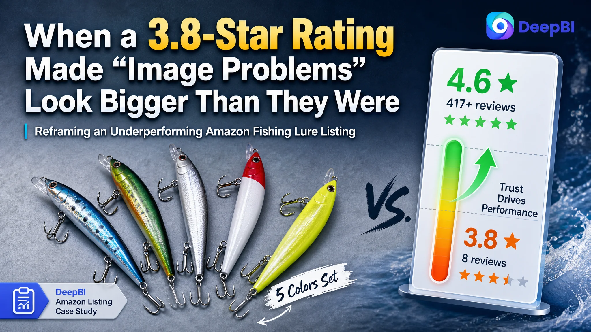
An Amazon seller in the fishing-lure category came to DeepBI with a familiar pressure: traffic was not the issue, but their Amazon product page was not converting the way they expected. They had already invested in professional-looking images and an A+ detail page, so the team’s first reaction was that “our visuals must still not be good enough” and that they needed another round of design and ad tweaks.
Once we put their Amazon Listing side by side with a category-leading spinnerbait competitor, a different picture emerged. On title, main images, bullet points, and A+ content, this seller was not weaker overall—in several areas, they were already ahead. The real gap was not design quality; it was trust. A 3.8-star rating with only 8 reviews was competing head‑to‑head against a 4.6‑star lure with more than 400 reviews and rich photo/video feedback. Ads and visuals were being asked to do a job that reviews had not yet done.
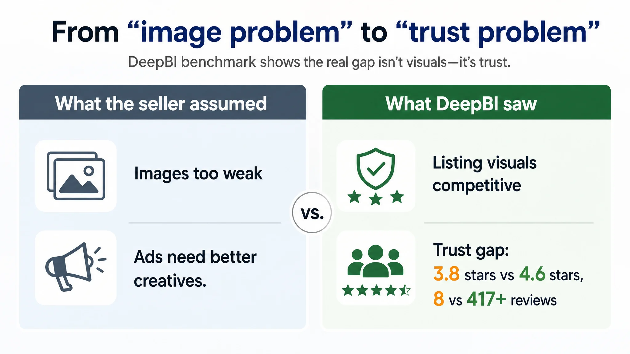
This changed the optimization route completely. Instead of endlessly polishing the “art” of the page or over-optimizing Amazon ads, we focused on tightening the Listing where it truly lagged (search relevance in the title, click triggers in the main images) and then deliberately using that improved experience to earn more high-quality reviews and social proof. Only after the product page could credibly convert cold traffic did it make sense to push harder on Amazon ads.
For other Amazon sellers, this case is a reminder: when a Listing already looks “better than competitors” but still loses, the bottleneck is often not in the next round of design tricks or bid changes. It is whether the page, including its review layer, can carry the trust required for your ad traffic to convert.
What the Seller Saw on the Surface
From the seller’s perspective, the situation looked straightforward:
- They were selling a 5-piece spinnerbait fishing lure set on Amazon US.
- They had invested in a full Amazon Listing: white-background product images, technical diagrams, scenario visuals, and a fairly elaborate A+ detail page.
- They were running Amazon ads and felt CTR and CVR were underwhelming compared with category expectations.
- A key competitor—another spinnerbait set—was ranking well and seemed to convert reliably.
When they looked at their own page, the team saw “nice but maybe not outstanding” images and a technically heavy angle. The pressure translated into a simple storyline internally: “Our images and copy are still not good enough; we need to refresh visuals and rewrite the Listing, then ads will work.”
The problem was that this storyline did not match the objective Listing comparison.
The Core Constraint Was Not Design. It Was Trust.
DeepBI’s Listing scoring put numbers on what was otherwise a gut feeling.
Overall Listing scores (out of 100):
- Target Listing (the seller): 65
- Benchmark competitor: 70
- Gap: –5 points
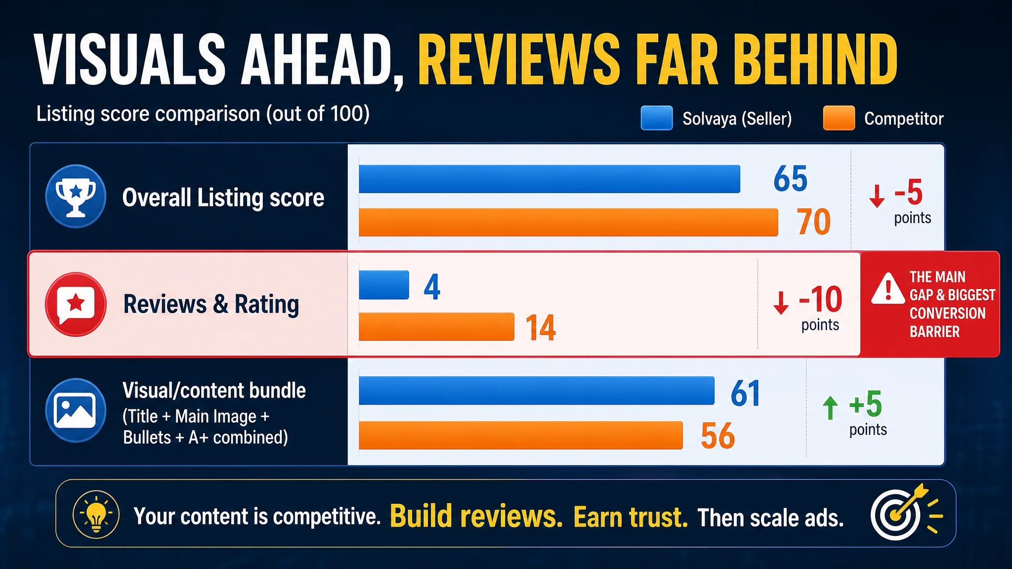
Broken down by Amazon Listing dimensions:
- Title: Seller: 10, Competitor: 13, Max: 20, Gap: -3
- Main Image Set: Seller: 25, Competitor: 24, Max: 30, Gap: +1
- Bullet Points: Seller: 5, Competitor: 3, Max: 10, Gap: +2
- A+ / Detail Page: Seller: 21, Competitor: 16, Max: 25, Gap: +5
- Reviews & Rating: Seller: 4, Competitor: 14, Max: 15, Gap: -10
This is the first important reversal.
- On main images, the seller was not behind; they actually scored slightly higher.
- On bullet points and A+, the seller was clearly stronger—more structured, more scenario-based, more technically coherent.
- The entire 5-point gap in total Listing score came primarily from one place: reviews.
The benchmark lure sat at around 4.6 stars with 417+ reviews and numerous photo/video evaluations. Our target Listing was at 3.8 stars with 8 total reviews, with very limited visual feedback.
“The real problem was not that the page lacked content. It was that the page lacked social proof robust enough to make the content believable.”
In other words, this was not a design-capacity problem. It was a trust-capacity problem.
The Seller’s Original Misdiagnosis
Before the data, the team’s working hypothesis looked like this:
1. “Our visuals are too weak.”
They believed that their images looked “cheap and artistic,” especially compared with a competitor who used more obvious scenes (fish hitting the lure, tackle-box layouts, etc.). The assumption was that photos were the main barrier to CTR and CVR.
1. “Our text might be too technical.”
Terms such as “UV-Enhanced Reflective Coating” and “mepps-inspired blades” made the Listing feel professional but maybe too niche. They worried this could be confusing and hurting conversion.
1. “We just need to tune ads on top of better visuals.”
With costs rising, ACOS pressure was interpreted as an ad-optimization problem: new creatives, new images, new bid structure.
From this misdiagnosis came a mis-prioritization: energy and budget were about to be poured into another round of image refresh and ad tinkering—while the core trust gap, the 3.8‑star rating with minimal reviews, stayed untouched.
Why Traditional Amazon Ad Optimization Was Stalling
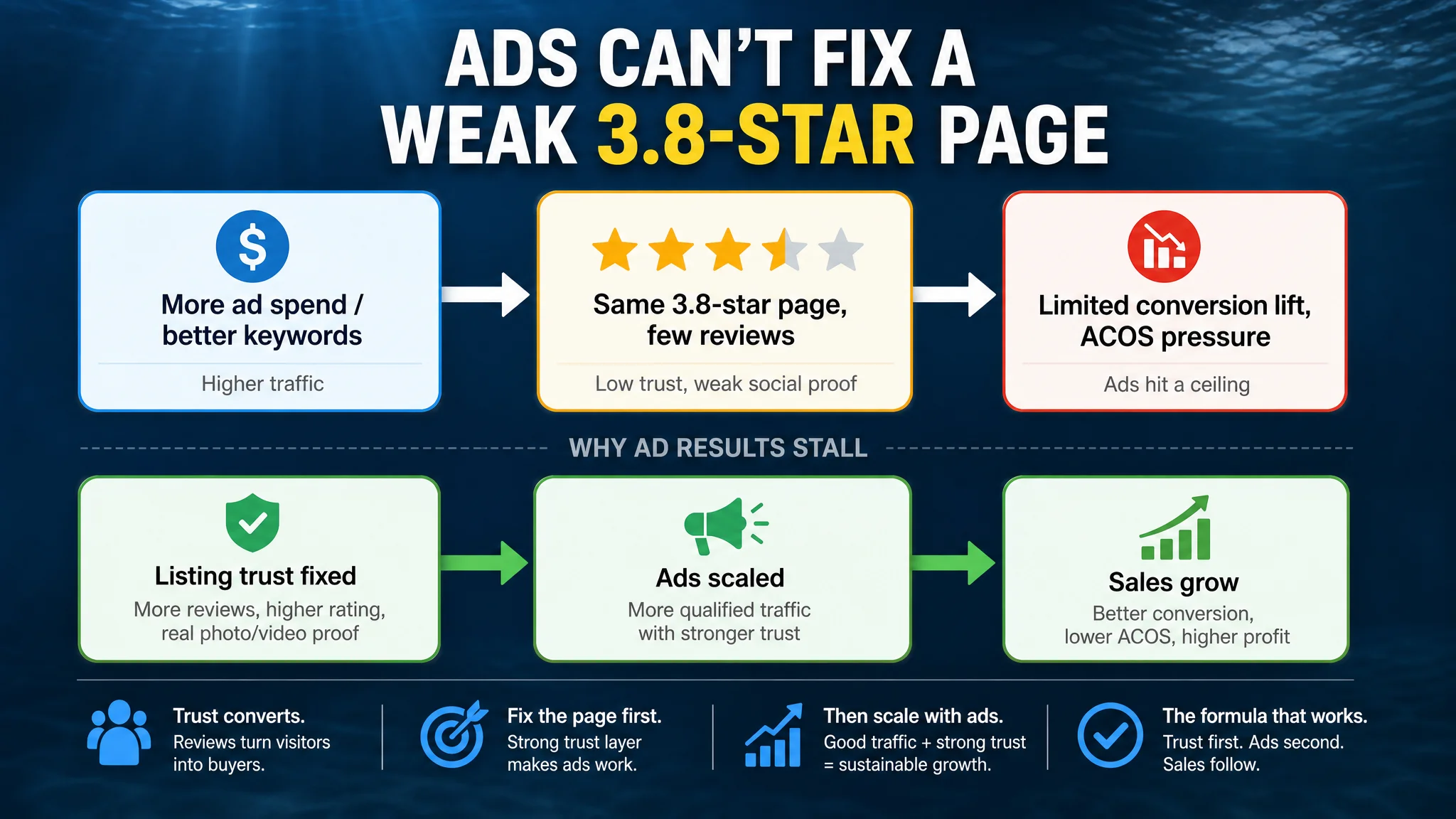
In this state, classic ad optimization tactics have very limited upside:
- You can buy more impressions, but new visitors see the same 3.8 stars and low review count.
- You can refine keywords, but they still land on a page that visibly underperforms competitors on social proof.
- You can tweak bids to control ACOS, but every click goes to a page that struggles to convince, so ad spend keeps hitting a ceiling.
This is how many sellers get stuck in an “ads don’t scale” loop: they are feeding traffic into a page whose core conversion driver—trust—is structurally weaker than the category leader’s.
DeepBI’s Listing-Level View: Where the Page Was Already Strong
Before proposing any optimization path, DeepBI puts the entire Amazon Listing under the same microscope as the benchmark.
Title: Search Logic, Not Just Wording
The seller’s title had professional language but lost ground on Amazon’s search and relevance logic:
- It underused key phrases like “Fishing Lure” / “Spinnerbait” compared to the competitor, who repeated core terms across the title, strengthening search weight.
- It front-loaded “5-Piece” instead of a brand or core product term, while the competitor followed the established “Brand + Core Keyword” structure.
- The competitor title packed in count options (“10/30pcs”) and tackle box info early, making value and completeness obvious from the search page.
DeepBI’s recommendation tightened this by:
- Putting a stronger core phrase up front:
5-Piece Spiral Blade Spinnerbait Fishing Lure Set
- Preserving the unique tech angle but simplifying it into high-signal language:
Single Hook UV-Enhanced Reflective Coating Spinner Baits for Bass Salmon Trout
- Keeping the kit aspect and tackle box visible for perceived value:
Portable Fishing Lures Kit with Storage Tackle Box
This was not about “making the title prettier.” It was about aligning with how Amazon search and shoppers read titles at a glance.
Main Images: Visually Competitive, but Missing Decision Triggers
Contrary to the seller’s fear, DeepBI’s scoring showed that main-image quality was not the primary weakness. In several respects, the page already outplayed the competitor:
- The current set included white-background product shots, UV-effect images, and some technical diagrams.
- The competitor’s images were not drastically superior; where they did win was in scene realism, measurable information, and clear results.
DeepBI’s image-level suggestions were therefore subtle but high‑leverage:
- From “product collage” to “professional fishing gear feel”
Rebuild the hero image around a fan-shaped layout of five lures, 45° top-down, with a textured light-gray background and a simple “5 Colors Set” callout. This mirrors the professional tackle aesthetic buyers expect.
- Make UV performance believable, not synthetic
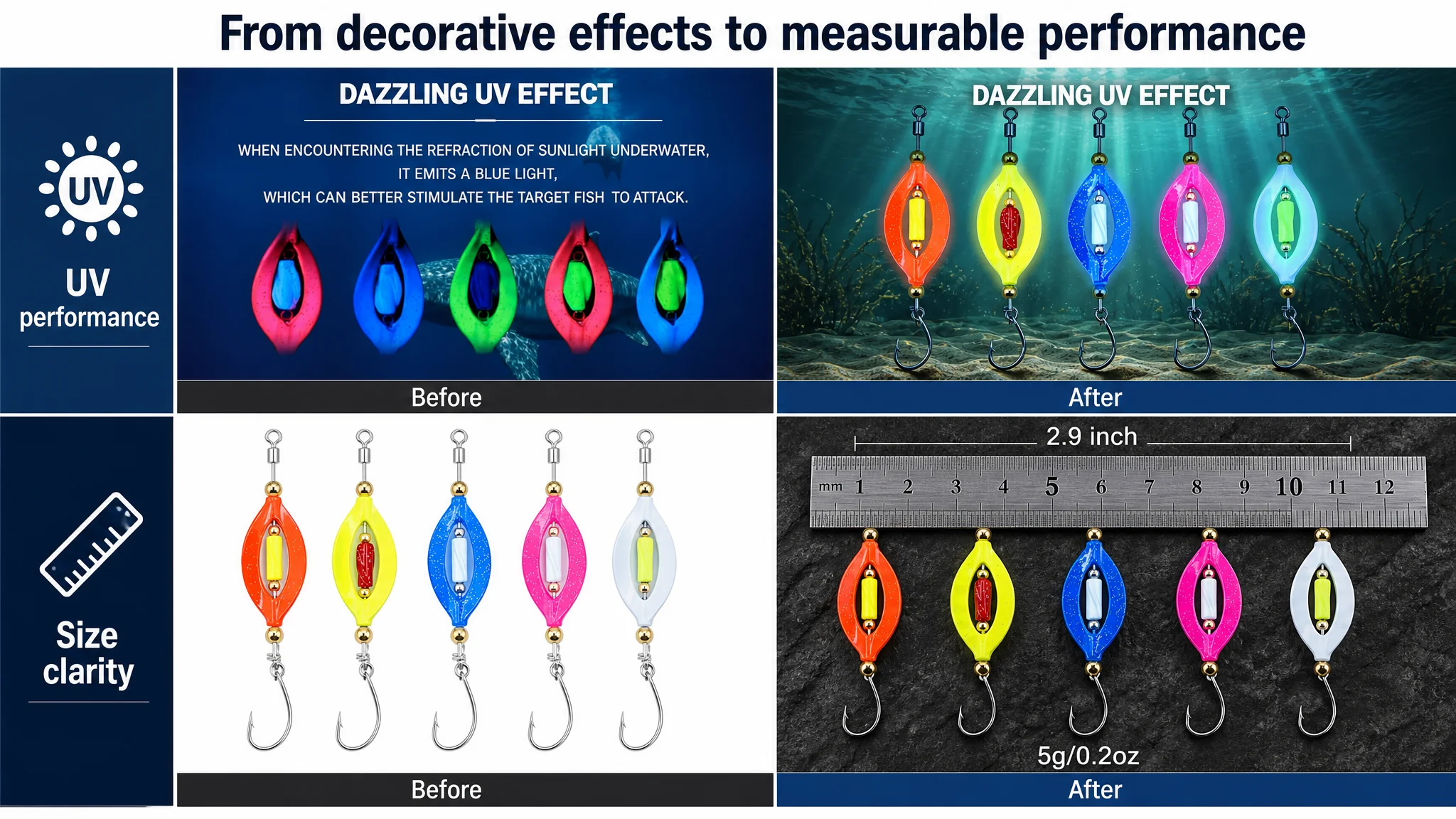
Replace overly composited UV visuals with a realistic underwater environment—3m depth, soft blue-green light, blurred sand and weeds—so the UV glow looks like it belongs in a real lake, not a poster.
- Turn the technical image into a trust-building diagram
Use a single angled lure with clean callouts labeling key components. This looks more like the diagrams serious anglers are used to judging gear quality.
- Visualize the spiral action with credible behavior
Show the lure “swimming” in a clean blue lake with a bass silhouette approaching, rather than an exaggerated fantasy backdrop. This links the design to a real outcome.
- Make size instantly clear
Add a metal ruler and clear “2.9 inch” / “5g / 0.2 oz” annotations. This reduces returns and hesitation for size-sensitive buyers.
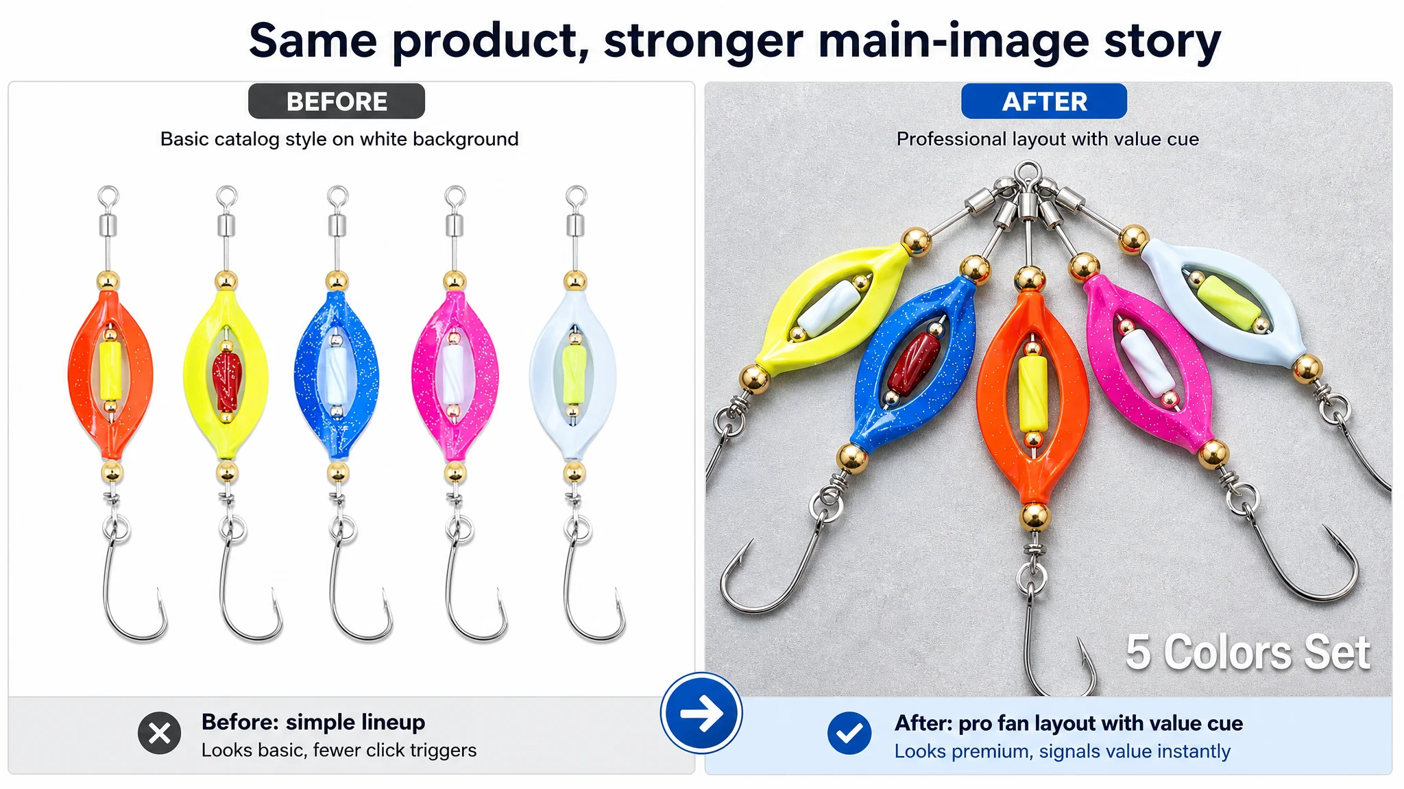
In other words, DeepBI did not conclude “your images are weak; redo everything.” The conclusion was: your images are competitive, but they need to carry more decision-critical information in fewer seconds.
Bullet Points: Strong Logic, But Missing Search and Trust Signals
On bullet points, the seller already had more depth and structure than the competitor:
- The content was organized around themes: Mastery, Combo, Rivalry, Portable, Gift.
- It used real fishing scenarios (rivers, lakes, topwater bass) and specific fish species.
- It leaned into differentiated features like single-hook design and UV coating.
DeepBI’s refinement was to:
- Make each point start with a bolded benefit name, e.g.
【PROFESSIONAL SNAG-FREE DESIGN】 followed by specific specs and use cases.
- Widen species coverage and environments, borrowing from competitor language where it clearly captured search demand (Pike, Walleye, freshwater + saltwater).
- Tie UV blades, vibration, and low-speed rotation into one combined “why this catches more fish” explanation, not separate technical fragments.
- Use the tackle box and durability to promise long casting and gear protection, not just storage.
- Expand the gift angle into clear occasions and user types: Father’s Day, Thanksgiving, Christmas, beginners and pros.
The point is that bullet logic was already good; it just needed to be better aligned with what shoppers actually search and worry about, so every bullet pulled conversion weight.
A+ / Detail Page: Visually Stronger Than the Competitor
In the A+ section, the seller was not behind—they were ahead:
- A strong brand main visual with a fishing silhouette and brand overlay, which created an emotional anchor from the first screen.
- Structured feature breakdowns: hook type, glowing beads, material close-ups, and text such as “ideal for beginners” and “long casting” directly connected technology to use.
- Immersive dynamic scenes (fish leaping, hexagonal environment compositions) that built a premium perception.
The competitor’s A+ by comparison:
- Led with a plain brand logo bar, low first-screen impact.
- Relied on multiple low-resolution collages of similar products.
- Failed to highlight any single SKU’s core strengths clearly.
DeepBI’s adjustments here were not about increasing “prettiness,” but about tightening the story:
- Opening visual: keep the pro feel, but move from black‑and‑white art to a real early‑morning lake scene with the lure in sharp focus and the brand name in metallic lettering.
- Core feature panel: use split layouts with the lure close‑up on one side and callout bubbles on the other for key components (hook, rotor, beads).
- Pain-point module: a micro shot of the hook tip under side-backlighting, visually proving sharpness and durability—more convincing than text alone.
- Scene fit: show the lure entry into a clear stream, freezing the splash at the golden ratio point in the frame.
- Underwater behavior: use a submerged perspective with realistic light beams (Tyndall effect) and subtle water disturbance to explain the lure’s attractor logic without words.
- Social proof: a real angler holding a bass with the lure in its mouth replaces generic “quality” claims.
- CTA: a panel showing all colors in a clean layout with “IDEAL FOR BEGINNERS” to reduce decision friction for newer anglers.
On every visual module, the direction was the same: keep the professional tone, but make it more concrete, more believable, and more conversion-focused.
The One Dimension That Could Not Be Ignored: Reviews
With title, images, bullets, and A+ all in the competitive zone—or stronger—the real bottleneck was obvious in the numbers:
- Seller: 3.8 stars, 8 reviews, almost no photo/video content.
- Competitor: 4.6 stars, 417+ reviews, many visual reviews.
This is a trust chasm, not a design gap.
From a shopper’s perspective on Amazon:
- A 4.6‑star lure with hundreds of reviews looks like a safe, proven choice.
- A 3.8‑star lure with single-digit reviews looks experimental or risky, no matter how polished the images are.
From an ad-efficiency perspective:
- Every paid click to a 4.6‑star page has a much higher probability of ending in a sale.
- Every paid click to a 3.8‑star page is much more likely to bounce or require higher discounts to close.
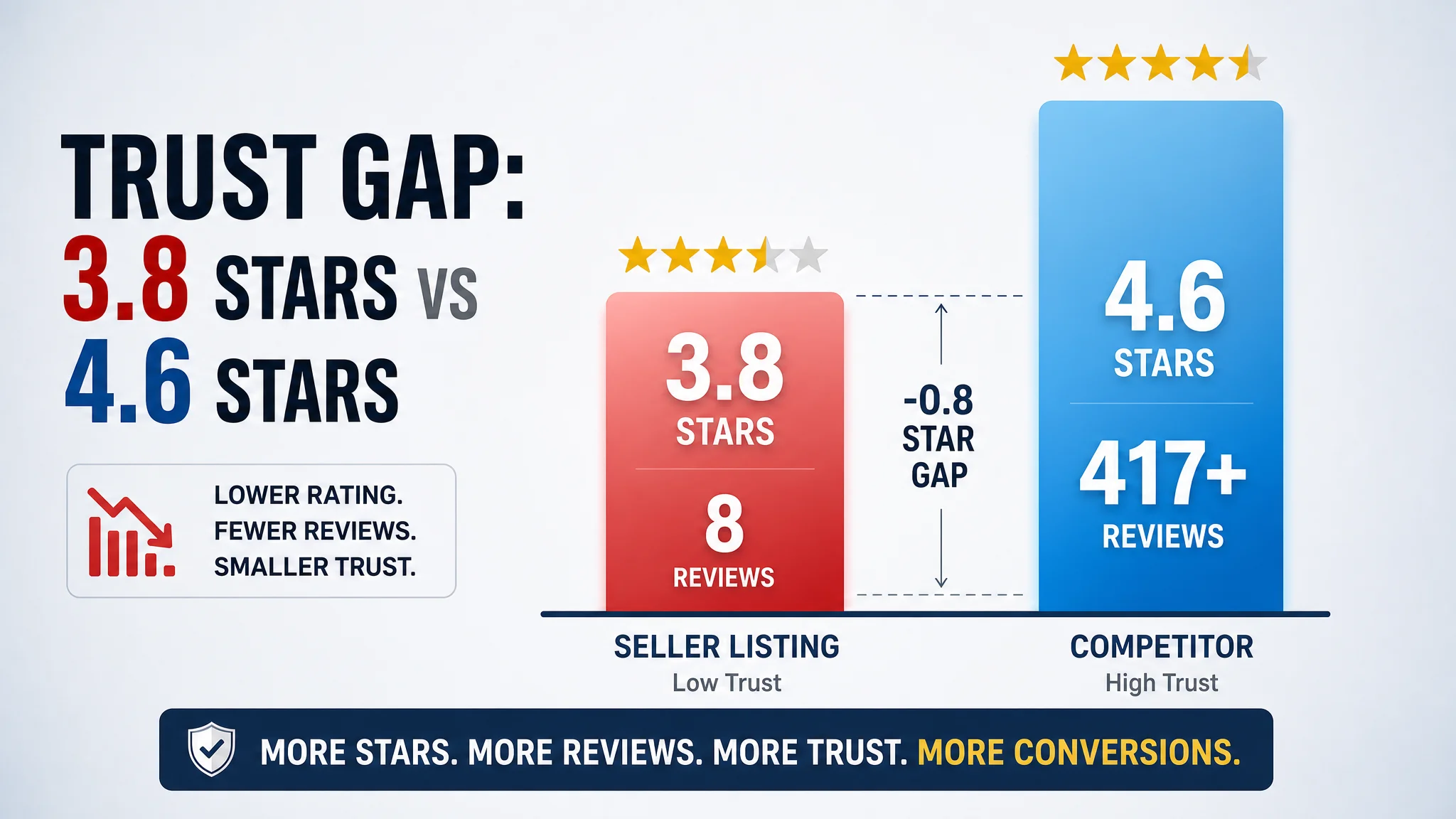
This is why DeepBI’s judgment was that Listing conversion capacity was constrained by trust, not by content length or design quality.
“Advertising does not only amplify advantages. It can also amplify a page’s existing defects.”
Pouring more Amazon ads into a 3.8‑star Listing without a review strategy would simply amplify the trust problem, not solve it.
Why Listing Conversion Had to Be Repaired Before Pushing Ads
Once the core constraint was clear, the decision path shifted.
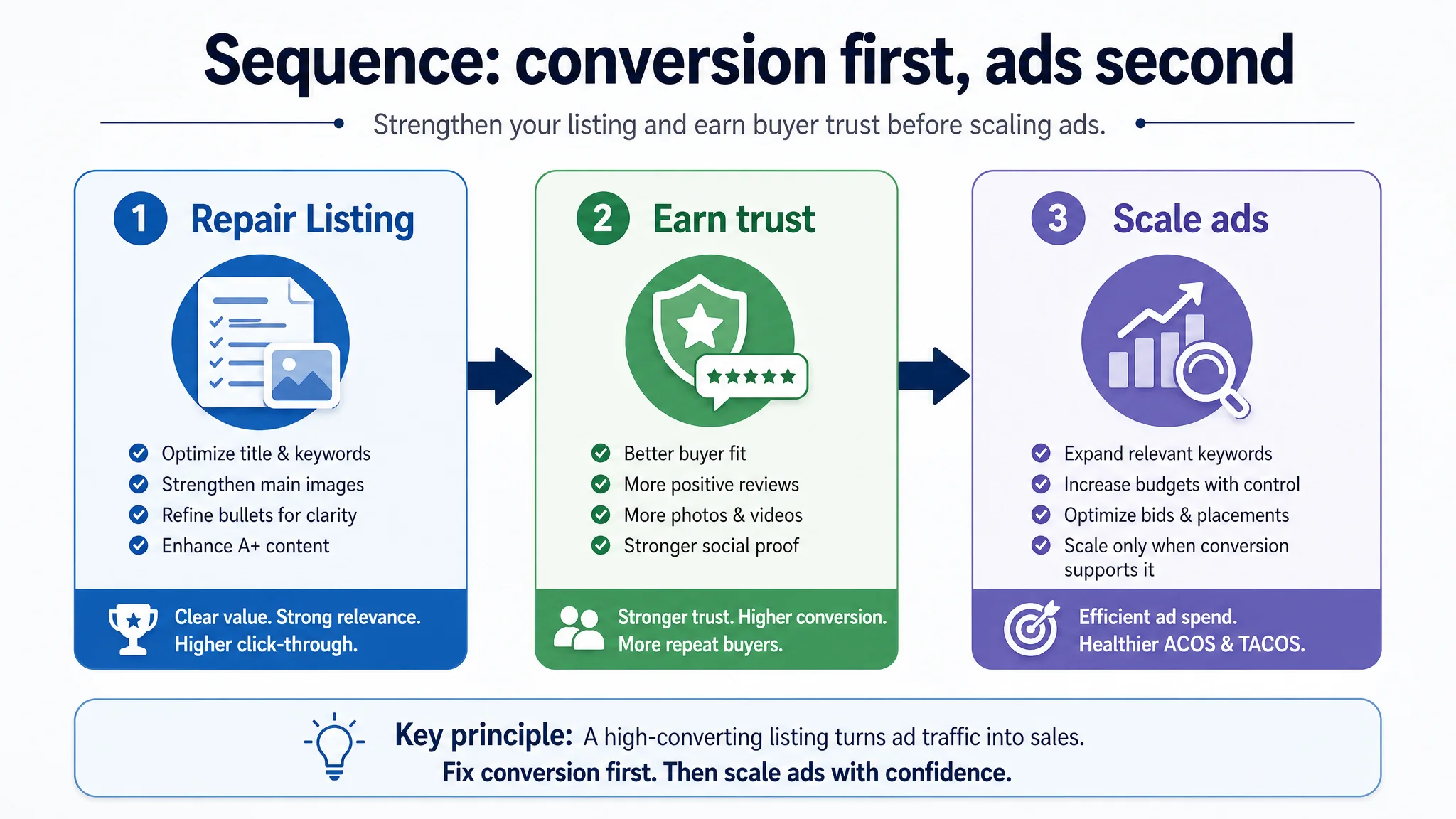
1. Fix the “Deserve Traffic” Question First
Before scaling ad spend, DeepBI’s stance was:
- Make sure the title can win impressions for the right terms.
- Make sure the main images can win the click against top search competitors.
- Make sure bullets and A+ answer real buyer questions: what it does, where it shines, what problem it solves (snags, casting distance, UV visibility, fish species).
These changes do not immediately fix reviews, but they:
- Increase the odds that early buyers succeed with the product because expectations are clear.
- Make it easier for those buyers to leave positive, photo-based reviews, since they can see the lure behaving in ways they already saw on the page.
2. Use Paid Traffic Strategically, Not Aggressively
Rather than scaling Amazon ads aggressively, the focus becomes:
- Target controlled, relevant keywords where the improved title and images have the best shot at CTR.
- Use that traffic to generate initial batches of satisfied customers.
- Actively encourage reviews once orders are fulfilled (within Amazon’s policies).
The goal is to move from:
- A 3.8-star, low-review Listing that burns ad budget,
to
- A 4.0+ star, growing-review Listing with visuals and messaging aligned to how anglers actually judge lures.
3. Protect ACOS and TACOS From Structural Drag
By refusing to treat this as a pure ad optimization problem, the seller avoids:
- Spending heavily on traffic that is structurally less likely to convert.
- Misreading ACOS issues as “bid or keyword problems” when they are really review and trust problems.
Instead, ad spend is only increased as:
- Listing-level trust improves (rating, review count, photo reviews).
- Conversion data confirms that the page is now carrying its weight.
How the Page’s Sales Logic Started to Recover
After DeepBI’s diagnosis, the seller’s Listing logic moved from “more art, more ads” to “more clarity, more trust.”
In practical terms:
- Search-entry clarity improved.
The revised title and main images made it easier for shoppers to see, from the search page, that this is a spinnerbait kit with UV blades, single-hook advantages, and a tackle box—without reading deeply.
- On-page doubts decreased.
The new bullet structures and A+ visuals answered core questions:
- Will this snag less in weedy cover?
- Can I throw it far enough?
- Does it really flash and vibrate at low speeds?
- Is it suitable for the species and waters I fish?
- Perceived professionalism increased.
The more grounded, realistic imagery (streams, underwater shots, real bass catch) acted as a visual “proof chain” for serious anglers, not just decoration.
This set the stage for more satisfied early buyers, and therefore:
- Higher probability of positive reviews.
- Greater likelihood of photo/video testimonials.
- Gradual improvement in rating and review volume.
As that happened, Amazon ad traffic stopped being “expensive visitors to a skeptical page” and started becoming fuel for a Listing that could actually convert.
What Changed in the Seller’s Understanding
For this fishing-lure seller, the biggest shift was not a specific new image or bullet point. It was their mental model of where the business problem actually sat:
- From “our images and copy are weak; ad performance is an ads problem”
- To “our Listing content is competitive; the core bottleneck is trust and review volume, and ads will only work if the page can convert that traffic.”
They also saw in concrete terms that:
- A visually strong A+ and sophisticated bullets cannot compensate alone for a weak rating and low review count.
- High‑quality images have to earn their keep: show parameters, scenarios, mechanisms, and outcomes that make reviews more believable and reduce returns.
- Amazon ads should not be the first lever pulled when Listing conversion fundamentals (including social proof) are not in place.
What Other Amazon Sellers Can Take Away
This case is about fishing gear, but the logic applies across categories:
1. Do not confuse “needs more design” with “needs more trust.”
If your images and A+ are already better than the benchmark but you lose on rating and review count, your problem is not another round of Photoshop.
1. Score the whole Listing, not just the hero image.
Look at title, main images, bullets, A+, and reviews together. A single weak dimension—often reviews—can neutralize strengths elsewhere.
1. Ask whether your page deserves more traffic before buying more traffic.
If conversion is fundamentally capped by low social proof or misaligned messaging, scaling ads only multiplies the cost of that misalignment.
1. Use visual and copy improvements to make good reviews more likely.
Clarity of expectations + realistic scenes + accurate parameters = fewer disappointments and more authentic, positive feedback.
DeepBI’s role in this case was not to turn the Listing into a design showpiece, but to locate the real constraint and sequence decisions correctly. For Amazon sellers, that sequencing—Listing conversion first, ads second—is often the difference between a page that quietly consumes budget and one that can sustainably grow.