


An Amazon seller in the home décor category came to DeepBI with an uncomfortable paradox: their canvas floater frame Listing in the US marketplace looked “high-end” and visually polished, yet the business side was getting harder to manage. Advertising brought traffic, but orders didn’t scale proportionally. The team’s first reaction was to blame ads—bids, keywords, campaign structure—because on the surface the page already looked “better” than many competitors.
Once we ran the Listing through DeepBI’s benchmarking analysis against a category-leading canvas floater frame, a different picture appeared. The root issue was not that Amazon ads were underperforming; it was that the product page did not fully convert the traffic it was already getting. The page leaned heavily into dark, gallery-style aesthetics, but under-delivered on one thing this category fundamentally lives or dies on: clear, low-friction installation logic and sizing reassurance.
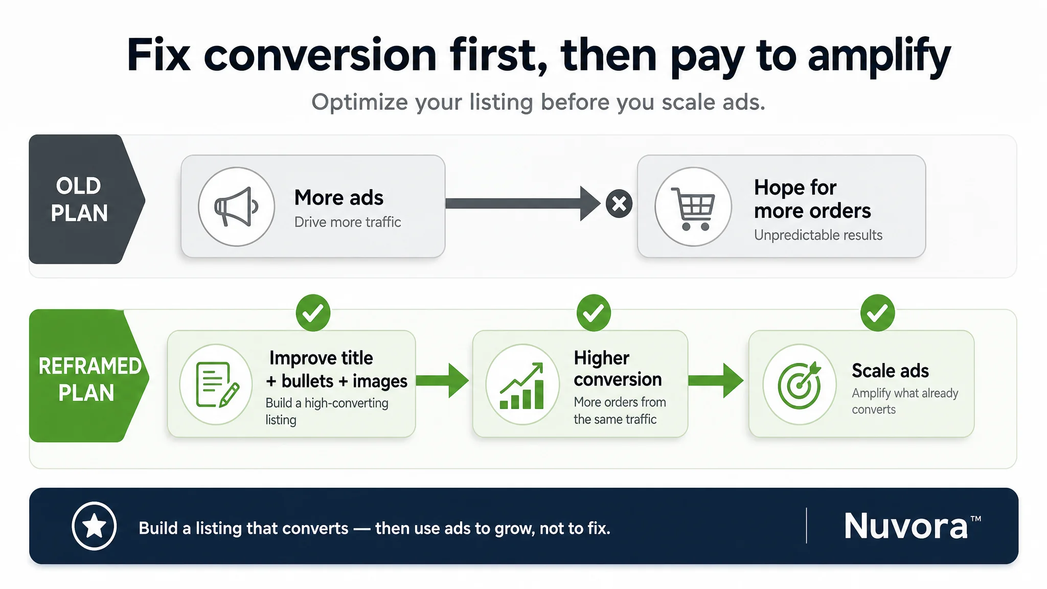
DeepBI reframed the problem with a simple judgment: before pushing harder on Amazon ads, the Listing itself had to be rebuilt from “pure aesthetic” to “aesthetic + tool.” That meant tightening the title around the real buying outcome, restructuring bullet points around concrete pain points (fit, install, durability, origin), and reworking main images and A+ modules to show dimensions, hardware, and installation steps as clearly as the art vibe. For other Amazon sellers, the case is a reminder: when ad costs rise and ACOS refuses to move, the limiting factor is often not your campaigns but your page’s ability to turn traffic into confident buyers.
The Real Bottleneck: A Listing That Looked Premium but Didn’t Lower Risk
On paper, this Listing didn’t look weak.
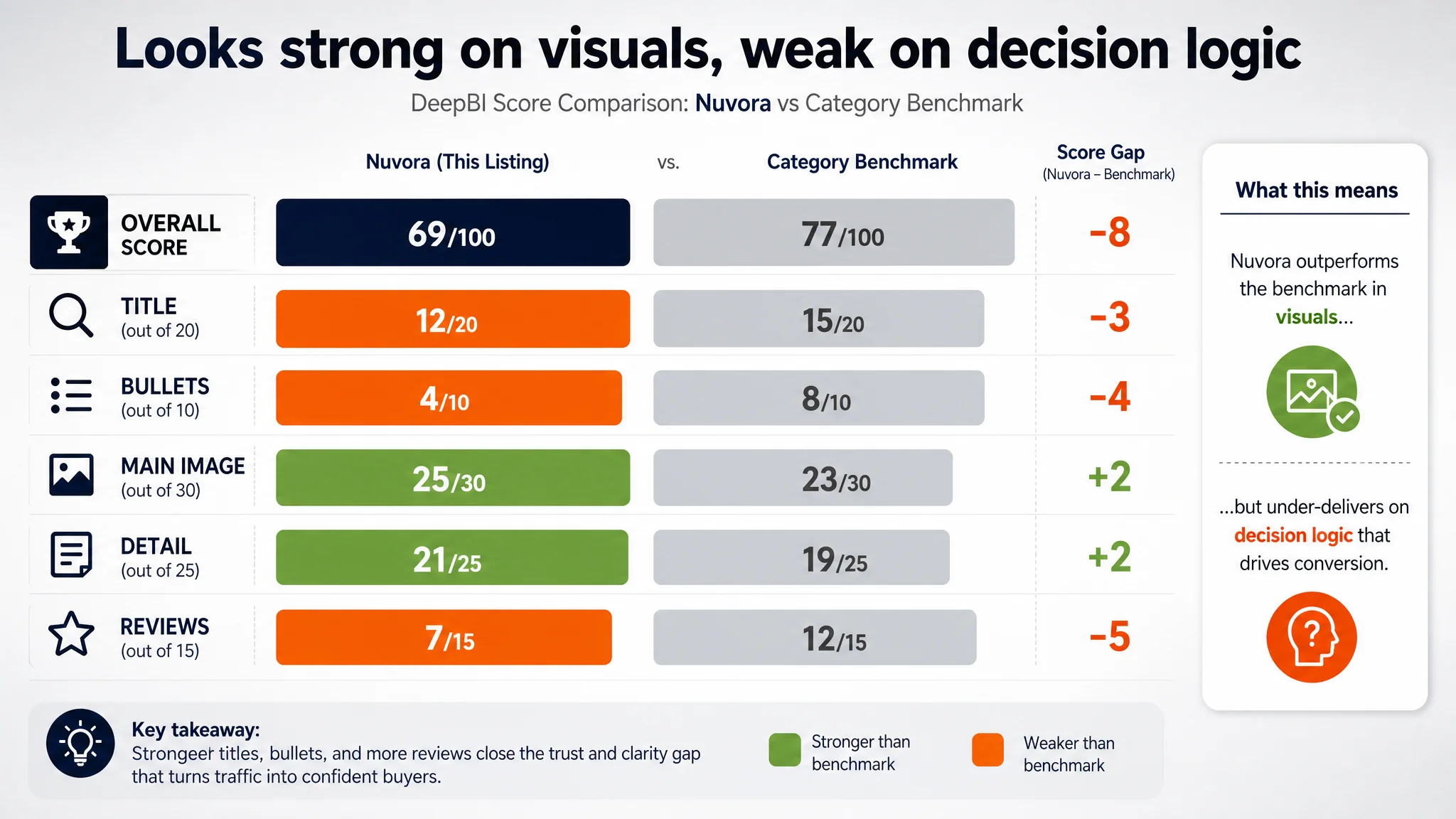
- Overall DeepBI score: 69/100
- Benchmark competitor: 77/100
- Main image and A+ visuals scored slightly higher than the benchmark.
- Review rating: 4.5 stars vs competitor’s 4.3 stars.
The seller’s anxiety came from the operating reality: traffic existed, but the page struggled to convert efficiently enough to support aggressive Amazon ads. Their instinctive diagnosis was:
“We probably haven’t structured the campaigns and bids well enough yet.”
DeepBI’s scoring broke that assumption. The main image and detail visuals were not the weakest link. The real structural leak was:
- Title: 12 vs 15 (out of 20)
- Bullet points: 4 vs 8 (out of 10)
- Reviews: 7 vs 12 (out of 15), driven mainly by volume gap (85 vs 3,000+ reviews)
In other words, the Listing looked refined, but it was not doing enough to answer the practical questions that close this category:
- “Will this frame really fit my canvas?”
- “Can I actually install this myself without extra trips to the store?”
- “Is the material solid or a cheap substitute?”
- “Have enough people bought this for me to trust it?”
Until those points were handled, more ad traffic would simply mean more expensive hesitation—not more orders.
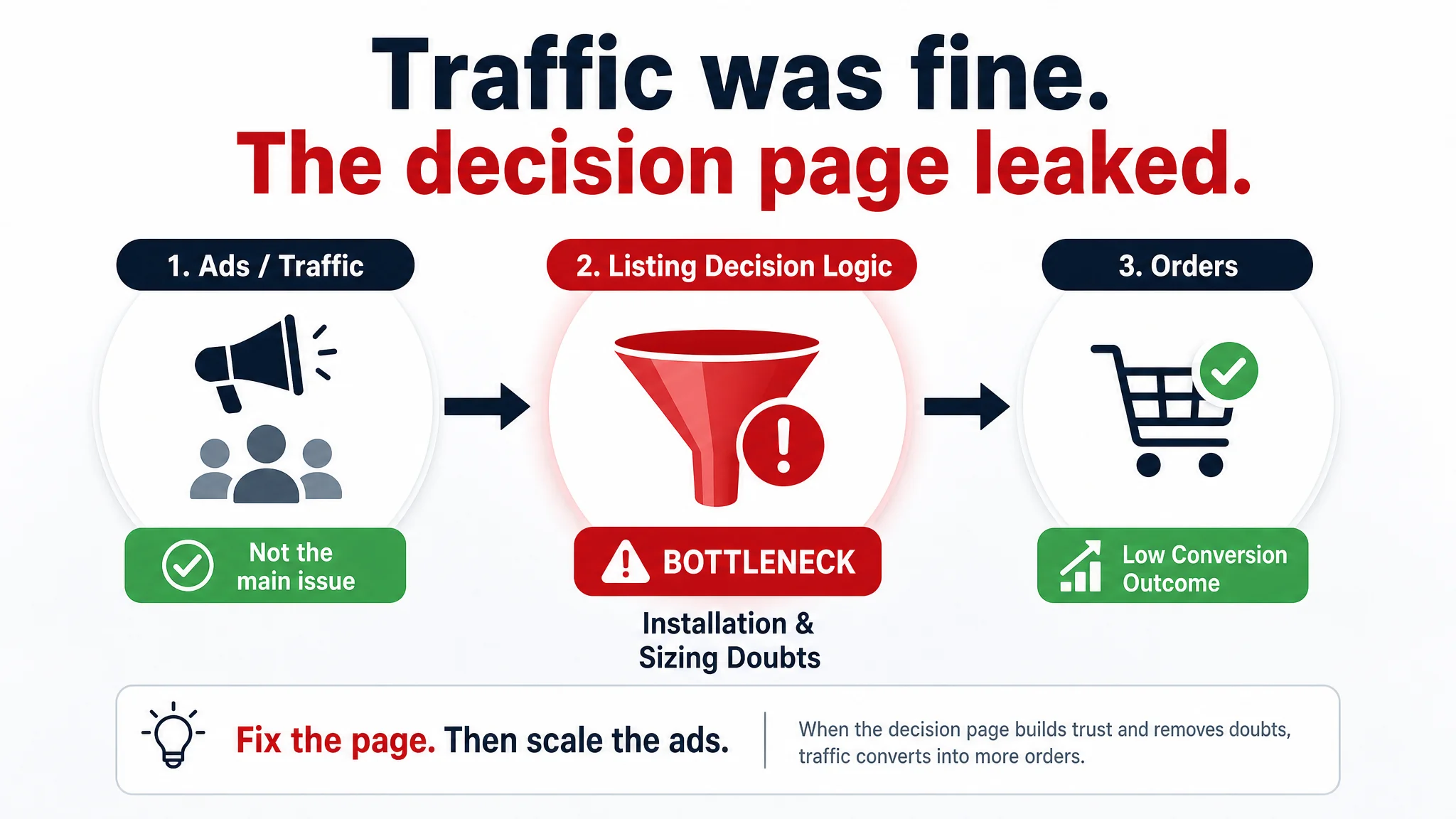
“The real problem was not that ads failed to bring traffic. It was that the page could not convert the traffic.”
What the Seller Originally Misdiagnosed
From the seller’s perspective, the path seemed logical:
1. Ads were getting more expensive → ACOS pressure increased.
2. Listing visuals looked “high-end” and differentiated.
3. Competitors’ images appeared more basic or less atmospheric.
4. Conclusion: “The problem must be our ads, not the page.”
All their energy went into:
- Pushing more keywords to cover art, wall décor, room décor.
- Adjusting bids on broad and phrase matches.
- Trying to “buy” visibility to catch up with a competitor carrying thousands of reviews.
What they did not question was the decision logic on the product page itself:
- Whether the title positioned the product as a professional floater frame solution or just another decorative item.
- Whether the bullet points gave a concrete, step-by-step sense of how easy it was to get from “canvas in hand” to “framed and on the wall.”
- Whether visuals clarified sizing and installation sufficiently to reduce returns and pre‑purchase doubts.
As a result, Amazon ads were being used to force traffic through a page that was not fully built to convert that traffic—especially when measured against a benchmark that had already refined its persuasion path.
Where DeepBI’s Listing Benchmarking Drew a Line
DeepBI’s Listing scoring did not start from aesthetics; it started from competitive context.
Against a benchmark floater frame Listing, the scores and qualitative differences surfaced three critical gaps:
1. Title: Plenty of Information, Weak Buying Logic
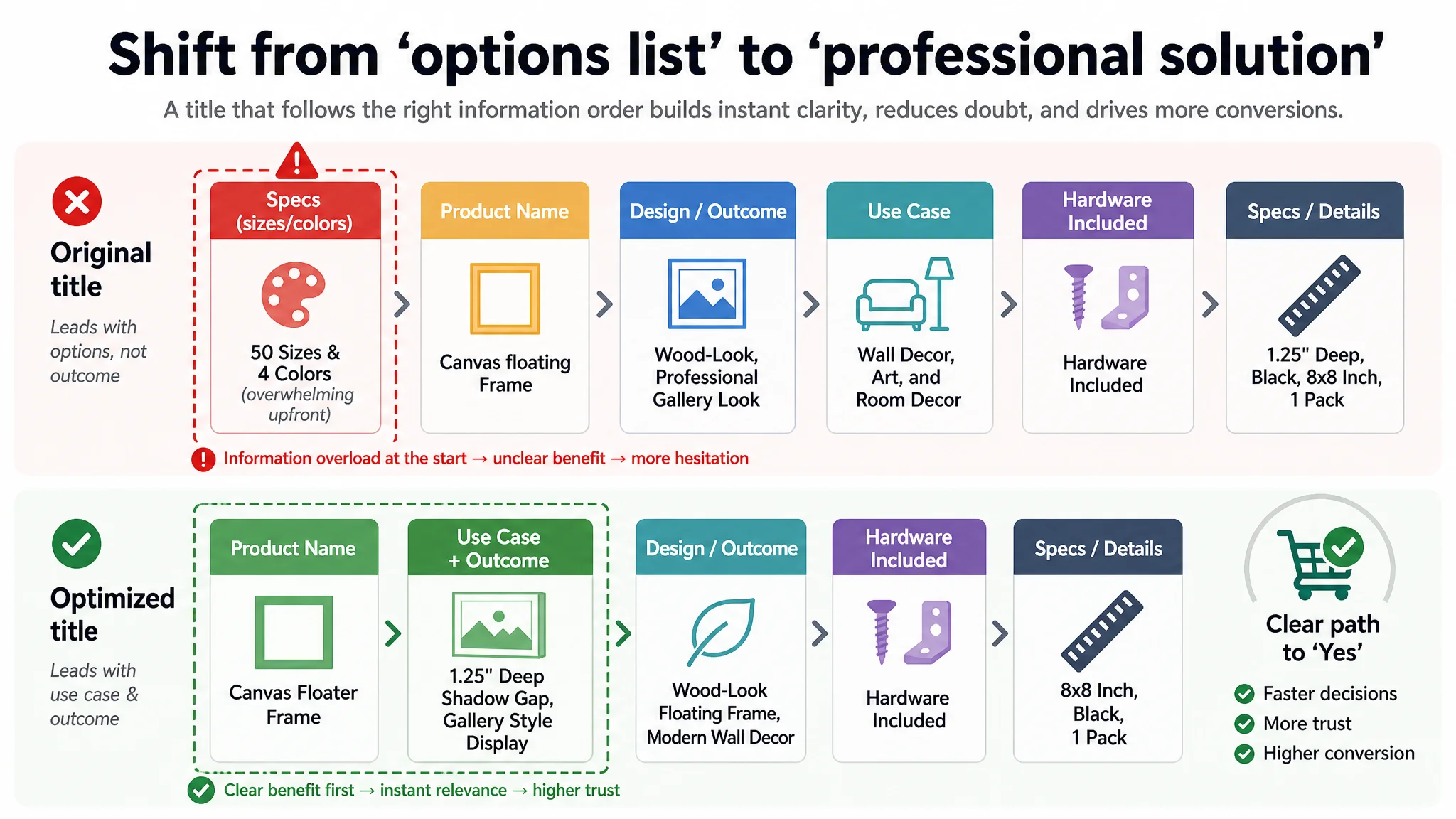
The seller’s original title:
- Led with “Canvas Floating Frame” and “Wood-Look,” then quickly jumped into “Available in 50 Sizes & 4 Colors.”
- Tried to cover multiple use cases: “Wall Decor, Art, and Room Decor.”
- Presented a product spec list, not a buying outcome.
The benchmark title:
- Led with “Canvas Floater Frame for Finished Canvas Art” — clear identity and use.
- Fast-followed with “1.25" Deep Floating Shadow Gap Design, Modern Wall Decor, Gallery Style Display” — design outcome and style.
- Closed with “Hardware Included” and clear spec.
Two key results:
- The benchmark’s title immediately told buyers: “This is the specific, professional solution for finishing your canvas with a floating shadow gap and gallery look, hardware included.”
- The seller’s title said: “We have many sizes and colors,” which is useful, but not the primary decision trigger.
DeepBI’s proposed title direction:
Canvas Floater Frame for 1.25" Deep Canvas Paintings, Wood-Look Floating Frame with Shadow Gap Design, Modern Gallery Style Wall Decor, Hardware Included (8x8 Inch, Black, 1 Pack)
This:
- Keeps “Canvas Floater Frame” at the front for search and clarity.
- Explicitly calls out 1.25" deep canvases and shadow gap design as the core use case.
- Makes “Hardware Included” visible without bloating the title with all 50 sizes.
- Shifts from “we have options” to “this is a professional floater frame solution.”
2. Bullet Points: Features Listed, Pain Points Under-Served
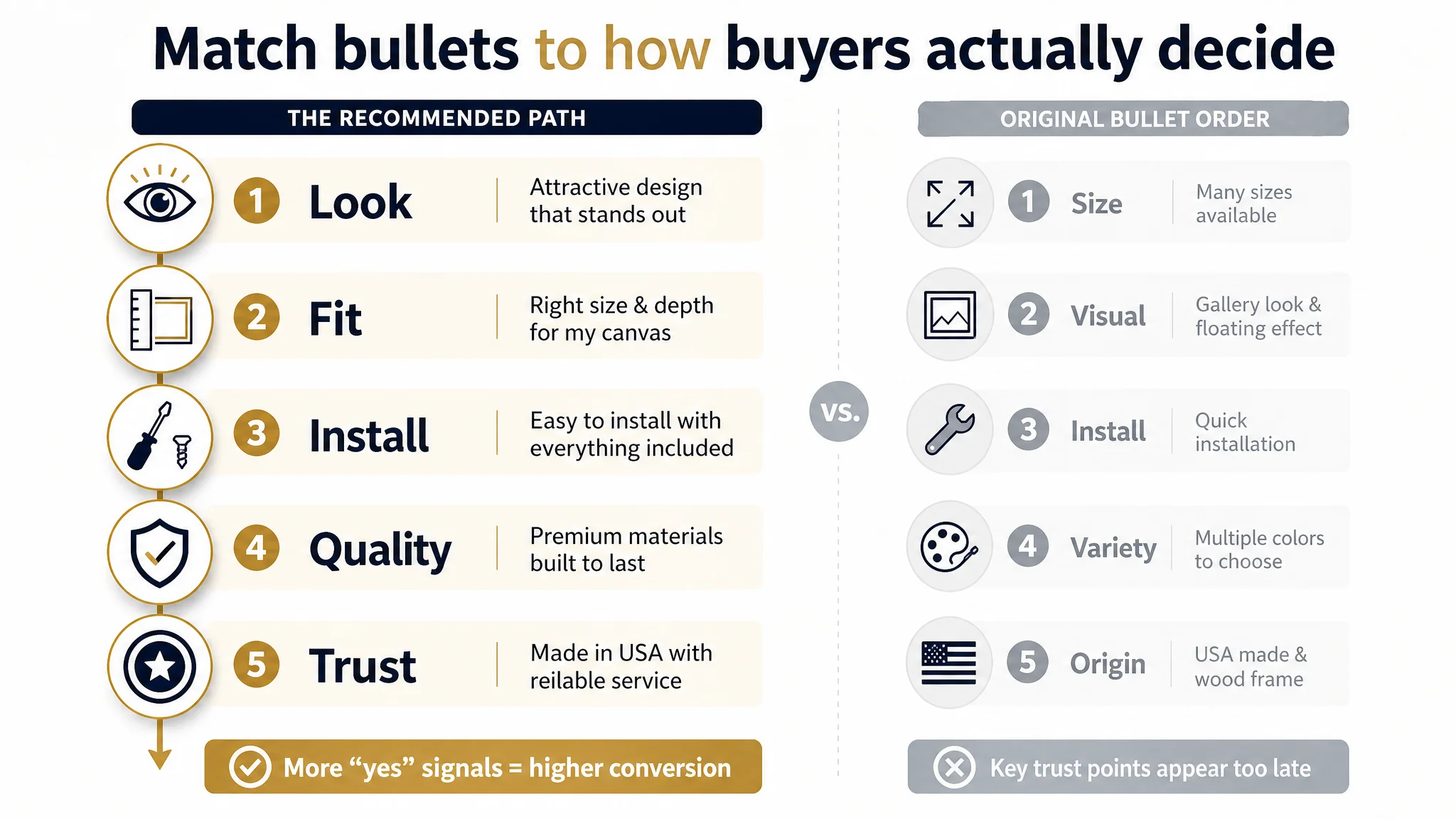
In the original Listing, bullet points followed this order:
1. Size choice
2. Visual effect
3. Installation convenience (briefly)
4. Appearance diversity
5. Origin and material
The benchmark did something different:
- Opened with emotional and origin trust: “Proudly made in Texas, USA.”
- Then led directly into “STUNNING FLOATING SHADOW GAP DESIGN” as a sensory, differentiated advantage.
- Explained installation and hardware with “Stop running to the store!”
- Addressed fit for different canvas depths with explicit shim guidance.
In short, the benchmark bullets walked the buyer through:
- Why this frame looks better
- Why it’s easier to finish your canvas with this kit
- Why you won’t be stuck with incompatible depth
- Why you can trust the build and origin
DeepBI’s judgment: until bullets are re-ordered and rewritten around the real decision path, ACOS improvements will hit a ceiling, because users are not getting enough “yes” signals at the point of purchase.
The recommended bullet structure:
- BP #1 – Visual outcome as the hook
【STUNNING FLOATING SHADOW GAP】Create a professional Gallery-Style display with our 1.25" deep Floating Shadow Gap design. This frame adds a breathtaking 3D effect and sophisticated flair to your artwork, transforming any canvas into a high-end masterpiece for your home or office.
- BP #2 – Fit and compatibility logic
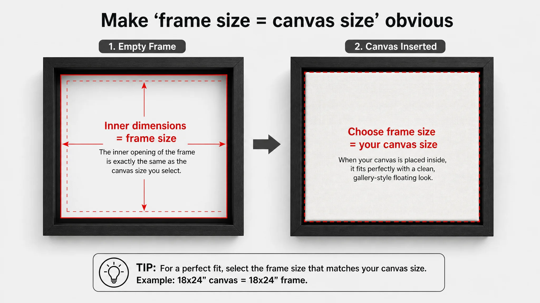
【PERFECT FIT & VERSATILE COMPATIBILITY】Size selection is simple: choose the frame size that matches your canvas (e.g., 18x24" frame for an 18x24" canvas). While optimized for 1.25" deep art, you can easily achieve a flush, professional look for thinner canvases by adding small shims behind the artwork.
- BP #3 – Installation friction removed
【QUICK INSTALLATION - ALL HARDWARE INCLUDED】Stop running to the store! Our kit includes all necessary hardware—corner brackets, screws, and mounting gear—along with pre-drilled holes. The hassle-free setup allows you to securely frame and display your favorite art in just a few minutes.
- BP #4 – Material and durability differentiation
【PREMIUM WOODGRAIN & DURABLE QUALITY】Handcrafted from premium artist-grade wood, our floater frames offer an elegant natural texture that enhances both modern and vintage decor. Unlike plastic alternatives, our wooden frames provide superior durability and a timeless aesthetic that won't warp over time.
- BP #5 – Origin and service-backed trust
【PROUDLY MADE IN THE USA】Precision-manufactured in Houston, Texas, we take pride in supporting local craftsmanship. Our frames feature secure packaging to ensure your wall decor arrives in perfect condition, backed by exceptional customer service and a commitment to quality.
This is not cosmetic rewriting; it is decision-logic reordering. It mirrors how a real buyer thinks:
“Looks good?” → “Will it fit?” → “Can I install it easily?” → “Is it high-quality and better than cheap alternatives?” → “Can I trust the seller and logistics?”
3. A+ Detail Page: Strong Aesthetics, Thin on “Tool” Behavior
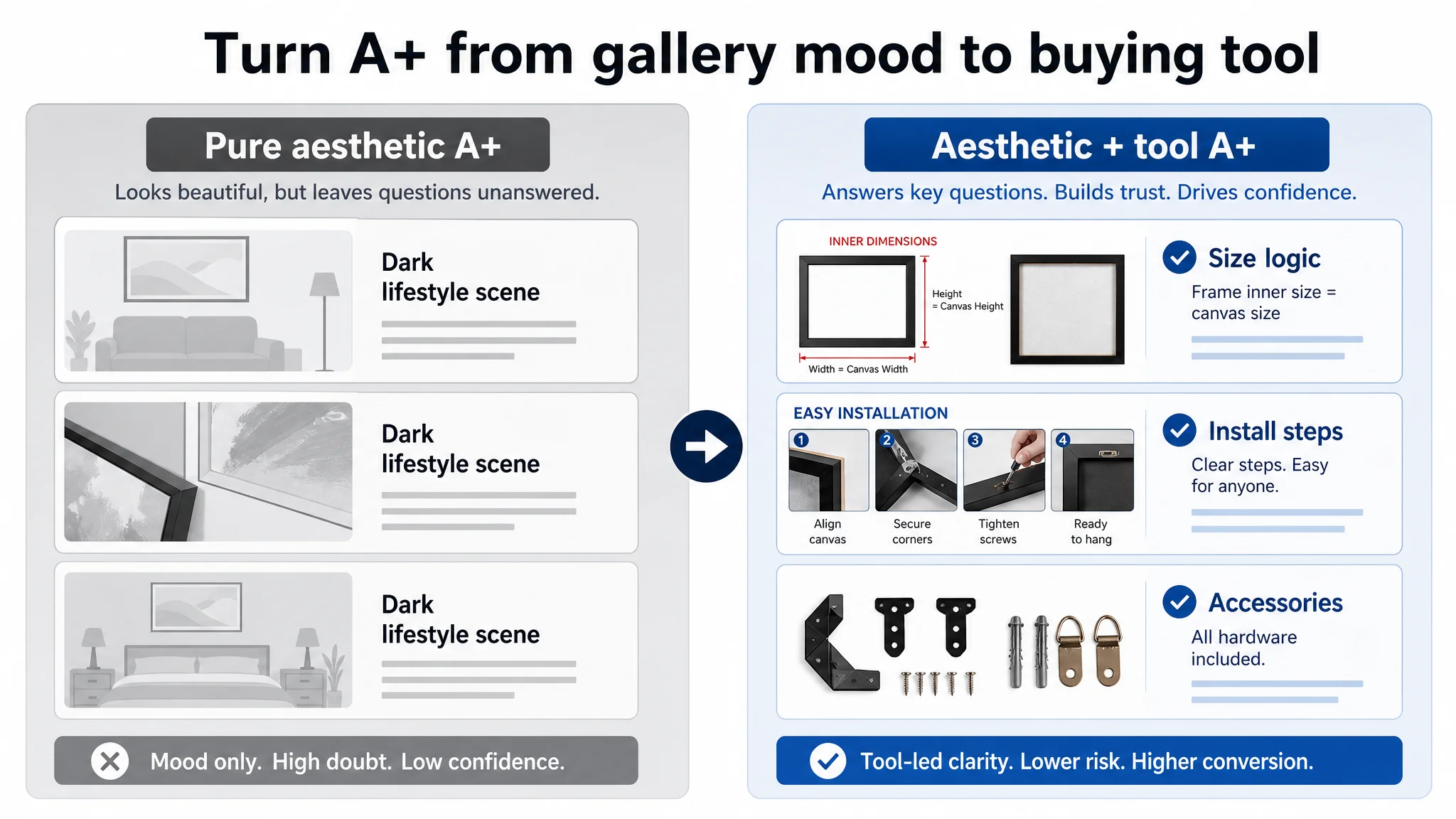
On A+ content, the seller was visually ahead of the benchmark:
- High-quality, full-bleed lifestyle scenes.
- Cohesive dark, gallery-like aesthetic.
- Clean focus on 5mm shadow gap, 1.25" structure, and color options.
The benchmark, by contrast:
- Used more white-background or simple compositional images.
- Repeated some visuals and text, diluting impact.
- Looked less “premium” at first glance.
But analysis uncovered a crucial functional gap:
- The seller did not show installation process or hardware detail.
- The seller did not visually solve the biggest category pain point: “How do I choose the right size, and what does ‘inner dimensions’ actually mean for my canvas?”
The benchmark compensated for weaker aesthetics with:
- Visual Before/After comparisons (unframed vs framed).
- Clear inner dimension marking (frame opening = canvas size).
- Installation step visuals and hand-in-action shots.
- A breakdown of all included accessories.
DeepBI’s judgment: the seller’s A+ was strong on aspiration, weak on reassurance. For this category, that imbalance limits conversion capacity no matter how much ad traffic arrives.
Why DeepBI Did Not Recommend “Keep Tuning Ads First”
From a pure advertising standpoint, it would have been easy to:
- Expand keyword coverage further into décor sub-niches.
- Push bids on “floating frame,” “canvas frame,” “gallery wall,” etc.
- Try to “outbuy” the competitor’s review moat.
DeepBI argued against that sequence for three reasons.
1. Ads Were Amplifying a Trust Gap, Not an Awareness Gap
The Listing already had:
- Reasonable visual differentiation.
- A clearly defined product category.
- Decent star rating.
The breakdown was in:
- Low bullet score (4/10 vs 8/10).
- Title not focused on the core buying promise.
- Lack of practical assurance in A+ for sizing and installation.
Running more ads into this setup would mainly amplify:
- Sizing confusion → higher pre-sale inquiries and returns.
- Install anxiety → lower add-to-cart rates.
- Review volume gap → slower trust accumulation versus the benchmark.
“Advertising does not only amplify advantages. It can also amplify a page’s existing defects.”
2. Review Volume Could Not Be Brute-Forced with Spend
The competitor had 3,000+ reviews vs 85 for the seller.
There is no realistic way for ad spend alone to close that gap quickly. What can be changed faster is:
- How much conversion work each visit does.
- How effectively the page converts both ad traffic and organic traffic into positive experience and reviews.
DeepBI’s position was: first stabilize conversion and buyer confidence; only then does additional advertising spend begin to “stack” reviews and rank in a sustainable way.
3. A Listing That Can’t Explain “Inner Dimensions” Will Keep Bleeding
In a floater frame category, one of the most expensive operational errors is wrong size ordering. It delivers:
- Returns and refunds.
- Negative or lukewarm reviews.
- Customer service overhead.
Without clear visual explanation that:
- “Frame size = canvas size.”
- “Inner dimensions are matched to canvas dimensions.”
- “Thinner canvases can be adapted with shims.”
each extra click bought through ads carries a higher risk of mis-buy. DeepBI judged that this had to be fixed before any systematic ad scale-up.
How the Page Was Rebuilt From “Pure Aesthetic” to “Aesthetic + Tool”
With the core constraint identified as Listing conversion capacity, optimization focus shifted to four areas:
1. Main image logic
2. Bullet point buying path
3. A+ modules that answer sizing and installation
4. Trust signaling to compensate for lower review volume
Main Images: From “Decorative Vibe” to “Clear Product Solution”
The existing main image set:
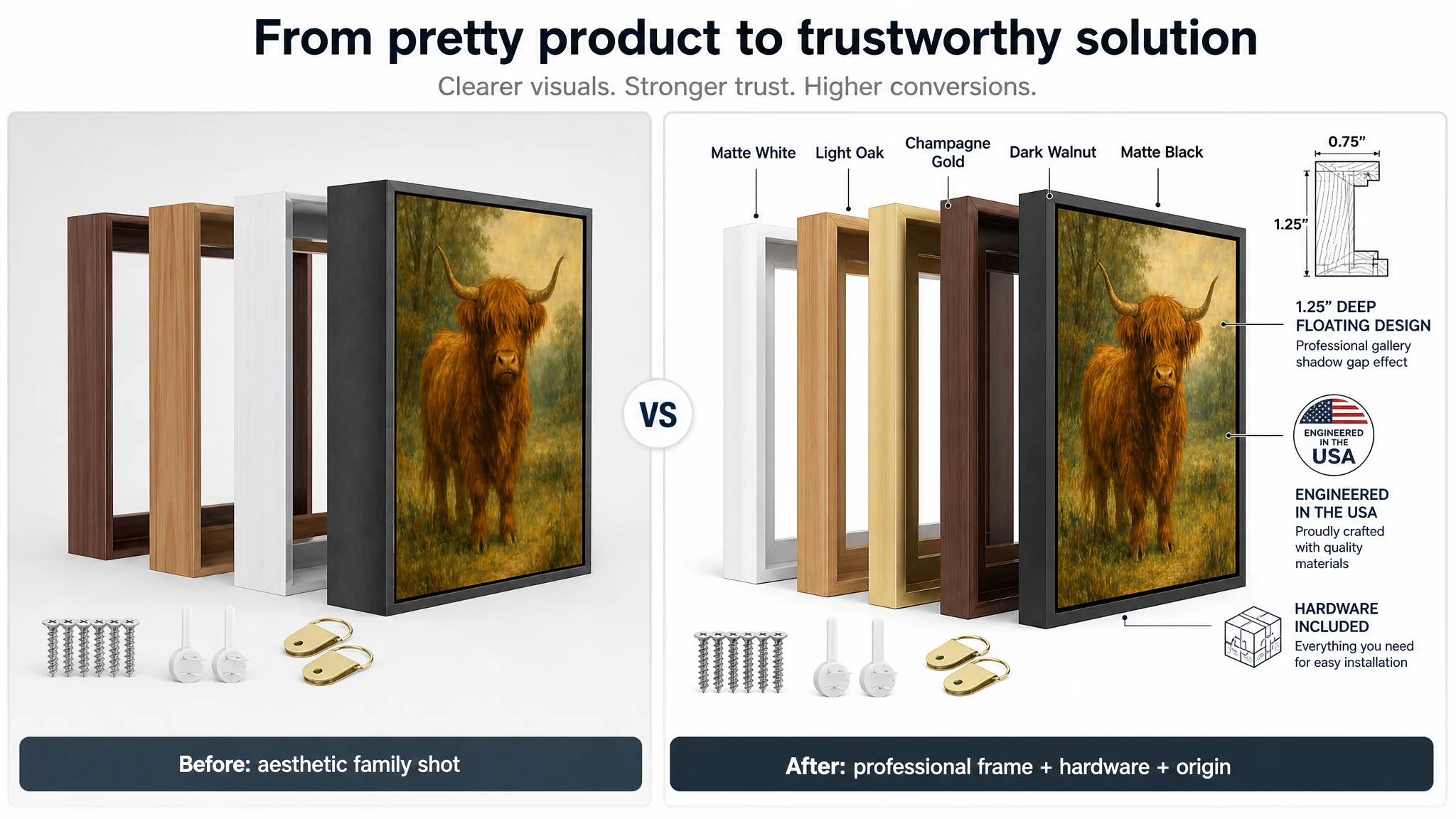
- Showed a family of frames but in tight, slightly cluttered composition.
- Risked being interpreted as wall art rather than a frame solution.
- Underused the power of angle, light, and negative space to highlight the floating effect and depth.
DeepBI’s prompts reoriented the main images toward:
1. Clear frame identity and color options
- Four frame colors fan-shaped, left-to-right, with the black frame with artwork in front occupying ~65% of the frame.
- 45° side angle to show depth, pure white background, hardware neatly arranged in the lower left.
- Bright, high-contrast, modern gallery tone.
This directly improves:
- Click clarity: “This is a frame, not a print.”
- Perceived professionalism: organized layout, visible hardware.
2. Before/After and floating gap visibility
- Left side: unframed canvas.
- Right side: canvas framed in black floater frame.
- Front angle, light grey gradient background.
- Arrow and clean text focusing on the floating shadow gap.
This quickly answers:
- “What will my art look like after framing?”
- “What does ‘floating frame’ visually mean?”
3. Color and material differentiation
- Five frame corners converging toward the center at 45° from above.
- White background, each color labeled in clean text.
This supports late-stage decision making:
- “Which finish matches my décor?”
- “Is this a cohesive, professional series?”
4. Technical credibility and origin
- Macro corner shot occupying 70% of the image.
- 45° side angle, strong side light to show depth and thickness.
- Minimalist callouts marking thickness, plus a translucent USA-origin badge.
This anchors:
- “This is a serious, well-built frame, not a flimsy generic item.”
5. Real-life room scene with controlled light
- Single framed artwork centered on a modern living room wall.
- Soft side natural light, light beige wall, subtle greenery.
- Warm but realistic tones, echoing the gallery feeling in a home environment.
This shifts the emotional takeaway to:
- “I can see this in my living room; it lifts the entire room.”
A+ Detail Page: From Mood Board to Decision Engine
DeepBI’s recommended A+ restructuring followed a clear sequence:
1. Size and inner dimensions clarification
- Visual module showing empty frame (left) with red lines and “INNER DIMENSIONS” label.
- Same frame with canvas inserted (right).
- 80% of frame occupied by product, light grey background, top-down soft light.
Purpose:
- Make it visually obvious that frame size is chosen to match canvas size.
- Reduce returns from mis-ordered sizes.
2. Installation process with human hand
- Close-up 45° angle of the frame back corner.
- A hand using a screwdriver to fasten hardware, white work surface, background blurred.
Purpose:
- Turn “easy installation” from a text claim into a visually credible, simple action.
- Lower perceived difficulty for DIY customers.
3. Full accessory layout
- All hardware flat-laid on a pure white background, neatly arranged.
- Each piece labeled in clean text.
Purpose:
- Reinforce “all hardware included.”
- Eliminate need for buyers to imagine missing parts or extra trips to the store.
4. Bright, everyday home scene
- Frame hanging center on a light wall in a bright Scandinavian-style living room.
- Soft natural side light, visible sofa edge and greenery.
Purpose:
- Balance the darker gallery scenes with a lighter, more inclusive aesthetic.
- Appeal to a broader range of home décor styles.

5. 5mm shadow gap as a precision feature
- Macro, top-down view of frame corner.
- Canvas edge and frame inner wall, with the 5mm gap visibly measured.
- Side backlight creating a natural shadow gap.
Purpose:
- Turn a technical spec (“5mm gap”) into a visually high-end detail.
- Signal precision manufacturing.
6. Color series comparison under identical light
- Five frame corner samples (black, white, gold, oak, walnut) in isometric layout.
- Grey gradient background, subtle reflections.
Purpose:
- Allow clear, apples-to-apples color comparison.
- Reduce hesitation at the final decision step.
7. Gallery trust backdrop
- Three framed artworks hanging on a clean white gallery wall.
- Professional rail lighting, dark wooden floor.
Purpose:
- Anchor the product as gallery-grade presentation, not just basic framing.
- Support a higher perceived value against cheaper alternatives.
Together, these modules transformed the detail page into what DeepBI wanted it to be:
Not just a mood board, but a tool that guides the buyer from “curious” to “confident to buy, sure of fit, and ready to install.”
Review Volume: A Structural Gap That Must Be Offset, Not Ignored
The review comparison could not be bypassed:
- Seller: 4.5 stars, 85 total reviews, 8 on first page
- Benchmark: 4.3 stars, 3,026 total reviews, 13 on first page
The seller technically had a slightly better star rating, but:
- The benchmark’s volume created overwhelming social proof.
- It also offered more detailed, photo-rich reviews that deepened trust.
DeepBI’s assessment:
- This volume gap is a long-term structural factor, not something a one-time optimization can erase.
- The only path forward is:
- Make each new buyer more likely to be satisfied through clearer sizing and installation.
- Reduce avoidable negative experiences (wrong size, missing hardware assumptions).
- Increase the probability of organic review growth on top of improved conversion.
By improving page clarity and interpretability, each order contributes more reliably to building the same trust moat the benchmark already has.
How the Business Logic Changed After Reframing
After repositioning the Listing around conversion instead of aesthetics alone, several shifts occurred in how the seller and DeepBI looked at the business:
1. Ads Became a Lever, Not a Crutch
When the seller understood that:
- The title now clearly targeted the true use case and outcome.
- Bullets walked through a coherent “looks → fit → install → quality → trust” logic.
- A+ content answered size and installation doubts visually.
then Amazon ads were no longer a way to “fix” performance, but a multiplier on a page that deserved more traffic.
2. Conversion Capacity Became a Measurable Asset
The DeepBI score evolution (especially in title, bullets, and detail logic) gave the team a way to think about Listing capacity as something they could:
- Diagnose against a benchmark.
- Improve with structured changes.
- Re-test once new assets were live.
Instead of “the page looks fine; ads must be the problem,” the mindset shifted to:
“Is the page actually doing at least as much conversion work as the category leader?”
3. Traffic Structure Risk Was Lowered
With clearer sizing logic and installation visuals:
- The risk of ad traffic generating outsized returns and complaints decreased.
- Organic traffic landing on the page also had a higher chance of converting without support from heavy ad spend.
- The Listing’s ability to stand on its own improved, which is essential for keeping TACOS in check over time.
What Other Amazon Sellers Can Take From This Case
For many Amazon sellers, especially in visually driven categories like home décor, this case should feel familiar:
- A page that looks “prettier” than competitors.
- Advertising feels like the obvious culprit when orders lag.
- Campaign tweaks don’t move ACOS or TACOS enough.
- It’s tempting to believe the answer is “more reviews” or “more traffic.”
The deeper lesson from this canvas floater frame Listing:
1. A beautiful Listing is not necessarily a high-conversion Listing.
The seller’s A+ was more premium-looking than the benchmark, but it underperformed on functional reassurance.
1. Ads cannot repair a missing decision path.
Without a clear logic from “what this is” to “why it fits you” to “how easy it is to install,” ad spend mainly amplifies doubts.
1. Title, main image, bullets, and A+ must all serve the same buying logic.
When they do, review volume is still a challenge—but no longer an insurmountable moat.
1. Before scaling ads, ask whether your page deserves more traffic.
If your Listing were placed side by side with the benchmark, does your page really make it easier for buyers to say “yes”?
DeepBI’s role in this case was not to generate “nicer” creatives, but to identify that the true constraint was Listing conversion capacity, and to rebuild the page as a tool that converts both organic and paid traffic more reliably. That shift in judgment—away from ads as the scapegoat and toward the page as the real engine—is what ultimately makes optimization sustainable.