

For this Amazon seller in the thermal shipping-label printer category, the early focus was on what looked right in the console: a technically strong title, clear bullet points, and an ad structure that seemed reasonable. When ACOS felt hard to control and orders lagged behind impressions, the team’s instinct was to keep tuning Amazon ads and occasionally tweak copy. On paper, the Listing didn’t look weak at all—its overall score was 74/100, with the title and bullets even outperforming a major benchmark competitor.
DeepBI’s diagnosis told a very different story. Against a category-leading benchmark at 85/100, the real gap did not sit in keywords or basic messaging; it sat in how the Amazon Listing visually answered the buyer’s core question: “Can this printer reliably handle my 4x6 shipping labels, across the platforms I actually use, with minimal hassle?” The main image sequence, A+ modules, and trust-building details were not constructing that answer. Ads were pushing traffic into a page that looked “informative” but didn’t complete the buying logic.
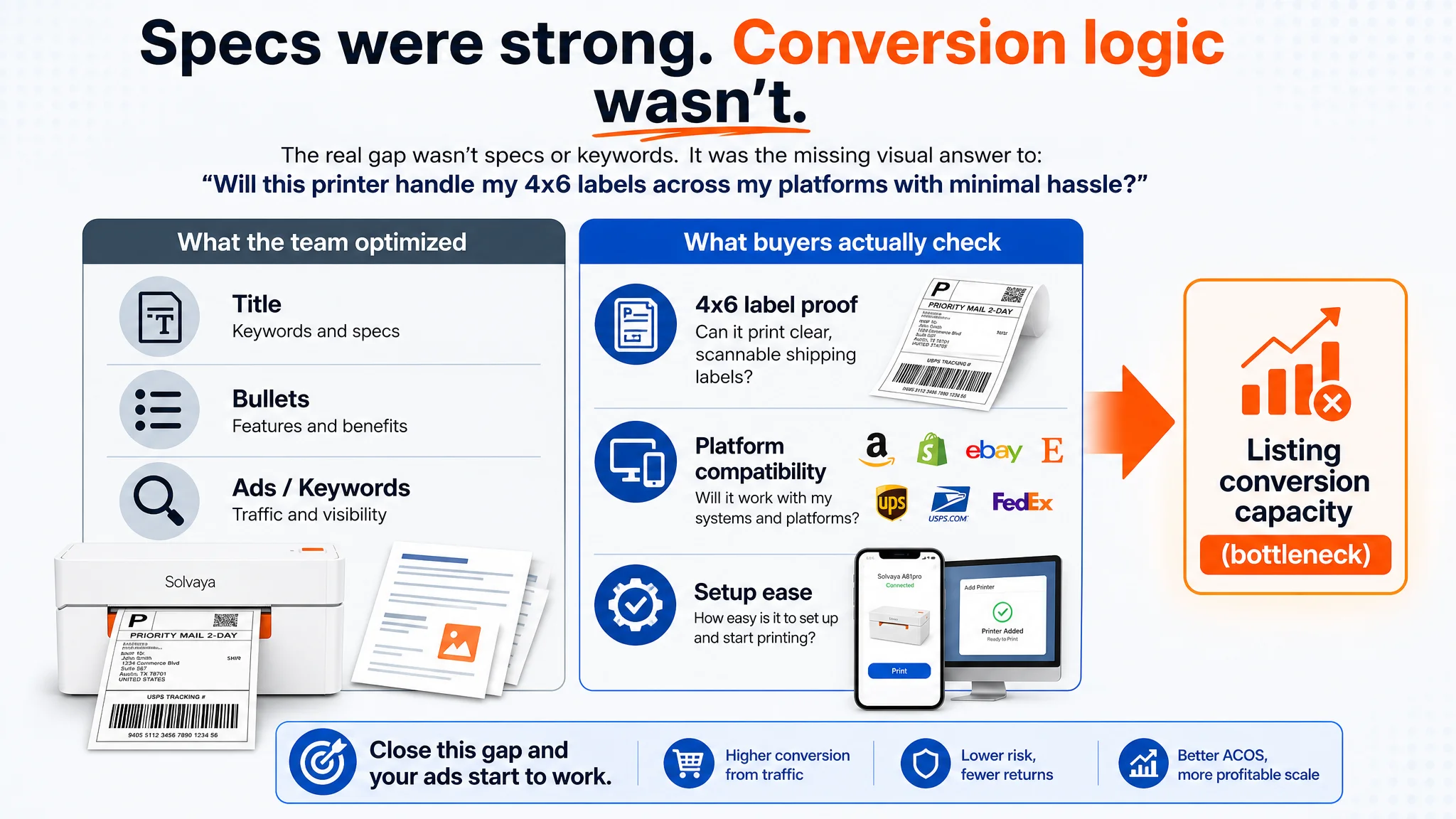
Once the problem was reframed as a product-page conversion issue—specifically, a missing visual and instructional story around compatibility, performance, and ease of setup—the optimization path changed. Instead of more bid and keyword experiments, the work shifted to rebuilding the main-image set and A+ content: visualizing real 4x6 labels, making platform compatibility explicit, mapping Bluetooth vs USB paths by system, and transparently addressing Mac setup friction. Ads started to serve a page that could actually convert.
For other Amazon sellers, this case is a reminder that a “good-looking” Listing by internal standards can still be structurally weak against how buyers decide. When ACOS resists improvement, it may not be the campaigns. The real leak can be a Listing that never quite proves, in images and A+, that it solves the core use case better than the alternative on the same search results page.
What the Seller Saw: A “Basically Fine” Listing, Struggling to Scale
From the seller’s perspective, the Amazon Listing did not look like a typical problem child:
- Overall Listing score: 74/100 versus the benchmark at 85/100 (a gap, but not a disaster).
- Title score higher than benchmark (17 vs 15 / 20).
- Bullet points slightly better (8 vs 7 / 10).
- Star rating at 4.5, even slightly better than the benchmark’s 4.4.
- The only visible “disadvantage”: far fewer reviews (34 vs ~5,500), which the team naturally interpreted as “we just need more sales and time.”
From here, it’s easy to reach a familiar conclusion:
“Our page is decent; the main problem must be traffic and ads. If we push more ads and refine bids, conversions will catch up as we build reviews.”
So the weight of effort stays on:
- Campaign structures
- Bids and placements
- Keyword coverage and negations
while the Listing is treated as “basically okay.”
The Original Misdiagnosis: Treating a Trust Gap as an Ad Problem
The seller’s misdiagnosis had two layers:
1. Overconfidence in on-page text quality
Because the title and bullet points scored well and looked “more professional” than the benchmark (more specific specs, clearer benefits), the team assumed the Listing was not the bottleneck.
1. Underestimating visual and A+ conversion logic
The seller had A+ modules and a full image set, so the assumption was: “We already have scenes, features, and accessories shown; visuals are not the main issue.”
In reality, against a benchmark product with a much higher total score (85), the seller’s Listing was losing where Amazon buyers make the final decision:
- Main image: lower score (23 vs 27 / 30)
- Detail/A+: significantly weaker (17 vs 23 / 25)
- Reviews: small absolute count vs massive social proof (34 vs 5,500), despite similar rating
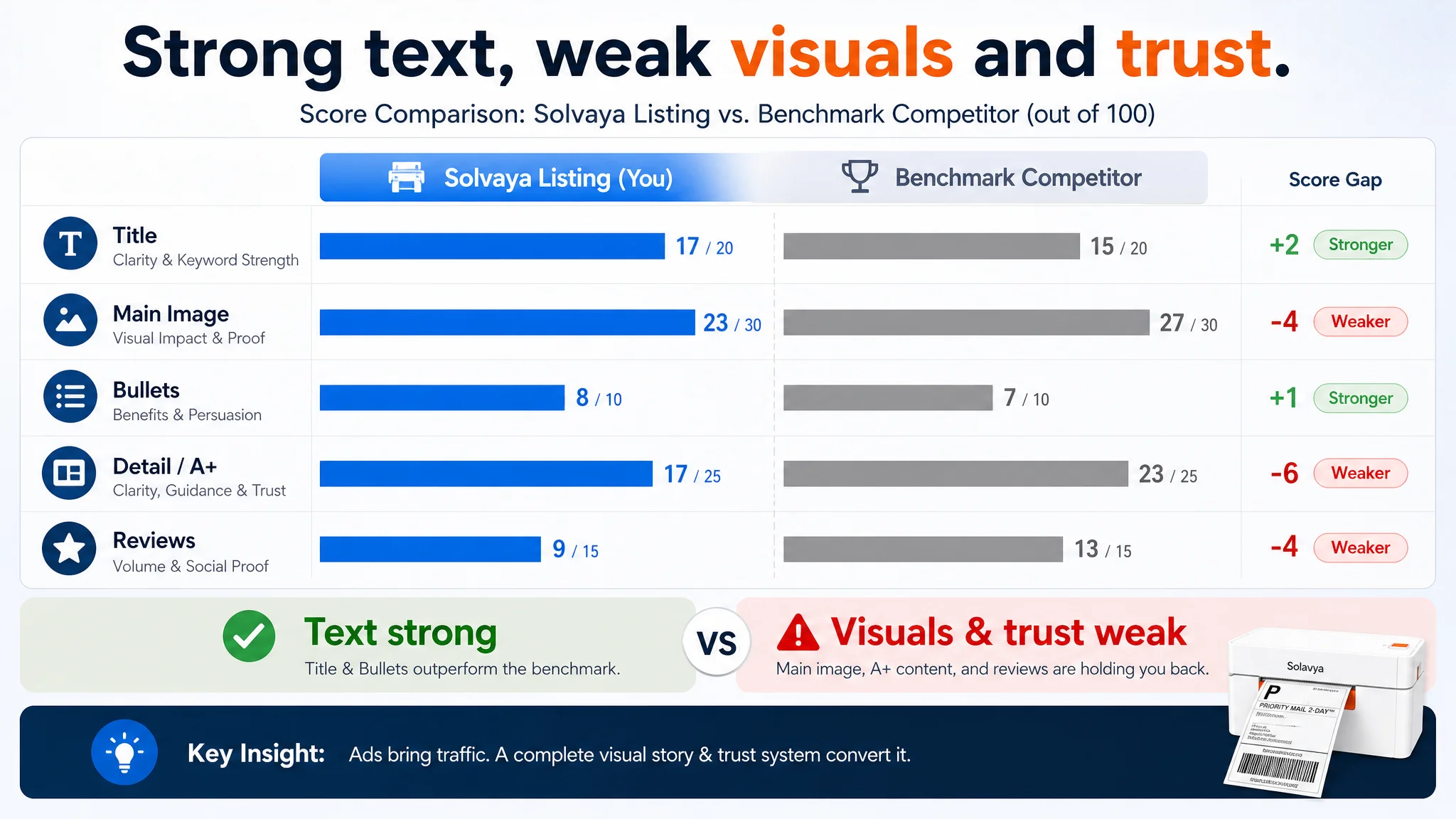
This is how the trap forms: ads keep bringing traffic, but the Listing does not build enough clarity + trust fast enough to compete in the search results environment. The team keeps treating the symptom (ACOS, spend, CTR tweaks) instead of the structural leak (page-level conversion capacity).
“The real problem was not that ads failed to bring traffic. It was that the page could not convert the traffic.”
DeepBI’s Judgment: The Real Constraint Was Listing Conversion Capacity
DeepBI’s scoring and competitive audit made one conclusion unavoidable: the Listing did not lack information; it lacked the right decision logic.
Title and bullets were not the issue
On paper, the textual foundation was solid:
- Title clearly front-loaded the core product type:
Wireless Bluetooth Thermal Shipping Label Printer, 4x6 Label Maker for Shipping Packages It also captured key specs (150mm/s, 203 dpi), ink-free printing, and system compatibility (Windows & Mac, phone app, home office & small business).
- Bullet points had a strong logic:
- Started with performance and user benefit (speed, clarity)
- Structured compatibility and flexibility as separate points
- Closed on “ink-free, durable, cost-effective” to form a value loop
By any internal checklist, this looked correct. DeepBI did not recommend an overhaul here, only targeted refinements to:
- Make platform names explicit (Amazon, eBay, Shopify, Etsy, UPS, USPS, FedEx…)
- Quantify speed in human terms (“up to 72 sheets of 4x6 labels per minute”)
- Tie 203 dpi directly to scan reliability and delivery accuracy
- Clarify label width range and supported formats
The critical gaps were visual and structural
Where the Listing actually lost to the benchmark was in how the page visually answered the buyer’s core questions:
1. Main image set: weak in immediate proof of use case
2. A+ detail page: weak in step-by-step guidance, platform confirmation, and troubleshooting support
3. Trust signaling: review count gap and lack of “professional ecosystem” visuals
That is why DeepBI’s core judgment was:
- Do not treat this as an “ad efficiency” problem.
- Treat it as a “page cannot fully convert traffic” problem.
- Fix the Listing’s conversion structure before scaling ads.
Amazon Ads Were Not Failing. The Page Was Consuming the Traffic.
On the search result page for a thermal shipping-label printer, the buyer’s mental script is simple:
- “Will this print my 4x6 labels clearly and reliably?”
- “Does it work with my devices (phone, Mac/Windows), and with Amazon, Shopify, eBay, etc.?”
- “Will setup cause me problems—especially on Mac?”
- “Is this a risk-free choice compared to the product next to it?”
The benchmark competitor answered these visually and systematically.
The seller’s Listing didn’t, for three specific reasons.
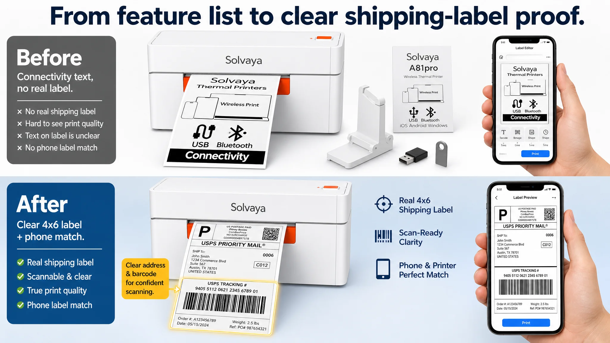
1. Main image failed to show the real job: 4x6 shipping labels
The hero image tried to do many things:
- Product body
- Phone
- Manual
- U disk
- Adapter
- A label with internal descriptive text (“Wireless Print”, “USB”, “Bluetooth”)
But it did not show what the buyer cares about most:
- A crisp, scannable 4x6 shipping label with barcodes, address, and details clearly printed
- A phone screen showing the same label design being printed via app
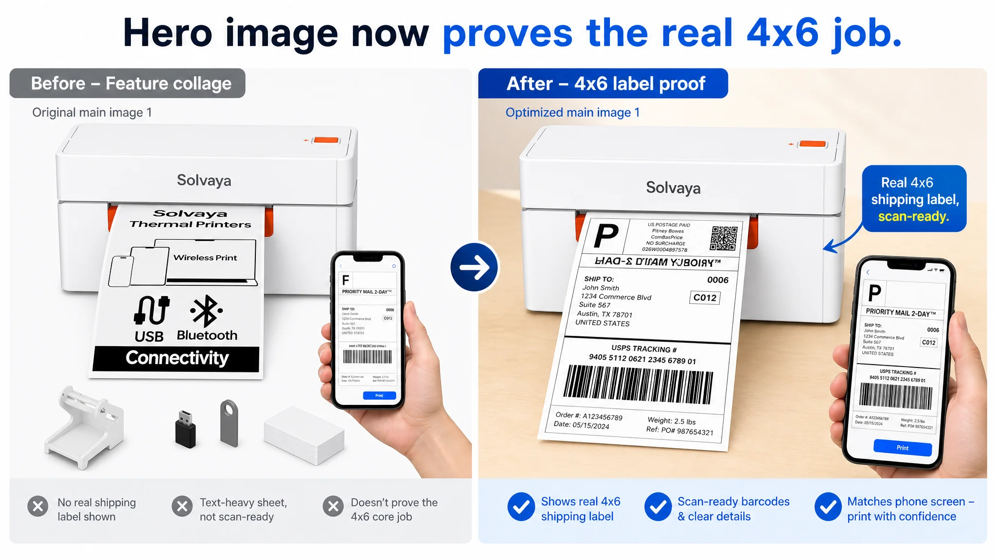
The benchmark’s hero image was simpler but more powerful:
- Clean product
- Clear printed label result
- Immediate “this is for shipping labels, and it prints them clearly” signal
When your main image uses seller-language (“wireless,” “USB,” “Bluetooth”) on labels instead of buyer outcomes (clear shipping label), you lose clicks and trust in the first second.
2. A+ content didn’t build a “decision path”—it just listed features
The seller’s A+ modules covered:
- Core selling points
- Ease of use
- Multi-scene usage
- Product photos
- Accessories list
But they lacked the critical decision-building pieces the benchmark used:
- Platform ecosystem wall: logos of 20+ ecommerce and shipping platforms to visually confirm “this works in my business stack.”
- Performance validation: large, visualized speed and dpi data with close-ups of printed labels.
- System & connection matrix: exactly which OS connects via Bluetooth vs USB, what is supported, and what is not.
- Step-by-step install and app usage guide: “download app → pair via Bluetooth → select label → print” with screenshots.
- FAQ and troubleshooting: common issues, especially for Mac security prompts, and how to solve them.
In other words, the benchmark’s A+ didn’t just “add information.” It reduced perceived risk:
- “Can I get this to work quickly?”
- “What if I hit an error?”
- “What exactly will I see on screen?”
The seller’s A+ never fully closed these questions. For a first-time label-printer buyer or a small business operator under time pressure, this is enough to push them to the better-explained alternative.
3. Review scale and trust gap
On rating alone, the seller actually looked slightly better:
- 4.5 stars vs benchmark’s 4.4
But in Amazon’s environment, review volume is a trust signal:
- Seller: 34 reviews
- Benchmark: ~5,500 reviews
The A+ and main images should have been used to compensate for this scale gap by:
- Showing professional ecosystem compatibility
- Explaining app features and value (label design options, templates, etc.)
- Providing transparent Mac install guidance
- Making “no ink, low maintenance, low risk” extremely obvious
Instead, the visuals stayed at a generic level. The Listing relied on star rating to carry trust, when the buyer was actually asking: “Is this as battle-tested as the one with 5,000+ reviews?”
How DeepBI Reframed the Problem and Set the Priority
Given this picture, DeepBI’s decision logic was:
1. Don’t push more traffic into a page that hasn’t earned it.
Ads were already feeding the Listing. The priority was to improve how each visit converts.
1. Fix the visual and informational bottlenecks first.
The core constraint was not keyword coverage; it was:
- Incomplete visual proof of the primary job (4x6 labels)
- Missing platform and system clarity
- Weak guidance for Mac and app setup
- Underdeveloped cost-savings and multi-size versatility story
1. Use the benchmark not as a design template, but as a decision-logic reference.
The goal was not to imitate visuals; it was to match or exceed how clearly the benchmark:
- Demonstrated printing performance
- Clarified system & connection paths
- Visualized use cases and scenarios
- Preempted doubts and friction points
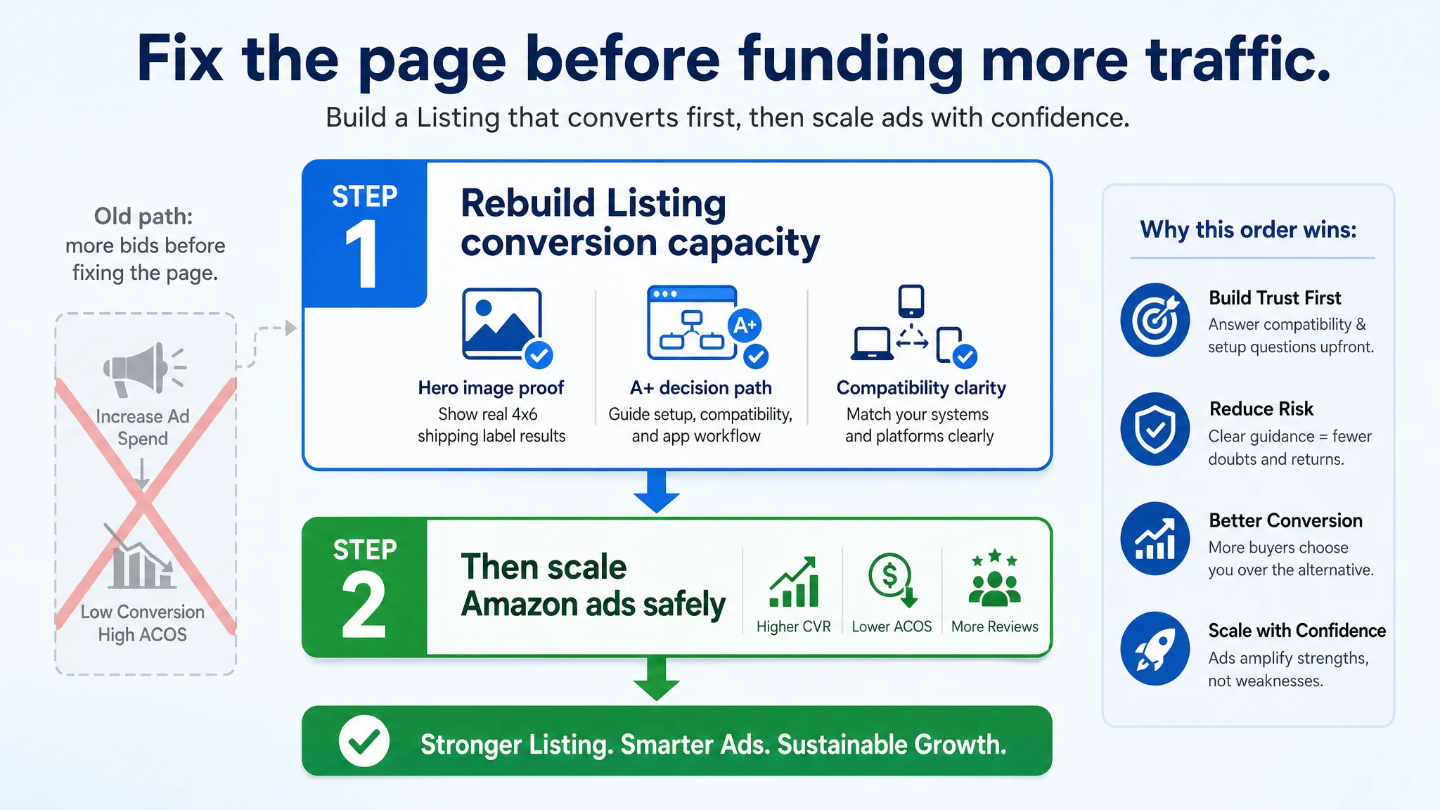
“Advertising does not only amplify advantages. It can also amplify a page’s existing defects.”
If the page leaves compatibility, setup, and quality ambiguous, every extra dollar of ad spend just multiplies the number of people who walk away unconvinced.
Rebuilding the Main Image Set Around the Buyer’s Real Questions
DeepBI’s optimization path focused on repurposing existing materials where possible, but in a completely different decision order.
Hero image: from “feature collage” to “4x6 proof”
Before:
- Many accessories, manual, adapter, phone, generic label text
- Phone shows app interface, but no direct link to printed label
- No clear 4x6 carrier label with barcodes and address
After (recommended logic):
- Hero shows:
- Printer
- A clearly printed 4x6 shipping label (barcodes and addresses readable)
- A phone screen displaying the same label design
- Accessories are present but secondary
- The visual answers instantly:
- “This is for real shipping labels.”
- “It prints clearly.”
- “It prints from my phone via app.”
Supporting images: each slide owns a specific decision
Instead of generic feature repetition, each image was given a specific job.
Image 2 – Performance proof
- Big, bold data on the image: 150mm/s, 203 dpi, “Clear,” “Sharp,” “Fast”
- Label content changed to a real logistics label
- Close-up inset showing:
- Barcode clarity
- Small text legibility
- Visual cues to:
- Multiple label formats
- Label width range (1"–4.1")
Image 3 – Versatility and app-driven creativity
- Organize multiple label types (thank you stickers, barcodes, product tags) neatly
- Add phone + app interface showing label design
- Text overlay for:
- Supported label width range
- Types of labels: shipping, inventory, product tags, file labels
Image 4 – System & connection map
- Use icons and color-coded layout to differentiate:
- Bluetooth path (iOS/Android via app)
- USB path (Windows, Mac)
- Replace blank labels with actual printouts
- Add platform logos (Amazon, eBay, Shopify, Etsy, UPS, USPS, FedEx…)
- Clearly and honestly flag limitations:
- Mac via USB only (if Bluetooth not supported)
- Any unsupported OS like Chrome OS
Image 5 – Social proof and workload readiness
- Focus on:
- Label holder + printer
- Different label rolls and fan-fold stacks
- All labels printed with real-looking carrier labels, not abstract copy
- Platform and logistics logos aligned visually:
- “High-volume ready, compatible with mainstream ecommerce and shipping platforms.”
This sequence rebuilds the path from:
“It has Bluetooth and USB”
to:
“I can see exactly what it prints, how fast, on which systems, and with which platforms. It looks like a working tool, not just a device.”
A+ Detail Page: From “Showing Features” to “Guiding the Buyer”
On Amazon, A+ is where buyers who have not yet decided go for reassurance. DeepBI’s view was clear: this A+ had to be rebuilt to reduce doubt, not just add marketing language.
Module 1 – Platform ecosystem and instant trust
- Transform the first A+ module into:
- A platform logo wall (Amazon, eBay, Shopify, Etsy, Poshmark, UPS, USPS, FedEx, etc.)
- Short text: “Works seamlessly with major ecommerce and logistics platforms”
- Purpose:
- Compensate for low review count by showing professional integration
- Answer: “Will this work with the platforms I already use?” in 1–2 seconds
Module 2 – Performance confirmation
- Replace generic “wireless concept” visual
- Focus on:
- Large, bold speed metric: 150mm/s, plus “up to 72 labels/min”
- 203 dpi resolution with close-up of printed labels
- Avoid showing accessories the buyer doesn’t actually receive (e.g., any misleading external holder)
- Purpose:
- Translate technical numbers into tangible “throughput and clarity” proof
Module 3 – System vs connection matrix
- Build a clear table:
- Rows: iOS, Android, Windows, Mac (and any others)
- Columns: Bluetooth, USB
- Mark what is supported where
- Text callouts:
- “Print wirelessly from your phone via app”
- “Print via USB from Windows and Mac”
- Purpose:
- Prevent returns and negative reviews from misaligned expectations
- Reduce pre-purchase hesitation: “Will this actually work with my setup?”
Module 4 – Label size and long-term cost story
- Keep the “multiple label types” idea, but reframe:
- Label width range: 1"–4.1" (25–104mm)
- Typical uses: 4x6 shipping, 2x1 product labels, warehouse barcodes, file labels
- “Direct thermal—no ink or toner required”
- Purpose:
- Turn “no ink” into a real cost-saving narrative
- Show that this printer will serve multiple use cases over time
Module 5 – Transparent app path
- Convert this module into an app workflow:
- Step 1: Download app
- Step 2: Pair printer via Bluetooth
- Step 3: Choose label / import PDF
- Step 4: Preview and print
- Use simple screenshots and concise captions
- Move packaging list to the end or a small footer
- Purpose:
- Reduce fear of “complex setup”
- Show that printing from phone is a guided, simple process
Module 6 – Mac-specific reassurance
- Create a dedicated Mac module:
- Show typical Mac security prompts
- Explain: where to go in “Security & Privacy,” how to click “Open Anyway”
- Purpose:
- Preempt the exact issues often found in 3-star reviews
- Turn a known friction point into a visible “we support you” signal
Module 7 – Scenario summary and final push
- Summarize in one visual:
- 4x6 shipping labels for ecommerce
- Home office
- Small business / warehouse
- File and document organization
- Use real, realistic scenes rather than abstract graphics
- Purpose:
- Help the buyer picture the product integrated into their daily workflow
- Close with “this is a versatile workhorse, not just a box that prints”
Bullet Point Refinement: Making Each Line Carry More Conversion Weight
The original bullet structure was already strong. DeepBI’s recommendations were about tightening the link between data and perceived value:
1. Connectivity and app convenience
- Emphasize Bluetooth + dedicated app
- Spell out iOS, Android, Windows (and Mac, if relevant)
- Highlight ease: “design and print labels directly from your smartphone”
1. Speed and clarity as operational leverage
- Quantify: “up to 72 sheets of 4x6 labels per minute”
- Connect 203 dpi to scan-readiness and avoided delivery errors
1. Platform compatibility as risk reduction
- Explicitly list Amazon, eBay, Shopify, Etsy, Poshmark, UPS, USPS, FedEx
- Frame as “engineered for ecommerce,” not just “compatible with many platforms”
1. Versatile sizes as future-proofing
- Clarify width range and examples of sizes
- Tie to multiple workflows: shipping, product tagging, inventory, files
1. Cost-effective and easy to live with
- “No ink, no toner” + “zero ongoing maintenance complexity”
- Mention drivers, instruction videos, and setup guides provided
This turned bullets from good information into concentrated buying arguments that align with the new visual and A+ story.
Why Listing Conversion Had to Be Fixed Before More Ad Tuning
At the stage this seller was in, the biggest risk was not low impressions. It was paying repeatedly to show a half-convincing page to the right audience.
DeepBI’s priority order:
1. Repair the page’s ability to convert incremental traffic
- Hero image and A+ must clearly prove:
- It prints 4x6 shipping labels clearly and fast
- It works with the buyer’s platform and devices
- Setup, especially on Mac, is manageable
- It supports their broader labeling needs
- This improves both:
- Conversion from existing organic traffic
- Conversion from current ad clicks
1. Only then iterate ads based on a stronger Listing
- Once CVR starts to recover:
- Ad bids can be pushed with less ACOS risk
- More keywords become profitable
- Review volume grows more healthily
- Ads now amplify strengths rather than structural weaknesses
Without this order, the seller would keep experiencing:
- Increasing ad spend
- Flat or volatile conversion
- Growing frustration and “we must need better keywords or lower bids”
What Changed in the Business Understanding
Even without inventing specific numbers, we can describe the shift in operating state:
- Listing conversion capacity improved
The page began to:
- Address compatibility and setup doubts upfront
- Show real-world printing results
- Guide buyers through app and Mac paths transparently
- Ad traffic became useful again
As the visual story and A+ logic improved, each paid click had:
- A higher chance of converting
- A lower chance of bouncing due to ambiguity or fear
- Review risk and return risk decreased
With clearer expectations and guidance:
- Fewer buyers were surprised by system limitations
- Mac users had a roadmap to solve common issues
- Negative reviews driven by “I didn’t know…” began to be less likely
- The team’s mental model shifted
The seller moved from:
- “Our Listing is fine; traffic is the problem”
- To:
- “Listing conversion is the foundation; ads are an amplifier”
They started to see:
- Amazon ads cannot solve a Listing that does not fully convince.
- Title, main image, bullets, and A+ must form a single, coherent buying story.
- Before scaling traffic, the page must deserve more traffic.
What Other Amazon Sellers Can Take Away
This case is not unique to label printers. Similar patterns appear across categories:
- Strong-looking titles and bullets coexist with weak visual decision paths.
- Ads are optimized while the page still fails to:
- Prove the primary use case visually
- Clarify compatibility and setup
- Address obvious friction points buyers worry about
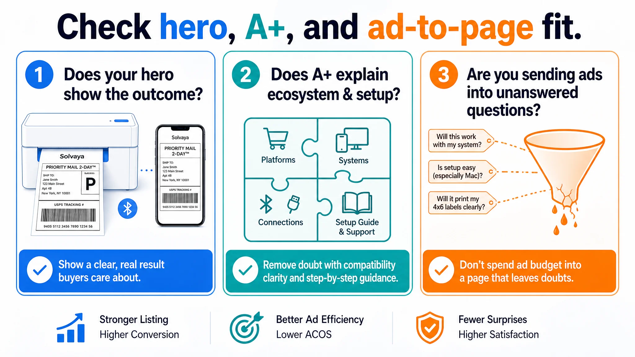
Three practical questions for any Amazon seller:
1. Does your hero image show the outcome your buyer cares about, not just the product?
2. Can a buyer understand, from A+ alone, exactly how your product fits their ecosystem and how to get started?
3. Are you spending ad budget to send traffic into a page that leaves obvious questions unanswered?
If the honest answer to any of these is “no” or “not really,” the priority is not another round of bid tweaks. It is to rebuild the Listing so that every pixel and line of copy contributes to a clear, low-risk buying decision.
Only then will your Amazon ads stop feeling like a cost you have to manage, and start acting like a lever you can deliberately pull on top of a page built to convert.