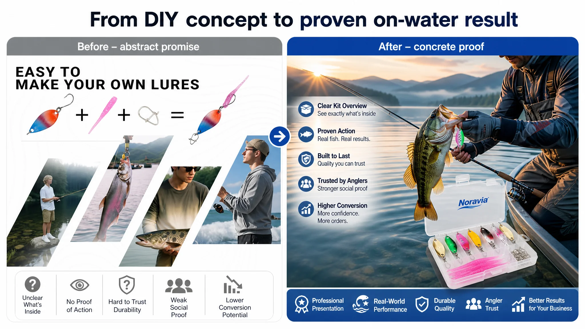
For this Amazon fishing-lure seller, the first instinct was to blame the ads. Clicks were not turning into enough orders, ACOS was hard to pull down, and the team kept thinking the problem lay in keywords, bids, or campaign structure. Only after a detailed DeepBI Listing diagnosis did it become clear: the main leak was not in Amazon ads, but in the product page’s ability to convert the traffic it was already getting.
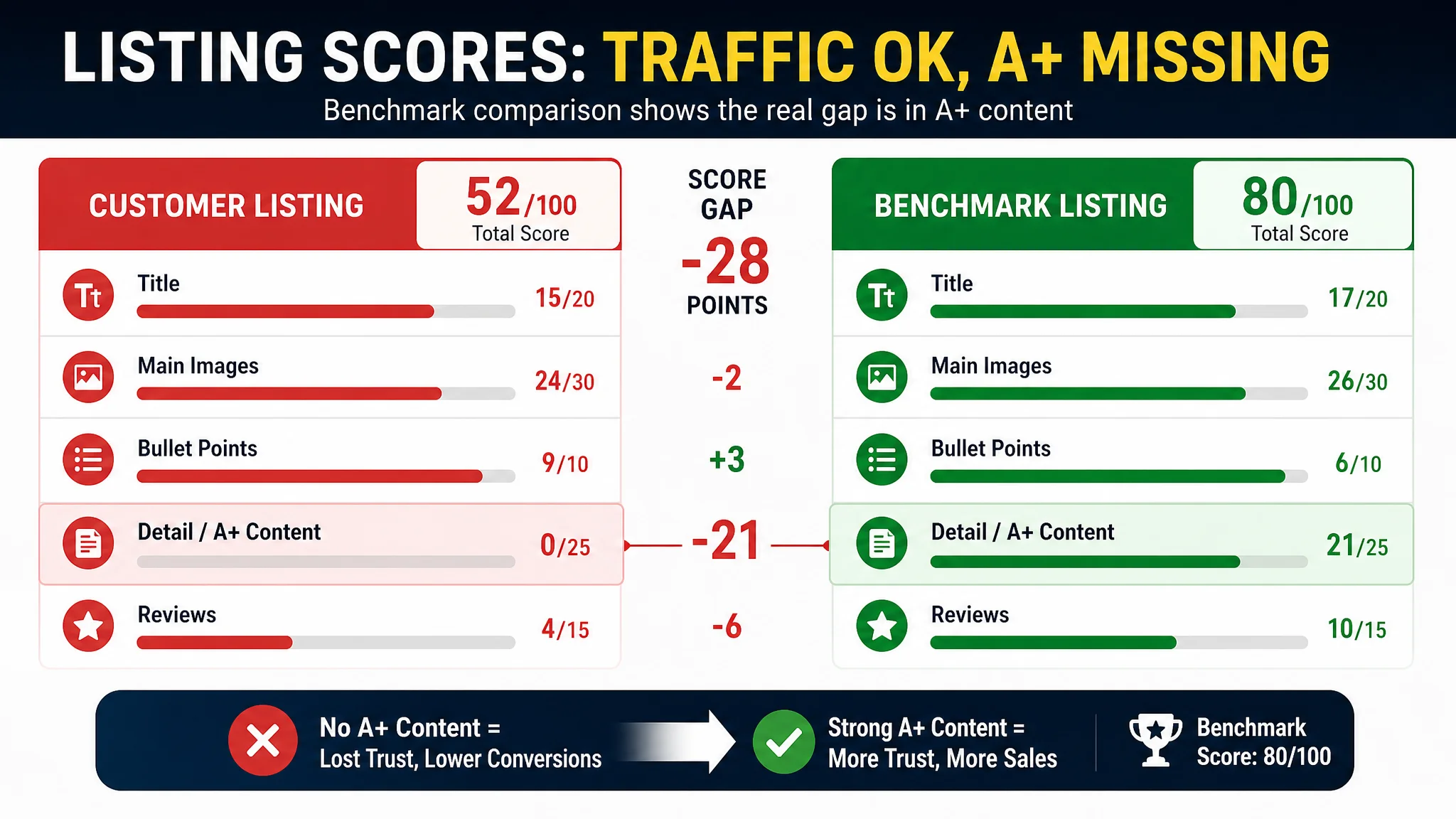
On the surface, the listing didn’t look disastrous. The title mentioned key terms, the main image wasn’t obviously “wrong,” and the bullet points followed a seemingly complete persuasion logic. But when DeepBI benchmarked this listing against a strong competitor in the same Amazon fishing-lure subcategory, the gap was stark: 52/100 versus 80/100 overall. The real cliff was in the A+ / detail section, where the customer had no A+ content at all while the competitor was using underwater scenes, kit overviews, and usage storytelling to close the deal.
DeepBI’s judgment was that it made little sense to keep “fixing ads” while sending paid traffic to a page that lacked professional visual proof, underwater effect demonstration, and trust-building structure. The optimization had to start from the Amazon Listing itself: recalibrating the title to catch the right search traffic, reshaping the main image set to look like professional outdoor gear rather than a random assortment, rebuilding bullet points around a clearer buying logic, and, most importantly, constructing a full A+ story that showed completeness, usage, and durability.
This case is worth reading for any Amazon seller who has felt their ads “hit a ceiling.” It shows how a listing can look decent on the surface yet still underperform against competitors, why the absence of A+ content can silently erode conversion, and how reframing the problem from “ad optimization” to “page conversion capacity” can make ad spend useful again instead of amplifying a weak product page.
What the Seller Saw: “Ads Are Getting More Expensive, But Orders Aren’t Following”
The product is a fishing lure kit in the US Amazon marketplace: metal spoons plus soft plastics in a compact tackle-box-style kit, targeting bass, trout, walleye, salmon, pike, and other species.
From the seller’s perspective:
- Traffic volume was not the core issue. Ads could bring in impressions and clicks.
- The pressure came from conversion and profitability: ACOS felt too high relative to the orders generated.
- The team’s operating reflex was to treat this as an Amazon ads problem: adjust bids, expand keywords, tweak targeting, restructure campaigns.
Nothing in that approach is wrong by itself, but it assumes one premise:
“The product page is already good enough; we just need the right traffic.”
DeepBI’s work started by challenging exactly that assumption.
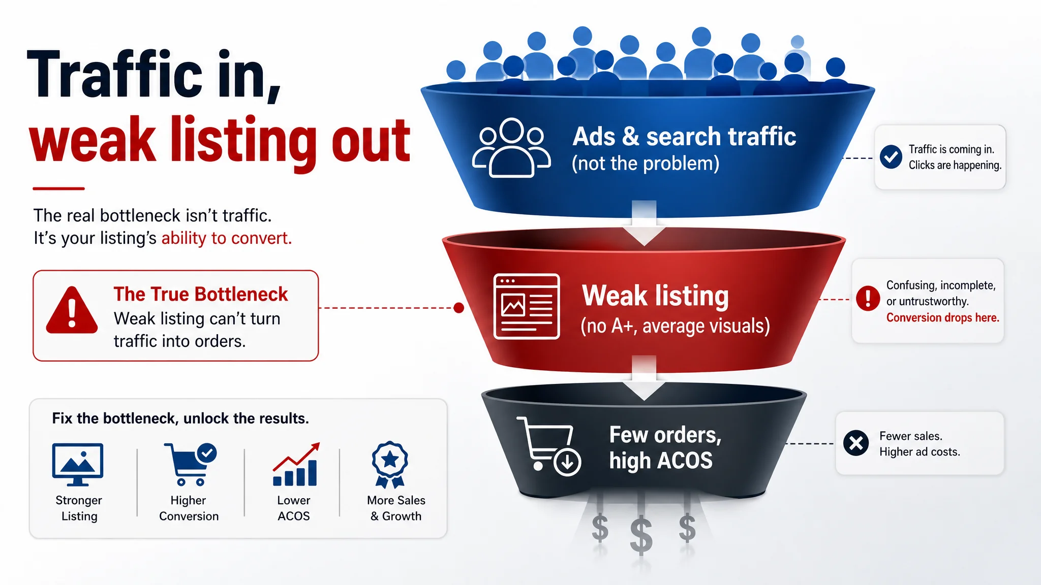
The Core Constraint Was Not Traffic, But Listing Conversion Capacity
DeepBI’s Listing score put hard numbers on what had previously been a gut feeling.
- Customer listing total score: 52 / 100
- Benchmark competitor total score: 80 / 100
- Gap: –28 points
Broken down by dimension:
- Title: –2 vs competitor
- Main image set: –2
- Bullet points: +3 (actually stronger on paper)
- Detail/A+ content: –21 (0 vs 21)
- Reviews: –6
The numbers made one thing unambiguous: this wasn’t primarily a “headline” or “hero image” disaster. The title and main image were behind but not catastrophically so. The catastrophic hole was the complete absence of A+ content and a very weak review base.
In other words:
The listing didn’t lack traffic. It lacked a structured, visual decision path to turn that traffic into confident buyers.
If the seller kept pouring ad spend into this page, they were essentially paying to expose more buyers to a half-finished pitch.
The Original Misdiagnosis: “It Must Be the Ads, or Maybe the Creatives”
Before the DeepBI diagnosis, the customer’s mental model looked roughly like this:
- High ACOS = ad targeting not precise enough
- CTR and CVR plateau = need better ad creatives and more keywords
- Listing tweaks = optional polish after ads are “working”
Under this logic, the operating plan became:
- Add or split campaigns
- Test new keyword sets
- Iterate ad copy and creatives
- Hope that more refined traffic eventually lifts CVR and lowers ACOS
The problem: the listing itself had not earned the right to receive more traffic.
- On the search-results page, the main image did not clearly beat competitors on clarity and professionalism.
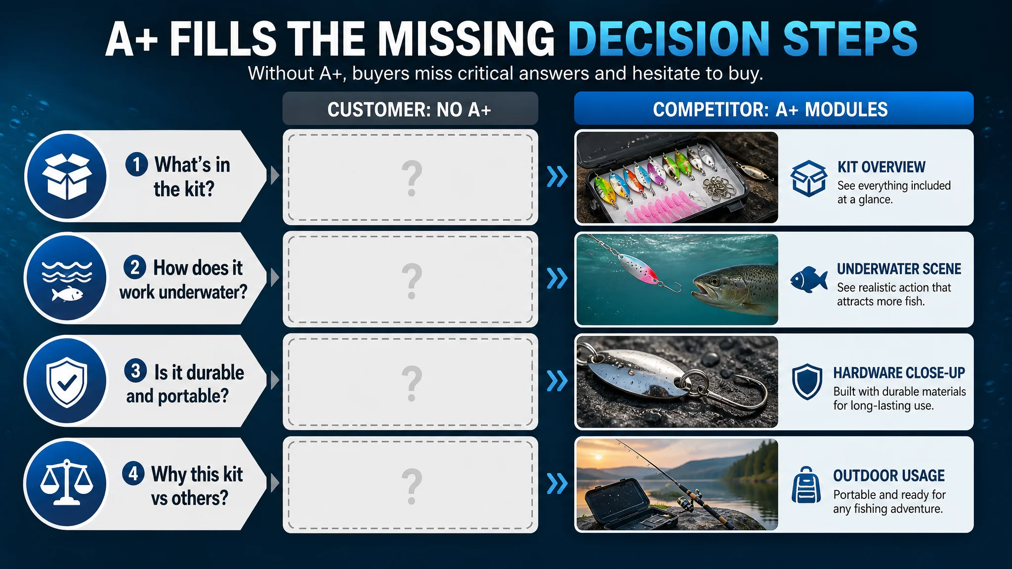
- Once users clicked in, they saw basic bullets and a standard gallery, but no A+ story to answer the key questions:
- What exactly is in this kit?
- How does it behave underwater?
- How durable is it in real fishing environments?
- Why is it worth its price versus others?
Advertising in this state was not unlocking hidden potential; it was amplifying the listing’s structural weaknesses.
Listing Score Abnormalities: Where the Page Fell Behind
Title: Not Terrible, But Not Leading the Click
Score gap: –2 vs benchmark.
The benchmark listing did several things that this listing did not fully match:
- Front-loaded quantity and form: “16 Pcs” and “Set” moved upfront, delivering a strong value signal at a glance.
- Specific specs: “2.5g 3.5g 5g” clearly listed; buyers knew immediately what they were getting and could match it to their fishing conditions.
- Tight keyword clustering: “Spoons Lures,” “Metal Baits” arranged compactly to help Amazon’s algorithm and search relevance.
- Concrete targeting: Explicit mention of “Bass, Pike, Sea” to tell both the user and the algorithm the exact use cases.
The customer’s original title used broader, more generic expressions like “Pro,” and spread species and scenarios less tightly. It wasn’t invisible in search, but:
- Information density per character was lower.
- Outcome clarity for the buyer scanning search results was weaker.
- Intent targeting (who this is for, where to use it) was less sharp.
Main Image Set: Information Exists, But Professionalism and Trust Lag
Score gap: –2 vs benchmark, but the qualitative differences mattered more than the points.
DeepBI’s analysis highlighted several issues:
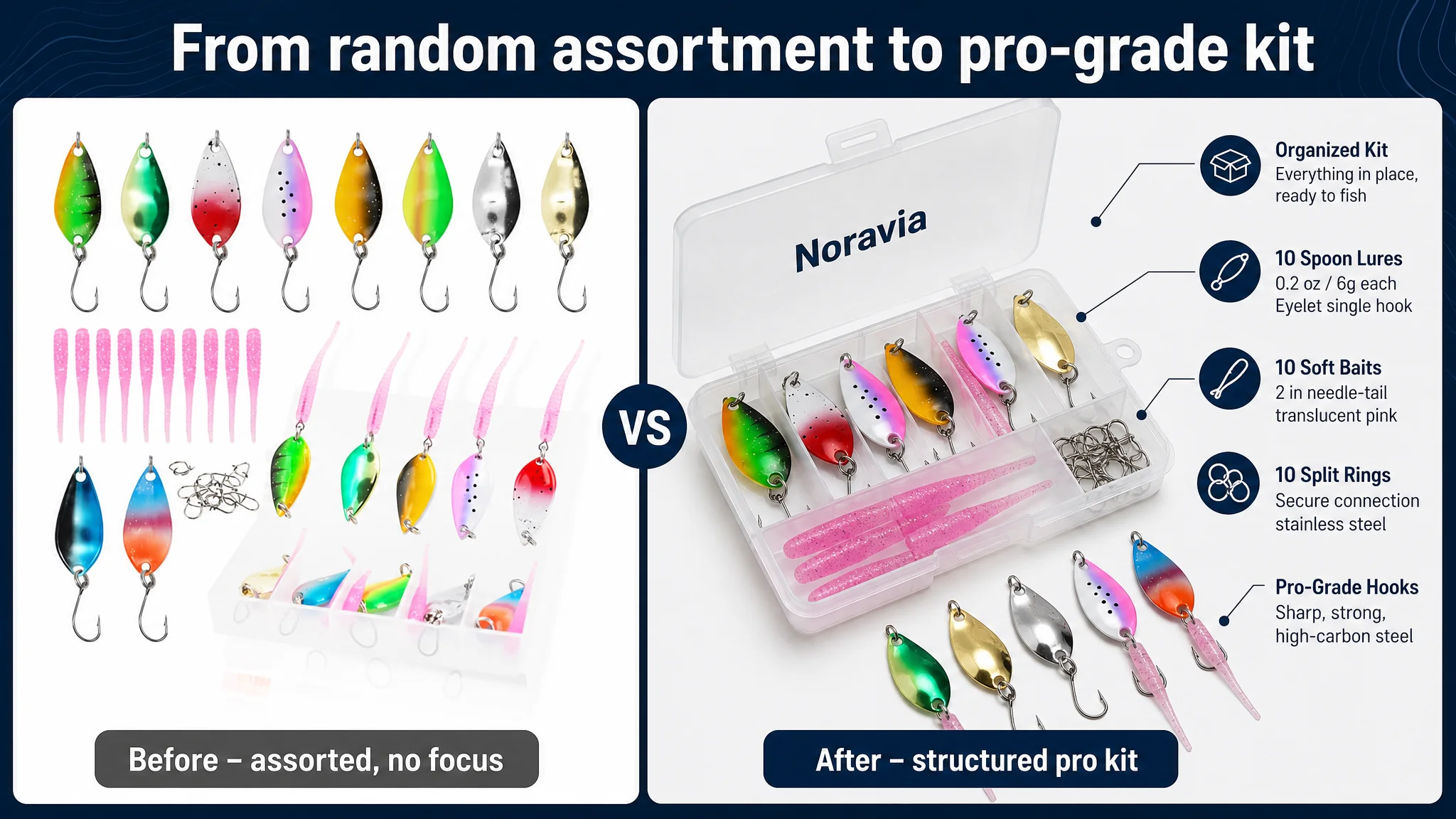
1. “Grocery assortment” vs “professional outdoor gear”
The existing images felt like a loosely arranged set of lures in a box—visually cluttered, no clear hierarchy. The benchmark, by contrast, looked like a professional kit:
- Tight, clean composition
- EVA-lined case that instantly signaled value
- Coherent outdoor/pro-angler visual theme
This affects both CTR and A9’s positive weighting on engagement.
1. Information decoding burden
The customer’s more technical diagrams required active interpretation. The benchmark delivered “one-glance understanding” via:
- Underwater scene with a lure in motion
- Annotated parameters tied to visible elements
- Clear mapping of “weight → depth” and “rotation → attraction”
1. Weak social proof in visuals
The competitor used multiple real-angler action shots catching fish with the kit. The customer had only a single composite scenario, with limited real-use credibility.
1. Usage value not visualized enough
Phrases like “Multiple Combined Swimming Strokes” appeared in copy, but there was no strong visual to show what that means in real water. For practical, results-driven buyers, that’s a gap.
The upshot:
The main image set did not scream “trusted, proven, professional gear.” It looked more like a commodity kit, making it hard to justify choosing it over a more “serious” competitor.
Bullet Points: Surprisingly Strong Logic, But Not Fully Supported by the Page
Ironically, the bullet points scored higher than the competitor (+3).
The structure was objectively good:
- Value proposition (kit completeness)
- Convenience (storage and portability)
- Technical edge (design and materials)
- Scenario adaptability (freshwater / saltwater)
- Gift positioning as the closing push
DeepBI’s refined bullet suggestions pushed this further:
- BP#1: Framed as a “Complete Jika Rig Kit for Pro Performance,” clearly listing what’s in the kit and emphasizing “ready for immediate action.”
- BP#2: “Lifelike Swimming Action & Anti-Tangle Design” made function and benefit explicit.
- BP#3: “High-Reflectivity & Durable Chrome Finish” tied materials and performance together.
- BP#4: “Precision Casting for Micro-Fishing” addressed technique-specific use.
- BP#5: “Multi-Species Versatility & Ideal Gift” combined breadth of usage with a gifting hook.
The paradox:
- On paper, the persuasion logic in text was stronger than the competitor’s.
- But without A+ visual reinforcement and professional imagery, that logic did not fully translate into real conversion.
The case shows a subtle but important point: good copy alone cannot carry conversion in a visual-heavy Amazon category.
Detail/A+ Content: The Real Conversion Leak
Here was the decisive gap:
- Customer detail/A+ score: 0 / 25
- Benchmark detail/A+ score: 21 / 25
The competitor’s A+ layout:
- Brand + identity introduction
- Immersive usage scenarios
- Kit composition overview
- Underwater effect simulation
The customer’s listing:
- No A+ content at all
- Only standard bullets and gallery
- No structured modules to build trust or explain usage in depth
For a technical, performance-sensitive product like fishing lures, that’s not a small omission; it’s removing an entire decision layer.
DeepBI’s diagnosis:
“This product page did not lack traffic. It lacked trust.”
Without A+ content, the listing:
- Could not visually confirm completeness of the kit
- Could not show underwater action, color behavior, or hook quality
- Could not visually validate durability or portability
- Could not create a narrative that justified choosing this kit over others
The competitor, by contrast, used:
- Professional underwater visuals showing a lure in motion and a fish about to strike
- High-quality kit “family portrait” with all parts laid out
- Micro details of hooks and swivels to signal build quality
- Outdoor action shots reinforcing real-world performance
This is why DeepBI judged: fixing the A+ and image set was a higher priority than another round of ad tweaks.
Reviews: Perfect Rating, But Not Enough Volume to Support Risky Buyers
Review snapshot:
- Customer: 5.0 stars, 2 reviews
- Benchmark: 4.7 stars, 13 reviews
Surface-level thinking might say “5.0 is better than 4.7,” but conversion psychology is different:
- Buyers trust a slightly lower rating with more volume more than a “perfect” 5.0 from a handful of people.
- The competitor’s 13 reviews and multi-region sources made the product feel more validated and universal.
- The customer’s 2 US-only reviews felt more like early-stage, insufficient social proof.
In the absence of strong A+ content, this low review count amplified the trust problem: the listing looked both visually under-explained and lightly validated.
Why DeepBI Did Not Recommend “Optimize Ads First”
From a business-risk perspective, DeepBI’s judgment was:
- Continuing to scale or optimize ads would push more paid traffic into a page that lacked core conversion infrastructure.
- The biggest risk was not failing to get impressions; it was paying for clicks that had a low probability of converting, due to:
- Weak professional signal vs competitors
- No A+ storytelling
- Shallow social proof
Advertising does not only amplify advantages. It can also amplify a page’s existing defects.
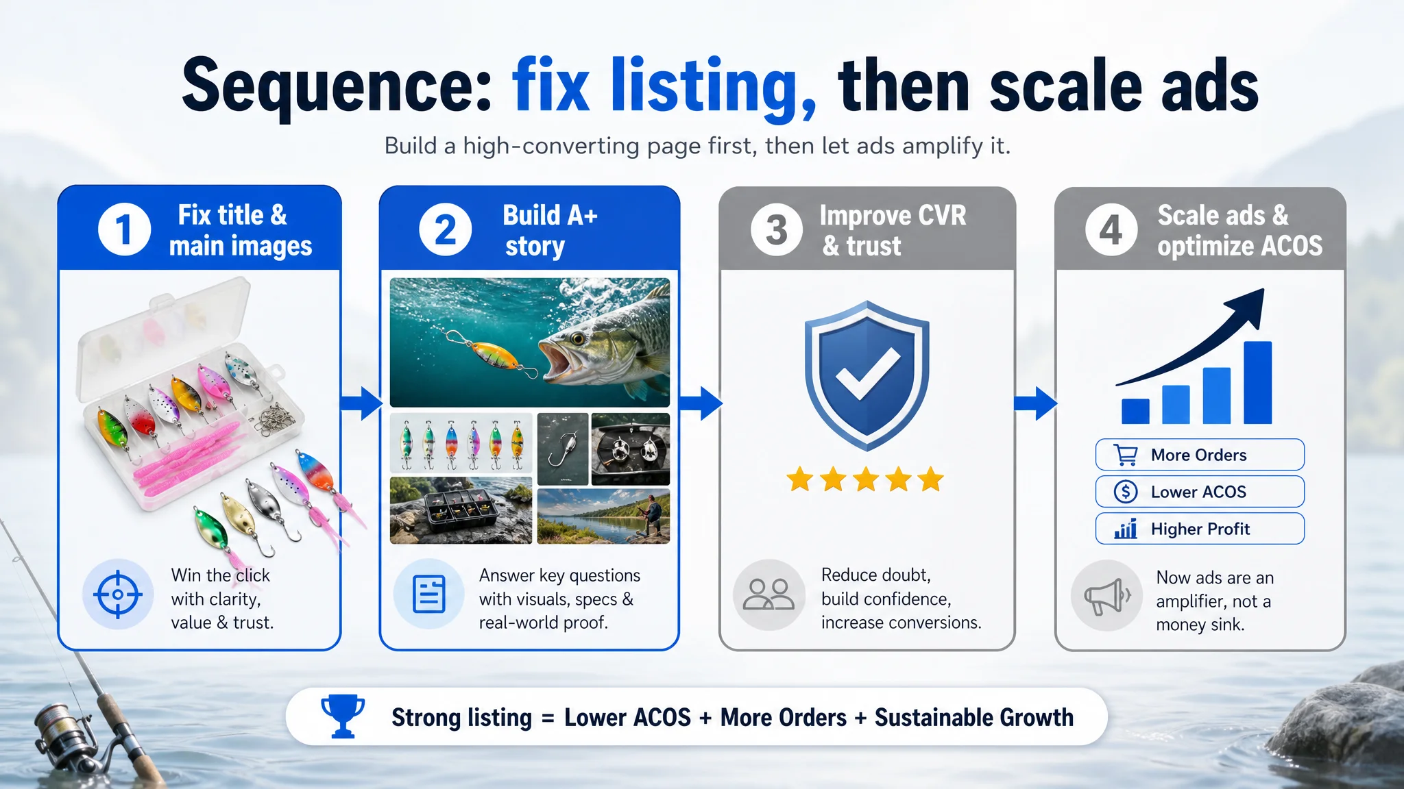
The logical order had to be:
1. Restore listing conversion capacity:
- Clarify title and search intent
- Professionalize main images
- Build a robust A+ layer and visual story
1. Then re-evaluate ad performance:
- Let the improved page convert both organic and paid traffic
- Use ad data to refine further once the basic “sales machine” is in place
This is the core operating discipline DeepBI tries to instill: don’t scale a page that cannot yet carry the traffic.
How the Page’s Sales Logic Was Rebuilt
DeepBI’s optimization direction did not start from “more design.” It started from what information the buyer needs, in what order, and at what depth to make a confident purchase.
1. Title: Front-Loading Search Intent and Value
Suggested direction:
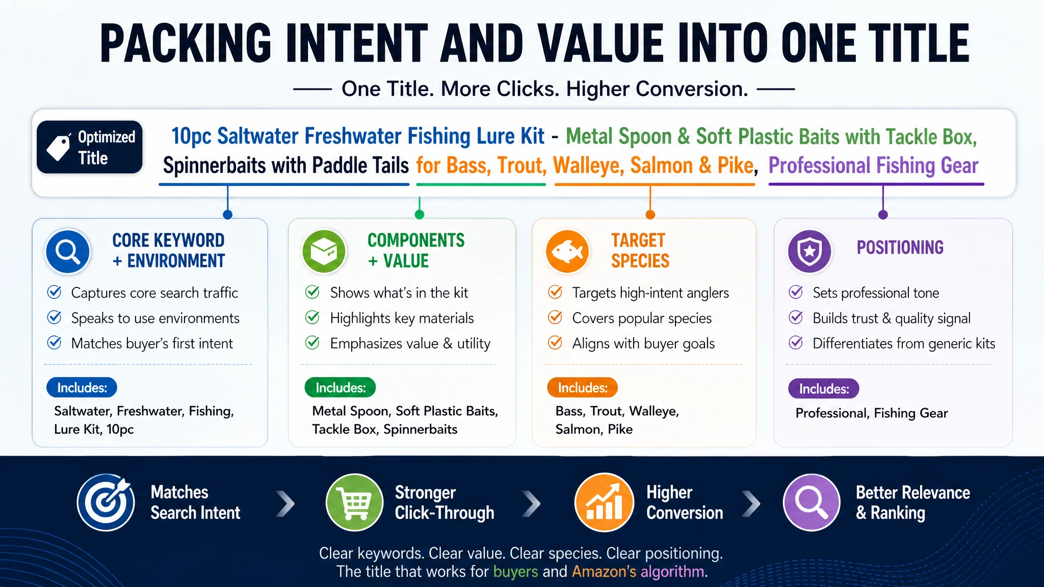
“10pc Saltwater Freshwater Fishing Lure Kit - Metal Spoon & Soft Plastic Baits with Tackle Box, Spinnerbaits with Paddle Tails for Bass, Trout, Walleye, Salmon & Pike, Professional Fishing Gear”
Key logic:
- Lead with the product type and environment: “Saltwater Freshwater Fishing Lure Kit”
- Immediately communicate quantity (“10pc”) and major components (“Metal Spoon & Soft Plastic Baits with Tackle Box”)
- Pack in species targeting (Bass, Trout, Walleye, Salmon, Pike) to capture diverse intent
- Close with a professional positioning (“Professional Fishing Gear”) that echoes the visual direction
This reordering and refinement helps:
- A9 understand what this product is and who it’s for
- Shoppers quickly judge “Is this for me?” while scanning search results
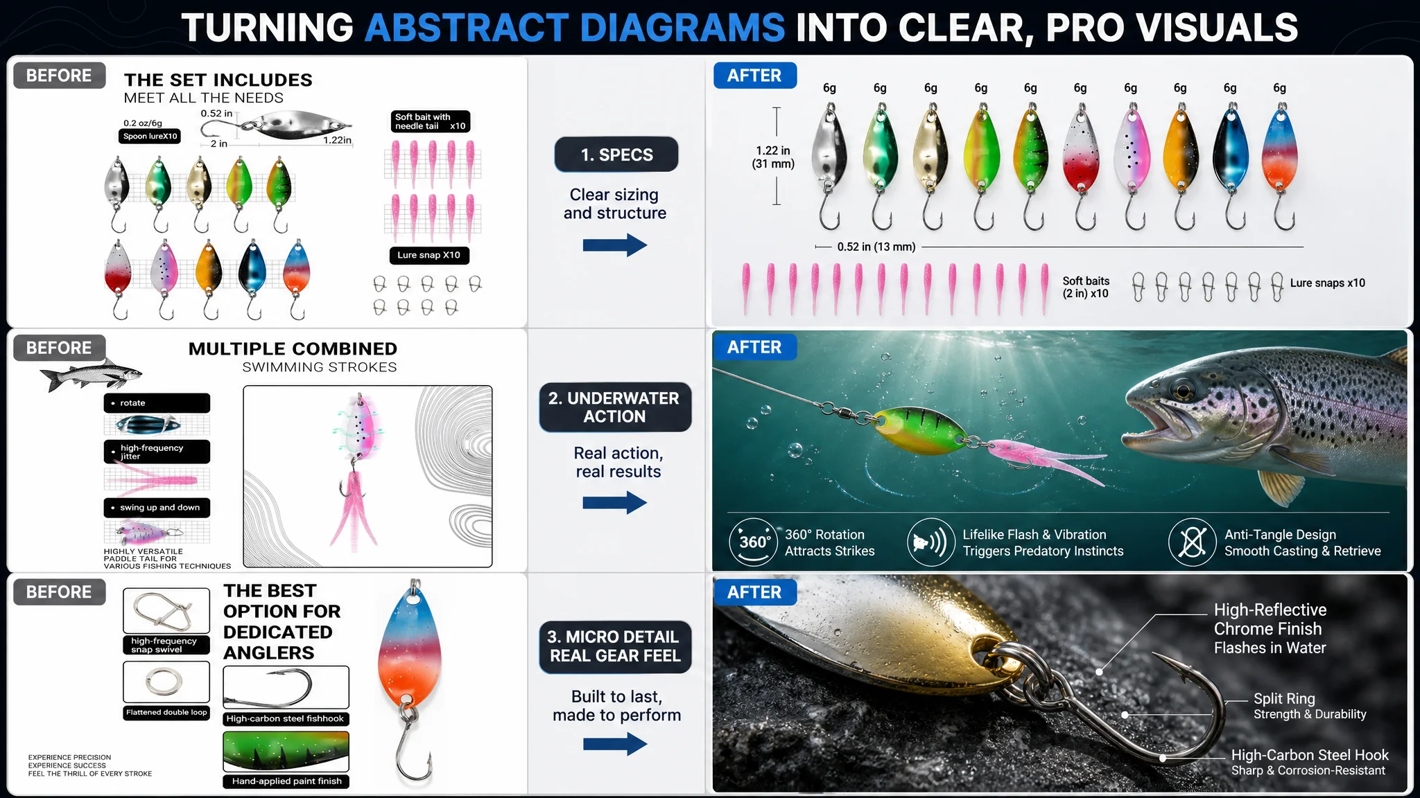
2. Main Image Set: From “Random Kit” to “Professional Outdoor Gear”
DeepBI’s guidance for the core images centered on:
- Clear, structured kit overview
- Quantified specs
- Underwater performance
- Micro-detail proof
- Real-world usage
Some examples:
Main image: Pro-grade kit overview
- Lures and tackle box centered, ~80% of the frame
- 45° top-down angle, clean white background
- Lures arranged by color gradient around the box
- Controlled lighting to eliminate messy shadows and highlight metal finishes
Outcome: Instant recognition of completeness and variety—this looks like a curated kit, not a random pile.
Spec image: Transparent parameters
- Lures aligned in a clear array on one side
- The other side reserved for weight and size callouts
- Neutral gradient background, even lighting
- Each lure labeled with weight (e.g., “6g”) and length scale
Outcome: Buyers can match the kit to their fishing techniques and waters without reading fine print.
Underwater action image
- Single lure at center in a deep-blue underwater environment
- Subtle bubbles and water-flow lines to suggest motion
- Shows how the lure sits and moves in water
Outcome: Visual proof that supports claims like “lifelike swimming action” and “high reflectivity.”
Micro-detail image: Hooks and finishes
- Extreme close-up of hooks and coating texture
- Dark, textured background to make metal stand out
- Clear labeling of “High-carbon steel” and similar attributes
Outcome: Signals durability and seriousness to experienced anglers who care about hardware quality.
Real-use scene
- Angler holding a caught fish, lure visible in the fish’s mouth
- Natural outdoor light, lakes and hills in the background
- High-impact, emotionally resonant shot
Outcome: Creates a “this actually works” impression in one glance.
The theme across all: move the visual language from “cheap kit photography” to “professional, purpose-built fishing gear.”
A+ Content: Building a Full Conversion Story, Not Just Extra Images
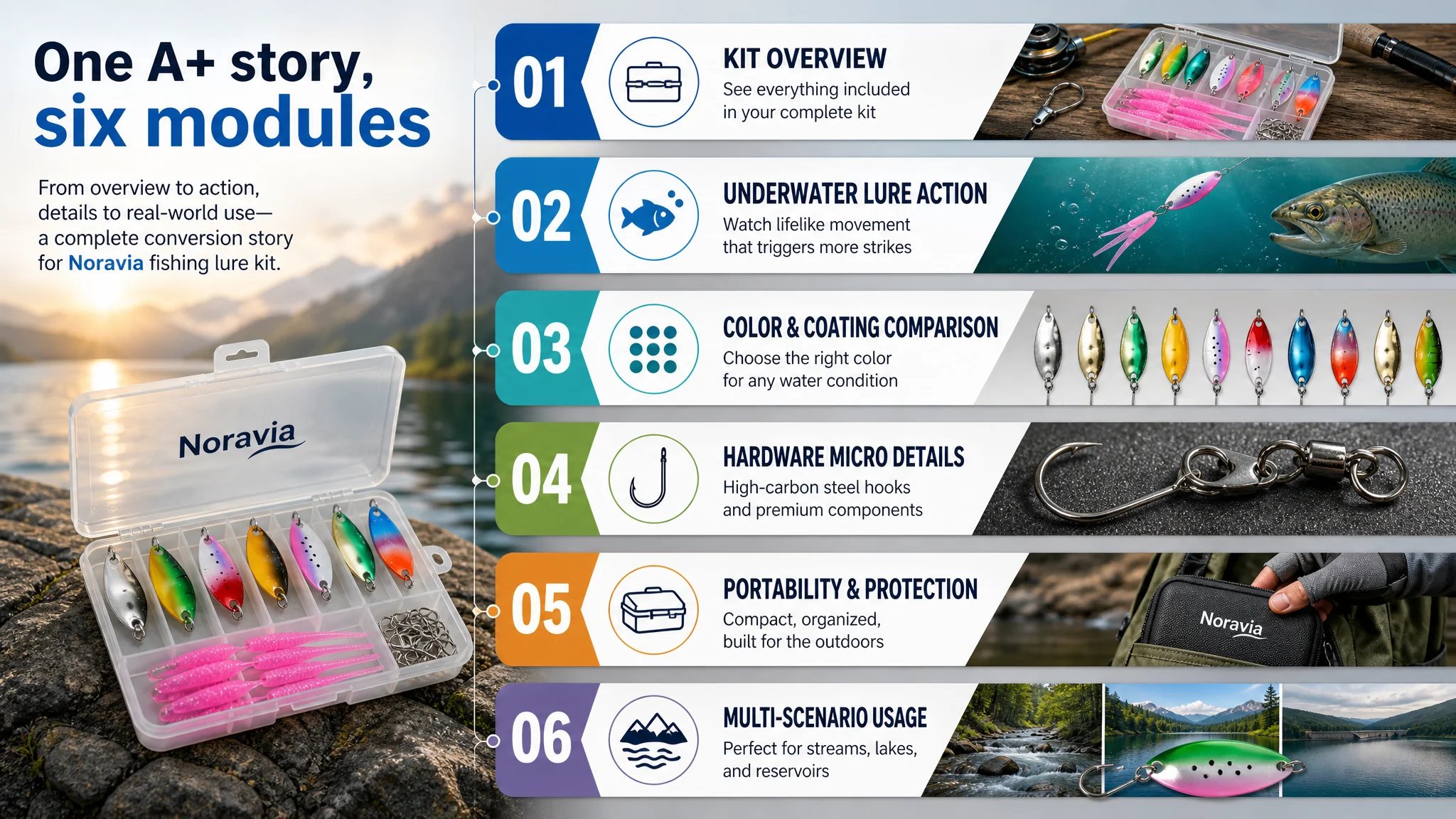
The A+ layer is where DeepBI saw the greatest leverage.
The proposed logic chain:
1. Opening overview:
Professional outdoor-style “family portrait” of the kit:
- Box at center, open at 45°, lures neatly arranged inside
- Outdoor wood surface and blurred fishing rod in the background
- Daylight-style lighting to keep colors accurate
Role: Immediately answer “What exactly am I getting?” and set a professional tone.
1. Underwater lure action module:
- Horizontal composition
- Lure in motion underwater, predator fish approaching to strike
- Cool, clear lake water with light beams
Role: Directly address the core fear: “Will this actually trigger strikes?”
1. Color and coating comparison module:
- Grid layout with multiple lure color variants
- Identical lighting and background for each
- No decorative clutter, purely comparative
Role: Help anglers match colors to conditions and reassure them that the kit covers key scenarios.
1. Hardware micro-detail module:
- Macro shot of swivels and single hooks
- High-contrast lighting to show sharpness and construction
- Focus only on the contact points
Role: Validate statements about “sharp penetration,” “anti-tangle,” and durability.
1. Portability and protection modules:
- Image of the EVA case sliding into a fishing bag pocket
- Another image of the case on wet rocks, showing water beads on the surface
Role: Solve practical worries: “Will this take space? Will it handle wet and rough conditions?”
1. Multi-scenario usage module:
- Composed background showing stream, lake, and reservoir environments
- Lure visuals overlaid as constant foreground
Role: Expand perceived applicability and justify purchase for different fishing habits.
These modules collectively:
- Take the bullet-point promises and prove them visually
- Reduce uncertainty along every major decision axis: what’s included, how it works, how it lasts, where it’s used
- Transform the listing from “a kit among many” into “a thoughtfully engineered, ready-to-fish system”
How Ad Traffic Became Useful Again
Even without adding fictional numbers, the expected operating shift is clear:
- Before:
- Ads drove clicks to a page that lacked depth and trust.
- ACOS and CVR were constrained by structural listing weaknesses.
- Organic ranking potential was capped because the page couldn’t convert enough of the traffic it got.
- After listing repair:
- The main image improved first-page competitiveness and CTR.
- A+ and structured imagery gave the page a much better chance to convert both ad and organic visitors.
- Bullet points, now visually supported, could play their full persuasive role.
- Reviews, while still low in count, were now backed by a professional presentation, making them feel less like isolated anecdotes.
As the page’s conversion capacity improves:
- Ad spend stops being “experimental waste” and starts being an amplifier of a working listing.
- ACOS has room to come down because more clicks turn into orders.
- Organic ranking can stabilize as Amazon observes better conversion performance.
- The seller’s dependence on ever-increasing ad spend decreases as the listing itself begins to carry more of the sales load.
What Changed in the Seller’s Understanding
The most important outcome of this case was not only visual assets; it was the shift in operating mindset:
- High ACOS is not always an ad problem.
- A listing that looks “okay” to the human eye can still be 20+ points behind a benchmark when measured across title, main images, A+, and reviews.
- Bullet points with good logic are not enough if the page lacks visual proof and structured story.
- Before scaling ads, it is critical to ask: “Does this page deserve more traffic?”
Or, put another way:
The real problem was not that ads failed to bring traffic. It was that the page could not convincingly convert the traffic.
For other Amazon sellers, this case underlines a simple but often overlooked discipline:
1. Use objective Amazon-specific listing diagnostics to see where you actually lag: title, main image, bullets, A+, reviews.
2. Identify the single core constraint—in this case, the total absence of A+ and weak professional visuals.
3. Fix the listing’s conversion foundation first.
4. Then let ads do what they’re good at: scaling a page that is already capable of turning traffic into business.