

This Amazon seller in the acrylic paint category came to DeepBI with a familiar pressure: ads were getting harder to control, yet the listing looked “good enough” on the surface. In internal discussions, the team pinned most of the blame on one thing—“we just don’t have enough reviews compared with that benchmark white acrylic paint.” So they kept thinking about coupons, giveaways, and ad scaling to “feed reviews”, while the Amazon product page itself was treated as largely finished.
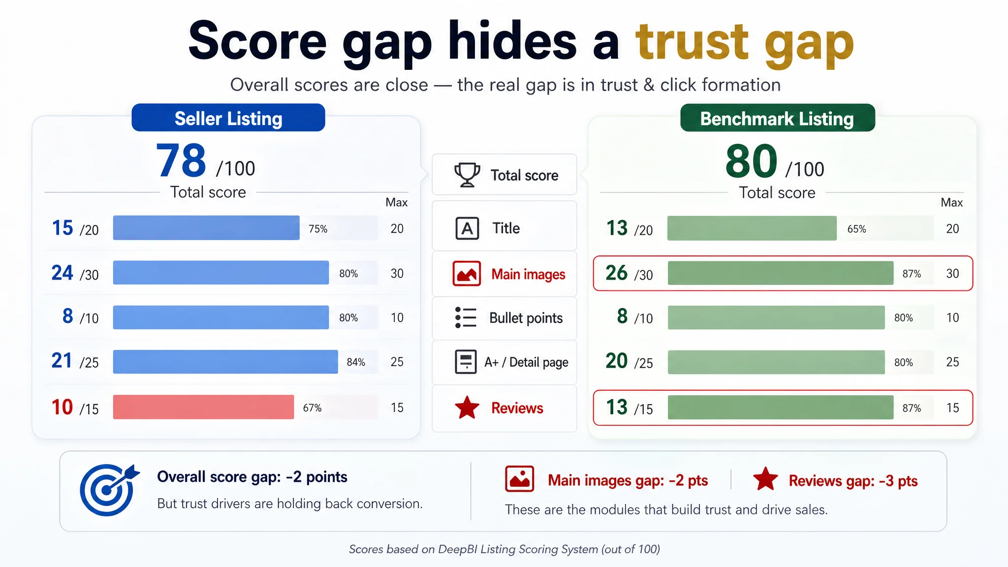
DeepBI’s Listing scoring told a different story. The target 1L heavy-body acrylic paint (earthy yellow) was only 2 points behind its benchmark competitor overall (78 vs. 80 out of 100), but the gap was concentrated in a very specific place: trust and click formation. The page had stronger A+ structure, and even a more complete title, but weaker main-image pull and a much smaller, more fragile review base (4.4 stars, 108 reviews vs. 4.6 stars, 581 reviews). In other words, the Listing was not fundamentally broken—but exactly the modules that should convert cold Amazon traffic were underperforming.
Instead of pushing the seller to “optimize ads harder” or “buy more traffic”, DeepBI reframed the problem: repair the Listing’s conversion logic around visual trust and decision flow first, then let ads work on top of that. The optimization focused on the main image set, bullet-point logic, and A+ story for heavy-body texture and usage scenarios, so that every new click—paid or organic—landed on a page that could actually close the sale. This case is a reminder to Amazon sellers: when reviews become the most visible weakness, it is easy to miss that your images and narrative may already be silently capping conversion and inflating ACOS.
What the Seller Saw: “Our Listing Isn’t Bad, We’re Just Outgunned on Reviews”
On paper, this Amazon US acrylic paint Listing did not look like a typical problem child:
- Total Listing score: 78/100 vs. the benchmark’s 80/100
- Title: slightly better than the benchmark (15 vs. 13 / 20)
- Bullet points: tied (8 vs. 8 / 10)
- A+ / detail page: slightly ahead (21 vs. 20 / 25)
The glaring gap sat in one place:
- Review score: 10 vs. 13 / 15
- 4.4 stars with 108 reviews vs. 4.6 stars with 581 reviews
- First-page negative-review exposure roughly twice the benchmark’s rate
From the seller’s perspective, the logic was straightforward:
- The content was “professionally built”: heavy technical details, multiple A+ modules, comparison charts.
- Benchmarks looked similar in structure; they just had more reviews and slightly higher star rating.
- Advertising costs were tight, and every time spend increased, returns didn’t scale proportionally.
The internal narrative quickly converged on:
“Our only real disadvantage is review volume and rating; once that catches up, ads will work better.”
So the team’s instinctive roadmap was:
- Keep campaigns running to sustain traffic.
- Consider more aggressive promotions to accelerate reviews.
- Adjust bids and keywords around the assumption that “the page is basically fine.”
The root issue: nobody was asking whether the page was truly ready to monetize each incremental click.
The Misdiagnosis: Treating a Review Problem as the Main Conversion Problem
The “we just need more reviews” diagnosis hid three business risks:
1. Over-reliance on social proof to fix structural conversion issues
Reviews do matter, especially when your competitor has 5x your volume. But when both Listings are above 4.4 stars, star rating alone rarely explains why your CVR and ACOS get stuck. If the page cannot persuade a cold visitor in the first 10–20 seconds, more reviews only soften, not erase, the leak.
1. Assuming A+ richness equals conversion strength
The seller had an A+ layout that looked fuller than the benchmark: multiple scenes, two comparison modules, application scenarios. It visually “felt” like an upgraded page. That made it easy to believe the conversion foundation was solid. But visual volume is not the same as decision logic.
1. Underestimating main-image influence on both CTR and trust
The main image was a clean white-background pack shot, but with flat lighting, limited sense of texture, and no visible certifications or clear technical cues. On a crowded Amazon search page, this meant:
- Fewer clicks compared with more scene-driven competitors.
- Weaker initial trust for parents, students, or beginners concerned about safety and quality.
As a result, ad optimizations were trying to squeeze efficiency out of traffic that either never clicked (CTR leak) or landed on a page that still raised subtle doubts (CVR leak).
“Advertising does not only amplify advantages. It can also amplify a page’s existing defects.”
What DeepBI’s Scoring Actually Revealed
DeepBI’s Listing comparison did not claim the page was bad; it exposed exactly where the real constraint lived.
1. Title: Structurally strong, but misaligned perception
The seller’s title:
- Followed a solid formula: brand + heavy-body acrylic paint + color + size + surfaces + audience.
- Included important qualifiers like “Non-Toxic” and “Heavy Body”.
- Covered multi-surface usage and both “artists & beginners”.
The benchmark’s title:
- Front-loaded the color (“Titanium White”) with the brand, gaining instant recognition for specific color searches.
- Focused on canvas/craft/furniture usage in a simpler, more compact form.
DeepBI’s judgment:
- The seller was not losing because of missing keywords; the layout was broadly correct.
- The weak point was not search reach but how quickly the title communicated outcome and role.
- The optimization opportunity was to condense repetitive phrases and tighten the front 35 characters around “heavy body acrylic paint” + color, while making “Non-Toxic” and usage scenarios more scannable.
In other words, the title was not the bottleneck; it was a secondary gain area.
2. Main-image set: The real click and trust bottleneck
On the main-image dimension, the seller trailed the benchmark (24 vs. 26 / 30). DeepBI’s analysis highlighted:
- Flat, low-impact lighting
The lead image had a standard white background but lacked the sense of volume and “pro” finish that a three-point studio setup could provide. This lowered perceived value at thumbnail size.
- Heavy-body texture not visually “felt”
The open-container image existed but was under-lit; texture waves and thickness weren’t clear. For a heavy-body acrylic paint, “how it holds brush strokes” is not just a detail—it’s the core buying trigger.
- Technical parameters hard to read on mobile
Lightfastness, opacity, and related specs appeared as small text; on Amazon’s mobile app, most users simply would not see them. The benchmark turned similar information into clearer visual panels.
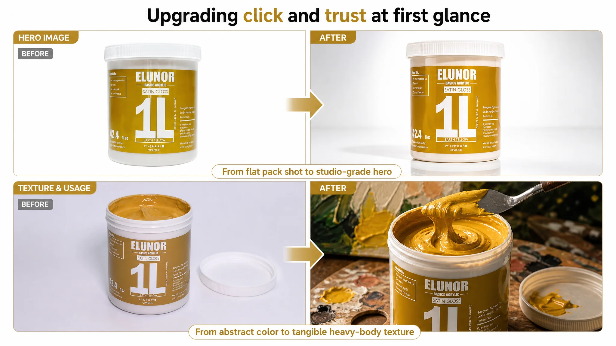
The consequence: the Listing did not create a strong enough visual reason to click or to instantly believe:
- “This is genuinely heavy-body, buttery paint.”
- “This is safe and trustworthy for home, kids, and long-term use.”
3. Bullet points: Informative but not a buying path
Both Listings scored the same numerically on bullets (8 vs. 8 / 10), but their strategies differed:
- The seller’s bullets read like a spec sheet:
- Volume and packaging design
- Professional quality and coverage
- Color mixing and compatibility
- Safe, eco-friendly formula
- Durability and broad applicability
- The benchmark:
- Started from studio positioning and effect (vivid, stand-out textures).
- Made heavy-body and gloss feel experiential, not just technical.
- Anchored safety with a concrete “AP certification” and “family” language.
- Closed with a simple brand promise and after-sales reassurance.
DeepBI’s observation:
The seller wasn’t missing information; they were missing a conversion narrative:
1. Why this paint feels different.
2. How it solves real pain points (fade, coverage, drying changes).
3. Why this brand will stand behind the purchase.
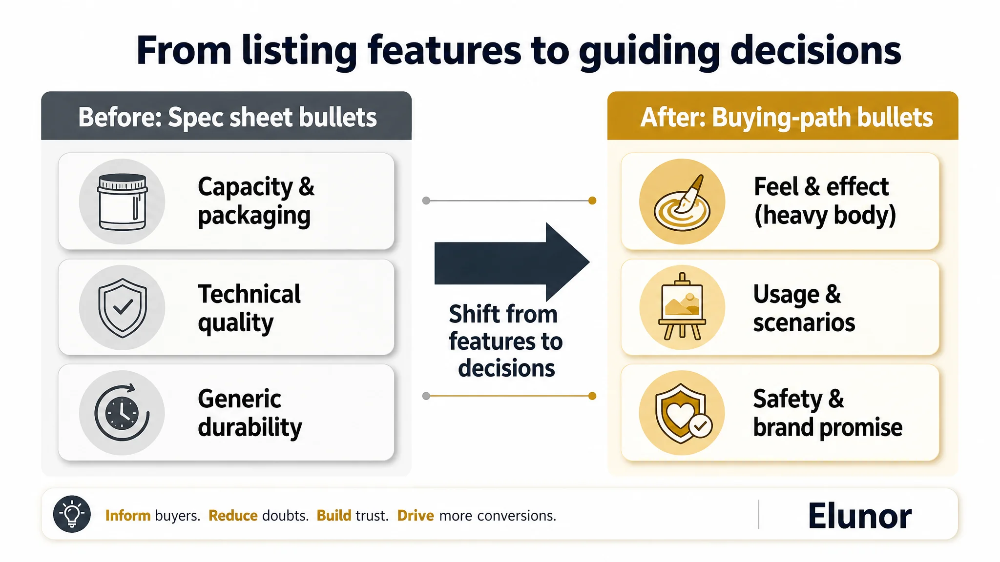
The bullet structure needed to move from “comprehensive description” to “pain point → solution → trust.”
4. A+ detail page: Stronger structure, but trust vs. reviews imbalance
On A+, the seller actually out-built the benchmark:
- V-shaped product layout emphasizing large 1L bottles.
- Heavy-body texture demonstrations.
- Dry/wet comparison.
- Two structured competitor comparisons (pump-head vs. wide-mouth, true capacity).
- Six application scenarios including children’s drawing.
The benchmark A+ was simpler: fewer modules, a core benefits paragraph, and one emotional scene.
DeepBI’s conclusion:
- Structurally, the seller already had an advantage.
- The A+ was not the main bottleneck; it was under-leveraged because top-of-page trust (main image + initial bullets + reviews) was not strong enough to get more visitors to scroll and fully absorb it.
5. Reviews: A real gap, but not the only one
Data clearly showed:
- 4.4 vs. 4.6 stars: small but meaningful trust delta.
- 108 vs. 581 reviews: the benchmark had over 5x the volume.
- The seller’s first-page negative-review rate was roughly double the benchmark’s.
This did matter. But DeepBI’s judgment was blunt:
- Even if review volume doubled, a flat main-image set and spec-sheet bullets would continue to cap conversion.
- Ads would still be paying to send traffic into the same weak click-and-trust frame.
Why DeepBI Refused to “Optimize Ads First”
With this profile, it was tempting to keep iterating Amazon ads:
- New keyword combinations.
- Bid tuning.
- Campaign restructuring.
DeepBI pushed back for three reasons.
1. The Listing was already in a fragile trust position
When:
- Your review base is smaller and slightly weaker.
- Your main image signals less professionalism than a top competitor.
- Your bullets sound more technical than reassuring.
Then every extra ad click is forcing a cold shopper to work harder to trust you than to trust the benchmark listing.
In this situation, ads amplify the trust gap.
2. CTR and CVR were jointly constrained by page presentation
DeepBI’s scoring logic ties:
- Main-image strength to potential CTR.
- Review and detail-page trust to CVR.
Here:
- Main-image score lagged the benchmark.
- Review dimension lagged heavily.
- A+ structure was better, but the full trust story wasn’t surfacing early enough.
Pushing traffic into a situation where both click formation and conversion-at-first-glance are handicapped is commercially unsafe.
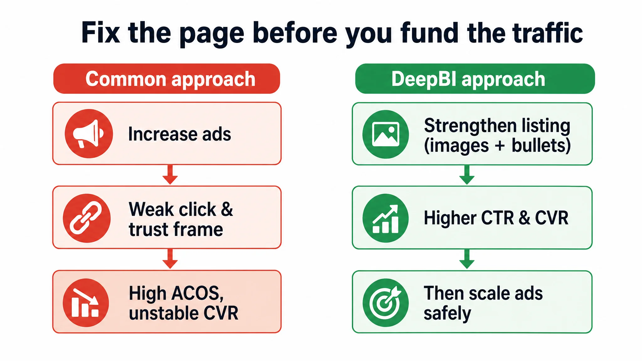
3. The biggest business risk was wasting ad spend on a page that doesn’t fully deserve more traffic
The decision order DeepBI recommended:
1. Repair the Listing’s conversion logic.
- Make the heavy-body story visually self-evident.
- Raise perceived professionalism and safety at thumbnail and hero-image level.
- Reshape bullets into a persuasive path, not just a parameter list.
1. Then re-tune ads on top of the improved page.
At that point, every marginal click has a higher probability of becoming an order, making ACOS movements meaningful instead of noisy.
How the Amazon Product Page Was Rebuilt Around Real Buying Logic
DeepBI’s optimization did not change what the product was. It changed how the Amazon Listing communicated, in exactly the places where the seller had been weakest.
The real constraint was Listing conversion capacity
“The real problem was not that ads failed to bring traffic. It was that the page could not fully convert the traffic.”
From that judgment, all decisions flowed.
Reframing the Title: Clarity and Outcome Before Exhaustive Detail
The proposed title:
Heavy Body Acrylic Paint (Earthy Yellow, 1L/42.4 oz) - Non-Toxic Gloss Thick Art Paint for Canvas Wood Ceramic Fabric Leather - Professional Bulk Craft Paint for Artists & Beginners
Three deliberate shifts:
- First 35 characters prioritized: heavy body acrylic paint + specific color.
This improves mobile recognition and reinforces what kind of paint this is.
- Redundant phrases removed, e.g., repeated “acrylic paint” and “large bulk,” freeing space for:
- Clear size notation (1L/42.4 oz).
- Multi-surface applications.
- Audience (“Artists & Beginners”).
- Outcome language surfaced:
- “Gloss” and “Thick” signal the final effect and texture, not just composition.
The title stops being merely a keyword container and becomes a fast, skimmable snapshot of what you get and for whom.
Rebuilding Bullet Points as a Buying Path, Not a Spec Sheet
DeepBI’s bullet recommendations followed a clear logic: each point must answer a specific buyer question and move them one step closer to “Add to Cart.”
Bullet 1 – Make “Heavy Body” feel like a real upgrade
From: descriptive professional quality. To:
PROFESSIONAL HEAVY BODY & HIGH GLOSS – Elevate your artistry with thick, butter-like consistency, oil-like texture, and vivid stand-up effects.
- Connects directly to studio-level expectations.
- Turns heavy-body from a technical term into a visible, tactile benefit.
Bullet 2 – Tie volume to real usage scenarios
From: generic packaging and volume. To:
1000ML LARGE BULK FOR STUDIO – 33.8 fl oz bulk paint, wide-mouth design for easy dispensing, air-tight lid to keep paint fresh.
- Positions volume as studio-scale, not just “a lot.”
- Shows how packaging design prevents waste and supports long-term use.
Bullet 3 – Merge mixing performance with color stability
From: separate mentions of mixing, coverage, and compatibility. To:
EXCEPTIONAL MIXING & VIBRANT SATURATION – Rich pigment paste that resists graying when blended, supports multi-layer applications and smooth gradients.
- Directly addresses painters’ fear of muddy colors.
- Positions the paint as suitable for complex, layered work.
Bullet 4 – Turn safety into a decision anchor
From: generic safety and eco-friendly wording. To:
SAFE & NON-TOXIC CREATIVITY – 100% non-toxic, eco-friendly formula safe for artists of all ages.
- Mirrors the benchmark’s “suitable for all ages” angle.
- Expands audience reach from pros only to schools, families, and hobbyists.
Bullet 5 – Close on durability, versatility, and a soft brand promise
From: broad “durable and versatile” statements. To:
LONG-LASTING VIBRANCY & VERSATILITY – Fade-resistant, compatible with canvas, wood, fabric, ceramic, metal, and rocks; designed to last as long as your inspiration.
- Connects fade resistance directly to long-term satisfaction.
- Reinforces multi-surface use and gently hints at brand commitment without overpromising.
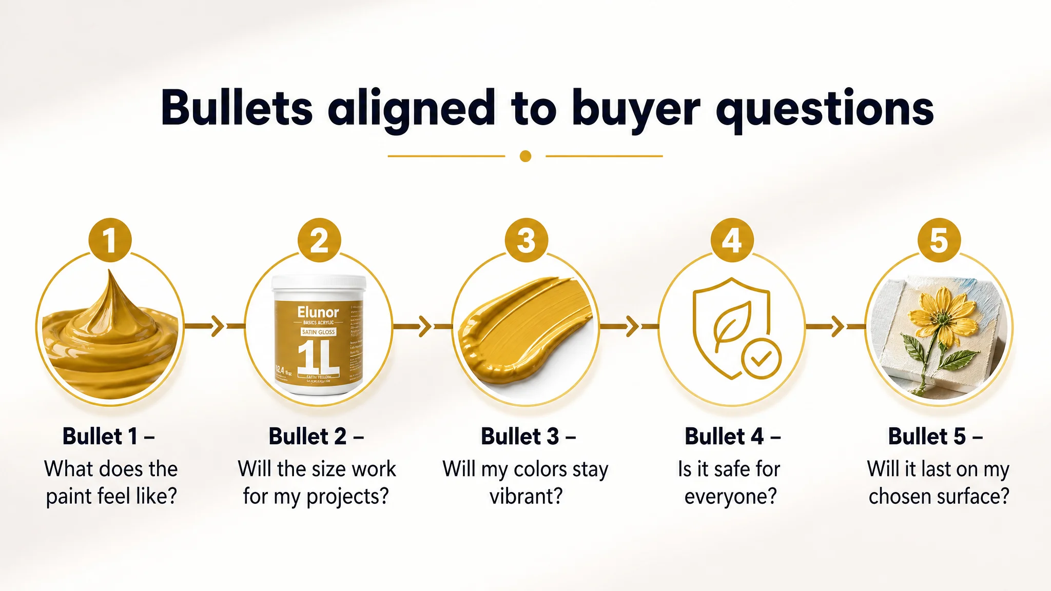
The cumulative effect: bullets now respond to emotional and functional concerns in sequence, rather than listing features in isolation.
Turning the Main-Image Strip into a Commercial Engine
DeepBI’s main-image recommendations were not aesthetic for their own sake. Each image was tied to a specific role in the Amazon decision funnel.
Image 1 – Professional hero shot for CTR and perceived value
- Product centered and occupying ~80% of the frame.
- Perfectly straight-on angle, three-point studio lighting.
- Pure white seamless background with a subtle reflection.
- Clean, minimal typography for key info only.
Business purpose: Win the click against visually noisier competitors by looking more professional and higher quality at thumbnail size.
Image 2 – Open-container macro to make heavy-body “visible”
- Product centered, 45° top-down view of the open jar.
- Side lighting to emphasize ridges, waves, and thickness.
- Soft gradient background to keep attention on the paint.
Business purpose: Remove ambiguity about “heavy body” and “thick” by letting shoppers literally see the texture they’re paying for.
Image 3 – Visualized technical parameters
- Split layout: product on one side, clean info panel on the other.
- Simple icons and bold text for:
- 1L capacity
- Transparency/opacity
- Lightfastness
Business purpose: Serve serious artists and art teachers who skim for specs; compress complex text into quick trust signals, especially on mobile.
Image 4 – Texture and coverage in action
- Top-half: a close-up floral painting with evident palette-knife strokes.
- Bottom-half: swirling paint being mixed in macro detail.
Business purpose: Show exactly what “high coverage” and “thick pigment” look like in an actual artwork—reducing the risk of disappointments (“too thin,” “not opaque”).
Image 5 – Pain-point comparison: wide-mouth jar vs. pump bottle
- Side-by-side visual:
- Left: wide-mouth jar with a palette knife easily scooping thick paint.
- Right: pump bottle with dried, clogged paint and unreachable residue.
Business purpose: Make the packaging choice itself a competitive differentiator. This doesn’t just explain the jar; it gives the shopper a reason to choose it over pump-based competitors, even if reviews are lower.
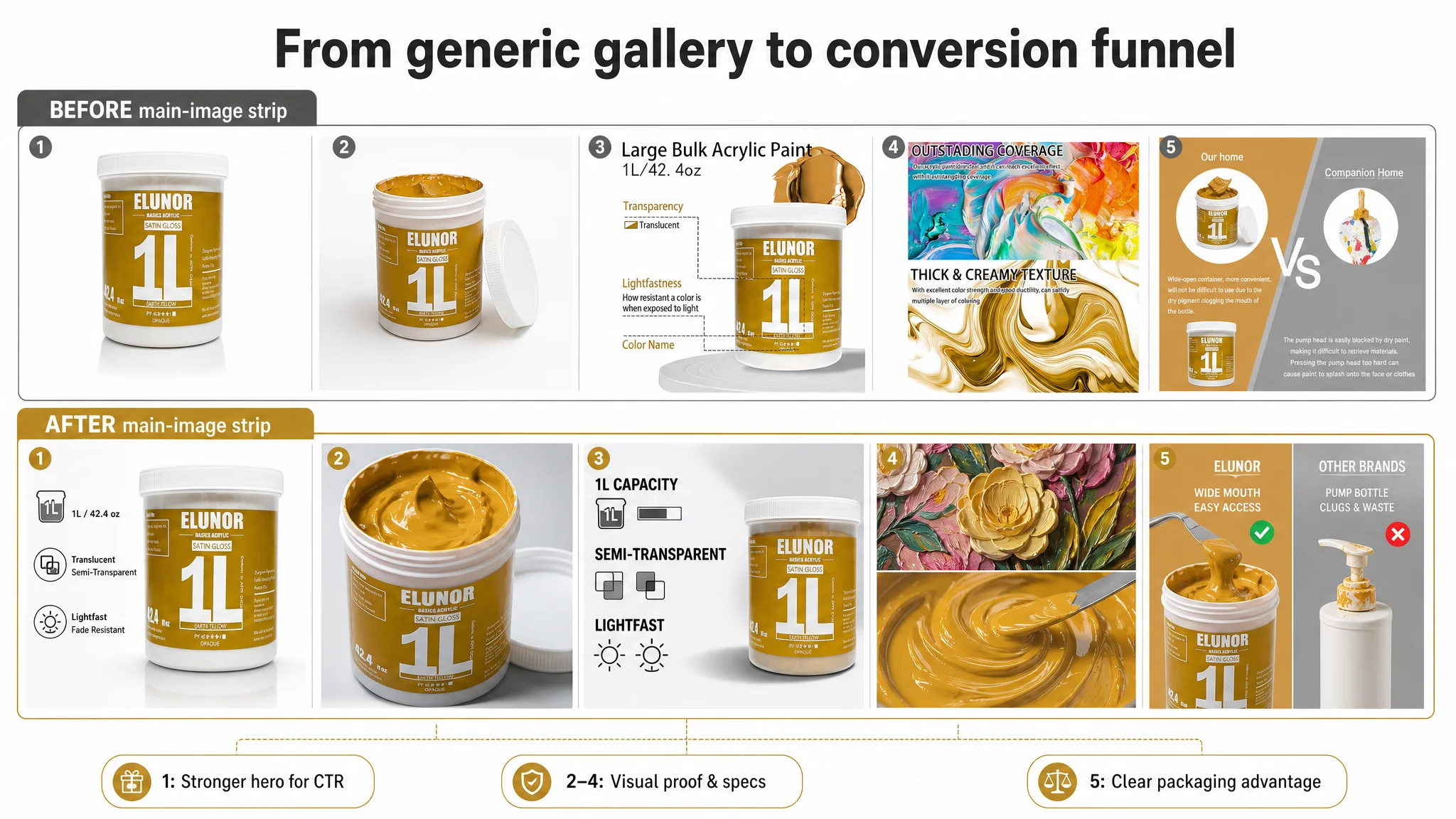
Together, these images rebuild the Listing’s role on the search results page: from “just another big jar of acrylic paint” to a visually credible, studio-ready heavy-body paint.
A+ Detail Page: Strengthening the Story the Listing Already Hinted At
DeepBI did not suggest tearing down the A+; instead, it sharpened the existing logic.
Key roles per module:
1. Opening KV:
Professional studio-style scene, V-shaped layout of multiple 1L jars, central bottle owning ~40% of the frame, clean “1L” labeling. → First impression: “serious, large-format, professional-grade paint line.”
1. Heavy-body macro:
Close-up of the paint surface with scrape marks that don’t collapse, under hard side lighting. → Makes the “heavy-body” claim physically undeniable.
1. Dry vs. wet comparison:
Split image on canvas, same color in “Wet” vs. “Dry (Satin Gloss)” under neutral soft light. → Addresses a universal acrylic pain point: fear of darkening or dulling after drying.
1. Usage pain-point comparison (wide mouth vs. pump):
Jar vs. pump as described above, with clear green/red cues. → Converts packaging into a “no waste, easy access” story.
1. Multi-material scenarios:
Grid or collage: canvas, ceramic, rocks, shoes; central product; natural light. → Expands the perceived market: professional art + DIY + customization projects.
1. Water-resistance proof:
Macro shot of water droplets on dried thick paint, no bleeding or dissolving. → Adds long-term and outdoor-usage confidence.
1. Step-by-step opening guide:
Four small panels: open cap, expose seal, remove seal, show rich paint. → Pre-empt questions about sealing, ease of use, and shipping integrity.
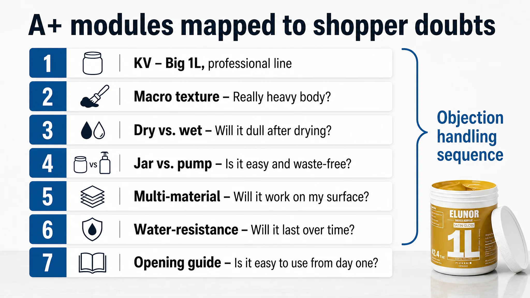
The A+ stops being “pretty extra content” and becomes a systematic response to objections that often show up in negative reviews—even before they can be written.
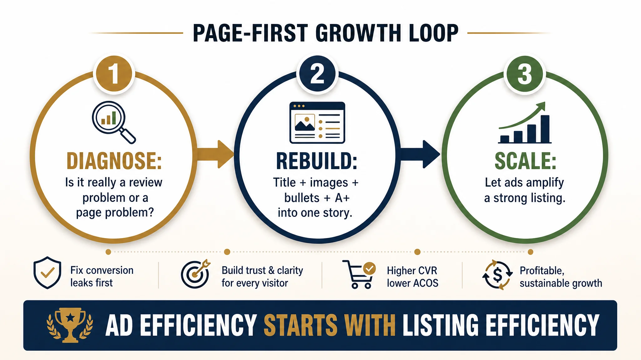
What Changed for the Seller: From “Ad Problem” to “Page-First” Thinking
This case did not end with a single metric snapshot; it ended with a changed operating mindset.
1. Understanding shifted from “review gap” to “conversion gap”
The seller began to see:
- Reviews were a visible symptom, not the only cause.
- Main-image quality and early-page trust were quietly depressing both CTR and CVR.
- Their A+ strength was underutilized because the hero image and bullets weren’t pulling enough visitors down the page.
2. Ads were reframed as an amplifier, not a fixer
Rather than expecting Amazon ads to compensate for Listing weaknesses, the team accepted a new sequence:
1. Get the Listing conversion-ready:
- Strong hero that can win clicks and project professionalism.
- Visual heavy-body proof to match and exceed benchmark expectations.
- Bullets that build a clear, emotionally resonant buying path.
1. Then invest in traffic:
- Use ads to exploit, not test, the Listing’s conversion strength.
- Treat ACOS movements as meaningful business feedback, not random noise.
3. Operational risk decreased
By aligning title, main image, bullets, and A+ around a coherent heavy-body, safety, and multi-surface story:
- Each paid click had a higher chance of converting, even with fewer reviews than the category leader.
- The page regained the ability to convert organic visitors without relying solely on discounting or aggressive promotions.
- The store’s dependence on “more and more ads” to hold position began to soften.
What Other Amazon Sellers Can Take Away
For many Amazon sellers, this acrylic paint case will feel familiar:
- Ads feel expensive and stubborn.
- A competitor’s review count looks intimidating.
- Your own Listing feels “good enough” because it’s full and technically optimized.
The key lessons:
- Do not let the review gap distract you from structural conversion gaps.
A 0.2–0.3 star disadvantage and lower volume matter, but main-image and bullet logic often decide whether cold traffic even gives your reviews a chance.
- Listing conversion capacity is the foundation of ad efficiency.
If the page cannot persuade, no amount of keyword tweaking will fix ACOS in a stable way.
- Title, main image, bullets, and A+ must tell one coherent story.
For this paint, that story was heavy-body texture, professional yet safe usage, and practical packaging advantages. In your category, the story will be different—but the need for coherence is the same.
- Before scaling ads, always ask: “Does this page deserve more traffic?”
DeepBI’s role in this case was not to adjust more ad parameters, but to pinpoint where the Listing was quietly consuming the traffic it already had—and to rebuild the Amazon product page so that every future click finally had somewhere strong to land.