

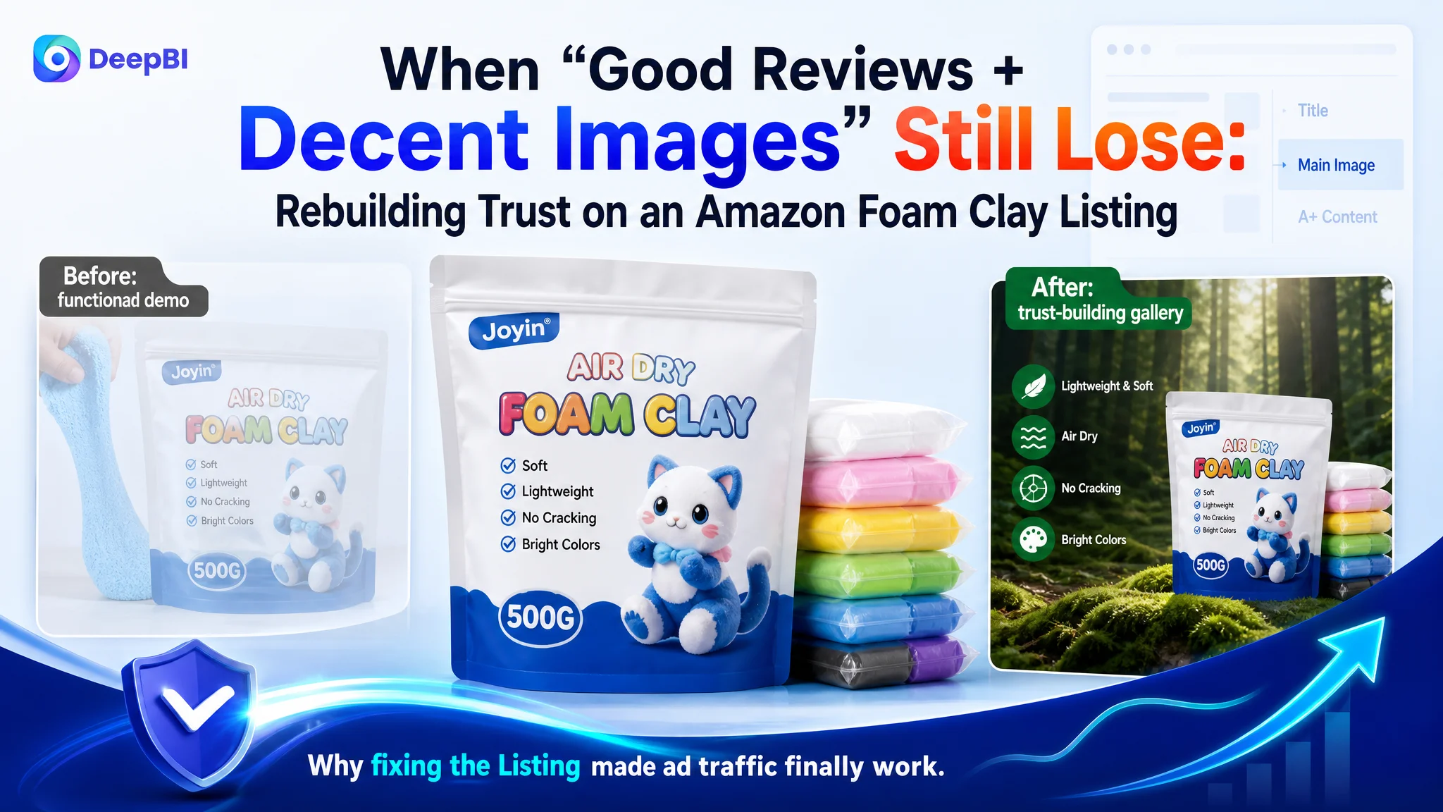
Many Amazon sellers recognize this moment: reviews look fine, ads are running, traffic is not terrible—yet the product page stubbornly refuses to convert like the category leaders. This case is about an Amazon seller in foam clay / craft supplies who thought the gap was mainly “we need more traffic and maybe nicer pictures,” while the real problem sat deeper in the Listing’s conversion capacity.
On this Amazon product page, both the seller and a top competitor had strong ratings and similar star scores. The seller assumed that with a 4.7 rating and a visually acceptable gallery, conversion problems must be an advertising or traffic-volume issue. DeepBI’s Listing diagnosis showed something different: the page was not building enough trust or decision clarity for the most valuable audiences—parents, teachers, and serious hobbyists—even though surface reviews looked competitive.
Once we reframed the problem as “a broken trust-and-education funnel on the product page,” the optimization direction changed. Instead of continuing to chase ad tweaks and minor cosmetic image changes, the focus shifted to title logic, main-image storytelling, and especially A+ content that systematically answered safety, usage, and outcome questions. The result: the Listing began to actually deserve traffic, and Amazon ads stopped feeling like they were pouring budget into a leaky bucket.
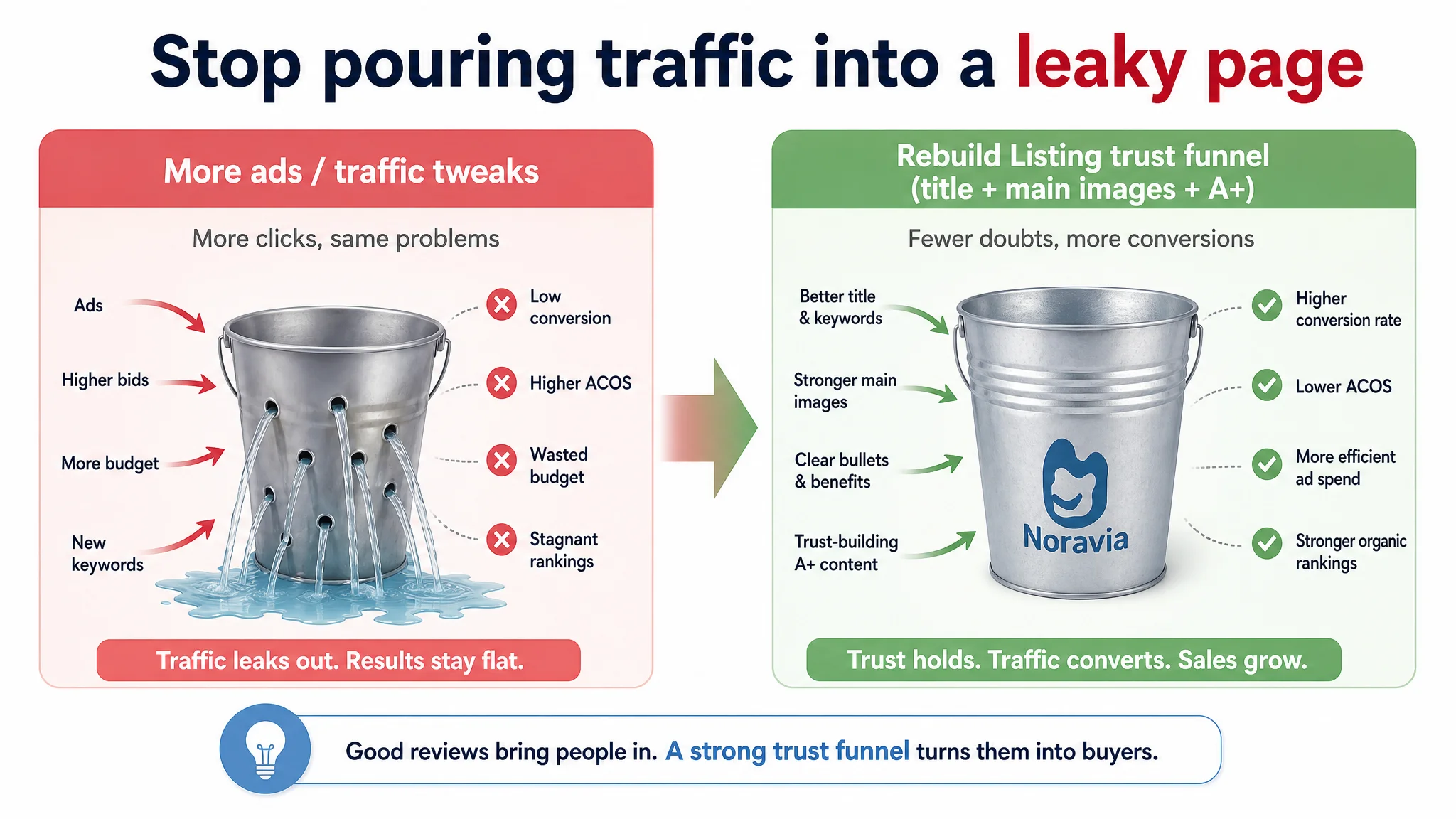
For other Amazon sellers, this case is a reminder: a good rating and a few decent images do not guarantee the page can convert today’s traffic. When ACOS feels hard to control and ads “should be working” but aren’t, it’s often the Amazon Listing’s trust path—not the campaigns—that is quietly capping your upside.
Amazon Ads Were Not Failing. The Page Was Consuming the Traffic.
From a distance, this foam clay Listing did not look like a classic problem ASIN.
- Star rating: 4.7
- Review volume: not huge, but positive and with low visible complaint rate
- Visuals: clean product photos, some usage scenes, bullet points present, A+ in place
The seller’s internal narrative followed a familiar pattern: “Reviews are strong, images are okay, conversion should be fine. If orders aren’t growing, we must be missing something in ads—wrong keywords, low bids, not enough budget.”
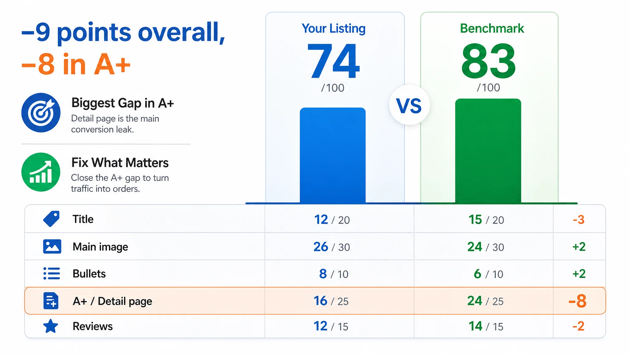
But when DeepBI benchmarked this Listing against a category-leading rival on Amazon US, the overall Listing score told another story:
- Target Listing score: 74/100
- Benchmark Listing score: 83/100
- Gap: –9 points
The gap itself wasn’t catastrophic. The problem was where those 9 points were lost:
- Title: –3 vs competitor
- Main image & gallery: slightly ahead (+2)
- Bullet points: slightly ahead (+2)
- A+ / detail page: –8 vs competitor
- Reviews: –2 vs competitor (volume and social proof)
On paper, the target Listing even beat the competitor on main-image and bullet-point dimensions. But in real buying journeys, the benchmark’s page still converted more confidently.
“The real problem was not that ads failed to bring traffic. It was that the page could not convert the traffic.”
The seller was trying to solve a conversion problem with ad tactics. DeepBI’s scoring showed the primary constraint lived in the trust and education layers of the Listing—especially the detail page and A+ story.
The Real Constraint Was Listing Conversion Capacity
DeepBI’s benchmark analysis stepped through each major module to see where the decision logic actually broke.
Title: Clearer Structure, Broader Scenarios on the Competitor
The seller’s original title was workable, but structurally weak compared with the benchmark:
- The competitor led with “Brand + core keyword” and color:
“Brand Air Dry Clay, 36 Packs Black Air Dry Foam Clay…”
- Key attributes were grouped as sharp, parallel promises:
“Air Dry, Crack-Free, Non-staining”
- Use cases were clearly separated with a “– for” structure, explicitly pulling in:
“Kids Education, Slime Add-ins” and other scenarios.
By contrast, the target Listing:
- Buried the core functional promise “Light Weight & Easy to Use” in parentheses and at the back of the title.
- Did not highlight “Air Dry Foam Clay” + color right up front on mobile.
- Listed fewer use scenarios, narrowing potential relevance.
So at search results level, the competitor’s Amazon title already did three jobs better:
1. Instant recognition (brand + product type).
2. Immediate reassurance (crack-free, non-staining).
3. Wider demand capture (kids, slime, crafts).
CTR and initial trust were starting higher before users ever saw the main image.
Main Image & Gallery: Functional Demonstration vs Value & Trust
DeepBI’s visual diagnosis found that the seller’s gallery was not “bad,” but it was framed around features more than outcomes and trust.
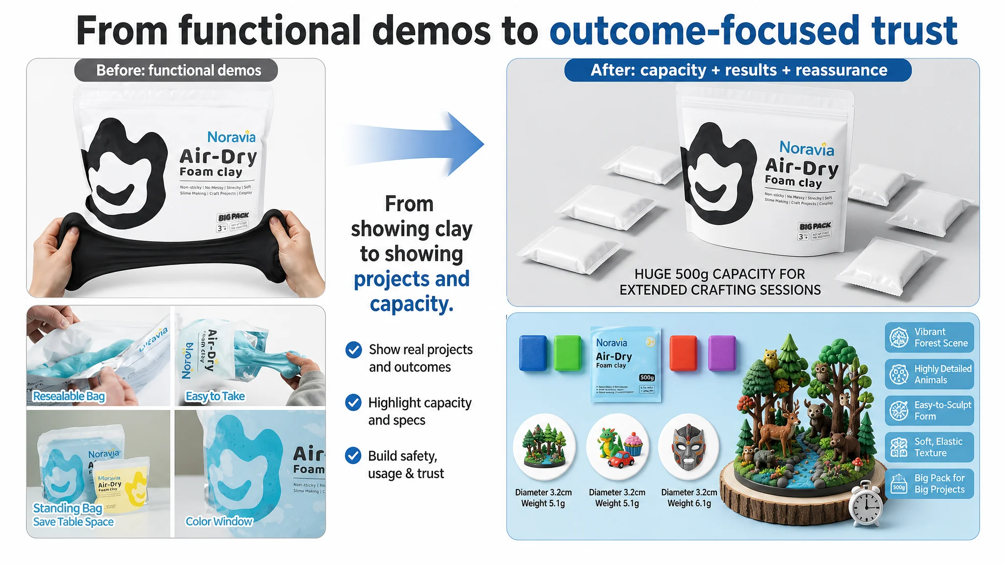
- Seller gallery leaned on:
- Product bag + clay texture closeups
- Stretching demos
- Packaging details
- Competitor gallery used:
- Real creation environments (workbench, kids crafting)
- High-fidelity finished models (dragons, houses, masks)
- Visual safety badges and certifications (CPSIA, ASTM, EN71)
- Professional-feeling use cases (home décor, “fake baking”, art projects)
The seller’s images told users what the clay looked like and how it behaved. The competitor’s images told users who it was for, what they could create, and why it was safe.
For a children-oriented craft material, that difference is decisive. Parents and teachers are not just buying “foam clay”; they’re buying:
- Trust that it’s safe on skin and in classrooms.
- Confidence that it won’t crack, stain, or disappoint kids.
- Proof that it can produce attractive, durable results.
Without visual anchors around those points, every click forced the customer to “fill in the gaps” themselves.
A+ Content Was the Core Conversion Leak
The most material gap was in the A+ / detail page dimension: –8 points vs the benchmark. That’s where Amazon sellers often underestimate how much conversion power they’re leaving on the table.
How the Competitor Built a Full Trust-and-Education Funnel
The benchmark A+ content effectively walked users through a complete journey:
1. Visual hook
High-quality finished models (dragons, mushroom houses, animals, masks) created instant desire and set a high “result ceiling.”
1. Usage education
- A step-by-step 4-step crafting guide
- Drying time, shaping, repairing and waterproofing tips
- Visual cues about sculpting, painting, and finishing techniques
1. Trust & risk removal
- Multiple safety certifications clearly displayed (e.g., CPSIA/ASTM/EN71)
- Ingredient transparency: vegan, gluten-free, latex-free icons
- FAQ addressing practical doubts: cracking, durability, storage
1. Scenario depth
Multiple contexts—home décor, fake bakery items, kids’ craft classes, advanced art projects—helped users imagine real usage in their own lives.
In DeepBI’s language, the competitor’s A+ created a “trust–education–conversion” funnel:
- Hook: “Look how good your results can be.”
- Help: “Here’s how to achieve it, step by step.”
- Reassure: “Here’s why it’s safe and long-lasting.”
- Expand: “Here are all the scenarios where it fits.”
What the Target Listing Actually Delivered
The seller’s A+ modules, by contrast, leaned heavily on:
- Basic product shots
- Children in generic scenes
- Texture closeups
- Cosplay and decorative use examples
- Packaging details (resealable, stand-up, window)
All useful pieces—but they did not form a coherent decision path.
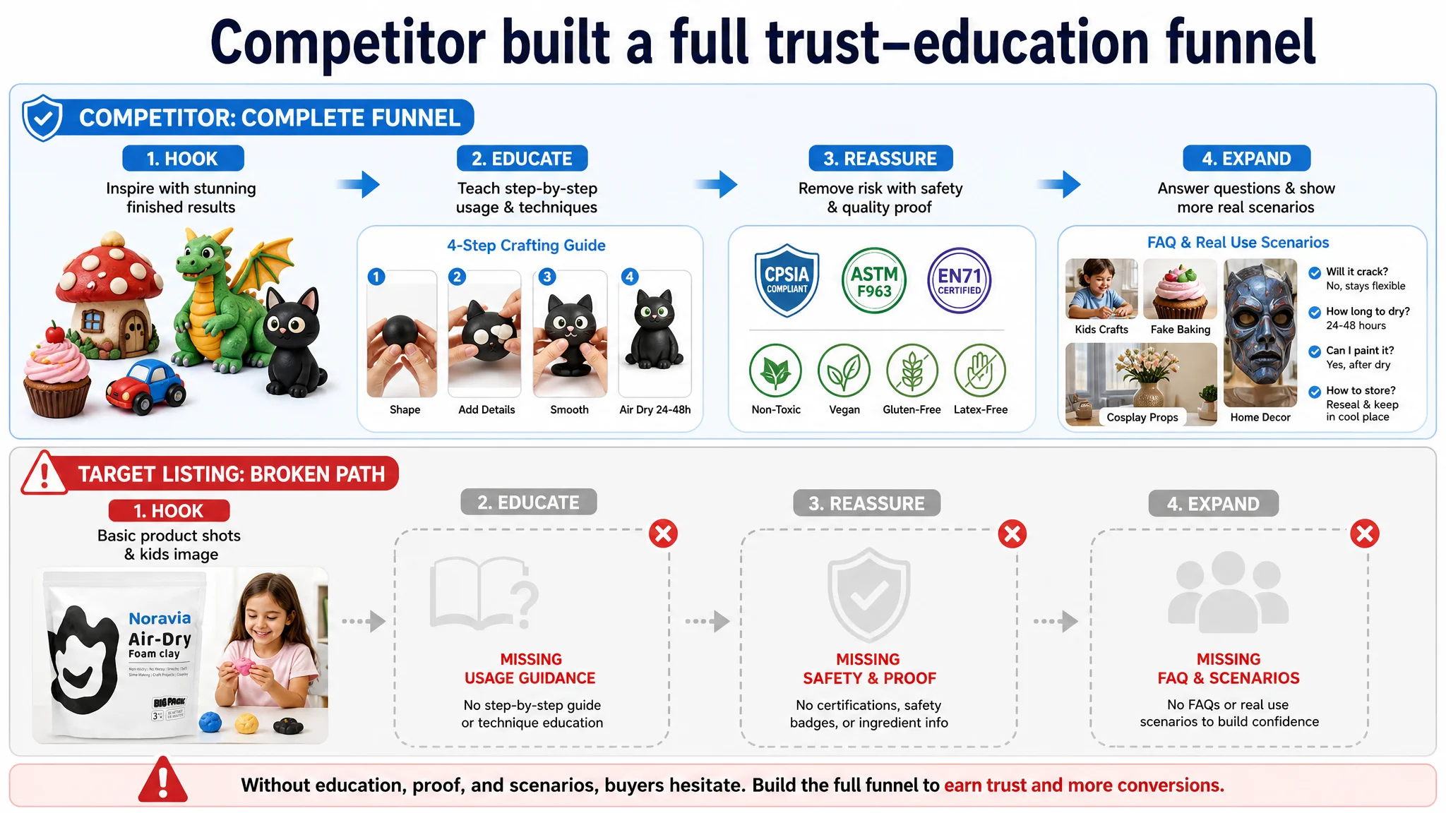
Key missing layers:
- No explicit safety certifications visible for a kid-facing product
- No clear ingredient/allergen positioning (vegan, gluten-free, latex-free)
- No step-by-step guidance to reduce “can I actually use this?” anxiety
- Limited demonstration of high-level finished outcomes
“The Listing did not lack images. It lacked a narrative that took the buyer from curiosity to confidence.”
This is why a Listing score of 74 could still feel “stuck” in real business performance. The decision-critical questions of parents, teachers and hobbyists were not being answered in one place.
Reviews Looked Strong, but Social Proof Volume Lagged
On rating, the seller seemed on par:
- Target: 4.7 stars, 76 total reviews
- Competitor: 4.7 stars, 3237 reviews
Star score parity made the seller feel the review “input” was “good enough.” But in a category where parents and teachers deeply rely on social proof, the massive volume gap mattered more than the decimal point:
- The competitor’s thousands of reviews created a strong “everyone uses this” signal.
- More photo and video reviews provided vivid, user-generated proof of results and safety.
- The seller’s slightly better negative-review ratio was essentially invisible at this volume.
So, from a consumer’s perspective:
- Both listings seemed good (4.7 vs 4.7).
- One clearly felt widely adopted and thoroughly tested.
- The other felt younger, more niche, and less validated.
In that context, any missing trust layer on the Listing (especially A+ and safety messaging) hurt even more. You can’t afford content gaps when you lack review-scale advantages.
Why DeepBI Did Not Keep Tuning the Ads First
From an ad-ops viewpoint, the seller’s instinct was to:
- Expand keyword coverage
- Adjust bids and budgets
- Test more creative variations
But DeepBI’s judgment was that further ad optimization would simply amplify an under-converting page.
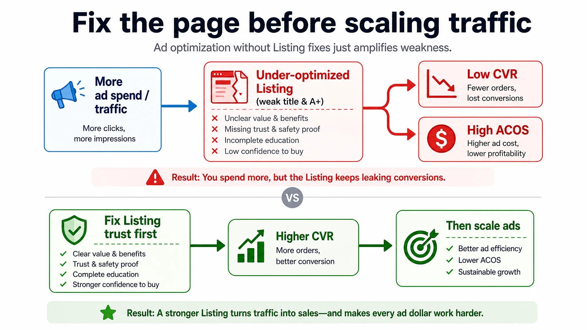
Key reasons we recommended fixing the Listing first:
1. Title and main image were not fully aligned with audience decision logic.
If the search-result snippet doesn’t instantly communicate “safe, air-dry, crack-free foam clay” for kids/crafts/slime, you are paying for lower-intent clicks.
1. A+ did not close the trust gap that reviews couldn’t cover.
Without visible certifications and usage education, many parents and teachers would hesitate or bounce—reducing CVR and inflating ACOS.
1. The competitor’s Listing created a stronger perceived category standard.
Ads were effectively driving buyers into a head-to-head comparison where the benchmark page looked more “complete” and “reassuring” on every trust dimension.
1. Traffic quality wasn’t the main constraint.
When both you and your competitor are appearing on similar keywords and your star rating is comparable, the performance gap usually comes from conversion, not targeting.
The highest business risk at that stage was not “insufficient traffic.” It was paying to send more visitors into a page that hadn’t earned their trust.
How the Optimization Direction Changed
Once the core diagnosis was clear—Listing conversion capacity, especially in A+, was the bottleneck—the seller’s optimization efforts shifted from tactical ad tweaks to structural content work.
Reframing the Title Around Search and Decision Logic
DeepBI’s recommended title restructuring focused on:
- Core keyword + color upfront for mobile visibility and relevance:
“Black Air Dry Foam Clay 1.1lbs/500g…”
- Explicitly calling out “Super Light Modeling Clay” to align with category expectations.
- Preserving differentiating scenarios like Cosplay props while also capturing general arts and DIY crafts search traffic.
- Removing brackets and rewriting into a clean comma-separated structure that Amazon’s system and human readers parse more easily.
Resulting direction:
“Black Air Dry Foam Clay 1.1lbs/500g, Super Light Modeling Clay for Cosplay Props, Arts and DIY Crafts, Soft and Flexible Foam Clay for Artists and Beginners”
This wasn’t about keywords for their own sake; it was about making sure that within the first 80–100 characters, the buyer understood:
- What the product is
- For whom
- For what types of projects
- With which key attributes (air dry, light, flexible)
Turning Bullet Points Into a Buying Logic, Not a Feature List
The seller’s original bullet points weren’t weak, but they were not fully aligned with the pain–solution–result logic that drives conversion.
DeepBI reorganized the bullets around five decision questions:
1. Does it feel good to use and behave as expected?
→ “Premium Texture & Ease of Use… ultra-soft, lightweight, non-sticky, non-fading, blendable colors.”
1. What can I actually do with it, and on what surfaces?
→ “Endless Creative Applications… adhesion to styrofoam, glass, metal… flower mirrors, cosplay, Halloween, slime, classroom projects.”
1. Is it safe for my kids or students?
→ “Certified Safe & Educational… non-toxic, gluten-free, wheat-free, latex-free, meets US/EU standards, supports brain development and parent-child communication.”
1. How does it dry and perform over time?
→ “Hassle-Free Air Drying Formula… air-dries in ~24 hours, no cracking or shrinking, stays soft even when cured.”
1. Will it dry out in the bag and become waste?
→ “Smart Packaging for Lasting Freshness… wide-mouth resealable, stand-up design, clear window, prevents drying and keeps workspace tidy.”
Instead of scattered benefits, each bullet now closed a specific buying hesitation, especially for parents and teachers.
This Product Page Did Not Lack Traffic. It Lacked Trust.
The most visible transformation potential was in the gallery and A+ content, where DeepBI’s optimization plan specified concrete, execution-ready compositions.
A few representative shifts:
Main Images: From “Product Shown” to “Product Understood”
- Main pack shot:
Recompose with the large 500g bag centered, surrounded by smaller sealed packs, 45° top-side angle, soft diffuse light, neutral background, and clear “500g large capacity” text overlay. → Purpose: Instantly reconcile “500g big bag” with “many small uses” in customers’ minds.
- Feature overview image:
Vertical three-part layout:
- Top: bright row of clay blocks
- Middle: three clean icons for key attributes (e.g., air-dry time, non-staining, safety)
- Bottom: finished craft models
→ Purpose: Marry specifications with outcomes in one glance.
- Drying time image:
Finished clay models on a desk, small clock icon, “24–48h Air Dry” tag, natural lighting. → Purpose: Remove uncertainty on drying behavior.
- Packaging usability image:
Close-up of hands opening the resealable bag, highlighting the seal strip and wide mouth. → Purpose: Address storage and waste concerns visually.
- High-end finished model scene:
A rich mini “forest” or colorful cars on a wooden base, with side lighting and functional callouts. → Purpose: Show the “ceiling” of what can be created, not just the raw material.
A+ Content: Rebuilding the Trust–Education Path
The recommended A+ structure aimed to:
1. Lead with capacity and outcome:
- First A+ image: big 500g bag in the center, surrounded by 5–8 vibrant finished models (strawberry, rainbow, octopus, dinosaur, etc.), bright light and clean background.
→ “One big bag, endless creations.”
1. Highlight tactile and “anti-disappointment” properties:
- Macro shot of clay being stretched between fingers over a pastel background, emphasizing fibers and softness, non-sticky feel.
→ “This feels as good as you hoped.”
1. Show professional-grade cosplay usage:
- Studio-style image: white wings or prop in progress, tools and cutting mat visible.
→ “Not just for kids—suitable for serious makers.”
1. Demonstrate classroom and group suitability:
- Natural classroom scene with several kids using the clay at once, plenty of finished models on the table.
→ “Great for teachers and group projects; capacity matches group usage.”
1. Visualize storage and anti-waste design:
- Four-in-one packaging feature image: resealable zip, wide opening, stand-up base, clear window, each annotated.
→ “Designed to avoid drying out and mess.”
1. Tap into slime and sensory trends:
- High-energy shot of slime mixed with clay, bubbles, bright color contrast, playful scene.
→ “Also a fun slime-add-in for sensory play.”
1. Close with stable, high-quality finished models:
- Minimalist white-background shot of multiple detailed clay models, all in sharp focus.
→ “Confirms durability and color stability after drying.”
Collectively, these changes were not about “making it prettier.” They were about answering the exact questions that currently blocked conversion.
How Ad Traffic Became Useful Again
Once the Listing’s title, bullets, main images, and A+ content were reconstructed around a coherent trust and decision logic, the nature of ad traffic changed without touching bids.
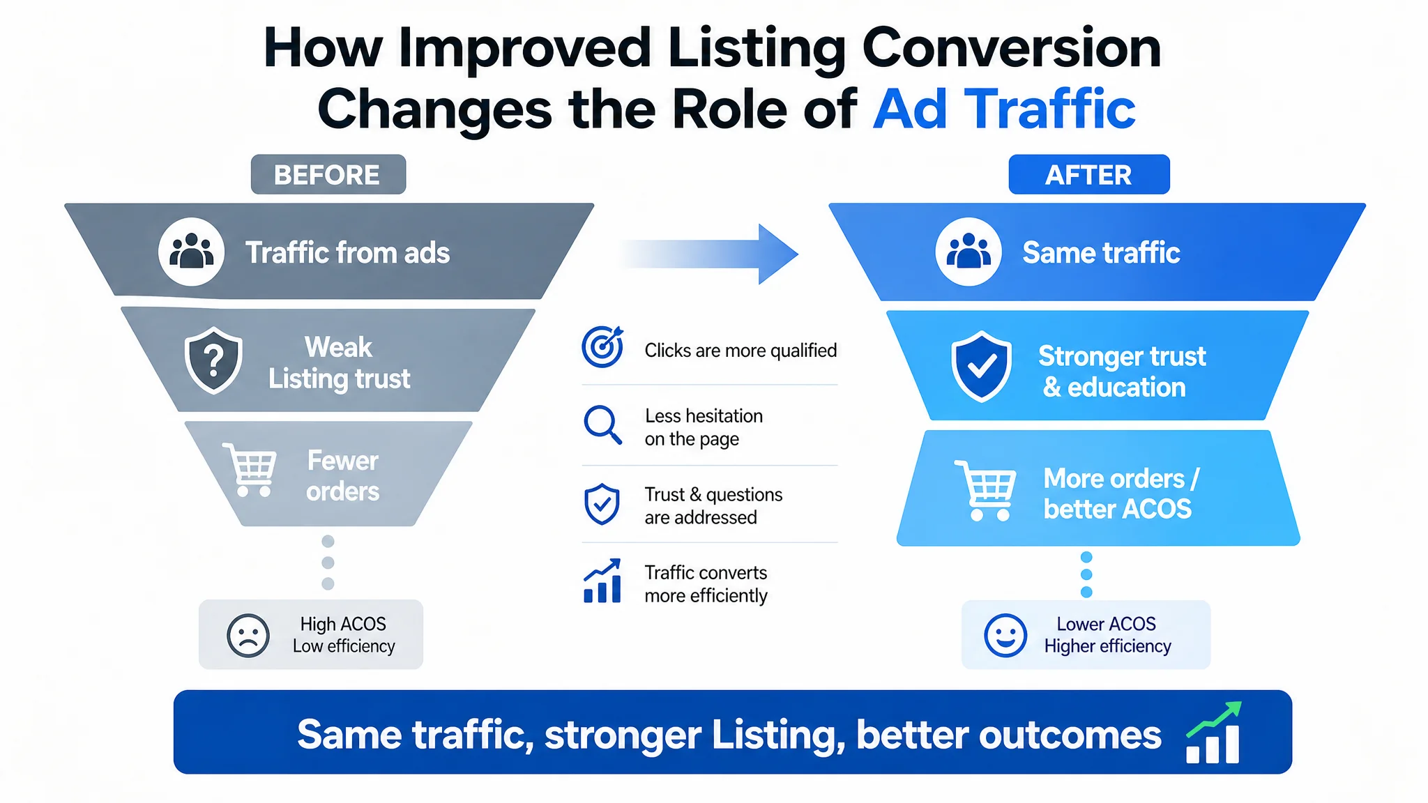
- Click intent improved because search results more clearly communicated “black air-dry foam clay, safe, light, for cosplay and crafts.”
- On-page hesitation decreased because:
- Safety and allergen concerns were addressed explicitly.
- Drying behavior and reusability were visually obvious.
- Capacity and group usability were demonstrated.
- Finished results matched or exceeded expectations.
- Ads stopped feeling like a cost center because the same traffic now had a higher probability of converting, which:
- Relieved ACOS pressure.
- Supported gradual recovery of organic rankings.
- Reduced reliance on brute-force ad spend to maintain visibility.
Even without inventing specific numerical outcomes, the operational shift was clear:
- The Listing began to regain its own sales capability instead of leaning entirely on ads.
- Traffic structure became more sustainable: a healthier mix of organic and paid orders.
- The seller gained a more reliable base from which to make ad decisions.
What Changed in the Seller’s Understanding
The deeper impact of this case wasn’t only the improved state of one foam clay Listing. It was the shift in how the seller thought about problems on Amazon.
Key mindset changes:
- “High rating ≠ high conversion.”
A 4.7-star score is only half the story; the other half is whether your A+ and images actually answer the buyer’s critical questions.
- “Ads don’t fix missing trust.”
When A+ lacks safety and usage education, no bid strategy can compensate. Ads simply amplify the Listing’s current strengths and weaknesses.
- “Listing quality is the foundation of ad efficiency.”
CTR and CVR are downstream of title, main image, bullets, and A+. If these are misaligned with audience decision logic, every advertising dollar works harder for less.
- “Title, main image, bullets, and A+ must tell one coherent story.”
In this case, the winning story was: Safe, air-dry foam clay that feels good, is easy to use, works in serious and casual projects, stores well, and delivers stable, attractive results.
“Before scaling ads, ask: does this page genuinely deserve more traffic?”
For Amazon sellers, this case underscores a simple but often overlooked truth: when ad optimization starts to stall, the problem is frequently not in the campaigns. It’s in the Amazon product page’s ability to convert the attention it already has.