

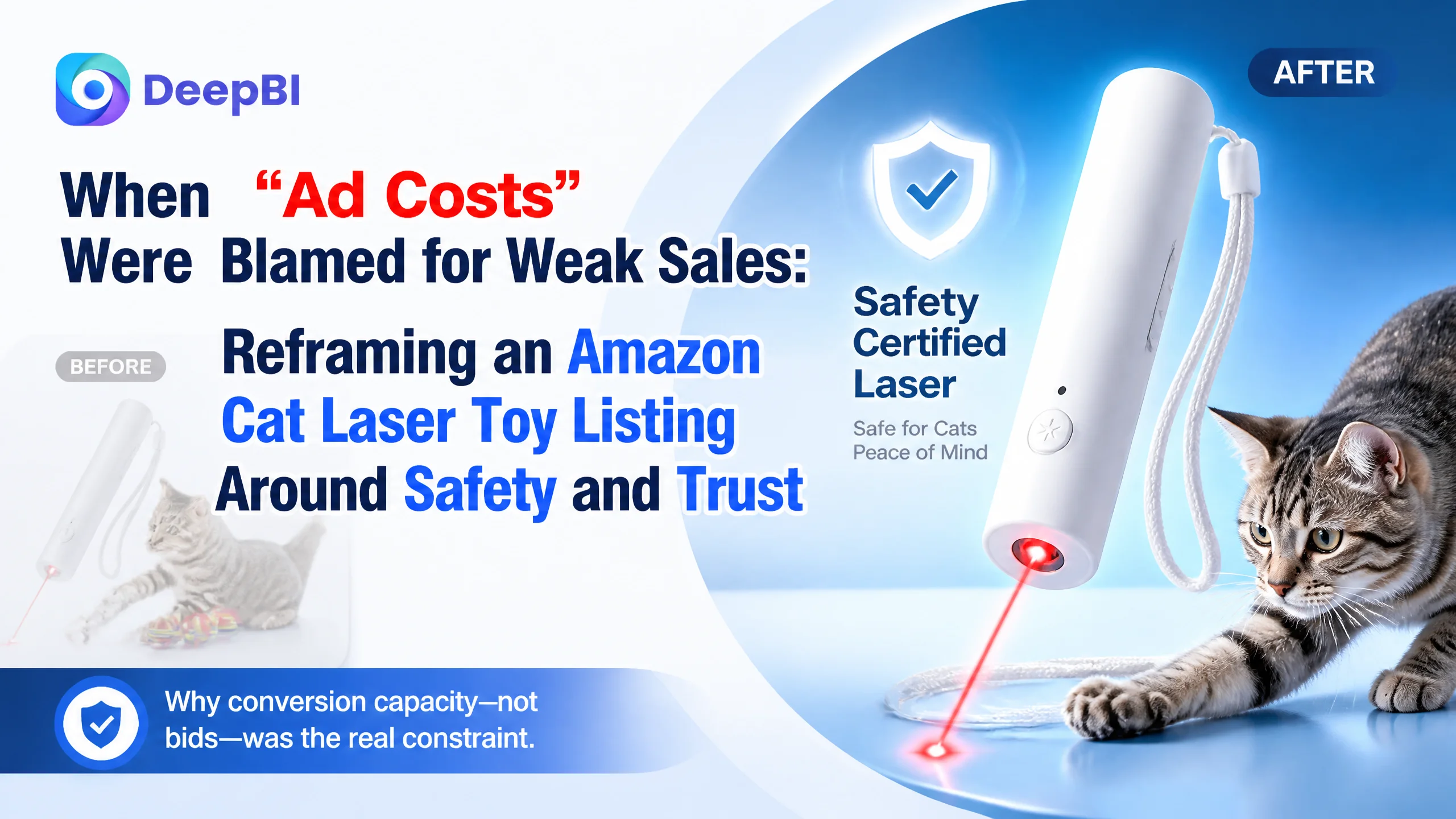
This Amazon seller in the pet-supplies category came to DeepBI with a familiar complaint: “Our cat laser toy isn’t selling as expected. Are our Amazon ads under-optimized, or are we just being undercut by a stronger competitor?” On the surface, the numbers seemed to support that view—higher ACOS pressure, weaker sales than a directly comparable cat laser feather toy. The team’s instinct was to push harder on bid tuning and campaign structures.
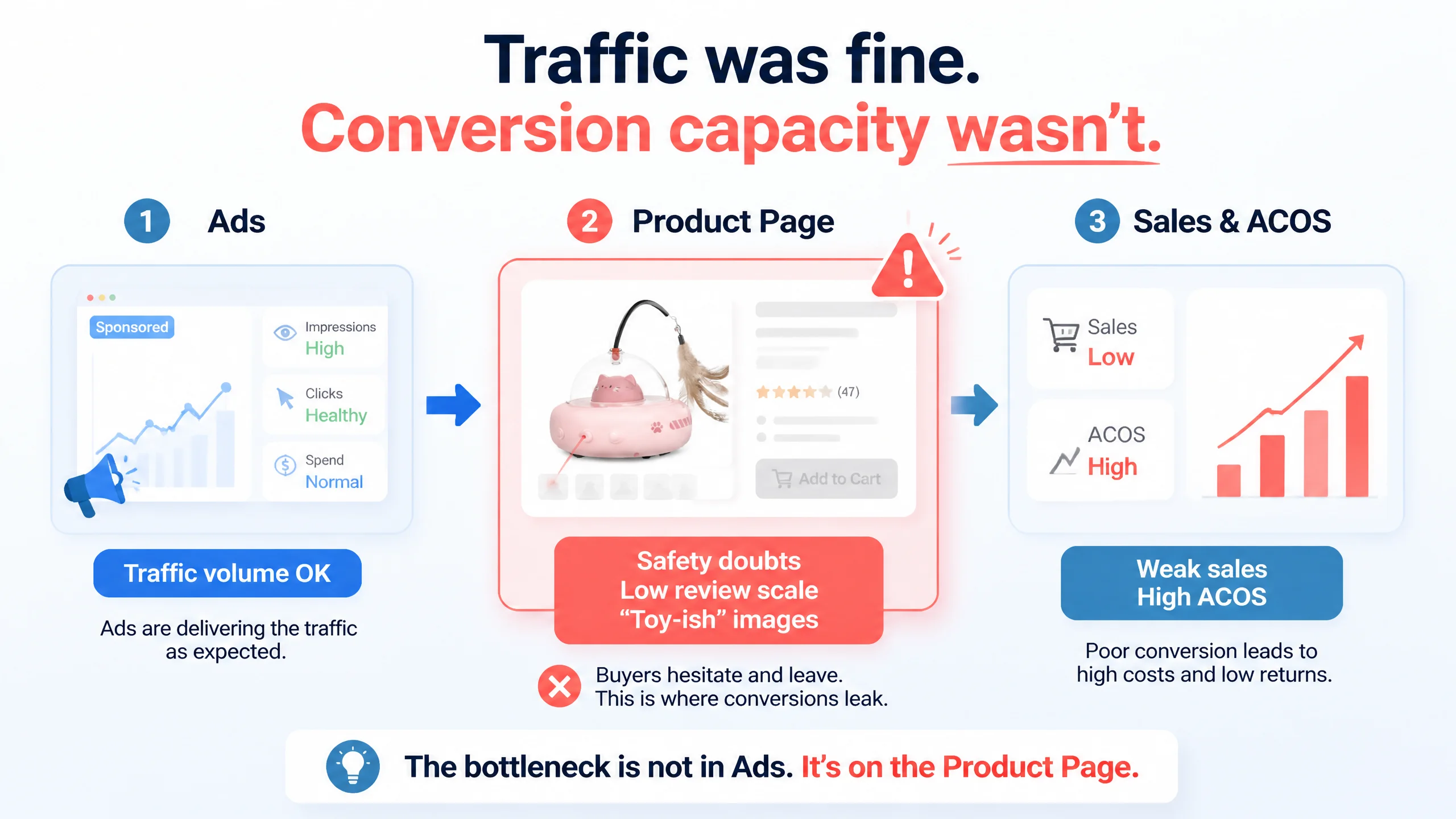
But once the Listing was benchmarked against a leading Amazon competitor, the problem turned out to be very different. The core leak wasn’t in the ad console; it was on the product page. While this seller actually did some things better in the bullet points, they were clearly losing in three more fundamental areas: perceived safety of the laser, professional “smart device” positioning in the images, and review scale/ratings. Ads were faithfully sending traffic to a page that did not fully resolve buyers’ trust concerns.
DeepBI’s diagnosis shifted the optimization order: instead of pushing more traffic into a leaky funnel, we focused on rebuilding the Amazon Listing’s conversion capacity—title logic, main-image story, safety signaling in A+ content, and durability/maintenance reassurance. As those gaps closed against the benchmark, ad traffic started to work again. For other Amazon sellers, this case is a reminder: when ACOS feels “unfixable,” check whether the real constraint is your page’s ability to convert cautious, comparison-shopping buyers.
What the Seller Saw: A “Pricing and Ads” Problem
From the seller’s perspective, the situation looked straightforward:
- They were selling a 2-in-1 automatic laser + feather cat toy for indoor cats on Amazon US.
- A directly comparable cat laser feather toy in the same niche was clearly winning:
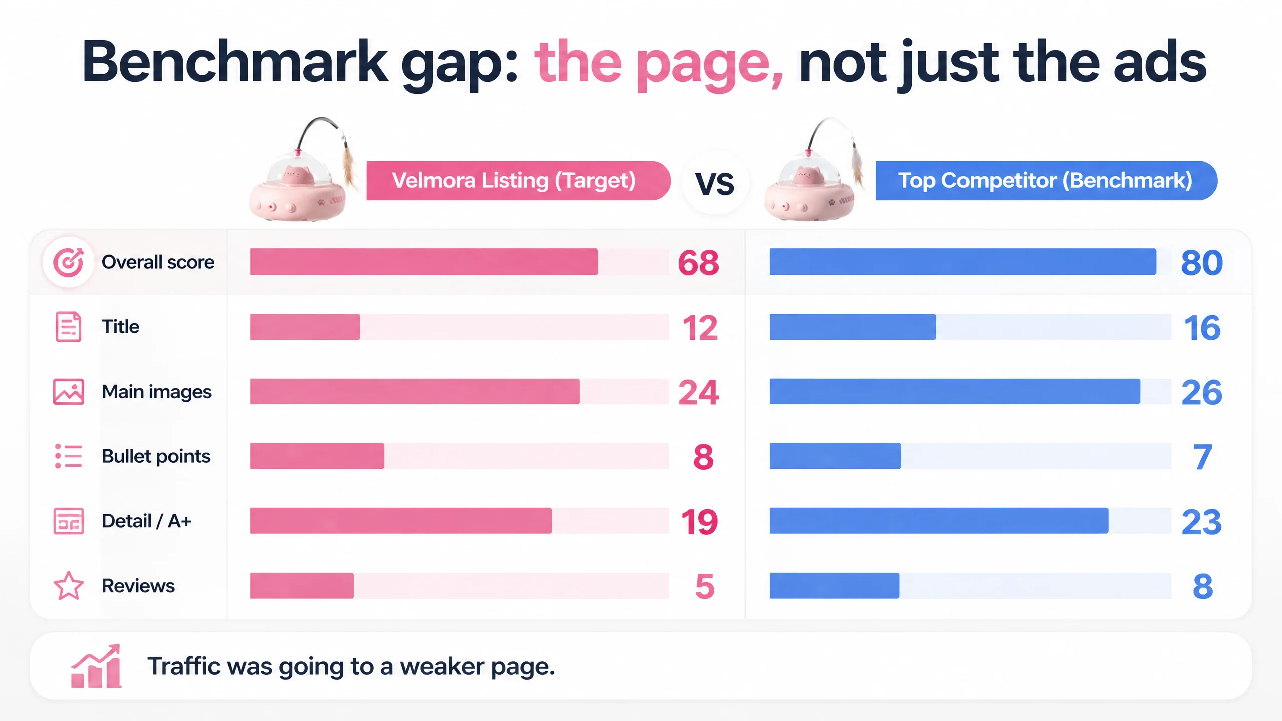
- Benchmark Listing score: 80/100
- Target Listing score: 68/100 (–12 points)
- Their own metrics landscape (based on the score breakdown and review section) looked like this:
- Title: 12 vs competitor’s 16 (–4)
- Main images: 24 vs 26 (–2)
- Bullet points: 8 vs 7 (+1 – actually stronger than the competitor)
- Detail/A+ content: 19 vs 23 (–4)
- Reviews: 5 vs 8 (–3), with:
- Rating: 3.9 stars, 47 total reviews
- Competitor: 4.3 stars, 169 total reviews
- Home page showing too many low-star reviews
Internally, the seller framed the problem as:
- “Our ads are getting expensive.”
- “The competitor brand has stronger brand recognition and more reviews.”
- “Maybe we just need to increase bids or broaden keywords.”
In other words, ad mechanics and brand power were taking the blame.
“The real problem was not that ads failed to bring traffic. It was that the page could not convert the traffic with enough safety and professionalism.”
The Original Misdiagnosis: Ads and “Brand Power” Took the Blame
Why did the team assume this was primarily an advertising problem?
1. They saw a clear review-volume gap
The competitor had roughly 3.5x more reviews and a higher average rating. It was natural to think:
- “We’re losing because they look more established.”
- “We can’t fix that quickly; let’s at least squeeze more from ads.”
1. They were emotionally attached to their own content
On paper, the team had worked hard:
- Bullet points written around real use scenarios
- Emotional angles like “owner is busy” and “cat personalities”
- A “problem–solution” logic flow in copy
This made it harder to question whether the images and A+ content were actually answering buyers’ top concerns.
1. They overestimated functional description, underestimated risk perception
In pet toys—especially laser toys—owners are sensitive to:
- Eye safety
- Electrical safety
- Durability and maintenance
The team believed their “360° laser toy” and “smart functions” copy was enough. They didn’t realize the visual and structural gaps were signaling “toy-ish gimmick” rather than “trustworthy smart pet device.”
Under this misdiagnosis, they were tempted to do more of the same:
- Keep adjusting bids and budgets
- Try more keywords related to “interactive cat toy,” “automatic laser,” etc.
- Hope that more impressions would offset the trust gap on the page
It didn’t.
What DeepBI Saw: A Conversion Capacity Problem, Not a Traffic Problem
Once DeepBI benchmarked the Listing against a top-performing competitor, a very different picture emerged.
The title was not pulling its weight
The competitor’s title structure did three things better:
- Brand + core product words front-loaded
“Brand + Cat Laser Feather Toy 2-in-1 Interactive for Indoor Cats Automatic…” → Strong alignment with how buyers actually search.
- Pain points and friction removers were spelled out in the title
Phrases like “No Batteries Needed” and “Easy Setup” were visible even before the click, reducing perceived hassle.
- Result- and use-case language at the end
“Electronic Kitten Exercise Toy” and “Kitten” as a long-tail keyword captured intent around cat exercise and younger pets.
The target Listing’s title:
- Wasted characters on “Pink Updated”—not a conversion driver.
- Focused on generic function descriptions rather than direct pain-point resolution.
- Underleveraged high-intent phrases like “Automatic Laser Cat Toy.”
DeepBI’s judgment: search relevance and pre-click trust were under-optimized, lowering click-through-rate on the Amazon results page. The page was starting the battle from behind.
The main images made the product look “toy-ish,” not “smart and safe”
The image comparison revealed a more serious issue than “ugly vs pretty.”
The competitor:
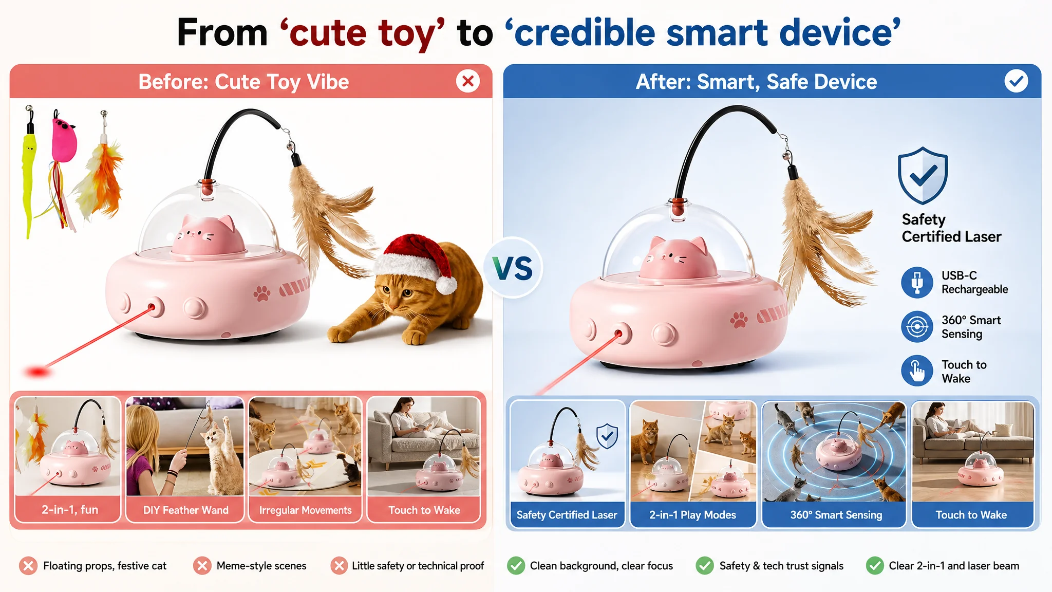
- Showed ABS certification badges, “Safety Certified Laser” shields, and USB-C interface close-ups.
- Structured images along a clear decision logic:
pain point → solution → detail evidence → certification/validation.
- Highlighted control and reliability:
- “Angle Adjustable”
- Clear hand-operation visual, making the device feel controllable and robust.
The seller’s images:
- Mixed festive props, emotional meme-style cats, and floating parts, creating a cluttered, low-end toy vibe.
- Over-emphasized “cute” and under-emphasized technical credibility and safety.
- Failed to visually prove:
- Laser class / eye-safe design
- Material quality
- Adjustment/interaction controls
- Real automatic operation vs manual play
Result: Even if an ad click landed on the page, the first-second impression was:
- “Fun toy” rather than “serious smart pet product.”
- No visual answer to: “Is this safe for my cat’s eyes?”
- No strong reason to justify the price relative to a benchmark that looks more professional.
A+ content did not close the risk loop
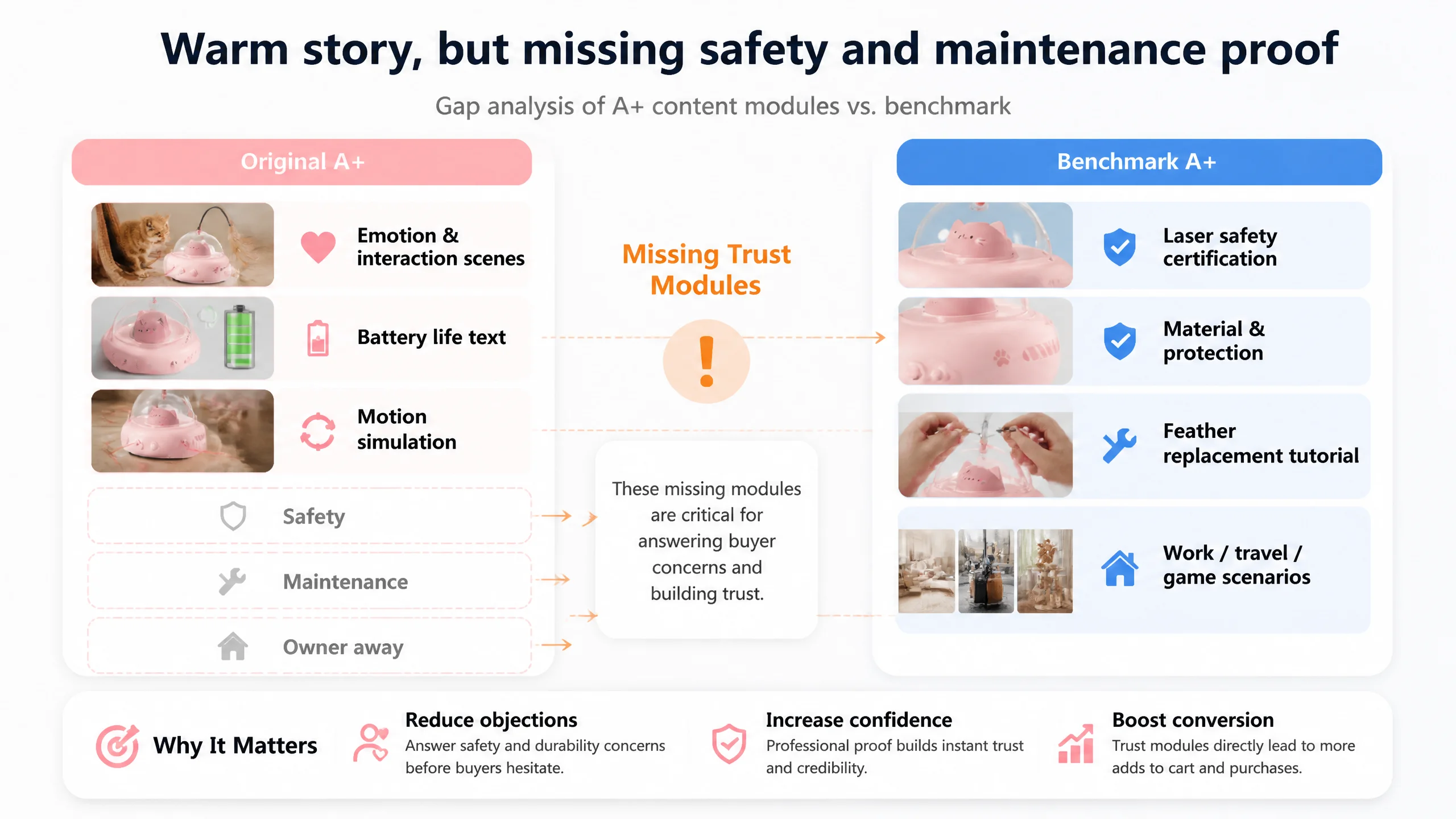
In the detail page (A+):
- The seller used:
- Emotional pain points and pet–owner interaction scenes
- Some battery life explanation
- Motion simulation visuals
- The competitor layered on:
- “Class I Laser” certification badges
- Explicit “protects pet eyes” messaging
- Material and protection explanations
- Multi-scene usage (“work/travel/game”) showing companionship when the owner is away
- “How to replace feather” step-by-step module
So while the seller’s A+ was “warm and emotional,” it had three critical missing pieces:
1. Formal safety proof
Only “360° cat laser toy” text, no authoritative safety logo or laser class signal.
1. Maintenance and durability reassurance
No visual instructions or cues on feather replacement or long-term use.
1. High-frequency away-from-home scenarios
Little coverage of “cat alone while owner works or travels,” which is exactly when an automatic toy is most valuable.
In DeepBI’s terms, the Listing had storytelling but lacked trust infrastructure.
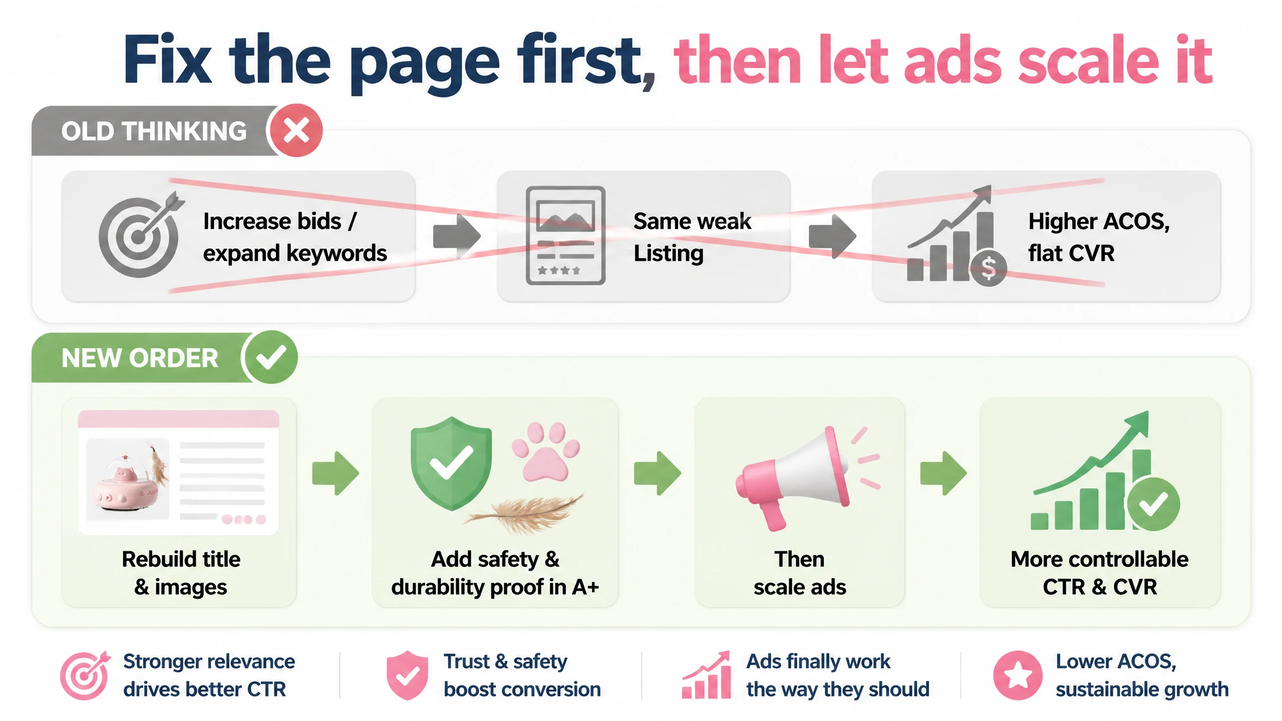
Why Traditional Ad Optimization Would Keep Failing
Given these findings, continuing to “optimize ads” first would have been commercially dangerous.
- CTR was capped by weak first-glance signals
A suboptimal title + low-authority main image meant that even ideal bids wouldn’t produce sustainable CTR.
- CVR was trapped by safety and durability doubts
Once on the page, buyers still had to overcome:
- 3.9 stars and low review volume
- No visible safety certification
- No clear feather replacement or material-proof visuals
- Ads were amplifying the wrong experience
Every extra dollar would just:
- Bring more skeptical buyers to a page that didn’t fully answer their fears
- Drive more shoppers to the stronger-looking competitor
- Increase ACOS without rebuilding the page’s conversion capacity
“Advertising does not only amplify advantages. It can also amplify a page’s existing defects.”
DeepBI’s call: stop trying to brute-force ads until the page can carry the traffic.
Reframing the Problem: This Page Did Not Lack Emotion. It Lacked Proof.
The core conflict was not “we have no story,” but “we do not provide enough evidence.”
1. Rebuilding the title as a conversion tool
DeepBI’s recommended title direction:
2-in-1 Automatic Laser Cat Toy with Feather, Interactive Motion Sensor Toy for Indoor Cats, USB-C Rechargeable with Obstacle-Avoidance, Smart Electronic Kitten Exercise Toy, Pink
Key shifts in logic:
- Front-load core search terms and product form
“2-in-1 Automatic Laser Cat Toy with Feather” moves the core query to the front.
- Bake in differentiators alongside category must-haves
- “USB-C Rechargeable” → modern, convenient power
- “Obstacle-Avoidance” & “Motion Sensor” → smart, autonomous behavior
- Push non-essential color styling to the end
Free up characters for real decision drivers rather than “Updated” type fluff.
This is not about keywords for their own sake—it’s about showing, in the search result, that:
- The product covers the main category expectation (automatic laser + feather).
- It removes friction (no batteries, modern charging).
- It offers smart features (sensing, obstacle avoidance).
2. Converting main images from “cute chaos” to “professional smart-device”
DeepBI redirected the visual baseline toward:
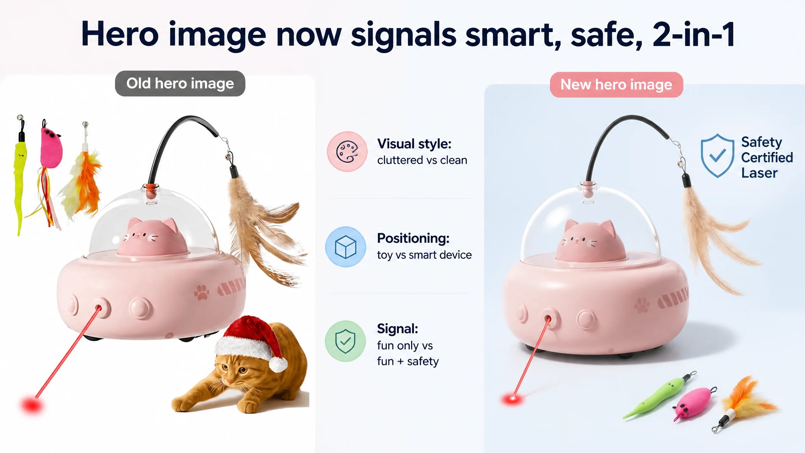
- Clean, high-contrast, minimal main image
- Product centered ~70% of frame
- 45° angle, pure white background
- Laser visibly active, beam pointing to a dot on the floor
- Feather accessory neatly arranged
- Overlay: “2-in-1 Interactive Toy”
- Dedicated safety image
- Simple, cool-tone background
- Shield icon + “Safety Certified Laser” text
- Close-up of the laser opening or breathing light
→ A visual anchor for the “eye-safe” concept.
- Clear mode differentiation image
- Split-screen: left, laser-chasing cat; right, feather-pouncing cat
- Label: “Double the Fun”
→ Buyers see both modes without reading.
- Bionic sensing and range illustration
- Top-down view with 360° blue ripples showing sensing radius
- Multiple cats around, each in different action
→ Conveys smart scanning and broad coverage.
- Touch-to-wake and path logic image
- Realistic home scene, owner relaxed in the background
- Toy in foreground, random red dotted lines for laser path
- An on-state indicator showing “Touch to Wake” moment
These changes move the listing from:
- “Fun and cute” → “Smart, safe, and credible”
This matters because Amazon buyers in this category are not just asking “will my cat enjoy this?” They’re asking:
- “Is this safe enough to leave running when I’m not home?”
- “Is it worth paying more versus a cheaper ‘toy’ option?”
- “Will it break or become a hassle to maintain?”
3. Tightening bullet points into “pain point → mechanism → outcome”
The original bullets already had good storytelling. DeepBI’s role was to make them more structured and benchmark-aware, not more verbose.
Examples of the recommended direction:
- BP #1: 2-IN-1 interaction anchored as the headline
Emphasize dual-mode (360° laser + feather) and how it caters to different cat personalities.
- BP #2: Combine obstacle avoidance with explicit eye-safety wording
“Bionic sensors” + “eye-safe” light + surfaces it works on.
- BP #3: Touch-to-wake reframed as “autonomous companionship”
Not just “a technical feature,” but “your cat can initiate play when you’re busy or away.”
- BP #4: Parametric battery story
“USB-C rechargeable & 7-day standby” with concrete numbers and charge time.
- BP #5: Patented UFO design & durable materials
Focus on scratch-resistant ABS, long-lasting feather, and premium look—without bloated gift lists.
Each bullet becomes a mini “closing argument” instead of a spec list.
4. Turning A+ from generic story to decision-completion engine
The A+ optimization focused on adding modules that neutralize risk:
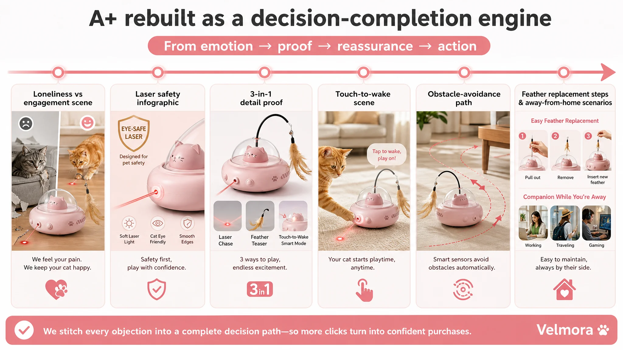
- Loneliness vs. engagement contrast image
One side: bored or destructive cat alone. Other side: cat actively playing with the toy in a bright living room. → Frames the product as an antidote to owner guilt.
- Laser safety infographic
- Product close-up with soft red emission
- Gold shield labeled “SAFE CLASS I” (or equivalent eye-safe framing)
- Short, high-contrast text explaining eye protection.
- 3-in-1 functionality macro detail
- Close-up of feather texture
- Type-C port detail
→ Visual proof of quality and modern charging.
- Touch-to-wake interaction scene
- Cat paw touching the toy
- Light indicator on
- Cozy carpet and warm evening lighting
→ Makes “touch to wake” emotionally tangible.
- Bionic obstacle-avoidance trajectory visual
- Curved, gradient path lines turning before a sofa leg
- Cat in motion blur chasing
→ Addresses “will it get stuck?” directly.
- Feather replacement tutorial module
- 3-step white-background guide
→ Reduces maintenance anxiety.
- Multi-scenario “owner away” collage
- Toy with cat at home
- Small windows showing owner at office, traveling, gaming.
→ Ties purchase to the real-life “I’m not home” pain point.
These modules do not just “look nicer.” They systematically close the gaps that previously forced buyers to imagine (and worry) on their own.
Why Listing Conversion Had to Be Fixed Before Ads
From DeepBI’s standpoint, the priority stack was clear:
1. The benchmark competitor was winning via page credibility, not just ad spend.
2. The target Listing had enough storytelling, but not enough evidence and reassurance.
3. Review weakness made visual and structural trust even more important.
If the seller had continued:
- Pumping more spend into Sponsored Products
- Scaling Sponsored Brands with the same main image
- Chasing more keywords without fixing page-level trust signals
…the business outcome would have been:
- Rising ACOS
- Flat or declining CVR
- More buyers bouncing to the competitor’s “safer-looking” page
Correcting the Listing first meant:
- Ads once again point to a page that:
- Looks like a professional smart pet device
- Proactively addresses eye safety and durability
- Shows off its battery and sensing advantages clearly
In that state, advertising stops being a cost amplifier for page defects and becomes a lever on a page that actually deserves traffic.
How the Page’s Sales Logic Started to Recover
After applying the new logic to the title, images, bullet points, and A+ modules, several things changed in the operating risk profile (even without inventing specific numbers):
- Click behavior became more controllable
With a cleaner title and authoritative main image, the seller is no longer purely at the mercy of the competitor’s visual dominance on the search page.
- Conversion risk decreased
Once buyers arrive, they now see:
- Safety badges and explanations
- 3-in-1 functionality clearly visualized
- Explicit battery and runtime expectations
- Feather replacement clarity
- Ads started to have a clearer ROI path
Each additional ad click has a higher probability of converting because the main objections are addressed on-page.
- Review weakness became less fatal
A 3.9-star, 47-review profile is still a headwind—but a professionally structured Listing can absorb some of that pressure by projecting competence and care.
In other words, the Listing began to regain its ability to convert both organic and paid traffic, rather than relying on brute-force ad spend to “pray for conversions.”
What Changed in the Seller’s Understanding
The most important outcome was not just a better set of images; it was a change in how the seller thought about Amazon operations:
- They realized that Amazon ads cannot compensate for a trust gap in the Listing.
- They saw that Listing quality is the base layer for any sustainable ACOS improvement.
- They learned that:
- Title, main image, bullets, and A+ are not separate tasks;
- They must form a continuous decision path: click → first impression → trust evidence → emotion → action.
For other Amazon sellers, especially in categories where safety, durability, and “owner away” scenarios dominate buying decisions, this case is a warning signal:
- If your first reaction to weak performance is “we need better ads,” check whether:
- Your main image visually proves what your bullets claim.
- Your A+ content addresses the exact objections that your competitor resolves.
- Your page looks like a serious, trustworthy product in its niche—not just a cute product.
The cat toy seller’s turning point came when they stopped asking, “How do we get cheaper clicks?” and started asking, “Does our Amazon product page truly deserve more traffic?”