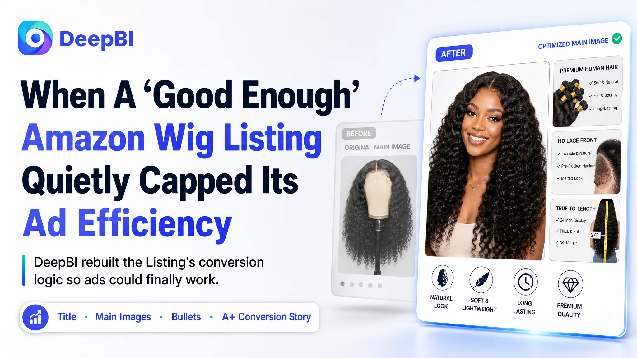
An Amazon wig seller in the US marketplace came to DeepBI with a familiar headache: Amazon ads were getting harder to control, yet the product page looked “fine” on the surface. CTR and CVR were not where they needed to be, but the team believed the problem was mostly about bids, keywords, and daily budgets.
Once DeepBI benchmarked their Listing against a high-performing synthetic lace-front wig competitor, a different picture appeared. Ads were not the primary bottleneck; the Listing itself was consuming the traffic. The page scored 76/100 versus the competitor’s 80/100, and the gaps were concentrated exactly where ads need the strongest support: title logic, main images, bullet-point persuasion, and A+ detail storytelling.
The later optimization did not start with another round of bid changes. It started with re-architecting the Amazon product page to carry a stronger “Wear & Go” promise: a clearer title structure, main images that show instant transformation and trust, bullet points that close real user objections, and A+ visuals that turn technical lace features into visible solutions. For other Amazon sellers, this case is a reminder: once your ad skills reach a certain level, the next breakthrough usually comes from fixing Listing conversion capacity, not squeezing another 0.05 out of ACOS.
The Problem Was Not Traffic. It Was What the Page Did With the Traffic.
This seller operates in the synthetic lace-front wig category on Amazon US.
They had already invested in Amazon ads and had built up a solid review base:
- Rating around 3.9 stars
- 130+ reviews, significantly more than a comparable competitor
- A healthier negative-review share than the benchmark competitor
From a classic Amazon operations perspective, this looked like a Listing with “enough” social proof. Yet performance pressure kept rising:
- Amazon ad costs were becoming harder to push down
- CTR and CVR were not matching the category’s better performers
- Increasing ad spend did not bring proportional order growth
Internally, the team’s working theory was straightforward: “ACOS is high because ads are not optimized enough.”
They tried adjusting bids, refining keywords, and tweaking campaign structure. But the data pattern fit something else:
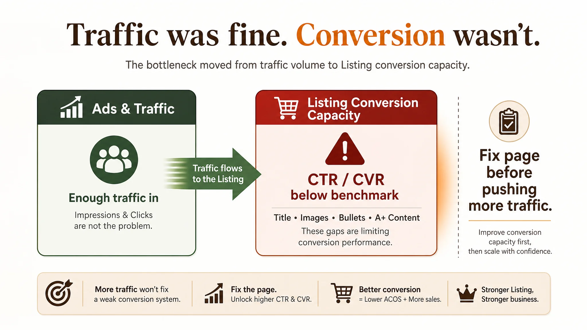
“The real problem was not that ads failed to bring traffic. It was that the page could not convert the traffic.”
DeepBI’s Listing scoring and benchmark analysis confirmed this: the competitor’s page outperformed in most content dimensions despite weaker reviews.
What the Seller Saw vs. What DeepBI Saw
The seller’s initial judgment
From the seller’s perspective:
- Reviews were more numerous and slightly better rated than a key competitor
- The page had main images, model shots, and A+ content in place
- Ads were delivering impressions, so attention stayed on advertising tactics
The misdiagnosis:
- Symptom: High ad pressure, unstable ACOS
- Assumed cause: Campaigns and bids not tuned enough
- Assumed solution: Keep adjusting ads, try more keyword combinations, refine budgets
In other words, they treated the problem as a pure advertising efficiency issue.
DeepBI’s core judgment
After running DeepBI’s Listing scoring against a benchmark wig Listing:
- Total score:
- Target Listing: 76/100
- Competitor Listing: 80/100
The gap was not huge in absolute value, but it was in exactly the wrong places if you want ads to work:
- Title: Target: 15, Competitor: 17, Max: 20, Gap (Target – Competitor): -2
- Main Image: Target: 24, Competitor: 26, Max: 30, Gap (Target – Competitor): -2
- Bullet Points: Target: 6, Competitor: 8, Max: 10, Gap (Target – Competitor): -2
- A+ / Detail: Target: 19, Competitor: 22, Max: 25, Gap (Target – Competitor): -3
- Reviews: Target: 12, Competitor: 7, Max: 15, Gap (Target – Competitor): +5
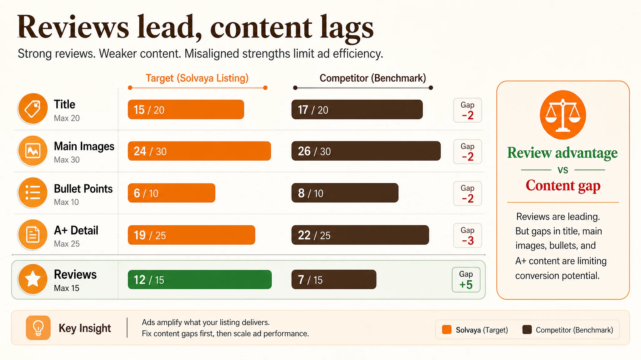
Key reversal: The seller had a review advantage but was behind in page content that drives click and conversion.
If you keep pumping ads into a page that underperforms on title, main image, bullets, and A+ logic, ACOS will naturally stay heavy. Ads were not failing; they were amplifying the Listing’s conversion weaknesses.
The Real Constraint: Listing Conversion Capacity, Not Ad Strategy
Title: information existed, buying logic did not
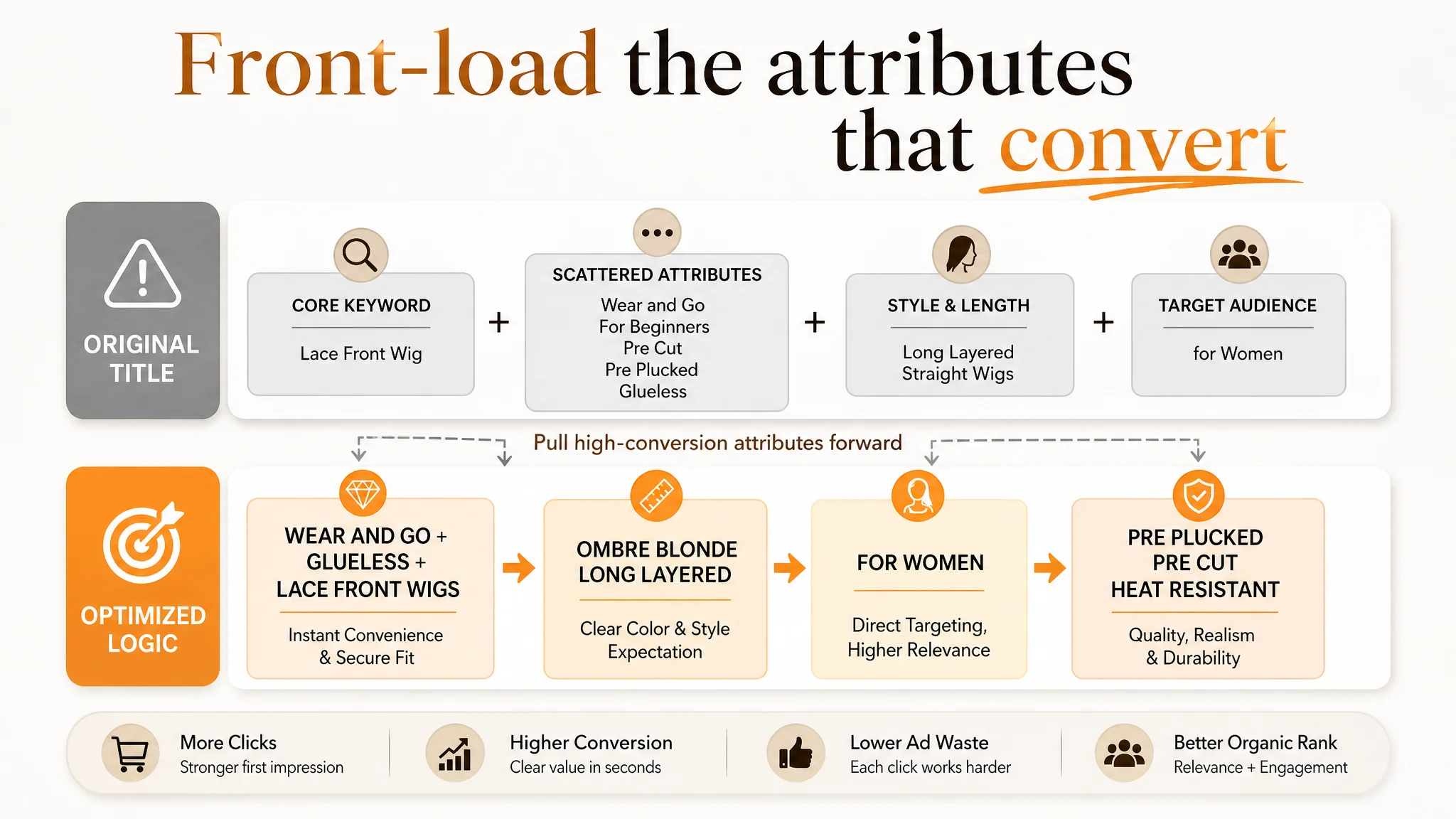
The original title contained many relevant words: “Wear and Go”, “for beginners”, “long layered straight wigs”. But the structure scattered key attributes and diluted the core promise.
The competitor’s title did three things better:
- Put “Lace Front Wig” and key attributes like “glueless”, “pre cut”, “pre plucked” right after the core keyword
- Defined length and use-case early (“14 Inch”, “for party and daily use”), so shoppers could instantly map the product to their scenario
- Used concise, targeted descriptors like “short straight wig for women” instead of longer, less-focused phrasing
On Amazon search results, title structure is not just SEO; it forms the first layer of decision logic. DeepBI’s judgment: this title did not clearly front-load the high-conversion attributes and target audience.
Main images: “showing the wig” vs. “showing the outcome”
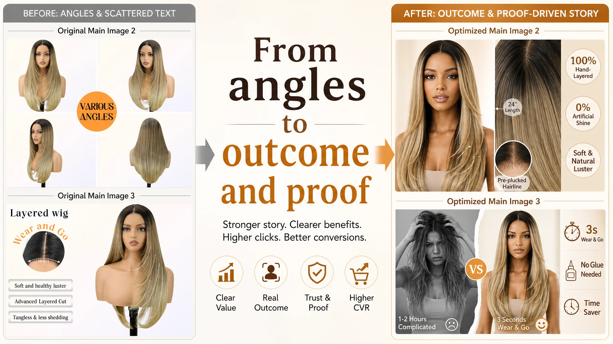
The target Listing’s main image set had:
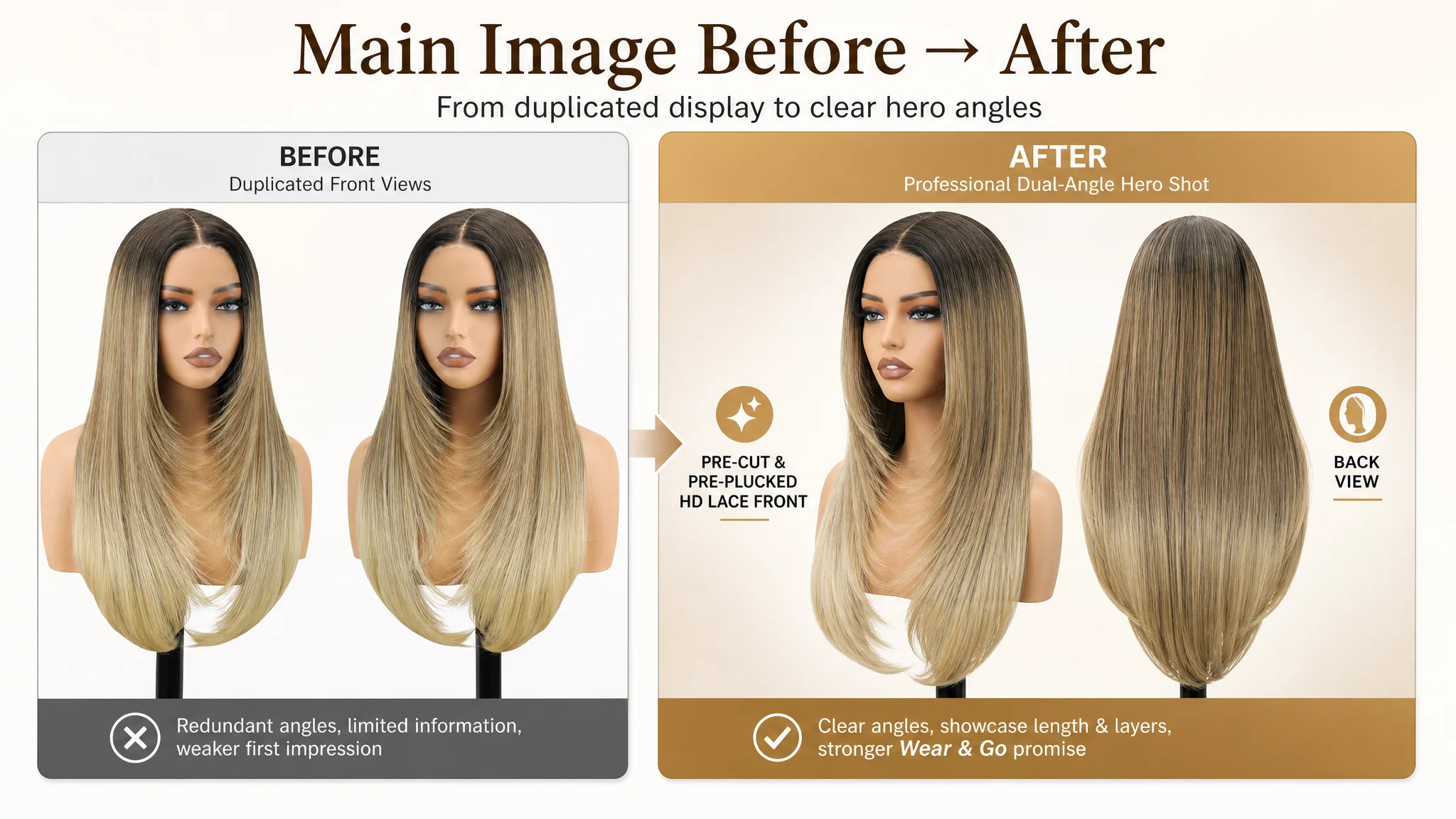
- Two repeated model images with similar framing
- Technical detail shots (lace, cap) without consistent size or clear units (e.g., “1351” with no unit context)
- Scene images without explicit mapping to target user scenarios (work, party, everyday)
The competitor’s images were constructed differently:
- Strong human-focused main image on the search thumbnail, delivering an “instant look” feeling
- Clear problem-solution visuals like “Solve Your Hair Trouble”
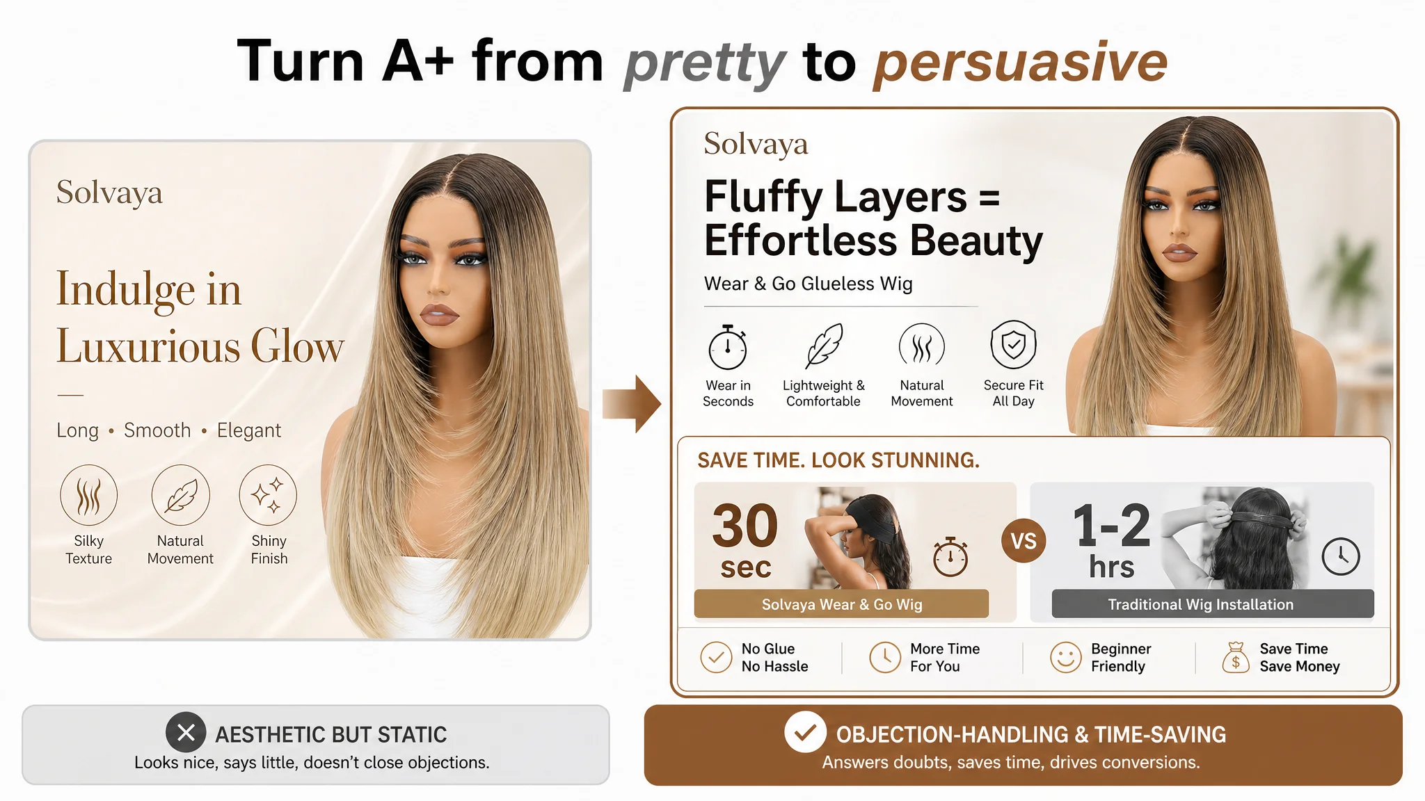
- Installation-time comparisons (“30 seconds vs 1–2 hours”) that turn efficiency into a visual promise
- Parameter visuals with clear labels (e.g., “3 combs”, “HD Swiss Lace”) tied directly to user benefits
The result: The target Listing looked like a wig display. The competitor Listing looked like a complete, easy hairstyle solution.
On Amazon, that difference becomes a CTR and CVR gap.
Bullet points: information-heavy, decision-light
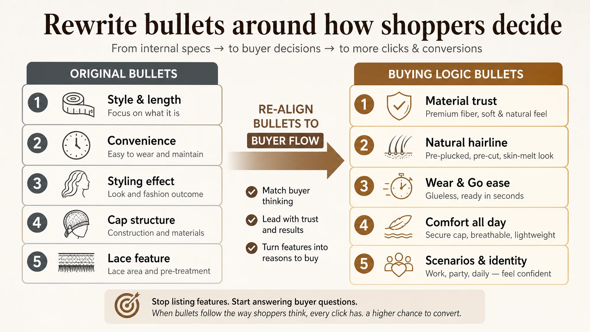
The target bullet points followed an internal logic:
- Style & length
- Convenience
- Styling effect
- Cap structure & comfort
- Lace characteristics
The competitor’s sequence followed a buying logic:
1. Start with material quality and “human-hair-like” feel to build trust
2. Hit the core visual pain point: credible, natural hairline
3. Then talk about wearability and convenience
4. Link cap upgrades directly to comfort
5. Close with user image and scenarios (confidence, charm, everyday use)
The target bullets had technical details but lacked a clear pain-point → solution → outcome progression. They stayed at description; the competitor moved into identity and scenario.
A+ / detail page: static description vs. objection handling
On the detail page:
- The target Listing used: trend images, scene images, multi-color displays, model collages, process details (pre-cut, hand-tied, fiber).
- The competitor used:
- A clear hero “core selling point” visual
- Time comparison visuals (“30 seconds vs 1–2 hours”)
- FAQ-style modules addressing high-barrier doubts (installation time, office appropriateness)
- Technical visuals (“3 combs”, “HD Swiss Lace”) directly tied to anti-slip, breathability, comfort
The target A+ looked aesthetically pleasing (“Indulge in Luxurious Glow”) but did not quantify value or systematically neutralize purchase hesitation.
For a category like synthetic wigs, where buyers fear “plastic gloss”, “difficult installation”, and “fake hairline”, this is a direct conversion bottleneck.
Why DeepBI Did Not Start With Ads
From DeepBI’s perspective, the biggest business risk at this stage was not “under-optimized campaigns.”
The risk was:
- Ad spend continuing to grow
- Traffic going to a page that under-indexes on critical conversion logic
- Organic sales potential being capped because the page never reaches its full conversion capacity
- The seller learning the wrong lesson (“ads don’t work”) instead of seeing the Listing as the constraint
“Advertising does not only amplify advantages. It can also amplify a page’s existing defects.”
With the review base already stronger than the competitor’s, DeepBI determined that fixing Listing conversion was the more leverage-rich move than another round of campaign tuning.
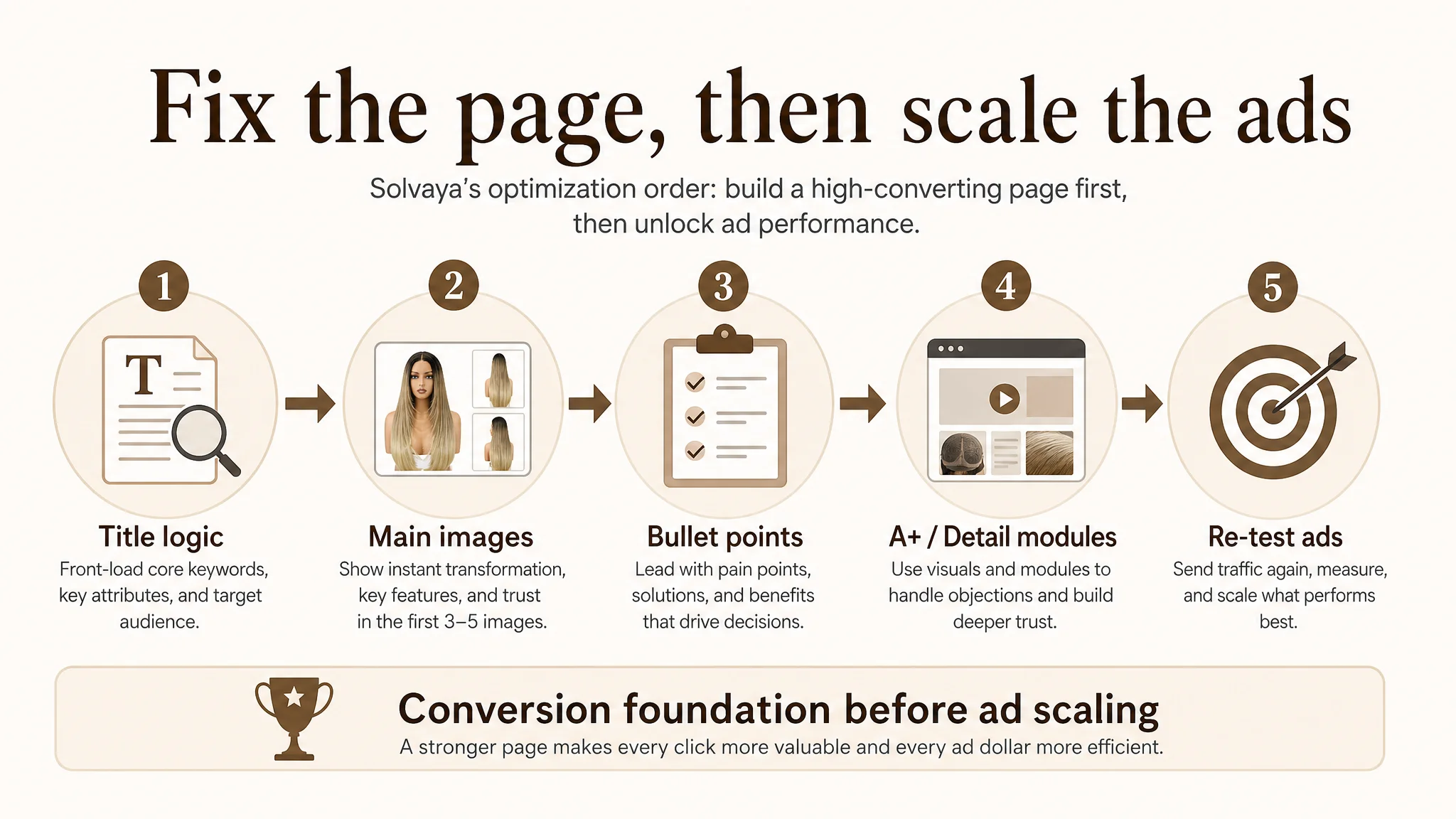
The priority sequence was:
1. Rebuild title logic so high-value attributes and audience cues are front-loaded.
2. Re-architect main images to deliver a “Wear & Go in seconds” outcome and show trust visually.
3. Reframe bullet points from parameter listing to a pain-point–solution–outcome structure.
4. Elevate A+ visuals from static storytelling to objection-handling modules that shorten decision time.
5. Only then, re-test ads, knowing the page can now meaningfully convert the traffic it receives.
How the Page’s Sales Logic Was Rebuilt
Title: from keyword pile to outcome-led structure
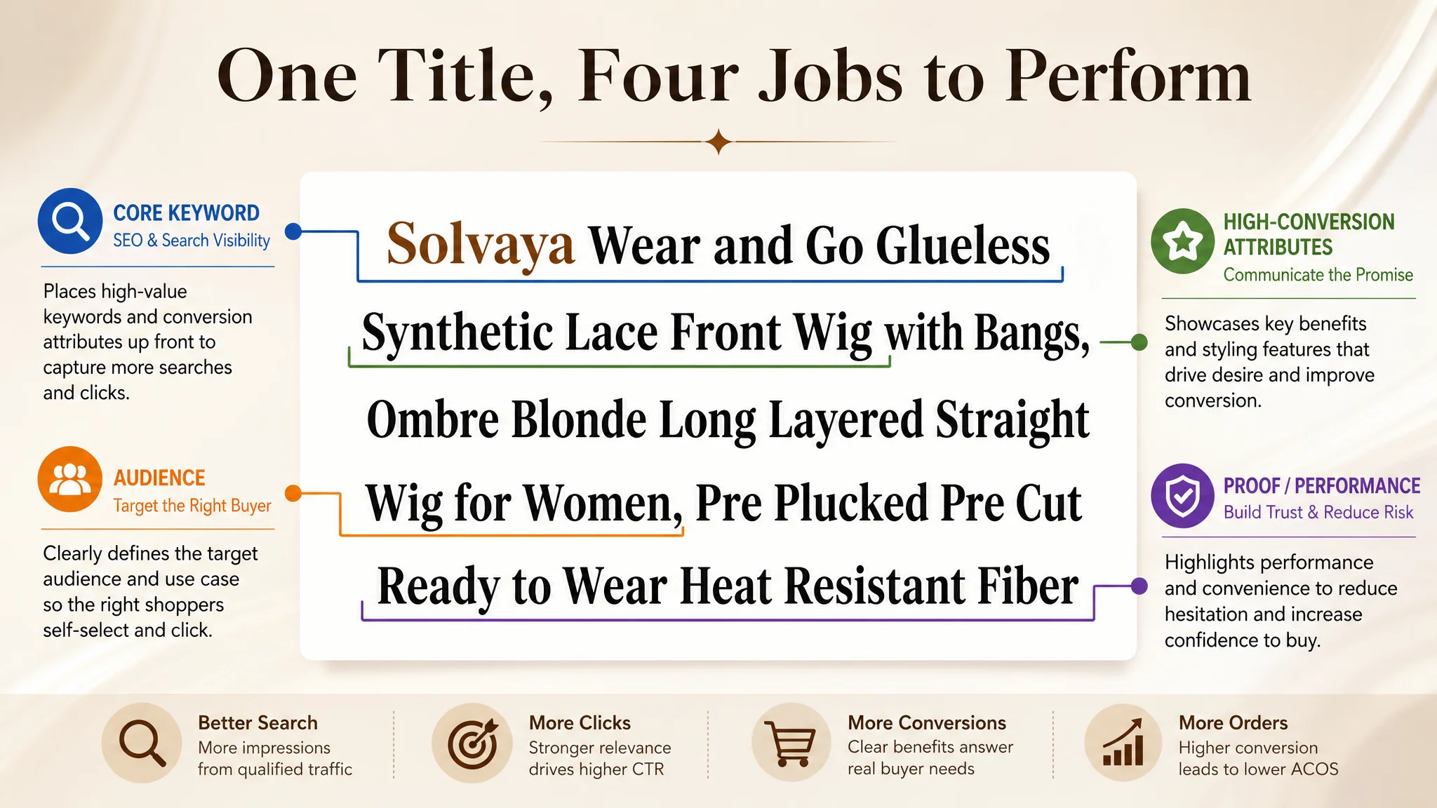
DeepBI guided the team toward a title structure similar to:
Wear and Go Glueless Synthetic Lace Front Wigs with Bangs, Ombre Blonde Long Layered Straight Wig for Women, Pre Plucked Pre Cut Ready to Wear Heat Resistant Fiber
Underlying logic:
- Core keyword + high-conversion attributes front-loaded:
“Wear and Go”, “Glueless”, “Lace Front Wigs” positioned together to capture search weight and decision impact.
- Audience clarity: “for Women” to enlarge coverage and clarify the target user.
- Value-packed modifiers: “Ready to Wear”, “Pre Plucked”, “Pre Cut”, “Heat Resistant” (if accurate) highlight convenience and flexibility rather than repeating color words.
This aligns title logic across:
- Amazon search algorithm needs
- Buyer scan behavior on mobile
- The “instant look” promise of a Wear & Go wig
Bullet points: from description to decision engine
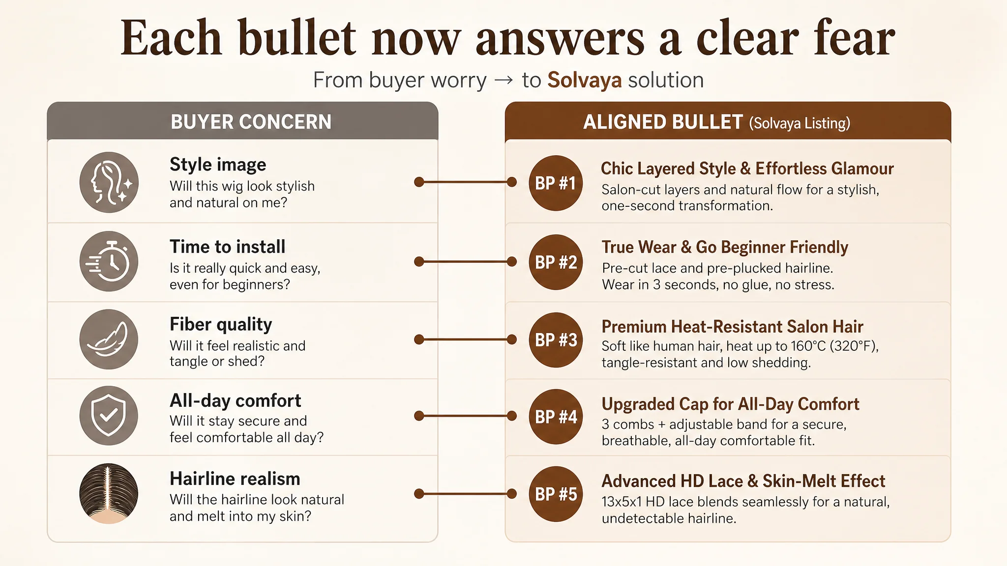
DeepBI did not just “improve wording”; it realigned each bullet to a specific buyer concern.
BP #1 – Style as a trust anchor, not a vague aesthetic
New direction: “Chic Layered Style & Effortless Glamour”
- 24-inch layered wig, salon-cut finish
- Gradient dyeing for depth and dimension
- One-second transformation for parties, travel, daily wear
This anchors fashion and style not as decoration, but as a clear, ready-outcome.
BP #2 – Wear & Go translated into a time promise
New direction: “True Wear & Go Beginner Friendly”
- “Achieve a stunning look in just 3 seconds”
- Pre-cut lace, pre-plucked hairline
- No glue, no professional styling required
- Explicitly positioned as time-saving and budget-friendly
This moves the concept from a buzzword (“Wear and Go”) to an operational promise (“3 seconds”, no glue, no stylist).
BP #3 – Material proof instead of vague “quality”
New direction: “Premium Heat-Resistant Salon Hair”
- Heat resistance up to 160°C / 320°F
- Human-hair-like texture
- Easy to comb, tangle-resistant, low shedding
Amazon wig shoppers are extremely sensitive to cheap fiber. This bullet gives clear, verifiable properties instead of generic “high quality” language.
BP #4 – Cap comfort tied to usage time
New direction: “Upgraded Cap for All-Day Comfort”
- Medium-soft cap (21.5–22.5 inches)
- 3 combs, removable elastic band
- Lightweight, breathable, secure fit all day
This bullet reframes internal structure as a solution to a hidden worry: “Will it hurt or slip if I wear it all day?”
BP #5 – Lace as a visible trust layer
New direction: “Advanced HD Lace & Skin-Melt Effect”
- 13x5x1 inch hand-tied HD lace area
- “Skin-melt” effect across skin tones
- Pre-cut lace for natural hairline without extra customization
This makes lace not a technical feature but a visible, emotional trust lever: “This will look like my scalp.”
Main Images: From Product Display to Conversion Story
DeepBI’s benchmark analysis showed the competitor’s images had a coherent narrative: show the wig, show the outcome, show the ease, show the proof.
The revised image plan aimed to restore that same logic to the seller’s Listing.
Image 1 – Core product angle with professional simplicity
- Dual-angle composition:
- 45° side view occupying ~60%
- Back view at ~30%
- Minimal, modern background (light gray to white gradient)
- Clean, soft-light setup
Purpose: project high-end, salon-like quality, reduce noise, create a strong first impression on search results.
Image 2 – Human outcome + material proof
- Left: real model, front-facing, natural expression
- Right: macro shot of fiber texture
- Overlayed quantified labels (e.g., “100% hand-layered”, “0% artificial glare” if factually accurate)
Purpose: show how it looks on a person and why the fiber looks natural, collapsing the “plastic wig” fear.
Image 3 – Parameters visible at a glance
- 3/4 view model, centered slightly left
- Right side: vertical parameter stack
- Top: large length display (“24” or “26” depending on SKU)
- Below: color and fiber type
Purpose: help shoppers get the “What am I buying?” answer in one second.
Image 4 – Effort contrast: complex vs. simple
- Left: black-and-white image showing a cumbersome wig-install process
- Right: bright, warm-color image of the finished look with the Wear & Go wig
- Soft curved dividing line with “instant wear” visual cue
Purpose: visually embody the “before vs. after,” making “Wear & Go” tangible.
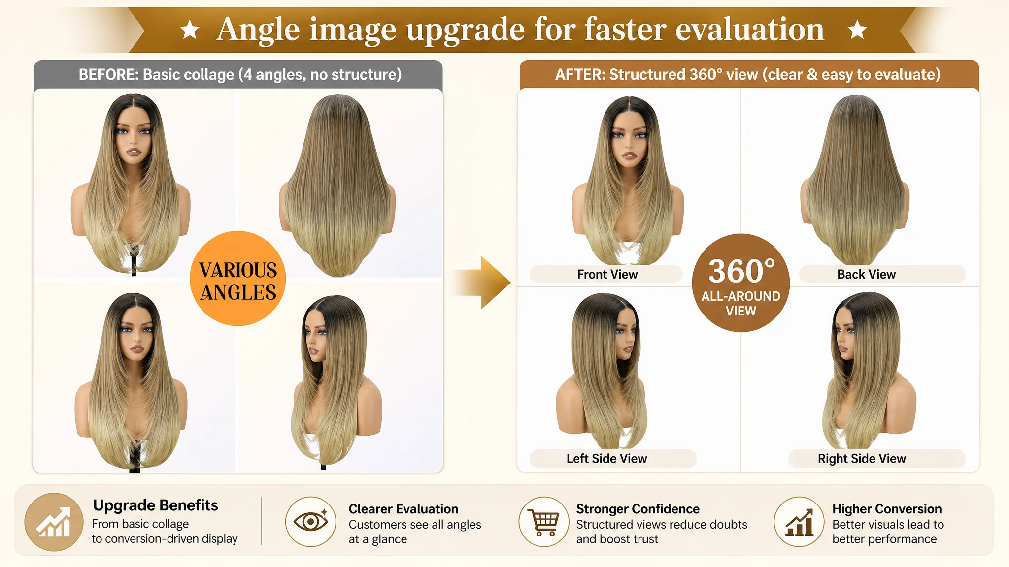
Image 5 – 360° coverage
- 4-square grid: front, left, right, back views
- Clean white background
- Uniform scale and lighting
Purpose: remove the last hesitation: “Will it look natural from the side/back?”
A+ Detail Page: Turning Objections Into Visual Answers
DeepBI’s diagnosis was that the existing A+ content looked good but was too static and aesthetic, not sufficiently anchored in:
- Time savings
- Real-life scenarios
- Color accuracy management
- Comfort and fit proof
- Hairline realism
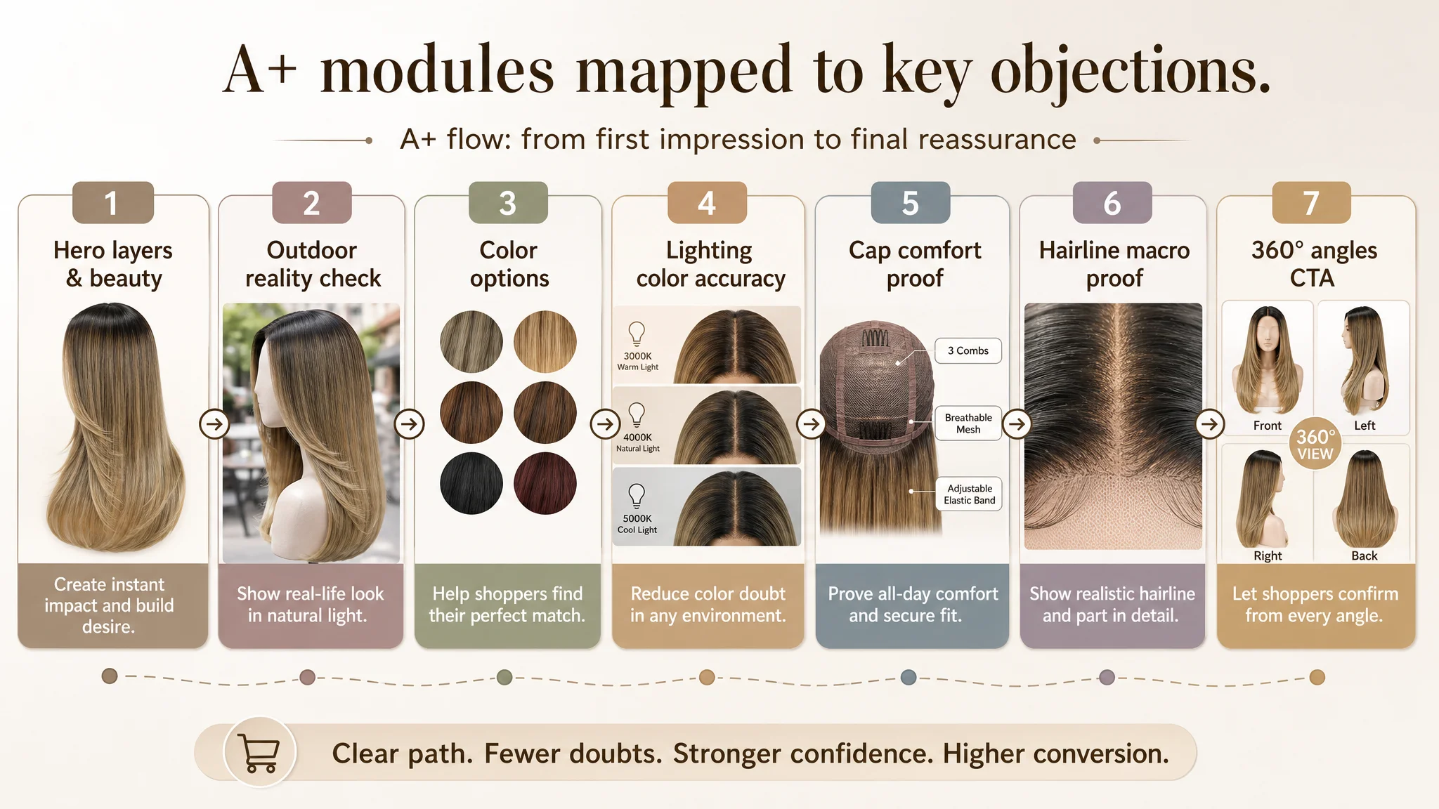
The revised structure focused on converting A+ into a decision-shortening engine.
1. Hero intro: layers + effortless beauty
- Studio-style cover image with the wig occupying ~65%
- Neutral, high-key background
- Strong softbox lighting to emphasize volume and layers
- Headline like “Fluffy Layers = Effortless Beauty”
Objective: immediately define the wig as a fashion-forward, ready solution, not a generic synthetic piece.
2. Real-world scenario: “Will it look normal outside?”
- Outdoor lifestyle shot (e.g., café background)
- Natural, warm daylight
- Slight backlight outlining hair edges
Objective: show that fiber looks natural in real light, addressing the “plastic shine” fear.
3. Color choice as a conversion driver
- Horizontal line of multiple color variants on clean white
- Uniform spacing, consistent background, ring-light illumination
Objective: make color comparison effortless and reduce returns due to color expectations.
4. Color accuracy under different lighting
- Three-way split visual:
- 3000K warm light
- 4000K neutral light
- 5000K cool light
- Each panel labeled clearly
Objective: manage expectations and reduce “color not as described” complaints through scientific, transparent communication.
5. Cap comfort: from words to motion
- Action shot of hands stretching the cap and straps
- Clean, neutral background
- Clear visibility of mesh and elasticity
Objective: transform comfort and fit into visible evidence, easing size/fit anxiety.
6. Hairline and part: micro proof of realism
- Close-up macro shot of parting and hairline
- Soft spot lighting to highlight root detail
- Visible hand-tied lines and pre-plucked edges
Objective: show the “skin-melt” effect visually, not just verbally.
7. Four-angle call-to-action
- 2x2 grid: front, left, right, back
- Uniform lighting and framing
Objective: allow the user to finish evaluation without leaving the page or scrolling review photos endlessly.
What Changed in the Business, Even Before the Final Numbers
The case material does not include post-optimization performance metrics, so we will stay with what is clear from the business logic.
What did change:
- Listing conversion potential improved
- Title, main image, bullets, and A+ now form a coherent path from click to decision.
- The page is better equipped to convert both paid and organic traffic.
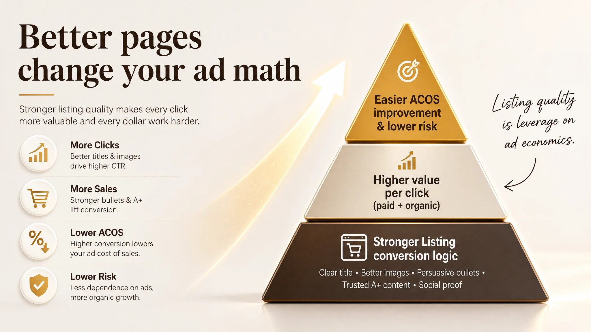
- Ad traffic became more valuable
- Each click has a higher probability of turning into an order, making ad spend more defensible.
- ACOS has a healthier environment to move downward because conversion logic is no longer the main bottleneck.
- Traffic structure risk decreased
- With stronger organic conversion capability, the Listing is less exposed to ad cost volatility.
- The review advantage can now be fully leveraged instead of being partially neutralized by weaker content.
- The seller’s understanding shifted
- Ads are no longer seen as the universal fix for every performance issue.
- Listing quality is understood as the foundation of ad efficiency, not an afterthought.
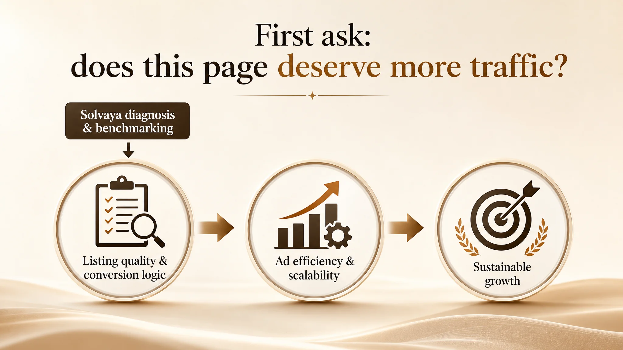
- The team now asks, “Does this page deserve more traffic?” before raising budgets.
What Other Amazon Sellers Can Take From This Case
1. A strong review profile cannot fully compensate for weak Listing logic.
This seller had better star rating and far more reviews than the competitor, yet still lost ground in title, images, bullets, and A+ storytelling.
1. If ACOS refuses to come down, check the page before you blame ads.
When CTR or CVR are structurally weaker than benchmark Listings, ad tuning alone will not fix the economics.
1. Title, main image, bullets, and A+ must tell one consistent story.
In this wig case, the story is “Wear & Go, natural look, realistic hairline, comfortable all day.” Every module now contributes to that.
1. Advertising amplifies the state of your Listing.
If your page feels unfinished in terms of trust and decision support, ads will amplify the weakness. Once the page is structurally sound, ads amplify strengths instead.
DeepBI’s role in this case was not to add more tactics, but to shift the seller’s judgment: from “We need better ads” to “Our Amazon Listing must first regain its conversion capacity.” For many Amazon sellers operating under rising ad pressure, this is often where the real breakthrough starts.