

This case comes from an Amazon seller in the bathroom storage category (wall-mounted toothbrush holder) who was stuck in a familiar loop: ads were running, A+ looked “better than competitors”, but the product page conversion never really caught up to the traffic. The team’s instinct was to blame Amazon ads—bids, keywords, budget allocation—and to keep tuning campaigns while leaving the Listing structure largely untouched.
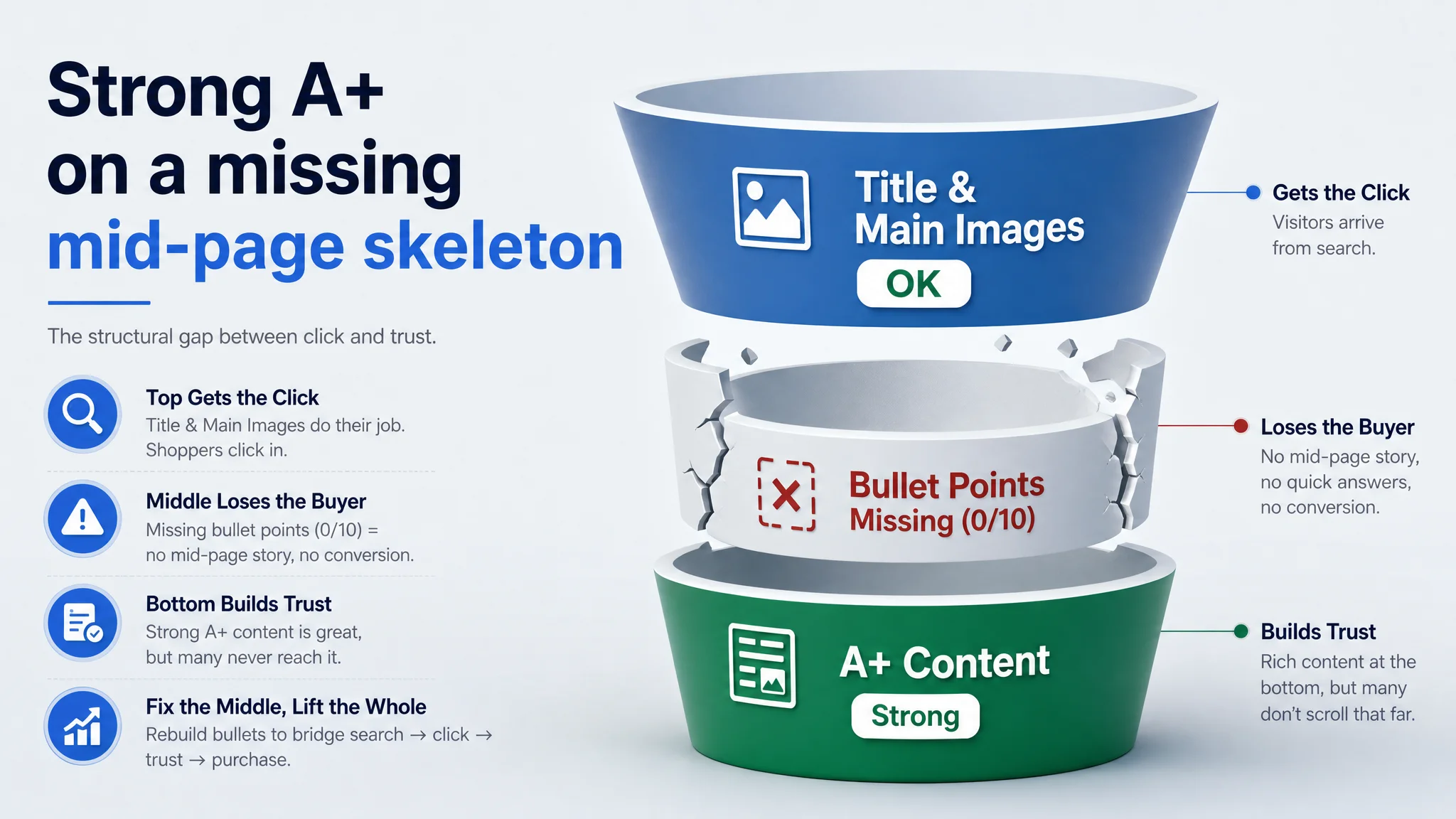
Once DeepBI scored the Listing against a benchmark Amazon competitor, a different picture emerged. The title and main images were not the real catastrophe; the A+ section even outperformed the competitor in richness and logic. The core leak sat in a place the team had almost ignored: the bullet points were completely missing. In other words, the page had a strong “bottom-of-page story” but no mid-page sales logic to bridge search result click to A+ trust.
The subsequent optimization did not start with more traffic or more bids. It started by rebuilding the bullet-point architecture around family capacity, material and design, installation, space saving, and compatibility, and then tightening the title and main-image narrative to align with that logic. Once the Listing’s conversion path became coherent, ad traffic stopped being “wasted clicks” and the Listing began to regain its ability to convert both paid and organic visitors.
Other Amazon sellers reading this can recognize the pattern: when ACOS feels unstable and “visuals aren’t obviously bad”, the problem is often not in the ad console. It is in how the title, images, bullet points, A+, and reviews work—or fail—to guide a buyer from search, to click, to trust, to purchase.
What the Seller Saw: Ads Harder to Control, Page “Already Good Enough”
This Amazon seller operates in the US marketplace with a wall-mounted toothbrush holder. On paper, the Listing did not look weak:
- The product-page A+ content was visually rich and structured.
- Ratings were healthy at 4.6 stars.
- The main image was functionally clear.
- The title included the core keyword “Wall Mounted Toothbrush Holder”.
Yet in advertising:
- ACOS was hard to push down.
- New campaigns didn’t translate into stable sales.
- Traffic existed, but orders and organic ranking did not follow as expected.
Internally, the team’s narrative became:
“Our page is okay; the issue must be in ads—keyword strategy, bids, or budget.”
That belief drove them to keep iterating ad structure and search terms, hoping that a better campaign configuration would “unlock” conversion. But the underlying Listing was not designed to fully convert the traffic being purchased.
The Original Misdiagnosis: Treating a Conversion Gap as an Ad Problem
The seller’s misdiagnosis had three layers:
1. Overconfidence in visual depth
The A+ was indeed richer than the benchmark competitor: more scenes, more detailed diagrams, clearer hygiene and compatibility storytelling. This made the team assume “page quality is not the problem.”
1. Underestimation of mid-page content
Because the A+ was strong and the title seemed keyword-rich, the missing bullet points did not appear alarming. They were treated as “nice to have” rather than “conversion-critical.”
1. Ad console bias
The team lived inside the Amazon ads interface. When ACOS or conversion was off, the first reflex was to adjust bids, match types, or budgets—not to audit the Listing structure.
The result:
- Ads were being tuned against a page that did not tell a complete story.
- The Listing had a good “top” (title + basic images) and a good “bottom” (A+), but the “middle” (bullet points) was a black hole.
- Every click had to fight its way through a trust gap before reaching the A+ content that could actually persuade.
What DeepBI’s Scoring Exposed: A Strong A+ Sitting on a Missing Skeleton
When DeepBI scored the Listing against a category-leading Amazon competitor, the numbers compressed the problem quickly:
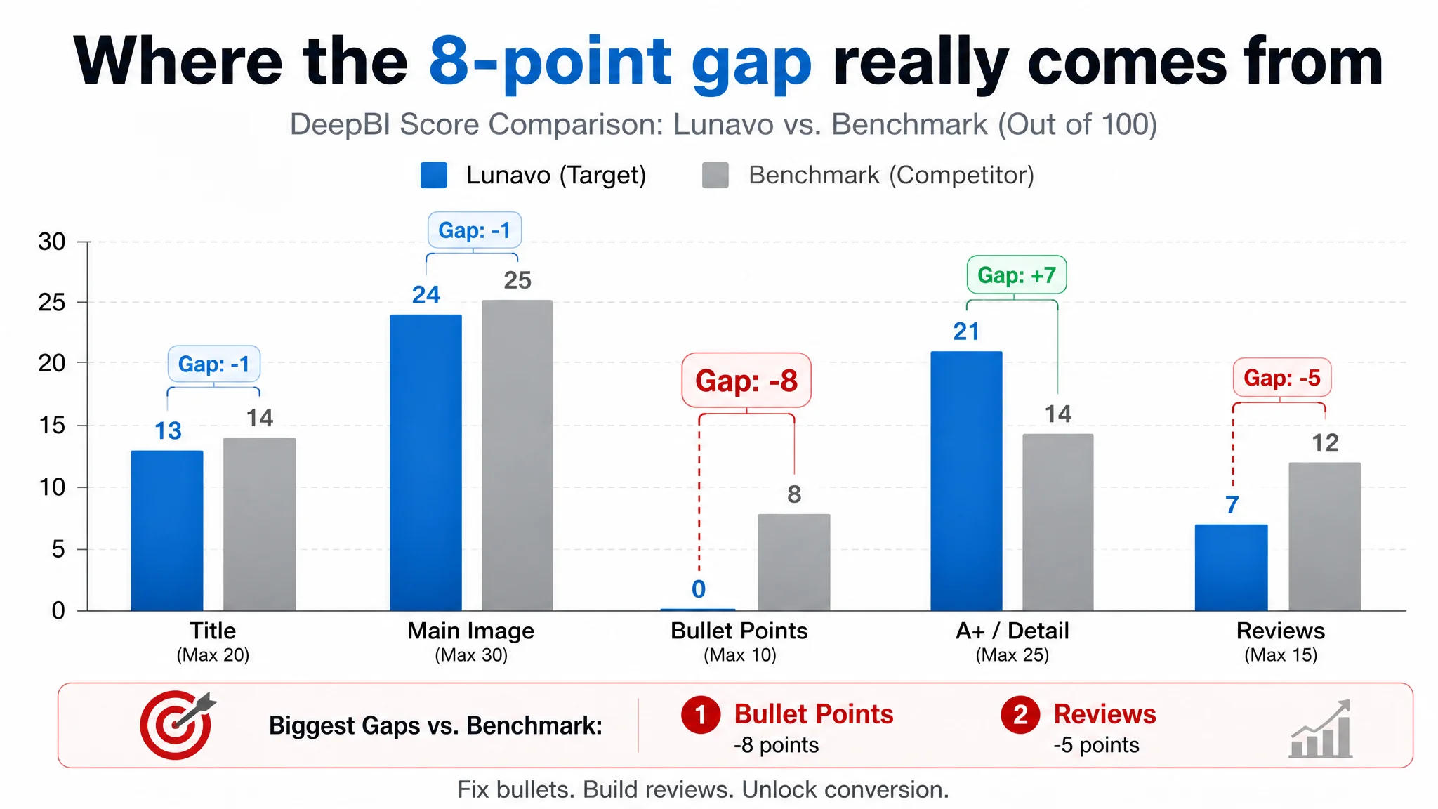
- Total score
- Target Listing: 65 / 100
- Benchmark Listing: 73 / 100
- Gap: -8 points
- By dimension:
- Title: Target: 13, Benchmark: 14, Max: 20, Gap: -1
- Main image: Target: 24, Benchmark: 25, Max: 30, Gap: -1
- Bullet points: Target: 0, Benchmark: 8, Max: 10, Gap: -8
- A+ / Detail: Target: 21, Benchmark: 14, Max: 25, Gap: +7
- Reviews: Target: 7, Benchmark: 12, Max: 15, Gap: -5
Two crucial judgments fell out of this:
- The real weakness was not the A+ or main image.
Those were competitive, even stronger than the benchmark in the A+ dimension.
- The real structural hole was bullet points + review volume.
Bullet points scored a hard 0; the competitor had a full, logical five-point structure. Reviews were high-quality but very low in volume compared with the benchmark.
“The real problem was not that ads failed to bring traffic. It was that the page could not convert the traffic.”
DeepBI’s view: if you keep pouring traffic into a page with a missing mid-page narrative and thin social proof, you are asking ads to do the impossible.
The Real Constraint: Listing Conversion Capacity, Not Traffic Volume
Bullet points: zero structure where buyers expect a roadmap
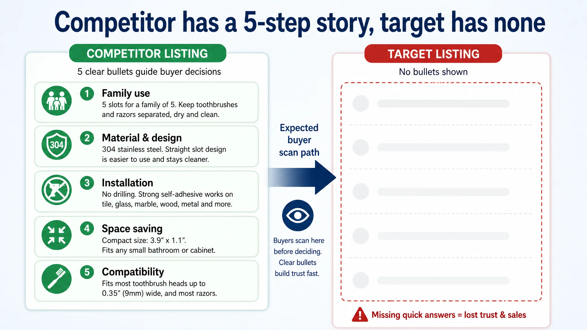
The benchmark competitor followed a clear decision path in its five bullets:
1. Family usage & multi-item capacity
2. Material and design superiority (304 stainless, slot design comparison)
3. No-drill, self-adhesive installation & surface compatibility
4. Space-saving dimensions for small bathrooms
5. Compatibility parameters for most toothbrush heads
In contrast, the target Listing:
- Had no bullet-point content at all.
- Offered no quick-scan storyline at the point where most buyers look for a concise summary.
- Forced buyers to either:
- Scroll down to the A+ and piece things together alone, or
- Click back to search results and choose a competitor that explained itself faster.
From DeepBI’s perspective, this is not a “copy tweak” problem. It is a conversion capacity problem: the Listing is physically unable to convert a meaningful share of visitors who rely on bullets to make a decision.
Reviews: quality fine, scale missing
Ratings:
- Both pages: 4.6 stars – healthy.
- Review count:
- Target: 32
- Benchmark: 960+ (about 30x more)
All visible reviews on the target Listing were positive (no 3-star and below on the first page), but the perception of market validation was weak. A buyer seeing “32 reviews” vs “960+ reviews” will assign very different levels of trust, even at the same star rating.
Combined with missing bullet points, this created a double friction:
- The Listing did not explain itself in bullets.
- It did not project enough social proof scale to compensate.
Why Traditional Amazon Ad Optimization Kept Failing
In that state, every dollar spent on ads faced three obstacles:
1. Weaker mid-page explanation vs. the benchmark
Buyers scanning bullet points saw an empty or minimal section on the target Listing and a clear, five-part logic on the competitor. This meant lower on-page engagement and more back-to-search behavior.
1. Lower perceived maturity because of review count
Even if the A+ story was strong, many buyers never scrolled that far. They already saw a page with thin bullets and low review volume; trust dropped before A+ content could work.
1. Ads amplifying the wrong asset
Ads were pushing up impressions and clicks to a page designed as if traffic were free and patience infinite. The more clicks they bought, the more they exposed the structural issues.
From a profit perspective:
- Raising bids or adding keywords could only move ACOS further away from stability.
- The traffic was not “bad”; the page just could not make the most of it.
Why DeepBI Refused to “Fix Ads First”
Given the scoring and page structure, DeepBI’s judgment was:
- Do not keep tuning ads as the primary lever.
- Repair Listing conversion logic first, then use ads to amplify a page that deserves more traffic.

The logic:
1. The largest score gap vs. benchmark was in bullet points.
-8 vs only -1 in title and main image, while A+ already outperformed. That showed a clear, high-leverage bottleneck.
1. Fixing bullet points was cheaper and faster than recovering from wasted ad spend.
Rebuilding five bullets is a one-time structural effort. Running inefficient ads is an ongoing cost.
1. Ads should scale a proven conversion asset, not compensate for missing basics.
Until the mid-page narrative existed, any incremental ad spend would mostly pay for user education—and largely benefit competitors.
“Advertising does not only amplify advantages. It can also amplify a page’s existing defects.”
Rebuilding the Sales Logic: From Zero Bullets to a Complete Decision Path
The optimization did not attempt to “beautify everything.” It focused on restoring the missing skeleton.
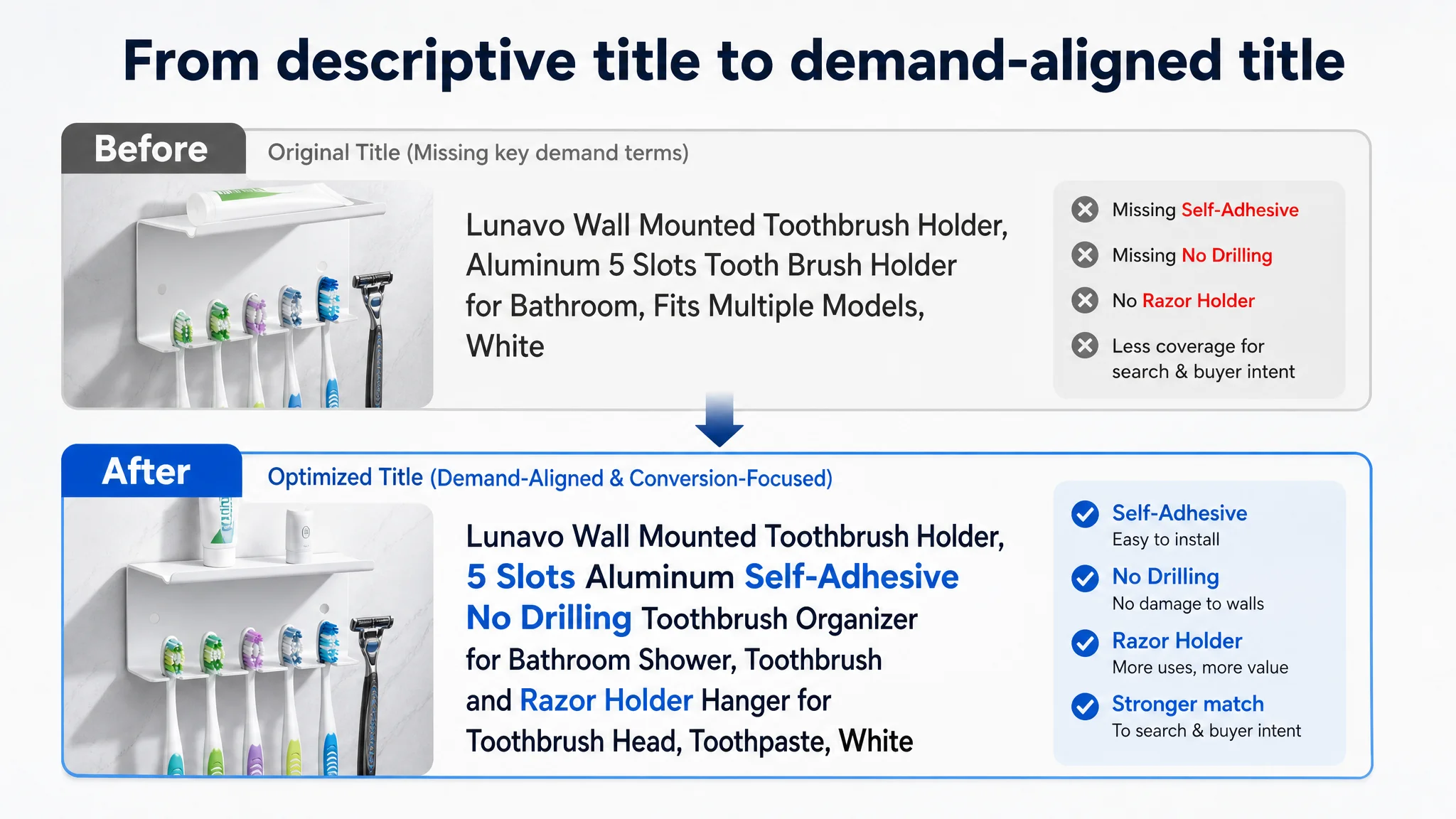
1. Title: align with search behavior and pain points
The original title already contained:
- “Wall Mounted Toothbrush Holder”
- Material (“Aluminum”)
- Capacity (“5 Slots”)
- Color
DeepBI’s adjustments:
- Keep the core phrase “Wall Mounted Toothbrush Holder” at the front for Amazon search relevance.
- Integrate high-intent modifiers from the benchmark:
- “Self-Adhesive”
- “No Drilling”
- Keep “5 Slots” and “Aluminum” for clear spec and material signals.
- Expand functional coverage in a controlled way:
- Add “Razor Holder” and “Toothbrush Head” to signal multi-use.
- Remove verbose brand-model lists that eat characters but don’t expand demand.
Resulting direction:
Wall Mounted Toothbrush Holder, 5 Slots Aluminum Self-Adhesive No Drilling Toothbrush Organizer for Bathroom Shower, Toothbrush and Razor Holder Hanger for Toothbrush Head, Toothpaste, White
This made the Listing:
- Easier to find for “self adhesive toothbrush holder”, “no drilling” queries.
- Clearer in expressing capacity and multi-function in the title itself.
- Better aligned with the upgraded bullet points below.
2. Bullet points: turn a 0/10 dimension into a structured decision engine
DeepBI framed the bullet points to mirror how buyers evaluate this category:
1. Family capacity & hygiene
- Emphasize “family of 5”, manual + electric toothbrushes + razors.
- Highlight separate slots to keep items dry and clean.
Example structure: [Family Capacity & Hygienic Design] - Features 5 dedicated slots perfect for a family of 5…
1. Material & design trust
- Leverage 304 stainless or premium metal positioning (as applicable to the actual product) for rust resistance.
- Explain straight-slot design vs round holes for easier access and less residue, while stressing smooth edges that won’t scratch.
Example structure: [Premium Material & Smart Slot Design] - Crafted from high-quality metal with a rust-resistant finish…
1. Tool-free installation & surface compatibility
- “No drilling required” and “powerful self-adhesive” made explicit.
- List the main wall surfaces: tile, glass, marble, metal, etc.
Example structure: [Tool-Free Installation] - No drilling or hardware required. Equipped with a powerful self-adhesive backing…
1. Space-saving footprint for small bathrooms
- Quantify size; stress that it fits even in tight spaces.
- Position as a vertical-space solution instead of counter-space consumer.
Example structure: [Compact & Space-Saving] - Measuring just 3.9” long x 1.1” wide…
1. Compatibility parameters to reduce returns
- Specify maximum toothbrush neck width (e.g., 0.35"/9 mm).
- State that it fits ~95% of manual and electric toothbrushes, plus common razors.
Example structure: [Universal Compatibility] - Engineered to fit approximately 95% of toothbrushes on the market…
By doing this, DeepBI was not “writing nicer copy.” It was reconstructing the buyer’s decision ladder in a format Amazon shoppers actually read.
3. Main images: connect click intent to the new bullet logic
The main image set originally:
- Showed the product clearly.
- But did not form a “problem → solution → effect” visual chain.
- Used scenes that were more functional than aspirational.
DeepBI’s visual guidance focused on:
- Image 1: Clear hero with “No-Drill Installation” overlay on a modern bathroom tile background.
- Image 2: Warm, real-bathroom scene with organized toothbrushes and toothpaste on a tidy sink.
- Image 3: Low-angle, centered product emphasizing 5-slot capacity with a “Maximize Your Space” hook.
- Image 4: Modern engineering-style dimension diagram, with a hand for size reference.
- Image 5: Macro detail showing multiple types of items (manual toothbrush, electric toothbrush, razor) to visually reinforce multi-function.
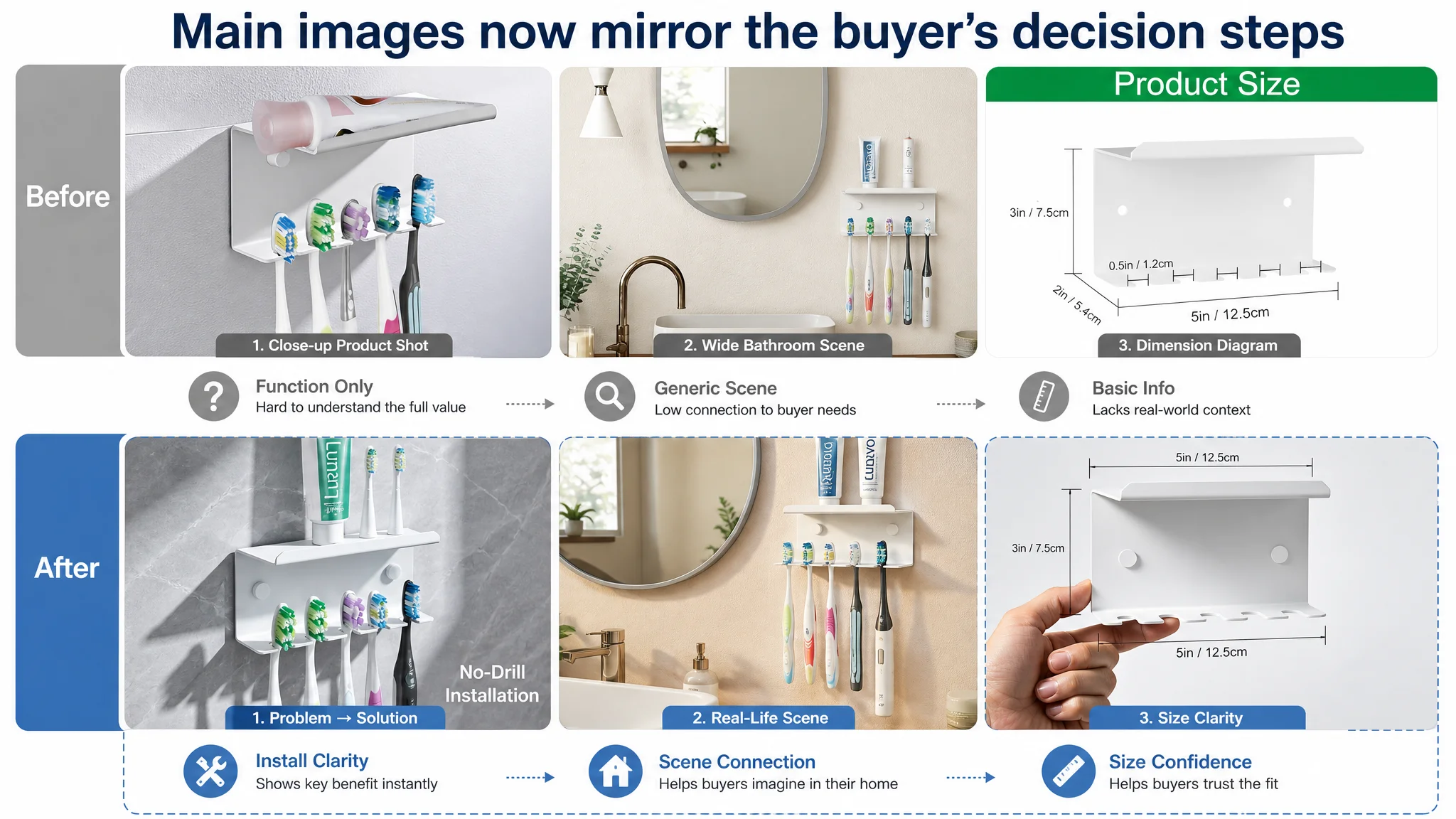
These directions were tightly aligned with the bullet points:
- Capacity & hygiene → family scene + drip-dry representation.
- Material & design trust → close-ups with crisp edges and perceived quality.
- Installation & surfaces → visual depiction of peel-and-stick on tile.
- Space saving → scale and dimension diagrams.
- Compatibility → multiple toothbrush heads visible in real slots.
4. A+ content: keep the strengths, sharpen the messaging
The A+ section was the page’s strongest part:
- High-resolution, full-bleed scenes.
- Visualized “before/after” of messy vs tidy bathroom space.
- Clear depiction of dry hanging and multi-model compatibility.
DeepBI’s role here was not to reinvent, but to refine:
- Introduce a dual-color (black/white) hero module with high-end marble background for immediate cleanliness and variety perception.
- Add a close-up of the protective film partially peeled to signal “new”, “protected surface”, and metal quality in one frame, mirroring benchmark signaling.
- Use macro imagery of toothbrush heads hanging with visible droplets to make “keep dry” visually undeniable.
- Clarify multi-function by showing the top shelf holding toothpaste, face wash, and a glass cup, reinforcing basket value.
- Visualize compatibility by showing various toothbrush types simultaneously in the slots.
- Show a clean step-by-step installation sequence with the actual product color.
- Maintain a strong before/after panel of counter chaos vs organized bathroom.
This made the A+ more tightly coupled with the mid-page bullet logic and the main images, rather than operating as an isolated “nice-looking” section.
How the Page’s Sales Logic Started to Recover
After the Listing was reframed around a coherent narrative, the operational state began to shift:
1. The Listing finally had a continuous decision path
- Search result: improved title and main image communicate “wall-mounted, self-adhesive, 5 slots, no drilling” immediately.
- Product page fold: bullet points quickly answer “for family?”, “will it rust?”, “will it fit my wall?”, “does it save space?”, “will my toothbrush fit?”.
- Scroll-down: A+ reinforces what bullets promised, with visual proof and lifestyle context.
1. Ad traffic became more valuable
With mid-page friction reduced, each click had a higher probability of turning into a purchase. Even without inventing new numbers, the operating effect was:
- ACOS had room to compress because more of the paid traffic converted.
- The Listing started to regain its ability to convert organic visitors, not just ad-clickers.
- The seller’s pressure to overbid on keywords eased as the page did more of the work.
1. Risk around overdependence on ads decreased
The seller was no longer relying on ads to “force” buyers through an incomplete Listing. Instead, ads were now supporting a page that explained itself quickly and clearly.
1. Understanding shifted inside the team
- They saw that a strong A+ alone cannot compensate for missing bullets and weak mid-page structure.
- They recognized that Listing conversion quality dictates how far ad optimization can go.
- They internalized that before scaling ads, the page must deserve more traffic.
What Other Amazon Sellers Can Take from This Case
Several patterns from this Amazon toothbrush-holder Listing are widely applicable:
1. A strong A+ does not mean the Listing is fine.
If bullets are thin or missing, your most important mid-page explanation layer is absent. You are asking shoppers to do too much work.
1. The largest score gap is usually your first optimization priority.
Here, bullet points were -8 vs the benchmark, while main image and title were -1 and A+ was +7. Fixing bullets first was not arbitrary; it was data-driven.
1. Ads cannot fix a structural conversion leak.
You can tune bids and keywords forever, but if the Listing does not answer “who is this for, why trust it, will it fit my space and device?” succinctly, ACOS will remain unstable.
1. Reviews: think in volume signals, not just star rating.
A 4.6-star page with 32 reviews feels very different from one with 960+ reviews. When your review volume is immature, your bullets and images must work even harder to create trust.
1. Listing elements must form one sales logic, not isolated modules.
Title → main image → bullets → A+ → reviews should tell one consistent story. In this case, DeepBI’s role was not to beautify each piece separately, but to align them along the buyer’s decision path.
For Amazon sellers facing stubborn ACOS, flat conversion, and pages that “look okay,” this case is a reminder: the real leverage often lies not in new campaigns but in rebuilding the Listing so that every click—paid or organic—has a clean, confident path to purchase.