

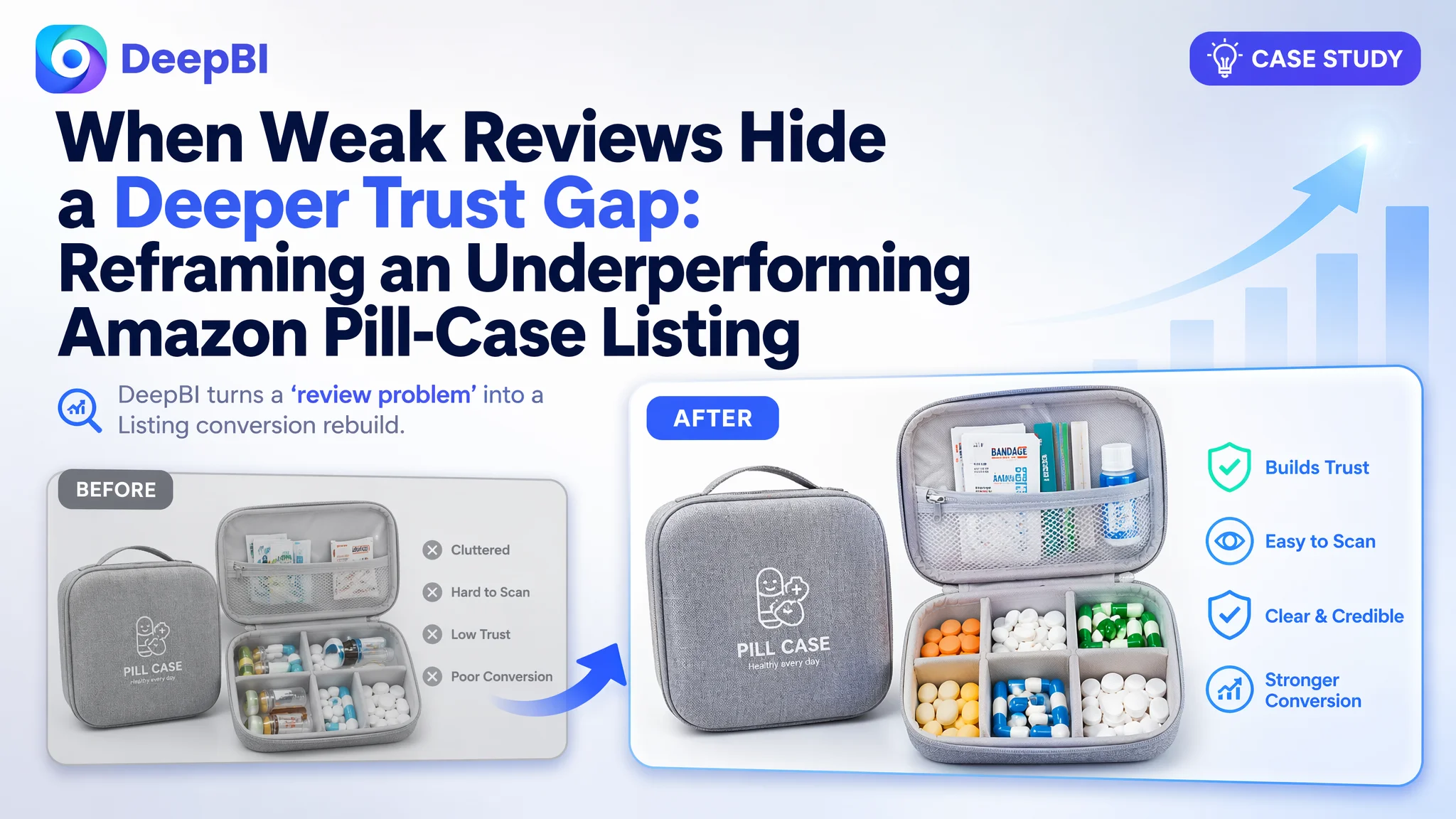
An Amazon seller in the pill-case / supplement organizer category on Amazon Japan was struggling with a Listing that simply could not keep up with a leading competitor. On the surface, the problem looked obvious: ratings were low, reviews were scarce, and the team believed they just needed “more reviews” and “better ad traffic” to fix performance. But after repeated ad tuning and cosmetic tweaks, the business metrics barely moved.
DeepBI stepped in and treated the Listing not as a design issue, but as a conversion system that had to compete against a strong benchmark. Once the seller’s Listing was scored against a category-leading pill-case page, it became clear that the real constraint was not only weak reviews. The page was failing to build trust and decision clarity across the title, bullet points, images, A+ content, and review layer, so any ad spend was being consumed by a low-conversion product page.
The later optimization therefore did not start with ads. It focused on rebuilding the Listing’s sales logic: restructuring the title around real search behavior, re-designing main images to visualize “防湿密封” (moisture-proof sealing) and capacity, turning scattered bullet-point information into a clear pain-point → solution path, and reframing the A+ content to show how this pill case solves everyday “forget to take meds / fear of moisture” scenarios. The lesson for other Amazon sellers is straightforward: when ACOS is high and ads feel “ineffective”, you may be amplifying a page that lacks trust, clarity, and proof — the problem often starts in Listing conversion, not in advertising settings.
Amazon Ads Were Not Failing. The Page Was Consuming the Traffic.
The pill-case seller in Amazon Japan had reached a familiar bottleneck. Exposure existed, a competitor in the same category was clearly converting, yet their own orders lagged badly. The internal narrative was simple:
- “Our reviews and rating are too low.”
- “Our images look fine; ads just aren’t bringing quality traffic.”
- “If we tune keywords and bids further, ACOS should come down.”
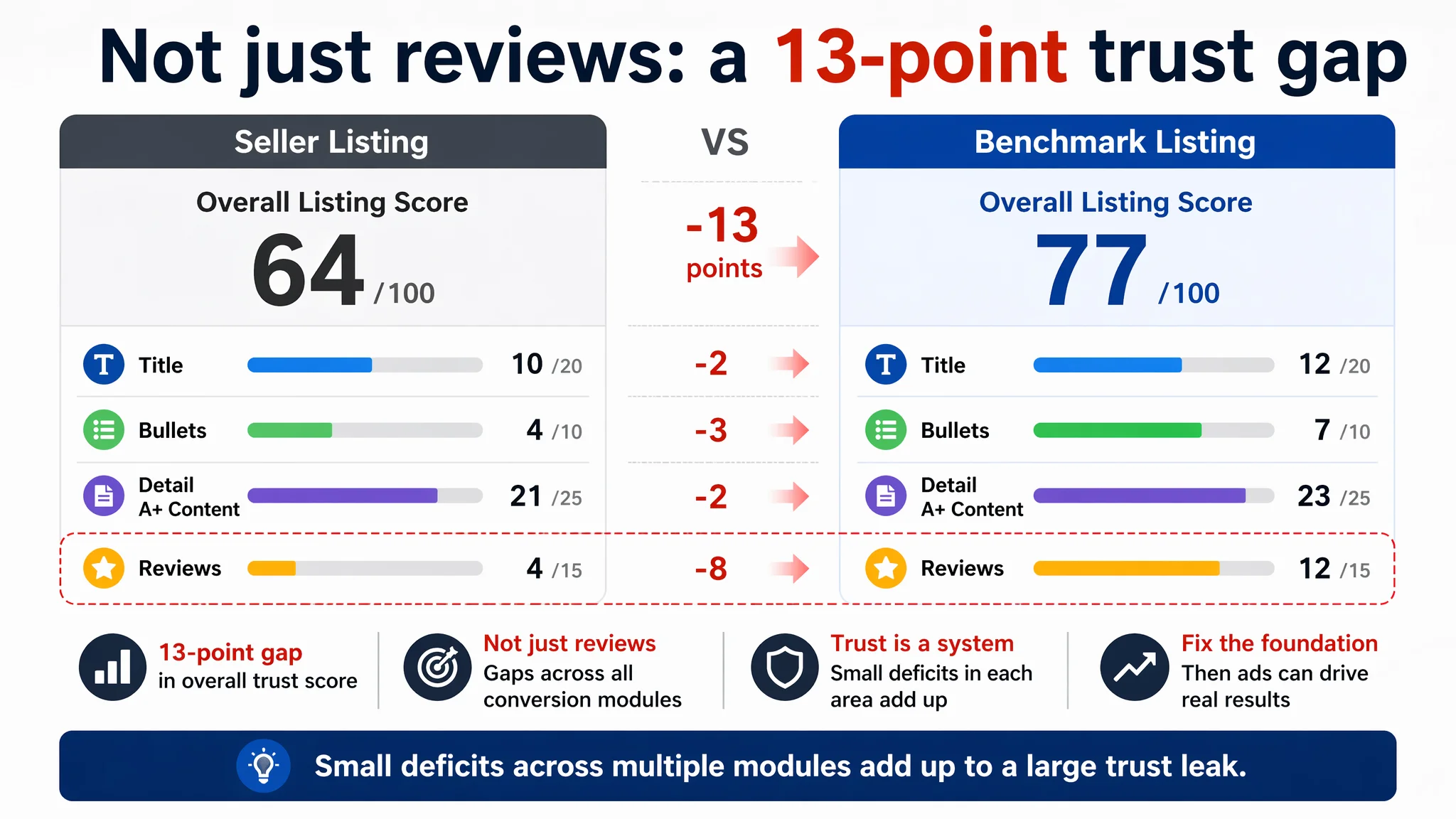
But when DeepBI benchmarked the Listing against a comparable high-performing pill-case product page, the score gap told a different story:
- Seller Listing: 64 / 100
- Benchmark Listing: 77 / 100
- Gap: -13 points
The weakness was not concentrated only in one area. It was spread across the elements that decide whether a click turns into a purchase:
- Title: 10 vs. 12
- Bullet points: 4 vs. 7
- Detail / A+ content: 21 vs. 23
- Reviews: 4 vs. 12
The seller believed they had a “review problem”. DeepBI’s scoring made it clear they had a conversion system problem: each layer of the Amazon product page was slightly underperforming, and together those small gaps created a big trust leak.
“The real problem was not that ads failed to bring traffic. It was that the page could not convert the traffic.”
With this judgment, continuing to tune ads first would only push more buyers into an incomplete decision path.
The Real Constraint Was Listing Conversion Capacity
DeepBI’s Listing scoring broke the situation into a single core constraint: this Amazon product page could not build enough trust and clarity to convert the traffic it already had. That was more important than any individual cosmetic flaw.
Title: Information present, but not structured for search and decision
The seller’s original title contained valuable information:
- “2個セット”
- “7区分け×2段式”
- Supplement case positioning
However:
- The core category term “サプリケース” was separated by the brand name, weakening keyword weight.
- The benchmark title front-loaded “ピルケース” and “1週間” to align with search intent (pill-case + weekly usage).
- The benchmark title stacked variants like “サプリメントケース サプリケース 小分け 薬入れケース” into a tight, high-density keyword cluster.
The seller’s wording was not wrong; it was loosely structured. This looseness reduced both search capture and immediate relevance at the search-results stage, lowering CTR and starting the funnel with weaker intent alignment.
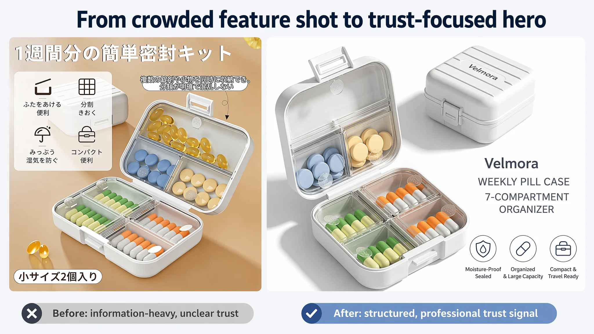
Main images: Not just aesthetics, but missing trust and usage clarity
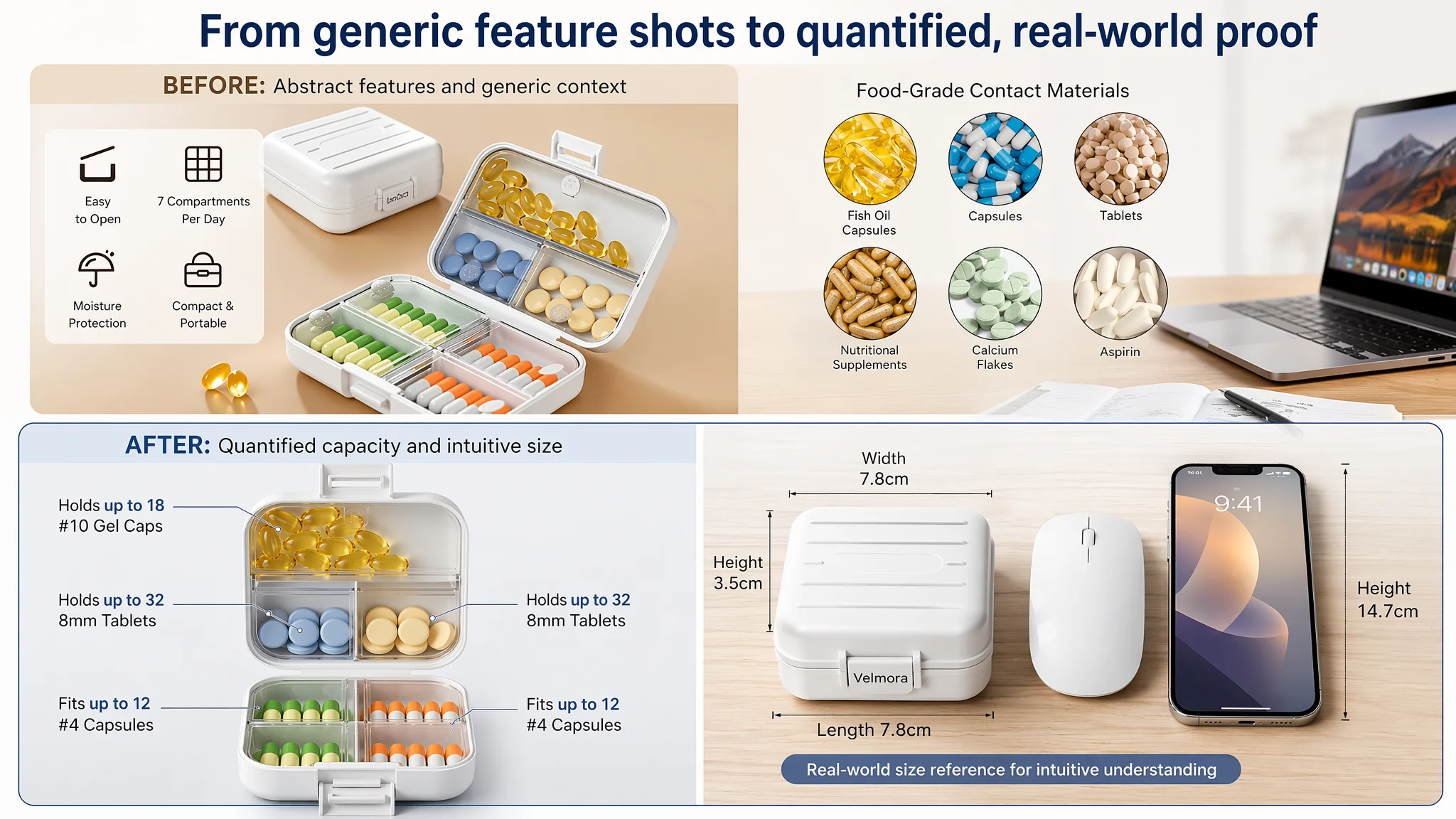
On the visual side, DeepBI’s multi-modal analysis found:
- Existing main images lacked clear capacity visualization (how many capsules per compartment).
- Size images relied on numerical cm values plus an “error” note, which diluted professionalism and did not give buyers a physical feel for “7.8cm”.
- Moisture-proof benefits were visually underpowered: simple water-surface composites did not strongly communicate sealing performance.
- Scenario images had visible composition issues and scale mismatches, which undermined perceived brand quality.
The benchmark Listing solved these points by:
- Showing real pills with explicit per-compartment capacity.
- Using everyday objects (e.g., a mouse or smartphone) as size reference.
- Employing dynamic water-drop visuals to dramatize “防湿 密閉”.
- Presenting clean, authentic home/travel scenes that support a lifestyle and trust narrative.
The seller’s main images had “information” but lacked professional clarity and emotional reassurance. For a product that touches medication, this is a critical conversion handicap.
Bullet points: Information mixed, pain points diluted
DeepBI’s comparison of bullet-point logic surfaced a structural issue:
- The seller’s bullets mixed multiple ideas in single points (e.g., material, safety, multi-use).
- Moisture-proof sealing, though present, was not the first bullet, and was not articulated as the central solution to the main user fear.
- There was little quantification (no “13 fish oil / 20 capsules” type concrete capacity proof).
By contrast, the benchmark Listing:
- Led with 防湿密封 as bullet #1 — directly attacking the key risk: moisture and air intrusion.
- Used a one-core-sell-per-bullet structure (防湿, 多機能, 便携, 耐用, 容量).
- Added specific numbers for capacity, turning claims into tangible evidence.
So buyers landing on the seller’s page saw scattered benefits, but no clear “this product solves your biggest worry in this way” path.
Detail / A+ content: Functional narration without a real decision journey
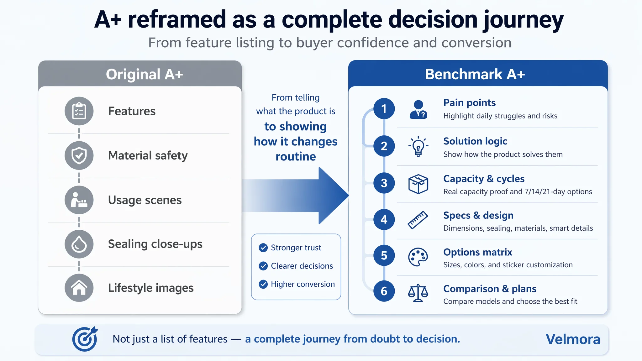
In the A+ section, DeepBI’s agents compared module-by-module:
The seller’s A+ focused on:
- Core feature visuals
- Material safety explanation
- Usage scenes
- Sealing-structure close-ups
- Lifestyle imagery
The benchmark A+ built a stronger journey:
- Emotionally framed pain points: “毎週のサプリ管理が面倒”, “飲み忘れ”
- A clear “pain → solution” layout for moisture and forgetfulness
- Visual matrices of multiple cycles (7/14/21 days) and multiple sizes/colors
- Detailed, mm-level dimension diagrams and design features (double lock, custom stickers)
- Product comparisons and cycle plans that support upsell and tailored choice
The seller’s A+ told what the product is; the benchmark showed how it changes the buyer’s routine and reduces risk. That difference in storyline is where conversion either happens or stalls.
Reviews: A symptom, not the root cause
The review gap was stark:
- Seller: 2.8 stars, 10 reviews
- Benchmark: 4.0 stars, 1403 reviews
Low rating and low review count compounded trust issues. But DeepBI treated this as part of the trust stack, not the only issue:
- Even if more reviews were generated, a weak page narrative would keep CVR suppressed.
- Ads driving more traffic to a poorly explained product would generate more disappointed buyers, and potentially worse reviews.
That is why the diagnostic conclusion was: Listing conversion capacity must be repaired before ads can work as intended.
Why DeepBI Did Not Keep Tuning the Ads First
From a business perspective, the biggest risk at this stage was letting ads amplify existing page defects:
- High ACOS would persist because traffic landed on a page that felt less trustworthy than the benchmark.
- Organic rankings would struggle because poor CVR undermines search-position stability.
- Attempts to “solve” performance by increasing ad budgets would only enlarge the waste.
DeepBI’s decision logic was:
1. Stop treating ads as the primary lever. Ads were showing the symptom (high ACOS), not causing it.
2. Use Listing scoring to isolate the real constraint. The 13-point gap against the benchmark was mainly in trust-building modules (title, bullets, A+, reviews).
3. Prioritize page conversion fixes that directly affect both organic and paid traffic outcomes.
“Advertising does not only amplify advantages. It can also amplify a page’s existing defects.”
Only after the page could reasonably convert traffic like the benchmark would ad optimization make sense again.
This Product Page Did Not Lack Traffic. It Lacked Trust.
DeepBI’s optimization framing for this pill-case Listing was built around one principle: build a complete “from worry to decision” path on Amazon.
Title: Rebuilding the search and usage logic
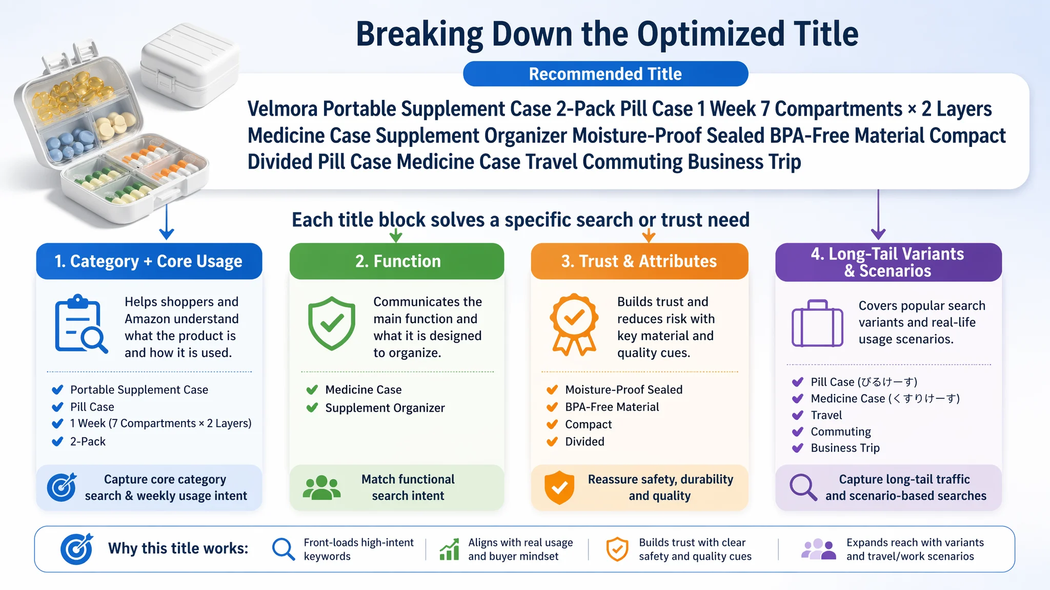
The recommended title reorganized the seller’s existing strengths, borrowing structure from the benchmark but staying true to the product:
携帯用サプリケース 2個セット ピルケース 1週間 7区分け×2段 薬ケース サプリメント 収納 防湿 密封 BPAフリー素材 コンパクト 小分け ぴるけーす くすりけーす 旅行 通勤 出張
Key changes in logic:
- Front-loaded “携帯用サプリケース” and “ピルケース 1週間 7区分け×2段” to directly signal mobile weekly pill organization.
- Inserted long-tail variants “ぴるけーす” and “くすりけーす” for broader natural search coverage.
- Kept high-value attributes (防湿, 密封, BPAフリー, コンパクト) but in a more compact, intent-aligned sequence.
This was not just about more keywords; it was about matching how buyers articulate the problem and search for a solution, which is foundational to CTR and relevance.
Bullet points: From scattered features to a coherent buying logic
DeepBI’s bullet-point plan turned seven bullets into a progressive narrative:
1. 手のひらサイズ・お得な2個セット
Establish portability and value: two compact cases for travel, commuting, and everyday carry.
1. 7区分け・整理整頓が簡単
Highlight organization: seven compartments to avoid forgetting doses and mix-ups.
1. 優れた密閉性・徹底防湿
Address the core risk: explain the silicone gasket and lock structure that block moisture, dust, and air.
1. 安心のBPAフリー・高品質素材
Build safety trust: emphasize food-grade, BPA-free plastic, odorless and durable, with “baby pacifier-level” analogy.
1. 二重構造・衝撃に強い設計
Reduce mishap anxiety: double-layer design that resists spills if dropped, while staying easy to open with a thumb.
1. コンパクトなのにたっぷり大容量
Quantify capacity emotionally: small but holds multiple capsules and tablets comfortably.
1. 多用途&おしゃれなギフトデザイン
Extend usage and giftability: pills, supplements, accessories; suitable for men and women, and for gifting.
This shift matters because each bullet now closes a specific worry: portability, organization, moisture, safety, durability, capacity, versatility. The page stops being an information list and becomes a sequence of solved pain points.
The Main Image Was Not Just a Visual Issue. It Failed to Create a Reason to Click.
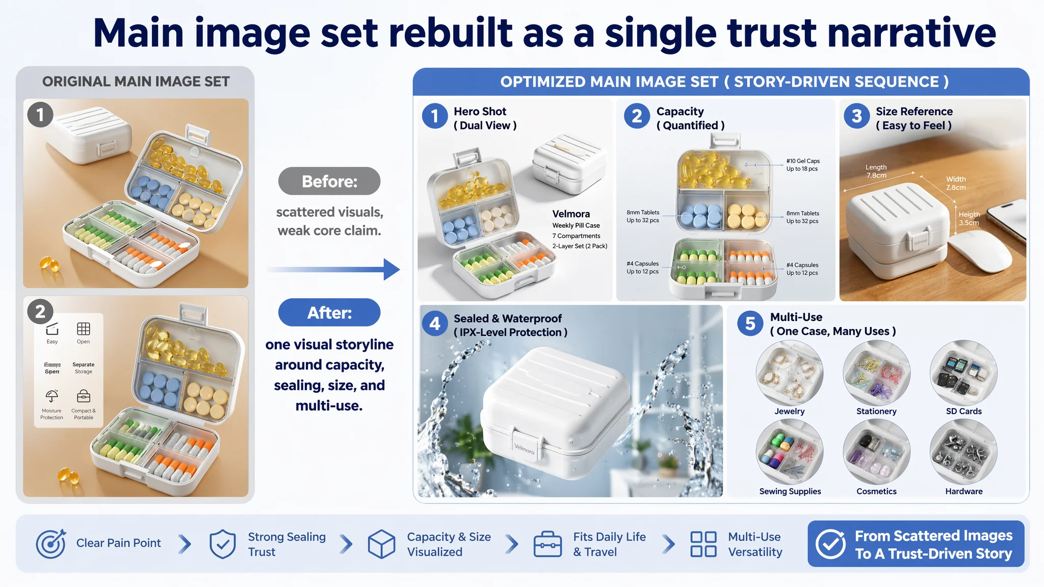
DeepBI’s image optimization did not chase “prettier” visuals; it aimed to make core functional claims visible and credible.
Main image 1: Core product, dual state, professional light
- Product centered, open-state occupying ~70% of the frame.
- 45-degree slightly top-down angle to show depth.
- A second closed unit behind as state comparison.
- Clean white background, cool tone, clear shadow for depth.
- Simple sans-serif text labeling the product.
Purpose: give buyers a clear first impression of structure, quality, and dual-state usage right on the search page.
Image 2: Capacity visualized, not just claimed
- Open product centered, compartments filled with real pills (e.g., 5 yellow capsules, 8 white tablets).
- Callout lines and text like “10号カプセルがX個収納可能” for each compartment.
- Soft, shadowless lighting, neutral gradient background.
Purpose: directly answer “How much can this case actually hold?” to reduce post-purchase disappointment and returns.
Image 3: Size made intuitive
- Product placed beside a familiar object (smartphone or mouse).
- Dimension arrows and labels like “高さ3.5cm”.
- Warm, realistic desk surface and balanced lighting.
Purpose: transform abstract cm measurements into a physical, relatable sense of size.
Image 4: Moisture-proof function dramatized
- Closed product at a floating 30-degree angle.
- Dynamic water splashes around, without obscuring the product.
- Text overlay such as “防湿 密封” or “IPX級密封防水”.
- Clean, blue-toned background to signal freshness and protection.
Purpose: visually dramatize 防湿密封 as the core differentiator, not just text.
Image 5: Multi-use value shown cleanly
- Six-circle grid showing different stored items: earrings, SD cards, paper clips, etc.
- Macro shots with uniform lighting and white background.
- Japanese labels under each use case.
Purpose: extend perceived utility and value beyond pills, in a visually ordered, premium way.
Together, these images turn the Listing into a visual argument for trust and usability, instead of a set of generic product shots.
The Detail Page Had to Tell a Pain-Point Story, Not Just Show Features
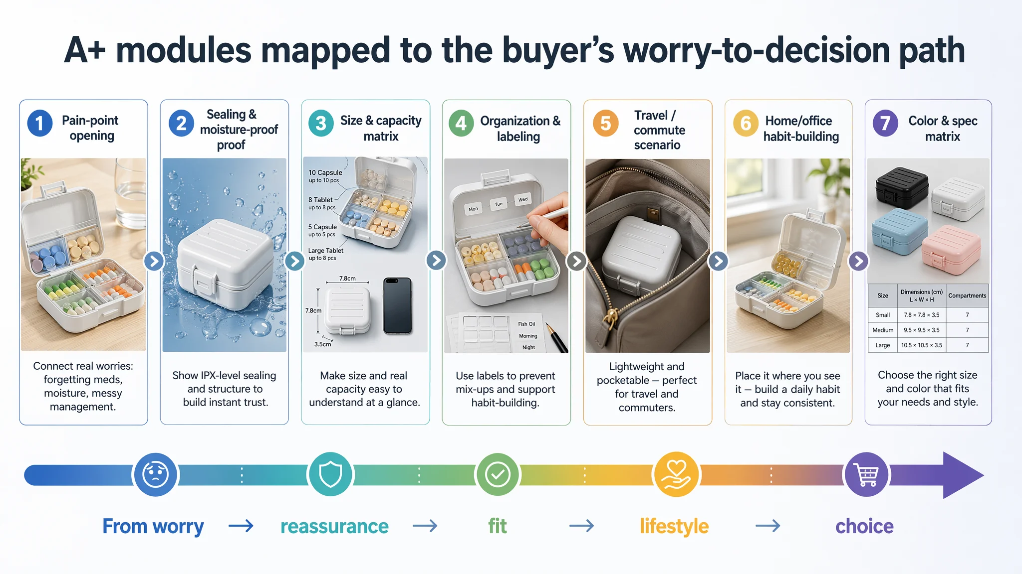
For this category, DeepBI’s logic was clear: buyers begin with worries (forgetting meds, moisture, clutter), not with features. The A+ had to reflect that.
Module 1: Pain-point opening
- Product open on a warm wooden table, colorful capsules neatly organized.
- Copy in the free space: “薬を飲み忘れたり、湿気で品質低下が気になることはありませんか?”
- Brand logo and key points like “二重ロック” and “防潮設計”.
Role: create emotional relevance and signal that the product solves everyday medication worries.
Module 2: Sealing and moisture-proof proof
- Closed product at 45-degree view.
- Zoomed-in or cutaway illustration of the silicone gasket and seal line.
- Light water-drop or splash elements, blue background.
Role: turn the abstract “防湿密封” into a visible mechanical barrier buyers can understand and trust.
Module 3: Size and capacity matrix
- Left: open case with different pill types in separate compartments and labels like “魚油13粒”.
- Right: product in hand or next to a smartphone for size comparison.
Role: help buyers predict real-world fit and load, avoiding size and capacity dissatisfaction.
Module 4: Organization and labeling
- Case open with labels like “月曜”, “火曜” or “魚油”.
- Additional unused label sticker sheet visible.
Role: show how the product supports routine and clarity, reducing mix-ups and mental load.
Module 5: Travel / commute scenario
- Case partly visible in a stylish handbag interior.
- Natural leather texture, realistic lighting.
Role: validate the “zero burden” portability promise for commuters and travelers.
Module 6: Home/office habit-building
- Case next to a glass of warm water on a minimalist desk.
- Clean, soft lighting.
Role: associate the product with healthy routines and reminders: “see the water, remember the medication.”
Module 7: Color and spec matrix
- All available colors and sizes aligned in a grid.
- Simple spec table with each size’s dimensions.
Role: simplify SKU choice and enable users to select the variant that matches their pill volume and style.
This A+ structure guides buyers from emotional pain recognition → technical reassurance → practical fit → lifestyle integration → final choice. That is what a high-conversion Amazon detail page must do.
Before Ads Could Work Again, the Page Had to Convert
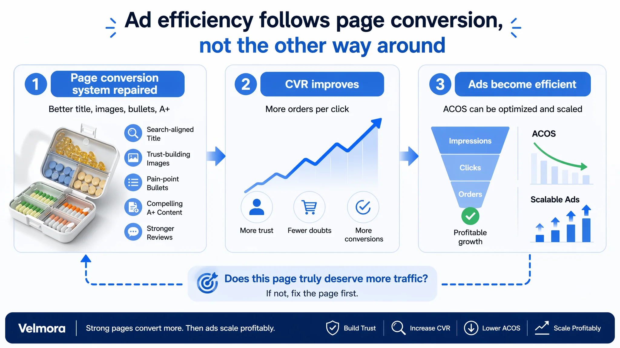
DeepBI’s work with this seller did not end with a design plan; it changed the seller’s understanding of where their main risk lay.
Operating state change
- The Listing moved from “generic feature listing” to a structured trust-building page.
- Moisture-proof and organization benefits were visual and quantified, not just claimed.
- Title and bullets were aligned with real search intent and pain points.
This gave the product page a far better chance to convert both organic and ad traffic.
Risk structure change
- The seller reduced the risk of ads amplifying a low-conversion page.
- With a stronger trust stack (visuals + text + A+ logic), future ad traffic would have a real chance of turning into orders, instead of being wasted.
Even without inventing artificial numbers, DeepBI’s decision path implies:
- CVR has room to recover because buyer doubts are more thoroughly handled.
- ACOS can eventually move down because each click has a higher probability of becoming a purchase.
- Organic traffic can become more meaningful as the Listing begins to deserve its position.
Understanding change
For the seller, the key realization was:
- Amazon ads do not fix every conversion problem.
- Listing quality is the foundation of ad efficiency.
- Title, main image, bullet points, A+ content, and reviews must work together as one persuasive path.
- Before scaling ads, the team must ask: “Does this page truly deserve more traffic?”
For other Amazon sellers—especially in categories where safety, precision, or daily routine management are involved—the case is a reminder that:
- Weak reviews often hide deeper structural trust gaps.
- High ACOS is frequently a Listing conversion issue wearing an “ads problem” mask.
- The most powerful optimization step is often to rebuild the product-page logic before touching bids and budgets.
DeepBI’s value in this case was not in generating images or copy alone, but in using data-driven benchmarking to reframe the problem: this pill-case Listing did not need more ad spend; it needed to become a page that can genuinely convert the traffic it already receives.