


An Amazon seller in the synthetic wigs category came to DeepBI with a familiar pressure: ad costs rising, impressions not the problem, but orders lagging behind expectations. The team’s first reaction was to blame Amazon ads and keyword bidding, assuming they simply hadn’t pushed hard enough on “cosplay” traffic or blue-wig keywords.
Once DeepBI ran a full Listing diagnosis, a different picture emerged. Against a benchmark Amazon blue wig listing, the target product scored 69/100 versus the competitor’s 79/100. Ads were doing their job bringing traffic, but the Amazon product page—especially the title, bullet points, and A+ detail content—was not converting that traffic efficiently. The main image strategy, internal structure information, and scene storytelling were all misaligned with how buyers actually decide on a wig.
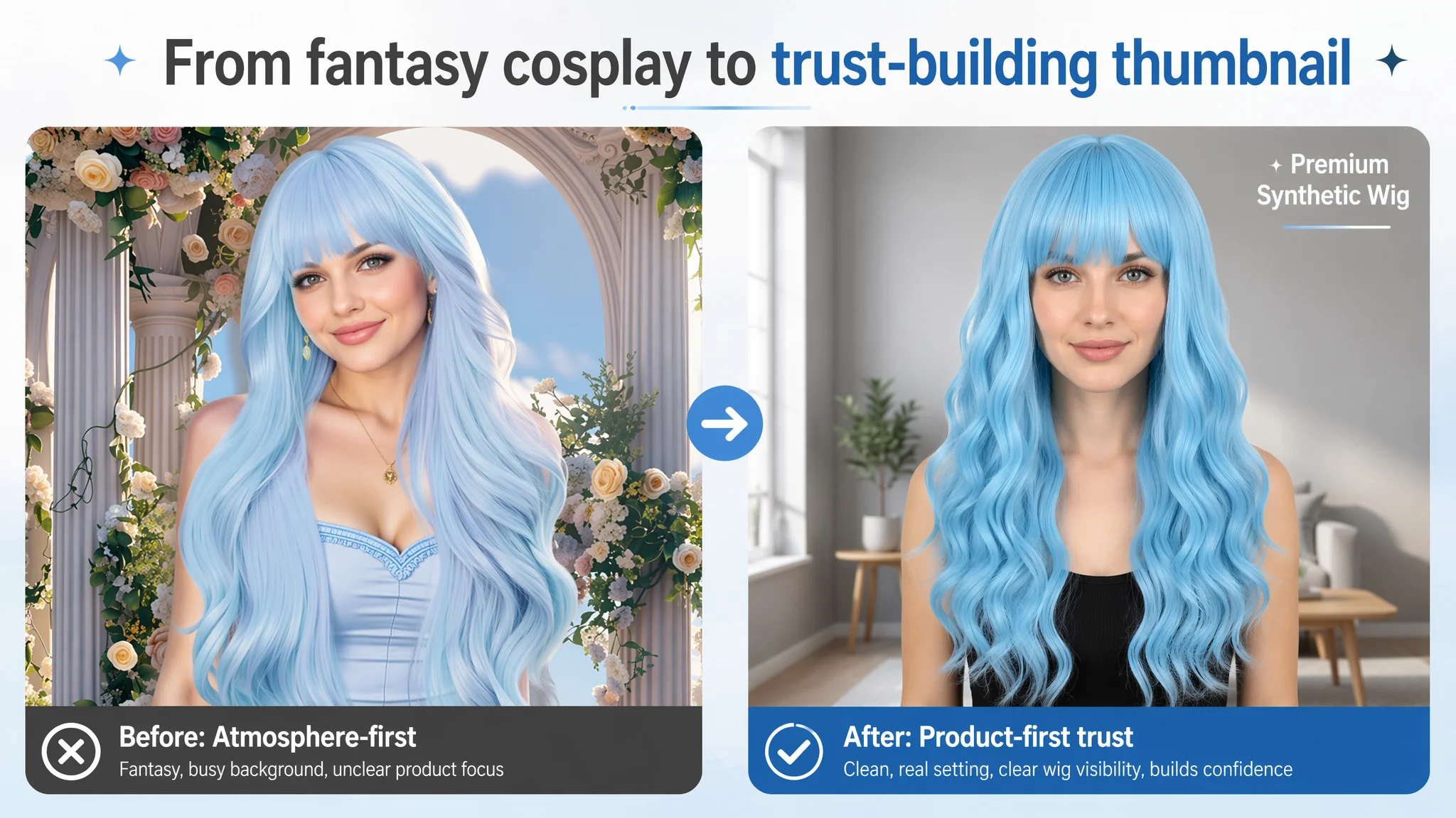
The optimization path therefore shifted away from “keep tuning ads” toward systematically rebuilding the Amazon Listing’s sales logic: widening scenes beyond cosplay, reshaping the title to answer trust concerns, restructuring bullet points around outcomes and comfort, and upgrading A+ modules to show real use, multi-angles, and internal construction. For other Amazon sellers, this case is a reminder that when ACOS feels stuck, the true constraint is often Listing conversion capacity—not the ads themselves.
Amazon Ads Were Not Failing. The Page Was Consuming the Traffic.
The seller’s starting assumption was straightforward: “Our blue cosplay wig is niche. If we just push cosplay keywords harder and refine bids, orders will follow.”
In their ad reports, exposure was not the bottleneck. The product appeared on relevant Amazon searches and had a reasonable review base (4.4 stars, 68 reviews). Yet conversion was unstable, and ad spend didn’t translate into predictable sales.
DeepBI’s Listing scoring made the pattern explicit:
- Total Listing score: 69 vs. a benchmark competitor’s 79
- Key gaps:
- Title: 10 vs. 15 (–5)
- Bullet points: 5 vs. 7 (–2)
- Detail page (A+): 19 vs. 23 (–4)
- Main image: slightly ahead (25 vs. 24), but with structural risks
- Reviews: essentially tied in rating (4.4 vs. 4.4)
In other words, the Listing’s core “decision modules” were weaker than those of a comparable high-performing Amazon wig listing. Ads were pushing traffic into a page that did not systematically build trust or show outcomes.
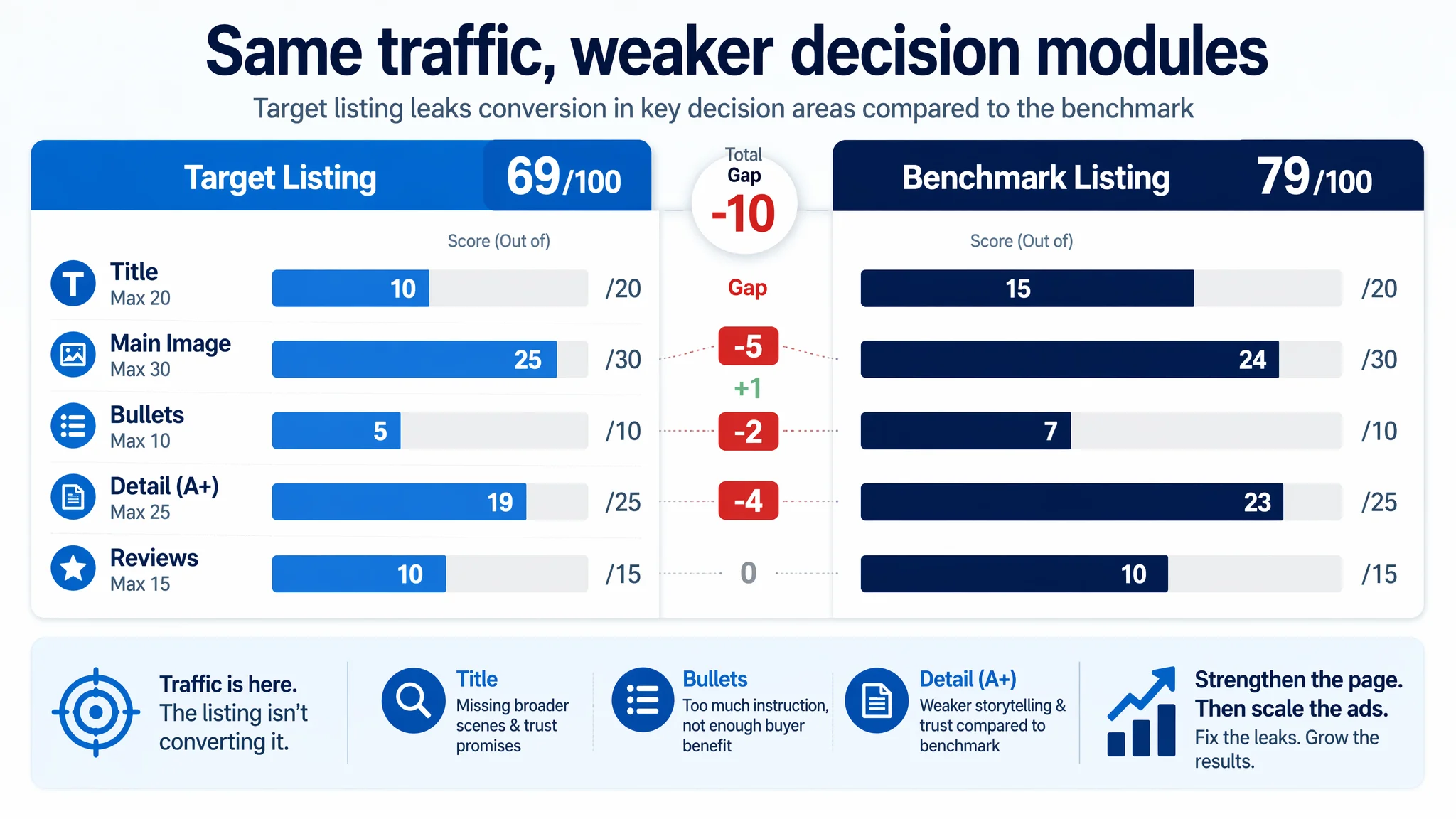
“The real problem was not that ads failed to bring traffic. It was that the page could not convert the traffic.”
For a high-decision-cost category like wigs—where buyers worry about naturalness, face shape, comfort, and fit—this gap is fatal. Every click paid for by Amazon ads was entering a page that made users work too hard to feel safe buying.
The Real Constraint Was Listing Conversion Capacity
DeepBI’s diagnosis narrowed the root cause to one core bottleneck: insufficient Listing conversion capacity on the Amazon product page, especially compared to a benchmark seller in the same category.
Several signals converged:
- The title did not fully leverage high-intent scenes beyond cosplay.
- The main image strategy favored atmosphere over product clarity and contained an obvious mislabel (“PINK WIG” on a blue wig image).
- Bullet points were structured like operational notes and after-sales terms, not a buying logic.
- The detail page (A+) lacked a cohesive brand story, multi-angle view, and strong social proof framing, despite having more reviews than the benchmark.
- Review volume was actually higher than the competitor, but that advantage was not being converted into a stronger trust story.
From a business standpoint, continuing to throw more Amazon ad traffic at this Listing would only increase the cost of the same underlying weakness. The ads weren’t broken; the page was.
A Title That Stopped at “Cosplay” While the Competitor Sold Outcomes
The title did not communicate the outcome
DeepBI’s title analysis highlighted a fundamental misalignment: the Listing’s title stopped at a narrow scene and generic descriptors.
The benchmark competitor’s title:
- Combined multiple scenes: “Daily” and “Party” together, not just cosplay.
- Used specific hair-style terms like “Curtain Bangs” and “Middle Part”, which directly match how many buyers search.
- Inserted a trust phrase: “Natural Looking,” explicitly addressing the biggest wig fear—“Will it look fake?”
- Followed a clear structure: core feature + core scene + core value promise.
By contrast, the target Listing:
- Focused mainly on “Cosplay,” limiting its organic reach and relevance in Amazon search.
- Described the style in generic terms, making it less likely to hook buyers with specific aesthetic preferences.
- Lacked a direct value promise around naturalness or appearance, even though this is a decisive factor in wig conversions.
- Cut off structurally after “Cosplay Use,” leaving the title feeling incomplete.
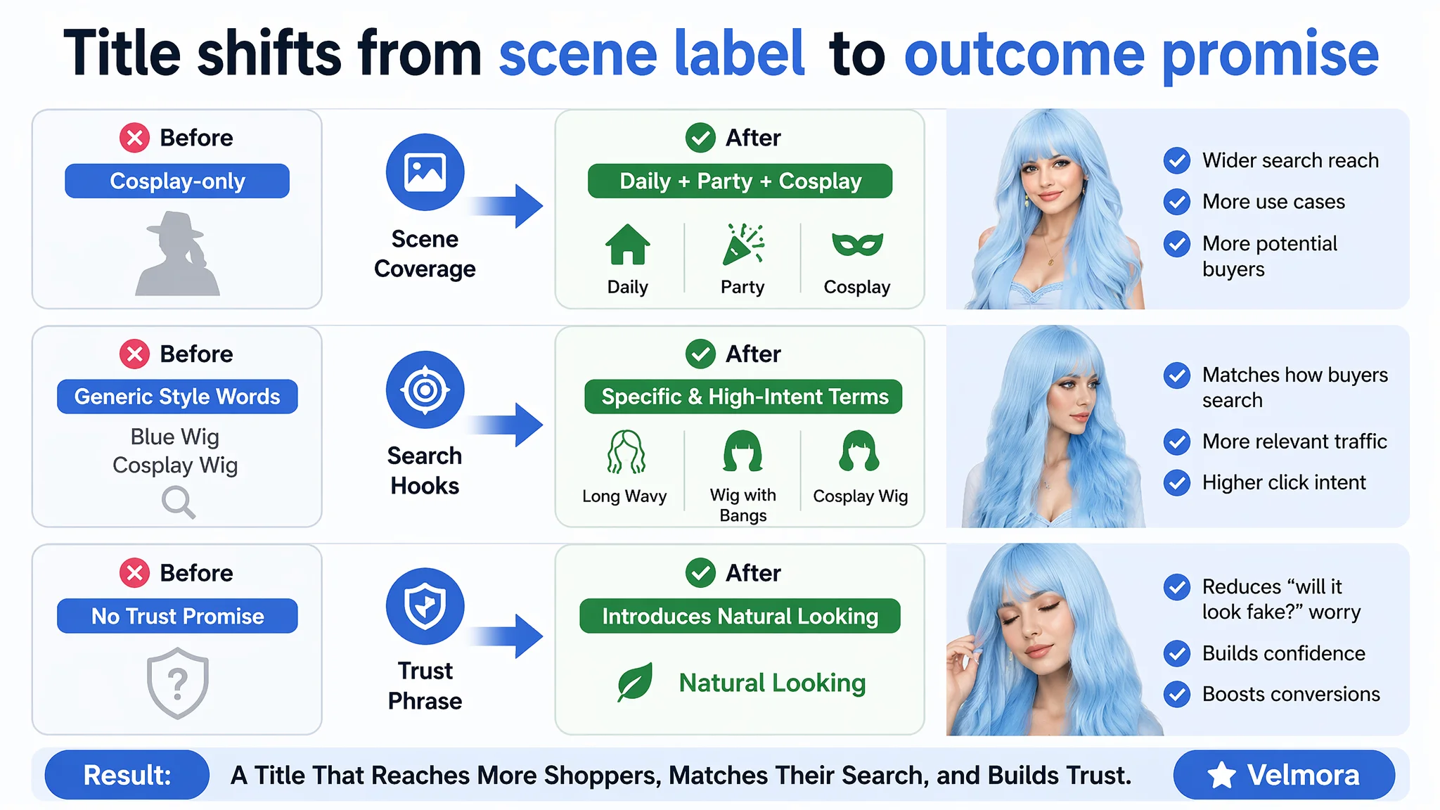
DeepBI’s recommended title reframed the Listing:
26 Inch Blue Wig with Bangs for Women, Long Wavy Synthetic Cosplay Wig, Natural Looking Heat Resistant Fiber Wigs for Daily Party Use
This does three things:
- Broadens scenes: Daily + Party + Cosplay, making the Listing eligible for more relevant searches.
- Injects trust: “Natural Looking” to reduce the perceived risk of a synthetic wig.
- Aligns with Amazon’s A9 logic: Keeps core keywords like “Blue Wig,” “Wig with Bangs,” “Cosplay Wig,” while improving readability.
The decision logic: if the title doesn’t clearly promise an outcome and trust, Amazon ads can only bring clicks, not conversions.
This Product Page Did Not Lack Traffic. It Lacked Trust.
The main image was not just a visual issue. It failed to create a reason to click and to stay.
On Amazon, the main image is responsible for two things: earning the click, and setting expectations so buyers are not surprised on the detail page.
DeepBI’s visual analysis found several structural problems:
1. Overly atmospheric first image
The first image led with a strong “mood” scene—heavy AI-composed background, strong atmosphere, weaker product clarity.
- Good for attracting curiosity.
- Bad for setting a clear, truthful expectation of the actual wig.
Buyers needed to swipe to image #2 to understand what the wig really looked like, which risked shorter dwell time and lower conversion.
1. Obvious text error on image #4
The image text said “PINK WIG” while the product was clearly blue.
- This kind of mismatch immediately damages perceived professionalism.
- It invites negative reviews like “I received the wrong color” and erodes Amazon’s algorithmic trust (A9).
1. Missing internal structure visualization
The benchmark listing dedicated an image to:
- Adjustable straps
- Breathable rose net
- Internal cap structure
This answered a critical wig decision question: “Will it fit and be comfortable?” The target Listing only used icon-like labels such as “Full and Bouncy,” with no real visual proof of the internal cap. In a category where comfort and secure fit directly affect high-price conversions, this gap is decisive.
1. Unstructured color and scene representation
The Listing attempted to address color differences and scenes, but the layout was visually noisy. By contrast, the competitor used clean comparisons and multi-color presentation to set clear expectations.
“Advertising does not only amplify advantages. It can also amplify a page’s existing defects.”
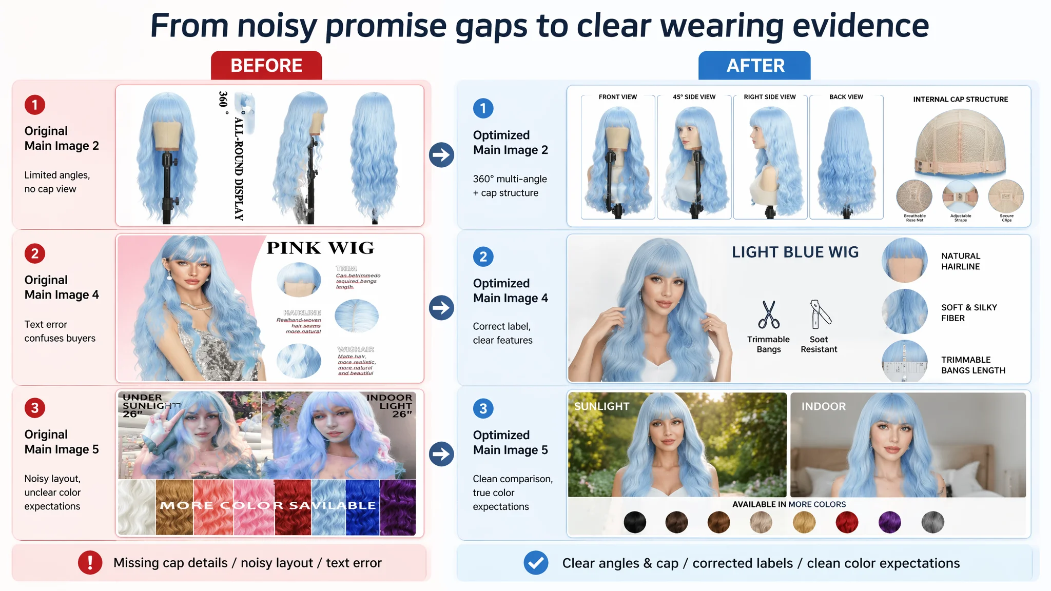
DeepBI recommended a complete restructuring of the image set:
- Main image:
- Real model centered, ~70% of frame
- Clean home interior background
- Natural, front-facing angle
- Simple “Premium Synthetic Wig” text tag
→ Less “AI art”, more trustworthy Amazon thumbnail.
- 360° multi-angle image:
- Four-grid view: front, 45°, side, back
- Neutral lighting, white background
→ Eliminates doubts about volume, shape, and wave pattern.
- Detail zoom image:
- Side view plus three zoom circles for hairline, fiber detail, bangs length
→ Visualizes quality, not just claims it.
- Corrected text image:
- Fix “PINK WIG” to “LIGHT BLUE WIG”
- Focus on bangs coverage and hair fullness
→ Aligns expectations, prevents complaints.
- Color and lighting comparison:
- “Sunlight” vs “Indoor” effects
- Additional color dots with “Available in More Colors”
→ Reduces color surprise and opens cross-variant purchasing.
The logic: before worrying about ad CTR, the main image set had to rebuild trust and clarity. Only then would clicks turn into real buyers.
Bullet Points Had Information, but Not a Buying Logic
The bullet points started from “functions,” while buyers cared about “results.”
DeepBI’s comparison showed a clear strategy difference:
- The benchmark bullet points:
- Started with desired results: becoming the focus, achieving a perfect look.
- Built a wearing experience chain: easy to use → comfortable → secure.
- Framed content as problem-solving: no styling hassle, no slipping.
- The target Listing:
- Led with features and operations: DIY bangs, trimming instructions.
- Mixed in warnings and after-sales terms.
- Lacked a coherent path from “why this wig” to “how it solves your problem.”
The result: the Listing read more like a manual and less like a persuasive path.
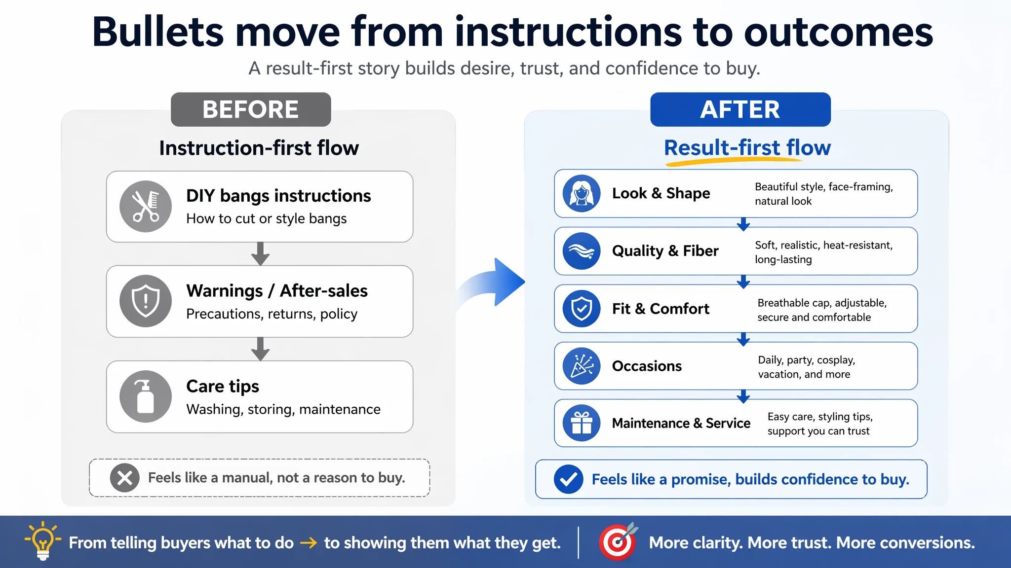
DeepBI restructured the bullet logic around five anchors:
1. Versatile DIY Bangs & Wavy Style
- Emphasized face-framing and slimming effect.
- Preserved the seller’s unique DIY bangs advantage but reframed it as styling freedom, not just a functional instruction.
1. Premium Heat-Resistant Fiber
- Combined both sides’ strengths:
- Soft, silky, tangle-resistant
- Fluffy yet natural density
- Long-lasting curls
- Upgraded the perceived quality without inventing new attributes.
1. Breathable Rose Net & Adjustable Fit
- Added critical internal structure info (rose net, adjustable straps) that was missing on the original Listing.
- Directly addressed size and comfort doubts.
1. Perfect for Every Occasion
- Integrated usage scenes into a clean rhythm: daily, work, Halloween, theme parties, weddings, dating, cosplay, concerts, travel.
- Positioning the wig as a quick transformation tool, not only a cosplay prop.
1. Natural Look & Easy Maintenance
- Turned a potential weakness (“shedding explanation”) into guidance: shake, lightly comb, easy maintenance.
- Affirmed commitment to quality and service without defensive wording.
Overall, the new bullet structure moved from:
“Here are features and precautions”
to:
“Here is the look you get, how it feels, where you can use it, and how easily you can keep it that way.”
This shift is exactly what listing conversion requires before ad spend can scale safely.
This Detail Page Did Not Lack Content. It Lacked a Coherent Story.
The A+ content modules were busy, but not aligned with decision logic.
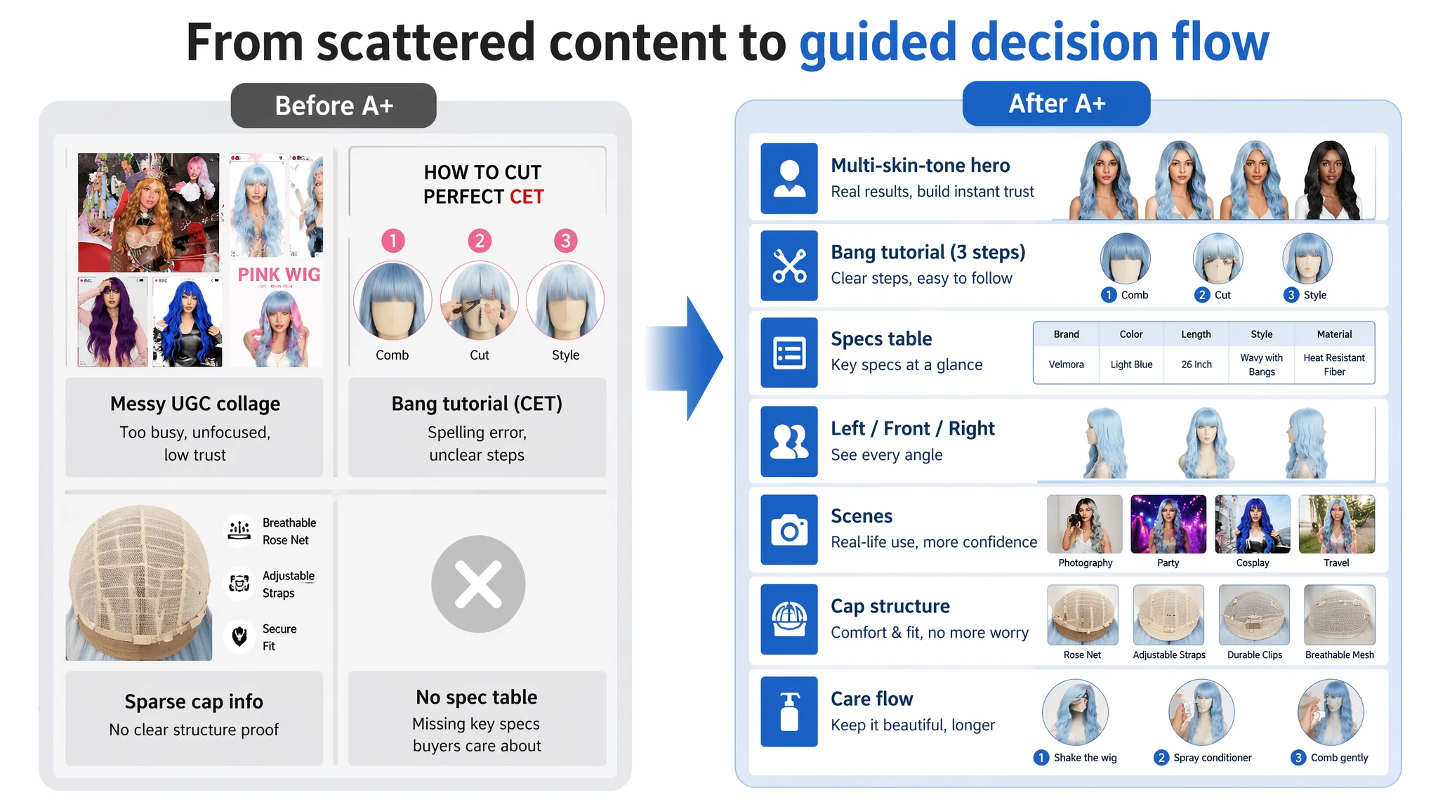
The seller had invested in A+ content: buyer photos, bang-cut tutorials, cap structure details, multi-device displays, and color difference explanations. On the surface, the detail page was not empty.
However, DeepBI’s benchmarking revealed structural weaknesses:
- Fragmented buyer collages
- Real but visually messy.
- Non-unified backgrounds and “tape-like” decorations diluted brand professionalism.
- Product was not clearly centered, making the wig itself less of the hero.
- Tutorial with spelling error (“CET” instead of “GET”)
- Small, but damaging in a trust-sensitive category.
- Suggested lack of attention to detail.
- Missing parameter specs
- No clear block listing brand, color, length, style, material.
- Forced users to infer or scroll around, increasing friction.
- Limited multi-angle evidence
- No clean, structured LEFT/FRONT/RIGHT module.
- In a wig category, 3D perception is critical for buyers to judge volume and shape.
- Weak scene-driven storytelling
- Scant visual anchoring for key usage scenarios like cosplay, travel, or party.
- No “this could be you” narrative to drive emotional buy-in.
- Underdeveloped internal structure and care logic
- Existing net images lacked clarity and visual hierarchy.
- No structured care guide to reassure users about long-term maintenance.
By comparison, the benchmark A+:
- Opened with a unified brand visual and 360° views.
- Showed packaging and manuals, setting expectations for unboxing and completeness.
- Used “social proof style” UGC panels resembling Instagram posts, creating social validation and community feel.
The gap was not “content vs no content.” It was coherent, professional storytelling vs. scattered information.
Before Ads Could Work Again, the Page Had to Convert
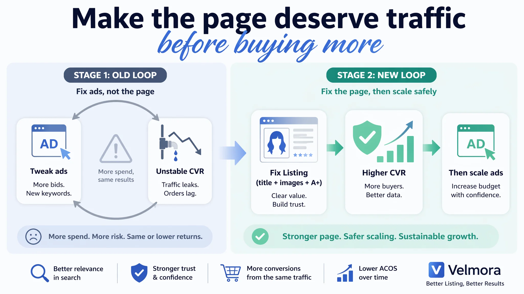
DeepBI’s recommendation was clear: fix Listing conversion capacity first, then scale ads. The risk of doing the opposite was obvious—ads would simply magnify existing leaks.
How the detail page logic was rebuilt
Key A+ module changes focused on restoring a structured decision flow:
1. Multi-skin-tone wearing collage
- Replacing the chaotic buyer collage with a structured layout: one large model image + three smaller images with different skin tones.
- Unified background and lighting to raise perceived brand level.
- Expanded the audience by helping more buyers see themselves in the product.
1. Clean, corrected bang tutorial
- Title corrected to “HOW TO GET PERFECT BANGS.”
- Linear three-step visual: comb → trim → style.
- Simple, scannable, aligned with how people consume tutorials on Amazon.
1. Parameter spec module
- Side-by-side: model image + specification table (Brand, Color, Length, Style, Material).
- Gave buyers a quick, reliable snapshot, reducing pre-purchase questions and hesitation.
1. Three-angle display (LEFT, FRONT, RIGHT)
- Equal-weight triple grid showing the wig from three angles in consistent lighting.
- Highlighted wave pattern, volume, and fall, reinforcing quality.
1. Scene adaptation module
- Four-grid collage: Photography, Party, Cosplay, Travel.
- Each scene labeled and visually distinct but style-consistent.
- Positioned the wig as a versatile lifestyle accessory, not just a niche item.
1. Cap structure dissection
- Central cap image with four callouts: ROSE NET, DURABLE CLIPS, ADJUSTABLE STRAPS, BREATHABLE MESH.
- Answered “Will it stay on?” and “Will it feel hot?” visually and concretely.
1. Care process module
- Simple three-step care flow: Shake the wig → Spray conditioner → Comb gently.
- Turned a potential objection (“synthetic hair tangles”) into an empowerment story: “Here’s how to keep it beautiful.”
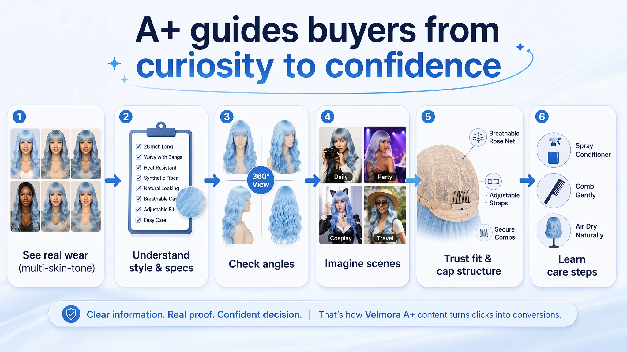
Taken together, these moves transformed the detail page from a collection of information into a guided decision journey: see real use → understand style and specs → trust fit and comfort → imagine your scenes → know how to care.
Why DeepBI Did Not Keep Tuning the Ads First
From a business perspective, DeepBI’s choice to prioritize Listing repair over further ad tuning rested on three core judgments:
1. Advertising was already doing its basic job.
Impressions existed; the Listing had reviews and a base of purchasers. The bottleneck was not reach but conversion.
1. The largest gap versus the benchmark was content logic, not traffic volume.
Title, bullet points, and A+ structure lagged by clear, measurable margins. Fixing these increased the probability that every future click would have a better chance to convert.
1. Continuing to optimize ads would amplify a structurally weak page.
That would push ACOS higher without reducing business risk, putting the seller into a dependency spiral: more spend, same or unstable outcomes.
By reordering priorities, DeepBI effectively said:
“Until the page deserves more traffic, we don’t scale traffic.”
Only after the title widened its reach, the main images clarified expectations, the bullets told a coherent result-focused story, and A+ content rebuilt trust, would it make sense to reconsider ad scaling or keyword expansion.
How the Operating State Changed
This case is not about claiming dramatic percentage jumps; the seller’s data journey is still ongoing. What did change, however, was the operating state and risk structure:
- Listing conversion capacity strengthened
The page evolved from “information-heavy but incoherent” to “structured, trust-building, and outcome-oriented.”
- Ad traffic quality improved in effect, not in input
The same or similar level of Amazon ad traffic now landed on a more persuasive product page, increasing the odds that clicks turned into sales.
- Organic opportunity widened
The revised title and scenes allowed the Listing to compete in more daily and party contexts, reducing overreliance on cosplay-only keywords and ads.
- Review leverage increased
The seller’s higher review count vs. the benchmark could now be better supported by professional visuals and structured A+ content, making those reviews more impactful.
- Operational anxiety decreased
Instead of constantly tweaking bids and keywords, the team gained a clearer decision rule:
- Fix page-level trust gaps first,
- Use data to confirm improved CVR,
- Then scale ads from a more stable base.
What Other Amazon Sellers Can Take from This Case
For many Amazon sellers, especially in high-decision-cost categories like wigs, electronics, or beauty, this case should feel familiar:
- ACOS feels stubborn.
- Ads seem “expensive.”
- The instinct is to adjust campaigns again.
This blue wig Listing shows another reality:
- The seller’s title was too narrow and incomplete.
- The main images mixed strong atmosphere with weak product clarity—and even a color text error.
- Bullet points read like instructions, not a buying story.
- The A+ page was busy but not coherent.
Once DeepBI reframed the problem from “ad inefficiency” to “Listing conversion leak,” the optimization path changed:
- From: More keywords, higher bids, new campaigns.
- To: Wider scenes, stronger trust messaging, clear structure, and visualized fit & comfort.
For any Amazon seller asking why traffic is not becoming orders, this case suggests a simple diagnostic question before touching ads:
“If I were a buyer, would this page give me enough clarity, trust, and outcome promise to make the purchase feel safe?”
If the honest answer is “not yet,” then the next move is not another bid change. It is rebuilding the Listing so that every future click—organic or paid—has a real chance to become revenue.