

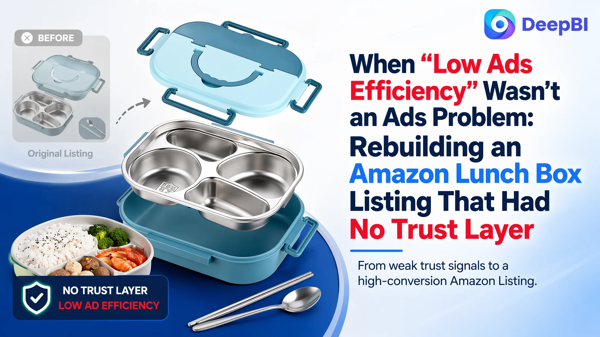
Many Amazon sellers meet this situation: ads are running, traffic is not terrible, but orders feel “stuck.” That was exactly where this stainless-steel bento lunch box seller found themselves. On the surface, the product looked decent—functional bullets, a reasonable title, and a set of images that “explained the product.” The team’s first instinct was to treat it as an Amazon ads tuning problem: adjust bids, test different keywords, maybe tweak the main image a bit and hope ACOS would come down.
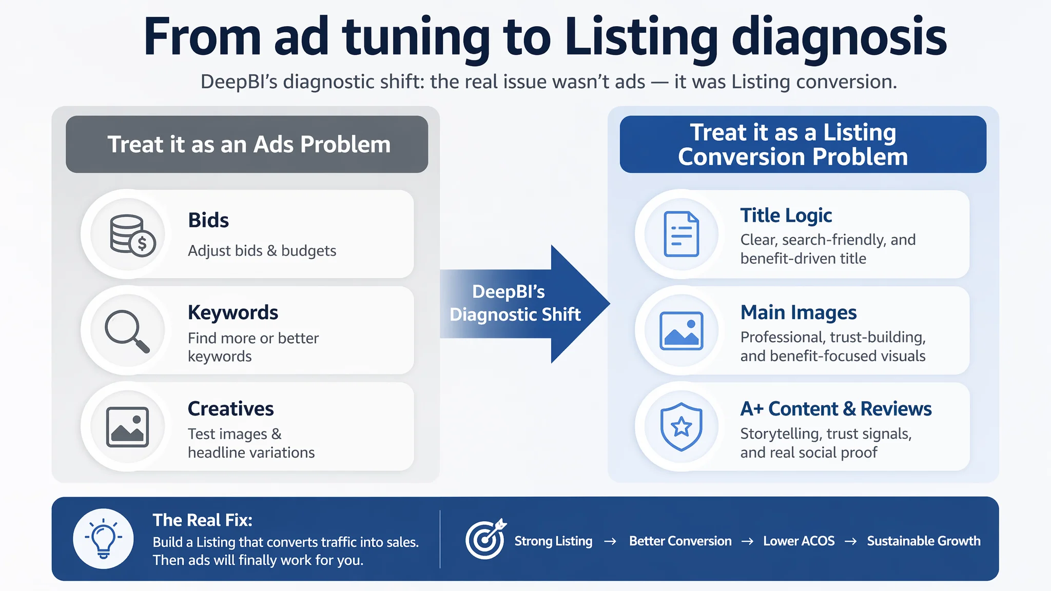
DeepBI’s diagnosis told a different story. When we scored the Amazon Listing against a category-leading stainless-steel lunch box competitor, the gap was not in basic information or functionality—it was in trust, visual professionalism, and decision support. The seller’s product page had no A+ content at all and zero reviews. Ads weren’t failing; they were being poured into a page that had almost no ability to convert cold traffic.
This case is about an Amazon Listing conversion problem masquerading as an advertising problem. Once the team stopped treating it as “bad ads” and started addressing the page’s core weaknesses—title logic, main image structure, A+ storytelling, and trust signals—the entire business picture changed. Other Amazon sellers can use this case as a mirror: if you keep tuning ads while your Listing scores 45 vs a competitor’s 79, you’re amplifying the wrong thing.
Amazon Ads Were Not Failing. The Page Was Consuming the Traffic.
The product is a stainless-steel bento / lunch box aimed at kids and adults, for school, office, and travel. The seller was pushing traffic via Amazon ads into this Listing and feeling typical pressure:
- ACOS hard to control
- Ads not scaling the way past experience suggested they should
- Organic orders barely forming because the base page could not “hold” traffic
From inside the account, it was easy to blame:
- Keyword selection: “maybe we don’t have enough long-tail terms”
- Bid strategy: “maybe our bids aren’t aggressive enough on core keywords”
- Creatives: “maybe our ad images just aren’t attractive”
The underlying assumption was: if ads were tuned, orders would follow.
DeepBI’s scoring and benchmarking process pushed the conversation away from ads and toward the Listing itself. We compared the page to a high-performing competitor in the same Amazon category and found:
- Seller Listing total score: 45/100
- Benchmark Listing total score: 79/100
- 34-point gap, mostly in the parts that build trust and guide decisions
Breaking it down:
- Title: Seller: 13, Competitor: 16, Gap: -3
- Main Image: Seller: 24, Competitor: 26, Gap: -2
- Bullet Points: Seller: 8, Competitor: 6, Gap: +2
- Detail / A+: Seller: 0, Competitor: 21, Gap: -21
- Reviews: Seller: 0, Competitor: 10, Gap: -10
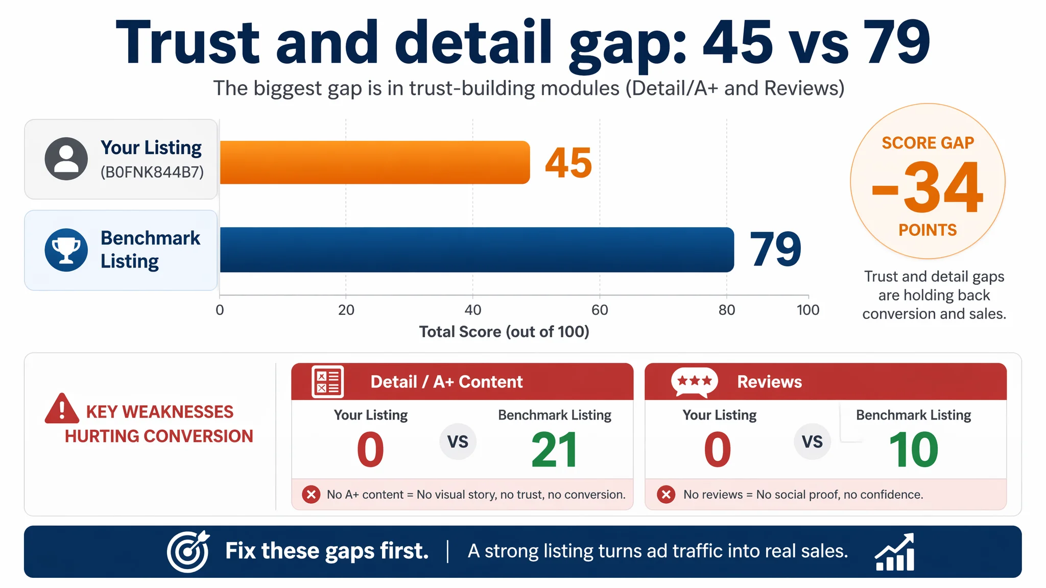
The seller’s bullets were actually slightly stronger than the competitor’s in structure, but that didn’t matter. The decisive weaknesses were:
- No A+ content at all (zero visual storytelling below the fold)
- Zero reviews (no social proof)
- A title and main image set that looked generic and underpowered compared with the benchmark
“The real problem was not that ads failed to bring traffic. It was that the page could not convert the traffic.”
As long as those gaps remained, spending more on Amazon ads would only magnify the Listing’s inability to convert.
The Real Constraint Was Listing Conversion Capacity
DeepBI’s judgment was clear: the core bottleneck was Listing conversion capacity, not ad configuration.
Several signals drove that judgment:
1. Detail / A+ score: 0 vs 21
The competitor’s Amazon product page used a full A+ stack:
- Combined product shots and brand identity
- Icon-based core benefit modules
- Usage guides and FAQs
- Multi-color variants display
- Accessory overview and comparison tables
The seller had none of this. Users landing on the page only saw the basic gallery, title, and bullet points. There was no structured narrative to answer:
- How big is it really?
- How safe is the stainless steel?
- Will it leak?
- How do I open the tight lid?
- What exactly do I get in the box?
For a lunch box, these are decision-critical questions. Without A+, the page asked visitors to assemble trust mentally from sparse information. Many would simply bounce or default to the competitor with rich visuals.
1. Reviews: 0 vs 486 (4.2 stars)
The competitor had:
- 4.2-star rating
- 486 total reviews
- A realistic mix of positive and negative feedback
The seller had no ratings and no reviews. On Amazon, especially for food containers and kitchen items, buyers heavily rely on real-user validation. Running ads into a zero-review Listing in a trust-sensitive category is inherently risky.
1. Title and image positioning lag
The seller’s title started with a generic term (“Generic”), pushed capacity to the front (“1200ml”), and scattered scenes. The competitor framed the offer like a clear solution:
- Branded “Stainless Steel Lunch Box”
- “Insulated,” “with Tableware & Bag”
- Safety and convenience tags (“Leakproof | BPA Free | Dishwasher Safe”)
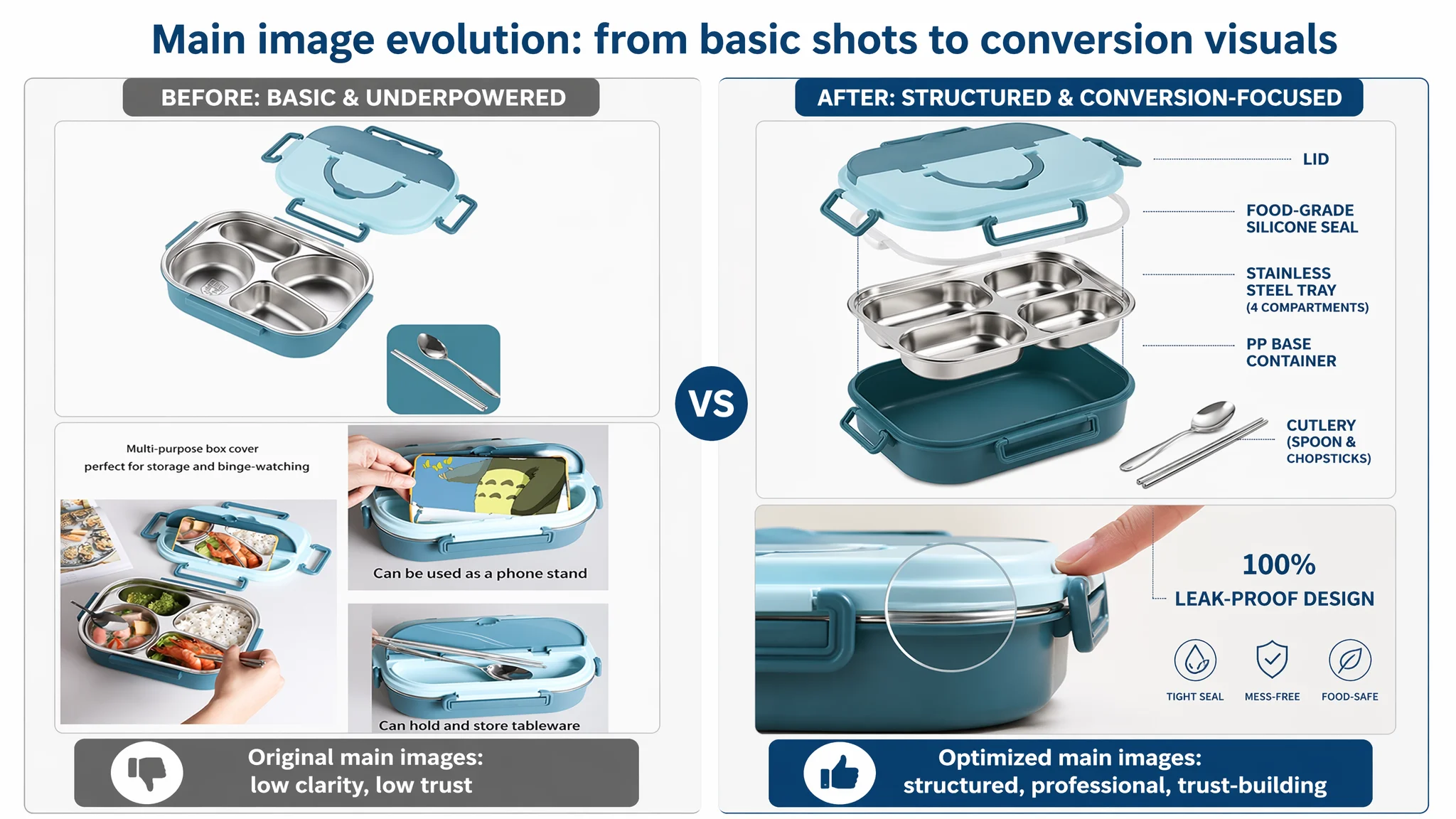
The main images showed similar functional content but lacked the competitor’s professional, component-focused visual structure and scene sophistication. The category—stainless-steel food containers—triggers safety and usability concerns. The seller’s visuals didn’t actively calm those concerns.
From a business standpoint, that meant:
- Ads were feeding a page that looked basic, unproven, and incomplete.
- Every extra dollar of traffic hit a conversion wall built out of missing trust and missing guidance.
Fixing ads without fixing this wall would only push more visitors into the same drop-off.
Why DeepBI Did Not Keep Tuning the Ads First
The key decision was about order of operations: whether to continue iterating ad campaigns or to first rebuild the Listing.
DeepBI prioritized Listing conversion for three reasons:
1. Advertising amplifies whatever the page already is
If a page has:
- No A+ content
- No reviews
- Generic title and under-structured images
then ads amplify:
- Bounce rate
- Hesitation
- The competitor’s advantage
Before scaling spend, the question must be: Does this page deserve more traffic?
1. The largest scoring gaps were in trust-bearing modules
The biggest numerical gaps (A+ and reviews) were not cosmetic; they were the modules that:
- Explain the product composition
- Make the size and capacity tangible
- Show how to operate tricky elements (like vacuum-sealed lids)
- Differentiate stainless steel vs plastic on safety
Without those, ads will attract clicks but fail to carry buyers through the decision path.
1. Bullet points were already relatively strong
Interestingly, the seller’s bullet points were not the weak link. They:
- Used a clear “function–scene–advantage” structure
- Focused on core features: leakproofing, material, portability, insulation
That freed the team from trying to overcompensate in copy. The real problem was that these bullets lived alone, unsupported by visual storytelling and trust layers.
So the decision path was:
- Step 1: Rebuild the Listing to be capable of converting traffic (title, main image cluster, A+ content).
- Step 2: Let ads work on a page that can actually close the sale.
- Step 3: Only then iterate campaigns, bids, and keyword structure.
This Product Page Did Not Lack Traffic. It Lacked Trust.
DeepBI’s diagnosis reframed the page as a trust-deficient environment for paid traffic, especially in a health- and family-related category.
Three trust gaps were critical:
1. No A+ Story: Users Had to “Guess” the Product
The competitor used A+ to turn abstract features into concrete, visual answers:
- Component clarity: full “family shot” showing the base, steel inserts, and accessories
- Capacity realism: a soda can as a size reference; clear volume labels
- Usage guidance: step-by-step lid unlocking and microwave warnings
- Material reassurance: emphasis on 304 food-grade stainless steel, BPA-free vs plastic
The seller’s Listing had zero A+ modules. Buyers had to imagine:
- How big is 1200ml in real life?
- Will this actually fit in a school bag or office scenario?
- How complicated is it to open after heating?
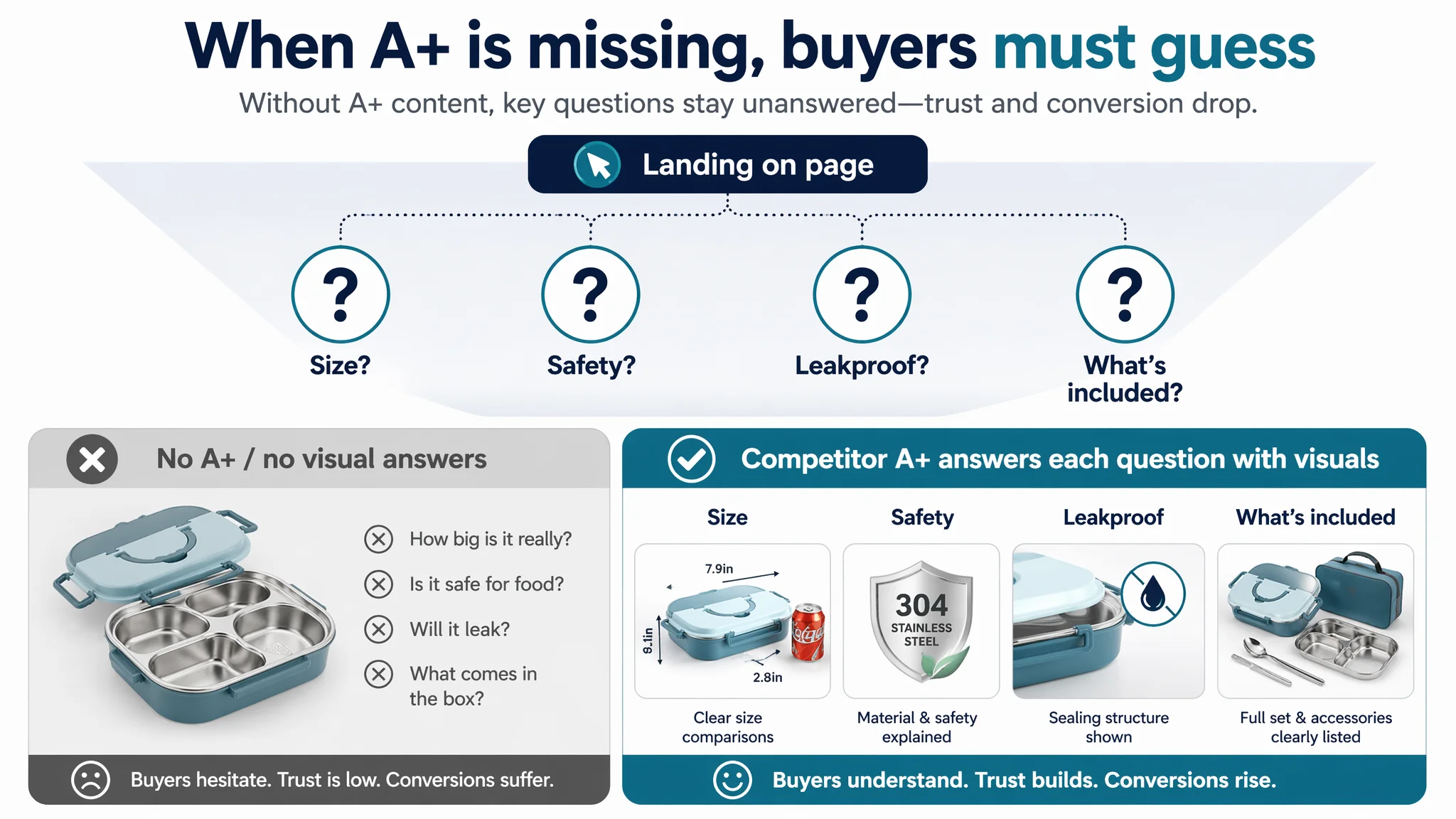
In a category where misjudged size and difficult lids generate negative reviews and returns, this silence is risky.
2. Missing Visual Evidence on Safety and Sealing
For stainless-steel lunch boxes, buyers worry about:
- Heavy metals and material safety
- Odors and residual staining
- Leakage of oils and soups
The competitor addressed these via:
- Close-up shots of seals and materials
- “Leakproof” visual modules
- Clear, reassuring copy in both bullets and A+
The seller’s visuals lacked that level of detail and focus. Trust is not built by saying “304 stainless steel” once—it’s built by showing structure, comparing with plastic, and visually clarifying why the design prevents leaks.
3. No Social Proof to Support the Claims
A zero-review Listing, even with honest copy, forces buyers to take a risk. The competitor’s hundreds of reviews—even with some negatives—signal:
- The product is real
- Many people have used it
- Issues and strengths are transparent
DeepBI’s judgment: ads into a no-review, no-A+ food container Listing create conversion risk that cannot be solved at the campaign level. The remedy had to start on the page.
How the Sales Logic Was Rebuilt: From Functional Listing to Decision Page
Once the root cause was clear, the optimization work focused on reconstructing the Listing’s sales logic, not just its aesthetics.
The Title: From Generic Label to Decision Hook
Original weaknesses:
- Starting with “Generic”
- Leading with capacity (“1200ml”) instead of the product category
- Underusing high-trust modifier terms
DeepBI’s optimization direction:
Stainless Steel Bento Box, 1200ml 4 Compartment Lunch Box for Kids & Adults, Leakproof Insulated Food Storage Container with Handle, BPA Free & Dishwasher Safe, for School, Office, and Travel
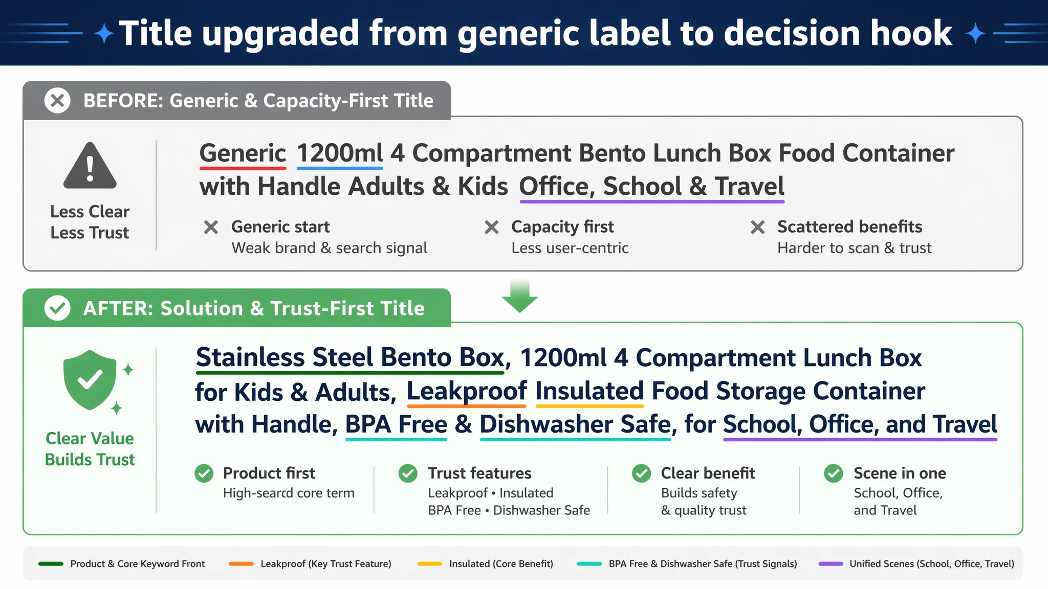
Key logic:
- Core keyword first: “Stainless Steel Bento Box” at the front, aligned with Amazon search behavior and A9 weighting.
- Capacity + structure clarified: “1200ml 4 Compartment Lunch Box” framed as a single, clear outcome.
- Trust terms embedded: “Leakproof,” “Insulated,” “BPA Free,” “Dishwasher Safe” directly address safety and convenience concerns.
- Scenes consolidated: “for School, Office, and Travel” captured key use cases without overloading.
This title isn’t just SEO; it recasts the product as a solution, bridging search intent with clear value.
The Bullet Points: Keeping Structure, Increasing Decision Power
The seller’s bullets already had a strong backbone. DeepBI’s adjustments focused on making each point more conversion-oriented:
1. Balanced nutrition and no flavor mixing
- Emphasis: Four compartments enabling portion control and diversified meals.
- Logic: Connect multi-compartment design to the buyer’s need for balanced, separated food for kids and adults.
1. Leakproof and mess-free
- Emphasis: Silicone ring and four-sided snap latches.
- Logic: Explicitly address bag placement anxiety—“won’t spill in your backpack or handbag.”
1. Material safety and durability
- Emphasis: Premium 304 stainless steel, BPA-free, odor-resistant.
- Logic: Position stainless steel as a long-term, safer alternative to plastic containers.
1. Thermal design
- Emphasis: Bottom hot-water layer for heat retention.
- Logic: All-season use—hot meals in cold weather, flexible for cold snacks.
1. Portability and ease of use
- Emphasis: Built-in handle, kid-friendly latches.
- Logic: Bridge the gap between “family product” and “practical daily carry.”
1. Cleaning and service
- Emphasis: Smooth interior, dishwasher-safe, clear service commitment.
- Logic: Reduce friction and support trust with after-sales responsiveness.
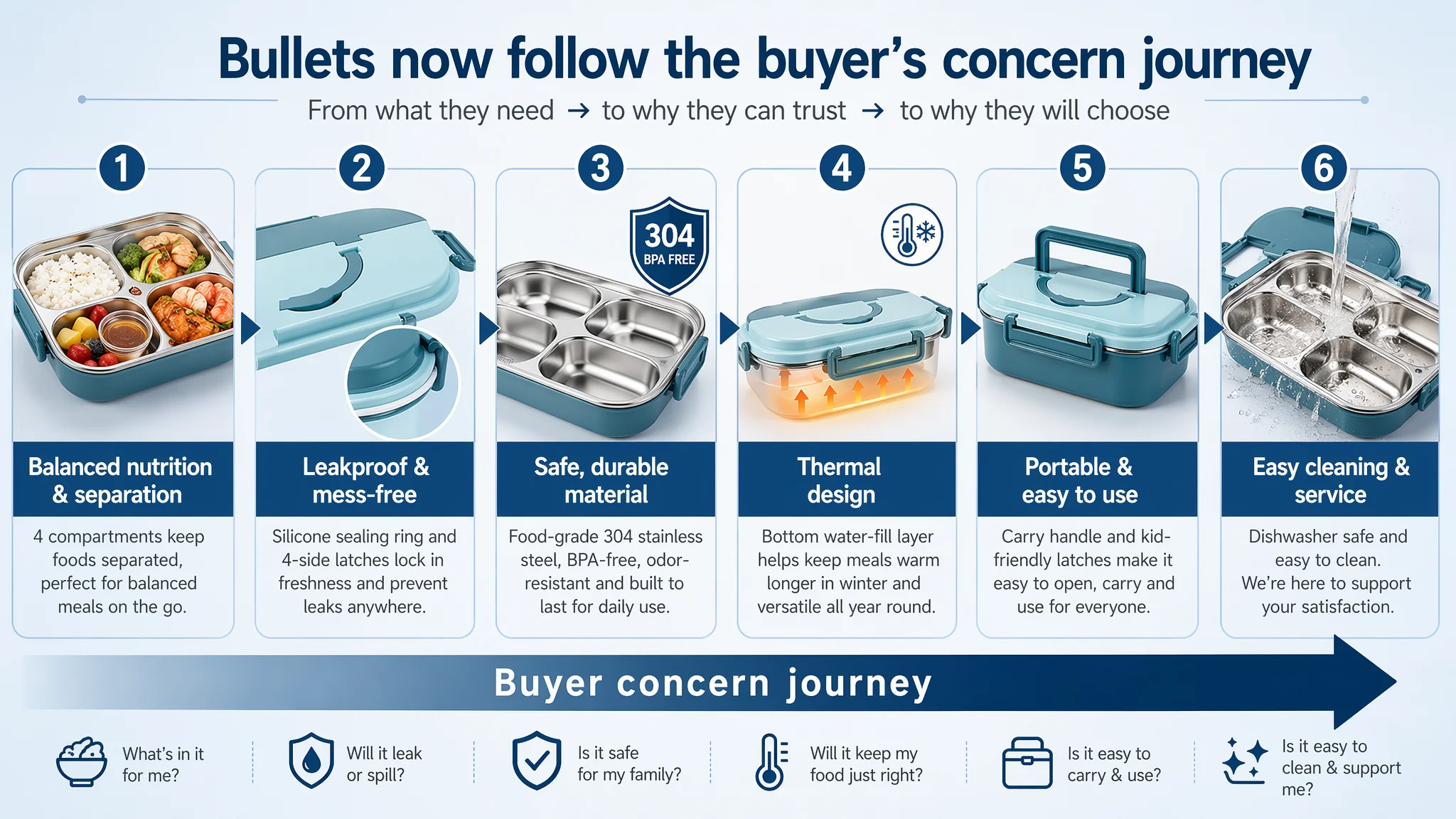
The result is a bullet structure that not only lists features but walks the buyer through their concerns in sequence.
The Main Image Set: From “Single Product Shots” to Professional Conversion Visuals
DeepBI’s main-image recommendations targeted the core job of thumbnails on Amazon: win the click and pre-build trust in 3 seconds.
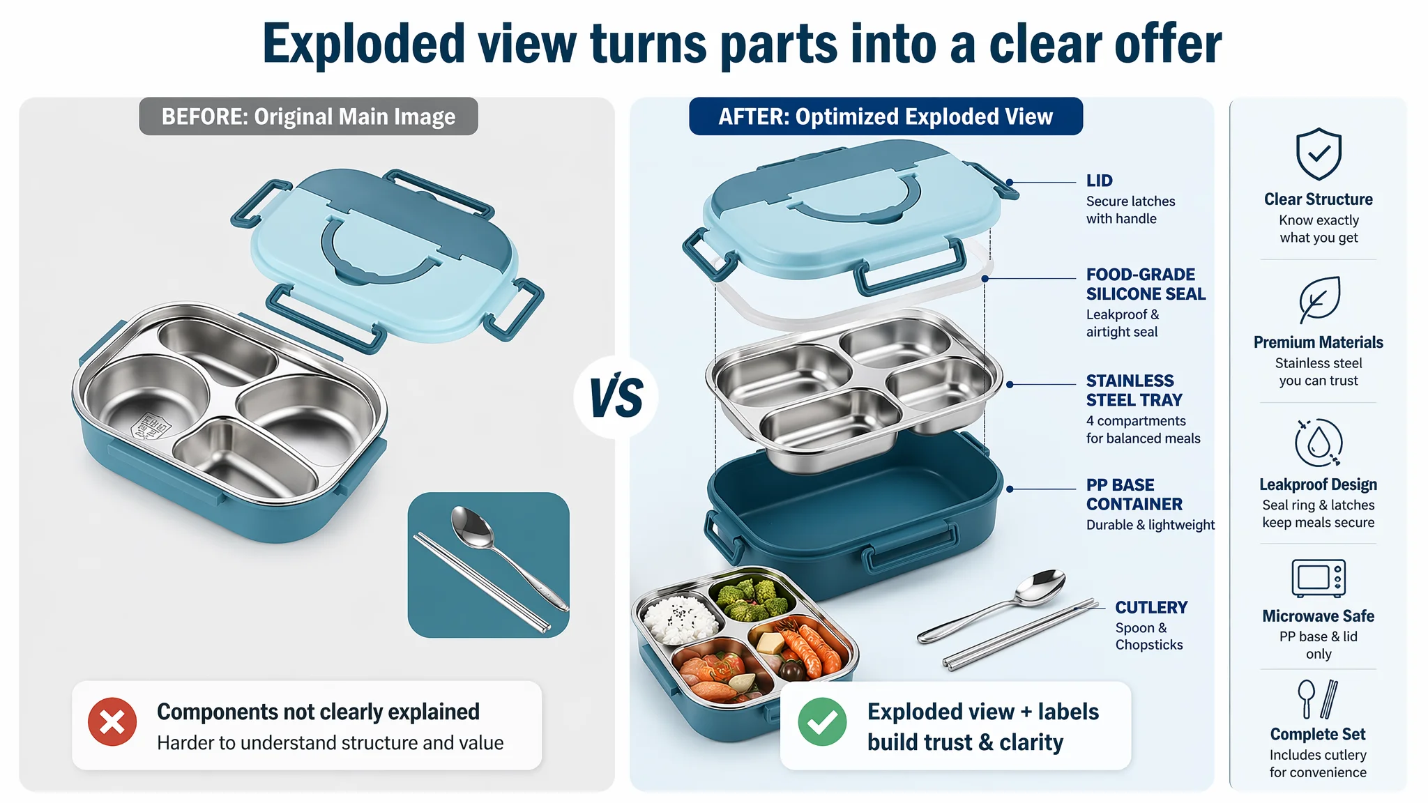
1. Exploded View: Component Clarity and Professionalism
- Centered product occupying ~75% of the frame
- 45° top-down perspective
- Exploded layout showing lid, stainless tray, PP base, and utensils
- Clean studio background
- Simple labeling of key components
This kind of image signals:
- Engineering-level clarity
- Richness of the offer (not just a single box)
- “Premium, thought-through design” instead of “basic container”
2. Scene Image: Phone Stand Function and Real Usage
One of the product’s unique functions is doubling as a phone stand. For this:
- Modern wood desk scene
- Lunch box in use with a phone playing video
- Text bubble highlighting “Hand-free Video Watching”
The logic here:
- Turning a subtle feature into a decisive lifestyle selling point
- Connecting the product with actual daily behavior (watching content while eating)
3. Vertical Exploded Layer: Seal and Material Focus
- Pure white background
- Vertically separated layers: lid, silicone ring, steel interior, base
- Fine grey connector lines
- Clear label on “Food-grade Silicone Seal”
This addresses:
- Leakage concerns visually
- “How is this box really constructed?” in a glance
4. Heating/Microwave Context
Even if the product has specific heating rules, visually showing warmth and heating context (where appropriate and truthful):
- Kitchen-appliance background (blurred)
- Warm light simulating microwave interior
- Controlled steam effect
- “Microwave Safe” callout (only if fully accurate for the product configuration)
The intent is to make the heating capability emotionally credible, not just textually stated.
5. Leakproof Close-Up
- Close-up of latch and seal
- Finger pressing to show sealing action
- Magnifying glass effect revealing the seal detail
- Clear “100% Leak-proof Design” annotation
For buyers who have had bad experiences with leaking lunch boxes, this is a visual answer to a painful memory.
“Advertising does not only amplify advantages. It can also amplify a page’s existing defects.”
These images collectively turn the page from “metal box with some text” into a professionally-presented solution, which is what paid traffic needs.
A+ Content: Turning Questions into Visual Answers
DeepBI’s A+ recommendations focused heavily on removing decision friction and uncertainty. Key modules:
1. Full Set / Component Overview
- White background
- All components laid out: base, steel inserts, utensils, bag
- Clear capacity labels next to each insert
Outcome:
- Buyers instantly understand what they’re buying
- Reduced expectations gap about capacity and included accessories
2. Size Reference with Common Object
- Product next to a standard 330ml soda can
- Clear length, width, height dimensions
Outcome:
- Resolves “looks bigger/smaller than expected” risk
- Cuts down on returns due to misperceived size
3. Seal Structure Focus
- Side-cut or macro shot of seal area
- “Leakproof Seal Ring” label
Outcome:
- Visual assurance about leak performance
- Aligns with bullet claims and main image messages
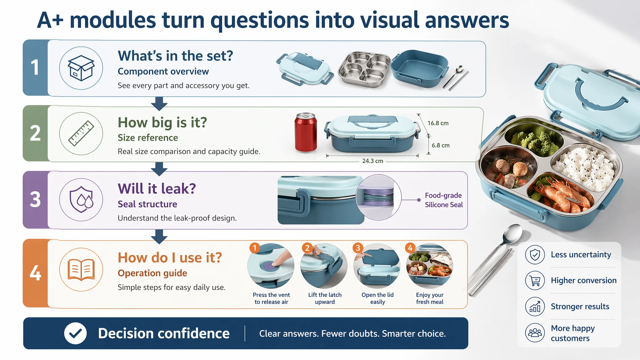
4. Operation Guide: Lid Opening
- Step-by-step visuals with text
- Hand pressing the vent valve
- Arrows indicating airflow
Outcome:
- Directly tackles “hard to open when hot” complaints common in this category
- Reduces potential negative reviews due to user misunderstanding
5. Scene Usage: School / Office
- Warm, realistic lunch scene
- Product in use with sandwiches, salads, fruits
- Background hints of books or office items
Outcome:
- Helps buyers imagine the product in their own routine
- Connects functional details with emotional use
6. Accessory Checklist
- Top-down matrix layout of all items
- Clear “You will receive” labeling
Outcome:
- Reinforces value perception
- Reduces surprises and confusion post-purchase
7. Material Trust Comparison: Stainless vs Plastic
- Side-by-side visual: stainless interior vs distorted plastic container
- “304 Food Grade Stainless Steel” vs “BPA/Odors”
Outcome:
- Positions the product as the safer, more durable choice
- Answers the unasked question: “Why not just buy a cheap plastic lunch box?”
With these modules, the product page becomes a guided decision journey instead of a static information dump.
How Ad Traffic Became Useful Again
Once the Listing’s conversion foundation was rebuilt, the relationship between ads and the product page changed.
Even without inventing specific performance numbers, several operating shifts are clear:
- CVR pressure eased: Better title, professional visuals, and a full A+ story reduced the “trust drop” between click and purchase.
- ACOS became more controllable: When the page converts more effectively, each click has a higher chance of turning into a sale, allowing bids to be sustained or even raised strategically.
- Organic traffic gained a foothold: A stronger Listing supports:
- Better keyword relevance (via title and on-page content)
- Higher likelihood of reviews over time
- A more stable base for ranking and organic orders
- Advertising dependence became less risky: Ads were now feeding a page that pulled its weight. Scaling traffic became a rational business decision, not a gamble.
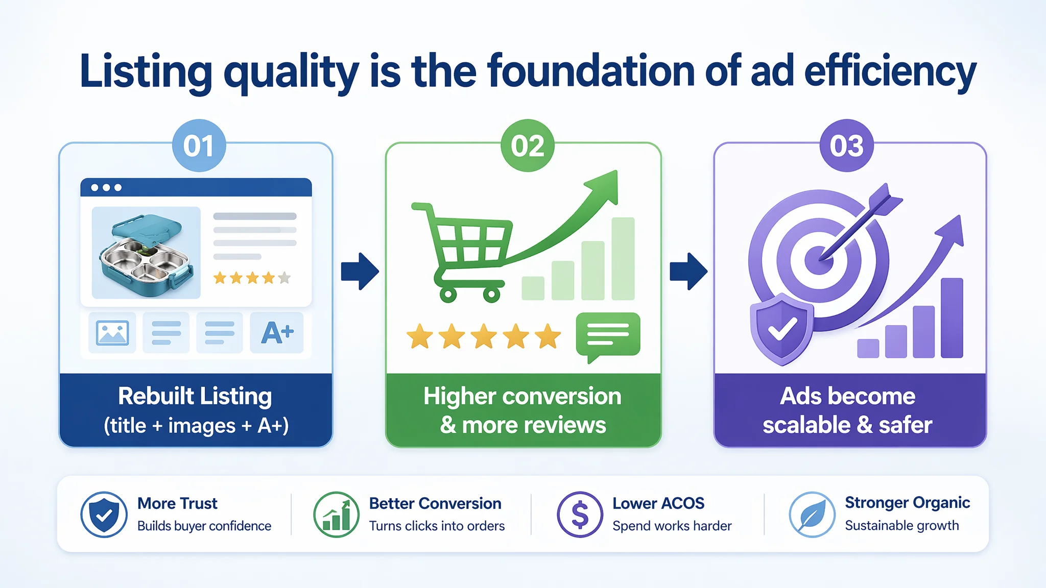
The real change wasn’t only in metrics; it was in understanding:
- The seller stopped treating Amazon ads as the primary lever for a weak page.
- They began to see Listing quality as the foundation of ad efficiency, not an optional cosmetic layer.
What Other Amazon Sellers Can Take from This Case
This lunch box Listing is a typical Amazon situation, not an exception. The learnings apply far beyond stainless-steel food containers:
1. Check your Listing score before blaming your ads.
If your page is a 45 against a competitor’s 79, ads will reflect that gap, not fix it.
1. Respect trust-bearing modules.
No A+ and no reviews in a trust-sensitive category mean ads are being sent into a low-conversion environment.
1. Title, main images, bullets, and A+ must work as one logic.
Bullet points alone cannot carry conversion. They need visual confirmation and structured storytelling.
1. Ads amplify whatever is on the page.
If your page is weak in trust, guidance, and differentiation, ads amplify those weaknesses. If your page is strong, ads amplify that strength.
1. Before scaling ads, ask: “Does this page deserve more traffic?”
If the honest answer is no, the first optimization budget belongs to the Listing, not the campaigns.
DeepBI’s role in this case was not to supply more ad tactics. It was to see that the Amazon product page itself could not convert the traffic it already had, and to help the seller rebuild the Listing so that ads—current and future—finally had a chance to work.