

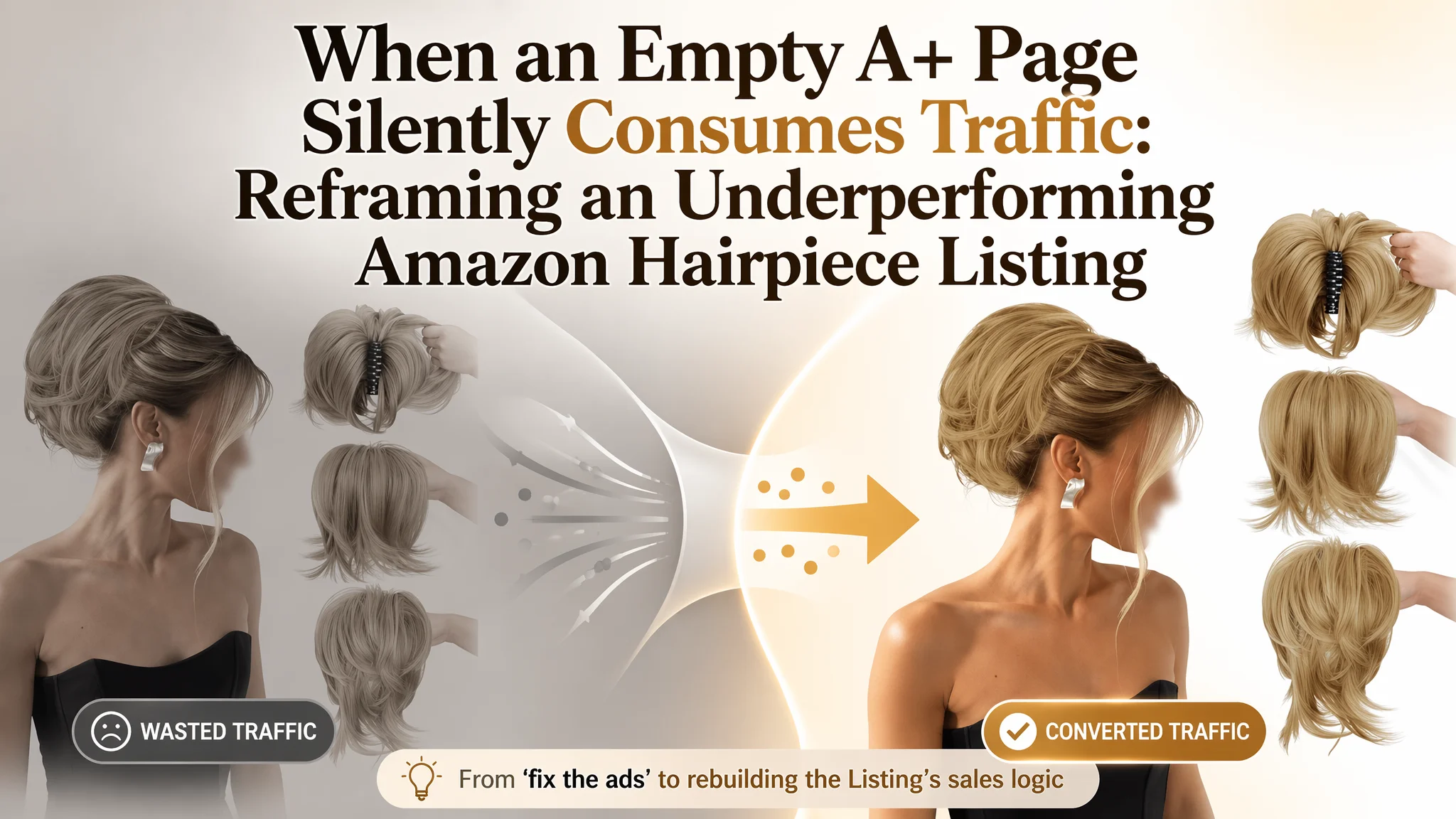
Many Amazon sellers first feel the pressure from their ad dashboard: ACOS drifts up, clicks look decent, but orders refuse to follow. That’s exactly where this hairpiece seller in the US marketplace thought the problem was—a “traffic and ads” issue. They kept tuning campaigns, expecting better performance, while their real bottleneck sat quietly on the Amazon product page itself.
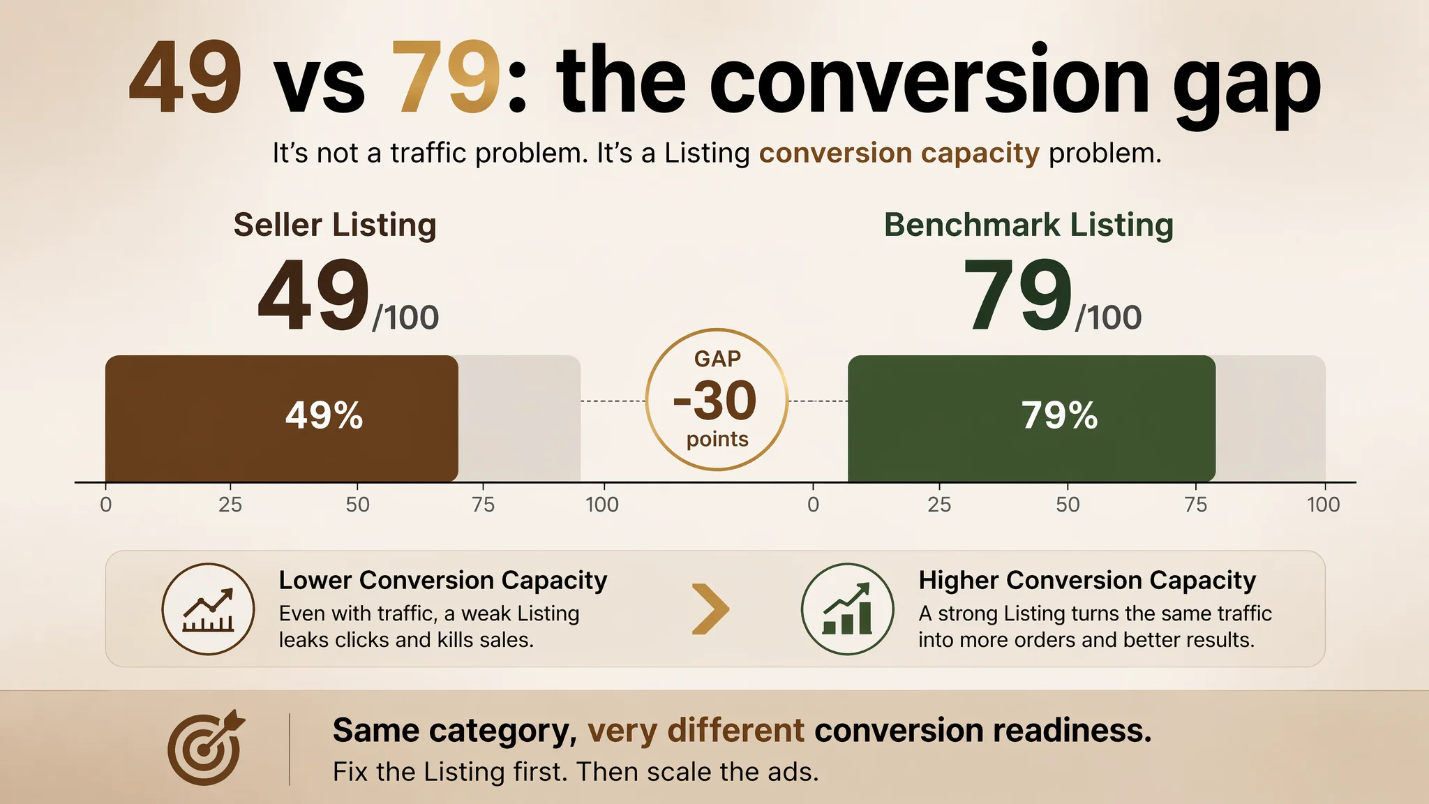
DeepBI’s diagnosis showed something uncomfortable but clear: this Listing was not short of impressions; it was short of conversion capacity. Against a strong benchmark in the same hairpiece category, the seller’s Listing scored 49/100 versus the competitor’s 79/100. The core leak wasn’t in the title or main image—it was a near‑blank A+ section and incomplete trust structure. Ads were feeding traffic into a page that barely knew how to sell.
Once the problem was reframed from “fix the ads” to “repair the Listing’s sales logic,” the optimization path changed. The work focused on redesigning the visual story (main images and A+ content), tightening the title around the core search intent, and rebuilding bullet points into clear problem–solution benefits. As the product page started to look and read like a credible, fashion‑driven hair accessory rather than a technical “fake hair clip,” ad traffic became useful again.
For other Amazon sellers, this case is a reminder: when a Listing structurally cannot convert, pushing more traffic into it only amplifies the leak. Before scaling Amazon ads, it’s critical to judge whether the product page can actually carry the load—especially in visually driven categories like beauty and hair accessories.
The Seller’s View: Ads Looked Weak, But the Page Was the Real Constraint
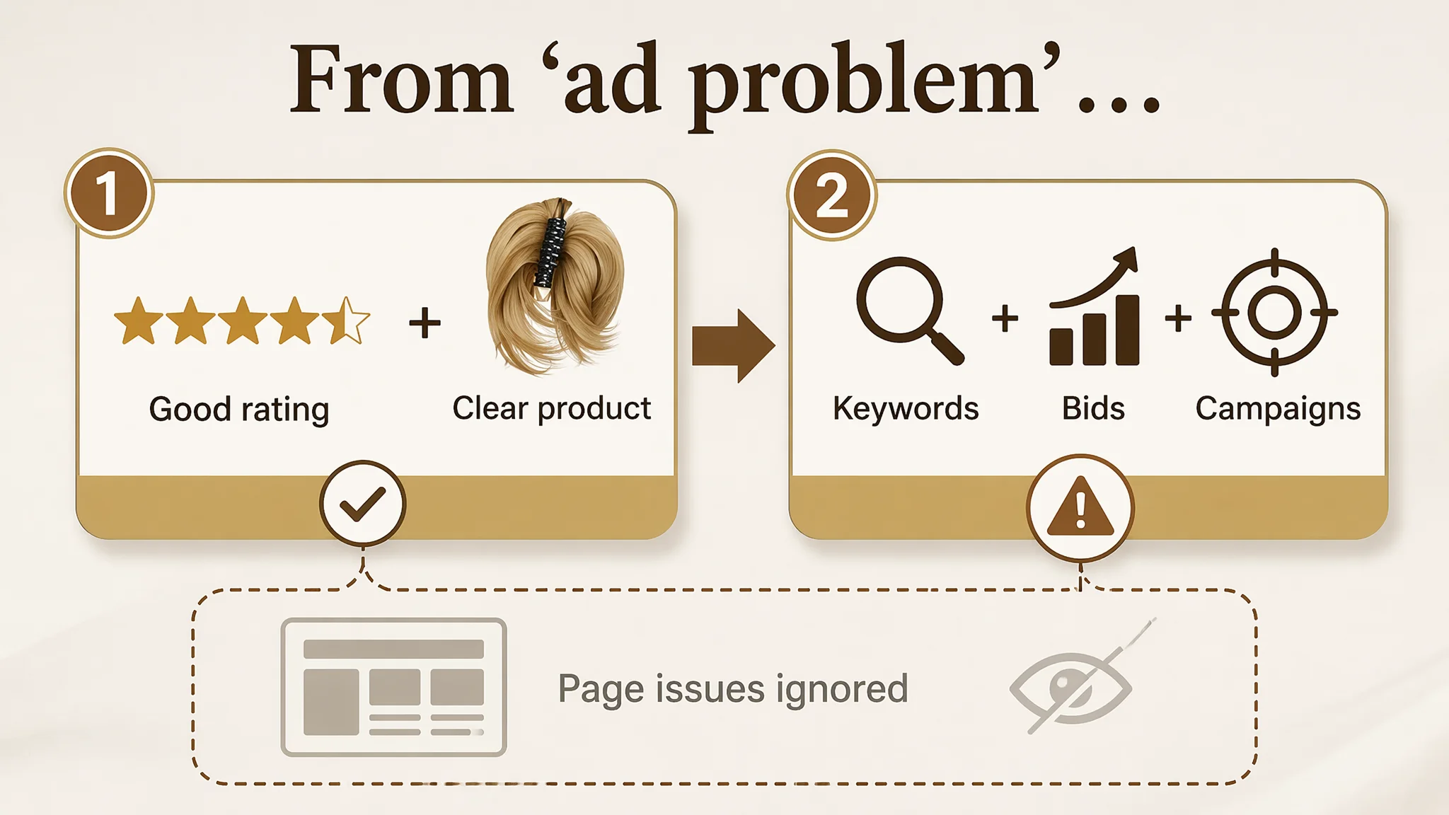
On the surface, this hairpiece Listing seemed “okay”:
- Star rating: 4.4, slightly higher than the competitor’s 4.2
- Core product: a claw‑clip short ponytail / messy bun hairpiece with bendable wires and a 7‑tooth clip
- Ads: enough impressions to see meaningful traffic
From the seller’s perspective, the logic was straightforward:
If rating is good and the product solves clear hair styling pain points, then poor orders must be an advertising problem—keywords, bids, campaign structure.
They tried to address performance through the usual levers: tune bids, adjust keywords, refine targeting. But the productivity of each ad dollar kept resisting improvement. DeepBI’s scoring made the gap visible:
- Seller Listing total score: 49/100
- Benchmark Listing total score: 79/100
- Gap: −30 points
Drilling down by dimension:
- Title: Seller: 11, Benchmark: 13, Full score: 20, Gap: -2
- Main Image: Seller: 25, Benchmark: 26, Full score: 30, Gap: -1
- Bullet Points: Seller: 7, Benchmark: 8, Full score: 10, Gap: -1
- Detail / A+: Seller: 0, Benchmark: 23, Full score: 25, Gap: -23
- Reviews: Seller: 6, Benchmark: 9, Full score: 15, Gap: -3
The numbers made one thing clear: this Amazon product page didn’t primarily suffer from weak ads; it suffered from a missing conversion engine.
“The real problem was not that ads failed to bring traffic. It was that the page could not convert the traffic.”
Amazon Ads Were Not Failing. The Page Was Consuming the Traffic.
An Almost Empty A+ Zone in a Visual Category
The most critical finding was brutal: the seller had no A+ content at all, while the benchmark had a fully built visual journey:
- Main A+ banner with clear brand tone (“One Clip Infinite Looks”‑style promise)
- Product detail visuals (claw clip, fibers, bendable metals)
- Multi‑style demonstrations
- 4‑step installation guide
- DIY styling tutorial
- Real model shots in multiple scenarios
- Multi‑shade color cards and color‑difference explanation
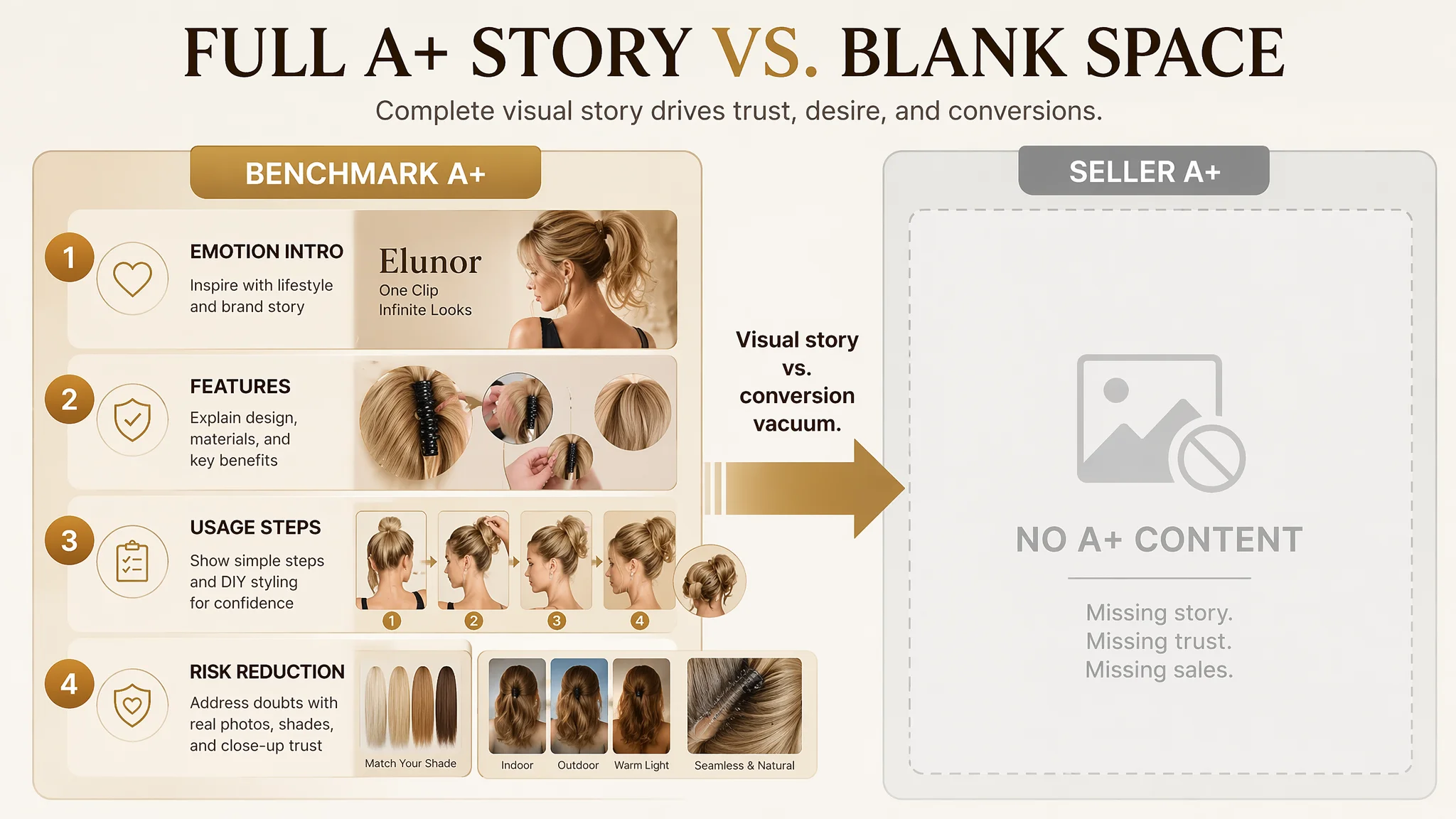
DeepBI’s judgment: in hair accessories—where buyers are choosing a “how I look” solution, not a technical part—having no A+ content is effectively a conversion vacuum.
The benchmark does four things systematically in A+:
1. Introduces the product emotionally (fashion, lifestyle, “infinite looks”)
2. Explains the mechanism and features (7‑tooth clip, layered fibers, bendable wires)
3. Shows usage and styling steps (simple installation, DIY variants)
4. Reduces risk and doubts (color differences, realistic photography, multiple models)
The seller’s Listing did almost none of this. The result: after clicking, users saw a product that “exists” but doesn’t “convince.” Ad traffic had somewhere to land, but nothing to escalate decision‑making.
A Trust Gap Masquerading as an Ad Problem
Review data reinforced this trust gap:
- Seller: 4.4 stars, 20 total reviews, 0 reviews surfaced on the first page
- Benchmark: 4.2 stars, 91 reviews, 9 visible reviews on first page, including 1 critical review
On paper, the seller’s rating looked slightly better. In practice, the benchmark’s review volume and visible content did the real work:
- More review volume → stronger social proof
- Detailed review content → addresses fit, comfort, realism
- Even a visible negative review → paradoxically increases perceived authenticity
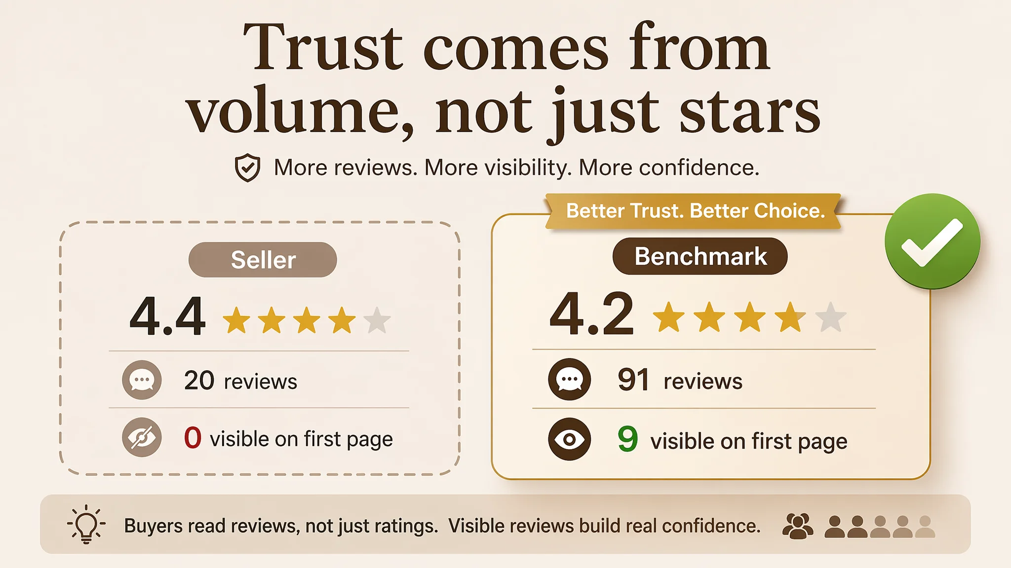
The seller Listing effectively had no visible review story. Combined with a missing A+ narrative, the page asked visitors to buy a synthetic hairpiece based on shallow information and almost no trust structures.
From DeepBI’s lens, continuing to optimize ads without fixing these page‑level constraints would only:
- Increase spend into a structurally low‑conversion environment
- Make ACOS harder to control
- Mask the real problem by blaming ads instead of the product page
The Real Constraint Was Listing Conversion Capacity, Not Title or Keywords
Title: Not Fatal, but Not Pulling Its Weight
The title gap was modest (11 vs. 13), but the structure reflected a common over‑detail mistake:
- The benchmark led with brand + core product phrase: “Claw Clip Short Ponytail Extensions”
- It front‑loaded a core functional promise: “DIY Bendable Metals”
- It kept color descriptions compact: “Mix Blonde”
The seller’s title:
- Allowed core keywords to be diluted by other descriptors
- Placed key sell points (bendable metals) mid‑stream
- Ended with an over‑specific color string:
“Ash Blonde Mix Ginger Blonde” — consuming characters at low functional value
DeepBI’s recommendation did not radically change what the product is; it re‑aligned the title around search intent and scan efficiency:
Suggested title Messy Bun Hairpiece Claw Clip Short Ponytail Extension with 4 Bendable Metals, DIY Synthetic Fluffy Hair Bun Extensions for Women, Ash Blonde Mix Ginger Blonde
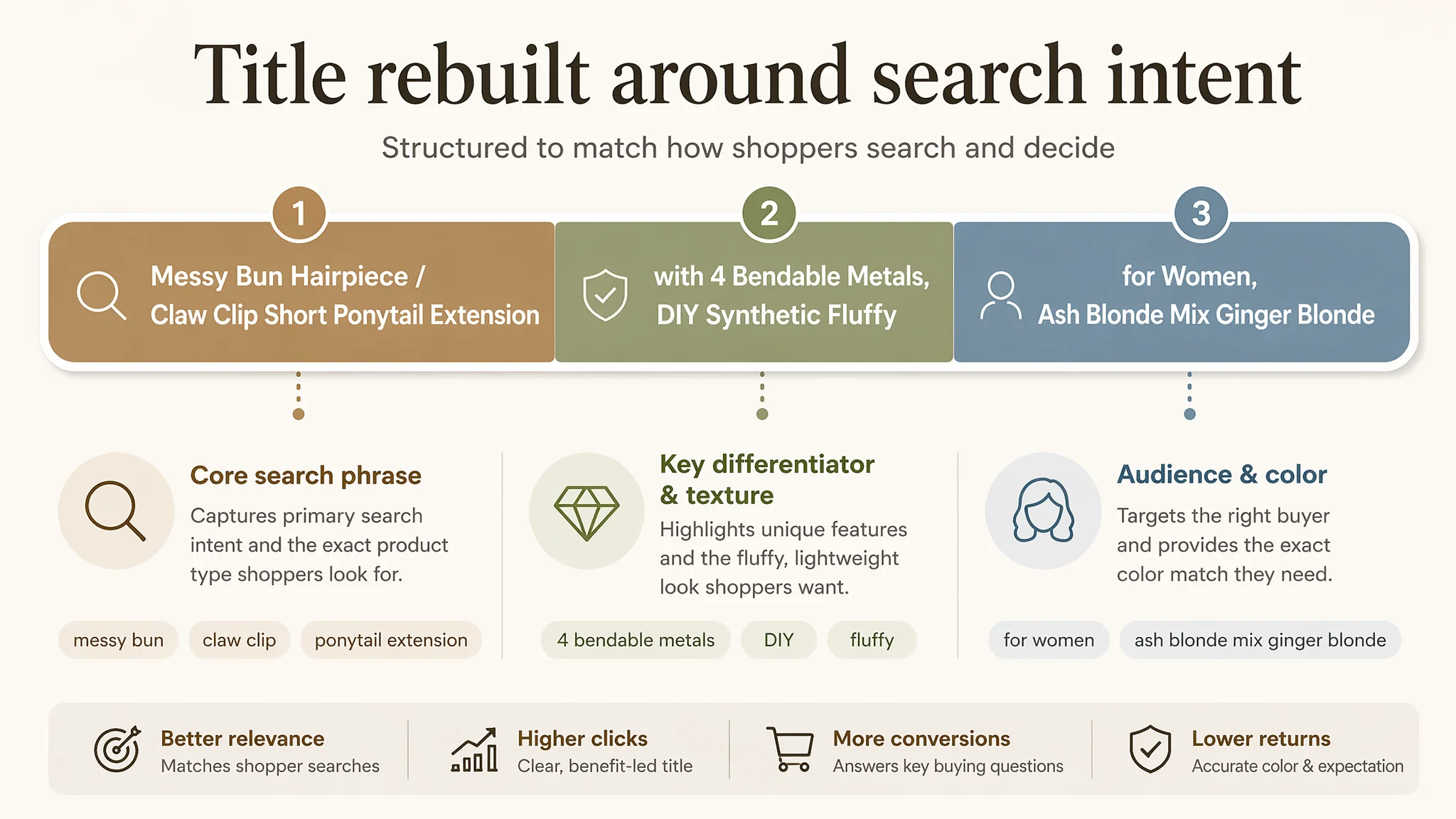
Logic behind the change:
- Push “Messy Bun Hairpiece” and “Claw Clip Short Ponytail Extension” forward
- Keep “4 Bendable Metals” in a prominent, readable position
- Integrate “Fluffy” to encode texture/output, not just material
- Retain the necessary color info but avoid letting it dominate the title
DeepBI’s judgment: title optimization matters, but here it was a secondary constraint. The primary break was that, once people clicked, the page still failed to convert.
Bullet Points: Logical Structure, Missing a Strong Buying Path
Bullet‑point scores (7 vs. 8) were close. In fact, the seller’s content had some solid logic:
- Emphasis on technical detail (high‑density fibers, 7‑tooth clip)
- Clear problem–solution links (fine hair, headaches, time pressure)
- Service and brand reassurance at the end
The benchmark’s bullet points leaned more into:
- Ease of styling
- “Elevate your look” language
- “No professional skills” reassurance
DeepBI did not judge the seller’s bullet points as fundamentally wrong; they were under‑leveraged. So the focus became refining them into sharper, conversion‑oriented units rather than re‑writing the entire concept.
This Product Page Did Not Lack Traffic. It Lacked a Cohesive Story and Trust.
The Main Image Was Functionally Acceptable, but Emotionally Underpowered
Main image scores were similar (25 vs. 26). On a raw compliance level, the seller’s images weren’t broken. The problem was how they worked in the search results and 3‑second attention window:
- Primary image: model plus three small circular thumbnails on the right
- Visually crowded
- First‑eye focus split between subject and small circles
- Parameter and function images: heavy text, limited design sophistication
- Before/after and DIY steps: present but not visually decisive
- Scene images: mixed styles, “collage” feel, lacking cohesive fashion tone
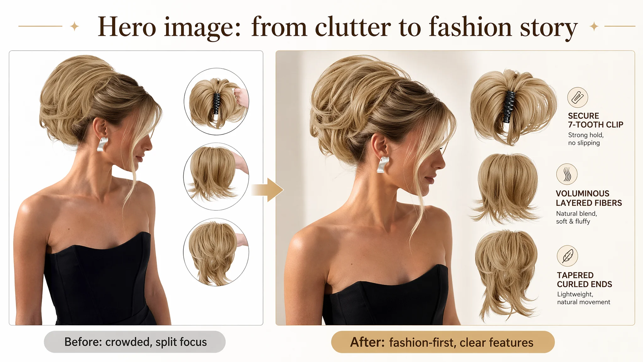
Benchmark images, by contrast:
- Centered the model more cleanly
- Used modern label/tag design and clean backgrounds
- Demonstrated multiple age groups and occasions (cross‑scene trust)
- Delivered a “Buy one, unlock countless styles” type promise visually
DeepBI’s judgment: in this category, the main image set isn’t just about showing the product. It must:
- Create an emotional “this could be me” moment
- Make “30‑second transformation” visually credible
- Visually highlight the differentiator: bendable metals + 7‑tooth ergonomic clip
So the optimization path focused on re‑orchestrating the image set, not on adding random variations.
Why DeepBI Did Not Recommend “Fix Ads First”
From a business‑risk perspective, DeepBI treated this case as a classic example of:
- Ads doing their job (delivering traffic)
- The Listing failing its job (converting that traffic)
If the team had kept prioritizing ads:
- Every improvement in targeting would send more visitors into a weak page
- The A+ vacuum and review‑story gap would continue to drag CVR
- ACOS would remain unstable, making ad spend feel “uncontrollable”
So the decision path was:
1. Freeze the urge to further scale ads until the page could carry traffic.
2. Repair the product page’s conversion logic first—title, main images, bullet points, and A+ content aligned to a coherent story.
3. Only then reassess ads, once page metrics showed signs of recovery (better CTR on new main images, improved CVR from more complete A+ and visual evidence).
“Advertising does not only amplify advantages. It can also amplify a page’s existing defects.”
In this Listing, ads were amplifying an absence: no A+ story, thin review visibility, and visually inconsistent images.
How the Page’s Sales Logic Was Rebuilt
DeepBI’s optimization did not revolve around generic beautification. It followed a structured re‑build:
1. Title: Tightening Around Core Search Intent
- Bring “Messy Bun Hairpiece” and “Claw Clip Short Ponytail Extension” to prominence
- Keep “4 Bendable Metals” and “DIY” visible and early
- Integrate “Fluffy” to speak to outcome (volume, texture)
- Reduce redundancy in “bun / hair / extension” phrasing
Result: a title that is easier for Amazon’s algorithm and human eyes to parse as:
- What the product is
- What it does
- For whom
- With which key differentiator
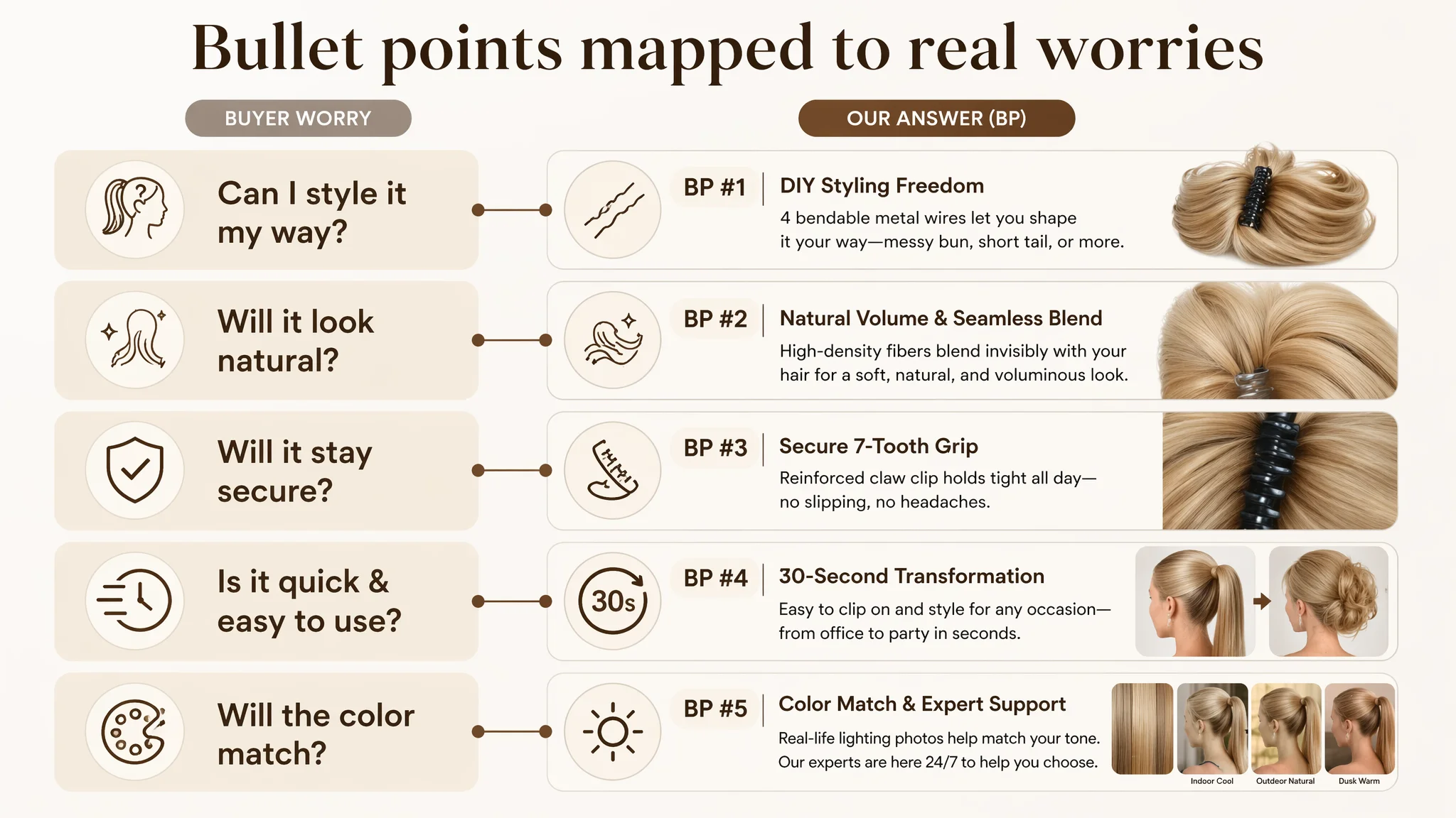
2. Bullet Points: From Features to Clear Problem–Solution Benefits
Each bullet was re‑framed to carry a coherent promise:
BP #1 – Core technology and styling freedom
【DIY Styling Freedom with 4 Hidden Wires】 Featuring 4 upgraded flexible inner wires, this ponytail allows you to sculpt, bend, and hold any shape effortlessly. Whether you desire a short bouncy tail or a voluminous messy bun, the hidden wires provide structural support while remaining incredibly lightweight for all‑day wear.
- Elevates “bendable metals” from a technical mention to styling freedom
- Connects structure (wires) → benefit (any shape, lightweight)
BP #2 – Natural blend and instant volume
【Natural Volume & Seamless Blend】 Our refined design wraps high‑density synthetic fibers around invisible hardware, ensuring a 100% seamless blend with your natural hair. Instantly boost your hair volume and achieve a polished look in seconds—no professional styling skills required for a flawless, natural‑looking finish.
- Moves beyond “synthetic hair” risk by stressing seamless blend
- Frames result as “natural, polished, no skills needed”
BP #3 – Secure wear and comfort
【Secure 7-Tooth Grip & Effortless Wear】 The reinforced 7‑tooth claw clip provides a high‑tension, non‑slip hold that stays secure during gym sessions or active commuting. It’s incredibly easy to use: simply tie up your own hair, open the claw, and clip it on for a comfortable, headache‑free fit even for fine or thinning hair.
- Uses the 7‑tooth clip not just as a spec, but as trust against slipping
- Keeps fine/thinning hair and headache concerns explicitly addressed
BP #4 – Multi‑occasion value and speed
【30-Second Transformation for Any Occasion】 Go from a casual brunch to a sophisticated office meeting or a vibrant cosplay event in under 30 seconds. These sleek, tangle‑resistant strands offer the perfect “lazy girl” solution for instant fluffiness and style versatility, designed to maintain their shape and texture through repeated use.
- Directly monetizes time (“30 seconds”) and maintenance (tangle‑resistant)
- Broadens scenario coverage: office, brunch, cosplay, events
BP #5 – Color expectations and expert support
【Color Accuracy & Reliable Expert Support】 We prioritize your satisfaction by using real‑life lighting for all photography to ensure the closest color match. Please note that slight variations may occur due to monitor settings. If you need assistance with shade selection, our expert team is available 24/7 to help you find your perfect match.
Together, the bullet points now:
- Speak buyer language (freedom, seamless, secure, fast, supported)
- Tie directly to Amazon hairpiece pain points (slipping, fake look, color risk, time pressure)
3. Main Images: From Crowded Collage to Fashion‑Driven Visual Logic
DeepBI’s visual suggestions re‑positioned images around a “magazine‑like” fashion narrative:
Main Image #1 – Hero beauty shot
- Model centered, occupying ~70% of frame
- 45° side view, natural light to highlight volume
- Clean light gray gradient background
- Black strapless dress to contrast ash‑blonde hairpiece
- Replace three small circles with 2 clean strand close‑ups along the right edge
Purpose:
- Strong first impression in search thumbnail
- Emotional, aspirational but still product‑clear
Main Image #2 – Clean product and specs
- Hairpiece centered, ~50% of frame, front view
- Soft, even lighting to reduce harsh shadows
- Minimal off‑white background
- Specs (e.g., “8 inch”) represented with icons + modern fine font around the product
Purpose:
- Quick spec capture (length, structure) in 2–3 seconds
- Professional, confident feel vs. text‑heavy design
Main Image #3 – Before/after with time promise
- Side profile of model, 45° side angle
- Warm home background, cozy lighting
- Small 20% circle on left showing “before” messy bun
- Main view showing “after” styled bun
- “ONLY 30S” in bold type on top left
Purpose:
- Visually prove “30‑second transformation”
- Convert abstract time claim into an immediate, believable impact
Main Image #4 – Functional core: claw and wires
- Close‑up of claw clip and bendable wires, ~60% of frame
- Slight low angle to emphasize structure
- Strong side lighting to show physical contours
- Pure white background
- Subtle glow effect around claw and wires, with fine lines pointing to brief labels
Purpose:
- Anchor trust in mechanical integrity (no slip, durable)
- Make the “hidden wires” tangible and understandable
Main Image #5 – Step‑by‑step installation
- 4‑frame sequence, each ~25% of width
- Side view, studio lighting, light beige background
- Steps numbered in gold blocks (1–4) below each frame
- Shows hair from “tie up” to “clip fixed and hidden”
Purpose:
- Remove “will I manage to wear it?” doubts
- Visually demonstrate simplicity and clarity
This image architecture turns the listing from “a product with several pictures” into “a guided experience” that answers:
- What it looks like on real hair
- How quickly it changes the look
- How secure and comfortable it is
- How to actually put it on
4. A+ Detail Page: Building the Full Fashion and Trust Story
The A+ rebuild follows a staged decision path:
1. Opening hero module
- High‑aesthetic side/back view of model wearing the hairpiece
- Left‑side text area with elegant serif title
- Black backless evening dress, soft side backlight
- Warm neutral palette, subtle marble background
Purpose: establish the product as a fashion accessory, not just “fake hair.”
1. Core features module
- Central back‑view of model wearing the product
- Three micro‑detail circles around:
- Circle 1: clamp teeth and fiber connection
- Circle 2: hand bending edge to show wire flexibility
- Circle 3: macro shot of fiber texture
Purpose: turn abstract features (claw clip, wires, fibers) into visible quality and durability.
1. Scene adaptability module
- Four‑grid model scenes:
- Workplace (blazer)
- Gym (activewear)
- Evening date (dress)
- Home (knitwear)
- Each with different ponytail angles and consistent style tones
Purpose: show “one product, multiple life contexts,” supporting premium price and multi‑use value.
1. How‑to‑wear module
- Four horizontal steps with a real model (no mannequin head):
- Tie own ponytail
- Open claw clip
- Fix and hide under hair
- Adjust bendable wires for volume
- 45° top‑down view, soft indoor light, vanity mirror background
Purpose: make installation feel accessible and human, not mechanical or plastic.
1. DIY styling module
- Side‑by‑side comparison:
- Left: standard ponytail form
- Right: messy bun form after wire adjustment
- Directional dotted arrows indicating adjustment possibilities
Purpose: emphasize “one clip, multiple looks” as a central value—not only a technical note.
1. Shade selection and light conditions module
- Left: organized color bundles
- Right: same model under three lights: indoor cool, outdoor natural, dusk warm
- Clear icons for light sources
Purpose: pre‑manage expectations around color variance, directly attacking a prime source of returns.
1. Trust and realism module
- High‑pixel close‑up of fusion point between product fibers and natural hair
- Strong side light to show grain and non‑plastic sheen
- Background heavily blurred, neutral color
Purpose: address the core fear: “Will it look fake?” Visual answer: no plasticky shine, soft fiber transitions, natural look.
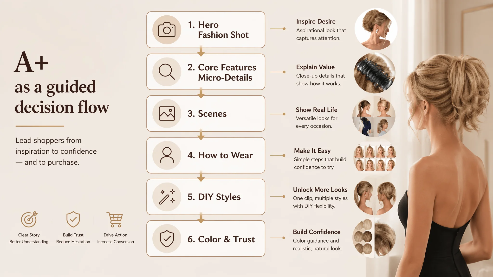
This A+ rebuild transforms the page from “no visual story” to a full decision flow: aspiration → explanation → illustration → reassurance → action.
What Changed in the Business State
The case material does not provide hard CVR or ACOS numbers after optimization, so we keep changes at the level of operating state and risk:
- Listing conversion capacity improved:
The page now systematically builds trust and desire—from main images through A+ modules and bullet points.
- Ad traffic became more usable:
With a more convincing page, clicks from ads are less likely to drop off without buying, reducing wasted spend.
- Review and color risk better managed:
A clearer color‑difference explanation and visual shade guidance reduce hesitation and potential returns.
- Traffic‑structure risk decreased:
The Listing is better equipped to convert both organic and paid traffic, rather than depending on ads to “force” sales.
Most importantly, the customer’s understanding changed:
- Amazon ads cannot compensate for a structurally weak product page.
- Listing quality—especially in visual categories—is the foundation of ad efficiency.
- Title, main image, bullet points, and A+ must work as a coherent persuasion system, not as isolated modules.
- Before scaling campaigns, it’s essential to ask: Does this page deserve more traffic yet?
For Amazon sellers in beauty, hair accessories, and other highly visual fields, this case is a practical reminder: when ACOS feels “unexplainably” high, look at the page. If your A+ story is thin or missing, ads may not be failing—you may just be amplifying a page that isn’t ready to convert.