

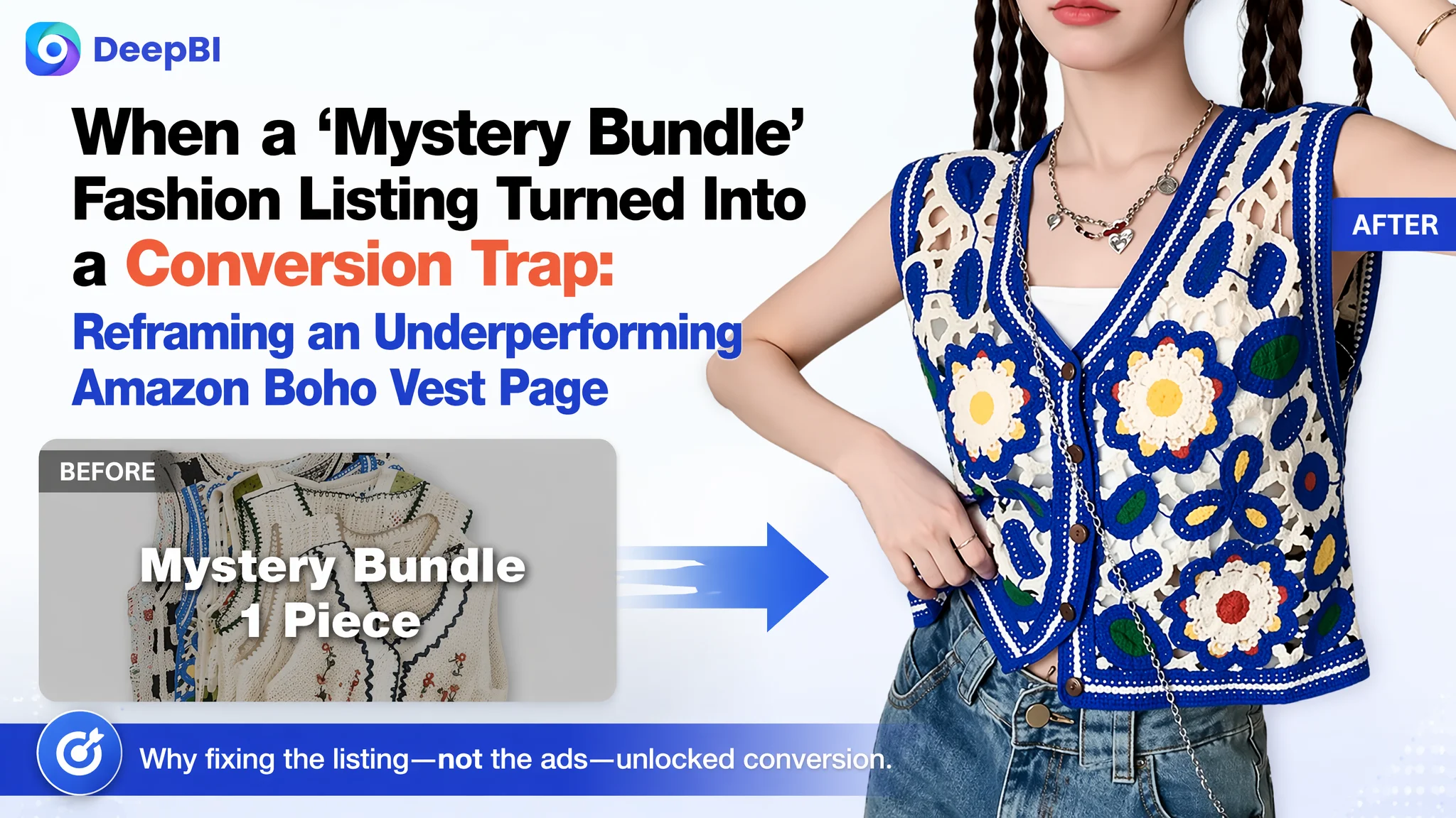
For this Amazon fashion seller, the problem looked like a familiar one: ads were getting more expensive, yet the boho crochet vest “mystery bundle” listing stubbornly refused to convert. The team’s first reaction was to treat it as an advertising issue—adjust targeting, tweak bids, and hope better traffic would fix the numbers.
DeepBI’s listing diagnosis told a different story. Against a benchmark Amazon competitor in the same vintage embroidered vest niche, the seller’s product page scored just 34/100 versus 79/100. Title, main images, bullet points, A+ content, and reviews all lagged badly. Ads were not failing; they were driving traffic into a page that could not explain, reassure, or persuade.
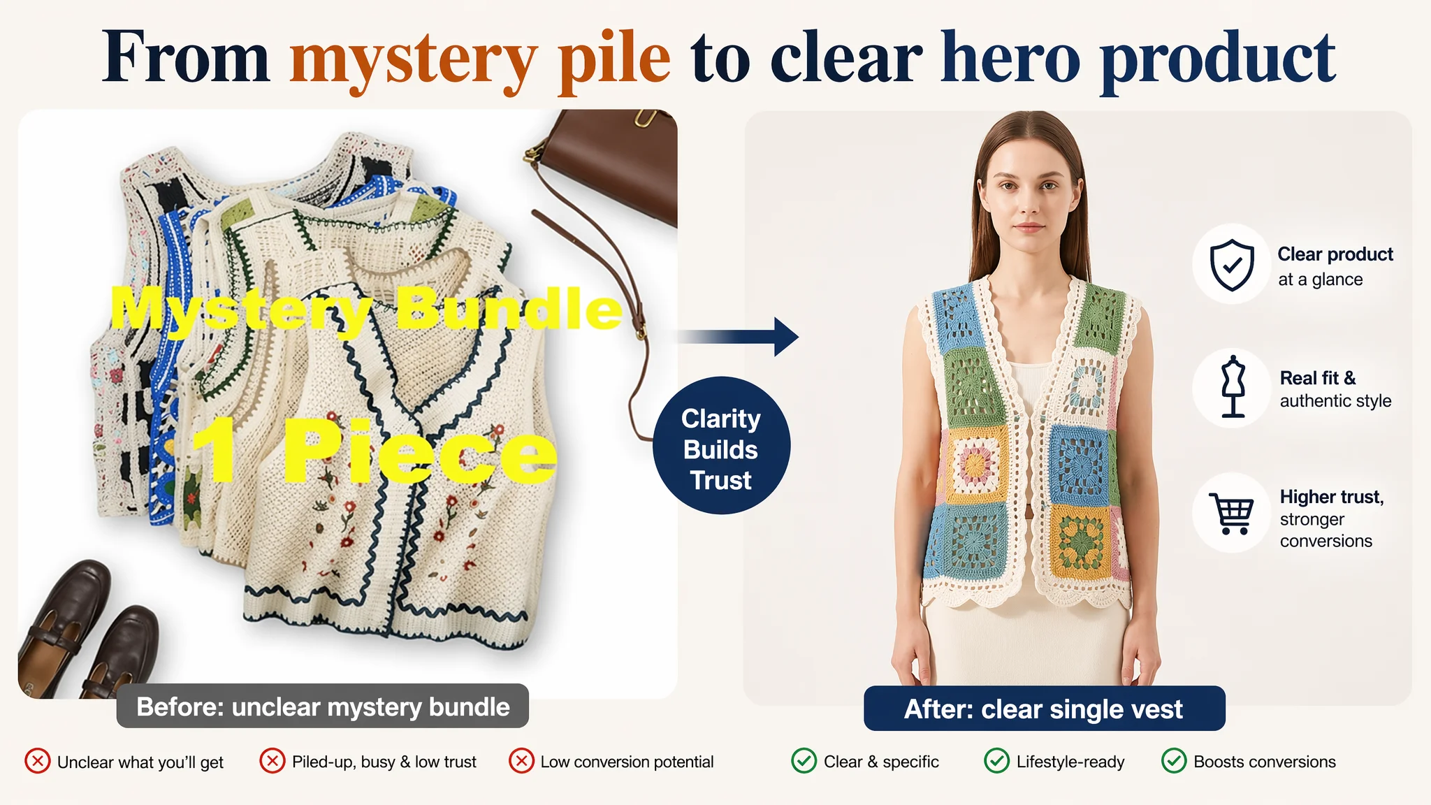
The later optimization shifted away from “how to get more clicks” to “what happens after the click.” Instead of pushing the mystery concept harder, the focus moved to clarifying the product type, rebuilding visual trust with lifestyle photography, rewriting bullets around material, design and use scenarios, and adding an A+ section that could finally carry the sales story. The case is a reminder many Amazon sellers need: when ACOS feels unmanageable, the bottleneck may sit on the listing, not in the ad console.
Amazon Ads Were Not Failing. The Page Was Consuming the Traffic.
What the seller saw in daily operations was straightforward pressure:
- Ad costs were creeping up.
- The boho vest bundle listing was not generating stable orders.
- Attempts to tune ads—changing budgets, keywords, and bids—did not move conversion in a meaningful way.
From the team’s perspective, the listing had “creative” appeal: a mystery bundle angle, multiple vest styles, and a boho aesthetic. It felt unique, so they assumed the core issue must be visibility and ad efficiency.
DeepBI’s data-driven listing score cut through that assumption. On a 100-point scale:
- The target listing: 34/100
- A high-performing comparable Amazon competitor: 79/100
- Gap: –45 points, spread across almost every key dimension.
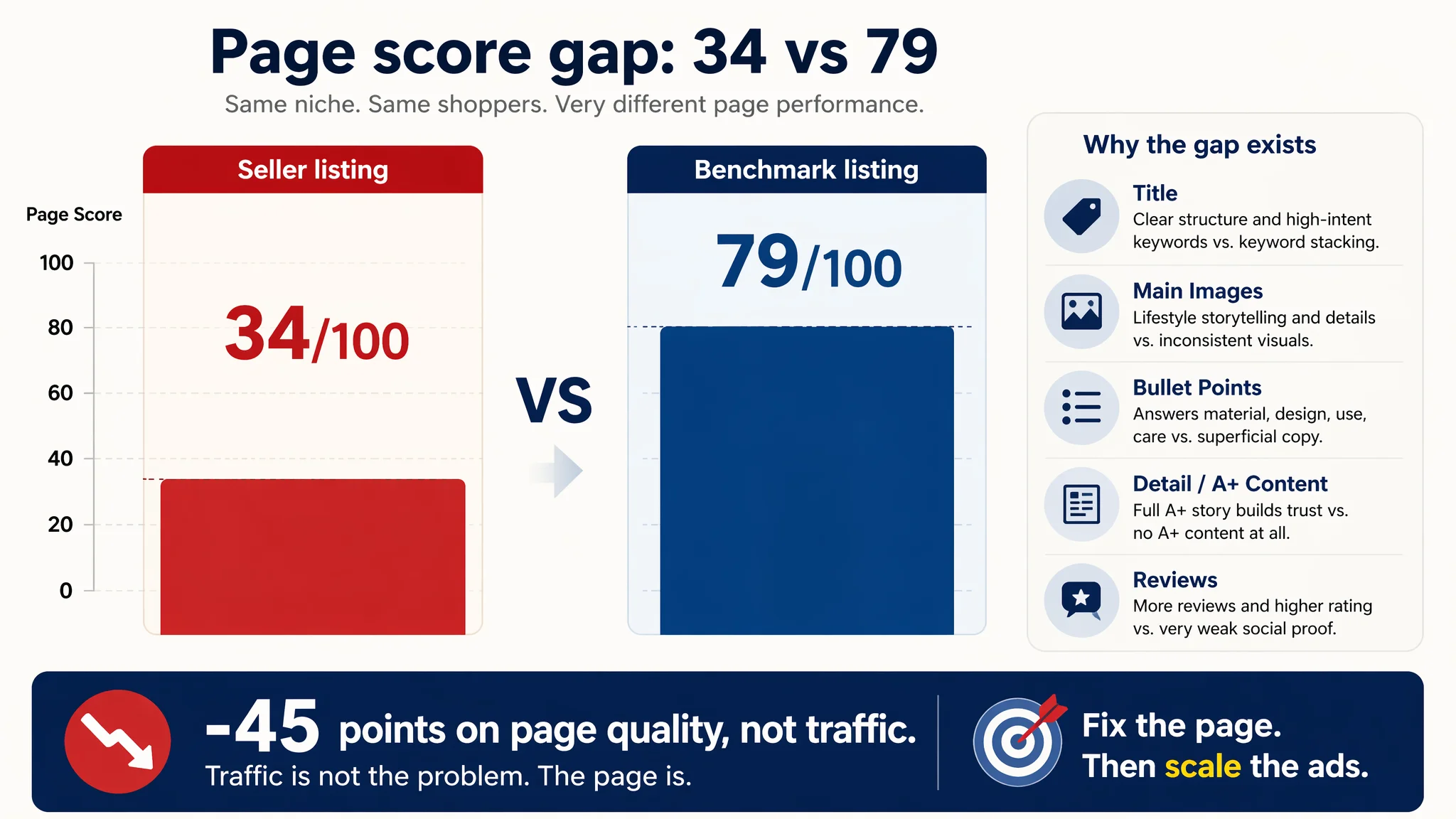
Once this gap was visible, it became clear why ads could not rescue performance. The product page did not lack traffic; it lacked the ability to convert the traffic it already had.
“The real problem was not that ads failed to bring traffic. It was that the page could not convert the traffic.”
The Real Constraint Was Listing Conversion Capacity
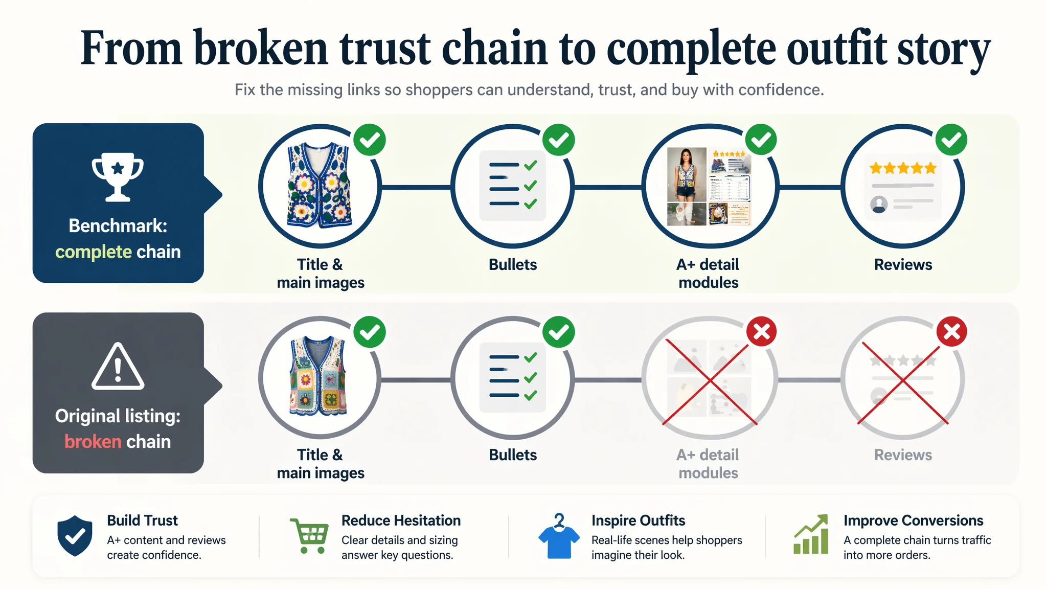
DeepBI’s scoring decomposed the 45-point gap into specific page-level weaknesses:
- Title: Seller Listing: 8, Benchmark Listing: 15, Max Score: 20, Gap: -7
- Main Images: Seller Listing: 21, Benchmark Listing: 26, Max Score: 30, Gap: -5
- Bullet Points: Seller Listing: 3, Benchmark Listing: 7, Max Score: 10, Gap: -4
- Detail / A+: Seller Listing: 0, Benchmark Listing: 21, Max Score: 25, Gap: -21
- Reviews: Seller Listing: 2, Benchmark Listing: 10, Max Score: 15, Gap: -8
Two constraints stand out:
- Detail/A+ content: 0 vs 21
There was no A+ section at all—no structured visuals, no story, no sizing guidance, no trust-building modules. The benchmark filled the A+ area with full-width lifestyle images, sizing tables and multiple videos (usage, unboxing, comparison, tutorial).
- Reviews: 3.0 stars, 2 reviews vs 4.1 stars, 55 reviews
The listing had only two reviews, both effectively negative, making the visible homepage review profile 3.0 stars with a 100% “low rating” surface impression. The benchmark had 55 reviews at 4.1 stars, with several strong positive comments on the first page.
On top of this, title and bullets were structurally weak, and the image set did not tell a coherent story. From a conversion perspective, the listing was competing with:
- Unclear product definition
- Unfinished visual sales funnel
- Almost no trust base
Under these conditions, pushing more ad traffic was simply amplifying an already weak page outcome.
The Customer’s Original Misdiagnosis: “It’s an Ads/Visibility Problem”
Before the listing diagnosis, the seller framed the situation in a way many fashion sellers will recognize:
- The “mystery bundle” concept felt creative and different.
- Boho, hippie, crochet, hollow-out—many style words were packed into the title.
- The team assumed that if enough shoppers were exposed to the concept, orders would follow.
Optimization attention went to:
- Expanding ad reach and keyword sets.
- Adjusting bids for popular fashion terms.
- Trying to improve CTR by changing minor creative elements in ads.
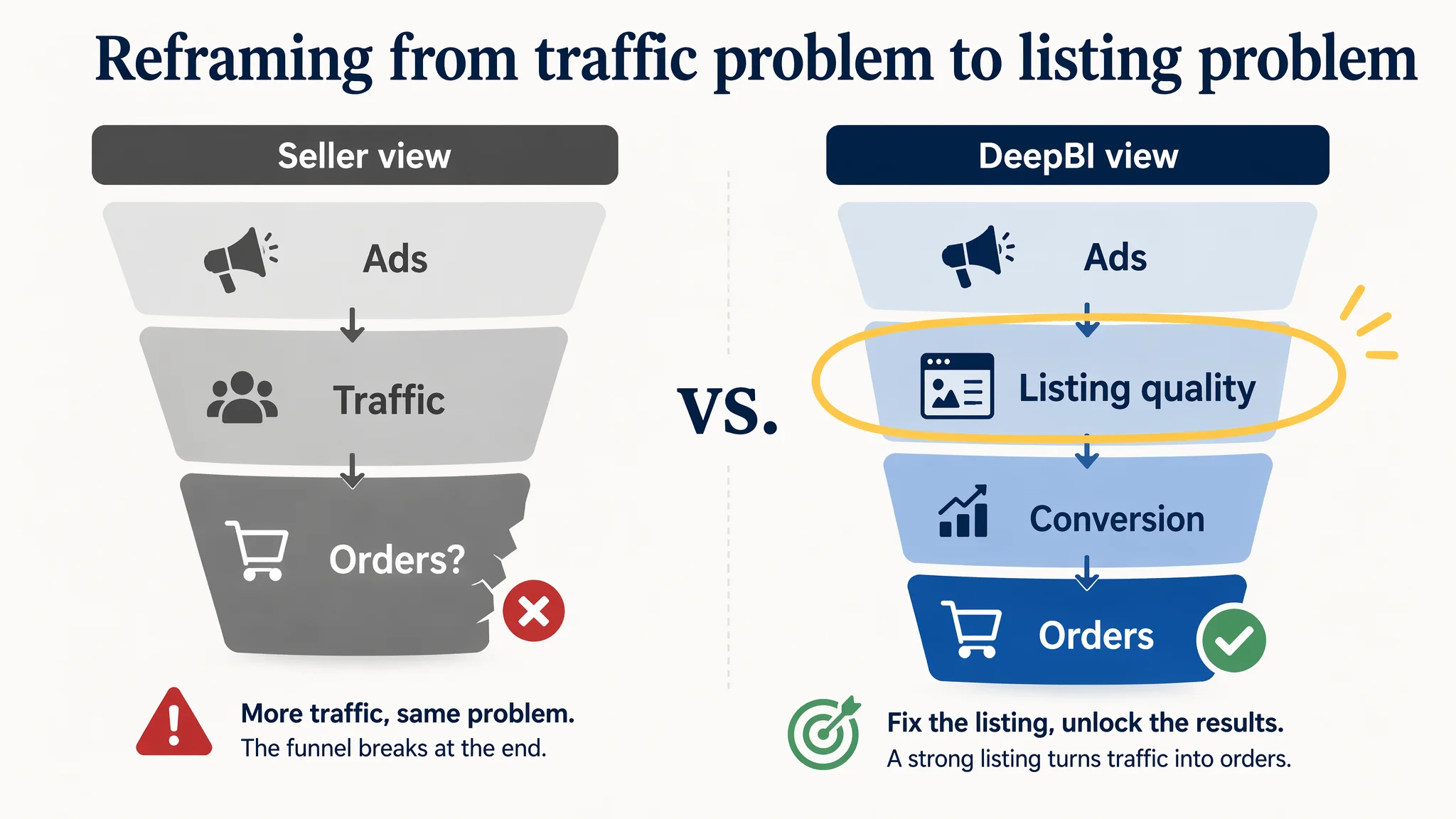
This path rests on a hidden assumption: the product page is already strong enough; the main problem is insufficient or imperfect traffic. DeepBI’s score made that assumption untenable. The benchmark listing showed what “strong enough” looked like in the same niche—and it was structurally different at every stage of the buyer journey.
Why Traditional Amazon Ad Optimization Kept Failing
Once the comparative numbers were on the table, the failure of ad-side optimization made sense.
- Title clarity and search logic were weak.
The seller’s title was a keyword stack with “Multi Pieces” and multiple style adjectives. The benchmark title followed “brand + style + attributes + core product word” and front-loaded “Floral Embroidered Vest” and “Cardigan”, clearly signalling what the item is and how it fits search behavior.
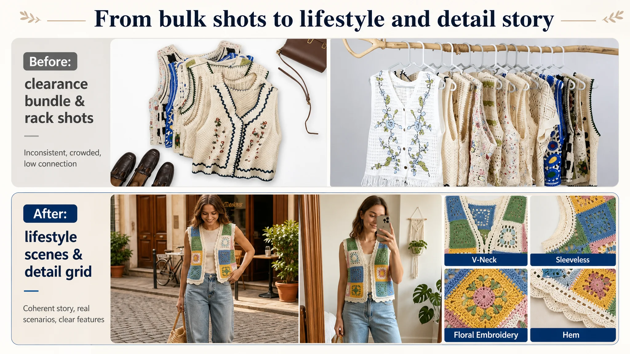
- The main images did not build a compelling sales narrative.
The seller’s image set mixed:
- Side-angle white-background shots that did not fully show the vest’s shape or key embroidery.
- A piled-up “clearance mystery bundle” flat lay with heavy text overlay—visually closer to discount bulk sale than boho fashion.
- Disconnected aesthetics: forest outdoor, white flat lay, mixed knitwear pieces, even an unrelated cardigan.
The benchmark instead used:
- Consistent color language (“light beige base + blue floral embroidery”) across core images.
- Multiple lifestyle scenes: street photography, indoor selfies, outdoor casual moments.
- A dedicated details grid: close-ups of V-neck, sleeveless cut, floral embroidery, hem.
- Bullet points did not guide a decision.
The seller’s bullets were built around:
- Purchase form (“mystery bundle” explanation).
- Abstract style talk.
- Limited scene description and generic craft mentions.
- An “unique value” emphasis with no care or sizing information.
The benchmark bullets walked through:
- Material comfort and breathability.
- Specific design elements and fit.
- Concrete matching guidance.
- Clear occasions.
- Care instructions and size mapping.
- There was no A+ content at all.
On Amazon fashion, A+ is often where trust, fit confidence, and style identity are built. The benchmark used it to create a complete information chain:
- Style positioning
- Material and crafting explanation
- Wearing scenarios
- Sizing decisions
- Video validation
The seller’s listing ended after basic bullets and a thin review section. The funnel effectively broke at the first scroll.
Under this structure, every extra click driven by ads had to cross:
1. Confusing product definition (is this a specific vest, a bundle, a blind box?).
2. Inconsistent, sometimes low-credibility imagery.
3. Missing practical information (material comfort, care, fit guidance).
4. Weak social proof.
It's not surprising ad metrics refused to improve. Ads were functioning normally; the listing was consuming the traffic without converting it.
“Advertising does not only amplify advantages. It can also amplify a page’s existing defects.”
Listing Data Abnormalities DeepBI Flagged
The score report highlighted several abnormalities that turned into core judgments:
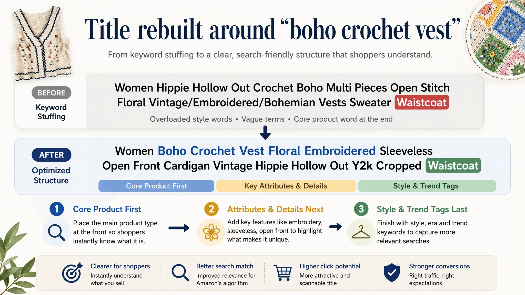
1. Title: The core product word got buried
The benchmark led with “Women Floral Embroidered Vest Vintage Sleeveless Boho Y2k Cardigan Open Front Cropped Waistcoat”:
- Clear core type: Vest / Cardigan / Waistcoat
- Trend markers: Boho, Vintage, Y2K
- Structural clarity: brand + style + attributes + product word.
The seller’s original approach diluted this:
- Overloaded with stylistic descriptors like “Hippie Hollow Out Crochet Boho”.
- Used vague terms like “Multi Pieces” that do not help the search engine or the shopper understand the actual product.
- Keyword order looked random, not aligned to search patterns.
DeepBI’s recommendation regrouped the title around:
Women Boho Crochet Vest Floral Embroidered Sleeveless Open Front Cardigan Vintage Hippie Hollow Out Y2k Cropped Waistcoat
This:
- Front-loads “boho crochet vest” as a complete phrase.
- Replaces “Open Stitch” with the more common “Open Front”.
- Integrates “Y2K”, “Cropped”, and “Waistcoat” to mirror benchmark traffic behavior, not just aesthetics.
2. Bullets: Sales format overshadowing product reality
The structure comparison is direct:
- Seller:
- Purchase method (mystery bundle)
- Abstract style definition
- Light scene description
- Craft and pattern mentions
- “Unique value” emphasis without practical guidance
- Benchmark:
- Material and comfort
- Design and fit
- Matching guidance
- Specific occasions
- Care and size information
The diagnostic conclusion: the listing tried to sell “mystery” before selling comfort, style and usage reality. That raised cognitive cost and risk perception at the exact stage where buyers need reassurance.
3. Detail/A+: Missing the entire persuasion backbone
The absence of A+ modules was not just a cosmetic gap—it fundamentally removed:
- A structured way to position the style.
- Space to visually back the embroidery quality.
- Multiple scenes to show wearing possibilities.
- A clear sizing decision aid.
- Any video-based trust reinforcement.
In fashion, these are not optional extras. They are the backbone of the conversion story.
Why DeepBI Did Not Keep Tuning the Ads First
Given this diagnosis, the decision path was clear:
- Continuing to optimize ads first would increase spend on traffic that the page could not convert.
- The largest scoring gap (A+ and reviews) sat in the trust and information layer, not the traffic layer.
DeepBI’s logic prioritized:
1. Rebuilding product-page clarity and trust
Before asking: “How do we scale traffic?”, the question had to be: “If we get more traffic, does this page deserve it?”
1. Aligning page content with category expectations
The benchmark defined the current “visual and informational ceiling” for vintage embroidered vests on Amazon. Any optimization had to close the distance between the seller’s listing and that ceiling, especially on:
- Title clarity and keyword structure.
- Main image narrative: from discount bundle visuals to boho lifestyle.
- Bullet-point buying logic.
- A+ visual chain and sizing confidence.
1. Avoiding ad amplification of a weak conversion state
With a 3.0-star, 2-review surface and no A+, increasing exposure risked:
- More shoppers bouncing after a confusing page experience.
- Potential new negative reviews if expectations stayed vague.
The biggest business risk at that stage was not low impressions—it was low conversion under rising ad cost. Fixing listing conversion capacity was the only viable first step.
This Product Page Did Not Lack Traffic. It Lacked Trust.
From the shopper’s perspective, landing on the seller’s page meant facing several unresolved questions:
- What exactly am I buying—a specific vest, or a random piece from a bundle?
- What does it feel like to wear—material, weight, breathability?
- How does it fit with my wardrobe—concrete outfit examples?
- Where can I wear it—day-to-day, events, holidays, festivals?
- Will it fit—how should I choose a size?
- How do I care for it—machine wash, hand wash, special care?
On the benchmark page, these questions were answered quickly:
- Title and images define a single, clear product with recognizable embroidered styling.
- Bullets start with material and comfort, then design and versatility.
- Matching suggestions and occasions appear explicitly.
- A+ modules show the vest in multiple natural scenes, plus sizing tables.
- Reviews provide social proof, with enough volume to feel credible.
DeepBI’s optimization recommendations aimed to bring the seller’s page closer to this state.
How the Later Optimization Rebuilt the Page’s Sales Logic
The focus shifted from ad parameters to listing fundamentals across five fronts.
1. Title: Clarifying what the product is
Optimization front:
- Front-load “boho crochet vest” as a single phrase.
- Explicitly mention “Floral Embroidered Sleeveless Open Front Cardigan”.
- Keep “Vintage”, “Hippie”, “Hollow Out”, “Y2k”, “Cropped Waistcoat” for style and search depth, but in a controlled sequence.
Resulting logic:
- Search engine can more easily classify the product as a vest/cardigan.
- Shoppers reading quickly see “boho crochet vest” and “floral embroidered sleeveless open front cardigan” before anything else.
- The stylistic descriptors support the identity instead of drowning it.
2. Bullet points: From abstract concept to usable information
DeepBI’s bullet restructuring recommendations systematically close the gap with the benchmark:
- BP #1: MYSTERY BUNDLE & COMFORT
Keep the mystery angle but pair it with material reassurance:
Choose your size and quantity; leave preferences; every vintage crochet vest is comfortable and breathable, suitable for all seasons.
- BP #2: VINTAGE DESIGN & CRAFTSMANSHIP
Move from generic craft language to structured design description with highly searched style tags:
Detailed stitching, open-front design, unique vintage embroidery, floral and geometric patterns, boho, 90s retro, Y2K aesthetic.
- BP #3: VERSATILE MATCHING
Replace vague “versatile” with concrete outfit pairing:
With basic tee and denim shorts for casual summer; over dresses, blouses, long sleeves for spring/autumn.
- BP #4: PERFECT FOR MULTIPLE OCCASIONS
Add scene-specific triggers:
Daily wear, hangouts, music festivals, parties, clubbing, holidays, beach, street fashion.
- BP #5: ONE-OF-A-KIND & EASY CARE
Preserve uniqueness while finally giving care instructions:
Unique vintage characteristics; machine wash with laundry bag or hand wash cold; hang dry; do not bleach; choose size carefully.
This transforms bullets from a concept pitch into a pain-point / solution structure: comfort, style, outfit ideas, occasions, care and sizing.
3. Main images: From discount pile to boho lifestyle narrative
DeepBI’s image prompts follow a decision logic: first fix basic product recognition, then build lifestyle, then reinforce detail.
Key changes:
- Image 1: Clean front-facing product recognition
A centered, 65%-of-frame, front-view vest on pure white background, with natural color and standard lighting. This answers “what does the product look like?” at a glance.
- Image 2: Street-style full-body look
Replace the flat-lay bundle shot and heavy text with a model walking down a sunlit European-style street in the vest:
- Warm tones, casual movement.
- Background lightly blurred to keep product focus.
- Signals “real outfit” rather than “clearance pile.”
- Image 3: Indoor mirror selfie
Introduce a blogger-style bedroom selfie:
- Modern, minimal room, wooden mirror frame, plants.
- Bright, soft light.
- Shows how younger boho/Y2K buyers actually wear and share the vest.
- Image 4: Outdoor boho scene
Enhance the forest shot into a more deliberate autumn scene:
- Side-backlight through trees.
- Boho accessories (fringe bag).
- Warm brown tones.
- A still moment capturing freedom and romance.
- Image 5: Four-grid detail close-ups
Replace wholesale-style hanging shots with a four-panel grid:
- Each panel shows one key detail: V-neck, sleeveless cut, floral embroidery, hem.
- High contrast, overhead close-up.
- Label each panel clearly.
Together, this sequence repositions the listing from “cheap mystery bulk” to curated vintage boho fashion with clear craft value.
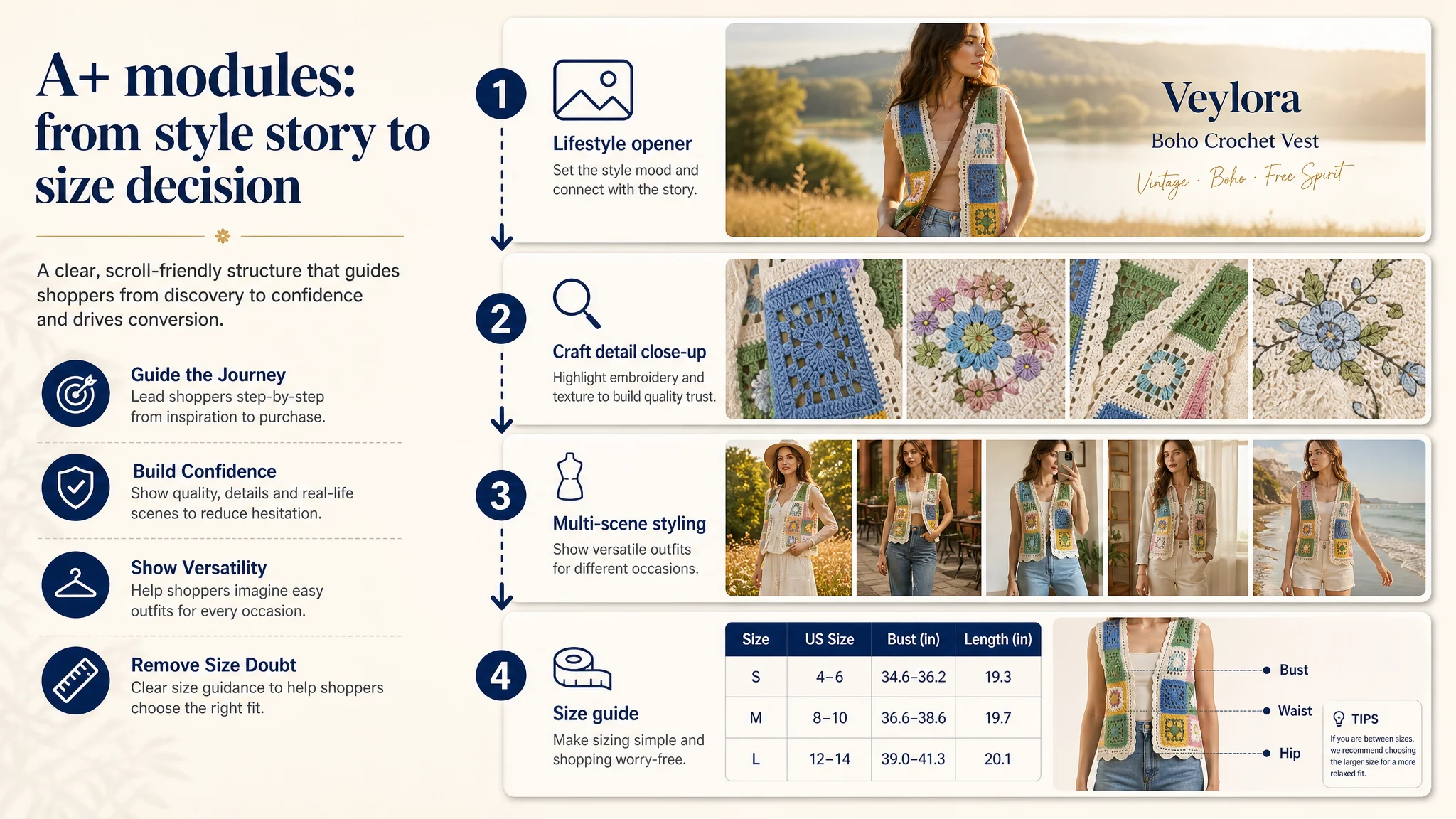
4. Detail / A+: Building the missing persuasion chain
Since the original listing had no images or structured content in the detail/A+ area, the optimization plan essentially designed a full A+ skeleton:
- Opening lifestyle module
Half-body outdoor shot with lake and grass, vintage warm tones, relaxed walking. Purpose: set emotional and style context.
- Craft detail module
Macro shot of embroidery, neutral background, clear text next to the image. Purpose: prove quality, not just claim it.
- Multi-scene styling module
Full-body street or café scene, vest over shirt and jeans, with textual overlay explaining “easy to match”, “daily wear”, “city casual”. Purpose: help buyers imagine outfits.
- Size guidance module
Split layout with a model wearing the vest on the right and a size table on the left. Purpose: reduce size uncertainty and potential returns.
This structure mirrors the benchmark’s “style → material → scenes → sizing → confirmation” flow while adding stronger craft visuals.
How Ad Traffic Became Useful Again
While the case material does not attach exact post-optimization metrics, the operational implications are clear:
- Listing conversion capacity improves
With:
- A clearer, search-aligned title.
- Visual storytelling that matches boho fashion expectations.
- Bullet points that answer material, design, use and care questions.
- A+ content that builds style identity and sizing confidence.
The page is better equipped to turn clicks into purchases.
- Ads stop amplifying the wrong outcome
Once the page can actually explain and reassure, ad spend is more likely to:
- Generate engaged sessions instead of quick bounces.
- Convert traffic without disproportionate reliance on discounting.
- Build review volume over time, slowly improving the trust profile from 3.0 stars / 2 reviews upward.
- Traffic structure becomes more controllable
With a functional funnel, the seller can:
- Judge when to scale campaigns.
- Use ads to support keywords that the title and images now serve well (boho crochet vest, floral embroidered vest, Y2K cardigan, etc.).
- Experiment with budgets knowing the listing is not the immediate bottleneck.
How the Seller’s Understanding Changed
The most important shift in this case was not in a specific image or bullet; it was in the seller’s mental model of the problem.
Before:
- High ACOS was seen as an ad tuning problem.
- “Mystery bundle” differentiation was assumed to be enough.
- Page content was treated as secondary.
After DeepBI’s diagnosis and listing-focused optimization:
- The seller understood that listing conversion is the foundation of ad efficiency.
- Ads cannot fix a page that does not:
- Define the product clearly.
- Show real-life wearing scenarios.
- Explain material and craft.
- Guide sizing and care.
- Provide social proof.
- Title, main image, bullets, A+ and reviews are now viewed as interlocking pieces of one conversion system, not isolated creative tasks.
For other Amazon fashion sellers, this case offers a specific lesson:
- When ads feel “inefficient”, first ask whether the product page deserves more traffic.
- Use competitive benchmarking to see how your listing’s title, images, bullets, A+ and reviews stack up against category leaders.
- Fix the conversion leaks—especially missing A+, weak bullets, and unclear visuals—before pouring more budget into campaigns.
Only when the listing can convert both paid and organic traffic does Amazon advertising regain its role as a growth lever instead of an expensive patch.