

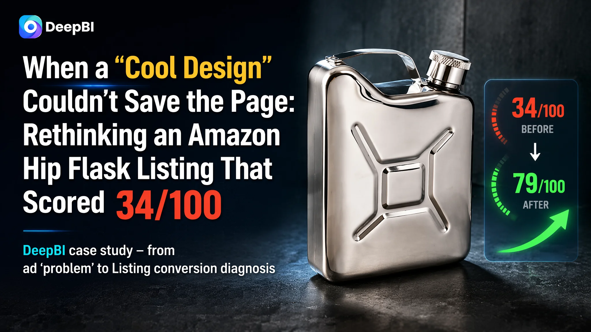
This case comes from an Amazon seller in the US marketplace, operating a hip flask designed like a mini oil jerry can. On the surface, the product looked distinctive and “giftable,” so the team originally believed their main challenge was simply “getting more traffic” and “waiting for reviews.” They poured effort into pushing ads and tweaking bids, assuming high ACOS and low orders were primarily an advertising problem.
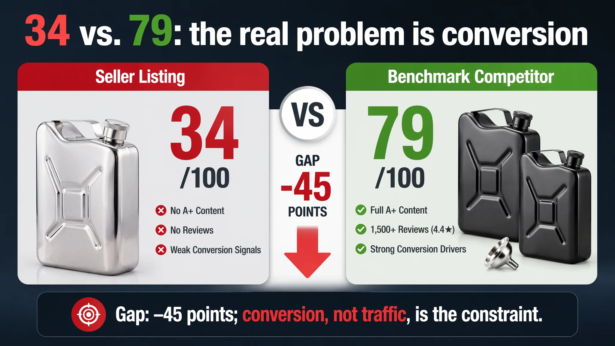
DeepBI’s Listing diagnosis told a very different story. Once the Amazon Listing was benchmarked against a category-leading competitor, the page scored only 34/100 vs. the competitor’s 79/100. The gap was not in traffic; it was in conversion capacity. There was no A+ at all, no reviews, vague title messaging, weak bullet logic, and a visual system that did not build trust around safety, leakproof performance, or usage scenarios. Ads were driving clicks into a page that was structurally unprepared to convert.
The subsequent optimization work did not start with “more ads” or “more keywords.” It focused first on rebuilding the Amazon product page: clarifying the title logic, reframing the bullet points around specific purchase concerns, and designing a full A+ structure with high-density visual information—especially around food-grade safety, leakproof design, and outdoor/social scenarios. The result was a Listing that could finally carry both organic and paid traffic instead of consuming it.
For other Amazon sellers, this case is a reminder that a distinctive product or “cool” design is not enough, and that high ACOS often masks a deeper page problem. If the Listing scores low against real competitors—especially on A+ and reviews—ad optimization alone will not unlock growth. Fixing Listing conversion is not a “nice to have”; it is the operating baseline for making every click count.
What the Seller Saw: “We Just Need More Traffic”
This Amazon seller was offering a whiskey hip flask in the US market, with a unique oil jerry can shape meant to stand out in search results and gift scenarios.
From the seller’s point of view:
- The design was eye-catching and differentiated.
- The price band was comparable to other hip flasks.
- The main challenge seemed to be exposure and reviews, not the page itself.
So their operating logic was:
- Push more Amazon ads to gain traffic.
- Assume that once a few orders and reviews appeared, conversion would naturally improve.
- Treat high ACOS as mainly a bidding / keyword problem.
In other words, they saw an advertising efficiency issue, not a Listing conversion issue.
“The real problem was not that ads failed to bring traffic. It was that the page could not convert the traffic.”
The Core Conflict: A Listing That Scored 34 vs. a Benchmark at 79
When DeepBI benchmarked this Listing against a high-performing competitor in the same hip flask segment, the result was a 45‑point gap:
- Seller’s Listing total score: 34/100
- Competitor’s Listing total score: 79/100
- Score gap: –45 points
Breaking it down by Amazon page modules:
- Title: Seller: 8, Competitor: 13, Full Score: 20, Gap: -5
- Main image: Seller: 21, Competitor: 26, Full Score: 30, Gap: -5
- Bullet points: Seller: 5, Competitor: 7, Full Score: 10, Gap: -2
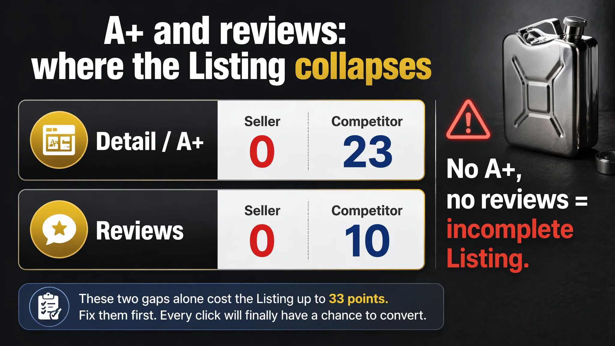
- Detail / A+: Seller: 0, Competitor: 23, Full Score: 25, Gap: -23
- Reviews: Seller: 0, Competitor: 10, Full Score: 15, Gap: -10
Two things stand out immediately:
1. Detail/A+ score = 0 vs. 23
The seller’s page had no A+ content at all. The competitor’s A+ was fully built out with nine structured modules.
1. Reviews score = 0 vs. 10
The seller had 0 reviews and no star rating, while the benchmark had a 4.4-star average from over 1,500 reviews.
The Listing was not just “slightly behind.” It was fundamentally incomplete as an Amazon product page:
- No structured story on the detail page
- No visual trust path
- No social proof
- Only a basic visual and text skeleton trying to carry paid traffic
At this point, continuing to push ads meant one thing: every extra click increased the cost of proving the page’s weaknesses.
The Seller’s Misdiagnosis: Blaming Ads for a Page That Couldn’t Sell
Before the DeepBI diagnosis, the seller’s implicit assumptions were:
- “Our design is unique; once people see it, they will buy.”
- “We just need to solve traffic and review volume.”
- “If ACOS is high, we should optimize keywords, bids, and structures.”
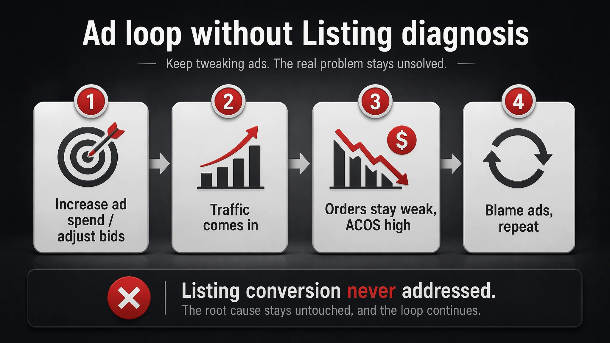
This led to a typical loop:
1. Increase ad spend or adjust bidding.
2. See some traffic, but orders do not follow proportionally.
3. Conclude that ads or keyword selection are still not “optimized enough.”
4. Repeat ad tinkering without touching the underlying Listing logic.
What they were not doing:
- Comparing their title, bullets, images, and A+ to a top competitor on the same keywords.
- Asking whether the page itself answered the buyer’s real questions:
- Is this safe to drink from?
- Will it leak?
- What size is it, and does it fit my use?
- Is this something I’m comfortable gifting?
Without that perspective, they kept trying to “fix ACOS” in the ads, while the real problem was the page’s inability to convert.
Amazon Ads Were Not Failing. The Page Was Consuming the Traffic.
DeepBI’s scoring and multi-dimensional comparison made one conclusion unavoidable:
Advertising does not only amplify advantages. It can also amplify a page’s existing defects.
For this hip flask Listing, the defects were concentrated in five areas.
1. A Title That Talked, but Didn’t Persuade
The original title:
- Pushed the core keyword “Hip Flask” to the back, reducing search-weight relevance.
- Used “Personalized” as a key selling word—too generic and weak as a driver of purchase.
- Listed a string of usage scenes (“Climbing Camping Barbecue Bar Party”), creating a loose, unfocused structure.
- Did not clearly emphasize food-grade safety, leakproof performance, or specific capacity—all critical for function-focused buyers.
The competitor’s title, by contrast:
- Started with “2 Pack Hip Flasks for Liquor”—clean, direct, and search-relevant.
- Included “Leakproof”, “with Funnel”, and explicit sizes (8 Oz & 12 Oz).
- Followed a tight formula: core keyword + result/use (“for Liquor”) + functional attributes + pack & capacity details.
This meant:
- On the search page, the competitor’s title instantly answered: “What is it, for what, with what, and in what sizes?”
- The seller’s title forced buyers to decipher what was special, and why they should click.
DeepBI’s title optimization direction was clear:
- Front-load “Whiskey Flask” and leverage “Hip Flask” as a supporting term, not buried.
- Highlight the “Oil Jerry Can” shape as a unique visual hook, but as a secondary element, not the main keyword.
- Introduce “Leakproof” and “Stainless Steel” (food-grade) to address practical concerns.
- Compress scattered scene lists into a more coherent, scannable structure.
2. Main Images That Looked Like Products, Not Decisions
The main-image set scored lower than the competitor’s for several reasons:
- Lack of credible scenarios:
No real outdoor, social, or gift situations. As a result, the page failed to connect the product to:
- Camping nights
- Parties
- Weddings
- Formal or informal social rituals
- Weak industrial feel:
Lighting and composition were flat. The stainless-steel or metal texture did not look premium or robust, which matters for a “hardcore” hip flask.
- Scattered and outdated layout:
Icon-based images and composited visuals looked cheap and unstructured compared with the competitor’s:
- Clean, minimal layouts
- Clear parameter callouts
- Trust-building visual cues
On Amazon, thumbnails and first images must create a reason to click and hint at trust in split seconds. Here, the images showed the product but did not:
- Communicate quality and safety visually.
- Show leakproof mechanics in a convincing way.
- Embed the flask in a believable lifestyle.
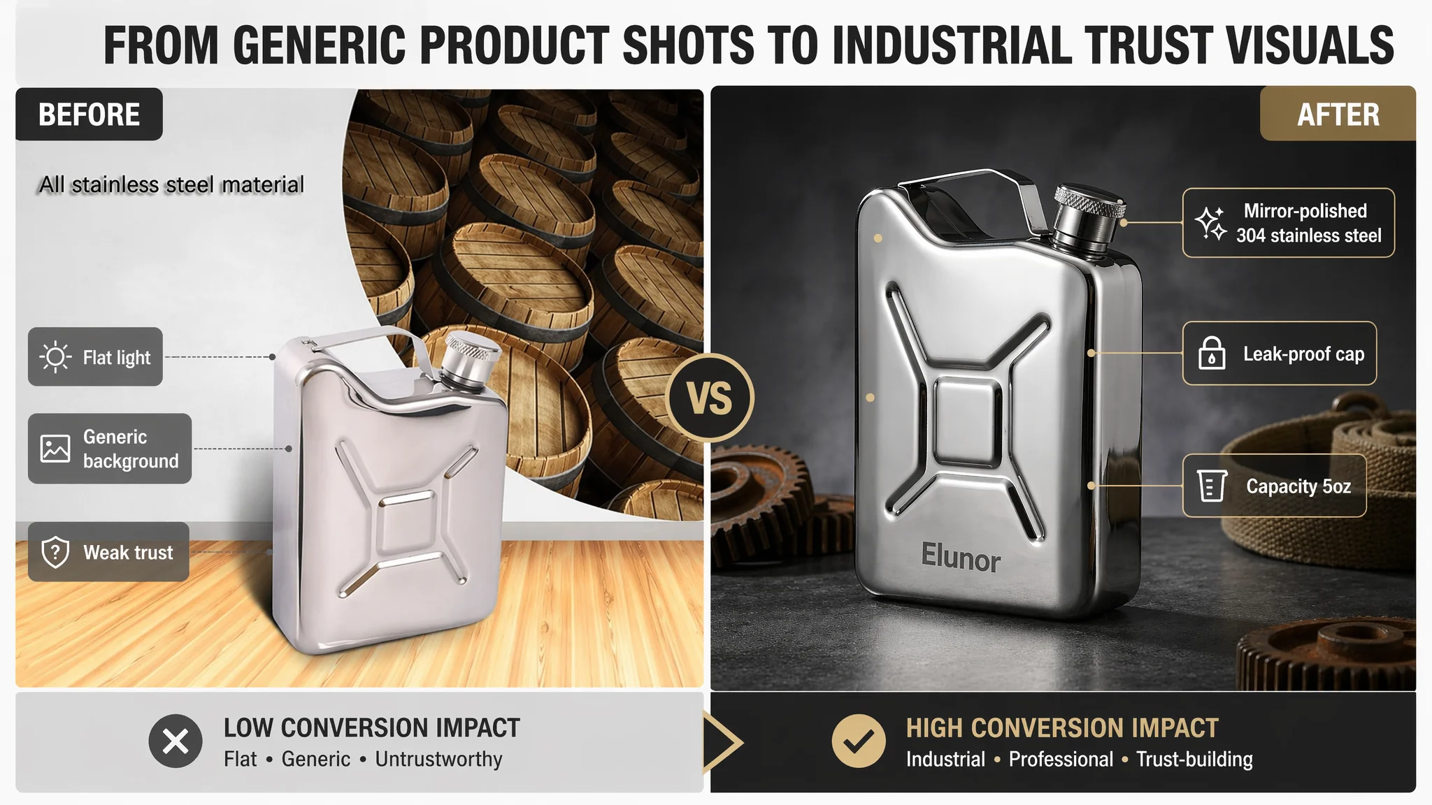
DeepBI’s visual strategy was to reposition the image system around a “hard industrial + professional parameters” tone:
- Use dark, high-contrast backgrounds and controlled highlights to emphasize metallic structure.
- Bring in:
- Macro shots of screw caps and threads
- Outdoor scenes (rock, wood, camp) to tie into rugged usage
- Everyday context (bag, briefcase) to answer portability doubts
The goal was not “making it pretty,” but making it look trustworthy and functional at first glance.
3. Bullet Points That Listed, but Did Not Close
The original bullet points:
- Mentioned material and safety, but without professional terms like “Food-grade”, “Anti-corrosion”, or “Rust-resistant”.
- Described “unique design” and social value, but in vague language.
- Touched on cleaning and portability, but without linking these to concrete benefits in use.
- Ended with a simple list of scenes, without tying them to risk reduction or after-sales confidence.
The competitor’s bullet structure, by comparison, followed a clear buyer-logic:
1. Food-grade material & safety certification
2. Set composition and extra value (two flasks + funnel)
3. Design fit for both men and women (giftability)
4. Leakproof cap structure and reassurance
5. Usage scenes + after-sales support (“Versatile with Great Support”)
DeepBI’s bullet optimization reframed each point into a pain-point → solution → reassurance loop:
- Bullet 1 – Material trust:
“Premium Food-Grade Material,” explicitly stating non-toxic, anti-corrosion, rust-resistant, and safe long-term storage.
- Bullet 2 – Finish & giftability:
“Elegant Mirror-Polished Finish,” tying appearance directly to gift scenarios and personal taste.
- Bullet 3 – Leakproof assurance:
“100% Leak-Proof Design,” explaining secure screw cap and attached lid to eliminate “lost cap” anxiety.
- Bullet 4 – Portability & cleaning:
“Portable & Easy to Clean,” marrying slim/ergonomic design to simple maintenance.
- Bullet 5 – Scenes & gifting:
“Versatile Gift for Every Occasion,” aligning key scenes (weddings, camping, sports) with specific recipients (husbands, fathers, friends).
The shift was from “we have these attributes” to “this solves exactly what you worry about, and here’s how”.
4. A Detail Page with Zero A+ vs. a Competitor with Nine Modules
This was the single biggest conversion leak.
The seller’s detail page:
- Had no A+ modules.
- No structured story.
- No expanded visuals beyond the basic image set.
- No attempt to visually prove:
- Material quality
- Leakproof design
- Ease of cleaning
- Multi-scene fit
The competitor’s A+ content, however, was a full conversion engine:
- Product set overview (two flasks + funnel)
- Size and capacity comparison
- Material close-ups and food-grade emphasis
- Leakproof structure diagrams
- Gender-neutral usage scenes
- Safety warnings and misuse examples
- Cleaning demonstrations
- Multi-scene usage collage (camping, fishing, etc.)
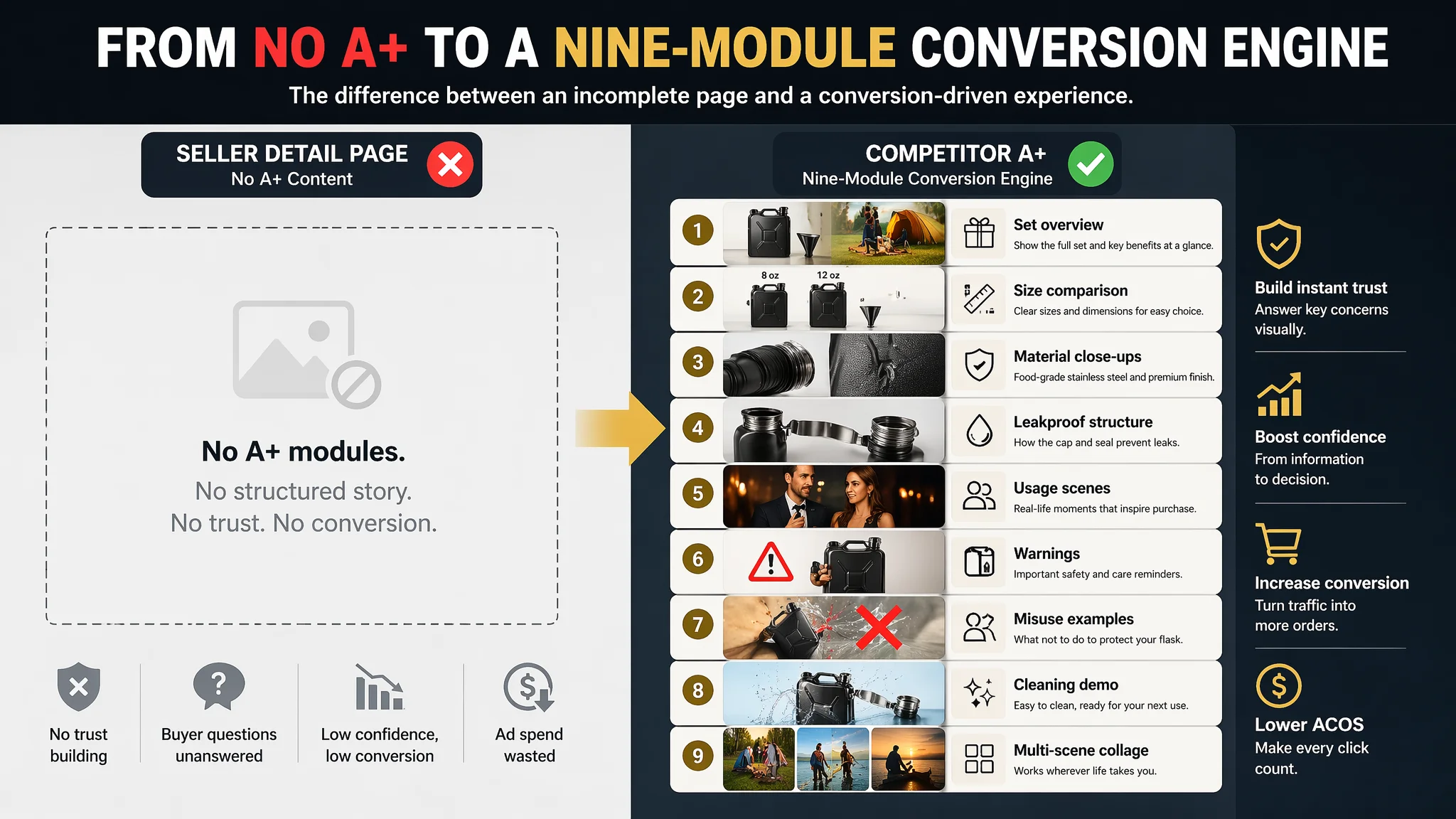
This did several jobs at once:
- Built emotional resonance with camping, travel, and social scenes.
- Addressed risk (“Do not drop seriously to the ground”) with clear visuals.
- Explained capacity and usage in one glance.
- Reinforced trust with material and structural close-ups.
- Expanded the audience from “outdoor guys” to broader social and gifting buyers.
DeepBI’s judgment: without A+, the Listing had almost no structured conversion logic. Even if ads brought in qualified traffic, many buyers would:
- Scroll, see no deeper content.
- Find no extra trust signals.
- Compare with a richer competitor page.
- Exit or choose the competitor.
5. Zero Reviews vs. 1,562 Reviews and 4.4 Stars
Finally, social proof:
- Seller:
- 0 reviews, no star rating, no buyer photos.
- Competitor:
- 4.4-star rating
- 1,562 reviews
- 13 reviews on the first page with detailed text and images.
This meant:
- The competitor’s page not only showed quality; it had thousands of buyers reinforcing the message.
- The seller’s page asked buyers to take all the risk without any proof or assurance.
In such a situation, ads only accelerate the realization that the page is unproven.
Why DeepBI Did Not Recommend “Fix Ads First”
Given this evidence chain, DeepBI’s decision logic was straightforward:
- Continuing to optimize ads first would:
- Increase spend without improving conversion.
- Push more users into a page that was structurally unconvincing.
- Distort ACOS and TACOS, making it harder to judge true ad performance.
- The biggest business risk was:
- Letting advertising amplify a low-conversion Listing.
- Teaching Amazon’s algorithm that traffic to this ASIN does not convert well, which can depress both paid and organic rankings.
Therefore, the priority order had to be:
1. Rebuild Listing conversion capacity:
- Title clarity and keyword weight.
- Main images that establish trust and use.
- Bullet points that follow a decision path.
- A fully structured A+ detail page.
1. Only then reassess ad performance:
- Once the page could convert, ad data would become meaningful again.
- ACOS changes would reflect both traffic quality and improved page quality.
In short: before asking whether ads deserve more budget, ask whether the page deserves more traffic.
How the Page’s Sales Logic Was Rebuilt
DeepBI’s optimization directions focused on reconstructing the buyer’s journey inside the Listing, not just polishing individual elements.
Reframing the Title Around Real Search & Purchase Logic
The recommended title moved to:
“5oz Oil Jerry Can Whiskey Flask for Liquor, Leakproof Stainless Steel Pocket Hip Flask for Men & Women, Portable Mini Liquor Flagon for Climbing, Camping, Barbecue and Outdoor Party”
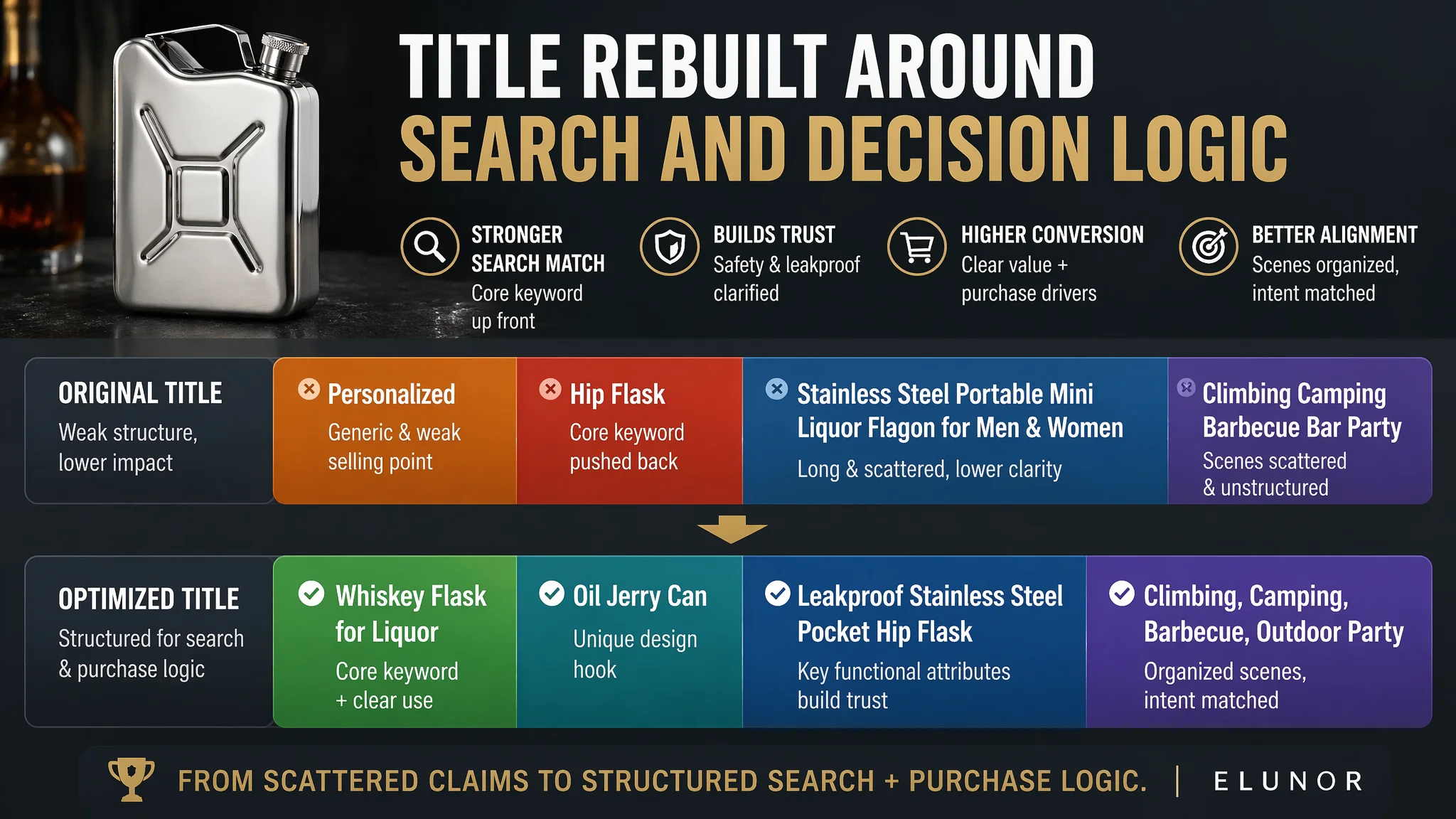
Key changes:
- “Whiskey Flask for Liquor” placed early, aligning with buyer search terms.
- “Oil Jerry Can” highlighted as a distinctive design hook, not the core functional keyword.
- “Leakproof Stainless Steel” emphasized to signal function and safety.
- Scenes compressed into a tidy, readable cluster at the end.
This improves:
- Search relevance for core terms.
- Click motivation by combining uniqueness and functionality.
- Readability, especially on mobile.
Turning Images into a Trust and Scenario Engine
Main-image directions included:
- Hero shot:
Flask centered, ~75% frame, 45° angle, dark industrial gradient background, controlled highlights on edges, subtle reflection—creating a premium, hard-edged look.
- Leakproof macro:
Cap off, threads in clear focus, bar-top background, annotation like “Precision leakproof thread,” visually proving leak resistance.
- Outdoor scene:
Flask on rock or wood in a camp setting, low-angle shot, dusk lighting, forest or camp behind, plus overlay parameters like “304 stainless steel,” reinforcing quality for outdoor use.
- Functional icons updated:
Clean, minimal icons with labels such as “Food-grade material,” “One-hand operation,” “Fine polishing,” replacing dated graphic styles.
- Portability shot:
Flask beside a leather briefcase or bag, 45° angle, clean office-style setting, label like “Industrial aesthetics, invisible in your bag,” directly answering “Can I really carry this easily?”
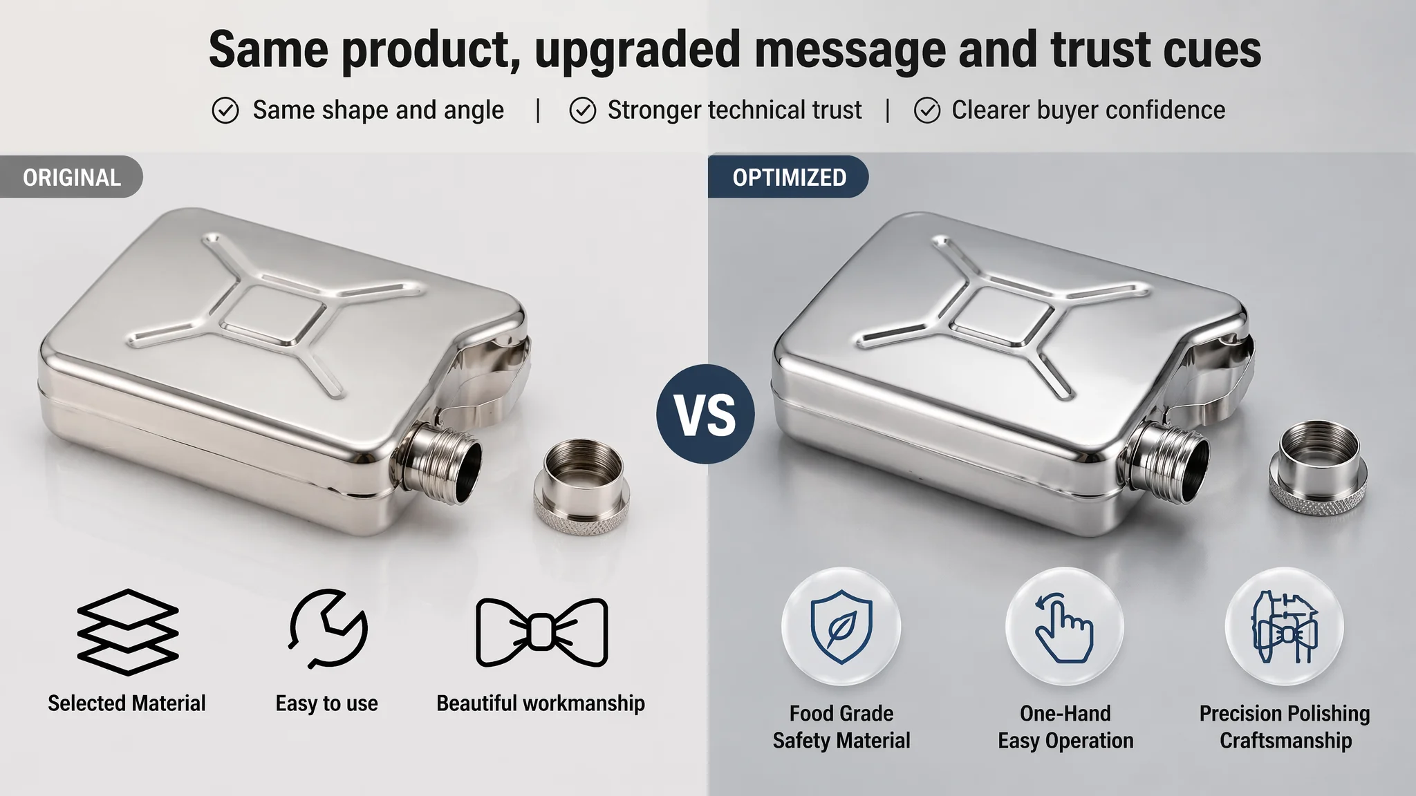
These were not aesthetic for aesthetics’ sake. Each image was designed to answer a conversion question:
- Is it strong?
- Is it leakproof?
- Is it easy to carry?
- Is it suitable for the scenes I care about?
Building a Full A+ Detail Structure
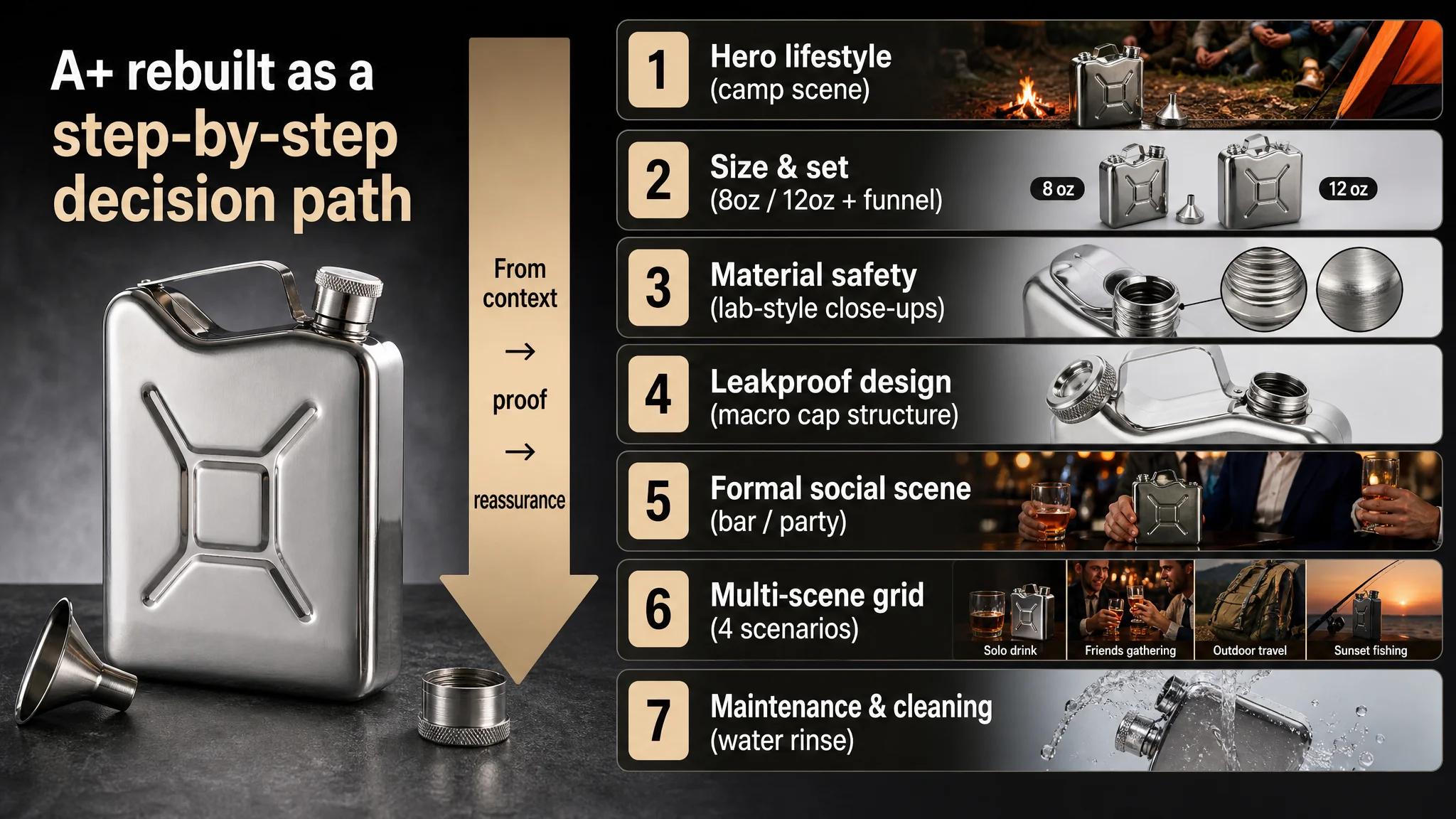
The recommended A+ modules mirrored the competitor’s strengths while respecting the seller’s product DNA:
1. Hero lifestyle module
- Camp scene with flask(s) and funnel on the ground, colorful tents and friends blurred behind.
- Communicates: “This lives where your outdoor memories happen.”
1. Size & set module
- Clear side-by-side 8oz and 12oz (or applicable sizes), with funnel and pouring action.
- Labels like “8 Oz” / “12 Oz” in bold blocks.
- Communicates: “You know exactly what you’re getting and how it feels in use.”
1. Material safety module
- Lab-style white background.
- Main product plus two magnified circles showing:
- Mouth threads.
- Side material texture.
- Communicates: “Food-grade, anti-corrosion, rust-resistant” in a visually credible way.
1. Leakproof design module
- Macro shot of cap, hinge, and seal, with shallow depth of field.
- Focus on the connection so buyers understand:
- Cap stays attached.
- Seal is tight.
- Communicates: “This won’t leak in your bag, and you won’t lose the cap.”
1. Formal social scene module
- High-end bar / private party background.
- Man in suit and woman in dress holding the flask together.
- Warm spotlight outlining the matte black shape.
- Communicates: “Not just for rough outdoors; also a premium social accessory and gift.”
1. Multi-scene four-grid module
- Four scenarios:
- Alone sipping.
- Friends gathering.
- Outdoor trip.
- Sunset fishing.
- Each with clear naming overlays.
- Communicates: “Whatever your scenario, this flask fits.”
1. Maintenance & cleaning module
- Dynamic shot of water rinsing over the flask.
- Clear water splash, blue gradient background.
- Text like “Clean after use.”
- Communicates: “Easy to clean, low maintenance, long-term reliable.”
With this structure, the detail page would finally:
- Anchor a clear use context in the first screen.
- Progress through what you get, why it’s safe, why it’s leakproof, and where you can use it.
- End with care guidance that reduces post-purchase anxiety and potential returns.
How Ads Became Useful Again
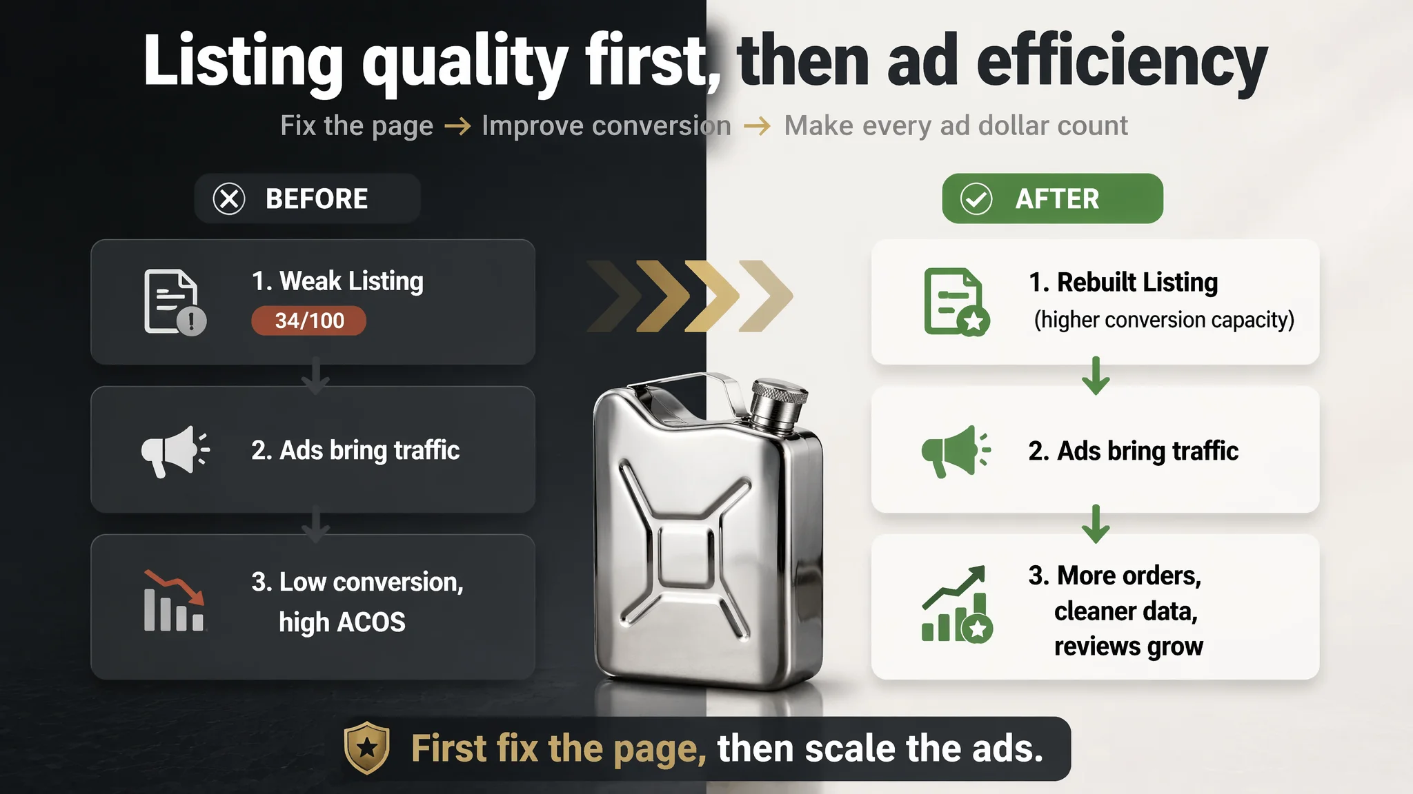
Once the Listing’s core conversion logic was rebuilt, the role of advertising changed:
- Before:
- Ads were forced to do both traffic acquisition and trust-building.
- Every click landed on a page that lacked proof, explanation, and reassurance.
- ACOS reflected not just traffic quality but page weakness.
- After:
- The page could stand on its own:
- Stronger title alignment.
- Visual trust hooks.
- Structured A+ storytelling.
- Bullet points covering all main objections.
- Ads began to:
- Bring in traffic that the page could actually convert.
- Generate cleaner data on which keywords and audiences worked best.
- Contribute to early orders and, over time, review accumulation.
Even without invented metrics, the operating state changed:
- The Listing’s ability to convert both paid and future organic traffic improved.
- The risk of high ACOS purely due to page weakness decreased.
- The seller gained a more stable base from which to:
- Test new ad structures.
- Scale budgets responsibly.
- Build an organic rank that was not overly dependent on ads.
What the Seller Learned—and What Other Amazon Sellers Can Take Away
For this Amazon hip flask seller, the main realization was blunt:
- Their problem was not primarily advertising.
- Their Listing had never been built to convert at category standards.
Key shifts in understanding:
- Listing quality is the foundation of advertising efficiency.
A low-scoring page cannot carry high-cost traffic, no matter how refined the keyword strategy.
- Title, main image, bullets, and A+ must form a coherent decision path.
Each module must answer a specific buyer question or objection, not just “fill space.”
- Advertising can amplify defects.
When the detail page has no A+, no reviews, and weak visuals, every extra click simply accelerates loss.
- Before increasing ad spend, ask whether the page deserves more traffic.
If a benchmark competitor scores 79/100 while your Listing sits at 34/100, the priority is clear.
For other Amazon sellers, especially in categories like drinkware, outdoor gear, or gifts, this case underscores:
- Distinctive design is a starting point, not a guarantee of conversion.
- A strong competitor’s A+ is not just decoration; it’s often the real conversion engine.
- When ACOS is stubbornly high and CVR weak, the first diagnosis should be:
- “Is my Listing structurally underbuilt?”
- “Have I matched the category’s trust and storytelling level?”
- “Would I buy from my page if I had never heard of my brand?”
DeepBI’s role here was not to tweak ads, but to reframe the problem and expose the real constraint: a Listing with a 34/100 score trying to compete in a 79/100 environment.
Once the seller accepted that Listing conversion had to be fixed first, the path became clearer: rebuild the page, then let ads work as they should—amplifying strengths instead of weaknesses.