


This case comes from an Amazon seller in the wedding and party-supplies category. On paper, their Amazon Listing looked strong: a luxurious gold wedding cake knife and server set, carefully written title, and emotionally rich bullet points. Yet ad spend was getting harder to justify and the product page could not convert traffic the way the team expected. They kept looking for problems in ads, keywords, and bids. DeepBI’s diagnosis showed something very different: the real bottleneck was a broken product-page conversion path, especially the complete absence of A+ / detail-page visuals.
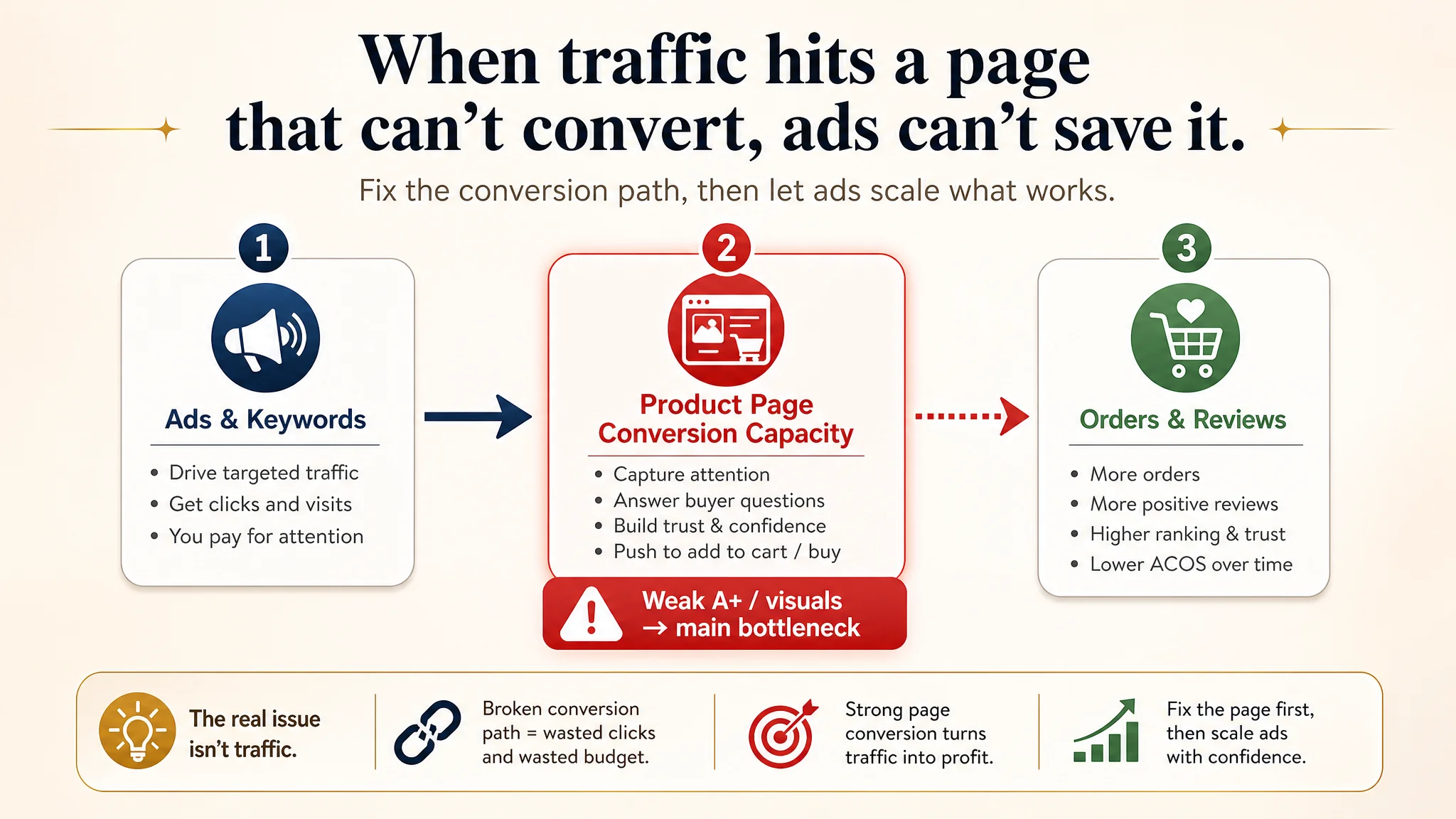
The seller originally believed the issue lay in advertising structure and perhaps minor title tweaks. But when DeepBI benchmarked the Listing against a top Amazon competitor in the same subcategory, the biggest gap was not in text or creative ideas – it was in the Listing’s ability to visually build trust and walk buyers through a wedding decision. With zero A+ modules and no visual storytelling, every click from Amazon ads was landing on a page that could not “hold” the visitor.
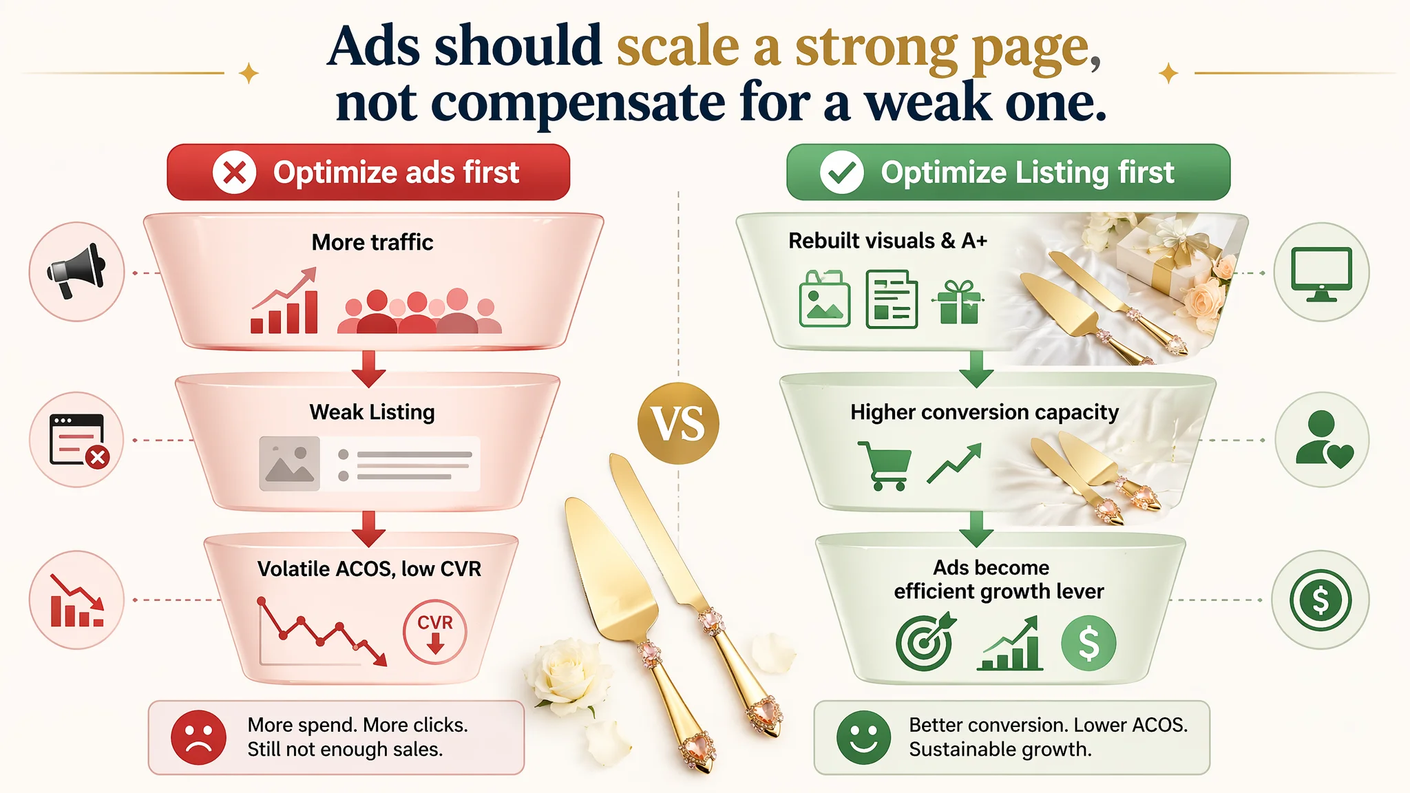
Once the problem was reframed as a Listing-conversion issue rather than an ads issue, the optimization direction flipped. Instead of endlessly tuning campaigns, DeepBI pushed to rebuild the visual logic of the Amazon product page: main-image system, gift-ready signaling, and a full emotional A+ journey around the wedding moment, multi-occasion use, and keepsake value. For other Amazon sellers, the lesson is clear: if your page cannot convert, ads will only magnify that weakness. Before pushing more traffic, you have to check whether your Listing deserves that traffic.
What the Seller Saw: A “Good-Looking” Listing That Still Wouldn’t Sell
The product is a gold wedding cake knife and server set on Amazon US – positioned as a romantic, luxurious item for weddings, anniversaries, engagements, bridal showers, and other celebrations.
From the seller’s perspective, the fundamentals looked “above average”:
- The title already led with “Handcrafted Luxury Gold Wedding Cake Knife and Server Set” and covered long-tail search scenes like “Bridal Shower”.
- Bullet points deeply explored romance, loyalty, “heirloom” symbolism, and multi-scene gifting.
- Main images showed the product from multiple angles.
So when ad performance felt unstable and conversion lagged expectations, the team’s instinct was:
- “Maybe we need better keywords or more precise campaigns.”
- “Maybe our bidding and budget allocations are not aggressive enough.”
- “Maybe we just need more reviews.”
Their operating pressure was real: each additional dollar of Amazon ads was producing less predictable orders. Yet nothing obvious on the surface of the Listing looked “terrible,” which made the team even more unsure where to act.
The Misdiagnosis: Treating a Page Problem as an Ads Problem
From the seller’s internal discussions, the working assumption was:
“We’re not getting enough orders because our Amazon ads and keyword strategy aren’t tuned enough.”
Under that assumption, they focused on:
- Iterating campaigns, bids, and match types
- Adjusting budgets to chase more impressions
- Hoping that more traffic, plus time, would “accumulate” conversions and reviews
But this approach implicitly assumed something dangerous:
“The product page is already good enough. The main limit is traffic.”
DeepBI’s scoring and benchmarking showed the opposite.
What the Data Actually Said: Listing Conversion Capacity Was the Constraint
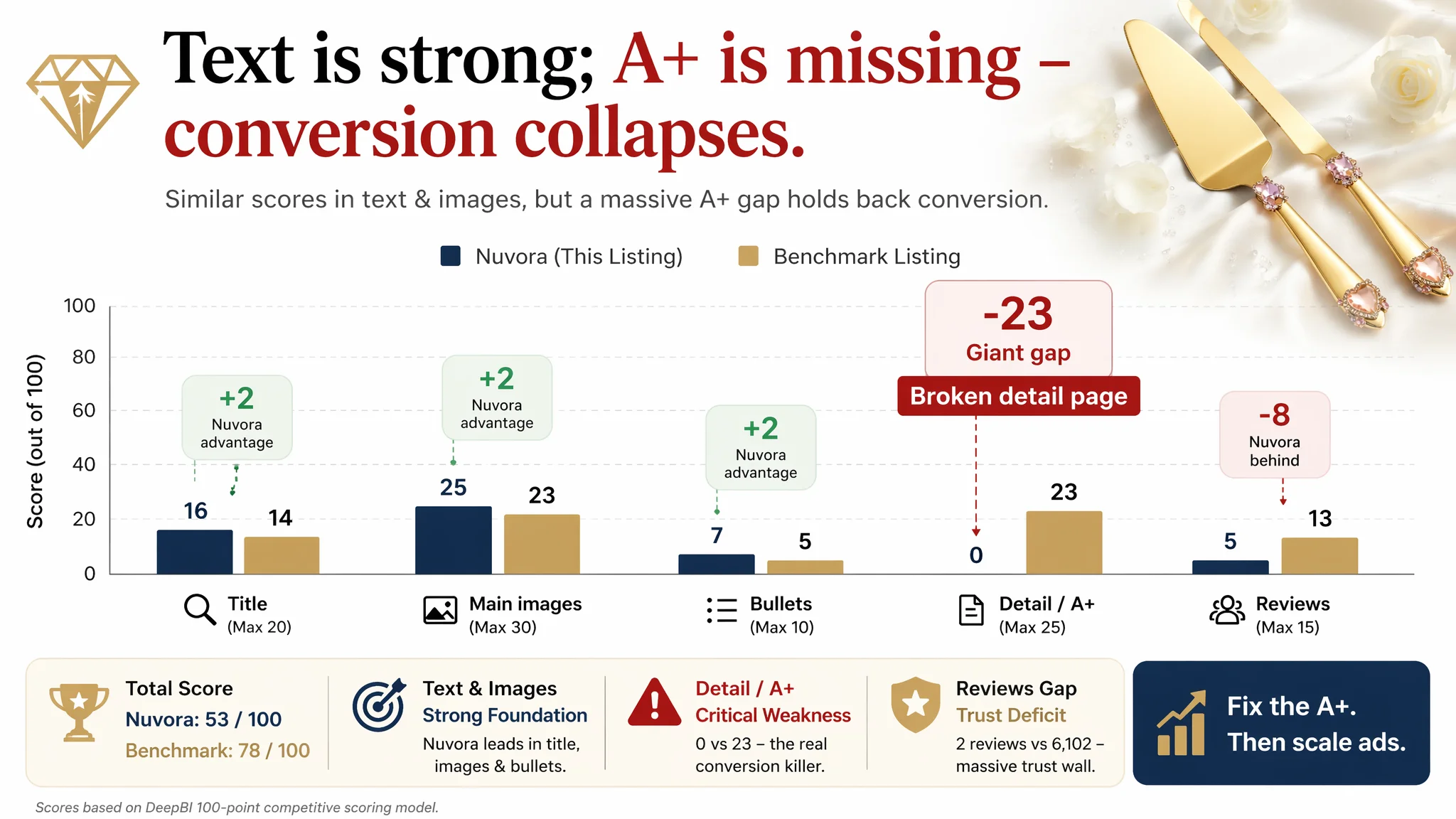
DeepBI compared the seller’s Listing against a high-performing benchmark Listing in the same Amazon wedding cake knife subcategory and generated a 100-point competitive score:
- Seller total Listing score: 53 / 100
- Benchmark Listing score: 78 / 100
- Gap: -25 points
Breaking it down:
- Title: Seller: 16, Benchmark: 14, Max: 20, Gap: +2
- Main image set: Seller: 25, Benchmark: 23, Max: 30, Gap: +2
- Bullet points: Seller: 7, Benchmark: 5, Max: 10, Gap: +2
- Detail / A+ content: Seller: 0, Benchmark: 23, Max: 25, Gap: -23
- Reviews: Seller: 5, Benchmark: 13, Max: 15, Gap: -8
Two things stand out:
1. Text and main-image fundamentals were not the problem.
The seller actually scored slightly higher than the benchmark on title, main image, and bullets.
1. The real collapse was in the detail-page / A+ area.
A brutal 0 vs 23 in the detail/A+ dimension. No A+ modules, no visual story, no supporting imagery.
“The real problem was not that ads failed to bring traffic. It was that the page could not convert the traffic.”
On top of that:
- The seller had a perfect 5.0-star rating but only 2 total reviews.
- The benchmark had 4.5 stars with 6102 reviews – an overwhelming trust wall.
So while the seller’s copy sounded premium and emotionally rich, the page structure and social proof simply did not reach the standard needed to convert cold traffic from Amazon ads, especially in a life-event category like weddings.
Why Traditional Ad Optimization Had No Chance to Work
From an Amazon business perspective, this is a classic trap:
- Ads are being tuned as if the page is “conversion ready.”
- But the page is structurally unable to convert the incoming traffic.
DeepBI’s diagnosis logic connects these dots:
- In wedding-related categories, emotional resonance and trust visuals carry as much weight as price or specs.
- The benchmark Listing used:
- Full-width emotional scenes (newlyweds cutting cake)
- High-quality product close-ups
- Multi-occasion scenes
- Gift-box or gift-like setups
- A+ modules that visually support each promise
The seller’s Listing, by contrast:
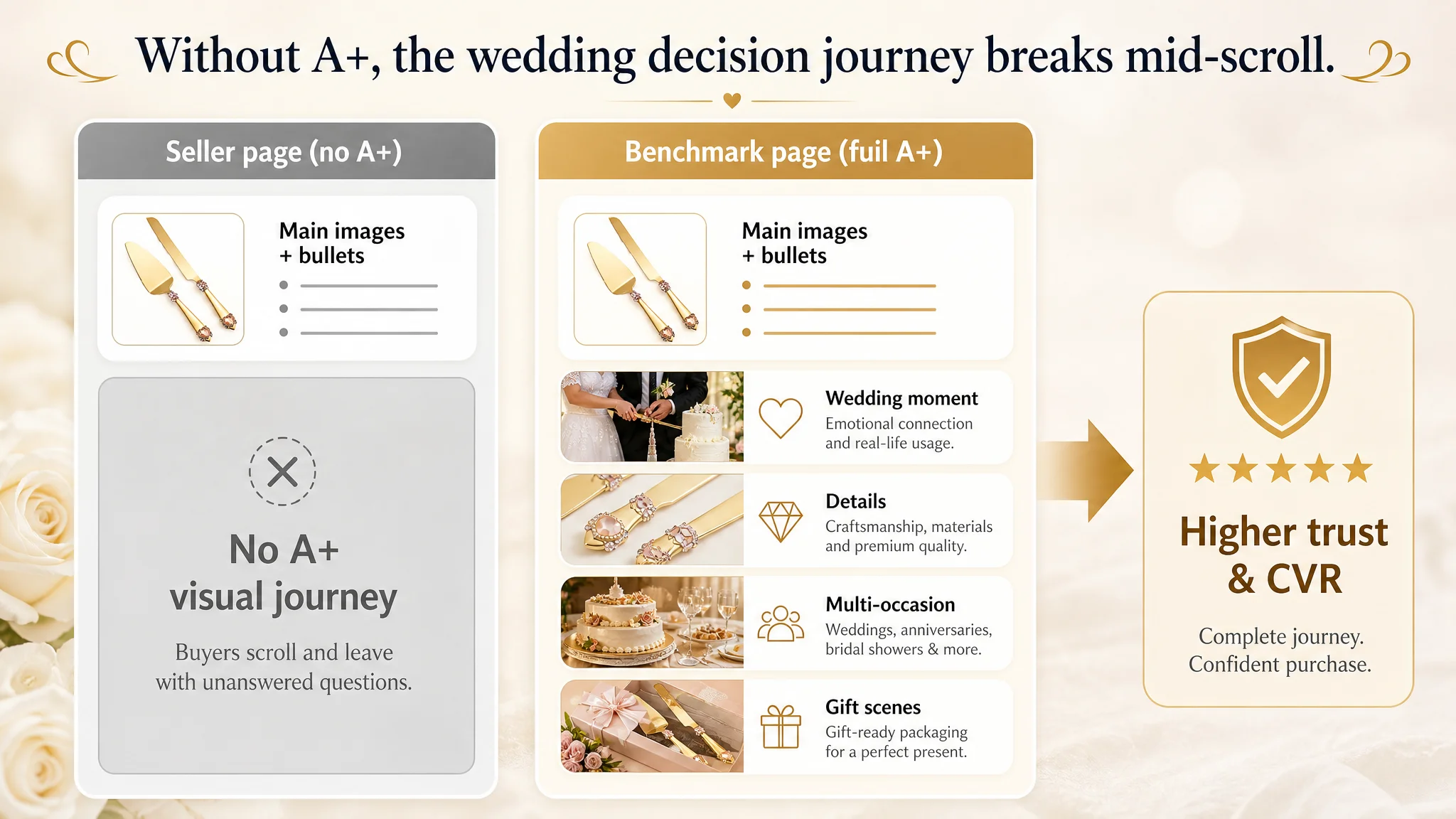
- Had no A+, no storytelling modules, and almost no visual flow below the fold.
- Left buyers with only:
- A good title
- Some decent product images
- Emotionally written bullets
- And then… nothing
In data terms, this means:
- Clicks from ads land on a page with a broken decision journey.
- Buyers cannot easily answer:
- “How will this look in my wedding photos?”
- “Does this feel premium enough for such a big day?”
- “Is it gift-ready and presentable?”
- “Is it durable enough to keep as a keepsake?”
Without powerful detail-page visuals, all those questions stay unanswered. The result: traffic bounces, conversion underperforms, and ACOS becomes stubbornly hard to move, no matter how much the seller tweaks ads.
“Advertising does not only amplify advantages. It can also amplify a page’s existing defects.”
What DeepBI Saw in the Listing: A Strong Story Locked Inside a Weak Container
Title: Strong Keywords and Value Signaling, But Slightly Overloaded
DeepBI’s benchmark showed that the seller’s title logic was fundamentally sound:
- Led with high-intent core terms:
- “Gold Wedding Cake Knife and Server Set”
- Integrated high-value attributes:
- “Stainless Steel”
- “Crystal & Gemstone Embellished Handles”
- Covered multiple scenes:
- Weddings, anniversaries, engagement, bridal shower, special occasions
Compared with the benchmark:
- The competitor’s title was more concise and formulaic (brand + product + material + core occasion).
- The seller’s title had more emotional and attribute depth, but was borderline long and slightly cluttered with symbols (like “&”) and bracketed color notes “(Pink)”.
DeepBI’s judgment: Title optimizations (ordering keywords, trimming redundancy) are worth doing, but they are not the main bottleneck. Title is not what’s holding back conversion.
Main Images: Competitive, but Not Fully Aligned with Premium Wedding Expectations
On scoring, the main-image set actually placed slightly ahead of the benchmark in pure “score” terms. But visual analysis revealed issues that matter in a wedding context:
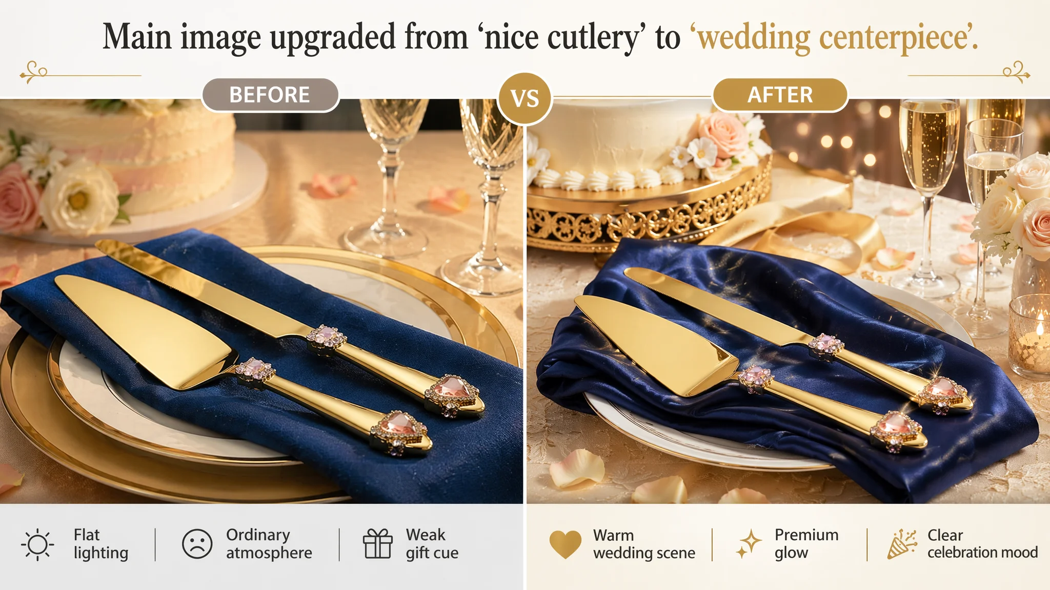
1. Atmosphere felt lower-end
- Blue woven mats and plain packaging clashed with a “luxury wedding” positioning.
- Missing that silk, marble, or champagne-toned background that signals premium and ceremony.
1. Scene beauty was underleveraged
- Cake and product proportions, lighting, and background were visually flat.
- Competing Listings created depth, bokeh, and warm champagne tones that feel like real wedding receptions.
1. Key features were scattered, not highlighted
- The handle’s heart-shaped crystal and pink gemstones were not emphasized.
- Competitors used magnified “bubble” callouts to show details clearly in one frame.
1. Specs were not visualized professionally
- Where the benchmark clearly visualized dimensions in clean layouts, the seller missed a chance to turn measurements into trust-building visuals.
1. Giftability cues were weak
- Original packaging looked ordinary.
- In a wedding category, buyers want instant reassurance that “this is gift-ready and presentable.”
DeepBI did not treat main images as “terrible”; they were salvageable but misaligned with the product’s premium romance story. More critical, they were not being supported by a strong detail page below.
The Real Hole: A Completely Missing A+ Story
The most decisive finding:
- Seller detail/A+ score: 0 / 25
- Benchmark detail/A+ score: 23 / 25
The seller’s Amazon product page had:
- No images in the A+ area
- No emotional modules
- No multi-scene or trust-building layouts
The benchmark Listing used at least six high-quality A+ images to cover:
- Ceremony scenes (newlyweds cutting cake)
- Product details and finishes (gold plating, crystal handles)
- Multi-occasion use (birthdays, holidays, events)
- Gift positioning (boxes, ribbons, setups)
- Festive atmosphere (decor, champagne, tablescapes)
DeepBI’s assessment:
- Without A+ content, the seller’s conversion path is broken.
- Buyers are forced to make a wedding purchase decision based on:
- A few images
- Bullets
- Two reviews
And nothing that visually answers emotional or quality doubts.
In categories where emotion, imagery, and social proof matter heavily, this is fatal.
Why DeepBI Refused to “Fix Ads First”
Faced with the scoring, DeepBI’s operational judgment was clear:
- Core bottleneck: Listing conversion capacity, not traffic volume
- Main risk: Ads are amplifying a page that cannot convert, wasting budget and eroding confidence
If the team had continued to tune ads first, they would have:
- Paid to drive more visitors into a structurally weak Listing
- Seen unstable ACOS and weak CVR
- Probably concluded “this product isn’t viable” far too early
Instead, DeepBI prioritized:
1. Rebuilding the product-page visual narrative (especially A+)
2. Realigning the main-image system to wedding-premium expectations
3. Then, and only then, letting ads test the new conversion capacity
The decision logic:
- In Amazon’s funnel, page conversion is the prerequisite for efficient advertising, not the other way around.
- For a wedding cake knife set, A+ visuals and emotional scenes are not “nice to have”; they are the main engine of trust.
How the New Page Logic Was Designed to Convert
DeepBI’s optimization focus was not on “more content,” but on a structured decision journey that matches how Amazon wedding buyers think.
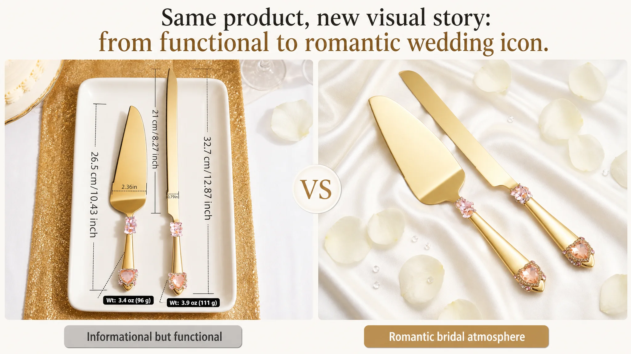
1. Reframing the Main Image: From “Generic Tableware” to “Wedding Icon”
DeepBI’s visual plan repositioned the main-image series so the product instantly reads as “romantic, luxurious wedding tool”, not just “a gold knife and server”.
Key decisions:
- Background upgrade
- Switch to white or champagne silk backgrounds with gentle folds.
- Use warm, soft lighting for a luxury, bridal feel.
- Hero composition
- Center the knife and server at a 30–45° angle, occupying around 70% of the frame.
- Use overhead or slight 45° side angles to create sculpted highlights on gold surfaces.
- Scene integration
- Place the set in front of a tiered wedding cake, with background bokeh of a reception (lights, décor, blurred guests).
- Subtle touches like rose petals, champagne flutes, or gold-rimmed plates signal “event-grade” and premium.
- Detail callouts
- White-background images with four circular magnifiers showing:
- Heart-shaped crystal detail
- Pink gemstone chips
- Serrated gold blade
- Handle end design
- Clean sans-serif labels for quick, professional information.
- Dimension visualization
- Use an overhead shot on a white porcelain tray with clear measurements:
- “32.7 cm / 12.87 inch” for knife
- “26.5 cm / 10.43 inch” for server
- Dark gray guide lines and labels for instant understanding.
- Gift-readiness
- Show the set resting on a deep-blue satin napkin in a gold-rimmed plate, with blurred champagne and cake stands in the background.
- The visual message: this isn’t just cutlery; it’s a gift-worthy wedding centerpiece.
Result: When buyers see the thumbnails and then the main image, their first impression shifts from “nice product” to “this fits the wedding I imagine.”
2. Structuring Bullet Points Around a Clear Buying Logic
The seller’s original bullet copy was rich but needed more direct functional and trust anchors. DeepBI’s adjustments kept the emotional core but made each bullet do a specific job:
1. Reassure on quality and performance
- “Premium Gold-Plated Stainless Steel – food-safe, rust-resistant, smooth slicing for multi-layered cakes, stable serving.”
1. Connect beauty with usability
- “Hand-Embellished Ergonomic Handles – crystals and natural gemstones, secure grip, high-end appearance and comfortable use.”
1. Anchor tradition and longevity
- “Meaningful ‘Something Blue’ Keepsake – loyalty, peace, romance; durable enough to become a family heirloom.”
1. Expand usage frequency
- “Versatile for Every Celebration – not just weddings; also pies, pastries, birthdays, holidays, dinner parties.”
1. Clarify gift convenience
- “Exquisite Gift-Ready Packaging – luxurious ribbon-adorned gift box, no extra wrapping required; ideal for newlyweds and party hosts.”
Now, each bullet acts as a step in the decision ladder: quality → comfort → meaning → versatility → gift ease.
3. Rebuilding the A+ / Detail Page: From Zero to Emotional Journey
This is where DeepBI deliberately concentrated the heaviest work, because it’s where the benchmark Listing was winning.
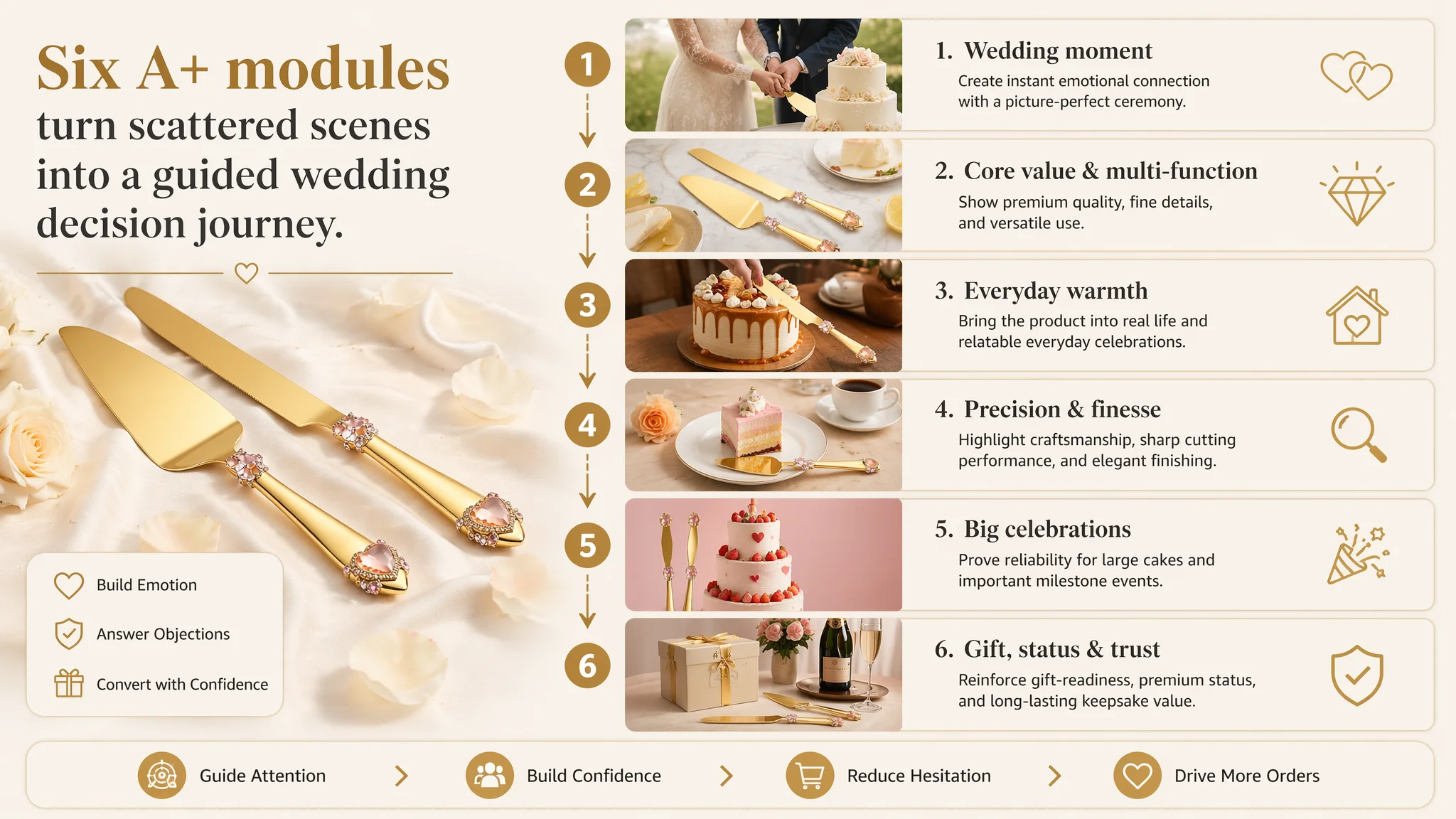
The new A+ concept was built around six modules that mirror how wedding buyers scroll:
Module 1 – The Wedding Moment (Opening Scene)
- Image: The knife and server in the hands of the couple cutting a three-tier white cake.
- Scene: Outdoor or softly lit wedding setting, greenery and décor in the blurred background.
- Lighting: Side backlight with golden tones, highlighting metal shine and the couple’s hands.
- Purpose: Instantly anchor the product in “your wedding ceremony”, not a generic kitchen.
Module 2 – Core Value and Multi-Function (Core Benefits)
- Image: Top-down shot on white marble.
- Elements:
- Knife and server diagonally placed.
- A lemon cake with cut slices dusted with sugar.
- Lemon slices, sugar bowl, fork around the scene.
- Purpose: Visualize cutting performance and extend the story beyond the wedding – showing everyday or celebratory dessert usage.
Module 3 – Everyday Warmth (Scene Expansion)
- Image: Cozy home gathering or afternoon-tea vibe.
- Scene:
- Caramel cream cake with cinnamon sticks.
- Warm wooden table, soft side lighting.
- Purpose: Address the “usage frequency” objection – showing the product belongs in family gatherings, not just a one-time event.
Module 4 – Precision and Finesse (Detail Focus)
- Image: The set next to an elegant mille-feuille cake in a café-like atmosphere.
- Elements: Coffee cup, single flower, neutral background.
- Purpose: Communicate fine control and elegance in serving delicate desserts, reinforcing perceived craftsmanship.
Module 5 – Handling Big Celebrations (Pain-Point Resolution)
- Image: The knife standing beside a large multi-layer strawberry cream cake with a heart topper.
- Background: Simple pink backdrop, no clutter.
- Purpose: Visually answer concerns about stability and capacity for large, heavy cakes at major events.
Module 6 – Gift, Status, and Trust (Social Proof Substitute)
- Image: The set in a light-luxury banquet scene:
- Transparent cake stand, mousse cake, champagne bottle, gold-rimmed glasses, flowers.
- Palette: Soft pinks, beige, champagne gold; blurred background.
- Purpose: Compensate for low review volume by building visual status and gifting credibility, signaling that this product belongs in high-end celebrations.
Collectively, these modules transform the product page from text plus a few images into a guided emotional experience that:
- Mirrors the buyer’s real usage scenes.
- Answers silent objections visually.
- Establishes a premium, trustworthy feel even with limited reviews.
How This Changed the Role of Ads
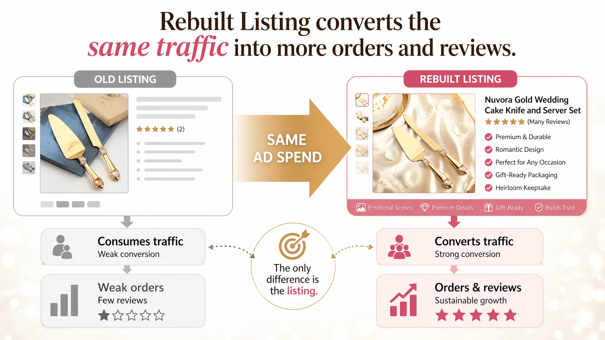
Once the Amazon Listing’s conversion logic was rebuilt, the role of ads shifted:
- Before:
- Ads were driving traffic into a conversion-deficient page.
- ACOS was volatile, and each click had a high risk of being wasted.
- The team questioned whether the product itself was viable.
- After the Listing redesign:
- Ads could finally test a page that deserves traffic.
- Every paid click was more likely to be met with:
- Strong first impression (main images)
- Clear quality and versatility story (bullets)
- Emotional and trust visuals (A+)
- Over time, this supports:
- Higher CVR
- More orders
- More reviews and image reviews
- Gradual reduction in dependence on paid traffic as organic ranking and trust improve
Even without publishing specific numeric lifts, the business logic changed:
- The Listing moved from “traffic consumer” to “conversion engine.”
- Ads became a lever on a solid page, not a bandage on a weak one.
What Other Amazon Sellers Can Take from This Case
1. High ACOS is often a page problem, not only an ads problem.
When DeepBI sees an Amazon Listing with weak detail-page/A+ and thin reviews, ad tuning alone is rarely the right first move.
1. Text quality cannot compensate for missing visual trust.
This case had robust bullets and a strong title, yet scored 0 vs 23 in A+ compared with the benchmark. Conversion loss was structural, not linguistic.
1. In emotional categories (weddings, gifts, ceremonies), “scene logic” is conversion logic.
Buyers need to see:
- The product in their specific occasion
- Gift-readiness
- Longevity and meaning
Or they will hesitate, no matter how good the specs are.
1. Ads can amplify defects.
If your Amazon product page:
- Lacks A+ content
- Has poor or generic imagery
- Has minimal reviews
Then aggressive advertising will mostly amplify those weaknesses into wasted spend.
1. Decision order matters.
For this wedding cake knife Listing, DeepBI insisted on:
- Fixing the conversion foundation (visual story, A+ content, trust cues)
- Then letting ads scale on a page built to convert
For Amazon sellers under pressure from rising ad costs, this case is a reminder: before pushing more traffic, ask whether your Listing—title, main images, bullets, and especially A+—can truly carry the decision load. If that foundation is weak, the smartest move is not another bid adjustment; it’s a precise rebuild of your Amazon product page’s conversion logic.