

An Amazon seller in the kids’ home-storage niche came to DeepBI with a familiar pressure: ad costs were rising, but orders were not following. Their clear stuffed-animal storage bean bag cover had traffic from Amazon ads, yet the product page could not turn that traffic into stable sales. The team’s instinct was to keep tweaking bids and keywords, assuming they had an “advertising efficiency” problem.
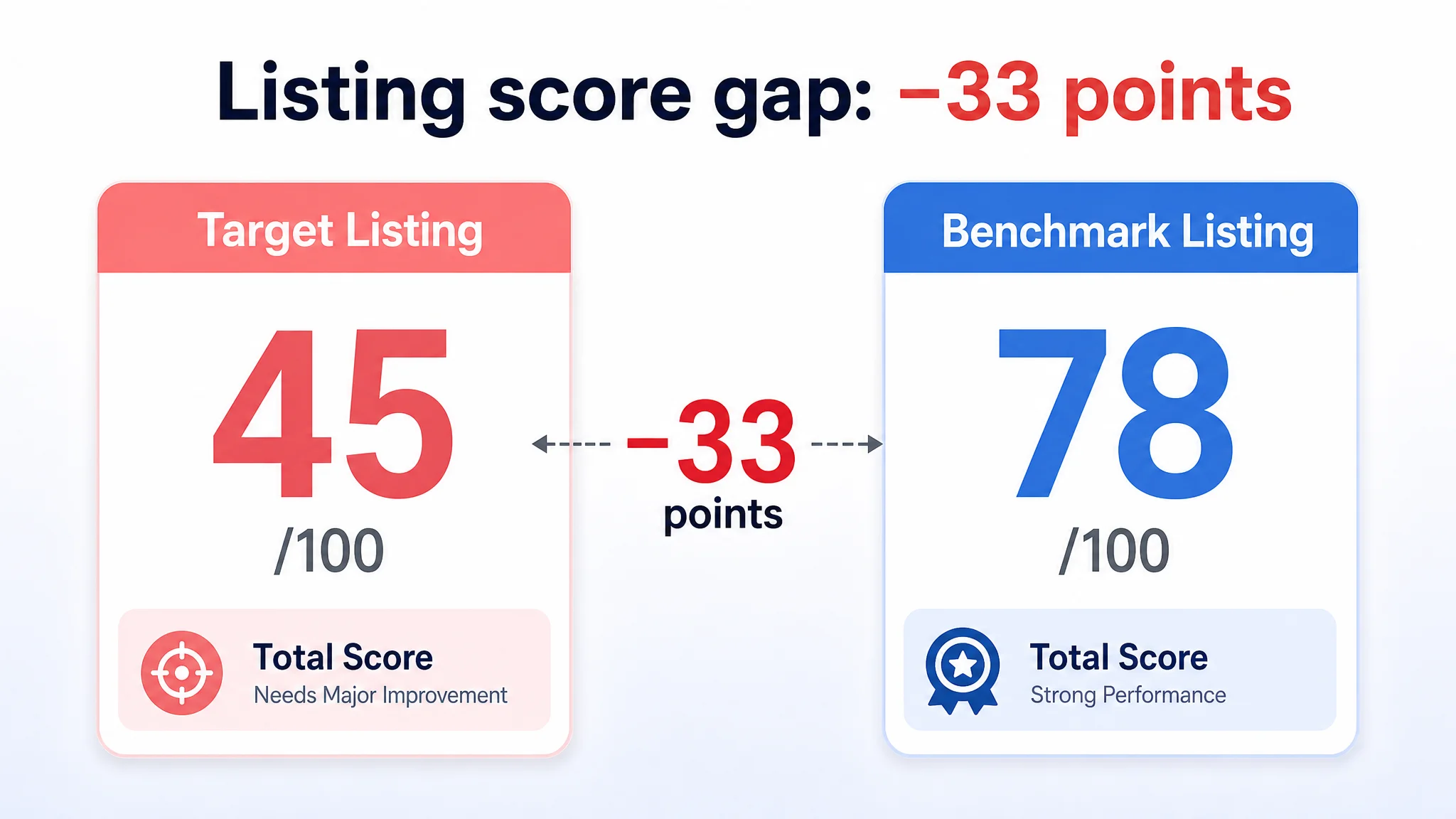
Once we ran the Listing through DeepBI’s scoring and competitive benchmark, a different picture emerged. Against a directly comparable high-performing Amazon Listing, this product scored just 45/100, with an enormous 22‑point deficit on the detail page (A+) and a 7‑point gap on reviews. There was no A+ at all, no review base, and the title and main image were not yet doing the heavy lifting needed to win clicks and trust.
Instead of pushing more budget into ads, the focus shifted to rebuilding the Amazon product page: restructuring the title around the core keyword, tightening the main-image logic, and designing a full A+ story that visually walks parents from “room chaos” to “organized, cozy seating”. This case is worth reading if you’ve ever tried to fix ACOS from the campaign dashboard while your Listing quietly consumed every click you paid for.
Amazon Ads Were Not Failing. The Page Was Consuming the Traffic.
From the seller’s perspective, the problem started where most Amazon operators look first: the ad console.
ACOS was difficult to bring down. Sponsored Products campaigns were pushing a clear kids’ bean bag storage cover into relevant queries, but the spend didn’t translate into a healthy order curve. The operational reflex was straightforward:
- Keep refining keywords
- Adjust bids and daily budgets
- Test new campaign structures
In other words, treat this as a pure advertising tuning problem.
But the deeper the team went into campaign tweaks, the less progress they saw. Clicks came in; orders didn’t keep pace. What they did not have yet was a quantified view of whether the Listing itself could actually handle the traffic they were buying.
“The real problem was not that ads failed to bring traffic. It was that the page could not convert the traffic.”
When we pulled the Listing into DeepBI’s scoring and benchmark system, the core issue surfaced immediately:
- Target Listing total score: 45/100
- Benchmark competitor total score: 78/100
- Gap: –33 points
And the most serious gaps weren’t in ad-facing elements like the title alone; they were in what happens after the click.

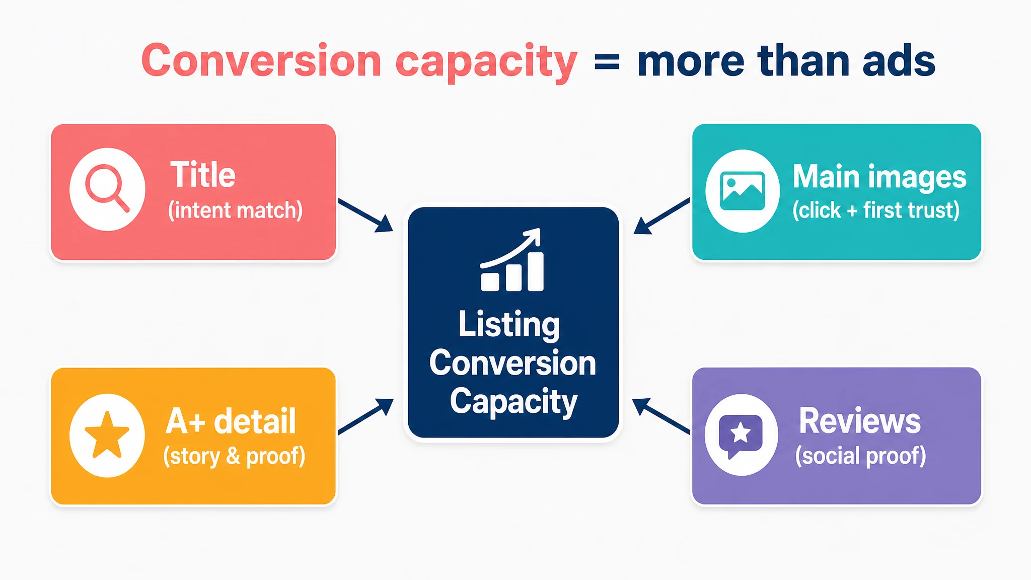
The Real Constraint Was Listing Conversion Capacity
Looking at the five scored dimensions made the bottleneck obvious:
- Title: 13 vs 16 (–3)
- Main image: 24 vs 26 (–2)
- Bullet points: 8 vs 7 (+1 — actually slightly better)
- Detail page / A+: 0 vs 22 (–22)
- Reviews: 0 vs 7 (–7)
So while the seller was obsessing over ads, DeepBI’s diagnosis was blunt:
This Listing was structurally unprepared to convert either paid or organic traffic.
A title that didn’t fully anchor the search intent
The original title did contain the core keyword “Bean Bag Chair Cover”, but:
- The core term appeared too far back, weakening how quickly it matched intent in search results.
- The value proposition “Waterproof Easy-Clean” was generic and flat.
- The structural logic leaned toward “description + feature + supplement”, rather than a tight Amazon-native pattern of “core keyword + audience + core benefit + scene”.
- A critical clarification — “Cover Only, No Filler Included” — was buried in parentheses at the end, risking post-purchase dissatisfaction instead of being used to build proactive trust.
The benchmark Amazon Listing, by contrast, led with “Clear Stuffed Animal Storage Bean Bag Chair Cover for Kids” and tightly connected:
- Core keyword
- Target user (kids)
- Core function (storage)
- Specific feature (with zipper, PVC)
It was not just about keyword stuffing; it was about a sharper decision logic in the title line itself.
A main image that showed the product, but not the decision
Visually, the target Listing’s primary image set did not break down, but it underperformed where parents make fast decisions:
- No clear dimensional information in the main visual, making it harder for parents to judge fit in their child’s room. In home categories, this uncertainty alone can quietly kill 5–8% of high-intent purchases.
- Technical signals were weak, making the transparent PVC cover look closer to a generic plastic bag than a durable, trustworthy piece of children’s furniture.
- Emotional resonance was lower. The benchmark used a child’s smiling face plus clearly visible toys to evoke both usage and joy. The target Listing used people, but the poses and expressions were static, producing less “I can see my child in this” impact.
In other words, the main images were not failing completely — they just weren’t doing enough to create a strong reason to click and then to continue scrolling.
A detail page that did not exist
The real structural break was in the detail page:
- The target Listing had no A+ content at all — zero modules.
- The benchmark had seven core modules:
- Hero scene: bean bag as both seat and storage
- Before/After clutter vs organized room
- Three-step usage explanation
- Material close-ups
- Multi-category usage examples
- Child interaction scenes across ages
- Additional trust-building visuals
Practically, this meant:
- No visual proof that the product could resolve “room chaos to order”.
- No scenes where parents could see children safely using the product as a chair.
- No expansion into additional use-cases (clothes, bedding, seasonal items).
- No craft or quality storytelling to justify any premium over a generic storage bag.
A complete absence of review-based trust
Finally, the Listing had:
- 0 reviews, 0 ratings, and therefore no public trust layer.
The benchmark had:
- 3.7 stars, 148 reviews, and a mix of positive and negative feedback.
Interestingly, the competitor’s 3.7 rating is not ideal; it clearly suffers from a meaningful chunk of low-star feedback. But even a middling review profile gives shoppers a starting point for evaluation. The target Listing, by contrast, presented nothing — requiring the page content alone to carry all trust.
This combination — no A+, no reviews, and only partially optimized title/main image — meant one thing:
No amount of ad tuning could compensate for a Listing that lacked a complete sales story.
Why Traditional Amazon Ad Optimization Failed Here
From a campaign-manager’s perspective, the symptoms looked like:
- ACOS higher than desired
- Clicks not converting at an expected rate
- Pressure to “optimize more precisely”
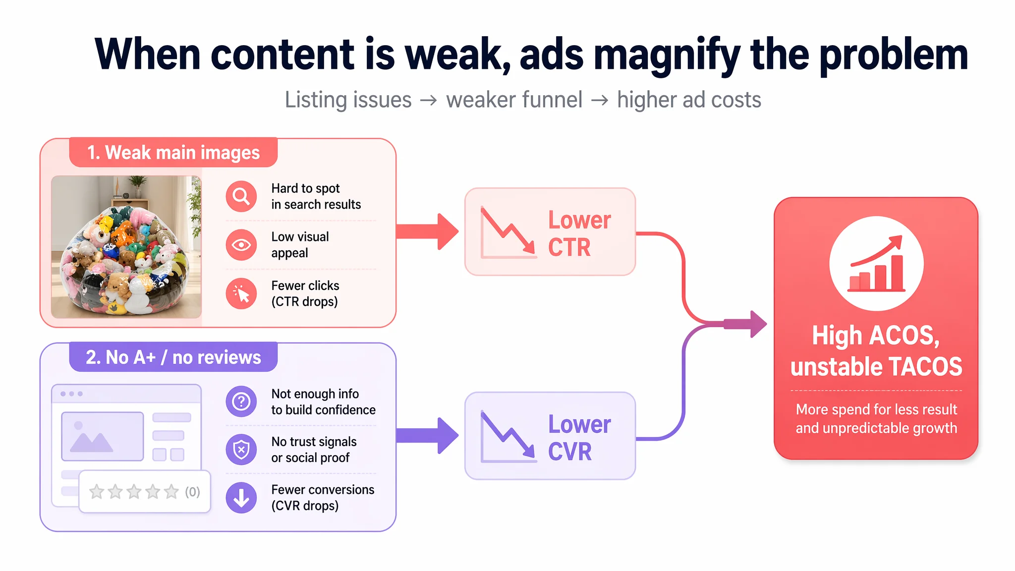
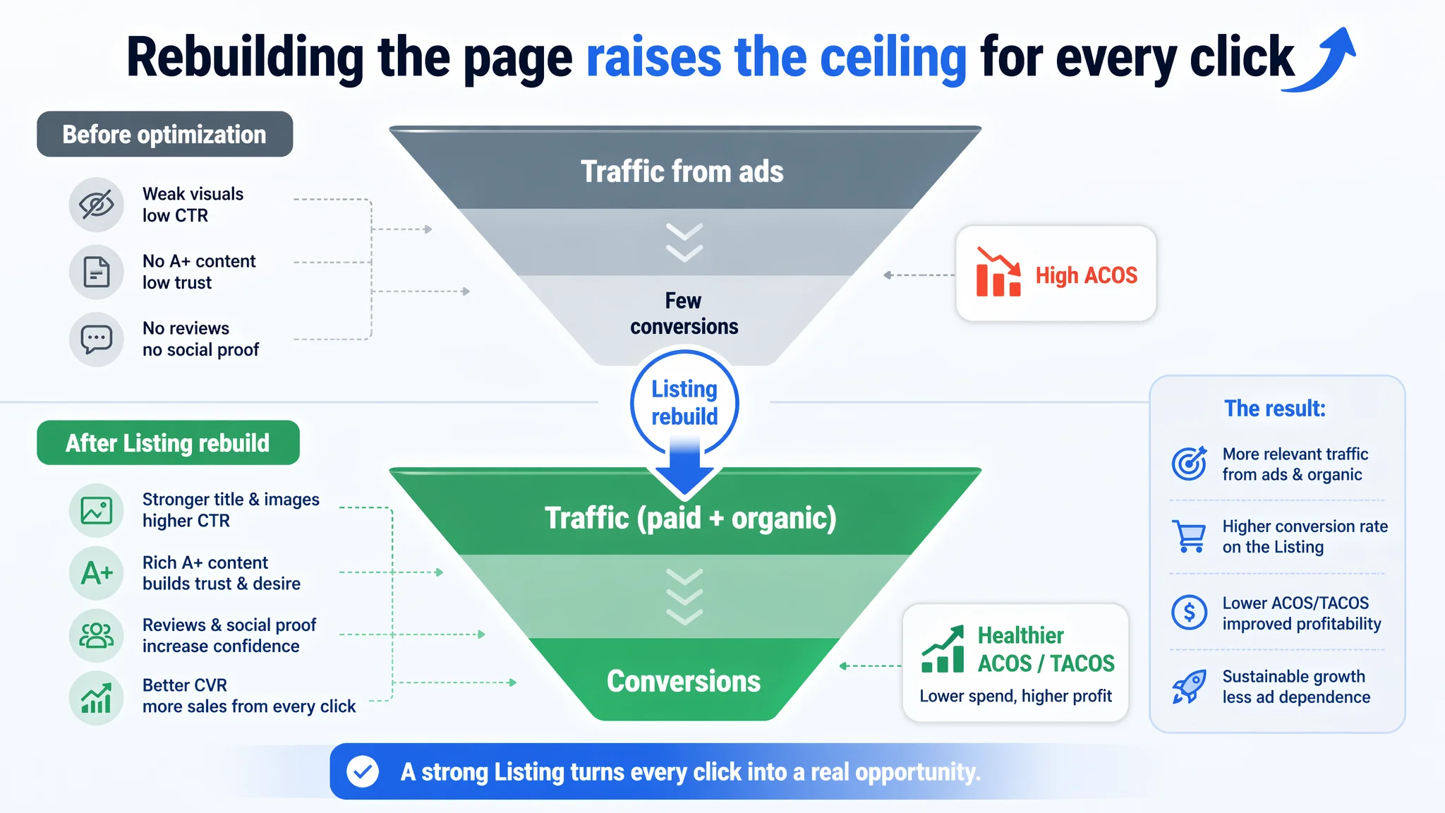
However, DeepBI’s scoring logic ties Listing content back to funnel metrics:
- Weak main images → depressed CTR
- Thin detail pages and missing trust layers → depressed CVR
- Ad spend poured into this structure → high ACOS, fragile TACOS
In this case, the bullets (textual persuasion) were actually one of the stronger pieces:
- The seller already used “benefit + outcome” framing (“turning floor clutter into a seat”).
- Each bullet embedded clear, tangible experiences (“making cleanup a game”, “molds into a cushioned chair”).
- Material details like “repair patches” were already present — a real competitive edge.
So the problem was not that “the copywriter failed”.
The problem was that the visual and structural environment — title order, main-image framing, A+ absence, zero review base — prevented those already-strong bullets from doing their job. Ads were amplifying this structural weakness instead of a conversion-ready funnel.
“Advertising does not only amplify advantages. It can also amplify a page’s existing defects.”
Continuing to adjust bids first would have simply sent more traffic into the same unprepared funnel.
This Product Page Did Not Lack Traffic. It Lacked a Story and Trust.
DeepBI’s judgment was to treat this as a Listing conversion capacity issue, not an ad-efficiency problem. That shaped the order of decisions.
Step 1: Re-anchor the title around the actual search job
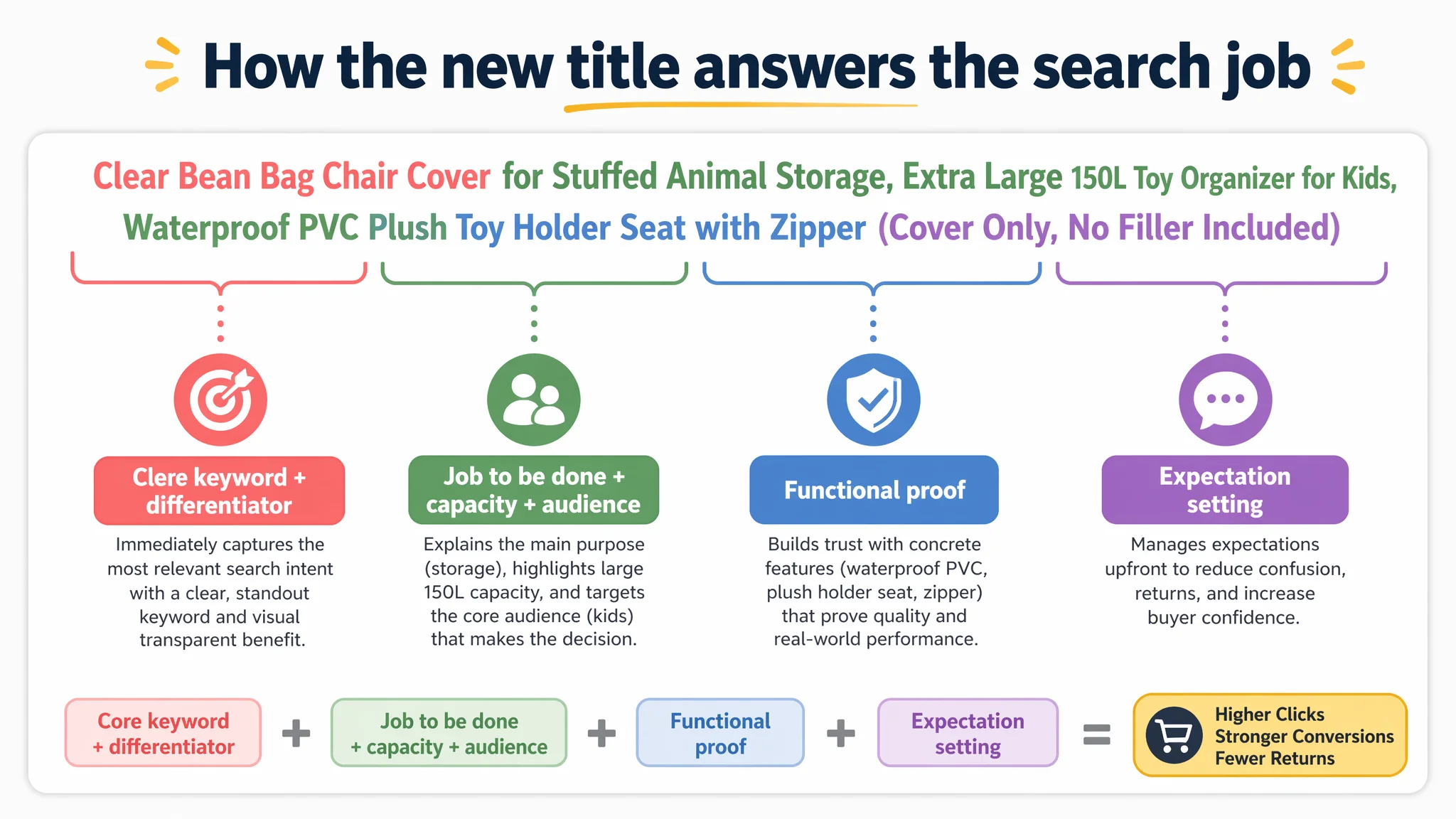
We recommended a new title:
Clear Bean Bag Chair Cover for Stuffed Animal Storage, Extra Large 150L Toy Organizer for Kids, Waterproof PVC Plush Toy Holder Seat with Zipper (Cover Only, No Filler Included)
The logic:
- Lead with “Clear” + “Bean Bag Chair Cover” to immediately align with shoppers looking specifically for transparent storage seating.
- Insert “Stuffed Animal Storage” early to anchor the primary job-to-be-done: controlling toy clutter.
- Quantify capacity (“150L”) to stabilize expectations and reduce size anxiety.
- Highlight “Waterproof PVC” + “with Zipper” for functional, concrete reassurance — this is not just a bag, but a durable, easy-to-clean structure.
- Keep “Cover Only, No Filler Included” visible but controlled, to preempt misunderstandings and potential returns.
This restructured title doesn’t change what the product is. It reorders how fast the buyer can see: “Is this for me? Does it solve my problem? Can I trust what I’ll receive?”
Step 2: Accept that without A+, every click was landing on a half-finished page
The 22-point gap on the detail page was too large to treat as a secondary issue. DeepBI’s decision logic was:
- A Listing with 0/25 on detail content is structurally unfit for aggressive ad scale.
- Any incremental budget on ads before fixing this would have a low probability of truly improving ACOS or TACOS.
- The biggest business risk was continuing to let ads pour into a page that does not visually prove its value.
So we prioritized building a full A+ path that mirrors how a parent actually decides.
Before Ads Could Work Again, the Page Had to Convert
DeepBI’s optimization plan for the A+ and image stack followed three strategic principles:
1. Scene-based function introduction
2. Strong visual before/after contrast
3. Concrete craft and material proof
Show the dual identity: “seat” and “storage”
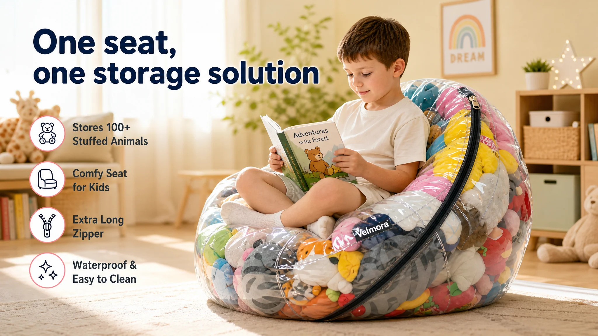
First, we designed a hero A+ module:
- A bright, Nordic-style kids’ room
- The transparent bean bag placed as a central furniture piece
- A child sitting cross-legged on it, reading, with colorful plush toys clearly visible inside
- Warm, natural light and slightly blurred background to emphasize the product
This module does two things in one shot:
- Anchors the bean bag as a cozy seat, not just a sack
- Shows it as a storage solution that visually organizes toys
For Amazon shoppers, this is a faster, more convincing way to connect the product to their home than text alone.
Turn “clutter anxiety” into a before/after visual
Next, we built a pain-point module:
- Left: a grey-toned, cluttered floor covered with plush toys (“BEFORE”)
- Right: the same space with toys neatly stored in the transparent bean bag (“AFTER”), with brighter, more welcoming lighting
This directly addresses the true purchase trigger for parents: relieving the stress of a messy room. Instead of telling them “this will organize your space”, the page shows the transformation.
Make “transparent” a functional, not just aesthetic, advantage
The transparency of the PVC material is a core differentiator, but the original Listing treated it like a generic visual trait.
The new A+ module:
- Places the product center-frame with different plush toys visible inside
- Shows a child’s hand pointing at a specific toy through the transparent cover
This scene communicates a practical outcome: no more digging and creating new messes to find a specific toy. For parents, it converts “clear PVC” from a generic spec into a daily-life advantage.
Address hygiene and durability visually, not only in words
Parents buying children’s furniture and storage care deeply about cleanliness and resilience. Instead of relying on text:
- A close-up module shows water droplets beading on the PVC surface, under controlled natural light, emphasizing waterproof and easy-clean behavior.
- Stitching and seams are clearly visible, reinforcing sturdiness and over-time reliability.
This makes the bullet point “waterproof, easy to clean, includes repair patches” feel tangible rather than theoretical.
Expand the perceived value beyond stuffed animals
A multi-function module uses a grid:
- Large image: the bean bag filled with toys
- Four smaller frames: pillows, seasonal clothes, towels/bedding, small plush toys
Each is labeled succinctly.
This gently teaches shoppers that this is not a single-use bag; it is a flexible, household storage hub. That supports a higher perceived value without any need to change price.
Put safety and interaction front and center
To relieve safety concerns:
- A scene shows a toddler playing beside or lightly climbing onto the filled bean bag in a soft, carpeted play area, with warm lighting and no sharp edges in sight.
This visual cue answers an unspoken question: “Is it safe for my child to sit, lean, or play near it?” Without adding new features, it strengthens trust in the product’s role as children’s furniture.
Visually defend the zipper and construction
One of the most common complaint themes for storage bags is “zipper broke” or “seams ripped”.
A final micro-detail module uses macro photography:
- The zipper track runs diagonally across the frame
- Teeth alignment and stitching density are clearly visible
- Lighting emphasizes precision and solidity
This module preemptively addresses a potential risk area: shoppers are less likely to suspect weak construction when they can see the workmanship.
The Main Image Was Not Just a Visual Issue. It Failed to Create a Reason to Click.
In parallel with A+, DeepBI reframed the main-image stack as the front door for any Amazon ad traffic.
Instead of treating visuals as generic “prettier photos”, we aligned each image with a specific decision step:
1. Click magnet: A white-background, high-clarity hero image showing the bean bag at a 45° angle, child seated comfortably, toys visible, with a subtle “Clear Design” callout.
2. Function close-up: A macro shot of the extra-long zipper in use, showing an adult hand smoothly opening it, highlighting ease of loading and unloading toys.
3. Before/After on the main-image level: A split image showing disordered toys vs. toys stored in the transparent bag, directly on the image carousel.
4. Lifestyle aspiration: A modern, minimal kids’ room with the bean bag in active use, conveying higher perceived value than a generic plastic bag.
5. Competitive contrast: A side-by-side composition labeling “Others: Opaque” vs. “Visible & Fun”, visually dramatizing the advantage of transparency.
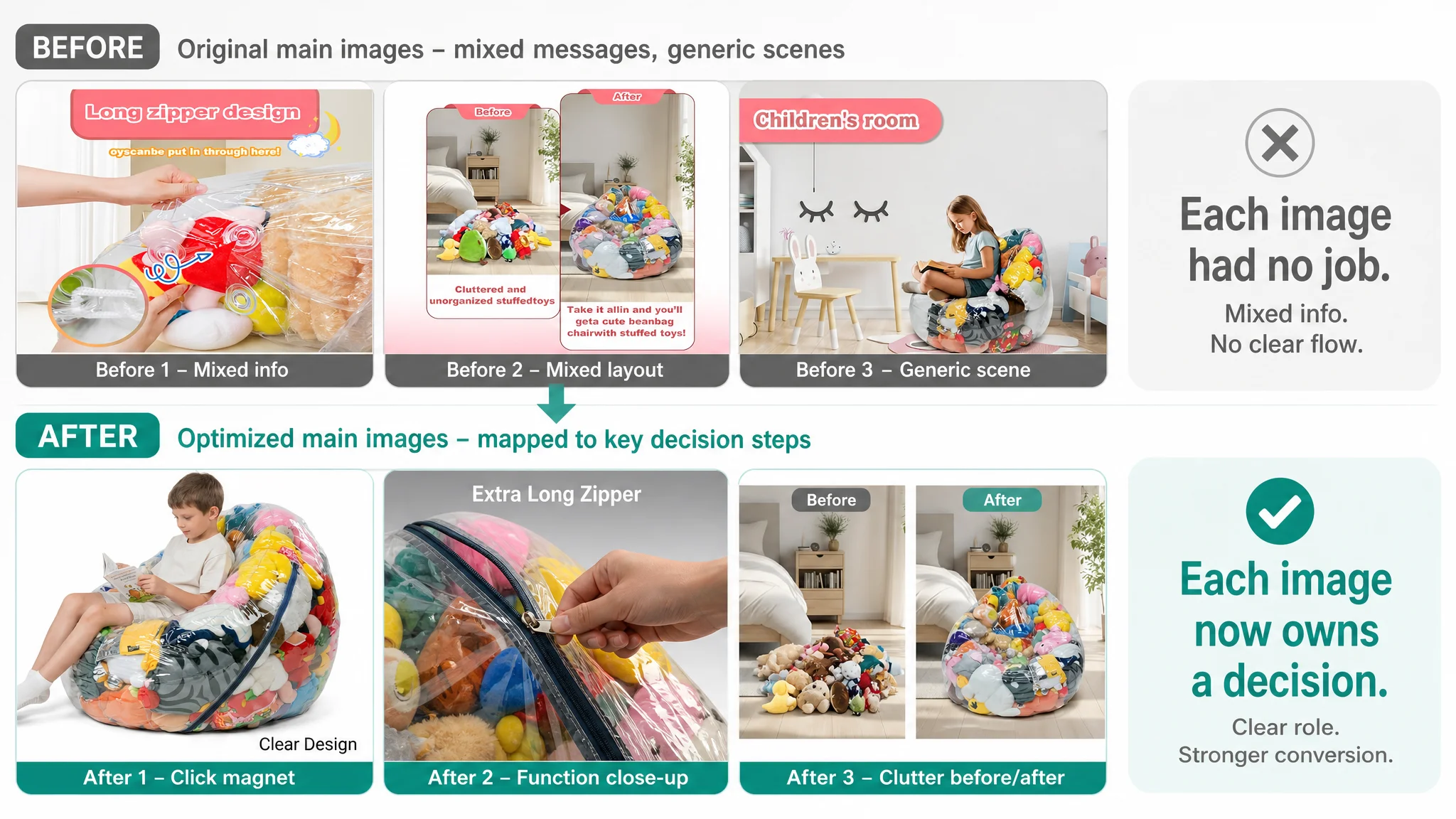
These are not purely aesthetic changes. They are designed to:
- Raise CTR by making the first thumbnail more emotionally and functionally compelling
- Reduce hesitation by answering key questions (size, ease of use, transparency benefits) before shoppers even scroll
Why DeepBI Did Not Recommend “Fix Ads First”
From a business-risk standpoint, DeepBI’s judgment order was:
1. Listing conversion is the foundation. With 0/25 on detail content and 0/15 on reviews, the Listing could not absorb incremental traffic efficiently.
2. Ads amplify whatever the page already is. In this state, ads were amplifying a half-built trust structure, which made ACOS volatility almost inevitable.
3. The most urgent risk was structural, not tactical. Without A+ and trust elements, every additional dollar in ads was a bet on a weak funnel.
Therefore:
- The seller’s instinct — keep iterating on keywords and bids — was de-prioritized.
- DeepBI prioritized building a minimum viable conversion engine: a coherent title, trustable main images, and a full A+ story, all aligned with how parents actually decide.
Only after these changes does it make commercial sense to re-evaluate:
- Does CTR respond to the new visuals?
- Does CVR begin to recover as A+ and bullets now work together?
- Can ACOS be brought under control with less wasted spend because clicks now have a higher probability of turning into orders?
How the Page’s Sales Logic Started to Recover
Even without inventing hard numbers, we can describe the operational shift:
- The Amazon Listing moved from 45/100 toward a structure much closer to the benchmark’s 78/100, especially by closing the 22‑point A+ gap.
- The page began to tell a complete story: from room clutter anxiety to a tidy, fun seating solution, backed by material and safety cues.
- The bullets, which were already relatively strong, gained a visual environment that finally supported their promises.
Practically, this changed three dynamics:
1. CTR: The main-image and title restructuring made it easier for the right audience to recognize the product’s relevance in search results and ad placements.
2. CVR: Once on the page, parents now had visually driven answers to: “Does it really organize? Is it safe? Is it durable? Is it worth the price?”
3. Advertising dependence: With a higher conversion ceiling, the brand could gradually rely less on brute-force spend and more on a healthier mix of organic and paid traffic.
What This Amazon Seller Learned — and What Other Sellers Can Take Away
By the end of this process, the seller’s understanding of their Amazon business changed:
- Ads are not a universal fix. They can’t compensate for missing A+ content and a zero-trust Listing.
- Listing quality is not a cosmetic issue. Title structure, main images, bullets, and A+ must function as a single, coherent sales funnel.
- Traffic deserves a “ready” page. Before scaling campaigns, the question is not “Can we afford more clicks?” but “Does this page deserve more clicks?”
For other Amazon sellers, this case is a reminder:
- If your ACOS is stubborn and CVR feels stuck, the core problem may not sit in your campaign console.
- A Listing with no A+, weak main images, and no review base will burn ad spend faster than any bid optimization can fix.
- Reframing the problem from “ad efficiency” to “Listing conversion capacity” can be the difference between endlessly turning knobs and actually changing your business trajectory.
DeepBI’s role here was not to showcase tools, but to make one critical judgment: stop blaming the ads, and start rebuilding the page that receives them.