

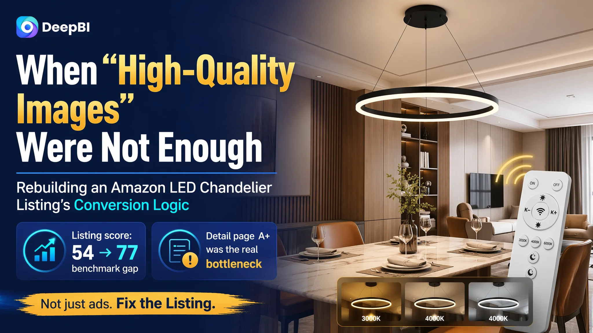
For this Amazon seller in the lighting category, the first impression from the data was brutal: their Amazon Listing scored 54/100 in DeepBI’s benchmark model, while a direct competing modern LED chandelier Listing scored 77/100. Ads were driving traffic, and the seller had invested in polished images, but the product page simply did not convert as well as it should.
The seller’s initial instinct was typical: keep tuning Amazon ads and keep “making the pictures prettier.” In their view, the problem was mostly a bidding and CTR issue, plus some cosmetic visual work. Once DeepBI ran a full Listing diagnosis, it became clear the real constraint was not the ad setup or overall image quality—it was a broken, incomplete persuasion path on the Amazon product page itself, especially in the title and A+ content.
The optimization therefore shifted away from “more traffic and more images” to “better decision logic on the page”: a title that carries real search weight, a main-image set that proves remote control and adjustability, bullet points that move from specs to buying reasons, and an A+ section that answers the core questions a high-ticket lighting buyer has. For other Amazon sellers, this case shows a common trap: when ad costs are rising and ACOS feels stuck, the answer is often not another round of keyword tweaks, but a hard look at whether the Listing truly deserves the traffic it’s already getting.
The Core Conflict: A Listing That Looked Refined but Could Not Carry the Sale
DeepBI’s scoring made the gap very explicit:
- Target Listing: 54/100
- Benchmark Listing (similar modern LED chandelier): 77/100
- Gap: –23 points
Breaking it down by dimension:
- Title: 10 vs. 16 (–6)
- Main images: 26 vs. 22 (+4)
- Bullet points: 6 vs. 8 (–2)
- Detail page / A+: 5 vs. 21 (–16)
- Reviews: 7 vs. 10 (–3)
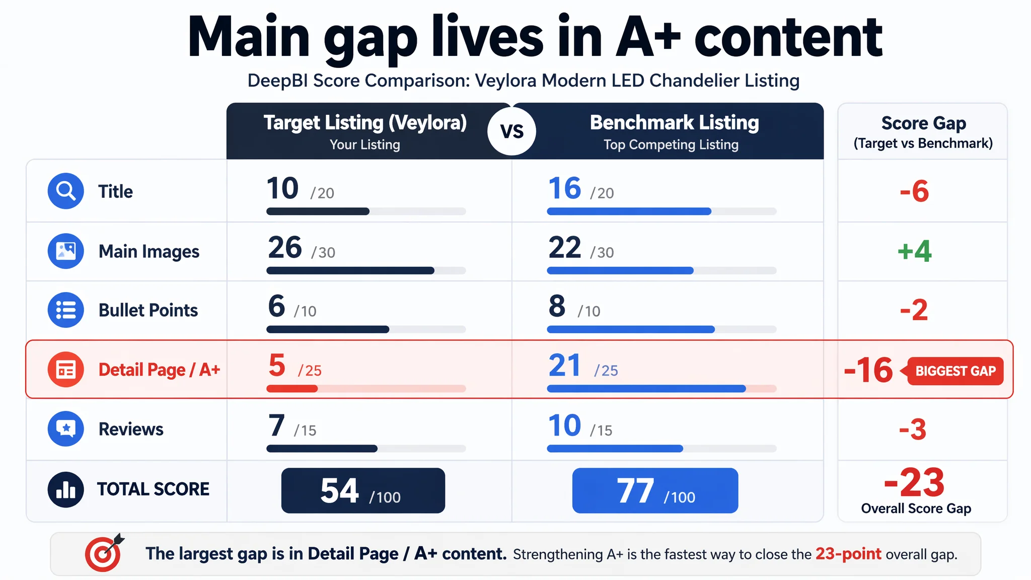
The main visual set was not the weak link—if anything, it slightly outperformed the benchmark. The real collapse was on the detail-page/A+ dimension, where the Listing lagged a massive 16 points.
In practice, this meant:
The Listing did not lack traffic or pixels. It lacked a clear, trustworthy path from “nice-looking lamp” to “I’m confident enough to buy.”
For a relatively higher-priced, installed product like a ceiling chandelier, that missing confidence is where CVR dies.
What the Seller Initially Misread
From the seller’s perspective, the situation looked like this:
- Ads had to work harder and harder to bring in orders.
- The main images looked polished and on-trend.
- CTR seemed “not bad” compared with category norms.
- ACOS pressure was rising.
The natural conclusion: “This is an advertising problem—improve creatives, fine-tune bids, expand keywords.”
So they focused on:
- Fine-tuning campaigns and bids.
- Testing more visual variants for the image gallery.
- Adjusting keywords around “LED chandelier,” “modern pendant,” and related terms.
What they did not realize was that the visual assets and page structure were not aligned with how buyers make decisions on a high-involvement lighting purchase. Ads were sending traffic into a page that:
- Failed to clarify the product’s core promise in the title.
- Did not visually prove key functions (remote control, dimmable, adjustable height).
- Relied on plain text instead of A+ visuals for high-ticket reassurance.
As a result, their ad spend was amplifying a structurally weak page.
DeepBI’s Diagnosis: Ads Were Not Failing. The Page Was Consuming the Traffic.
The DeepBI Listing scoring system did not start from “what looks nicer,” but from a structured, Amazon-specific comparison with a strong benchmark Listing in the modern LED chandelier subcategory.
Title: Search Weight and Promise Were Misallocated
The benchmark Listing’s title followed a mature pattern:
- Core feature + product type + strong scenario coverage
It front-loaded:
- “Modern LED Chandelier”
- “with Remote Control”
- “Dimmable”
- “3 Rings”
- Multi-room scenarios like “Living Dining Room Foyer”
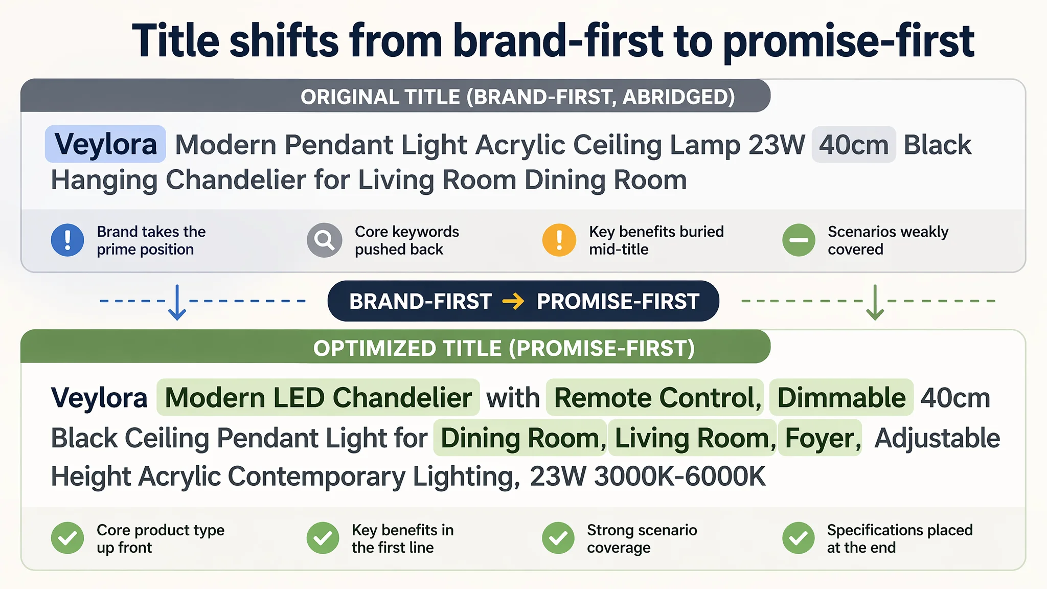
Meanwhile, the target Listing’s title:
- Pushed the brand name to the front, taking up valuable head keywords.
- Buried important specs like “Acrylic” and “40cm” mid-title.
- Lacked strong, front-loaded selling phrases like “Dimmable,” “LED Chandelier,” “Ceiling Pendant Light.”
- Under-covered broader scenario keywords in the way the benchmark used “Living,” “Dining Room,” “Foyer,” etc.
Result: weaker search relevance and weaker at-a-glance promise in search results, even if the rest of the Listing looked polished.
Main Images: Good Aesthetics, But Missing Functional Proof
On the main-image dimension, the seller actually had an advantage:
- High-quality, multi-scenario images.
- Wide style coverage: modern minimalism, light luxury, etc.
- Strong visual appeal that likely helped CTR and session time.
But crucial conversion details were missing:
- The remote control—a core buying reason—was not consistently or prominently integrated into the first image as a proof point.
- Functional anchors like dimming range (10–100%), color-temperature range (3000K–6000K), and adjustable height were fragmented across different images, forcing buyers to assemble the story themselves.
- One parameter image included an unverified wall switch icon, potentially implying a function not supported by title or bullets, which creates risk and confusion.
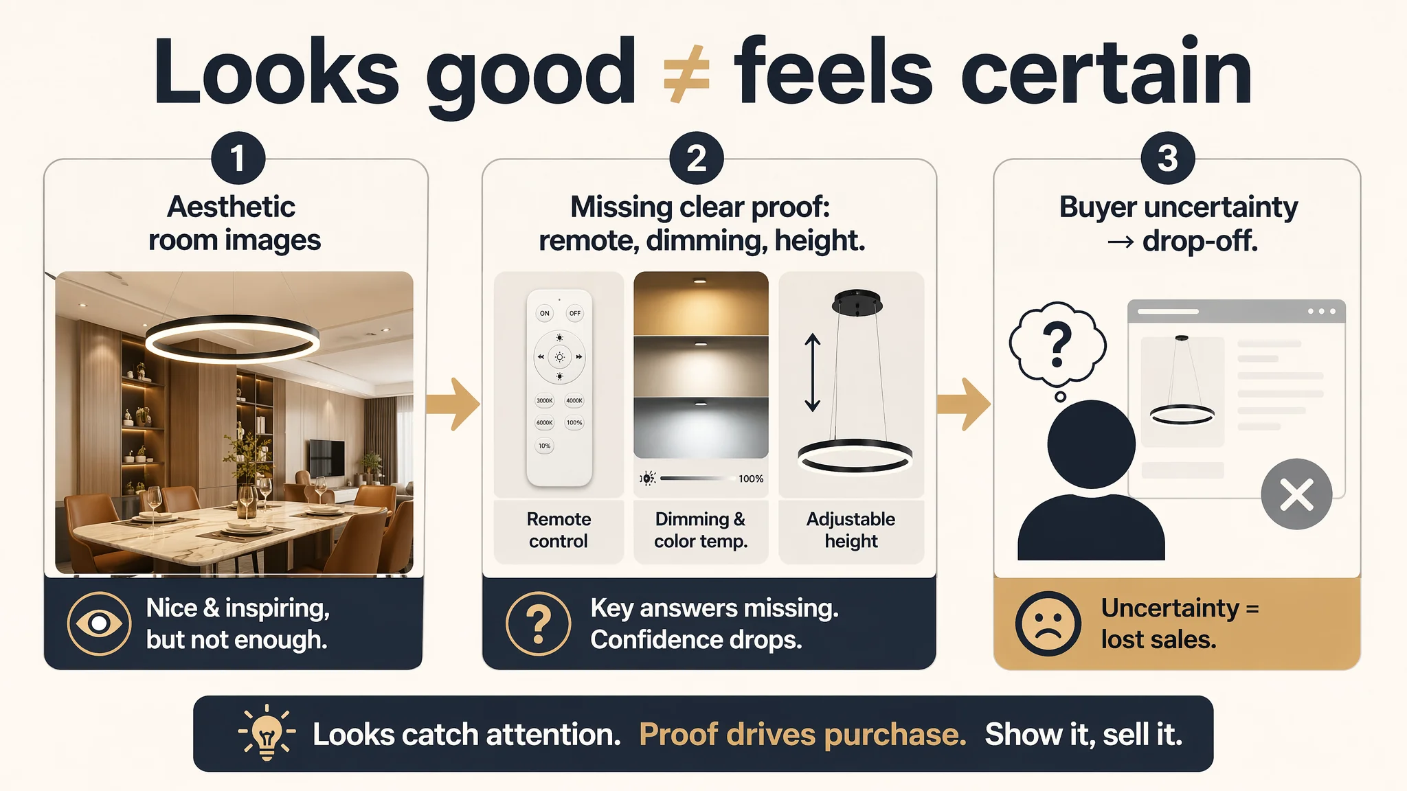
In other words, aesthetically strong visuals without functional certainty—a common trap in home & lighting categories.
Bullet Points: Information Without a Buying Logic
DeepBI’s comparison showed a clear difference in persuasion structure:
Benchmark’s bullets:
- Built around DIY playfulness and decor value.
- Each bullet blended scene, experience, and result (“cozy, flicker-free illumination”).
- Followed a progression:
Emotional value → Functional experience → Creative freedom → Scene application → Service assurance.
Target Listing’s bullets:
- Focused on functional parameters and installation steps.
- Read like a manual: design description, remote parameters, installation adjustment, materials, energy parameters.
- Lacked emotional framing and clear outcome-language.
So even if all the technical facts were “correct,” the bullets did not create a narrative path from curiosity to confidence.
Detail Page / A+: A 5/25 Score in a Category Where Visual Proof Sells
This was the real bottleneck.
The target Listing:
- Used pure text.
- No A+ image modules.
- No visual mapping of:
- Room suitability (10–15㎡).
- Height-adjustment demonstration.
- Remote control usage.
- Color-temperature switching.
- Light quality (flicker-free, glare-free).
The benchmark Listing:
- Combined scene hero images with icon modules.
- Used height-adjustment explanations and color/brightness comparison images.
- Provided full, high-quality, in-home scenes to build trust.
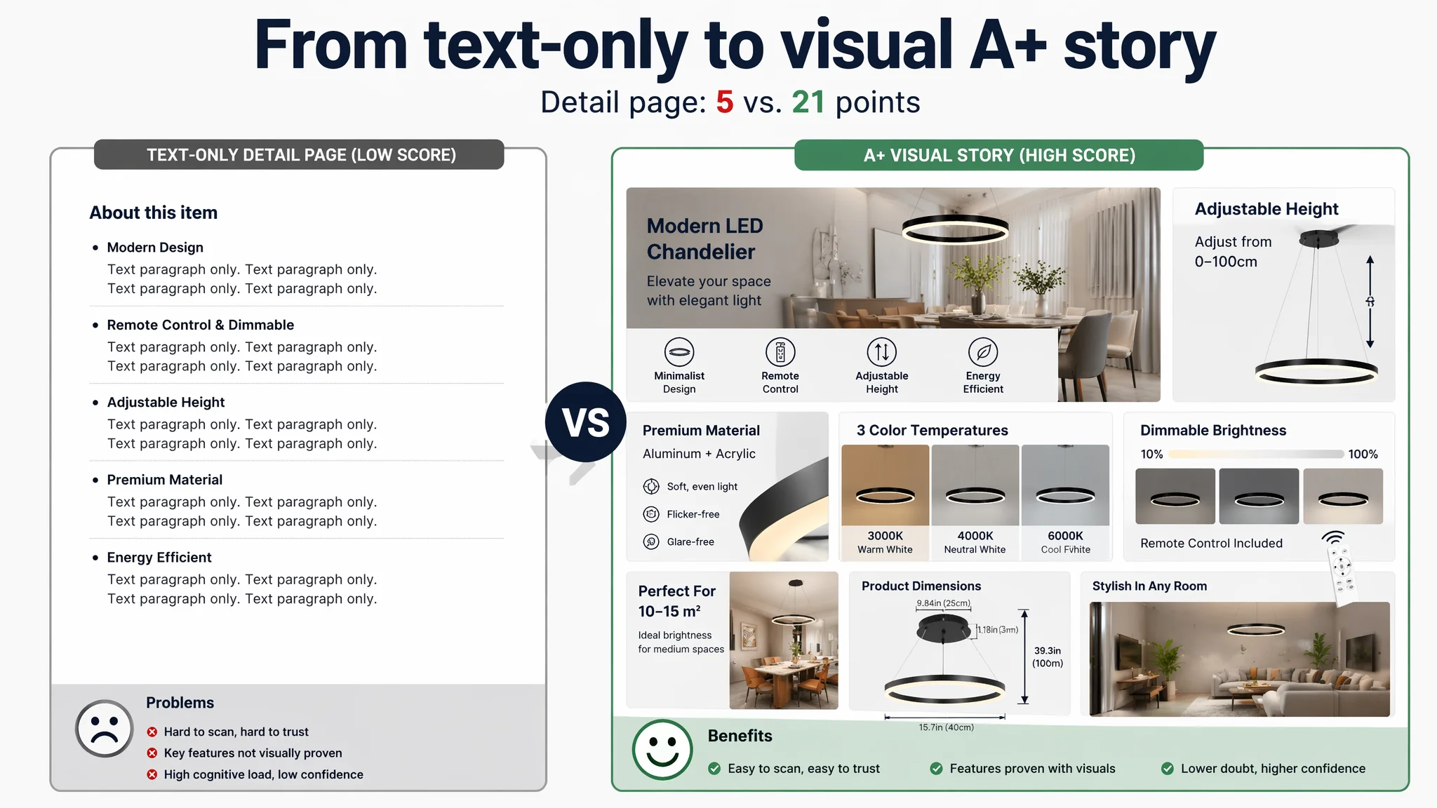
For a hanging light that requires installation and becomes part of a room’s visual identity, the absence of A+ visuals meant:
- Very high cognitive load on the buyer.
- No “what you see is what you get” reassurance.
- Higher drop-off during the consideration stage.
Advertising does not only amplify advantages. It can also amplify a page’s existing defects.
That was exactly what was happening.
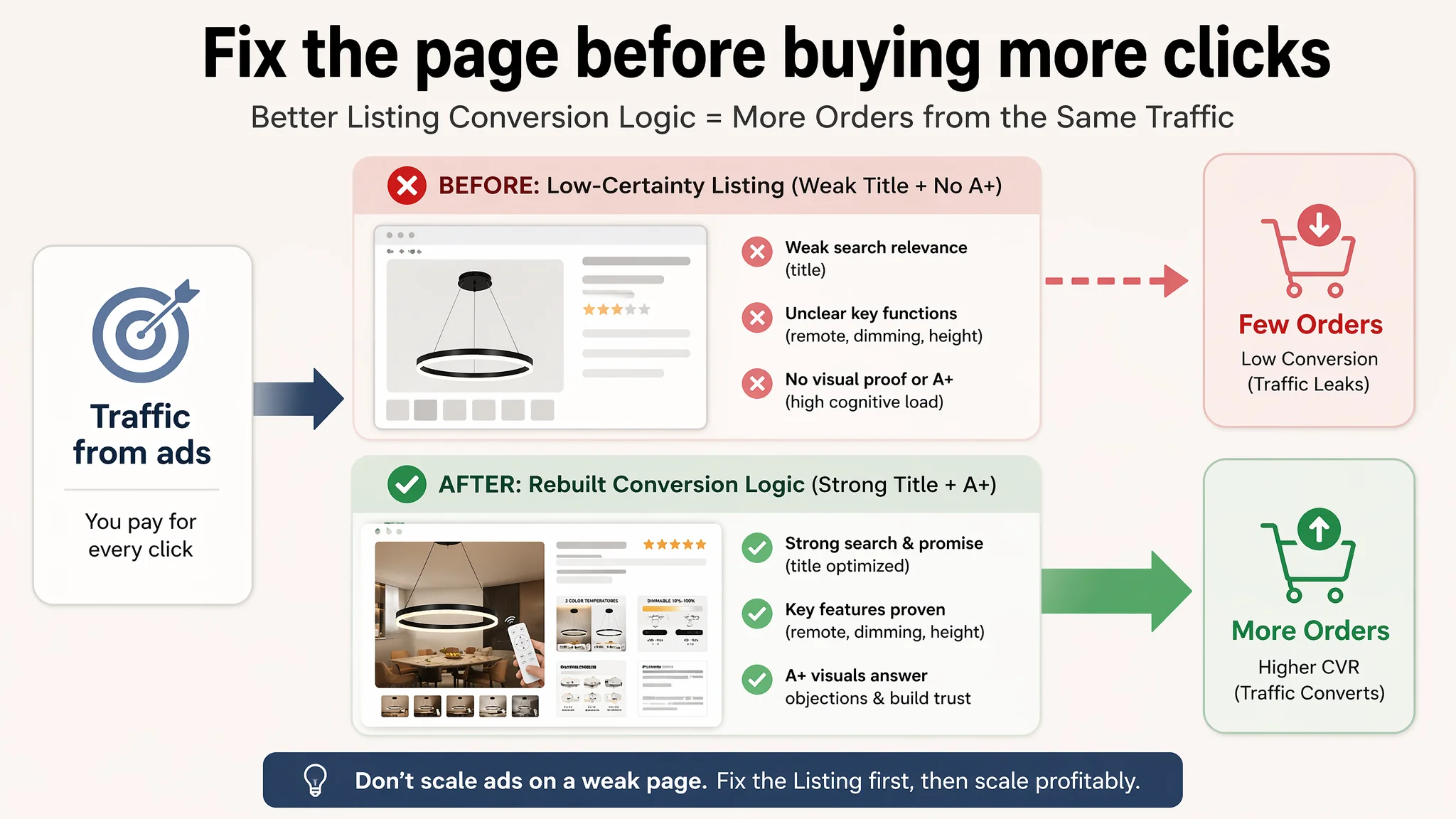
Why Listing Conversion Had to Be Fixed Before Touching Ads Again
Once DeepBI mapped the –16 point gap on the A+ dimension and the –6 point gap on title, the decision logic became straightforward:
- Any additional ad spend—or further bid tuning—would route through the same low-certainty product page.
- Incremental CTR gains from more ad creatives would not be captured in orders if the decision-layer content remained weak.
- The biggest business risk was paying more for traffic that the product page was structurally unable to convert.
So the priority sequence shifted:
1. Rebuild the Listing’s conversion logic (title, main image, bullets, A+ flow).
2. Let existing and baseline ad traffic test whether CVR stabilizes and improves.
3. Only then consider scaling or re-optimizing ads based on a more trustworthy CVR baseline.
Reframing the Listing: From Specs List to Conversion Story
DeepBI did not “add more content for the sake of it.” The work focused on aligning each module with a specific step in buyer decision-making.
Title: From Brand-First to Promise-First
Proposed structure:
Brand + Modern LED Chandelier with Remote Control, Dimmable 40cm Black Ceiling Pendant Light for Dining Room, Adjustable Height Acrylic Contemporary Lighting Fixture, 23W 3000K–6000K
Key shifts:
- Keeping the brand, but tightly coupling it with “Modern LED Chandelier” at the front.
- Bringing in “with Remote Control” immediately after the core product type.
- Integrating “Dimmable”, “Ceiling Pendant Light”, and room scenarios in a compact way.
- Consolidating technical parameters like 23W and 3000K–6000K to support a professional, trustworthy feel rather than scatter them.
This is not just wording improvement; it directly affects:
- Search discoverability (A9/A10).
- What buyers see and understand within 1–2 seconds on the search results page.
Bullet Points: Turning Functions Into Reasons to Buy
Each bullet was restructured to answer a specific buyer concern:
1. Design & role in the room
- “Modern Single-Circle Design”
- Emphasis on minimalist 40cm form factor as a visual focal point.
- Clear room fit: dining room, living room, hall.
1. Control & mood-setting
- “Dimmable with Remote Control”
- Explicit 3 color temperatures (3000K, 4000K, 6000K).
- Flicker-free guarantee, no extra bulbs needed.
- Directly addresses “can it handle different occasions?”
1. Height adjustability
- “Adjustable Hanging Height”
- 100cm adjustable cable, secure locking mechanism.
- Explicitly covering both high ceilings and semi-flush needs.
1. Quality & application
- “Premium Quality & Wide Application”
- Materials: aluminum + high-transmittance acrylic.
- Soft, glare-free, long-lasting illumination.
- Multiple room scenarios to help buyers picture it in their home.
1. Energy efficiency & ease of installation
- “Energy-Efficient & Easy Installation”
- Translate 23W into 10–15㎡ coverage.
- Reassure on installation difficulty and support.
Now, instead of five parallel pieces of information, buyers see a structured path:
Design → Control experience → Space fit → Quality & scenarios → Energy + installation + support.
The Main Image Set: From “Nice” to “Decisive”
DeepBI’s analysis did not aim to replace everything—it focused on where the images failed to answer crucial questions fast enough.
First Image: Show the Lamp in a Real Room, with the Remote
The shift:
- Replace the pure floating product image with a high-quality modern dining-room scene.
- Keep the remote control clearly visible and associated with the lamp.
- Subtly hint at different hanging heights / shapes through the scene.
- Maintain clean, decisive hierarchy in any overlay text.
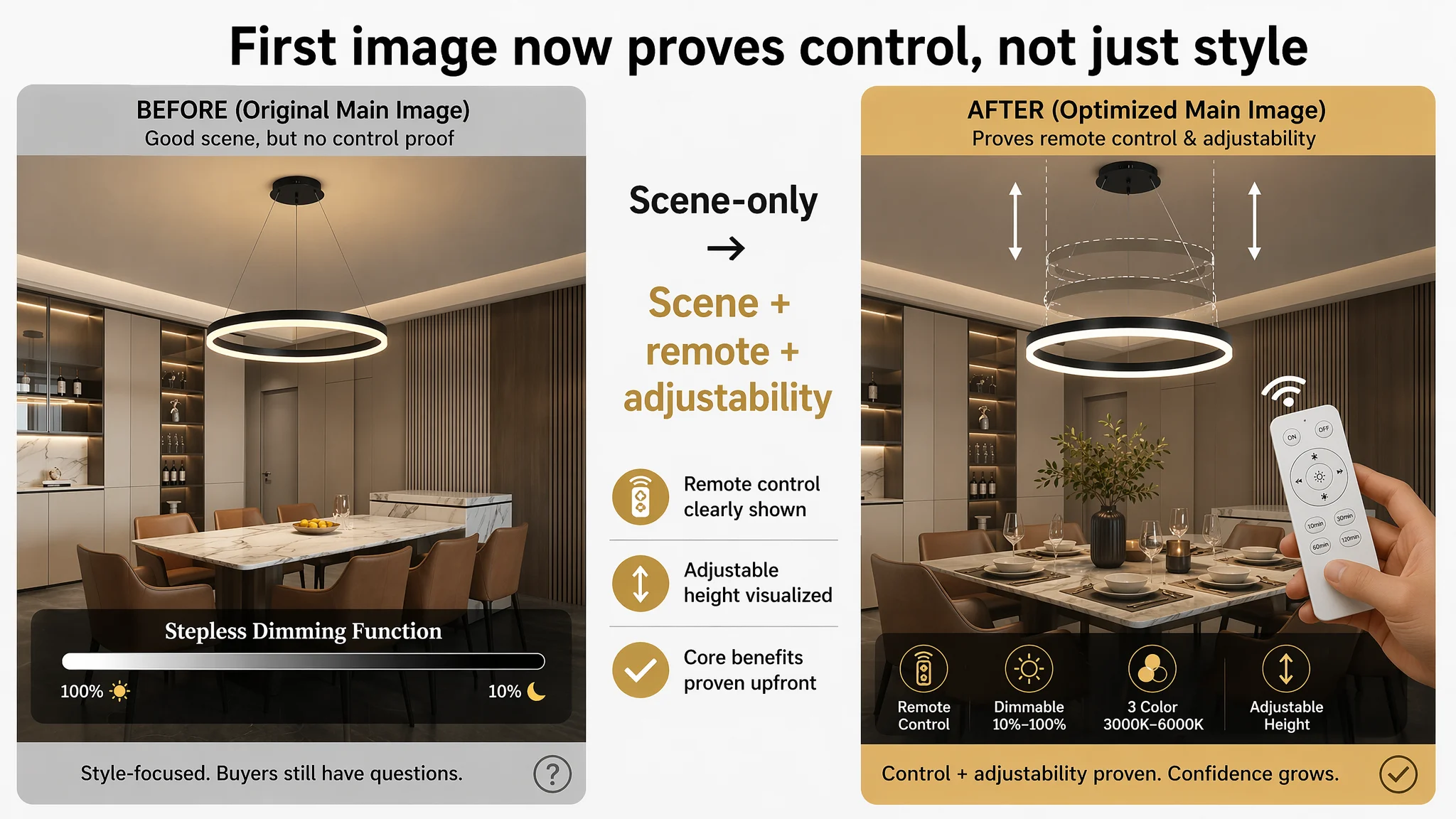
This serves two goals simultaneously:
- Click motivation: buyers see how the lamp actually looks in a space.
- Function proof: remote control is real and included.
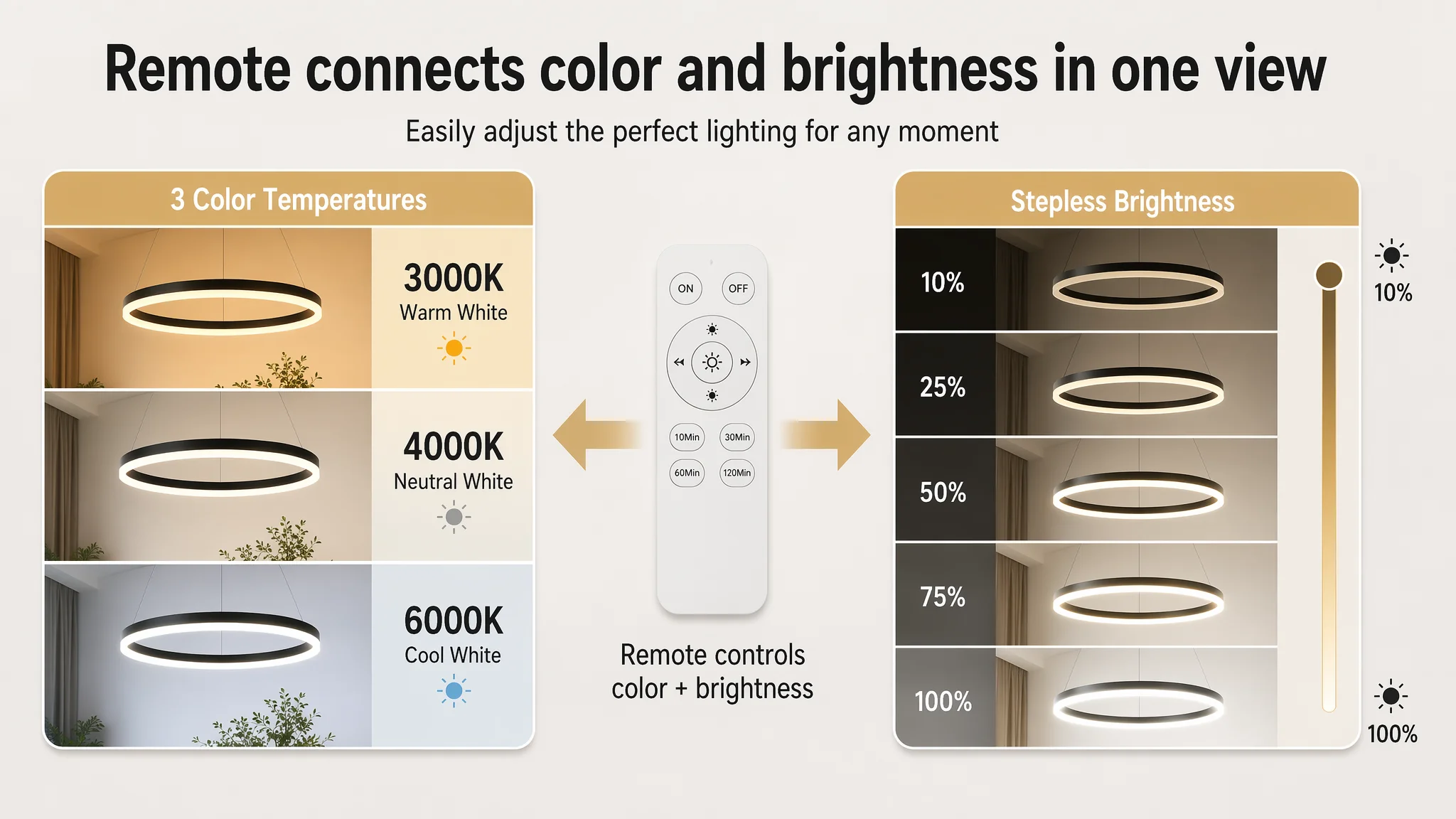
Second Image: One Image to Cover All Light-Control Questions
Instead of splitting:
- Color temperature in one image.
- Stepless dimming (10–100%) in another.
The revised image:
- Keeps clear 3000K–6000K visual comparison.
- Adds a brightness progression (e.g., slider or staged brightness slices).
- Makes the remote’s capability visually obvious.
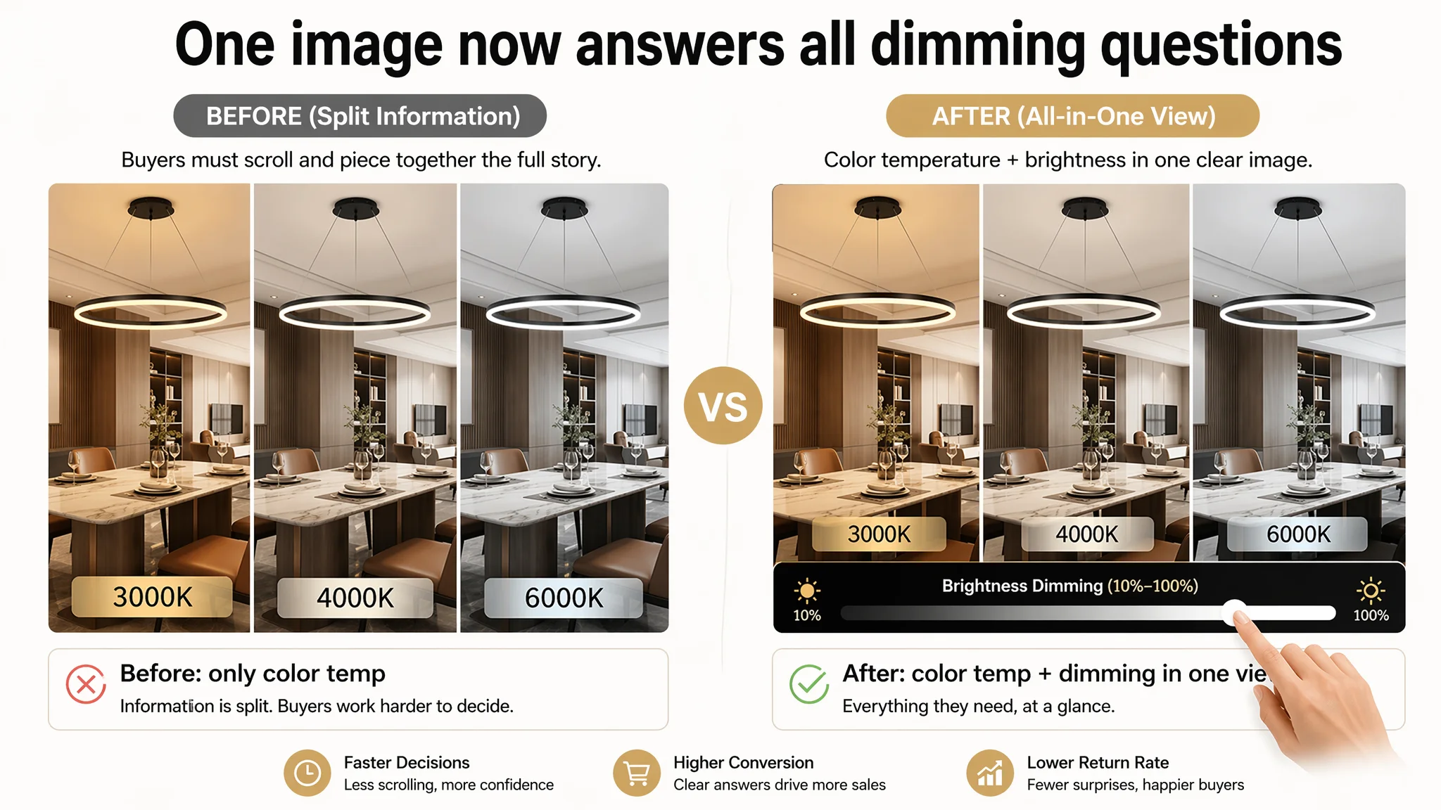
One glance → buyers know:
- Color can change.
- Brightness is adjustable.
- Remote is included.
Parameter Image: Clarity and Compliance
Adjustments:
- Simplify layout and improve readability.
- Keep essential dimensions: ring diameter, canopy size, cable length.
- Remove or clarify the wall-switch icon if the product does not support wall-switch dimming.
- Use freed space to emphasize 10–15㎡ suitability and 23W capacity.
This reduces the risk of:
- Misinterpretation about included accessories.
- Over-promising functions that reviews will later contradict.
DIY Shape & Height: Answer the “Can I Adjust It?” Question Visually
One of the benchmark’s advantages was its clear display of DIY ring shapes.
For the single-ring product:
- Repurpose the “material breakdown” image slot.
- Show different hanging-heights and angles for the ring.
- Use arrows or simple graphic hints to imply how adjustment works.
That image no longer just says “premium materials”—it shows “you can actually tailor this to your ceiling and look.”
Trust / Quality Slot: From Redundant Function to Confidence Builder
By merging color-temperatures and dimming into a single image:
- A redundant “dimming-only” image becomes free.
- This slot can now be used for:
- High-quality material close-ups (aluminum + acrylic).
- Simple, visual installation steps (without technical wiring diagrams).
- A final trust layer for nervous buyers.
A+ Content: Rebuilding the “Attraction → Clarity → Decision” Flow
The biggest structural change was on the A+ level. DeepBI’s judgment was blunt: pure text in this category is a conversion handicap.
The new A+ flow is designed around a simple logic: Attract → Explain → Reassure → Close.
Module 1: Hero Scene + Icon-Based Core Selling Points
- Large, full-width scene: the lamp installed over a dining table in a modern home.
- Icon row under the image, each with short text, covering:
- Minimalist design.
- Remote control + dimming.
- Adjustable height.
- Integrated 23W energy-efficient LED.
This solves:
- “What is it?” and “Is it for me?” in seconds.
Module 2: Height Adjustability, Visualized
- Close-up or schematic for the adjustable cable.
- Clear label: “0–100cm adjustable range.”
- Short text: supports different ceiling heights; simple to adjust.
This addresses the second-biggest concern after design: “Will it hang at the right height in my room?”
Module 3: Light Quality & Eye Comfort
- Close-ups of the acrylic light strip.
- Emphasis on:
- Soft, diffused light.
- No glare.
- Flicker-free.
This targets buyers who worry about eye strain and harsh LED light.
Module 4: Remote-Control Logic, Fully Visual
- Side-by-side comparison:
- Left: 3000K warm / 4000K neutral / 6000K cool.
- Right: brightness bar from 10%–100%.
- Clear label: “Remote Control Included”.
This eliminates hidden-cost suspicion (“Do I need to buy the remote separately?”) and clarifies the actual experience.
Module 5: From 23W to Real Rooms
- Warm dining-room or living-room scene.
- Simple text: “Ideal for 10–15㎡ spaces.”
- Tie back to integrated 23W LED.
This converts abstract wattage into something a buyer can actually use.
Module 6: Full Dimension Map
- Clean dimension diagram:
- 40cm ring diameter.
- Canopy size.
- 100cm max hanging length.
Engineers, detail-oriented buyers, and anyone with limited ceiling space get clear, low-friction information.
Module 7: Final Emotional Confirmation
- High-quality lifestyle image in a modern living room or hallway.
- Lamp lit, blending naturally with decor.
- Text reinforcing its role as an “elegant visual focal point.”
This is the last push from rational clearance to emotional desire.
How the Listing’s Sales Logic Started to Recover
After this reframing, the Listing’s job changed:
- The title now earns traffic and sets the right expectations.
- The main image + gallery prove design and key functions quickly.
- Bullets walk buyers through a buying logic, not just specs.
- A+ content answers the major objections before the buyer has to scroll reviews or leave the page.
As a result:
- Ad traffic becomes useful again. Even baseline traffic can now be tested against a stronger conversion infrastructure.
- The Listing begins to regain organic conversion capability, since Amazon’s algorithm prefers pages that can both attract and convert.
- The seller is less forced to chase volume via ever-higher ad spend just to hold position.
Even without inventing numbers, the operational state changes:
- ACOS pressure becomes more manageable because each click has a higher probability of turning into an order.
- The store’s dependence on ever-escalating ad budgets decreases.
- The team’s understanding of “where to fix first” becomes more disciplined.
What Other Amazon Sellers Can Take from This Case
Several patterns from this lighting case generalize well beyond chandeliers:
1. A high score on main-image quality does not guarantee high CVR.
If the A+ section and bullets are weak, your best photography still cannot carry the sale.
1. When ACOS is stubbornly high, it’s often a Listing problem masquerading as an ads problem.
If DeepBI shows a 10+ point gap on detail page content vs. benchmark, no amount of bid tuning will fully fix the leakage.
1. Title structure is not just for the algorithm. It frames the entire buying expectation.
Front-loading brand at the expense of core product terms or key functions is a frequent and costly misstep.
1. For medium–high ticket home products, text-only detail pages are a risk.
Buyers need to see the product in a room, see how it’s controlled, see how it’s installed.
1. Ads amplify whatever the page already is.
If the page cannot convert, ads amplify waste. If the page is structurally sound, ads amplify profitable outcomes.
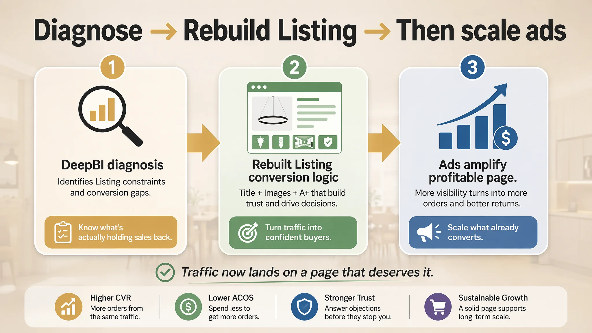
This case illustrates why DeepBI’s value is not in listing features, but in clarifying judgment:
- Identifying that the real constraint was a 5/25 detail-page score—not ad structure.
- Showing why Listing conversion had to be rebuilt before further ad optimization.
- Providing a concrete, Amazon-native path from diagnosis to a Listing that deserves more traffic.
For Amazon sellers feeling stuck between rising ad costs and flat orders, this is the core question to revisit: Is the problem really in my ads—or is my product page quietly consuming the traffic I already paid for?