

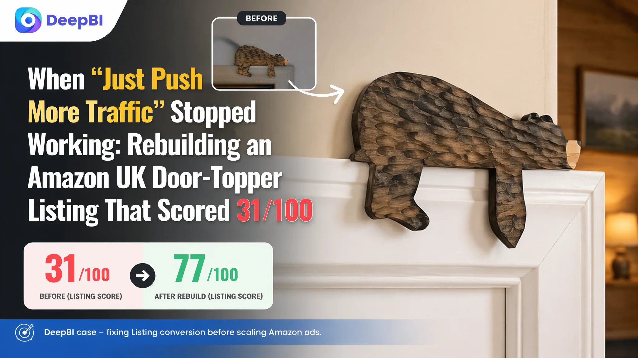
This case comes from an Amazon UK home-decor seller whose wooden bear door-topper looked charming in person, but could not turn Amazon traffic into orders. The seller kept feeling that the problem was “not enough exposure” and “ads haven’t really started,” so their instinct was to think about advertising. Yet when DeepBI scored the Amazon Listing against a leading metal door-frame decoration competitor, the result was a brutal 31/100 vs 77/100. The page was not ready for more traffic at all.
DeepBI’s diagnosis showed that this was not an Amazon ads problem. It was a Listing conversion problem. The title was loose and keyword-stuffed, the images lacked visual selling logic, the A+ detail page didn’t exist, and the product had zero reviews. Any ad budget at this stage would simply be poured into a page that could not convince. The real bottleneck was the Amazon product page’s ability to build trust and guide a purchase.
The later optimization did not start with bids or keywords. It started with the Listing foundations: re-framing the title around clear themes and use scenarios, rebuilding the image set around a “simple, warm cabin” visual line, and designing an A+ story that solved three core doubts—does it look good in my home, does it fit, and is it easy to use or gift. Only after the page could actually convert did ad traffic become meaningful again.
For other Amazon sellers, this case is a reminder: when ACOS is hard to control or you hesitate to scale ads, the true constraint may not be in the ads panel. It may be that your Amazon Listing—title, main image, bullets, A+, and reviews—has not yet reached the level where paid traffic can be profitable.
The Seller’s Reality: Product Not Bad, Page Not Selling
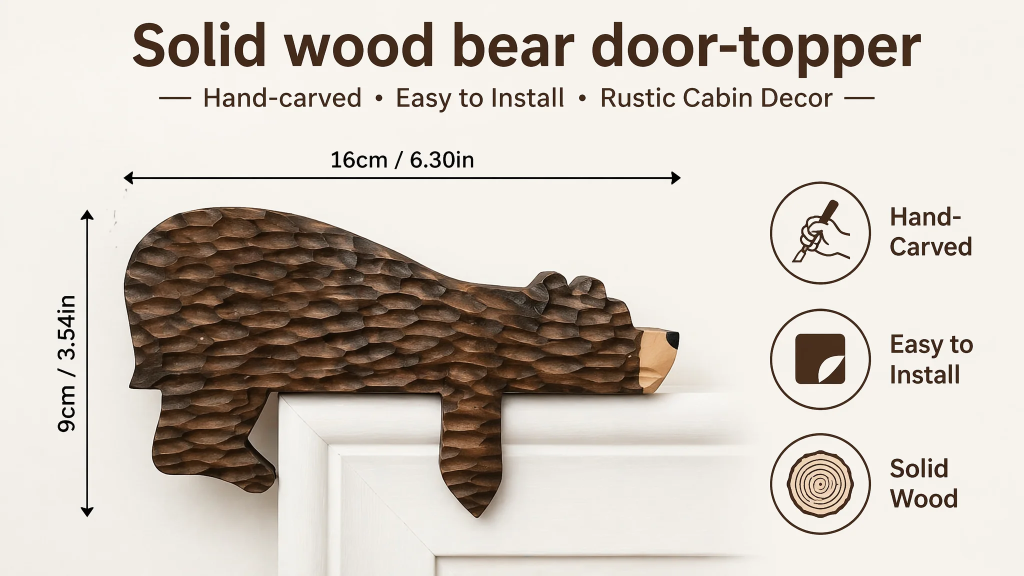
This Amazon seller operates in the home-decor category on the UK marketplace, selling a wooden bear door-topper / corner ornament. The product itself is distinctive: solid wood, hand-carved feel, forest/bear theme, fits right-angle corners of doors or shelves.
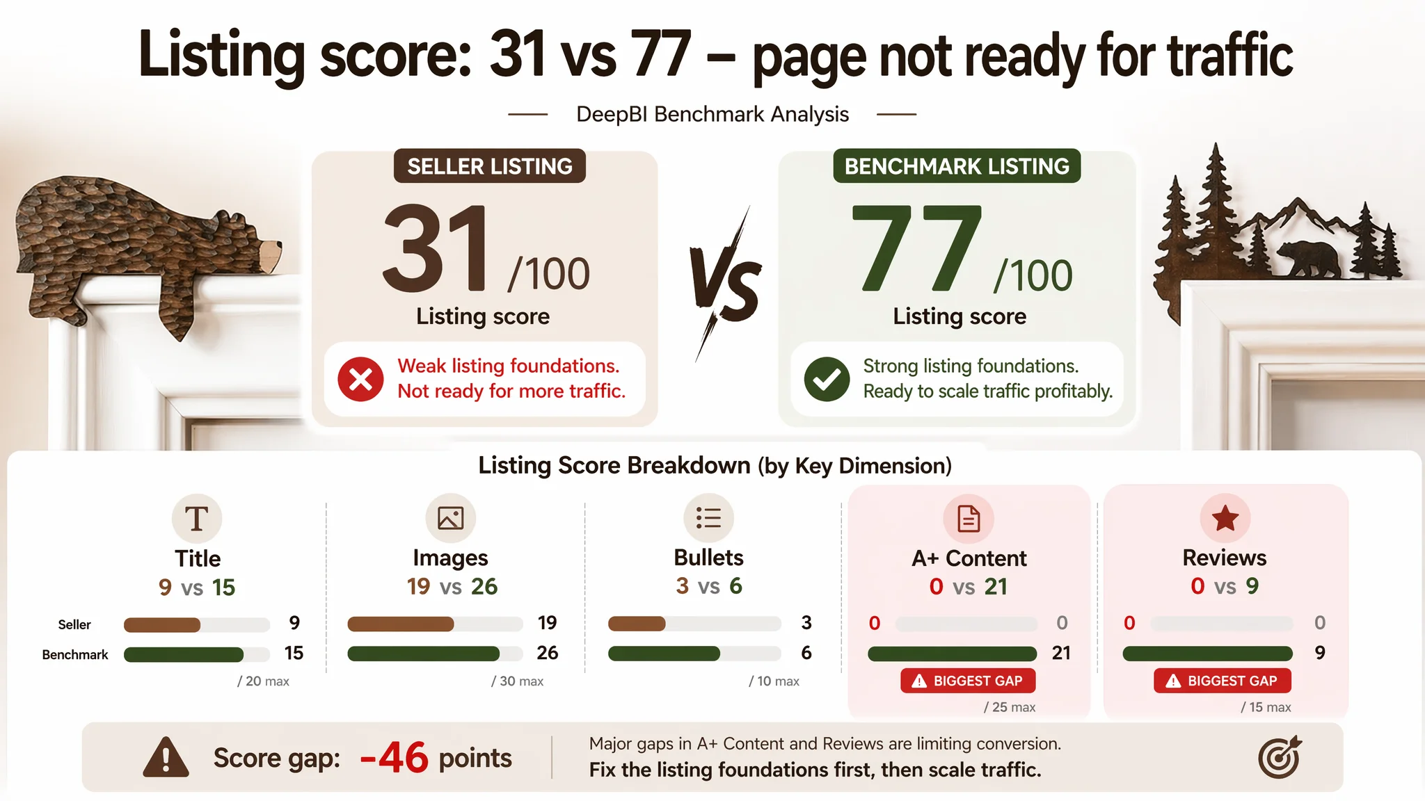
Yet on Amazon, it was losing to a benchmark competitor selling metal mountain-forest-and-bear door-frame decor. DeepBI’s Listing score made the gap painfully clear:
- Seller’s Listing total score: 31/100
- Benchmark Listing total score: 77/100
- Score gap: -46 points
Broken down by key Amazon Listing dimensions:
- Title: Seller: 9, Benchmark: 15, Max: 20, Gap: -6
- Main Images: Seller: 19, Benchmark: 26, Max: 30, Gap: -7
- Bullet Points: Seller: 3, Benchmark: 6, Max: 10, Gap: -3
- Detail / A+: Seller: 0, Benchmark: 21, Max: 25, Gap: -21
- Reviews: Seller: 0, Benchmark: 9, Max: 15, Gap: -9
The harshest gaps were exactly where conversion is decided: A+ content and reviews. The seller’s Amazon product page had:
- No A+ detail content at all
- Zero reviews, zero rating
This meant that even if ads did bring visitors, the page had almost no structured way to answer questions, reduce risk, or create desire. The Listing’s “conversion capacity” was severely constrained.
“The real problem was not that ads failed to bring traffic. It was that the page could not convert the traffic.”
The Original Misdiagnosis: “We Just Need More Traffic”
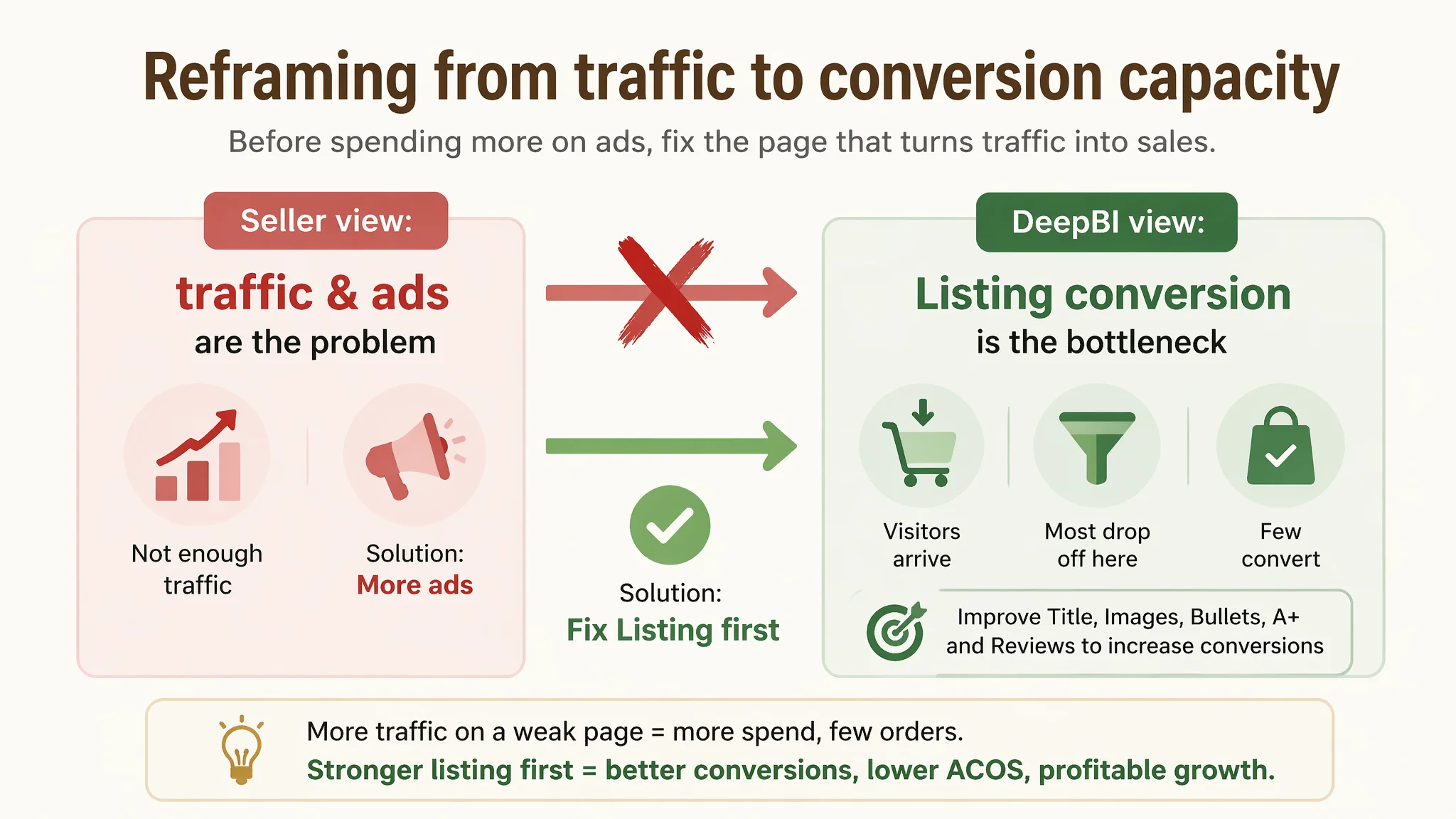
From the seller’s perspective, there were three intuitive beliefs:
1. Product is niche and attractive in itself – a hand-crafted wooden bear for doors and corners should resonate with cabin and forest-themed decor buyers.
2. Category traffic is limited – so the first instinct was to “just get more exposure” when sales were slow.
3. The Listing is ‘acceptable’ – images show the product; the title has keywords; bullets exist. The assumption was that any issues were minor and that ads could solve the rest.
This is a common pattern among Amazon sellers:
- When orders do not grow, the blame often goes to traffic volume.
- When ACOS looks scary, the instinct is to micro-tune bids and keywords first.
- When page performance is poor, teams often feel they “already improved images once” and don’t suspect a structural Listing problem.
In this case, the belief that “the category is small and we just need more exposure” hid a tougher reality: the benchmark competitor was converting better because its Listing made buyer decisions easier, step by step.
Why Traditional Amazon Ad Thinking Would Not Have Worked
If the seller had started ads aggressively at this stage, three things were likely:
1. ACOS would surge quickly
With a weak Listing score (31/100) and no reviews, the page would require heavy discounts or very low bids to keep ACOS from exploding. The probability that visitors would convert on first visit is low.
1. TACOS risk would increase
Without a Listing that can convert ad traffic and improve organic ranking, advertising becomes pure “renting traffic,” not building an asset. TACOS would stay high because organic orders would not naturally catch up.
1. Operational anxiety would rise
As ad costs go up but orders don’t follow, the team would likely:
- Blame keyword match types or campaign structure
- Constantly adjust bids
- Lose confidence in the product or the category
In other words, ads would be used to compensate for a page that wasn’t yet capable of selling. That is exactly the opposite of what a healthy Amazon flywheel requires.
Amazon Ads Were Not the Core Problem. The Page Was Consuming the Traffic.
DeepBI’s scoring and benchmark comparison reframed the issue. The question became:
“If we gave this Listing more traffic today, could it realistically convert close to the benchmark?”
The answer from data was clearly no.
Title: Keywords Without a Clear Decision Logic
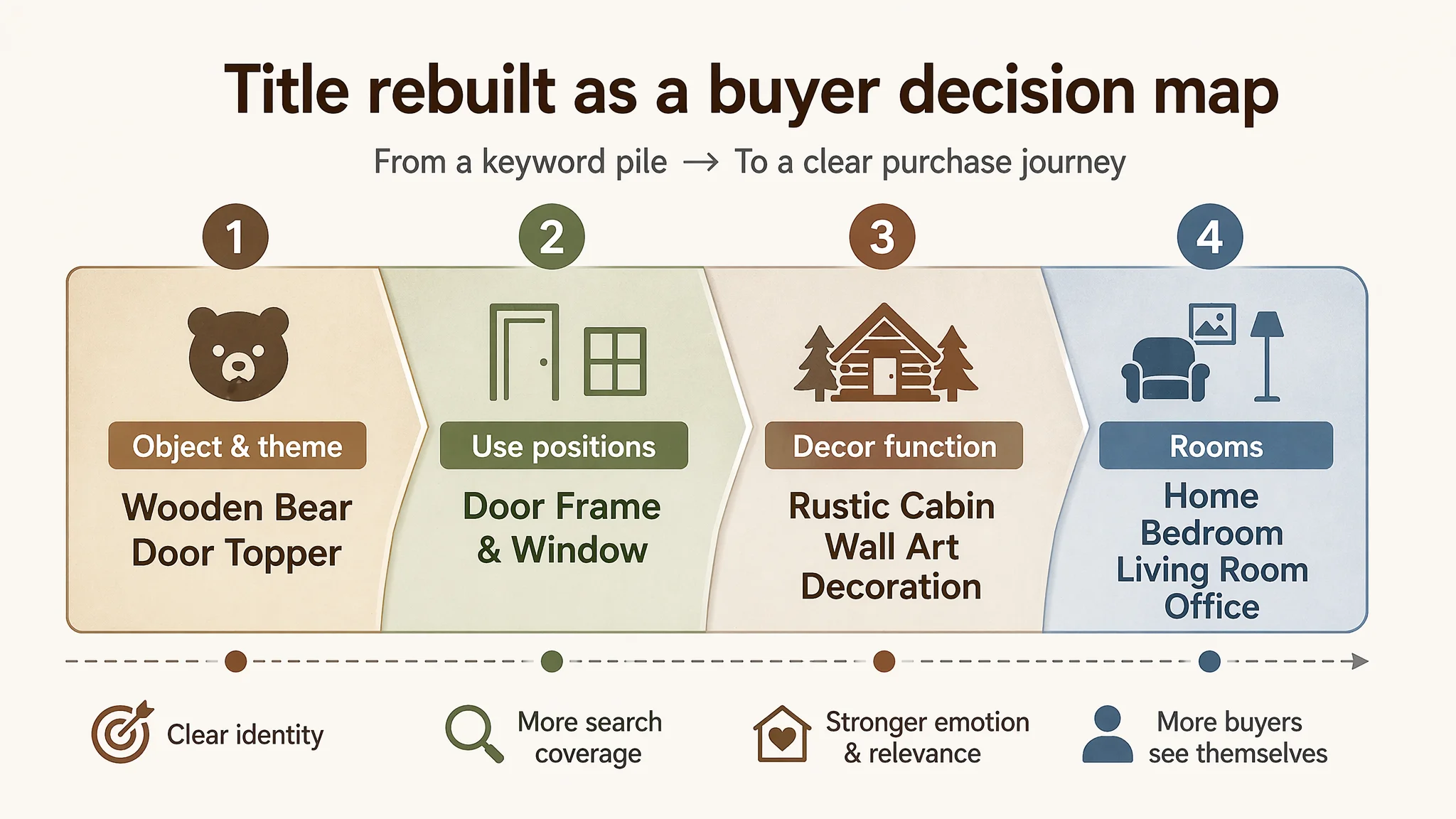
The seller’s original title leaned towards keyword stacking and lacked a strong, coherent structure. The benchmark, by contrast:
- Starts with brand + clear category (metal door-frame decoration)
- Then layers in:
- “Adorable double-sided”
- “Forest theme”
- “Wall art”
- Multiple applications: door frame, door topper, window corner, wall art
- Rooms: home, bathroom, bedroom, office
This gives Amazon and the buyer an immediate, structured understanding:
- What it is
- What theme it belongs to
- Where it can be used
- In which rooms it fits
The seller’s title had some scene words like “Rustic Cabin Decor” but:
- Did not strongly anchor forest theme / nature-inspired identity
- Covered fewer use positions (mostly “door topper,” “door corner”)
- Missed explicit room-level scenarios (bedroom, living room, office)
DeepBI’s view: the title was not building a decision frame; it was just throwing words. That keeps the Listing from capturing the full spectrum of relevant searches and from quickly telling buyers, “this is for you.”
Main Images: No Visual Reason to Click, No Reason to Trust
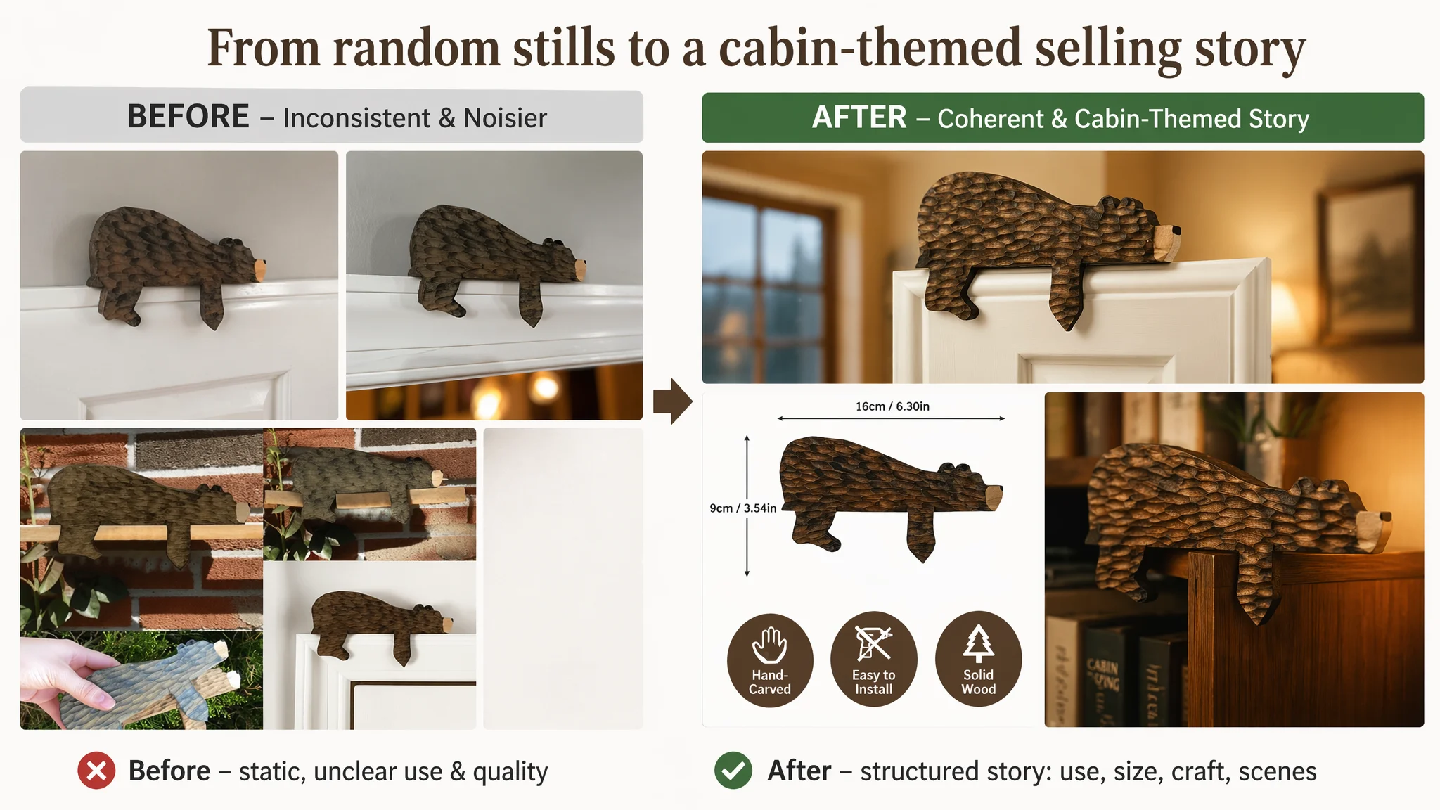
The benchmark Listing used a structured visual chain:
- “Why choose us” diagrams
- Scene images that show the product actually installed
- Parameter visuals (rust protection, thickness)
- Emotional/occasion images with gift packaging and human interaction
The seller’s image set, by comparison:
- Backgrounds were noisy (e.g., game blocks, random furniture), weakening the “door-topper decor” perception.
- Shots were mostly static stills, missing:
- Emotional hooks (gift, family, seasonal atmosphere)
- Clear “this is how it looks in my home” scenes
- Visual cues like size, material, and hand-carved texture
“Advertising does not only amplify advantages. It can also amplify a page’s existing defects.”
If these images were pushed hard through Amazon ads, what would be amplified is:
- Ambiguity about where and how to use the product
- Doubts about quality (no clear craftsmanship shots)
- Lack of emotional connection (no cabin, holiday, or gifting moments)
Bullet Points: Story Exists, but Not as a Buying Logic
DeepBI’s analysis found that the seller’s bullets leaned on emotional wording (“natural charm,” atmosphere) but did not structure a clear purchase path:
- Opened with atmosphere and design concept, not the core bear/forest theme anchored to scenarios.
- Material descriptions were abstract, not strongly differentiating “solid wood, handcrafted” vs cheap alternatives.
- Installation was mentioned, but without sharp promises like “no drilling, no tools, fits standard right-angle corners in minutes.”
- Gift attributes were mixed into general usage, so the gift value never stood out as a key, separate reason to buy.
The benchmark:
- Starts with the core visual theme (mountain forest and bear) tied to themed spaces.
- Provides specific durability features (outdoor use, rust-resistant coating).
- Dedicates a bullet to gift positioning: for forest lovers, homeowners, birthdays, housewarmings.
So while the seller had bullets, they lacked a “pain point → solution → scenario” structure that corresponds to how Amazon shoppers actually decide.
Detail / A+ Page: The Largest Conversion Leak
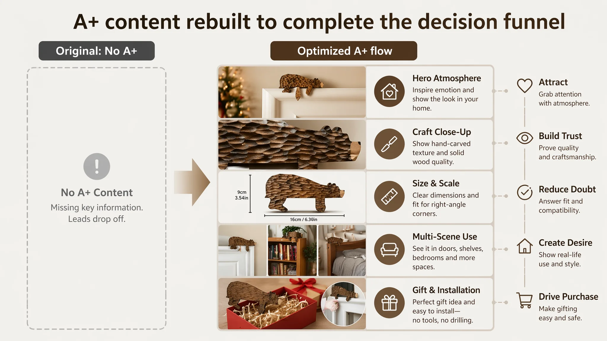
This was the most critical gap.
- Seller’s Listing: no A+ module at all.
- Benchmark: a full A+ suite:
- Large hero scene images
- Size and spec diagrams
- Multi-scene application collages
- Several design variations highlighted
- Gift and emotional value visuals
Without A+, the seller’s conversion funnel is effectively broken at the moment a cautious buyer scrolls:
- No strong visual “first impression” past the main images
- No structured explanation of size, craftsmanship, and installation
- No emotional story (cabin life, holidays, gifts) to make the product feel special
For a decor item that lives or dies on “How will this look in my home?”, this is fatal.
Reviews: Trust Foundation Missing
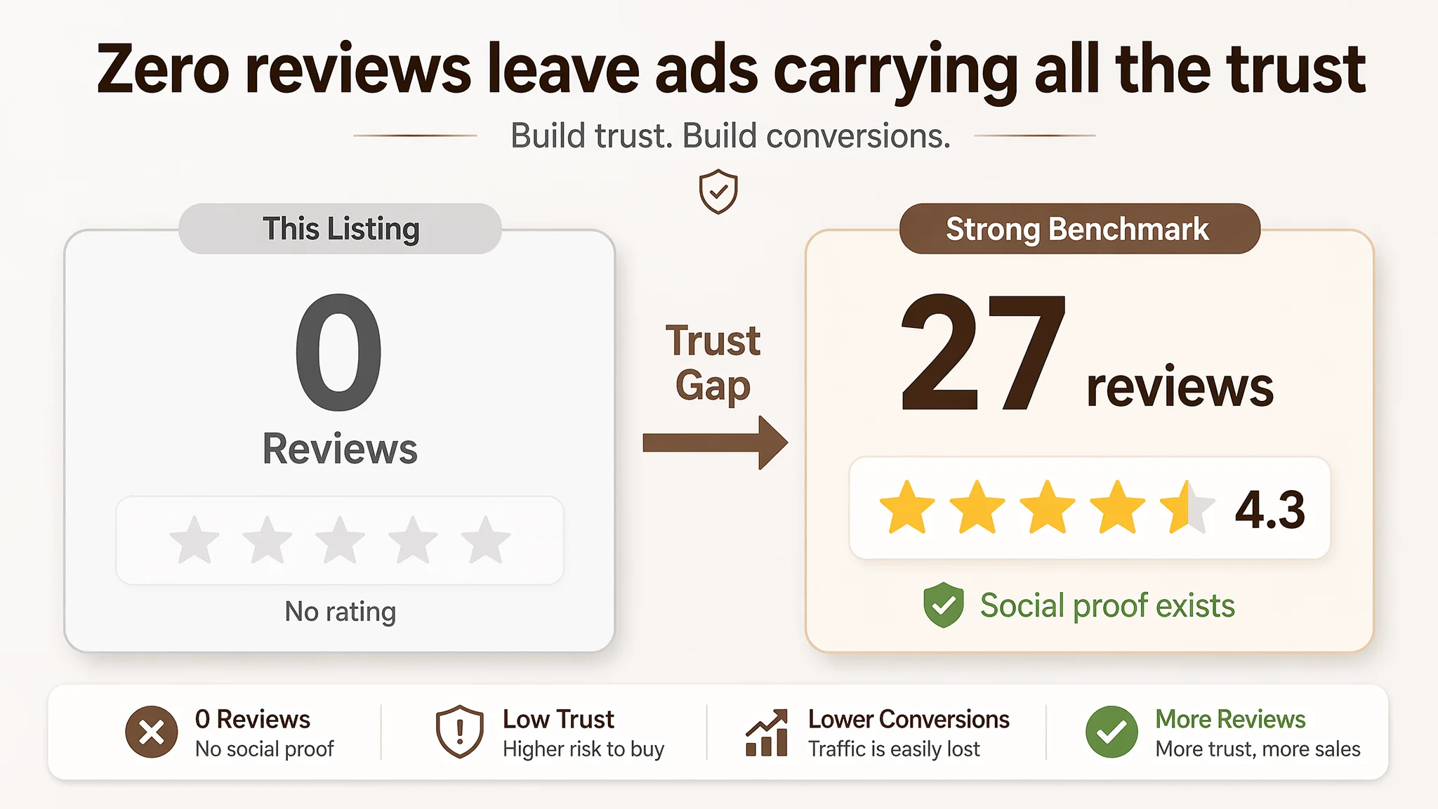
- Seller: 0 reviews, 0 rating
- Benchmark: 4.3 stars, 27 reviews, with 4–5-star reviews and text + images on the first page.
No matter how attractive the product is, a Listing with zero reviews asks ads to carry an impossible trust burden. Even if ads send the right people, the absence of social proof triggers hesitation and deferrals: “I’ll save this for later,” or “I’ll choose one with reviews.”
The Real Constraint Was Listing Conversion Capacity
DeepBI’s judgment: The Listing itself was not yet capable of making Amazon ads pay off.
Given the -21 gap in A+ and -9 in reviews, fixing the page’s conversion foundation was more urgent—and more impactful—than adjusting ad campaigns.
If the team had gone ads-first, they would have:
- Pumped money into a page with no A+, no reviews, and weak visual logic
- Seen poor CVR and high ACOS
- Potentially misjudged that “this product category just can’t scale”
Instead, the priority needed to be:
1. Bring the Listing closer to benchmark quality, so that:
- Organic visitors can be converted more reliably
- Ads have a realistic chance of delivering profitable orders
1. Only then re-open the conversation about ad scaling, once the page is not leaking traffic.
Why DeepBI Did Not Recommend “Tuning Ads First”
From a business-risk perspective, focusing on ads first would have:
- Increased TACOS volatility
- Exposed the seller to longer learning cycles with expensive experiments
- Delayed the moment when the product page actually starts “earning its keep”
DeepBI’s approach is to anchor decisions in a simple question:
“At today’s Listing quality, is each additional 1,000 ad impressions more likely to generate profit, or to confirm that the Listing cannot convert?”
With a 31/100 score vs a 77/100 benchmark, the answer was obvious: more impressions would mostly confirm the Listing’s weakness, not fix it.
So the first phase of work focused on rebuilding the Amazon product page so that:
- The title is structured for both Amazon’s algorithm and human decision-making
- Images form a clear visual story from search result thumbnail to detail page
- Bullets guide the buyer through logical steps
- A+ content answers practical and emotional questions
- The overall page makes buyers feel safe enough to be the first reviewers
Rebuilding the Page: From “Has Content” to “Has Conversion Logic”
The optimization direction that followed was not a generic “make images prettier” exercise. It was a targeted re-architecture of the Listing’s decision logic.
1. Title: From Loose Keywords to a Clear Identity and Use Map
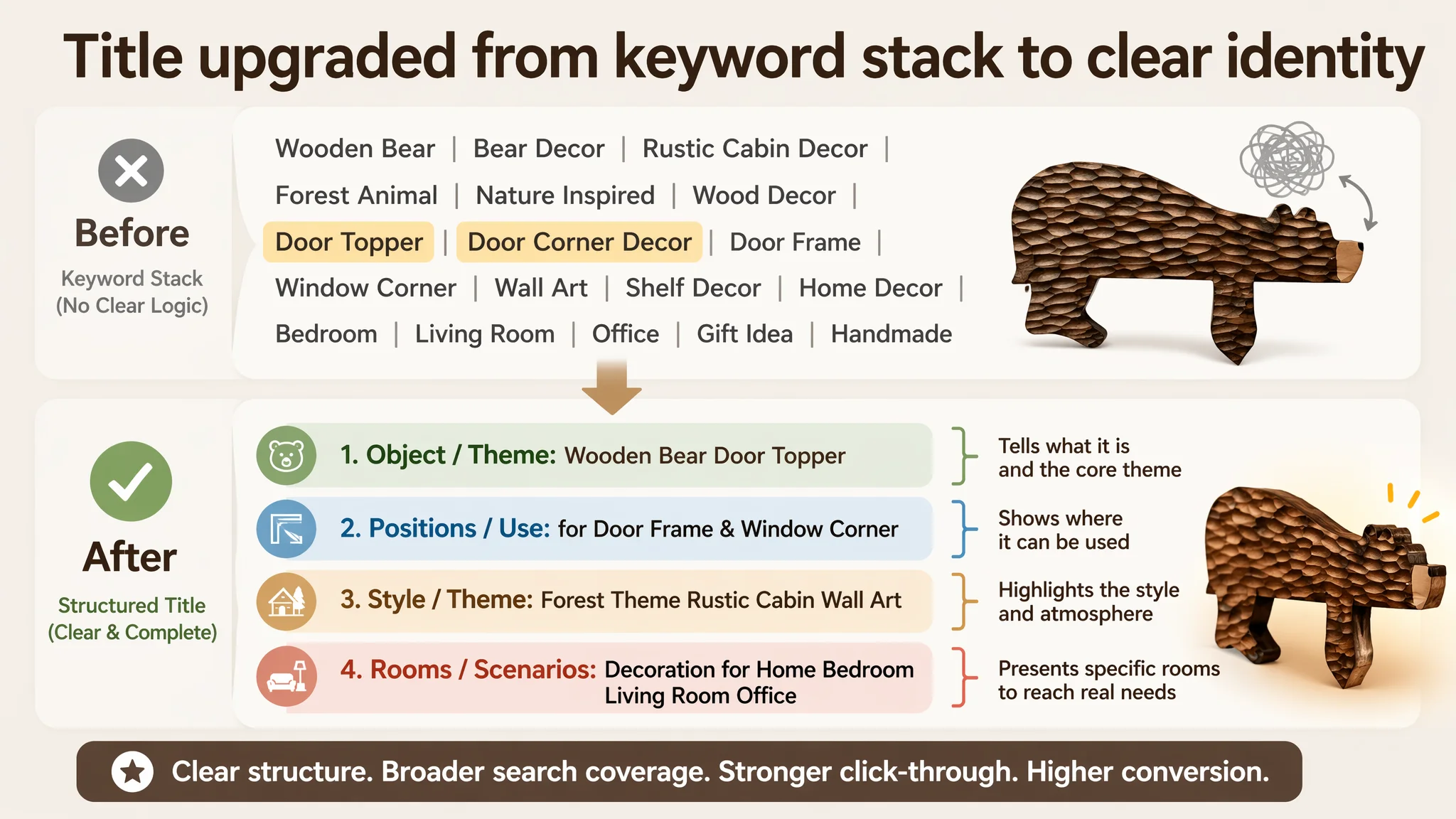
DeepBI recommended a title that:
- Leads with the core object and theme:
- “Wooden Bear Door Topper”
- “Forest Theme Bear Door Corner Decor”
- Explicitly covers key usage locations:
- “Door Frame & Window”
- Adds decor function and scene:
- “Rustic Cabin Wall Art Decoration”
- “Home Bedroom Living Room Office”
This does three things simultaneously:
1. Tells Amazon exactly what this ASIN should rank for (door topper, door corner, wall art, forest/cabin decor).
2. Tells buyers “this is what you are looking for” if they are decorating cabins, rustic or forest-themed rooms.
3. Expands keyword reach beyond “door topper” alone, into “wall art,” “window corner,” and specific room searches.
2. Main Image Set: A “Simple Cabin” Visual Chain, Not Random Scenes
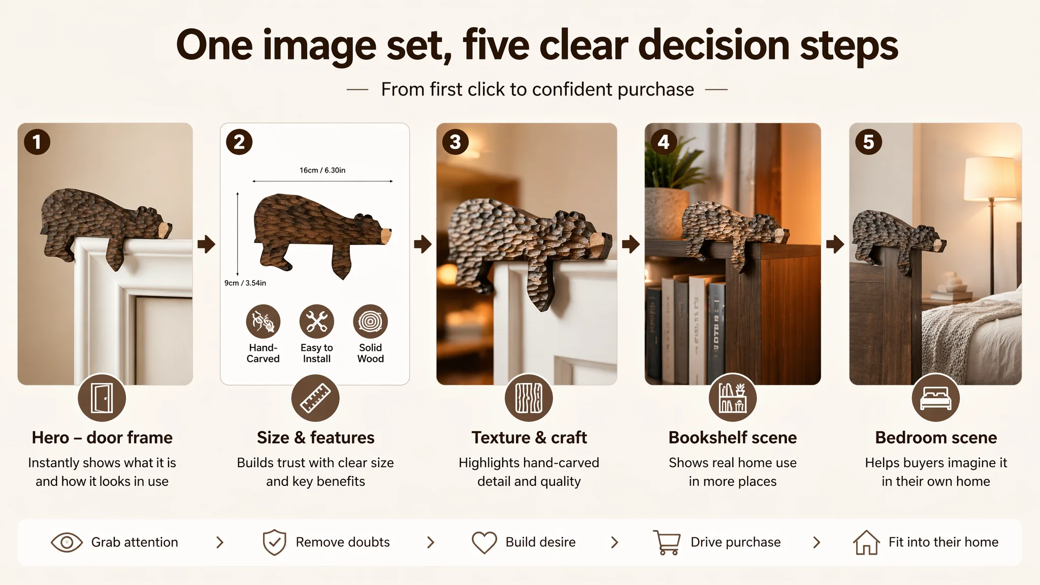
Instead of disconnected product shots, DeepBI’s recommendations built a coherent visual chain:
- Image 1 (Primary)
A minimal, warm-toned interior door frame. The bear topper sits on the top-right corner, about 40% of the frame, under natural light. Background is a light, clean wall; the vibe is “simple, warm cabin home.”
- Image 2 (Size + Features)
Bear centered on white background, occupying ~50% of the frame, with clear dimension lines (e.g., 16cm, 9cm). Below, three simple icons: “Hand-Carved,” “Easy to Install,” “Solid Wood.” This turns invisible qualities (craftsmanship, material, convenience) into visible, scannable proof.
- Image 3 (Texture & Craft)
45° side angle on a white door top, strong side/back lighting to reveal the carved surface and 3D form, text like “Unique Home Decor.” It shows texture and depth, not just silhouette.
- Image 4 (Alternative Scene: Bookshelf)
The bear perched on a dark-wood bookcase corner, with books and a plant in the background, low-angle shot and warm light. This says: “Not just a door-topper—also fits shelves and corners.”
- Image 5 (Bedroom Scene)
Mid-shot of a cozy bedroom, the bear installed on the bedhead corner, 20% of the frame, modern minimalist decor, soft lamplight. Buyers see: “It fits my private spaces too.”
Each image is not just decorative; it carries a specific decision function:
- “What is it?”
- “How big is it?”
- “What is the material and craftsmanship?”
- “Where can I put it?”
- “Does it suit my style and rooms?”
3. Bullet Points: Turning Emotion into a Conversion Path
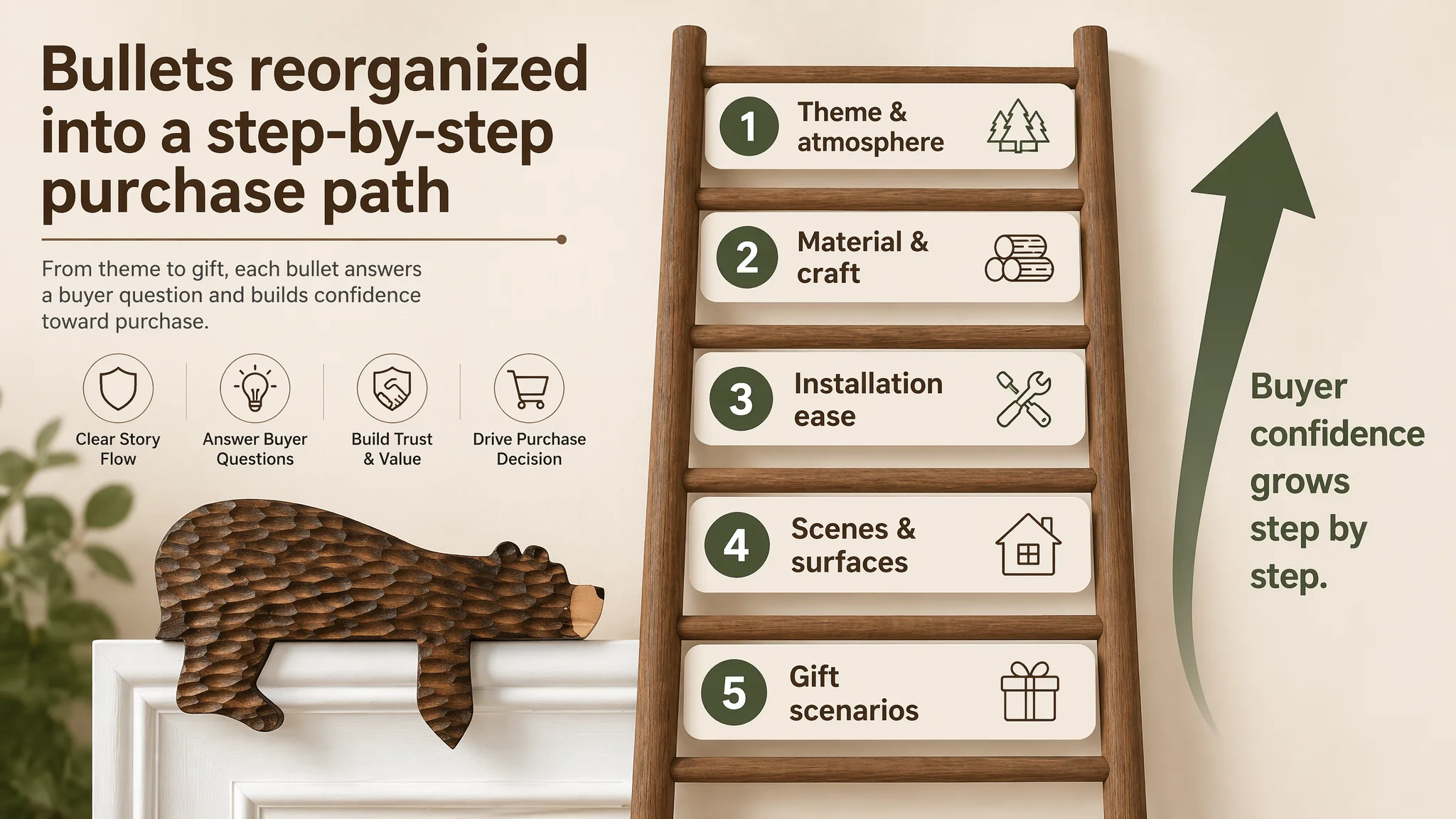
DeepBI’s bullet structures transformed vague, emotional messaging into targeted hooks.
Bullet 1 – Theme & Atmosphere “Rustic Cabin-Inspired Bear Design…”
- Anchors the bear + forest/cabin visual theme
- Names specific spaces: lodge, cabin, forest-themed rooms
- Signals the emotional payoff: a welcoming, nature-inspired entrance
Bullet 2 – Material & Differentiation “Premium Solid Wood Craftsmanship…”
- Emphasizes “solid wood” and “handcrafted”
- Positions this as superior to cheap synthetic decor
- Reinforces durability and tactile quality
Bullet 3 – Installation Ease “Tool-Free Easy Installation…”
- Clarifies “no drilling, no complex tools”
- Explains “fits standard right-angle corner”
- Reduces a key friction point: fear of damaging doors or walls
Bullet 4 – Versatile Use Cases “Versatile Decor for Multiple Spaces…”
- Lists concrete surfaces: door frames, shelves, mantels, windows
- Lists rooms: living room, bedroom, nursery
- Expands buyers’ mental map of where they can use it
Bullet 5 – Gift Positioning “Unique Gift Idea for Nature Lovers…”
- Defines target audience: forest enthusiasts, new homeowners, cabin lovers
- Names gift occasions: birthdays, housewarmings, holidays
- Gives buyers a second purchase scenario: not just “for me,” but “for them”
In combination, the bullets now walk a buyer through a complete “Yes” path:
1. I like the theme.
2. The material and craftsmanship justify the price.
3. It’s easy to install, won’t damage anything.
4. I can picture exactly where I’d put it.
5. Even if not for me, it’s a strong gift choice.
4. A+ Detail Page: Building the Trust and Desire Layer That Was Missing
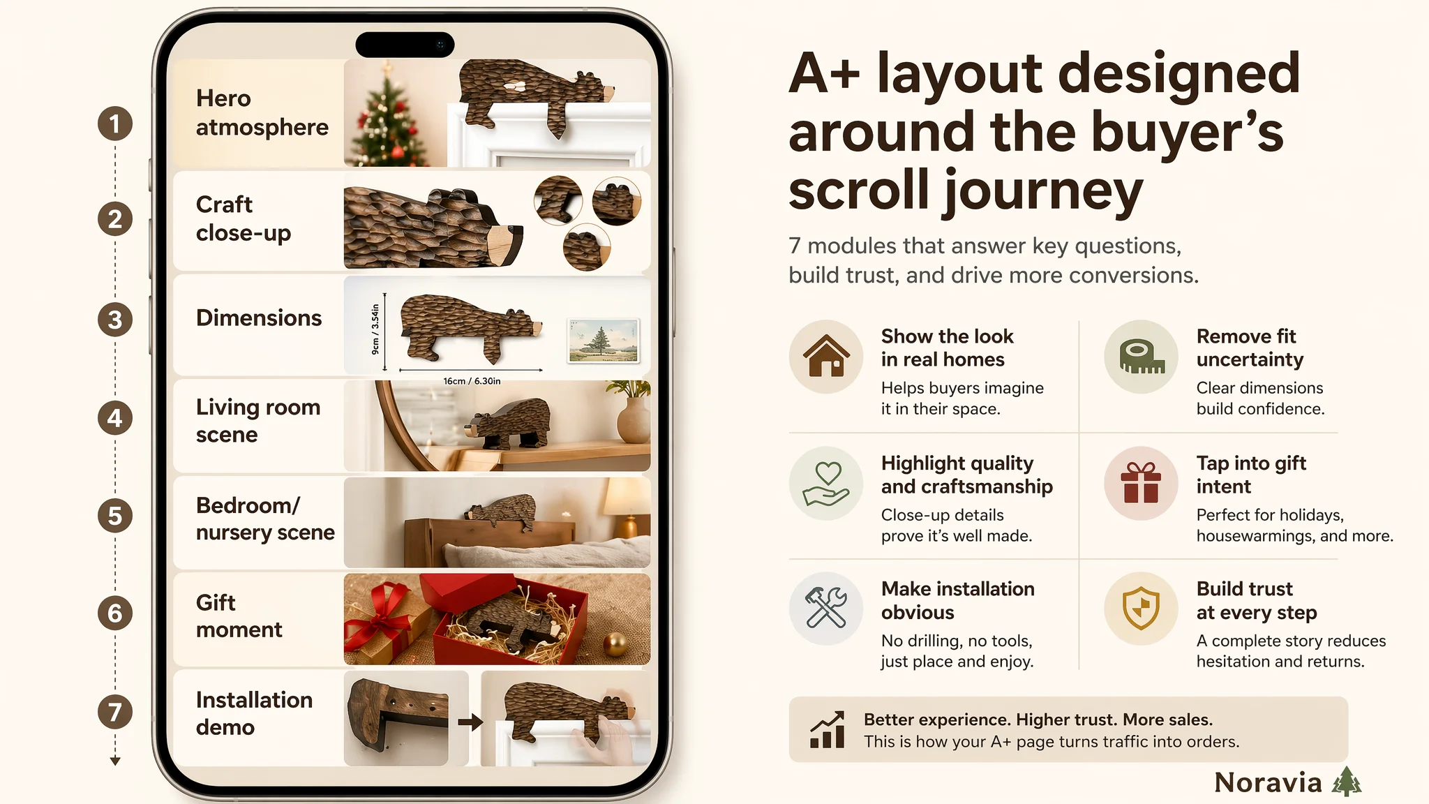
With A+ completely absent, DeepBI recommended constructing a full visual and logical sequence:
1. Hero Banner: Holiday Home Atmosphere
- White carved door, bear topper on the right corner
- Warm natural light, neutral wall, edge of a Christmas tree with red ornaments
- Colors: white, forest green, festive red
This anchors the product as a holiday atmosphere hero: “this is how your home will feel.”
1. Craftsmanship Close-Up
- Macro photography of the bear, neutral background
- Shows surface texture, paint details, smooth edges
- Round zoom-ins of edges and prints
This removes doubts that “it might look cheap in person.”
1. Dimensions and Real-World Scale
- Flat-lay of the bear with clear dimension lines (e.g., 25cm / 9.8in)
- Minimal wooden tabletop background
- A postcard as a visible size reference
This prevents mismatched expectations and reduces returns or negative reviews about size.
1. Multi-Scene Adaptability – Living Room
- Bear on a mantel corner or mirror edge in a cozy living room
- Soft warm lighting, blurred sofa and rug background
This reframes the product from “just door decor” to a multi-surface corner art piece.
1. Bedroom/Nursery Scene
- Bear on a dark wooden headboard corner, calm grey wall and white bedding
- Quiet, relaxing tone
This shows compatibility with restful, personal spaces, not only festive decor.
1. Gift & Occasion Module
- Bear half-visible in a red gift box, with raffia and golden bells
- Warm, textured background
This directly triggers “Christmas gift” and “special small present” mindsets.
1. Installation Trust Module
- Left: product back structure, L-shaped bracket or resting edge
- Right: semi-transparent hands placing it on a door corner
- Clean wall, simple arrows or micro-text to show “no drilling, just place”
This visually solves the “Will this damage my door?” concern far better than text alone.
By covering atmosphere, craftsmanship, size, multi-scene usability, gifting, and installation, the A+ page reconstructs the whole decision process that was previously outsourced to imagination.
How This Changed the Role of Ads
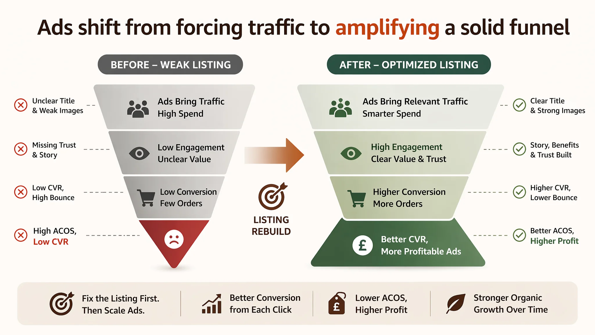
Once the Listing is rebuilt along these lines, the role of Amazon ads changes fundamentally:
- Before: Ads would have been a way to “force” exposure onto a weak page, with high risk of wasted spend and unstable ACOS.
- After: Ads become a way to accelerate a sound funnel:
- Search queries now match a clear title and keyword architecture.
- Thumbnails show a compelling, professional main image.
- Clicked visitors walk into a coherent story from images to bullets to A+.
- The Listing has a realistic chance to earn early reviews, improving organic conversion and reducing ad dependency over time.
Even without inventing specific numbers, you can predict the operational shift:
- Conversion rate has room to recover because key questions are now answered visually and structurally.
- ACOS becomes manageable because the page can capture more value from each click.
- Organic ranking is more likely to stabilize, as improved conversion feeds back into Amazon’s relevance models.
- The seller’s anxiety decreases, because the Listing is no longer a black box; it has a clear logic tied to benchmark performance.
What This Case Changes in the Seller’s Understanding
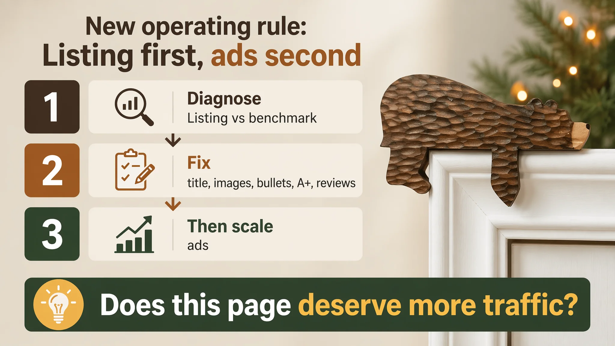
By the end of this diagnosis and Listing rebuild, the seller’s internal narrative changed from:
- “We just haven’t pushed ads yet”
- “Maybe the target audience is too niche”
to:
- “Our Amazon Listing was the bottleneck, not the ads.”
- “Title, images, bullets, and A+ have to work together; otherwise ads are just expensive visitors.”
- “Before scaling traffic, we have to ask: does this page deserve more traffic?”
The DeepBI scoring gap—31 vs 77—did not just identify weaknesses. It forced a reordering of priorities:
1. Fix Listing conversion capacity first.
2. Then use Amazon ads to amplify what already works.
For other Amazon sellers, this case is a practical reminder:
- When traffic exists but orders lag, do not assume it is a keyword or bid problem.
- Look at your Listing against a strong benchmark:
- Are you missing A+?
- Are your images doing a job, or just filling slots?
- Do your bullets follow a buying logic, or just list features?
- Do you have any review base at all?
- Only when those foundations are in place should you expect Amazon ads to deliver stable, scalable returns.
In short: ads can accelerate a good Amazon Listing, but they cannot rescue a weak one.