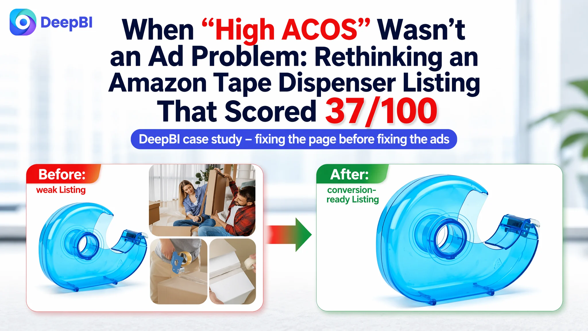
An Amazon seller in the office-supplies category came to DeepBI with a familiar concern: they felt their Amazon ads were “too expensive” and suspected keyword bids and campaign structure were to blame. Impressions were coming in, but orders were weak, and every new round of bid tweaks seemed to push ACOS in the wrong direction.
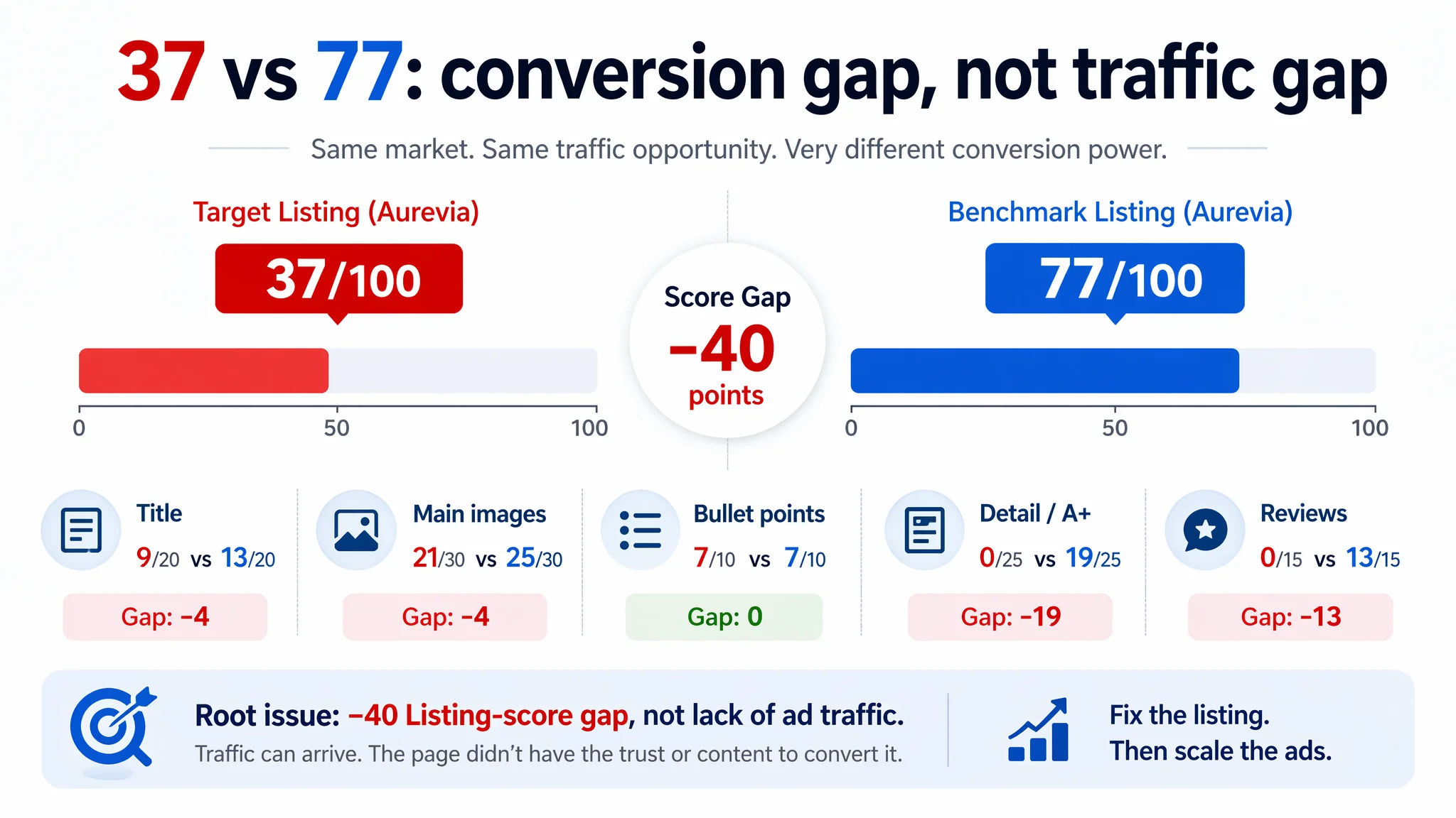
Once DeepBI ran the Listing through its Amazon-focused scoring and benchmark system, a different picture emerged. Against a directly comparable desktop tape dispenser benchmark, this Listing scored only 37/100 versus 77/100, with almost zero trust and zero detail content. The problem wasn’t that Amazon ads couldn’t deliver traffic; the product page itself could not carry visitors from click to purchase.
The later optimization work therefore did not start from new ad tactics. It started from reconstructing the Amazon product page: title logic, main-image system, bullet-point decision flow, and a missing A+ section that competitors were already using to shape user judgment. This case is a reminder to Amazon sellers that when ACOS feels out of control, the root cause may sit inside the Listing’s conversion capacity, not inside the Sponsored Products dashboard.
The Core Conflict: A Listing That Cannot Convert Paid Traffic
DeepBI’s diagnosis made the core constraint very clear:
The Listing did not lack traffic. It lacked the ability to convert that traffic.
In concrete terms:
- Total Listing score:
- Target Listing: 37/100
- Benchmark Listing: 77/100
- Gap: –40 points
- By dimension (target vs. benchmark, full mark in brackets):
- Title: 9 vs. 13 (20) → –4
- Main images: 21 vs. 25 (30) → –4
- Bullet points: 7 vs. 7 (10) → 0
- Detail / A+ content: 0 vs. 19 (25) → –19
- Reviews: 0 vs. 13 (15) → –13
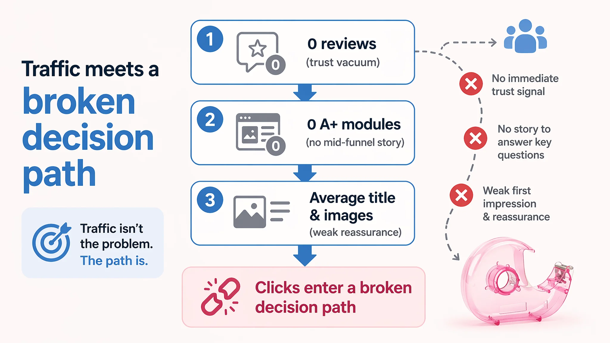
On the surface, the seller saw “poor performance” and attributed it to ads. Underneath, DeepBI found a more fundamental sequence:
1. No reviews – trust level effectively at zero.
2. No A+ content – no mid-funnel narrative to answer “Is this reliable for my use?”
3. Only average main images and a loose title – weak click motivation and weak post-click reassurance.
In this state, any additional advertising spend was simply pushing more buyers into a broken decision path.
What the Seller Initially Misdiagnosed
From the seller’s perspective:
- Sponsored Products campaigns were running.
- Impressions looked acceptable.
- Orders and ROAS did not meet expectations.
Their intuitive response:
- Adjust bids.
- Add or remove keywords.
- Consider pausing certain match types.
- Blame “weak creatives” in ads.
The working assumption was:
“If ACOS is high, the problem is in the ad setup.”
This is a common pattern. When metrics are visible only on the ad side, teams tend to keep iterating inside the ad console, assuming the product page will “take care of itself” as long as traffic is relevant.
DeepBI’s scoring, however, showed that even the best-structured campaigns would feed into a Listing structurally unprepared to convert.
Why Traditional Ad Optimization Didn’t Move the Needle
DeepBI cross-checked the Listing scores against the expected Amazon funnel behavior:
- CTR (click-through rate) is heavily influenced by the search-results thumbnail: title + main image + star rating.
- CVR (conversion rate) is driven by what happens after the click: images, bullets, A+, and reviews.
On this Listing:
- Title and main-image dimensions were clearly weaker than the benchmark (–4 points each).
- Detail/A+ and reviews were effectively missing (0 points vs. 32 combined for the benchmark).
That means:
- Even if ads pulled impressions, the search thumbnail lacked a clear promise and trust signals to win clicks consistently.
- For the visitors who did click, the detail page provided almost no structured content to answer “Is this stable?”, “Will it fit my tape?”, “Can I use it one-handed?”, “Will it break?”.
Continuing to tune bids in this situation would not repair the trust gap. Ads were amplifying deficiencies:
“Advertising does not only amplify advantages. It can also amplify a page’s existing defects.”
The Listing Abnormalities DeepBI Found
DeepBI’s Listing scoring and benchmark comparison surfaced specific, controllable gaps. The point was not that “everything is bad,” but that one bottleneck controlled the whole outcome: the Listing’s conversion capacity.
1. Title: Information Exists, but Decision Logic Is Weak
The original title emphasized “Small” and “Random Color” and scattered key descriptors:
- Started with “Small”, a generic descriptor with low decision power.
- Put “Random Color” at the end, injecting uncertainty instead of clarity.
- Mixed “Portable”, “Transparent”, “Refillable” without clear order.
- Lacked a core pain-point phrase like “Weighted Nonskid” that the benchmark used.
Benchmark behavior:
- Opened with a recognizable brand name – early trust and a branded search advantage.
- Immediately clarified product type + core function: desktop tape dispenser.
- Followed with concrete compatibility: fits 1" and 3" core.
- Added a functional differentiator: weighted non-skid base, directly attacking the “too light, moves around” pain point.
DeepBI’s judgment:
The title was not just a keyword issue; it failed to set up a clear outcome and reassurance in the first 50 characters. That weakens both CTR and downstream trust.
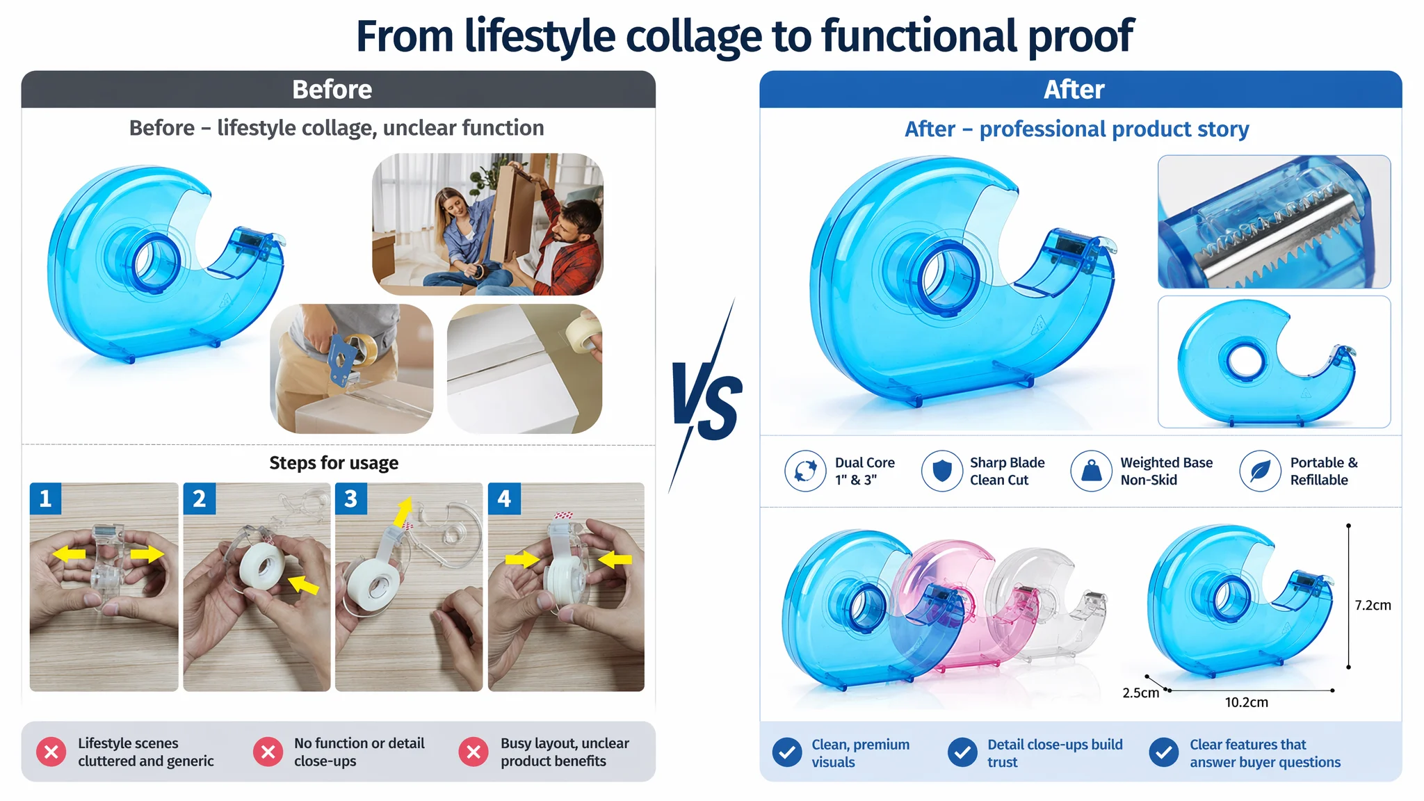
2. Main Images: Lifestyle-Focused, Function-Questions Unanswered
Main image score gap: –4 points, but the qualitative differences were larger:
- The target Listing leaned on casual lifestyle scenes, with mixed compositions and cluttered text overlays.
- The benchmark used a structured image sequence:
- Hero shot with clean white background.
- Dimensional drawing with measurements.
- Compatibility visualization (1" & 3" cores).
- Functional diagram showing blade and nonskid base.
- Close-up macro shot of blade detail.
For office buyers and B2B procurement:
- The benchmark images built professional trust: clear construction, stability, and compatibility.
- The target Listing allowed easy “cheap plastic” associations: no blade close-up, no bottom pad detail, no structured step-by-step visuals.
DeepBI’s conclusion:
This product page did not lack pictures. It lacked a visual sales argument.
3. Bullet Points: Information Without a Buying Path
Both the target and benchmark scored 7/10 in bullet points, but their strategy differed:
- The target bullets:
- Started with design and material.
- Stayed at the level of “what it is,” not “what problem it solves.”
- The benchmark bullets:
- Opened with core specs & compatibility.
- Explicitly addressed usage pain points like “fighting with your tape.”
- Ended with a pre-purchase caution to manage expectations and reduce negative reviews.
Structurally:
- Target bullets:
1) Cartoon shape 2) Transparent body explanation 3) Usage scenarios 4) Core-part function 5) Material & durability
- Benchmark bullets:
1) Core specs & compatibility (1" & 3" cores) 2) Blade performance 3) Nonskid pad & weight (single-hand operation) 4) Pain-point framing (“fighting with tape”) 5) Pre-purchase note (compatibility and store ecosystem)
DeepBI’s judgment:
The bullet-point dimension was not the primary bottleneck; it could be upgraded relatively easily. The real damage came from the absence of A+ and reviews, not from bullet wording alone.
4. Detail / A+ Content: A Complete Void
This was the most critical abnormality:
- Target Listing: no A+ content at all (0/25).
- Benchmark Listing:
- Branded introduction module with logo.
- Scenario images (office, crafts, home).
- Core-function visuals (double-core compatibility, blade detail, nonskid base).
- Multi-color display with clear selection logic.
- Variants and cross-sell (tape rolls + dispenser).
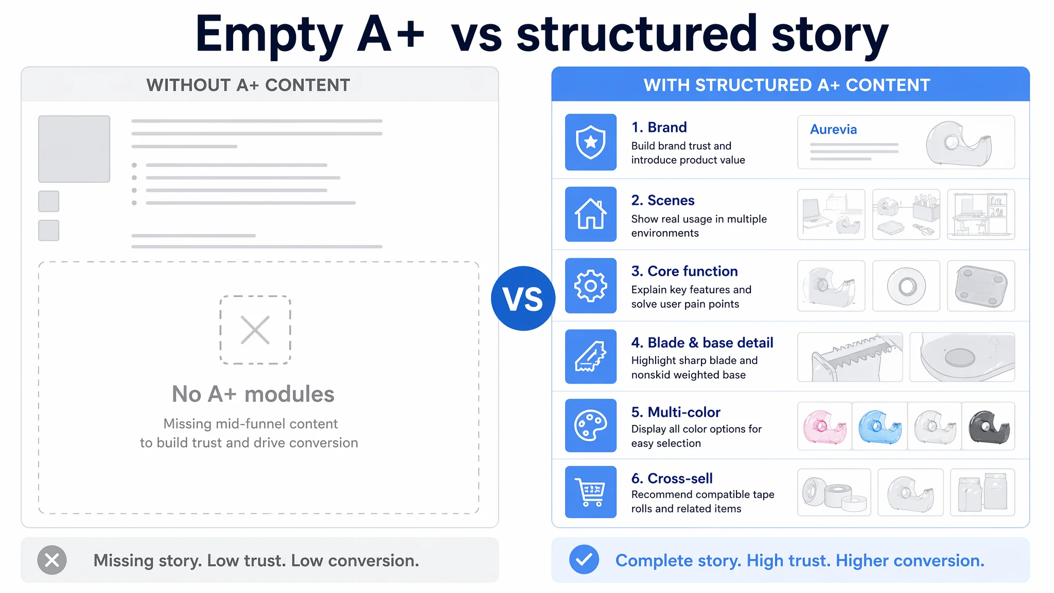
Without A+:
- There was no place to:
- Visualize double-core compatibility.
- Demonstrate single-hand stability.
- Show blade precision.
- Build multi-scene usage beyond a short line of text.
- The conversion funnel had a broken middle layer: from bullet points, buyers dropped directly into reviews and Q&A—except this Listing had none.
5. Reviews: Zero vs. 3,113
- Target Listing:
- 0 reviews, 0 stars.
- Benchmark:
- 4.4 stars, 3,113 reviews, with approximately 85% at four stars or above.
In practical terms:
- The benchmark’s review presence acts as a trust wall on the search page and on the detail page.
- The target Listing, even if priced competitively, forced buyers to take a full risk on an unproven product.
In this context, ad spend did not just bring cold traffic; it brought cold traffic into a trust vacuum.
How DeepBI Identified the Real Root Cause
DeepBI’s scoring system does not start from “let’s make this prettier.” It starts from:
- Benchmark selection:
A strongly comparable desktop tape dispenser with similar function and target audience.
- Dimension-by-dimension comparison:
Title, main images, bullet points, A+ content, and reviews—all scored against the benchmark.
- Funnel-based reasoning:
- If CTR is low and main-image/title scores are weak → visual hook issue.
- If clicks come but orders lag, and A+ / reviews are near zero → page trust and explanation issue.
For this Listing, the evidence chain lined up:
1. High gap in A+ and reviews (–32 points combined) → major trust and explanation deficit.
2. Moderate gap in title and main images (–8 points combined) → weaker search-page presence and in-page visual logic.
3. Comparable bullets → not the primary limiting factor.
From a business perspective, DeepBI concluded:
- Root cause: The Listing’s conversion capacity, especially mid-funnel narrative and trust, not ad-traffic volume.
- Most urgent fix: Build an A+ structure and professional image system that can realistically lift CVR and support review growth.
- What not to do first: Keep sinking time into ad micro-optimization while the product page remains structurally incomplete.
Why Listing Conversion Had to Be Fixed Before Ads
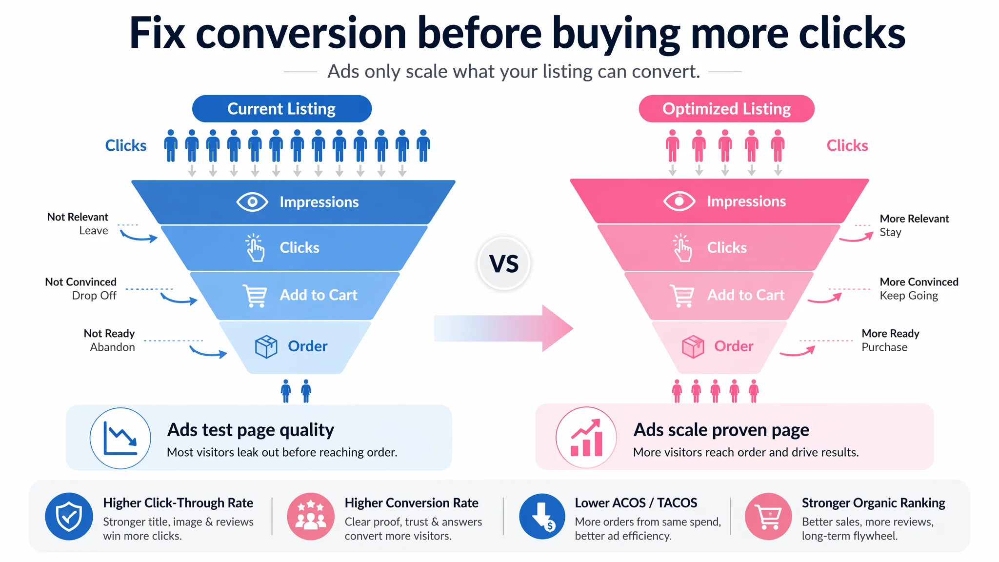
Continuing to push ads into this Listing would have had three risks:
1. Wasted spend on an unproven page
Every additional click from ads pays to test a page that lacks trust and explanation, rather than paying to test actual demand.
1. Slower review buildup
With a low-conversion Listing, the volume of orders—hence reviews—remains constrained. That delays the trust flywheel and keeps the page dependent on paid traffic longer than necessary.
1. Wrong learning signals
Ad dashboards would show poor performance and push the team to conclude “the keyword is wrong” or “the audience is wrong,” when the audience simply hasn’t been convinced.
DeepBI’s decision logic:
Before scaling ads, you must decide whether the page deserves more traffic.
In this case, the answer was no—at least not yet. The priority became:
- Build a convincing story for:
- Compatibility (1" and 3" cores).
- Stability (cannot move around easily, supports one-hand use).
- Blade performance (fast, clean cuts with safe handling).
- Usage scenarios (office, school, home, crafts).
- Present that story in:
- A reconstructed title.
- A coherent main-image series.
- A structured A+ detail page.
- Bullet points aligned with pain-point/solution logic.
Only after this foundation is in place does it make commercial sense to re-accelerate ad investment.
How the Product Page’s Sales Logic Was Rebuilt
DeepBI’s recommendations focused on re-aligning the Listing with how real buyers decide, not just filling slots with more content.
Reframing the Title Around Decisions, Not Adjectives
Suggested title:
Small Tape Dispenser, Portable Desktop Adhesive Roll Holder, Refillable Handheld Tape Cutter for Office, Home and School, Transparent Design (Random Color)
Key adjustments:
- Core keyword first: “Small Tape Dispenser” within the opening, to align with Amazon’s search behavior and A9 expectations.
- Function words early: “Portable” and “Refillable” close to the core, maximizing relevance.
- Scene descriptors structured: “Office, Home and School” grouped to clarify versatility.
- Physical traits normalized: “Transparent Design” framed as a professional descriptor rather than a casual label.
- Random color managed as an attribute, not the core promise.
This moved the title from “loose description” to a structured, scan-friendly representation of what the product is and where it fits in daily use.
Turning Bullet Points into a Buying Path
DeepBI’s suggested bullets reorganized the logic around pain points and solutions:
1. Ergonomic design
Highlighting the unique snail shape and comfortable, one-handed grip—turning a “cute” design into a functional benefit.
1. Transparent & portable body
Connecting clear housing to practical value: easily seeing remaining tape and being ready in critical moments.
1. Smooth operation & versatility
Addressing the annoyance of tangled tape and repositioning the product as suitable for school, home, office, and DIY.
1. Precision blade with safety
Combining “sharp & clean cut” with “protected hands,” resolving both performance and safety concerns.
1. Premium & durable material
Giving a reason to trust that this lightweight plastic is not flimsy, and hinting at broad tape compatibility without inventing specs.
This structure aligned with how buyers evaluate small office tools: comfort, reliability, ease of use, and longevity.
Rebuilding the Main-Image System as a Professional Story
DeepBI did not simply suggest “better pictures.” It specified how each image should support a different step in the decision:
1. Hero image (search thumbnail)
- Product centered, 45-degree angle, 75% frame occupation.
- Clean white background with consistent soft lighting.
- Clear visibility of transparent body and compact size.
1. Blade close-up
- Split composition: macro blade detail on one side, full product on the other.
- Emphasis on clean cutting edge, clarifying performance visually.
1. Clean office scene
- Product on a tidy desk with blurred pen and notebook.
- Subtle signal: this is a real office tool, not a toy.
1. Step-by-step loading process
- Four-panel grid showing how to insert tape.
- Hands neatly presented, bright lighting, wooden surface for warmth.
1. Color and size parameters
- Multiple colors lined up, dimensions clearly annotated.
- High contrast labeling, but not overwhelming the product.
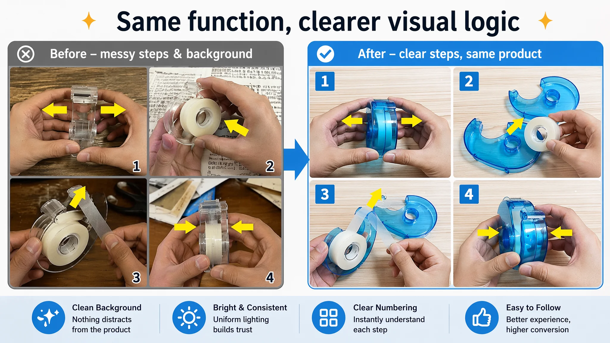
This sequence answers in pictures what the text promises: what it looks like, how big it is, how to use it, and how it fits into workspace aesthetics.
Constructing the Missing A+ Detail Page
DeepBI proposed a six-module A+ structure:
1. Brand gateway
- Logo and key product placed in a clean, modern office-themed module.
- Early trust anchor for office-supplies buyers.
1. Core function: double-core compatibility
- Side-by-side visualization of 1" and 3" cores installed.
- Clear labeling of diameters so buyers can confirm fit in seconds.
1. Single-hand stability
- Action shot of a hand pulling tape, dispenser stationary.
- Focus on base and table contact to visually prove nonskid and stability.
1. Blade detail
- Macro shot of serrated blade with an inset of a clean-cut tape edge.
- Visual evidence of “sharp and neat,” instead of only text claims.
1. Bottom anti-slip pad
- Tilted product showing full coverage black rubber pad.
- Contrast between pad and body to communicate robustness.
1. Multi-scene and color selection
- Warm craft or gift-wrapping scene to extend beyond office-only use.
- Horizontal lineup of all colors with labels for low-friction choice.
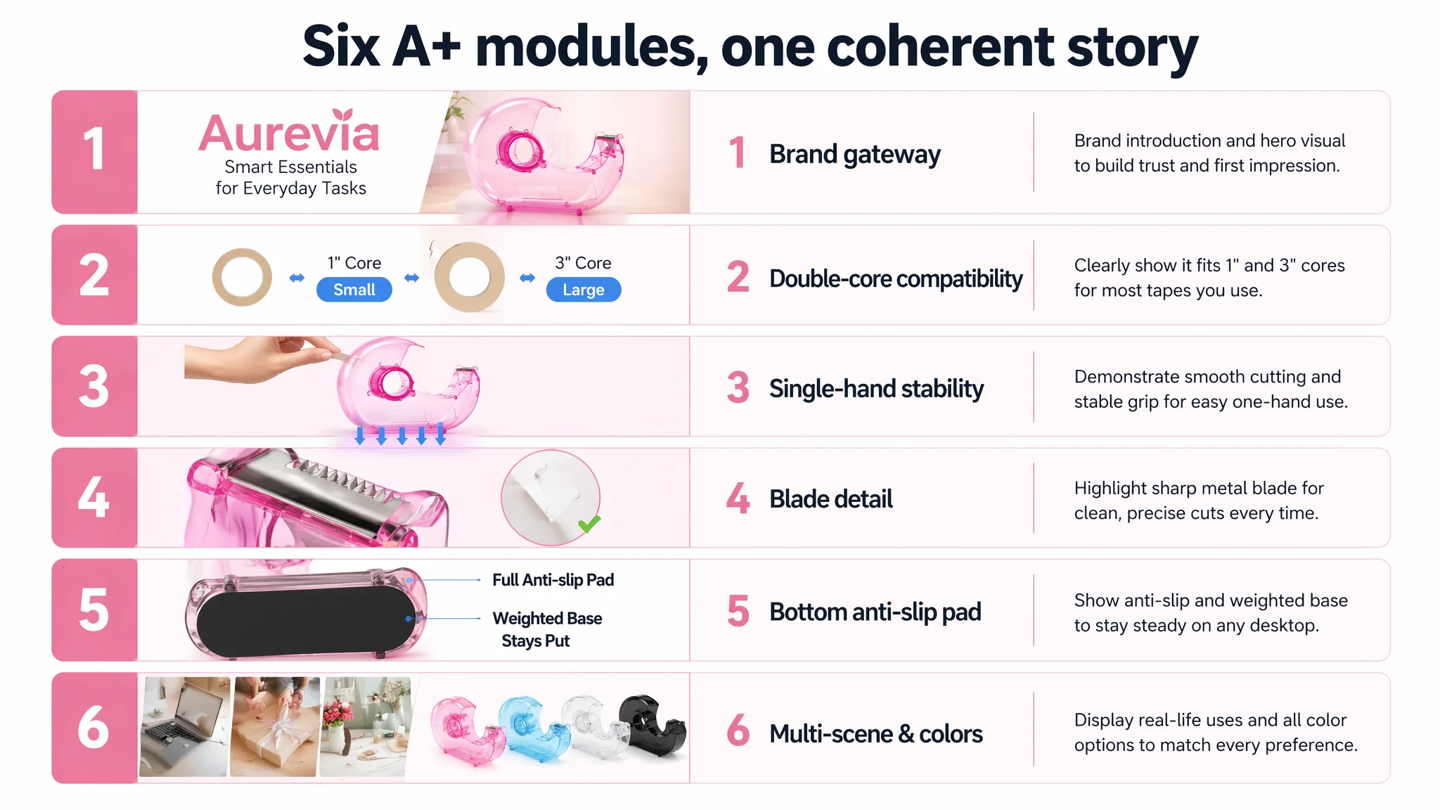
The result is a coherent narrative: from brand, to fitment, to operation, to durability, to lifestyle fit.
How Ad Traffic Became Useful Again
Once this Listing-level work is implemented, the relationship between ads and the product page changes:
- CTR:
- A more focused title and professional hero image increase the chance that ad impressions turn into clicks.
- The presence of reviews (as they begin to accumulate) further boosts click likelihood from Sponsored placements.
- CVR:
- Buyers see clear compatibility, operation, and stability proof.
- A+ content answers the silent questions that previously led to drop-offs or hesitation.
- ACOS / TACOS:
- With higher CVR, the same ad spend yields more orders.
- Over time, the Listing can win more organic placements, lowering dependence on ads.
The seller’s operating state also changes:
- Ads become a way to accelerate an already conversion-capable page, not a crutch for a weak one.
- Ad dashboards start reflecting real demand, instead of punishing a weak page composition.
How the Seller’s Understanding Changed
By the end of this diagnosis, the seller’s view of “ad problems” shifted:
- From:
“We need better keywords and lower bids to fix high ACOS.”
- To:
“Our Listing’s conversion ability is the foundation; ads can only scale what the page can already sell.”
Key internal realizations:
- Amazon ads cannot solve every conversion issue.
When reviews and A+ are absent, ad spend is largely testing the Listing, not testing market demand.
- Listing quality is not cosmetic.
Title, main images, bullets, and A+ are a single system that decides whether traffic turns into orders.
- Trust and explanation must be visible.
Especially in categories where benchmark competitors already use detailed A+ modules and have thousands of reviews.
What Other Amazon Sellers Can Take Away
This case is not about a single tape dispenser. It is about a pattern many Amazon sellers face:
- Ads seem “too expensive.”
- Teams keep adjusting campaigns.
- Meanwhile, the Listing:
- Has weak or missing A+ content.
- Has no or few reviews.
- Offers only a partial visual argument compared to top competitors.
The real lesson:
Before assuming a traffic problem, verify whether your Amazon product page has the structural ability to convert that traffic.
If your Listing shows:
- Low or zero A+ score.
- A large score gap vs. a directly comparable benchmark.
- No reviews while your benchmark has thousands.
Then your first lever is not another bid test. It is rebuilding your Listing’s conversion logic—exactly what DeepBI surfaced in this case.
Once the page can persuade, your ad spend finally has something solid to work with.