


This case comes from an Amazon seller in the facial massage / beauty tools category who was under pressure to improve performance on a US marketplace Listing. Ads were already bringing traffic, reviews were all 5-star, but orders were not growing as expected. The team’s instinct was to keep tuning Amazon ads and keywords, assuming the problem was exposure and bidding rather than the product page itself.
After DeepBI stepped in, the diagnosis went in a different direction. A full Listing-score benchmark against a strong category competitor showed that the seller’s biggest gap was not in title, not in images, and not in reviews—it was a completely empty A+ section. In other words, the Amazon product page had almost no structured story to convert the traffic ads were paying for.
The optimization therefore shifted from “more ads, better bids” to rebuilding the Listing’s conversion capacity: a clearer Amazon title, more commercially focused bullet points, a visual main-image system that actually sells the outcome, and a full A+ story that connects wooden-material trust, multi-function use, and gift scenarios. For Amazon sellers, this case shows how an apparently “fine” Listing—with perfect ratings and decent creative—can still quietly consume ad spend if the detail page isn’t doing the heavy lifting.
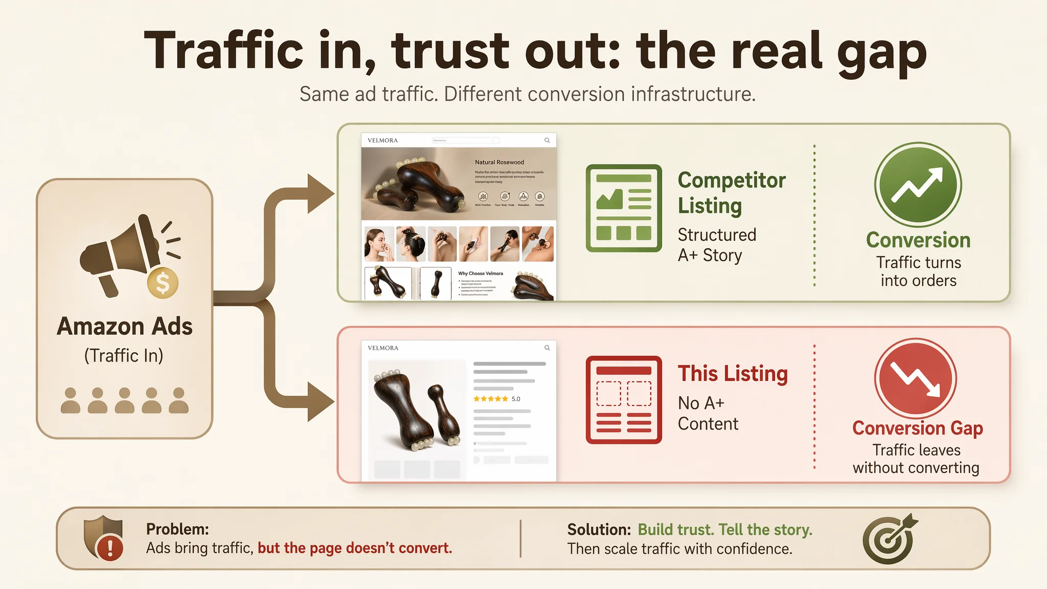
Amazon Ads Were Not Failing. The Page Was Consuming the Traffic.
What the seller saw at first looked reassuring:
- Category: facial massage / wooden beauty tool on Amazon US
- Ratings: 5.0 stars, all visible reviews positive
- Visuals: a set of images already showing the product and some usage
- Ads: delivering traffic, but conversion felt weak relative to spend
Because the ads were already running, the internal narrative quickly became: “We probably haven’t found the right keywords, bids, or campaign structure yet. If we just refine the ads, ACOS will come down.”
But DeepBI’s Listing-score benchmark against a comparable high-performing competitor told a different story:
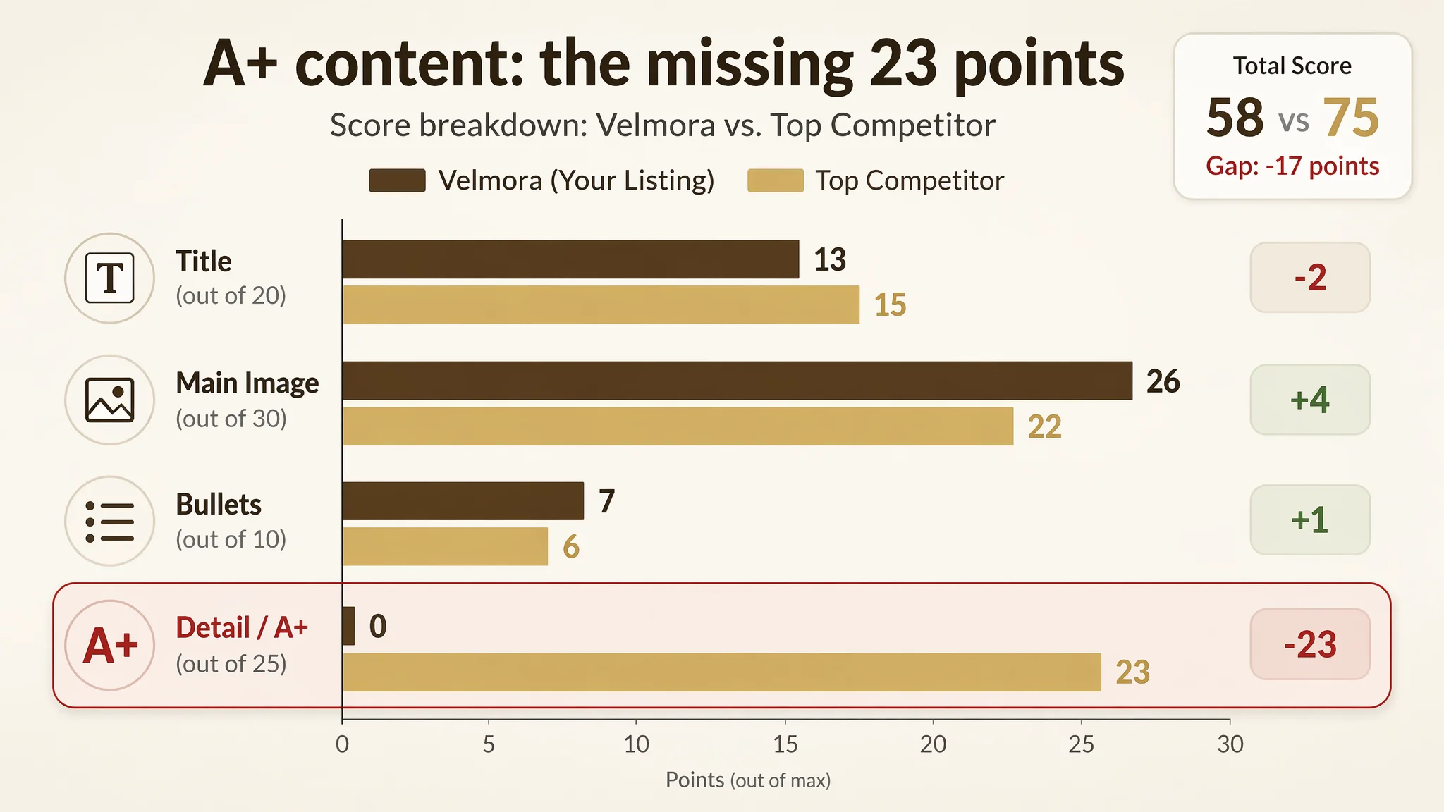
- Seller Listing total score: 58 / 100
- Competitor Listing total score: 75 / 100
- Gap: –17 points
The surprising part:
- Title: slightly behind, but not disastrous (13 vs 15)
- Main image: the seller actually outscored the competitor (26 vs 22)
- Bullet points: roughly on par or better (7 vs 6)
- Reviews: stronger rating, though fewer in number (5.0 vs 4.1)
The critical gap sat in one place:
Detail / A+ content: 0 vs 23, a –23 point difference
Ads were delivering traffic into a Listing that had no A+ structure, no visual trust path, and no “how/why to use” narrative. Conversion was being lost not at the ad level, but at the page level.
“The real problem was not that ads failed to bring traffic. It was that the page could not convert the traffic.”
The Real Constraint Was Listing Conversion Capacity
Once the scoring radar made the gaps visible, the single core constraint became obvious:
The Listing lacked the conversion infrastructure to justify more Amazon ad traffic.
DeepBI’s diagnosis hinged on a few key observations.
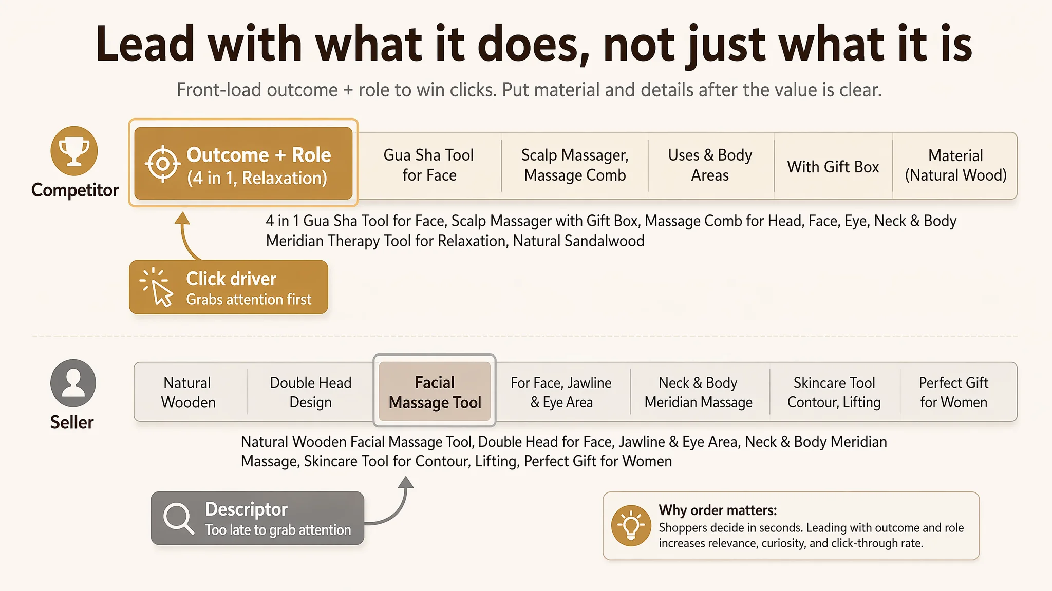
Title: Informative, but Not Outcome-Led
The seller’s original title:
- Spread the core keyword “Facial Massage Tool” too late in the structure
- Over-emphasized “Natural Wooden” and specific body parts
- Lacked a strong result-oriented hook or bundle framing
- Ignored gift intent (no “Gift Box”, no gift scenario keywords)
The competitor:
- Front-loaded “Gua Sha Tool for Face” as the primary search anchor
- Used “4 in 1” to summarize the product’s role and multi-function promise
- Embedded “Meridian Therapy Tool for Relaxation” to signal the result
- Explicitly included “with Gift Box” to capture gift-search demand
The problem wasn’t keyword stuffing. It was decision logic: the competitor’s title told a buyer, in one glance, what the product achieves and how multi-functional it is. The seller’s title mostly described what the product is and where it can be used.
Main Images: Visually Decent, Strategically Underutilized
On pure image quality, the seller didn’t look weaker. In fact, in scoring, the main-image dimension slightly outperformed the competitor.
But the strategic role of the images differed:
- The seller’s images showed the product, but lacked:
- A clear “gift set” visual (box + pouch + product together)
- A compressed view of all usage areas in one frame
- Visual proof of material quality and craftsmanship
- Before/after type cues for facial contouring or lifting
- The competitor’s images, though not perfect, did:
- Compress multiple usage scenarios into fewer frames
- Echo the “4 in 1” multi-function narrative visually
- Make it easier for a price-sensitive buyer to justify purchase
DeepBI’s judgment: the seller’s visual style suited a higher-end, ritual-oriented audience, but the images weren’t fully leveraged to support that positioning—especially on the first screen where most Amazon click decisions are made.
Bullets: Strong in Content, Weak in Commercial Priorities
DeepBI’s scoring found the bullet points structurally clear and, in some areas, stronger than the competitor:
- More focused on facial massage and skincare enhancement
- More concrete in describing effect (distribution and absorption of skincare)
- More specific about material (“red sandalwood”) and craftsmanship
- Gift and portability mentioned, but buried in the last bullet
The competitor, by contrast:
- Tried to cover everything (face, body, scalp, hair growth)
- Pushed “gift” as a fully independent, prominent bullet
- Used broader but less anchored claims (“reduce swelling, lift, tighten skin”)
This meant the seller had content strength, but misaligned priorities. The gift scenario, which drives a large share of beauty-tool orders, sat too low in the bullet hierarchy.
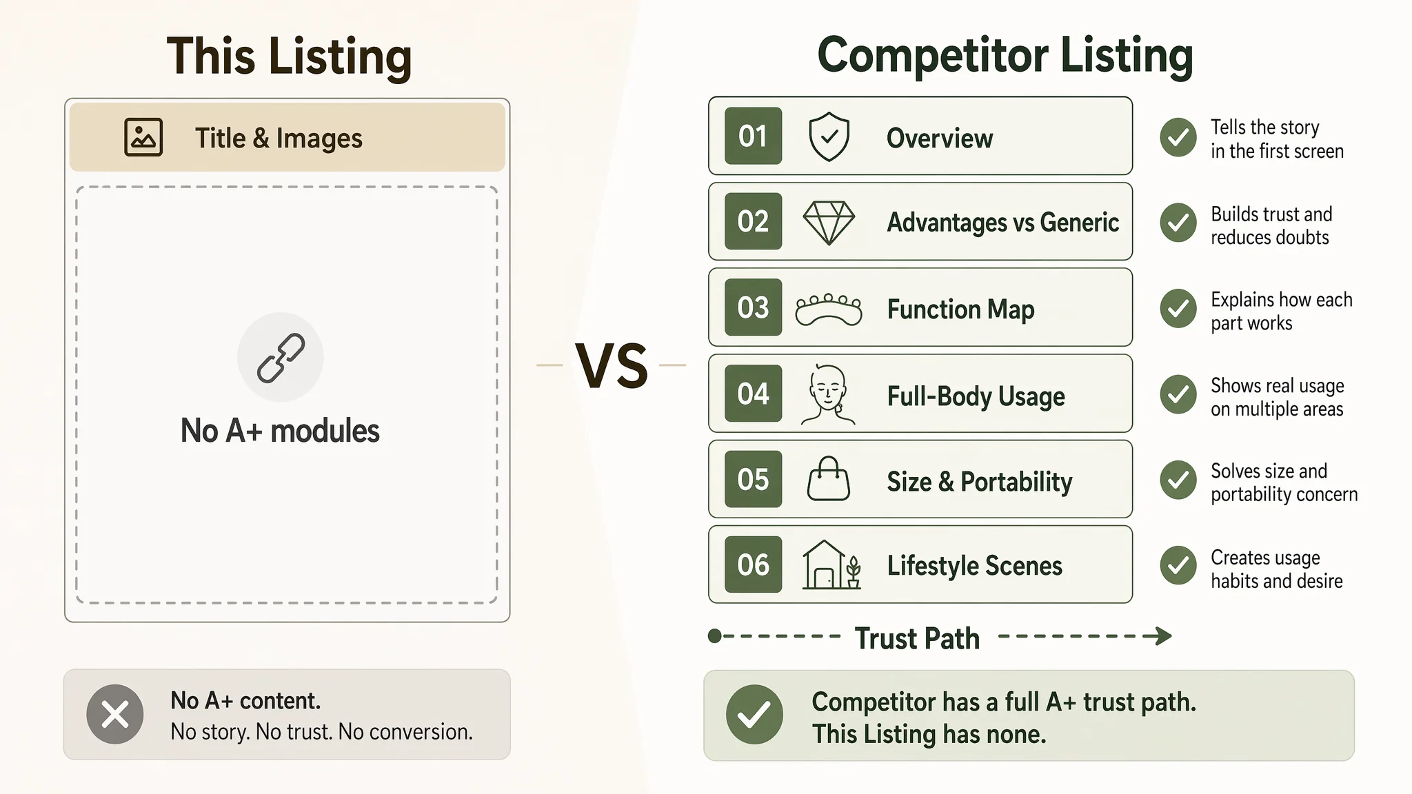
Detail Page: A Conversion Void vs a Full A+ Story
The decisive difference lay in the detail page:
- Seller: no A+ content, no modules, no structured visual story
- Competitor: multi-module A+ chain:
- Core selling-point overview
- Product advantage vs generic tools
- Function-division diagrams
- Multi-scenario application visuals
- Full-body usage demonstration
- Size and portability explanation
- Lifestyle montage across daily scenes
DeepBI’s view: without A+ content, this Listing has:
- No place to:
- Visually resolve material concerns (wood splinters? fragile?)
- Show multi-body-part usage in a low-effort way
- Explain how it replaces multiple traditional tools
- Anchor a higher price with higher perceived value
In Amazon terms, this is a trust gap, not a traffic gap.
Why DeepBI Did Not Keep Tuning the Ads First
From a pure advertising perspective, the seller could have:
- Adjusted bids
- Swapped match types
- Expanded keyword coverage around “gua sha”, “meridian massage”, “gift box”
- Tested new creatives
But DeepBI’s operating logic is:
“Before scaling ads, judge whether the page deserves more traffic.”
There were three business risks to “ads-first” optimization:
1. Amplifying a weak conversion funnel
Every incremental click would keep landing on a page that did not explain multi-function, did not visualize trust, and did not show usage clearly. ACOS would remain stubborn because the Listing itself was not designed to convert.
1. Eroding organic potential
If ads feed a low-conversion Listing, Amazon’s overall signal (including organic) can suffer. The ASIN risks becoming a Listing that constantly requires paid traffic to maintain visibility, without building organic conversion strength.
1. Misleading internal judgment
As long as the team thought “ads are the problem,” they would keep searching for the next campaign tweak instead of acknowledging that the page lacked a persuasive structure.
Given this, DeepBI prioritized Listing reconstruction over ad-level micro-tuning:
- Fix the title to communicate outcome and multi-function early
- Rebuild bullet points to tighten the “pain point – benefit – scenario” logic
- Redesign the main-image sequence to support the chosen positioning
- Build A+ modules that close trust gaps and explain the product’s value in one visual chain
Only after the Listing’s conversion capacity improved would further ad investments make sense.
This Product Page Did Not Lack Traffic. It Lacked Trust.
Once the core constraint was clear, the question became: What does a convincing Amazon facial massage tool Listing need to do that this one doesn’t yet do?
DeepBI’s diagnosis translated into four key directions.
1. The Title Had to Lead With Outcome and Role, Not Just Anatomy
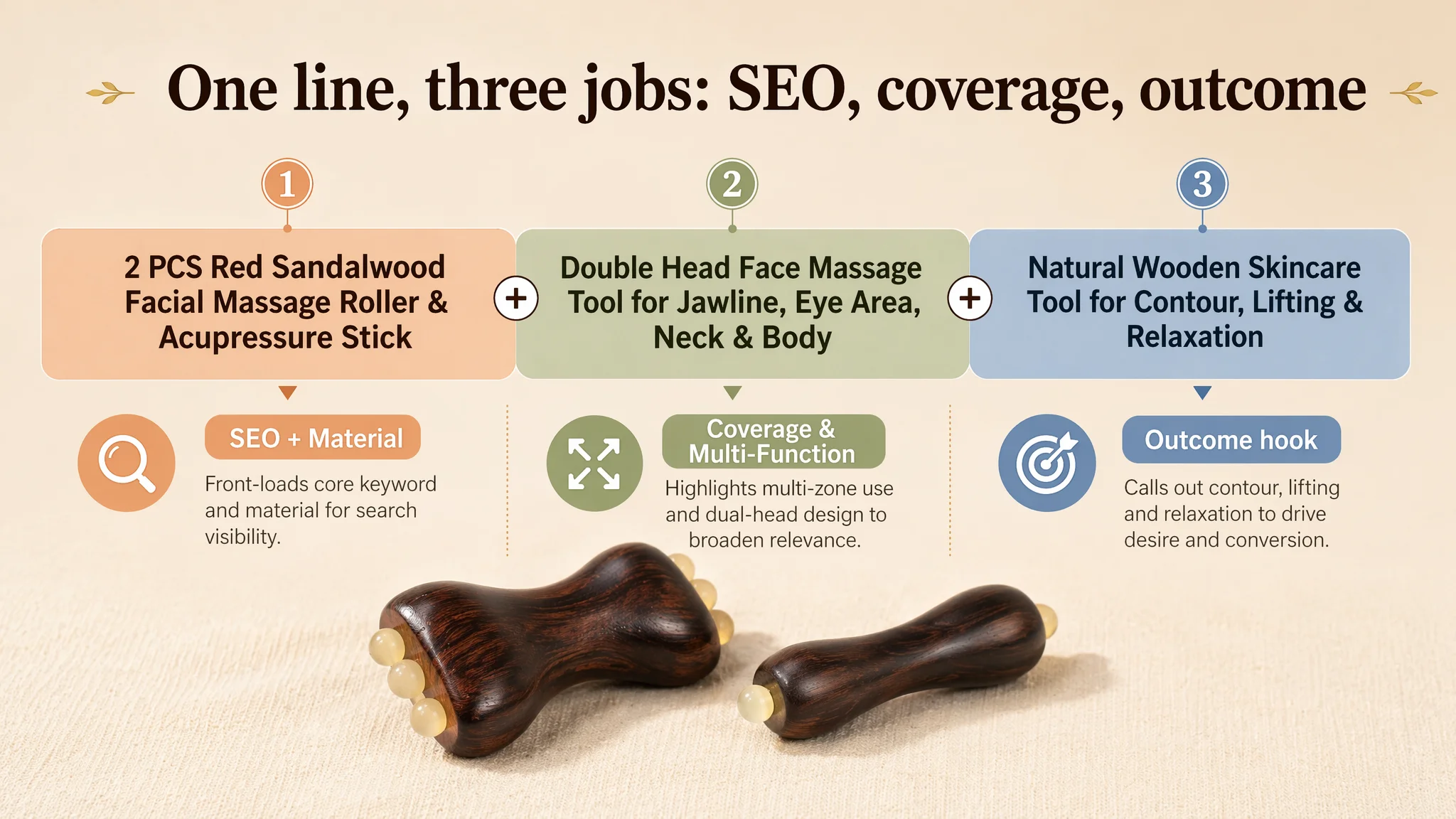
Suggested title direction:
2 PCS Red Sandalwood Facial Massage Roller & Acupressure Stick, Double Head Face Massage Tool for Jawline, Eye Area, Neck & Body, Natural Wooden Skincare Tool for Contour, Lifting & Relaxation
The thinking:
- SEO & relevance
Bring “Facial Massage Roller” and key body areas (“Neck & Body”) into the front half to align with buyer search patterns and ad keyword targeting.
- Material differentiation
Preserve “Red Sandalwood” to maintain the premium, natural-material story.
- Function & result in one line
“Double Head” + “Acupressure” signals multi-function; “Contour, Lifting & Relaxation” introduces the outcome buyers are actually paying for.
By shifting from “where it can be used” to “what it does,” the title starts operating as a click driver instead of just a product label.
2. The Main Image Was Not Just a Visual Issue. It Failed to Create a Reason to Click.
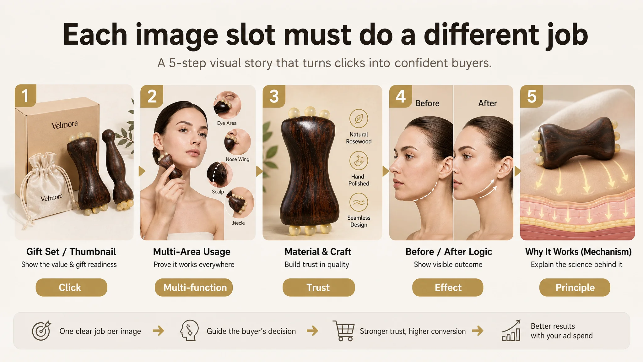
The existing images were not “bad,” but they weren’t orchestrated around buyer decisions. DeepBI’s guidance turned each image slot into a specific conversion job.
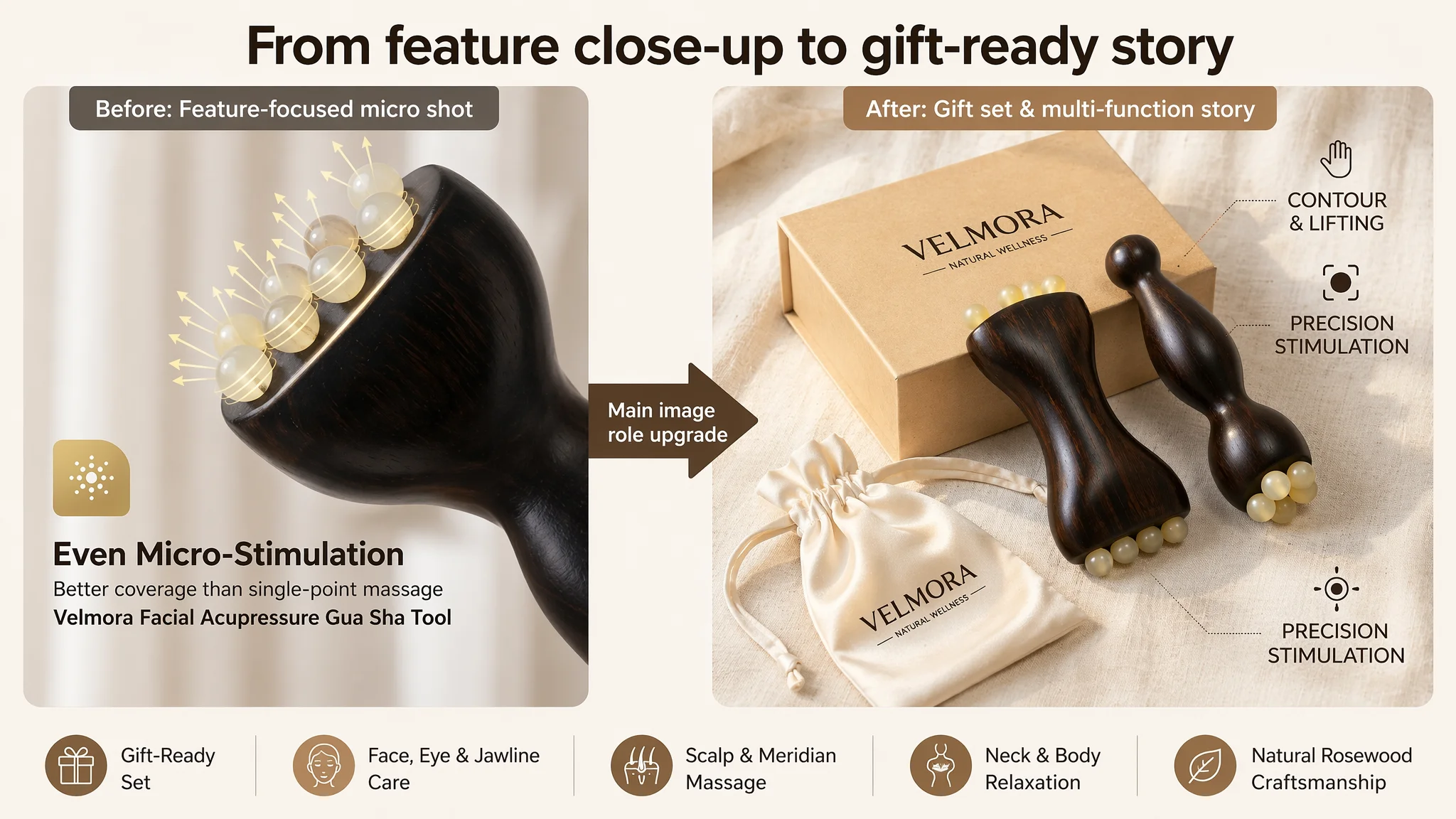
Gift Value at the Thumbnail Level
First image recommendation:
- Product centered, 45° top-down angle
- Warm, light beige linen background
- Gift box + silk pouch arranged behind and in front of the product
This doesn’t just look better—it answers a gift-buyer’s question in the search results themselves: “Does this feel like a complete gift?”
One Frame, Multiple Usage Areas
Second image recommendation:
- Model centered, neutral background
- Transparent circles around face, eyes, scalp, jawline, neck
- Each circle showing close-up usage, labeled with the body part
Instead of forcing buyers to click through multiple images, this compresses multi-function proof into one glance.
Material Trust, Visualized
Third image recommendation:
- Macro shot of the wooden tool at a 45° angle
- Icons for “Natural Rosewood,” “Hand-Polished,” “Seamless Design”
Buyers in this category care about splinters, rough edges, and cheap wood. This image visually answers those concerns without lengthy explanations.
Before/After Logic Without Overpromising
Fourth image recommendation:
- Left: model using the tool on the jawline
- Right: subtle contour outline showing before/after lift
The point is not to claim miracles, but to translate “lifting” from a word into a picture that supports the promise.
“Why It Works” Without Medical Claims
Fifth image recommendation:
- Tool used on leg or body
- Simple skin-layer diagram beneath, with arrows showing pressure into tissue
This explains the massage principle visually, not medically, lowering skepticism for buyers who ask, “Will this actually do anything?”
3. The Bullet Points Had Information, but Not a Buying Logic
DeepBI’s adjustments didn’t try to rewrite everything; they re-ordered and reframed.
BP #1 – Materials & Safety First
Lead with:
Premium 100% Red Sandalwood Craftsmanship… …smooth finish, safe, no splinters, durable, eco-friendly
Reason: buyers of wooden tools worry about safety and feel before they think about benefits.
BP #2 – Multi-Function in One Tool
Emphasize:
Multi-Functional Double-Head Design… …facial roller + acupressure stick, for face, neck, jawline
Reason: reduce perceived complexity (“How many tools do I need?”) and justify price through “one tool, multiple roles”.
BP #3 – Concrete Skincare Outcomes
Clarify:
Lift, Tighten & Reduce Puffiness… …especially around eyes and contours, supports lifting and circulation
Reason: link the tool to clear, realistic outcomes rather than generic wellness language.
BP #4 – Works With Existing Skincare
Highlight:
Enhances Skincare Absorption… …evenly distributes oils/serums, deeper absorption, spa-like routine
Reason: show that the product fits into what buyers already do, instead of demanding a new habit.
BP #5 – Portability and Gift Logic
Close with:
Portable Self-Care & Perfect Gift… …compact, easy to carry, thoughtful gift for birthdays and holidays
Reason: move the gift decision from a side note to a central, emotionally resonant driver.
Before Ads Could Work Again, the Page Had to Convert
The largest rebuild effort was in A+ content, because the seller had none.
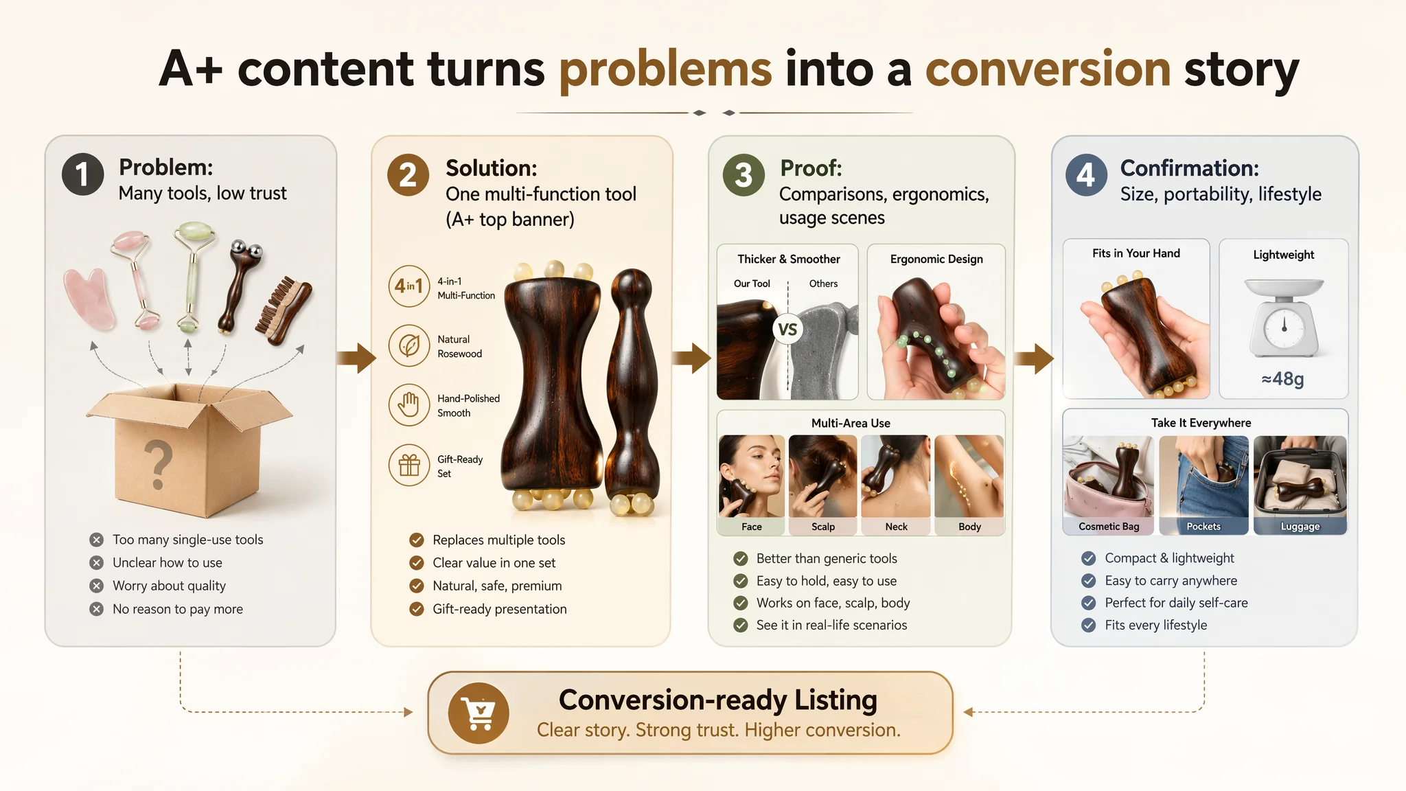
DeepBI’s benchmark showed the competitor using A+ as a full “problem – solution – confirmation” chain:
- Multi-function overview in the first module
- “This tool vs generic tools” comparison
- Anatomy-based function mapping
- Full-body usage
- Size and portability explanation
- Multi-scenario lifestyle collage
The seller needed a similar level of structured persuasion, tuned to its own positioning:
From “Four Tools” to “One Multi-Function Tool”
A top banner that:
- Shows the product in the center
- Lists key functions (hair growth support, lifting contours, relieving muscle tension, body gua sha, cellulite breakdown, meridian massage) in clean icon form
- Visualizes “one tool replaces multiple traditional tools” with silhouettes
This frames the purchase as cost-efficient and space-saving, not just “another gadget.”
From Invisible Pain Points to Visual Comparisons
A comparison module that:
- Pits this tool vs. generic tools on:
- Comb thickness
- Size
- Surface smoothness
With visible checkmarks and crosses, buyers can see why this specific tool might justify a slightly higher price or more trust.
From Abstract Product Shape to Concrete Body Mapping
An ergonomics diagram that:
- Maps different parts of the tool to:
- Scalp massage
- Eye & nose sculpting
- Jawline lifting
- Body gua sha
This reduces learning cost and positions the product as professionally designed, not random.
From “Nice Idea” to Daily Routine
Scene modules that:
- Show facial and scalp usage in relaxed, spa-like lighting
- Extend usage to arms, legs, back, waist with directional arrows
- Clarify size and weight in both numbers and hand comparison
- Place the product visually in office, home, yoga, travel scenes
These visuals answer:
- “Where would I use this?”
- “Will it fit in my bag?”
- “Will I actually remember to use it?”
How the Seller’s Understanding Changed
Because this case did not include precise post-optimization numbers, what changed most clearly was operational risk and decision logic rather than a single metric spike.
After the Listing rebuild:
- The product page began to regain organic conversion capacity:
- Better title alignment with search
- More coherent main-image story
- Bullets that support a clear buying path
- A+ content that builds trust rather than leaving buyers to guess
- Advertising decisions became more controllable:
- The team could now judge whether changes in ACOS were linked to ads or to page changes
- New A/B tests on ads would no longer be undermined by a structurally weak Listing
- Traffic structure risk decreased:
- With a stronger product page, the seller no longer depended entirely on ad spend to extract value from each click
- Organic and paid traffic both had a better chance of converting
Most importantly, the seller’s mental model of Amazon operations shifted:
“Amazon ads are not a universal fix. If the Listing cannot convert, ads will only amplify the problem.”
They began to see:
- Listing quality is the foundation of ad efficiency.
- Title, main image, bullet points, and A+ content must form a single persuasive chain.
- Before scaling ads, they now ask: “Does this page deserve more traffic?”
What Other Amazon Sellers Can Take From This Case
For Amazon sellers in beauty, personal care, or any category with high perceived value:
- A 5.0-star rating is not a guarantee of strong conversion. If the review count is low and the A+ section is empty, you may still have a weak Listing foundation.
- A “good-looking” main image set is not the same as a strategically designed main image set. Each slot must serve a specific decision step: click, trust, understand, imagine usage, justify price.
- If your DeepBI or internal listing audit shows a zero A+ score versus a competitor with rich modules, it is almost always a sign that Listing conversion must be fixed before ad scaling.
- Ads can amplify advantages—but they can also amplify existing page defects.
When traffic keeps growing and orders don’t follow, it’s tempting to blame Amazon ads. This case shows that, often, the more critical question is:
“Is my Amazon product page truly set up to convert the traffic I already have?”