

An Amazon seller in the UK home‑hardware category came to DeepBI with a familiar pressure: ad spend was going out, impressions were not bad, but orders were not moving in step. In their view, this was “an Amazon ads problem” – bids, keywords, and campaign structure. They had already tried to tweak campaigns several times, yet the economics of the product stubbornly refused to improve.
Once we ran the product page through DeepBI’s Amazon Listing diagnosis, the picture changed quickly. Against a directly comparable top competitor, the Listing scored 36/100 versus 78/100. The real issue was not the lack of traffic. It was that the Amazon product page itself had almost no ability to convert the traffic it already had: no A+ content at all, weak bullets, and zero reviews.
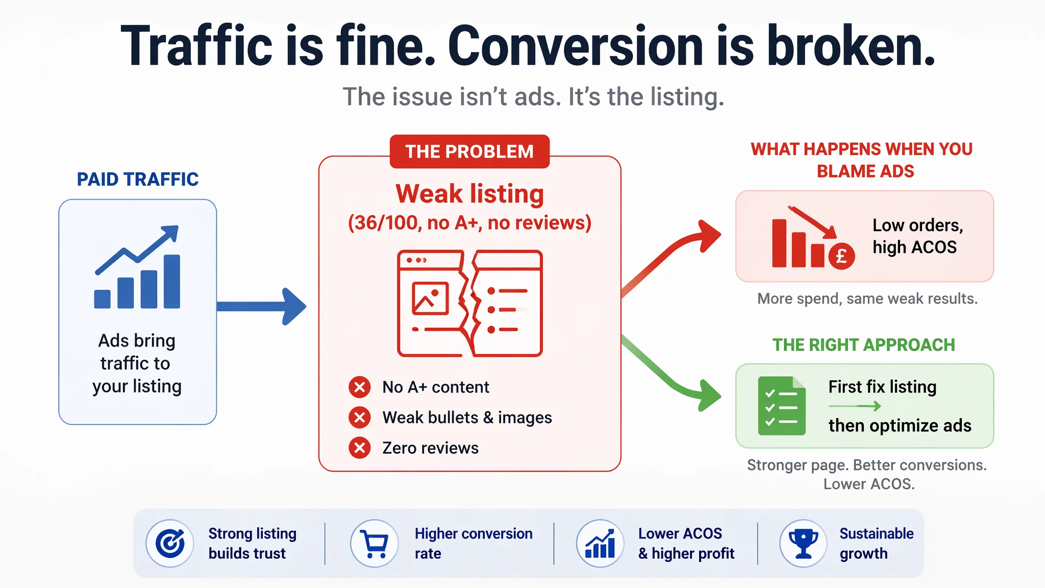
From that point on, the optimization focus shifted: not “how do we buy cheaper clicks,” but “how do we give those clicks a page that deserves them?” We rebuilt the judgment around Listing conversion – title clarity, main‑image decision logic, bullet‑point structure, and a missing A+ story – instead of chasing yet another round of ad tuning. The case is a reminder to Amazon sellers: when ads stop working the way they used to, it’s often the page, not the campaign, that’s broken.
Amazon Ads Were Not Failing. The Page Was Consuming the Traffic.
For this UK Amazon seller, the initial complaint was straightforward: ads felt increasingly “inefficient.”
Clicks were coming in, but:
- Orders lagged expectations
- ACOS was hard to push down
- Any bid increase quickly looked like wasted money
The team’s reflex was to treat it as a classic advertising problem:
- Expand and refine keyword lists
- Adjust bids and budgets
- Test small structural tweaks to the campaigns
But the operational tension never eased. Spend went out, yet the basic sales curve barely bent. From the outside, it looked like “ads just don’t work for this product.”
DeepBI’s judgment was very different: at this stage, continuing to tune ads first was the highest‑risk choice. The paid traffic funnel was flowing into a weak Listing that could not convert, and ad optimization was simply amplifying that weakness.
“The real problem was not that ads failed to bring traffic. It was that the page could not convert the traffic.”
The Real Constraint Was Listing Conversion Capacity
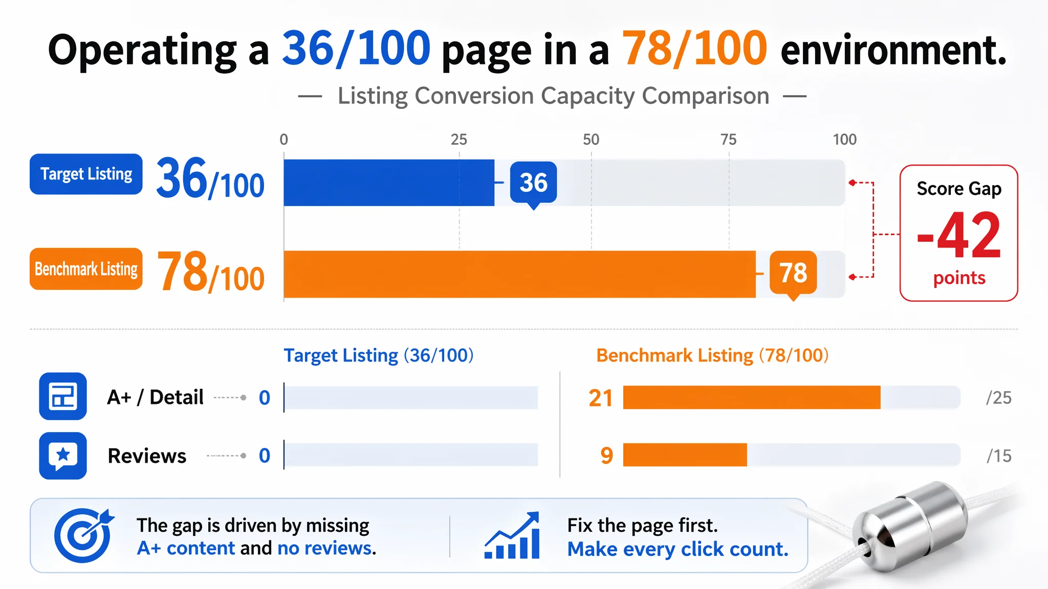
Once we scored the Amazon Listing against a benchmark competitor in the same pull‑cord connector niche, the constraint became explicit:
- Target Listing: 36 / 100
- Benchmark Listing: 78 / 100
- Gap: –42 points
Broken down by dimension:
- Title: Target: 11, Benchmark: 16, Max: 20, Gap: -5
- Main Images: Target: 21, Benchmark: 26, Max: 30, Gap: -5
- Bullet Points: Target: 4, Benchmark: 6, Max: 10, Gap: -2
- A+ / Detail: Target: 0, Benchmark: 21, Max: 25, Gap: -21
- Reviews: Target: 0, Benchmark: 9, Max: 15, Gap: -9
Three things stood out immediately:
1. A+ content was completely missing
The product page had zero A+ modules. The competitor, in contrast, used a full A+ layout with:
- Core benefit explanation
- Clear installation steps
- Multiple real‑life scenes (bathroom light, ceiling fan, curtains, etc.)
This alone explained a major part of the conversion gap. Any ad that landed on this bare page was effectively pushing traffic into a dead end.
1. No review data at all
The Listing had:
- No star rating
- 0 total reviews
The competitor had:
- 4.5‑star rating
- 27 reviews, with 7 visible on page one and no visible negative reviews
On Amazon, this is not a “small disadvantage”; it’s a trust cliff. Even if ad CPC were perfect, users arriving on a page with no social proof and no A+ story were far more likely to back out and pick the competitor.
1. Core modules were transactional, not persuasive
- Title: keyword coverage was broad but structurally immature. It read like attribute stacking rather than a clear, outcome‑oriented hook.
- Bullets: mostly specs and usage notes, but no strong “why buy this one” logic.
- Main images: functional, but missing structured decision support (size clarity, installation reassurance, multi‑scene usage).
DeepBI’s conclusion: this Listing did not lack traffic – it lacked conversion infrastructure. Ads were not the bottleneck. The product page was.
How the Seller Originally Misdiagnosed the Problem
From the seller’s point of view, the logic felt natural:
- We’re getting impressions →
- Orders are low →
- Ads must not be “optimized enough”
Their operational habits were typical:
- Scan the ad console first
- Spend time on CPC, bids, and campaign splits
- Assume the page “looks fine” as long as it has decent images and full text
This misdiagnosis came from two blind spots:
1. Over‑indexing on ad mechanics, under‑indexing on page logic
The team treated the Listing as “baseline OK” and assumed the main gain would come from better traffic. Yet the scoring showed they were operating with a 36/100 page in a 78/100 environment.
1. Underestimating how much A+ and reviews drive conversion in this micro‑category
Pull‑cord connectors are low‑ticket, but:
- They sit in visible home environments (bathrooms, fans, blinds)
- Buyers care about finish, durability, ease of installation, and matching decor
- A small price gap can be easily overridden by a stronger visual story and more trust
The competitor had already framed the product as a high‑quality, easy‑to‑install solution with lifestyle scenes. The target Listing still felt like a generic spare part.
Why Traditional Amazon Ad Optimization Kept Failing
With a Listing in this state, any attempt to “fix” performance only through ads hits the same wall:
- Raising bids: more expensive clicks to the same weak page
- Changing keywords: new traffic, same trust and information gaps
- Tweaking campaign structure: better management of an already low‑converting funnel
In effect, ads were amplifying a structural defect:
“Advertising does not only amplify advantages. It can also amplify a page’s existing defects.”
Without A+ content, without reviews, and with only partially persuasive images and bullets, each incremental click had a low probability of closing. That’s why ACOS felt stubborn: the underlying CVR problem was never addressed.
This Product Page Did Not Lack Traffic. It Lacked Trust.
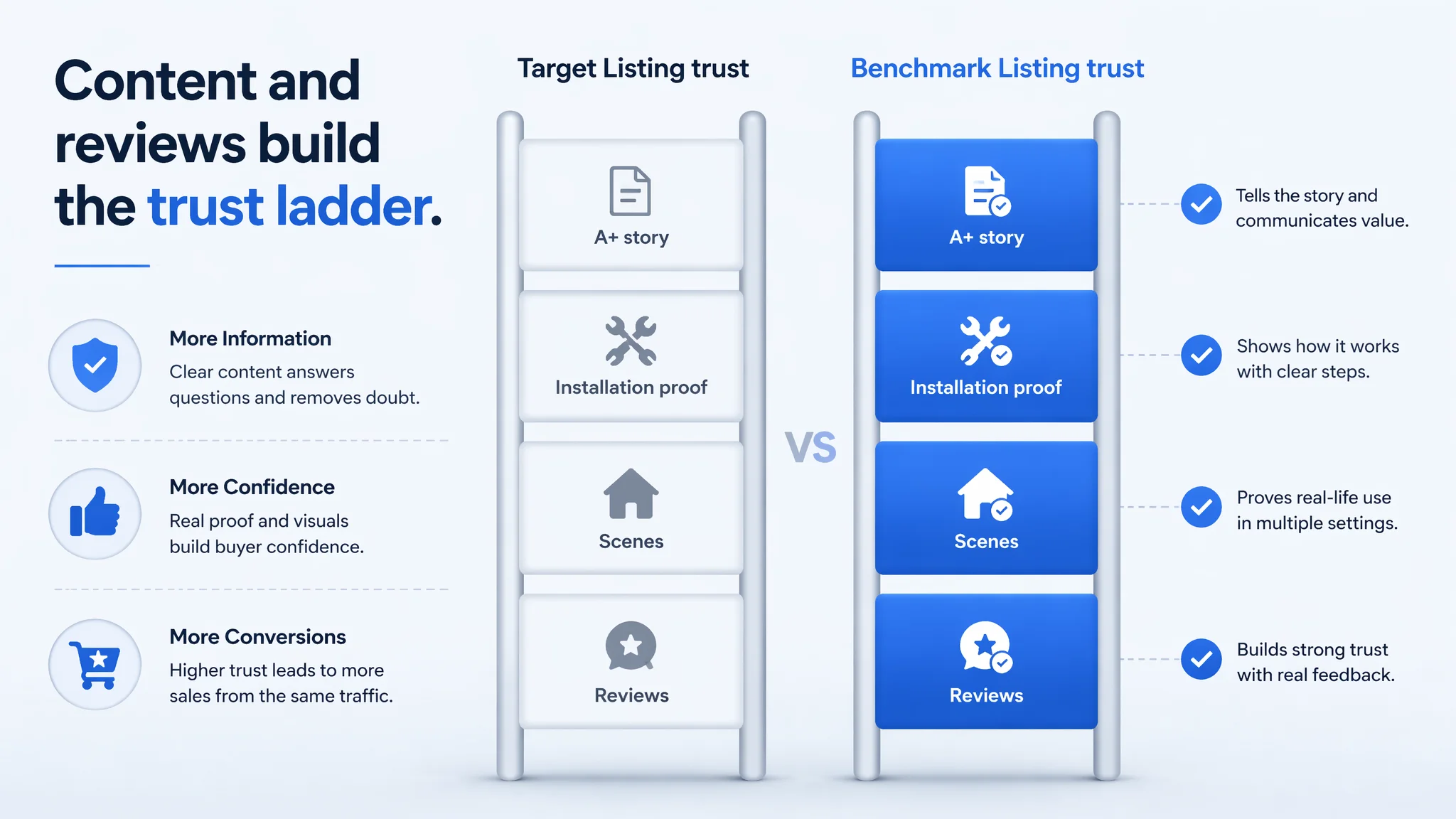
Looking at the detail modules side by side, the trust gap was very obvious.
A+ / Detail Page: Missing the Entire Story
- Target Listing:
- No A+
- No visual storytelling beyond basic images
- No detailed installation guide or strong scene usage proof
- Benchmark Listing:
- “Problem → solution” structure
- Visual breakdown of metal construction and pull mechanism
- Step‑by‑step installation visuals
- Multiple real scenes: bathroom light switch, shower pulls, ceiling fan, curtains
The competitor was not just selling a piece of metal. They were selling:
- Confidence that it fits
- Proof that it looks good in real homes
- Reassurance that installation is simple
The target Listing left buyers to guess all of this.
Reviews: The Social Proof Cliff
With 0 reviews, the target page gave the buyer no reassurance that:
- The connector will not break or rust
- The finish matches typical chrome bathroom fixtures
- The size and fit align with standard cords and chains
The competitor had 27 reviews at 4.5 stars, mostly 4–5 star comments on the first page. That alone reduces buyer hesitation dramatically. On a low‑cost product, many buyers make decisions in seconds – star rating and first reviews often carry more weight than the text below the fold.
From a business standpoint, this meant ad money was being spent to fight both a content gap and a trust gap simultaneously.
The Main Image Was Not Just a Visual Issue. It Failed to Create a Reason to Click.
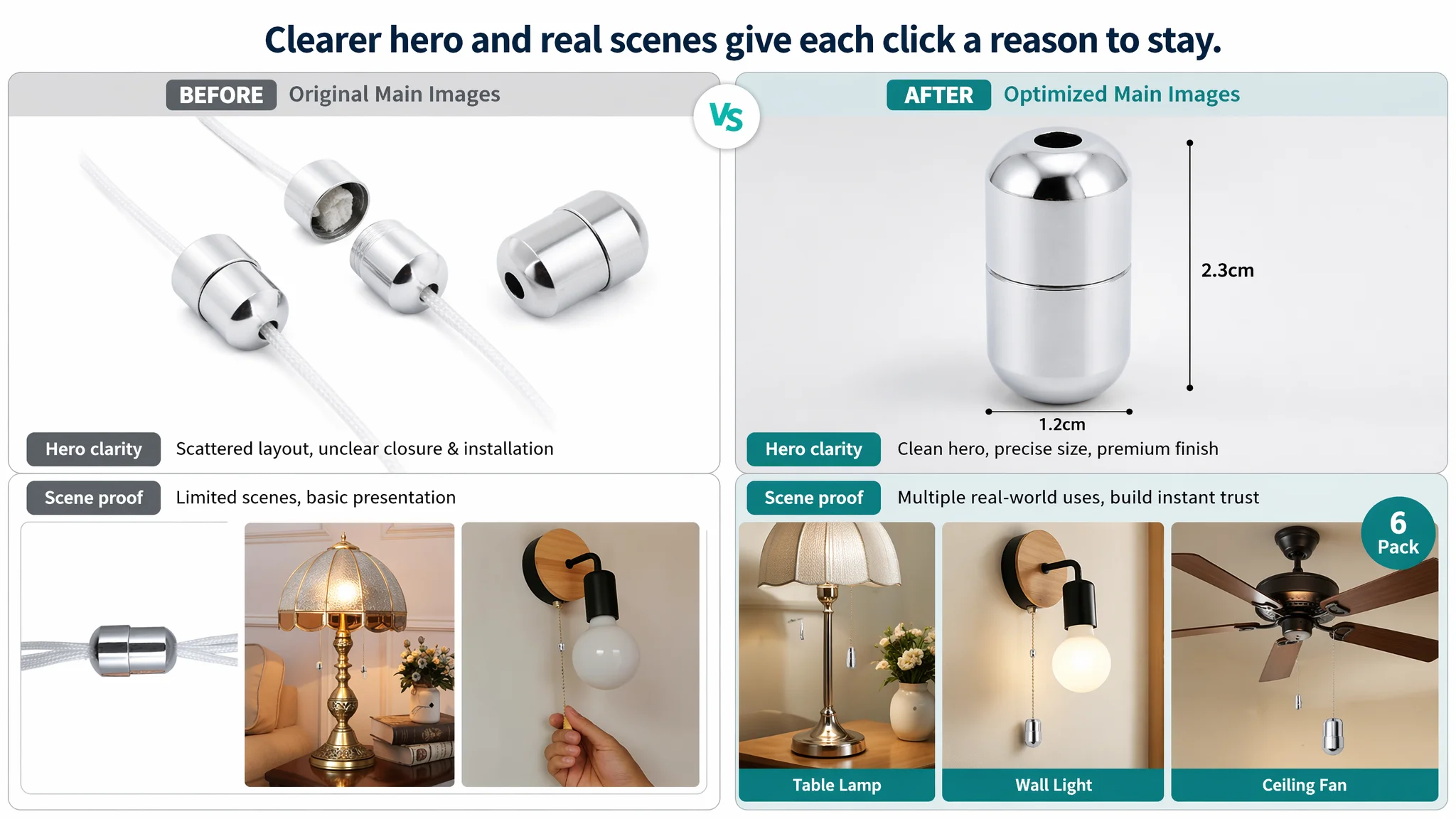
The main image set was not “bad” in an obvious sense, but it lacked a cohesive click logic compared to the competitor.
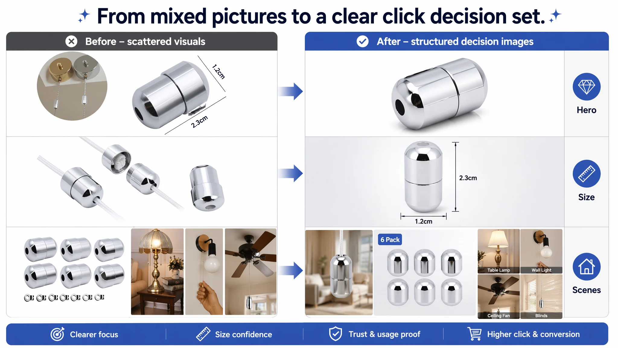
Key gaps DeepBI identified:
1. First image – weak visual focus
- Background and composition were not as clean and centered as they could be
- The product did not dominate the frame with a crisp, high‑contrast outline
Suggested direction:
- Product centered, ~70% of the frame, 45° angle
- Clean white background, controlled light, soft shadow
- Clear, high‑end metal texture
1. Size visualization – unclear hierarchy
- Existing size image contained numbers but lacked design discipline
- For a small metal connector, size confusion directly impacts purchase hesitation
Suggested direction:
- Front‑on view, ~60% frame
- Thin leader lines, neutral background, standard font (e.g., “2.3 cm” / “1.2 cm”)
- Visual hierarchy that makes size instantly legible
1. Usage context – too abstract
- Very limited imagery of the connector actually assembled with cord/chain
- Little demonstration of how it looks when installed, or in what environment
Suggested direction:
- Hanging state with white cord attached
- Slightly blurred modern bathroom or interior background
- Simple text overlay like “Easy Installation” in one corner
1. Pack size – not fully leveraged
- The product is a 6‑pack, a strong value anchor, but the images did not push this hard visually
Suggested direction:
- Six units arranged in two rows of three, neat overhead shot
- “6 Pack” badge in a rounded corner label
1. Multi‑scene montage – missing breadth of usage
- Competitor showed multiple concrete application scenes
- Target Listing needed similar visual proof to say: “this works across your home”
Suggested direction:
- Grid image with tiles: table lamp, wall light, ceiling fan, blinds
- Realistic warm home lighting, each tile labeled with scene name
Each of these changes is not just aesthetic. They directly support:
- Higher CTR from the search results page
- Lower confusion and fewer doubts after the click
- Stronger perception of value (6‑pack, premium finish, broad use)
The Bullet Points Had Information, but Not a Buying Logic
The bullets on the target Listing followed an “instruction sheet” logic:
- What the product is
- Some features
- Dimensions and materials
- Where it can be used
The benchmark competitor, by contrast, followed a conversion logic:
- What you receive (package clarity)
- Why it lasts (durability)
- How it fits (adjustability / size)
- Why it’s safe and convenient
- Where it can be used
DeepBI reframed the bullets into a more Amazon‑native structure, each starting with a bold, outcome‑oriented label:
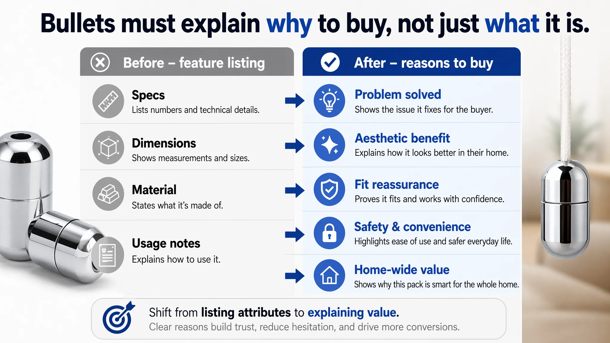
1. Versatile Cord Joiner & Extension
- Emphasizes real‑world problems: broken cords, short pulls
- Reframes the product as a repair and reach‑extension solution, not just a metal piece
1. Premium Metal Finish with Hidden Knot
- Connects the zinc alloy chrome finish to bathroom and fixture aesthetics
- Highlights the “hidden knot” design as a tidiness and professionalism advantage
1. Precise Fit & Size Guidance
- Combines exact measurements with clear “fits cords under 3.6 mm” guidance
- Reduces purchase anxiety and returns due to wrong fit
1. Wide Application & Enhanced Convenience
- Lists a broader scene range: bathroom switches, shower pulls, fans, blinds, exhaust fans
- Ties in safety and ergonomic benefits (“reduces overreaching”)
1. Value 6‑Pack for Home‑Wide Use
- Converts quantity into a narrative: one kit covers multiple rooms
- Reinforces ease of installation and cost‑effectiveness
The shift is subtle but commercially critical: from listing attributes to structuring reasons to buy.
The Missing A+ Story Removed the Final Layer of Persuasion
In home hardware, especially visible items like pull‑cord handles, A+ is not a “nice to have.” It’s often the difference between:
- A user bouncing because they are uncertain, and
- A user deciding “this looks solid and easy, I’ll buy now.”
DeepBI’s A+ recommendations were built around three pillars:
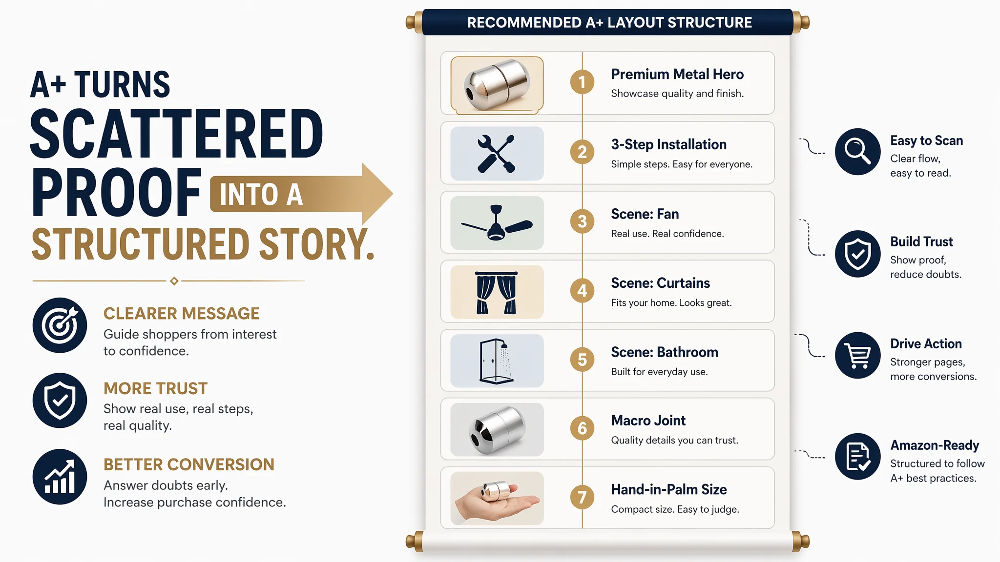
1. High‑quality metal aesthetics
- Hero image of the connector at 45°, on a clean, high‑end surface (e.g., light marble)
- Controlled side light to create long strip highlights and show smooth finishing
- Visual language closer to “home hardware upgrade” than “cheap spare part”
1. Simplified installation steps
- A three‑panel sequence showing:
- Pulling out the cord
- Cutting with scissors
- Tucking the knot into the connector
- Hands and tools visible, neutral background, clear step‑by‑step flow
- The message: “you can do this yourself in minutes”
1. Multi‑scene, multi‑environment trust
- Ceiling fan with pull connector, warm lighting and wood tones
- Curtains or blinds scene with soft fabrics contrasted against the metal pull
- Bathroom exhaust fan with water droplets on tiles (hinting at anti‑corrosion)
- Macro shot of cord and connector joint to reassure on strength
- Hand‑in‑palm shot to fix perceived size
Together, these modules address:
- Perceived quality
- Fit with interior decor
- Ease of DIY installation
- Durability in humid environments
- Physical scale and sense of robustness
This is precisely the layer the competitor was using to win conversion – and where the target Listing had a 0 vs 21/25 score gap.
Why DeepBI Did Not Keep Tuning the Ads First
From a decision‑order perspective, DeepBI’s stance was:
1. Fix the listing’s ability to convert traffic first.
With a 36/100 Listing and no A+, any further ad tuning would be economically irrational. The primary risk was not “too little traffic,” it was paying to send more traffic into a low‑trust experience.
1. Reduce the risk of ads amplifying defects.
As long as:
- A+ = 0
- Reviews = 0
- Visual story = incomplete
every extra click is more likely to exit than to convert, dragging down CVR and making ACOS look worse than the underlying product potential.
1. Rebuild the sales logic of the page as the foundation.
Only when:
- Title clearly communicates quantity, core use, and premium finish
- Main image set explains size, installation, pack value, and scenes
- Bullets follow a pain‑point → solution → application logic
- A+ visually answers quality and installation doubts
do ad tests begin to make sense again.
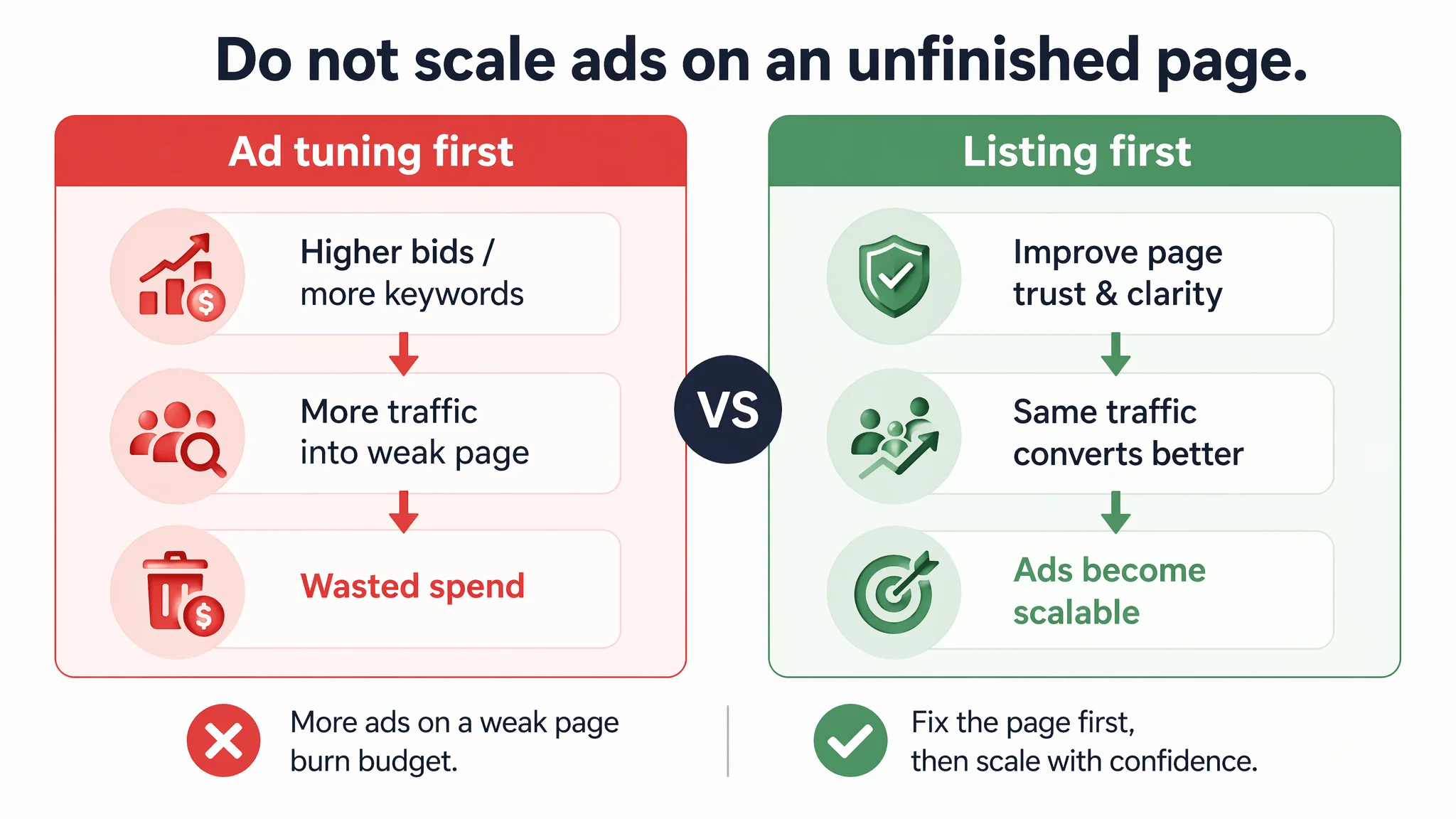
From a business‑risk standpoint, the worst move would have been to “scale the ads” on an unfinished Listing. DeepBI’s diagnosis was to reverse the order: upgrade the Listing first, then re‑evaluate ad performance.
How the Page’s Sales Logic Started to Recover
After reframing the problem as a Listing conversion issue, the optimization path became much clearer:
- Title: reoriented around “6 Pack Pull Cord Connector, Metal Chrome Light Pull Cord Handle…” with quantity and premium finish up front, plus compatibility cues (“fits cords & beaded chains under 3.6 mm”).
- Main images: redesigned set to:
- Clean, high‑contrast primary product image
- Professional size visualization
- Hanging, in‑use shot with blurred modern interior
- Pack‑value image with “6 Pack” label
- Multi‑scene montage (lights, fans, blinds)
- Bullets: restructured to communicate:
- Repair and extension value
- Premium hidden‑knot design
- Exact sizing and fit reassurance
- Safety, convenience, and multi‑room applicability
- Full‑home replacement value in one kit
- A+ plan: defined around:
- Premium metal hero shot
- Step‑by‑step installation
- Fan, curtain, bathroom, and micro‑detail scenes
- Palm‑in‑hand scale visualization
The goal was not cosmetic improvement. It was to give each visitor:
- A reason to click from the search results
- A reason to stay instead of backing out
- Enough reassurance to complete the purchase without over‑thinking
How Ad Traffic Becomes Useful Again
When the Listing begins to regain its conversion capacity, several things change in the economics of Amazon ads:
- Each click has a higher probability of turning into an order
- Ad campaigns can be evaluated on real performance, not handicapped by a broken page
- Scaling spend becomes more controllable because the page is doing its job
In this case, while we do not attach fabricated numbers, the expected operational shifts are clear:
- CVR begins to move upward as the trust and explanation gaps close
- ACOS has room to decline because each paid visit yields more revenue
- The product can compete more fairly with the benchmark Listing, even if reviews are still ramping up
Over time, as orders accumulate and genuine reviews start to appear, the Listing’s dependence on paid traffic can decrease, and organic visibility can stabilize.
What Other Amazon Sellers Can Take from This Case
Several key judgments from this Amazon UK Listing apply broadly:
1. When ads feel “inefficient,” do not assume it is only an ads problem.
If your Listing’s structural score is low and A+/reviews are weak, you are likely paying to push traffic into a conversion leak.
1. A bare detail page is a direct drag on CVR.
No A+ and no reviews in a category where competitors are using both is effectively choosing to operate with one hand tied.
1. Title, main image, bullets, and A+ must form one coherent sales logic.
- Title pulls attention and sets expectations
- Main images secure the click and answer quick doubts
- Bullets translate features into reasons to buy
- A+ handles deeper trust and usage questions
1. Fix the page before scaling the ads.
The order matters. A strong Listing makes every advertising decision more meaningful and every test more interpretable.
In this case, DeepBI’s value was not in generating more assets or toggling more switches. It was in reframing the problem: from “ads are not working” to “this Amazon product page is not ready to receive ad traffic.” Once that judgment was made, the path forward – and the risk to avoid – became obvious.