


This case comes from an Amazon seller in the kids’ craft and DIY materials category, focused on white air-dry foam clay. The team felt they had done their homework: a clean main image, structured bullet points, and a very healthy 4.9-star rating. Yet under Amazon ads, orders lagged behind traffic, and a directly comparable competitor kept widening the gap in sales and visibility.
The seller’s instinct was familiar: they assumed this was still a “front-end” problem—maybe the title keywords weren’t rich enough, maybe the images weren’t attractive enough, maybe they just needed more reviews. DeepBI’s diagnosis went in a different direction. The tools showed that while the title and main image had room for refinement, the real missing layer was a complete absence of A+ content and a weak mid-page decision story. The product page could attract views, but it did not walk buyers from “this looks fun” to “I trust this as a material for my kids and my projects.”
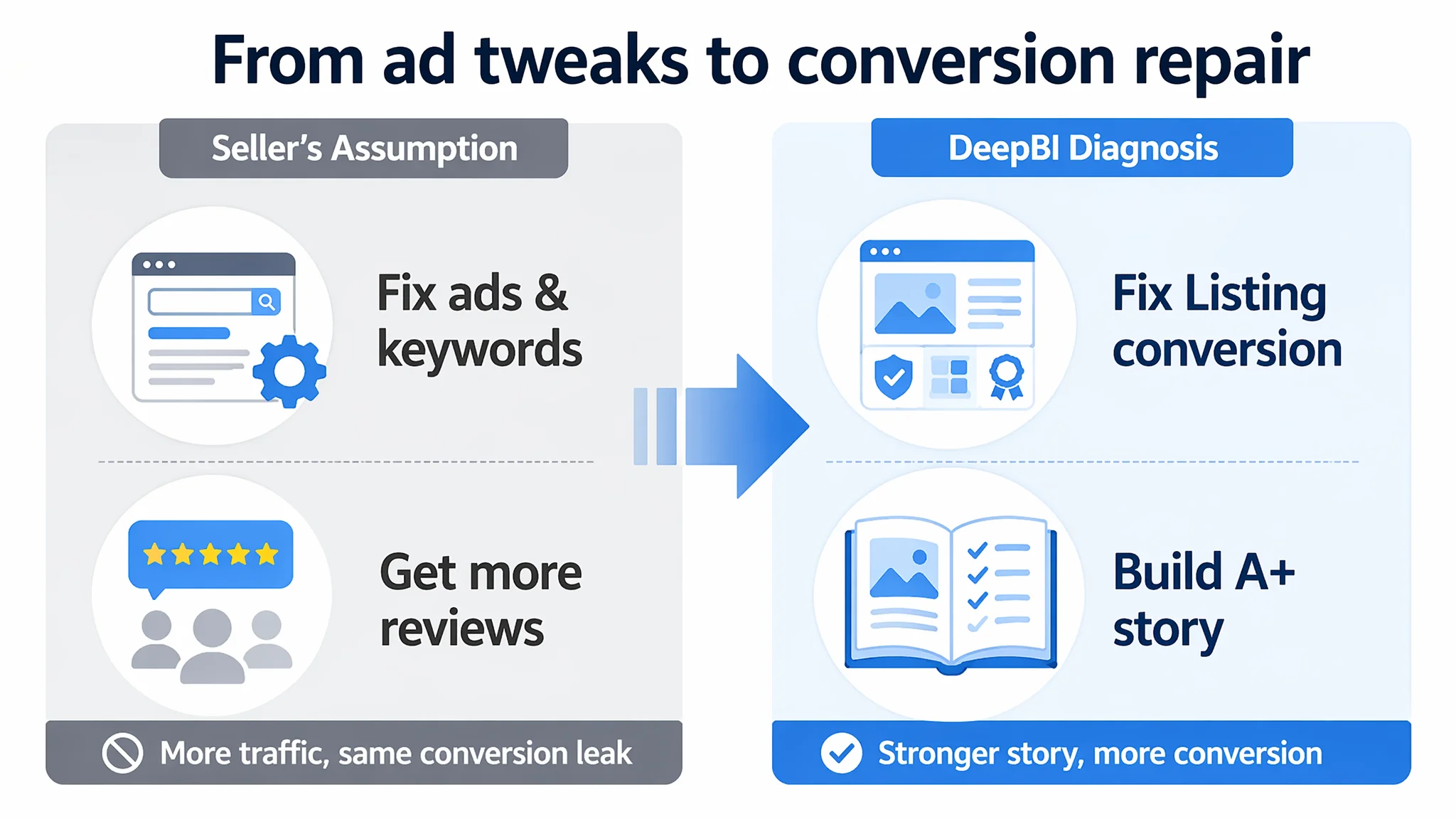
By reframing the issue from “tweak ads and keywords” to “repair the Listing’s conversion capacity,” the optimization shifted toward three levers: a title that clearly anchors audience and outcome, bullet points that build a pain-point-to-solution arc, and an A+ module that visually answers “what can I actually do with this clay?” The result was not a cosmetic overhaul but a clearer decision logic on the Amazon product page, turning existing ad traffic into genuinely usable traffic. Other Amazon sellers will recognize the pattern: when ACOS pressure rises, the most expensive mistake is to keep tuning ads on a Listing that still cannot convincingly tell its story.
What the Seller Saw: Strong Ratings, Weak Follow-Through
On the surface, this Listing did not look like a problem child.
- Rating: 4.9 stars
- Reviews: 24, all 4–5 stars, no visible negative feedback
- Category: white air-dry foam clay for kids and DIY
- Marketplace: Amazon US
The seller’s perception was: “Customers love the product; we just need more traffic and more reviews.” They believed:
- High ACOS and unstable orders were mainly an advertising problem.
- The Listing’s core was fine; only incremental keyword and creative tweaks were needed.
- Competitor advantages came mostly from larger review volume (thousands of reviews vs. their dozens).
From their standpoint, the path forward was:
- Push more Amazon ads to drive exposure.
- Adjust bids and keywords to improve ACOS.
- Maybe refresh a few images to make them “more beautiful.”
But the business pressure was already visible:
- Ad costs were rising.
- Competitor visibility in searches for foam clay, slime supplies, cosplay props, and school crafts remained strong.
- Additional traffic did not convert in proportion to spend, especially compared with a benchmark Listing that appeared similar at first glance.
The seller was trapped in a familiar loop: assuming a solid product rating and “good enough” pictures meant the page itself was not the bottleneck.
The Single Core Constraint: Listing Conversion Capacity, Not Traffic
DeepBI’s scoring made the real constraint explicit.
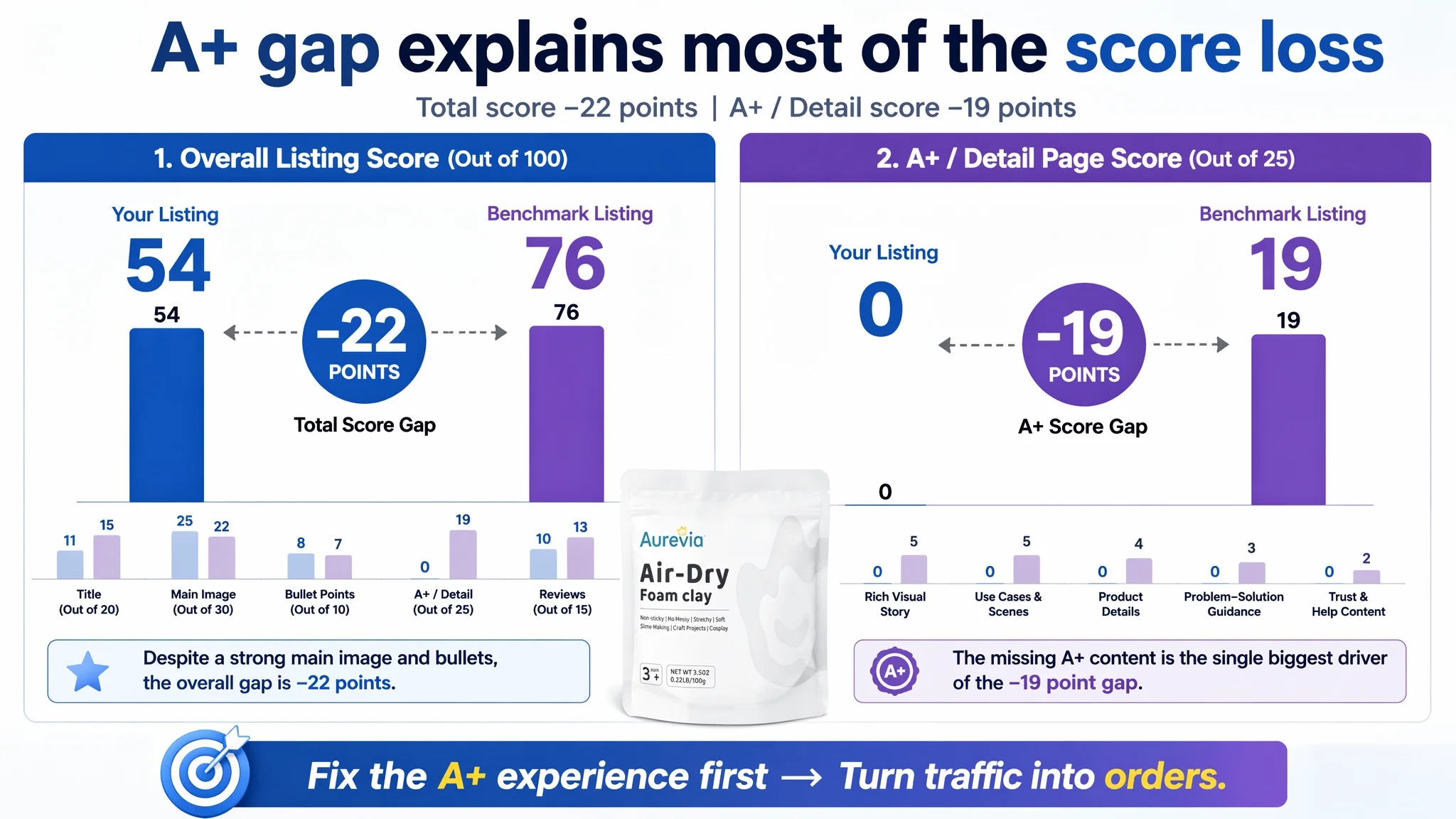
Overall Listing scores (vs. a directly comparable competitor):
- Target Listing: 54 / 100
- Benchmark Listing: 76 / 100
- Gap: –22 points
Breakdown by dimension:
- Title: Target Listing: 11, Benchmark: 15, Max: 20, Gap: -4
- Main Image: Target Listing: 25, Benchmark: 22, Max: 30, Gap: +3
- Bullet Points: Target Listing: 8, Benchmark: 7, Max: 10, Gap: +1
- Detail Page (A+): Target Listing: 0, Benchmark: 19, Max: 25, Gap: -19
- Reviews: Target Listing: 10, Benchmark: 13, Max: 15, Gap: -3
The diagnosis was direct:
“The real problem was not that ads failed to bring traffic. It was that the page could not convert the traffic.”
The main image and bullet points were not the primary drag. The A+ / detail page dimension scored 0, while the benchmark’s A+ scored 19/25. That single gap explained most of the 22-point deficit.
This Listing did not suffer a traffic shortage; it suffered a missing mid-funnel story:
- No A+ modules at all.
- No structured visual sequence to reduce perceived risk.
- No clear path from “this looks like clay” to “this is the right material for my kids, my slime, my cosplay, my home decor.”
In a category where buyers ask “what can I build?” and “will it crack, stick, or feel cheap?”, the page left them to guess.
The Original Misdiagnosis: Blaming Ads and Underestimating the Page
The seller’s initial narrative:
- “We don’t have enough exposure; competitors have more reviews.”
- “Our rating is better (4.9 vs. competitor’s 4.5); that should help conversion once traffic arrives.”
- “If ACOS is high, ads and bids are the problem, not the content.”
Why this misdiagnosis felt so convincing:
1. Star rating bias
A 4.9 average with no visible negative reviews creates a sense of security. It encourages the belief that “the product and page are already strong; only traffic volume is missing.”
1. Surface-level visual confidence
The main image looked clean; bullets were structured. Compared to some low-effort Listings in the same category, this page did not look obviously weak.
1. Review volume blind spot
The competitor’s 6,000+ reviews vs. the seller’s 24 seemed like a historical advantage that could only be solved by time and more orders, not by immediate Listing work.
1. Ad-centric habits
Historically, when performance dipped, the team would:
- Adjust keyword lists.
- Rebalance automatic vs. manual campaigns.
- Experiment with bids and budgets.
This reinforced the belief that ad control knobs were the primary way to fix performance.
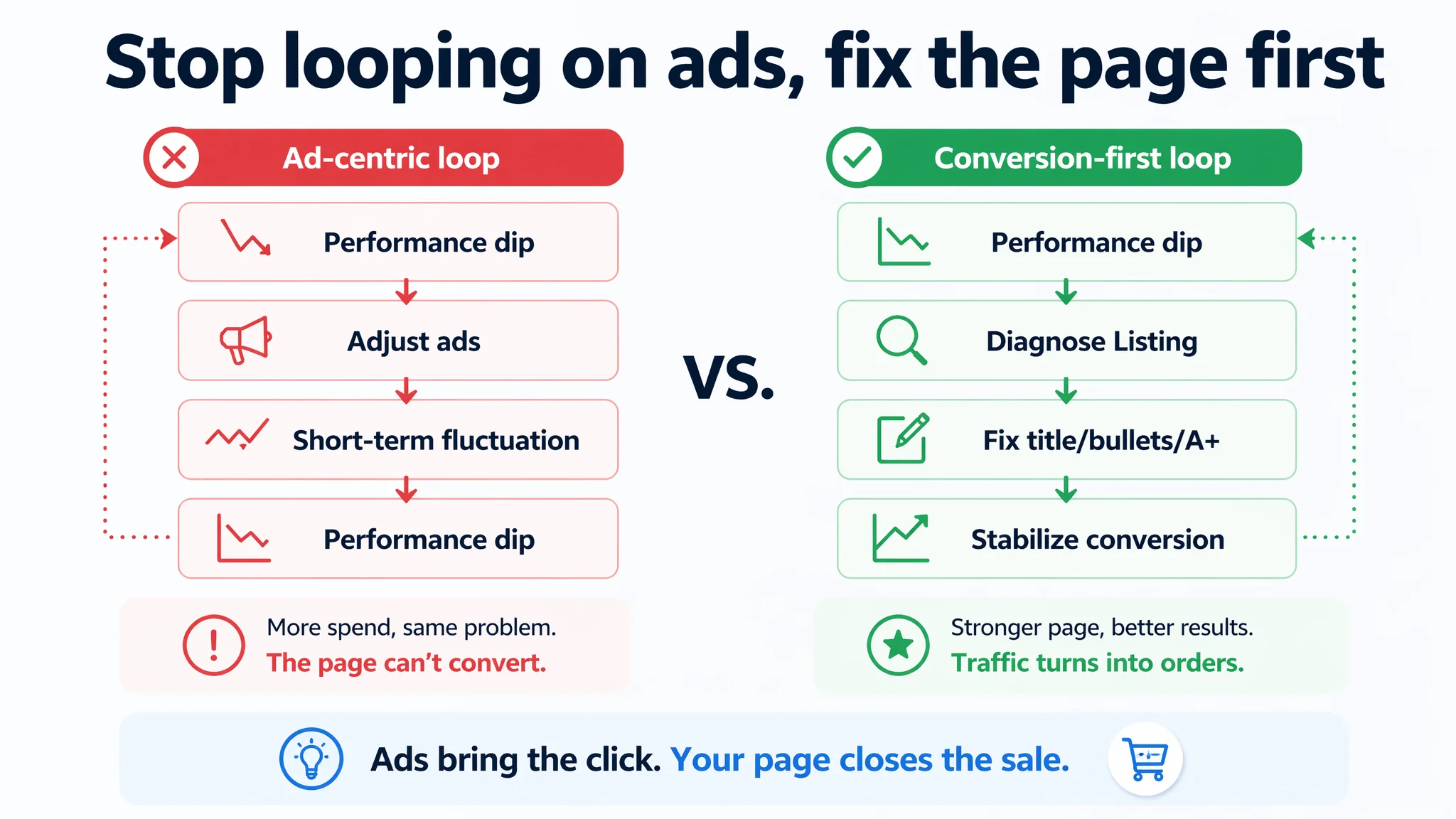
The net effect: they kept pouring effort into traffic shaping, while the page’s conversion engine was not built to match the category’s best practices.
Why Traditional Ad Optimization Kept Failing
Under a pure advertising lens, the team’s moves made sense:
- Increase coverage on “air dry clay”, “foam clay”, “kids modeling clay”.
- Extend into “slime supplies”, “school art project”, “cosplay props”.
- Try to bring down ACOS by tweaking bids and negative keywords.
Yet the results would not stabilize. DeepBI’s logic was simple: you can’t solve a conversion leak with traffic controls alone.
Several things were happening simultaneously:
1. Advertising was amplifying a weak mid-page experience
Every click arrived at a page that:
- Did not visually demonstrate “what can I make?” beyond basic packaging.
- Did not show the clay’s stretch, softness, or adhesion clearly.
- Had no A+ modules guiding buyers through different use cases.
1. The competitor was running a complete decision path
The benchmark Listing used six core A+ modules:
- Packaging overview and component breakdown.
- Material close-ups and texture.
- Usage scenes (e.g., foam masks, cosplay props).
- Tool integration (heat guns, etc.).
- Before/after style benefits.
- Problem–solution copy (“Takes forever to air dry? Try our heat gun!”).
Buyers did not just see clay; they saw a system for creative projects.
1. Ads were pushing into high-intent segments without a trust answer
Keywords around cosplay, deco, and school projects pull buyers with specific demands:
- Lightweight but strong.
- Non-toxic and non-sticky.
- Crack-free after drying.
- Easy to cut, sand, and paint.
The page did not respond in depth. Ads drove those users in, but the Listing did not carry them over the line.
1. Review volume signalled social proof imbalance
Even though the seller’s star rating was higher, the competitor’s 6,046 reviews vs. 24 created a different perception:
- The competitor looked battle-tested and widely used.
- The seller’s product felt more like a newcomer.
Without strong A+ content and visuals, the page could not compensate for this volume gap.
In this context, every additional ad dollar risked amplifying the Listing’s structural weaknesses instead of unlocking incremental orders.
The Listing Data Abnormalities DeepBI Found
DeepBI did not treat the Listing as a generic “needs improvement” case. It identified specific missing pieces that directly affected conversion.
1. Title: Functional, but Not Outcome-Led
The seller’s original title followed a keyword stack pattern:
- “Keyword + attributes + application scenarios”
This meant:
- The core keyword “Air Dry Foam Clay” appeared early—good.
- But the supporting phrases like “Soft, Light Weight” were generic.
- Applications like “School Supply, Art Projects” were present, yet keyword density and long-tail coverage were weaker than the benchmark.
The competitor title used a more mature ecommerce structure:
- Core product + differentiated material benefits + usage result
Examples from the benchmark:
- “High Density and High Quality for Intricate Designs”
- “Air Dries to Perfection”
- Action verbs: “Cutting with a Knife or Rotary Tool, Sanding or Shaping”
These phrases did three things simultaneously:
- Anchored material performance (high density, high quality).
- Connected to work steps (cutting, sanding, shaping).
- Suggested the post-dry outcome (“to perfection”).
DeepBI’s conclusion: the seller’s title lacked:
- Clear audience targeting (e.g., kids aged 3–12).
- Strong safety signals (“Non-Toxic”, “No-Sticky”).
- Explicit result-oriented claims and operational verbs.
2. Main Image: Attractive, but Not Fully Trust-Building
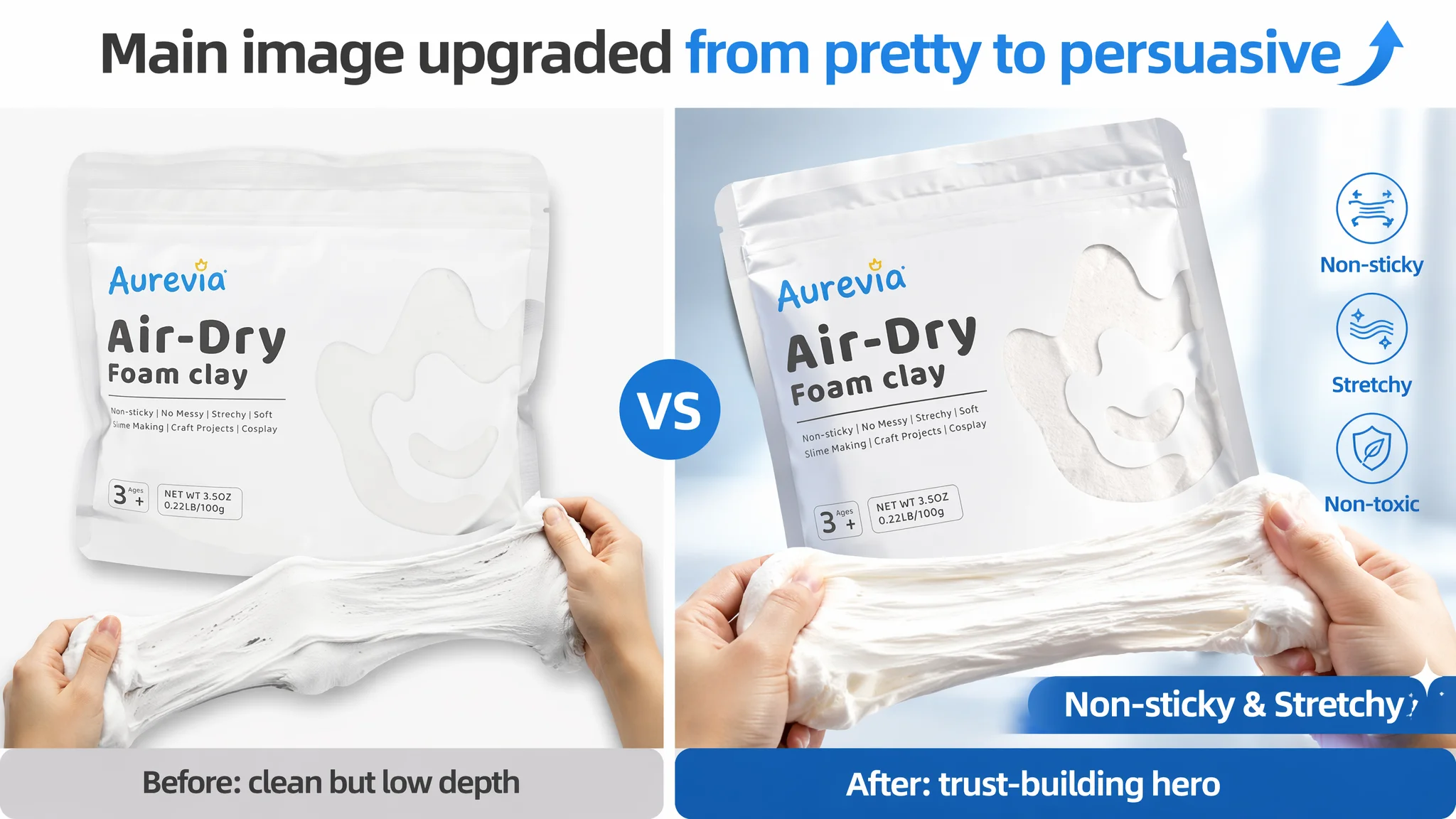
On paper, the seller’s main image score was slightly higher than the competitor’s (25 vs. 22), thanks to:
- Clean composition.
- Aesthetic styling.
But visual analysis revealed hidden risks:
- A video thumbnail occupied one slot without actual video content behind it, breaking the flow and causing drop-offs.
- The size image was visually disconnected from real-life usage; the 3.5oz pack’s story (“family-friendly, easy to store”) was not visually tied to the product.
- High-aesthetic sculptural shots lacked material proof—no close-ups of stretching, pulling, or post-dry surface.
This can create a paradox:
A beautiful main image can lift CTR, but if the rest of the carousel fails to close trust, add-to-cart rates stall.
DeepBI’s recommendation focused on functional visual hooks:
- Show hands stretching the clay, annotated with “Non-sticky & Stretchy”.
- Introduce a size-reference image with a pencil and precise dimensions.
- Use structured 2×2 grids to show cosplay props, flower mirrors, cup coasters, kids’ crafts.
- Highlight packaging details like resealable standing bag and clear window.
The goal: keep the aesthetic level but attach it to concrete, observable properties.
3. Bullet Points: Structured, but Not Fully Exploitative of Safety and Value
Unlike many weak Listings, this one had bullet points with clear label-style intros:
- “Trusted Quality”, “Hassle-Free”, etc.
- It already covered safety, convenience, and packaging.
DeepBI’s evaluation:
- Structural clarity: good.
- Category fit: partial, missing stronger safety and usage framing.
The competitor’s bullets leaned into:
- Creative potential.
- Drying behavior and operation instructions.
- Core applications and adhesion behavior.
- Strength and durability.
DeepBI recommended rebalancing:
- Integrate beginner & kids positioning at the top.
- Quantify value: “100g pack = plenty for large projects”.
- Spell out safety standards (ASTM D-4236, CE EN-71).
- Connect drying, adhesion, and versatility clearly to use cases like cosplay props and home decor.
- Elevate gift and educational value as a final bullet.
Short version: bullets needed to move from “everything we can think of” to “what this specific buyer cares about in this category.”
4. Detail Page / A+: The True Conversion Leak
This was the most critical abnormality.
- Seller’s A+ / detail score: 0
- Benchmark: 19
The competitor’s A+ layout covered:
- Product world: rainbow backgrounds, multiple finished models.
- Texture and feel: large-scale clay pull and squeeze.
- Slime integration: process shots with hands interacting.
- Cosplay: professional-looking props, masks, wings.
- Home decor: finished decor pieces to show long-term appearance.
- Packaging and storage: real-life usage scenes, showing resealable features.
- Ideal gift: emotional scene with kids’ creations and gift-ready packaging.
In contrast, the seller’s detail area had:
- No A+ content.
- A complete absence of structured visual storytelling.
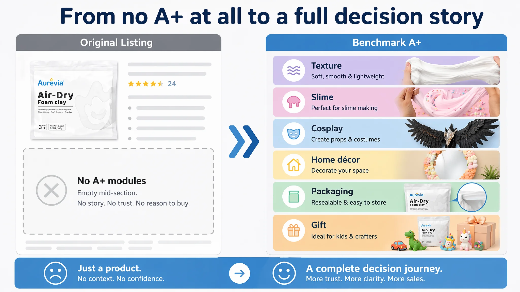
The gap was not cosmetic; it was behavioral:
- The competitor guided buyers from curiosity to imagination to trust to purchase.
- The seller forced buyers to piece everything together from packaging images and text.
DeepBI’s analysis was straightforward:
“This product page did not lack traffic. It lacked trust, imagination, and a guided decision path.”
How DeepBI Identified the Real Root Cause
DeepBI’s advantage in this case was not a feature list, but the way it connected scoring data to business risk.
1. Weight of A+ vs. other gaps
The total score gap was -22; 19 points were coming from the missing detail/A+ module alone. This made A+ not just one of many issues, but the primary bottleneck.
1. Alignment with category expectations
Foam clay, slime, cosplay materials, and kids’ craft supplies are visually driven categories. Buyers want to see:
- Texture and stretch.
- Finished models.
- Real usage scenes.
The benchmark Listing treated A+ as the main sales story. The absence of any A+ on the seller’s page was not just a technical omission; it was a strategic misalignment with the category’s decision process.
1. Separation of CTR vs. CVR problems
The main image and title, while imperfect, did not show catastrophic weaknesses:
- Main image: slightly stronger than competitor in scoring.
- Title: only -4 gap.
Combined with a 4.9-star product rating, DeepBI judged that:
- CTR issues were not the dominant crisis.
- Conversion after click (CVR) and mid-page trust were the bigger problem.
1. Avoiding over-optimizing the wrong lever
With these data points, DeepBI drew a clear line:
- Improving ads or even only main image first would not address the biggest numerical deficit.
- The priority had to be: “Give the page a complete A+ story and restructure the visual decision path.”
This is what differentiated DeepBI’s judgment from ad-driven adjustments: it prioritised the most constraining weakness, not the most familiar control knob.
Why Listing Conversion Had to Be Fixed Before More Ad Tuning
From a business standpoint, continuing to optimize ads first would have led to three risks:
1. Wasting incremental traffic on an underbuilt page
More clicks would continue to encounter:
- No visual validation of “non-sticky, stretchy, light, crack-free”.
- No clear demonstration of usage scenarios (slime, cosplay, decor, gifts).
- No A+ structure that justifies the price and differentiates from lower-priced alternatives.
1. Distorting diagnostic feedback
If ads were adjusted without improving conversion:
- Any short-term changes in ACOS might be misread as “ad success or failure.”
- The team would lack a clean read on whether the Listing itself could now pull its weight.
1. Reinforcing wrong operational habits
Keeping ads as the primary lever reinforces a dangerous lesson:
- “When results stagnate, buy more traffic and micro-tune campaigns, even if the page is underdeveloped.”
Instead, DeepBI’s decision order was:
- Step 1: Repair Listing conversion capacity:
- Upgrade title to anchor audience and safety.
- Refine bullets into clear pain-point–solution arcs.
- Build an A+ story that answers “what can I do with this clay?”.
- Step 2: Allow ad traffic to test the rebuilt conversion logic:
- Observe how CTR and CVR respond.
- Only then decide whether to scale or redistribute ad spend.
This sequence respects a simple principle:
“Before scaling ads, you must judge whether the page deserves more traffic.”
How the Page’s Sales Logic Started to Recover
DeepBI’s optimization guidance did not focus on generic advice; it translated the gap into concrete content directions.
1. Reframed Title: Audience, Safety, and Use Cases Up Front
Suggested title:
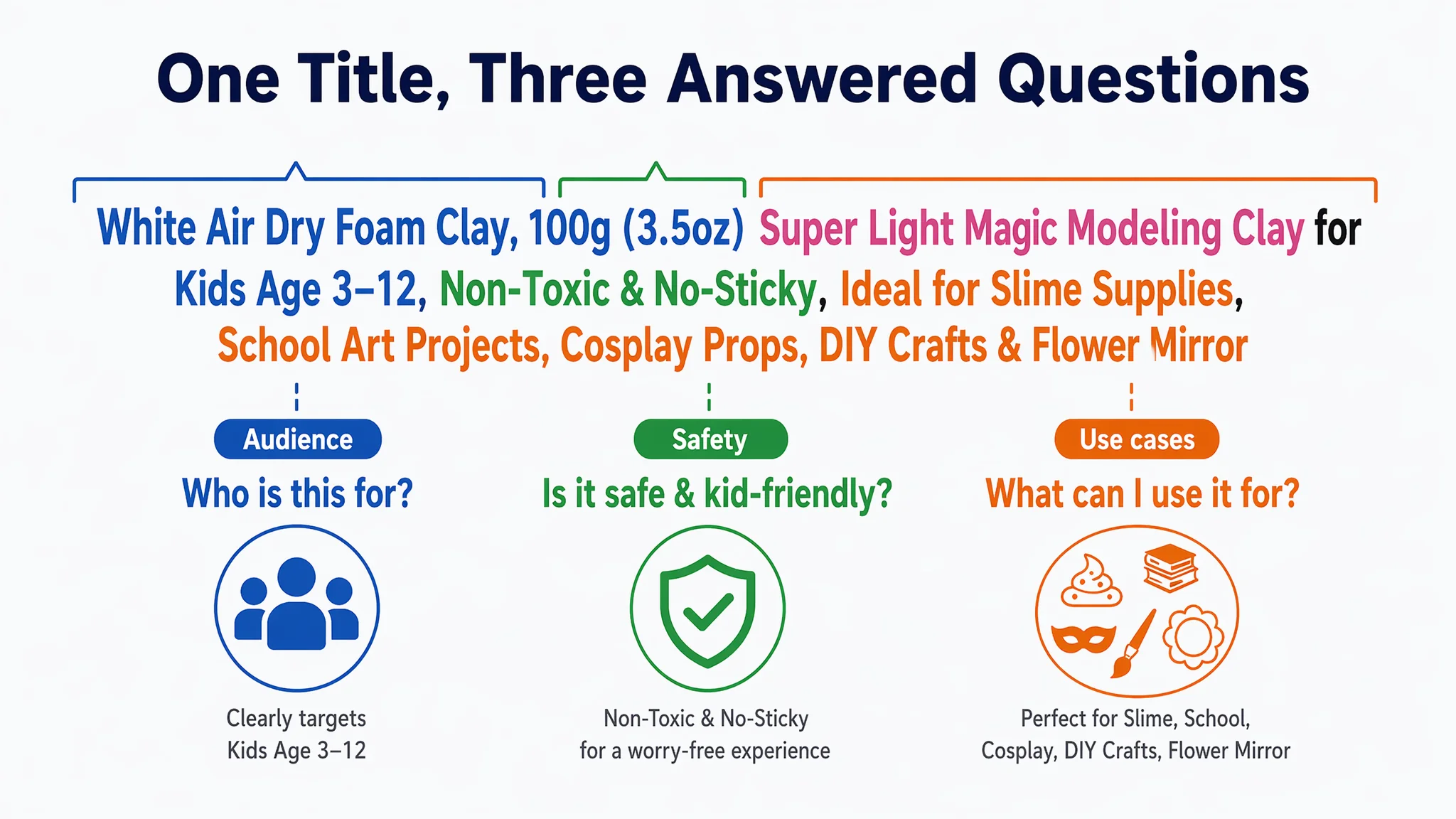
White Air Dry Foam Clay, 100g (3.5oz) Super Light Magic Modeling Clay for Kids Age 3-12, Non-Toxic & No-Sticky, Ideal for Slime Supplies, School Art Projects, Cosplay Props, DIY Crafts & Flower Mirror
Key shifts:
- Audience clarity: “Kids Age 3–12” anchors decision-makers (parents, teachers).
- Safety reinforcement: “Non-Toxic & No-Sticky” directly addresses parents’ concerns.
- Keyword diversity: Maintains “Air Dry Foam Clay” while adding “Super Light”, “Magic Modeling Clay”.
- Scenario richness: Includes “Slime Supplies, School Art Projects, Cosplay Props, DIY Crafts, Flower Mirror”.
This moves the title from “stacked attributes” to “who it’s for, what it does, and where it fits.”
2. Bullet Points: From Features to Structured Buying Logic
DeepBI’s bullet restructuring positioned each point as a step in a decision path:
1. Quality and ease of use for beginners & kids
- Emphasizes softness, non-stick, mess-free crafting.
- Connects to classroom and home use.
1. Large-capacity, resealable packaging and value
- 100g pack, wide-mouth stand-up bag, clear window.
- Calls out usage flexibility and freshness.
1. Certified safety
- Explicit standards: ASTM D-4236, CE EN-71.
- Notes on non-edible, 3+ age suitability.
1. Drying behavior and versatility
- Air-dry only, no baking.
- Smooth, foamy texture without cracking.
- Adheres to multiple surfaces; suitable for props and décor.
1. Gift and educational value
- Fine motor skills, imagination, hand–eye coordination.
- Ideal for school projects, slime, holidays.
Each bullet now carries:
- A named benefit.
- Supporting evidence or specifics.
- A clear link to category-specific concerns.
3. Main Image and Gallery: Visual Proof of Claims
DeepBI recommended a sequence that turns the gallery into a proof chain:
- Main image: Packaging bag centered, hands stretching white clay across the bottom, annotated “Non-sticky & Stretchy.”
- Size reference image: Bag next to a pencil, with precise centimeters indicated.
- Use-case collage: 2×2 grid showing:
- Cosplay prop.
- Coffee coaster.
- Flower mirror.
- Handcrafted figurine.
- Packaging function image: Close-ups of resealable strip, standing bag posture, transparent window.
- Texture detail image: Pink clay being stretched, annotated “Stretchy”, “Non-Sticky”, “Non-Toxic.”
- Family scene: Realistic home crafting, emphasizing capacity for larger projects.
- Color mixing / teaching image: Visual instructions on mixing colors, mirroring the competitor’s educational angle.
The emphasis is on closing the loop between claims and visuals, so the buyer no longer has to imagine the product behavior.
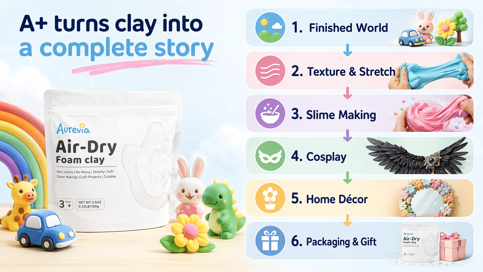
4. A+ Content: From Zero to a Full “Clay World”
The A+ plan replaced the previous void with a structured narrative:
1. “Finished World” opener
- Packaging in the center, surrounded by playful clay models (cars, animals).
- Rainbow, bright background to signal creativity and child-friendliness.
1. Texture and stretch module
- Large close-up of clay being stretched, showing fibers and “fluffiness.”
- Clean pastel background to keep focus on the texture.
1. Slime-making scene
- Hands working slime mixed with clay.
- Visible decorations (glitter, beads) on a craft table.
- Communicates tactile pleasure, not just static output.
1. Cosplay module
- Black wing prop or similar cosplay element in a studio setting.
- Emphasizes detail, lightweight feel, and finished surface.
1. Home décor module
- Flower-decorated mirror hanging on a wall with warm lighting.
- Shows color richness and long-term appearance after drying.
1. Packaging and gift module
- Standing bag with clear window and resealable strip in a home craft area.
- Gift-style layout with kids’ creations around the pack.
Each module responds to a category-specific question:
- “What can I make?”
- “How does it feel and behave?”
- “Is it suitable for slime?”
- “Can I trust it for cosplay-level projects?”
- “Will it still look good in my home?”
- “Is it easy to store and gift?”
How Ad Traffic Became Useful Again
With the page’s decision logic rebuilt, the nature of advertising changed:
1. Clicks carried more meaning
A click did not land on a thin page. It landed on a:
- Clear title framing audience and use.
- Bullets that responded to key doubts.
- A+ experience that visually answered “what can I do with this?” and “why this product?”
1. CVR had real room to move
Instead of chasing micro-changes in bids, the team could now observe:
- Whether conversion from traffic segments (slime, cosplay, school projects) improved after A+ launch.
- How different creative angles affected performance.
1. Organic potential improved
Stronger conversion signals on the product page can:
- Support better organic ranking over time.
- Reduce overdependence on ad spend for visibility.
1. Ads stopped amplifying defects
Once the biggest gap—A+—was addressed, ads no longer primarily exposed:
- Missing trust cues.
- Incomplete usage explanation.
- Unanswered category questions.
Instead, they amplified a more coherent and persuasive page.
What Changed in the Seller’s Understanding
Beyond visual and textual changes, this case shifted how the seller thinks about Amazon operations:
- Ads are not a universal fix
They saw that:
- High ratings and “nice” images do not guarantee conversion.
- Ad performance can stagnate when the page’s decision logic is incomplete.
- Listing quality is the foundation of ad efficiency
The score breakdown made it clear:
- A single missing dimension (A+) can dominate the gap.
- Fixing that dimension changes the meaning of every subsequent click.
- Title, main image, bullets, and A+ must work as a system
Instead of treating each as separate tasks, the seller began to view them as:
- Title: who it’s for and what outcome to expect.
- Main image: why the product is worth a click in the search results.
- Bullets: structured answers to the top five buyer concerns.
- A+: visual proof and scenario storytelling that closes the sale.
- Before scaling ads, test whether the page deserves traffic
They adopted a new internal question:
“If we double traffic to this page today, will the incremental spend meet a page that can reasonably convert it?”
For other Amazon sellers, especially in highly visual categories like crafts, beauty, personal care, and home décor, the lesson is clear:
- A healthy star rating and decent main image are not the end of Listing work.
- If ads feel harder and harder to optimize, the cause may not be inside the ad console.
- Sometimes, the biggest ACOS relief comes not from a new keyword set, but from finally giving the Amazon product page a complete and convincing story.