

This case comes from a US Amazon seller in the home-protection accessories category (gel wall bumpers for door handles and furniture). The team originally believed their difficulty was mainly an Amazon ads problem: ACOS was hard to control, and they felt they “just needed more traffic” or better bids to get sales moving. But when DeepBI looked at the data, it became clear this Listing was missing something more fundamental: it had almost no product-page conversion capacity to begin with.
Against a category-leading competitor, the target Amazon Listing scored only 40/100, with a −49 point gap. On the surface, the title and bullet points looked “acceptable,” so the seller kept trying to solve the problem with keyword tweaks and campaign structures. DeepBI’s diagnosis showed that the real break was deeper: no A+ content at all, no review base, weak main-image logic, and a page that never built trust or context. Ads weren’t failing; they were pouring traffic into a page that could not convert.
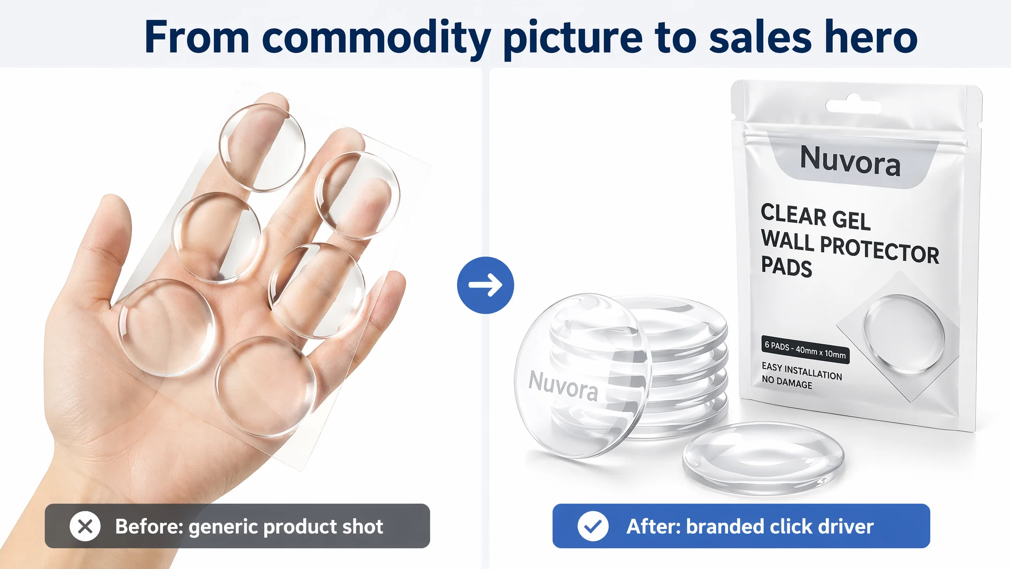
Once the problem was reframed as a Listing-conversion issue rather than an advertising issue, the optimization direction changed completely. Instead of pushing more Amazon ads, the focus shifted to: a clearer, outcome-oriented title; main images that actually create reasons to click and buy; and an A+ detail section that walks users from pain point to solution with real, visual proof. For other Amazon sellers, this case is a reminder: when traffic exists but orders don’t follow, the issue is often not “bad ads” but a product page that has no sales engine.
What the Seller Saw: Traffic Pressure and a “Normal-Looking” Listing
From the seller’s perspective, the situation did not look disastrous at first glance:
- The title contained key parameters like “6 Pack” and exact size (40x40x10mm).
- The bullet points mentioned impact reduction, noise cushioning, installation, cleaning, and multiple scenes.
- Images existed; they were not obviously “broken.”
Yet in the market context, this Amazon Listing was losing badly:
- Listing total score: 40/100
- Benchmark competitor score: 89/100
- Gap: −49 points
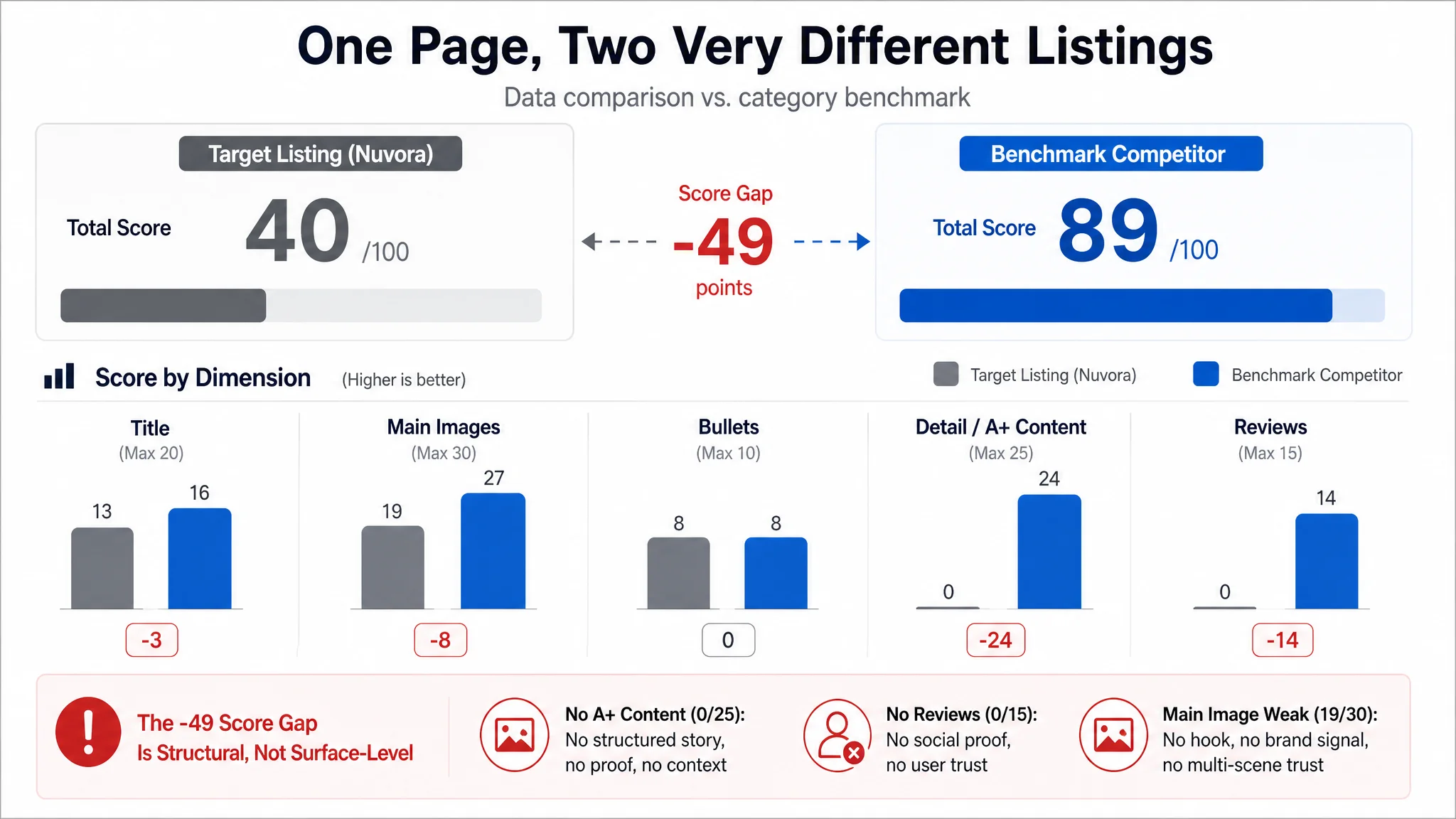
Breaking it down by dimension:
- Title: 13 vs. 16 (out of 20)
- Main images: 19 vs. 27 (out of 30)
- Bullet points: 8 vs. 8 (out of 10)
- Detail/A+ content: 0 vs. 24 (out of 25)
- Reviews: 0 vs. 14 (out of 15; competitor had 4.5 stars and 16,000+ reviews)
On the ads side, the seller was feeling classic Amazon pressure: clicks were not turning into orders, and scaling budgets only increased spend without improving the sales slope. Operationally, the first reaction was:
“We must not be bidding well enough or covering enough keywords.”
In other words, they put the blame on advertising tactics.
The Original Misdiagnosis: Treating a Conversion Problem as an Ads Problem
The seller’s instinct was to work the usual playbook:
- Adjust bids and budgets
- Add more keywords
- Try to push more impressions to the SKU
That logic rests on an assumption: the product page is already good enough, and the task is “just” to buy more traffic or buy it more efficiently.
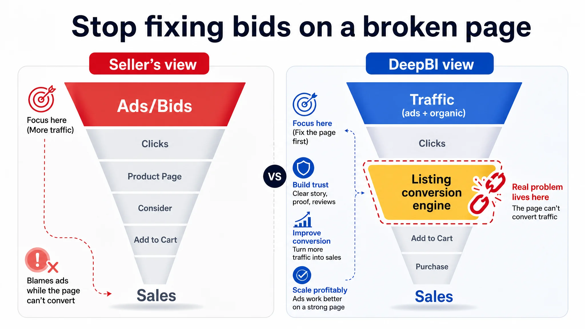
But DeepBI’s scoring made a different judgment: this Amazon product page was not ready to receive traffic at all.
“The real problem was not that ads failed to bring traffic. It was that the page could not convert the traffic.”
Two critical misreadings were at play:
1. “Our Listing looks fine; we just need more reviews.”
Reality: The page lacked basic trust-building layers (A+ content, strong visuals). Even with reviews, the page would still be weak in persuasion.
1. “Title and bullets are OK, so conversion should be acceptable.”
Reality: The highest-impact gap was not word choice inside bullets; it was the total absence of visual story and validation. A buyer needed to work too hard to believe, imagine, and decide.
In short, the seller was trying to optimize ACOS on a Listing that had not yet built a conversion machine.
DeepBI’s Cold View: A Listing with No Trust Spine
When DeepBI benchmarked the target Listing against a category leader, one core conflict emerged:
The constraint was not traffic volume. It was the Listing’s conversion capacity.
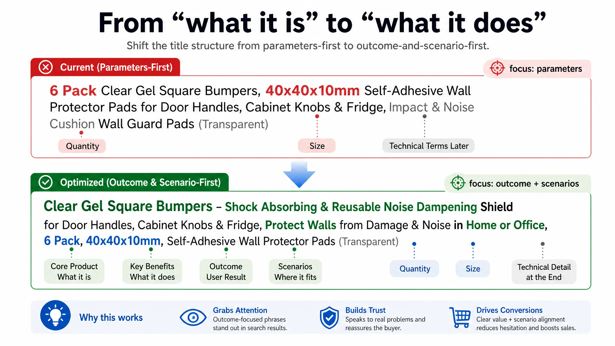
1. Title: Informative, but Weak on Outcome and Context
Compared with the benchmark, the title’s structure signaled the problem:
- The competitor led with brand + result:
“Brand – Door Wall Bumper Protector – Prevents Damage & Noise … Home or Office, Discreet, Reusable…”
- The target Listing led with parameters:
“6 Pack Clear Gel Square Bumpers, 40x40x10mm Self-Adhesive Wall Protector Pads…”
From a user’s search-page perspective:
- The competitor put “Prevents Damage & Noise” up front: an immediate, outcome-based promise.
- The target Listing used “Impact & Noise Cushion” later and with less action-oriented clarity.
- The competitor explicitly covered environments: “Home or Office,” “Discreet,” “Reusable,” widening search intent and emotional resonance.
The result: the target title explained what the product is, but did not clearly say what life outcome it creates or where it fits (home, office, multiple surfaces, etc.).
2. Main Images: No Hook, No Trust, No Story
On main images, the gap was not just aesthetics. It was business logic:
- No strong hook copy in the primary image
- No visible brand identity or packaging
- No clear installation steps
- No multi-scene illustration (doors, cabinets, shower, furniture, etc.)
- No specification/size visual
- No trust markers (long-term use, “family-safe,” social proof style visual cues)
This has direct consequences:
- CTR risk: On the Amazon search page, the thumbnail does not give a sharp reason to click. It appears as “just another clear pad.”
- CVR risk: Once clicked, the gallery does not lower decision cost. Users have to imagine size, compatibility, and use scenarios by themselves.
- Trust risk: There is no visual signal of reliability, years in use, or “people like me” using it in real homes.
The competitor, by contrast, uses:
- Product + packaging in the main image for brand recognition
- A clear “Clear Wall Protector” call-out
- Step-by-step installation visual
- Scene images tied to real pain points (e.g., sleeping baby and door noise)
- Multi-scene collage (toilet lid, cabinet door, bed headboard, cutting board)
- Size diagram with measured dimensions
DeepBI’s judgment: the target Listing’s main images are not just less “pretty”; they fail to perform the core commercial functions of click attraction and trust building.
3. Detail / A+ Content: A Complete Black Hole
This was the biggest structural failure:
- Target Listing A+ score: 0/25
- Benchmark A+ score: 24/25
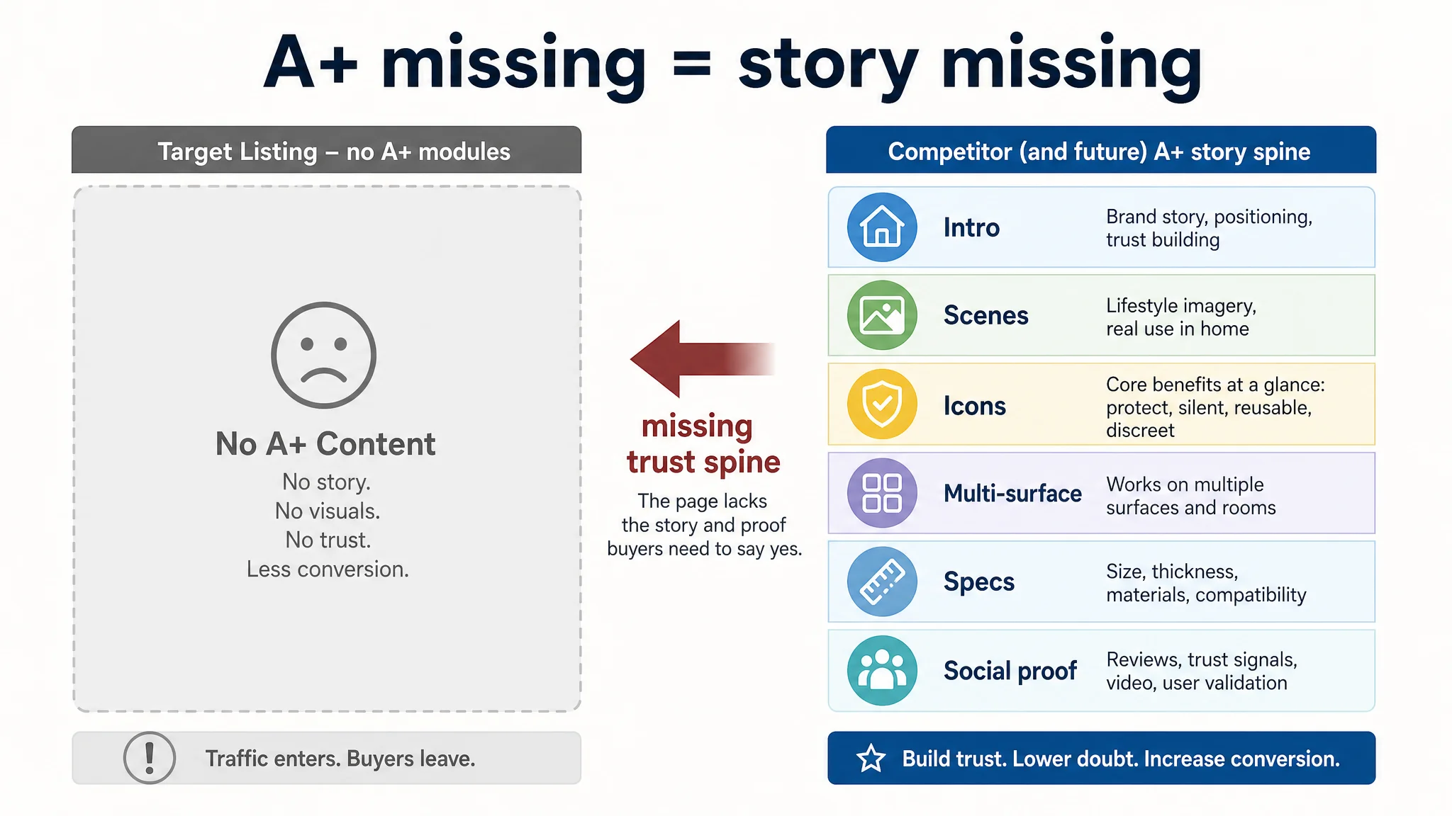
The competitor’s Amazon A+ content includes:
- Brand-value introduction module (family-owned story, positioning)
- Full-width lifestyle scenes (family room, nursery, bathroom)
- Icon-ized core benefit blocks (protection, silent, reusable, discreet)
- Multi-surface fit imagery (glass, tile, wood, metal, etc.)
- Size and thickness diagrams
- Social proof (“over 1,000,000 walls protected”)
- Video demonstration prompt
The target Listing has none of this. No A+ means:
- No structured explanation of pain point → solution
- No emotional context (home safety, baby sleeping, quiet nights)
- No proof that the product works across multiple surfaces or in humid environments
- No data or social validation
In DeepBI’s scoring logic, this is where the conversion funnel breaks completely. Even if the title and main image manage to attract some clicks, the user journey stops on a weak, flat page.
4. Reviews: Zero vs. 16,000+
Review data:
- Target Listing: 0 reviews, 0 rating
- Benchmark: 4.5 stars, 16,755 reviews, multiple detailed front-page reviews
The absence of reviews would already be a challenge. Combined with no A+ and weak visual story, it becomes a structural trust collapse:
- There is no “user voice” to borrow trust from.
- The page itself does not compensate with rich visuals or professional A+ design.
- For a low-ticket item with many alternatives, the rational choice is to bounce to a Listing that “looks proven.”
Why DeepBI Did Not Recommend “Fix Ads First”
Given this diagnosis, DeepBI’s judgment was clear:
“If we continue to adjust ads while the Listing stays like this, we’re just paying to prove the page is weak.”
The biggest business risk was letting ads amplify an unprepared page:
- Every additional click is likely to leak.
- ACOS will remain high because the denominator (conversions) is artificially constrained.
- The seller may misread the situation as “this product doesn’t work on Amazon,” when in fact the page never gave it a fair test.
So the decision path was inverted:
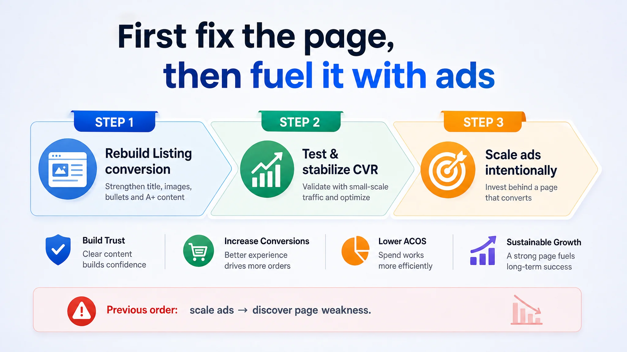
1. Stop treating this as a bid/keyword problem.
2. Rebuild the Listing’s conversion capacity first.
3. Only then consider scaling Amazon ads again.
The priority became:
- Rewrite the title around core outcome and scenarios
- Rebuild main-image set as a conversion funnel, not just “photo gallery”
- Construct a proper A+ story that mirrors how users decide
- Use those to gradually earn reviews and organic conversion signals
How the Optimization Direction Changed
Instead of tweaking campaigns, the team moved to rebuild the Amazon product page itself. DeepBI’s analysis shaped the focus in four main areas.
1. Title: From Parameter List to Outcome + Scenario
DeepBI recommended a new title structure:
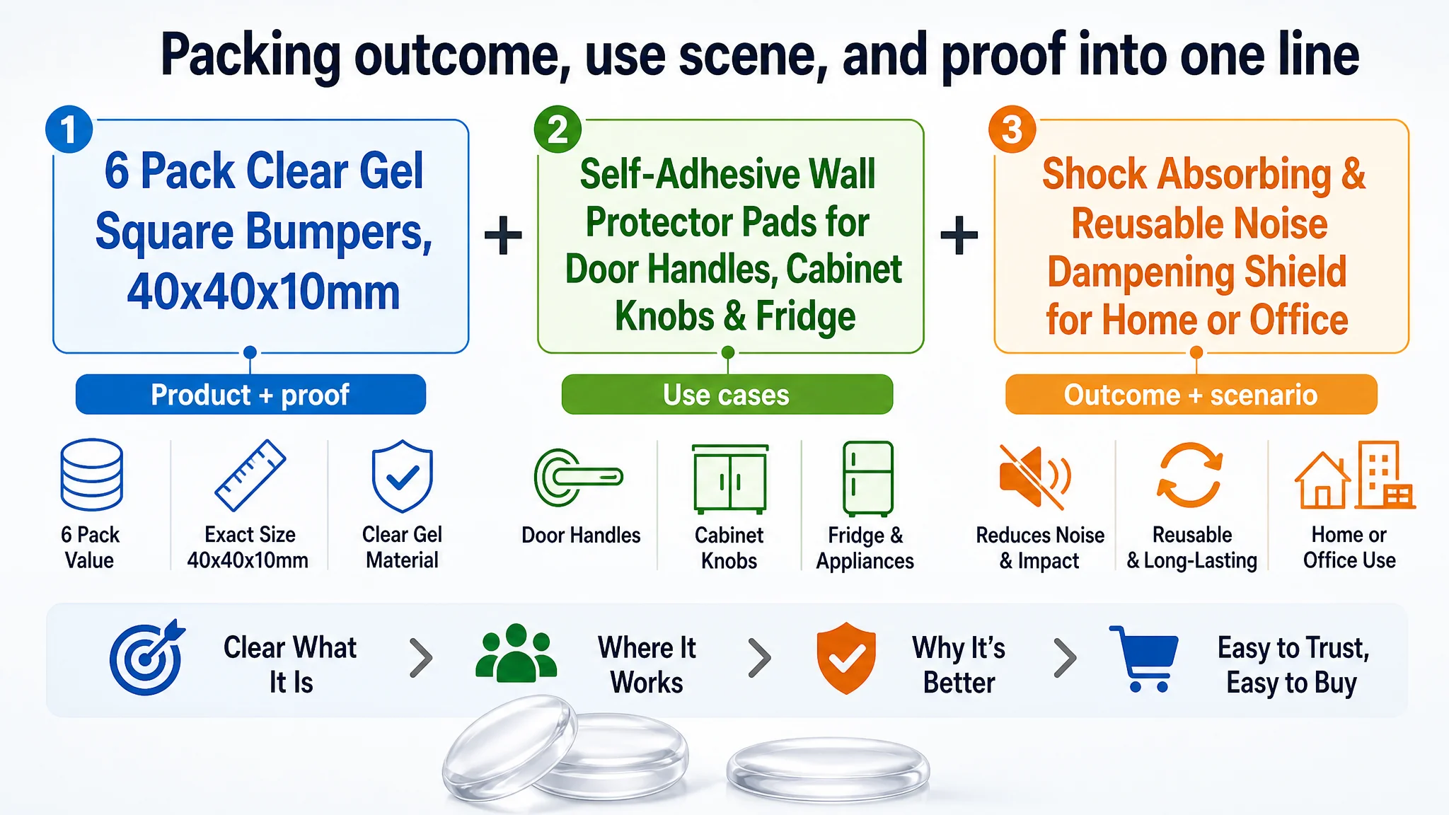
“6 Pack Clear Gel Square Bumpers, 40x40x10mm Self-Adhesive Wall Protector Pads for Door Handles, Cabinet Knobs & Fridge, Shock Absorbing & Reusable Noise Dampening Shield for Home or Office”
Key shifts:
- Core keyword and shape earlier: “Clear Gel Square Bumpers” moved forward for stronger A9 relevance and instant product recognition.
- Outcome words integrated: “Shock Absorbing,” “Noise Dampening,” “Reusable” — aligning with competitor’s proven wording.
- Scenario expanded: Explicit “Home or Office” and surfaces like “Door Handles, Cabinet Knobs & Fridge” make intent coverage broader and clearer.
- Redundant phrases removed: Cleaning up repetitive terms (e.g., multiple “wall protector” synonyms) to keep the title within effective length while increasing semantic density.
This transforms the title from “what it is” to “what it does, for whom, and where.”
2. Bullet Points: Building a Persuasion Path, Not Just Listing Features
The original bullets and competitor bullets were structurally similar, but the emphasis differed. DeepBI’s optimization pushed each bullet into a pain point → benefit → proof logic.
Examples:
- BP1 – Discreet & durable protection
Emphasizing transparent, low-profile look that blends with any wall color, plus the value of a 6-pack.
- BP2 – Shock absorbing & noise reduction
Strong focus on impact softening and eliminating the “bang” sound, tying directly to quality-of-life improvement (quiet home).
- BP3 – Strong self-adhesive & tool-free install
Clear installation promise (peel-and-stick, no tools) and surface compatibility (painted walls, wood, tile, glass, metal), plus “no residue upon removal.”
- BP4 – Washable, reusable & long-lasting
Material durability (resists yellowing, cracking) and simple cleaning to restore stickiness.
- BP5 – Versatile multi-scene compatibility
Extending to high-intent scenarios (refrigerator, shower doors, furniture guard) and locations (kitchens, bathrooms, bedrooms, offices).
The goal was not word beauty; it was to mirror how a buyer thinks:
1. Will it look ugly on my walls?
2. Will it really stop noise and marks?
3. Is it easy and safe to install/remove?
4. Will it last or turn yellow and fall off?
5. Can I use it all over the house?
3. Main Images: Turning the Gallery into a Mini Sales Funnel
DeepBI reframed each main image slot as a specific decision step.
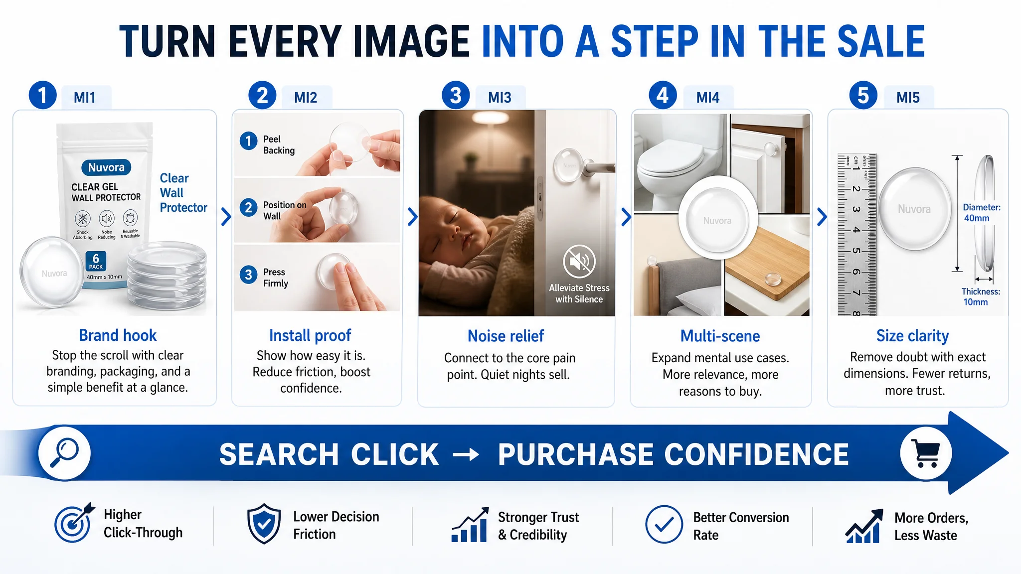
Main Image 1 – Product + Packaging + Clear Label
- Product group and outer packaging centered (~80% of frame) on a clean white background
- Soft 45° light for depth, balanced highlights for a “professional, clean” feel
- On-image text like “Clear Wall Protector” in a simple sans-serif font
Role: Increase CTR by signaling a real, branded, professional solution — not generic commodity.
Main Image 2 – 3-Step Installation Visual
- Three equal sections: peel, stick, press on a white wall
- Consistent soft lighting, subtle home background
- Clear visual story: “tool-free, quick, anyone can do this”
Role: Remove anxiety about installation complexity; lower friction.
Main Image 3 – Noise & Family Comfort Scene
- Protector on wall behind door; sleeping baby scene covering ~60% of the frame
- “Alleviate Stress with Silence” text + icon
- Warm, quiet bedroom atmosphere, background gently blurred
Role: Connect product to an emotional pain point — quiet nights, no waking the baby, less household stress.
Main Image 4 – Multi-Scene Collage
- Central product, surrounded by four smaller scenes: toilet lid, cabinet door, bed headboard, cutting board bottom
- Modern, bright home environments
- High contrast and clarity
Role: Visually deliver “one set, the whole home”: protect walls in multiple high-contact points.
Main Image 5 – Size & Thickness Visual
- Top-down view of a single bumper with a ruler
- Clear dimension lines and labels for diameter and thickness
- Neutral grey background for technical precision
Role: Prevent size misunderstanding, reduce returns, and give buyers confidence that dimensions match their doors and handles.
Each image is not “just nicer”; it is targeted at a specific conversion barrier: click, trust, install, versatility, and sizing.
4. Detail Page / A+ Content: Rebuilding the Missing Story Spine
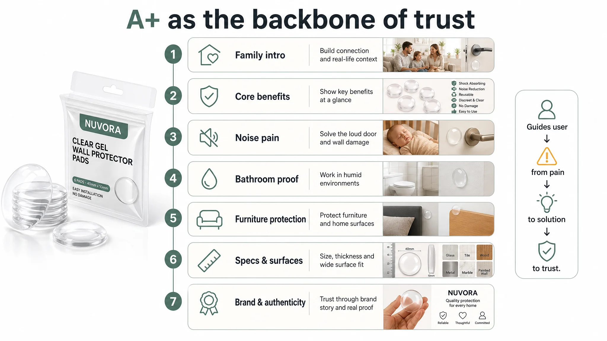
Because the original Listing had no A+, DeepBI effectively designed the A+ as a fresh conversion structure:
1. Intro module:
Split-screen: a warm family scene on one side, real-life door + wall protector close-up on the other. Objective: Immediately tie “happy home” with “no wall damage” as the product’s core value.
1. Core benefits module:
Centered layout with 3–4 bumpers and 6 vertical benefit points on an energetic warm gradient background. Objective: High-density information about protection, silence, reusability, and versatility, at a glance.
1. Noise-pain module:
Baby sleeping vs. door closing with protector. Objective: Put “noise reduction” in a deep emotional context (parents, light sleepers).
1. Bathroom compatibility module:
Product installed behind toilet in a realistic bathroom. Objective: Show performance in humid, tiled environments — a key use case buyers worry about.
1. Furniture protection module:
Bed headboard against wall with protectors on both sides. Objective: Expand buyer imagination beyond doors — into furniture and home decor.
1. Specs & surface compatibility module:
Sizes on the left; a 3×3 grid of materials (glass, wood, marble, metal, tile, etc.) on the right, all with product overlay. Objective: Remove doubt about fit and adhesion on different surfaces.
1. Brand & authenticity module:
Hand holding a protector, warm wooden background, human-scale proportion. Objective: Add brand warmth and “real product in real hand” credibility, compensating for the absence of review volume.
In effect, A+ is used to reconstruct the missing “trust triangle”: contextual use + technical clarity + human signal.
What Changed: From “Ads Don’t Work” to “Does the Page Deserve Traffic?”
This case did not rely on invented numbers after optimization, but several shifts in operating state are clear:
- The Listing moved from 40/100 with a 0-point A+ to a page that can actually explain itself and build trust.
- The product page began to have a realistic chance to convert both organic and paid traffic, instead of burning clicks.
- The seller’s mindset shifted from “we need better ads” to “we need a page that deserves better ads.”
“Advertising does not only amplify advantages. It can also amplify a page’s existing defects.”
Once the title, main images, bullets, and A+ started working together:
- Amazon ad traffic could be repurposed as a test signal, rather than an expensive bandage.
- It became possible to see whether the product itself fits the market — without the Listing quality bottleneck distorting the picture.
- Over time, as reviews accumulate, the page’s conversion ability can start feeding back into more sustainable ads and organic ranking.
What Other Amazon Sellers Can Take from This Case
This wall-protector Listing illustrates a common trap for Amazon sellers:
- Symptom: ACOS high, ads feel “inefficient.”
- Misdiagnosis: “We need better keywords, better bids, or more budget.”
- Reality: The Amazon product page itself is not yet capable of turning traffic into orders.
Key lessons:
1. A weak A+ (or no A+) is not a cosmetic issue; it is a conversion break.
If your detail section is empty while top competitors are running full, trust-rich A+ modules, you will struggle to convert, no matter how good your ads are.
1. Title, main image, bullets, and A+ must form a single buying logic.
If the title promises nothing clear, the main image lacks a hook, and A+ doesn’t exist, users will leave — even at a low price.
1. Ads cannot fix a trust gap.
Scaling campaigns on an underbuilt page only scales waste. Always ask: “If I doubled traffic today, would the page handle it?”
1. Before optimizing bids, check your Listing scores against best-in-class competitors.
DeepBI’s scoring in this case exposed a −49 point gap, with zero A+ and zero reviews. No ad strategy can compensate for that level of page immaturity.
For Amazon sellers under similar pressure, the sequence matters:
1. Diagnose whether the core constraint is traffic or page conversion.
2. If conversion is the bottleneck, rebuild the Listing’s sales logic first.
3. Only then scale Amazon ads into a page that has a real chance to convert the traffic you pay for.
In this case, DeepBI’s value was not in “generating better images” by itself; it was in recognizing that there was no conversion engine under the ads — and insisting that the page be fixed before any serious ad scaling could be meaningful.