

An Amazon seller in the UK memorial and gift category came to us with a familiar frustration: ads were bringing traffic to a personalised memorial night light, but orders were not following. The team’s first reaction was to treat this as an advertising issue—tighten keywords, adjust bids, and “wait for reviews” to fix conversion.
DeepBI’s diagnosis led in a different direction. By benchmarking the Amazon Listing against a strong bereavement photo-frame competitor, we found that the real bottleneck was not in traffic volume, but in how the product page converted—and failed to convert—that traffic. The listing’s title logic, A+ narrative, and absence of any review layer meant the seller was paying to send emotionally vulnerable buyers to a page that did not fully reassure them.
Once the problem was reframed as a Listing conversion issue, the optimization focus shifted: clarify Amazon title keywords and emotional positioning, rebuild the story in the main images and A+ modules around “sympathy gift” decisions, and structure bullet points to close specific trust gaps. For other Amazon sellers, this case underlines a hard truth: when ads feel “expensive,” the leak may be on the Amazon product page, not in the campaign dashboard.
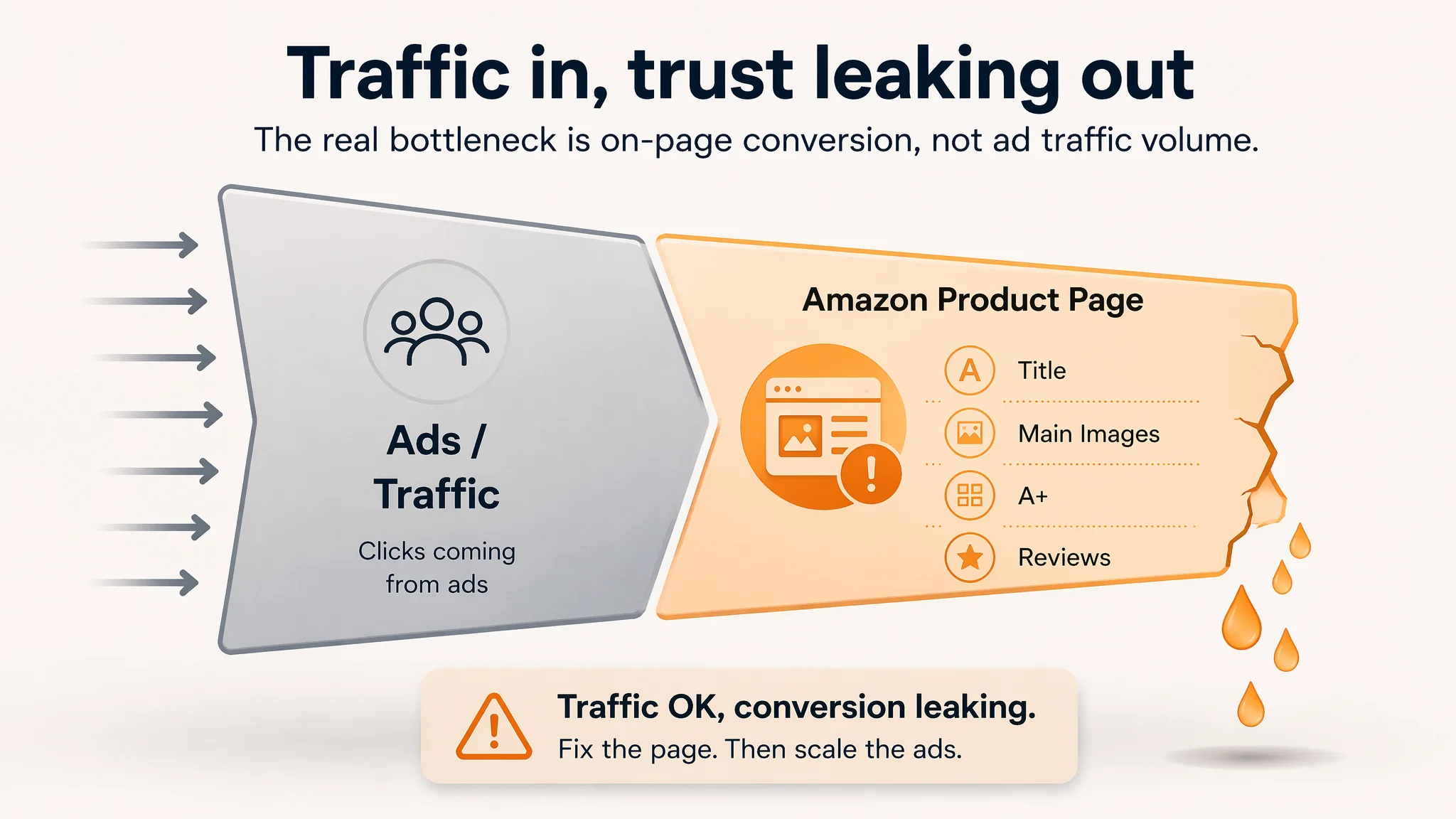
Amazon Ads Were Not Failing. The Page Was Consuming the Traffic.
From the seller’s perspective, the situation looked straightforward. A new personalised memorial night light had been launched on Amazon UK in a sensitive niche: bereavement and sympathy gifts. The product had:
- A relatively sophisticated main-image set
- Thoughtfully written bullet points
- A visually polished A+ section
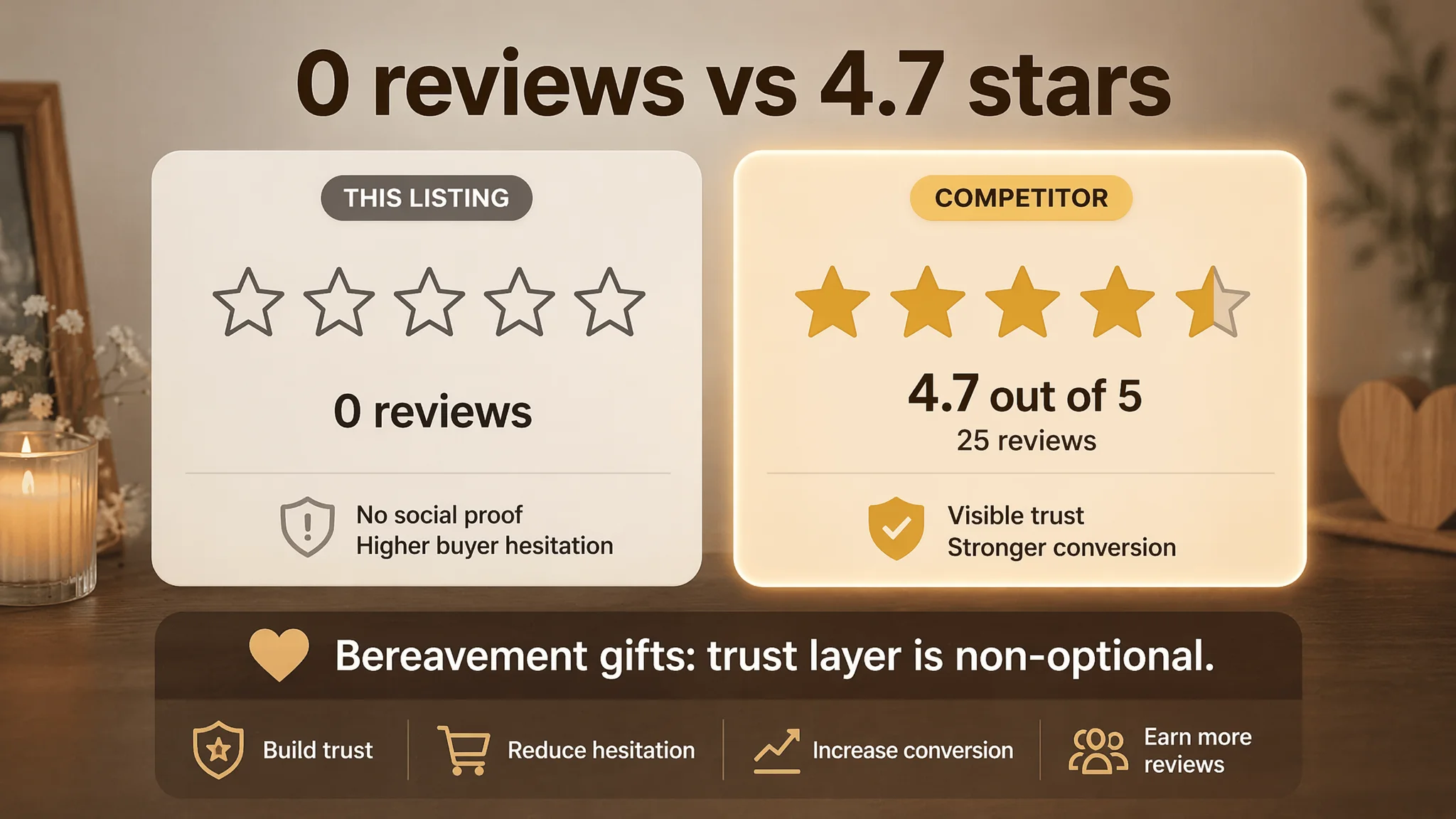
Yet the listing sat on zero reviews, while a key competing bereavement photo frame nearby already held a 4.7-star rating with 25 reviews.
Ad spend began to feel harder to justify. Traffic was coming in, but the page did not generate the volume of orders needed to build its own review base. Internally, the team framed this as:
- A timing problem: “Once reviews come in, conversion will fix itself.”
- An ad problem: “We need better keyword coverage and more precise bids.”
What they did not test was the opposite hypothesis:
“Maybe the listing as it stands does not deserve more traffic yet.”
DeepBI’s role was to pressure-test that assumption, using a structured Listing scoring and competitor benchmark rather than subjective impressions.
The Real Constraint Was Listing Conversion Capacity
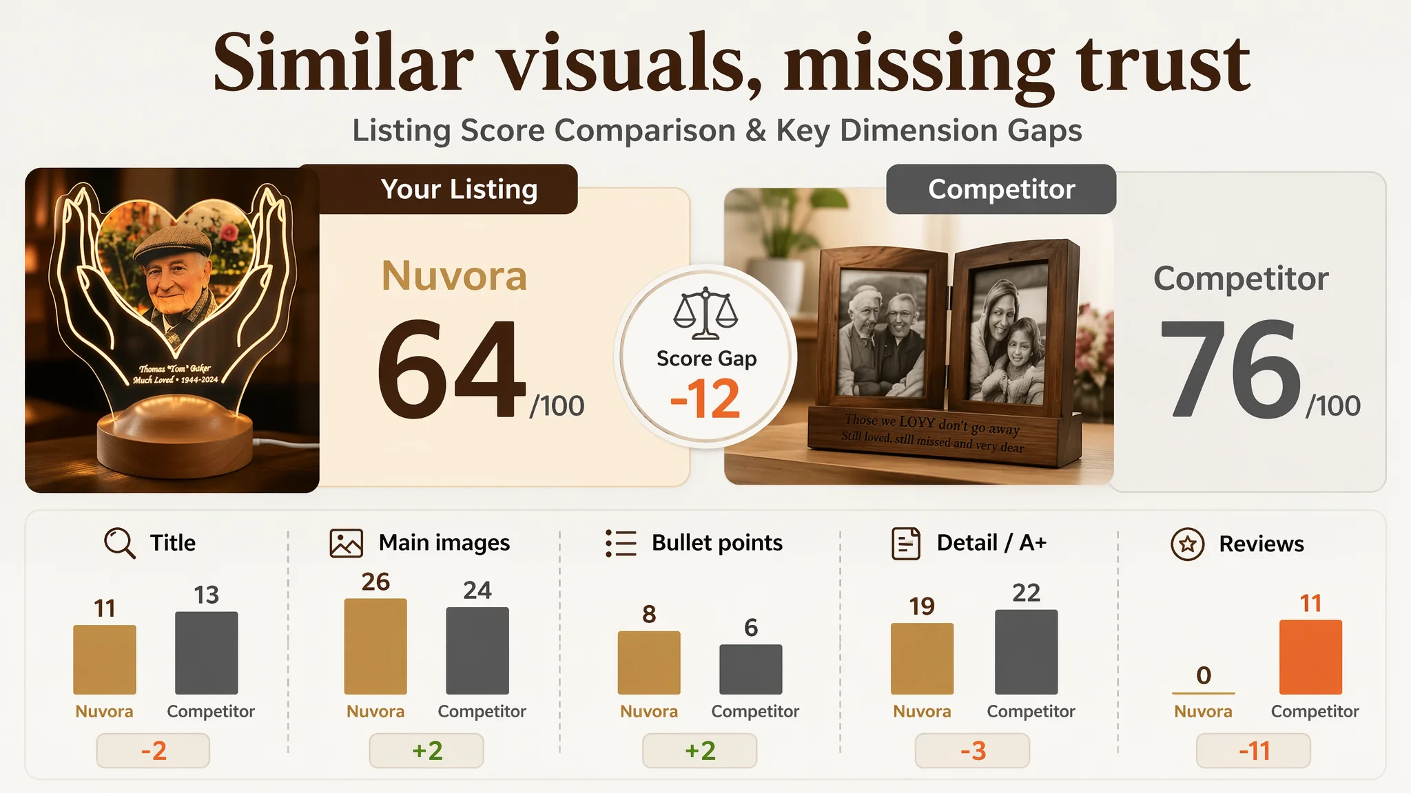
When the Listing was scored across core Amazon dimensions—title, main images, bullet points, A+ detail, and reviews—its total score landed at 64/100, versus 76/100 for the benchmark competitor.
On the surface, the gap did not look catastrophic: only -12 points. But the way those points were distributed revealed the true constraint:
- Title: 11 vs 13 (−2)
- Main images: 26 vs 24 (+2)
- Bullet points: 8 vs 6 (+2)
- Detail / A+: 19 vs 22 (−3)
- Reviews: 0 vs 11 (−11)
In other words:
- The seller’s images and bullets were not the main weakness; they were, in some respects, already ahead of the competitor.
- The decisive deficit lay in page-level trust:
- A title that didn’t align cleanly with Amazon search and category expectations.
- An A+ that lacked emotional and functional decision support.
- A complete absence of reviews, versus a competitor with a visible trust base.
The page had enough visual polish to look good in isolation, but not enough structured trust and decision logic to convert cold traffic—especially ad traffic—within a high-emotion, bereavement context.
The Customer’s Original Misdiagnosis: “Reviews and Ads Will Fix It”
Before the diagnosis, the seller’s operating logic roughly followed this pattern:
1. Launch with polished visuals
- Invest in a strong main image system.
- Prepare a metaphor-rich A+ section.
1. Turn on Amazon ads early
- Drive traffic quickly to start ranking.
- Accept high ACOS in the short term as “review-building cost.”
1. Blame delays on review volume
- If conversion remained low, the working theory was simply: “There are no stars yet; buyers are cautious. Once we get reviews, things will improve.”
This is a common path: ads treated as the primary engine, listing treated as “done enough,” and reviews seen as the eventual fix.
The risk with that logic is that:
- Amazon ads amplify whatever your product page already is.
- If the page cannot articulate its value and trust story, ads will mainly amplify leaks, not sales.
DeepBI’s scoring confirmed that the listing was not yet in a healthy enough state to justify aggressive ad scaling. The problem was not the absence of traffic; it was the quality of the page’s conversion pathway once traffic arrived.
This Product Page Did Not Lack Traffic. It Lacked Trust.
When we looked beyond the score and into qualitative differences, a pattern emerged:
Title: Technically Detailed, Strategically Misaligned
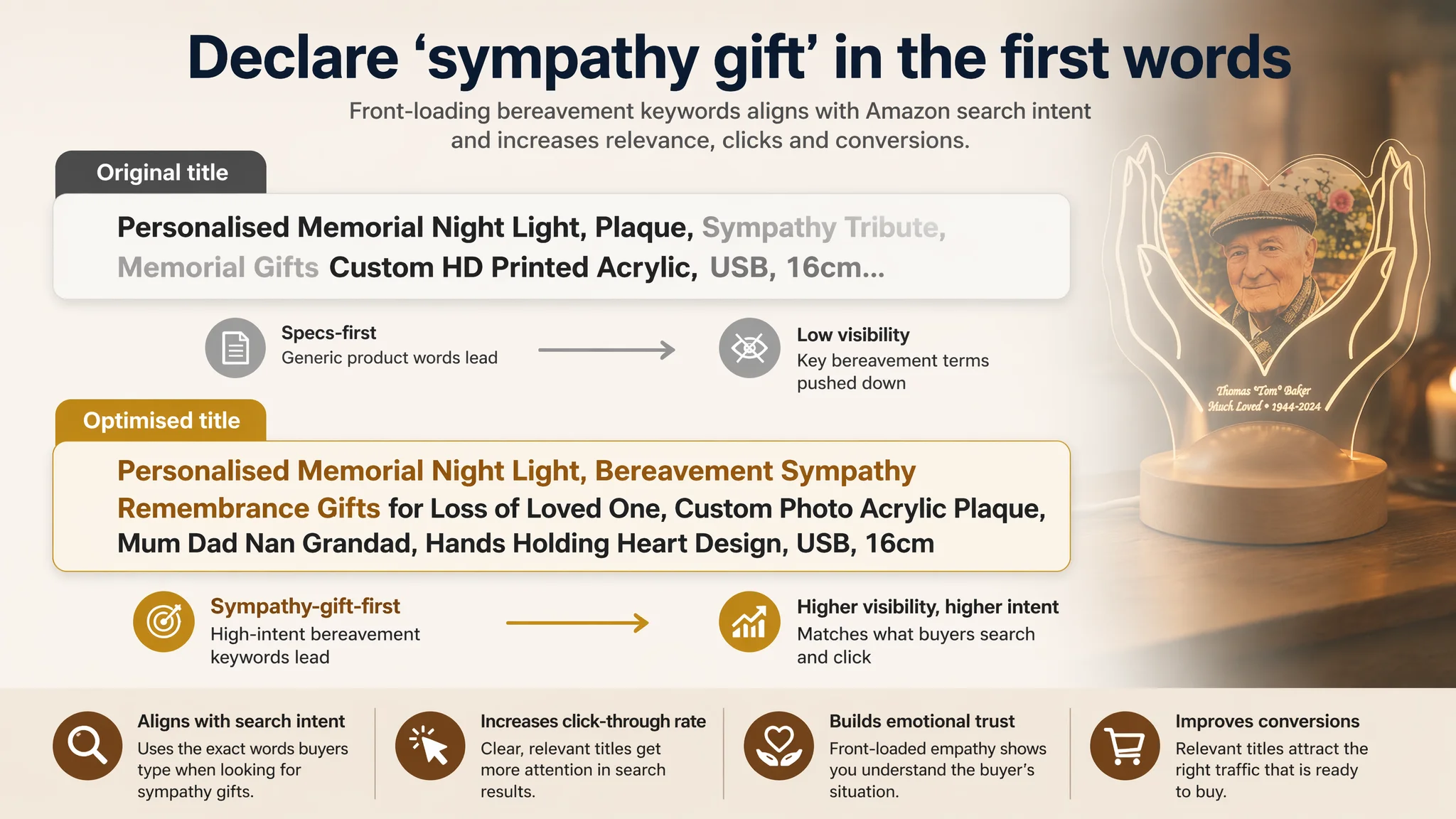
The original title did mention important elements—“Night Light,” “Plaque,” custom printing, USB, size, etc.—but from Amazon search and buyer-decision perspectives it was misaligned:
- The competitor front-loaded “Bereavement Photo Frame” and phrases like “Sympathy,” “Remembrance,” “Thinking of You”.
- These words are not decorative; they are exactly what grieving buyers type and mentally scan for in Amazon’s search results.
By contrast, the seller’s title:
- Pushed emotional and category terms like “Memorial Gifts,” “Sympathy Tribute” into later positions.
- Mixed several concepts (memorial gift, plaque, sympathy tribute) without a single dominant anchor, creating semantic noise.
- Buried differentiating specs like “USB,” “16cm” too far back, risking truncation.
Net effect: the title did not clearly declare itself as a sympathy/bereavement gift solution in the first few words. This weakens both search relevance and click-through rate.
A+ Content: Emotionally Poetic, Commercially Incomplete
The A+ section leaned heavily into:
- Symbolic language.
- A single static memorial scene.
- General metaphors of remembrance.
The benchmark competitor, by contrast, ran a much more commercially complete narrative:
1. Function + Emotion together
- Dual-sided, rotating frame.
- Real family photos in use, reinforcing the idea of “relationship continuation.”
1. Multiple real-life gifting scenes
- Collages of people receiving and using the product.
- Clear holiday and occasion anchoring (Christmas, birthdays, anniversaries).
1. Embedded FAQ logic
- How it’s powered.
- How big it is.
- What can be customized.
DeepBI’s judgment: The seller’s A+ looked refined, but from a purchase-decision standpoint it did not answer enough of the buyer’s practical questions nor show enough social proof-like context.
“The real problem was not that ads failed to bring traffic. It was that the page could not convert the traffic.”
Reviews: A Complete Void vs a Visible Trust Layer
The most obvious but critical difference:
- The target Listing: 0 reviews, no rating.
- Competitor: 4.7 stars, 25 total reviews, with the first page showing mostly 5-star praise and one 2-star warning.
In a category where buyers are often purchasing on behalf of someone grieving, this matters more than in everyday commodities.
DeepBI’s position was not that reviews could be “quickly manufactured,” but that:
- Every other element of the Listing needed to compensate for this trust gap until social proof could catch up.
- Running ads into a page with zero trust signals and incomplete decision content placed the seller in a double-risk position:
- Paying for each click.
- Leaving buyers with unresolved doubts.
Why DeepBI Did Not Keep Tuning the Ads First
From a short-term ACOS perspective, the easiest lever is usually to tweak:
- Keyword selection.
- Match types.
- Bids and budgets.
But the data pointed to a different priority order.
1. Listing score vs competitor was not catastrophic in visuals
The main image score was higher than the competitor’s (26 vs 24). This implied:
- The click-stage imagery was not the primary failure.
- Further ad tuning would still be feeding a page with incomplete trust logic.
1. Detail and review dimensions showed structural weakness
- Detail / A+ lagged by 3 points.
- Reviews lagged by 11 points.
- This combination usually correlates with conversion problems, not reach problems.
1. Emotional category, high stakes decision
- In bereavement gifts, buyers are unlikely to “experiment” with unproven pages.
- They need reassurance that:
- This is truly a sympathy gift.
- It will look dignified and appropriate.
- It will arrive in a way that feels respectful.
Given that, DeepBI prioritized page conversion capacity over further ad experiments.
“Advertising does not only amplify advantages. It can also amplify a page’s existing defects.”
Reframing the Problem: From “We Need More Traffic” to “We Need a Stronger Story”
Once the diagnosis was accepted, the team shifted from “turn up the ads” to “repair the page.”
1. Title: Declaring the Right Identity in Amazon Results
The recommended title reframed the Listing around how Amazon and buyers actually recognize the category:
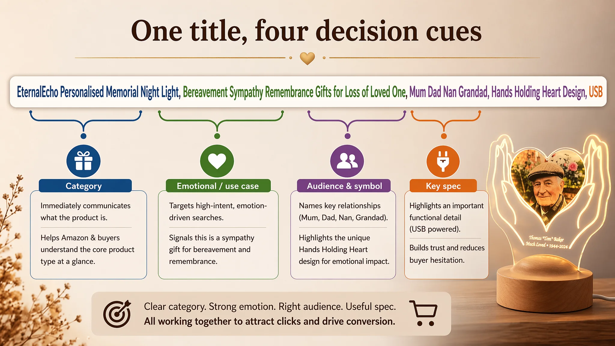
EternalEcho Personalised Memorial Night Light, Bereavement Sympathy Remembrance Gifts for Loss of Loved One, Custom Photo Acrylic Plaque for Mum Dad Nan Grandad, Hands Holding Heart Design, USB
Key changes in logic:
- Front-load the true category and use case
“Personalised Memorial Night Light” and “Bereavement Sympathy Remembrance Gifts for Loss of Loved One” move to the front, capturing:
- Category (memorial night light).
- Primary use (bereavement gift).
- Emotional context (loss of loved one).
- Pull in high-intent emotional keywords
Terms like “Bereavement” and “Remembrance” match buyer searches in this niche more directly.
- Clarify audience and design
“Mum Dad Nan Grandad” and “Hands Holding Heart Design” specify:
- Who this is often for.
- What symbolic form it takes.
- Preserve necessary specs without overloading
“USB” remains, but now supports the decision instead of dominating the message.
This is not a cosmetic rewrite; it is a decision to compete directly in the right search and emotional corridor, rather than hiding behind generic or scattered wording.
Bullet Points: From Informative to a Structured Buying Logic
The original bullet points were already stronger than many category listings. They:
- Opened with emotional pain points.
- Introduced technical advantages like HD UV printing.
- Followed a rough “pain–solution–quality–convenience” progression.
DeepBI’s role was to sharpen their commercial clarity and alignment with actual search and decision paths.
Bullet 1: Naming the Gift Explicitly
New logic:
- Lead with “sympathy gift for loss of loved one”.
- Anchor the unique “Hands Holding Heart” design as a symbol of care and eternal connection.
- Explicitly mention applicable recipients (Mum, Dad, Partner).
This makes the opening bullet not just poetic, but discoverable and immediately recognisable as a bereavement solution.
Bullet 2: Connecting Technology to Night-time Comfort
Instead of just stating “HD UV printing,” the revised bullet ties it to:
- Clear, glowing names and dates.
- A “guiding light” at night.
This reframes technical differentiation as emotional utility: not just better printing, but a credible, lasting presence at night.
Bullet 3: Elevating Convenience into Dignity
The point about “no film to peel” is not presented as mere convenience.
- It is recast as respect for the deceased:
- No fumbling with protective film.
- Ready to display immediately.
- More dignified than traditional frames.
This is key in this category: buyers care that the product respects the moment.
Bullet 4: Defining It as a Long-lasting Alternative to Flowers
The revised copy:
- Positions the product directly against funeral flowers.
- Calls it a “thoughtful alternative to flowers” and a permanent tribute.
- Introduces an optional premium gift box for direct gifting.
This gives buyers a clear frame: If you would normally send flowers, this is a more lasting, appropriate option.
Bullet 5: Combining Specs, Power, and Placement
Instead of separating specs, power, and customization, the final bullet binds them:
- “Simply upload a photo and add a personal message.”
- USB-powered for easy placement.
- Clear size (16cm x 15cm) tied to typical locations:
- Bedside table.
- Mantel.
- Next to an urn.
This integrates how to buy, where to place, and why the size fits, removing practical doubts that could kill conversion.

Main Images: From “Good-Looking” to Decision-Oriented
Quantitatively, the seller’s main image set already outranked the competitor’s. But DeepBI’s analysis showed micro-gaps in how those images supported decisions:
- Certain infographics looked slightly rough, diluting perceived craftsmanship.
- A phone-in-hand customization demo image had fingers covering part of the interface, weakening clarity.
- Technical information was scattered across multiple images instead of being anchored in clear modules.
The optimization plan did not seek to reinvent the wheel, but to realign each image with a specific role in the buying journey.
Example Adjustments
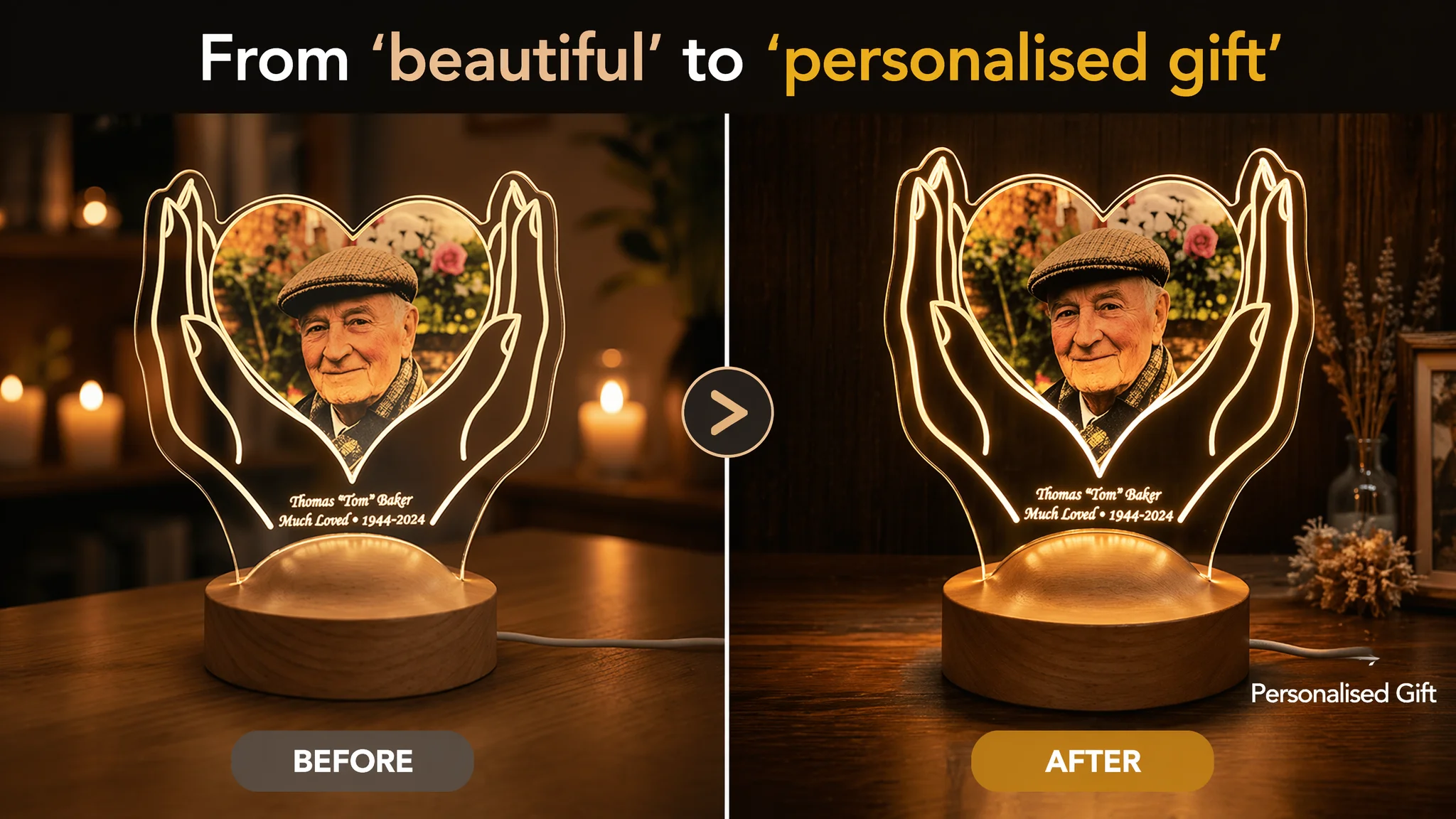
- Primary image:
Focus on a 70%-frame, centered product with warm, high-contrast lighting and a deep, dignified wood-textured background. Add a simple “Personalised Gift” label to anchor the use case.
- Day/Night comparison image:
Show the product clearly in:
- Bright natural light (as decor).
- Dark environment (as a night light).
This resolves a common question: “Will it still look good during the day?”
- Size reference image:
Use a clean, industrial-style measurement graphic with actual height/width. Let the image do the explanatory work instead of burying it in text.
- Emotional scene image:
Introduce a lifestyle shot with an older couple’s photo or a grieving recipient, placing the product in a warm, real home context.
- Bedside use image:
Show the night light on a simplified modern bedside table, with the glow as the primary light source, reinforcing the night comfort narrative.
Together, these changes move the visual system from “beautiful product gallery” to structured decision support.
A+ Detail Page: Filling the Trust Gaps
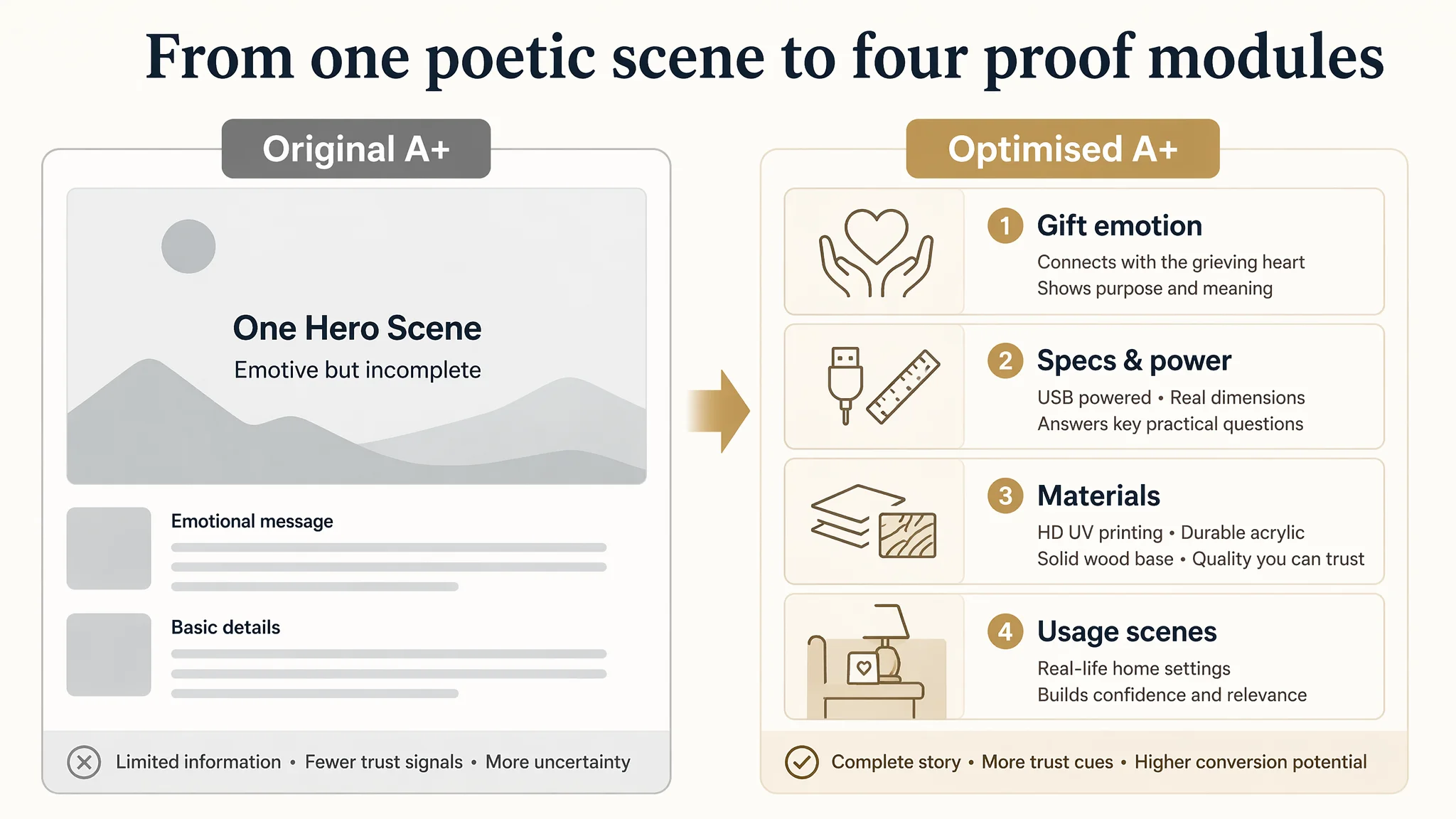
The A+ optimization followed four key judgments:
1. Add a clear gifting-emotion module
- Show a recipient being comforted by the gift.
- Use a headline like “A Heartfelt Sympathy Gift for Your Loved Ones.”
- Make the emotional payoff explicit, not implied.
1. Add a specifications + power module
- Visualize USB power, energy-saving LED, and dimensions.
- Reduce pre-purchase questions like:
- “How do I plug this in?”
- “Will it fit on my shelf?”
1. Add a material and durability module
- Close-up shots of:
- HD UV-printed portrait.
- Thick acrylic edges.
- Natural wood base.
- Each labeled with clear benefit statements:
- “HD UV Printing”
- “Durable Acrylic”
- “Natural Solid Wood”
1. Add a multi-scenario usage module
- Show the product in:
- Bright living-room shelf.
- Fireplace mantel at dusk.
- Night-time bedside.
- Reinforce that it is both:
- A beautiful daytime decor piece.
- A comforting night light.
This transforms the A+ from a single-tone static story into a multi-angle proof of value—exactly what a review-less listing needs to compensate for its social-proof gap.
Before Ads Could Work Again, the Page Had to Convert
DeepBI did not stop at “better copy” and “better design ideas.” The critical conviction was sequence:
- First, establish a Listing that:
- Clearly signals the correct category and intent in title and images.
- Provides enough information and scenes to reassure a cautious buyer.
- Reduces the cognitive friction that usually leads to tab-closing.
- Then, re-evaluate ads:
- When click-through is driven by a clearer title and primary image.
- When the product page is more capable of turning traffic into orders.
- When systematic leaks (missing specs, missing emotional context) are patched.
Only after the page’s conversion capacity improved did it make sense to:
- Scale ads on core bereavement and sympathy keywords.
- Test broader “thinking of you” and gift terms.
- Build review volume in a way that had a higher chance of sticking.
How the Seller’s Understanding Changed
By the end of the engagement, the seller’s view of the problem had shifted in several ways:
- From “Our ads are not efficient enough”
→ To “Our listing was not ready to convert the traffic we were buying.”
- From “Once reviews come, everything will improve”
→ To “We must build a page that can win trust even before social proof.”
- From “Our main images look better than the competitor’s, so visuals are fine”
→ To “Visuals must map to specific decision steps, not just look good.”
In operating terms, the changes meant:
- The Listing began to regain organic conversion capability; it was no longer entirely dependent on paid traffic.
- Ad traffic became more economically useful, as fewer clicks were lost to preventable questions or uncertainty.
- The seller’s traffic structure became more controllable, with reduced risk of overpaying for impressions that the page could not harness.
What Other Amazon Sellers Can Learn from This Case
This case is not about a single memorial night light; it is about how easily an Amazon seller can misdiagnose where the real constraint lies.
Key takeaways:
- Ads cannot repair a structurally weak product page. They can only expose its weaknesses faster.
- A good-looking Listing is not necessarily a good-converting Listing. The benchmark competitor’s visuals were not dramatically superior—but their page logic and trust structure were.
- In high-emotion categories, trust content is as critical as functional content. Buyers need to see:
- Who this is for.
- How it will be used.
- That others have trusted it in the same situation.
- Title, main image, bullets, and A+ must operate as a single system.
When they are misaligned, your Listing may look “fine” but still quietly leak conversion.
For Amazon sellers facing rising ACOS and stubborn conversion rates, this case suggests a different starting question:
Not “How do we push more traffic?” but “Does our current Amazon product page truly deserve the traffic we are paying for?”
DeepBI’s value in this story was not a list of tools. It was the ability to see that, in this specific Amazon Listing, the real bottleneck was conversion capacity—not traffic volume—and that ads needed a stronger page to land on before they could perform.