

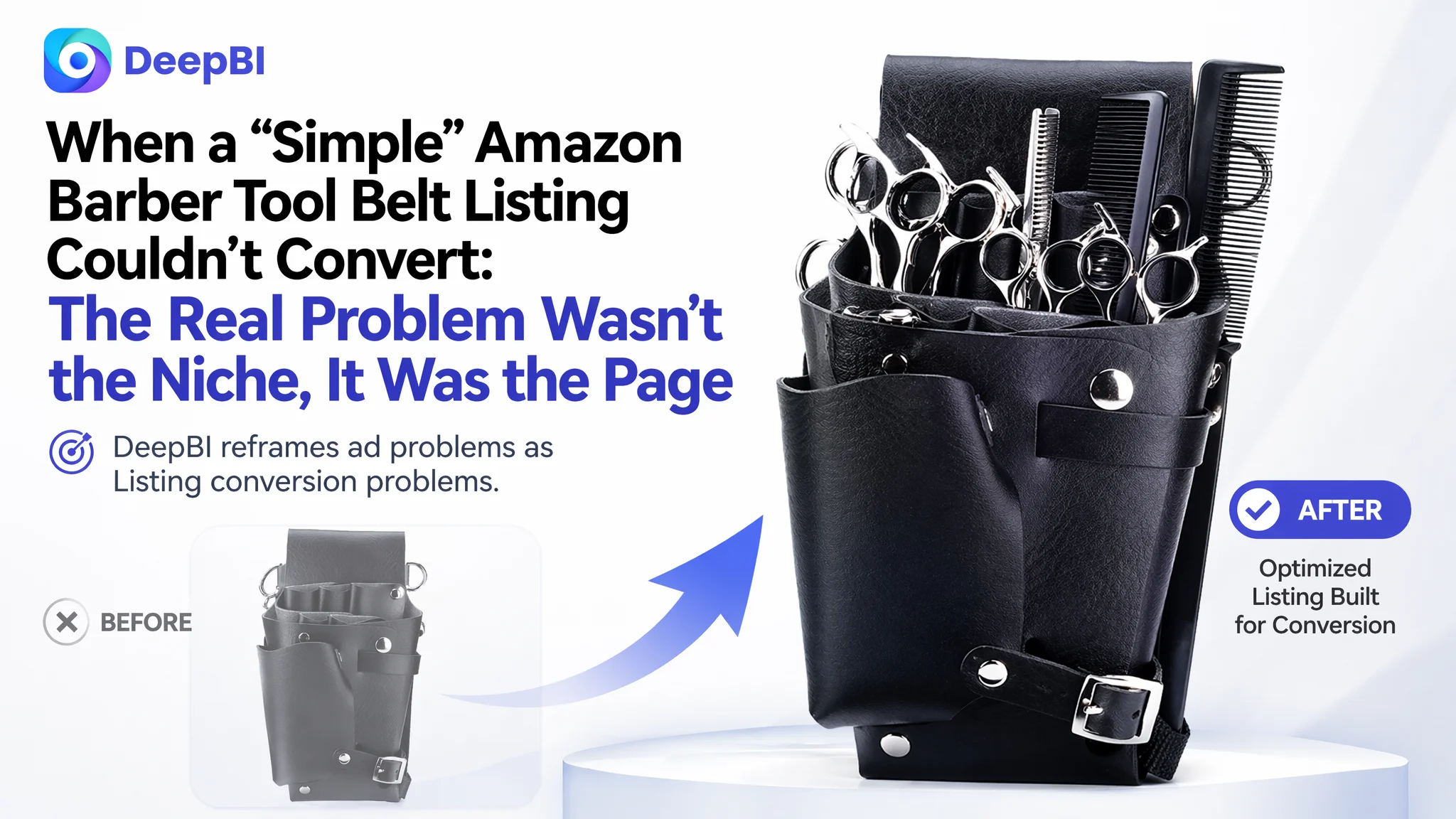
This case comes from an Amazon seller in the UK marketplace, operating in a seemingly straightforward niche: barber and hairdressing tool belts. On the surface, the product was not the issue—the problem was that the Amazon Listing could not turn traffic into orders. While ad costs were rising and category competitors were steadily accumulating reviews, this seller’s product page sat with a 37/100 Listing score and zero reviews, struggling to convert even the traffic it already had.
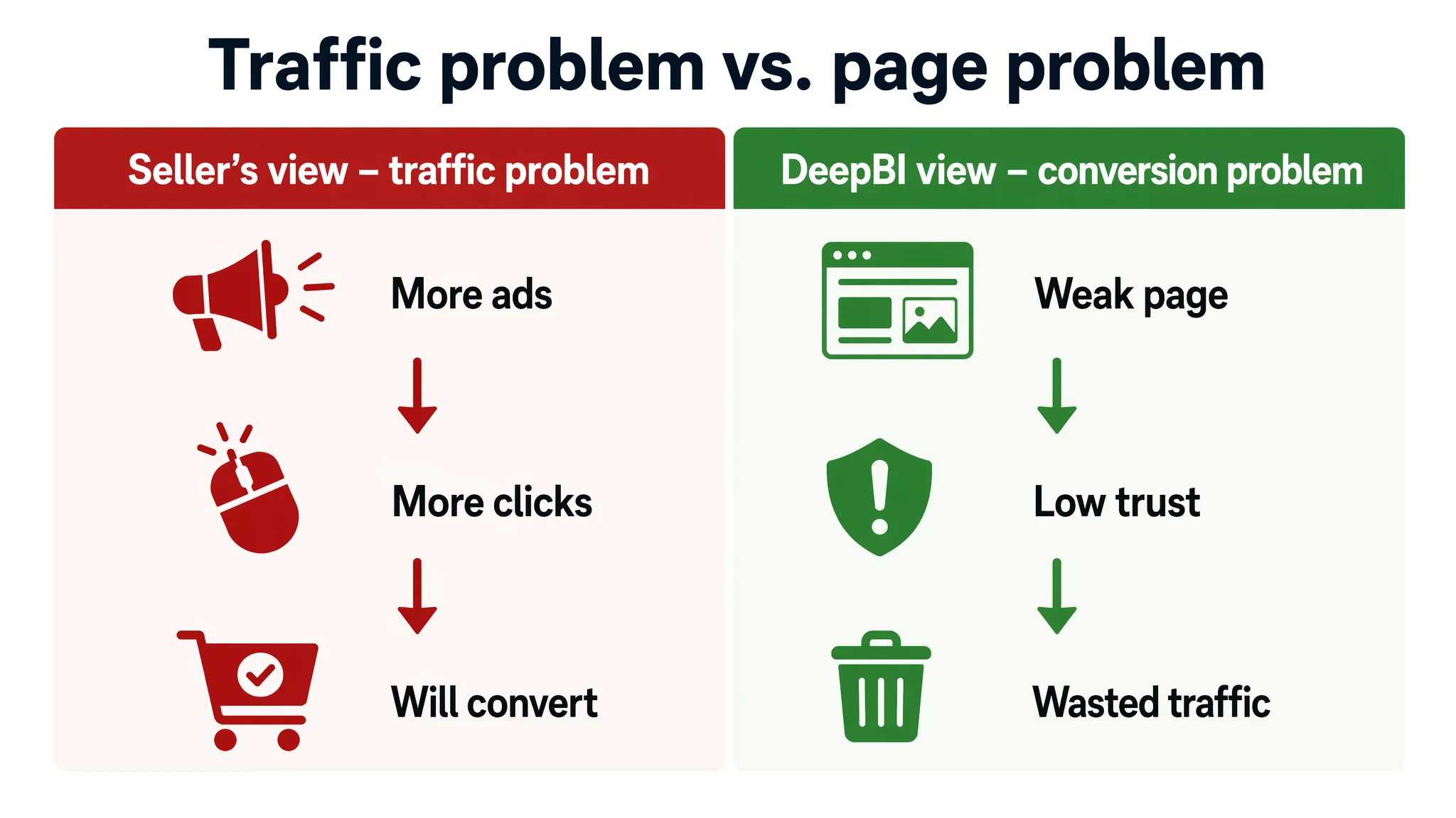
The seller originally believed the challenge was about exposure and category competition: “traffic is low, price is fine, the niche is small; we just need more ads and time.” But once we put the Listing into DeepBI’s scoring and benchmarking system, it became clear the real bottleneck was conversion capacity on the product page itself: no A+ content at all, no visual story, generic title logic, weak bullet persuasion, and no review base—while the benchmark competitor’s page was structurally complete and scored 75/100.
DeepBI reframed the problem from “ads and traffic volume” to “page trust and decision logic.” Instead of continuing to tweak bids, keywords, or budgets, we first rebuilt how the Amazon Listing communicates: a more focused title around barber/scissor belt intent, bullets that move from material and pain points to real benefits, and a full visual chain from main images to A+ that shows capacity, ease of cleaning, and professional use. The core lesson for other Amazon sellers: if your Listing has no visual proof, no A+, and no review base, ads will only amplify the page’s weakness. You must repair conversion before you try to scale traffic.
The Core Conflict: A Listing That Looked “Functional” but Scored 37/100
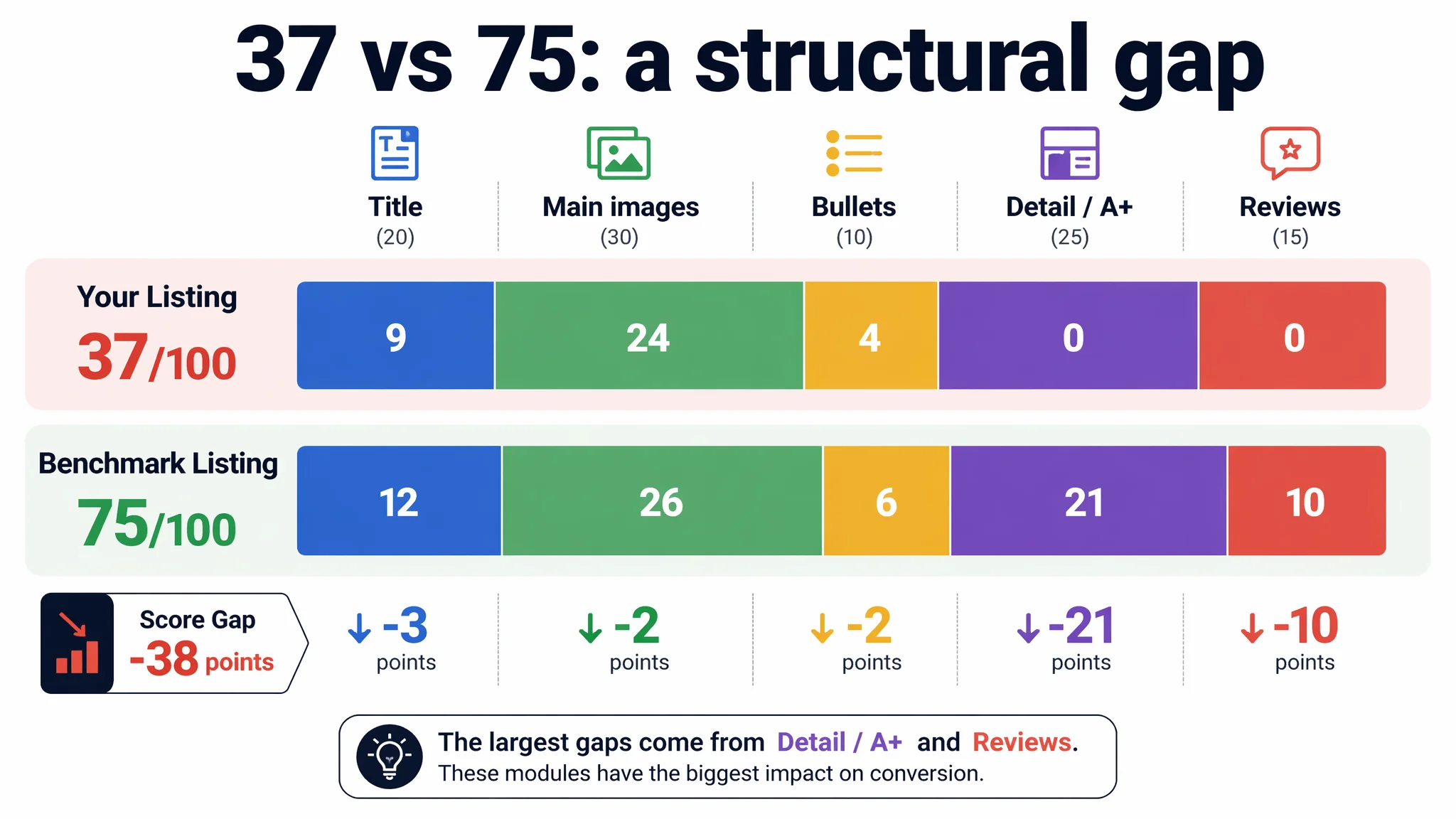
DeepBI’s Listing scoring placed the seller’s barber tool belt page at 37/100, versus a benchmark competitor at 75/100.
Breaking it down:
- Title: 9 vs 12 (out of 20)
- Main images: 24 vs 26 (out of 30)
- Bullet points: 4 vs 6 (out of 10)
- Detail/A+ content: 0 vs 21 (out of 25)
- Reviews: 0 vs 10 (out of 15)
On the seller’s side:
- Generic, functional title starting with “Hairdressing Tool Belt Pouch,” diluting search intent.
- Main images that showed the product, but didn’t clearly visualize capacity, structure, or professional context.
- Bullet points stuck at the “feature description” level rather than solving real stylist pain points.
- Zero detail images and no A+ content at all; just a bare default page.
- Zero reviews, no rating, no social proof.
On the competitor’s side, every section of the Listing was working together:
- A title framed around “Scissor Bag Belt” and “Professional Salon Barber Hairdresser,” locking in professional search intent.
- Image set including multi-angle product views, capacity visuals, and real barbers wearing the belt.
- Bullet points structured around pain points (losing scissors, cleaning hair clippings) and clear benefits.
- A full A+ module with usage scenarios, structure breakdowns, material close-ups, and trust-building details.
- Solid review base: 4.4 stars from 63 reviews, with 5-star reviews on the front page.
The gap was not subtle. It was structural. The seller’s page looked like a basic SKU upload; the competitor’s page looked like a fully built Amazon product experience.
“The real problem was not that ads failed to bring traffic. It was that the page could not convert the traffic.”
What the Seller Originally Misdiagnosed
From the seller’s perspective, the category is niche and competition is relatively small. Their internal view was:
- “We’re in a specific hairdressing accessory niche; as long as the price is okay and we get some clicks, we’ll convert.”
- “The page is complete enough. If we push more ads and wait for reviews to accumulate, the Listing will naturally grow.”
- “There isn’t much we can do without a lot of reviews; we just need patience and ad spend.”
In other words, the seller framed the bottleneck as a traffic and time problem, not a Listing conversion problem.
But DeepBI’s scoring showed a different picture:
- The competitor already had a fully built A+ visual story and a stable review base.
- The seller’s Listing had no visual or trust infrastructure to even start catching up.
- The largest score gap (–21 points) was in detail/A+ content, not in title or main images.
Continuing to optimize ads in this state would have meant:
- Paying for clicks that land on a page with no A+ coverage and zero reviews.
- Letting competitors capture the buyers who do click, because their pages are more reassuring and more informative.
- Watching ACOS drift upward while conversion remains weak, blaming “ad competition” instead of “page conversion capacity.”
Why Traditional Ad Optimization Could Not Help
If this seller had continued along their original path, the typical ad “optimization” sequence would have been:
- Expand keyword coverage, including “hairdressing tool belt,” “scissor pouch,” “barber holster,” etc.
- Test different bid levels, hoping to find a sweet spot for ACOS.
- Possibly test new ad creatives (if using SB/SBV) without fixing the underlying Listing.
This path assumes that the Listing is already trustworthy, and the only question is whether enough qualified traffic sees it.
But several hard facts make that assumption untenable:
- No A+ content at all – so buyers have no structured story about capacity, cleaning ease, or durability.
- No review base – the Listing shows no rating, while the competitor has 4.4 stars and dozens of reviews.
- Generic title logic – starting with “Hairdressing Tool Belt Pouch” instead of a more intentful phrase like “Barber Tool Belt” or “Scissor Bag Belt.”
- Bullets with weak decision logic – describing how many pockets and how light it is, but not clearly solving the stylist’s daily anxieties.
Under these conditions, more traffic does not solve the problem. It simply increases the number of buyers who will bounce back to the search results and choose the competitor instead.
“Advertising does not only amplify advantages. It can also amplify a page’s existing defects.”
DeepBI’s judgment was clear: this Listing was not yet in a state where more ad spend would produce proportional returns. The priority had to shift to building a page that actually deserves the traffic.
The Real Constraint: Listing Conversion Capacity, Not Category Competition
The single most important constraint in this case was Listing conversion capacity—the ability of the Amazon product page to:
- Create a reason to click from the search results.
- Quickly show how the belt organizes tools.
- Reduce anxiety about cleaning hair clippings.
- Build enough trust that buyers are comfortable ordering a no-review ASIN.
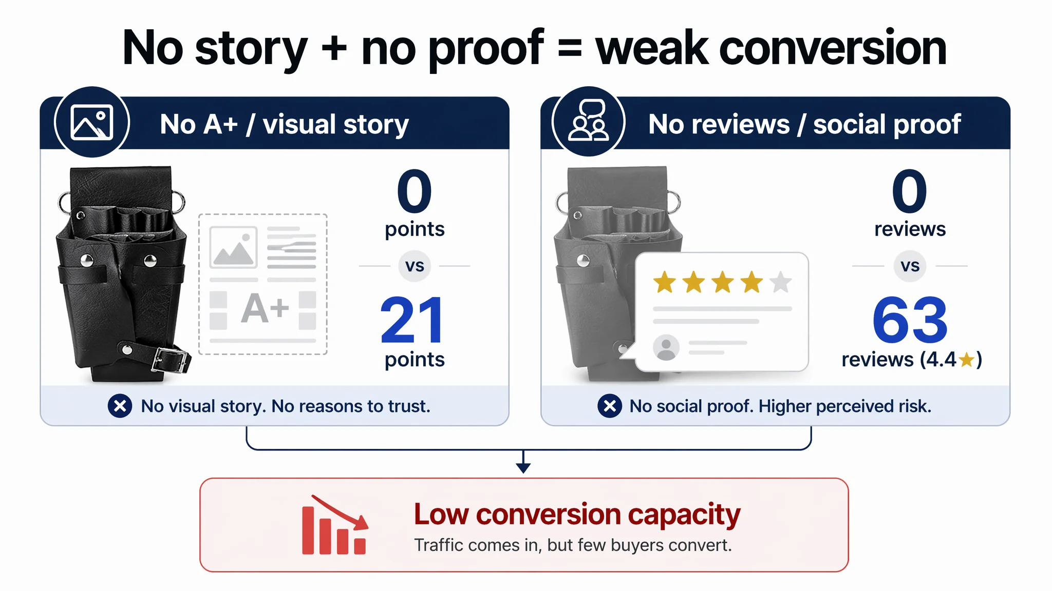
DeepBI’s scoring highlighted two decisive bottlenecks:
1. Detail/A+ Content: 0 vs 21 (out of 25)
The seller had no visual or A+ modules at all. The competitor used:
- Multiple usage-scenario images (barbers wearing and using the belt).
- Structure breakdown graphics showing scissor slots, compartments, detachable covers.
- Material close-ups, stitching, and hardware details to signal durability.
- A clear narrative from “who this is for” to “how it solves your daily pain points.”
1. Reviews: 0 vs 10 (out of 15)
The competitor sat at 4.4 stars with 63 reviews. The seller had no rating, no comments, no images, nothing to reassure a buyer that this product is safe and practical to use in a professional environment.
When the page lacks both a story and social proof, Amazon ads cannot compensate. At best, they bring in a few early adopters; at worst, they burn budget.
DeepBI’s conclusion: before any serious ad scaling, this page had to be rebuilt as a trustworthy, professional Amazon Listing.
This Product Page Did Not Lack Traffic. It Lacked Trust.
Looking deeper into each Listing element clarifies how the page was “consuming” traffic.
The Title Did Not Anchor Professional Intent
The original title:
- Led with the generic label “Hairdressing Tool Belt Pouch.”
- Spent too much space listing usage scenarios and generic functions (“Waist or Shoulder”) instead of anchoring the professional use case.
- Scattered important variations like “bag,” “pouch,” “holster” instead of concentrating them to strengthen keyword relevance.
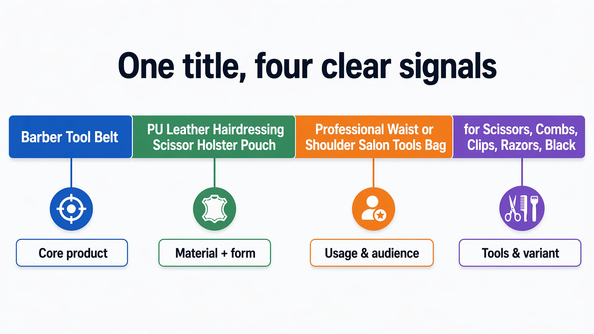
The benchmark competitor:
- Started with “Scissor Bag Belt,” directly mirroring how professional users search.
- Immediately followed with “Leather Hairdressing Pouch Holster Professional Salon Barber Hairdresser,” reinforcing the professional identity.
- Structured the title around core product + modifiers + target users, exactly how Amazon shoppers scan for relevance.
DeepBI recommended a revised title:
Barber Tool Belt, PU Leather Hairdressing Scissor Holster Pouch with Adjustable Buckle Strap, Professional Waist or Shoulder Salon Tools Bag for Scissors, Combs, Clips, Razors, Black
This change is not cosmetic:
- “Barber Tool Belt” at the front increases alignment with professional search terms.
- “PU Leather” and “Scissor Holster” clarify product nature and material in a precise way.
- “Professional Waist or Shoulder Salon Tools Bag” explicitly addresses how pros will actually wear and use it.
- Listing key tools (“Scissors, Combs, Clips, Razors”) signals capacity and use cases at the title level.
The Bullet Points Had Information, but Not a Buying Logic
The original bullet structure:
- Explained carry methods, pocket layout, materials, and weight.
- Separated specs into a standalone bullet, making them read like a spec sheet.
- Rarely connected features to specific daily frustrations of stylists.
The competitor’s bullets:
- Started from emotional pain points: anxiety about misplacing scissors, hassle of cleaning hair clippings.
- Explicitly told users “no more worrying about cleaning hair in your bag.”
- Blended dimensions and usage tips so buyers could instantly understand how the product fits their routine.
DeepBI’s bullet suggestions deliberately moved from “feature listing” to “pain point → benefit”:
- Material & professional style:
“Durable PU Leather & Professional Style... designed for daily salon wear… hygienic with just a quick damp cloth wipe.”
- Organization for pros:
“Organized Pocket Layout for Professionals… never lose track of your essential styling tools during a busy appointment again.”
- Cleaning and maintenance:
“Effortless Hair & Dust Maintenance… designed for busy stylists, it allows for quick debris removal.”
- Ergonomics and mobility:
“Lightweight & Ergonomic Dual-Carry… reduces fatigue during long shifts… ideal for mobile hairdressers.”
- Target users & specs:
“Versatile Multi-Function Organizer… ideal for barbers, hair stylists, and salon students…”
This reframe matters because bullet points are not only for text—they guide how images and A+ modules are structured. They define the narrative spine of the Listing.
Why DeepBI Did Not Keep Tuning the Ads First
From a business-risk perspective, this was the key decision: do we keep optimizing ads, or do we stop and rebuild the Listing first?
The risk of “ads first” in this state:
- Every click is more likely to bounce due to lack of A+, lack of reviews, and weak visual story.
- ACOS becomes unstable and unpredictable; performance depends solely on the smallest subset of low-cost, high-intent keywords.
- Competitors with full A+ and review bases will absorb the buyers who care about long-term durability and daily usability.
DeepBI’s decision logic:
1. Listing score gap is structural, not marginal.
A 37 vs 75 total score is not about fine-tuning; it is about missing modules and missing trust.
1. The largest deficit (–21 points) is in detail/A+ content.
This is exactly where professional buyers decide whether the product will actually work in their daily workflow.
1. Reviews cannot be forced, but trust can be compensated.
Without reviews, the only way to convince buyers is to build an extremely clear, professional visual narrative that minimizes perceived risk.
1. Ad traffic without a conversion foundation is a cash burn.
Until the page can convert convincingly, extra ads only increase the cost of learning.
Therefore, DeepBI prioritized rebuilding the Listing’s content and visuals before any serious ad scaling.
Rebuilding the Main Image Set: From “White Background Product” to “Professional Organizer”
DeepBI’s visual diagnosis did not stop at “images look simple.” It compared each main image to the benchmark and translated the gap into concrete design directives.
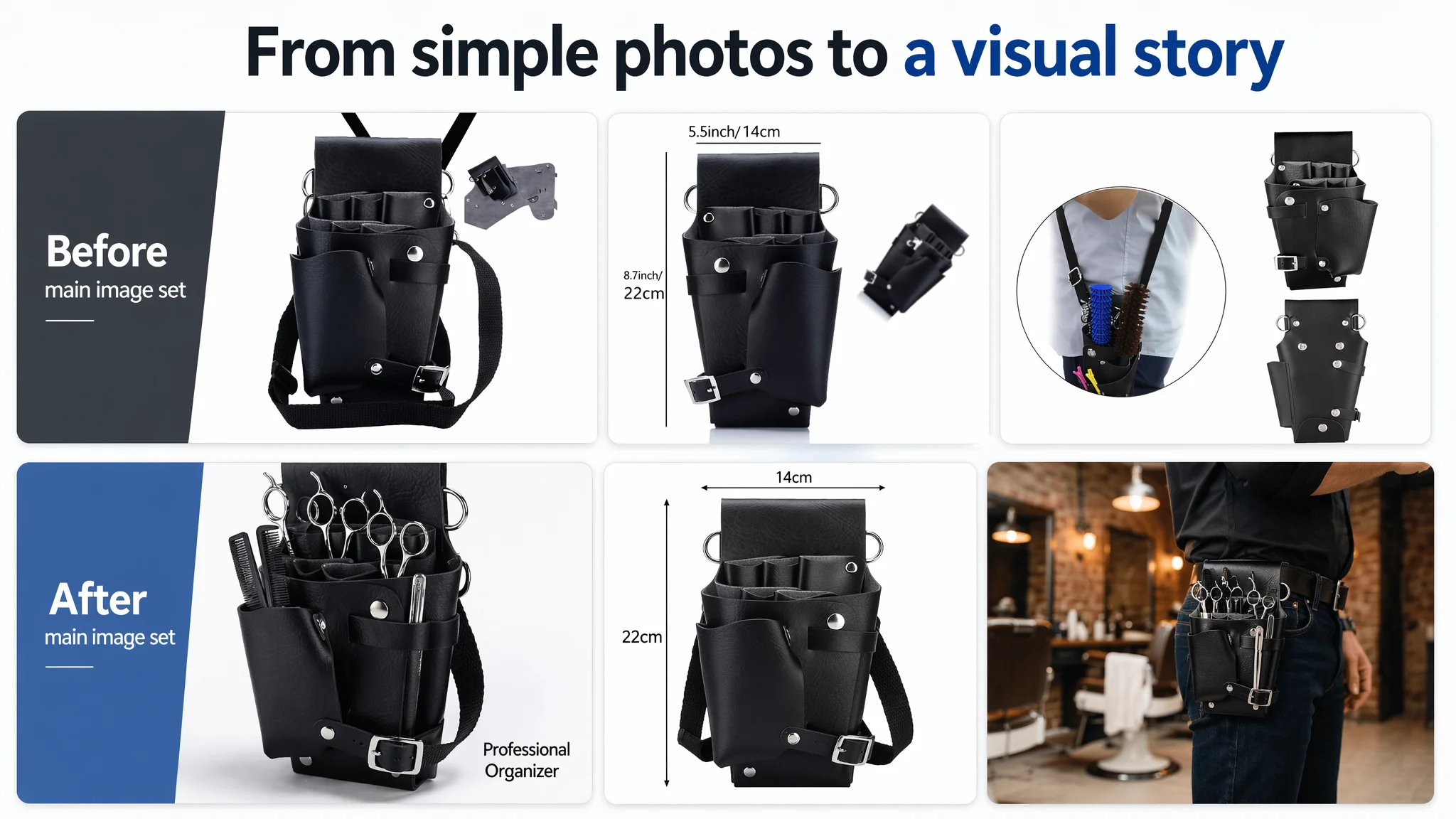
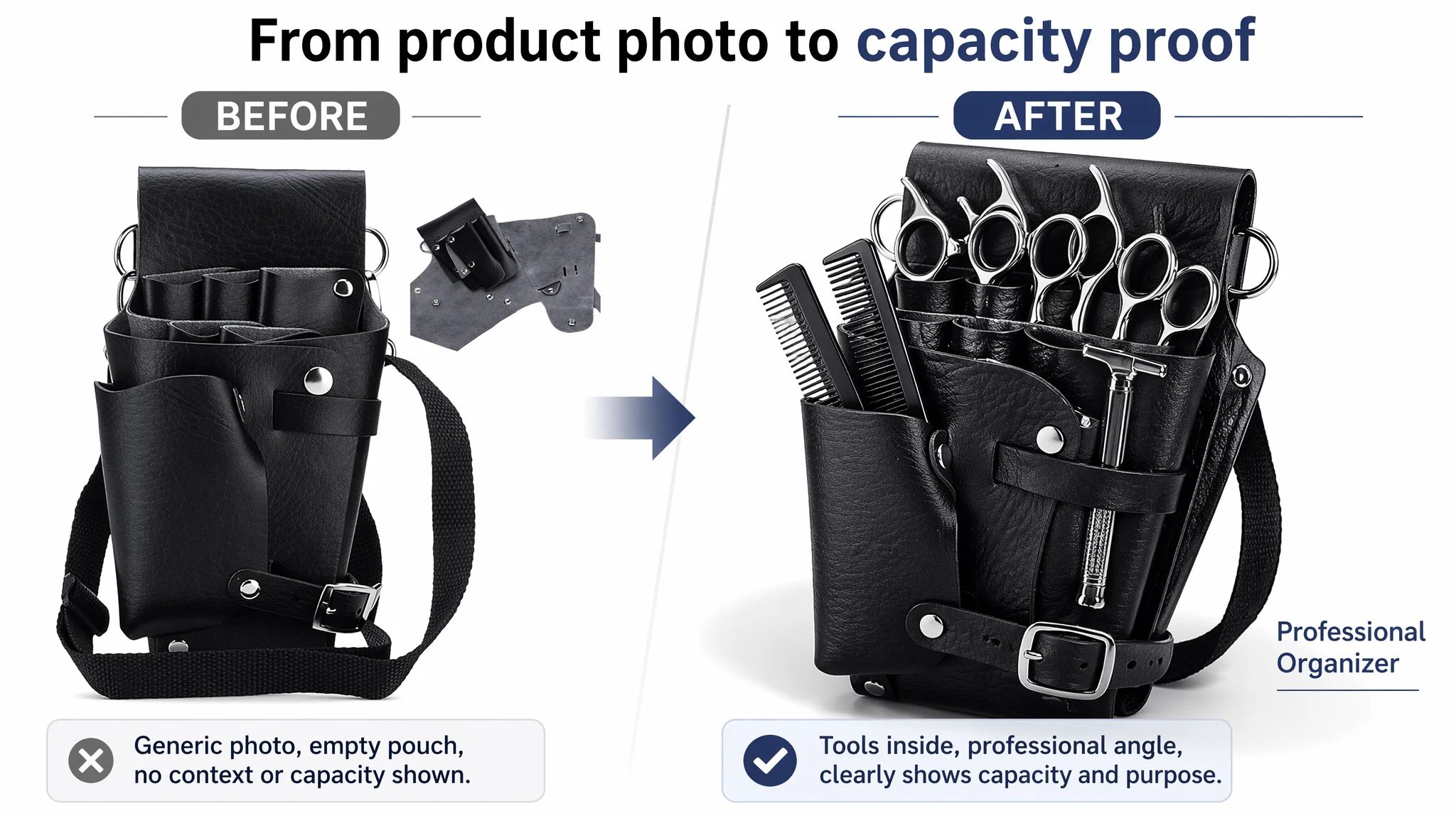
1. Show Capacity and Professional Context in the Primary Image
Current: basic white background, product alone, limited sense of capacity.
Recommended:
- Product centered at ~75% of the frame.
- Slight 30° side angle to show depth.
- Insert 4 stainless-steel scissors and 2 black combs inside the belt.
- Add a small “Professional Organizer” label in the corner.
Business logic: professional buyers are buying organization, not just a belt. They need to see, at a glance, that the belt can hold their everyday kit.
2. Visualize the Pocket Layout Clearly
Current: darker detail shots, hard to see layer separation.
Recommended:
- Macro-style composition at ~85% of the frame.
- High-contrast lighting to show layered openings.
- Clean background, no clutter.
Business logic: stylists mentally simulate where each tool will go. If the image doesn’t reveal structure, they assume the capacity is generic or limited.
3. Reduce “Imagination Cost” with Dimension Visualization
Current: dimension lines and extra small images scattered and unstructured.
Recommended:
- Front-facing product view with standardized dimension lines.
- Simple “14 cm” and “22 cm” labels in clean sans-serif font.
- Pure white background.
Business logic: less imagination = fewer returns. If they misjudge size, they will blame the seller, not themselves.
4. Replace Generic Model Cut-Outs with Real Salon Context
Current: circular model cut-outs that feel generic and low credibility.
Recommended:
- Full-body or half-body model wearing the belt in a real barbershop scene.
- Warm, slightly vintage barbershop background, subtly blurred.
- Tools visibly inserted into the belt.
Business logic: professional buyers care about identity. Seeing a real barber in a real environment makes the belt feel like legitimate work gear, not a cheap general-purpose pouch.
5. Show the Detachable Structure Clearly
Current: structural images with cluttered composition.
Recommended:
- Flat lay shot of the detachable components occupying ~80% of the frame.
- Top-down view, neutral lighting, symmetric layout.
Business logic: detachable inserts and covers are a functional differentiator. If buyers can’t see how it disassembles, they won’t trust cleaning and maintenance claims.
Building the A+ Story: From Zero Images to a Complete Decision Path
At the detail page level, the difference between seller and competitor was absolute: no A+ modules vs a fully built A+ experience. DeepBI’s recommendations built a six-part visual chain.
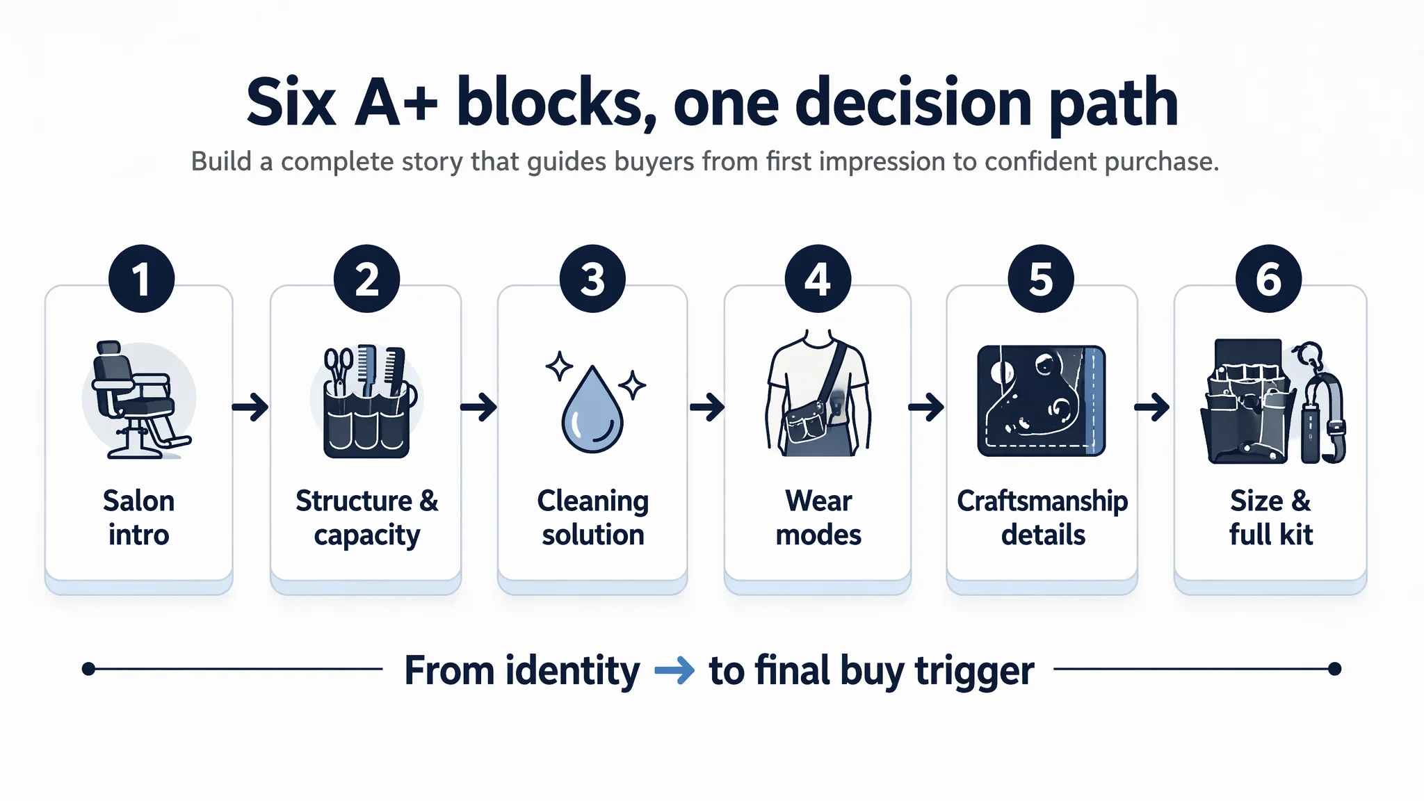
1. Real-World Salon Introduction
- A barber wearing the belt in an authentic salon, mid-haircut.
- Industrial/retro barbershop environment, warm spotlight-style lighting.
- Belt visible at the waist with tools organized.
Purpose: identity and context. It shows the belt as part of a professional toolkit, not a generic pouch.
2. Structure Breakdown and Capacity
- Belt opened and split into outer shell + inner insert.
- Visible distinct scissor slots and a wide comb/tool area.
- Clean white background, high contrast.
Purpose: organization clarity. When buyers can see exactly where each tool goes, they mentally test whether the belt fits their workflow.
3. Cleaning and Hair-Clipping Management
- Focus on the bottom area where hair clippings would accumulate.
- Demonstrating how the bottom structure or detachable parts facilitate cleaning.
- Clear emphasis on preventing hair buildup.
Purpose: pain-point resolution. Hair buildup is a daily frustration. Showing how this belt addresses that pain builds immediate preference.
4. Wear-Mode Adaptability (Waist and Shoulder)
- Split image showing shoulder-carry on one side, waist-carry on the other.
- Neutral background, clear focus on strap adjustability and hardware.
Purpose: fit and comfort. Stylists have different body types and work habits; showing both modes reduces hesitation.
5. Craftsmanship and Durability Close-Ups
- Macro shots of metal rivets and stitching lines.
- Dark, matte background to emphasize quality.
Purpose: trust in durability. Close-ups allow buyers to judge whether the belt feels “cheap” or “solid” just by looking.
6. Size, Tools, and Final Buy Trigger
- Straight-on size reference shot with standard scissors and comb placed nearby.
- Simple dimension annotations.
- Final flat-lay of all components (belt, strap, cover) on a dark surface, ready to use.
Purpose: capacity and perceived value. It answers “how big is it really?” and “what am I getting?” in a single storyline, making the final add-to-cart decision easier.
How the Page’s Sales Logic Started to Recover
Once the title, bullets, main images, and A+ content were planned along this logic, the Listing’s role in the funnel changed.
Before:
- The page expected ads and price to compensate for a lack of story and trust.
- Professional buyers had to imagine capacity, cleaning, and durability on their own.
- Zero reviews magnified every uncertainty.
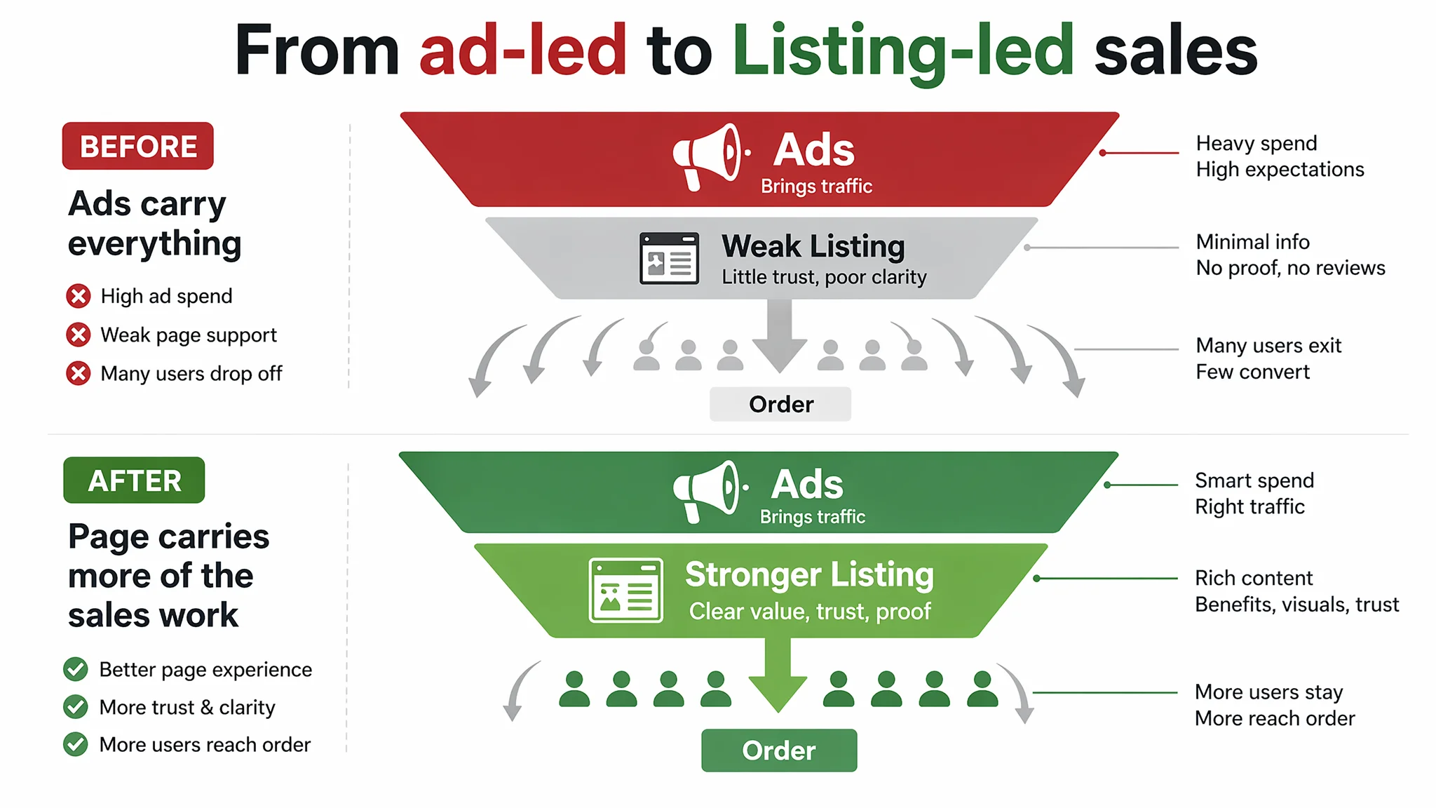
After restructuring:
- The page itself started to carry more of the sales work, using visuals and bullets to answer the most important questions.
- Even without reviews, the page could partially offset risk with clear visuals of materials, structure, and usage scenarios.
- The Listing’s score gap against the competitor shrank on the exact dimensions that matter most for CVR: detail/A+ presentation, bullet logic, and main image information density.
At that point, ad traffic became useful again:
- Each click had a higher chance of progressing deeper into the page.
- Buyers had fewer reasons to return to search results and choose the competitor.
- Organic visitors from search and related-product placements received the same enhanced experience as ad visitors, helping to slowly rebuild organic conversion.
What Other Amazon Sellers Can Learn from This Case
Several patterns in this case are extremely common among Amazon sellers:
1. High ACOS is often a Listing problem, not an ad problem.
If your A+ is empty, your images are generic, and your review base is weak, ads are just feeding a leaky funnel.
1. A no-review ASIN needs an even stronger visual story.
You can’t control how quickly reviews accumulate, but you can control how clearly the page demonstrates capacity, ease of use, and durability.
1. Title, main images, bullets, and A+ must form one coherent decision logic.
The buyer’s journey is not “title → price → buy.” It’s “Is this for me? Can it handle my tools? Will it be easy to clean? Will it last?” Each section of the Listing must answer one of these questions.
1. Benchmarking exposes structural gaps, not just cosmetic ones.
Without comparing against a high-performing competitor Listing, it’s easy to think “our page is decent.” DeepBI’s scoring surfaced that the real gap was not in a single image or keyword, but in modules the seller hadn’t built at all.
1. Before scaling ads, ask: does this page deserve more traffic?
If your Listing looked like this barber belt before optimization—no A+, minimal visual story, no reviews—then your first investment should be in conversion capacity, not more impressions.
Closing Perspective: Listing Quality Is the Foundation of Ad Efficiency
For this Amazon seller, DeepBI’s value did not lie in a new ad tactic or a clever bid rule. It lay in reframing the problem:
- From “our niche is small and ads are expensive”
- To “our Listing’s conversion capacity is fundamentally weaker than the benchmark”
Once that became clear, the path forward was obvious: fix the Listing first, then grow traffic. Only after the product page could convincingly present itself as a professional barber tool belt—visually and structurally—did ad optimization become a rational next step.
For any Amazon seller reading this, the question is simple: Are your ads struggling because of competition, or because your Listing cannot yet convert the traffic you are already paying for?