

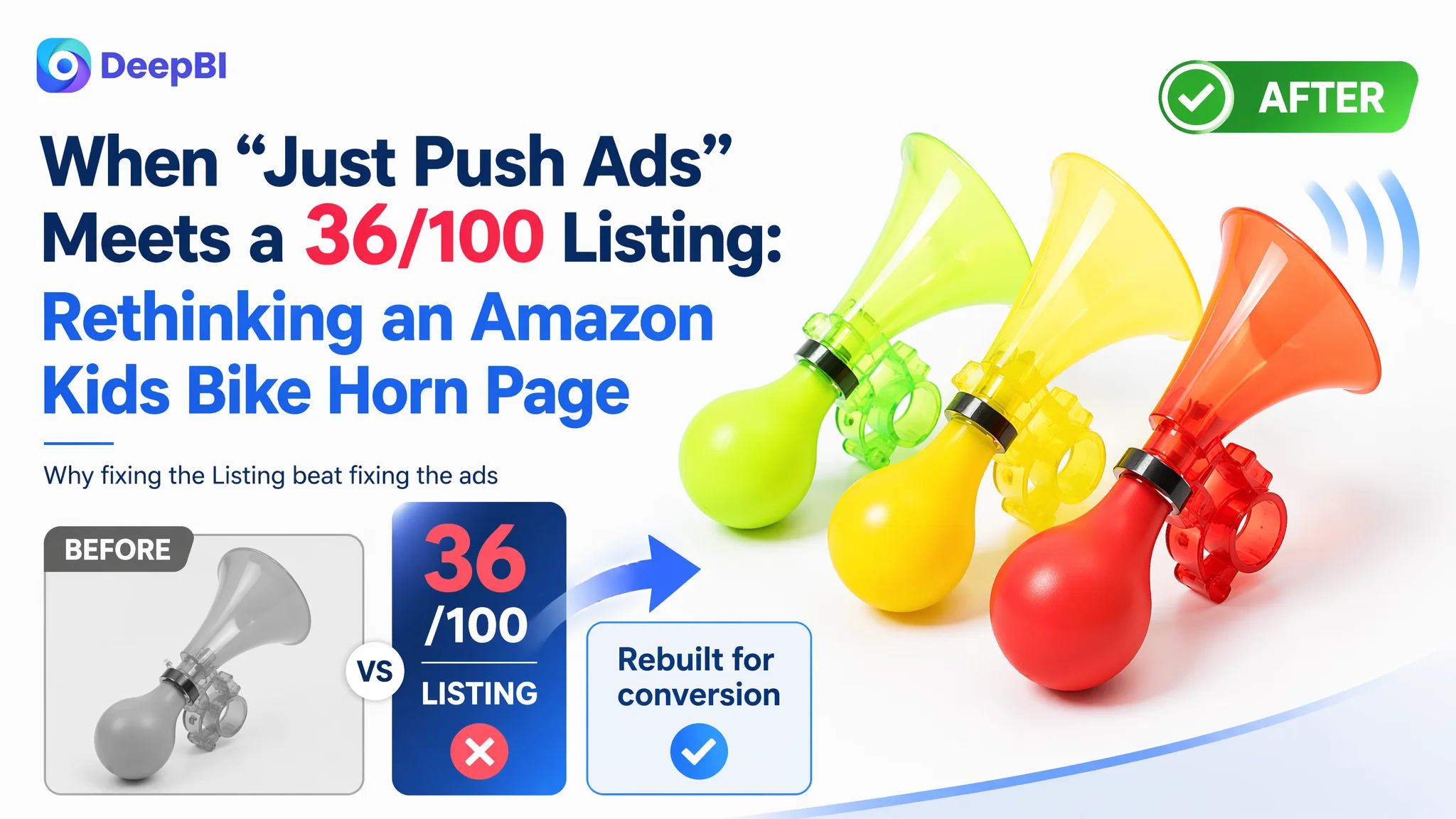
This case comes from an Amazon seller in the kids bike accessories category. The team was under pressure from rising Amazon ad costs and weak order growth, and their instinct was to “optimize ads harder” for a kids bike horn bundle on the US marketplace. Bids were adjusted, keywords expanded, and budgets increased—but ACOS wouldn’t ease, and conversions stayed fragile.
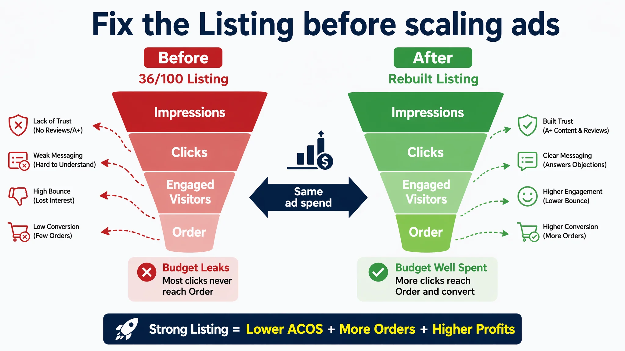
Once DeepBI stepped in to audit the Amazon Listing itself, the picture changed completely. Against a benchmark kids bike accessory listing, this page scored only 36/100, with 0 points in A+ content and 0 in reviews. Ads were not the core problem; the product page simply could not convert. Main images lacked a trust path, there was no A+, and the listing had zero social proof competing against a 4.6‑star competitor with nearly 600 reviews.
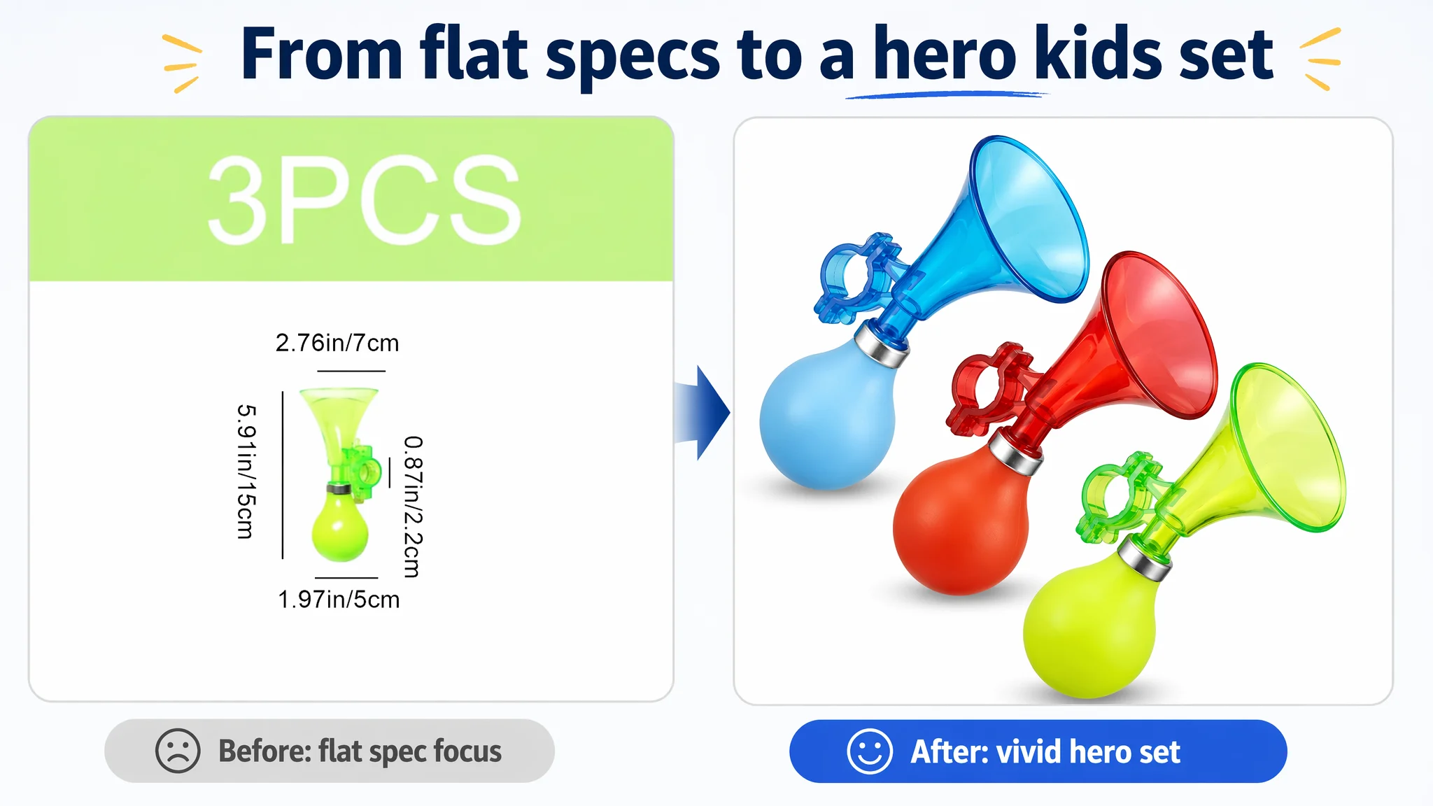
The following story is not about how to tweak campaigns. It’s about how an Amazon seller realized their ads were amplifying a low‑conversion page, why DeepBI insisted on rebuilding the Amazon Listing first, and how a new focus on main-image logic, bullet-point structure, A+ storytelling, and trust building turned ad traffic from “expensive waste” into “usable fuel.” Many Amazon sellers in similar categories will recognize the same trap.
Amazon Ads Were Not Failing. The Page Was Consuming the Traffic.
At the time of diagnosis, the seller’s situation looked familiar:
- A kids bike horn / small kids cycling accessory bundle on Amazon US
- Ongoing Sponsored Products traffic, but orders lagging behind impressions
- ACOS difficult to control; adding new keywords and adjusting bids had limited impact
From an operations perspective, the first assumption was straightforward: “Our ads are not efficient enough. We just need better keywords and a better bidding structure.”
But once DeepBI ran a Listing-level competitive scoring, the real bottleneck became obvious:
- Target Listing total score: 36/100
- Benchmark Listing total score: 75/100
- Gap: –39 points
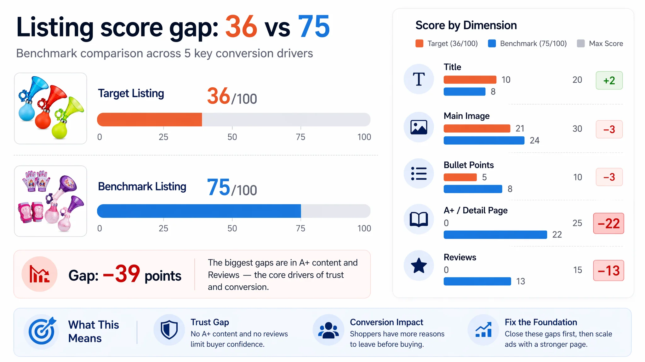
Breaking down the scores:
- Title: Target Listing: 10, Benchmark Listing: 8, Max Score: 20, Gap: +2
- Main Image: Target Listing: 21, Benchmark Listing: 24, Max Score: 30, Gap: –3
- Bullet Points: Target Listing: 5, Benchmark Listing: 8, Max Score: 10, Gap: –3
- A+ / Detail Page: Target Listing: 0, Benchmark Listing: 22, Max Score: 25, Gap: –22
- Reviews: Target Listing: 0, Benchmark Listing: 13, Max Score: 15, Gap: –13
The title and basic main image were not the main story. The real hole was brutal: no A+ content, no reviews, and a weak persuasion chain for a kids product where parents are highly sensitive to safety and trust.
“The core problem was not that ads failed to bring traffic. It was that the product page could not convert the traffic it already had.”
The Seller’s Original Misdiagnosis: “This Is an Advertising Problem”
Before the Listing audit, the seller’s internal reasoning looked like this:
- Symptom: ACOS high, orders not keeping pace with impressions
- Assumption: Campaign structure and keyword selection are the constraint
- Planned actions:
- Expand keyword coverage on “kids bike horn / air horn / scooter bell”
- Increase bids on high-CTR terms
- Try broader match types to reach more parents and gift buyers
This thinking is understandable. When ACOS climbs, most teams instinctively look at:
- Bid strategy
- Negative keywords
- Daily budgets
- Campaign segmentation
But several signals suggested something else:
- The benchmark competitor was already converting well in the same category and similar price band.
- The seller’s title actually covered more relevant keywords than the competitor.
- There was no sign that “insufficient traffic” was the main blockage—the issue was what happened after the click.
From DeepBI’s view, continuing to pour traffic into this Listing without addressing conversion capacity would only deteriorate ACOS further and erode margin.
This Product Page Did Not Lack Traffic. It Lacked Trust.
DeepBI’s Listing scoring made one judgment very clear:
At this stage, the main business constraint was Listing conversion capacity, not ad reach.
Several structural issues on the Amazon product page were directly suppressing conversion:
1. No A+ at All in a Category Where the Benchmark Tells a Full Story
- The target Listing had no A+ content—no brand banner, no scenario images, no detail blocks.
- The benchmark Listing used a full A+ suite:
- Brand hero banner with licensed kids IP
- Product set overviews
- Real usage scenes with kids
- Feature close-ups
- Emotional parent–child interaction shots
Impact on behavior:
- The benchmark creates an immediate “this belongs to my kid’s world” feeling, plus implicit quality and safety cues.
- The target page, by contrast, leaves parents with only a bare upper section and some bullets. The scroll depth becomes dangerous: there is no visual reason to continue reading, and bounce risk rises.
In DeepBI’s language, there was no “conversion runway” below the fold. Ads could land users on the page, but there was nowhere for that intent to go.
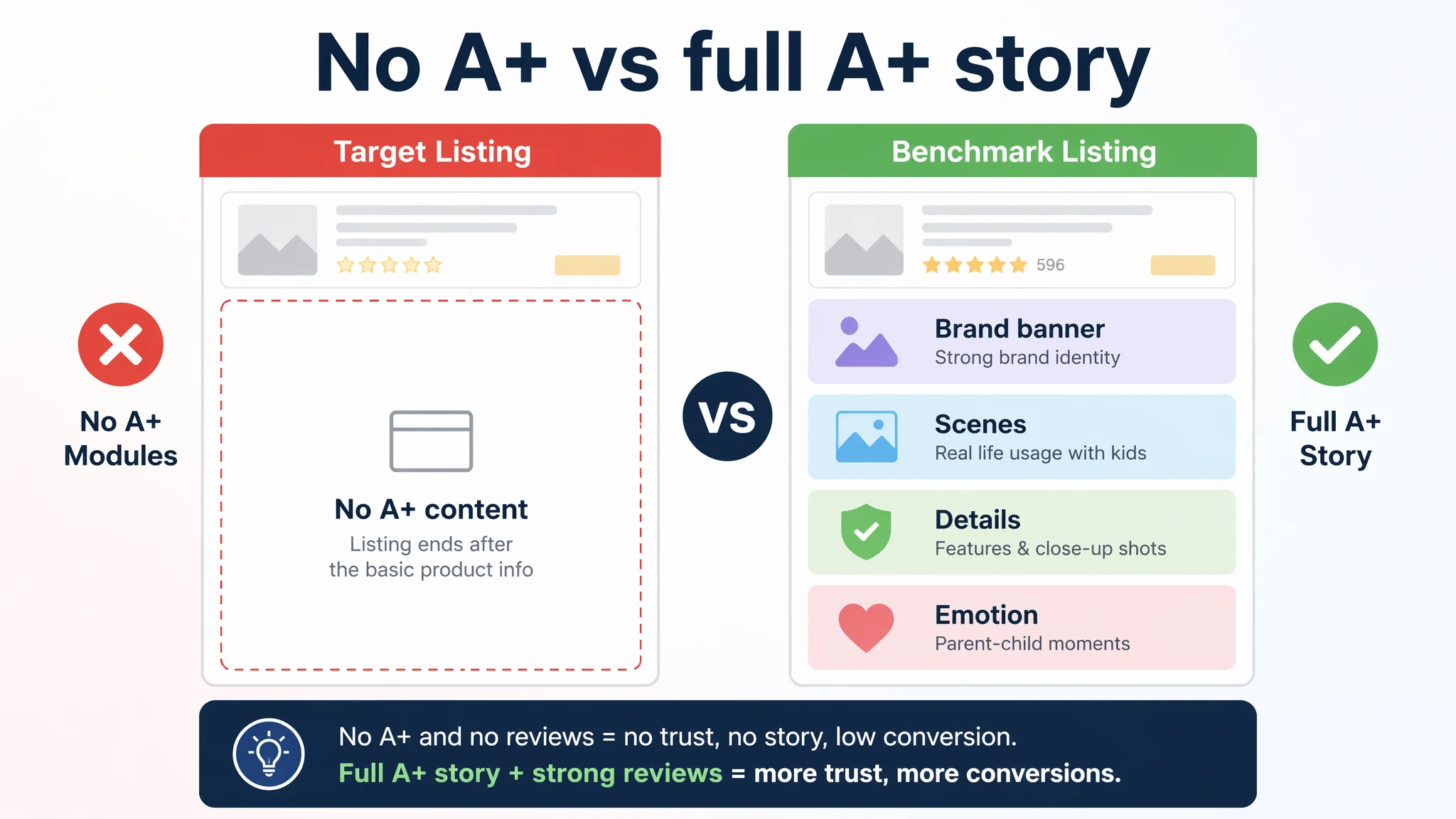
2. Zero Reviews Versus 4.6 Stars and 596 Reviews
The review dimension was even more decisive:
- Target Listing:
- 0 reviews
- 0 average rating
- Benchmark Listing:
- 4.6 stars
- 596 total reviews
- Rich photo / video content on the first page of reviews
In a kids category, this difference is not cosmetic—it is existential:
- Parents are buying for safety and peace of mind, not just for fun.
- With zero reviews, every visitor is essentially a “brave early adopter”.
- With hundreds of positive reviews, the benchmark offers strong social proof and perceived scale, which sharply reduces perceived risk.
With this backdrop, simply increasing ad volume was effectively buying more people to tell you, “I don’t trust this page enough yet.”
Title and Main Image: Not Bad, but Not Building Enough Desire
Title: Strong on Keywords, Weak on Focus
One of the counterintuitive findings: the target title was not the weakest piece.
- It covered multiple relevant terms: “Kids Bike Horn”, “Air Horn”, “Clown Bicycle Horn”, “Plastic Scooter Bike Bell”, “Cart”, “3 Piece”, etc.
- From a pure Amazon A9 perspective, keyword coverage was even heavier than the benchmark.
But there were trade-offs:
- The title adopted a “full list” ecommerce style.
- While search-friendly, it sacrificed some brand focus and emotional clarity.
The benchmark title was shorter and brand-led, which worked well with its IP and strong downstream visuals. For a non‑IP seller, DeepBI judged that:
- The primary risk was not title keywording.
- The bigger risk was sending traffic into a page that had nothing convincing to show afterward.
Main Image: Functional, but Not Selling a Kids Wish
On main-image scoring:
- Target: 21/30
- Benchmark: 24/30
The target main image:
- Showed three horns in a simple parallel arrangement.
- Did its basic job of showing variants but lacked visual depth and energy.
The benchmark:
- Used the kids IP, dream-like background, and packaging shots:
- Strong emotional trigger for both kids and parents
- Higher perceived value and giftability
DeepBI’s judgment here:
- The target main image was not completely broken, but it failed to create a reason to click or to imagine a child actually using and loving the product.
- In search thumbnails, especially on mobile, this lack of a “kids wish” angle weakened CTR and made any click you did buy more expensive in relative terms.
Bullet Points Had Information, but Not a Buying Logic
Bullet points are where a lot of Amazon sellers believe they have “enough text,” but conversion still doesn’t move.
In this case:
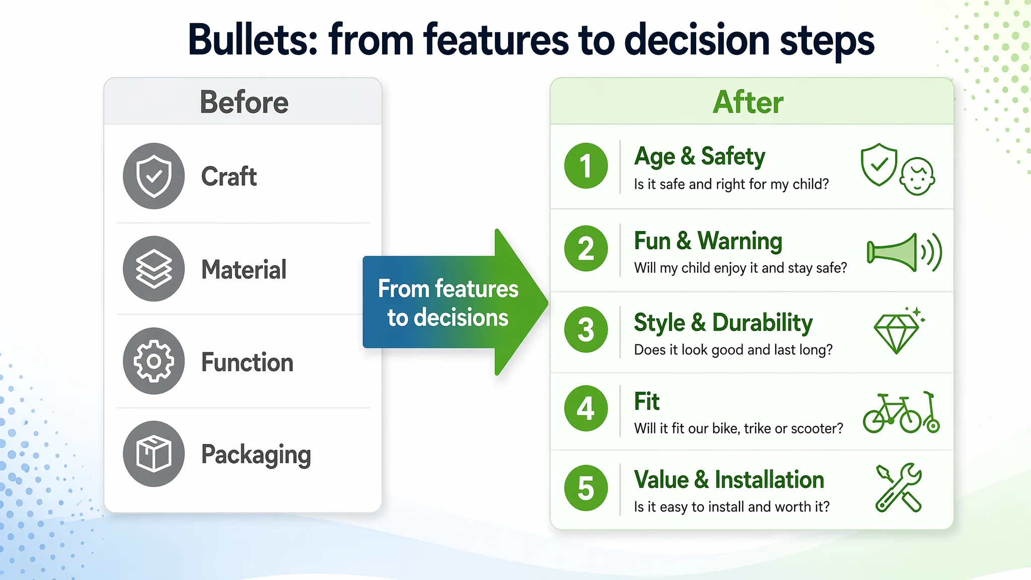
- The target bullets focused on craft, safety, material, ease of use, and packaging.
- The competitor bullets focused on:
- Target age (“Recommended for ages 3+”)
- Fun and loud (“announces rider’s presence in style”)
- Style and flair
- Compatibility (“Fits most bikes, trikes and scooters”)
- Ease of installation and hardware included
DeepBI’s assessment:
- The seller’s bullets were feature-heavy and material-focused, but they didn’t walk the buyer through a clear decision path:
- “Is this safe for my child’s age?”
- “Will my kid actually like it and use it?”
- “Will it fit our bike, scooter, or trike?”
- “Is installation going to be a hassle?”
- The competitor’s bullets answered exactly those questions in simple, emotionally resonant phrases.
This is why DeepBI’s bullet-point rewrites started with decision triggers, not just extra adjectives. For example:
- Age and safety up front
- [Safe for Kids & Ages 3+] Recommended for children aged 3 and up... smooth, polished surface with no sharp edges... safe and worry-free experience for young riders' hands.
- Fun + safety in one move
- [Fun & Clear Warning Sound] Announce your presence in style!... clear, loud sound that alerts passers-by... helping to maintain a safe distance.
- Style plus durability
- [Durable Material & Stylish Design] … weather-resistant plastic and rubber… adds flair to any bike, making it an attractive and practical accessory that kids will love.
- Broad compatibility and practicality
- [Universal Fit for Most Cycles] … fits most standard bicycles, tricycles, and scooters… compact and portable… ideal tool for every little cycling enthusiast.
- Value clarity
- [3-Pack with Easy Installation] Value set includes 3 kids' bicycle horns… hardware included for quick, hassle-free setup.
The goal was to convert “we have features” into “we solve your exact decision worries in the order you feel them.”
Why DeepBI Refused to Keep “Fixing Ads” First
From a pure advertising standpoint, the easiest path would have been:
- Continue testing new bids and match types
- Try new ad creatives
- Push more impressions for “kids bike horn” and related keywords
DeepBI’s view was different:
“Advertising does not only amplify advantages. It can also amplify a page’s existing defects.”
Given the Listing scored 36/100 against a 75/100 benchmark, with 0 in A+ and 0 in reviews, DeepBI judged:
1. Every extra dollar of ad spend was more likely to underperform until the page could hold trust.
2. Even if a temporary sales spike were forced through aggressive ads, the lack of trust infrastructure (A+, reviews, visual story) could lead to:
- Lower review velocity
- Higher return risk if expectations weren’t clearly set
- Weak organic ranking resilience once ad pressure is reduced
Therefore, the decision order had to be reversed:
1. Repair the Amazon Listing’s conversion capacity first:
- Main-image logic and secondary image set
- Bullet points as a decision funnel
- A+ content to build a complete trust path
1. Then re‑evaluate ads once conversion and trust signals started to move.
How DeepBI Reframed the Visual Logic of the Listing
The visual strategy that emerged was not “make it prettier.” It was:
- Show the product’s role in a kid’s real world
- Answer parents’ safety and fit questions visually
- Make the product feel like a gift, not just a piece of plastic
Main Image Set: From Flat Display to Interactive Kids Scenario
DeepBI’s image-level diagnosis found several main issues:
- The current triple horn lineup was too flat and stiff, lacking depth and emotional pull.
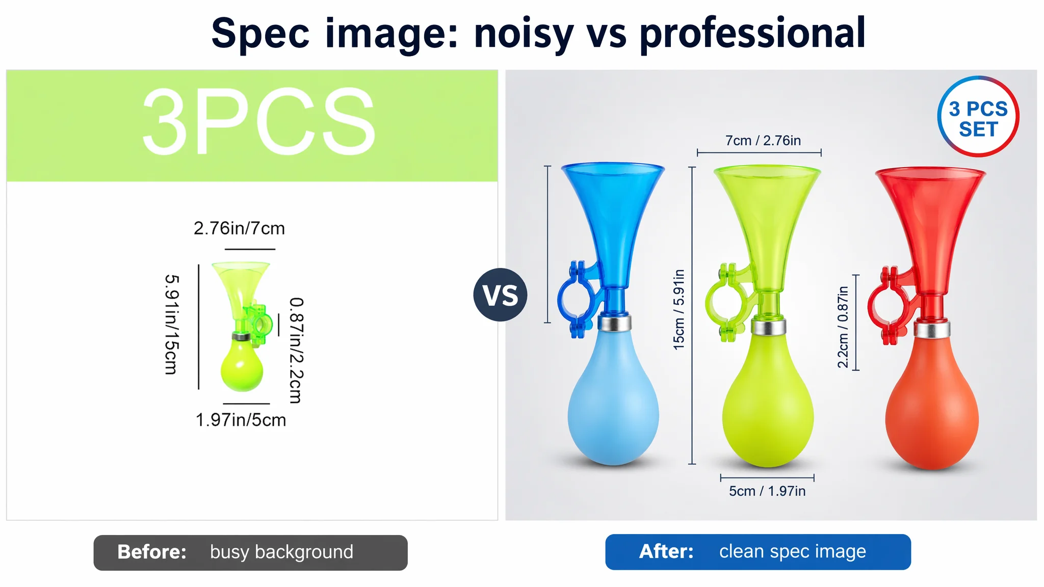
- Parameter images had overly noisy backgrounds, making the information feel less professional.
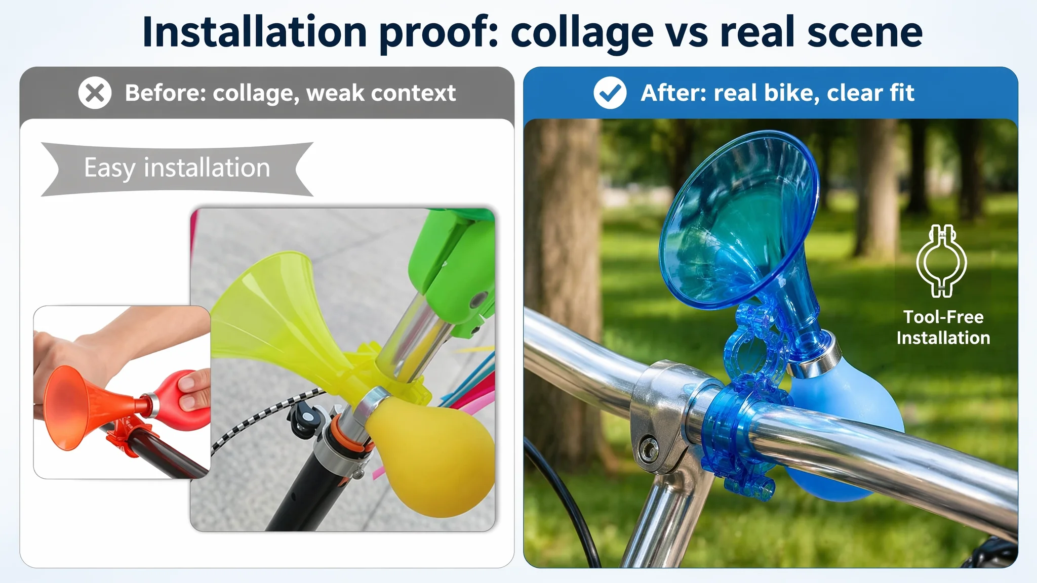
- Installation and function images were cluttered, and the action of using the horn was not clearly highlighted.
- There were no authentic outdoor scenes, so parents couldn’t immediately picture their child actually using the product.
The optimization directions were therefore precise:
1. Hero product shot with depth and clarity
- Red, blue, and green horns arranged in a staggered, stepped layout
- 45° angle to create depth
- Occupying ~80% of the frame on a clean white background
- Strong edge lighting and subtle shadows to make colors pop
1. Professional dimension / spec image
- Single horn centered, ~60% of frame
- Neutral gradient background
- Precise lines indicating height, width, and ball diameter
- Clean sans-serif annotations and a “3 PCS SET” icon to highlight kit value
1. Interaction and sound visualization
- A child’s hand actively squeezing the horn
- Outdoors, slightly blurred residential background
- Subtle “sound wave” arcs visualizing loudness and alert function
1. Real-world mounting context
- Horn installed on a real bike handlebar
- Bright park background with depth-of-field blur
- Minimal overlay text such as “Tool-Free Installation”
This wasn’t aesthetic for its own sake; it was about:
- Proving the product is real, easy to use, and kid-appropriate
- Translating “loud horn for safety” into an instantly graspable visual signal
A+ Content: Building the Missing Story Parents Needed
The gap in A+ (22 points behind the benchmark) was the most severe. DeepBI’s judgment was clear: Without A+, this Listing had no structured way to convert interested parents.
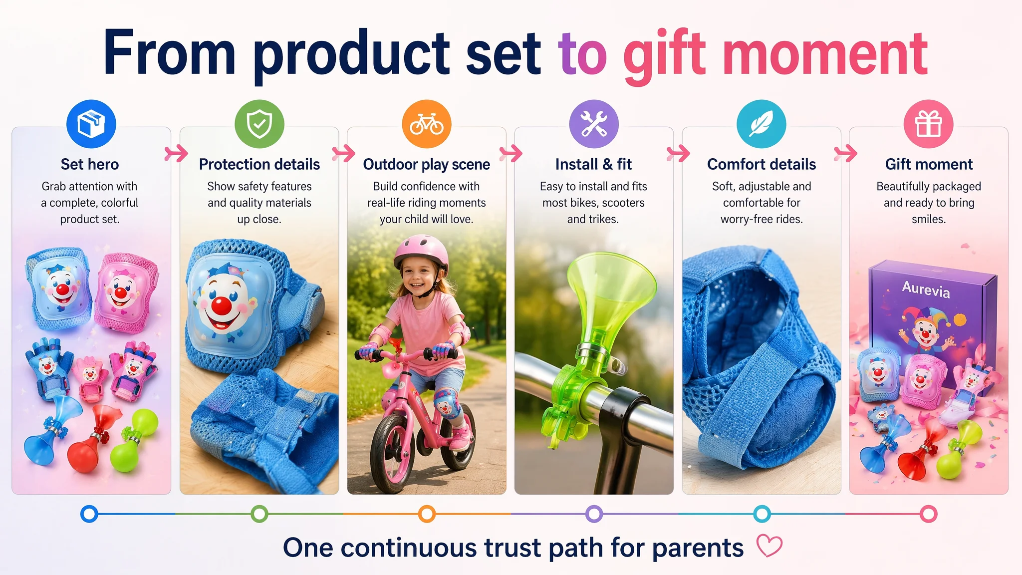
The A+ reframe followed a deliberate chain:
1. Opening module: Set-level hero, “one-stop kids riding kit”
- Show the full set (horns, protective gear, bell) in a clean, dream-like layout.
- Make immediately obvious:
- This is a complete kids riding set, not a random loose accessory.
- It aligns with a kids-friendly color and theme direction.
Business effect:
- Communicates value and “one order covers multiple needs.”
- Positions the product as a giftable set, not just a cheap single item.
1. Core protection and quality module
- Close-ups of gloves and knee pads (for SKUs that include them), with lighting emphasizing thickness and padding.
- Overlays like “Thickened Protection Layer” and “Durable Shell” to answer safety concerns.
Business effect:
- Addresses the parent’s first question: “Will this really protect my kid?”
1. Real-use outdoor riding scene
- A child (~5 years old) riding a balance bike in the park, wearing the protective set and using the accessories.
- Bright, natural light, smiling expression, clear visibility of gear.
Business effect:
- Shows the end state: safe, happy outdoor activity.
- Reduces mental distance between “product on screen” and “my child next weekend.”
1. Installation and fit clarity module
- Macro close‑ups of the horn and bell mounted on a handlebar.
- Extremely clear focus on clamp and mounting structure.
Business effect:
- Neutralizes “will this fit our bike/scooter/trike?” and “is install a pain?” objections.
- Reduces pre‑purchase anxiety and future customer service load.
1. Comfort / pain-point resolution module
- For protective pieces, show the backside of straps and Velcro.
- Explain visually how they prevent slipping and avoid cutting into the leg/arm.
Business effect:
- Tackles negative expectations from similar products: “too tight, falls off, uncomfortable.”
- Directly supports better future review outcomes.
1. Multi‑scenario versatility module
- Triptych layout:
- Child on a skateboard
- Child on a bike
- Child doing roller sports
Business effect:
- Makes the purchase feel more economical: one kit, multiple sports.
- Justifies price and encourages more confident buying.
1. Giftability / final CTA module
- Product neatly displayed with packaging on a warm indoor table setup.
- Visual cues of birthday / holiday atmosphere.
Business effect:
- Triggers the “gift” usage scenario, particularly important in kids categories.
- Gives parents a mental script: “This is a great birthday present.”
What Changed Once the Page Started to Convert
Because no post‑optimization numbers are given, we do not claim specific CTR or CVR percentages. But the operating state and risk profile clearly shifted.
1. Listing Conversion Capacity Began to Recover
With:
- Bullet points rewritten around age, safety, fun, compatibility, and value
- Main images showing realistic usage and installation
- A+ content providing a full trust and scenario narrative
The page was now structurally capable of:
- Holding visitors on the page longer
- Answering key objections visually and textually
- Making the product feel like a credible, giftable kids accessory
2. Ad Traffic Became Useful Again
After the Listing repair:
- Every paid click had a higher chance of turning into a buyer, not a bounce.
- The seller could legitimately revisit ad strategy, now with a page that:
- Supported stronger CTR (better thumbnails and visual hooks)
- Supported higher CVR (more complete trust path)
Instead of throwing budget at a 36/100 page, the seller was now sending traffic to a Listing that had closed its most serious leaks.
3. The Seller’s Understanding of “Ads vs. Listing” Changed
The most durable change was conceptual:
- Before:
- ACOS high → “We have an advertising problem.”
- Intuitive reaction → “Fix the ads.”
- After:
- DeepBI scoring exposed structural gaps (A+ 0, Reviews 0, total 36/100 vs. 75/100 benchmark).
- Reframed judgment → “We have a Listing conversion problem that ads are making more expensive.”
The team internalized several lessons:
- Amazon ads cannot compensate for a page that does not build trust, especially in kids and safety-adjacent categories.
- Listing quality (title, main image, bullets, A+, reviews) is the foundation of ad efficiency, not a cosmetic final step.
- Before scaling traffic, you must ask: “Does this page deserve more traffic yet?”
What Other Amazon Sellers Can Take from This Case
For Amazon sellers, particularly in kids, personal care, protective gear, or gift categories, this case is a reminder:
1. If ACOS is rising and you already have traffic, check conversion first.
- Compare your Listing structurally with a strong benchmark: main image, bullets, A+, reviews.
- If you are missing entire modules (like A+ or social proof), no bid strategy will fully fix it.
1. Keyword‑rich titles are not enough if the rest of the page is underbuilt.
- This seller’s title scored better than the benchmark on keyword coverage.
- But the page still lost on actual purchase decisions because it didn’t show safety, fun, or trust clearly enough.
1. A+ is not optional when your competitor is telling a full story.
- A product that is just “a horn” at the top of the page cannot out‑convert a competitor that shows kids using it, parents trusting it, and multiple scenarios where it fits into family life.
1. Ads can either amplify a strong Listing or magnify a weak one.
- DeepBI’s judgment in this case was to fix the Listing first.
- Once the page started to sell the story properly, ad optimization finally had something solid to work with.
In short, the real breakthrough in this Amazon bike horn case did not come from more aggressive campaigns. It came from admitting that the 36/100 Listing itself was the bottleneck—and rebuilding the page so that every ad dollar had a fair chance to become a profitable order.