

This case comes from an Amazon seller in the US travel-accessories category. On the surface, their waterproof toiletry bag had traffic and a clear main keyword, but ads were getting harder to justify and page conversion was weak. The team’s first instinct was to “push harder on ads and tweak bids,” assuming the problem lived in campaign structure and keyword coverage.
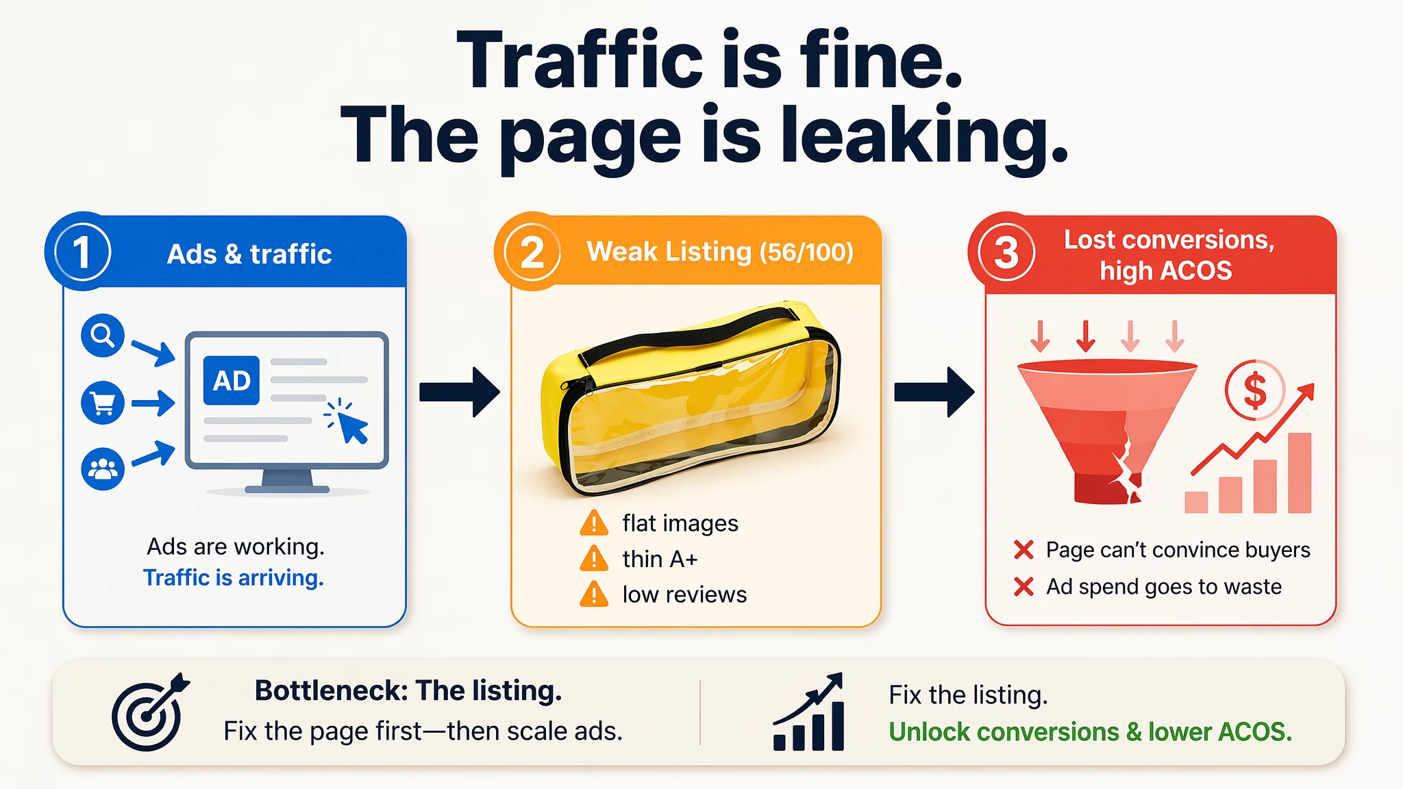
Once we put their Listing into DeepBI’s scoring and competitive-comparison workflow, a different picture emerged. Against a directly comparable, high-performing Amazon competitor, the product page lagged by 31 points out of 100. The core gap was not traffic or bidding—it was that the Amazon Listing itself could not convert: generic title logic, emotionally flat bullets, low-impact main images, thin A+ storytelling, and almost no review support.
The later optimization therefore did not start with “more ads.” It started with rebuilding the page’s sales logic: reframing the title around summer travel and beach scenarios, redesigning main images to visualize waterproof performance and capacity, restructuring bullet points around usage and gifting, and upgrading detail images to anchor the product as a “must-have vacation accessory” rather than a generic plastic pouch. For other Amazon sellers, this case is a reminder: when ACOS feels unmanageable and ads “stop working,” the real leak may be that the product page does not deserve the traffic it’s buying.
The Problem the Seller Saw on Amazon—And Why They Blamed Ads
This Amazon seller operates in a crowded US category: clear waterproof toiletry / makeup bags frequently used for beach trips, pools, and travel.
Operationally, the team felt the pressure familiar to many Amazon sellers:
- Paid traffic was there, but orders did not follow as expected.
- It was increasingly difficult to keep ACOS under control.
- Competitors in the same niche seemed to scale ads comfortably and dominate search results.
Internally, the explanation was simple:
“Our bids and keywords probably aren’t refined enough. If we tune the ad structure and raise bids on the main term ‘waterproof toiletry bag’, we should be able to win more impressions and convert.”
They kept iterating on:
- Campaign structure and match types
- Bid levels on core keywords
- Daily budgets and placements
But the business state didn’t fundamentally change: traffic quality and volume were not the main issue. The page simply wasn’t converting at the level needed for ads to pay back.
The Real Constraint: Listing Conversion Capacity, Not Traffic
When we ran the product through DeepBI’s Amazon Listing scoring and competitive benchmarking, the core constraint appeared very quickly.
Against a directly comparable, high-performing Listing in the same subcategory, the results were:
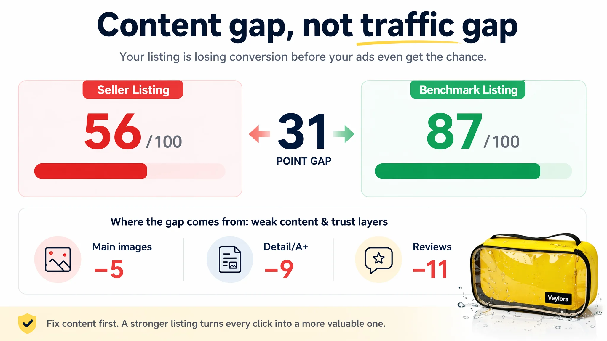
- Seller Listing total score: 56 / 100
- Benchmark Listing total score: 87 / 100
- Gap: –31 points
Broken down:
- Title: Seller: 14, Benchmark: 16, Max: 20, Gap: -2
- Main image set: Seller: 21, Benchmark: 26, Max: 30, Gap: -5
- Bullet points: Seller: 4, Benchmark: 8, Max: 10, Gap: -4
- Detail / A+: Seller: 14, Benchmark: 23, Max: 25, Gap: -9
- Reviews: Seller: 3, Benchmark: 14, Max: 15, Gap: -11
Two things stand out:
1. Every customer-facing content layer was weaker than the benchmark.
2. Reviews and detail/A+—the final trust layers—were fundamentally broken.
Yet the team had been trying to solve everything “from the ad account.”
“The real problem was not that ads failed to bring traffic. It was that the page could not convert the traffic.”
With a 3.4-star rating (2 total reviews, half of them 3 stars or below) versus the benchmark’s 4.6 stars and 642 reviews, any traffic arriving on the page was immediately hit by a trust wall. Ads were only amplifying that weakness.
How the Title Quietly Limited Both Traffic and Clicks
On first glance, the seller’s Amazon title did not look “wrong”:
- Core keyword “Waterproof Toiletry Bag” was front-loaded.
- Size and material were clearly stated: “12.4 x 5.2 inches”, “Yellow PVC”.
- Structure followed a standard ecommerce formula: product + attribute + function.
From an advertiser’s lens, this often looks “good enough.” But in direct comparison with the benchmark, the commercial limitations became obvious.
The benchmark title did something the seller’s did not
The competitor:
- Embedded scenarios: “Beach Vacation”, “Summer Pool”
- Used emotional and urgency language: “Must Have”, “Gifts”, “Essentials”
- Expanded audience coverage: “Women Teen Girls”, “Easter Basket Stuffers”
- Connected product to outcome: “Clear Makeup”, “Beach Vacation Essentials”
The seller’s title:
- Stayed on generic function: “Waterproof toiletry bag in yellow PVC”
- Gave no strong reason to click versus dozens of similar thumbnails
- Underused scenario keywords that actually drive seasonal and gifting searches
When you are buying Amazon ads on terms like “beach vacation accessories” or “summer pool bag,” this difference in title logic directly affects:
- How often the Listing gets surfaced in long-tail queries
- How click-worthy the result looks when it appears alongside competitors
- Whether the user understands, within one line, “why this and not another bag”
DeepBI’s recommendation reframed the title:
Large Waterproof Toiletry Bag, Yellow PVC Clear Makeup Pouch for Women Girls, Beach Vacation Essentials, Travel Storage for Cosmetics & Toiletries, Summer Pool Accessories, 12.4 x 5.2 inches
Key shifts:
- Scenario and season terms were promoted: “Beach Vacation Essentials”, “Summer Pool Accessories”.
- Audience was named, not implied: “Women Girls”.
- Function and specs were kept, but subordinated to use-case and value.
This is not cosmetic. It directly connects:
- Organic discoverability
- Ad-relevance signals
- User’s first-scan impression on the search results page
The Main Images Wasted the Chance to Win the Click
In this category, the main image set carries enormous weight. Buyers are often in impulse or semi-impulse mode: they don’t deeply read; they react visually.
The seller’s main-image set had several structural issues:
- Static, flat lay visuals with indoor, neutral backgrounds
- Minimal emotional content—no real beach, pool, or travel ambiance
- No visual “proof” of waterproofing, capacity, or durability
- No clear visual differentiation from generic, low-priced clear bags
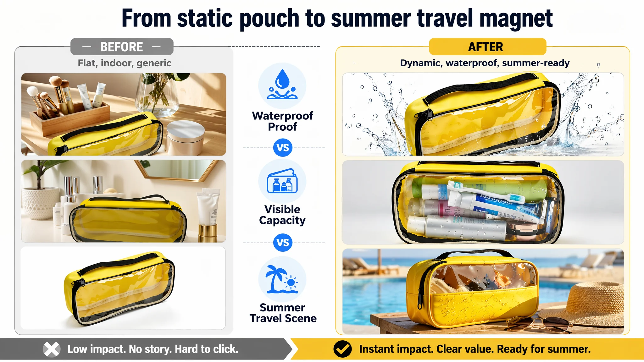
The benchmark Listing, by contrast, did three critical things:
1. Pulled the product into a summer water scene
- Dynamic water splashes
- Bright, high-saturation colors
- Visual energy that suggests fun, outdoors, movement
1. Demonstrated capacity and usage clearly
- Real bottles and products inside the bag
- Quantity and size of items obvious at a glance
1. Created a “reason to click” from the thumbnail
- Preppy styling, decorative letters
- Strong sense of fashion and social-media readiness
For Amazon ads, this is crucial:
“Advertising does not only amplify advantages. It can also amplify a page’s existing defects.”
Sending paid traffic to a thumbnail that looks like every other clear pouch, with no visible summer or travel story, means:
- Lower CTR on sponsored placements
- Higher CPCs to compete with more visually attractive Listings
- Less efficient spend even before users arrive on the detail page
DeepBI’s judgment was that main-image restructuring needed to happen before further ad scaling. The target was not just “prettier images,” but a sequence that served specific conversion roles:
1. First main image: waterproof impact and professional feel
- Product centered, ~65% of frame, 45° angle
- Pure white background to comply with Amazon main-image rules
- Strong directional light creating crisp highlights
- Dynamic water droplet/splash effects to immediately telegraph “waterproof”
- High-contrast cool tone to make the bright yellow pop in search results
This is the image that has to win the click.
2. Second image: capacity made visible, not just claimed
- Product centered, ~70% of frame, straight-on view
- Soft, even lighting against a light gradient background
- Bag clearly filled with shampoo, toothbrush, razor, and other toiletries
- Clean, uncluttered layout to make “large capacity” obvious at a glance
This image answers the immediate question: “Can this actually hold what I’ve packed for a trip?”
3. Third image: intuitive size reference
- Bag on one side, a modern large smartphone (e.g., iPhone-sized) on the other
- Clean white background, soft top lighting
- Simple, clear text labels indicating length and height
Instead of forcing users to imagine “12.4 x 5.2 inches,” it lets them feel the size instantly.
4. Fourth image: quality-proof through details
- Four-grid macro composition: handle stitching, zipper head, PVC beading with water droplets, reinforced corner
- Soft, micro-level lighting that suggests quality and durability
This image is about trust: “it’s not a flimsy plastic bag that will rip and leak.”
5. Fifth image: real summer travel scene
- Bag placed outdoors on a small table under a parasol
- Blurred pool or beach in the background
- Sunglasses and sun hat subtly placed around
- High-saturation summer palette
Here, the aim is to anchor the product as a travel essential, not just a storage item. That emotional anchor is what many Amazon sellers underestimate when they focus solely on function.
Bullet Points: From Feature Lists to Buying Logic
The seller’s bullet points were typical of function-led Listings:
- Size specifications
- Waterproof material statement
- Generic use-case description
- Portability
- Transparent window mention
This structure had two problems:
1. It read like a technical checklist, not a reason to buy.
2. It never fully connected with how, where, and why the bag would be used.
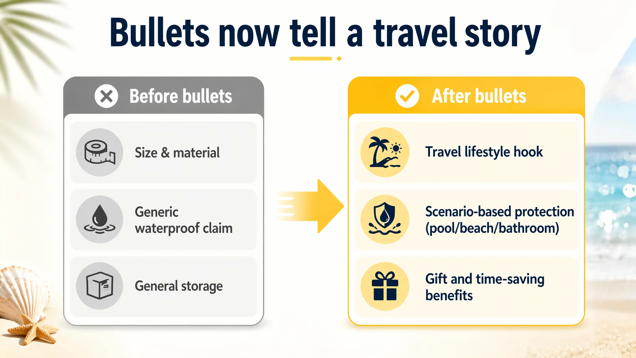
The benchmark did the opposite:
- Led with style and emotion: “cute”, “preppy”, “Instagram-worthy”
- Framed the bag as a must-have beach and pool accessory
- Explicitly pitched it as a gift for women and teen girls
- Listed concrete item types it carries: sunscreen, tanning oil, SPF products
- Positioned it as an accessory that fits into popular bags
DeepBI’s diagnosis: the seller’s bullets had information, but not a persuasive path. There was no narrative from:
- Why I notice the product
- To how it fits my lifestyle
- To why I should buy it now or gift it
The optimized bullets were rebuilt around a more coherent progression:
Bullet 1: Capacity and lifestyle in one line
[SPACIOUS & STYLISH TRAVEL COMPANION] Measuring 12.4" L x 5.2" H, this large toiletry bag offers ample room for full-sized bottles and personal care essentials. Its sleek design makes it a versatile accessory that fits perfectly in your suitcase, beach tote, or bathroom counter without taking up excess space.
- Starts from travel identity, not just numbers
- Ties size to what matters: full-sized bottles, fitting in suitcase/beach tote
Bullet 2: Waterproof tied to real environments
[WATERPROOF & SAND-PROOF PROTECTION] Features a durable PVC window and reinforced construction that keeps your beauty essentials dry and protected from water splashes, spills, and sand. This sturdy waterproof bag is an essential for active lifestyles, whether you are at the pool, beach, or in a humid bathroom.
- Moves from “PVC is waterproof” to “here is where and how it protects you”
- Names explicit scenarios: pool, beach, humid bathroom
Bullet 3: Specific content, not “general storage”
[ORGANIZED STORAGE FOR ALL YOUR FAVORITES] Ideal for both daily home organization and vacation travel. This versatile bag neatly holds sunscreen, lotions, makeup brushes, and skincare products. It helps you keep your loose items organized and accessible, making it a must-have for your travel checklist.
- Lists concrete items: sunscreen, lotions, brushes
- Bridges home and travel, reinforcing relevance year-round
Bullet 4: Portability with durability and multi-scene use
[PORTABLE DESIGN WITH REINFORCED HANDLE] Equipped with a sturdy black handle strap, this bag is designed for effortless transport. Its durable grip allows you to easily carry it from your hotel room to the spa or gym, providing the ultimate portability for everyday use and adventure travel.
- Ties handle to specific movements: hotel to spa or gym
- Suggests robustness without overclaiming
Bullet 5: Transparency + gift positioning
[QUICK VISIBILITY & THOUGHTFUL TRAVEL GIFT] The clear PVC window allows for instant identification of contents, saving you time during airport security or while searching for items in your luggage. Its practical and professional look makes it a perfect gift for friends, family, or frequent travelers who value organization.
- Converts “transparent window” into time savings and airport convenience
- Adds gifting dimension, broadening purchase motivations
This shift turned the bullets into a sequence that:
- Hooks with lifestyle
- Demonstrates context-specific utility
- Ends with giftability and efficiency
Detail Page and A+: From “Static Pouch” to “Vacation Essential”
The detail page and A+ content were where the biggest scoring gap sat:
- Seller: 14 / 25
- Benchmark: 23 / 25
- Gap: –9 points
The seller’s detail content focused on:
- Static product shots
- Basic function callouts (double zipper, waterproof)
- A simple load-out image
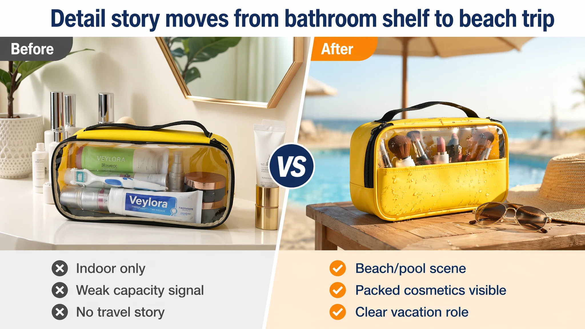
The benchmark went much further:
- Full-bleed summer scenes with real people
- Capacity demonstrators showing exact counts of bottles
- Multi-scene usage: sunscreen, tanning, pool, family
- Social proof via UGC-style imagery with visible likes
- Consistent, recognizable visual language and branding
DeepBI’s evaluation: The seller’s page never truly answered the first emotional question for this category:
“Can I imagine this in my summer trip, pool day, or beach vacation?”
So the detail/A+ redesign blueprint focused on a clear arc:
1. Opening: anchor in a beach vacation
- Product centered (~55%), shot outdoors on light sand
- Soft palm-leaf shadow on the side to suggest tropical shade
- Bright daylight, sharp contrast, but clean separation between yellow bag and sand
- Slight background blur: sand texture visible, but eye pulled to the bag
This first A+ image’s job is scenario anchoring: “This is a summer travel product, not just a bathroom organizer.”
2. Capacity demonstrator: “can it actually hold what I need?”
- Left side: short, labeled checklist “3 x 100ml bottles + toothpaste”
- Right side: bag at 45°, transparent window showing these exact items loaded
- Clean white background, soft lighting
This directly solves the “can it fit?” objection—without forcing the user to imagine.
3. Pain-point image: waterproof performance in a real environment
- Macro shot of the bag at a slight angle
- Light, real-looking water droplets beading and sliding on the PVC surface
- Background: lightly textured bathroom or sink area, slightly misty atmosphere
- Focus on zipper and seam to imply “no leaking through stitching”
This picture translates “waterproof” from a word into a felt, credible visual.
4. Core feature: double zipper, shown in motion
- Close-up of the zipper area
- A hand (fingers only) actively pulling one zipper head, the other visible
- Soft-side lighting to pick up metal shine and teeth alignment
- Blurred hotel bedroom background
Here, we address a hidden but important review driver: Does the zipper feel cheap, snag, or break?
5. Luggage fit: space efficiency
- Top-down flat-lay of an open suitcase with light summer clothes
- Bag placed in a corner or pocket, taking ~30% of the frame
- Yellow as a pop of color against neutral fabrics
This speaks to space anxiety: “Will this thing eat up my limited luggage?”
6. Bathroom scene: everyday practicality
- Bag on a slightly wet, white ceramic sink
- Light water droplets visible on the surface
- Some skincare or makeup visible through the window
- Realistic bathroom light from above
This reminds buyers: You’ll use this often, not just once a year at the beach.
7. Final call to action: multi-angle + dimensions
- Collage of front, side, and bottom views
- Clean, light background
- Clear dimension labels on each view
This closes the loop for users who care deeply about size, shape, and fit.
Reviews: The Hardest Constraint—and Why It Changed the Priority Order
The review layer was stark:
- Seller: 3.4 stars, 2 total reviews, 1 of them 3 stars or below
- Benchmark: 4.6 stars, 642 total reviews, rich positive photo reviews
With this gap, any user comparing the two Listings—especially after arriving via ads—will:
- Discount the seller’s product as “unproven” or “risky”
- Be more sensitive to even minor content or image flaws
- Require stronger visual and copy-based trust signals to convert
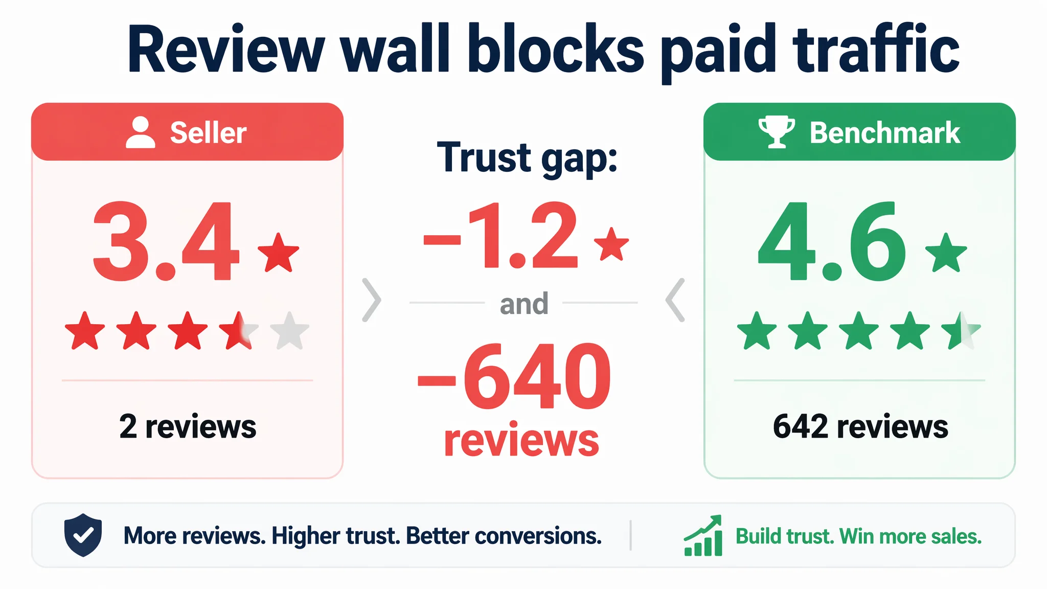
This is precisely why DeepBI did not recommend:
- Aggressively scaling ads first
- Pushing more broad-match or discovery campaigns
- Relying on bidding tactics to “power through” weak conversion
Instead, the guidance was:
1. First, reconstruct the Listing’s conversion story
- Title, main images, bullets, and A+ all aligned to a clear travel/beach narrative
- Visual proof of waterproofing, capacity, durability
- Everyday and travel scenarios to broaden perceived value
1. In parallel, begin building a healthier review base
- Encourage genuine reviews from early customers
- Monitor and address any product-quality issues that emerge
- Avoid overpromising in visuals: keep product DNA truthful to prevent backlash
1. Only then, gradually re-accelerate ads
- Use sponsored placements to test CTR and CVR after the Listing overhaul
- Let Amazon’s algorithm see a page that can actually hold the traffic it sends
Why the Listing Had to Be Fixed Before Ads Could Work Again
At this stage of the product’s life on Amazon, the greatest business risk was wasting ad spend on a page that eroded trust instead of earning it.
If the seller had continued prioritizing ad tweaks:
- ACOS would likely stay high or worsen.
- Clicks would still hit a 3.4-star product with minimal social proof.
- Weak visuals and generic copy would keep the CVR depressed.
- Any organic ranking gains bought through ads would be fragile and expensive.
DeepBI’s decision logic was therefore:
- Core bottleneck: listing-conversion capacity, especially trust and scenario fit.
- Primary lever: rebuild title, main images, bullets, and A+ into a coherent travel/beach story with concrete proof and clear benefits.
- Secondary lever: gradually improve review volume and rating.
- Tertiary lever: once conversion stabilizes, refine and scale Amazon ads.
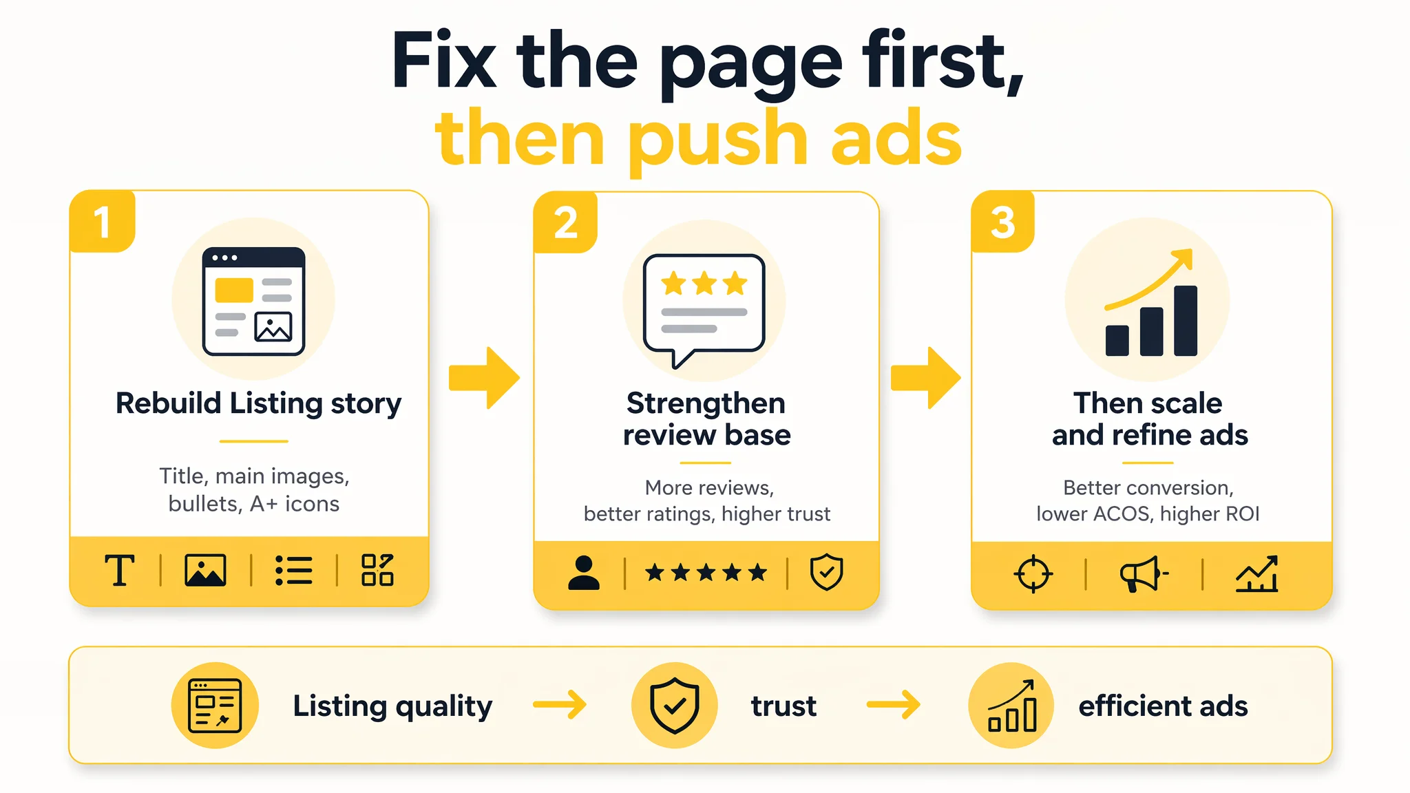
This order matters. A stronger Listing:
- Raises baseline CVR, making every paid click more valuable.
- Improves CTR on sponsored ads via more compelling thumbnails and titles.
- Reduces dependence on ads over time by helping organic rankings stick.
In other words, Listing quality is not a cosmetic layer; it is the foundation of ad efficiency.
How the Operating State Changed After Reframing the Problem
Because this case focuses on diagnosis and strategy, not on post-optimization numbers, we won’t invent specific performance metrics. But the shifts in operating state and risk are clear:
- The team stopped over-attributing problems to ads and started seeing that:
- A 31-point content gap vs. the benchmark made ad optimization structurally hard.
- Reviews and detail content were undermining every click they paid for.
- The Amazon Listing moved from “generic storage bag” to “high-visibility travel and beach essential”:
- Title now carries scenario and audience cues that tie directly to ad keywords.
- Main images build an emotional and functional case in the first few seconds.
- Bullets and A+ content walk the buyer from impulse to rational justification.
- Ad traffic became more useful:
- A higher share of clicks can now reasonably convert, especially from summer and beach-related queries.
- Sponsored placements have a stronger visual presence against competitors.
- The seller’s internal understanding evolved:
- Ads are no longer treated as a universal fix for weak pages.
- Listing conversion is recognized as the prerequisite for sustainable ad scaling.
- Title, main images, bullet points, and A+ are seen as a single conversion system, not separate tasks.
What Other Amazon Sellers Can Take From This Case
This waterproof toiletry bag is just one SKU in one subcategory, but the pattern is common across Amazon:
- High ACOS is often diagnosed as an “ad problem” first.
- Listing conversion defects—especially weak main images, generic titles, and poor trust layers—are underestimated.
- Ads are scaled on top of pages that cannot justify the traffic they buy.
The practical takeaways:
- Before you push bids or expand keywords, measure your Listing against the true category benchmark, not your own taste.
- Treat Amazon title, main images, bullets, A+, and reviews as a single sales engine, not separate checkboxes.
- Ask whether your page earns the click and the order from the specific search terms your ads are buying, especially scenario-heavy terms like “beach vacation essentials” or “pool bag for women.”
- Remember: advertising can only amplify what is already there—if your Listing does not build trust and desire, more traffic only increases your burn rate.
DeepBI’s role in this case was not to “add features,” but to reframe the core business problem: from “ads aren’t working” to “the Amazon product page doesn’t yet deserve aggressive ads.” For sellers facing similar symptoms, that reframing is often where the real turnaround begins.