

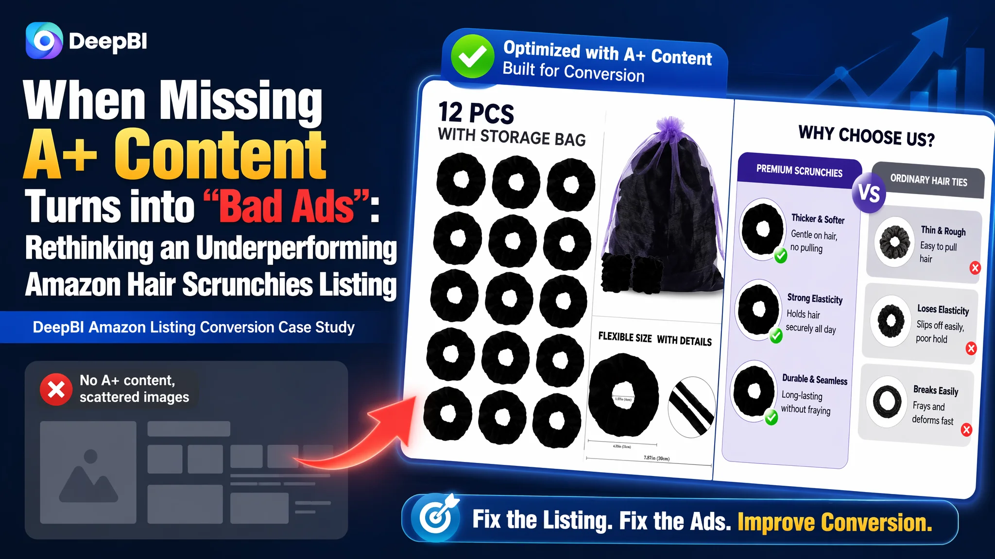
This case comes from an Amazon seller in the hair accessories category. The team had been struggling with a listing that could not keep up with a dominant competitor, and rising Amazon ad spend was getting harder to justify. On the surface, main images looked “good enough,” reviews were healthy, and the team believed the problem was mostly about increasing traffic and polishing creatives. Yet conversion would not follow.
After DeepBI dissected the full Amazon Listing—the title, main images, bullet points, A+ area, and review structure—the picture changed completely. The listing’s real handicap was not traffic, but its weak product-page conversion capacity, especially an empty A+ section where the competitor was telling a complete, visual story. Ads were sending traffic into a page that could not fully convince.
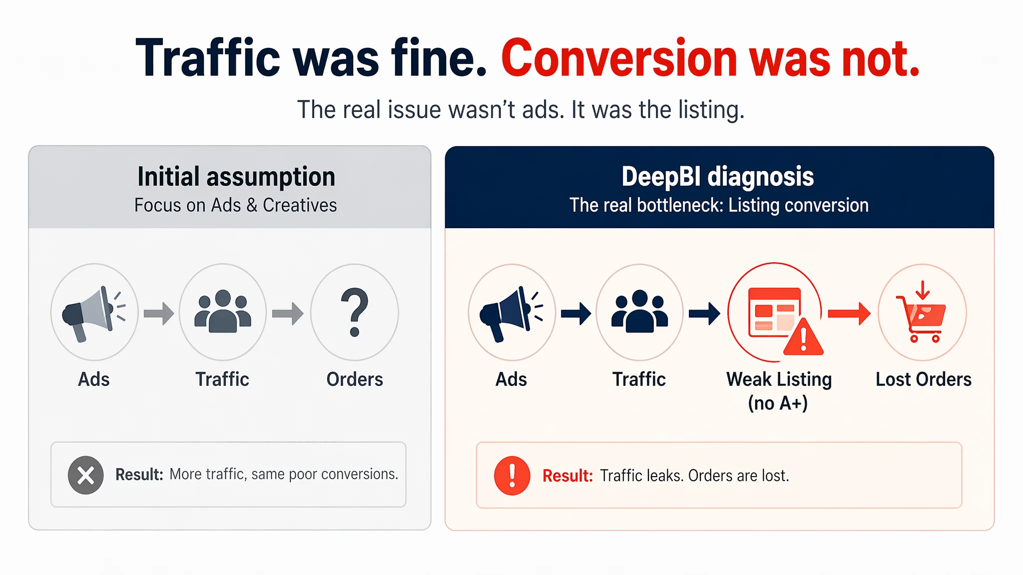
Once the team shifted the optimization focus from “keep tuning ads and tweaking images” to “rebuild the Amazon product-page logic end-to-end,” the listing started to regain its selling power: a clearer title, more structured bullets, a main-image set aligned with decision logic, and a trust-building A+ flow. For other Amazon sellers, the lesson is direct: as ad costs climb, the real bottleneck is often not bids or keywords, but a page that hasn’t been built to convert.
Amazon Ads Were Not Failing. The Page Was Consuming the Traffic.
From a distance, this hair scrunchies listing looked “basically fine”:
- Category-fit main images were present
- Star rating was 4.6 with 300+ reviews
- The product had a clear functional use and a defined audience
Yet against a benchmark competitor in the same Amazon category, the DeepBI listing score exposed a hard constraint:
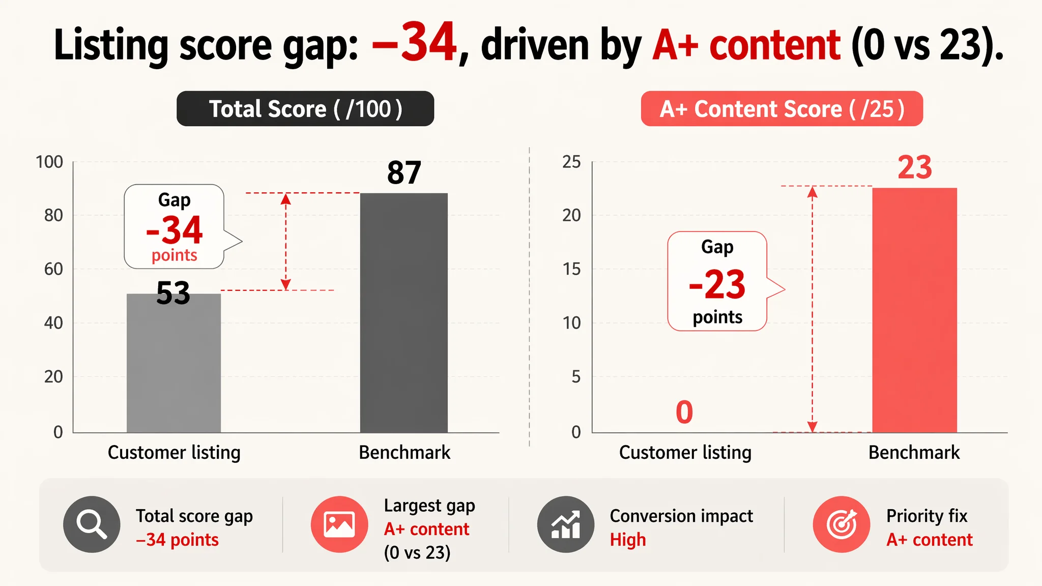
- Customer listing total score: 53/100
- Benchmark listing total score: 87/100
- Gap: –34 points
Broken down by dimension:
- Title: 11 vs 16 (–5)
- Main images: 24 vs 25 (–1)
- Bullet points: 6 vs 8 (–2)
- Detail / A+ content: 0 vs 23 (–23)
- Reviews: 12 vs 15 (–3)
On the ad side, the team was already under pressure. They felt:
- Clicks were not turning into enough orders
- Lowering ACOS was increasingly difficult
- Standard keyword and bid optimizations were not changing the trajectory
So their working assumption was: “Ads and creatives are not strong enough; we need better campaigns, better images, and more reviews.”
The data told a different story.
“The real problem was not that ads failed to bring traffic. It was that the page could not convert the traffic.”
The single most damaging gap was not in the main image or even the star rating—it was the complete absence of A+ content, where the competitor was building the entire trust and decision narrative.
The Real Constraint Was Listing Conversion Capacity, Not Visual Taste
DeepBI’s diagnosis started with one core question:
“If we magically doubled this ASIN’s traffic tomorrow, would the Amazon product page be ready to convert it?”
For this listing, the answer was clearly no.
1. A Zero-Score A+ Section in a Visual Category
In the details/A+ dimension, the listing scored 0/25 versus the competitor’s 23/25.
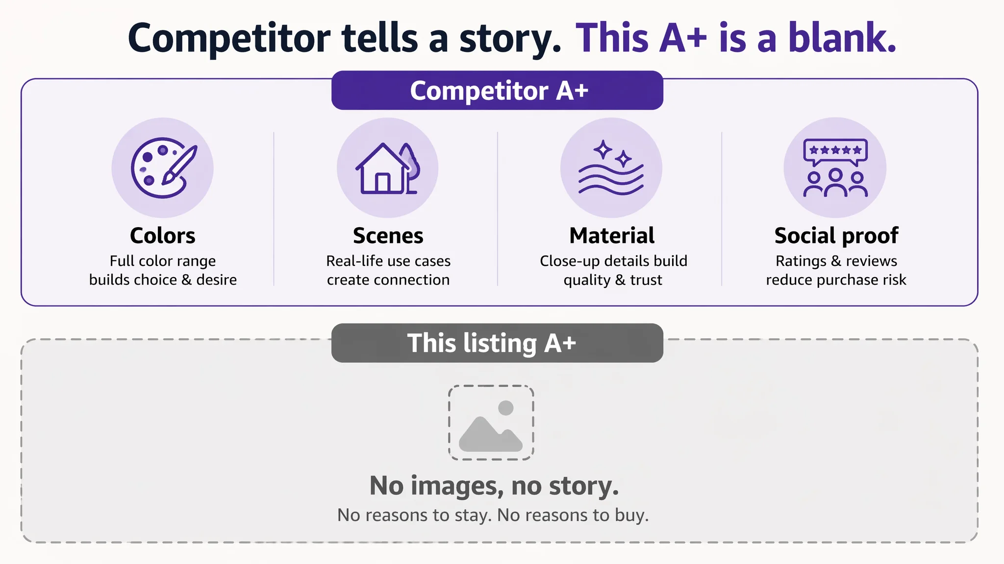
The competitor’s A+ implementation:
- Brand hero image with full color-range overview
- Multi-scenario usage modules (home, travel, daily outings)
- Real model shots showing hair styles and movement
- Product bundle layouts (single color vs multi-color sets)
- Material close-ups to convey softness and durability
- Visual hints to social proof (ratings, review volumes)
The customer listing:
- No A+ images at all
- No color overview
- No elasticity demo
- No lifestyle validation
- No structured trust-building modules
For a low-ticket, visually driven product like hair scrunchies, this meant:
- Users arriving from ads encountered a visual and information vacuum after the bullets
- There was nothing to deepen their interest, answer durability questions, or reduce risk
- Social proof and perceived professionalism lagged far behind the benchmark
In other words, the “bottom-half” of the Amazon product page was not participating in the sale at all.
2. Title Logic: Words Present, but Not Working for Search or Clicks
Title scores: 11 vs 16
Key issues:
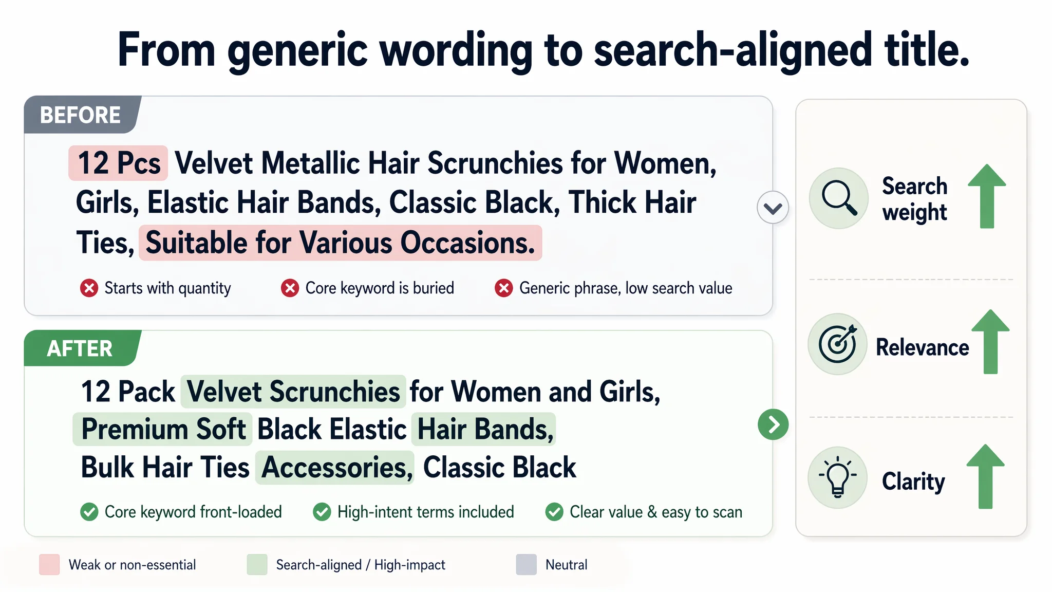
- The customer led with “12 Pcs” instead of a brand or core product phrase
- Core term “Hair Scrunchies” appeared later, rather than front-loaded for search relevance
- “Suitable for Various Occasions” consumed characters without adding search weight or a clear purchase reason
- Positioning around “Classic Black” narrowed perceived use, while the benchmark stressed “12 Colors” and variety
DeepBI’s judgment: the title was not pulling its weight in Amazon search or in the SERP thumbnail. It neither fully captured the key search terms nor surfaced the strongest selling angle for this specific offer.
The proposed direction:
“12 Pack Velvet Scrunchies for Women and Girls, Premium Soft Black Elastic Hair Bands, Bulk Hair Ties Accessories, Classic Black”
Strategically:
- Core term “Velvet Scrunchies” is now early, improving A9 friendliness
- Non-contributing phrases like “Suitable for Various Occasions” are removed
- “Pack,” “Hair Bands,” and “Accessories” align with category expectations
- “Premium Soft” helps set a comfort/quality expectation in the search results
The goal is not to “stuff more words,” but to align the title with how Amazon search works and how shoppers scan SERP results.
3. Main Images: Not Terrible, but Not Organized Around a Decision Funnel
Main-image scores: 24 vs 25—a superficial near-parity that hides deeper differences.
The customer listing:
- Had multiple images: product-only, some scene shots, a parameter diagram, a bag image, etc.
- But composition was busy, lighting and style were inconsistent, and scenes looked more like cut-outs than real life.
The competitor:
- Used clean grid layouts for quantity clarity
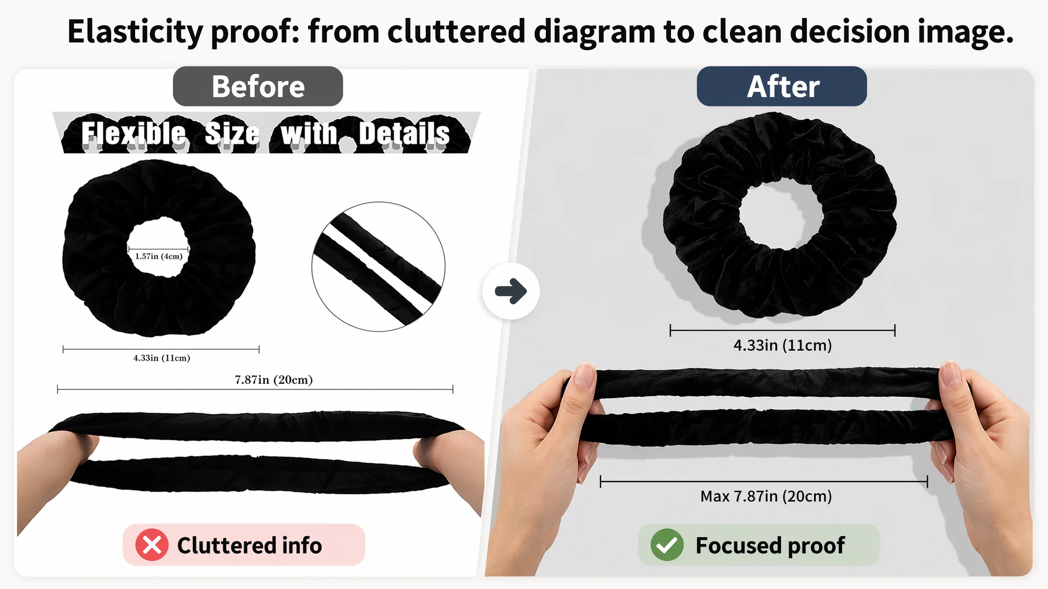
- Showed elasticity in a single, simple, legible diagram
- Combined close-up details with real lifestyle shots
- Dedicated an image to a “Why Choose Us” comparison block
DeepBI’s reading:
- The issue was not absence of images, but lack of structure.
- Each key decision question (“How many pieces?”, “Will it hurt my hair?”, “Is it durable?”, “Is it suitable for my daily life?”) should have a dedicated, easy-to-read visual answer.
Hence the recommended rework:
- Image 1 – Quantity & order: 12 pieces laid out in a 4×3 grid, 85% of frame, clean white background, no text; instant recognition of “bulk set” and neatness.
- Image 2 – Elasticity proof: One scrunchie above, hands stretching another below, simple gray background, only two precise measurements (max stretch and diameter).
- Image 3 – Material + on-hair shot: Left, macro detail of texture; right, a model wearing a ponytail; split composition; warm, consistent tone.
- Image 4 – Value bundle: Left, 12 pieces stacked; right, the storage bag clearly visible; bottom text “12 PCS WITH STORAGE BAG”.
- Image 5 – Direct comparison: Left, this product with a green check; right, a generic thin hair tie with a red cross; clear “VS” icon to frame the choice.
“Advertising does not only amplify advantages. It can also amplify a page’s existing defects.”
Under ad pressure, cluttered or inconsistent images waste clicks; a clear, decision-led set turns the same traffic into orders.
4. Bullet Points: Strong Scenes, Weak Proof
Bullet scores: 6 vs 8
The bullet strategy contrast:
- Customer:
- Emphasized gifting, party scenes (e.g., Taylor Swift themed parties), emotional uplift
- Lacked concrete specifications and hair-protection language
- Competitor:
- Led with material, comfort, and “does not hurt your hair”
- Provided detailed size and elasticity data
- Covered scenes, but as a secondary layer, not the core
DeepBI’s judgment:
- Scenes and emotion are assets—but only after the user is satisfied on the basics: material, fit, comfort, durability.
- Without those, the listing sounds “fun” but not “reliable.”
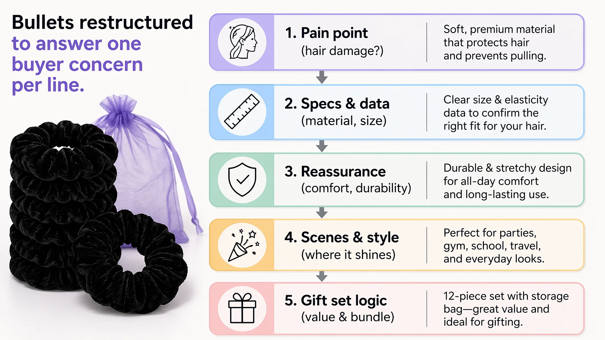
So the bullets were restructured to form a “pain point → spec → reassurance → scene” chain:
1. Material & hair protection
- Premium metallic fabric, soft shine
- Explicit “will not pull or damage your hair”
- Durable internal rubber band
1. Dimension & elasticity
- Outer diameter and inner diameter stated
- Maximum stretch length quantified
- Applicability to thick/thin/curly/straight hair
1. Occasions with fashion payoff
- From themed parties to gym/school/travel
- Positioning as a way to stand out while staying secure
1. Color variety & styling flexibility
- “12 vibrant colors” or metallic colors
- Link to matching with outfits and makeup
1. Gift set logic
- 12 pieces + storage bag
- Positioned for birthdays, Christmas, Valentine’s Day, etc.
This way, each bullet resolves a distinct buyer concern instead of repeating generic claims.
Why DeepBI Did Not Recommend “Keep Tuning Ads First”
Given the 34‑point listing score gap—especially the 23‑point A+ deficit—DeepBI made a clear priority judgment:
- Do not keep forcing more traffic through a weak conversion asset.
- Fix the listing’s ability to persuade first; then let ads scale into that.
Continuing to optimize bids and keywords without addressing:
- A 0‑content A+ area
- A title misaligned with core search logic
- Unstructured main images
- Under-specified bullets
…would only:
- Burn budget on users who leave unconvinced
- Depress CVR, pushing ACOS up and TACOS higher
- Delay the point at which reviews and organic ranking can improve
In this situation, Amazon Listing conversion is the primary bottleneck. Ads are secondary levers until the product page becomes worthy of amplification.
Rebuilding the Amazon Product Page: From Visual Holes to a Conversion Story
DeepBI’s optimization path was not a long checklist of cosmetic edits; it was a restructuring of the listing around how Amazon shoppers actually decide.
1. Reframing the Main Image Set Around the Decision Funnel
Each new or reworked image was assigned a specific decision role:
- Image 1 – “What is it, and how much do I get?”
Clear quantity and neat layout to answer the “value for money” reflex question.
- Image 2 – “Will it break or be too tight?”
Visual elasticity test with measurements to address durability and comfort.
- Image 3 – “Does it look good in real life?”
Texture close-up + model wearing shot to show both quality and style.
- Image 4 – “Is it a complete package?”
Product plus bag to strengthen perceived value and organization.
- Image 5 – “Why this over others?”
Side-by-side comparison to reduce hesitation and speed up decision.
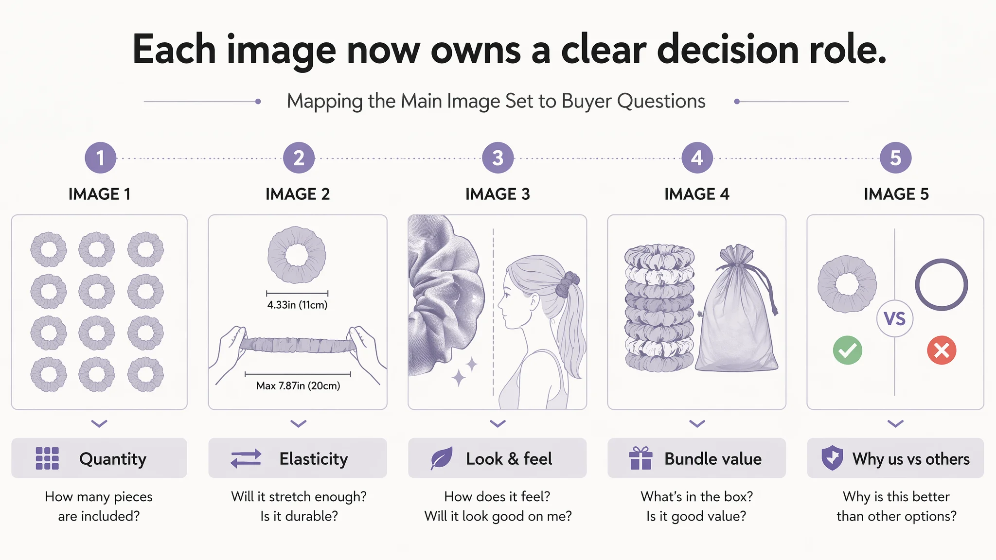
Once you map images to these questions, CTR and CVR stop depending on vague “beauty” and start depending on whether each decision step is supported.
2. Designing an A+ Flow That Actually Sells
With the A+ section previously empty, DeepBI treated it as the primary conversion lever that needed to be built from zero:
Recommended A+ modules:
1. Color system hero image
- Multi-block collage with brand center, 6+ colors clearly visible
- A high-end, “palette-like” look that immediately communicates variety and taste
1. Elasticity demo
- Hands stretching a scrunchie across most of the frame
- Side lighting emphasizing texture and tension
- Visually resolves “will it snap?” and “is it tight enough?” doubts
1. Material macro shot
- Micro-level close-up of velvet/metallic texture
- Side-backlight to show fibers and softness
- Connects “premium feel” with what the buyer sees
1. Daily home/office scene
- A woman working, hair up in a bun, scrunchie clearly visible
- Cozy, natural lighting, warm palette
- Positions the product as a simple, everyday helper, not just party wear
1. Outdoor active scene
- Girl running or on a skateboard, hair tied with the scrunchie
- High saturation, strong sunlight
- Reassures on stability and non-slip performance during movement
1. Color system layout
- Scrunchies arranged by cool/warm color groups
- Clean, white background, equal spacing
- Reduces “choice overload” and helps shoppers quickly find their style
1. Craftsmanship & durability detail
- Top-down view of a scrunchie stretched open, stitching clearly visible
- Clean desk background, fresh color tone
- Serves as a visual trust anchor for “won’t fall apart, won’t pull hair”
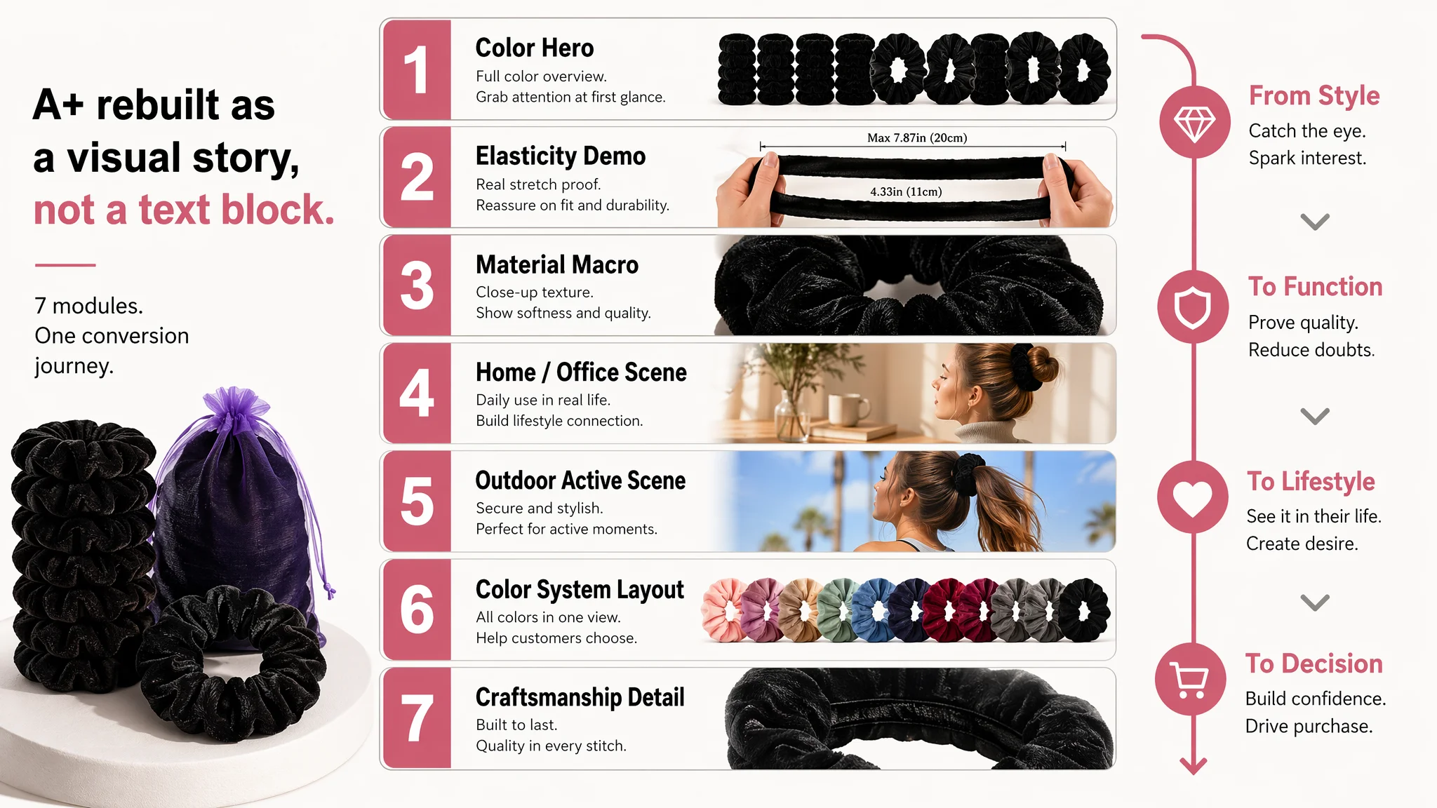
This A+ reconstruction follows a deliberate logic:
- From diversity & style (colors, hero image)
- To function & durability (elastic demo, stitching)
- To lifestyle proof (home, outdoor scenes)
- To decision support (color layout to pick a set)
So instead of a flat, text-heavy bottom half, the listing now has a visual story that takes over where the bullets stop.
Reviews: Good, but Not Enough to Carry a Weak Page
On the surface, the review profile looked “healthy”:
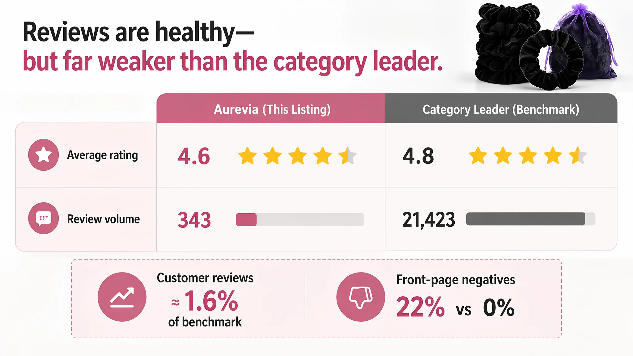
- Customer listing: 4.6 stars, 343 reviews
- Benchmark: 4.8 stars, 21,423 reviews
But there are two hidden issues:
1. Scale of social proof
- 343 reviews is only about 1.6% of the benchmark
- For many shoppers, that difference alone signals who is “the safe choice”
1. Homepage negative review ratio
- Customer: 22% of front-page reviews are 3 stars or below
- Competitor: 0% in front-page sampling
DeepBI’s judgment:
- The listing cannot rely on reviews to compensate for a weak page.
- With this gap, strong page content is mandatory to offset social proof disadvantage.
- Visual clarity, spec transparency, and A+ narrative must carry more of the persuasion burden.
Once the page starts converting better, ad-driven volume can gradually build review count, but it cannot work in reverse.
After the Page Started to Work, Ad Traffic Became Useful Again
The outcome here is not a single vanity metric; it is a change in how the business operates this ASIN on Amazon.
Post-optimization, the listing moved from:
- A 53/100 page that leaks conversion at the A+ level
- A title misaligned with search logic
- Unstructured visuals and under-specified bullets
- Overreliance on ads to “brute-force” volume
Toward a listing that:
- Has a coherent product-page story across title, images, bullets, and A+
- Addresses core user questions visually and textually before they exit
- Uses each image slot and A+ module with a defined decision role
- Starts to justify traffic, making ACOS reductions realistic rather than wishful
From an operational standpoint:
- The team can now push Amazon ads knowing the product page is not the bottleneck.
- As CVR improves, the same ad spend can generate more orders, easing ACOS pressure.
- Over time, increased sales and better user experience can help grow review volume and organic ranking, reducing dependence on paid traffic.
What Other Amazon Sellers Can Take from This Case
Several patterns in this hair accessories case are common across categories:
1. A healthy star rating does not mean your page can convert ad traffic well.
Reviews help, but they cannot compensate for a zero-content A+ section and unstructured main images.
1. When ACOS feels stubborn, check the Listing score before your ad console.
A 34‑point gap to a benchmark—driven mostly by A+ and content—will keep conversion depressed regardless of bid strategies.
1. Main images and A+ are not “design work”; they are decision architecture.
If each slot does not map to a clear buyer question, you are leaving money on the table.
1. Scene and emotion are valuable only after you’ve nailed material, fit, and data.
In this case, “Taylor Swift themed party” is a nice hook—but only once size, elasticity, and hair protection are already crystal clear.
1. Ads do not fix a weak page. They expose it.
Before scaling campaigns, ask: “If traffic doubled today, would this page actually convert it?” If the answer is uncertain, fix the listing first.
DeepBI’s role in this case was not about plugging in another tool, but about reframing the seller’s understanding of where the real bottleneck was. Once the team accepted that Amazon Listing conversion—not ads—was the primary constraint, the path forward became much clearer, and every subsequent dollar of paid traffic had a better chance of turning into an order.