This case comes from an Amazon seller in the kids’ home-organization niche. On paper, their basketball laundry hamper Listing looked decent: solid star rating, clean images, and a functional description. Yet paid traffic was hard to scale, ACOS kept feeling heavy, and the team’s instinct was to blame Amazon ads—bids, structure, keywords—rather than the product page itself.
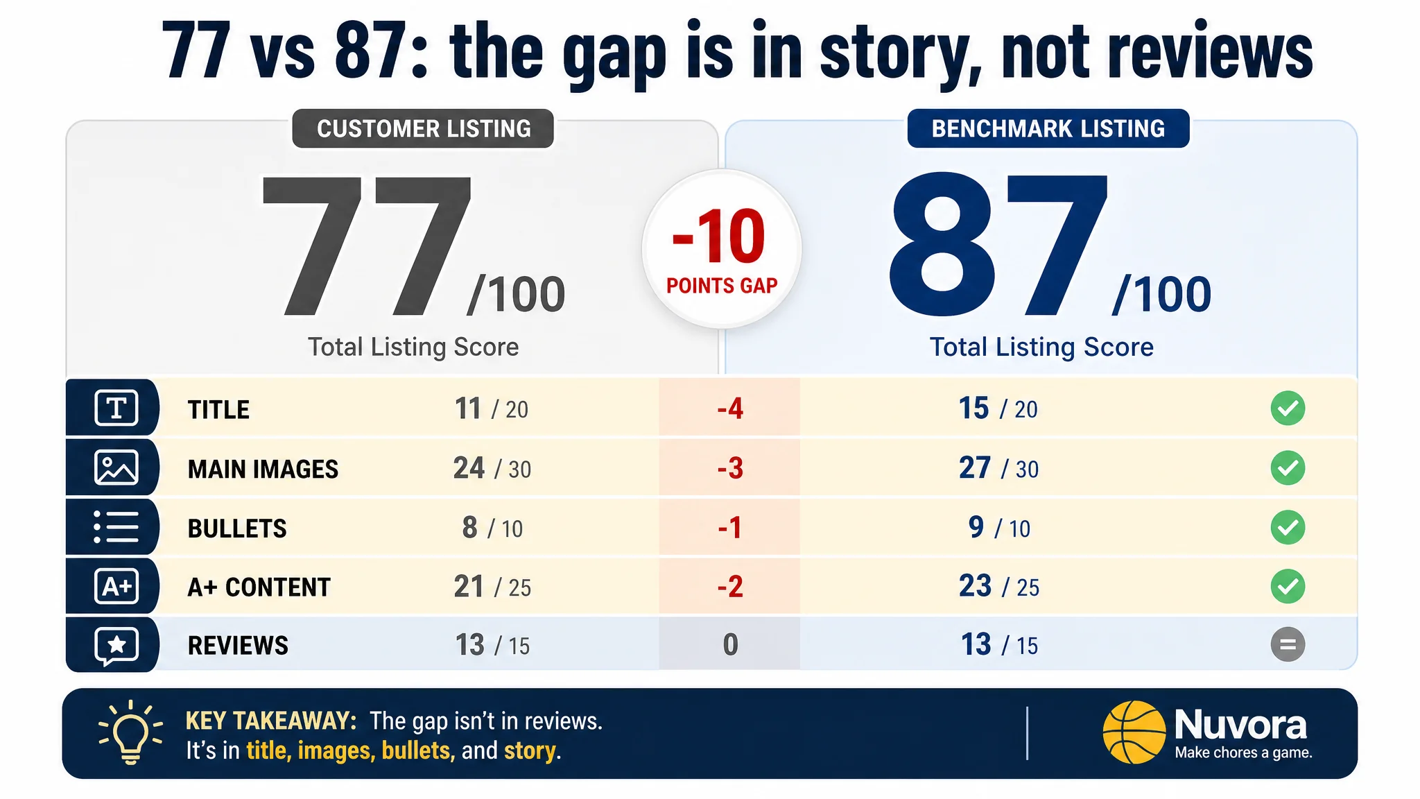
DeepBI’s diagnosis told a different story. Against a benchmark basketball laundry hamper Listing, the customer’s Amazon product page scored 77 vs. 87 out of 100. The gap wasn’t in reviews or basic quality signals; it was in how the title, main images, bullets, and A+ content worked together (or didn’t) to convert traffic. Where the competitor turned “laundry” into a game with a clear emotional hook, the customer’s Listing stayed in “functional description” mode, quietly consuming both organic and ad clicks.
Once the problem was reframed as an Amazon Listing conversion issue—not an advertising flaw—the optimization direction changed. DeepBI guided the team to rebuild the page around “make chores a game”: front-loading the core keyword in the title, clarifying the zipper-bottom advantage, restructuring bullets around pain-point → game → convenience, and redesigning images and A+ to show a three-step “shoot–store–wash” flow and clear before/after results. The outcome wasn’t a flashy “growth miracle,” but a more important shift: ad traffic finally had a page that could carry it, and the seller’s understanding of where their real constraint lay fundamentally changed.
For other Amazon sellers, this case is a reminder: when Amazon ads feel “inefficient,” the bottleneck is often the Listing’s conversion capacity. Especially in family, home, and kids categories, a page that only explains the product but never sells the story will steadily drag down CTR, CVR, and ad efficiency—no matter how much you keep tuning campaigns.
Amazon Ads Were Not Failing. The Page Was Consuming the Traffic.
From the seller’s perspective, the situation looked familiar:
- A playful kids’ basketball laundry hamper on Amazon US
- Decent rating (4.6 stars), all front-page reviews positive
- Advertising spending that felt harder and harder to justify
- A competitor in the same niche clearly getting more traction
The immediate reaction inside the team was typical: “Maybe our bids aren’t aggressive enough.” “Maybe we need more keywords or a different campaign structure.”
In other words: they assumed a traffic problem.
But when DeepBI scored the Listing against a directly comparable benchmark within the same Amazon category, a different pattern emerged:
- Total Listing score: 77 vs. benchmark 87 (–10)
- Title: 11 vs. 15 (–4)
- Main images: 24 vs. 27 (–3)
- Bullets: 8 vs. 9 (–1)
- A+/detail content: 21 vs. 23 (–2)
- Reviews: 13 vs. 13 (0)
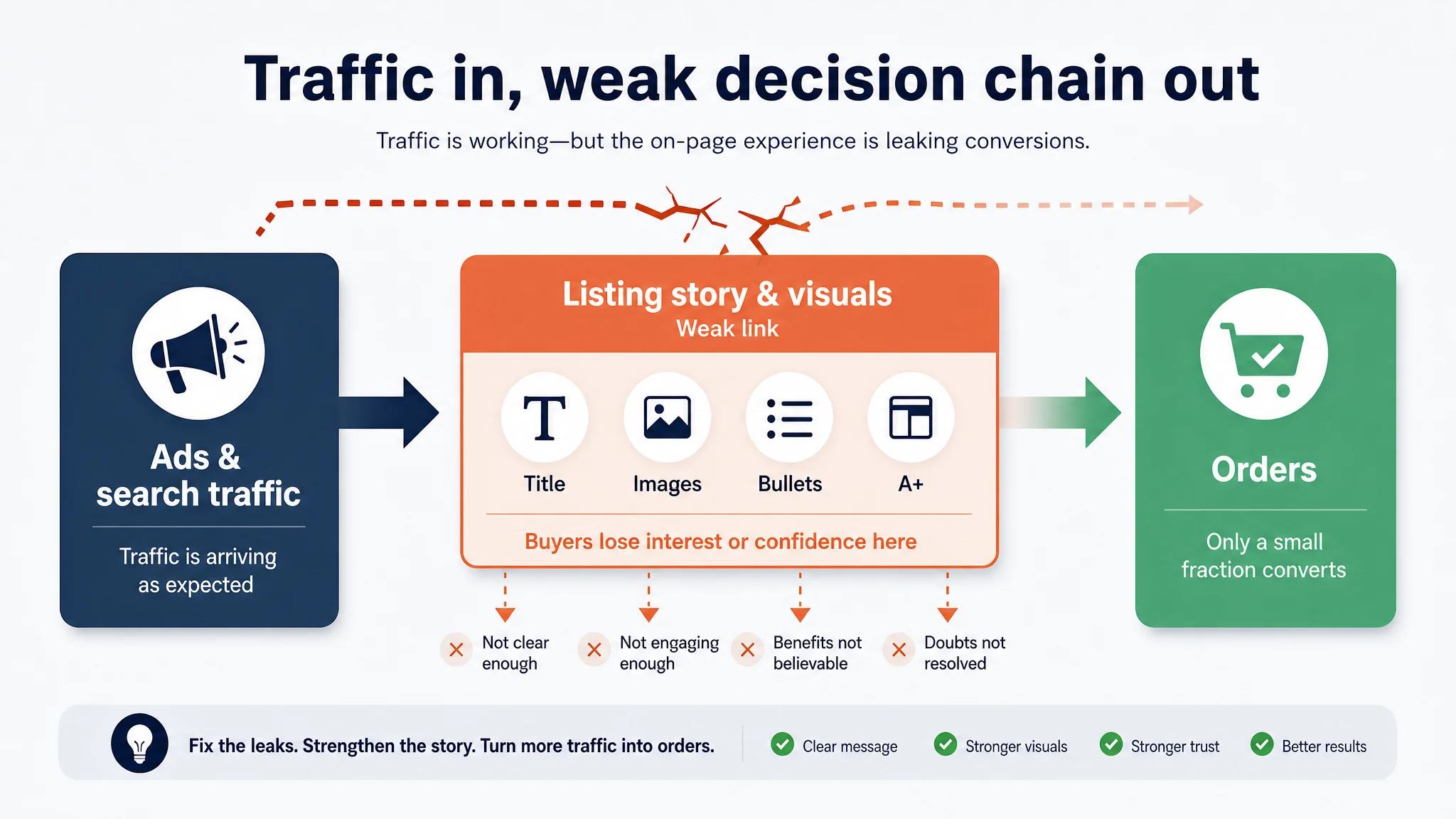
“The real problem was not that ads failed to bring traffic. It was that the page could not convert the traffic.”
Reviews were not the weak link. The core leak lived in how the Listing told the product story, not in whether the market liked the product.
If the team had kept increasing bids and adjusting campaigns on top of this page, they would simply have paid more to send buyers into the same weak decision chain.
The Real Constraint Was Listing Conversion Capacity
A page that explained the product but never owned the “game”
At first glance, the customer’s Amazon product page “covered the bases”:
- Title with “basketball laundry hamper” wording
- A set of images showing the product, some installation steps, some usage scenes
- Bullets that listed features and scenarios
- A+ modules with size, details, and family scenes
Yet the benchmark Listing consistently won more clicks and conversions from the same search environment. DeepBI’s dimensional scoring made the reason visible.
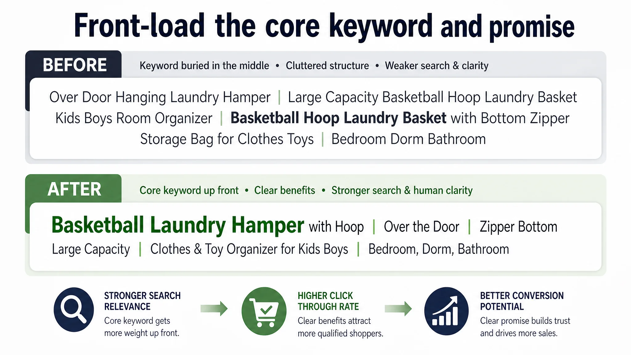
1. Title: the core keyword and the promise were buried
- The customer’s title contained the core term “Basketball Laundry Hamper”, but not at the very front; modifiers split it up and diluted initial search weight.
- The benchmark opened with “Brand – Basketball Laundry Hamper – Wooden Backboard & Mesh Hoop – Over Door Hanging Organizer…”:
- Brand + core keyword up front
- Then very concrete, visual attributes (wooden backboard, mesh hoop, color)
- Clear structure via separators, easy to scan
The customer’s title felt like a long, loosely structured list, with some keyword stacking and repeated phrases (“Basketball Hoop Laundry Basket”) rather than a clear promise. It technically “had keywords,” but in terms of search relevance + human clarity, it underperformed.
DeepBI’s judgment: Title logic was not aligned with how Amazon’s search and buyers prioritize information. The keyword was present but not leveraged.
2. Main images: “product manual” vs. “game and result”
Both Listings had multiple images, but they played very different roles:
- The benchmark’s gallery mixed:
- Real kids and family interaction
- Strong copy like “Turn chores into play”
- Before/after room comparisons
- Clear step-by-step installation
- Full accessory breakdown
- The customer’s gallery:
- Showed the product, some installation, some details
- Lacked a strong before/after frame
- Lacked a clear three-step “game + function” storyline
- Leaned more into a manual-style layout than into emotional scenes
Click behavior in Amazon search is heavily driven by thumbnail-level storytelling. Where the benchmark sold “laundry as a fun game,” the customer sold “a hoop-shaped laundry container.” Same product type, different promise.
“Advertising does not only amplify advantages. It can also amplify a page’s existing defects.”
Ads were pouring more eyes onto a gallery that never quite answered the parent’s deeper question: “Will this actually make my kid pick up their clothes?”
3. Bullets: information present, buying logic missing
DeepBI found that both Listings had structured bullets, but the rhetorical paths diverged:
- Benchmark bullet #1 opened with “SHOOT, SCORE & STORE – Make laundry day fun!”
It immediately reframed the item as a game that solves a daily pain point.
- The benchmark used:
- Game-like action phrases
- Material comparison (sturdy MDF vs. flimsy plastic)
- A satisfaction guarantee in the last bullet
The customer’s bullets:
- Described durability, structure, function, applicability, safety
- Mentioned storage, space savings, gift angle
- Lacked:
- A gameified hook at the start
- Clear pain-point framing (“messy rooms,” “kids’ clutter”)
- Brand or satisfaction-backed trust language
In other words, information existed, but the decision staircase— pain → solution → practical advantages → trust—was incomplete.
4. A+ / detail content: modules present, but the story never closes
Both pages had A+ content. The difference lay in the central theme:
- Benchmark:
- Led with a strong emotional positioning like “Laundry, but make it fun”
- Visualized a simple “Toss–Store–Wash” 3‑step habit loop
- Used consistent deep-blue backgrounds, white text, and real-life scenes
- Closed with user-testimonial style reassurance
- Customer:
- Used modules for scene display, size, installation, detail shots, storage, family scenes
- Positioned the product with lines like “Fun and Storage Are Both Reliable”
- Mixed visual styles (light green, white) with slightly cramped typography
- Never built a crisp, memorable “housework-as-game” narrative
The customer’s A+ did many individual things right, but as a decision system, it weakened:
- No clear emotional hook that anchors in memory
- Information scattered instead of forming a flow from “attraction → proof → trust → result”
Why DeepBI Did Not Keep Tuning the Ads First
From a pure advertising standpoint, the seller still had levers:
- More granular keywords
- Different bidding tactics
- More aggressive budgets on high-CTR terms
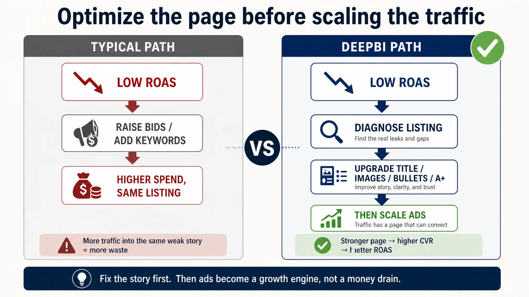
DeepBI’s view was blunt: these would mostly magnify waste at this stage.
The biggest risk: paying to send more traffic into an incomplete story
With a 77/100 Listing and clear deficits in title structure, emotional framing, and visual decision logic, the page had not yet earned the right to receive more traffic.
The key judgment:
- Reviews: acceptable; no obvious credibility crisis
- Product: competitive; features like the zipper bottom were objectively strong
- Benchmark gap: primarily in storytelling, positioning, and visual logic
So the real constraint was not “ads unable to bring enough people,” but the page unable to convert the people ads already brought.
That led to a firm prioritization:
1. Repair the Listing’s conversion logic first
2. Then use ads to scale what was proven to convert
3. Only after that, revisit more advanced campaign structure questions
This is the decision path many Amazon teams skip under pressure. But in categories where emotion and habit-formation matter—kids, home, lifestyle—a function-only page nearly always loses to a story-driven page, no matter how good the media buying.
This Product Page Did Not Lack Traffic. It Lacked Trust and a Game.
Once the Listing was identified as the bottleneck, DeepBI’s work shifted from “why things are broken” to “what must change in the page logic.”
Reframing the title: from keyword list to search + promise
DeepBI recommended a revised Amazon title:
Basketball Laundry Hamper with Hoop, Over the Door Laundry Basket for Kids Boys, Basketball Hoop Net with Zipper Bottom, Large Capacity Clothes & Toy Organizer for Bedroom, Dorm, Bathroom
Core changes in logic:
- Core keyword front-loaded:
“Basketball Laundry Hamper” moved to the front to align with Amazon search behavior.
- High-impact modifier early:
“Over the Door” comes right after, clarifying form factor.
- Flagship feature explicitly called out:
“Zipper Bottom” is named instead of buried; it solves the “how do I empty it?” pain.
- Audience and scenarios integrated, not stacked:
“Kids, boys, dorm, bedroom, bathroom” expand coverage without random repetition.
This moved the title away from “stacked phrases” toward “search-driven, outcome-aware” wording—giving both the algorithm and humans a clearer, faster understanding.
The Page Needed a Game, Not Just a Basket
Bullets: rebuilding the logic around “gameified chores”
DeepBI didn’t just “polish” the bullets; it rebuilt them around one central idea: “Turn cleanup into play, and train habits without fights.”
Examples from the optimized bullets:
1. Lead with the game
SHOOT, SCORE & ORGANIZE – Turn cleanup time into playtime! This basketball laundry hoop makes chores fun, encouraging kids and teens to keep their bedrooms and playrooms clutter-free while developing great organization habits through interactive play.
- Hooks attention with game language
- Anchors the parent’s core desire: less nagging, better habits
1. Durability framed as freedom to use it hard
DURABLE & STURDY CONSTRUCTION – Built with a reinforced frame and high-density breathable mesh net, this basketball clothes hamper is designed for heavy everyday use. The sturdy construction ensures it holds laundry, toys, or sports gear without losing its shape or tearing.
- Not generic “durable” language: tied to everyday heavy use and multiple types of items
1. Zipper-bottom as a time-saver, not a raw feature
EXTRA LARGE CAPACITY WITH QUICK UNLOAD – The spacious mesh bag provides plenty of room for days' worth of clothes, blankets, or toys. Featuring a reinforced zipper bottom design, it allows for quick, mess-free unloading directly into your laundry basket, making laundry day faster than ever.
- Moves from feature → outcome (“quicker, mess-free” laundry day)
1. Space-saving + installation anxiety removed
SPACE-SAVING & TOOL-FREE SETUP – Maximize your floor space with this over-the-door basketball hamper that fits most standard doors. Perfect for kids' rooms, bathrooms, or college dorms, it includes secure hooks and door-protective pads to prevent scratches and ensure a stable fit.
- Answers: “Will it fit?” and “Will it damage the door?” in one bullet
1. Gift and safety as a combined trust signal
THE PERFECT SPORTY GIFT – Designed with smooth edges and safety in mind, this basketball laundry basket is a fun and practical gift for boys, teens, and basketball fans. It’s a high-quality, sports-themed decor piece that parents love for its utility and kids love for the game.
- Appeals simultaneously to parents and kids
- Positions product as both decor and functional organizer
The impact is subtle but crucial: every bullet now participates in a single sales story, instead of being a disconnected feature list.
Images: From “Instruction Sheet” to Decision Engine
DeepBI’s image-level analysis found that the customer’s visuals:
- Showed the product clearly
- Missed critical narrative and emotional angles that the benchmark used to win the click
The optimization did not ask for random “prettier” pictures. It specified how each image must change the decision state of the viewer.
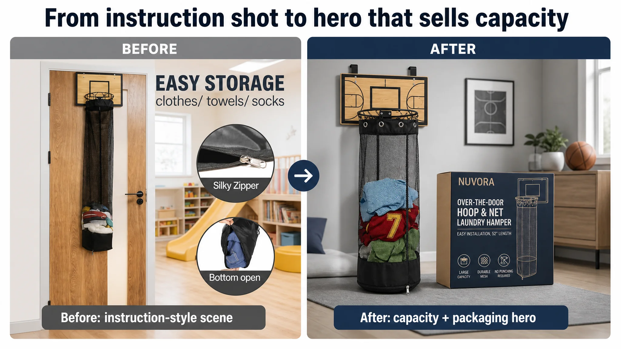
1. Hero image: proof of capacity + packaging = “real product, not a toy”
Suggested adjustments:
- Product at a 45° angle in the center, ~60% of the frame
- A few colorful clothes inside the net
- Branded packaging box angled beside it
- Clean light-gray wall background, soft directional light, gentle floor shadow
Business logic:
- Capacity is visually obvious
- Packaging hints at “serious product,” helping justify price and trust
- Still white/clean enough for Amazon main-image standards when adapted correctly
2. Dimension + key-features image: parameters that actually reduce returns
Proposed:
- Product hanging on a white door
- Vertical dashed line indicating total height, horizontal for width
- Three dark blue icons: “Large Capacity”, “Durable”, “No Drilling”
- Soft window light, lightly blurred kids’ room behind
Business logic:
- Size becomes intuitive
- Core benefits attached to real context (“on a door,” not floating on white)
- Reduces sizing anxiety and suitability doubts
3. Installation trust-image: fix the “will this damage my door?” objection
Proposed:
- 45° top-side close-up of the door edge and hooks
- Three magnified bubbles pointing to:
- Protective pads on hooks
- Metal rim connection
- Reinforced stitching on the net
- Clean white background, soft even lighting, “Easy to Install” caption
Business logic:
- Directly addresses the most common structural and damage fears
- Turns invisible quality into visible reasons to believe
4. Function-flow image: from random details to a clear use cycle
Proposed three-part vertical composition:
- Top: child shooting a shirt into the hoop
- Middle: net bag full of clothes
- Bottom: zipper opening and clothes dropping into a hamper below
Business logic:
- Builds the “shoot–store–wash” mental model in one glance
- Connects fun + capacity + convenience into one narrative line
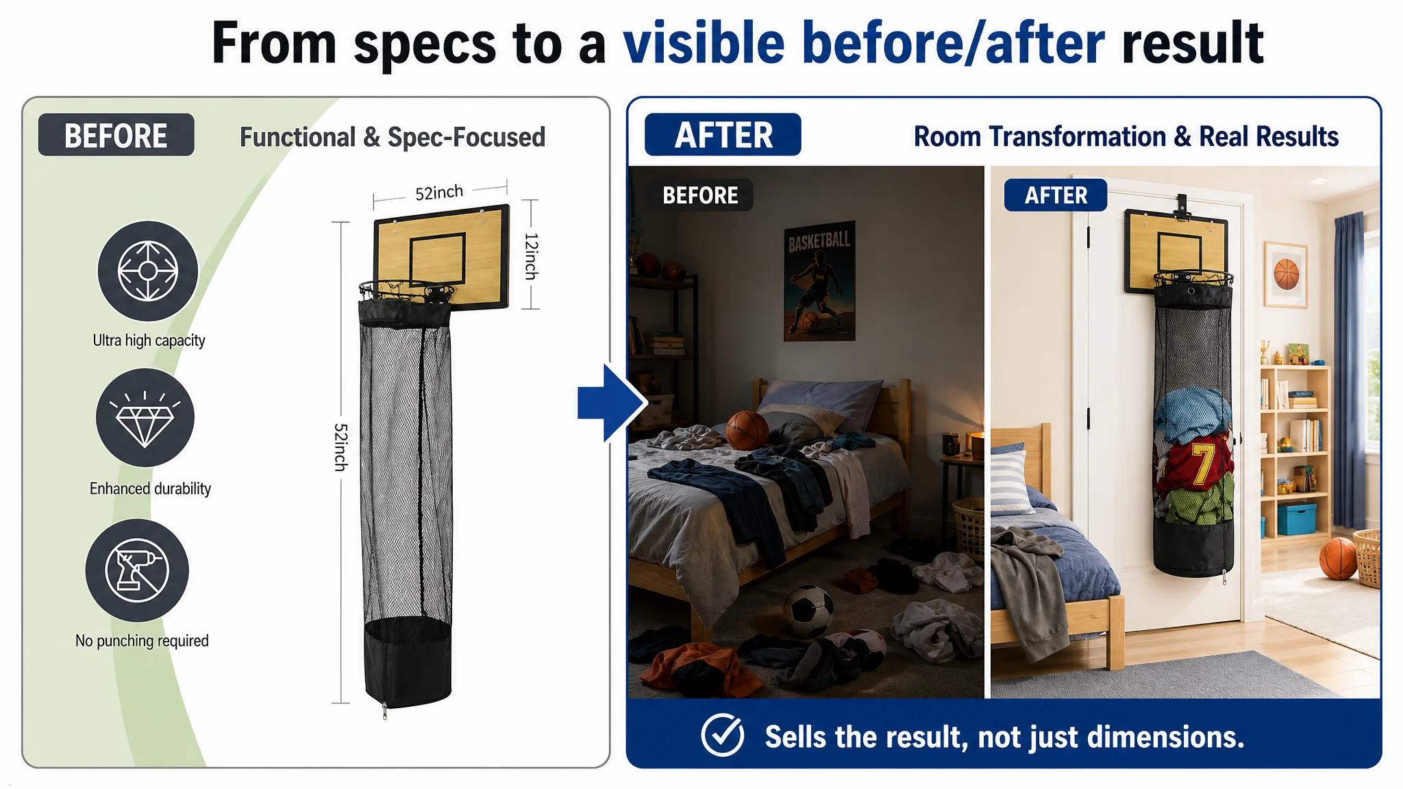
5. Before/after: visualizing the room’s transformation
Proposed split-screen:
- Left “Before”: messy bed, clothes everywhere, dimmer light
- Right “After”: products hung on the door, room tidy, brighter light
Business logic:
- Household organizers sell the result, not just the container
- The image does what text cannot: make the outcome feel immediate and desirable
A+ Content: From Disconnected Modules to a Chore-Game Story
DeepBI’s A+ recommendations followed a simple principle: Every module must either increase desire, reduce doubt, or close the sale.
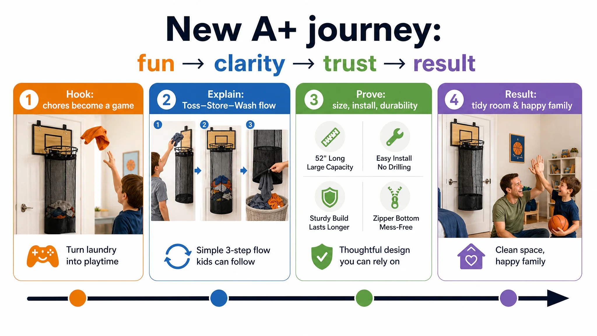
Key structural changes:
1. Open with a chore-as-game hero image
- Child mid-throw, clothes flying toward the hoop
- Warm, Scandinavian-style kids’ room
- Natural morning light, slightly blurred background
- Text on the right: the central promise about “turning chores into a game”
Role: hook—emotion before specs.
1. Visual three-step “Toss–Store–Wash” strip
- Three equal sections:
- Tossing clothes
- Bag partly filled, net clearly visible
- Zipper open, clothes sliding into laundry basket
Role: clarify usage, reduce mental load, show daily cycle.
1. Clean, accurate size diagram
- White background, straight-on product view
- Lines marking board width, net length, hook spacing
- Precise, verified numbers
Role: prevent mismatch & returns, answer “will it fit our door?” without support tickets.
1. Installation close-up with human hands
- Close shot of adult hands placing hooks over a door edge
- Neutral light, clear view of protective pads and hook fit
Role: disarm installation anxiety, increase “I can do this in 30 seconds” confidence.
1. Durability detail grid
- 3–4 micro shots:
- Thick metal rim connection
- Tight mesh weave
- Zipper head and stitching
- Reinforced bottom seams
Role: upgrade perception from “cheap toy” to “serious home product,” supporting higher price tolerance.
1. Zipper-bottom convenience showcase
- Focus on bottom opening mid-unzip
- Colorful clothes dropping into a basket
Role: highlight the differentiating feature that actually affects laundry workflow.
1. Trust and emotional payoff
- Wide shot of a tidy kids’ room
- Father and child high-fiving, child holding a basketball
- Warm, late-afternoon lighting
Role: communicate the result—a cleaner room and less conflict over chores.
At this point, the A+ no longer reads like “extra pictures.” It functions as a guided journey from fun → clarity → trust → result.
How Ad Traffic Became Useful Again
The customer did not change their core product. They did not suddenly collect hundreds of new reviews. What changed was how the Amazon Listing converted the traffic they already had.
After realigning the page:
- The title communicated both search relevance and a concrete benefit sequence.
- The bullet points formed a coherent pain → game → convenience → trust chain.
- The main images and A+ content illustrated:
- How the product is installed
- How the game works
- Why it is durable
- How it changes the room and family dynamics
This produced three business-level shifts:
1. Ad clicks no longer felt “wasted”
Buyers landing on the page encountered a tight, believable story that matched the promise of the thumbnail and search terms.
1. The Listing regained organic conversion potential
A stronger conversion rate on inbound traffic supports better organic ranking over time, which in turn reduces dependence on ever-rising ad spend.
1. The team’s mental model changed
They stopped viewing Amazon ads as a universal fix and started treating Listing quality as the foundation for any serious scaling.
Even without public numeric results, you can infer the operational difference:
- Lower likelihood of money-burning impressions
- Clearer sense of “when we should scale ads”
- Reduced risk of overcompensating for a weak page with brute-force spend
What Other Amazon Sellers Can Take Away
This basketball laundry hamper case is not unique to kids’ home organization. The underlying pattern shows up across categories:
- Teams see ACOS pressure and blame campaign settings.
- Listings look “fine” but lag behind benchmarks by 8–15 points in core dimensions.
- Emotional hooks, decision structure, and trust modules are quietly weaker than the real category leaders.
From DeepBI’s perspective, the key lessons are:
- Ads do not fix a broken story. If your Amazon product page cannot clearly articulate pain, promise, proof, and result, more traffic will just increase costs, not orders.
- Listing scoring is not cosmetic. A 10-point gap (77 vs. 87) between you and the benchmark usually means you’re losing both clicks and conversions long before price or reviews come into play.
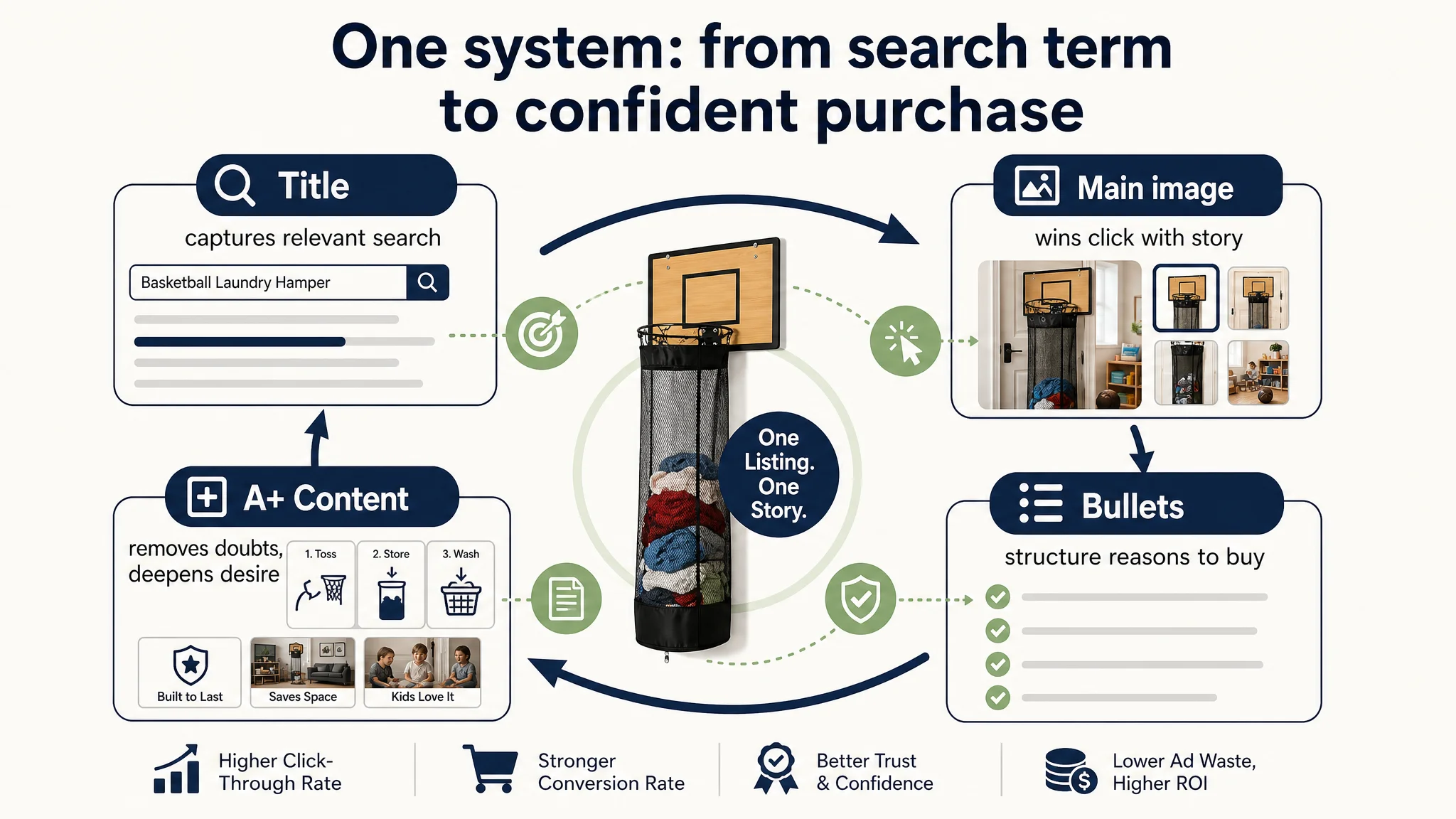
- Title, main image, bullets, and A+ must work as one system.
Title captures relevant traffic, the thumbnail wins the click, bullets structure the rationale, and A+ closes doubts and builds desire.
- Before scaling ads, ask: “Does this page truly deserve more traffic?”
If the honest answer is “not yet,” your first lever is Listing conversion—not bigger bids.
When those elements align—as they did here around the simple idea of “turning chores into a game”—Amazon ads stop feeling like an uncontrollable cost and start behaving more like a predictable growth input.