


An Amazon home & kitchen seller came to DeepBI with a familiar concern: ads were getting harder to control, yet the glass coffee mug Listing was not turning traffic into stable orders. The team’s first judgment was that they needed better Amazon ads and more reviews; in their mind, the product was beautiful, and the page was already “good enough.” But once we put their Listing side by side with a high‑performing benchmark on Amazon, a different picture emerged: the real problem was not exposure, it was weak product‑page conversion.
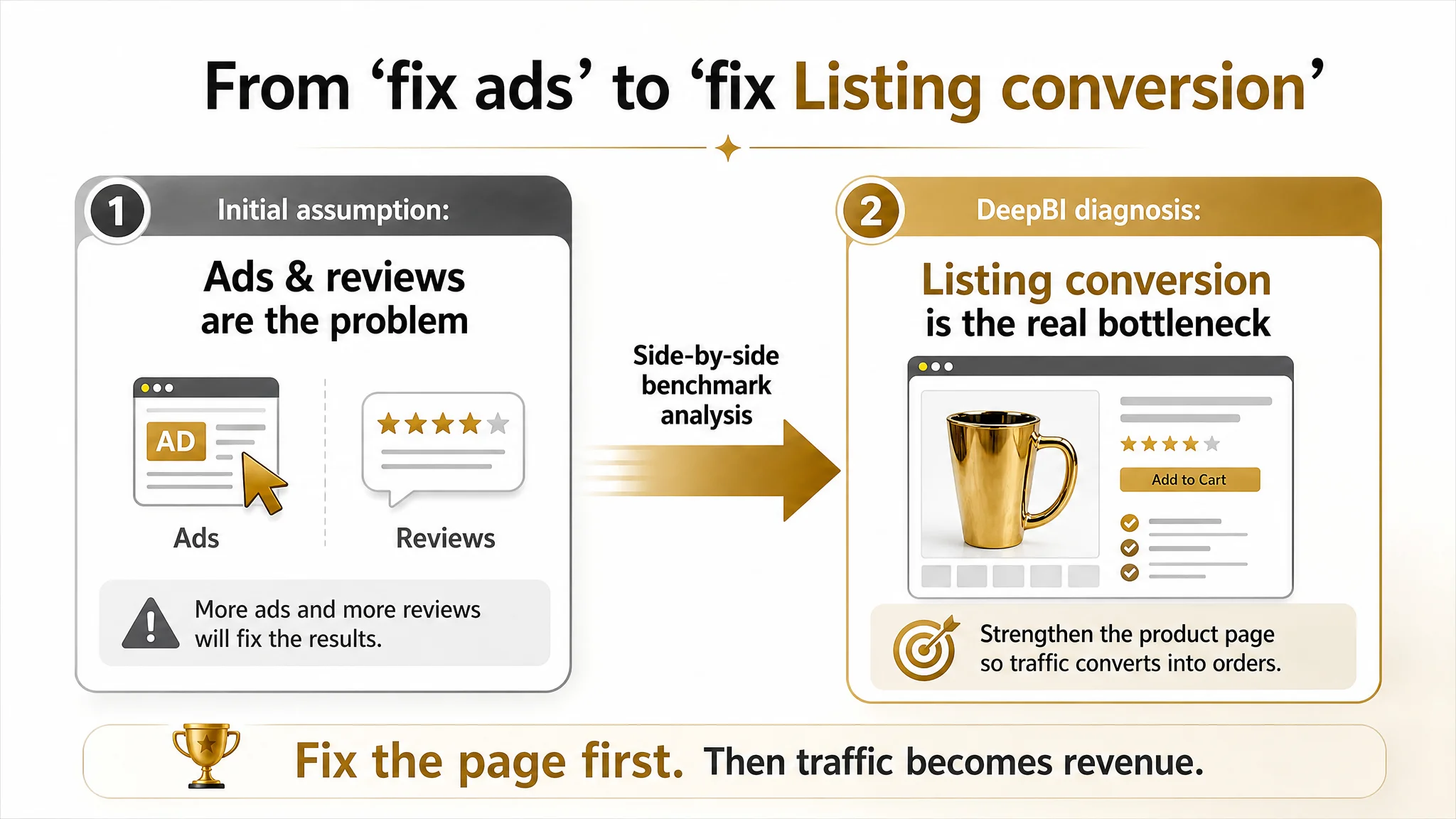
The DeepBI diagnostics showed a clear gap. Where the benchmark Listing used its Amazon title, main images, bullets and A+ to build a coherent “modern light‑luxury coffee lifestyle” story, this Listing scattered its story across abstract “artistic” visuals and parameter-heavy images with little trust backing. Instead of missing traffic, the seller was missing a convincing buying logic: why click this mug in the search results, and why feel safe paying a premium once on the page.
We reframed the work from “keep tuning Amazon ads” to “rebuild the Amazon Listing’s conversion capacity.” That meant restructuring the title around real search and decision logic, redesigning the main image set to create a clear visual hook and lifestyle context, and turning the bullets and A+ from a vague art concept into a concrete chain of ergonomics, safety, size, scenarios, gifting, and after‑sales trust. For Amazon sellers in similar categories, the lesson is sharp: if your Listing scores and page logic lag far behind a benchmark, pouring more budget into ads only amplifies a conversion leak.
The Amazon Problem: Traffic Was Not the True Bottleneck
This case is about an Amazon US glass coffee mug Listing.
The seller was under pressure from:
- Rising ad costs and difficulty lowering ACOS
- Very low review volume compared with peers
- A sense that “we have a beautiful, artistic product page, so ads must be the problem”
From their perspective:
- The mugs had a distinctive golden electroplated look and wavy surface.
- The page already showcased “artistic” lifestyle scenes.
- The star rating (4.6) looked healthy.
So they focused on:
- Adjusting ad bids and structures
- Hoping that more exposure and more reviews would gradually lift orders
But DeepBI’s Listing score told another story:
- Their Listing: 60 / 100
- Benchmark Listing in the same Amazon category: 86 / 100
- Gap: –26 points, spread across every key conversion dimension:
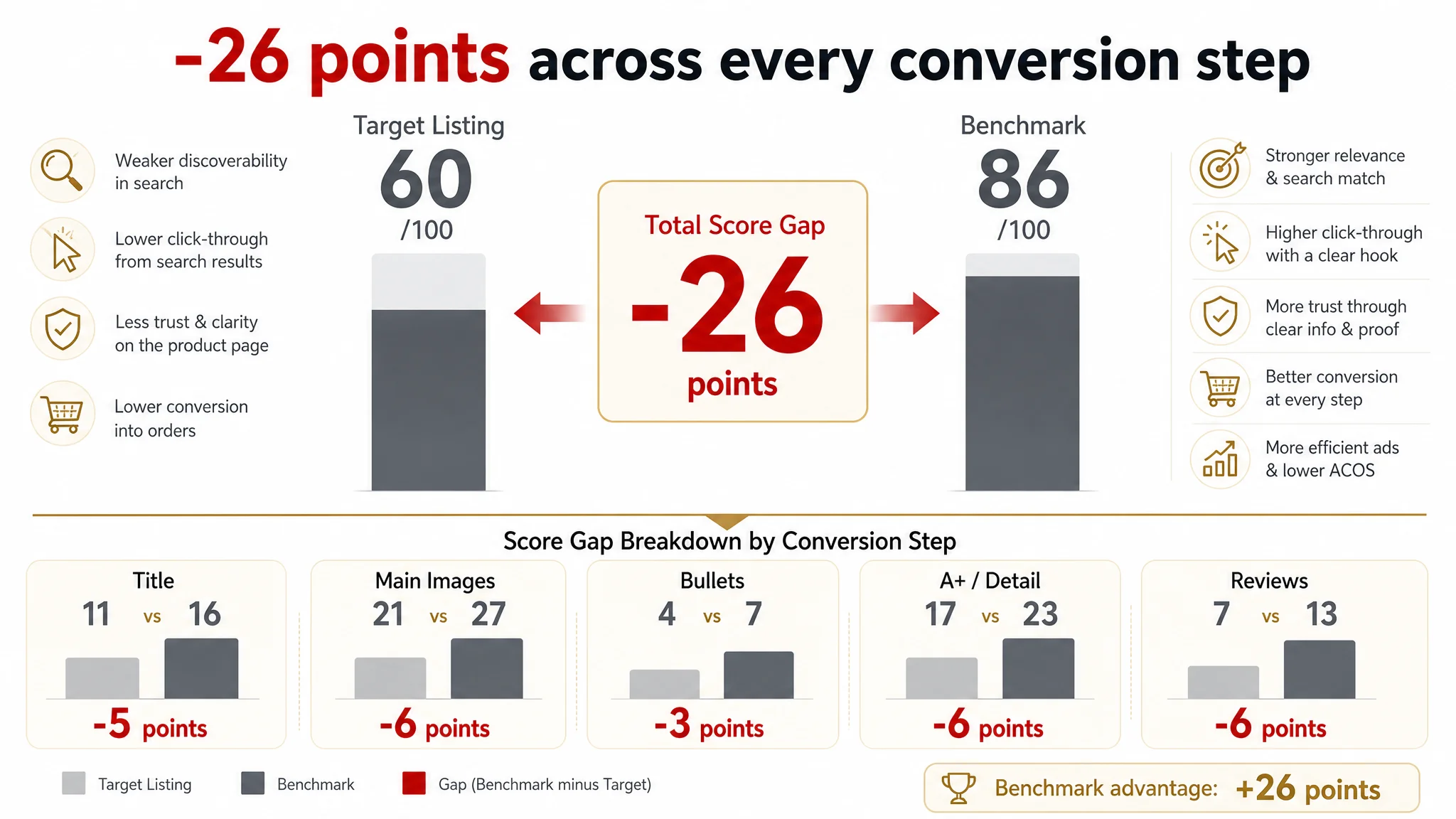
- Title: Target Listing: 11, Benchmark: 16, Gap: -5
- Main Images: Target Listing: 21, Benchmark: 27, Gap: -6
- Bullet Points: Target Listing: 4, Benchmark: 7, Gap: -3
- A+ / Detail: Target Listing: 17, Benchmark: 23, Gap: -6
- Reviews: Target Listing: 7, Benchmark: 13, Gap: -6
The core conflict was not “insufficient traffic” but insufficient Listing conversion capacity. Ads were feeding traffic into a page that was structurally weaker than the benchmark at almost every decision step.
“The real problem was not that ads failed to bring traffic. It was that the page could not convert the traffic.”
The Original Misdiagnosis: Blaming Ads and Reviews
From the seller’s internal view, the main obstacles looked like:
- “We don’t have enough reviews yet; once reviews grow, conversion will catch up.”
- “If we push some more on ads and tune keywords, the category will open up.”
Why this felt reasonable:
- Star rating was good: 4.6 vs 4.7 for the benchmark.
- They had some lifestyle and “artistic” imagery they were proud of.
- They believed their product’s unique design (wavy surface, electroplating) already differentiated them.
But several facts undercut that judgment:
- Review volume gap was huge:
- Target Listing: 2 total reviews
- Benchmark: 59 reviews, across multiple countries
This made their great star rating look statistically fragile to buyers.
- The page structure did not carry its own weight:
- Title was messy and weak on core search terms and spec clarity.
- Main images lacked a decisive visual hook and lifestyle coherence.
- Bullets read like a loose spec list, not a buying argument.
- A+ had artful images but almost no hard information or trust modules.
In this situation, trying to repair performance mainly via ads was a misdiagnosis. Any additional traffic – paid or organic – would still hit the same conversion ceiling.
Why Traditional Ad Optimization Was Failing
When an Amazon seller is convinced the Listing is “fine,” ad optimization becomes the default lever:
- More campaigns, more keyword variations
- Bid tweaks and budget shifts
- Hoping ACOS will gradually come down as the algorithm “learns”
But three structural issues made traditional ad work ineffective here:
1. The main image set couldn’t win the click battle
On Amazon search results, the benchmark’s first image showed:
- Two mugs together on refined golden bases
- Strong symmetry and a “light‑luxury” vibe
- A high‑contrast, instantly recognizable thumbnail
The target Listing’s first image:
- Had a cluttered background and weaker visual center
- Lacked an emotional or design “hook” at thumbnail size
- Relied more on later images and text to explain its value
As a result, even if ads bought impressions, CTR hit a ceiling: the thumbnail did not give a compelling reason to click versus the benchmark.
2. Once buyers clicked in, the product page did not reduce risk
The page leaned on:
- Abstract “artistic” visual language
- Atypical scenes (e.g., sand, lab‑like backgrounds)
- Missing or weak modules about safety, material, size, and after‑sales
The benchmark, in contrast, systematically answered key questions:
- Material is clearly 100% lead‑free and BPA‑free
- Dimensions and 12 oz capacity are visualized with precise lines
- Multiple hot and cold beverages shown in real daily use
- Gift positioning and clear after‑sales commitment
Ads couldn’t compensate for this missing trust chain; each extra visitor still had the same unresolved doubts.
3. The Listing logic didn’t support a higher‑price, “art” positioning
Visually, the seller wanted to position the mug as a piece of “table sculpture.” But the implementation:
- Mixed in scenes that felt more like creative art photography than daily life
- Did not explain the electroplating quality in a verifiable way
- Offered no clear warranty or risk‑reversal message
So the market read it as an ordinary glass cup with some art styling, not as a controlled light‑luxury upgrade worth paying up for. Ads simply made that perception spread faster.
“Advertising does not only amplify advantages. It can also amplify a page’s existing defects.”
What the Listing Scores Exposed
DeepBI’s side‑by‑side Listing diagnosis with the benchmark highlighted where conversion was actually leaking.
1. Title: Information, Not Just Keywords
The benchmark opened with:
- “Glass Coffee Mugs with Handle” – locking the core Amazon search intent
- Then layered: vintage style, clear material, gold rim, capacity (12 oz), and set quantity
The target Listing:
- Started with “Tea Coffee Cups with Handle” – broad, vague, and not clearly glass‑focused
- Scattered descriptive phrases like “Vogue Glasses” and “Electroplated Surface” in a way that broke reading flow
- Contained a spelling error (“Gloden cup”) that hurt trust
- Placed “12oz” mid‑title and did not connect it to a set concept
Conversion impact:
- Weaker relevance on core search terms like “glass coffee mug with handle”
- Lower professional impression due to spelling and structure
- Slower decision‑making: buyers must decode capacity and purchase unit themselves
2. Main Images: Art Without a Conversion Hook
Visually, the current set:
- Used artistic or experimental backgrounds (sand, lab‑style) that did not intuitively map to “home coffee use”
- Relied on overlay text such as “WAVY SURFACE DESIGN” to explain what images could have shown
- Showed parameters but rarely in real, intuitive contexts like a breakfast table or reading corner
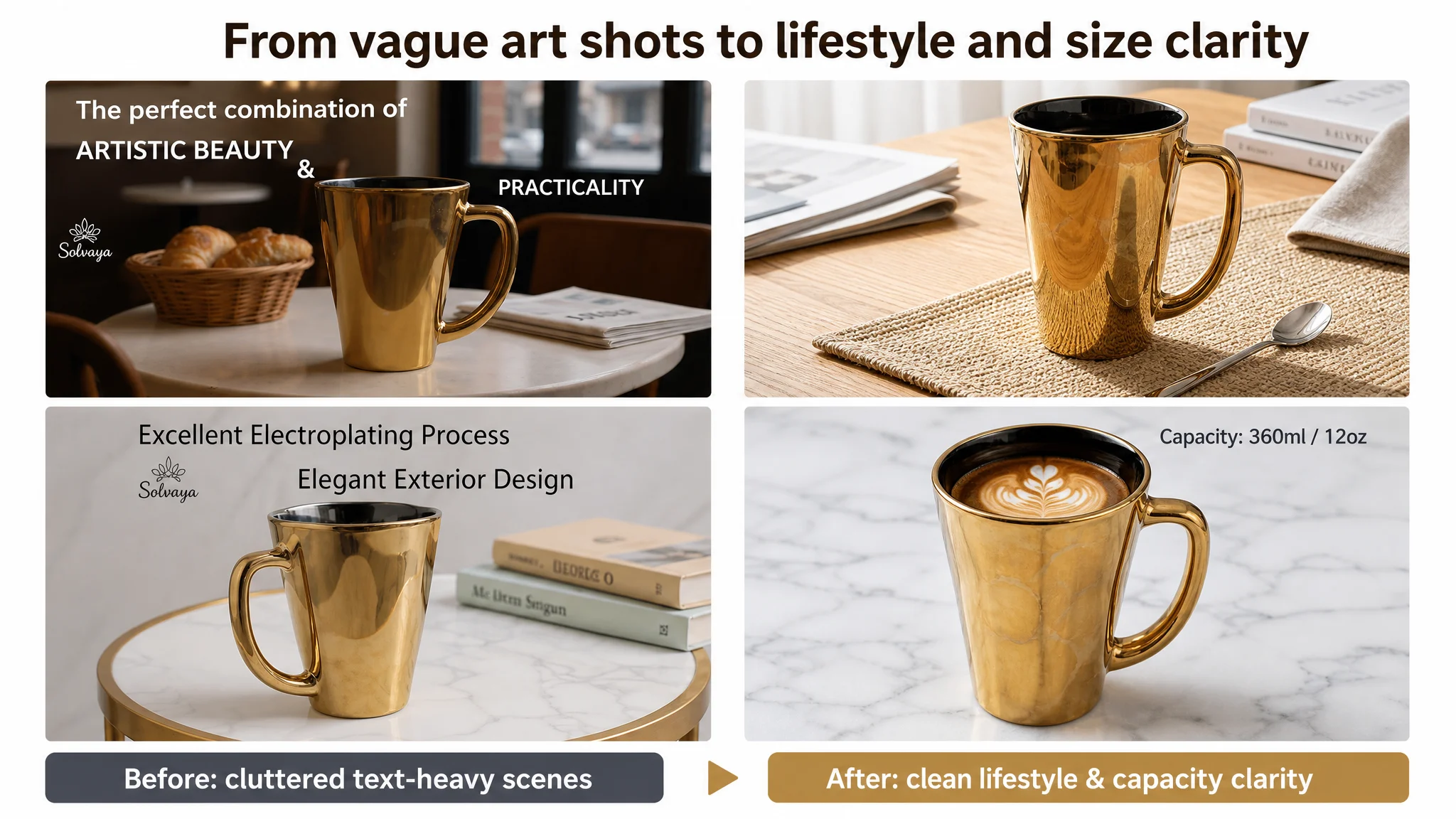
The benchmark images:
- Combined product shots with realistic home scenarios
- Showed multiple drinks (coffee, tea, cocktails, milkshakes)
- Used props (flowers, books, tableware) to create a consistent light‑luxury home narrative
Conversion impact:
- Lower CTR from search: the main image lacked a distinctive aesthetic anchor
- Weaker premium perception: the product looked like a generic cup with some gold, not a curated lifestyle object
- More buyer doubt around practical aspects: size, comfort in hand, actual color in normal light
3. Bullet Points: Specs Without a Buying Logic
The target bullets focused on:
- Design features (wavy surface, plating)
- General style statements (simple design, color description)
But missed:
- A clear ergonomic story: why the wavy design matters in grip and anti‑slip
- Material safety: lead‑free, BPA‑free claims
- Concrete size/capacity cues tied to real drinks
- Gift scenarios (occasions, recipients)
- After‑sales support and risk reduction
The benchmark’s bullets formed a clear ladder:
1. Design aesthetics + function (gold rim + ribbed grip)
2. Material safety (100% lead‑free glass)
3. Size and scenarios (12 oz, hot/cold, coffee, latte, juice, family use)
4. Gift value (multiple occasions)
5. Supplier reliability and after‑sales
Conversion impact:
- Buyers saw an attractive object but got no full story about comfort, safety, fit‑for‑use, and guarantees.
- For a higher‑priced mug, that missing trust chain directly suppressed “Add to Cart.”
4. A+ Detail Page: Aesthetic, but Incomplete and Unstructured
The target A+:
- 9 images in total, mostly atmospheric scenes and product close‑ups
- No structured textual modules (no specs table, no use tips, no guarantees section)
- No clear dimension diagram or material explanation
- Limited diversity of scenes (mostly one color, limited people interaction)
The benchmark A+:
- 13 high‑resolution scenes, covering:
- Multi‑angle product views
- Dimension diagrams with precise labels
- People using the mugs in realistic daily life
- Multiple drink types, colors, and lighting
- Cleaning and after‑sales illustrations
- Structured text modules:
- “Specification & Warm Tips”
- “What can we promise?”
Conversion impact:
- The seller’s A+ looked nice, but felt like an art portfolio, not a credible product dossier.
- Buyers who scroll this far usually want reassurance, not more mood imagery.
- The absence of written modules made the entire detail area feel “light” on proof.
5. Reviews: Quantity, Not Just Rating
- Both Listings: strong rating (4.6 vs 4.7)
- Review count: 2 vs 59
- Benchmark’s reviews:
- Multiple geographies
- Enough volume to look “proven”
Conversion impact:
- The target Listing’s 4.6 looked like an early, unproven average.
- With so few voices, any small future negative feedback could dominate perception.
- The Listing needed to compensate for this with stronger on‑page trust; instead, it leaned more on “art.”
Why Listing Conversion Had to Be Fixed Before More Ad Tuning
At this stage, DeepBI’s judgment was:
- Core constraint: The Listing’s conversion capacity was structurally weaker than the benchmark’s.
- Biggest risk: Continuing to scale ads would intensify wasted spend, with little room for sustainable ACOS improvement.
- Necessary next step: Rebuild the Listing’s sales logic and trust chain first, then let ads work on a more efficient foundation.
We explicitly advised against prioritizing:
- More keyword and bid iterations
- More campaigns trying to find a “magic” traffic pocket
And instead focused on:
- Aligning title and images with how Amazon shoppers search, click, and decide in this category.
- Turning bullets and A+ into a step‑by‑step risk reduction path:
- Is it comfortable?
- Is it safe and non‑toxic?
- Is the size right for my drinks and my kitchen?
- Is this suitable as a gift?
- If something goes wrong, will someone help me?
Until that path existed, any new traffic would hit the same wall.
How the Conversion Logic Was Rebuilt
DeepBI’s optimization path did not start from “make it prettier.” It started from reconstructing the decision logic for an Amazon glass coffee mug buyer who is paying for light‑luxury design.
1. Title: From Keyword Pile to Decision‑Friendly Structure
Proposed direction:
Artistic Coffee Cup with Handle, 12oz Golden Electroplated Glass Mugs for Tea, Latte, Cappuccino, Espresso, Vintage Drinking Glasses for Milk, Juice, Ice Cream and Hot Chocolate
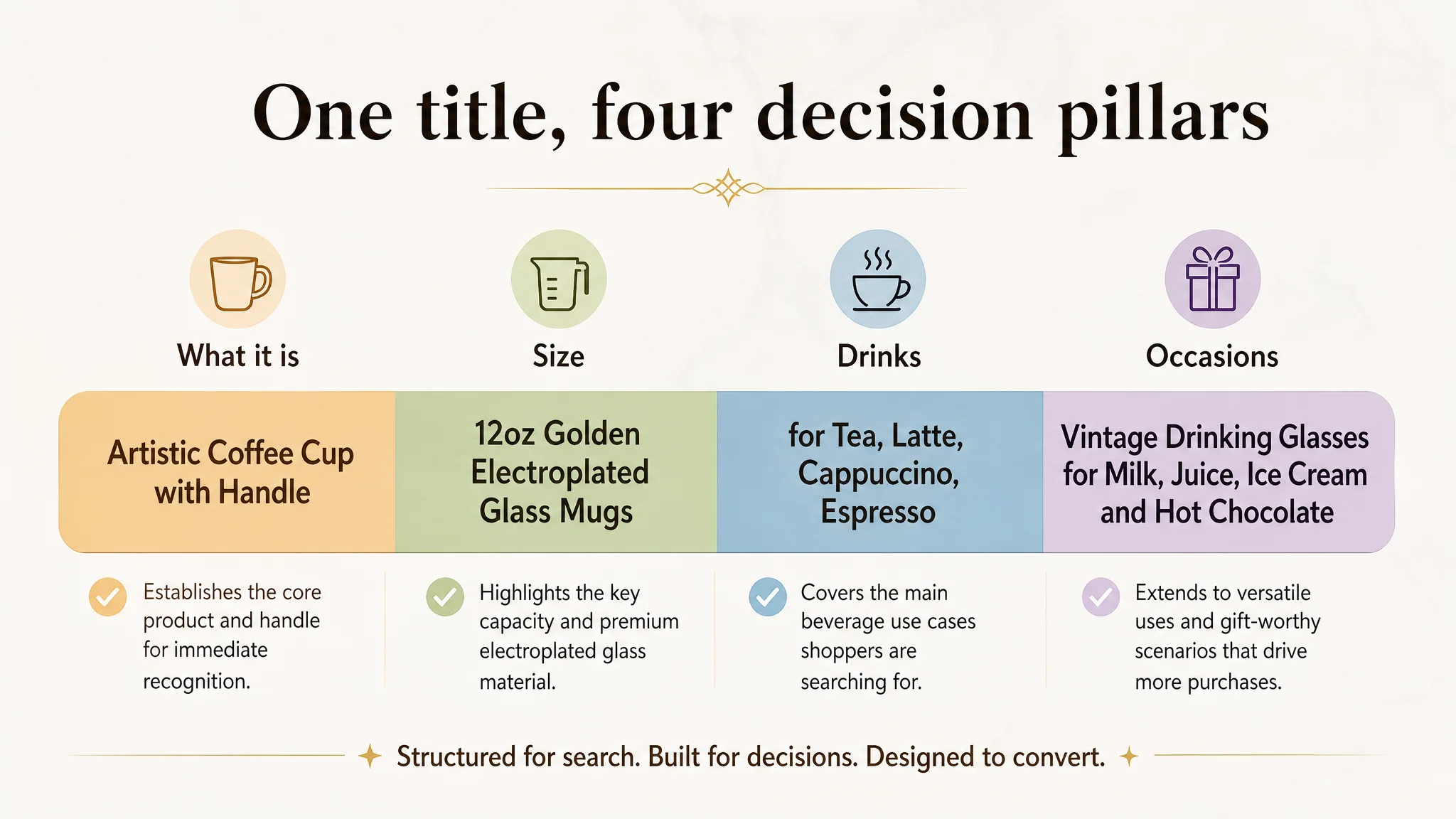
Key shifts in logic:
- Bring a clear, concrete core term (“Artistic Coffee Cup with Handle”) to the front, correcting prior spelling errors and vague wording.
- Integrate capacity and buying unit more cleanly: “12oz … Glass Mugs” rather than burying “12oz” mid‑phrase.
- Borrow proven, category‑relevant descriptors from the benchmark:
- “Mugs,” “Vintage,” “Glass,” beverage names with strong search volume.
- Use commas to segment information so human readers and Amazon’s algorithm can both parse it efficiently.
This was not a cosmetic wording change. It was a re‑anchoring of the Listing on what the page is actually selling and for which use cases.
2. Bullets: From Specs List to Trust Chain
Each bullet was redesigned to serve a discrete role in conversion.
Bullet 1 – Ergonomics + Aesthetics
- Combine “wavy surface” and “electroplating” into one coherent message:
- Comfort and anti‑slip grip
- Visual sophistication and gold shine
“Ergonomic Wavy Design & Aesthetic” Highlights a comfortable palm grip, reduced slip risk, and a refined gold finish that upgrades the daily drinking experience.
Bullet 2 – Material Safety and Durability
- Explicitly state lead‑free and BPA‑free glass.
- Emphasize thickened, durable construction and eco‑friendly, food‑safe properties.
This directly addresses one of the most common Amazon kitchenware concerns.
Bullet 3 – Size, Capacity, and Use Scenarios
- Clarify suitable drinks (coffee, tea, latte, cappuccino, juice).
- Emphasize that the capacity and design fit both quiet mornings and entertaining.
Instead of just throwing “12oz” somewhere on the page, we tied volume to a mental picture of usage.
Bullet 4 – Gift Value
- Translate “simple design” and “gorgeous color” into gift scenarios:
- Christmas, birthdays, weddings, Valentine’s, housewarmings.
- Position the mug as a symbol of taste.
This expands search relevance in “gift” contexts and adds emotional value.
Bullet 5 – After‑Sales Commitment
- Make the support pathway explicit:
- Pride in craftsmanship
- Inspection before shipment
- 24‑hour response promise
This bullet is the last piece of the risk‑reduction ladder before “Add to Cart.”
3. Main Images: From Abstract Art to Click‑Winning Visual Story
We reframed each image around its role in the funnel: search CTR, first impression, detail clarity, lifestyle resonance.
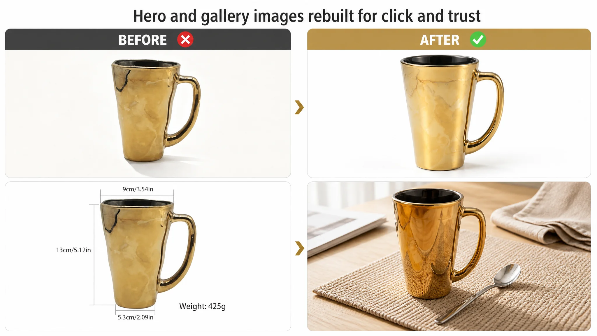
Image 1 – Core white‑background hero
- Mug centered, ~70% of frame.
- 45° side angle, pure white seamless background, bright, clean lighting.
- Purpose: clear shape, color, and gold detail; immediate “glass coffee mug” recognition at thumbnail size.
Image 2 – Realistic table scene for size and lifestyle
- Mug on a beige woven placemat on a light wood table.
- Natural window light, silver spoon as prop.
- Purpose: give buyers a subconscious feel for size and context at a typical dining table.
Image 3 – Capacity and use visualization
- 60° top‑down shot with latte art in the cup.
- White marble background, subtle capacity text (“12oz / 350ml”) in a corner.
- Purpose: answer “How much does it really hold?” and connect the mug to coffee lovers visually.
Image 4 – Elevated art‑lifestyle context
- Mug on a black stone tray, warm spot light, blurred bookshelf in background.
- A few raspberries for color contrast.
- Purpose: upgrade from “art for art’s sake” to “art within a refined living space.”
Image 5 – Dynamic “pouring coffee” shot
- Cup in the lower right; in the upper left, a hand pours coffee from a kettle.
- Sunlit white desk, fluid motion captured.
- Purpose: inject movement and realism; help the buyer imagine using the mug every morning.
Overall, the main‑image set shifts from “creative concept photos” to “conversion‑oriented, category‑standard visuals with a light‑luxury twist.”
4. A+ Detail Page: From Mood Board to Structured Proof
The new A+ design aimed to create a complete conversion loop:
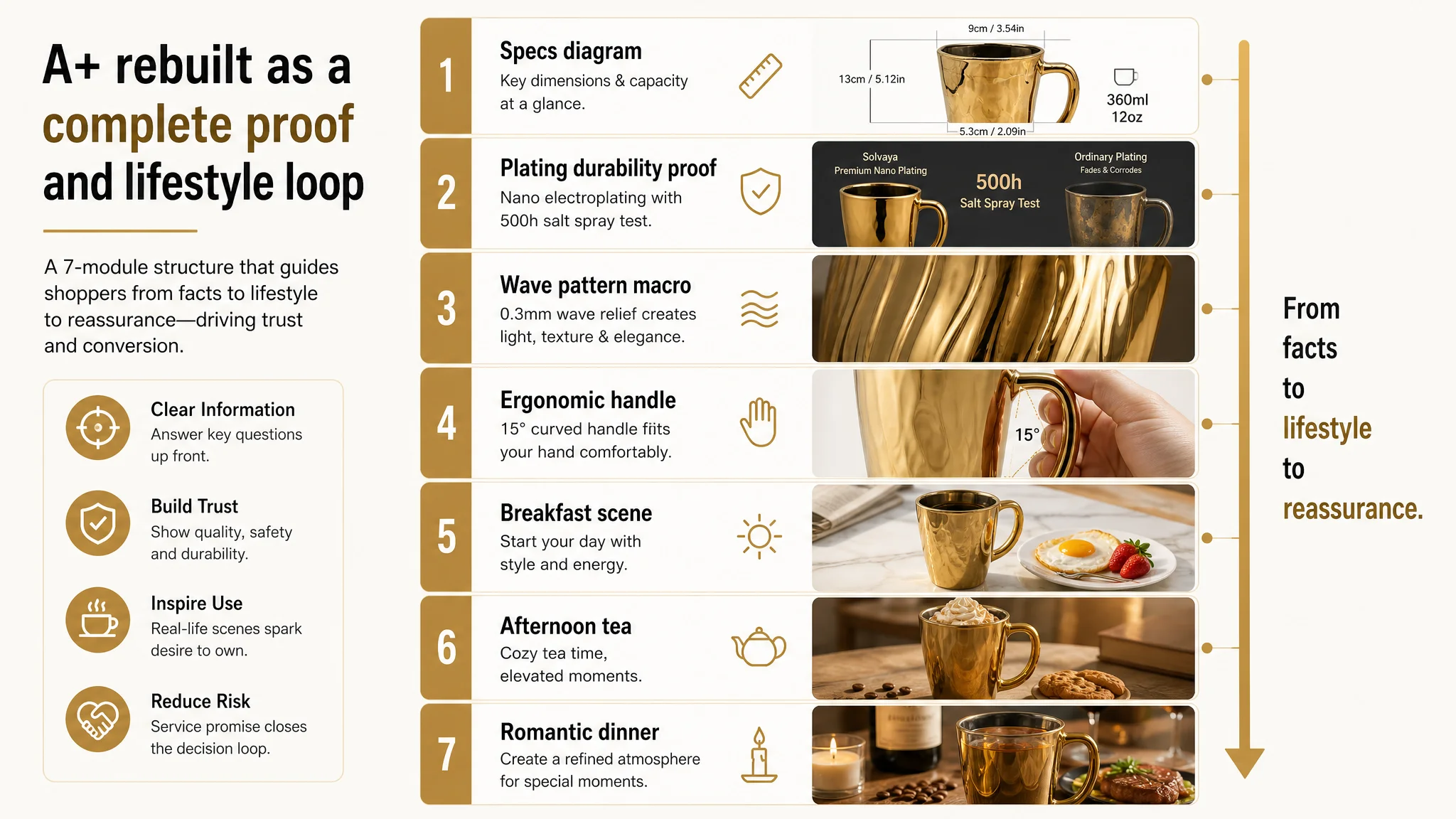
1. Professional spec diagram
- Clean white background.
- Clear lines marking:
- Top diameter
- Height
- Base diameter
- Capacity (350ml/12oz)
- Standard e‑commerce lighting and neutral typography.
Role: instantly solve size and storage doubts.
2. Craft and durability visual proof
- Side‑by‑side comparison: this mug vs. a generic plated mug.
- Deep gray background, top lighting to show uniform reflection vs. simulated fading.
- Central label “500h Salt Spray Test.”
Role: turn abstract “high‑density plating” claims into a credible visual.
3. Macro shot of 0.3mm wave pattern
- Close‑up angled view, hard side light to accentuate relief.
- Shows texture and precision, not just color.
Role: convert “artistic wavy design” into tangible craftsmanship.
4. Ergonomic handle demonstration
- Clean shot of a hand holding the 15° curved handle against a soft beige background.
- Focus on the contact area, visualizing fit and anti‑slip function.
Role: validate comfort and usability for everyday hot drinks.
5. Breakfast scene
- Mug with black coffee on white marble.
- Breakfast plate with eggs and strawberries.
- Morning side‑back light to create a fresh atmosphere.
Role: anchor the mug in an aspirational but realistic morning ritual.
6. Afternoon tea scene
- Mug filled with hot chocolate and cream, on a light wooden table.
- Coffee beans and a cookie as props, warm color tone.
Role: extend usage into social, cozy settings.
7. Romantic dinner / drink scene
- Mug with amber drink on a dark wood table.
- Wine bottle and lit candle in the background, warm low light.
Role: return to the seller’s original “table sculpture” ambition, but within clearly recognizable dinner context.
Together, these modules answer:
- What is it? (specs, material)
- How was it made? (plating quality, craftsmanship)
- How does it feel in hand? (ergonomic handle)
- Where do I use it? (morning, afternoon, evening)
- Why is it worth the price? (design, durability, gift value)
How Ad Traffic Became Useful Again
Once the Listing’s core structure was rebuilt, several important shifts became possible, even before quoting any specific numerical uplift:
- CTR had a realistic chance to improve
With a stronger hero image and coherent thumbnail story, Amazon search impressions could translate into a higher share of clicks, especially versus nearby competitors.
- CVR could begin to recover
Visitors no longer faced a vaguely artistic page with missing hard facts; instead, they saw:
- A clear title that matched their search
- Images that answered size, use, and design questions
- Bullets that chained ergonomics, safety, versatility, gifting, and support
- Organic and paid traffic started to share the same logic
Both ad‑driven visitors and organic searchers landed on a page that:
- Matched the keywords that brought them there (“glass coffee mug,” “12oz,” “gift”)
- Delivered consistent expectations from thumbnail to final image
- Advertising dependence became more controllable
With a stronger baseline conversion rate, each paid click had a better chance of turning into a sale, making ACOS more manageable and reducing the pressure to endlessly raise bids.
Operationally, the seller moved from:
- “Ads are expensive and not working; maybe we just need more reviews”
- To:
- “Our Listing was not defending the price or the art positioning; now that the page converts better, ads actually have room to perform.”
What This Case Changes in Understanding
For Amazon sellers, what matters is not that a tool can generate images or rewrite bullets. What matters is the order of judgment:
1. Diagnose where conversion is actually breaking
In this case, every dimension – title, main image, bullets, A+, reviews – lagged the benchmark.
2. Resist the reflex to fix ads first
If your Listing score and content are substantially weaker than a category leader’s, scaling ads is often just scaling waste.
3. Treat Listing conversion as the foundation of ad efficiency
Title, main image, bullets, and A+ are not separate decoration tasks. They must align as one conversion chain:
- Thumbnail: give a reason to click
- Above the fold: establish what it is and why it’s special
- Bullets and A+: remove doubt through ergonomics, safety, size, scenes, and guarantees
4. Use benchmarks as mirrors, not as inspiration boards
The pivotal shift in this case came from seeing a quantifiable –26 point gap to a single, well‑chosen Amazon benchmark Listing, not from vague impressions that “the competitor’s images look nicer.”
When sellers internalize this, their questions change from:
- “How do we reduce ACOS this week?”
to:
- “Does our Amazon product page deserve more traffic yet? If not, where exactly is the conversion logic breaking?”
That change in judgment is ultimately what made this Listing’s traffic – organic and paid – start working again.