

This case comes from an Amazon US seller in the home storage category, operating a clear plastic rolling drawer cart. On the surface, the problem looked familiar: ads were getting more expensive, and the product page was not converting as expected. The team’s first reaction was to keep tuning Amazon ads and keywords, assuming the issue was traffic quality and bids.
Once we compared their Amazon Listing against a category-leading plastic drawer tower, a different picture emerged. The real gap was not in advertising tactics but in the Listing’s conversion capacity: weak title framing, undifferentiated main images, almost no persuasive bullet logic, and a complete absence of A+ content. The benchmark Listing, by contrast, was using every part of the page to build trust, tell a brand story, and turn generic “storage drawers” into a concrete solution for clutter and sustainability.
DeepBI’s diagnosis pushed the team to pause “more ads” and reframe the problem as a product-page issue: before paying for more clicks, they needed a page that could actually convert Amazon traffic. The subsequent optimization focused on rebuilding the title around real search logic, restructuring bullet points into buyer benefits, and designing an A+ story that connected tidy spaces, recycled materials, and US-based manufacturing. For other Amazon sellers, this case is a reminder: when ACOS is stubborn and CVR is weak, the first place to audit may not be your campaigns, but whether your Listing deserves the traffic you’re already buying.
The Core Conflict: Traffic Was There, Conversion Was Not
On the numbers, the situation looked stark.
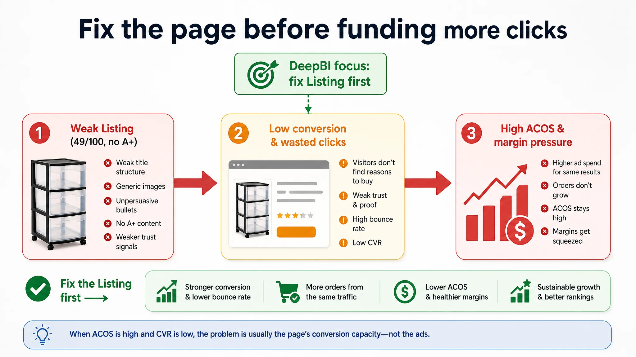
DeepBI’s Listing score put the customer’s Amazon product page at 49/100, while a directly comparable high-performing competitor in plastic drawer towers scored 86/100. That 37‑point gap wasn’t spread evenly:
- Title: 11 vs. 16 (–5)
- Main images: 24 vs. 27 (–3)
- Bullet points: 5 vs. 8 (–3)
- Detail / A+ content: 0 vs. 22 (–22)
- Reviews: 9 vs. 13 (–4)
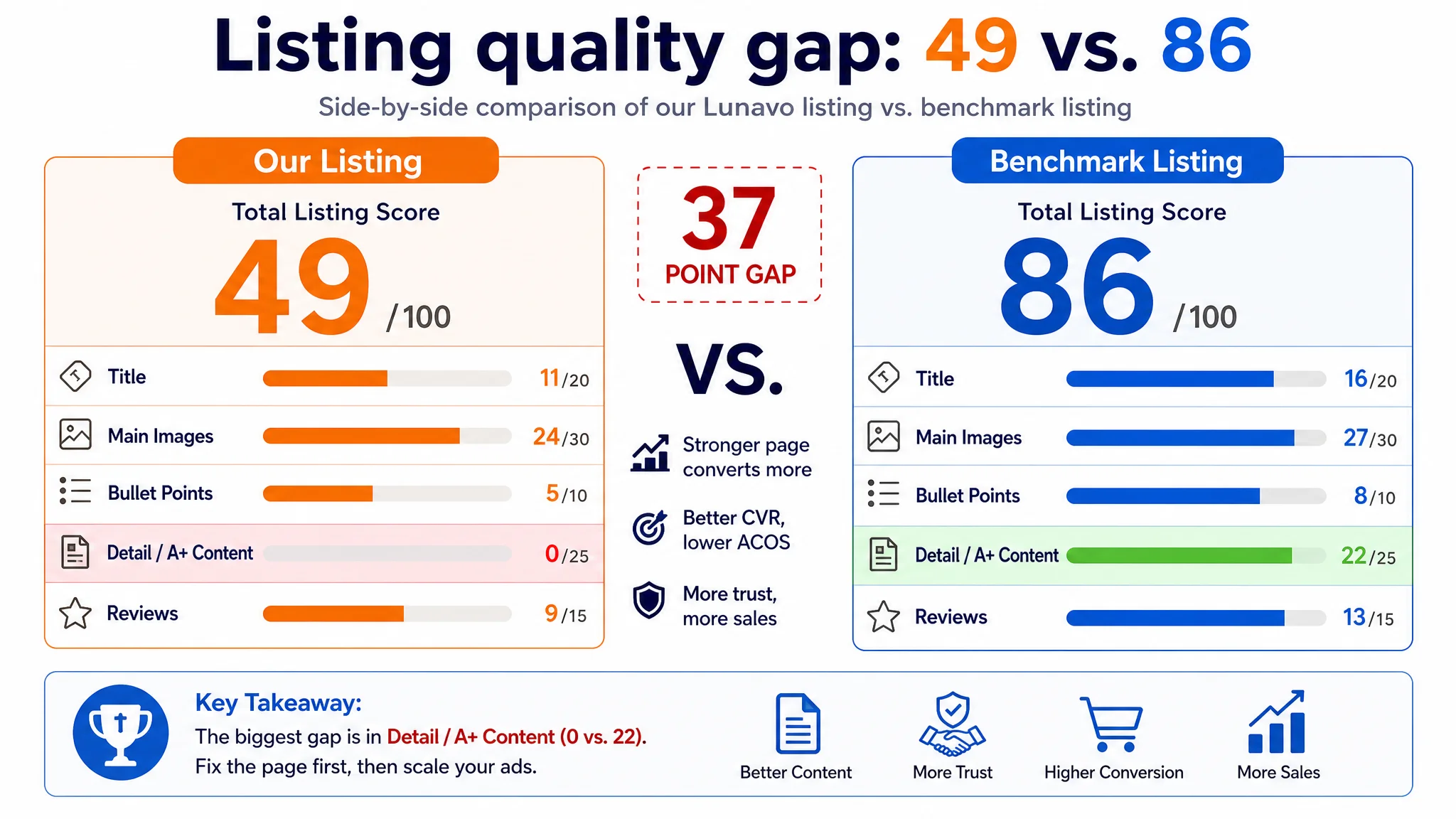
The single biggest deficit—by far—was A+ / detail content. The customer had no A+ at all, while the benchmark was running a fully built-out Amazon A+ stack: emotional slogans, before/after clutter scenes, dimension infographics, multi-color options, and a clear “from chaos to order” story.
At the same time, ads were still being pushed. Traffic was not the core constraint; the page’s ability to convert that traffic was.
“The real problem was not that ads failed to bring traffic. It was that the page could not convert the traffic.”
How the Seller Originally Misdiagnosed the Problem
From the seller’s point of view, the symptoms lined up with an “ads” issue:
- Rising ACOS and pressure on margins
- Ads felt harder to optimize than in earlier phases
- Traffic was coming in, but orders were not following proportionally
The team’s working assumptions were:
- Maybe the keywords weren’t accurate enough
- Maybe bids and campaign structure needed another round of tuning
- Maybe they should increase budgets to “break through”
What was missing was a hard, side‑by‑side look at how their Amazon Listing actually compared to the page that was winning the category.
Without that comparison, it was easy to keep treating Amazon ads as the main lever. In practice, the seller was amplifying a page that:
- Did not establish brand or product positioning
- Did not close trust gaps (origin, materials, durability)
- Did not show how the drawers solved real-space chaos
Ads were not underperforming in a vacuum; they were being funneled into a Listing that could not stand up against a strong benchmark.
What the Data Actually Showed: A Listing That Could Not Carry Its Weight
Once DeepBI scored the page against the benchmark drawer tower, the pattern was clear: this Listing did not lack traffic; it lacked a conversion engine.
1. Title: Informative, but Not Competitive in Amazon Search Logic
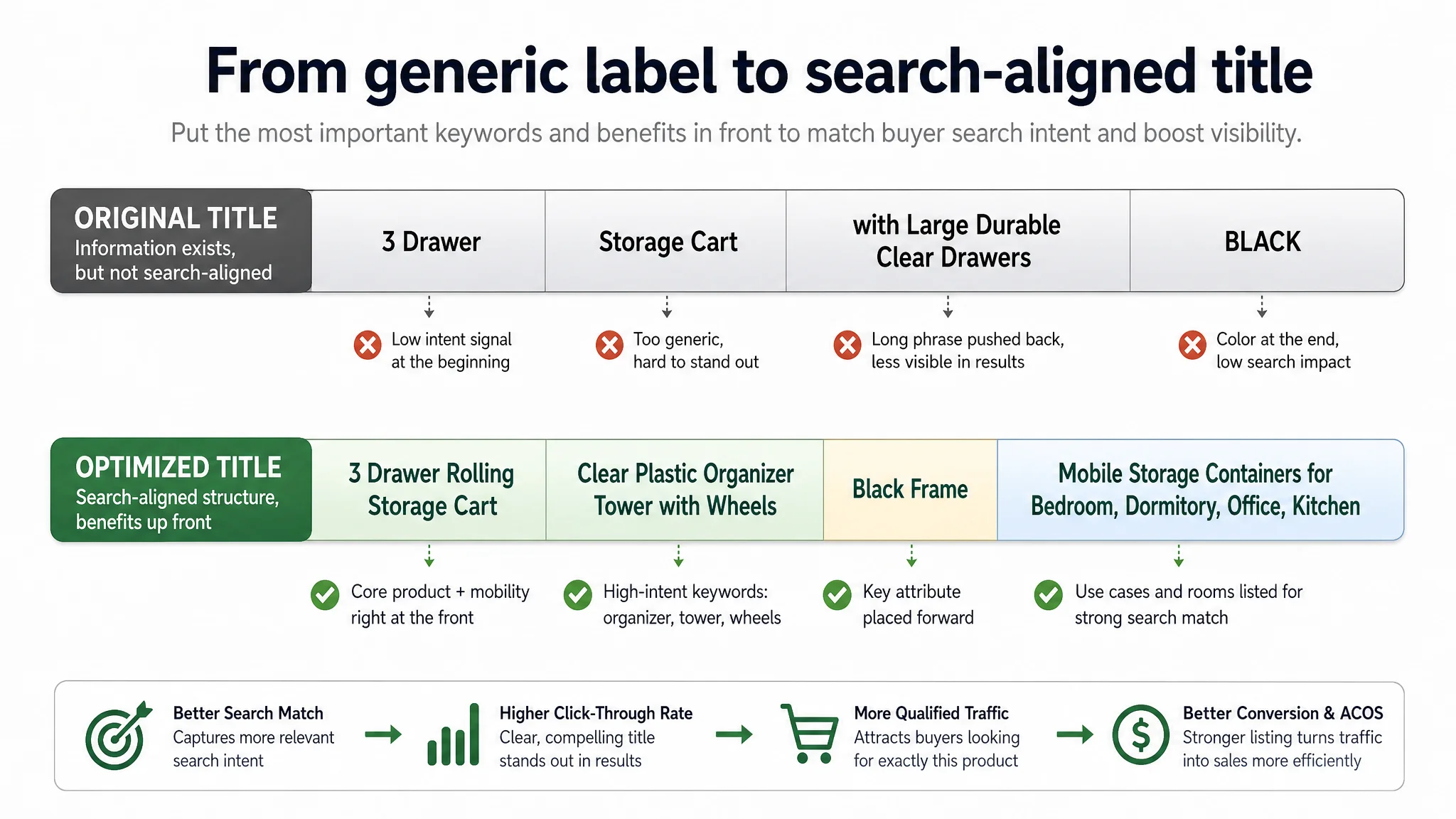
The customer’s original title was centered on:
- “3 Drawer”
- “Storage Cart”
- “with Large Durable Clear Drawers”
- Color “BLACK” isolated in caps at the end
It was technically descriptive but structurally weak for Amazon:
- Generic “Storage Cart” instead of a more precise, visualizable phrase like “Drawer Tower” or “Storage Organizer Cart”
- No strong up‑front signal of product form and role in organization
- Color treated as an afterthought, not part of a coherent product description
The benchmark title, by contrast:
- Led with brand plus “Drawer Tower” (forming a clear product image in the search results)
- Framed the product as a “4‑Tier Clear Plastic Storage Organizer Cart”
- Repeated and reinforced the “rolling drawer containers with wheels” concept and linked it to specific rooms (bathroom, bedroom, office, classroom)
From an ads and SEO perspective, this was decisive. The benchmark title:
- Captured more relevant search intent
- Stacked high‑value keywords without bloating
- Made the product’s role at a glance obvious in the Amazon results grid
The customer’s title wasn’t “wrong”; it just didn’t earn the click with the same precision.
2. Main Images: Functional, but Not Building a Reason to Click
The customer’s main image set did not have obvious fatal flaws; it showed the product, angles, and some use cases. But next to the benchmark, the weaknesses were structural:
- No strong visual hook on the hero image
- A “product manual” feel rather than a lifestyle solution
- Limited emotional or trust content (no strong cues on safety, origin, or environmental friendliness)
The benchmark’s Amazon image stack did three things well:
- Used brand color and matte textures to give a more “premium” feel in a very price‑sensitive category
- Built emotional anchors (“From trash bin to storage drawers”) so buyers weren’t just buying plastic—they were buying a cleaner, more sustainable home
- Dedicated frames to BPA‑Free and Made in USA, which are category‑critical trust signals
The effect is simple: in a crowded search result page, the benchmark’s thumbnail gives both a reason to click and a hint of higher trust. The customer’s thumbnail, while correct, disappears into the grid of generic storage carts.
DeepBI’s evaluation aligned with what Amazon CTR patterns usually show: when a main image doesn’t clearly differentiate, you often end up buying more and more traffic just to achieve the same number of clicks.
The Hidden Hole: A+ Content Missing Where It Mattered Most
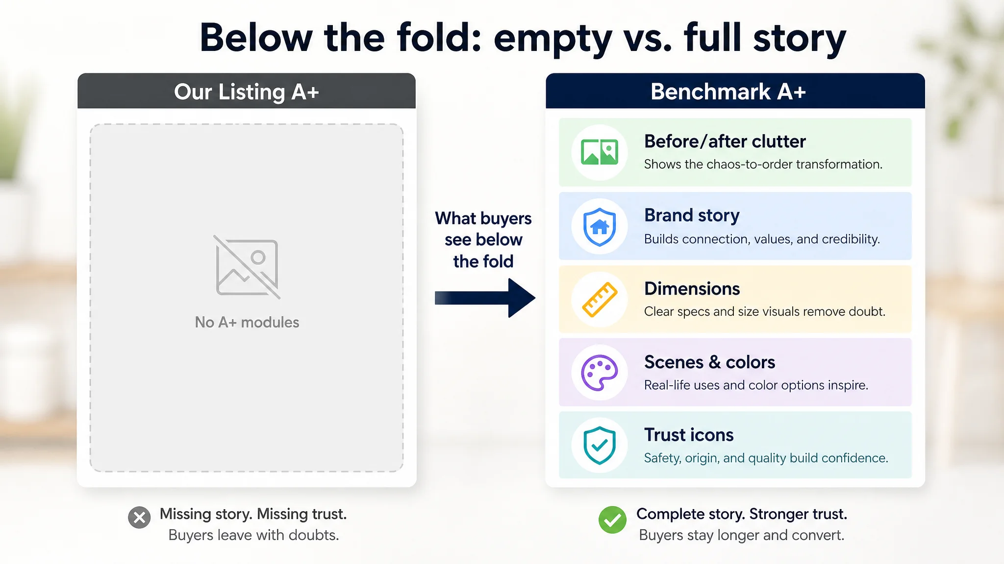
The most damaging gap was not visible in the search results—it was below the fold.
- The customer had no A+ content at all
- The benchmark had a six‑module A+ layout:
- Scenario before/after (“CHAOS & CLUTTER” vs. tidy space)
- Brand story and slogan
- Dimension spec diagrams (icons + numbers + product visuals)
- Multi‑color displays
- Functional pain‑point solutions
- Multi‑angle product visuals
This is where DeepBI judged the real conversion leak was happening.
Why This A+ Gap Couldn’t Be Ignored
In home storage, buyers often:
- Worry whether the unit fits their space
- Care about material safety and durability
- Want reassurance that the drawers can handle real-world usage (clothes, books, tools)
The benchmark’s A+ answered all of that visually and structurally:
- Clear before/after clutter comparisons anchored to an emotional slogan (“SAY BYE TO CHAOS & CLUTTER!”)
- High‑resolution images showing size and context
- Clean dimension graphics turning complex numbers into fast visual understanding
- Brand and origin (“Made in USA”) in a consistent design system
The customer’s Listing left this entire layer empty.
Result: ad traffic reached the detail page, scrolled, and found no deeper story, no additional proof, and no reassurance. Many of the most intent‑driven visitors likely bounced or went back to the benchmark ASIN.
“Advertising does not only amplify advantages. It can also amplify a page’s existing defects.”
From a business perspective, this meant:
- Every additional dollar of Amazon ads was being pushed into a page with a 0/25 score on detail/A+ content
- The more aggressively the seller scaled ads, the more visible that structural weakness became
At this stage, spending more on ads without repairing the Listing would only scale waste.
Bullet Points: Information Without a Buying Logic
On the text side, the bullets reflected the same pattern: information was present, but persuasive logic was weak.
The customer’s structure:
- Started with raw dimensions
- Listed multi‑purpose usage
- Explained drawer structure
- Mentioned transparent design
- Touched on mobility and scenes
The benchmark’s structure:
- Opened with brand story and emotional connection
- Emphasized “Made in USA” and “90% recycled materials”
- Highlighted benefits: “reduce waste”, “smart, sustainable solution”
- Then mapped to multi‑scene use and convenience
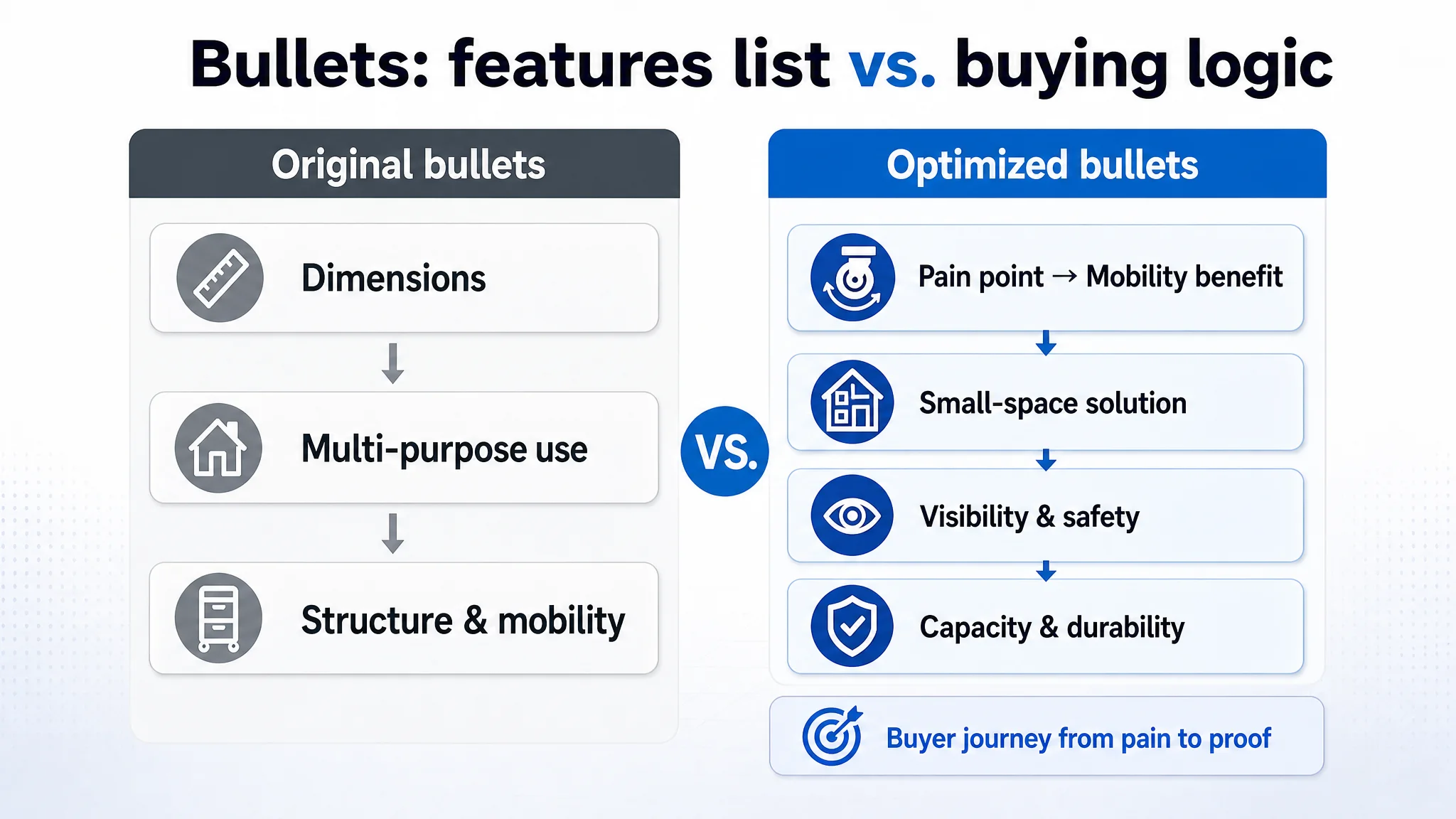
In practice, this meant:
- The customer talked about what the product is
- The benchmark talked about what the product does for the buyer and why it is trustworthy
DeepBI’s diagnosis reframed bullets as a conversion tool, not a compliance exercise. The revised bullet concepts moved from “features list” to “pain‑point → benefit → proof”:
- Mobility as experience, not just “has wheels”:
“360° Effortless Mobility – smooth-gliding casters that move across hard floors and carpets; move from office to laundry room with zero hassle.”
- Small-space solution, not just “multi-use”:
“Versatile & Compact Organization – maximize storage in small spaces like dorm rooms and bathrooms.”
- Visibility and safety, not just “clear drawers”:
“Clear Visibility with Secure Design – quick ID at a glance, drawer stops prevent accidental removal.”
- Capacity with clarity, not just random measurements:
“Large Capacity & Precise Dimensions – dimensions supported by explicit internal measurements tying to ‘everyday storage needs.’”
- Durability and wide applicability, not just “sturdy”:
“Sturdy & Durable Construction – reliable for home, office, garage, or craft room.”
The key was not that the original bullets were “bad English,” but that they were not arranged as a convincing buying path.
Why DeepBI Did Not Recommend “Fix Ads First”
From a pure ad-operations point of view, there were plenty of levers left:
- More precise keyword harvesting
- Bid rebalancing between generic and long‑tail terms
- Campaign restructuring for Sponsored Products vs. Sponsored Brands
DeepBI’s judgment was that none of this should come first.
Reasons:
1. Listing conversion was structurally weaker than the benchmark
- Overall 49 vs. 86 score
- 0 vs. 22 on detail/A+
- Lower title clarity and main-image differentiation
2. Ads were already doing their job: delivering traffic
The issue wasn’t lack of impressions; it was the page’s inability to close.
3. Every additional ad dollar had diminishing ROI
Without fixing the page, improved targeting would still send visitors into a storyless, trust‑light Listing.
4. The category leader proved what “good” looks like
The benchmark’s high review count (~12,900+ reviews vs. the customer’s 17) and fuller visual narrative showed how a strong Listing can compound over time: better conversion → more orders → more reviews → more organic share → more stable ad efficiency.
In other words, the system judged that the biggest business risk was not under‑spending on ads, but continuing to pay for traffic that the current page could not monetize.
Rebuilding the Page: From “Product Cart” to “Mobile Organization Solution”
DeepBI’s Listing analysis did not just critique; it dictated a new priority order:
1. Strengthen the title to align with Amazon search and decision logic
2. Re-architect bullets into benefit-driven, small-space-focused messaging
3. Redesign the main image stack to visually answer key questions
4. Build A+ content as the core trust and storytelling layer
Title: Aligning With How Amazon Buyers Actually Search
The proposed title reframed the product as:
3 Drawer Rolling Storage Cart, Clear Plastic Organizer Tower with Wheels, Black Frame – Mobile Storage Containers for Bedroom, Dormitory, Office and Kitchen
Key shifts:
- “Rolling Storage Cart” and “Organizer Tower” pushed forward as primary searchable concepts
- “3 Drawer” paired with “clear plastic” to signal both capacity and visibility
- Wheels and mobile use embedded as core identity, not a side feature
- High-frequency scenes (bedroom, dormitory, office, kitchen) baked into the tail to align with long‑tail intent
This was not cosmetic. It repositioned the ASIN in Amazon’s ecosystem:
- Easier for ads and organic to hit the right, high‑intent queries
- Stronger clarity for shoppers scanning a crowded search results page
Main Images: From Static Product to Contextual Answer
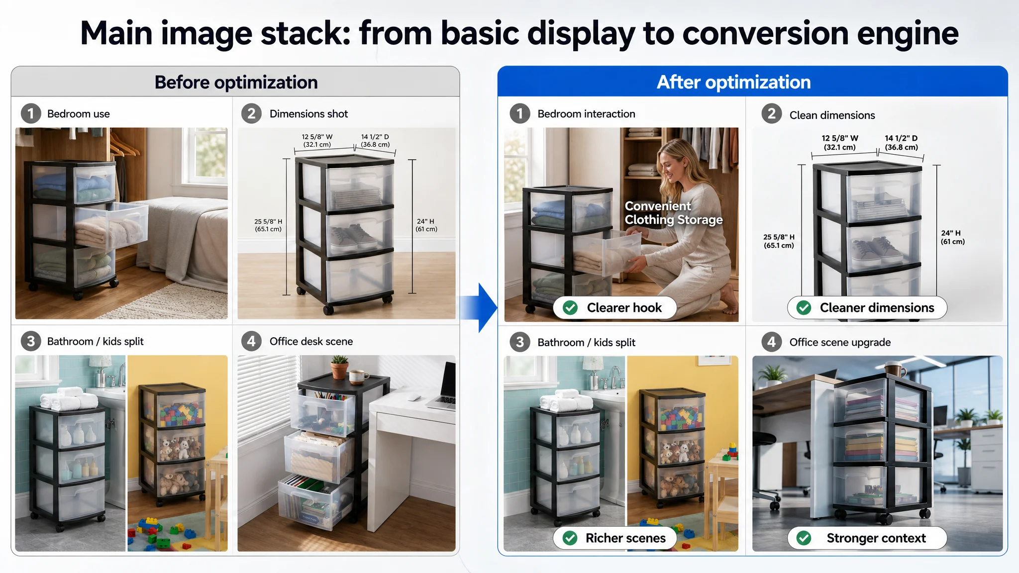
Each proposed main image change was designed to solve a specific decision doubt:
- Hero image – Product centered (~75% frame), 45° angle, clean shadow, pure white background, neatly organized colorful contents inside
→ Clear form, scale, and “premium yet practical” visual.
- Human-interaction scene – Person half‑squatting and opening a drawer in a modern closet environment, labeled “convenient clothing storage”
→ Addresses: “Is this actually usable in a bedroom/closet context?”
- Dimension diagram – Front-on view with precise measurement lines around height, width, depth
→ Addresses: “Will it fit in my space?” without needing to read tables.
- Multi-scene split – Bathroom tiles on one side, kids’ room wooden floor on the other, each with the cart integrated
→ Addresses: “Does it work in my type of room?” and demonstrates versatility.
- Office scene – Next to a desk, low upward angle, drawers filled with files and stationery, top holding a coffee mug
→ Addresses: “Does it feel at home in an office?” and signals load capacity.
Each of these images turned a potential friction point into a quick visual “yes”.
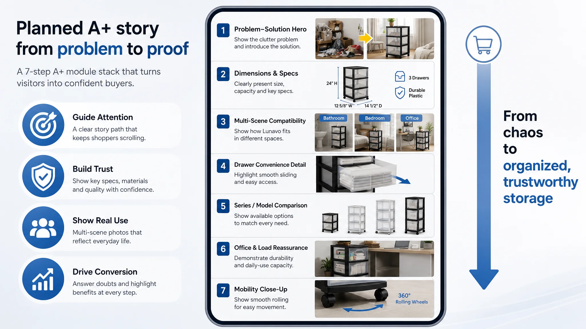
A+ Content: Making Up for a 0/25 Deficit
Given the Listing’s 0 in the A+ dimension, DeepBI’s blueprint was to construct a full Amazon A+ layer that mirrored—and adapted—the benchmark’s success logic:
1. Brand / Problem–Solution opener
- Industrial storage room style
- Left: organized drawers with bright tools and gloves
- Right: textual hook “SAY BYE TO CHAOS” with brand logo and US flag
→ Instantly sets a narrative: this product exists to transform messy spaces, backed by credible origin.
2. Dimensions & core specs infographic
- Strong contrast layout
- Product with arrows marking exact height/width/depth
- Icons for “3 Drawers” and “Durable Plastic”
→ Converts dimension anxiety into confidence and reduces returns from size mismatch.
3. Multi-scene compatibility module
- 3 colors of the product in a bright modern bedroom, beside an open closet
- Clothes visible to emphasize transparency and organization
→ Expands perceived audience and supports cross‑variation selection.
4. Functional detail: drawer smoothness & no-lid convenience
- Close-up of a half‑opened drawer with clothes
- Caption like “No more lid‑lifting”
→ Directly counters traditional storage pain points: heavy bins, awkward lids, difficulty accessing contents.
5. Model / series comparison module
- Clean, high vertical composition showing more tiers or alternative configurations
→ Sets the stage for cross-selling and clarifies vertical-space efficiency.
6. Study/office usage & load reassurance
- Cart next to a desk, drawers full of heavy books and notebooks
→ Visually answers “Will this bend, warp, or collapse?”
7. Mobility close-up on casters
- Low angle on wheels over a neutral floor, with clear shadow and “Easy Mobility” callout
→ Solves the “once full, is it still easy to move?” worry.
Collectively, this A+ plan is not about making the page “prettier.” It directly addresses the trust gaps that had previously forced the team to rely on ads alone.
What Changed: From Ads Consuming Traffic to Ads Fueling a Stronger Listing
Because this case focuses on diagnosis and decision logic, not post‑hoc number inflation, we won’t invent metrics. Instead, it’s more accurate to describe what changed in the operating state and risk profile once the Listing path was rebuilt.
1. The Page Started to Regain Conversion Capacity
By reinforcing:
- Title search alignment
- Main-image differentiation and clarity
- Benefit-based bullet structure
- A+ trust and scenario storytelling
…the Listing moved from a 49/100 profile towards the benchmark’s pattern. That does not instantly match an 86/100 top performer, but it materially changes how:
- Organic visitors perceive the ASIN vs. competing results
- Paid traffic behaves once it reaches the detail page
- Review accumulation and perceived authority evolve over time
2. Ad Traffic Became Useful Again
With a stronger Listing:
- The same ad clicks had a better chance to convert
- The seller could begin to see ACOS move down from previous pressure levels
- Incremental ad budget now had a clearer pathway to incremental orders, instead of being eaten by page‑level doubts
This also opened the door to:
- Testing more aggressive keywords without fear that every mismatch would be fatal
- Allowing Amazon’s algorithm to see better downstream CVR, which, over time, supports more favorable placements and impression opportunities
3. The Seller’s Understanding of “What’s Broken” Shifted
The most important change was conceptual:
- From: “Our Amazon ads are too expensive and not optimized enough”
- To: “Our Amazon Listing was too weak to monetize the traffic we were already buying.”
They saw that:
- A nearly empty A+ section in a trust‑sensitive category is not a minor omission; it is a structural handicap.
- Title, main images, bullets, and A+ are one conversion system, not separate decoration layers.
- Before scaling ads in a competitive Amazon category, you must ask: “Does this product page deserve more traffic?”
What Other Amazon Sellers Can Take From This Case
1. High ACOS is not always an advertising problem.
If your Listing scores are heavily skewed—especially a 0 in A+ while competitors are fully built out—ads will only magnify that weakness.
2. Benchmark against the real category leader, not your own past.
The gap between this seller’s 49/100 and the benchmark’s 86/100 was not abstract; it was visible in every module: title clarity, visual hooks, story depth, and trust badges.
3. A+ is not optional in decision-heavy categories.
For storage, furniture, and similar lines, A+ is often where doubt is resolved. Ignoring it forces your ads to do the impossible: sell without a story.
4. Bullet points must form a buying logic, not a checklist.
Switch from “this is what the product is” to “this is what the product does for you, in your constrained space, with proof.”
5. Before touching bids, audit your page against a benchmark.
A systematic Listing score and side‑by‑side competitor inspection often reveal that your “ads issue” is really a product-page conversion issue.
DeepBI’s value in this case was not in outputting nicer images or longer copy. It was in reframing the problem: from chasing ad tweaks on a weak Listing to repairing the Listing so that Amazon ads, organic traffic, and the page itself could start working together again.