

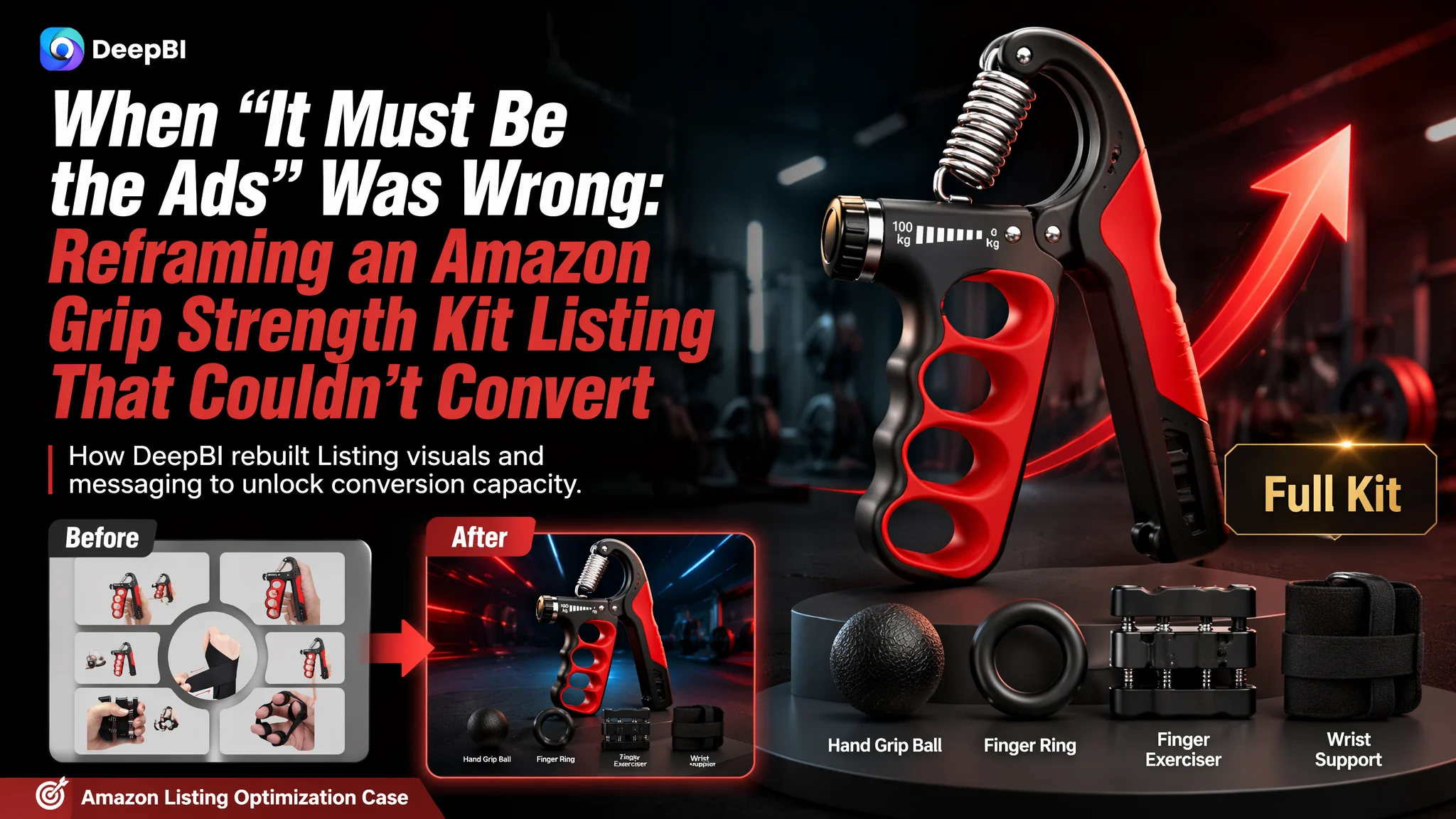
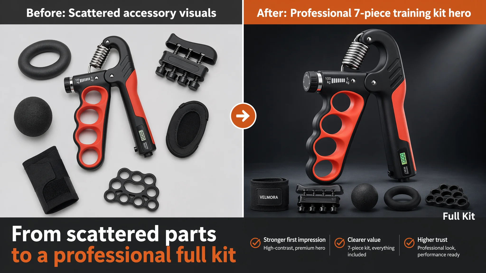
This Amazon seller in the fitness accessories category came to us with a familiar complaint: ad spend was rising, but orders on their grip-strength kit were not following. They tried to blame Amazon ads—bids, keywords, campaign structure—because the product was a 7‑piece hand grip strength kit with a competitive spec. Yet even with traffic coming in, the Listing simply was not building enough trust to turn clicks into purchases.
Once we ran the Listing against a category-leading Amazon competitor, the pattern became clear. The problem was not that ads “didn’t work”; it was that the product page could not fully convert the traffic it already had. Title keywords were mis-prioritized, the main-image set lacked a strong professional hook, the A+ visuals weren’t telling a clear “7‑in‑1 solution” story, and the social proof gap versus the benchmark Listing was massive.
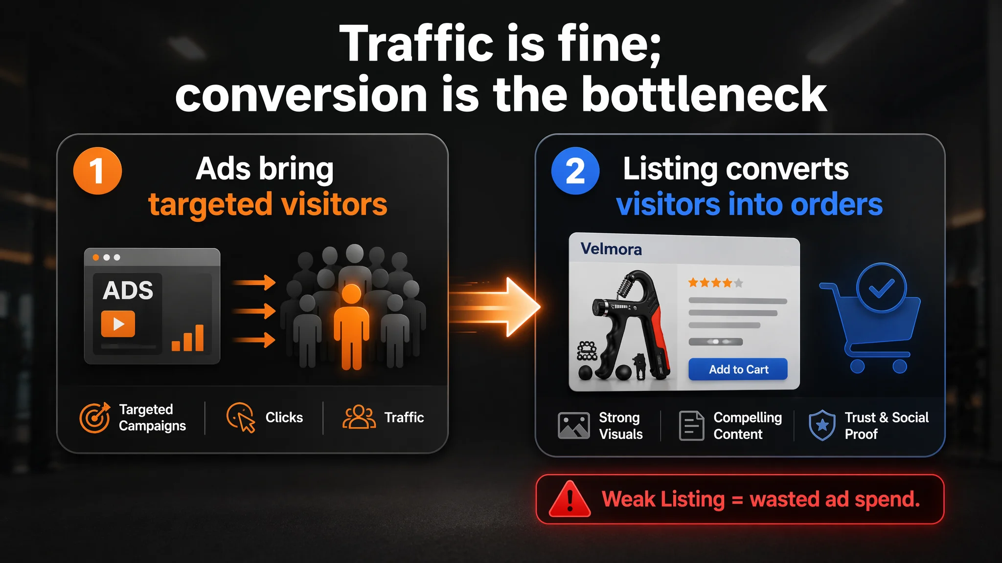
The later optimization work therefore did not start with deeper ad tuning. It started with Amazon Listing conversion fundamentals: reordering the title around high-intent search terms, reframing bullet points into clear “pain point → solution → outcome” paths, and redesigning the visual system (main images and A+) around a high-end, professional training kit narrative instead of scattered product illustrations. Other Amazon sellers in similar categories can draw a direct lesson: if your ads feel “expensive” and unstable, it may be your Listing that is consuming the traffic, not your campaigns that are failing.
What the Seller Saw: Rising Ad Pressure, Weak Follow‑Through
This was an Amazon US marketplace seller offering a 7‑piece grip strength training kit (adjustable hand gripper with auto counter, finger exerciser, squeeze ball, wrist support, etc.).
Operationally, they were facing a classic situation:
- The product category is competitive and ad costs are not low.
- They had to run Amazon ads to gain exposure.
- Even with paid traffic, sales felt fragile and hard to scale.
Internally, the team’s default explanation was: “ACOS is high because ads are not optimized enough—maybe keywords, maybe bids.”
What they did not suspect was that, when measured against a benchmark Amazon Listing in the same category, their page was structurally weaker at turning visitors into buyers.
“The real problem was not that ads failed to bring traffic. It was that the page could not convert the traffic.”
The Core Constraint Was Listing Conversion Capacity
Using DeepBI’s Listing scoring logic, we benchmarked the target Listing against a high-performing Amazon competitor in the same grip-strength segment.
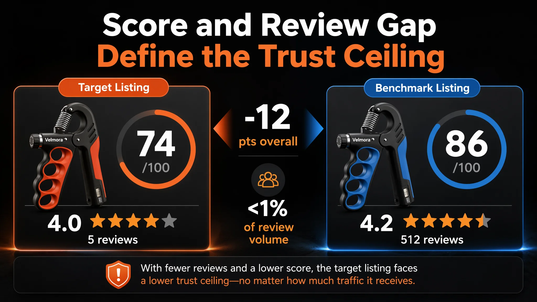
Overall score gap
- Target Listing: 74/100
- Benchmark Listing: 86/100
- Gap: –12 points
Across five key dimensions:
- Title: Target: 15, Benchmark: 18, Max: 20, Gap: -3
- Main images: Target: 24, Benchmark: 26, Max: 30, Gap: -2
- Bullet points: Target: 8, Benchmark: 7, Max: 10, Gap: +1
- Detail/A+: Target: 21, Benchmark: 23, Max: 25, Gap: -2
- Reviews: Target: 6, Benchmark: 12, Max: 15, Gap: -6
The single biggest red flag was not text quality or feature coverage—it was trust and social proof:
- Target Listing rating: 4.0 stars, only 5 reviews
- Benchmark Listing rating: 4.2 stars, 512 reviews
On Amazon, that gap is not cosmetic. With less than 1% of the benchmark’s review volume, the target page lacked the basic “this product is proven” signal new buyers expect, especially when the benchmark Listing sits only one click away with hundreds of reviews.
From a business perspective, this means:
- Paid traffic lands on a page with visibly weak review volume.
- Even if the product is objectively good, the conversion ceiling is lower.
- Running more ads into this page will mostly amplify the trust deficit.
At this stage, the core constraint was not traffic volume; it was the Listing’s ability to absorb and convert the traffic already arriving.
The Seller’s Original Misdiagnosis: “It Must Be the Ads”
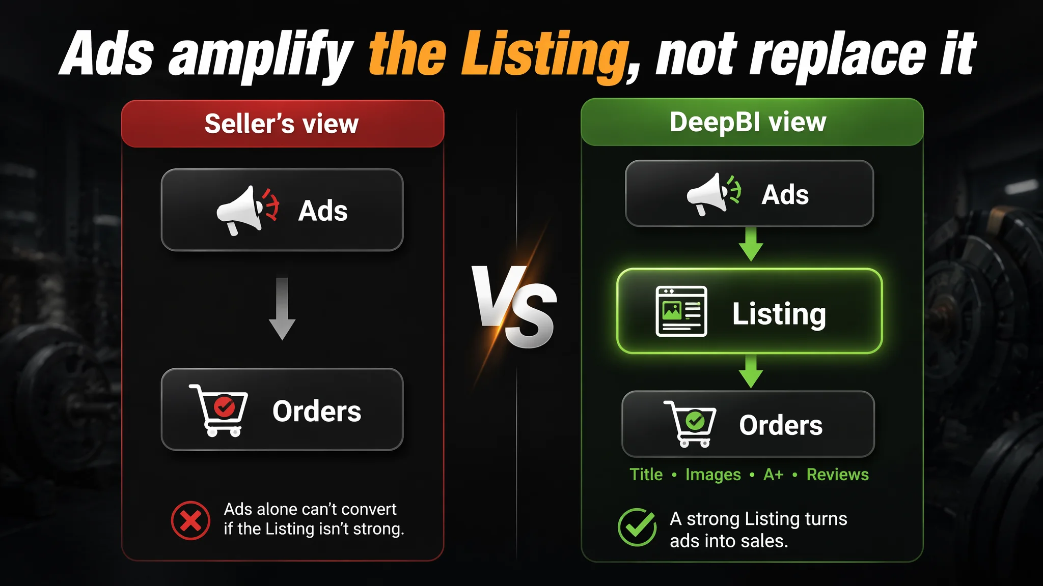
The seller’s initial thinking followed a common Amazon pattern:
1. “We have a more complete 7‑piece kit than many competitors.”
2. “We already highlight ‘auto-count’ and adjustable resistance.”
3. “If orders are unstable, ads must be under-optimized.”
This led them to focus on:
- Adjusting bids and budgets
- Tweaking keyword lists
- Tweaking campaign structure
Yet, when we aligned the Listing scores and visual patterns with what we see on higher-converting Amazon pages, a different story emerged:
- Title search logic lagged behind the benchmark.
- Main images looked more “generic accessory set” than “professional training device.”
- A+ content did not fully capitalize on the 7‑in‑1 advantage.
- The review gap significantly weakened initial trust.
Result: Traditional ad optimization could shift click patterns slightly, but it could not fix a product page that wasn’t yet “conversion-ready.”
Why Traditional Ad Optimization Couldn’t Fix This Page
When a Listing has fundamental conversion issues, ad tuning has diminishing returns:
- You can push more impressions and buy more clicks, but
- Each click lands on a page that does not visually justify the price or signal enough social proof.
Two signals from the Listing analysis illustrate this:
1. Title and keyword intent were not fully aligned with Amazon search behavior.
- The benchmark title starts with “Grip Strength Trainer, Hand Grip Strengthener,” front-loading the most important search terms.
- It also clearly states the KG range (5–100kg) and key audiences (musicians, athletes, injury recovery), improving search friendliness and click relevance.
- The target title leads with the brand name, which is helpful later, but weakens core keyword weight in the cold-start phase when brand search volume is low.
This meant the Listing was not maximally discoverable and did not immediately signal relevance to the right buyers on the search results page.
2. Visual narrative lacked a strong professional hook.
- Main image #1: white background, flat kit layout, no strong visual center or high-contrast styling.
- Several images rely on schematic arrows and overlays instead of real-life, high-trust product captures.
- The benchmark uses metallic textures, local light halos, and micro close-ups of the spring and components to build a feeling of precision and durability.
So even when ads placed the product in front of buyers, the thumbnail and detail images did not generate the same “this is serious, professional gear” impression that the benchmark Listing delivered.
In other words, ads were not the bottleneck. They were amplifying a page that did not yet match category expectations on trust, professionalism, and decision clarity.
What DeepBI’s Diagnosis Actually Found on the Listing
1. Title: Strong Product, Suboptimal Search Logic
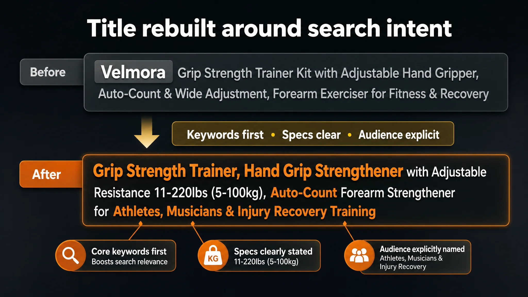
The target title had good content but weaker search-term architecture:
- Brand name placed first.
- Core search phrases not as aggressively front-loaded.
- No explicit KG range conversion (LBS + KG) in the original structure.
- Less explicit audience naming in the title line itself.
Against a category benchmark that leads with:
“Grip Strength Trainer, Hand Grip Strengthener with Adjustable Resistance 11-220Lbs (5-100KG), Automatic Counter, Ergonomic Design, Forearm Strengthener for Musicians Athletes and Injury Recovery”
…the target title simply could not compete for search visibility and click-through at the same level.
DeepBI’s recommendation was to reframe the title as:
“Grip Strength Trainer, Hand Grip Strengthener with Adjustable Resistance 11-220lbs (5-100kg), Auto-Count Forearm Strengthener for Athletes, Musicians & Injury Recovery Training”
Key shifts in logic:
- Core keywords first: “Grip Strength Trainer, Hand Grip Strengthener”
- Specs fully normalized: “11-220lbs (5-100kg)” to cover both units
- Value and audience encoded in the title: Auto-count + Athletes/Musicians/Injury Recovery
This is not cosmetic copywriting; it’s directly about search coverage and relevance for Amazon’s environment.
2. Main Images: No Clear Visual Hook, Weak Perceived Professionalism
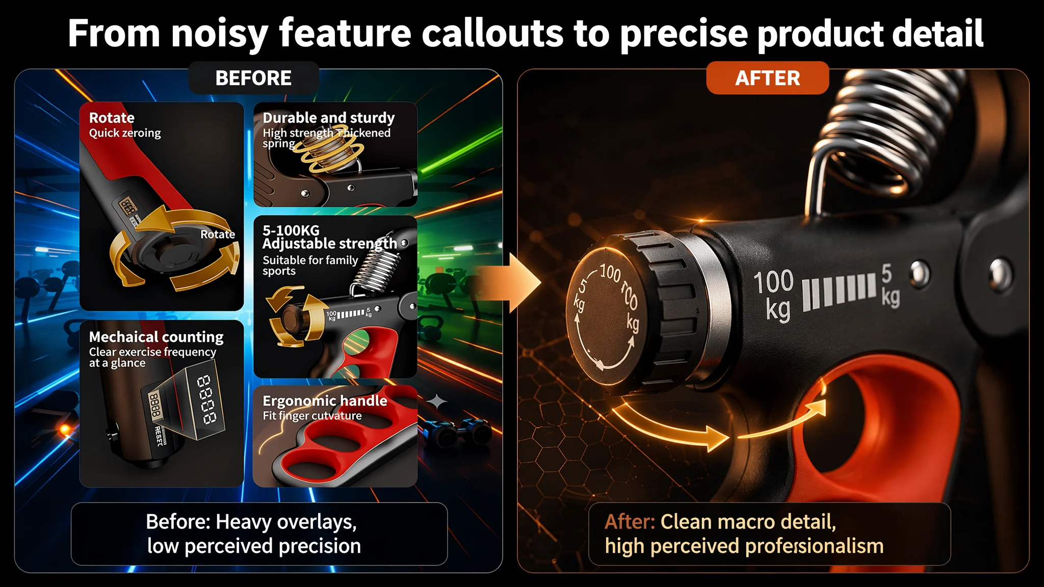
The main-image set was scored slightly below the benchmark (24 vs. 26 out of 30), but this small numeric gap masked a meaningful perception gap.
Key issues:
- Flat, white, dispersed layout for the hero image:
- Accessories spread out with no visual center.
- Bright white background washes out depth; the kit feels “cheap accessory set” rather than “serious training device.”
- Overuse of schematic graphics:
- Rotating arrows, digital overlays, and generic icons are used instead of tactile close-ups.
- This weakens the perceived authenticity of crucial elements like the spring and the counter.
Meanwhile, the benchmark uses:
- Darker, high-contrast, “gym tech” aesthetics.
- Strong directional light to emphasize metal and texture.
- Action shots and close-ups that visually communicate “durable, precise, engineered.”
DeepBI’s visual direction was to reposition the entire main-image strategy:
- Hero image:
- Product centered, ~60% of frame, 45° angle.
- Accessories arranged cleanly around it.
- Deep gray gradient background with strong top-right lighting and cold/warm contrast.
- Simple “Full Kit” callout.
- Functional close-ups:
- Adjusting knob in 30° low-angle macro shot with a 3D golden rotation arrow and resistance range text.
- Counter in a 45° close-up with bright focus on the screen and “Automatic Counting” label.
- Spring in a front-facing macro with glowing rings indicating force and text specifying spring specs.
- Realistic hand-in-use scene in a blurred gym background with a subtle orange halo around the product and clear use-case copy.
These are not design flourishes; they are conversion levers:
- A stronger hero image improves CTR from both ads and organic search.
- Macro shots and realistic scenes improve CVR by making durability, adjustability, and counting feel tangible.
3. Bullet Points: Good Logical Structure, But Under-Leveraged as a Differentiator
Interestingly, the bullet-point dimension was one of the few where the target Listing outscored the benchmark (8 vs. 7 out of 10).
The target bullets already:
- Open with “kit value” (7‑piece set).
- Use a clear “pain point → solution → scenario → result” structure.
- Map to multiple user identities (athletes, musicians, rehab patients, etc.).
- Plant specific result promises (“turn effort into measurable progress,” “comfortable grip training”).
However, there was still room to sharpen the commercial clarity of each bullet:
- Bullet #1: Shift from generic “7‑piece kit” to
“Comprehensive 7-Pack Kit with Smart Counting” – tying the breadth of the set and the flagship auto-count feature into one, concrete offering.
- Bullet #2:
“Precision-Adjustable Resistance (11-220 LBS)” – explicitly linking the wide range to both beginners and serious athletes.
- Bullet #3:
“Industrial-Grade Durability & Ergonomic Design” – connecting materials (stainless steel, TPR) to long-term reliability and comfort.
- Bullet #4:
“Targeted Recovery & Athletic Performance” – directly addressing rehab, dexterity, and pro audiences like climbers and tennis players.
- Bullet #5:
“Portable Training & Anytime Wellness” – emphasizing on-the-go training, office use, travel, and gift positioning.
Here, DeepBI’s judgment was not “rewrite everything,” but reframe each point as a clear, outcome-linked, search-friendly building block that works in tandem with the title and visuals.
4. A+ / Detail Page: Selling a Product, Not Yet a Full Training System
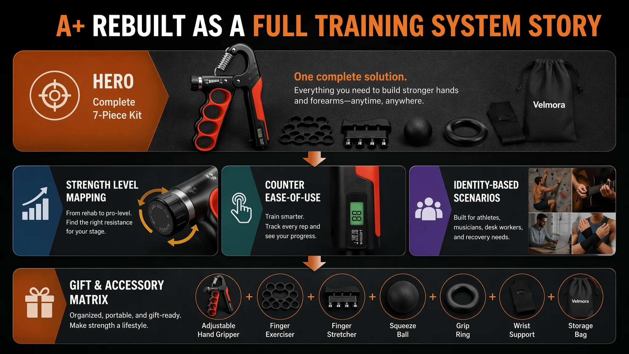
On the A+ detail page, the target Listing had a reasonably rich set of modules:
- Core benefit image
- Functional breakdown images
- Usage guide
- Wearing instructions for the wrist support
- (Implied) competitor comparison
- Multi-scenario collage
- Gift scenario image
The benchmark Listing, however, executed more coherent, modular storytelling:
- Brand hero visual with core value claim
- Modular info graphic with 5 sub-modules
- Structural diagrams and handle details
- Counter close-up with explicit reset process
- Scenario-rich collages with labeled user identities and benefits
The operational impact:
- The benchmark A+ page compresses decision-making: who it’s for, how it’s used, why it’s better, how easy it is to live with.
- The target A+ page lists features, but visually doesn’t make the “7‑in‑1 solution” and “easy-to-use pro device” story fully obvious.
DeepBI’s A+ recommendations focused on:
1. Lead with the 7‑piece kit as the “hero.”
A full-kit image with:
- The red-and-black main gripper centered, accessories fanned around.
- Dark industrial gym background with light blur.
- High-contrast lighting to highlight springs and contours.
- Clear headline: “Complete 7‑Piece Grip Strength Kit.”
2. Map resistance (KG) to concrete user tiers.
A micro shot of the knob and spring with side text boxes:
- “5–20KG: Physical Therapy”
- “20–40KG: Beginners”
- “40–70KG: Daily Fitness”
- “70–100KG: Professional Athletes”
This reduces decision friction: buyers immediately see where they fit.
3. Make the counter’s ease-of-use visually obvious.
A visual showing:
- Close-up of the counter window with “99” enlarged.
- Gold arrow showing “Spin to Reset in 3 Seconds.”
This explicitly addresses a common hidden concern: “Will this counter be annoying to reset?”
4. Upgrade scenarios from generic to identity-based.
- Replace generic “people holding products” with:
- A climber or pianist environment for the gripper.
- A real lifting scene for the wrist support.
- Add subtle text labels linking each scene to outcomes (recovery, performance, daily wellness).
5. Consolidate scattered small images into one “finger strength matrix.”
- Use a 3x3 layout: main gripper in the center, accessory close-ups around.
- Each accessory labeled with a single, sharp function (Dexterity, Flexibility, Stress Relief).
6. Upgrade the gift narrative.
- Present the full kit in a gift box on a textured surface, with props (candle, training log) and warm lighting.
- Label it clearly as a “Perfect Gift for Hand Wellness”.
Overall, the A+ optimization is not about art direction for its own sake; it is about shortening the distance between “I’m interested” and “I will buy now.”
Why Listing Conversion Had to Be Fixed Before More Ad Tuning
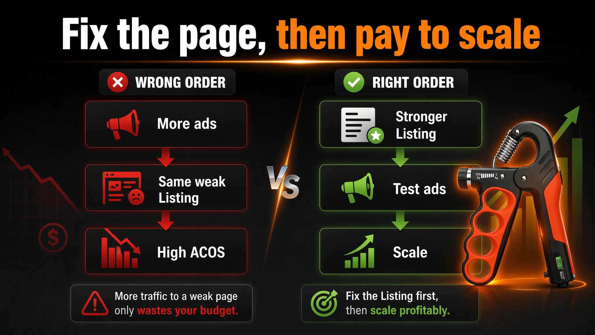
From a business standpoint, DeepBI’s judgment was:
- If the page cannot convert incremental traffic, then each additional dollar in ads is buying more exposure to the same conversion limits.
- If we first fix the Listing’s ability to build trust and communicate value, then every click (organic or paid) starts to work harder.
In this case, the biggest risks of continuing to optimize ads first would have been:
- Wasting budget driving traffic into a low-review, sub-optimized visual environment.
- Misreading ad performance: concluding that keywords or bids are “bad,” when in fact buyers were simply choosing the more credible, better-presented benchmark Listing.
- Entrenching a high ACOS structure: trying to brute-force results with more spend instead of addressing the conversion bottleneck.
That’s why the priority stack for this seller was:
1. Correct the title and messaging architecture around search behavior and user identity.
2. Rebuild the visual narrative (main images + A+) to:
- Make the 7‑piece nature instantly obvious.
- Make adjustability, durability, and counting feel tangible.
- Map resistance levels and scenarios clearly to user segments.
3. Accept that review volume is a strategic constraint:
- Focus on early buyers’ satisfaction and review generation.
- Use improved conversion to slowly build a more credible review base.
4. Only after these foundations are in place, revisit ads:
- Test new creatives and placements.
- Measure CTR and CVR shifts in response to new Listing assets.
- Then decide on scaling.
“Advertising does not only amplify advantages. It can also amplify a page’s existing defects.”
How the Page’s Sales Logic Started to Recover
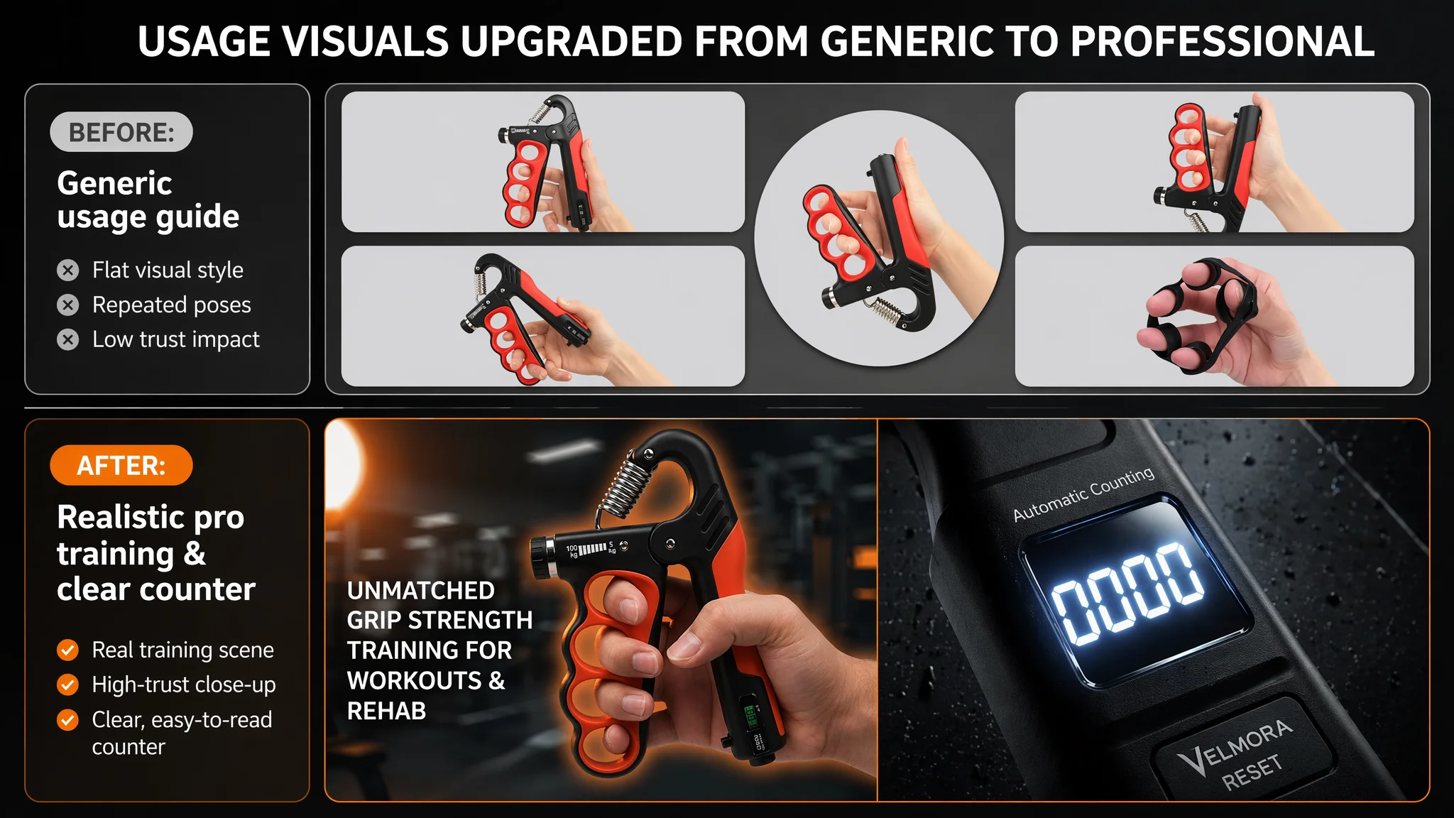
Once the Listing was reframed around a clearer Amazon-native logic, several things changed in how traffic interacted with the page:
- Search-page click potential improved:
- The title spoke more clearly to “Grip Strength Trainer / Hand Grip Strengthener.”
- The unit range and target audiences were visible at a glance.
- The main image looked more like a professional training kit, not a random package of plastic parts.
- On-page trust increased:
- Visuals better expressed material quality and adjustability.
- A+ content made the 7‑in‑1 value and “right level for me” mapping explicit.
- The mechanical counter’s usability was visually de-risked.
- Bullet points and visuals worked together:
- Each bullet point’s promise (kit completeness, adjustable range, durability, rehab support, portability) was mirrored by a corresponding image or A+ module, closing the “text says X, pictures say something else” gap.
Even without inventing new features or overclaiming performance, the Listing moved closer to the benchmark’s conversion posture:
- Same category
- Similar core functionalities
- Much better structured signal to the buyer:
“This is a complete, adjustable, durable, easy-to-use system, for people like you.”
What This Changed in the Seller’s Understanding
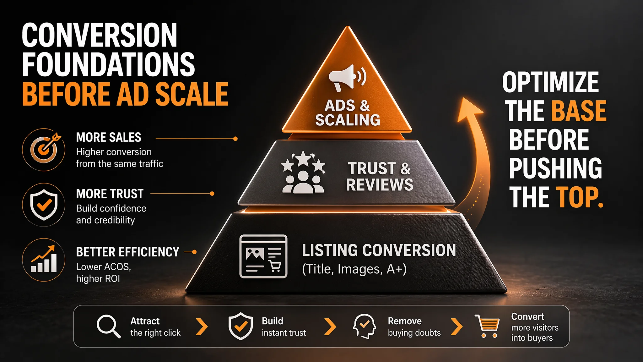
Before this diagnosis, the seller’s mental model was:
- “If orders don’t grow, we must push ads harder or smarter.”
After working through the Listing analysis and optimization:
- They saw how directly Listing conversion quality shapes ad efficiency.
- They recognized that a low-review, visually underpowered Listing cannot be ‘fixed’ by campaigns alone.
- They understood that title, main image, bullets, and A+ have to work as a single decision-flow:
- Draw the right click.
- Provide immediate visual proof.
- Clarify use cases and specs.
- Resolve doubts about effort, usability, and suitability.
- Let ads amplify an already strong conversion engine.
For other Amazon sellers—especially in crowded categories like fitness accessories—the lesson is straightforward but often overlooked:
- If your Amazon ACOS feels stubbornly high and your instinct is to keep tweaking campaigns, pause and examine the Listing first.
- Benchmark against a clear category leader and compare:
- Title keyword architecture
- Main image click-worthiness
- A+ narrative and scenario coverage
- Review volume and rating
- Fix the conversion bottleneck before you pay to send more traffic through it.
When the Listing itself regains conversion capacity, advertising stops being an expensive bandage and becomes what it should be: a multiplier on a product page that already knows how to sell.