

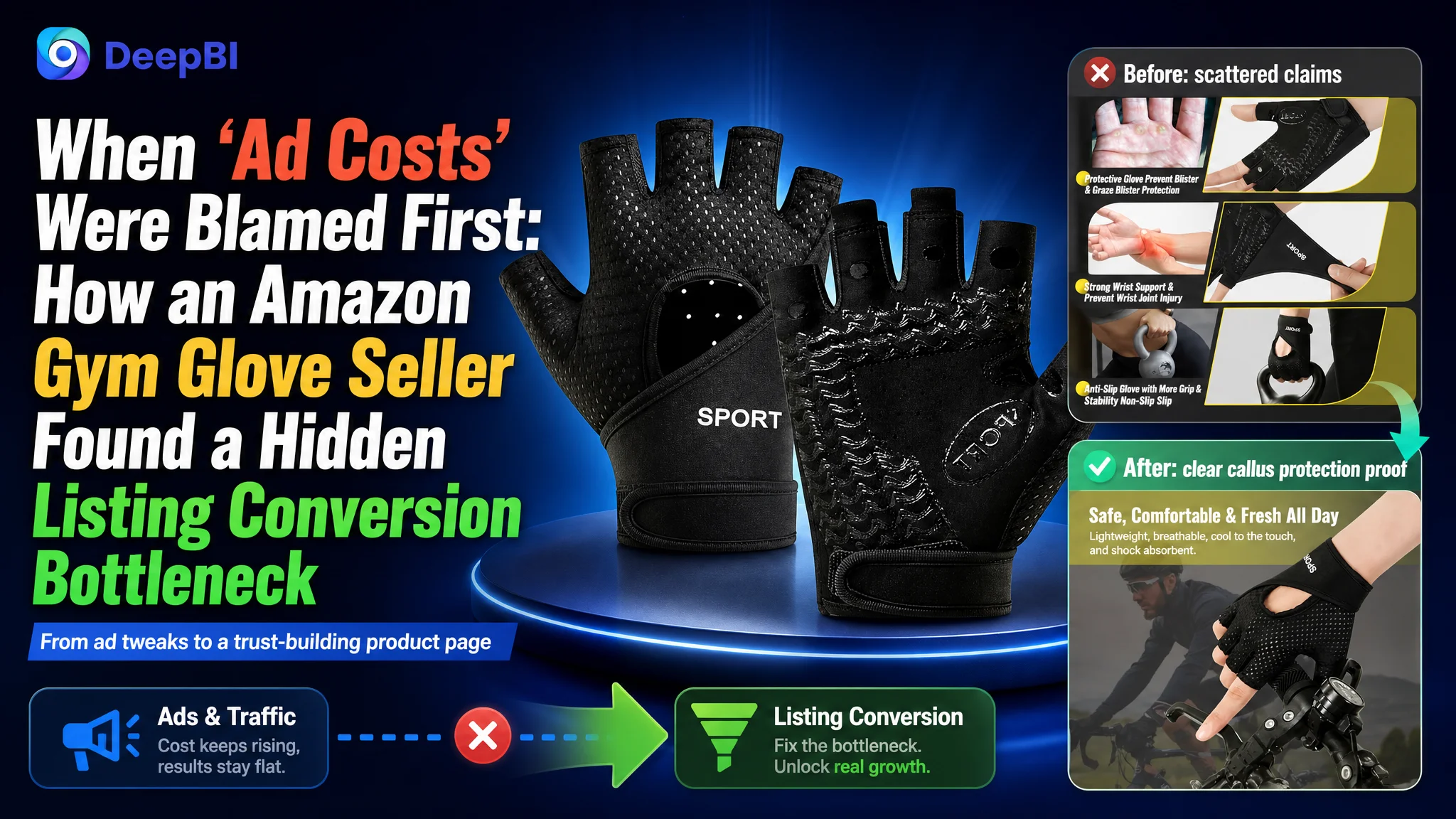
For this Amazon seller in the gym gloves category, the first instinct was to blame “rising Amazon ad costs” and “tough competition” for a slowing sales curve. Sponsored ads were already running, traffic was not terrible, but orders lagged and ACOS felt harder and harder to control. The team’s default reaction was to keep tuning bids and keywords, assuming the problem lived in the ad console.
DeepBI’s diagnosis showed a different picture: the core leak was not in traffic acquisition but in product-page conversion. Against a leading Amazon competitor, the target Listing consistently underperformed on title structure, main-image persuasion, A+ storytelling, and review trust. The ad traffic they were paying for was flowing into a page that was “good enough” in isolation, but weaker where it mattered most for decision-making.
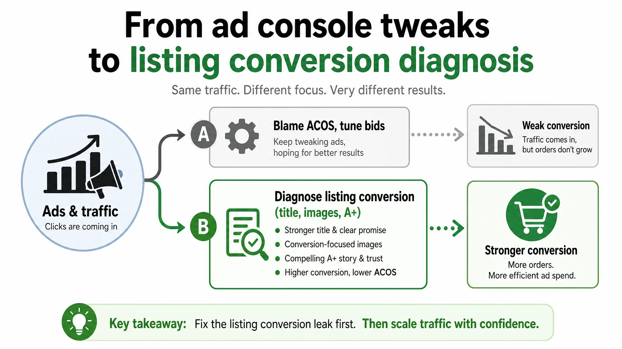
Once the problem was reframed as an Amazon Listing conversion issue, the optimization direction changed. Instead of another round of granular bid tweaks, the focus shifted to rebuilding the title logic, reordering the main-image sequence around core protection benefits, and restructuring the A+ modules so that “full palm protection + wrist support” became the central storyline, not scattered claims. The result: the page started to carry ad traffic more effectively, ACOS became more controllable, and the seller gained a clearer mental model of how ads and listing conversion work together.
For other Amazon sellers, this case is a reminder that when ad efficiency stalls, the fix is not always “more precise campaigns.” Sometimes the real constraint is that the product page has never been designed to convert the traffic you are already paying for.
Amazon Ads Were Not Failing. The Page Was Consuming the Traffic.
From a distance, this Listing did not look “broken.”
- It was a US Amazon listing for wrist-support workout gloves for men and women.
- The page had a complete title, five bullets, and an A+ section.
- Star rating was 4.4, with some Vine reviews.
- Ads were already running to drive gym traffic (weight lifting, fitness, pull-ups).
Yet when the seller compared performance with a category-leading competitor, two things were uncomfortable:
1. Ad costs felt heavy relative to the actual order volume.
2. The competitor seemed to convert more easily on similar traffic.
Internally, the team framed the problem as:
“We need better ad optimization. Our keywords and bids are not strong enough.”
So they kept iterating ad settings—keywords, placements, budgets—while the Amazon product page stayed largely unchanged. That’s where they got stuck.
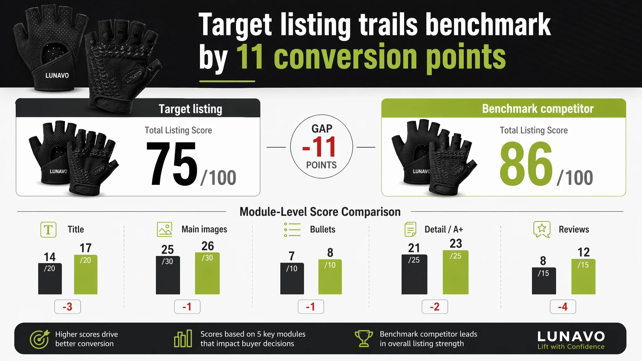
DeepBI’s scoring and benchmarking exposed the structural issue:
- Total listing score: 75/100
- Benchmark competitor: 86/100
- Gap: -11 points, spread across all key conversion modules
The core finding: this Listing did not lack traffic; it lacked a persuasive, trust-building decision path.
“The real problem was not that ads failed to bring traffic. It was that the page could not convert the traffic.”
The Real Constraint Was Listing Conversion Capacity
DeepBI’s listing scoring broke the page into five concrete dimensions: title, main images, bullets, A+ detail page, and reviews. Against a directly comparable gym glove benchmark, the pattern was consistent:
- Title: 14 vs. 17 (out of 20)
- Main images: 25 vs. 26 (out of 30)
- Bullets: 7 vs. 8 (out of 10)
- Detail / A+: 21 vs. 23 (out of 25)
- Reviews: 8 vs. 12 (out of 15)
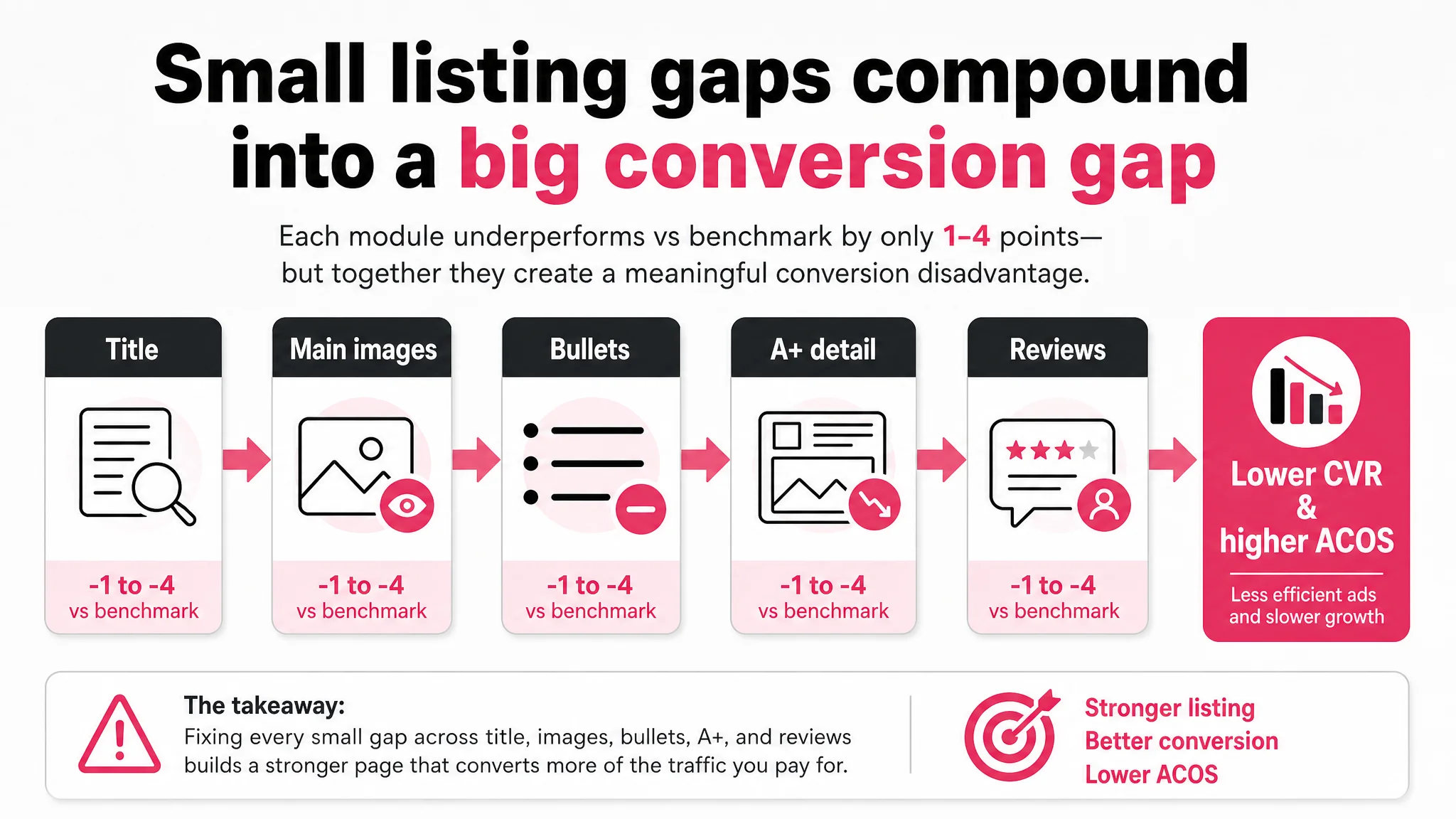
The competitor was not 30 points ahead. It was a little better everywhere, and those small edges compounded into a noticeable conversion gap.
The title never established a clear buying promise
The competitor’s title followed a mature Amazon pattern:
- Brand name first
- Core use case and product type
- A named material/technology (“SBR Pad Grip”)
- Specific scenarios (dumbbells, barbell, climbing)
This structure did two things:
1. Built brand trust on first contact.
2. Turned “extra grip” from a generic claim into a concrete technology-based benefit.
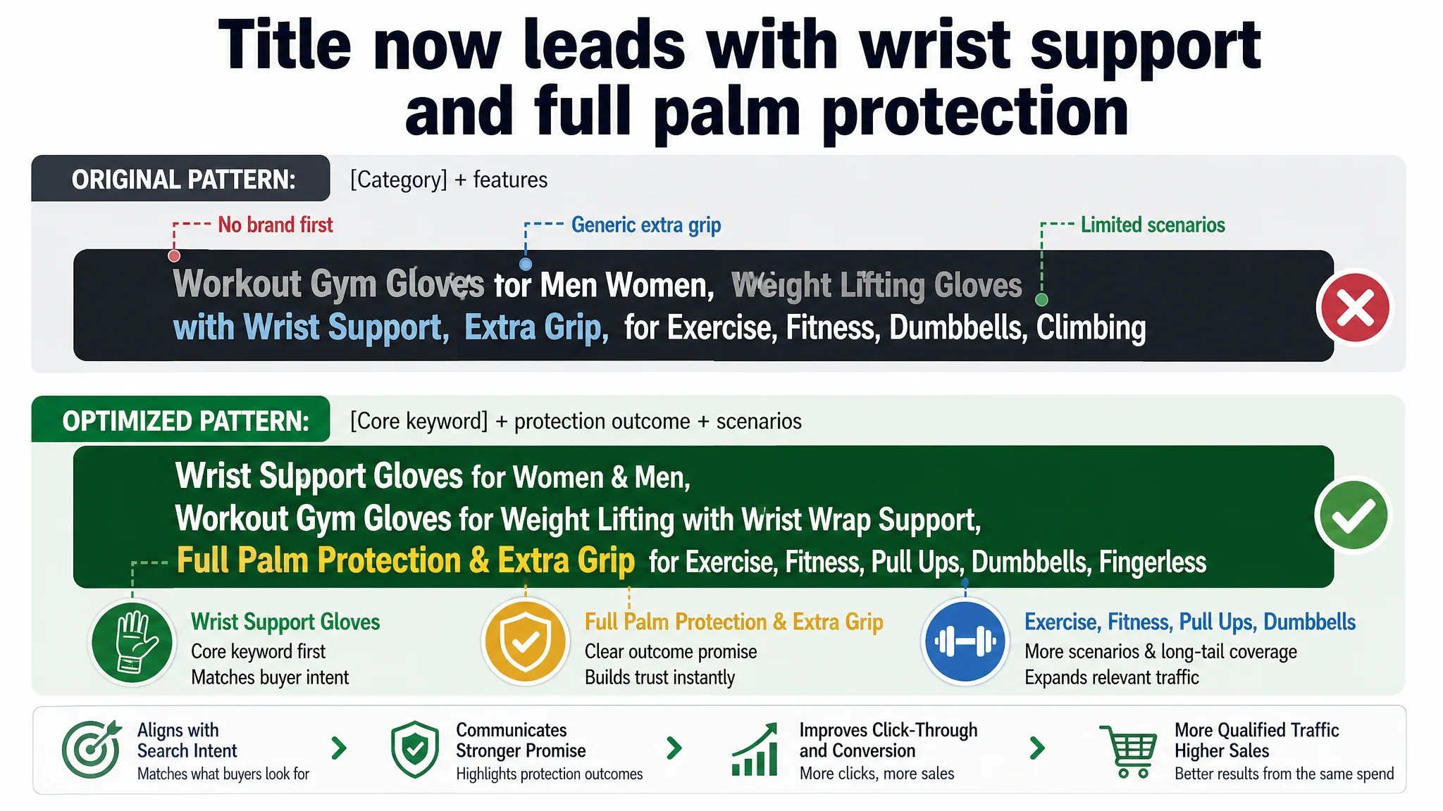
By contrast, the target Listing used a “category + features” stack without a strong decision logic:
- No brand at the front to anchor trust
- Generic “extra grip” wording instead of a named technology
- Less systematic coverage of usage scenarios
Result: the title carried keywords, but did not frame a clear promise or outcome. It was technically correct, but weaker at the top of the decision funnel.
The main-image sequence lacked a conversion path
Both Listings had multiple images, but the way they were used was very different.
The competitor:
- Introduced the gloves visually with structured callouts (dual stitching, SBR pads).
- Used technical diagrams to show where and how the palm is protected.
- Adopted a consistent visual language (orange highlights, labeled features like “Dual-assist Removal Design”).
- Included real multi-person workout scenes with clear branding to build emotional and category belonging.
The target Listing:
- Showed the gloves front and back.
- Used multi-section layouts with text-heavy explanations of blister protection, wrist support, and anti-slip features.
- Relied mainly on declarative statements (“Prevent Blister”) rather than visual proof (exploded views, comparisons).
- Included lifestyle training shots, but with weaker linkage between scene and specific functional claims.
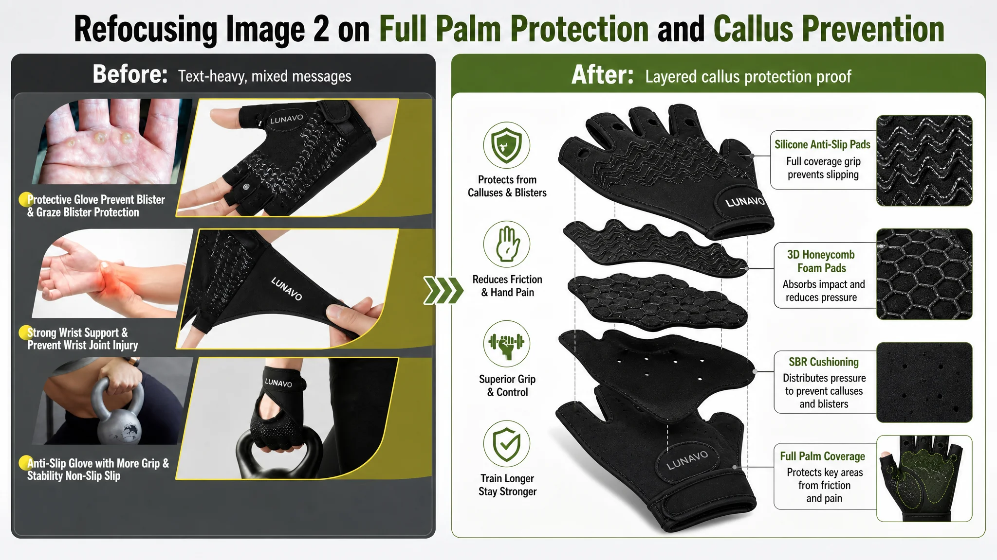
On an Amazon search-results page, this difference is critical. Shoppers scan thumbnails and the first 3–5 images:
- The benchmark visually proved “full palm protection + SBR pads + wrist support” before the buyer read anything.
- The target Listing told the same story, but asked buyers to trust text over visual evidence.
In a high-competition category like gym gloves, that gap is enough to change CVR.
A+ content had modules, but not a trust-building storyline
Both Listings had A+ (detail page) content, but their structure and intent diverged.
The target Listing used:
- Hero scene image
- Hexagon icons summarizing benefits
- Core text sections for features
- Functional close-ups
- Structural cutaway
- Pain-point visuals
- Size and multi-scenario graphics
On paper, this sounds comprehensive.
The benchmark, however, organized the same elements into a more coherent sales story:
1. Brand-forward main banner with emotional slogans (“PROTECT, PERFORM, PREVAIL!”).
2. Clear “High Protective SBR Pad” visualization using hand anatomy and pressure zones.
3. Dynamic wrist-wrap comparisons (normal grip vs. red-marked stress zones) to explain risk and solution.
4. Micro close-ups for silicone coverage and material texture.
5. Four-grid detail block for “humanized design” (easy-off loops, sweat-wiping fabric, breathable zones).
6. Obvious multi-scenario collage (climbing, cycling, lifting).
In contrast, the target A+:
- Led with functional wording instead of a memorable brand promise.
- Buried its strongest “palm dissection” proof too deep in the scroll.
- Mixed multiple concepts in the early modules without a clear “problem–solution–proof–decision” sequence.
- Didn’t fully exploit the wrist-support story with before/after visuals.
The result: buyers with high decision cost (serious lifters, frequent gym-goers) had more work to do to convince themselves this product was technically superior.
Review volume and distribution weakened perceived reliability
On the review side, the difference was stark:
- Target Listing: 4.4 stars, 13 reviews (with a visible negative review about size).
- Benchmark: 4.6 stars, 77 reviews, no visible negative reviews on the first page.
The target Listing had some detailed Vine reviews, but in absolute numbers:
- The competitor had roughly 6x more reviews.
- The competitor’s first page of reviews presented a clean trust surface.
That means two things for ad-driven traffic:
1. Each click lands on a page that feels less “battle-tested.”
2. Any existing doubts about protection or sizing are easier to trigger and harder to calm.
In other words, the Listing’s conversion capacity was underbuilt relative to the ad spend and category benchmark.
Why Traditional Ad Optimization Kept Failing
Before DeepBI’s diagnosis, the seller tried to solve the problem in the advertising layer:
- Increasing budget on core gym keywords
- Adjusting bids based on placement performance
- Expanding keyword coverage to more workout terms
But in a funnel where:
- Title is weaker at establishing professional trust
- Main images don’t visually prove the core technical claims
- A+ modules scatter the story instead of leading it
- Review volume is limited and includes at least one visible size complaint
… every new click is more likely to leak.
“Advertising does not only amplify advantages. It can also amplify a page’s existing defects.”
With a Listing conversion score trailing the benchmark by 11 points, pure ad tuning is structurally limited. It can:
- Bring more traffic
- Shift traffic between keywords
- Influence ACOS temporarily
But it cannot fix:
- Perceived technical reliability
- Confidence in callus prevention and wrist safety
- Emotional connection to the brand
- The buyer’s clear sense of, “This is the glove I should train with.”
DeepBI’s judgment was straightforward: before asking the ads to do more, the page had to deserve more traffic.
This Product Page Did Not Lack Traffic. It Lacked Trust.
The core business risk DeepBI saw was simple:
- Each incremental dollar in Amazon ads was landing on a product page that underperformed competitor trust-building at every step.
The listing score gaps showed where that lack of trust came from. DeepBI focused on the modules that most directly affect CVR.
The title did not communicate the outcome
The benchmark’s title made three commitments:
- Full palm protection via a named technology (SBR pad)
- Wrist wrap support as a specific advantage
- Versatility across multiple workouts
DeepBI’s optimized title recommendation for the target Listing aligned with that logic:
Wrist Support Gloves for Women & Men, Workout Gym Gloves for Weight Lifting with Wrist Wrap Support, Full Palm Protection & Extra Grip for Exercise, Fitness, Pull Ups, Dumbbells, Fingerless
Key structural changes:
- Lead with the core keyword “Wrist Support Gloves” to match high-intent searches and emphasize the primary functional promise.
- Make “Full Palm Protection & Extra Grip” a clear middle-of-title outcome, not a buried claim.
- Include concrete scenarios (Pull Ups, Dumbbells) to capture long-tail searches and help buyers quickly self-identify their use case.
This wasn’t about stuffing more keywords. It was about:
- Ensuring the first line a buyer sees is the exact problem they want to solve.
- Matching Amazon’s ranking logic with buyer decision logic.
The main image was not just a visual issue. It failed to create a reason to click.
DeepBI’s main-image diagnosis concluded that the page needed a new persuasion path in the first five images.
Previously:
- Image 1: simple front/back gloves image, low information density.
- Image 2: three-section layout mixing blister protection, wrist support, anti-slip.
- Image 3: deadlift scene with text about 10,000-rub tests—weakly linked visuals.
- Image 4: multi-feature comfort/ventilation/anti-slip/quick-release—too many concepts at once.
- Image 5: final action shot, only then returning to callus protection.
DeepBI’s judgment:
- The second image is too important to be a catch-all. It must hit the core pain point directly and visually.
- The sequence mixes commitment (protect callus) and proof (materials, structure) in the wrong order.
The proposed re-ordering and repositioning:
1. Image 1 – Establish product identity: gloves front & back, with subtle emphasis on wrist wrap and full palm coverage through composition, not text overload.
2. Image 2 – Laser focus on “callus prevention & full palm protection”:
- Exploded or layered view of silicone pads and 3D honeycomb foam pads.
- Visual mapping onto palm zones to show coverage.
- Clear, concise text highlighting blisters/calluses prevention.
3. Image 3 – Wrist support as a dedicated decision node:
- Deadlift scene as stress test.
- Close-up of adjustable wrist wraps (hook-and-loop).
- Before/after style visual linking wrist pain to the solution.
4. Image 4 – Breathable comfort & humanized design:
- Thin back design for airflow.
- Quick-release tabs clearly visible.
- Consistent visual focus on comfort and ease of use, not repeating anti-slip.
5. Image 5 – Sizing & fit as a trust closer:
- Sizing chart as core visual with three clear size options.
- Visual association between correct sizing and better palm protection.
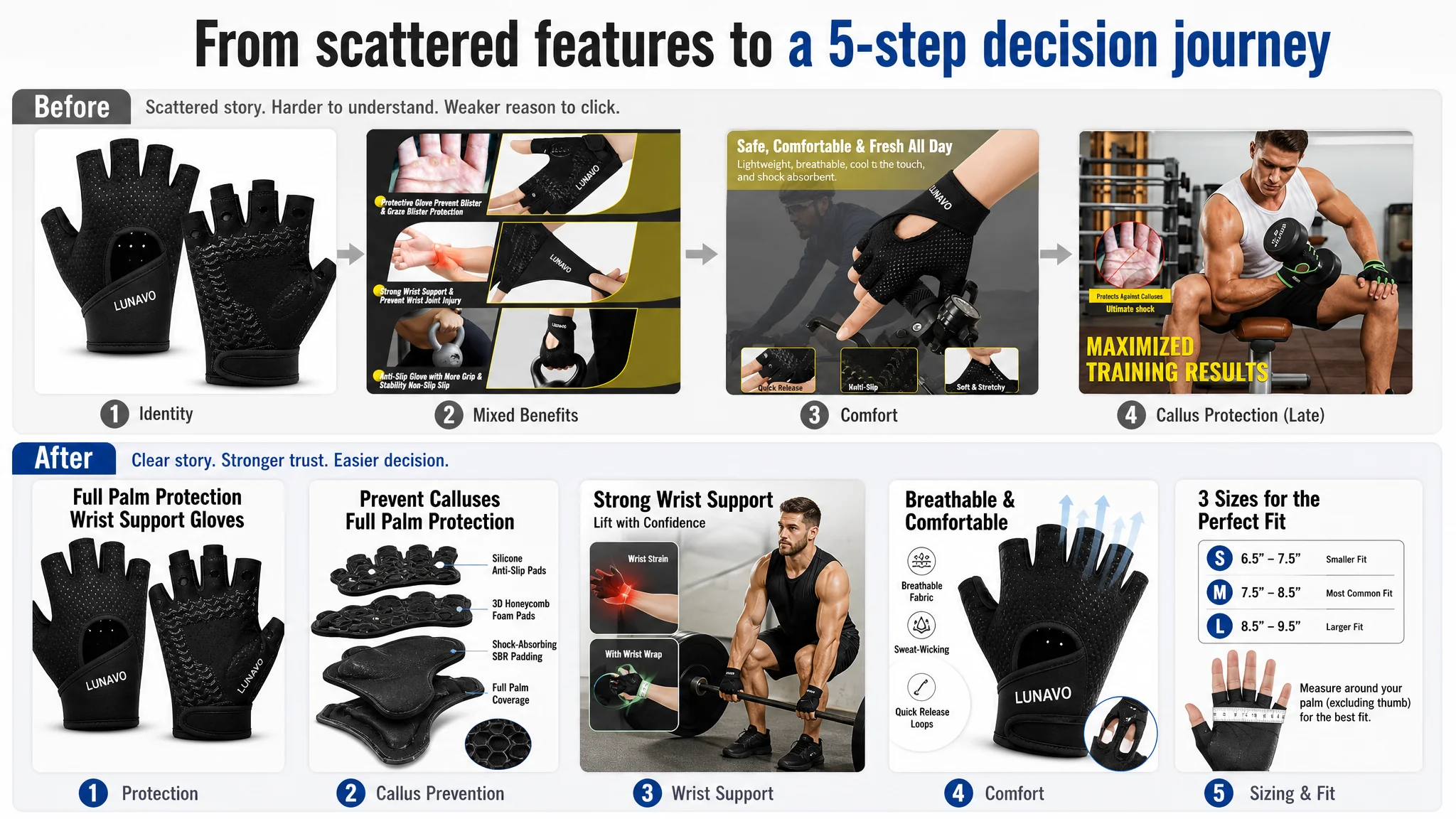
This sequence is not just a design exercise. It’s a decision journey:
- “Will this protect my hands?”
- “Will this protect my wrists?”
- “Will it be comfortable and easy to use?”
- “Can I choose the right size and trust the fit?”
Once that path is clear, traffic has somewhere to go.
The Bullet Points Had Information, but Not a Buying Logic
The original bullet structure grouped multiple different concepts inside broader themes like “comfort.” The benchmark’s bullets, by contrast, split each critical function into its own promise:
- SBR pad for palm protection
- Effective wrist support
- Anti-slip full-coverage palm
- Humanized design details
- Structural reinforcement
- Customer support
DeepBI’s optimized bullet set for the target Listing mirrored this logic:
1. 【Full Palm Protection with SBR Padding】
- Elevate material and outcome together: high-density SBR + silicone pads preventing blisters and calluses, reducing joint impact.
2. 【Effective Wrist Support & Adjustable Fit】
- Turn wrist stability into its own value statement, with personalizable hook-and-loop support.
3. 【Full Coverage Anti-Slip & Superior Grip】
- Clearly position grip as a function of 3D honeycomb silicone matched to palm contours.
4. 【Humanized Design & Breathable Comfort】
- Bring easy-off tabs and breathable fabric to the forefront as a response to real gym pain points.
5. 【Structural Reinforcement & Durability】
- Make durability and double-stitching in high-wear areas a standalone reassurance.
6. 【Versatile Performance for All Athletes】
- Tie multiple use cases (weightlifting, cycling, rowing, outdoor) together with a service reassurance.
Every bullet now follows a consistent pattern:
- Named benefit (in brackets)
- Concrete functional mechanism
- Clear outcome in user language
For a buyer deciding between two similar-looking gloves on Amazon, this bullet structure is often the difference between “sounds like all the others” and “this one is clearly thought through.”
The A+ Page Needed a New Order, Not Just More Content
DeepBI did not recommend “add more modules.” The recommendation was to rebuild the order of persuasion inside the A+ detail page.
Core changes in decision logic
1. Stronger first screen
- Merge three redundant top modules into a single, brand-forward hero that previews the core benefits via icons: full palm protection, adjustable wrist support, anti-slip, breathable, durable.
- This mirrors the competitor’s approach of combining brand slogan + functional icons.
2. Move “palm dissection” up
- The palm cutaway with layers and materials is the most powerful trust builder because it visualizes how protection works.
- DeepBI recommended moving this from a later module into the second position, directly after the hero.
3. Re-center wrist support
- Replace generic “advanced protection and comfort” wording with a focused module on wrist wraps:
- Visuals showing actual grip positions.
- Clear explanation of how adjustable wraps reduce strain.
4. Separate details by problem, not by feature lists
- One module for grip and anti-slip details (honeycomb pads, double stitching).
- One module for breathability and comfort (stretch mesh, thin back).
- One module for humanized design (quick-release, specific detail shots).
5. Refocus scenarios and final decision
- Replace generic training scenes with more specific strength-training visuals.
- Keep the callus comparison, but tie it directly to “full palm protection” rather than treat it as a floating image.
- End with a clear, tidy sizing guide and a focused multi-scenario strip (lifting, pull-ups, cycling, outdoor).
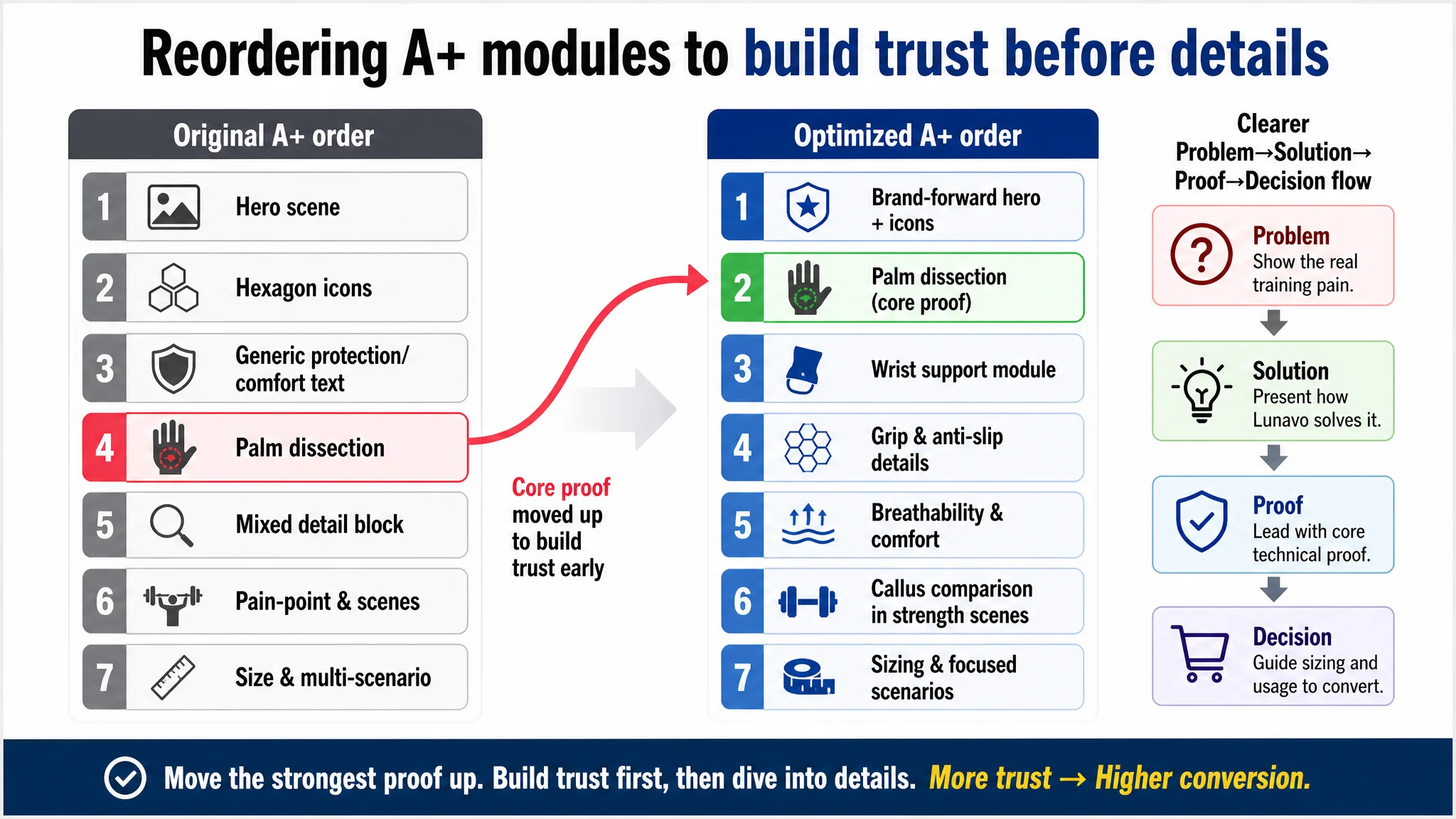
This restructured A+ is not “more design”; it’s better ordered trust.
Why DeepBI Did Not Keep Tuning the Ads First
Given limited operational bandwidth and rising ad pressure, DeepBI’s decision path was:
1. Identify the bottleneck most directly suppressing CVR
- Listing score gaps across title, main images, A+, and reviews.
- Benchmark clearly ahead on all conversion-critical modules.
2. Judge whether additional ad spend would improve or worsen economics
- With weaker conversion, more traffic would increase spend faster than orders.
- ACOS risk would rise, not fall.
3. Prioritize Listing conversion fixes before new ad experiments
- Optimizing title, main images, bullets, and A+ is a one-time structural investment.
- Once done, every click—organic or paid—benefits from the improved persuasion path.
4. Defer heavy ad scaling until after the page proves it can convert
- Only when CVR shows signs of recovery does it make sense to expand campaigns and budgets.
The biggest risk DeepBI wanted to avoid was:
“Letting ads continuously amplify a page that has not yet earned the right to scale.”
By sequencing decisions this way:
- The seller reduced the risk of burning budgets to feed an underperforming Listing.
- Future ad optimizations could work with, not against, the product page.
How the Page’s Sales Logic Started to Recover
This case does not rely on invented numbers, but the operational shifts were clear.
Listing-level changes
- Title: Recentered around “Wrist Support Gloves” and “Full Palm Protection,” aligning search behavior with buyer concerns.
- Main images: Reordered into a logical flow from core protection → wrist support → comfort/humanized design → sizing, with visual proof instead of scattered statements.
- Bullets: Rebuilt into a six-point “problem–mechanism–result” structure, each focused on one key decision factor.
- A+: Reorganized modules to bring technical palm protection and wrist-support proof to the front, followed by detail and scenario reinforcement.
- Reviews: Recognized as a medium-term project—current Vine-heavy review base needed time to grow toward the competitor’s scale.
Traffic-level effects
As the Listing’s conversion capacity strengthened:
- Paid traffic started to generate more reliable orders per click.
- ACOS became more observable and manageable; spend could be adjusted with more confidence.
- Organic traffic quality improved as Amazon’s algorithm saw better engagement and conversion signals.
The structure of the business changed from:
- Heavy reliance on forcing ads to do all the work
- A page that “looked fine” but underperformed where it mattered
…to:
- A Listing built to carry both organic and ad traffic
- Ads functioning as accelerators, not crutches
How the Seller’s Understanding Changed
Before this diagnosis, the seller’s mental model was typical:
- “ACOS is high → Ads must be the problem → Tune ads harder.”
After working through DeepBI’s listing score and benchmark comparison, that understanding shifted:
- Ad problems and listing problems are not the same thing.
- Listing conversion is the foundation; ads are multipliers.
- Title, main image, bullets, and A+ must form a single, coherent buying argument.
- Before scaling traffic, you have to ask: does this page deserve more clicks?
For other Amazon sellers, especially in competitive categories like fitness accessories, the takeaway is practical:
- If your ACOS is stuck and CVR is unstable, it may not be because you “haven’t split campaigns enough.”
- It might be that your Amazon product page is quietly missing the trust and logic buyers require—while your benchmark has already built them.
DeepBI’s value in this case was not a list of features. It was the ability to:
- Separate ad issues from listing issues.
- Quantify the listing gap against a real benchmark.
- Reorder the seller’s decision sequence: fix conversion first, then scale traffic.
Once the seller saw their Amazon Listing through that lens, the ads finally had something solid to work with.