

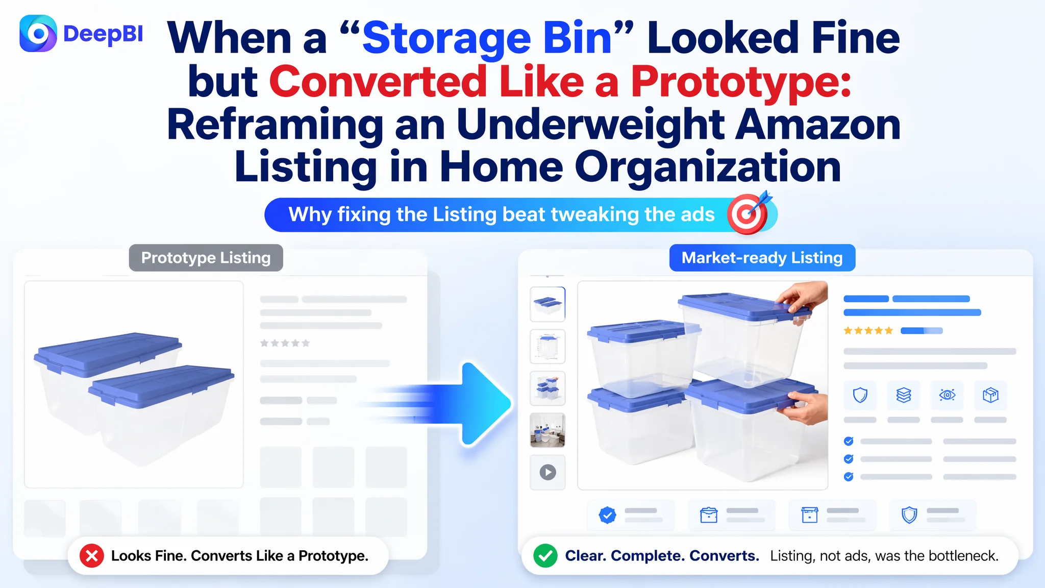
An Amazon seller in the home-organization category approached DeepBI with a familiar pressure: ad costs were rising, yet the large plastic storage bins they were promoting were not turning traffic into stable orders. They believed the problem was mainly that the product was “new” and needed more reviews and slightly better images; in their view, once ads were tuned and ratings climbed, conversion would naturally follow.
DeepBI’s Listing scoring made a different judgment. Against a benchmark storage-bin brand on Amazon, the customer’s product page was not just “a bit weaker” — it was structurally incomplete. Title, main images, bullet points, A+ content, and review scale were all underpowered, and the page had almost zero ability to build trust once traffic arrived. Ads weren’t failing; they were being consumed by a page that behaved like a half-finished test listing.
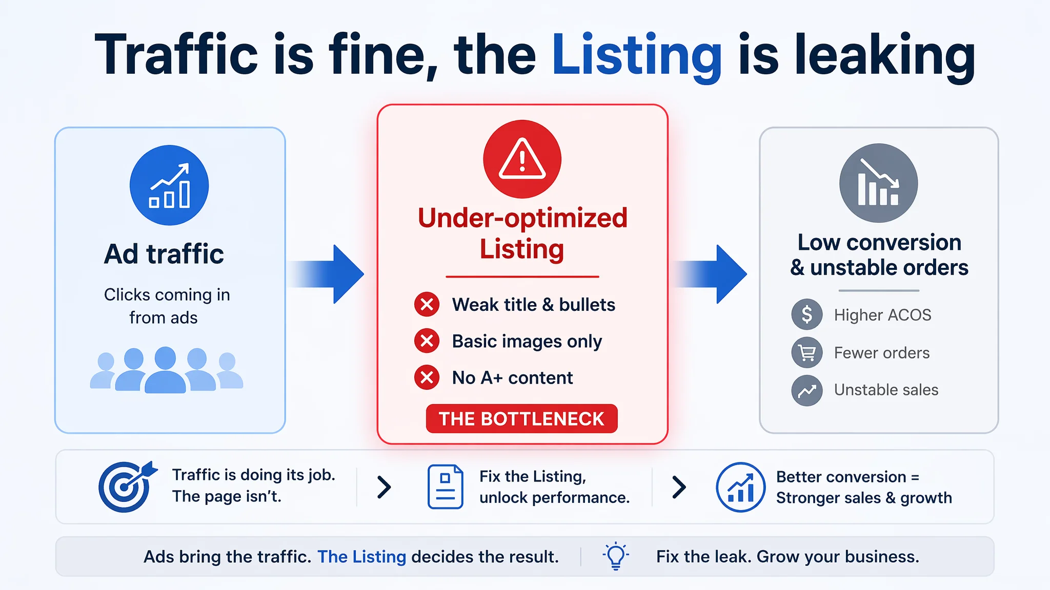
The optimization, therefore, did not start with more intricate ad tactics. It focused on rebuilding Amazon Listing conversion capacity: strengthening the title’s search and decision logic, reframing bullet points around use scenarios and trust, and designing a full A+ story with AI-generated images that could match or exceed the benchmark’s visual narrative. As conversion fundamentals recovered, ad traffic started to have something to work with.
For other Amazon sellers, this case illustrates a hard but useful pivot: when ACOS and TACOS feel uncontrollable, the leak may sit in the product page rather than the campaigns. High-quality ad traffic can only perform as well as the Listing that receives it. Understanding that boundary — and fixing page-level trust and decision logic first — is often what turns “expensive ads” back into a predictable growth engine.
What the Seller Saw: A New Product with “Not Enough Social Proof”
This seller was launching a large-capacity clear plastic storage bin with latching lids on Amazon US. From a product standpoint, it ticked many boxes:
- Very large capacity (113 Quart, 2-pack)
- Clear body for visibility
- Latching Smoke Blue lid
- Stackable design for home, garage, attic
On the Amazon side, they saw:
- A 5.0-star rating
- 3 total reviews
- Early-stage traffic mainly from ads
They were benchmarking themselves loosely against a dominant storage-bin brand in the same category that sold a 4-pack 64 Quart latching box with more than 10,000 reviews and robust A+ content.
Internally, the team’s diagnosis was straightforward:
- “We are new; we just need time and more reviews.”
- “Our title and images are OK; the core problem is ad cost and review scale.”
- “Ads need better tuning; once ACOS improves, conversion will follow.”
This led them to keep pouring energy into campaign structure and keyword adjustments while leaving the core Listing largely as-is.
The Score Gap: A Listing That Looked Like a Prototype Next to a Finished Product
When DeepBI scored the Listing against the benchmark, the gap was not subtle.
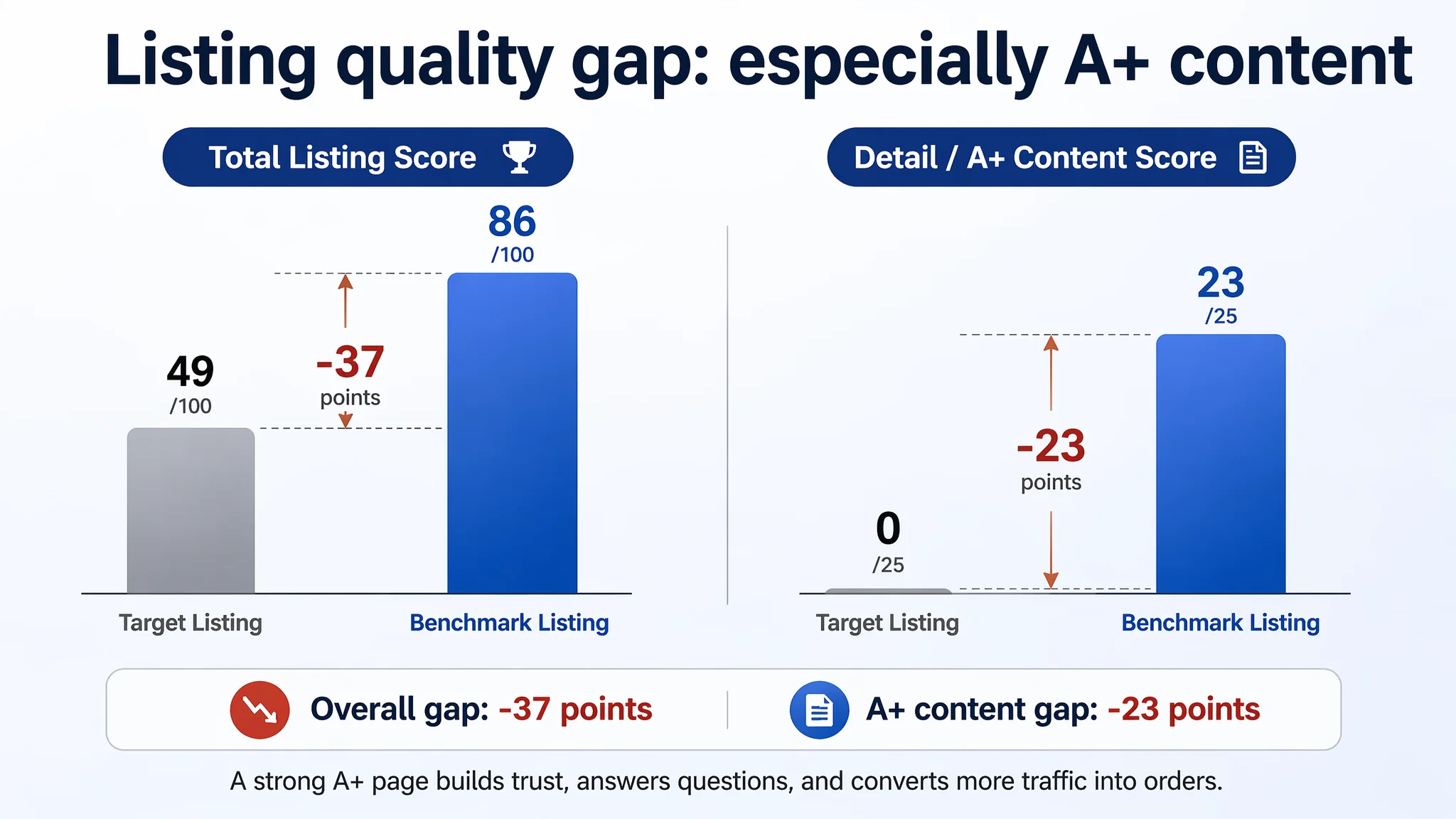
Total Listing score
- Target Listing: 49 / 100
- Benchmark Listing: 86 / 100
- Difference: –37 points
Dimension breakdown
- Title: Target Listing: 13, Benchmark: 16, Full Score: 20, Gap: –3
- Main Images: Target Listing: 24, Benchmark: 26, Full Score: 30, Gap: –2
- Bullet Points: Target Listing: 6, Benchmark: 7, Full Score: 10, Gap: –1
- Detail / A+: Target Listing: 0, Benchmark: 23, Full Score: 25, Gap: –23
- Reviews: Target Listing: 6, Benchmark: 14, Full Score: 15, Gap: –8
The most critical finding was not that the benchmark was “stronger”. It was that the customer’s Listing had zero score in the A+ detail dimension. On Amazon, this means the product page lacked any A+ modules — no brand story, no structured explanation of core functions, no scenario demonstrations, no visual proof.
“The real problem was not that ads failed to bring traffic. It was that the page could not convert the traffic.”
This changed the nature of the conversation:
- With no A+ content, the page offered only basic images and bullets.
- With only 3 reviews, trust was entirely dependent on the page content.
- Ads were driving users into a page that looked and felt unfinished compared to the benchmark.
Under these conditions, further ad optimization would scale a page-level defect rather than fix it.
Why Traditional Ad Optimization Couldn’t Rescue This Listing
From DeepBI’s perspective, the key risk was clear: over-optimizing ads on an under-optimized Listing.
- The main images were serviceable but structurally weaker than the benchmark.
- The bullets were technically correct but framed around physical attributes rather than buyer scenarios and trust.
- A+ content was completely absent.
- Review volume was extremely low, making page content the only way to earn trust.
If the seller continued to focus on:
- Bid adjustments
- Keyword expansions
- Campaign restructuring
without fixing the page, two things would likely happen:
1. ACOS would remain stubbornly high. Ad traffic would arrive, but the page lacked enough narrative and visual evidence to convert cautious buyers, especially in a category where large incumbents already “feel safer”.
2. Organic growth would stall. Without a convincing page and A+ foundation, the Listing would struggle to increase organic orders and maintain relevant keyword positions, forcing ongoing dependence on paid traffic.
DeepBI’s judgment was that the core constraint at this stage was Listing conversion capacity, not ad mechanics.
Title and Main-Image Logic: Not Just “Words and Pictures”
The title: Clear specs, weak decision narrative
The target title emphasized:
- “2 Pack”
- “113 Quart”
- “Clear Storage Bin”
- “Smoke Blue Lid”
- “Home, Garage, Attic”
The benchmark title, by contrast, led with:
- Brand name (well-known in storage)
- “4-Pack 64 Quart Latching Box”
- “Clear Plastic Storage Organizer Bins”
- “Stackable Containers”
- “Bedroom, Dorm Room, Closet Organization”
DeepBI’s analysis:
- The target title front-loaded capacity (“113 Quart”) for search weight, which is valuable.
- The benchmark front-loaded brand and the core concept “Latching Box”, mapping directly to how buyers think about the product.
- The benchmark also used standardized color (“White”) and explicit pack size (“4-Pack”) — both high-frequency search terms in the category.
- Scenario targeting differed: “Bedroom, Dorm Room, Closet” vs. broader “Home, Garage, Attic”.
The proposed title reframing was:
2 Pack 113 Quart Clear Storage Bin with Latches, Heavy-Duty Plastic Storage Containers with Smoke Blue Lid, Stackable Organizer Bins for Home, Garage, Attic, Dorm Room and Closet Organization
Decision logic behind this change:
- Pull core keywords (“storage bin with latches”, “clear plastic”, “organizer bins”, “containers”) into the front and middle of the title to align with how Amazon users search in this category.
- Make material and form factors explicit so users can instantly see what they’re clicking into.
- Expand scenarios to cover both heavy-duty spaces (garage, attic) and living spaces (dorm room, closet) to match benchmark breadth without losing product positioning.
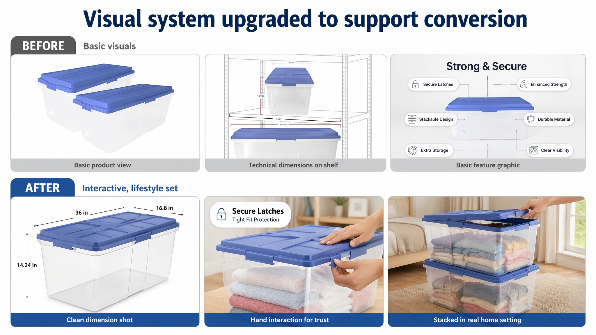
Main images: Information without tactile trust
Both Listings had several images, but they served different roles.
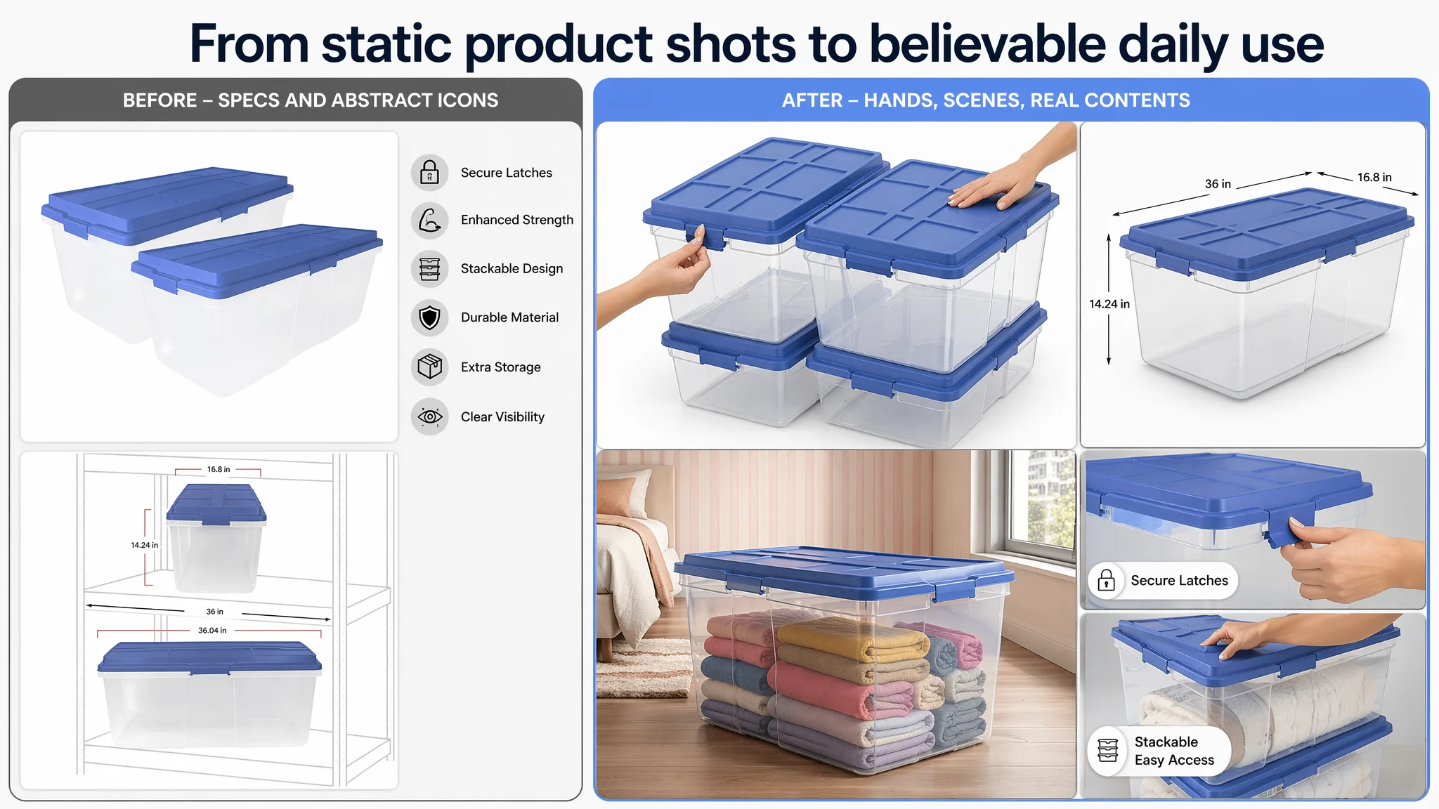
The target Listing:
- Focused on product parameters and static functionality.
- Used white backgrounds and relatively neutral compositions.
- Often stacked multiple textual callouts into single images, risking overload.
The benchmark Listing:
- Showed 4-piece stacked sets to signal value and combination utility.
- Used clean dimension images with professional markings.
- Presented lifestyle scenes: bedroom, under-bed storage, tidy closets with warm colors.
- Included hand interaction shots — users latching and opening the lids.
- Showed actual contents (boots, clothing, decorations) inside the bins.
“Advertising does not only amplify advantages. It can also amplify a page’s existing defects.”
DeepBI’s assessment was that the seller’s images were:
- Adequate for explaining “what the product is”.
- Weak at conveying “how it feels to use” and “how reliably it performs”.
With AI image generation constrained by the product’s real physical attributes, DeepBI recommended a systematic visual upgrade that stayed true to the product while closing the gap in trust cues:
- Stacked pack shot: Four bins arranged in staggered stacks occupying ~80% of the frame, 45° top-down angle on a white background to emphasize stackability, capacity, and combination purchase.
- Dimension image: Single bin centered (~70% frame), 45° side view, clean white background, professional black lines and clear Sans-serif text for length, width, height.
- Lifestyle bedroom image: Bin at bedside in a modern room, natural light, soft color palette, clothing neatly stored inside.
- Latch interaction image: Close-up of a hand actively snapping the blue latch, in a modern home environment, with a simple callout like “Secure Latches”.
- Stack + access image: Two stacked bins with a hand lifting a corner of the lid, showing ease of access even when stacked.
The point was not to “decorate” the Listing, but to:
- Make latch reliability tangible.
- Make stack stability visible.
- Make capacity and vertical space usage intuitive.
- Make clear-body visibility emotionally relevant (no more “digging through multiple bins”).
Bullet Points: From Specs to Use Cases and Trust
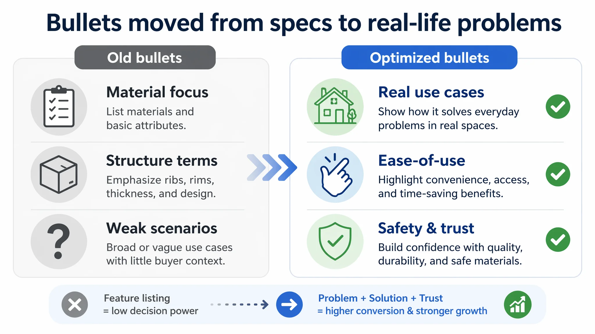
The original bullet points were heavily anchored in physical features:
- Safety and structure
- Space design
- Visibility
- Scene application
The benchmark bullets followed a different logic:
- Dimensions and capacity
- Organized home storage use cases
- Latching lid design and user experience
- Stackable vertical storage
- Brand and material trust (BPA-free, made in USA)
DeepBI’s judgment was that the customer’s bullets:
- Told the reader what the product is made of and how it is built.
- Did not clearly connect those attributes to day-to-day organization problems.
- Lacked a final trust-oriented statement about material safety or brand reliability.
The optimized bullets shifted toward scenario + experience + trust while staying true to the product:
1. Capacity and structure together
Large Capacity & Robust Structure: Designed with a deep interior capacity to hold bulky items; the double-rimmed base enhances load-bearing strength, ensuring the bin holds heavy loads without bending or breaking.
Decision logic: Help the buyer judge if it fits blankets, bulky clothing, sports gear, etc., without needing to interpret “113 Quart” alone.
2. Latch function framed as ease-of-use
Secure One-Handed Latches: Large sturdy latches lock the lid tightly to protect contents from dust and moisture, while the ergonomic design allows for smooth, one-handed access during daily organization.
Decision logic: Mirror benchmark’s emphasis on smooth one-handed use while maintaining the seller’s existing latch structure reality.
3. Stack stability articulated as a vertical-space solution
Stable Vertical Stacking: The recessed lid with a crossbar structure ensures secure stacking and prevents tipping, maximizing vertical storage space in your closet, garage, attic, or dorm room.
Decision logic: Combine structural strength and stackability into a clear value: safer, more efficient vertical storage.
4. Clear visibility tied to specific items
Crystal Clear Visibility: The transparent body provides instant identification of contents like blankets, seasonal clothing, boots, or holiday decorations, eliminating the need to search through multiple bins.
Decision logic: Solve the “I can’t find anything after I organize” pain point explicitly.
5. Material safety and versatility as trust backbone
Versatile & Safe Material: Ideal for various environments from garages to apartments; made of thick, high-quality plastic that is BPA-free and phthalate-free, ensuring safe and durable storage for all your household supplies.
Decision logic: Provide a last-layer assurance that the product is safe and durable enough for everyday household use.
Collectively, these bullets reframe the Listing from “a plastic bin with specs” into “a safe, easy-to-use, high-capacity solution to messy spaces,” which is how buyers actually decide.
The Missing Story: A+ Content as the Real Trust Engine
The most severe gap was in the detail / A+ dimension:
- Target Listing A+ score: 0 / 25
- Benchmark Listing A+ score: 23 / 25
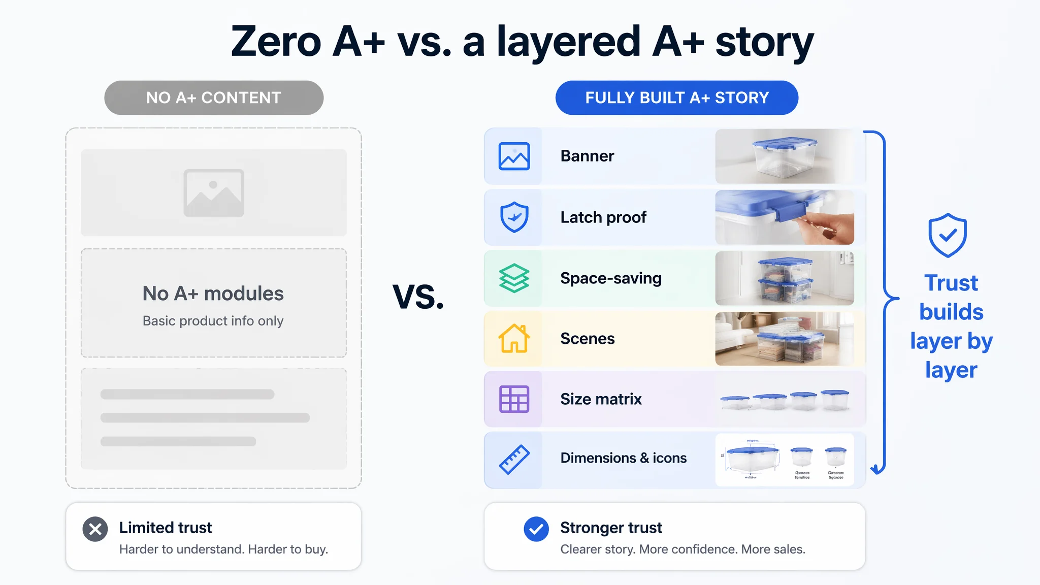
The benchmark’s A+ structure:
- Brand banner with stacked bins conveying “organized space” at first glance.
- Module on Secure Latch with hand-interaction close-ups.
- Space optimization module for stackable & space-saving design.
- Usage scenario module (modern easy-access design).
- Multi-scene organization module (“Organize Like a Pro”).
- Size matrix module (6QT to 106QT) mapped to specific uses (under-bed, closets, camping).
- Dimensions + core icon module (latch, stackability, modern design, transparency).
The target Listing: no A+ modules at all.
DeepBI’s rationale was straightforward:
- In a category where buyers compare multiple Listings side-by-side, A+ content is not optional; it is the foundation for trust, especially without review scale.
- Without A+ modules, the seller’s page appeared shallow and incomplete next to the benchmark, eroding conversion even when title and main images brought in clicks.
DeepBI’s A+ design logic was built around three core category needs: visibility, stability, and space efficiency, and operationalized into structured modules using AI image generation tied tightly to the product’s real attributes:
1. Opening banner: “Order at first sight”
- Two bins stacked in an isometric 3D view on a clean, light-gray and white background.
- Emphasis on structure clarity and neatness.
- Immediately communicates “organized, stackable, high-capacity storage”.
2. Core latch module: “Eye-level proof of reliability”
- Macro shot of the latch with a hand (female hand, natural nails) engaged in a closing motion.
- Background softly blurred to highlight latch engagement.
- Text overlay: “Secure Latch — Tight seal, stable closure.”
3. Space-saving module: “Vertical storage in real rooms”
- Three stacked bins in a real bedroom scene with bed and carpet.
- Natural window light, warm neutrals.
- Emphasizes the idea: this product does not just store items; it frees up horizontal floor space.
4. Visibility module: “No more digging through boxes”
- Central bin filled with colorful rolled towels, shot in a bathroom environment.
- Soft lighting to minimize reflections and maximize clarity.
- Messaging around “Quick Viewing” and eliminating time wasted searching bins.
5. Multi-scene module: “Whole-home coverage”
- Three zones: study shelf with smaller bins, attic with medium bins, closet with large bins.
- Shows the product family adapting to various spaces.
- Reinforces suitability for multiple room types and encourages multi-size purchases.
6. Capacity reference module: “What 6 Quart really holds”
- 6 Quart bin on a stool holding a pair of athletic shoes.
- Clear “6 QUART” label.
- Helps users translate abstract volume into tangible capacity using common items.
7. Dimension and icons module: “Closing the decision loop”
- Technical illustration with clear dimension lines and numbers for length, width, height.
- Four icons: secure lock, stackability, modern design, clear visibility.
- Gives buyers the final specs they need to confirm fit before adding to cart.
This A+ framework accomplishes three critical things:
- It visually answers “Will this work in my space?” without making the buyer guess.
- It tactically resolves fears about latch reliability, stack stability, and size.
- It gives the Listing a professional, complete feel comparable to the benchmark.
Reviews: Early-Stage Trust Needs Page-Level Compensation
Review comparison:
- Target Listing: 5.0 stars, 3 reviews
- Benchmark Listing: 4.6 stars, 10,160+ reviews
The benchmark’s trust advantage is overwhelming. However:
- The target Listing’s 5.0 rating is positive but statistically weak; buyers know 3 reviews don’t prove long-term quality.
- With such a small sample size, the page itself must carry the burden of trust — images, bullets, and A+ content have to do more work than they would on a mature Listing.
DeepBI’s judgment:
- The seller cannot rely on ratings alone to persuade.
- Without a strong page, the combination of low review count and thin content signals “early-stage risk” to buyers, depressing conversion even for traffic that is initially interested.
Hence the priority: repair the Listing first, then scale reviews and ads on top of a stable conversion foundation.
Why DeepBI Did Not Keep Tuning the Ads First
Faced with rising ad pressure, it is natural for sellers to focus on:
- Lowering bids
- Refining keyword negative lists
- Shifting budgets between manual and auto campaigns
In this case, DeepBI explicitly advised against making ads the primary optimization lever at this stage.
Key reasons:
1. Ads were already bringing sufficient traffic signals. The issue was not “no visitors”, but “visitors not convinced enough to order.”
2. Listing conversion was structurally compromised. A zero-score A+ dimension and weak trust cues meant that any additional traffic would suffer similar drop-off patterns.
3. Risk of amplifying a flawed page. Aggressive scaling of ads on a page with incomplete content can:
- Inflate short-term revenue but with poor margins.
- Lock the product into a pattern of high ACOS and high TACOS.
- Delay the realization that the Listing itself is the bottleneck.
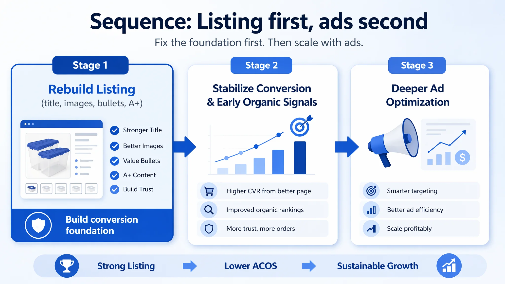
The decision path DeepBI laid out:
- Stage 1: Rebuild the Listing’s conversion capacity — title, main images, bullet points, and a full A+ narrative that creates a credible, visually robust alternative to the benchmark.
- Stage 2: Stabilize conversion metrics (CVR) and observe early organic positioning changes.
- Stage 3: Only then, re-enter deeper ad optimization, now backed by a page that can convert both paid and organic traffic.
How the Page’s Sales Logic Started to Recover
After implementing the content and visual restructuring, the Listing moved from a “lean spec sheet” toward a coherent sales narrative:
- Title: More aligned with high-frequency search behavior and clearer about product form and use.
- Main images: Clearly demonstrated capacity, latch reliability, stack stability, and visibility with human interaction and lifestyle context.
- Bullet points: Connected physical attributes to concrete buyer pains and use cases, while adding material safety as a trust anchor.
- A+ content: Provided a layered story from “what it looks like” to “how it solves organization problems” to “what exactly it can hold and where it fits at home.”
Operationally, this changed the Listing’s role:
- Ad traffic was no longer landing on a skeletal page.
- Organic visitors comparing multiple Listings saw a more competitive visual story.
- The seller had a credible base from which to grow reviews instead of relying on ratings alone.
Even without fabricating specific post-optimization numbers, the shift in risk profile and decision logic was clear:
- The Listing began to regain the ability to convert both paid and organic traffic.
- Advertising dependence became more controllable because each click had a higher chance of becoming an order.
- The page moved from prototype-like to market-ready in the eyes of buyers.
How the Seller’s Understanding Changed — and What Others Can Take Away
By the end of this diagnostic and optimization cycle, the seller’s internal model of the problem had shifted:
- From: “Our ads are expensive, and we need more reviews.”
- To: “Our Listing was not structurally ready to receive ad traffic; we need to fix page-level trust and decision logic first.”
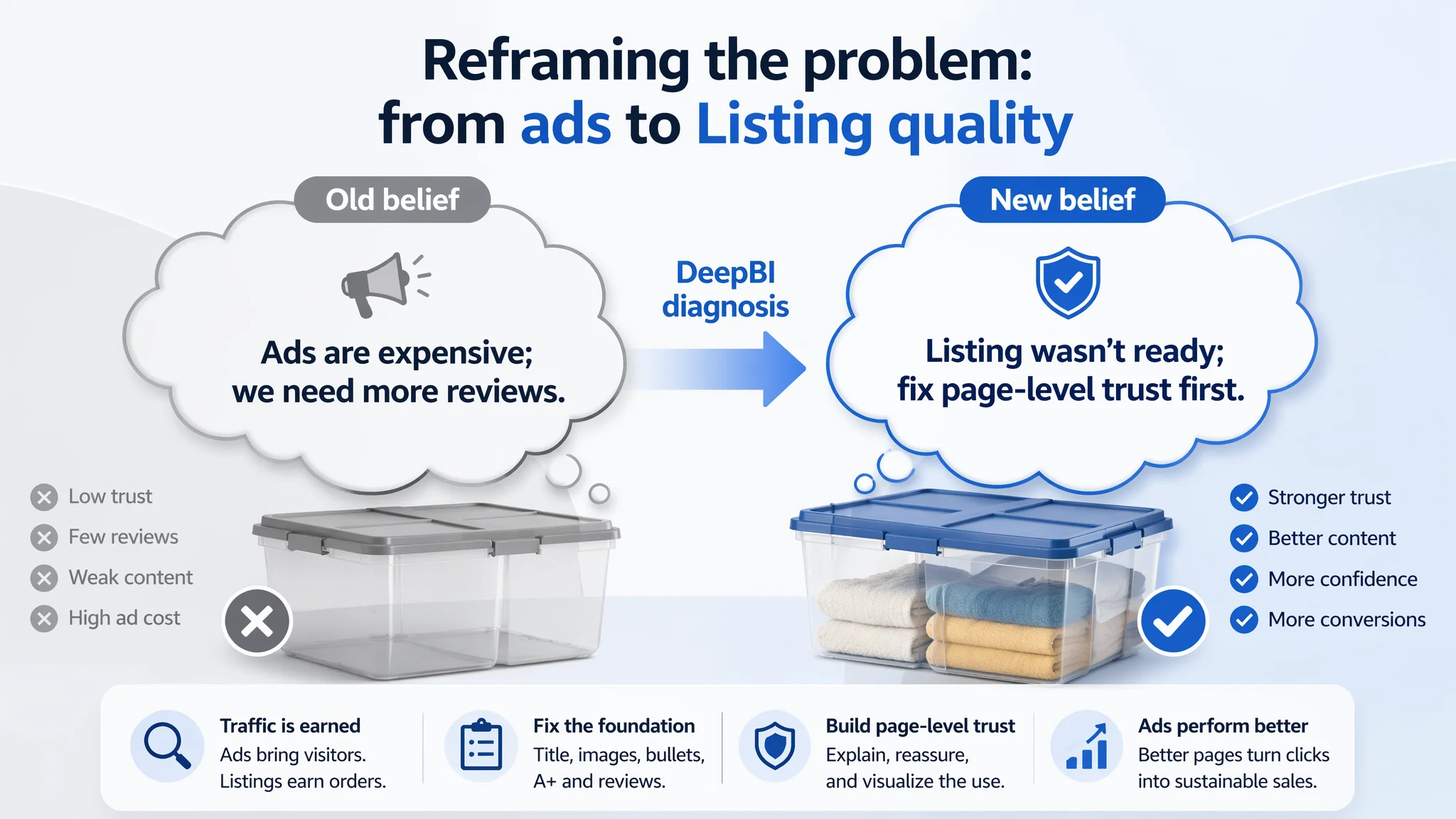
Key realizations:
- Amazon ads cannot solve every conversion problem. They can deliver traffic, but they cannot compensate for a page that fails to explain, reassure, and visualize use.
- Listing quality is the foundation of ad efficiency. Title, main image, bullets, and A+ must work together as a single argument, not independent components.
- Trust has layers. In early-stage products without review scale, visuals and structured content are not “nice-to-have”; they are essential trust infrastructure.
- Before scaling ads, the team must ask: “Does this page deserve more traffic?” If the answer is no, ad optimization should be sequenced after Listing repair, not before.
For other Amazon sellers in home organization and beyond, this case is a reminder that high ACOS and weak CVR are often symptoms, not root causes. The real bottleneck may be a product page that looks finished from the seller’s perspective but feels incomplete from the buyer’s perspective.
DeepBI’s strength in this case was not in listing a set of features, but in making one crucial judgment: ads were not the real constraint; the Amazon Listing’s conversion capacity was. Once that was addressed, every subsequent ad decision had a far better chance of producing controllable, sustainable business results.