

An Amazon seller in the travel accessories category launched a compact 4‑in‑1 toiletry dispenser on the US marketplace. On paper, the product logic was strong: fewer bottles, less clutter, TSA-friendly size. Yet the Listing struggled to convert, especially when compared to a leading competitor with a similar product. The team’s first instinct was to treat this as a “creative problem” and keep tweaking images and copy in isolation.
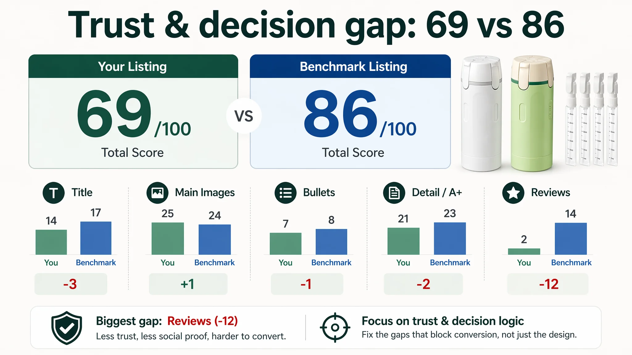
DeepBI’s diagnosis showed a different picture. Against a benchmark Amazon Listing, the target product page scored 69/100 versus 86/100, with the biggest gap not in design finesse but in trust and decision logic—especially reviews (2 vs 14 out of 15) and the way TSA compliance, leak-proof structure, and usage flow were communicated. Ads and organic traffic were landing on a page that looked busy, but didn’t quickly answer the core travel fears: “Will this leak?”, “Will it pass TSA?”, “Is it actually easier than separate bottles?”
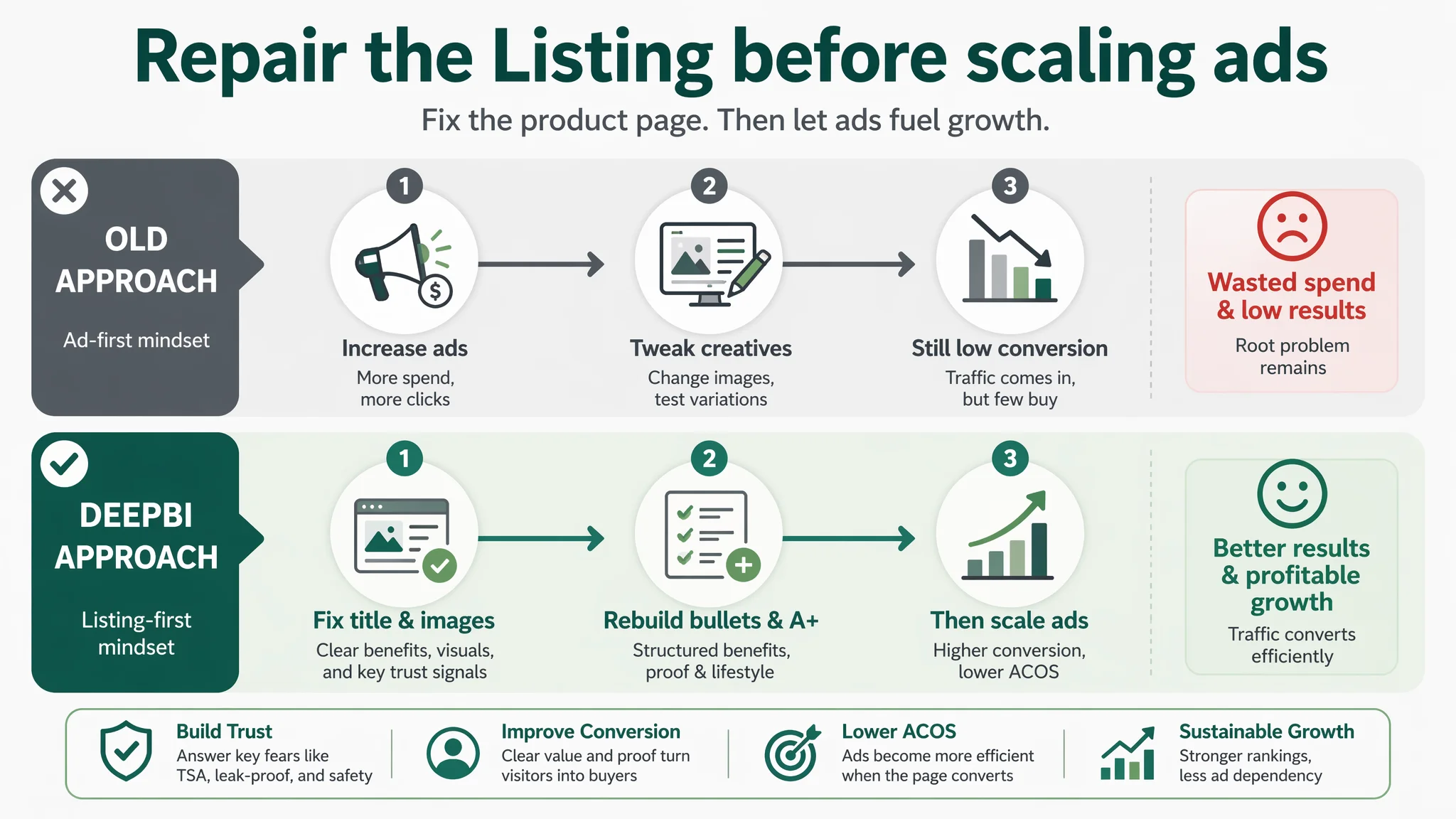
By reframing the problem as a Listing conversion issue rather than an ad or isolated image issue, DeepBI pushed the optimization in a different direction: tighten the title around “TSA Approved” and core outcome, simplify and re-sequence the main images around leak-proof and space-saving, and restructure bullets and A+ modules into a clear pain‑point → solution → trust chain. For other Amazon sellers, this case is a reminder that when ACOS feels hard to control or traffic doesn’t turn into orders, the blockage may sit in the product page’s decision path, not just in ad settings or “prettiness” of creatives.
The Core Conflict: A Page That Looked Busy but Didn’t Resolve Travel Risk
DeepBI’s Listing scoring exposed one central constraint: the product page lacked enough trust and structured reasoning to convert Amazon traffic efficiently.
The score breakdown against a strong benchmark Listing was clear:
- Total score: 69 vs 86 (‑17 gap)
- Title: 14 vs 17 (‑3)
- Main image set: 25 vs 24 (+1, but with issues in information delivery)
- Bullet points: 7 vs 8 (‑1)
- Detail/A+ content: 21 vs 23 (‑2)
- Reviews: 2 vs 14 (‑12, the largest single gap)
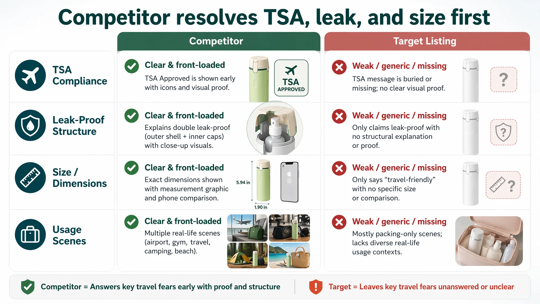
The seller saw low orders and immediately focused on “visual improvement”—more images, more explanations, more color variation. But on Amazon, more content is not automatically better. DeepBI’s comparison showed that the competitor wasn’t winning because it had “nicer” images; it was winning because every pixel and line of text worked together to remove specific buying fears:
- TSA compliance was explicit and front‑loaded.
- Leak-proof engineering was explained as double protection, not just claimed.
- Size and dimensions were quantified, not vaguely described as “travel‑friendly”.
- Usage scenes covered multiple identities: airport, gym, camping, beach.
- Reviews provided social proof and real-use validation.
The target Listing, in contrast, over‑indexed on generic “organized packing” and space saving, while underplaying:
- TSA “Approved” wording where it matters most (title, main image).
- Structured leak-proof logic (outer shell + inner caps).
- Clear, visual explanation of “4‑in‑1” usage (rotate, press, dispense without removing bottles).
- Specific dimensions and technical detail that make the product feel engineered, not just conceptual.
“The real problem was not that the page lacked information. It was that the information did not resolve the right fears in the right order.”
The Seller’s Original Misdiagnosis: Treating It as a Pure Design Issue
From the seller’s perspective, the situation looked straightforward:
- New product in a competitive Amazon travel category.
- Good concept: integrated 4‑in‑1 toiletry dispenser.
- A full image set and A+ content already in place.
- But orders lagging behind a comparable competitor.
The immediate conclusion: “Our images aren’t attractive enough; let’s redesign and add more detail.”
This led to typical but ineffective actions:
- Loading the main image with multiple elements—outer case, inner bottles, color options.
- Adding text-heavy diagrams into the gallery.
- Repeating “space-saving” and “carry-on” benefits across bullets and A+.
- Relying on generic phrases like “travel-friendly weight” instead of specific numbers.
- Assuming that if users saw “4‑in‑1” and “compact”, persuasion was largely complete.
What this missed:
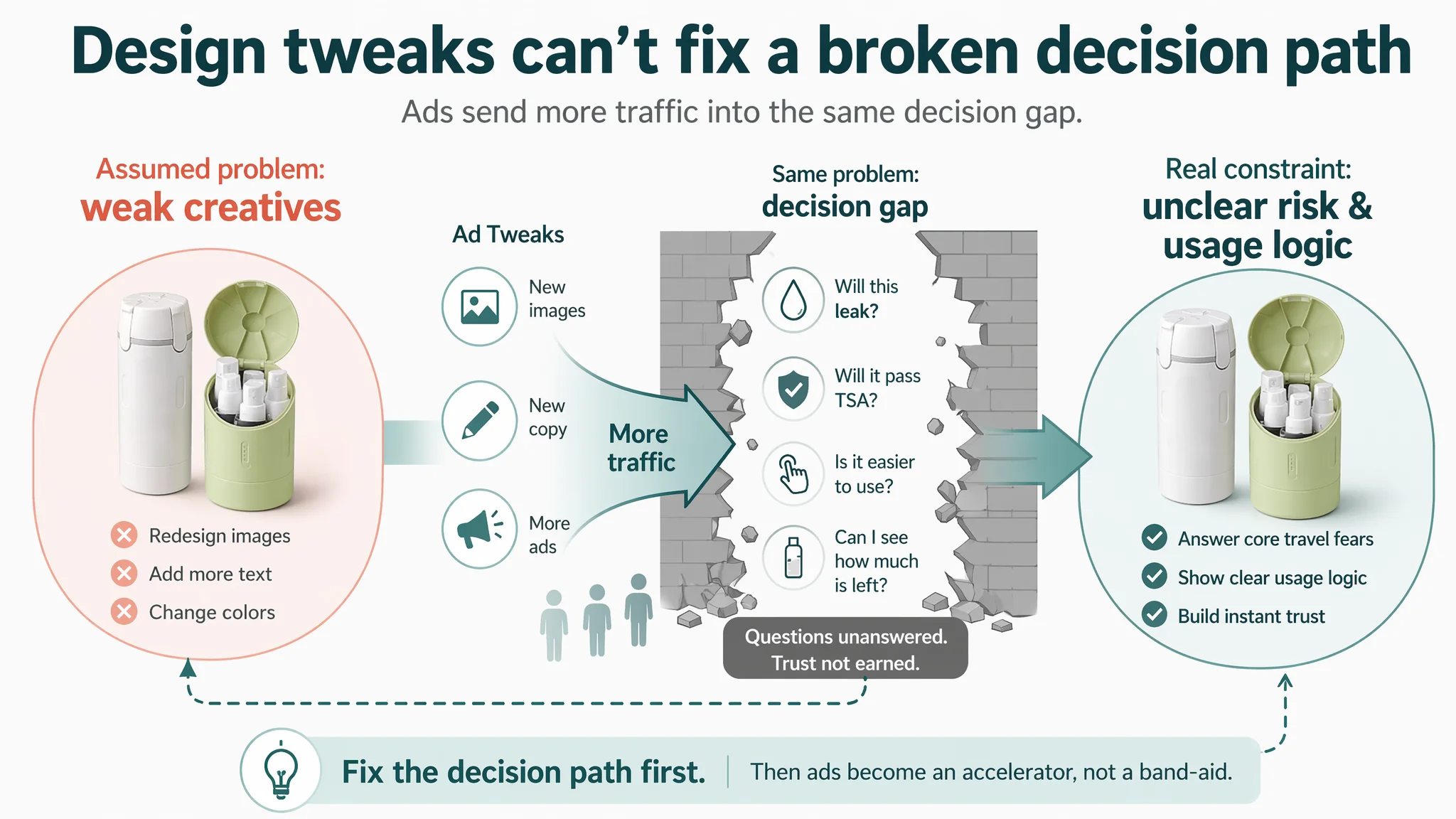
- Amazon shoppers for travel bottles are not buying a concept; they are managing risk and hassle:
- Will TSA allow this?
- Will it leak in my suitcase or gym bag?
- Is it easier than my current routine?
- Can I quickly see what’s inside and how much is left?
Traditional ad or creative optimization—new designs, more color, nicer layouts—could not fix the fact that the page did not walk the buyer through these questions in a structured way. Ads would only send more traffic into the same decision gap.
What DeepBI’s Scoring Revealed: A Trust and Logic Deficit, Not a Visual Deficit
The scoring comparison against a category-leading competitor made the constraint visible in data, not just opinion:
Title: Missing Certification and Outcome Focus
The competitor’s title structure:
- Leads with “Travel Bottles with Case, 4x2oz TSA Approved, Leak-Proof, Press to Unlock, Compact & Portable…”
- Packs core purchase logic early:
- Product type + case
- TSA compliance (very early)
- Specific capacity (4×2oz)
- Leak-proof assurance
- Easy‑use mechanism (“Press to Unlock”)
The target Listing’s title:
- Uses “4 in 1” but leaves it abstract.
- Delays or dilutes TSA wording.
- Emphasizes “Labels & Scale” and refillability—valuable, but secondary to basic travel risk.
- Offers less information density in the first characters where Amazon search and user scanning pay most attention.
DeepBI’s judgment: without “TSA Approved” and leak-proof clearly front-loaded, the title underperforms both in search relevance and immediate trust signaling.
Main Images: Information Overload Without a Clear Hook
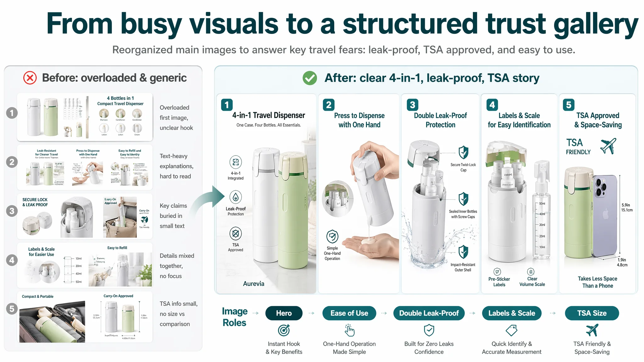
Visually, the target main image set is not low quality. It shows:
- The outer shell.
- Inner bottles.
- Multiple diagrams and text overlays.
- Scenes of packing into luggage.
However:
- The first main image is overloaded, forcing users on mobile to parse many elements just to understand what the product is.
- Several images rely heavily on small text to explain functions, which is hard to read at thumbnail scale.
- Lifestyle context is narrow—mostly “packing” stills—without multiple distinct scenes (airport, gym, weekend trip) that help different customers see themselves using it.
DeepBI estimated:
- CTR loss vs strong listings: 5–8% purely due to thumbnail-stage overload and lack of a simple dominant hook.
- Key message skip rate on mobile: up to 30% of users may never zoom in to read dense text, leaving them unconvinced about leak-proof and TSA benefits.
In contrast, the competitor:
- Uses cleaner hero imagery and simple, bold concepts: TSA-approved sizes, leak-proof design, dedicated slots, push-button lock.
- Supports those claims with focused visuals: dimension diagrams, open/close states, component close-ups.
“Advertising does not only amplify advantages. It can also amplify a page’s existing defects. In this case, ads would amplify confusion and unanswered risk.”
Bullet Points: Emotion Without Enough Evidence
The target Listing’s bullet strategy:
- Emphasizes space-saving, reduced clutter, convenience.
- Repeats themes like “carry on” and “organized packing”.
- References labels and scales, reusable materials, and environmental value.
These are good ideas but not orchestrated into a coherent buying path. DeepBI’s comparison showed:
- Repetition without progression: similar claims appear multiple times.
- Lack of “hard evidence” phrasing: TSA compliance, double leak-proof structure, specific capacities are not framed as clear commitments.
- Weak logical sequence: benefits are listed, not built into a stepwise resolution of fears.
Competitor bullets form a clear ladder:
1. Size and TSA compliance.
2. Double leak-proof (hard shell + caps).
3. Individual compartments and organization.
4. Locking mechanism to prevent accidental opening.
5. Wide-mouth transparent bottles for easy fill and visibility.
This is a pain‑point → mechanism → reassurance → usability chain. The target Listing was closer to a benefit list without that chain.
Detail/A+ Content: Stories Without Measured Proof
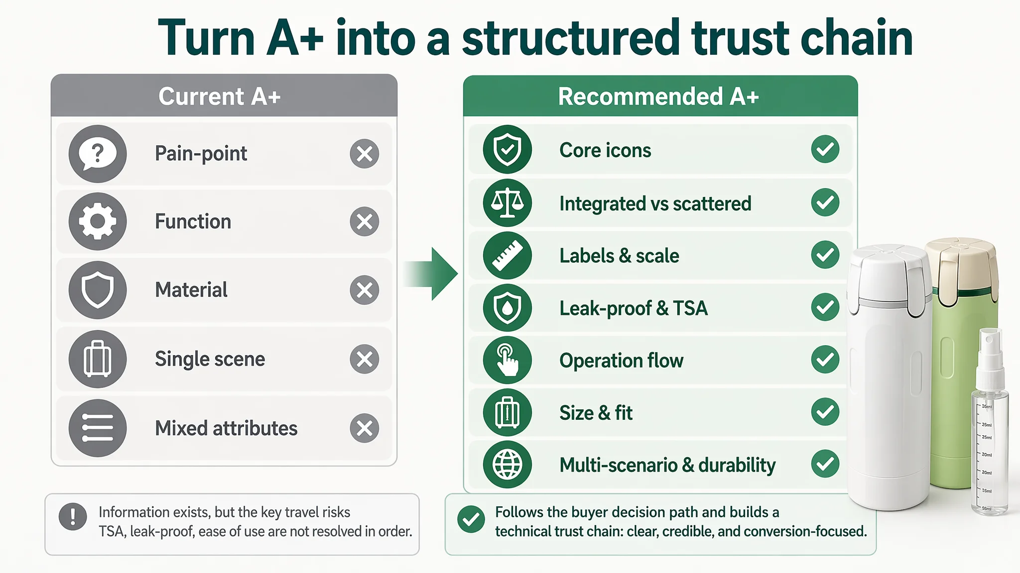
On the A+ page, the target Listing uses:
- Pain-point comparison (scattered bottles vs integrated dispenser).
- Core function explanation.
- Material and structure highlights.
- Packing scene images.
- Product combination visuals.
DeepBI’s visual and text analysis found that:
- Claims like “travel-friendly weight” lack specific metrics (dimensions, volume).
- Leak-proof is mostly a phrase and an icon, not a visually explained structure.
- “4‑in‑1” remains conceptual; the rotation and dispense logic is not clearly demonstrated in sequence.
- There is only one main lifestyle scene, instead of a broader lifestyle mosaic.
The competitor’s A+:
- Quantifies size (e.g., 5.94in × 4.63in).
- Visualizes open/closed states and how the lock works.
- Shows multiple distinct usage contexts.
- Offers a dense grid of technical close-ups (wide mouth, soft press, matte texture, leak-proof caps).
This creates a technical trust chain: users feel the product has been engineered, not just styled.
Reviews: A Near-Total Trust Vacuum
The most critical gap:
- Target Listing: 0 reviews, 0 stars.
- Competitor Listing: 4.5 stars, 322 reviews, including video content.
No matter how well ads perform, a page with zero social proof is at a fundamental disadvantage, especially in a category where leakage risk can cause real damage (stained clothes, ruined electronics). DeepBI’s scoring reflects that with a massive gap in the review dimension (2 vs 14 out of 15).
Why DeepBI Prioritized Listing Conversion Over More Ad Tuning
Based on the scoring and Amazon category norms, DeepBI’s view was:
- Sending more ad traffic into this Listing, in its current state, would mostly burn budget:
- Title does not immediately signal TSA approval and leak-proof engineering.
- Main image set creates cognitive load at thumbnail scale.
- Bullets and A+ lack a structured technical story.
- Reviews are absent, so the page bears all trust responsibility alone.
Therefore, the operating risk was:
- High ACOS and unstable TACOS if ads were scaled.
- Organic visibility limited because Amazon’s algorithm also reacts to conversion.
- Strategic misalignment: treating an on-page trust gap as an ad optimization problem.
DeepBI’s decision logic:
1. Fix the promise and trust layers first (title, core bullets, main images, A+ sequencing).
2. Make sure the page can truly convert the traffic it receives.
3. Only then consider scaling ads, once CTR and CVR show signs of stabilizing.
“Before ads could work again, the page had to convert. The Listing did not lack traffic potential. It lacked a clear, credible story that matched the buyer’s risk calculations.”
How the Optimization Direction Changed: From “More Content” to “Structured Proof”
DeepBI’s recommendations reorganized the Listing around one central idea: reassure the travel buyer about compliance, leakage, and ease of use, then talk about organization and eco benefits.
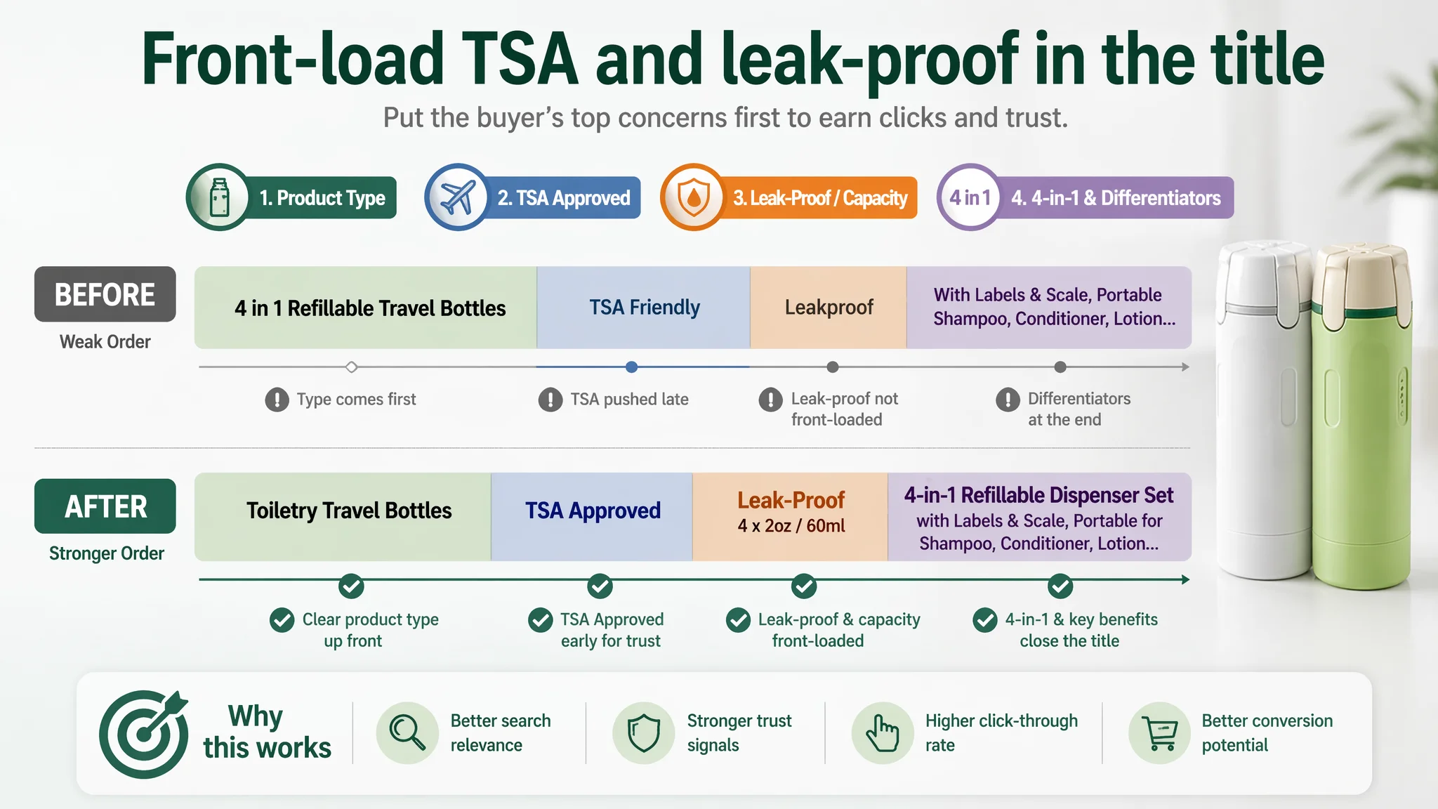
1. Title: Anchor on Product Type, TSA, Leak-Proof, and 4‑in‑1
Suggested direction:
Toiletry Travel Bottles, 4‑in‑1 TSA Approved Leakproof Refillable Dispenser Set with Labels & Scale, Portable Containers for Shampoo, Conditioner, Lotion, Body Wash, Carry On Essentials (Gray+Green)
Key changes in logic:
- Lead with “Toiletry Travel Bottles” to align with Amazon search behavior.
- Insert “TSA Approved” early to directly answer the airport security question.
- Combine “4‑in‑1” with “Leakproof” and “Refillable Dispenser Set” so the structure/benefit is clear.
- Retain unique differentiators “Labels & Scale” but position them after core risk resolution.
- Include specific usage (shampoo, conditioner, lotion, body wash, carry-on essentials) to win long‑tail queries.
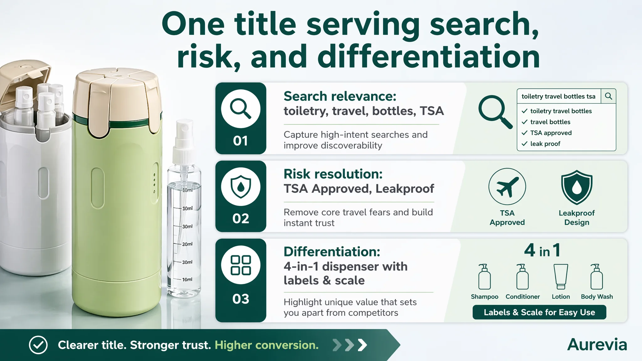
This reframing makes the title perform triple duty:
- Search relevance (toiletry, travel, bottles, TSA).
- Risk resolution (TSA Approved, Leakproof).
- Differentiation (4‑in‑1 dispenser with labels & scale).
2. Bullet Points: Build a Pain-Point → Structure → Trust Path
DeepBI’s bullet restructuring is less about stylistic polishing and more about logic:
Bullet 1: Compact & TSA-Approved Travel Solution
- Frames the product as a 4‑in‑1 organized dispenser, explicitly designed to meet TSA liquid requirements.
- Contrasts “one sleek case” with “individual bottles” to make space saving concrete.
- Positions the set as ideal for carry‑on luggage.
This immediately answers: “Can I bring it on a plane? Is it really more compact than what I use now?”
Bullet 2: Double Leak-Proof Protection
- Introduces structural leak-proof logic:
- A sturdy outer shell that resists compression.
- Secure sealing caps on each inner bottle.
- Emphasizes travel conditions: flights, bumpy car rides, compressed suitcases.
This shifts leak-proof from a claim to a mechanism—removing a key fear before users read further.
Bullet 3: Easy Fill & Visibility with Measurement Scales
- Highlights wide-mouth openings for easy refills.
- Calls out semi-transparent bodies and measurement scales.
- Emphasizes labels for quick identification and reduced confusion/waste.
Here, DeepBI connects usability (easy fill) with control (visibility and measurement), making “4‑in‑1” feel manageable, not abstract.
Bullet 4: Individual Compartment Organization
- Explains how each bottle sits in a dedicated slot.
- Prevents clanking and shifting during travel.
- Presents durable, upright organization as a long-term structural advantage.
This reinforces professional design rather than mere convenience, mirroring the competitor’s “dedicated slot” messaging but tied to this product’s integrated design.
Bullet 5: Secure Locking Mechanism for Daily Use
- Moves beyond pure travel to daily routines:
- Gym bags
- Business trips
- Weekend getaways
- Hotel stays
- Emphasizes a lid-lock system that prevents accidental dispensing.
This broadens the buyer pool (not only air travelers) and positions the product as a reusable, durable solution—important when reviews are not yet available.
3. Main Images: Simplify and Sequence Around Core Fears and Differentiation
DeepBI’s main-image guidance does not ask for “nicer” pictures; it asks for images that each answer a specific question:
1. Hero Image
- Focus on the product front, showcasing the 4‑in‑1 integrated dispenser.
- Make the structure recognizable at thumbnail scale.
- Introduce concise overlays: “4‑in‑1”, “TSA Approved”, “Leakproof”.
2. Ease-of-Use Image
- Show single-handed operation with iconography: rotate, press to dispense.
- Use symbols rather than dense text to communicate the workflow.
3. Leak-Proof Evidence Image
- Left-right split-screen: product under pressure vs stable, dry contents.
- Highlight the outer-shell protection and internal caps visually.
4. Labels & Scale Close-Up
- Zoom into the bottles with labels and measurement scales.
- Relate this to reduced waste and confusion, visually.
5. TSA & Space-Saving Comparison
- Compare the integrated dispenser to multiple separate bottles.
- Emphasize TSA-friendly volume and how much space is saved in a carry-on.
Each image gets a defined role in the conversion story. At thumbnail stage, buyers should grasp: compact 4‑in‑1, TSA-approved, leak-proof, clearly labeled and measurable.
4. A+ / Detail Page: Rebuild the Trust Chain Module by Module
DeepBI’s detail-page recommendations turn the A+ into a structured runway:
1. Module 1: Headline Visual with Core Icon Set
- Keep the attractive lifestyle scene but overlay 4–5 key icons:
- 4‑in‑1 integration
- TSA compliant
- Leak-proof lock
- Labels & scale
- Refillable/reusable
- This establishes the full mental model within seconds.
2. Module 2: Integrated vs Scattered Comparison
- Move the narrative beyond “saves space” to “highly integrated vs scattered bottles.”
- Show how one compact case replaces many individual containers and improves single-hand operation.
3. Module 3: Usability & Identification System
- Dedicate this module to the label + scale system.
- Use close-ups to show bottle labels and measurement marks.
- Connect it to practical benefits: easier identification, less overfilling, less waste.
4. Module 4: Leak-Proof & TSA Assurance
- Make this the fear‑resolution core:
- Enlarged “Leak Proof Lock” icon.
- Macro shots of the lock and cap structure.
- Clear TSA icon and a short, explicit statement about compliance.
5. Module 5: Operation Flow – Rotate, Select, Press
- Show the full operation:
- Bottles filled and fixed inside.
- Top rotating to select different liquids.
- Pressing to dispense without removing bottles from the case.
- Highlight “no need to take bottles out” as a major convenience advantage vs competitor’s separate-bottle designs.
6. Module 6: Compact Size & Packing Fit
- Use existing luggage imagery with added dimensions.
- Emphasize the “energy bar” slim profile that slides into tight spaces.
- Contrast with box-style storage solutions.
7. Module 7: Multi-Scenario Use & Durability
- Illustrate multiple contexts: flights, business trips, gyms, weekend trips.
- Mention reusable and durable construction for repeated trips, building a long-term value narrative.
This sequencing turns the A+ from a collection of scenes into a conversion-engine storyboard: understand → trust → see yourself using it → feel confident enough to buy.
What Changed for the Seller: From Isolated Fixes to a Conversion-First Mindset
There is no invented post-optimization data here; the case material does not provide hard metrics. What did change, and matters for other Amazon sellers, is the operating state and understanding:
- The seller moved from “our images need to be prettier” to “our page needs to answer TSA, leak, and usage questions in order”.
- The Listing’s weakest dimension—reviews—was acknowledged as a structural trust gap, not silently ignored.
- Optimization moved from scattered edits to a coherent conversion strategy:
- Title as the first trust anchor.
- Main images as quick risk answers and differentiation.
- Bullets as structured promises.
- A+ as a deep technical and lifestyle proof chain.
- Ads were seen not as a universal remedy, but as something that should follow once the page deserved more traffic.
If these changes are executed consistently:
- CVR is likely to recover as buyers meet a clearer, more credible story.
- ACOS can begin to decline because ad clicks have a higher chance of turning into orders.
- Organic traffic and ranking can stabilize as Amazon’s algorithm sees stronger conversion behavior.
- The seller’s dependence on raw ad spend decreases, replaced by a more balanced traffic structure.
What Other Amazon Sellers Can Take From This Case
For Amazon travel and personal care sellers—and broadly any category where risk and trust matter—the lessons are direct:
1. Don’t treat high ACOS or low orders as purely an ad problem.
If your Listing looks busy but lacks clear TSA, safety, or usage logic, ads will only amplify that weakness.
2. Title, main image, bullets, and A+ must jointly resolve specific fears.
In this case, the pivotal fears were leakage, TSA compliance, and ease of use. In your category, they may be safety, durability, or fit—but they need to be addressed explicitly and early.
3. Certification and structural mechanisms are decision tools, not decorations.
“TSA Approved”, “double leak-proof”, specific dimensions—these aren’t just nice to mention. They are what make buyers move from “interesting” to “I trust this enough to purchase.”
4. Reviews are part of the conversion engine.
A zero-review Listing must over‑deliver on structural clarity and technical proof to compensate until social proof accumulates.
5. Before scaling ads, ask a hard question: does this page deserve more traffic?
DeepBI’s approach in this case was to repair the Listing’s conversion capacity first. That shift in judgment—seeing the product page as the foundation of advertising efficiency—is often the difference between sustainable growth and chronic ad spend pressure.
This travel dispenser case is not about one product. It is about recognizing when an Amazon Listing’s real constraint is trust and decision logic—and having the discipline to fix that before expecting ads to carry the business.