This Amazon seller in the Australian marketplace thought their Merino wool quilt had only one problem: not enough traffic and reviews yet. Ads were cautiously on, the product itself was solid, and the few reviews were all 5 stars. But the Amazon Listing’s conversion stayed weak, and every extra click from ads felt more like a cost than an investment.
The team’s first instinct was to push harder on Amazon ads and wait for reviews to accumulate. When this failed to move orders, they blamed “insufficient exposure” and “not enough social proof.” After a DeepBI Listing diagnosis against a strong category competitor, we found the real bottleneck was not traffic quality or review rating at all. It was that the Listing itself could not build enough trust or decision clarity: the main images did not prove the wool filling, the A+ content did not form a buying story, and the bullets did not answer the doubts buyers actually had.
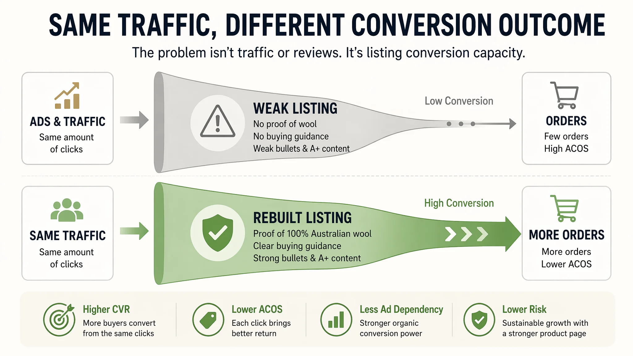
Once the problem was reframed as an Amazon product-page conversion issue instead of an ad or review problem, the optimization direction changed completely. Instead of continuing to tweak bids, the focus moved to: a main-image strip that visually proves “100% Australian wool” and durability, an A+ page that starts with a selection guide and material proof, and bullets that turn scattered parameters into “pain point → solution” logic. For other Amazon sellers, this case is a reminder: if your page cannot convert, more ads and more impressions only amplify the leak.
This Listing Did Not Lack Praise. It Lacked a Reason to Believe.
From a distance, the product page looked “safe”:
- Merino wool quilt in the Amazon Australia marketplace
- Claimed “Australian made”, “breathable natural”, “450GSM all-season”
- Star rating at 5.0, and both visible reviews were detailed and positive
The seller’s own narrative was simple: “The product is good. We just need time, more traffic, and more reviews.”
However, once we put the Listing into DeepBI’s scoring and benchmark comparison, a different picture emerged:
- Target Listing: 55/100
- Benchmark Listing: 86/100
- Gap: -31 points
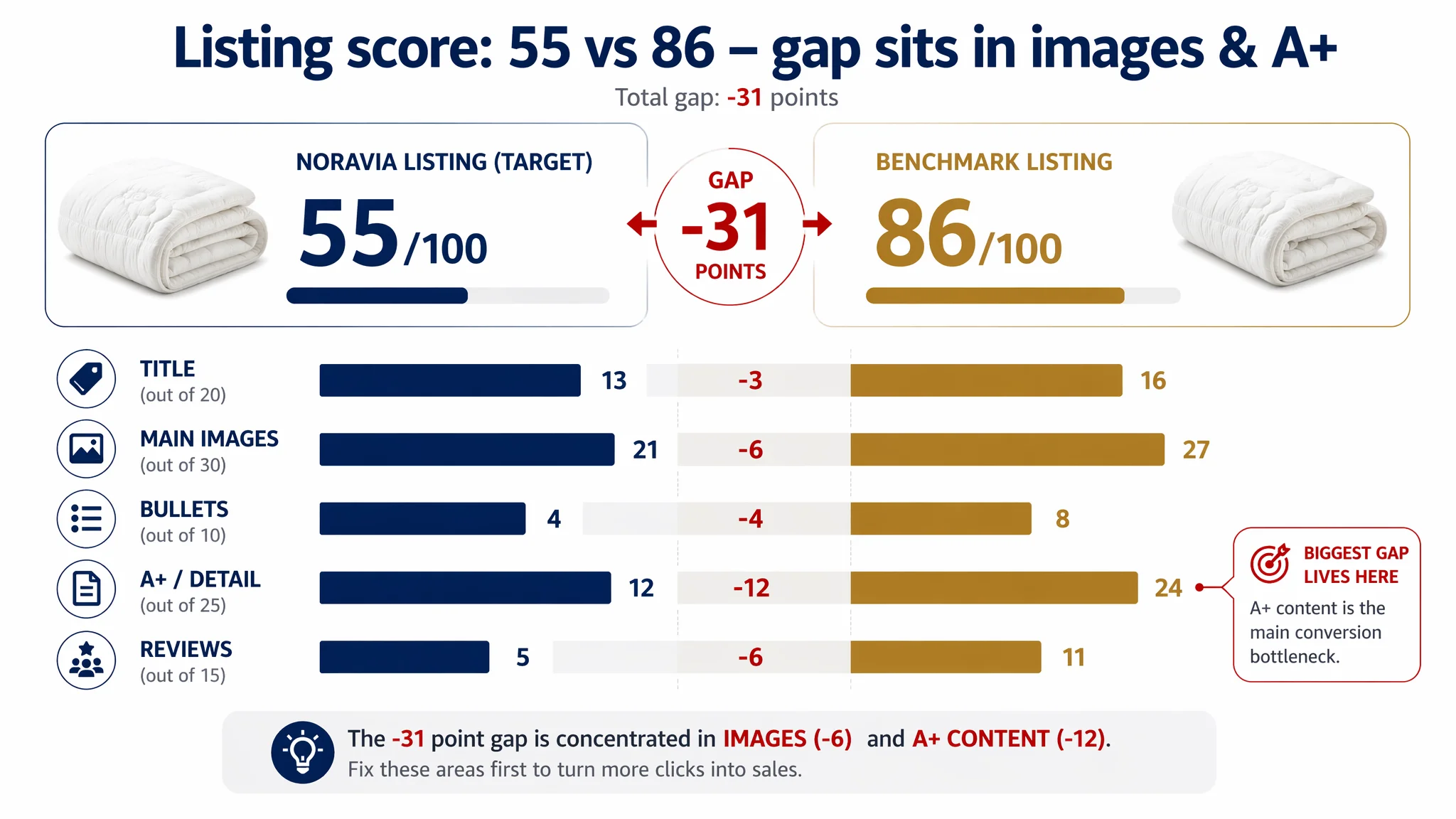
And the gap was not scattered. It was concentrated exactly where conversion should be built:
- Title: 13 vs 16 (out of 20)
- Main images: 21 vs 27 (out of 30)
- Bullets: 4 vs 8 (out of 10)
- A+ / detail: 12 vs 24 (out of 25) – the biggest shortfall
- Reviews: 5 vs 11 (out of 15) – not rating, but scale and trust mass
“The real problem was not that ads failed to bring traffic. It was that the page could not convert the traffic.”
So why did a 5.0-star product still struggle? Because Amazon shoppers don’t buy wool quilts in theory. They buy proof that this specific quilt is truly 100% Australian wool, warm but not stuffy, durable, machine washable, and easy to choose correctly.
On those questions, the competitor was answering. This page was not.
The Original Misdiagnosis: “We Just Need More Traffic and Reviews”
Before the diagnosis, the seller’s thinking path looked like this:
- Product quality is solid
- The few reviews are all 5 stars
- Ads are running, but ACOS is hard to push down
- Orders are not following impressions
So the internal conclusion was:
- “We don’t have enough exposure yet”
- “We need to wait for more reviews to accumulate”
- “Maybe bids and keywords still need fine-tuning”
In other words, they framed a conversion problem as a traffic and review-volume problem.
From an ads-operations standpoint, this is understandable. When ACOS is high and orders are slow, it’s intuitive to think “ads not precise enough” or “still early-stage, no trust yet.” But when DeepBI overlaid Listing scores with the structural comparison to the benchmark, a clearer root cause appeared:
- The benchmark did not win by a dramatically higher rating (4.9 vs 5.0)
- It won by how it used title, images, bullets, and A+ to build decision logic
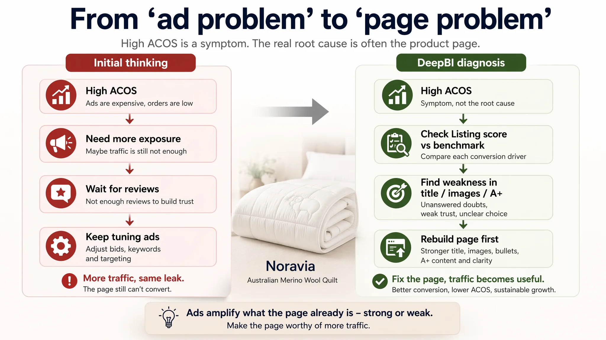
This meant: even if this seller tripled traffic and doubled reviews, the core conversion gap on the product page would still remain.
Amazon Ads Were Not Failing. The Page Was Consuming the Traffic.
Looking at the benchmark’s Amazon product page clarified where the real leverage was.
The competitor’s Listing did three things the target page simply did not:
1. Captured the click quickly on the search results page
- A main image with a strong memory anchor (iconic sheep + alpine imagery)
- Clear visual cues of “premium wool” and warmth
- Title front-loaded with “Australian Merino Wool Quilt” and “all-season”
2. Proved the material and usage logic inside the detail page
- A+ modules that showed: wool source, processing, structure, and usage
- Visual explanation of temperature control and moisture management
- Selection guide and size/thickness explanation early in the scroll
3. Managed doubts rather than ignoring them
- Bullet points and images that explicitly addressed:
- Wool’s natural color showing through the shell
- Freedom to choose weights (350/500/700GSM)
- How quilting prevents clumping and shifting
- What to do after unpacking a vacuum-packed quilt
The target Listing, by contrast:
- Repeated similar “bed laid out” visuals 2–3 times
- Did not show any cross-section or anatomy to prove wool filling
- Left “all season / 450GSM / size” unstructured and hard to interpret
- A+ consisted of three static images without explanatory text
- No selection guide, no process transparency, no explicit temperature-control explanation
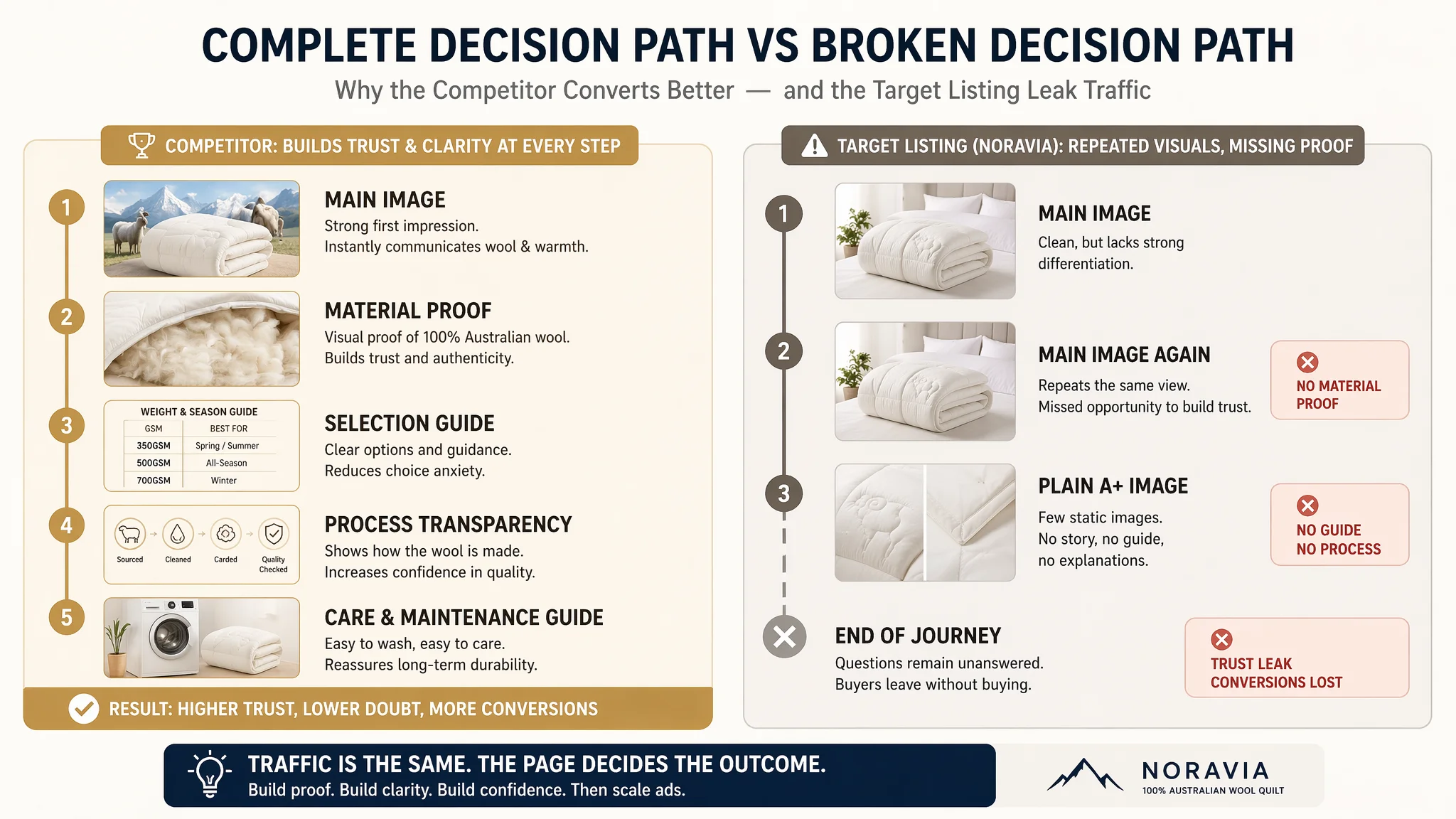
“Advertising does not only amplify advantages. It can also amplify a page’s existing defects.”
Under this structure, every additional ad click only hit the same wall: buyers arriving with interest, then hitting unanswered doubts about material authenticity, warmth vs breathability, durability, and whether 450GSM was really right for them.
The Real Constraint: Listing Conversion Capacity, Not Star Rating
DeepBI’s Listing scoring drilled into each dimension, exposing one core constraint: this Listing did not know how to convert the traffic it already had.
Title: Keywords Were There, but the Logic Was Weak
The original title:
- Led with the brand name, not the “Merino Wool Quilt” category keyword
- Scattered key specs (450GSM, 180×210cm, white) without clear decision order
- Focused on “Breathable Natural” and “Australian Made,” but lacked concrete body-feel language buyers latch onto (warm, lightweight, ergonomic)
The benchmark title, by contrast:
- Started directly with “Australian Merino Wool Quilt”
- Grouped GSM as options (350/500/700) to signal choice and expertise
- Introduced “Ergonomic” and “Lightweight” to connect to real usage comfort
DeepBI’s view: title is not only for indexing. It is the first micro-pitch. If the category term and outcome language are not front-loaded, CTR and initial trust both suffer.
So the recommended new title structure shifted to:
[Brand] Australian Made Merino Wool Quilt – 450GSM All-Season Warm Duvet Doona, Ergonomic Quilted Breathable Lightweight Blanket (Double, 180×210cm, White)
This did not invent new attributes. It reordered them to match Amazon search and decision logic.
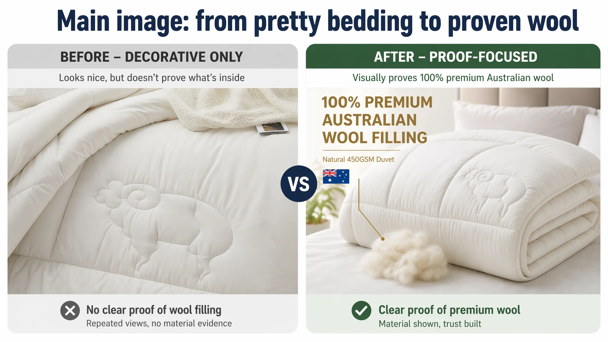
Main Image Strip: Beautiful, but Not Persuasive
Score gap: 21 vs 27 (out of 30).
The target images were:
- Clean, high resolution, with tasteful bedroom scenes
- But they repeated the same external view of a folded or laid-out quilt
- No visual proof of “100% premium Australian wool filling”
- No direct response to core doubts (material authenticity, warmth vs breathability, machine wash durability)
The competitor’s strip, in contrast:
- Used a distinctive “sheep + snow mountain” concept at thumbnail level to burn in the “pure wool + warm” association
- Included a material anatomy image showing the inner filling and explaining how wool regulates temperature
- Added a real ranch/farm shot and icons for hypoallergenic/safety to build trust
From a conversion perspective, DeepBI’s judgment was clear: this main-image strip did not lack aesthetics; it lacked functions.
This Product Page Did Not Lack Traffic. It Lacked Trust and Clarity.
The deepest structural issue sat in the A+ content.
Score gap: 12 vs 24 (out of 25) — almost half the points lost.
The A+ Page Lacked a Story and a Path
The existing A+:
- 3 static images
- No text blocks or structured explanation
- Only basic visual repetition of product texture and edge details
The benchmark A+:
- Brand story + Australian origin to frame authenticity
- Core value modules: “Why wool vs other fillings?” with visual comparisons
- Craftsmanship process: selection, cleaning, processing of wool
- Thickness and size guide, with usage scenarios and first-use instructions
- Care instructions with icons to lower fear of maintenance mishandling
DeepBI’s assessment: the target A+ was operating at a “display” level, while the competitor’s A+ operated at a “decision engine” level.
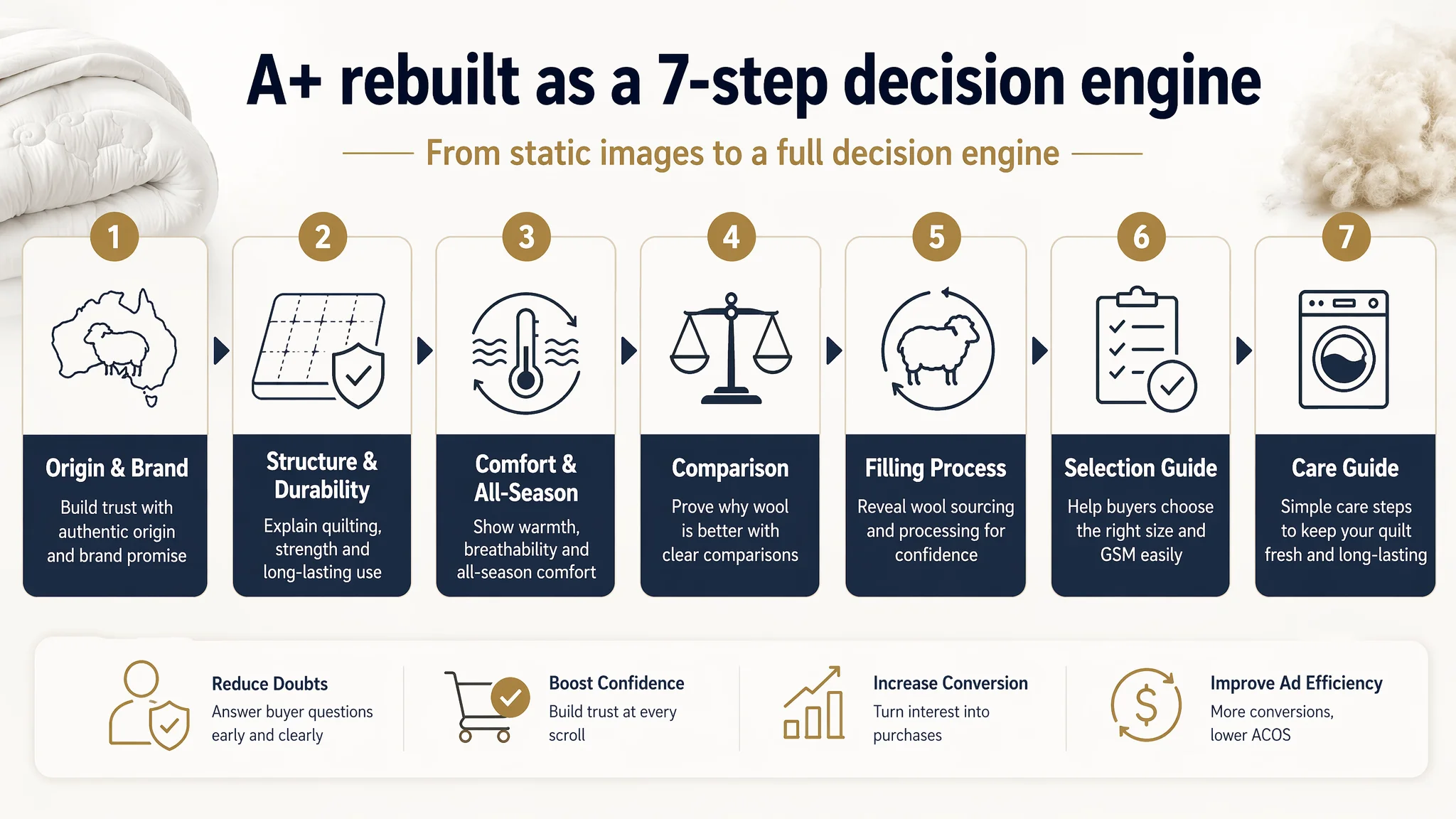
So the optimization logic was intentionally sequence-driven:
1. Move selection guidance very early (second module).
- Immediately answer: “Is 450GSM all-season appropriate for me?”
- Clarify size and scenarios to reduce “fear of buying wrong.”
2. Turn empty visuals into concrete proof.
- Every image must carry a core message:
- “100% Australian wool filling”
- “Warm yet breathable – not stuffy”
- “Durable quilting prevents clumping”
- “Machine washable, restores loft”
3. Fill the missing logic gaps.
- Introduce a comparison module: wool vs synthetic, or this quilt vs generic quilts
- Add a filling process / treatment module to explain “no weird smell” and “purity”
- Add a care-guide module with clear, icon-based washing and maintenance steps
In short: before we asked ads to send more people, we needed a page that could logically walk a cold shopper from doubt to purchase.
Why DeepBI Did Not Recommend “Keep Tuning Ads First”
From an Amazon operations perspective, the team had a very real pressure:
- Advertising costs were rising
- ACOS was hard to compress
- Organic orders were not growing fast enough to take over
The safer-looking option was: “optimize keywords, play with bids, maybe refine targeting.”
DeepBI explicitly pushed against that.
The reasoning:
- With a 55/100 Listing competing against an 86/100 benchmark, each extra click is more likely to leak than to convert.
- Main images and A+ lacked the basic proof structures common in this category.
- Reviews were too few to carry the trust load alone.
So the decision order we recommended was:
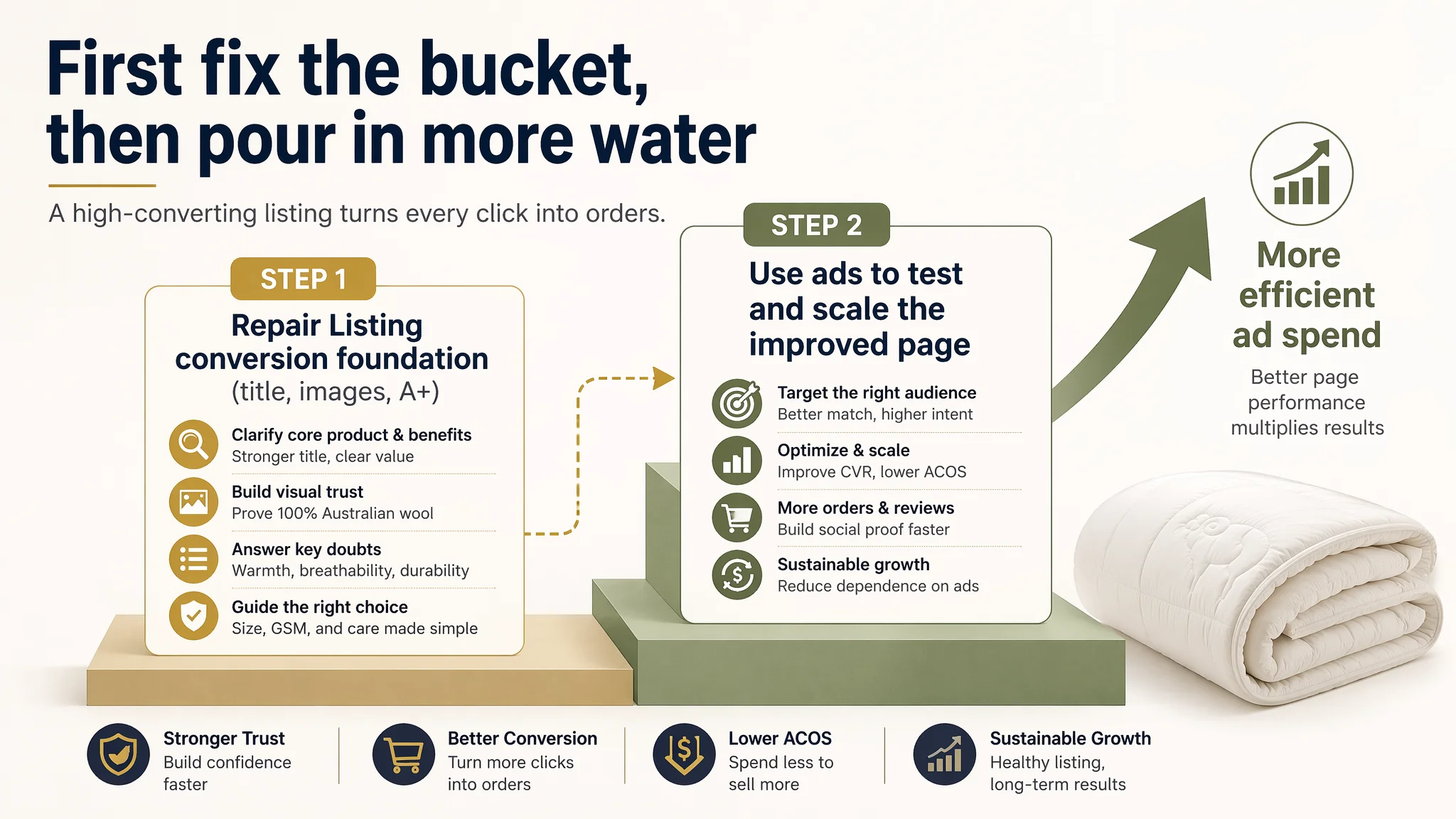
1. Repair the Listing’s conversion foundation first
- Title clarity and outcome language
- Main image strip with material proof and durability proof
- A+ with selection guidance, process transparency, and logical comparison
2. Then let ads test and scale the improved page
- Run incremental tests to see if CTR and CVR lift on the new assets
- Only after seeing stabilization, consider scaling bids and budgets
This is not about underestimating ads. It is about refusing to let ads keep amplifying a structurally weak page.
How the Page’s Sales Logic Started to Recover
Instead of listing every micro-change, it’s more useful to see how the whole decision path was rebuilt.
1. The Title Now Speaks the Same Language as the Amazon Search Page
- Category term “Australian Merino Wool Quilt” is front-loaded
- “All-season”, “450GSM”, and size are clearly placed and easy to scan
- “Ergonomic quilted”, “breathable”, “lightweight” give body-feel signals
Outcome: searchers scanning thumbnails can now understand what this is, how it feels, and whether it suits their need in one pass.
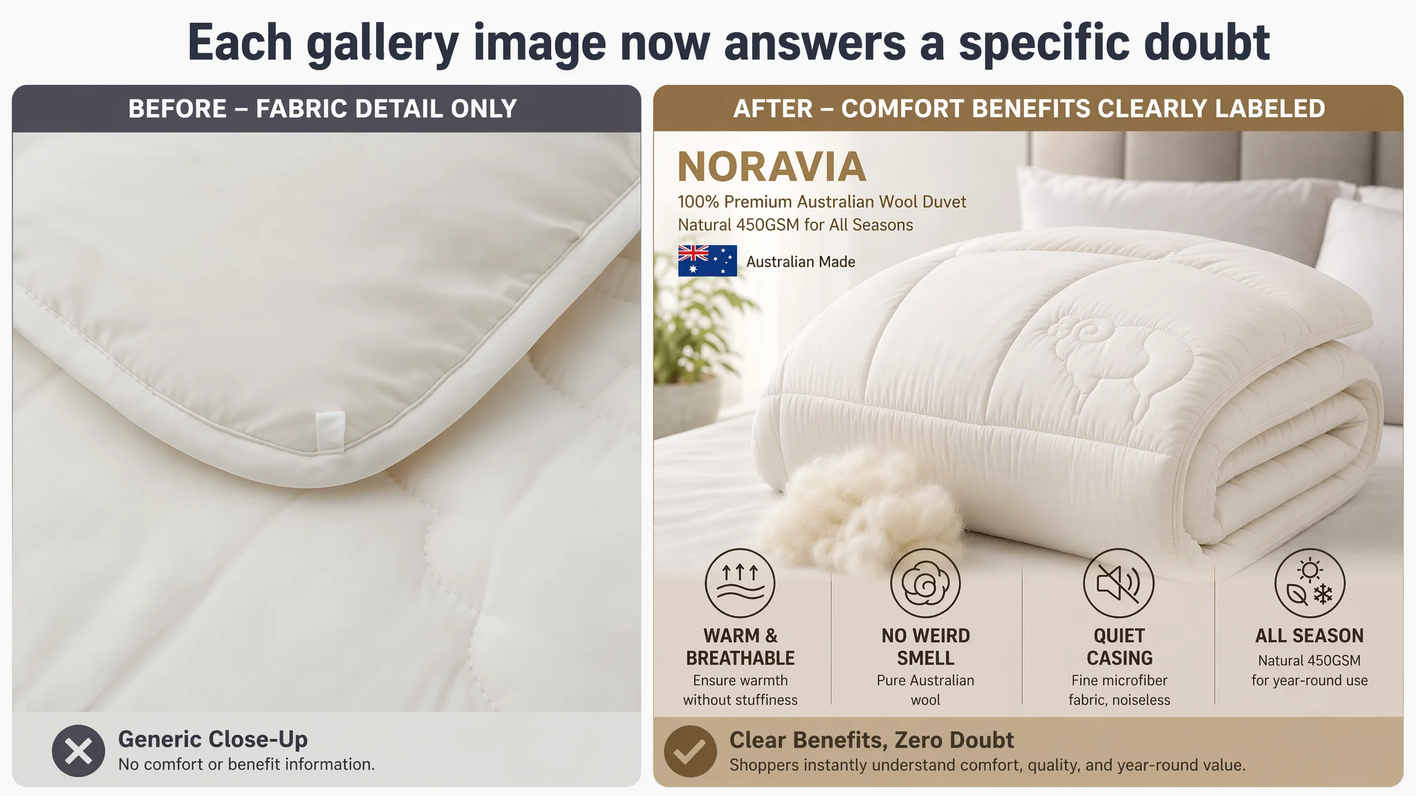
2. The Main Image Strip Gains Jobs, Not Just Frames
Each of the 5 gallery images is repositioned with a role:
- Image 1 – Hero: premium bedroom scene + clear overlay like
- “100% Premium Australian Wool Filling”
- “Australian Made”
Possibly with a small wool tuft visual to quickly anchor “real wool.”
- Image 2 – Core benefits panel: same bed scene, but overlaid with icons/short texts answering health and comfort concerns:
- warm but breathable
- hypoallergenic / skin-friendly
- noise-free fabric for quiet sleep
- Image 3 – Material anatomy: cross-sectional view showing inner wool filling, labeled “Premium Australian Wool Filling.” This is the pivotal trust image.
- Image 4 – Craft + comfort: stitching, quilted pattern, and copy specifically explaining how quilting keeps wool in place and improves body-hugging comfort, plus the “noise-free” point.
- Image 5 – Durability and care: fabric close-up with explicit “Machine washable – restores to original loft and shape” messaging, positioned as a late-stage objection killer.
Outcome: buyers no longer see five versions of the same quilt on a bed. They see a stepwise proof sequence: real wool → comfort → structure → durability.
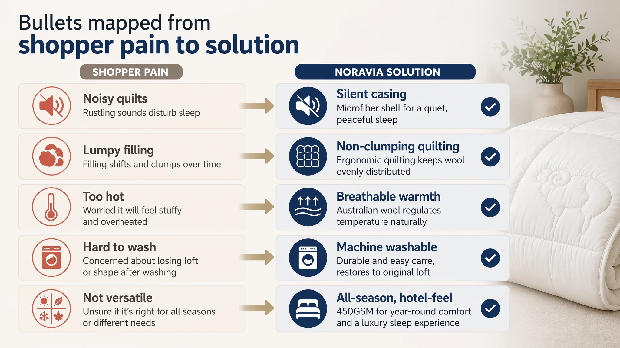
3. Bullets Become a “Pain Point → Solution” Ladder
Originally, bullets were basic material and durability statements without clear structure.
The rewired bullets follow a deliberate pattern:
1. Premium Material & Silent Design
- 100% Australian wool filling + microfiber shell
- Hypoallergenic, skin-friendly, noise-free even when turning over
2. Ergonomic Quilting & Non-Clumping
- Quilting that fits body contours
- Reinforced stitching to keep wool evenly distributed long-term
3. Breathable Warmth & Odor-Free
- Wool’s natural curling and loft → warmth
- High breathability → avoids stuffiness
- Treated for “no weird smell”
4. Machine Washable & Easy Care
- Designed to be machine washable
- Restores to original loft and shape
- Note about vacuum-packed delivery and how to fluff before use
5. Versatile & Durable Performance
- All-season usage
- Standalone or duvet-insert usage
- Non-pilling, long-lasting “hotel-quality” feel
Outcome: bullets no longer read like a specification dump. They read like a guided conversation, hitting the precise doubts identified in buyer behavior and competitor communication.
4. A+ Content Evolves from Decoration to Decision Support
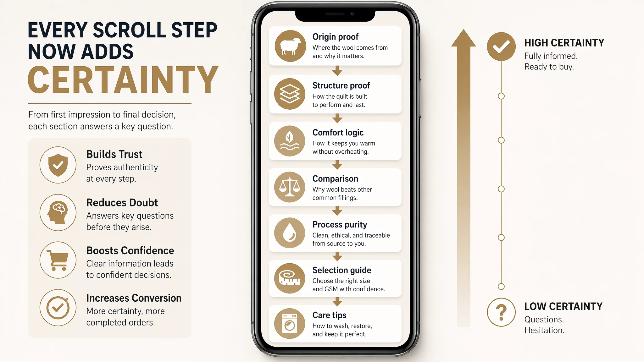
The restructured A+ modules are designed around a full trust and choice journey:
- Module 1 — Origin & Brand Promise
- Visual of Australian landscape / farm
- Clear statement: “100% premium Australian wool” and “Australian made”
- Purpose: answer “is it really what the title says?” in the first screen
- Module 2 — Structure & Durability Proof
- Detail shots of quilting and edging
- Copy: how quilting prevents shifting and clumping, even with washing
- Purpose: address lifespan and “does it go lumpy?” doubts early
- Module 3 — Comfort & All-Season Logic
- Visualization of warmth + breathability
- Explanation of wool’s curl and loft and moisture-wicking behavior
- Purpose: explain “warm but not stuffy,” especially relevant to “all-season”
- Module 4 — Rational Comparison & Pain Visual
- Side-by-side panels: wool quilt vs generic/synthetic blankets
- Differences in moisture, temperature control, and sleep quality
- Purpose: give logical justification, not just claims
- Module 5 — Filling Process & Purity
- Step-like visual: selection, cleaning, treatment, carding
- Emphasis on “no weird smell,” clean and safe for long-term use
- Purpose: turn “unknown process fear” into “high-process trust”
- Module 6 — Selection Guide
- Sizes listed, with 450GSM + “all-season” use cases
- Clear mapping: who this quilt is ideal for, climate, and room type
- Purpose: eliminate “fear of buying the wrong spec,” which often silently kills conversion
- Module 7 — Care & Maintenance Guide
- Icons for washing, drying, fluffing
- Simple instructions to maintain loft over time
- Purpose: reassure cautious buyers about long-term upkeep
Outcome: the A+ no longer wastes the scrolled area. It converts scrolling into growing certainty.
How Ad Traffic Becomes Useful Again
Once this type of Listing repair is in place, the role of ads fundamentally changes.
Before:
- Ads were driving clicks to a page that could not convincingly prove:
- real wool
- warmth-without-stuffiness
- durability and washability
- correct GSM choice
- Result: high bounce, slow review accumulation, ACOS pressure
After the structural shift:
- The page is set up to carry the full weight of a cold buyer’s journey
- New clicks from ads encounter:
- a category-aligned title
- a thumbnail and main images that visually assert wool and durability
- bullets that speak in buyer language, not factory language
- A+ content that answers “is it right for me?” early and explicitly
While we do not fabricate numbers where the case does not provide them, the expected operational changes are clear:
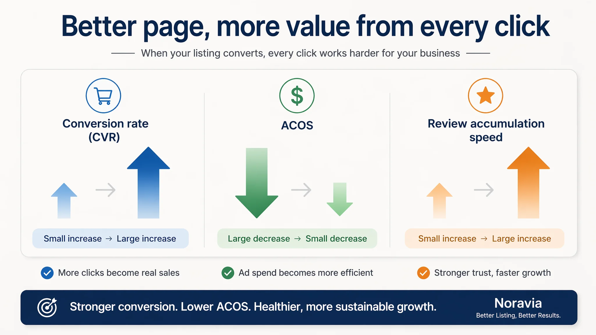
- CVR has room to improve, as doubts are addressed instead of left hanging
- ACOS has room to ease, because each ad click is more likely to convert
- Dependence on ads becomes more manageable, as the Listing regains its organic conversion strength
- The traffic structure risk declines: organic and paid traffic are both landing on a page that can actually sell
What Changed in the Seller’s Understanding
The most valuable outcome in this case is not just a better-looking page. It is a different mental model of Amazon operations.
Before:
- High ACOS = ad problem
- Low orders = not enough traffic, not enough reviews
- Listing optimization = minor cosmetic touches, not a conversion engine
After the diagnosis and restructuring:
- High ACOS with a 55/100 Listing vs 86/100 benchmark = page problem first
- Ads can only amplify what the page already is—strong or weak
- Title, main image, bullets, and A+ must work as one continuous sales logic
- Before scaling ads, the question must be: does this page deserve more traffic?
For other Amazon sellers, especially in categories where trust, material authenticity, and feel are crucial, this case is a practical warning:
- A few 5-star reviews do not equal a high-converting Listing
- Competitive pressure is often not in price, but in how clearly your page reduces risk and clarifies choice
- Amazon ads are powerful, but they are not a substitute for a coherent product-page story
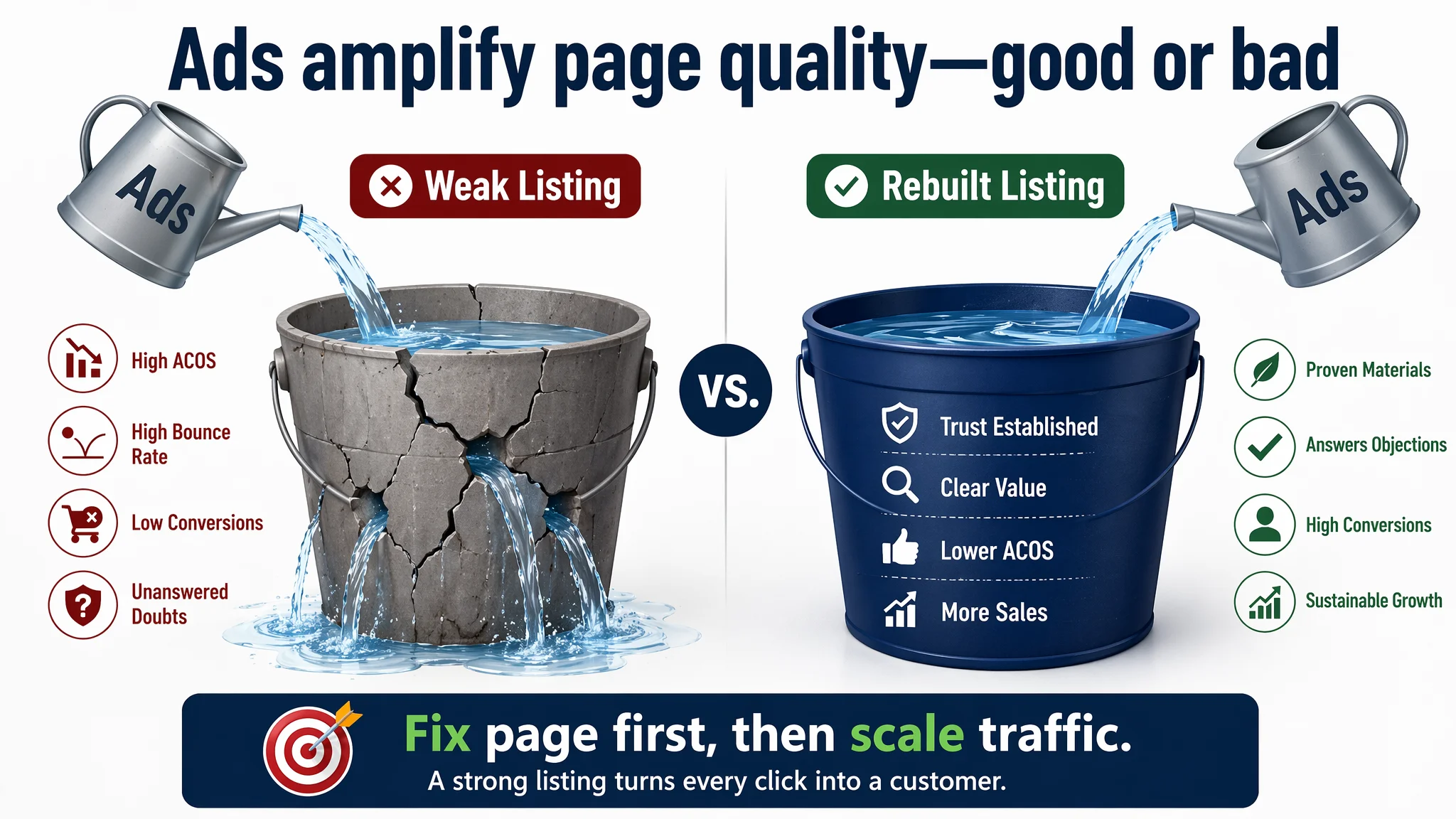
Fixing ads without fixing the Listing is like pouring more water into a cracked bucket. In this wool quilt case, DeepBI’s real contribution was not “better wording” or “prettier pictures.” It was helping the seller see where the bucket was actually cracked—and why that crack had to be sealed before any more water was poured in.