

For this Amazon UK bathroom-accessory seller, the pressure first showed up in ads: traffic wasn’t cheap, ACOS was hard to bring down, and yet the team felt they had already “fixed” the basics — a clean white background, clear product photos, and functional copy. They instinctively treated it as an Amazon ads problem: adjust bids, refine keywords, restructure campaigns.
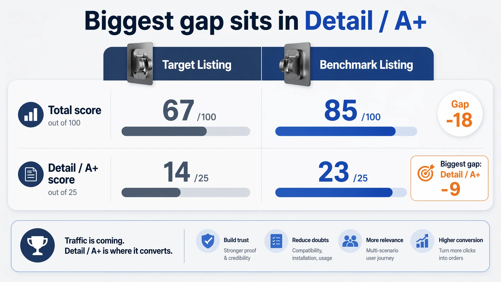
DeepBI’s diagnosis overturned that assumption. When we put the target Amazon Listing for an adhesive handheld-shower holder side by side with a strong category competitor, the gap was not in traffic volume or bidding sophistication, but in how the product page converted that traffic. The Listing scored 67/100 versus the competitor’s 85/100, with the largest gap not in the main image or title, but in the A+ / detail content and the overall buying logic.
Once the team stopped trying to “optimize their way out” through ads and instead treated the Amazon product page as the real bottleneck, the direction flipped. The later optimization focused on: making the title speak Amazon’s search logic, re‑building bullet points as pain‑point → solution → proof, and upgrading the entire image stack (main images + A+) from “static product display” to a clear user journey from installation, to compatibility, to family usage and trust.
This case is not about one shower holder; it’s about a pattern many Amazon sellers share: ad metrics scream “efficiency problem”, but the real leak is that the Listing cannot absorb the traffic. Understanding where this seller misdiagnosed the issue — and how DeepBI reframed it — can help other Amazon brands decide when to stop touching bids and start fixing the page.
Amazon Ads Were Not Failing. The Page Was Consuming the Traffic.
From the seller’s perspective, the situation looked familiar:
- Ad spend was under pressure.
- Orders were not growing in proportion to impressions and clicks.
- ACOS was stubborn; every round of bid and keyword adjustments only moved the needle slightly.
Internally, the working hypothesis was simple: this was an Amazon ads optimization issue. Maybe the campaigns were not granular enough, maybe the bids were inefficient, maybe negative keywords were late.
But when DeepBI ran the Listing through its scoring and benchmark comparison against a top‑performing Amazon competitor in the same shower‑holder niche, a different picture emerged:
- Total Listing score:
- Target Listing: 67/100
- Benchmark competitor: 85/100
- Gap: –18 points
- By dimension:
- Title: –2
- Main image: –1
- Bullet points: –2
- Detail / A+ content: –9
- Reviews: –4
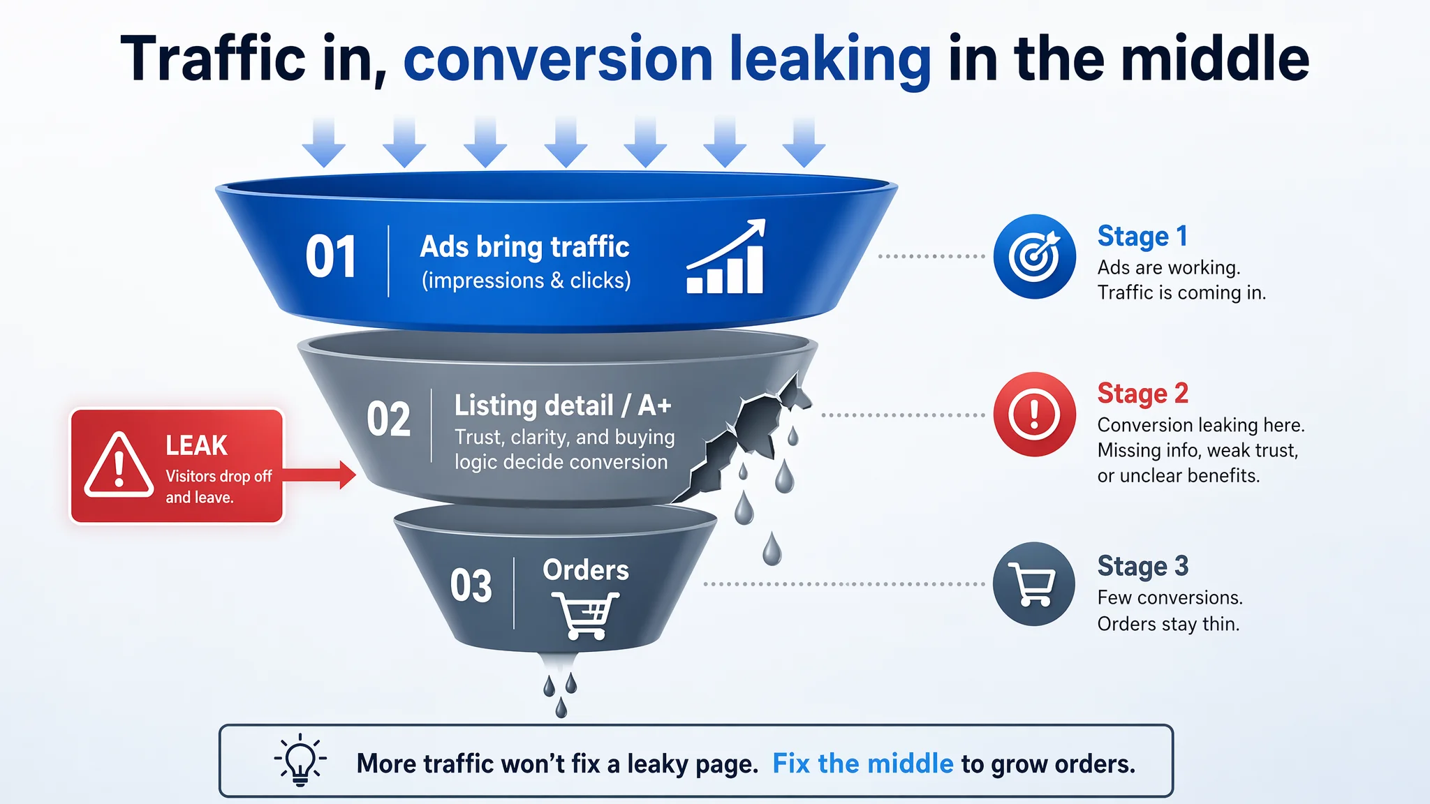
The largest deficit was in detail/A+ content, the core trust‑building and conversion area. Ads were doing their job — bringing visitors. The product page was not doing its job — converting those visits into orders.
“The real problem was not that ads failed to bring traffic. It was that the page could not convert the traffic.”
If the team had continued to treat this as an ad-only problem, every extra pound spent on clicks would simply have flowed into a leaky funnel.
The Real Constraint Was Listing Conversion Capacity
Looking at the Amazon product page as a whole, one core conflict became clear:
The Listing did not lack visibility. It lacked a complete buying story.
Title: Technically Relevant, Commercially Underpowered
On the surface, the title seemed “okay” — it mentioned adhesive, adjustability, and shower holder. But compared to the benchmark:
- The competitor led with its brand name, building recognition and trust at the first line.
- It quantified the feature as “Adjustable 3 Angle”, whereas the target title merely said “Adjustable”, less specific and less visually sticky in search results.
- It embedded material and reliability claims (“Strong Adhesive”, “ABS”, “Chrome Plated”), giving a concrete sense of durability and quality.
- It layered usage scenarios (“Home Hotel Bathroom”) directly into the title, expanding keyword coverage and clarifying context.
The target title, by contrast, followed a “function + selling point + scene” pattern but missed brand presence and much of the concrete, decision-driving language.
DeepBI’s conclusion: the title was not the biggest failure point, but it was under‑leveraged — not fully aligned with how top listings in this Amazon category compete for clicks and search relevance.
Main Images: Serviceable, But Not Category-Leading
Visually, the main image set wasn’t “bad”. It showed the product, angles, and some basic function. But under Amazon’s search-page competition, “not bad” is dangerous.
Key issues:
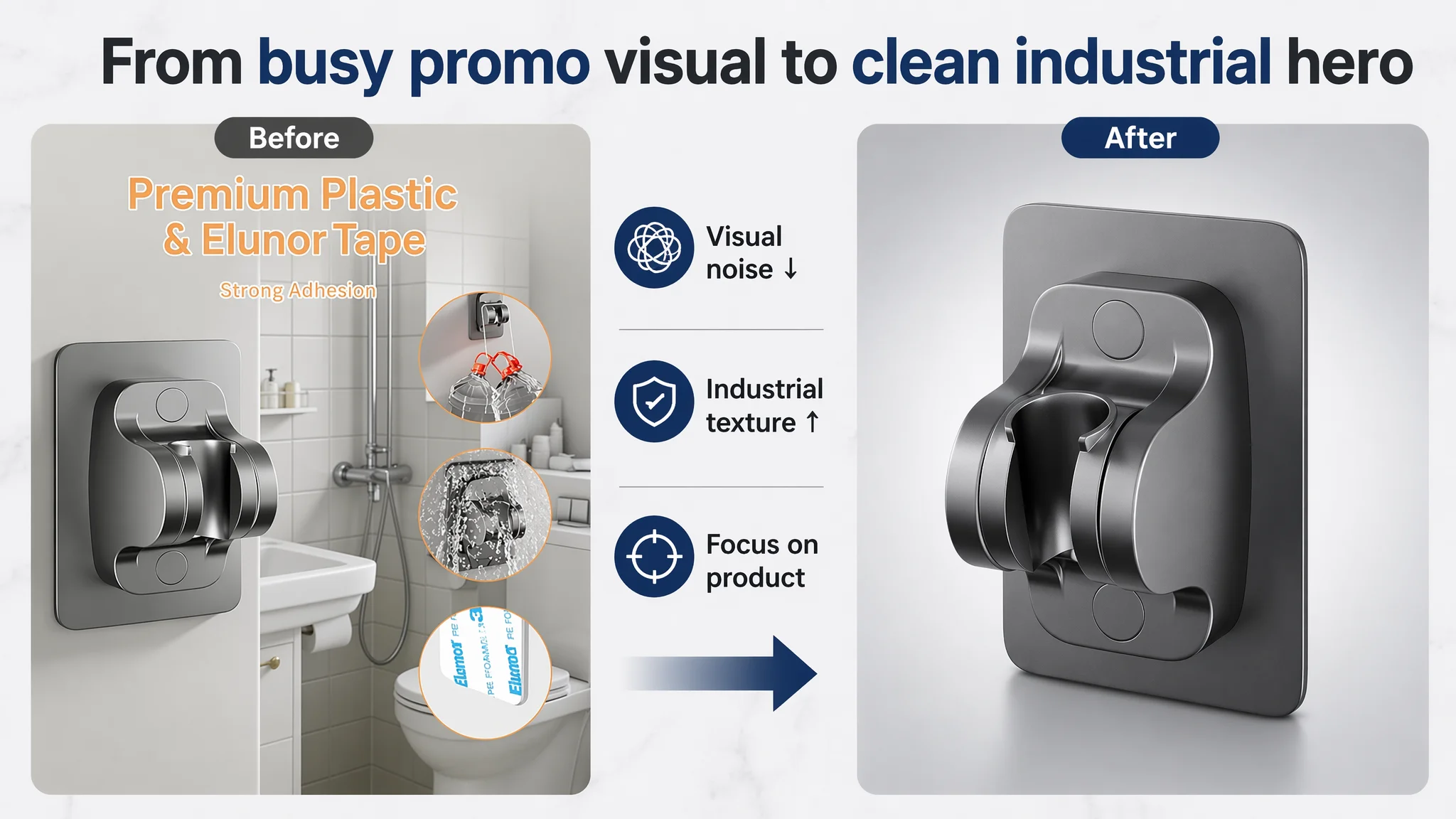
- The pure white background and lighting lacked depth and professional texture. In a hardware-adjacent bathroom category, that cost an estimated 3–5% of potential CTR in a side‑by‑side search result.
- Some images tried to show installation or multi-functionality but overloaded the frame with dense information, raising cognitive friction before add-to-cart.
- There was no clear, authoritative material/compatibility visual — nothing that immediately reassured high-value buyers (e.g., hotel or premium home renovators) about wall compatibility, adhesive strength, or interface fit.
In DeepBI’s scoring, the main image dimension only lagged –1 point behind the competitor. So while there was room to upgrade to a more modern, industrial, trust‑driven style, this was not what explained the 18‑point total gap.
The real constraint sat deeper in the page.
This Product Page Did Not Lack Traffic. It Lacked Trust.
Bullet Points: Information Without a Buying Logic
The target Amazon Listing’s bullet points followed a “feature header + feature explanation” format:
- Material reliability
- No-drilling characteristic
- Angle adjustment introduction
- Simple installation steps
- Scenario applicability
That structure is common — and often underperforms.
The benchmark competitor used a different pattern:
- Pain point / outcome + concrete explanation in each bullet.
- Integrated specific data (e.g., time to install, degrees of adjustment, dimensions) and time guidance (“wait 24 hours”), which both instructs and builds credibility.
- Closed the sale with usage limitations and after‑sales commitment, building a “purchase → use → support” trust chain.
In other words, the competitor’s bullets formed a conversion narrative, not just a feature list.
DeepBI’s assessment:
- The target bullets explained, but did not persuade.
- They lacked:
- Quantified claims (load-bearing in kg, angle data)
- Clear risk management (what surfaces not to use, how to avoid failure)
- Explicit after‑sales reassurance
So, even if ads delivered qualified traffic, the bullet section did not remove the main anxieties for a no‑drill adhesive product: “Will it fall?” “Will it rip off my tiles or paint?” “Does it fit my hose?” “Is it okay for my family and bathroom layout?”
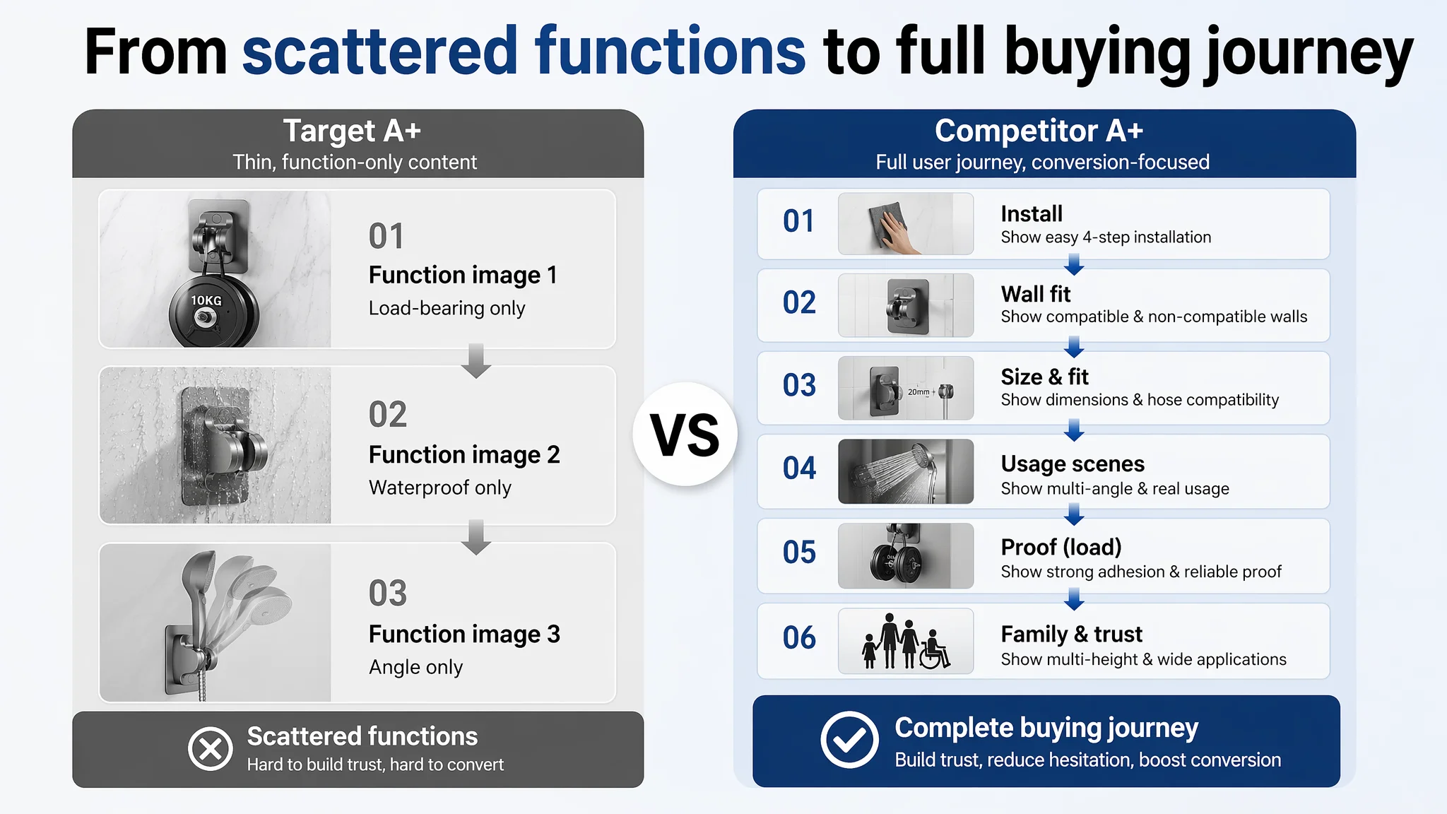
A+ / Detail Content: The Conversion Gap That Hurt the Most
This is where the –9 point gap to the competitor came from — and where the conversion bottleneck became undeniable.
The target A+ / detail section essentially consisted of:
- A few images emphasizing:
- Load-bearing
- Waterproof
- Multi-angle adjustability
Those are important, but:
- There was no structured installation journey.
- No wall-compatibility visual.
- No explicit parameter mapping between product and hose types.
- No multi-height or family scenarios.
- No deep emotional or contextual usage scenes.
The benchmark competitor, by contrast, used A+ as a full user journey:
- Brand hero image
- Suitable surface guide
- Four-step installation process
- Dimensional compatibility illustrations
- Multi-angle usage examples
- Measured load-bearing demonstration
- Multi-scene adaptation: family, hotel, different wall types
- Detail close-ups: water flow, waterproofing, material texture
- Height/adaptation visuals (including accessibility considerations)
“Advertising does not only amplify advantages. It can also amplify a page’s existing defects.”
DeepBI’s judgment was straightforward: as long as this A+ remained thin and generic, ad traffic would continue to be poorly monetized. The seller’s main business risk was not insufficient impressions, but a Listing that could not justify the click.
Why DeepBI Did Not Keep Tuning the Ads First
At this stage, the seller had two options:
1. Keep iterating on Amazon ads:
- Narrower keywords
- Different bids
- More campaigns
- Trying new match types
2. Accept that conversion capacity was capped by the Listing, and rebuild the page logic before scaling traffic.
DeepBI recommended the second path, for three reasons.
1. The Detail-Page Score Made the Risk Visible
With:
- –9 points in detail/A+
- A bullet-structure gap
- Weak trust and compatibility visuals
any additional ad spend would behave like:
- Pouring more water into a funnel with a missing middle section.
- Investing budget into testing keywords, not into converting the traffic those keywords brought.
In such a state, even “winning” keywords cannot show their true potential, because the page cannot reflect the value buyers need to feel secure.
2. Reviews Could Not Shoulder the Conversion Burden
Interestingly, the target Listing had:
- 4.2 stars average
- Only 8 total reviews
- All visible reviews positive, detailed, some with images
The competitor had:
- 4.1 stars average
- 343 total reviews
- Higher share of negative comments
The seller’s initial hope was understandable: “Our rating is slightly higher and our comments are very good. If we just bring more traffic, people will see this and convert.”
The problem:
- The target review volume was only 2.3% of the competitor’s.
- Even with a 0% visible negative rate, the scale was too small to create the “everyone is buying this” effect.
- With a weak A+ story, visitors had to lean entirely on a handful of reviews to build trust — too fragile a foundation to sustain ads at scale.
So reviews alone could not compensate for the missing conversion infrastructure on the page.
3. Ads Were Already Doing Their Job
The seller’s internal data (impressions, clicks, ad orders) showed that:
- People were clicking ads.
- The Listing did receive ad traffic.
This meant ads, structurally, were functioning.
The loss was happening after the click — making it commercially irrational to allocate more optimization cycles to the ad side while leaving the Listing logic unchanged.
How the Page’s Sales Logic Started to Recover
The priority shifted from “campaign tuning” to “Listing reconstruction”. DeepBI’s diagnosis guided the order:
1. Clarify the promise in the title (search and click stage)
2. Restructure bullet points around buyer anxieties and outcomes
3. Rebuild the visual journey in images and A+
Title: Aligning With Amazon Search and Buyer Language
Instead of copying the competitor formula outright, the new suggested title emphasized:
3M Adhesive Handheld Shower Holder, Adjustable Shower Head Bracket Wall Mount, Waterproof No Drilling Universal Shower Wand Holder for Bathroom
Key changes in logic:
- Bring “3M Adhesive Handheld Shower Holder” forward, anchoring search relevance around adhesive + handheld + holder.
- Retain “3M” as an implicit trust and performance signal.
- Introduce “Universal” to clearly communicate compatibility (a known concern in this category).
- Keep a clean structure visible on mobile — modular phrases separated for easy scanning.
The outcome was a title that:
- Spoke directly to Amazon’s A9 indexing needs.
- Communicated adhesive type (3M), universality, no-drill, waterproof — in the first few visible words.
- Laid a stronger foundation for CTR without overstuffing.
Bullet Points: From Feature List to Decision Path
Each bullet was re‑written to function as a mini conversion step.
Bullet 1 – Installation clarity + usage rule
From generic installation description → to:
- Clear, bold header
- “Install in seconds” promise
- Explicit no-drill, no-screw reassurance
- Step sequence (clean/dry, peel, press)
- 24‑hour wait instruction for stability
This not only sets expectations and reduces improper usage (and returns) but also signals professionalism: the brand knows how its adhesive works and tells you how to succeed.
Bullet 2 – Angle and family usage
From “adjustable angle” → to:
- Emphasis on flexible multi-angle adjustment
- Highlighting installation at any height
- Directly naming kids and adults as beneficiaries
The bullet now frames adjustability as family fit, not just a technical lever.
Bullet 3 – Material and durability
From generic ABS mention → to:
- “High-grade waterproof ABS engineering plastic”
- Lightweight yet wear-resistant
- Rustproof in humid bathroom environments
- Long-term performance promise
This tackles the “will it last in steam and water?” concern.
Bullet 4 – Adhesive strength and safety
From “strong adhesive” → to:
- Brand‑anchored 3M adhesive
- “Powerful bonding” and “stable load-bearing” language
- Explicit reference to protecting fixtures and preventing drops
Here, the seller is no longer just stating “strong”; they’re connecting adhesion to family safety and hardware protection.
Bullet 5 – Surface compatibility + scenes
From broad usage → to:
- Clear list of compatible surfaces (tiles, glass, marble, smooth wood/metal)
- Explicit list of non‑compatible surfaces (lime wall, wallpaper, uneven)
- Extension into more scenes (bathroom, balcony, washstand)
This bullet both reduces pre‑purchase uncertainty and targets more use cases, increasing the chance that a shopper recognizes their own bathroom layout in the description.
Collectively, this bullet redesign turned a static feature inventory into a five‑step logic: easy → comfortable for all → durable → safe → compatible and versatile.
Detail Images and A+: Turning a Product Into a “Family Shower Solution”
DeepBI’s scoring made it clear: the detail/A+ dimension was the main drag on conversion. So the page had to be rebuilt around how a buyer actually evaluates a no‑drill shower holder on Amazon.
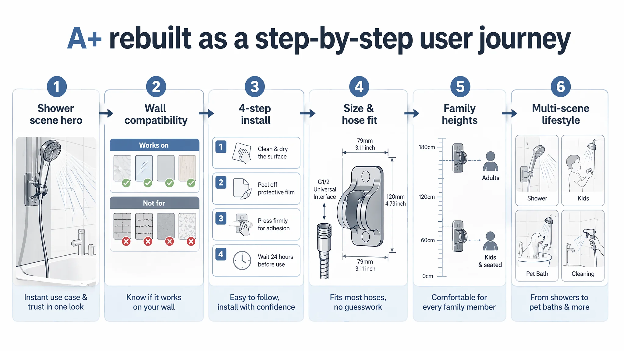
From Function-Only Images to a Full User Journey
The new visual direction prioritized:
1. Emotional entry
- A real-life shower scene with steam, warm lighting, and the product solidly mounted in a modern bathroom.
- Purpose: transport the viewer from “looking at a hook” to imagining a better shower experience, and visually prove stability in a wet, real environment.
2. Wall compatibility clarity
- Side-by-side panel showing:
- Green‑check compatible surfaces (smooth tile, marble, glass, smooth wood/metal)
- Red‑cross incompatible surfaces (rough brick, plaster, cement, wallpaper)
- Centered close‑up of the adhesive backing.
This directly answers: “Will it stick on my wall?” and pre‑emptively lowers return risk from misuse.
3. Step-by-step installation
- Four-frame visual: wipe, peel, press, wait 24h.
- Unified background and clear arrows.
The goal is not only to “show steps”, but to reduce perceived effort and make success feel easy.
4. Parameter-based compatibility
- Close-up of the hose slot with labeled dimensions (e.g., top and bottom diameter).
- Visual examples of compatible vs incompatible hose connectors with check/cross marks.
For a category where “will my hose fit?” stops many buyers, this image allows them to verify fit in seconds, without scanning dense text.
5. Multi-height and accessibility
- Visual of two holders mounted at different heights.
- Silhouettes for an adult and a child or wheelchair user, with height markers.
This reframes the product from “a hook for one person” to a flexible system for families, children, elderly, and people with mobility needs.
6. Angle adjustment visualization
- Composite frame showing several angle positions within a clear range (e.g., around 45°), with motion implied.
Instead of cheap-looking ghosting, the new approach anchors the concept of precise, controlled adjustability.
7. Multi-scene montage
- Four lifestyle shots: adult showering, child washing, pet bath, relaxed singing shower scene — the product present but not overpowering.
This spreads the buyer’s imagination beyond “standard shower” to pet care, kids’ independence, and other moments that make the holder feel indispensable.
Main Image Direction: From “Just White” to Professional Industrial Confidence
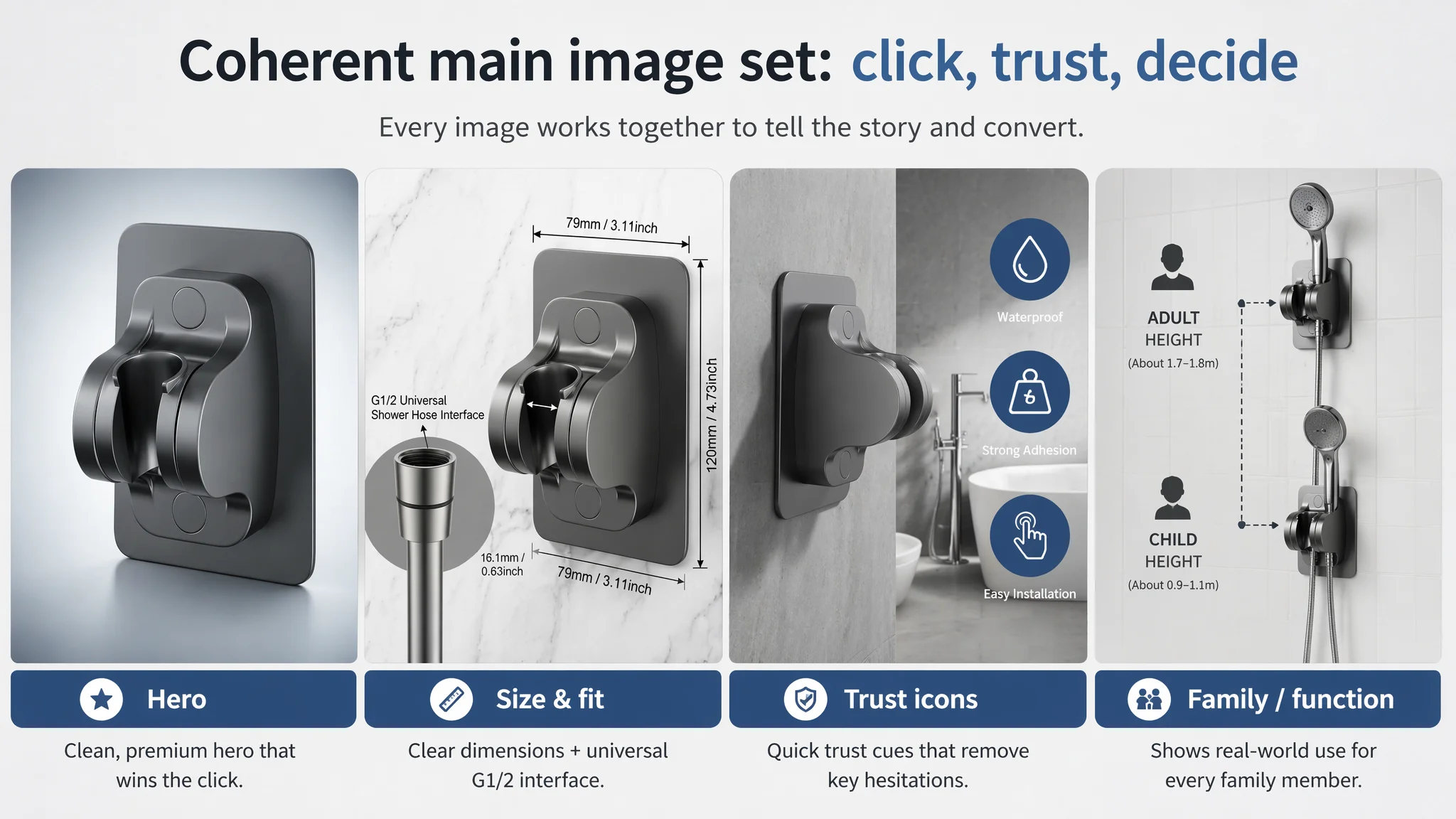
On Amazon search pages, the main images are the gatekeepers of CTR. DeepBI recommended a move from generic “white background + product” to a controlled modern industrial aesthetic:
- Cold grey tones with subtle gradients instead of flat white.
- Marble or high-end tile textures in certain views to imply quality environments.
- Consistent, soft lighting and natural shadows to make the holder feel solid and tangible.
- Visualized dimensions and icons (water droplet, weight, touch) to encode waterproofing, load-bearing, and usability at a glance.
- Angled shots that clearly communicate 45° adjustment, water flow, and real installation context.
These upgrades aren’t “beautification for its own sake”. They are designed so that every pixel either attracts the click or reduces a buying hesitation.
How Ad Traffic Became Useful Again
Once this Amazon Listing started to:
- Tell a coherent story from “what is it” → “will it work in my bathroom” → “how do I install it” → “is it safe and durable” → “does it fit my family and hose”;
- Visually prove key claims in line with category expectations;
- Speak clearly to Amazon search and to human reading behavior;
the role of ads changed.
Instead of “paying to test whether the product can sell at all”, the seller could:
- Trust that a meaningful portion of visitors would convert once they clicked.
- Use ads to systematically expand keyword coverage around “adhesive shower holder”, “no drilling shower head bracket”, “universal handheld shower” instead of constantly patching poor conversion with sharper targeting.
- Watch ACOS with more confidence, because changes would now reflect both traffic quality and page improvement, not just ad mechanics.
Even without quoting specific post‑optimization metrics, the operational state changed:
- The Listing regained conversion capability — it could finally carry its own weight.
- Dependency on “perfect” targeting decreased; the page began to self‑convert a broader set of relevant queries.
- The business risk of scaling ads dropped, because spend was no longer feeding into an under‑built product page.
What the Seller Ultimately Learned
By the end of this process, the seller’s internal understanding of Amazon operations had shifted in several important ways:
- High ACOS is not always an ad problem.
If the Amazon product page cannot absorb traffic, no amount of bid tuning will fix structural conversion leaks.
- Listing quality is the foundation of ad efficiency.
Title, main image, bullets, and A+ must form a single, continuous argument — not four disconnected modules.
- Detail / A+ is not a “nice-to-have”.
In categories like no-drill bathroom hardware, A+ is often the decisive layer where compatibility, risk reduction, and emotional trust are won or lost.
- Reviews cannot replace a strong page.
A small number of great reviews help, but they cannot compensate for missing installation guidance, compatibility visuals, and quantified claims.
- Advertising amplifies whatever you already have.
A strong Listing turns ads into a growth engine. A weak Listing turns ads into a loss amplifier.
For other Amazon sellers, the key takeaway is simple but demanding: before pushing harder on ads or blaming “bad traffic”, first ask — does my Listing truly deserve more visitors?
In this case, DeepBI’s value was not in generating nicer images or clever copy by themselves, but in forcing a hard judgment: ads were not the limiting factor; Listing conversion was. Once that root cause was accepted and addressed in the right order, ad traffic finally had somewhere solid to land.