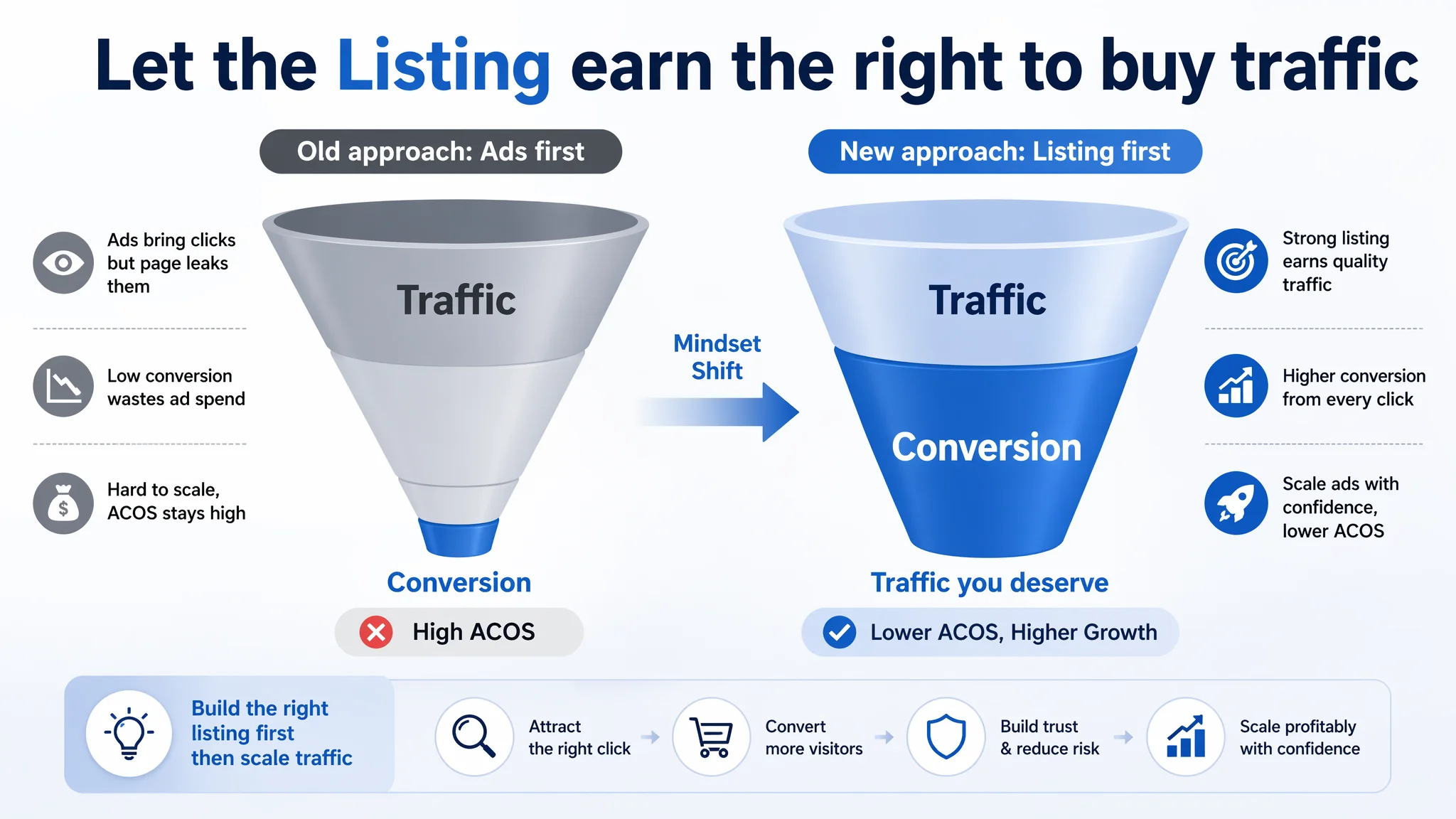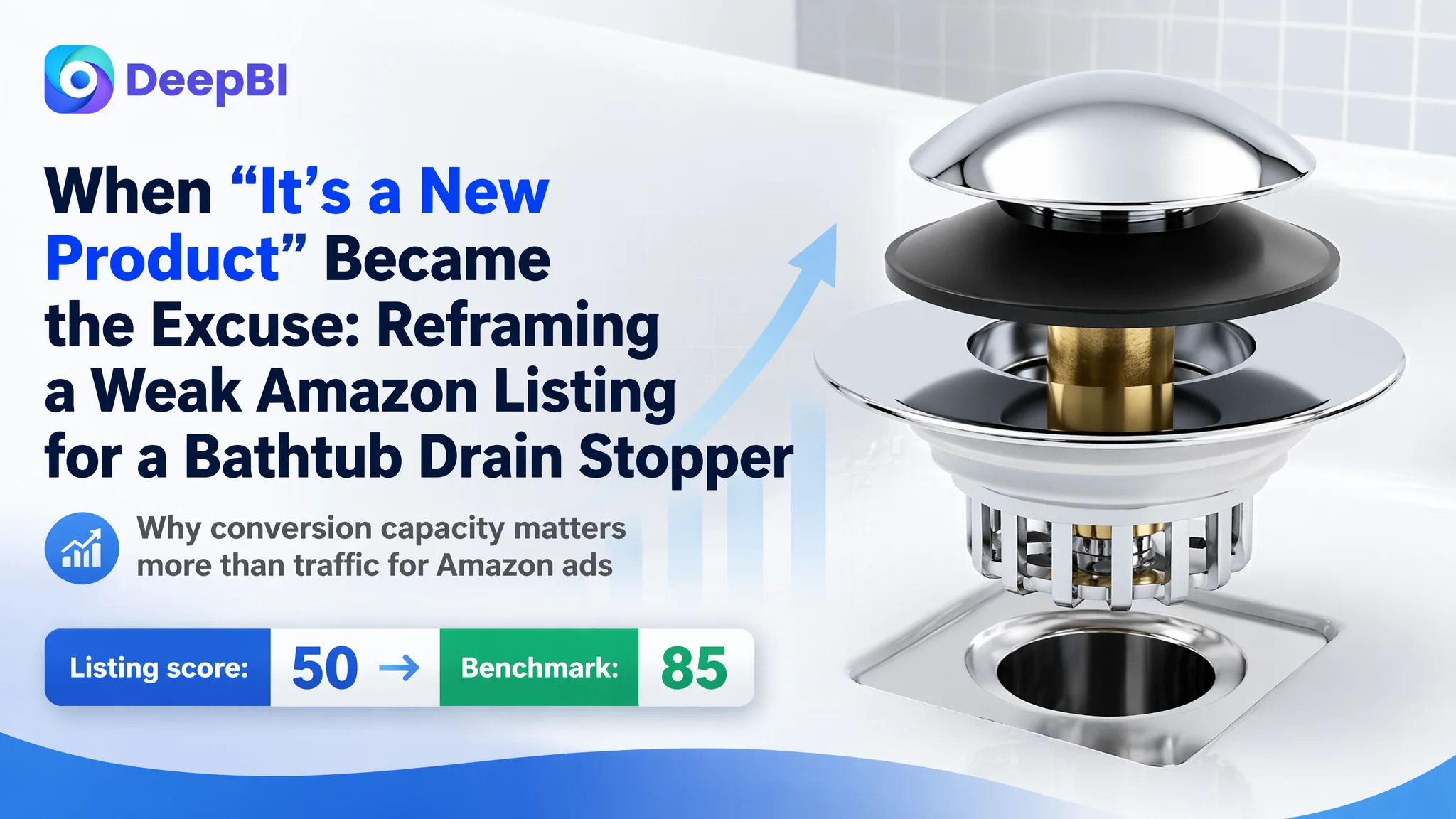
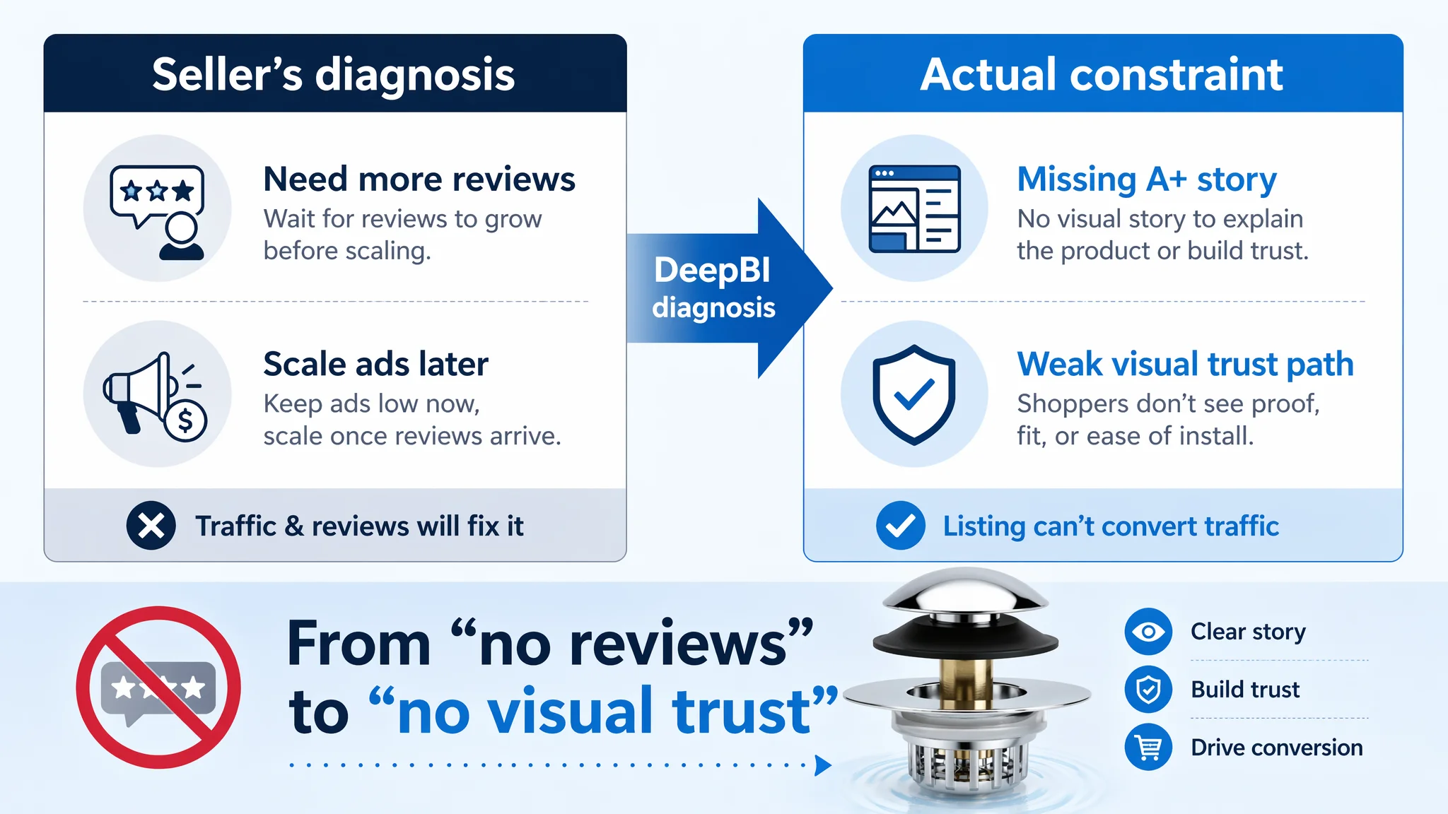
This case comes from an Amazon seller in the bathroom hardware category who believed their problem was “not enough traffic yet” and “too few reviews.” Amazon ads were still on a small budget, CTR looked acceptable at first glance, and the team’s instinct was to wait for reviews and then push ads harder. But once we put their Listing against a mature benchmark in the same Amazon category, it became clear: the real bottleneck was not traffic or reviews, but a product page that could not carry the traffic it already had.
DeepBI’s Listing scoring showed a brutal gap: total 50 vs. the competitor’s 85 out of 100, with a -23 difference on the detail/A+ dimension and -8 on reviews. The seller had actually done a decent job on bullet points; their weakest link was that the Amazon product page looked like a half‑finished prototype next to a fully built commercial page. There was almost no A+ story, no visual decision path, and no trust structure. Ads, if scaled at that point, would only have amplified an incomplete page.
We reframed the problem from “we need more traffic and reviews” to “we must first restore the Listing’s conversion capacity.” The later optimization centered on: tightening title keyword logic, rebuilding the main-image system around click and clarity, and constructing a full A+ visual story that mirrors how shoppers actually decide: problem → solution → proof → compatibility → ease of install. Other sellers in similar niches can borrow this logic: before you fight ACOS on Amazon ads, ask whether your Listing deserves the traffic you are buying.
The Core Conflict: Traffic Wasn’t the Real Bottleneck
The product is a universal 3‑in‑1 bathtub drain stopper / hair catcher for the US Amazon marketplace.
From the seller’s angle, the situation looked “normal for a new ASIN”:
- Star rating: 5.0 stars
- Review count: 3 total
- Amazon ads: conservative testing, no obvious “disaster” in the account
The internal narrative became:
- “Reviews are too few. Let’s wait for more feedback.”
- “We are still in seeding. Once reviews come in, we can scale ads.”
- “Competitors have 1,000+ reviews; we just need time.”
But the Listing score comparison told a different story:
- Our Listing total: 50 / 100
- Benchmark Listing total: 85 / 100
- Gap: -35 points
Breakdown:
- Title: 13 vs. 16 (‑3)
- Main images: 24 vs. 26 (‑2)
- Bullet points: 8 vs. 7 (+1)
- Detail/A+: 0 vs. 23 (‑23)
- Reviews: 5 vs. 13 (‑8)
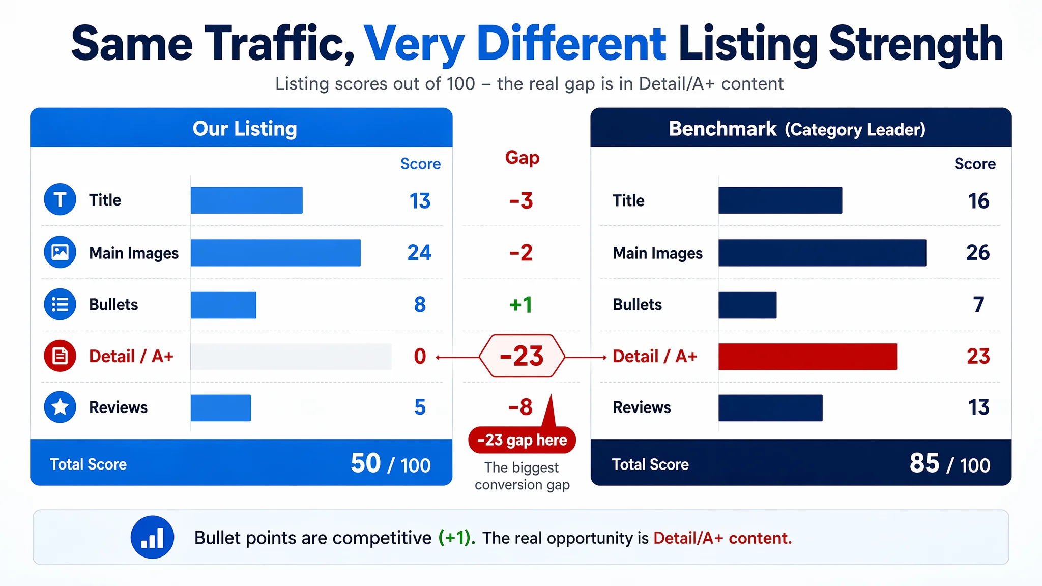
The bullet points—what the team thought they needed to “rewrite later”—were actually slightly stronger than the benchmark. The real collapse was the detail/A+ module at 0 vs. 23.
The product did not lack a story. The story simply never made it onto the Amazon product page.
In this state, pushing more traffic—organic or paid—would only increase the cost of every order, not the volume.
How the Seller Misdiagnosed the Problem
From conversations with the team and the Listing itself, the misdiagnosis was very typical of Amazon operations under pressure:
1. Over‑attributing to review volume
- Competitor: 4.5 stars, 1655 reviews, with rich text and image feedback
- Our Listing: 5.0 stars, 3 reviews
The team concluded: “Conversion is low because we lack social proof.”
In reality, the review gap mattered, but it was not the only or even the first constraint. When we looked at the benchmark’s A+ and image structure, it was clear that the competitor had built a full pre‑review trust system: visuals, scenarios, proofs, and clear installation. Our Listing had almost none of this.
2. Treating ads as the main lever
Because there was no immediate catastrophe in ACOS, the team’s plan was:
- Hold bids relatively low
- Slowly collect reviews
- “Fix images later when we scale”
This is a dangerous order of operations. If the Listing doesn’t convert, every extra click you buy through Amazon ads just feeds a leaky funnel.
3. Thinking “bullet points are weak” while they were not
DeepBI’s textual comparison actually showed:
- Our bullet points followed a pain‑point → solution → result chain more clearly than the benchmark
- Titles such as “Say goodbye to…” and “Enjoy faster…” already contained result‑driven language
- Specific materials and scenarios (“solid brass”, “pet fur”) were clearly called out
The team’s instinct to “rewrite bullets” first would have spent energy on the least urgent problem.
The net effect: ad optimization and text tweaks were being used to treat a structural weakness in page‑level conversion logic.
Why Traditional Amazon Ad Tuning Would Keep Failing Here
Even without full ad data in this case, DeepBI’s Listing audit gives a traffic‑funnel warning signal:
- Main image and title: only slightly behind the benchmark
- Bullet points: competitive, even a bit stronger
- Detail/A+: empty vs. a fully built commercial system
In Amazon’s reality, that means:
- Search results: You can still win some impressions and clicks if your main image and title are acceptable.
- Product page: Once shoppers land, they face:
- No A+ visual explanation of “3‑in‑1”
- No clear proof of anti‑clog performance
- No visual installation steps
- No multi‑scenario reassurance (jewelry, pet hair, kids, family)
Ads can bring people to the door; this page gave them no reason to walk through it.
Any attempt to lower ACOS only through:
- Pausing keywords
- Restructuring campaigns
- Micro‑adjusting bids
…would be operating on the wrong layer. The ads were not “under‑optimized”; they were feeding an underbuilt product page.
What the Listing Data Actually Revealed
1. Title: Not Disastrous, but Not Maximized
- Our title buried the core term “Bathtub Drain Stopper” in the 6th word position, while the benchmark led with it.
- Size information “Fits 1.45 to 1.8 Inch” was pushed to the end; the competitor tied the size phrase tightly to “Drain Plug” up front.
- We emphasized feature wording like “Built‑in Anti‑Clog Filter Basket”; the competitor leaned on outcome words like “Effective Filter Basket” and “Anti‑Clogging.”
This is not a title crisis—but it is lost efficiency in how the A9 algorithm and humans read the line.
The optimized direction DeepBI proposed:
Universal 3 in 1 Bathtub Drain Stopper and Bathtub Drain Hair Catcher, Pop-Up Tub Plug with Anti-Clogging Filter Basket, Drain Protector Fits 1.45 to 1.8 Inch Tub Drain Holes
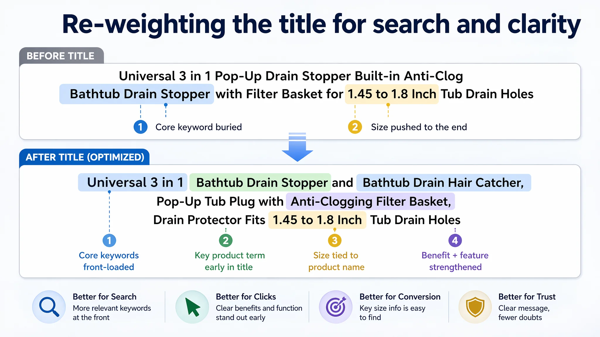
This re‑orders:
- “Universal 3 in 1” + “Bathtub Drain Stopper” + “Bathtub Drain Hair Catcher” up front
- Keeps “Pop‑Up” as a high‑value function term
- Keeps the critical 1.45–1.8 inch compatibility explicit and clean
2. Main images: Visually acceptable, strategically underused
Score gap: 24 vs. 26 (‑2). On paper this looks small, but the qualitative gap matters:
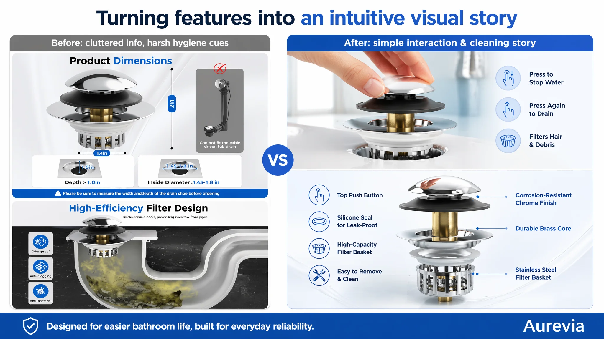
- Weak first‑screen impact
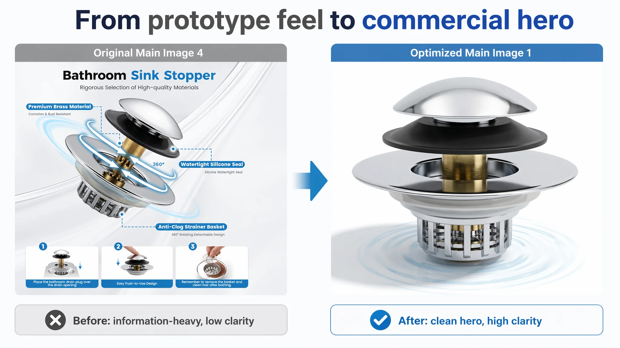
- Our first image had busy water splashes that obscured details.
- On mobile, the metal structure and finish lost clarity.
- The benchmark used a clean “product hero → core value” image pair in the first two slots, which Amazon’s algorithm and shoppers tend to reward in dwell time.
- Missing installation reassurance
- Our images didn’t clearly show “no tools required” or a simple installation path.
- The benchmark explicitly visualized “no tools needed” and emphasized DIY friendliness, reducing perceived risk.
- No strong functional proof
- We used icons and text to list functions but lacked side‑by‑side comparison or “before vs. after” structure.
- The competitor used a clear VS graphic to discredit other solutions and highlight its own anti‑clog advantage.
The main images weren’t ugly; they were neutral. In a crowded Amazon bathroom category, “neutral” is effectively invisible.
3. Bullet points: A rare bright spot
DeepBI’s analysis:
- Our bullet points actually outperformed the benchmark in structure:
- Each point followed pain → solution → result
- Headlines were more action‑oriented and result‑oriented
- Content was richer and more scenario‑specific
For example, recommended directions:
- BP1 – Universal 3‑in‑1: clearly explains “one stopper, three functions: plug, filter, odor seal,” with an outcome‑oriented headline.
- BP2 – Anti‑Clogging High‑Capacity Strainer: ties bigger basket → more hair & pet fur catch → “Warm Tip” guidance to reduce misuse‑based complaints.
- BP3 – Tool‑Free Installation & Easy Cleaning: connects “no tools, no plumber” to cost saving and shows a simple 3‑part removable design.
- BP4 – Wide Compatibility & Universal Fit: sets precise 1.45–1.8 inch and clarifies drain types supported and excluded.
- BP5 – Premium Metal Quality & Durability: contrasts solid brass and polished chrome with cheap rubber plugs and makes durability a value lever.
This meant we did not need a full textual rebuild. We needed to align the visual story with bullet logic so that shoppers who don’t read long text still get the same persuasion chain.
4. Detail / A+ content: the real black hole
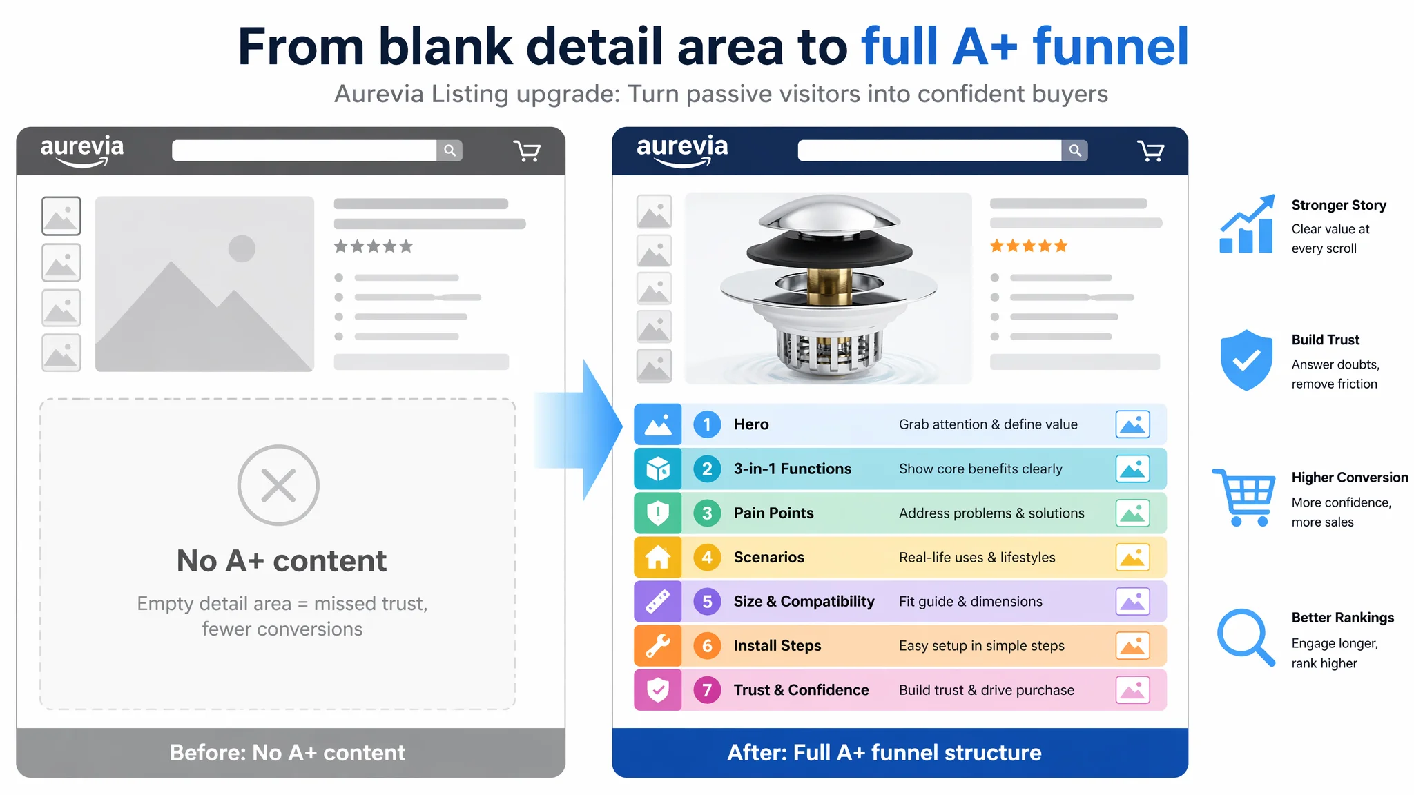
Score: 0 vs. 23 (‑23). This is where the Listing fundamentally collapsed.
Benchmark A+ modules covered:
- Core value hero module (3‑in‑1 clearly stated)
- Function breakdown (stopper / strainer / odor isolation)
- Pain‑point resolution (leakage, clogging, hair, jewelry, pets)
- Water‑flow and multi‑scenario demonstrations
- Install steps with STEP 1–4 visual path
- Size compatibility and measurement guide
- Emotional & trust module: user scenarios, reassurance wording
Our Listing had none of this. No A+ modules. No structured visual path.
The result:
Shoppers came from Amazon search into a page that felt like an incomplete file: a few images, some bullets, and then… nothing. All the “why” and “how” content existed only in the seller’s mind.
How DeepBI Reframed the Problem
Instead of asking, “How do we reduce ACOS?” the key questions became:
1. Is this Amazon Listing converting traffic as well as the category allows?
Data response: clearly not; detail/A+ at 0 vs. 23 is a red flag.
2. If we poured more paid traffic into this page tomorrow, would each extra click be cheaper or more expensive in terms of cost per order?
With this A+ gap, extra traffic would mostly mean more expensive orders.
3. Which single bottleneck is most constraining CVR right now?
Not the bullets, not the title. The absence of a visual decision path and trust structure.
DeepBI’s judgment was:
- Core constraint: Listing conversion capacity, especially in the detail/A+ layer.
- Primary risk: Ads amplifying a page that cannot effectively convert, leading to rising TACOS and stalled organic ranking.
- Correct sequence:
1. Repair the page’s ability to convert (title, main images, A+ flow).
2. Then let ads and organic traffic test, not rescue, the page.
Why We Did Not Keep Tuning Ads First
From a pure advertising perspective, the seller could have:
- Expanded keyword sets
- Tested more match types
- Split campaigns by theme or intent
- Micro‑optimized bids daily
But none of those actions change what happens after the click.
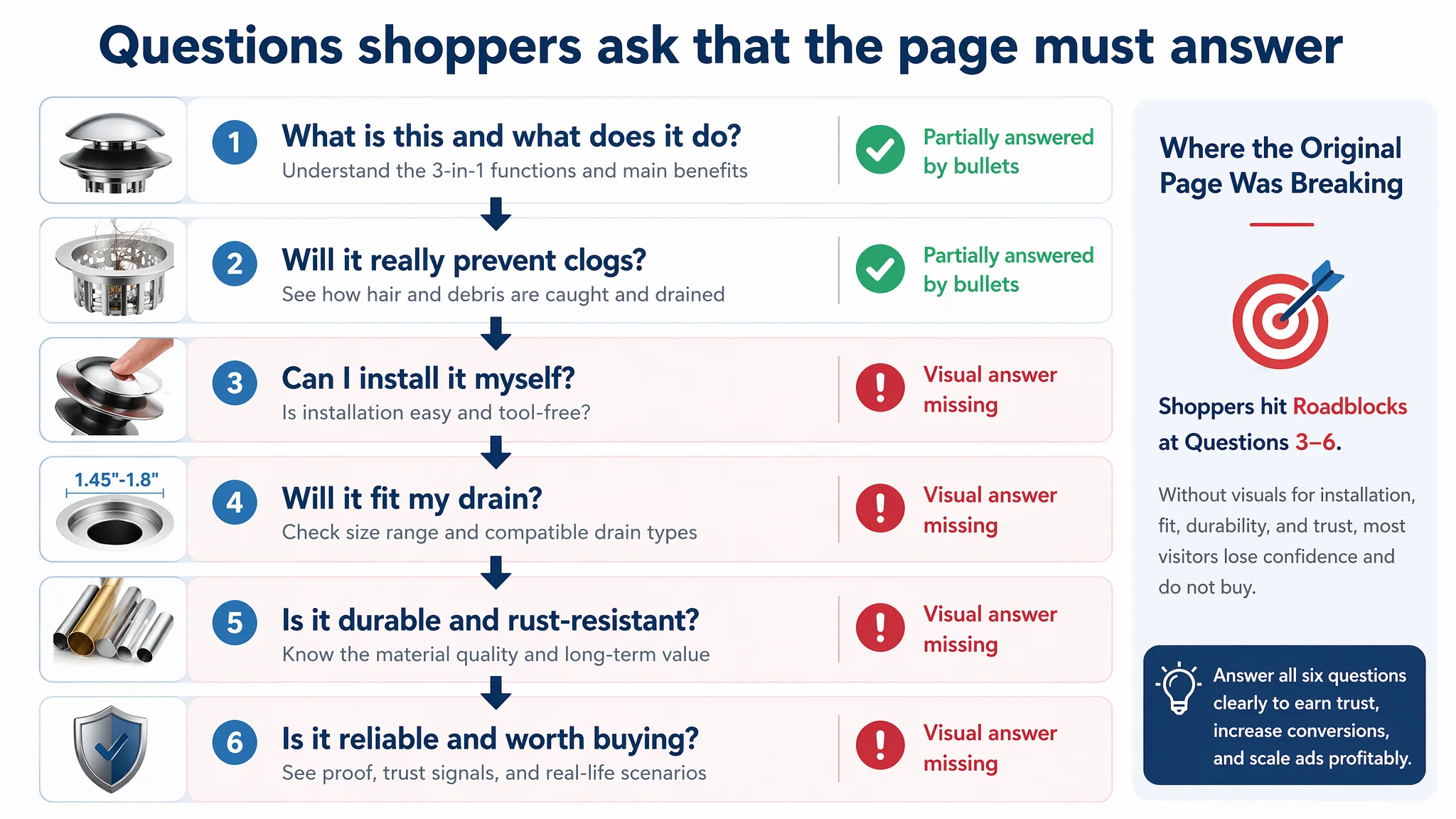
At the actual conversion layer, the sequence of shopper questions is:
1. Is this the right type of bathtub stopper for my drain?
2. Will it really prevent clogging and catch hair and jewelry?
3. Can I install it myself without tools or a plumber?
4. Will it fit my specific drain size and style?
5. Does it look and feel as high‑quality as the price suggests?
6. Can I trust the brand and the product?
On the benchmark Listing, these questions are answered visually, step by step.
On our Listing, without A+:
- Many of these questions were either unanswered or buried only in bullet text.
- Shoppers had to work to gather enough information; some simply bounced.
Advertising does not only amplify advantages. It can also amplify a page’s existing defects.
Running more aggressive ads in this state would have:
- Increased impressions and clicks,
- But likely left CVR flat or even down,
- Pushing ACOS and TACOS to an unsustainable level.
So DeepBI’s recommendation was strict: build the page first. Then let ads measure how much conversion capacity has actually been restored.
Rebuilding the Page: From Technical Piece to Bathroom Solution
The optimization focus was not “make it prettier,” but “rebuild the decision logic in visuals.”
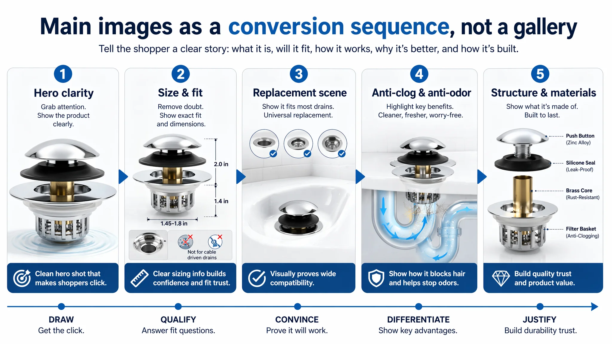
1. Main‑image system: from “image set” to “conversion sequence”
Key changes in direction:
- Main Image 1 – Clean hero, industrial clarity
- Product centered, ~75% of frame, 45° angle
- Strong but soft side lighting to highlight metal texture
- Pure white background with minimal circular water ripple under the product
- No messy splashes—industrial, precise, clean
Purpose: maximize clarity and perceived quality at thumbnail scale, especially on mobile.
- Main Image 2 – Professional size & compatibility visualization
- Product centered, ~60% of frame, front view
- Light gray gradient background
- Clean measurement lines with simple sans‑serif text (e.g., 2.0" and 1.4")
- Reduce visual dominance of “not compatible” elements; keep them readable but secondary
Purpose: reduce doubt about fit in one glance, rather than forcing shoppers to decode text.
- Main Image 3 – “Universal replacement” in real scenario
- Product installed in a white ceramic tub drain
- 45° low angle, bright bathroom lighting, subtle tile background
- Top third: three small circles showing outdated stoppers for contrast
- “Universal Replacement” text in a deep‑blue badge
Purpose: position this as a modern upgrade to old, annoying stoppers.
- Main Image 4 – Anti‑odor & anti‑clog, but hygienic
- Product in a tub scene, 45° side view
- Simple U‑shaped pipe graphic overlay in light blue at lower right
- Blue dots or bubbles symbolizing odor‑blocking and filtration
- No real hair clumps to avoid disgust; use symbolic visualization instead
Purpose: explain function while protecting viewer comfort and brand perception.
- Main Image 5 – Exploded view: why it works
- Components in an exploded vertical layout along the center axis
- 30° top‑down angle, focus light on brass core
- Light blue tech‑line background
- Clean callouts like “Brass Core” and “Silicone Seal”
Purpose: convey engineering seriousness and justify durability claims without changing actual product design.
Together, these images shift the impression from “a small tub part” to “a well‑engineered bathroom solution.”
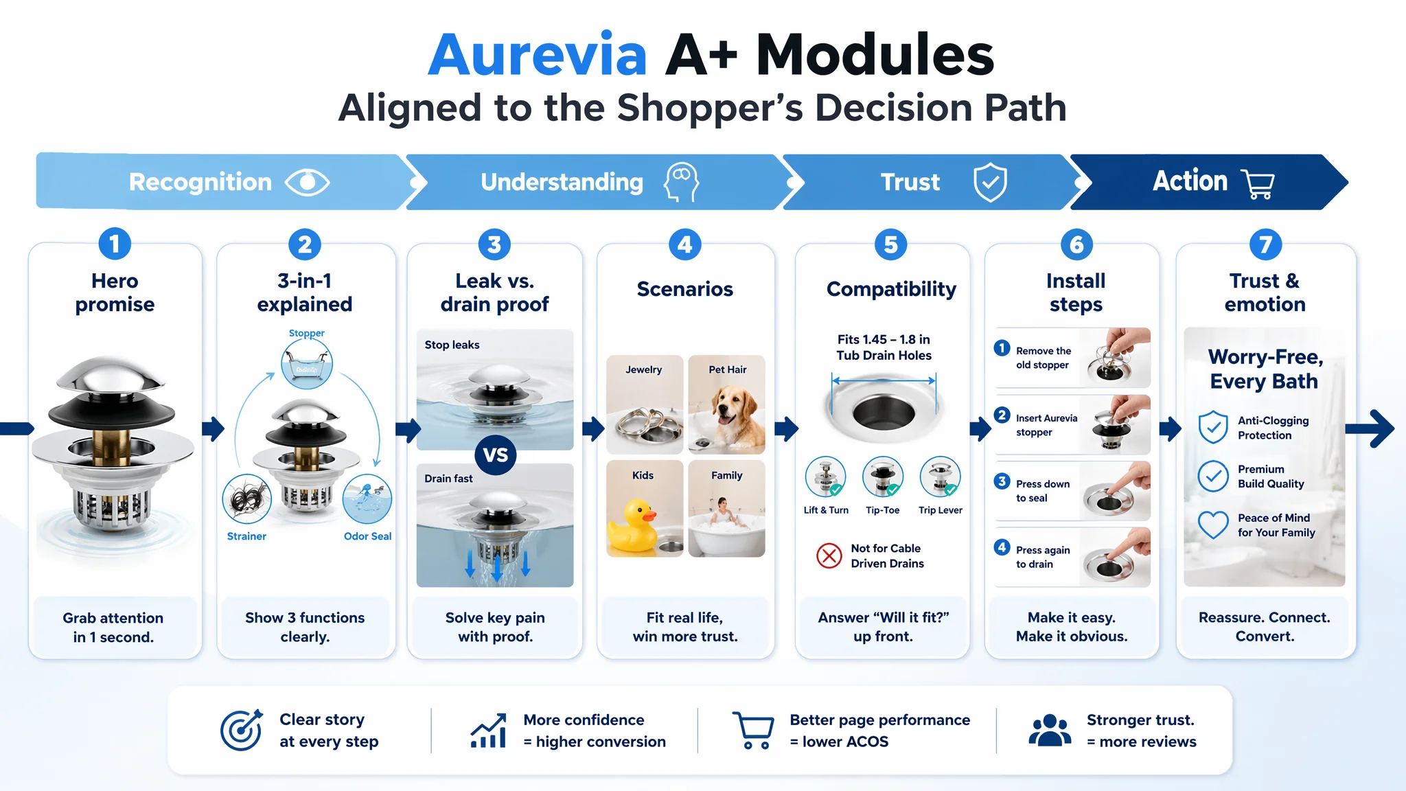
2. A+ / detail page: constructing the missing trust funnel
DeepBI’s logic was to mirror the benchmark’s best behaviors, but with our product’s strengths:
- Module 1 – Opening hero: define the promise in 0.5 seconds
- Bright home bathroom scene with marble‑like tub edge
- Product on the right side as the focal point
- Bold headline: “3-IN-1 BATHTUB STOPPER”
- Subline: “Faster Drainage & Effective Filtration”
Role: immediately communicate what this is and why it matters.
- Module 2 – Core 3‑in‑1 function visualization
- Center product in full assembled form
- Three semi‑transparent bubbles around it:
- Stopper: under water, fully sealed
- Strainer: close‑up of water flowing while hair is caught
- Odor seal: tight seal at base
- Emphasize brass core and thick silicone rings in callouts
Role: translate “3‑in‑1” from a bullet point into an easily grasped mental picture.
- Module 3 – Pain‑point resolution: leak vs. drain
- Left/right split:
- Left: tub filled with clear water, stable level → “STOP WATER EFFECTIVELY”
- Right: powerful water swirl draining fast → “DRAIN QUICKLY”
Role: set clear expectations around what “stopper” and “drain” performance look like.
- Module 4 – Scenario protection: not just hair
- Four‑grid layout:
- Ring caught by basket
- Necklace near the catcher
- Pet bathing with visible hair control
- Human shampooing scene
- Labels: “Valuables”, “Jewelry”, “Pet Hair”, “Human Hair”
Role: extend use cases and raise perceived value beyond “just hair.”
- Module 5 – Compatibility clarity
- Product at 45° on left
- Three silicone rings with clear diameter labels (1.12", 1.34", 2") on right
- Minimal gray background, high contrast text
Role: lower returns and decision friction around “Will this fit my tub?”
- Module 6 – Installation guide: tool‑free in four steps
- Horizontal four‑step strip:
1. Remove old stopper
2. Insert new stopper
3. Press to plug
4. Press again to pop and drain
Role: remove “I’m not handy” anxiety and tie into bullets about no tools, no plumber.
- Module 7 – Trust & emotion
- Warm family bathroom scene
- Model happily washing hair
- Product shown clearly on the other side
- Text:
- Question: “HAVE YOU WORRIED ABOUT CLOGGED DRAINS?”
- Checklist: “Anti-Clogging”, “Universal Fit”, “Easy to Clean”
Role: convert technical advantages into a feeling of “problem solved at home.”
These modules reconstruct the missing recognition → understanding → trust → action path on the Amazon product page.
How the Page’s Sales Logic Started to Recover
Once these changes are designed and applied (using DeepBI’s AI image production and one‑click Listing sync in an actual deployment), the expected operational changes look like this:
- Listing conversion capacity improves
- Shoppers land on a page that answers “What is it?”, “Will it fit?”, “Can I install it?”, and “Will it really prevent clogs?” without making them dig.
- The bullet logic is now mirrored visually, so non‑readers still get persuaded.
- CVR begins to move up before heavy ad scaling
- Even with modest traffic, the page can convert a higher share of visitors.
- This creates room to increase bids or expand keywords while keeping ACOS under control.
- Ads become a multiplier rather than a patch
- Sponsored traffic now lands on a page aligned with category‑leading visual logic.
- Better CVR makes each click cheaper in terms of cost per order.
- Organic signals (click‑through to cart, purchase behavior) improve, supporting ranking.
- Review risk decreases
- Clear usage instructions and compatibility visuals reduce “doesn’t fit” and “hard to install” complaints.
- The “Warm Tip” about cleaning the basket sets realistic expectations, lowering the chance of unfair “it clogged again” reviews.
Operationally, the seller moves from:
- “Ads are expensive and reviews are slow”
to
- “The Listing itself is working harder for every visit.”
What Changed in the Seller’s Understanding
By the end of this diagnostic process, the key mindset shifts were:
1. Amazon ads cannot compensate for a weak Listing.
You can always buy clicks, but you cannot buy conversion. The product page has to earn that.
2. Listing quality is not mainly about text density.
In this case, bullet points were already strong. The gap was structural: title weight, main-image decision sequence, and a missing A+ story.
3. Detail/A+ content is not “nice to have later.”
A missing A+ is a missing trust funnel. In categories like bathroom hardware, where function and fit matter, A+ is a primary conversion lever, not decoration.
4. Ads should follow Listing readiness, not lead it.
Before scaling spend, the seller now asks:
- Does my main image win the click against the benchmark?
- Does my A+ answer the key pre‑purchase doubts?
- Is my page built to convert the traffic I’m about to buy?
“The real problem was not that ads failed to bring traffic. It was that the page could not convert the traffic.”
For Amazon sellers in similar categories—plumbing, hardware, small home accessories—the lesson is clear: whenever ACOS feels stubborn and traffic seems “fine but not profitable,” do not only look at bids and keywords. Put your Amazon Listing next to the true benchmark and ask: _If I were a shopper, would this page give me enough reason, proof, and confidence to click ‘Buy’_?
Only after that answer is “yes” does it make sense to push the throttle on Amazon ads.